Transcripts
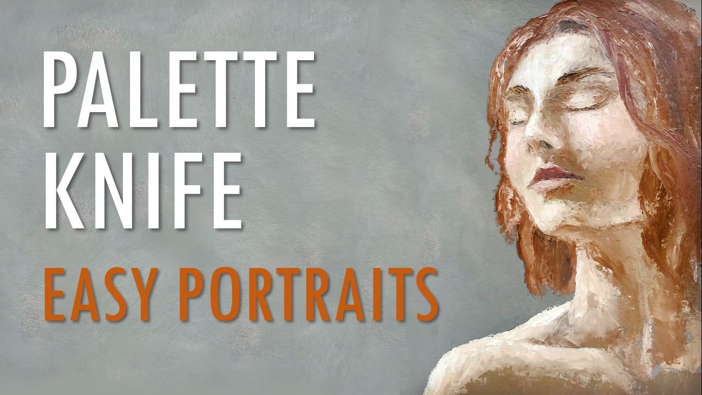
1. Intro: As human beings, we usually feel drive into wires, representations of human faces and figures of all kinds. And author images that adhere to reality have dominated art for a long time. It is increasingly common to find paintings that intentionally seek and nor realistic style. My name is margin and the Colombian artist. And in this class, I want to show you some methods to create non-realistic phases and figures using oil or acrylic paint. Although there are many means to create this type of work. In the following lessons, we'll see for simple methods. And for each one, I will pay a small BCE. This glass is made for all levels. And despite that are simpler methods than others, the idea is that they all can be taken to different levels of complexity. So I hope you join me and I look forward to see your projects.
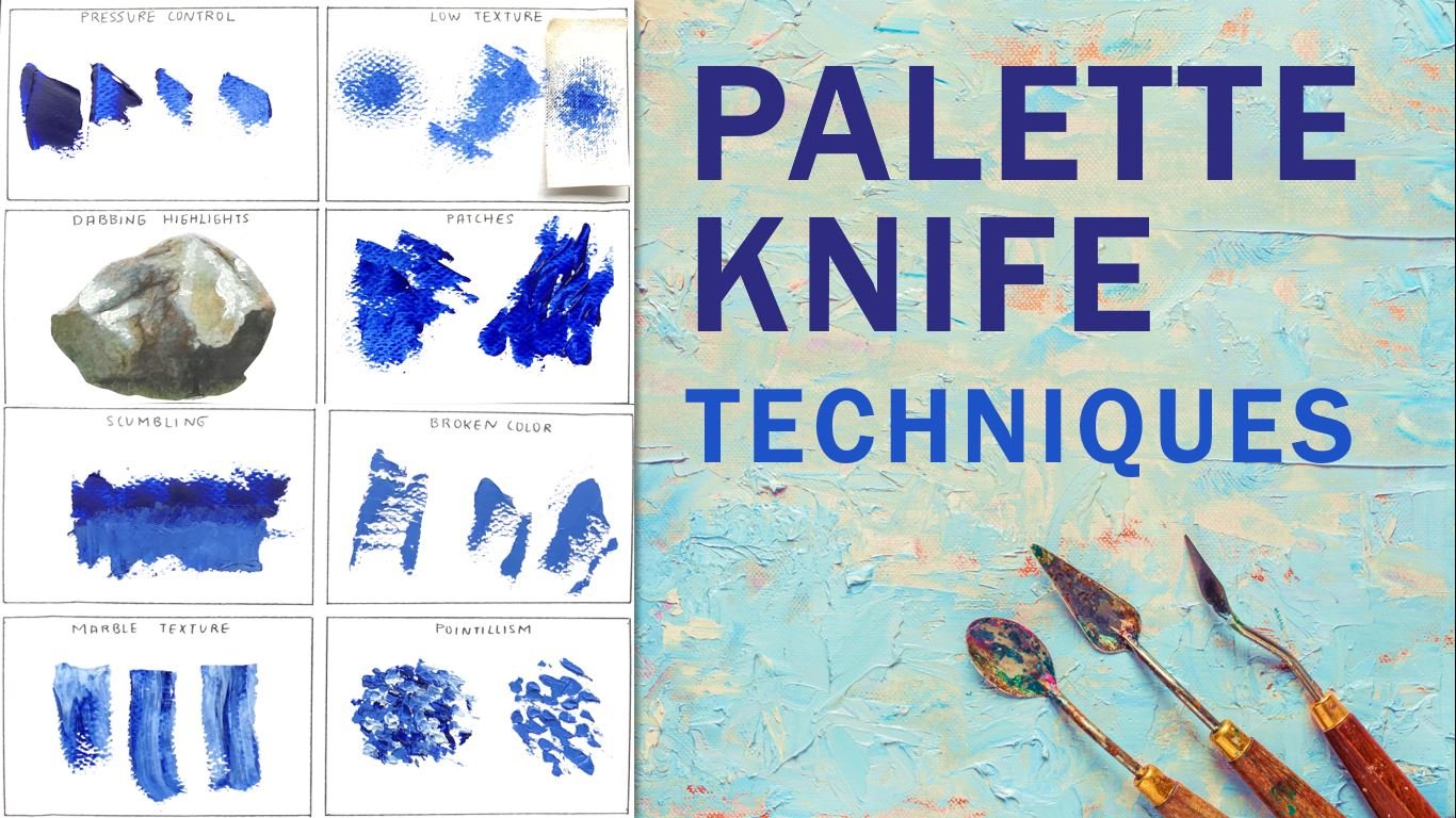
2. Materials: For this class, we need Canvas, paper or whatever surface you want to work on. For practices or quick demos like these. I usually use cardboard, thick paint like oils or acrylics. And mixing palette or a dish with a flood surveys when it some palette knives sign different size of brushes. And finally, where do you think paper, pencil eraser and some paper towels.
3. Simple lines: The first method that we are going to use to create a realistic faces and figures is to use simple lines. For these, we only need to limit some areas that help us to create a general idea of the face. For example, we can mark the contour of the face, the nose and the ice, or join the AIIB rose and the nodes in a single stroke to simplify things. This technique can help you create more abstract style paintings, which can be as simple or complex as you want, depending on the number of fingers you have and the level of detail you use. There are two basic ways to create simple lines. The first one is to create a striking bad symbol background and then draw the figures with flat lines. The key to achieving business of this style that doesn't look childish is to use loose lines to denote confidence. The second path is allowing the figures to merge with the background, resulting in an image between abstract of your relief. Now, I'm going to paint a simple piece of this style to show you what I mean. The colors I'm using R for a million red, cadmium, yellow, and black. I have always liked a left-leaning as an simplicity of this color palette. Although to make it a little more interesting, you can either blue or purple. Instead of luck. I prefer the surface with a code of orange acrylic paint, as this will be the predominant colour in the piece. I start by drawing a red stripe that will help me separate the space so that there will be abstract objects around and behind the strip. There will be a face that I will define. I am not using any sketch because the idea is to avoid the stiffness. Therefore, with yellow, I draw the light bars of the face so that I can create some volume. This way. I create the most protruding areas, which are the forehead, the nose, the cheeks, and the team. Then I add some color to the background, delimiting the face and not worrying about covering the entire area. This is why it is important to use a background color to avoid showing white patches of Canvas. Generally, when choosing a color palette, the complimentary of the color is used to create the shadows instead of using black. As this helps us to create more lively and natural tones. In this case, the predominant color is orange. So I could have used blue to mix the shadows. However, I'm using black as it can behave as a very dark blue. So when mixed with their million ER gives are very earthy poor bulls. And when mixed with yellow, it creates a nice, all these green. Some famous pallets, such as Zorn's, use black as a replacement for blue as it gives more possibilities when creating very powerful shadows. For now, only the finding shapes and values. I fill the red stripe, look a bit like it's Lake. So I give it a little more shape because I like the idea of the fuzzy phase hidden behind snake. Now that I have a clearer idea of what I want, I mix red with a pinch of black to shade and defined some areas using the edge and deep of the artist's life. This style of Beidi lends itself to creating all kinds of crazy things and inconsistencies, especially when working in very large formats. For example, you could create a background full of eyes of different shapes and sizes, but difficult to decipher. You can also add the many figures that at first glance do not seem more like random spots. But that when you squint takes shape. This is done by highlighting only the areas of greatest importance and avoiding to use too many hard edges. There are really many possibilities that you can explore to create interesting, fun and easy to do works. As I find that this style is very relaxing and it's difficult to have catastrophic results. But at the same time, it is very versatile and declarative. The most complex part when painting these type of peace is the color composition. For this reason, if you're in a very skilled in color theory, I recommend you to start with the Siebel palette, like the one that I'm working on. Because the more colors reuse, the more likely we are to end up with muddy colors or with a poorly cohesive result. Once I'm comfortable with the shadows, I mix yellow with wide to paint the highlights of our nose, left cheek, and some part of the background to balance the color. Now, the only thing left is to adjust the last details. I add more red in a shaded areas, saw that there is more variation in color. And then I rectify the shape of the nose. Wage of though I think it was to beef. It doesn't bother me at all. I you also add more highlights and shadows here and there. Not only to change the value, but also to add more texture within buster. Instead of Beijing well-defined eyes, I'm just going to leave the sockets aligned. I'm thinking of this figure more like a mask than a person for which I paid a large, well-defined knows, but one that lacks naturalness. And at the same time, I do not include neither neck nor shoulders. For these types of pieces, it can be useful to seek inspiration in African or a carnival masks. Seemed they have quite simple lines. Likewise, monoliths and ancient sculptures such as the Easter Islands, more ice, pre-Columbian figures and so on, are great ideas for creating works of this type and for practicing handling volumes. And finally, to break the monotony scenes, most of the edges are smooth and there are no straight lines in the rest of the piece. I paint a kind of cross at the top with a lighter color as if it were a Shiner. This painting was quite fast as it took me less than 15 minutes to complete. But without adopt. It can be a very interesting exercise.
4. Single feature: The next method to create a realistic faces and figures is to use a single feature. I start by drawing the silhouette of a person. By the silhouette will have a solid fill. It can be the colour you prefer, or it can even have some texture inside. The important thing here is that all the tail of the work will be concentrated in a single part. For example, we can focus our attention on the eyes as they are the most important part of the face. We can also focus our attention on the mouth. And paid a mysterious smile as if the smile belongs to a shadow instead of a person. Okay? Now I'm going to paint the first one of these sketches. The colors I'll use our sorrow, Leon Blum, vermilion read, cadmium yellow and black. Once a half, prepare my surface with an acrylic base, and I have the drone ready. I proceed to paint the eyes of the, I want the eyes to show details. I don't want them to look realistic. Therefore, I'm going to use artificial colors for them. I start by mixing adult being for the lightest part of the ice, and I apply it using a fine brush. Also, this part may appear white dot times. The truth is that it has darker tone that tends to be a bluish gray. So try not to use pure white in order to avoid something unnatural. In fact, given for a painting like this where I'm not using a realistic palette, I prefer to use a shade other than white, as I think it looks much better. That is why instead of the natural bluish gray, I chose this pink. Keep in mind that the eyes are spheres, and therefore lights and shadows should be used to prevent them from looking flood. To do this, I mix a medium grey and applied on top. And in the area near the tear duct with vermilion and a hint of black. I create the darker tone and added on the lash line to start giving more definition to the I. And since I'm using non-natural Shades, i, yada poor vermilion read to outline the lower part of the elite. For the iris, I use moral of the dark red that I had mixed previously, but only for the edges of the iris and the pupil. Because for the rest, I'll use a darker blue. Usually in the iras, we can find two basic tones. A dark one that is responsible for ordering the circle and a light one that is inside. I recommend you that even if you are trying to paint something, I rarely stick. Pay attention to these details. So that lack of realism looks intentional and not due to ignorance of anatomy or nature. This can be achieved through violence. For example, in the case of this work, I will keep a bit of relativism in the ice, but at the same time, I use a loose strokes and our natural colors so that when someone sees the final result, don't think that I only painted the eyes and because I'm not able to do the rest of the face. But because my invasion was to only paint the ice. Well, now why mix orange and bullied around the ice on the bottom and on-site. As I want to give the upper eyelids darker, I add the white to the mix to create some highlights where light orange. After cleaning the brush, I take an almost pure white and with a few other reflection to the ice so that they finally begin to come to life. Since I want to have a lot of contrast in this piece, the remaining areas will be different shades of blue. Don't forget to differentiate the eyelids by working in sections instead of just being deemed the entire area. So add strokes following the natural shape of skin and wrinkles for a more organic results. And once you're happy with the overall shapes, start adding more tonal variations, adjusting highlights and shadows, and readily initiating important areas like the lash line. I'm using her gray base color because with a neutral tone, I can work with different colors and obtain excellent results. It, it's very important to choose a good hue for the surface. Sees a very dark colors, can absorb the light of the work. And to light colours illuminated the tones of the paint, but they can reveal is more white patches that are known to the eyes. The background color reuse can be a good complement to our work, especially if we are working with transparencies. Or using negative space as part of the painting. Personally, I like to have several canvas of different sizes are ready preferred when our great color, as this is the most versatile of tone. That way, whenever I want to paint, I have a canvas readin advanced, except in the cases in which I'm going to place an order of the spatial size, or in which I'm going to work with a different background color has happened with the first painting of this class. Either way, it's always great to have something ready to work on. So bang the silhouette of the face. I'm going to use black. I thin down the bank with linseed oil and applied evenly over does Dyer area, adding ears to the figure so that it looks more human. I also paint the neck and the chin separately so that despite everything has a solid color, the phase can be differentiated from the neck. For the background, I'm going to use some of the colors that are used in the ice. I started by other environmental read, but a gentle light teeth very much. So. I just makes orange and applied around the figure. These methods of creating and realistic figures. It's probably the one layer lack the most, as it allows us to create very mysterious images. And not only using phases. Instead, you can create complete figures and add other details than the eyes and mouth. For example. You can play with the outfits off the silhouette and create the shadow side, wear coats, hats, or scarves. A crowd of shadows can be created in which only one of the individuals is complete. Or symbolic elements can be added to give more meaning to the BCE. In short, there are many possibilities that can be explored because just by modifying the colors you use, you can change completely the mod of the body. In this case, making the silhouette white instead of black would make a very different final result. To avoid the making their work look too dark. I faded the Cold War towards the edges with a lighter color is present in the bank as if it came from behind a character. And finally, I yell at some loose strokes around the eyes in order to remain them from looking like a patches on the silhouette. Cause that makes it look a lot more natural.
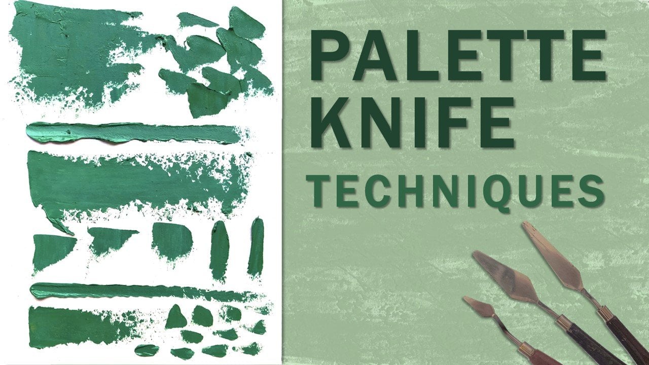
5. Weird features: What we are going to do now, it's more imaginative. It is about creating things that are not quite human. Or the half some time of very exaggerated or strange characteristic, such as twice the length of normal sharp nose like that of an eagle. An extra verifies or an oversized the school. The idea is to let your imagination run wild. And for these, something you can do is take an image as a reference and randomly choose a characteristic to change. Maybe instead of changing something you want to audit. For this, you can be inspired by the animal kingdom add-in and Taney horns or funds. For this lesson, I'm going to paint that combination of the two sketches using the palette knife technique. The chorus I'm using are cerium, blue, vermilion, read, cadmium, yellow, and black. As you can see, I already have done the sketch. I will paint Freeman figures and to divulge only be seen in the background. I start by mixing turquoise with blue, yellow, and some white. Then I mix orange for the background, in which I'm going to make a gradient between light orange on the top to vermilion to the bottom. I start with a lighter tone, being careful not to overstep the figures and adding some heads of white. Then I bring the next shade, blurring the areas where the two colors meet to finally add the vermilion. With the two queries that I had previously mixed. I paint the two secondary figures. For this painting. I'm not using any reference. But what I want is to have the lighter colors in the background and the darker tones in the foreground. So for now, I apply a base code for the individuals without worrying about the details. For this painting, I wanted to make a composition a little more elaborated down in the other lessons. So I added a few more characters. There are some composition rules that can make life much easier for us. The first one is the Rule of Odds. Which suggests that an odd number of objects in an image, it's more interesting than uneven number. Even numbers produce symmetry, which can appear overly formal and unnatural. When we see multiple objects that are evenly number, our mind tried to group them into pairs, which often leaves the center of a scene empty. The human eye naturally is attracted to the center of an even number of objects, creating an empty space in that place. For these, I used a knob Number, Three Men figures and five in total. On the other hand, we have the rule of thirds, which is a technique to ensure that the focal point of your Basie is not directly in the center. And that's your bank. Dq is not overly symmetrical. What it entails is carrying the scene into thirds both ways. The aim is to place your focal point at the one of the intersections and to ensure none of your sections are the same. In general, a focal point which is directly in the center of the painting, is not visually a building for the viewer as it chops the image in a very unnatural way. The rule of thirds, It's a simplification of the golden mean. This divisions do not have to be exact, but rather a guide for locating objects on the canvas. I found the two figures in the background to be too dark. So I just added more white to the mix and Bayesian them again. That is why you should start by adding a thin layer of paint instead of adding a lot of impasto at first. Okay, for now, I want paying the figure in the front as I preferred to finish the one right behind first to avoid ruining the details of either. Now, I start to define more shapes and volumes with a lighter color. I only merge some areas such as the cheeks, the nose, and the chin. This strange characters will were simple capes. A shade is slightly lighter than their skin tone. It's starting to add details. To do these, AI makes a pinch of black with the turquoise. And with the help of a brush, I defined the features such as the nose, the eye sockets, the mouth. And the isolates. Although I'm not looking for a realistic finished, I want the features to be well-defined and somehow silicon natural in the midst of the overall artificial style. Now, I move on to the last character for which I mix a slightly darker blue in order to very distinguishing it from the figure behind. In this case, the characteristic turning his back on light. So I defined the values from that, adding highlights and shadows to create the volumes of the head due to the incidence angle of delight. The most eliminated parts are the cheek, the side of the forehead, the jaw, and the IR. These types of non-realistic figures are more common in other media, suggests squash, watercolor, or digital art. But the truth is that you can also look really well in noisy or acrylics, especially when working with a palette knife. This images can be as realistic or a quirky as we want. In this case, my original bland to paint several relatively normal women with hair and width, natural skin tones, whose only peculiarity would be deal located neck. However, at the last minute, I changed my mind as I found it interesting to work with more striking colors, since my paintings are usually more unmute. I think that in the end, these two quasar aliens were quite intersting. But without adopt, the original idea could have been very nice as well. You may have noticed that I always use vermilion read, or maybe you haven't. The truth is that it is practically the only red tone that I use. An ortho. I liked it a lot and forced to paint almost always with the same hues. Simply because I live in a very small city where for some strange reason, I can't find colors like a reasonably red or green some lake. It seems that the only red pigment in the region is vermillion. In fact, until a couple of years ago, I had the same kind of problem with the blues. What I mean by all this is that many times we may not have access to all the art supplies that we want. But somehow, we must adapt and learn to work with what we have, whether we lack paintings, media, Canvas, or more. I assure you that there will always be another option. I assure you that there will always be another option with which you can replace what you just lack. Something that I love about oils is the ease with which mistakes can be corrected. As in this case, the jawbone was too wide. So I just scrub it to a size more consistent with the rest of the image. I returned to the brush to make these tails off the last character and abolish the other two. These last space consists of an hasten the light and shadows that I already painted. And given more definition to the nose, the eyes, mouth, and ears. As you can see, I have fathered the details with a fairly small brush. In fact, this is the brush that I usually use for signatures. But in this case, I'm not using it because I'm not able to use something bigger. But because that way I avoid the temptation to overwork the painting. Let me explain. I wanted this painting to look as if either was made with a palette knife with not too many details. The problem is that attained to include a lot of details. Although that is not my intention, because it is difficult for me to work in a way more loose. To avoid doing these, I usually use very small brushes. And I know it sounds contradictory. But in reality, working with a small brush makes it difficult to work large areas. And also it slows you down. So I only add what is a strictly necessary and finished my work. Otherwise, it would take me ages to complete a large sprinting with a small brush. If I use that bigger brush, I would sure be going through each section over and over again. And then the end result would be much more rigid. If you're a joined to paint them are loosely, I recommend you to try different strategies, such as varying the size of your tools, are limited in the amount of brush strokes that you can use for each object. In modernism art, it is difficult to find universal rules. It is more about trial and error until you find the method that best suits you. I painted the eyes in a very light tone, but I left them without pupils are eyelashes to give them a more mysterious air. After a few streets. This is the final result. Yeah.
6. Silhouettes: Painting silhouette is a very common method of creating a realistic figures. When we talk about silhouettes, we are not necessarily referring to our flood figure without any detail, but there are more things that we can do. First, you have to decide where you want to focus. He can be in the background or in the silhouette itself. What you paid inside the silhouette, it can be an abstract image, some volume that resembles the shape of the body, or even things that have nothing to do with the fingers, like a landscape. A simple way to create these type of images is to cut out the silhouette, repainted, and use it as a stencil. And this way, you can create a complex interior mesh without worrying about running the figure. Okay, now let's see what we can do. The colors. I'll use our spirulina and blue, cadmium, yellow, vermilion red, and a hint of black. I start by mixing a lighter blue and applying it to one of the size of the figure on the upper part of the face and neck, shoulders, and the breast. In this case, I want to create some volume, not to make it look like a real person, but rather to make it look like i j the sculpture or something like that. Then I have a bit of black to the same color in order to create the shadows. In this image. Light does not come from the front. Another rather from the left side and Bach of the figure. And therefore, the edges of the silhouette will be lighter and the center will be darker. Finally, I add more Y to the mix to make a lighter hue, and I apply the colour over their remaining areas. I also add some yellow to blue to create moreover tones. And the rest is just about adjusting what I already leaf, although it is not necessary for the figure to keep the perfect forums. I can add some highlights and shadows. To make their volumes are veterans find. By adding the light tones, I tried to define very briefly some important areas such as the hairline, the ear, cheeks, and a waste. Not too much to make her look realistic and not too little too late flood. Benton silhouettes with very imaginative interior images is one way to add interest to our ready SQL paintings. Either using some set starry skies, ocean waves, et cetera. Just use the silhouette as a stencil on band, whatever you want inside. I phoned the image to be and complete at the bottom. So I decided to add more to it. However, they see who are the importance of selecting a good image for reference becomes Park. In the photo I used, the woman was leaning against a balcony. The problem is that when converting several adjacent elements into silhouette, the sense of the mesh can be lost as it is difficult to differentiate the objects from each other. For example, this image looks pretty good in color. However, if we turn it into a silhouette, it suddenly stops making much sense. The same thing happens with this other image, where conflicts are born between the different objects in the image under four, transforming it into a silhouette in Luke's up in strange. On the other hand, if you use an image whose elements does not overlap too much, as in this case, by transforming it into a silhouette. The result will be much better. Sees the shapes can be preserved in a cleaner way. To finish, I painted the background with pure vermilion read. In order to create a contrast between the two planes, I used a brush for the edges and then work the remaining part with a palette knife. Tried to create a fairly flat background. Okay. In the end, I did not like the lower part just because it did not look consistent with the rest of the silhouette. Saw. I cut it out and this is the end result.
7. Project: For the project class, you can paint or sketch your ideas for non-realistic faces and figures. If you want, you can paint alongside with me to create your own bees and then upload a picture of feeds to the project section so everyone can see it. I hope you enjoyed this class and found this lesson useful. Thanks for watching, and if you liked it, please live good feedback and follow me for future updates.
 Martin Jaramillo, Artist