Transcripts
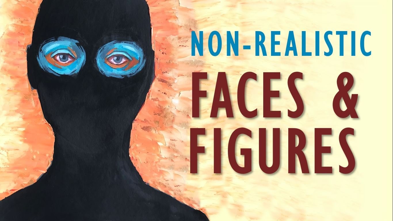
1. Introduction: Palette knives are the tools
of many artists as they allow you to create incredible effects that can't
be achieved with a brush. You can use them to us, certain details to your works or to create entire painting. The possibilities offered
by this tool are endless. Hi, my name is Martin
Emma Goldman, artist. And in this class
I want to show you some palette knife techniques as well as some important
tips to have in mind, which is in his tomb, will see the differences between a plastic and metal
painting knife, the characteristics of a stroke. And so unusual palette
knife stab me, help us to add something
different to our paintings. This class is the second part of parallel knife techniques
for oils or acrylics. So if you haven't
watched the first part, I recommend you to go and check it before guarantee
just discussed.
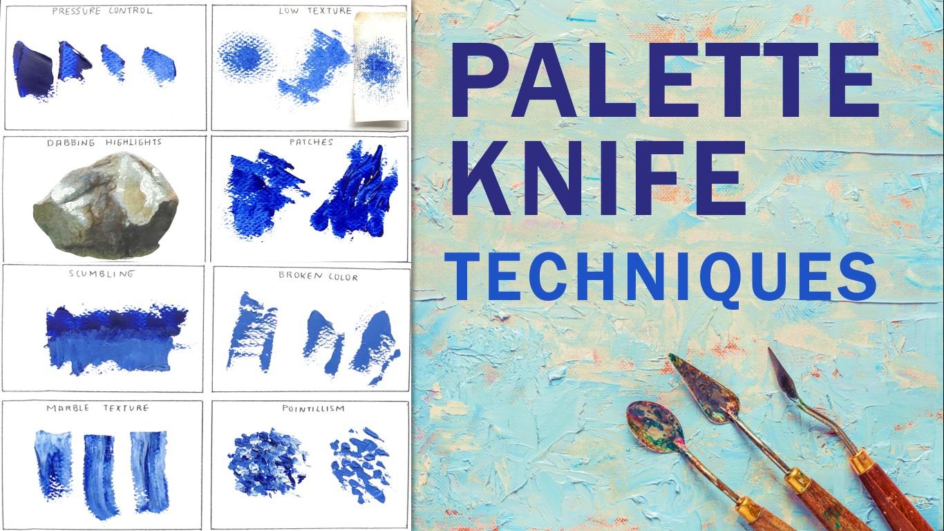
2. The palette knife: There are plenty
of palette knives of different shapes and sizes which you can use according to your
particular tastes. The painting knife
has two parts. The handle on the blade. It's important to learn how to hold the palette knife properly. Avoid rubbing your hands around the handle or
personally tightly. Don't hold it from
the tepee there. Or you want to have a
good control of the tool. Keep in mind that when painting your knuckles shouldn't
touch the surface. This type of positions, voodoo at the risk of
staining your hands, are running your painting. Now let us see the proper way
to hold the palette knife. They index should be the guide. As you can see, the
fingers should be very loose to prevent the
strokes from looking stiff. The palette knife regards
more skill than strength. So practice fluid and
control of movements. Of course, if you're a
dominant hand, is the left. The way you hold it
is just the same. Plastic palette
knives are usually much cheaper than metal ones. However, they don't provide
the same quality service. For this reason, I
think it's worth investing a little more
in the right tools. Let's look at some comparisons between plastic and
metal painting knives. As far a flexibility
and resistance, both types of palette
knives are quite good. However, the metal ones keep
their shape over the years, while plastic knives
deform with each use, bending at the tip by
losing their flat shape. Plastic palette knives can leave unsightly marks on
your paintings. Now, let's see what some techniques look like
with both types of tools. These are just patches of paint. As you can see, the
plastic bulb knife is not completely flat as it
has bent over time. That is why each patch
lithos space without paint. Unlike the uniform
results of the metal one. If you want to paint lines, one of the differences
between metal and plastic is the thickness
of the material. Metal bulb knives
are thinner and this helps creates a
slightly finer lines. However, if you hold a plastic
palette knife correctly, you can get very decent results. Also, it's usually a
bit more difficult to prevent those blobs
of paint from farming. On the other hand, if
you want to create a thicker lines using a vertical motion of
the palette knife, you will experience
the same problem as when trying to paint batches. Since the plastic knife
is not completely flood, the resulting lines are inconsistent and
harder to control. Creating sharp edges with a
metal knife is quite easy. Whether you use vertical
or horizontal movements, you will find that the
paint seems to offer less resistance compared to
the plastic palette knife. And in my opinion, the results also
looks more tidy. Finally, we must mention the cleaning process
of this tool. We start by getting
rid them of some of the paint on the palette
knife to avoid the waste. Then just gently wipe off the rest with a paper towel
or some toilet paper. You will see that
the metal palette knife, it's easily clean. On the other hand, plastic
absorbs more paint, so there will usually be
stays left after clinic. If you paint with acrylic, the paint will dry quickly and may form a cross
on the plastic. In general, baby with a plastic palette knife
can be very frustrating. This tool gifts
inconsistent results, as it is much more
difficult to control and doesn't help in
creating delicate strokes. They are very cheap for a
reason and at the end is way better to have just one or two high-quality palette knives. Rather than having a whole
set of low grade tools.
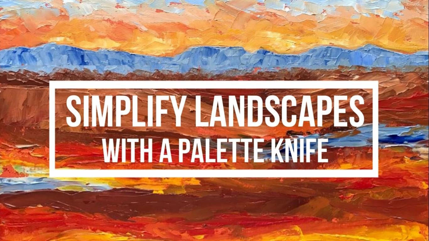
3. Characteristics: The first part of this class, we talked about the
main techniques that can be achieved
with a palette knife. However, there are different
factors that can be applied to these techniques in order to achieve
different looks. These factors are the thickness of the paint or the
amount of impasto, the length of the stroke, which can be long or short, and the coverage that
might be solid or broken. When working with a brush. There are other important
characteristics, such as the jail and shape
of the brushstrokes. However, with a palette knife, we can simplify them
into these three. Now, let's see how each characteristic can impact the final style
of our breathing. You can create the strokes or short as a dot and
as long as like. The more paint to load into the artist knife and the
more pressure you apply. This year, it will be to
create law continuous strokes. Applying more pressure
will help you stretch the paint as
much as possible. However, the end result will
have a very little texture. That is why the strokes with more impasto are
usually the shortest. Short strokes are great for
adding detail of movement. While lung strokes can
help you quickly create the background and drop particular objects,
family and confidently. Shorter strokes can be classified into point
ageism and depths. In a landscape, you can
use long strokes for distant planes and short
strokes for close-ups. This can help you
create the sense of depth more easily as this ensures that the tails are only in places closest
to the viewer. If you want to use short
strokes in the farther RES, makes sure to use
the same type of strokes in the
foreground as well. That will keep the
idea of perspective and give the final piece
and impressionistic look. As an example, I'm going to
paint this figure quickly. On the left side, I will use long strokes. And on the right side,
only short strokes. I load the palette knife with enough paint to
make a base coat. Another bit of yellow and
white fur color variation. For the node. I use the
tip of the palette knife. This way I can make a continuous line
without having to use a short strokes farthest. Secondly, mush, hello,
use patches of color from different directions
to create some volume. The node I first used this graffito technique to
get rid of the excess paint. Then I applied some wide
using dabs of paint. On a small surface. It might be a bit
easier to create dynamic image if you work
with a shorter strokes. As you can see, though the
shape and colors are the same. The length of the stroke makes the end the result to
look very different. The coverage level of
the paint refers to how much of the previous layer
we can see between strokes. The coverage can be solid, in which case the
paint is smooth and we can't see any
of the base coat. It can also be broken so that we can observe each of the
strokes individually. Broken strokes are
usually related to short strokes like
dabs point or Staples. Bats can also be done
with long strokes. Let's see an example. I'm going to paint this lemma. On the left side, the
cover will be solid, the other one will be broken. I start with a base color, applying the paint evenly over the entire
surface of the lemma. With some red. I'm mixing a darker tone and apply it
on one side to add volume. Remember that this is a
very simple practice, so I'll just add some
details quickly, as well as a few highlights to make the figure
look more rounded. For day my Shonda, right? I started with a base
coat of acrylic paint. I use a very dark color. I want some of this color to
show for the final result. Once this paint is dry, I take some of the same green
that I used for the base in the previous example
and applied using depths. Since the workspace
is a bit small, I work only with a tip
of the palette knife. And you'll see short strokes. Once again, I give
volume to the figure. But letting this stroke
it's standard by itself. As you can see also in
the figure on the left, the strokes are not
completely blended. We can't really tell
one stroke from another quite the opposite of what happens in
the second image. Thick buildup of paint
is known as investment. And it's probably the
most noticeable feature when Beidi with a palette knife. Beyond the carefree and generalized the strokes
that we can achieve with this tool with catches our attention is usually the
Jarrett's layers of paint. Nowadays with high-quality
digital printing, one of the means to
make an original work stand out is simply
to use impasto, which is something you
can find in a print. You should keep in mind that the higher the
pressure you apply, the less amount of paint
will remain on the Canvas. Also know that when
a layer of paint is applied over another
dice is still wet. We may end up lifting
the first layer. For this reason, it is necessary to have
control over pressure. Because sometimes when
we apply paint with a knife will only need to
gently touched the surface. The other factor that
comes into consideration here is the quantity
of the paint bad. We'll talk more
about that later. Let's see an example. I'm going to paint these simple. Imagine placing the impasto
in opposite areas so that you can see the impact of the distribution of the
paint on the final result. For the first one,
I'm going to apply a large amount of
impasto on the cherry. Both lights and shadows will
have the same thickness. While the background will
remain without any paint. I apply light pressure and use a short strokes and other worrying about
blending the colors. The morally years you add, the harder reason to
maintain the impasto. So I won't care too
much about the tails. I'm just going to outline the overall volume
of the cherry. The stem, the first thing, the line without much impasto, because this way it is
easier to have a guide. And then I add some extra paint. The other painting will have the impasto on the
opposite areas. Instead of having a
completely flat background, I apply thick paint with a palette knife to
make it stand out. On the other hand, the Cherry will be very smooth and women
have any Barstow. I use a lot of pressure to prevent a thick layer
of paint from for me. And as you can see, using a lot of
pressure also makes it easier to mix the colors
to create a blended look. In general, this way of distributing the impasto
is not very common. The impasto is
usually located in the most interesting
parts of a figure, such as the focal points, the highlights, and
the closer areas. This is a bit of
an extreme example that is just meant to show you the different
finishes that can be obtained when painting
with a palette knife. So before you start painting, it's important to decide
how you want to handle the impasto and which areas
you would like to highlight. Even if you like working
with a lot of impasto, not all strokes needs
to be highly textured. A work will need
flooded areas without any impasto to allow the thicker ones to
stand out better. It's very important to know
where to place the impasto. It upgrading. The areas closer to the viewer
should be thicker. Similarly, the
brighter and area is, the more impasto we should have. Areas that WE shadow should
have almost no relief. This is because
heavily painted areas draw the eye to a focal point. Therefore, impasto is a special
useful to add highlights, depict closer object and give interest to
the focal point. If we observe the final
results from other uncles, the differences between
both techniques become a lot more evidence. We have already seen the three main
characteristics that affect painting with
a palette knife. The idea is that when pay Dave, we can play with these features to create different
styles of painting. In the project section, we will use these to
create different styles.
4. Thicken your paint: Traditionally, all paint
is the medium used for impasto paint age due to its thick consistency
and slow drying time, bat acrylic can also be used if you use our professional
heavy body paint. Notice the consistency of
these different paint brands. As you can see,
professional paints are better for creating impasto, since we can use the paint
straight out of the tube. However, it is also the most costly approach
and this lowest drain. Scenes and impasto paint in oils can take weeks to
dry completely. If you look at this paint, you can notice that
it is quite Ollie. And the truth is that it
is low quality oil and thus it's not very good
for creating impasto. However, there is something
we can do to improve it. Simply a squeeze your
paints into bluffs onto a piece of card a day or two
before your due to paint. The old will be drawn out
of the paint and turn to a thick Buddha like consistency that is perfect
for impasto painting. This technique was widely used
by the impressionist is in the 90th century to achieve a greater consistency
in their paintings. The general acrylic tends to
be much thinner than normal, a very low quantity, or it will almost always have a very consistency than
a student grade acrylic. Notice the differences
in the consistency of these two different
brands of acrylic paint. Now, the best way to
thicken the paint to get a bearing pesto is by
adding another medium. Some artists use
dry materials like sand or zinc white
to accomplish this. The interesting thing
about sand is that in addition to given the
beta Merkel systemsy, it also allows us to create
a striking textures. Coarser grid will show in the paint and naked
Lu crumbling. This material can be used
with both oils and acrylics. You use this medium is very
important to avoid adding an excess of sand as the paint could lose else
the city another rents, making the final result
of the work too fragile. If you don't mix the paint well, some grains of sand may be
left behind as it being dry. Deserts, what can
happen if you put too much science and
too little paint? On the other hand, when zinc white is use, the result will remain creamy. The Beta will lose
some of its gloss or satin effect due to the opaque
nature of the zinc white. You may not notice this match while you're
painting by the, once it dries, the loss of the oldest characteristic shine will become more apparent. Again, it is important to pay attention to the amounts
of material you use. As too much of this medium
will make the paint powdery. Another very durable. In the case of
these two mediums, it is essential to know how
to manage the proportions. Remember that the amount
of medium you applying should never exceed the
amount of paint or flow. It is best to keep
the amount of medium around 30% of the mix. Or one part medium,
two parts paint. This isn't necessary
since both the sand and the zinc white do
not have additive that allow the mixture
to maintain itself. And now there is level. The word media available
to thicken the paint will depend on whether you're
working with oils or acrylics. In the case of oils, you can work with ALU pastel, liquid impasto be
wax, and others. Unlike zinc oxide,
these compounds tend to make the paint
a bit more translucent. Notice the difference between pure paint and mixing
with liquid impasto. Also, keep in mind that
some of these mediums contain substances that
facilitate the paint drying. So not only you will get a thicker paint bad the
drain will also be shorter. Don't worry about the
color of these mediums. Once they dry, the color of
the paint won't be affected. And also most of these mediums
right to a semi gloss, to our gloss finished. You won't lose the
characteristic shine of the oil. In the case of acrylic paint, one of the most common products that are you can find
is the model and based this paste
will allow you to completely changed the
consistency of a cheap paint. However, there are a couple of things you should
know before using it. The first one is that if you use an excess
of this medium, the colors will lose its shine
and get approved quality. Look. Notice that when you mix it, it will seem as if you
were adding white, saw the tone of the painting
will look much lighter. Colors would actually
light in quite a bit. But as it dries, the model-based will
become more translucent. Making the end result
looks something like this. Because of this,
it's very important that you never use too
much mobile and paste. And know that if you want
to lighten the colors, you should use white
in the mixture because these products are not
made to lighten the paint, but to make it thicker. Compare their results you can get with different materials. Some are much more
expensive than others. Software practices are
non-professional pieces. Sink white can work very well since it is very cheap
and easy to get. If you asked me for
this type of works, I prefer to have low quality oils and use them directly
without mixing them. As I find it much more
comfortable and broke the call. For the business I sell, I use only professional lawyers mixed with liquid
impasto if needed. Because this is a
longer lesson product.
5. The painting support: It is important to choose well, the material on which
you are going to paint. Lena and gomphoses
are preferable. They're flexible
and strong and they don't suck when loaded
with thick paint. Other materials, such as William panels can
also be rewarding. They can hold a lot
of paint and last for a long time where you
work with impasto, you should consider
whether your inspect your work to be
folded or rolled. Sometimes it's
necessary to remove a canvas from stretchers
for transport. Large works may need
to be ruled for practical reasons and
to avoid the puncture, acrylics and
recently paint oils, standard best
chance of surviving a good condition because the
paint film is more flexible. Aged old paintings should not be rolled if you
can avoid doing so. In the event that you must roll your painting is
essential to use good quality materials
to prevent the paint from cracking or even
starting to fall off. For practical
purposes, I prepared these small pieces of leaning
with different materials. If you use acrylics, keep in mind that
the materials you handle must have a plastic base, which makes it more
malleable and flexible. This ends, if you use additives, you should pay attention
to their components and avoid adding
materials such as stalk, sink white, or chalk
to thicken the paint. Because with this, you will only spoil the paint
when you roll it. Remember that the thicker
the layer of impasto, the higher the risk of running the painting after rolling it. It is recommended to keep
the thickness of the paint around five millimeters maximum
for these types of works. Finally, it's worth
mentioning that paintings should be rolled paint side
out to avoid compression. Just covered the painting with wax paper or something similar. This is made to prevent
the paints from sticking together are being damaged
by the back of the canvas, which is usually
rough and texture. Once you've covered the paint, just roll it carefully. It's very important that you never roll it with a
paint on the inside. Because this may
cause the impasto to flooding and even
ruined the paint. In this case. I'm using a small business of
materials as an example. But the truth is that
these problems are only found when working
in large formats.
6. Avoid muddy colors: Knowing how to control
the pressure of the palette knife is essential to avoid
muddy and the colors. In the first layers, you should apply more pressure. This way, the amount of paint left on the surface
will be less. Then he should decrease
the pressure level. And in the last three years, you should apply the paint
that very delicately, barely touching the surface. Now, see what would happen if I handled a similar pressure
level for all layers. I'm using the same
amount of impasto on each layer until it gets
too hard to control. As you can see, the result is not as good as
the previous one. In addition, these limits our ability to add more
and more layers of paint. You could set that
this factor is of little importance when we know that we want to work
with many layers. Some paintings little bit ready, just off there, one or
two coats of paint. In those cases,
we're going to work for your pressure levels within wet paint onto wet paint now result in the mixing
and Medina of colors. To prevent this, it's preferable to make each mark
in only one pass. It should all be done in a
confident controlled way. Also, keep in mind
that the wetter, the layers of paint, the easier they will blend. Therefore, it's important to use the pens paints to
create the impasto. If an area has too
many layers of paint and the investor starts
to get out-of-control. Sometimes it might
be better just to remove the paint and
start over again.
7. Avoid cracking: In order to make sure that
the paint at the ears properly layers and therefore
avoided from cracking. It's very important to
paint thin to thick. When you apply paint in
different thicknesses, it's vital to make the
first layer is thin, then save your thicker
layers of paint for last. This point connects with
the previous lesson. By working within layers. Not only will we prevent
the paint from cracking, but it will also be easier to avoid unwanted color mixtures. Painting this way,
It's something that most artists do even when
painting with a brush. This principle applies
particularly tall building. That it can also be useful
when working with acrylics, especially low quality acrylics, which tends to crack easily. We have to work thin to thick because the thicker
layer of paint is, the longer it takes to
cure all the way through. It may feel dry in the top, bad, it's not
completely solid yet. Because of that, it's not safe to paint over until
it's thoroughly cure. Especially if you have a
thin layer over the top. Layer will dry faster
and may crack as the thicker layer underneath continuous to dry
and change shape. For this example, I applied
a thick layer of acrylic and just let the surface dry a bit before adding
the yellow layer. The moisture from
the blue paint, along with the fact that both
paints are of work quality, calls this table cracking, which is not something that you usually want in a painting. The best practice is to
begin with thin layers, then gradually
increase the thickness of each additional layer or do all the layers thin and then thick accents of there
the painting is finished. All of this doesn't apply only when we're
working in layers. Worry for each one
to dry individually. It is also important to know that even if we work wet on wet, it might be best to
start with thin layers and increase the degree of
impasto towards the end.
8. Unusual palette knives: There is a great variety
of palette knives and also the basic ones offer
as many possibilities. We can also use some rather
initial palette knives to create interesting effects. You don't need to buy a complete set of
this painting knives. To begin, you can look
for cheaper alternatives, Cs, naught everyone, and SAP like in these
types of tools. In my case, I have some plastic knives that serve
that purpose quite well. That if you have access to some unusual metal palette
knives, far better. If you don't have any
unusual palette knives, that's no problem either. It's not necessary to spend money on something
that we may not like. Indeed, we can use
other types of elements to create
similar effects. For example, you can take a plastic palette knife and carefully cut it to
the shape you prefer. An easier option is to simply use an old plastic card
that you no longer use. Trace this shape you prefer with a cutter or C
source, code it out. If you don't have plastic cards, you can use cardboard. The bad thing about
this material is that it can't
withstand many users, unlike plastic, which you
can easily use four years. Next, we will see some ideas to use this unusual palette knives. Spoon is something that we
can all have access to. It is a tool that
helps create volume in a very different way than a traditional
palette knives does. Since the result is a somewhat
concave blob of paint, instead of a flat patch. Is both are often used to
paint elements of nature. So I'll try to paint the flower. I start by painting the petals. To do this, I apply less pressure at the
beginning so that the tip of each petal is left
with a thick layer of impasto to make the
colors look less flat. I didn't mix the color as well, so that different shades
are seen with each stroke. For the flower details, I use a normal palette knife, leaving most of the pastor
in the panels alone. That are different
palette knives, similar to this one. And they all can be used more
or less in the same way. Try applying the paint in
as many ways as possible. Depending on the angle
and pressure you use, you can get different results. This palette knife has
many practical uses. In particular, it's perfect
for when we want to paint quickly an element that
requires some randomness. I start by painting a couple of color basis with
acrylic paint. The first example is a rapid
way to paint the foliage. Once I have the darkest
background color, I take a medium
green and dab it on. The idea is to only touch the surface with the ends
of the palette knives. That way we can not several
dots at the same time. Then I'm mixing a lighter green and apply it using
the same technique, bad not covering all
the entire aria Sola. We can still see the
previews, two colors. Finally, I put some
highlights in some areas, and this is how our
brush would look like. For the second example, I'm going to make some clouds. On this occasion, I
apply the paint using a circular motion so that
the colors will blend. These are two fairly
simple examples. These type of palette
knife gives you good results for painting
these types of detail. They can also be used to
paint sea foam, grass. Most another similar elements. This palette knives are
not very good for applying paint badly can be useful for using this
graffito technique. If we have a thick
layer of paint, we can create different lines
and shapes with this tool. Use the jagged side, lift the paint and the
flat side to spread it. I really liked this
one would square the edges as it
allows you to create geometric patterns
that are extremely hard to do with a
regular palette knife. For my example, I will
paid an abstract image. I apply a layer of black
paint on the entire surface. This will serve as a base coat. Then I spread patches of metallic acrylic paint with the help of a normal
palette knife. Sees, I'm not working with us. I have to work fast
before the paint dries. With the help of this
query digit palette knife, I draw different figures, such as concentric circles
and parallel lines. This technique works much
better with a denser paint that maintains the thickness of the impasto and keeps its shape. But I just wanted to show you that this rather liquid paint, it can also be used. We can group unusual palette
knives in two types. Those that form right angles and therefore are better for
depicting man-made objects. And those that have more
rounded shapes or with certain characteristics
that make them useful for appending
elements of nature. Abstract painting
applications are probably the greatest field of application
for this type of tool, as they are ideal for creating
interest in business. We're form and detail
are of little relevance.
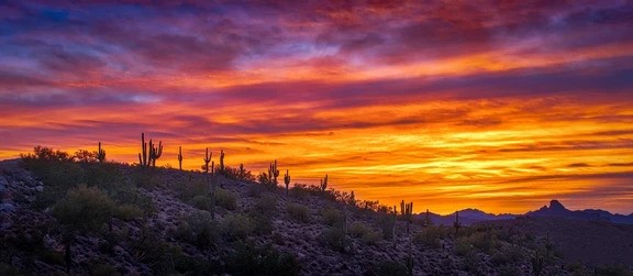
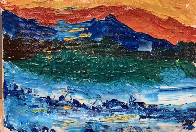
9. Project: The class project, I'll paint the symbol for graph in
two different styles, altering the characteristics
of strokes that I use. That way, you'll
see that there is more than one way to paint
with a palette knife. I start by applying a stripper
four-inch to the sky, just above the horizon line. For this first image, I will use long strokes
covering the entire surface. Well. Then I mixed a very light blue and put
it beside the orange. Remember that sees blue and orange are complimentary colors. They shouldn't be mixed directly or the result will
be a muddy color. To avoid this, I use an
intermediate color and applied carefully without
working the patches of paint onto each other. When using complimentary colors, like in this case, you can try adding y to
both colors and other way. If they get mixed, the result will look softened. Next, I apply the other colors, which would be dark blue, purple, and some pink. Remember that their results
can also be very different depending on the shape and size of the artists
knife that you use. In this class, we will focus on the basic palette knife using a small size due to the size of the surface
I'm working on. I paint the mountains were the same purple that
I used for this guy. I made these colors
by adding a pinch of orange to make it
less saturated. Then allowed some current
variations with blue, pink, and dark purple, and even a beautiful orange. Another factor that can
affect the style of a beanie is the
shape of the stroke, which is different from the shape of the object
that we are Bailey. The stroke can be
organic and carefree. Usually when we paint
patches of paint, we do it irregularly, creating more random shapes. This type of stroke
is less for a mile and it's used mostly
for natural objects, such as clouds, rocks,
foliation, water. On the other hand,
there are lines that Lucas structured,
linear or rigid. These types of
strokes are made in a more controlled manner and
reflect greater formality. They are especially useful
when it comes to representing artificial objects such as buildings and almost any
architectural landscaping. Jared, all. For the cacti, I use dysgraphia
technique and lifting the bandwidth the hub of the
team of the palette knife. We also have decided where
to put each factors. I put lights and shadows on them with a small round brush. For the second painting, I started by bd and naval
layer of orange acrylic. This will help some of the colors to show
for the strokes. I'm going to use the same colors as in the previous painting. However, in this case, the type of strokes
will be different. I apply the paint
somewhat casually without putting too much
pressure on the surface. The result will have more
impasto Dan differs the marsh. The style of this secondary
mesh is a big caloric. Colors do not make store create a smooth gradients and instead, they're bright colored
background makes all other colors
look more saturated. This is a very useful
and easy exercise to do. Each of these paintings can take between five to ten minutes, but it can help you to make decisions before making
a much larger painting. For example, if I were
to paint this landscape in a larger format and
with much more detail, I would already have an idea of the self strokes that best suits the motive
of the painting. I was probably try one
or two more styles before it's starting to be RPD. It may seem like a waste of time that it's actually
quite the opposite. C's planning, it's also a fundamental part of
the creative process. I hope you enjoyed this class and found his lessons useful. Thanks for watching.
If you liked it, please lift good feedback and follow me for future updates.
 Martin Jaramillo, Artist