Transcripts
1. Say Hello to Nomad Sculpt!: Hello, and welcome to Nomad
Sculpt Solid Foundations. Nomad Sculpt is the three
D sculpting program for the iPad, for the Android. And while I was
recording this course, it was released for
the MD and the PC. So this program is
really hot right now. Now, if you're a two D artist, you use a program
like Procreate or Photoshop or rebel or
clip studio paint. But you've seen these beautiful
three D sculpted models, and you thought to
yourself, That looks great, but it also looks hard. I have a treat for you. Nomad Sculpt is
definitely one of the easier three D sculpting
programs out there. But it's also got
power, a lot of it. And I will show you everything
you need to know to harness that power and
start creating your models, your way, and they
are gonna look great. Now, we're not just
going to learn a tool here and a tool there. I have four different
projects for you. We are going to build
complete objects, and we're going to learn
the tools along the way as part of a workflow
because workflow counts. We'll start off by doing
what everybody does. We're going to make a
head, and you can learn the fundamental tools and
the workflow needed with it. Then, if you have done my Procreate solid
foundations course, you might remember
Anna the Angler fish. Well, we are going to do
her in Glorious three D, and she is every bit as
fun as she was in Tu Di. But that's one of the points. If you're a Tod artist, and you ever wanted a reference to draw from or to paint from, well, with a three
D sculpting program like no Mod sculpt, you can create any
reference model you want. Can paint it any
kind that you want. You can add lights to get all the light and
shadow that you want. Learning a three D package like nonad sculpt can take your two D artwork
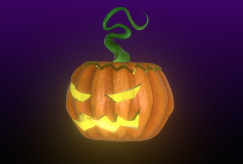
to the next level. So let's take a look at that, as well. For the third project. We will create a pumpkin head, and we will use slightly
more advanced tools. And we'll introduce
painting your objects. And we'll introduce lighting. And for the fourth
and final project, we are going to take the
goblin head that we created, and I'm going to give you an
advanced painting course so you can really bring
your models to life. I'm Simon. I've been a designer illustrator
for close to 40 years. I have many courses out there. They all get very good reviews. You are in safe hands. So let's move on to the next
lesson where we are going to make a huge mess and
enjoy ourselves doing it, and you are going
to start learning the tools and the workflow. That's going to enable you
to make some great models. I'll see you in the next lesson.
2. Make a Mess! Part 1: Hello, and welcome
to the course. Okay, so here's the
screen in my iPad. I'm just circling the
nomad app right now. And the first thing
I'm going to do is something I really
don't want you to do. I am going to tap
and hold on the app, and I am going to
remove the app. Yes, I do want to.
Now, the reason I've done that is because you
can customize nomad, and you can also add extra things to it to
increase its functionality. I've done both of those things, and so I'm reinstalling
so I can guarantee nothing on my screen is something
you don't already have. Now, can I repeat,
please don't do this. If you've played with nomad
you even have one project. Seriously, I don't
want you to lose work. And, of course, I backed up everything to my iCloud Drive. If you're seeing
this on an iPad, you can do the same thing, or you could use the
Files app on the iPad and save either onto your iPad
or to an external drive. Now, if you don't have those,
you can always back up stuff to Dropbox or Google
Drive or One Drive. And so what I'll do now is
I will go to the app store. I will reinstall Nomad, and I'll get straight
back to you once I have. Okay, so here we are again. You can see nomad in the same
place before I open Nomad, here's some text on the screen. This is showing you
the various things I will be covering
in this lesson and also a timestamp just
to the left so that if you come back to this lesson and you want to revise
a particular thing, you know where that thing is on the timeline so you
can go quickly to it. Okay, so deep breath. Let's open it up. And
that's what we see. That is the default
interface for nomad at the time that
I'm recording this video. And if now you are
looking at this, thinking, What am I gonna do? It's okay. Together, we will discover the
fundamentals of nomad. And in this lesson, you're
going to make a mess. You are not going to make
anything recognizable. Hopefully. And the
reason I'm doing it this way is because
over the years, I've introduced
quite a few people to two D and three D software, and you see the same thing
happening again and again. You show people a few things, then they start to
practice with it, and quite often, you get
the light bulb moment. That's where you
can practically see the little light bulb
going off over their head, and they can start to see
the possibilities and people start to get interested and
people start to get excited. The problem comes
when instead of just playing around with the
interface and the tools, people start to try
to make something. At that point,
they start saying, how do I do this or
how do I do that? And they haven't learned it yet. And that's the point where
sometimes people just stop being interested because
it all looks too difficult. So we're not going to do that. We're not going to be making
anything in this lesson. Instead, we're just going
to play around with some of the tools and get a feel
for what nomad can do. Now, before I do anything, I'm going to do a couple of
things which should help us. I'm going to come
up to this icon, which I'm circling
in the top right, and that is your
various settings. The first thing I'm
going to do from the interface tab is
I'm going to come down and I'm going to change
the color scheme to just where I'm circling and
I'm going to change it. To green. The reason I'm doing that is because by default, you get a lot of red
buttons all over the place. And when I see those, I
sometimes think, Well, is Nomad trying to
warn me not to do something because it's red
and red is a warning signal? I don't want that for us, so change it to green. Green is good. Green means go on any of the buttons
that you can see. The next thing I'm going
to do is I'm going to come over to the tab next to
it, which says gesture. And I'm going to make
sure that things like finger and stylus are
turned on hand mouse, as well, in case I
use a mouse later on. And the reason I do that is
so that if, for example, I have two fingers on
screen at the same time, you'll be able to see
the little finger marks. Look, I'll show you. See that? See those two little blue icons? I'm using my thumb and my
finger to drag inwards, and you can see that blob, that sphere in the middle
gets bigger or smaller. That's how you zoom in and out. And if I drag around, you can't see it
too clearly yet, but if I drag on the outside of that object, I
can move it about. That's your basic navigation. I'm going to come back to the top right to my various
different settings. I'm going to come down to the bottom and right
at the bottom, it says palm rejection. I'm going to turn that on. That means I should only
be drawing with my pencil, and I'm less likely
to get strange things happening because
I'm accidentally resting my palm on the screen, and it's doing things that
I don't want it to do. And, look, a red warning button. Yes, I'll press okay for that. So I'll tap once on the screen just to
get rid of that menu. Okay, so just touching
that sphere on the outside is an orange
circle with a.in the middle. That shows me where I'm going to be drawing with my pencil. And I can move it around and I can drag things
around like this. But when I come and I
just hover and I come to the actual surface
of that blob, it turns red, which means
if I press down now, I'm going to make
a brush stroke. Okay, so what am I going to
make a brush stroke with? I'm going to make a brush
stroke with the clay brush. Come to the right hand
side of your screen. At the top, I'm circling it now. That brush is your clay brush. Alright, so let's make a
couple of brush strokes. And something happened. If I come to the outside and
drag around a little bit, can you see that I have raised the surface of that sphere? And it's quite a
flat brush stroke. That is what the clay
brush stroke does, and it is one of the most fundamental brushes
you will use. Alright, let's make a
few more brush strokes. I'm starting to build up shapes. If I drag around the outside, you can see my blue cursor. I'm starting to
affect the shape of that sphere by using my brush. Let's take a look at some
of those brush settings. The brush settings come down
the left side of the screen, and I can do things like I
can affect the brush size, make it smaller or bigger by dragging that slider
on the left hand side. So let's make it small to make some smaller brush
strokes like this. And I can also adjust
the intensity. This slide just underneath, that's the intensity slider. If I drag that right
the way down and I make a couple of more
brush strokes, Okay, you can see I'm making
repeated brush strokes, but I'm building up the
surface much more slowly. And sometimes
you'll have to turn the shape around to
see what you've done. If I turn the intensity up, you can see I'm getting
much bolder strokes. Now, supposing so far I
don't like this masterpiece. I want to undo some of
the things I've done. Well, that's really,
really easy. Two finger tap.
Each time you tap, you undo one step,
and you can see that. If I decide, No, you know what? I really enjoyed the
masterpiece before. The finger tap will redo
your brush strokes. So just take a minute
with this now just to experiment with
the clay brush, draw on the surface you
can draw across like this. You don't have to draw always
in the same direction. I can take the intensity down so it builds up a little
bit more slowly. And I can adjust the
size so I can get some very big brush
strokes like this. Incidentally, let's take that brush size down a little bit. If I pinch inwards to zoom out, the brush stays the same size. So effectively, I'm increasing more area with the same brush
size simply by zooming out. If I zoom in like
this and I make the same brush stroke
with the same size brush, I'm going to make
smaller brush strokes because we're more zoomed in. Incidentally, sometimes
you'll get to the stage where you've
really zoomed in like this, and sometimes you'll
want to zoom out, but it can be a little
bit difficult to do so. If that happens, come up
to where I'm circling now, you can see that little Well, you've got
three icons there. I'm going to tap the one
I'm circling and everything zooms out so that your selected object
fits on the screen. While you're doing this, can you see where I'm circling in
the top right hand corner, that little cube is helping
me figure out where I am, which can be a bit
difficult sometimes. Like at the moment,
I'm looking at my sphere from the back,
you can see it says back. If I move around, I can move around so I can
see it from the front, from the right, from the left, and if supposing I want to
go to the right hand view, but I want to be looking at this straight from the
right hand side, just tap where it says right, and now I'm looking
at whatever I'm doing directly from
the right hand side. So this is a very useful tool. You can also move things around by moving the cube or as before, just by using one finger. Okay, so so far, I'm making my brush strokes. I'll make it a little bit small. I'll move around a little bit and make a couple of
brush strokes here. But if I come just underneath
where I'm circling, you can see sub that
stands for subtract. So instead of adding volume to my sphere,
I can take away. Now, this, if I make a few brush strokes
and I move around, can you see how I'm cutting
into the surface of my blob? Now, you can see the sub
is highlighted in green. That means I'm in subtract
mode for the brush. If I tap on it, again, I start to add brush strokes. Okay, so there is one
thing you can do with this if I come around for
a bit I haven't done yet, two things to drag. So I'm adding brush strokes
and I'm adding brush strokes. If I press and hold,
you can see where my thumb is on the left
hand side of the screen. If I hold that, I'll do subtractive brush
strokes just so long as I'm holding down on
the subtract button. If I let go, it
toggles off again, so you can toggle it on and off by holding
down on that button. Same thing with the
button underneath. You see where it says
smooth, I will tap on it. And let's come to a bit
which is quite rough. Let's come to this bit here. And you can see,
when I scribble, I'm starting to smooth out
all those little ridges and valleys on my object for a
smoother effect, like this. I can turn it off again. And as with the subtract, if I press my thumb on there
and hold, I can smooth. And if I let go again, I go back to my clay tool and I can build up and I can subtract
as much as I want. So can you do that for me? Just pause the video and just play around
with the clay tool, play around with the
size of the brush, play around with the
intensity of the brush, and just play a little bit with the subtract button and smooth button also
while you're about it. Just practice undoing by two finger tap and redoing
with three finger tap. I'm going to do something now which I don't really want to do, and that is very briefly
explain the interface. Now the reason I
don't like doing this is because, for example, if I show you where
the VaxaRmash button is and explain very
briefly what it does, that's going to mean
nothing to you. You have to see what
the VaxllRmsh function is before you actually want
to go and look for it. So I'm not going to explain
where everything is. You'll never remember
all the information, and I don't want you to end
up feeling pretty frustrated because I'm explaining a whole
load of where things are, and those things
mean nothing to you. But I know that if I don't, people will write to me and say, Look, could you
explain the interface? So, okay, I will try and
give a brief explanation. And can you see
that little cursor moving around with
a little.in the middle? That is my mouse. And I'm happy about this
because it means you can follow wherever
I am on the screen, which saves me having
to put a whole load of yellow circles
all over the place. Okay, so on the right
hand side of the screen, these are the various
tools that you will use to curate your models. Like, for example, I
have clay at the moment, and I can use that like this. If I come and swap and I
come to say the Move tool, I can move things around. So these are all the tools that you've
got at your disposal. Each one of these tools
has various settings. And depending on which
tool you've got, let's come back to
say our clay tool. And when I click on it, look at that narrow bar on the left
hand side of the screen. Did you see that? That size
slider changed a little bit. Look if I move it like this. And I come back
to the move tool, or what about the
flattened tool? Oh, what about the cube tool? Oh, now all of a sudden,
on the left hand side, you get the things
you can do with whatever tool you have selected
on the right hand side. So choose a tool on the right, then look on the left to
see what its settings are. Okay, so that is for
your on screen settings. If you come to the top, here on the right hand side, you've got settings for
the flattened tool. If I come to, say,
the clay tool, doesn't have any
specific settings, but if you come to
the next co along, this panel means
you can do more of a deep dive into how this
particular tool behaves. And you have this panel,
but the panel actually has several different
sub tabs like this. Now, what's on there will depend on what
tool you're using. But as you can see,
there's a lot of customization you can do with
the tools at your disposal. Come to the next one
along, stroke painting. That is where you can
paint on your object. Symmetry, that controls whether or not you're drawing
with symmetry on your object and what kind
of symmetry your operations, these are various tools that you can use to affect your object. And it's a fairly recent panel because there were a lot of
tools in different places. They all got put into their
own particular panel. That's the operations panel. Layers. You can have more
than one layer which does different things
within nomad sculpt. We will talk about those. Now, your display settings, that controls things like, well, this top section here, that controls what you can
see down here on the bottom. These are like
quick use buttons. Like, for example,
there is a grid, and if you turn that button on, you get a grid in the background which moves around like this, and then you can come back
and you can turn it off, or you can have things like
an outline around the object, which you can turn on and off. Things in this panel
are more about your working environment than
the actual object itself. Then you've got your
various options here where you can affect
things like your interface. And this one on the
very top right, controls how you see your tools. So that's most of the interface. The only other thing now is things like your big operations. That's on the top
left hand side. That gives you some information, also gives you a little
turntable in case you want it. This button is your file button for things like new projects, opening projects,
saving projects, import, export, all that stuff. This is your SN
project which controls the various scenes which
are in your project. Now, this one, this is your
multi resolution panel or your auxilary messing all of
these tools are to do with increasing the amount
of detail you've got in your scene or decreasing it or rearranging the polygons which make up your objects. We will talk about that.
Material, what kind of material you're working
with because you have different ways of
showing that model. Shading, this is where you control what the final
image will look like. You can also add
things like lights in there to affect the look
of your model quality. Well, this is for when you do your final finished
picture and you can control what quality is plus add various
different effects to it. Your background,
that controls, well, at the moment, we've
got a gray gradient. You can have images
in the background. And then you've got your camera. This controls how your camera sees this world that
you're sculpting in. And you can also set up views. We'll do that in a while, and that's useful
for things like creating fairly accurate models. There are one or
two other things, as well in the top left
in this area here, which I'm squiggling
my mouse around. That tells you how much am
you have on your system, how much you're
using at the moment, and how many points
there are in the scene. I will explain that to you. And on this side, you have this. This is your snap cube. And if you come on there
and you move it around, you can move the scene around. You can lock the view
so you can't rotate it. And if you've zoomed
in way too much, and you're going
to panic, frankly, come to this little icon here, and that resizes
your active object so that it's more
manageable on the screen. And this one, the home
thing. Well, that takes you to the
front view, let's do. Let's make it a bit smaller. There's a Os. There's two I's. So I move around
all over the place, and if I come to home, it takes me back so that
head is facing me directly. Okay, that really is as much as I want to say
about the interface. You will learn it
as you go along, and that's a much better way of learning it than trying to remember everything I've
told you all at once. Okay, let's move on.
3. Make a Mess! Part 2: That's your very first mess, Let's just forget about it and create a new sphere and
practice some more. To do that, I want
you to come up to this little folder icon in
the top right hand corner. These icons along the top, left. Oh, those are a bit like a
desktop program, you know, where you get file, edit, whatever menu along
the top of your screen. Well, that's these icons here. So I'm going to come
to the project menu. Unsafe changes,
that's fine by me. I would just come down
to where it says new, and it says, you'll lose
your unsaved changes. Yep, not a problem. Come back to there's my sphere. Now, the reason
I've started with a new project where we drop down another sphere is because I want you to repeat
what we've just done. Scribble, delete without
saving, because that way, we're just playing and figuring out what the different tools do. Hopefully, that is
all straightforward. Let's show you a
little bit more stuff. I've got my clay tool selected. You'll notice I've got
my big red circle. Let's make that a
little bit smaller, and you can see that red circle moving around with
the.in the middle. You can also see there's another dot moving around
on the opposite side of it. And look, you may have
figured this out already. At the moment, I'm
mirroring things. So whatever I do on one side
gets done to the other. That is because look,
a lot of the time, you're going to be
making things like heads or bodies and
stuff like that. And you're making your life easier if you can
draw in symmetry. Now, just in case you
don't want symmetry, come up to this little icon here and the top right,
which I'm circling, tap on it, and you can see
symmetry, it's enabled, and you can see a
little red line going down the
middle of my object. That's your line of symmetry. If I don't want that
on, disable it, and you can see, I only draw things on the one
side like this. If I come up and I
turn it back on again, then I go back to drawing
in symmetry again. Okay, I will come up to
my project menu again, and I will create a new scene. Start again. This is
what I want us to do. We've done the clay
tool, but there's a whole list of tools going
down the right hand side. These are what you
use to push and pull and carve and
sculpt your sphere, in this case, into
something that you want. Come down to the bottom
where I'm circling. Can you see that
little round thing at the bottom of
those list of icons? If I come there
and I drag it out, I can decide how
many of my tools I want on screen at the
same time. Give that a try. Just move it up and
down like this. Now, what I prefer to
do this is my choice. I prefer to have my
tools four columns wide. There are two reasons for that. One is that I want to see all my brushes on screen
at the same time. But also quite a long time to figure out where these
various different tools are. And if I always have it
set to four columns, I can see all my tools. But also, if I come to the next tool that
we're going to be using, which is the move tool, I always know that it's going to be at the top third one along. And also, we're going
to be looking at two more tools in this tutorial. We're going to be
looking at flatten and we're going to be
looking at crease. And if I keep this four columns wide
arrangement, eventually, you will know that if I want
to use the flatten tool, it's always three
down and one across. And if I want to use the crease, it's always going
to be three down and right next to the
side of my screen. If I started to move
this around like this and didn't keep
it, in my case, four columns, I'm
going to have to go back to playing Hunt the icon, which is never that much fun. So back to four wide. Okay, so I'm going to
come to my move tool. I'm going to two finger pinching to make
this a bit smaller, and I'm going to move
things around like this. If I turn it around like this, you can see I'm starting to move various parts of my sphere
around and this way, I can quickly make shapes. Now, when you're starting
to create a shape, you will use the
move tool a lot. That's how you make big changes. And I'm not making
anything in particular, just playing and moving it
around to see what I can do. And already, I'm
starting to think, Oh, maybe I can make a bird if I
push this in a little bit, and if I move it
around, maybe I can start to make a bit of a beak or is that a nose of some kind? I'm just playing around with the shape to get a feel of it. And this is one important thing. If you are making shapes, I'll just zoom out a little
bit and move it around. You want to be looking
at whatever it is you're modeling in lots of different
directions because look, if I come and I move across
with two finger drag, and I'll come and press right, that's looking at this
straight from the right. Now if I start to pull things around and I'm
starting to think, Oh, this is looking interesting, something I want to make. And then if I move it
around, all of a sudden, things can start to
look a little bit, not how I was expecting
them to look. So when you're modeling,
move things around. You want to be
looking at everything everywhere all at once. And I really do want to watch
that movie at some point. Okay, so that's the move tool, and then I can come
back to my clay tool and I can start to build
up a bit of definition. That's a bit too high
definition for what I wanted, or too large. So I can zoom in with
the same brush size, and if need be, I can move
the radius down a little bit, and I can start to carve
out a shape that I want. And then maybe I
come down and tap my subtract button and I can start to make indentation here, maybe I can move this
around like this. I'm just playing around and
seeing what forms I can create just with
these two tools and maybe turn off sub and then come to smooth and just smooth
that out a little bit, and I can start to build up the shapes that
I want to build up. Okay, so at this point, I should explain to you what is Noma doing to what used to be a sphere and now is a little bit of an
interesting shape. To explain that, I'm going
to come down to the bottom. You see where it says wireframe? I'm going to tap
on that. That is what you are manipulating. If I zoom right at
close and personal, let's come down to
say this bit here. What I've got are a series
of points in space. And if I turn off smooth, that makes me come back
to my Claytor. No. I'll come back to move, and I'll make my brush
size very, very small. Take the intensity up so it's pretty obvious
what I'm doing. Now, can you see I've got
my cursor pretty small? Let's make it even smaller. And I'm going to come to
where these two lines are crossing and I'm going
to move that around. Can you see that? Let's zoom in even more to make
it very obvious. I'm taking that point in space, and I'm moving it around, and I'm not particularly sure
which way that is moving, and I won't know
until I start to rotate around a
little bit like this. And there you go. I'm
moving that point. I can move points
next to it like this. And you can see those points
are arranged in squares. So the point you can call
a point or a vertice, and it's moving around various different points of
that particular square. Let's come to a new one.
Let's come to this one here. Move that, move that,
move that, move that. I've got four points,
and together they are making up a four sided square. That is known as a polygon. Now, the bits connecting
this point here with this point here,
let's try another one. Let's try this point here
with this point here, that bit there is
known as an edge. So you've got your
points, your edges, and together, they
make polygons. Now, at the moment, because
I'm zoomed in really, really close, I'm moving
individual points. That's not much
good to me. So what I will do is I will come. Do you remember this
little icon here, which means if I tap on it, I can fit things on screen, and I will make my brush
size a bit bigger. Now when I move, you can see I'm moving around groups of points. The bits which are right
underneath that red dot, those are the points that
are moving the most. Because that's the
center of my brush. But as you start to go
more towards the outside, and you can see the outside of the brush with that red circle, the less the points
are affected. And that's what you're doing. If I come to my clay brush, and I'll take the
intensity up a little bit, the clay brush is moving
those points around, but in a different way
if I come to subtract. I press just softly, so it's not quite
as intense or hard, so I get a stronger effect. All of these brushes push, pull, carve, inflate, flatten. But all the brushes do them in slightly different ways.
Okay, I'll come down. I'll turn wireframe off so that you can see
what we're doing. Now, the reason you
get those little rather curious
shapes around here. These little jaggy shapes is because if I turn
on wireframe again, you can see sometimes I'm taking those polygons
and I'm pulling them in some rather strange ways
because, look, here's a secret. That little four sided shape is actually two triangles
stuck together. You can see that triangle
moving around there, and you can see that triangle
moving around there. You don't really want those
in your final object, but there's plenty of things
we can do about that. So if I just zoom out, one of
the things we can do, well, you've already seen
it, come to smooth, and you can smooth
out those shapes. Like this. That's
helping at the moment, but there's plenty more that
we can be doing with this. Let's make the
size a bit bigger. Okay, we are nearly
there for this lesson. There are just a couple of more tools that I want to show you. Try this one, the Crease
tool on my screen, third one down, fourth, one along, tap on that. Let's come from an area. If I come to say this bit here, I'm going to make a line
going down like this. And can you see
what's happening? It's doing what the tool
says it's going to do. It's creasing the
surface of my object. So I'm getting little
indentations, little creases. Imagining you're
doing someone's face, you want to do some wrinkles. This would be the tool you use. You can also make it
do the opposite if you come down to
where it says invert. So now, instead of
creating a little gouge, I can create a little
ridge like this. Can you see that? I'm getting
a little sharp ridge. No, actually, no, I
made a mistake there. I don't want that
in that position, so two finger tap
come to invert, and I can start to gouge details in the
surface of my little shape. Say, these bits here are a
little bit too much for me. I can come to smooth,
take down the intensity, and I can gradually
soften them like this, turn smooth back off, come back to the crease tool. Now, the other tool
I want to show you is this one,
the flattened tool. Let's make this fairly big. And let's come to this what?
Should we call it a beak. And if I start to make
the brush strokes here, what it's doing it's starting to flatten that rather blobby area, if I move this around.
Can you see that? I'm starting to flatten
that particular area. Maybe I can do it a little
bit on top of this, what you would call
it, the eyebrow of a rather strange creature. And then I might decide, well, that's come back
to my cruise tool, and I might want to
increase this bit here, which is starting to look
a little bit strange. And this is the point where if you were doing this
for the first time, you might think, Well, I
don't particularly like that. How do I make it smoother? How do I get more
polygons to play with? We will cover all of that. In the meantime, you already
know something you can do. You can come back to smooth
and try and smooth this out. Now, those four tools
that I've just shown you, the clay tool, the move tool, the flatten tool and
the crease tool, People tend to prefer different tools to
do different tasks. Everyone has their
own preferences. But I'm guessing
that most users of nomad will use these
four tools maybe 70, 80% of the time to
carve their shape. Now, if you remember, this
started out as a sphere, and already, it's looking
nothing like a sphere. It's starting to look a
little bit like some kind of sci fi bird of prey, maybe. I don't know. And so
that is the point that I want to stop
because I could carry on working on if I don't have the knowledge of how to do
various different things, I'm gonna fall into the trap. I want to take this
forward, but I don't know how to. No matter
is frustrating. I don't want to
know. So come here, come down to New
and start again. Use the clay tool for sculpting. Let's turn it off subtract. Use the move tool for
making bigger movements. And I know some three D
modelers who tend to use the move tool nearly all the
time to do their sculpting. Use the crease tool for sharp fold in the surface
of what you are doing. Use the flattened tool. To smooth out the various
different areas so you don't get the kind of
blobby, ill defined form. Okay, so to finish
off this lesson, I've got a little
exercise for you, which I would like you
to do several times. I want you to create
a new object. I want you to spend
about 30 seconds using the clay tool and
moving things around and pinching in and
out to Zoom and too fing a drag to move up
and down side to side. Then I want you to spend up to 30 seconds moving
your form around like this, not trying to create something, just playing with it, and play with the
size of the brush, or to play around with whoops. Let's drag that back down
to four wide and play around with just pushing
and pulling things around. I want you to spend 30 seconds
just making a few creases, maybe inverting it and
making a few sharp ridges, and then spend another
30 seconds playing with the flatten tool like this. Again, it looks like nothing. That's all I want. Just
tinker with the tools. Get used to them, get used
to moving things around, get used to making things bigger or smaller with two finger drag. Get used to two
finger tap to undo, get used to three
finger tap to redo. Get used to say tapping
where it says right, where I'm circling to look at this from the right hand side, or try looking at it from
the top. Two finger drag. If I tap again on the top, it toggles to the bottom, tap again, it turns to the top. If you get too big like this, come to your little icon to make everything
fit on screen. That's all I want you to do. If you can get to the
stage where you feel comfortable doing just
these simple things, you are well on your
way to creating a whole range of objects
within nomad sculpt. Okay, so I think this
lesson is so important. What I'm going to do,
I'm going to create a short PDF which covers the various things we've
done in this lesson. And repeat today's
mess for everything up to 5 minutes whenever you
get lost on a new project. So that means the
future you will swear at Nomad and me less. Right. In the next lesson, we will still be
covering basics, but this time, I want us to
actually build something. I think we might build. Let's try Goblins
head, shall we? I think there comes a certain
point where you think, Okay, great. I've made a mess. Let's make something.
So next lesson, let's make something, and
I will see you there.
4. Primitives, the Gizmo & Multirez: Okay, before we get started on our very simple head,
that is coming up. But I wanted to go over a few basic but also
very practical things. The first thing,
if you remember, I came up to the top right tap
the icon I'm circling now, which has things like the
interface, the gestures. And if you remember, I put on palm rejection
because you spend a lot of time resting the side of your hand on
the iPad when you draw. And if you want to
make your life easier and have a smoother
experience overall, it's a good idea to use a special glove
where basically it covers the side
of your hand plus your little finger and
maybe a ring finger. And it makes your life easier because there's
less chance of you doing accidental
brushstrokes and things like that
using your palm. Also your hand just slides
across the surface of your iPad or Android
tablet or drawing tablet. And as well as your hand moving more smoothly
across the surface, you get less moisture from your hand on the surface
of whatever you're doing. Now you can buy these online, and some people charge rather
a lot of money for it. But here's a tip for you, which I've also spoken about on one or two
of my other courses, especially in my
procreate courses. Instead of buying that
expensive specialist glove, you don't need it. Buy yourself a packet
of cotton gloves. You can buy them online for about the price of
two cups of coffee, and you get dozens and dozens of these little cotton
gloves in one pack. Now, it looks like
a regular glove, but this is what you do. And I'm showing you
a photo of it now. You take your glove and you cut away the first three fingers,
plus also the thumb, and you leave a little bit on the end just to slip
over your wrist, and you end up with
something like this. Only your little finger
plus the side of your palm and a little bit
around the wrist is left. It won't leave any
moisture from your palm. It glides across the surface of whatever you're drawing
on really easily. And instead of getting
one expensive glove, you have practically a
career's worth of gloves because if one wears out,
you just make another one. Now, my recommendation
for you is make sure that only your little finger is the finger that's
covered by the glove. The reason being as you saw
in the previous lesson, you can do two
fingertaps to undo and three finger taps to redo. And so if I'm redoing, I want my first three fingers free
so I can do the redo tap. Anyway, that's the first point. The second point, look, if I come back to my
clay tool again and I start making brush
strokes like I did before, and then I decide I want to
either subtract or smooth. Here's the thing. If
I tap on my subtract, yes, I can start subtract. But then what happens is, you may move on to another tool, then come back to
your clay tool. You've probably forgotten that
you've turned subtract on, and you're not gonna
notice it until you start doing brush strokes like this and thinking
it'll hang on. Why am I gouging out areas
rather than adding areas? Oh, yes, oh, dear. I didn't turn off subtract. So I turn of subtract
again and carry on. Believe me, that is gonna
happen to you quite a bit. And so the second choice,
where you hold down, subtract. Well, you can see
because you can see my little icon on the subtract button
that it's held down. I find that button to
be a little bit small. And sometimes I think
I'm pressing it, but I've kind of got it wrong. I might be pressing
slightly off to the side of my screen like this and
thinking, Oh, great. Now I've toggled to subtract and I start trying
to build up stuff. And it doesn't work. The
exact same thing with smooth. I've been caught
out enough times by the subtract button and the smooth button that I wanted
to do something about it. Now, you can do this
using keyboard commands. Like, if you hold down
your alter option button, that toggles on the
subtract button just as long as you hold
down on a keyboard. And if you hold down
Shift on a keyboard, you get to smooth
things out only while you're holding down the
Shift on your keyboard. Now for most tablets, you can get a built in keyboard. You know the kind
of thing where? It's part of the case that
your iPad or Android sits in. But those keyboards are
attached to the case and they fold out and you can use it for things like
typing or whatever. But when it comes to drawing, I like to have the
iPad on my lap. I don't want to
have it standing up just so I can access
the keyboard. So I found for me
the best solution is to get an external keypad. Now, in my case, I use this one. This is a Huon wireless keypad. It's wireless, so
I can just have it next to me on my
desk or whatever, while I rest my iPad on my lap, I draw using my right hand
because I'm right handed, and my left hand is resting
on my wireless keypad. Now, you can see, I put little stickers on
it with things like altered delete
plus the clay tool and different other tools. But really, the main
thing I use it for is just holding down the Alt
key or the shift key. As long as you hold down the lt key, you'll have subtract, and as long as you hold down the Shift key, you'll have smooth. Take your finger off
and you click back to adding things or in
the case of smooth, you might go back to the tool
you were originally using. You might go back to, in
this case, the clay tool. I'm telling you this from
now because if you decide you want to get serious with
something like nomad sculpt, I found that to be
a good investment. Now, I'm sure you can get similar things where you plug it into the charging port of your tablet. But
here's the thing. Nomad sculpt can burn through your battery life like no
other program I've ever known. It is amazing how quickly
your battery life drains. So the tip from that is, when
you start anomad session, try and make sure that your
tablet is fully charged. As for that little wireless
keepad well, it's wireless. So if need be, I can
plug my tablet into my charger so that I know my battery isn't
going to drain. Okay, let's do a little
bit more with this lesson. In the past, we've come up
to here the project menu, and we've created a new project. Well, I don't want to do
that. Instead, I want to introduce you to the
next icon along here. This icon shows you scene menu, and it shows everything
you've got in your scene. Now, in this case, well, look, the one that's highlighted
is this sphere. And if I come to this
little eye icon, which I'm circling, can make
it invisible or visible. I can make it
active or inactive. See I'm not drawing on it. If I come back, I make it active again, now
I can draw on it. But the fact of the matter is, there's a whole load
of different shapes that you can use to sculpt. So, in the case of this,
this sphere is highlighted. I will come up to delete. So now I have an empty scene. If I then come to this icon, which I'm circling called
add tap on that, well, look, there's your sphere, but I have a whole load of different
other shapes that I can use, supposing I want to
use a box like this. I get a box primitive because these are
called primitives. And if I want, I can two
things pinch inwards to zoom out a little bit
to see what I've got. And you've got these little
lines and little dots. Well, using them, supposing
I come to this one here, I can stretch it out
or make it thinner. I can do the same thing here. I can squash or squeeze
it using that middle one. If I come to this one, I can
stretch and squeeze that, same with this one, and I can move and squash and stretch. Now, this is all great.
Oh, look, I've got this. I can scale the whole thing
so it's bigger or smaller. This is great, and there's
more to these primitives than I'm saying right now.
But here's the thing. If you take a look at my various tools on
the right hand side, you notice they're
all grade out. I can't start to sculpt this until I do something
called validate. So, here it is. I'm
just circling it now. It says validate, tap on that. And now, if I want, I can start. To sculpt it, let's just
turn on wireframe SC, what I've got,
turn it off again. Come back to our scene menu. And if I want, I can come
to these three little dots, and it gives me more options. Now, the one I'm interested
in for now is naming it, so I can name my
box to flat box. Because I'm very
imaginative with my naming. Come too, and it's there. If I decide I don't like it. Well, okay, I can delete that. I can choose another primitive. Give this a try now. Choose I would safer now
choose any of the top four. And yeah, the second
four icons, as well. Choose one of those.
I'm going to choose, say cone like this. Remember, I've got my
little control dots where I can change the look
of it like this. Make it thinner or smaller. And if I want to sculpt with it, I come to validate
and I can start doing things with
it. Don't like it. Come back. Delete it. Come to add. Let's
try a cylinder, play around for a little bit. And yeah, let's validate it. But now I'm gonna come
back to my s menu, come to add, and I'm going
to add something else. Let's try a sphere, shall we? Now, this you can see I'm
not really able to move it, but I want to make
it a bit smaller. I want to move it
around. Maybe I want to make it so it's flatter
in one direction. Well, I can do that by
coming down to this. The one I'm circling
now, the Gizmo. Tap on that and you get Well, that, that is the gizmo. I can come to this top yellow arrow and
move it around like this. I can rotate it, although you may not be able to see
that very clearly. Let's turn on wireframe. And you can see, when
I come to this, say, this blue, it looks like a ball with a blue
line going through it. If I drag on that
line, it turns yellow, and you can see the
whole thing is rotating. Similarly, if I come
to this red line, it turns yellow, and I can
rotate in that direction. I come to the green one, I can move it around
in this direction. I can move it around
using the green arrow, I can move it around using the blue arrow or the red arrow. I can also scale it. And if I want, I can come to this see that circle just
when I'm hovering over it. That turn yellow. If I move
that, I can move it around. And the way it's rotating is
parallel with your screen. Look, if I try, say
moving, if I try, say rotating, using
this red circle. It's kind of moving at a bit
of an angle to the screen. If I try this one,
it's moving around at a bit of an angle to the screen. It's not parallel, but
if I come to this one, that's rotating at the exact same angle
as your screen is. Now, finally, you've got
these little dots here. These are your scaling dots. If I come to this
one and I do this, can you see I'm
flattening this down if I come to the blue
I'm flattening that. If I come to the red one, I can flatten it or I can
make it bigger, and I can still rotate
it around like this. Now, you may notice, Look,
I'll bring this over here. You notice how I've
got something red, something green,
and something blue? Well, those are the
different axes that you can move or rotate
or scale things in. And if you take a look
at, say, this green one here, oh, look at this. Green moves things
top to bottom, the red axis moves
things right or left. And the blue one
Can you see that? The blue one can move things or scale
things front to back. And these are your X, Y, and Z or Z axis. Look, if I call the mirror
tool again, can you see? I've got different planes here.
Let's call that up again. For the symmetry, you've
got three planes. You X axis, that's your left
to right, and that's red. You've got your green
axis, that's your Y axis, that moves things up and down, and you've got your Z or Z axis. That's your blue one, that moves or rotates or scale
things front to back. Okay, I'm going to
validate my sphere. The gizmo is still selected, I can still move things around. I can still scale them. But because I've
now validated it, if I come to my clay tool, for example, yeah, I can
start to move things around. If I come to my flatten tool, I can start to Whoops,
I made a mistake. I was supposed to click
flatten, but I missed it. So two fingertaped one, do that. Come to flatten this, this time it is chosen. Me my radus a bit bigger. And I can start to flatten it. Now, you may notice
with this because I've moved it around
in different axes. You're getting some slightly
unpredictable results. Like, if I flatten
this bit here, can you see where I'm
circling that little dot, which is supposed to
be my mirror dot? Because I've moved
my sphere around, it's not quite doing what
I thought it would do. See what I mean? Keep
rather strange results. We'll talk a bit more
about that later on. Now, the final thing I wanted
to talk about here was if I come back to my scene menu, I've got two things here. I've got a cylinder, which I tap on it, and it briefly flashes purple. That lets you know that that is a currently
active object, and if I could bring
my tool here to it, that's the object that's going to be affected by
my different tools. If I come back to my scene
menu and choose my sphere, that is what's going to
be affected by my tools. But there's more to it
than that. Look, if I come back to my Gizmo. I move it up a little bit. Supposing I wanted to move
the two of those together, because at the moment, I
can only move this one. If I want to move the other
one, I have to tap on it, make it the active object, and then I can move
it around like this. But if I come back to my scene menu, I've
got my cylinder, but what I want is for my sphere to move when
my cylinder moves. So what I can do
is I can come to my sphere and I can
drag it up there. You see that, you get a
little yellow line which comes down from the cylinder
and across to the sphere. If I let go, that sphere is
now a child of the cylinder, and if I choose my cylinder, so it's the active object. And look, I've
still got my gizmo, if I move it around,
oh, look at that. Because my sphere is a child
object of the cylinder, when I move the
cylinder or rotate it, or if I scale it, whatever I do to the parent, same thing happens to the child. As it happens, if I was
to come to my sphere, which is now the child object, I can move that independently
because it's the child. If you've got kids, yep, your child will move around in all lots
of different ways. Unless, if I come
to my cylinder, I move that around, this is the parent holding
the child's hand. So wherever the parent
goes, the child follows. Alright, that's all I wanted
to do for this lesson. I wanted to talk
about how you can add various things called
primitives to your scene. I wanted to show you that
you can rename them, and I wanted to show
you that you can link them together so that
you can make the sphere, in this case, a child
of the cylinder. And I also wanted to
show you the Gizmo. Right, I am going to
delete both of those. Let's give this a try
just for a bit of fun. Come to AD. Come to Taurus. There's your Taurus, and I'm going to come to these
little three dots here, which gives me some more
things that I can do with it. What I want to do is come
down to outer radius, play around with
it a little bit, make it a bit smaller,
inner radius. Can you see that?
When I do this, you can affect what
this looks like. And if I come back
and tab again, you've got something
here called division X. At the moment it says 36. If I put my pen on my finger on there and
slide it to the right, you can see I'm getting more
and more and more faces. Let's take that right the
way up to something like, say, 100 plus 98, let's make it 100. And then I'm going to close this by coming up to this
little X in the top right, and I'm going to validate this. I'm going to turn
off wire frame. Now, there is a program
out there for the desktop, which can do this stuff and a whole lot more called Blender. And there's a very good
tutor called Blender Guru. And by far, his most
famous tutorial is how to make a doughnut. Now, we're not going to
go as far as he does, but just to finish
off this lesson, why not have a go and maybe try to sculpt
a little doughnut. I'm just going to
start with this. I'm not going to do
the whole thing. But I'm just going to put maybe a little bit of cream on top. I'm not going to
put any paint on. We will do stuff
like that later on, and maybe I can use
the crease tool to add a bit of a
sharper point there. Oh, look what I just did. Do you remember me saying, these two little buttons here, you will often forget whether
you've flipped them so that instead of cutting into
the shape of that doughnut, I was gouging it outward, so I will turn that off tiffing a tap a couple of
times to get rid of that. And I can start to do a
bit of icing around here. Move it around. You
don't have to do this. But I just thought just to finish off just for
a little bit of fun, you can maybe try and
make a very, very simple. Doesn't have to look
good. Doughnut. We can come back
to our clay tool. And you know what? I'd like a few more polygons with this. Because if I come to our
wire frame, you can see, I haven't really got
enough polygons to give a smooth surface
to this doughnut. So what I can do is come
to the third on along. And this is the
multi resolution. Now, at the moment, look how
many polygons we've got. Come on, let's zoom in
on this and come back. There is a button here
called subdivide. If I tap on that, you see that? Every single little
square got subdivided. So now there's four times
as many polygons in there. If I subdivide again, I'm getting a really,
really fine mesh. Let's come out and turn
off our wire frame again. Now, when we start to try and sculpture you're going to
get some smoother lines. If you really want to emphasize that, come to the Smooth tool. And you can smooth
out your various different polygons
and what have you. Now, very last thing.
Here's a new tool for you. You've used the clay tool
to build up the surface. There is another
tool which works in a similar way called inflate. This does something similar, but it makes more
of a rounded mark. Look, I'll show you. I I comp to the underside and I use clay, you can see I get a fairly
flat drawing stroke. If I then come to inflate
and do the same thing, can you see how it's more
rounded, more blobby? So if I'm doing
something like icing, the inflate tool might be
a better choice for this. I will to fingertap a few times. Bring the whole thing
around, and maybe I can use the inflate tool to get more of a rounded blobby icing effect, which I'm doing now. This is me working
at breakneck speed. I'm not going for
great art here. I'm just going for well,
show the technique. And if you want
to carry on doing this, just in your own time, just for a little bit more
practice and to learn a new tool called the
inflate tool, then great. Maybe if I come down
to my smooth tool, I can smooth things
out a little bit. And I know it's a
very simple shape. It's fairly easy to get something whilst showing
you how to use the tools. But there you are. Your first, very, very simple
shape, a doughnut. And the various tools
I've shown you here, at least some of them we will be using in our next project, which is our very
simple head project. So I thought I'd show
you these tools now. I see menu, the inflate tool, and also how to subdivide
to get more geometry. These are going to
come in useful when we do our next project,
the simple head. Let's get started with that.
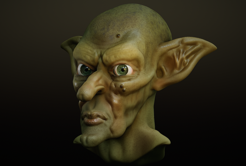
5. Goblin Head 01 - Multirez: Okay, so we did say we're
going to do a head, because I think 90% of the time, one of the first
things that people try to model is a head, so great. Let's do that. I'm going to be doing kind
of a goblin head or an chad. And the reason for that is we're still in baby steps
at the moment. We're figuring out the
tools and the workflow. I'm trying to do an
ultra realistic portrait of Jean Luc Picard of Star Trek. That is way too big of an ask. And you'll spend all your
time thinking, Well, it doesn't look like the
person I want it to look like while you're trying
to learn everything else. But with a fantasy head,
like a goblin head. Well, it's gonna be big
exaggerated shapes, big nose, big chain,
evil staary eyes. And because it's a fantasy
creature, it doesn't exist. It takes the pressure off
you to create something that looks very much like something that exists in the real world. It can be any shape you want. It's your creature? Your choice. Okay, so let's get started. If you haven't
already, camp up, too, our project menu and just tap on new to create
a new project. Normally, the first tool you go to would
be the move tool, so let's tap on that now. And at this stage, we're
blocking out forms. We're making big shapes. We are not going to
do wrinkles just yet. We need to define the
larger shapes first. So to do that, I'm going to pinch inwards a
little bit to zoom out. I am going to make
sure that I'm facing front is facing down
and towards the left. And so when I start
doing things like pushing in on either side, remember, symmetry is
turned on by default. I'm going to correct the
basic shape of the head, and I know that this bit here that is the
front of the head. If I turn around more
to the right, well, you can see it's a sphere shape. A human face or humanoid face generally tends to be a lot
narrower than a sphere. So the first thing is, I'm
pushing in various bits. I'm going to try and make the front slightly
narrower than the back. And if I drag down, you can see now I'm looking at this pretty
much from the top. I'm going to pull out
the back end ever so slightly because the human
skull is wider at the back. Now, I realize I'm playing two games here
at the same time. On the one hand, I'm saying,
It's a humanoid face. Do whatever you want. Be free. But at the same time,
if it can obey some of the general characteristics
of a human skull, but just with
exaggerated features, then it helps sell the final
idea of this humanoid face. Anyway, I'll carry on
pushing and pulling, making things maybe
a bit bigger at the top than I do at the bottom. Let's come round to
the right hand side, and I'm going to push
upwards a little bit, so the back of the skull looks more like the back of a skull. Let's make my brush
size a little bit smaller to try and
help to find things. Now, I wonder if I'm gonna get the classic mistake,
which people do. I'm looking at this
from the side, and I'm thinking so far,
Oh, yeah, this is working. This is starting to
look more humanoid, maybe a larger chin for
kind of a goblin shape. Now when I start
turning things around? Well, in this case,
it's not too bad, but really, the base of the skull needs to
be bigger like this. I wouldn't have
realized that until I turned from the
right to the back. So, as I said, everything
everywhere all at once. You don't want to concentrate on one particular area and get it looking just how you like it. And then when you
turn around and look from different angles, you realize that that one
particular area looks good in one particular area
at one particular angle. But then when you turn
things around, not so much. So just carry on creating
my very basic form. More bulging out here, maybe just for now, a little bit flatter at the top. Okay. I've got a very, very basic shape here. Let's do something we
haven't done before. Let's, I don't know,
save the project. Come up, too, our project
menu and come to save us. And then I want to tap new. And let's save this as
Gobel and Tutorial 01. As we go on, I'm
probably going to save the same project
with different names. That way, I've always got my very basic shape here,
ready to do something with. The more I look at it,
the more I think, No, I want to change this bit,
I want to change that bit. At this point, there is
no one particular form, and there is nothing
that can't be changed. So try and be playful. Try and be a little bit bold. I know that's an easy thing for me to say, because right now, you're probably
quite nervous about this because you're just
not used to doing it. Well, believe me, the
more you do this. Well, let's put it this way. So more experienced users of
three D software will just spend 20 minutes making a head of some kind
just as a warm up. So I know this feels a little
bit strange at the moment, but it will get
easier, I promise you. Alright, so I've got something approaching a basic shape here. So now I'm going to
swap to my clatol and just start building up
shapes and defining forms. Like, for example, I wanted
to find the eye sockets. So I will come to my subtractol. What's my intensity
on? Let's take that down a little bit. I'm around 50% mark. Symmetry has turned down, so let's put in some
eyes like this. Now, here's a very
common mistake. When people do this,
let's undo that a second. People think eyes
go at the top of the head so they'll do
eyes appear somewhere. No bad idea. That cavity in your skull, where the eyes go, that's around about the
halfway marks one. I'm just going to mark
that in about there. Take it around a
little bit here and maybe sink the cheeks in a
little bit because well, this particular goblin
has sunken cheeks. Then I'm going to come
to my subtract button on the side, turn it off, so I'm adding or building up detail rather than
gouging detail in. I'm going to build up
the eyebrows because this particular goblin
has thick eyebrows. I'm going to build up the
cheek bone area as well, sharply defined cheek bones. Remember, it's a fancy creature, so I can do whatever I want. I'll make my brush size
a little bit smaller. I can also zoom in a little bit. And there's a little
line which goes from the side of your
skull up like this. So I'm going to put
that in as well. Maybe take the eye sockets
round like this and the nose. Come on, let's put the nose in. Gradually build
that up like this. This is going to be a
big nose by the end. Nice, exaggerated features. I'm not going to do
the nostrils just yet. I'm just going to
build up the nose like this, maybe just maybe. Brush side a bit smaller. I put down the side
to the mouth here. Maybe something approaching
a bit of a pointed chin. All of this is going to be
changed as we go along. Looking at this from
various different angles. Yeah, that brushes too small. I need to build that up a
little bit more vigorously, maybe make the chin more
clearly defined like this, maybe take the cheek bone back. Because the year is going to
be somewhere around here. Now, that's looking
a bit different to what human skull
would look like, but that's okay. It's fancy. Let's not put pressure
on ourselves to make this look anatomically
really correct. Come back to subtract, make the brush a bit bigger, and maybe lower the
intensity a little bit, just to put in the size
of the temples like that. On that skull, look, making the brush size
bigger or smaller or zooming in and out,
yes, that is important. So you get bigger shapes and smaller shapes or thick
shapes and thin shapes. Sunken areas and
areas that stick out. When you do this, you
are obeying well, what I call the second
universal law of creatives. Three universal laws
for any creative. The third most important
rule is a three word rule. The second most important
rule is a two word rule, and the absolute fundamental, most important rule for
any creative is one word. So the third most important rule for any creative is three words. Things started. You stop
sitting there being afraid. You stop counting your paper clips because
they need counting. You stop making
yourself a cup of tea, and you stop complaining
about your artistic headache. You get things started. Whether you feel ready or not? Now, in this case, we are doing the second most important
rule for any creative, and it's a two word rule. Blend opposites, in
the case of this, we're aiming for a model
that has opposites in it. Broad, flat areas, smaller,
more contoured areas. Dark and light, thick and thin. Saturated colors,
desaturated colors. If you're into music, your high notes, and your low notes, your quick passages and
your slow passages, it's how you blend
opposites together. That is the trick to creating things that
are interesting. As for the number one
most important rule, which is one word, well, keep doing the course, and I'll tell you that at some point. Anyway, this mouth area needs
to come round like this. I need to build up an area here where the lips
are going to be. Then I'm going to come
back to my mootol because now I've established
some basic shapes. Well, I want to exaggerate it.
Come on. This is a goblin. Big arched, evil eyebrows, jutty out cheeks,
a jetty out chin. Let's come down here. This is looking really quite
a pointed chin. I want to move that
out a little bit. I want to have a
little bit more space so I can define the mouth. And again, it's everything
everywhere all at once. Keep turning your model round. I need a jutty out bit here. I need to make my
breast size smaller, maybe zoom in a
little bit because I want those brows to be heavy and stick out
quite a bit like this. The nose, well, that's
going definitely be much more pointy. Come on. Big goblin nose. That's starting to look
more like the shape I want. Maybe that chin, just a little bit more rounded,
like this. Oh, hang on. Let's take that back
a little bit there. Let's take a look at
the back of the head. Yeah, I want a pointy head. So this is the bit
where I'm starting to exaggerate the form
of the goblin. Let's make it more of a
sloping forehead like this, maybe a bit more of
a pointy back head. Again, keep looking around
to see what we're doing. Yeah, 'cause the back
of the head is looking a little bit strange, a little bit nondescript. Actually, you can make your biggest changes
and you can make your biggest changes
more smoothly to the model with the less amount
of polygons you've got. If you've got load
loaded polygons, the tools you're using
from your toolbox, that's where all the
tools are stored, are going to work in
slightly different ways. And so here's something
that I can do. If I come over to the
multi resolution menu, I've got a slider here with one, two, three different notches. At the moment I'm working on the highest resolution that I've got. In fact,
let's show you this. Let's come down to my wireframe
and turn it on there. If I then come to this slide, and I move it down one. Did you see that?
I'll do it again. I'll move this slide to the first notch,
the far left notch. Any primitive you create comes along with something
called multi resolution. And most of these primitives
start out with this, which is the very
lowest resolution. Then there's kind
of an in between resolution where you
get more polygons and this where you get the
highest default amount of polygons. Well,
let's go back again. That's your lowest. And if you take a look at this top bar, see where I'm sliding on
and off to highlight it. This tells me that
I've got 6,146 points, the zero triangles,
and 6,144 polygons. That's the little squares
appearing on the screen. If I then take my little slider and move it to the
middle position, well, every single polygon suddenly divided into
four smaller ones. Now I've got 24.5 K
polygons to play with. Oh, well, now I've got 98.3, just short of 100,000 polygons, which you can see
on your screen. Now, the more
polygons you've got, the more fine detail you've got. But let's see if I can
do something with this. Just temporarily, I'm
going to subdivide, so now I've got
400,000 polygons, and I'm going to
subdivide again. So I've got just over
one half million polygons on my screen. Now, you may be
thinking, Well, great. Lots of fine polygons. I'll turn the wireframe off. I'll come to my move tool. And supposing I want
to do something with the back of the head, so I'm going to
move things around and it's not that easy. Can you see how I'm
getting dimples in there? I'm not moving large groups of polycons around
at the same time. I'm getting a border just
along here, for example. I can just about see a border here as well. That's
not what I want. I'm not creating
large smooth shapes. I'm creating little indents, which I'm not so keen on. If I then come back to my
multi resolution menu and I'm going to take this all the way down to the lowest resolution
I can get my hands on, I've got the same brush, same view, same size. And now I'm going to move
things around like this. And now, if I come to my multi resolution slider and slide it up to
what we had before, I'm getting a smoother effect. When you are creating
these big broad shapes, you don't need
higher resolution. In fact, it can
work against you. I'd subdivided it
two times in night. I'm going to take it
down to where it was before, turn on wireframe. And I'm going to delete higher because I just wanted to
demonstrate something, so I'll delete higher and we're back to where
we started from. Let's turn off
wireframe and just do a little bit
more around here. Come back to my move tool, I
think the front of the mouth needs to be a little
bit further forward. Quite often, when people
are doing stuff like this, the whole mouth area is
very flat like this. Well, that doesn't really work. If you take a look at
someone's face on the side, you can see quite
a bit of the lips, quite a bit of the
cheeks, as well, but mainly the lips, you notice they do come forward like this. Okay, so I'm narly
there with this with just doing the
basic blocking in. But I know I'm going to run
into a bit of a problem. Because, well, look, supposing
I want to define that line that runs from the side of your nostril down to
the side of your mouth. I can come to the Crease
tool and I can just draw this in like this. And supposing I want to
do the line of the lips, as well, come on. Let's give a very nice
downward turn to the mouth. My brush slice is
too big to do this. Can you see how I'm doing it? I'm pulling in too many
bits from the side. I need this to be a
sharply defined crease. I need this to affect the
surrounding geometry. Not as much as it has, so I'm going to undo that a
few times. Come on. There you go. Uh,
no, let's redo. I want the nose to be wider. I'll make my brush size smaller. I can get a better
effect now? Yes, I can. And slightly downward
turning mouth like this because this
isn't a very nice gobling. No one of your friendly ones. And maybe I can put a little
bit here, just a start. Where that crease between
the eyebrows goes. But you can see I'm
running into a problem. If I turn on my wireframe, look at the end of that nose. That simply does not have enough polygons to give me
the kind of detail I need, even at this crude
stage of blocking things in to do any
significant sculpting. You compare that with,
say, the back of the head. Well, that's got plenty
of polygons to play with, but I don't really care
about the back of the head. There's not a lot of detail
that I need to put in there. All the interesting stuff is
at the front on the face. Now, I could do
what we did before. Come to a multi resolution, Okay, let's do subdivide. And subdivide again.
Well, now I've got more polygons to play
with in the nose area, but I've got a ton
of polygons at the back of a head, which
I simply don't need. And come up to here. This is something
that you're going to be looking at a lot. The name of my primitive
is called sphere, and I've got 1.5
million polygons. The more polygons you've got, the more your tablet or your computer is
going to slow down. And the amount of polygons
you can have depends on how much RAM you've
got on your system. If you keep on doing this and you keep on adding polygons, there will come a point where whatever you're using
will slow down. If you do too many polygons,
certainly on a tablet, which doesn't have
as much RAM on average compared to
a desktop computer, there is a chance that the
entire program could crash. So this is not the way
to add extra detail. There are a couple of ways, and the main one
you're going to be using is something
called voxel remeshing, and that is what
we will talk about in the next video. I
will see you there.
6. Goblin Head 02 - Basic Shapes: So in the end of
the previous video, I was pointing out a
problem where I've got plenty of polygons around
the back of the head, but not enough polygons
in all the detail areas, especially things like the nose. I could also do with some more detail around the
shape of the mouth, as well. So, in short, plenty of
polygons in one place, not enough polygons in another. So we're going to
use something called voxel remeshing in this video. I'm going to come and I'm
going to save as, tap on that. And I'm going to create
a new name for this. I want to have several
different versions of what I'm doing
as we go along. So come to new
gobbling tutorial two. Great. It's already
renamed it for me. Click on Okay. Now I have
Goblin Tutorial two. Now, Vox already mashing. Let's come to this
icon at the top. And at the moment,
the panel I've got is something
called multi Rs. Well, we saw that
before, didn't we? Let's take this
down a little bit and get rid of the
higher resolutions. And let's make sure you can see particularly the detail around the face and open
up my panel again. Now, instead of coming
to the multi Rs panel, I'm going to tap on this one, which I'm circle to call voxel. Voxel remeshing. The two buttons
I'm interested on are either the remesh button, which I'm just flashing on
and off by hovering over. I also have a slider
here called resolution. That is important. You
will use that a lot. Now, at the moment,
it's set to 144.94. If I come and I place my pencil or my finger on the
resolution slider, I can drag in and out like this. And you see that little checker
pattern which gets bigger or smaller as I move around? That's giving me a
preview of how big the polygons are
going to be once I tap that button
above called remsh. Now, at the moment, I'll
take this to somewhere let's trade around,
say, 130 mark. And now watch what happens to the model when I tap remesh. I'm tapping remesh now. It says, Multi
resolution will be lost. Do you remember we were playing around with multi resolution? Well, we had a small amount of polygons and a larger
amount of polygons, depending upon that little
slider we were sliding around. That was multi resolution.
That will all be gone. You will get one level
of resolution with this. Okay, so I'll press Okay. Look at that. What
voxel remeshing does is it takes a look at the resolution
that you've done, in this case, 132.79. And it knows what your
three D shape looks like, and it gives you a
new set of polygons, in this case, about
40,000 polygons. And it redistributes
the polygons around so you get a much more even spread of polygons rather than not enough polygons
in the nose area. So now I have extra
detail on the nose, which I can use to create
more clearly defined forms. And that works a lot better
than keep on subdividing or subdividing and
getting a whole load of polygons that you don't need. Okay, so now at this stage, I can carry on working much more efficiently than
I was doing before, because I have polygons in
the right place to play with. You will end up doing
this quite a bit. And at this stage,
I still only have about 40,000 polygons
to create this head. That's not many at all. Later on, we will take objects into a much
higher resolution. You may have millions
of polygons there, and that is the point
where you start adding in much finer detail, things like wrinkles, skin
pores and things like that. But not yet. At this stage, I'm still blogging
in large shapes. Okay, so I'm going to tap close that, and now
I can carry on. Incidentally, if you can
write down to the bottom, you can see you have a
number of icons here, and one of them is Vauxhall. And if you press and
hold, you can see the sliders we were
using in that top menu, but instead, it's
down at the bottom. These little icons
at the bottom, this does the exact same thing, but it's in an easier place, so you don't have
to go searching through the menus at the top and trying to remember where the particular Vauxhall
remesh buttons were. These are just very
quick buttons at the bottom to give
you instant results, but they do the same thing. Alright, so I'm going
to turn off wireframe, and you can see I've still
got a blocky effect there. That is okay. At this stage, you get used to the fact you're going to be seeing a lot of these little faceted
polygons like this. Now one thing you
can do, for example, is you can come to the smooth button just where I'm circling, tap on that, and you can start to smooth out these
different areas. And it's tempting to do that because you want the model to look nice at all different
stages of development. But the more you get into this, the more you start
to think, Well, I know sooner or later, I'm going to be
smoothing this out, but I have more polygons. So if you can learn to live with that slightly faceted look
and just get used to it, then you don't have to spend a lot of time
smoothing out areas, but you're going
to end up fasted anyway because you're going to be using voxel
remash quite a bit, and these fasted polygons are just going to
keep on reappearing. So I've got more detail there to play with so I can
start to work on things. Let's come to our claytol
and maybe I want to start building this the ends of
the nose up like this. I want it to be pointed
but not quite that pointy. Take a look, everything everywhere I want to
look, you see there. I was doing the
sides of the nose, but the top of the nose, that
needs building up as well. So everything
everywhere all at once. We can build up the side
of the nostrils as well, like this and maybe come to subtract
and just provide a little bit more
definition just on the side of the nose and maybe do that middle
ridge of the nose, so it's got a little bit
more of a nose like shape, maybe come back to
subtract, turn it off, build up here, maybe provide a little bit of a heavier brow just at
one particular place. Maybe the sides here,
bring that down. Maybe I can build up some jaws just down the bottom, like this. Come subtract. Maybe start building up a larger
lower lip like this. Maybe put in that little dimple you get at the side
of the nose like this and gradually build
up the shape, turn off, subtract and
build up the shape here, maybe the top of
the lip like this. If I come to my crease tool, I can put a bit more
definition here. And if I invert, so instead of gouging
out something, I'm going to build up a
fairly sharp edge like this, just to define the
lips like this. Let's give them some
fairly large lips, shall we? Can you see that? It's still looking crude, but I'm starting to get
the shapes that I want. I want to smooth off
this little bit here. Turn off smooth so I come
back to my crease tool, and it's on inverts, so I'm creating a
sharp edge here, build that like that. Maybe put a crease down
the middle of the nose, so turn off inverts
so I'm now cutting in and put in a
little crease here. Yes, I know it looks crude, but we're still
blocking in shapes. Not sure that's working.
Let's come to smooth. Maybe I'll put that in when I've got a higher resolution mesh. One thing I will do, though, is I will come to my inflate
tool and I'll set it to subtract because the
inflate tool is very good. Doing these sharply
defined areas. Now, can you see that again?
If I turn on a wireframe, I've got almost no polygons
to work with here. Not a problem, if I
come to vox or remash. For now, I'll just leave it on the same resolution setting as before 132.4 and remash. And when I do that, there's more polygons in that
area to work with. I had wireframe on because I wanted you to see what was
actually happening there. Normally, when you work, well, you don't really need have
wireframe on all the time, and sometimes it can be a
little bit distracting. So from here on in unless
I have a reason to, I'll try leaving all
the wireframe off. So take off subtract. Remember, if you just rest your thumb on
the subtract button, you can toggle between
the two different states. So rest my finger on, and I'm gouging out fairly
deep in don If I take my thumb off, can build
things up and up. The inflate butt might
be good for doing this big nose that
I want to do here, maybe a little bit on the top, maybe do the eyebrows a
little bit more here, what about the side of
the face, the cheeks? I can build up shapes there, keep on turning it round all different
angles, all at once, and maybe flesh out the back
end of the jaw like this, maybe take these jaws, so they're a little bit bigger, as well, how's that worked? Yeah, pretty much. Oh, also, hold my thumb on sub
again at the side and just read a little bit more of definition
underneath the mouth like this. Take my thumb off, build
the chin a little bit more. No, I think those jaws are
a little bit too much, so I will rest my thumb
where it says smooth at the side and just smooth
those down a little bit. And now what's happened here? Can you see all my tools at
the side have grade out? Oh, what have I done wrong? That's simple. Somehow I've managed to deselect my object. I just tap on the object again. It flashes purple
briefly to let you know that is the active object that your tools are
going to affect, and everything comes
back on again. Alright, so what I'll do is
I'll come to my project, and I'm happy to overwrite
Goblin tutorial too, so I'll just come to save. Yes, I want to save, and yes, I'm happy to overwrite. There. Okay, that is the
basics of Vox remeshing. In the next video, we'll
carry on and we'll start by talking about
something called MCCAps. Alright, we'll see you there.
7. Goblin Head 03 - Matcap & Barrel Roll: Okay, let's carry on
with our gobbling. Now, I've gone straight into this tutorial straight on the
back of the previous one. It might have been an
idea if I went away, made a cup of coffee,
do something else, and then come back
because when you do that, you're gonna look at your
model with fresh eyes, and you're gonna notice
various things that you want to change, like,
for example, with this. If I look at that
nose on the end, yeah, that needs a
fair amount of work. And also, I want the
face to be a little bit wider around the eye
area. And you'll do that. You'll notice various
things, like, Oh, I like that bit, but
I don't like that bit and so on and so forth. But in the meantime,
I did mention we're going to talk about
something called MTCAps. To show you that,
I'm going to come up to the icon I'm circling now. This is the shading
panel because there's various different ways to view your objects within nomad sculpt or pretty much any three D sculpting program or pretty much any
three D program. And depending on where you are, the different ways of
looking at it can help. At the moment, we're
looking at what we're doing using a shading
model called it PBR. PBR stands for physically
based rendering. Any three D program I can
think of and I've used quite a few works by within the little computer
world behind your screen. It shoots out little rays
of light which bounce off the object that we're working on and then back
towards the camera, which gives you the shadows and the highlights and whatever. Now you can do a lot with this. However, we're just
modeling at the moment. We're not looking at this as a final finished
picture or what we call a rendered image
where the computer renders out all
those little rays of light and gives
you a picture. Instead, I'm going to come to the next icon along
called Mt cap, which, as you can
see, stands for material capture. I
want to tap on that. And when I do,
everything changes. Now, a mat cap is
just a way of helping you visualize what you're doing when you're
modeling something. And certainly, looking
at this, because I have a not white texture
and a texture which looks more similar in tone and shininess to
the final object, that gives me a better idea
of what it is I'm looking at. And it will help me
while I'm modeling this head to visualize
how it looks. And if I come back to my menu, you see where it says, Mat cab? I'm using something
here called Linco mud. If I tap on that icon, I have a whole load of
different mac caps. Like if I come across one, tap there, I get a
different effect. If I come down to
the one beneath it, I get a much more
different effect. Now, if I was modeling
something which I wanted to be brown but strongly
lit from the top, this might be a good
mac cap to use. If I wanted something which
more of an orangy color, but sharp little
points of highlight. Then I've just selected
one which could do that. This is not what your final
image would look like. All it's doing is, it's looking at that
reference picture, that little orange sphere, and it's letting you know that supposing that little
white highlight, it's saying that, Well, that's a certain angle on that sphere. Pretty much directly toward us, slightly up and
slightly to the right. That means your model, no matter what angle you
turn it around at, any of those polygons which are lying at the same angle as that sphere are going to have that same little
white point of light. Similarly, let's move this
off to one side for a second. Any of those polygons
which are pointing out to the side and
down a little bit, are going to get
those darker tones that you can see in the mat cap. So choosing the right mat
cap is really going to help you to decide the look
of your final object. So let's just find one, which
I think is going to give us a fairly decent of what I want the final
goblin to look like. That's too bright. That's too
dark. That's getting close. In fact, I think I'll
probably go with that one, which is Kanaki clay, red gloss. You can see plenty
of definition. I can see the three D
forms that I'm doing. So, yeah, that's
going to work for me. Remember, my final model is
not going to be this color. You can paint on your model. You can define how shiny it is. But this gives me a good
overall impression of what the three D forms of my
model are going to look like if I want to take
this to the final render. It's still looking
slightly blocky, but here's something
you can do as well. If you come to the next
icon along called material, and you come down to where it says smooth shading,
it's set to auto. I'm going to turn this on, and when I do, it helps
to shade the model. If you like, it averages
out the light effects over all those different polygons or squares that we're looking at and gives you a smoother result. That could be useful
for your final render. Some people like to work like this because it
just feels nicer. I'm going to set
that either off or auto because I want to see where those
little polygons are, especially in areas around, say, the mouth, for example, I know that when I'm
sculpting there, it's very clear to me
that where the lips meet, I need a sharp edge
there, but I've got all these polygons
to deal with. So I'm better informed about the choices I'm making with
that smoothing turned off. Alright, let's
carry on with this. I'm going to come back
to my move tool because I still want to affect
some of the bigger shapes. I make my brush size larger
and my model smaller. I want this exaggerated. I want. The bottom of the face
to be a bit narrower. The chins stick
out even more side of the mouth to come
back like this. Maybe those cheek
bones come out a little bit more. Now,
here's the thing. Look, if I make my
brush sie really big, I can make the entire side of the face move backwards
and forwards like this, and I actually
quite prefer that. And remember to
keep on looking at everything everywhere
all at once. But supposing I decide, well, just that cheek bone going back towards the ear, I just
want to affect that. So I do that. I think,
great. That's fine. But because my brush
size is so big, I'm affecting everything around it. Maybe that's not gonna work. Maybe I need to make
my brush size smaller. So I affect just that
particular area. Let's move it around, see if I'm doing the right
thing. Yes, I am. I want the top to be more sunken in the sight
of the temples. Make the jaw line a little bit further
in towards the back. Let's look at it
from the bottom. Actually, no, that jaw line
needs to be moved around. How does that look
when I take a look? Yeah, that's looking better. Should I play a little
bit more with the mouth? At this stage, this is
where I can go a long way towards defining the
character of the shape. Maybe come in a little bit, make my size a
little bit smaller and play with the
end of the nose. I'm still not happy with that. Oh, yeah, look at that. That's
really not working, is it? So push and pull that around. Now, at this point, I'm going to annoy
quite a few people, apart from people who have an M four iPad and
the pencil Pro. I'm going to come to
my settings panel. I'm circling it now,
and I will tap on it. I will come to gesture, and then I'm going to come all
the way down where it says stylus roll. I'm going
to turn this on. The Apple Pencil Pro
has something called a roll facility or
barrel roll facility. That's where if you
twist a pencil around, whatever program you're
using can utilize that. And in the case of nomad,
look, let me show you this. I'll make my brush a
little bit bigger. I'll come to this
cheekbone. I will pull, but then I will bowl roll. I'm twisting my bowel
around there. Can you see? All that geometry
is moving around because I'm rolling the
barrel of my pencil. When I first saw this, Okay, I didn't quite get off my seat and do a little
dance around the room, but goodness me, I was
so happy about it. Because this ability to move
things and twist things around is one of the most exciting things in three D that I've
seen for years. It may not look like much, but it makes the whole
business of creating character and playing around
with the forms to see what kind of character
fft I can get. Look, see that? It's
completely changing. Without barrel roll, I would have to do a whole
load of twisting and pulling and all kinds of
things. No fun at all. But with this, look, there's the shape of the
eyebrows changed radically and the character changed radically simply by using the barrel roll. There is no desktop tablet
which will let you do this. And on Android, I'm sorry. You can't do this,
as well. I wish you could. I really, really do. And I wish it wasn't just
available on an iPad four or later on versions.
But there we are. If you've got an iPad four and the Apple Pencil
Pro, turn on roll. It makes things so
much more intuitive. And just that one little feature means that if I'm doing
character work and especially at this stage
where I'm defining the different forms and the
character of the forms, I will always do
it using nomad on the iPad because this is the only way I can get
this functionality. Sure, I might export
out to the desktop when the desktop version
gets released because I have more RAM on my
desktop computer, which enables me to do
much more finer detail. Or I could always
export this out to Zbrush on my desktop, because I have that
on my desktop. As far as I know, Zbrush
doesn't have this simple, intuitive way of modeling. I may be wrong. If I
am, please tell me. But for now, I can't assume that you've got the same
functionality I have, so unfortunately gonna
have to turn it off. Okay. I'll stop the
video now and we'll carry on building up these
forms in the next video.
8. Goblin Head 04 - Mask & Pinch: In this video, we are
going to create the E, and we're going to use a new
tool to help us with that, and that is the mask tool. And the good thing is I can go straight to it because I am used to all my tools being
laid out in four columns. And so muscle memory
tells me that mask is going to be right here
where I am circling. Tap on that. I'm going
to come to the side. Now the good thing about
gobbling is you take a look, they tend to be positioned
all over the place. They can be high.
They can be low. They can be towards
the back of the head. I'll make them fairly high. Now, what I'm going to do is I'm going to come to the side. You can see I have this little yellow circle with
a.in the middle, and I can start to do this. Can you see how I'm just
drawing out an area like this? I'll make it vaguely ear shaped. Oops, I blurred accidentally. So I'll take it
back a little bit. If I zoom in very close, I hope you can see the
various different polygons. What's happening is,
I make this very, very small and I
turn on wire frame, supposing I come to Hovo just over this bit here,
if I come here, you can see, it's finding
where those little points are, and wherever it goes over a
point, it makes it darker. That lets me know where
my sentil is working. The more points you've got, the finer the detail you can get. Let's zoom out a little bit, and maybe make my brush a
little bit bigger. Like this. I'm trying to imagine what the start of the year
is going to look like. Not the entire ear, where
the ear joins the skull. And if I come around
to the other side, because symmetry is turned on, I'm getting the same
thing on the other side. And maybe make it a little
bit bigger like this. If this was a human skull, it would not look like that. But it's a humanoid skull. So I can do what I want and not have to worry about
getting it right, so that worry is taken away. Now, eventually, what
I'm going to do is I'm going to use the gizmo to pull all of these polygons on the side of the
head outwards, and then I'm going to vax or remesh so I have enough
polygons to play with. But here's the thing. That area I've just painted in is masked, so nothing's going to affect it. Instead, I'll be affecting
the surrounding geometry. I don't want to do
that. So I come up to this button here, invert. Now. Well, everything's
been swapped over. So now when I start
moving the polygons, only that lit up area is
going to be affected. I'm also going to come
to where it says blur. And the way you do this is
you hold your pencil down and you slide around like this, and I'm creating a slightly
more blurred border there. That means that a
slightly softer edge around whatever
I'm going to be doing. Now what I'm gonna do? Well, there's different
ways to do it. I can come to my mootol
make it nice and big. And now when I pull.
Oh, look at that. Only those areas are affected. And okay, the ears tend to come back a bit,
don't they like this. And looking at it
everywhere all at once, which direction do you
want your ears to do? Do you want them
pointing upwards? That looks like a bunny rabbit? Let's try. I still looks
like a bunny rabbit. They need to be rather
sharper and more pointy and maybe a little bit more curved around
like that, maybe. Now, look at all that geometry
you've got to work with. Can you imagine trying to
sculpt with that? Let's try it. Come to Clay. Move
things around. Oh, it is a nightmare. Do not want to do that. So, come back to mask, and this sometimes trips
people up a little bit. They forget how to
get rid of that mask and carry on working.
It's very simple. Create your mask, paw things around, do whatever
you want to do. Come on. Let's do that
a little bit more. Let's come to the Mo tool and move that around a little bit. And once you've done
that, come back to the mask tool and clear all. That's made my life
a little bit easier. Dopes? I just undid. Redo, come on, redo. And let's come back
to our move tool. Maybe just maybe I can
move things around now, but you can see I'm having
a hard time with this. That geometry is
awful to work with. It's all stretched out,
and there's simply not enough of it. Not a problem. Come down to the bottom
where it says Vauxhall. Resolution 171.6. Okay,
we'll go with that. Let's try remshing. Now
I've got more geometry. If I turn off wireframe, though, that happens quite a bit
when you do voxel remshing. I mean, I've got the polygons
there I need to work with, but I'm getting this very
textured polygonal effect, which I don't want. So I will come to
my smooth button. Let's just smooth this
out a little bit. The intensity is set quite high, so this does well, it's a no nonsense job. If I was to low down
the intensity a little bit, quite a bit. It gets more subtle so I can gradually build up the
smoothness a little bit more easily, like this. And again, we're still
blocking in shape. So let's come to, say, a clay brush tool. And let's see what we can
start to do with this. First of all, I will
set it to subtract. Oops. I didn't press
on my subtract button. I thought I did, but
clearly, got that wrong. Come subtract. I'm not using
my little keypad for this. I'm just doing this as much as possible in the same way
that you would do it. But if I was working on
this on my own, yes, I'd have my little key dial
next to me so that Well, it doesn't make those
kind of mistakes. Okay, so again, big brush
here, defining big forms. Turn off subtract. I want some
kind of an elope, don't I? But also, it's come
to subtract again. I need the actual
log hole, don't I? That's gonna be about
there. For that, again, I will come
to my inflate tool. I don't use the inflate
tool that often, not as much as some
of the other tools, but I found for
gouging holes in like this, it's really good. Now, is that? Yeah, that's
about where I want it. You can see there
inflate is very good for creating these areas where there's almost no
geometry, not a problem. Come to voxel remesh.
I just tapped on it. I didn't bother opening up
just a single fast tap, and I've got much more
the effect that I want. Let's start to build this up. That line along the bottom, I'm going to use
my flattened tool. Whoops way too strong. Do that. Make it smaller. I'm
just going to flatten this. Look, let's turn off wire
frame so you can see more clearly what I'm doing
on the finished object. I'm going to flatten
this bottom part there. Then I'll come back
to my inflate tool, give more of an elope there. That needs to be bigger. As you work, you gradually
get an intuitive feel of how big a tool needs to be and how intense
it needs to be. That's just simply called
getting to know your tools, and the more you do it, the
easier life is going to be. Let's put a little bit of
a ridge behind this here. I think it could do with being flattened in certain areas. Remember, whoops, let's take
that back down to four. Rule number two.
I'm creative work. Blend opposites. I
want to blend in the sharp creases with
flat areas like this. That's how I'm going to
get character forms. What I don't want
is a shape that looks like a 5-year-old
spent a few minutes playing around with a plasticine and didn't have access to any of those lovely little plastocne tools that you get to use. I want variations.
I want opposites. No, I think, overall, the
ear hole is way too high and needs to somehow connect up to the side of the cheekbone. I think I've created a problem
for myself here, actually. Right, come to move.
The brush size a little bit smaller. I'm
going to move that down. That's already starting
to look a bit better. But what I am going to
do come to flatten. I want to flatten out
this particular bit where the jaw line goes back, then I'm going to
come to my clatol and I'm gonna try
and redefine it. And I made the mistake again. I told you, it
keeps on happening. I wanted to build some
positive strokes here, but I didn't realize
last time I forgot that I'd set my clatol
to subtract mode, turn it to add mode. Let's move this a little
bit more like this. Starting to work a
little bit better. It's still not quite how
say human ear would work. But it's a lot better
than it was before. Getting too much blah, geometry around there,
not enough polygons. So come back to
VauxllRmash tap one and he presto, it gets done. Let's carry on working on
this here a little bit more. Not happy with the shape here. Let's come to our crease tool, and I want to add a little bit more of
a definition there. I also want put a bit
more definition hit. Now, I think I know
why I was going wrong. You know what? It is
really hard trying to talk and design
at the same time. If you're not
certain what an ear looks like, go on the Internet, get a few different
pictures of the ear to use as guides that
will really help you. I'm purely working for memory
here. I really, really am. I wonder if I come
to the Smooth tool, this little bit down here. No, still not enough geometry in that area because
I've moved it around, come to Vauxhall tap again. There's my extra geometry. I keep on using the Vauxhall remash for this because we're
still at the stage, where we're defining Well, not the overall
shape of the head, but the form of the
various different things on the head like in
this case, the is. And it's a case of
just pushing and pulling and playing around
the shapes you've got, riding the radius
and the intensity. And as I said, the
more you do this, the more you will pick up a feel what the different tools do. Whoops. Did a rogue stroke
there, get rid of that? Maybe try the inflect
tool set to subtract. God out a little bit more here. Now, at the moment,
you're watching me work. But the fact of the
matter is by now, what you're doing is gonna
look quite a bit different to what I've done because we're making different brush strokes. We can't make the same
brush stroke all the time. Turn subtract off. And remember, you're doing your
own thing here. The objective is to do a head and practice the techniques. Well, to practice these different techniques
by doing a head. The objective is not to get
yours looking like mine. Just seriously, take that
pressure off yourself, okay? Now, what about this pointy ear? I could do with that
being more pointy. Come to this new
tool, the pinch tool. I will turn on my wireframe for this so you can
see what's happening. Come to the very edge of my ear, turn on pinch, make it
a little bit bigger, bit bigger, think again. And now what I'm gonna do is I'm going to make a
few brush strokes. Can you see how those polygons are all gradually moving
towards each other? That's what the pinch tour does. In a way, it's the opposite
of the inflate tool. The inflate tool pushes
polygons away from each other, whereas the pinch tool
drags them all in. It's starting to look a
little bit too pinched, I think, in one or two areas. Look, that doesn't
work, does it? Ah, now, look at that. That is awful. What
can we do with this? Let's try coming to
the smooth tool. And can we smooth this
out? Yeah, we can. The smooth tool is quite
useful sometimes to getting you out of these
awful situations where you've done
something like that. Let's take a look at that.
Now, if I turn off wireframe, yeah, that's giving me the kind of pointy ear that I want. I expect a Goblin to
have pointy ears. Now, let's see. Can we move this down a little
bit like this? That's starting to look more
like I want it to look. I'll look at it from
the side, as well. Let's move it to oops. I accidentally put my
pen on the bit behind. I want to put this on the
side of the ear like this, make my brush size bigger and give more of
that kind of shape. I like that. Yeah, that started to look more
how I want it to look. Now, let's come back
to my clay top. I want to build up a bit
here for the side of the and also come to Vauxhall
once more, remesh it. I just want to put in
the round bit here. Also, you get this
little kind of Y shape effect on the ear, which kind of comes
round like that. If you look at the
side of an ear, you get this kind of an effect. That's kind of how I want it. But I think come to subtract
because I need to push those polygons in so I'm getting a sharper definition
on the top of the ear. Push the polygons down. Let's move it around
so that I can see from different
lighting angles because if you only keep it at one angle as well as not
being sure about the form, you can't see how the
form looks because well, you need to look at it from
different lighting angles. You see how those
highlights are bouncing off the shapes I'm
doing right now. That helps me to define
the form a bit better. It helps me to visualize to think that I'm
doing a bit better. To and subtract off. I'm getting somewhere
with these ears. Now, more how I want to get I'm still on the top
of the way too high. Can I just come to my mortal? Move this down a little bit more to lessen the effect of it. In fact, you know,
that's not too bad. Let's come to our clatol. What I'm doing is,
as I'm working, I keep on noticing something that's gone
wrong in another area. And again, it's everything
everywhere all at once. But I think we've
got to a stage now the e is where I can
sign off on this video. We will come back and
work on this when we have more resolution or if I notice something and I
think, Oh, that's awful. But in the meantime, I'll
stop doing this video. In the next video, we'll
take a look at the eyes.
9. Goblin Head 05 - Eyes & Mirrors: The sharper eyed among you may realize that this is not
the gobbling project. The reason for that
is that things are going to get a little
bit more involved now, and I would like you to
have the same model that I'm working on so we can both
start from the same place. There is a file for you to download called
gobbling Tutorial 02. It will come zip up, and I want you to put it in a place where you can access it. In my case, I'm
using the iCloud. And so what I'm going to do is come over to my project folder, then I'm going to
come down to Import. I stored mine in a place
called Noma Tutorials. There we are Goblin
tutorial two, tap on that and open. Do I want to out of the
scene or new project? I'm going to choose New project. And there you go. We're
ready to start again. Okay, so what I want to do
now is start with the eyes. Now, I have seen people
working or tutorials where people build up the shape of the eye and then start
cutting into it or whatever. Don't think that is a
very good way to work, because the eye is
basically a sphere. Actually, it's a bit more
complicated than that, but for our purposes, we're going to call it a sphere, and it is very difficult to start guessing at what the
shape of the sphere is going to be like if
you're modeling on this object without any
kind of a reference. So I'm going to add a
sphere to this project. I will mirror it, and
those will be my eyeballs, and it's going to be
a lot easier to build up things like the eyelids
and the surround of the eye. Once I have the
eyeball in place, I'll know what that round shape looks like. So to do that. Come over to our scene menu, top left, and come down to add. Now, in the past, we've added a sphere. I don't want a sphere. I want a different
kind of sphere, and that's a U V
sphere. Tap on that. The reason I'm using
this if I turn on my wire frame and
move to the top, you can see that unlike the
spheres we've been using, this comes to a
point at the top. Now, if you imagine that is
the center of the pupil, that can make life a little
bit easier if we have to add any detail to this sphere. So think about it, though, it's facing directly upward. I want that pole where
everything comes to a point to be facing forward. To do that, let's come
to our Gizmo tool. Now, you know you can rotate it. If I come to this red band here and I move it down,
you can say I can do that. But it's not going to go
exactly straightforward. I kind of having
to guesstimate it. There was an easier
way to do this if I two finger tap to undo. And then kismo like all
the other tools has various things you can do with that tool or coming down
the left hand side. I want us to come to snap. Now, you can see it's set
to a 90 degree angle. So now, if I come back
to that red curved bit, which lets me rotate, I can keep moving, keep moving, keep going down and
eventually snap. It snaps to going
straightforward at a 90 degree angle
to what it was. That's great. That's
what I wanted, so I can turn off Snap now. It's a little bit big. So I want to scale it. Again, I can use the Gizmo
tool to do that. Come to this outer circle, which I'm just
blinking on and off. And if you drag that inwards, the entire thing scales down. Oh, dear, it's got invisible. I can't see where it is.
That is not a problem. If I come down to
the very bottom, can you see I have
something here called Xray? I, I turn on Xray. Anything which isn't
the selected object gets this kind of well,
this X ray thing. This helps you to
position what we've got, so it needs to be
smaller, doesn't it? But how small? I mean, it could be a big eyeball, it could be a very small eyeball. Sometimes it's
difficult to know. I'll give you a
quick tip for this. I know we're doing
a humanoid shape, but for humans, in general, if you have two eyes on
either side, you can, generally speaking, fit an eyeball in between
the two of them, and those three spheres would just be touching each other.
Let me show you what I mean. I'll zoom in a bit closer. And I'll tap where
it says front. Look, if I move slightly
off and I tap on front, it snaps to the front view. So now I can position
this eyeball to what? See a part there? Maybe make
it a little bit smaller. By pushing in that outer
yellow ring like this. And then what I'm
going to do, come back to the scene menu. I've got my UV sphere. That's my selected object. I am going to come to here
where it says, Clone. If I tap on that, I get an exact copy of whatever
was active in this case, the UV sphere, and I'm
going to move that across. So it's just touching the
side of that central sphere. Does that look about right? Well, let's say this gobblin has some quite big, scary eyes. So let's say that's
the right size. In fact, you know what? I'm
not so sure about that. Maybe I want it just
a little bit smaller. So what I do is I come back up to the scene
menu and I'm going to press just where I'm circling that little box and
I get a tick there. That means both
objects are selected, and I'm going to
make both of them. Just a little bit
smaller like this. Now, because I
made them smaller, that central one is
not quite centered. So I'm going to move
everything across, so it more or less
matches up like that. It doesn't have to be exact. Come back to our scene menu. Now, which one do
I want? Let's tap on I wanted to tap on the sphere instead of
tapped on the goblin head, so come back and
choose U sphere one. That's what I wanted selected because I want to delete that. So there's my one eyeball. If I turn off X ray, you still can't see
it it's too far back. Let's move around by
dragging and pinch inwards, and let's come and tap where I'm circling and tap so it's
exactly facing right. Come to this green arrow and
drag everything forward, and eventually you
see the eyeball, if I move this around like this, and I'm going to turn
off wireframe so I can visualize this a
little bit better. Do I want it about there?
Well, maybe I'd like the eyes slightly wider
apart. Say there. Remember, this is
humanoid, not human, so I can play games with
the spacing of the eyes. That's about where I want it, maybe come a little bit
further forward, actually. I can always adjust it
later. About there. Now, I'm not planning on doing
any sculpting with this, so I don't need to
validate this sphere, but I do want a mirror of it, so I'm going to come
back to my scene menu. And before I do anything else, I'm going to tap where you
get those three little dots, and I'm going to come down to name. Here's your first tip. Name your object
as you go along, which I haven't been
doing Naughty me, because once you start
getting a list of objects, it can be very difficult to figure out which
object is which. But if I call this eyeball, and I come up to my sphere, and I tap just where
those three dots are, and I'm going to
name this two head. Well, great. Now I
know what's what. So I want to come
down to my eyeball. I want to mirror that
so I have a copy of the eyeball on the
other side of the face. Come back to our scene
menu and come down to add. Underneath my
various primitives, I have a couple of other things. I want to come down to repeaters and come down to where it says, mirror, tap on that. And there I have
a mirrored copy. Now, just looking at
this, I'm thinking, wouldn't it be easier if those eyeballs were a different
color? So, come back. Don't select the mirror,
select the eyeball, and I'm going to come
over to my shading panel. I've got use global
mat cap selected. I'm going to uncheck this, and then I'm going to tap
where the actual mat cap is, and I'm going to choose
a different mat cup. Sh would say, that's too bright, a bit darker, maybe a
bit darker like that. And because I unchecked
use global Mt cap, only the eyeballs
have changed color. That's going to make
life a lot easier for me to visualize when I start building up the
surround of the eyes. Now, just as an aside,
let's remind you, all my tools are great out. Can't do anything
with this apart from maybe use the Gizmo tool
to move things around. That's because I
haven't validated this. You can't use your
sculpting tools until you've validated things,
but that's okay. I don't want to
do any sculpting. On the eyeballs, I want
to sculpt on the head. So tap on the head. It flashes purple briefly
to let me know that that is the selected object.
And oh, look at that. I have all my sculpting
tools back, which is nice. Now, just while we're
looking at that, if I come to my settings up
in the top right hand corner, on the interface panel
just underneath, you can see I have all the
shortcuts at the bottom, and you can see that some
of them are selected. Like you've got Xray
which we just used. If you've got vaxl
in this panel, that's selected, you can
see that down the bottom. I want to turn on outline. And when I toggle it on and off, can you see in the bottom, it gets added there. That's great. If I come to that and tap
outline, you see that? I'm getting a red line around my currently selected
object, which is the head. Turn it off, it goes away. If I was to choose my eyeball, that gets a red
outline around it. That can give you
a clearer idea at all times of which object
you have selected. So tap back on the head. There's my red outline. Okay, I'll call a halt now
and in the next lesson, we'll build up the skull and the skin tissue around the eyes.
10. Goblin Head 06 - Dynotopo: Okay, so I want to add some
detail around the eyes. I think before I do,
I'm just going to move the eye socket around
a little bit just to give me a little bit
more space to work on. I can always move things
around afterwards, but I will come to the
move tool. Eye brush. Yeah, that seems to be
about the right size. Let's move this around. There's a little bit more
space just around the back. And let's try around
there, shall we? Okay, so I'm gonna
come to my clatol, zoom in, and I'm going to
show you a bit of a problem. If I start building up the eyelids like this,
Oh, can you see this? I'm starting to get
to the stage now where I need some
finer detail, but, if I turn on my wire frame, there's simply not
enough polygons here for me to get the kind
of detail that I want. At this point, let's
tap and hold and use VauxllRmsh and move
the resolution slider up so I get a finer mesh. But I'm not sure
I've finished out blocking out my
larger forms yet. And if I take it to a
much higher resolution mesh with a lot
of more polygons. It's not that easy. To make big changes. We discussed this in
an earlier video. What I would like is to have more polygons just
around this eye area, so I can work just on that
area in a higher detail. Well, we can do that if we come up to the top
where I'm circling. If you remember multi
resolution, we used FoxelRmsh. Next to it, you've
got this thing here, dino topo or dynamic topology. And if I enable that and I'll turn on the wire frame so you
can see what's happening, and I'll zoom in a little bit more so you can see
things very clearly. I will also just make my
eyeball invisible for a second, and I can do that by coming down to where
it says eyeball, and I've got a little
eye icon there. Turn it off and it
becomes invisible. My head is still selected. Watch what happens
when I start drawing with dynamic topology enabled. Oh. Look at this. I'm suddenly getting
a whole load of really fine polygons here. Now, they're not ideal. They are rather messy. But what's going
to happen is I'm going to sculpt with these. And then after I've
got the kind of detail and shape and
the forms that I want, I can carry on building up any larger forms in other areas. And then when I go
to a higher mesh, this will all get remshed so that hopefully I keep the finding details
just in this area, but I can also work on
other areas without a really fine mesh kind of getting in the
way a little bit. So I'm going to turn
off dynamic topology. I'm going to turn off wireframe, and I'm going to come to my seeing menu and
I'm going to turn on my eyeball because I
want that there to act as a reference for the various things I'm
going to be doing. Now, I come back to my claytol. And now, when I
start doing things, can you see, Because I have
all that extra detail, I'm able to build up the eyelid area plus
also underneath as well with much greater detail, this is giving me a
much easier time. A little bit of a bag
under the eye like this. Can I grease the top
bit of my eyeball? Yeah, I'm not set to
invert, that's useful. And yeah, you can
see I can start to get some finer
detail around here. And because I have
my eyeball in place, I can use that as a guide
to build up the shapes, the lower eyelid, which
I'm doing at the moment, and the upper eyelid like
this, much more easily. I'm starting to get
something with this. Okay, this guy's a baddie, so he's gonna have some
rather wild staary eyes. I'm going to tilt upwards so that I can view this
from different angles, and I'll come to my move tool is that about the right size. Maybe make it a
little bit smaller, and I'm going to drag that
upper eyelid out so that Oops, I just accidentally
touch the eyeball. I don't want to sculpt that. I want to sculpt the
head to tap on that and move the upper eyelid around to get the edge of the eyelid where
it meets the eye. I want it to be down a little
bit and up a little bit, so I'm getting this Well, the shape of the eye, a little
bit more how I want it. Okay, this is a nasty critter. So let's move the
eyelid up like this, so it's got a slightly more
spiteful look to his eye. But you can see when I moved it because of the angle
I'm working at, it's starting to go
into the eyeball. So again, move up like
this, move that out. And this is something that
kind of comes with practice. Move down and start moving
that lower eyeball out. Sorry, not eyeball, the
edge of the eye like this. And yeah, that's starting to
give me more of what I want. I'm going to move the inner part of the eye out like this. Look at it from
different angles, like that's not really
working, is it? So that needs to come down
there and maybe there. If I look at it directly from
the right hand side, well, the upper eyelid normally is further forward
than the lower eyelid, so maybe I need to do
some work with this. So make my move to a bigger, pull the whole thing
forward like this. Leaving a little gap
there. I don't mind that. I can always work with that
later on and maybe move this more to the side and
see how that is working. What I'm also going to do is
come to the eyeball itself. I'm going to come to my gizmo, I just want to maybe
move that around. I'll make sure I'm
facing exactly right. Maybe if I move it up a
little bit like that, moving it up is giving
me more the effect I want where I want a slight
slant to the eyeball. So the upper eyelid protrudes
forward a little bit more. So come back to my head, come back to my move tool, move things forward a
little bit more there, move things back a
little bit more here. And that's kind of
working from this angle, but it's only when
you move it around and look at it from
different angles, you start to get a better idea
of what you're looking at. And that is starting to work. I need to move that top lid
out a little bit like that. As you can see, it is
quite intricate work. That's why I'm glad we've both
got the same model to work on because if you are working on your own particular model, this would be pretty hard to match up
with what I'm doing. I'm going to come
to my inflate tool. It's fairly small, and I'm going to just rub here a
little bit so I get a little bit of bulge there for that little tear duct on
the corner of the eye. I'm going to come
back to my clay tool, set it to subtract
because I want a little bit but an
indentation just hit, and also you can see
here I need to even out. Part of the bags of the eye, let's change that back
from subtract to add, gradually build up
the eye like this. I want bags under
the eyes like this. And yeah, this is
starting to work, okay? Come back to my move tool. You can see I'm
tweaking at the moment. Sorry, I'm not tweaking. I'm doing something different. I'm tweaking the
form of the model. My move the top bit of the eyebrow further forward like this, look
at it from above. What's that looking
like? Actually, no, I want to make that more rounded a little bit more
like the kind of thing you see on a human make
this a little bit smaller move this bit around here, here as well, okay, I'm going to come back in, and I'm going to come
to my crease tool, I'm going to set it to invert. So rather than
gouging out a groove, I'm going to define the
edge of the eye like this. I'm getting a sharper edge. Around the outside of
the eye. Like this. Come, bring it down like this. Do the same to the bottom. Make a slightly better
defined eyelid. Like this. That's starting to
work a bit better. I'm going to turn off
invert and I want to gouge out shapes
a little bit now. Just a little bit of definition. Maybe I can have
wrinkles at the side. I'm not sure I put enough
detail on that side area, but when I get to higher res, I'll be able to work
on that a bit better. Can I get a little bit
better definition where the top eyelid goes underneath
and meets the eyebrow? Yes, I can do that a little bit. A little bit more
definition around here. Turn that to invert. And a little bit more
definition there. Turn off invert,
and maybe just get a little bit more
definition here as well. Now, do I want a little bit
more wrinkles onto here? I'm getting a little bit
of ahead of myself here. I'll be adding the wrinkles
and stuff like that at a later stage. Now, what else? And when I come
to my brush tool, which is kind of a
halfway house brush in between the clay tool
and the inflate tool, add a little bit more to fill out this side
of the eye there. Can I move it? Come to my move tool and just move that around a little bit, maybe a little bit around the
back of the eye, as well. That should be pushed
in a little bit, I think, for the
side of the temple. I'm just looking at various
things I can do just to tweak the shape a little bit so that I get eyelids that
I can live with now. To are fairly wide
open, starry eyes. I keep on looking at
different things I want to do just gradually guide
it into place. Oh, let's try turning on smooth and just making
my brush size smaller, maybe smoothing this
out a little bit, maybe come back to
my brush tool again. So I can one along, pad out
this a little bit more, come to my clay tool, and build at the top of the
eye, a little bit like this. Bit more of an angry
shape to those eyebrows. Come to my crease
to carve out there. I think I'm getting
to the stage with these eyes now that really I need to start putting in some finer detail now because
what I've done to the eyes, I could do the same thing
for the lips as well. But with the eyes in place, I just want to make
one or two more tweaks to the general shape of this, like I want the
nose to be a little bit more out like
that and I want. A little bit more on
the side of the nose. Do I want that nose to be a
bit more pointy? Yes, I do. Now, I could use the
move tool for that. Or next to the move tool, you have the drag tool. This is like the move tool, but a bit like the move
tool on steroids, maybe. If you want to
move things around this drag tool, some
people don't like it. They find it a bit
difficult to control. But in the interest
of showing you how it works, let's use it now. Nos towards further forward. Just come down to
where the mouth is. That could do with being
changed a little bit. Make the chin a bit more pointy. And that looks a bit strange. Alright, I think I've got to
a certain point with this. So I'll come to my project. This is gobbling Tutorial two. I'm going to come to
Save As and choose new so I don't overwrite my
file. I'll look at that. It renamed it for me,
Gobblin Tutorial three. Okay. This is a
good thing to do. You save your project
in iterations. Goblin Tutorial one is a
very, very basic shape. Goblin Tutorial two is where we were at the
start of this video. And now any further
changes we make will be made as Goblin 03. That way, if I completely
mess up this stage, I can always go back to
Goblin 02 and start it. Gain. Alright, we'll carry on adding detail to this
in the next video.
11. Goblin Head 07 - Finer Details: Alright, now I'm
looking at this, thinking there's various
things that I want to do to it to make it look more how I want it, but
time is moving on, and this is about showing
you the techniques rather than me trying to come up with an actual finish
model that I can go, Hey, wow, that's one
for my portfolio. So I'll take a look
around, quick look around. Is there anything more I want to do with the overall form? Well, yeah, there's plenty of things I want to do with it. But I think now it is a good
time that we need to start increasing the amount of
polychons we've got so we can start to do
more finer detail. Okay, so I've got my vauxal
remsh here at the bottom. But the moment the
resolution is on 172.7. Let's give you some figures. At the very early stage, when you're doing
blockout and rough forms, you're looking at a recommended
vaxal resolution 50-100. For mid progress, which
is where we are now, where you're refining
those primary forms, you're going to look at
vaxel resolution of between, say, 150 and 250. Now, when you come
into the later stages, adding things like
wrinkles and pores, you're looking at anywhere 300-500 Vauxel
resolution or more. That's for things like wrinkles, sharp edges or something
called texture stamping, where you can stamp in textures
to build up your texture. I'm going to remash I'll turn on wireframe so you can see
what's happening with this. Can you see I've got all
that sharp detail around the eyes and less
detail in other areas. Now, we know why that is because we did this in the
previous lesson. I'll turn off wireframe again. Then I'll come back
to Vox will remash. Don't tap it, tap and hold. Otherwise, if you just tap it, you vox will remash at
that resolution of 172.7, and then you're going
to lose a lot of detail around the eye area. No. This is kind of halfway in between mid progress
and the later stages, so I'm going to try
and move this up to I'll try say around 280 mark, and let's see what
happens when I do that. Yeah, I quite like that. I've not lost much detail around the eye
area. That's fine. But if put on the wire frame, you can see it is
quite a bit finer, and I can start to put
in some finer forms. So let's make a start with that. I'll come to my crease tool. I want to add more of
a crease around here. The sides of the mouth can be right the way down like that. For the mouth itself, I
want better defined lips. There, come down like this. I'm going to invert my crease tool because I want to find the top
of the lips like this. It down. Also the bottom
of the lips, as well. Let's define those a bit better. That's starting to work.
The inside of the nostrils. Let's come to a move tool, and we're going to pull
that forward like this, so I have more of a
open nostril like this. Maybe bring that down a
little bit like this. I will come to my
clay tool again, maybe start to build up the
side to the nose like this. Can't you see, now that
I've got a finer mesh, I'm able to build up well, some of the strokes because
I have a finer mesh. Keep looking at it from
all angles, though. Let's bring the side down, so I'll get wrinkles
around here. Maybe come to my smooth tool and smooth that
out a little bit. Yeah, smooth that out
a little bit more. Come back to my cruise tool, turn off invert I need that
to be a sharper area there. Bring that around here. I will come to my
clay tool again. I want to just increase a bit volume just under
the nose like this. Increase the size of my clato a little bit,
lower the intensity. When you lower the intensity, you can build up the
shapes more gradually. Look, if I was to do this
and crack up the intensity, and incidentally, you can
take it way past 100%. Now if I was to try
and do the same thing. Oh, no, that is way too crude. Tiffing and tap to do that. Now, let's take the intensity
down and we can gradually build up these shapes where
am I about 20% even that? And, yeah, that's starting
to look a bit better for me maybe build up this area around just to
the mouth, build up the lips. I don't want this one
to have thin lips. I want him to have thick lips. And you know what? I'm finding
a bit of a problem here. I've got to work
at a certain pace. Otherwise, you're gonna
get completely bored. And so I don't have
quite the time that I would like to really take
a look at these forms. So, look, we'll just
work it through, okay? If it doesn't turn out quite how I'd like to non subtract. Well, it's about you
getting a good grounding in modeling rather than me getting a model that
I can show off about. Build up the chin a little
bit more like this. Let's come to Crest. Let's put a little gap going down the middle so I get
a cleft in the chin. Can I get a dimple
in there, maybe? I'm using a higher
resolution here, but still for the
really fine detail, I could use something even finer than this, and we will do. As well as using the
various different tools, you can still use the move tool. Let's make this a
little bit bigger. Push that forward a
little bit like this. I pulled this bit
outward so I've got more of a sneery expression. There. That's whoops. I undid it accidentally, that's too finger
tap to redo it. Come back to my brush
tool, the halfway house. Oh, that's way too small. Brush size larger,
intensity down. And build up this cheek area. Like most goblins,
this is not well, let's call it a him.
He's not a pretty boy. Good thing about doing it
this way is I can really play around I put wrinkles,
character for shapes. You do something which is
very pretty, for example. And one of the features of
pretty things is they don't have all these wrinkles and divots and everything
like that in the skin. Tend to be very smooth skinned. That's gone in a bit too much to come to smooth, smooth this out. I'm going to up the intensity of this smooth a little bit, so I can work a
little bit faster. Water maybe smooth out
these bits at the top. I'm concentrating mainly
on the face because that's got the
most ins and outs, which is what I should
be showing you. But I suppose we should
bear in mind, as well, there is the back of the
head there on that score. Maybe I'd want some kind
of a neck for this. So what I'll do is I'll
come back to my mask tool. And I'll a fine
area around here. Which is going to be
where the neck goes now. Whereabouts? Yeah, it's gonna come down a little bit
further forward like this. Let's give him a
skinny neck, shall we? Down to about There? Come to invert. I want to
blur that a little bit, so come to a blur where
I'm circling and drag to the right and gradually
increase the blur on that. Let's move that a
little bit more. Maybe there. Because I want to move the neck area,
I will come to move. I will make this nice and big, and let's pull out
this area like this. Awful geometry, but as we know, we can do something about that. Just before we do, let's
pull it around a little bit. Try and look at it
from different angles, like the bottom of
the neck needs to come out a little
bit, doesn't it? And if you look at the neck, it's not just flat. It's not down there somewhere. There's a definite
angle to the neck. Move this back a bit here. Push that in a little bit there, push that out a
little bit there. That's a good starting point for any future sculpting
I want to do. So come back to my mask
tool and clear all. Well, that's an awful geometry. So let's come to
vaxlRsolution 301.5, right? Well, tap and oh, look at that. That will happen. Voxel remesh is
very, very useful, but sometimes it can't figure out where you want
things smoothed out. So let's come to smooth. Set my brush size nice and large and my intensity
fairly high. And they go just smooth
away all of that stuff. So we get a much smoother neck. Let's take a look at
that with wire frame. Yeah. That's a mesh
I can work with. So for that, let's also, while we're in smooth mode, let's smooth out this area
here because otherwise, that neck's going
to be rather sharp. And let's come to clatol set it fairly large
because I need to build up this front area here and
maybe come subtract so that I get a bit of cutting in in various different
areas like this. Let's give him a skinny chin. That. A little bit
smooth on that, but let's come to turn off
smooth and turn off subtract and gradually build a
larger area around here. I know that I can smooth
this at any point, and I can subtract at any point. And so what I want to try and do is work
fairly fast with this. Because the faster I work, the more I feel I'm
working intuitively. If I'm agonizing over
every single brush stroke, there's less chance of me
looking at the overall form. Now, let's try the brush tool. Don't want to subtract.
The intensity, I'll up it a little bit. Brush siden needs to be smaller, 'cause what I want to do is
build up these muscles which connect underneath
the ear and come down and join the
top of the clavicle. Like this. Then probably going to be Adam's
apple here somewhere. That's gonna be way too
big. Oh, look at that. Come subtract. Make this
a little bit smaller. Put a little dimple in there, then come to smooth and try
and tame some of this down. Sometimes, when you're
defining forms like mussels, the temptation is to
make say these muscles here just a little
bit too overdfined. I need this to be a little
bit more subtle than that. And that Adam's apple. Oh, my goodness.
Yeah, that really does need smoothing
down a little bit. Let's come back to
our clay top and just gradually build up stuff. This way, I need a little
bit more definition here. I want a little bit more gap. There, I can see at the side. Let's Whoops. Turn off subtract. I need that to spread out
a little bit down here. Turn off subtract
because I've got a bit of a ridge here
which I want taking down. I'll come to my Motel
because I want the bits just towards the back
of this neck where I've done to come out a
little bit more like this. I'm only going to be doing
the head and the neck. I'm not going to do the
whole body with this. But one, let's take a
look at the top here. Turn on my clay and what I want, again, set fairly
low, subtract off. There's a couple of muscles come down the back of
the neck like this. I want to include those as well. Also maybe soften up
that skull a little bit. Build with these muscles here. By the way, the clay tool,
when you're doing fine detail, is really good for building
up kind of a muscly effect. Bring that down here. Let's come to smooth this out. And, yeah, that's
starting to move. Oh, I've got a little
bit of a rogue. Bit behind the ears, again,
I can smooth that out. And yeah, I'm starting to
get some more of this. Although I can still
see things right now that I want to
carry on working on. Time is moving on. I need you to at least try
and stay awake. Sorry, I just do not like
that Adam's apple at all. Let's bring it down
a little bit there. A little bit more wide a bit
here underneath the chin. Okay, look, I'm gonna save this gob in tutorial
three. Come to save. And I think I'll carry on adding finer detail
in the next lesson.
12. Goblin Head 08 - Finer Details: Alright. Now it's gonna
be more of the same. I'm gonna increase the
amount of polygons I've got, and I'm gonna car on starting to add more and more detail. When you're building up
a project like this, and this is a fundamental
workflow that we're doing, you start off with
the blocky forms, you start to build them up. There comes a certain
point where the mesh gets fine to a point that you have to decide, Look, I'm
not going to go back. If I want to go back, I can load up one of the
previous projects. Tutorial one, Tutorial
two, Tutorial three. If I wanted to go back and
do some larger changes, maybe I'll go back to
Goblin Tutorial two. That is one of the advantages of doing these saves with zero, one, two, and three. But for this, I'm going to move into some higher detail now. And you know what? Because I am, I'm going to come save as. And I'm going to save this
as new Goblin tutorial. Four. And let's come
down to VauxelRmash. I have this on 300. I'm going to crank this up now. Let's take it up to Let's
take it up to what? Let's take it up to around 450, something like that.
Come to remash. How I think about it? If
I come to my wire frame, that's giving me lots of
polygons to work with. If I come up again to look, I've got a little bit
of information here, which is useful to me from
a technical point of view. I have 531 k just over half
1 million polygons here. And just above it, I can see the total amount of RAM
I've got on my system. That's 16.6 gigabytes.
And so far, I've used 256 megabytes.
That is good news. It means when I want to go
into ever higher detail, it means I've got plenty
of polygons to play with. At this point, I might
come up to my materials. And do you remember earlier, I showed you smooth shading, and I said that I'm going
to leave it off for now because I want to see what's happening with the
individual polygons. Well, now, maybe
I can turn it on, because when you
come to render this, it'll be rendered
with smooth shading. So now, I think I
can get away with having smooth shading on and start to refine
the forms some more. When I do that, yet, you can see I'm getting
better defined forms here. I'm starting to define some of the larger wrinkles
and the bags, and the eyes like this. Maybe put another
wrinkle just here. Let's undo that
because I'm starting to affect where the sharp
bit of the eyelid is, in fact, I'm going to be
really uptight about this. I say uptight, but
this is the point where you're going to
be making fine tweaks. Maybe move that up a
little bit like this. Maybe move that out a little bit and in a little bit so that we got an even edge around the outside of the eyeball, which is what you're gonna get. Do yourself a favor. Don't make it really
close like that. Eyelids aren't like that.
They're thicker than that. Now, all the way through this, I've just been relying
on my knowledge of anatomy to work
on this model. If you get into
three D sculpting, doing things like this
heads or humanoid heads, chances are you're
gonna be doing stuff like this quite a bit. So it is worth studying
the shape of the head to try and avoid making
the various mistakes that people tend to make. When they sculpt ahead. For example, a very
common mistake is that people put
the eyes too far up or the inner corner of the eye tends to be further forward than the outer
corner of the eye. That tends to be more
around the side. That's why I decided to
do a humanoid head so that you don't have
to agonize about getting a human
head exactly right. Let's come to crease.
I'll come to invert. I'll make it small, and can I increase the definition of where
the eyelid meets the eye? And, yeah, that's gonna
help me, I think. Same with the above. Oh, yeah, I do need to do a bit above. Still not happy with
the shape of it there. Let's come back to crease. Extended a little bit like this. Come to invert, so I'm gouging
in, make it very small, make it quite intense, just to find this tear
duct a little bit better. My come to my move tool, make it absolutely tiny. Pull that out a little bit, so it looks a little bit
more like a tear duct. You can still use
the move tool at this point and maybe come
back to my Crease tool again. Come to invert, add a little bit more
definition around here. Take off invert. I still
want it fairly intense, but pretty small, so we can add a couple of wrinkles
around here. Maybe we cantend this
round, keep those creases. Maybe take this crease
up a little bit here. Can you see now I'm
starting to get the kind of detail that I was
talking about earlier. I want to smooth
this bit down here. Let's make my brush size larger. I want that to be a
little bit smoother, but now I'm going to come
back to my crease tool again, more definition down here. Bring that around here. I'm trying to follow. Where
I think the crease would be. Now, you can see with my
final resolution now, that's starting to
look a little bit better coming round like this, go to add a little bit of
crease just on the inside because the human lips
very interesting forms. If you do get the
bottom lip going in a little bit like
this, maybe come to. Let's try my brush tool. Try built hoops that
set to subtract. I wish I was using my little
wireless pad so I could just rest my thumb on either
the lt key or the shift key, so I wouldn't keep
on doing that. I wouldn't keep on getting subtractive strokes when
I want additive strokes. Ever paint that. Now,
I'm just going around, and I keep on noticing
things that I think well, I don't like that, and
I want to change that. And maybe can try crease to. Let's put a little crease. It's not set to
invert. Oh, good. Put a little bit of a
cleft in the lip there. Maybe take up around a bit here. Let's try coming back
to my brush tool and just bringing a little bit more
definition to the underside of those lips like
this set to subtract a bit larger and just try and
bring those bits around here. If I know, look, I can come to my flatten tool,
set it fairly low. And do I want this to be a
little bit more plainer? That's up intensity, so you can see very obviously
what I'm doing. Or more obviously
what I'm doing. And I'm making this whole
area a little bit flatter. As I said, you're
blending opposites. You don't want it
to be all blobby, and you don't want it
to be all wrinkles. You want your flatter areas, and your bulging areas,
and your wrinkles. And just defining
these planes, well, a human face or a humanoid face, it is often a series of planes. It's one way of learning to draw and understanding
the human head. Make that bigger. Just trying to break up.
Sometimes it can look like the head. They're a bit sick. Their face is swollen
up. I don't want that. This is should help you to break up the forms a little bit. Definitely want a plane
at the side of the head. A little bit around the
back side of the eyes, a little bit more here,
tone down the neck, the side of the chin, maybe
the front of the chin, so it's not all
just gentle curves with a few wrinkles in so
it gets a bit monotonous. Yeah, you want curves, but
you also want flatter areas. You know, these muscles
down here are looking a little bit blobby,
the Adam's apple. I could do a flattening
down a little bit. Again, come to my
grease too because I think the top of those lips
are not so well defined, so I'll come to
invert and again, add a sharp line
along the top there. Come to invert and
dig in a little bit. And one or two wrinkles
around the side of the mouth. You can also do a slight
crisscross pattern as well, because you do get that. Often, you don't just
get just one wrinkle. You get a series of wrinkles, maybe make that a tiny bit
more defined around there. And while I'm here,
I can start to add maybe a few wrinkles on the
lips as well. Just here. When I go to the
very fine detail, I may turn symmetry off so that, well, you don't want things
to be completely symmetrical. Nature doesn't work like that. What about here? Come on. Let's add a little bit here, maybe have a couple of wrinkles
coming around like this. Nice. Blue strokes. I can do a little bit of
crisscross as well to suggest that maybe a mean goblin, but he's had a few
laughs in his time, so let's put a few
laughter lines there coming round like this. Breathing a little bit of life, a little bit of
character into the face. Now, what about a
couple of wrinkles on top of the forehead? Because
you're gonna get them. The clat make it very small. Make it fairly well, a
little bit more intense, but halfway intense and maybe build up a little bit
in the middle here. And, come on, let's stick on. Why can't I find the tool? I know it's because it's
not set to four columns. There we go. That's
my crus tool. Let's add a bit of cleft
on the nose like this. And still not keen on that nose. Let's come to my moo tool. Move it around like
this a little bit. Push in a little bit here. Come to my clay tool,
set to subtract, maybe bring a little
bit more definition around the nostrils. Cut in around the
side over the eyes. Smooth that out a little bit. Maybe smooth this
out a little bit. I realize now I'm starting
to talk to myself. That is because you'll get to the stage. You've
got your model. You've got an idea of what
you want it to look like. But again, you're still going
around and making changes, seeing how everything looks
relative to everything else. Come to my move table. Maybe move that down
a little bit here. Now, right at the
beginning of this course, I did say to you that there's basically four tools
you turn to use a lot, and hopefully you
can see this now. Mainly, I'm using the clay tool, the move tool, the play the
tool and the crease tool. I'm also using the brush tool, which is a halfway
house in between the clay tool and
the inflate tool. The inflate tool always good. Forging out spaces if
I turn it on subtract and make that bit around here
and a little bit deeper in. Come back to my crease tool. Start add a few
wrinkles around here. I'm doing crisscross to get a more aged, more textured look. And I do kind of like
those little kind of wrinkles that I've got on
the side of the cheek. Maybe come to my
brush tool again, a little bit larger and just build up the side of that cheek. The Again, I could keep
on going with this. And I want to keep on going
with this I'm enjoying myself and I'm starting to lose
myself in the process. But time is moving on. I will stop this video now,
and in the next video, I'm going to increase the
resolution even more.
13. Goblin Head 09 - More Finer Details: Okay, I want to do one more pass and add in some
finally detail, and then I want to call
a halt to this project. The whole point of
this project was to introduce you to a workflow. You start off with a low
polygon or a low polymsh. You pull it around,
you sculpt it, using the tools you've seen, and you gradually
use a remesh to add in more and more detail
and refine your forms. Okay, so let's take a
look at our wireframe. That is quite a few polygons, but now I want to put in some
really quite fine details. So now I'm going to come to
my voxel again. I was on 452. I want this to be really high. When you're doing your
wrinkles, you want a resolution of 500 plus. I'm going to take this all
the way up to say, 600. Let's remash this.
It'll take some time and turn off the wire
frame, turn it on again. Yeah. That would give me
some finer detail. But I'm looking
at the top again. I have 16.4 gigabytes
to play with. I've used 379 megabytes, which is nothing for the Ram. I can go a lot higher than this. And the amount of polygons
in there, I've got 928. I've got just short of 1
million polygons in this scene. I can go higher. So let's
do that. I will tap to do. I will come to Vauxhall.
Let's crank this up to what? Say, around 750 mark. Remash it takes its time. That is going to give me a
whole load of fine detail. I'll turn off wire
frame. There are just one or two things
I want to do before I start adding in some
extra fine detail. I will come to my pinch tool and just around the
side of the nostrils, let's make this a
little bit smaller. I'm going to pull in that crease just where the nostril
meets the face, maybe a little bit underneath. Now with this, it's pulling
polygons in close together. So I'm getting some more
sharply defined creases. Maybe I can do a little
bit on the lips, as well. Just to get the difference
between the top lip and the bottom lip
even more defined. I can still use my
existing tools, but I'm going to be
concentrating more on my crease tool to put in those fine wrinkles,
nice and small. See if I can put in some
extra fine things here. Let's make this a little
bit more intense, shall we? And I'm going to turn symmetry off so that I can do just one side and
then the other side. Remember, you don't get
perfect symmetry in nature, so I can add a few gouges here just to make it clear
that this isn't symmetrical. Hurrah. Differences
from one side of the face to the other. Let's take a look at that.
Yeah, that's starting to work. A few extra lines increases down here and on the
other side as well. Now, this would be a
good time to put in some extra wrinkles around here. Let's come back to
our pinch tool, and I'll just use it to
pull some of the vertices in or some of the
polygons into each other to get a more sharply
defined line there. Let's come back to
my crease tool, set it to invert, and just
define this even more sharply. A lot of it is going
to depend on how far away you're
looking at this model. Look at it from far away. These details won't
really matter. But it does affect the way the light falls and bounces off. This model, take off invert, make this a little bit
sharper around here. Maybe a few wrinkles along here along the
top of the eyelid. And yet, at this
point, maybe I should have put symmetry
back on so that I don't have to do it twice for some of these areas.
Not a problem. Always adds to the
overall effect of it being asymmetrical. Oops. Take invert off. Add a few wrinkles around here. Pull that in a little bit here. For these wrinkles, let's add
a couple of criss crosses. In fact, let's take
a wrinkle going from one side of the face to
the other like this. Add a few extra lines in. Let's turn on invert again. And for this, yeah, I will turn symmetry back on and give the idea of
there being eyebrows here. Turn invert off and had a few gouges rather than
raised areas as well, just to further define this. Oh, my pencils not
running out of power. I told you this thing drains
things like you wouldn't believe.Hd some more
wrinkles underneath. Now, I want to have some
skin pores in here as well. Let's turn on smooth for this. Just get rid of some of
the detail around here. I would so like to carry on doing more detail
around the years, but look, time is moving on. So I'm now going to come down to a tool here called
the stamp tool, and I'm going to come
up to this icon here, which gives me the settings
for the stamp tool. Now, this tool works
differently to the other tools. Previously, like if I choose a clay or
something like that, you make a brushstroke and
you draw a continuous stroke. But with the stamp tool,
it works differently. If I come to this area
here, if I drag out, can you see instead of
drawing your brushstroke, I'm dragging out
an area like this. Now, that's not what I want. What I want is to
add some skin paws and rough skin texture. So I'll two finger
tap to do that. Instead, I will come
back to my settings. And you see where
it says square? Well, that's what
I was drawing out. I want to put an
alpha map on this, and I'll do it first, and then
I'll explain what it does. If I tap where it says square, I'm going to import, and
I'm going to import, in my case, from my files. I have a folder here
called three D textures. And if I come down, let's find one which I
want to use here. Let's try I'll try skin
one a deep, skin 03 A, skin 03 A deep B because I'm great at naming things
and skin three A large. I've selected those, and
I'm going to come to open. Now, at the moment, you can see, I've got one called
skin three A. If I drag out now, can you see I'm getting
a texture there? That is what I want, but it's not there yet. Now, do I want to
use skin three A? Look, I've got them all
down here at the bottom. How do I using what's
this skin one a deep? How does that look?
That's giving me more of the
effect that I want. I'm going to increase
the scaling. There's little slider here. And when I do,
watch what happens. See that round shape next
to my actual texture. I can make it bigger like this. So I get slightly larger skin
paws and now look at that. I'm getting a rough
skin texture. That is starting to
raise things up. What happens is Look, if I zoom in on this, you got your dark areas and
you've got your light areas. All that happens is, when I drag out something like
this, come back. The darker areas won't
really be affected. The black areas
won't be affected. But the lighter the
individual dots in that skin texture are, the more they get raised up from the surface
of your mesh. I have two fingertap to do that. Now, what happens if I
invert the pixels so the dark pixels become light
and the lighter pixels could become dark that's giving me more the
effect I want, but it's too regular. That brushstroke,
when I do this, I want this to fade
out more as it gets to the outside of my texture. So I come to where
it says, fall off. That curve you see affects
how my texture falls off. Like at the moment, you can see, it's a fairly rounded curve. If I tap on it, I've got
a series of presets. At the moment I'm using out paw three. Don't
really want that. Let's try smooth step. And if I do that, I drag out a texture which
fades away much more readily as it goes to the
outside. That's what I want. I'm going to lower the
intensity down a little bit. And yet, that's giving
me a smoother texture. So now what I can do is I
can go around my model and I can start to drag out much
more of a smooth skin texture. Definitely want it
on these cheeks. And I've got symmetry enabled. And sometimes I'll make a fairly large drag
out like this. Sometimes I make it finer. The less I drag out, the fineer the skin
pores I'm going to get. Like, for example, I
would expect there to be some pretty big skin pores
on the edge of the nose. I'm going to drag
that out a little bit more so like this. And also areas like the chain, I might expect to see some
fairly large textures there. But in other areas, it's just a series of
quick, draggy Ay strokes. You start off in the
middle and you drag out. Start off in the middle,
and you drag out, and you drag out,
and you drag out. And this way, I start
to build up a texture. Now, imagine trying
to draw in with, say, the crease tool, all
these tiny little areas. This would take forever,
but doing it this way. Relatively quickly,
I can build up a much more subtle skin
texture down around here. And my word of advice
about this is, well, vary the radius of
your pro strokes so you don't get one texture
that matches all. Maybe a bit more under here. I mean, this could be kind of
like stubble, couldn't it? In fact, let's try that. Let's come back up
where I'm circling, come to the Alpha and
invert the pixels. And in that way, I'm using a slightly more
built up texture. That could be a
bit like stubble. Okay, tap again. I'm to invert pixels because skin pools are going
to go in more, aren't they? The skin stretched
over the top of the nose because the bones very close to the surface there. So I'm not gonna make
that very built up, maybe one or two smaller
pro strokes there. Bigger strokes around,
maybe the cheek area. Take a look around the
ridge of the brow. Lots of little brush
strokes around. Here. The main thing that's
going to happen here is that you're gonna forget to do certain areas like say around the back of a
head, for example. Now, the e, I want a little
bit of texture there. But again, the skin is
quite smooth in this area, so lots of little protrokes to build a more subtle texture. Similarly, the top of the skull. Again, the texture is
going to be much fiiner around here 'cause the skin
is stretched over the skull. But don't forget to do
it. That's probably the main thing that people
get wrong at this stage. They concentrate on the
interesting bits like the face and the boring bits
like the back of a head. People tend to forget. Incidentally, if you find the backs of people's heads
incredibly interesting, I do apologize for
calling it boring. Lots of little bits around here. Maybe a few little
bits around the back just to suggest a skin texture. And again, the
principle is the same. Keep turning the model around, everything everywhere
all at once. I want bigger paws
around the cheek area, a little bit around
the eyes. Around here. Let's just try. I've
used skin one a deep? Let's come down and try
another one just for the look. What's this? Skin 03 a deep B. Let's drag that out. Oh. I'm starting to get a
slightly scaly look now, maybe that would
look quite nice. In certain areas.
And definitely, if I come back, going to invert pixels is
it going to work? Yeah, add a little
bit more pop marks in certain areas like
around the nose, you're going to get some
big paws around here. Maybe come back, tap on
invert pixels again. So instead of getting
surfaces going in, I can drag out some
slightly errased surfaces around here, maybe around here. I'm using different
textures just so that I don't use one
texture for everything. It's gonna make things
a bit more interesting. No, I wonder if I drag out, so it's very big like that. Just give it a try, see if
it works. I like that look. By the way, I will include
these textures for you so you have the same
textures to work with. Come back, invert. So I'm drilling things into the surface of what I'm doing. And it's by combining
the different texts, I'm gonna have to
stop this tutorial. My Apple pencil is
about to die on me. In fact, I think it might
have died on me already. Hi, Mom. Let's try. Yes, it has. My pencils died.
But that's okay. That's nature
telling me that it's time to stop doing it tutorial because I've explained
everything I wanted to explain in this
first project. It was all about Sculpting, how you start with
a primitive shape and you build it up using the various tools
into something that looks recognizable like this. I will come and I
will come to save us. No, I don't want
to overwrite this. I'm going to call this
goblin, goblin tutorial. Finished. We've covered a lot of crowd. But this is your
fundamental workflow. Okay, so this was
the first project. There is so much more to do. For example, with this, we've
just been using MAC caps. If I turn that off
and take a look at it with a different texture. Or a different mac cap. One thing we haven't covered is painting directly onto the
surface of your object. That's gonna be an
interesting tutorial. There's also lighting
your object. There's also different
materials you can use to affect the
look of your object. You can affect how metallic, how shiny it is, how
fleshy looking it is. Then you can light your
object from different angles. That will all be coming
up in future tutorials. And I will see you soon.
14. Primitives, the Grid & Trackball: Before we go on to
the next project, there are one or two things I want to talk to
you about first. In the next project, we will
take the objects we've done, and we will merge them together. Because you can do that
using voxel remsh. So before we do, I just
wanted to talk to you a little bit about these
objects we've been using, which all start out as
something called primitives, and we can control the look of the primitives to
a certain extent. So let's talk about that first. Before I do, though,
okay, is my little mouse. I just want to alter a couple
of different settings. So I'm going to come up to the second button
from top right, and I've got various
panels here. You can see don't look at Debug. You don't
need to know about that. So let's come to the interface because in previous videos, we did turn on Outline,
if you remember. But there's another one
I do want to turn on, and that's called perspective. And can you see when I do? I'll turn it off and
turn it on again. You can see it appear in those little icons along the
bottom left. There you go. Now, to show you this in action, I'm going to come down
to where it says grid. That gives me a grid, which can be useful for letting you know which
way you're facing. Look, if I put my finger or my mouse to the side
and move it around, you can see that grid
moves with your object, and that gives me a good
idea of where I am. And also, can you see you've got your different axes here. You've got your left
to right, your X axis. You've got your lu axis
going front to back, and it can be difficult to
remember which one is X, which one is Y,
which one is Z or Z. If you're from
Jolly Old England. So, let's come back
to our interface. Oh, no, sorry, my bad, come to this one where I'm
wiggling my mouse button. We want display settings. And scroll down and hit. Remember the snap cube?
It's kind of rounded. Well, I can make it square like that so you can see
top, front, right, or I can come to this icon
here and if I turn that on, you can see the X axis, the Y axis, which
goes up and down, and the Z axis. That can help you when
you're getting used to the whole idea of
X being side to side, Y being up and down, and Z
being forward and backward. If you're familiarizing yourself
with what's up and down, side to side and back to front, then maybe use that and
then go back to either using the Snap cube,
rounded or square. I'll go back to rounded because I want to
see what's front, what's right and what's top. At the moment, can you see
that grid in the background? I'm going to come down to that
little perspective button which is now sitting on the bottom left icons.
I'm going to turn it on. And when I do, can you see that? Can you see how that grid appears to go off
into the distance? So at the moment, the way
I'm looking at the world is that things get smaller as they go off
into the distance. This feels like a natural way of viewing our
little nomad world, because the real
world is like that. But there are some times
when you don't need things getting smaller as they
go off into the distance, like if you're drawing
something technical, which needs some fairly
precise measurements, or if, say, you're drawing a little isometric house
for an isometric game, and you want to see
what it would look like if you rendered it out, that's make it a picture
of your three D mesh. In which case, come along here
and turn off perspective. Watch what happens to that
grid when I do. You see that? This square here is the same size and area as that
square in the background. So you're not getting
any depth cues as to what your
object looks like. And if you're finding
all the depth cues from this mode
to be distracting, then click into this mode. Like, especially if you're
working up close and personal on some details
around the eye of a creature, having it so close with depth on can get a little
bit distracting. So turning perspective off, that can help your
sculpting experience. Okay, look, I'm just
going to do a couple of quick things here just so that when I move
this object around, you're not looking
at a blank sphere. And so, look, I can move
around to about there. I'm more or less facing the top, but I can't move any further. Sometimes you want to
go further than that. In which case, you
come up to the camera. I'll look. There's what we were talking about perspective
orthographic. But underneath,
you've got rotation. At the moment we're
set to turn table. If you turn it to trackball,
and I'll do the same thing. I'm coming up, I'm coming up, I'm coming right to the
top, where it locked. I can now just keep on
going straight over. My advice to you with
this is when you are learning, keep the turntable, because it makes things
a little bit less disorienting when
you're busy turning around your object from
all different angles. But when you feel
comfortable enough, personally, I prefer trackball. Because I don't want to come to the top and have the
whole thing lock up in me having to find another way to go to the other
side of my object. But for now, I will
just keep this on turntable, be aware of that. Okay, so primitives, whenever
you create a new file, you are going to get a sphere, and it is going to be validated. So let's take a look at that.
Let's delete our sphere, and let's add a new one. Bad sphere. And there at
the top, in the middle. You get various
different settings. And if I come to these
three dots here, well, you can see what
settings we've got. And let's play around
with a few of these. Now, see that? I
just close that up. If I come to this
little button here, just hovering over it,
click again, it goes down. Come back up, click where it says sphere. There
are your settings. I will turn on wireframe because we're going to need this
to see what we're doing. And I will zoom in
a little bit like this and come to settings. You can see what I've
got at the moment. I have something which has 6,144 different little squares
making up this shape. I've got my radius here, 0.5. I can make this
bigger or smaller. I've got the maximum
amount of faces. That's at the moment it's half
1 million or 1.2 million. I can take this
right the way down. At the moment, it won't make
a huge amount of difference. So maybe I'll explain this a little bit more using
another primitive. Post division, what
does that mean? Well, sooner or later, if I want to sculpt on this, I'm going to have to come
to this button, validate. And once you do that,
all these settings will go away and you can't add any more post subdivisions or maximum faces or blah,
blah, blah, blah, blah. But it does mean you can
start sculpting on it using things like the clay tool or
the move tool or whatever. So a primitive is just
where you're setting up your object to do
further sculpting. Now, post subdivision, let's take a look at that.
Let's take that down. What this means is that if I take it down
to something like two or even one, let's do that. Okay? And then come to validate. I now have an object or a sphere with hardly
any polygons, and that would affect how
I work with that polygon. Just if we come up
to our subdivision, it's still multi resolution. We spoke about this
in earlier videos. If I take it down, your
sphere is actually a cube which has been subdivided once and subdivided again. And of course, I
can subdivide again and again and again to
get a smooth sphere. But if I take it all
the way back down, it's still basically
just a cube. I will come to my scene menu
and I will delete that. Then I will come and add, but let's try a box. I will to finger tap
and drag to bring down to here and do
what we did before. The moment you can see, I've
got a few controls up here. I've got this one
here, X subdivision. Let's drag that down because
I can slide to the left. And you can see it's
doing the same thing that I had before with the spit. I'm changing how many
polygons make up this cube. I can also alter it like this. I can drag any one
particular side in or out. But this one in between that stretches things
outwards or inwards. Now, again, if I come to
my little three dots, you can see Max face is 250,000. Well, that's quite a bit less. But let me show you
something. Look, I've got the same thing
here, division X. If I move that up a little bit, I'm going to come to
post subdivision. The moment it is set to zero, which means if I was to come and validate this shape
or this primitive, I'd end up with the
squares, you can see. But if I come to
post subdivision and start moving it,
can you see that? If I validate, I'm going
to get this rounded cube, and you can play
with your settings. Look, if I come to division
X and increase that, you can see I'm getting many, many more polygons, but it's
affecting that rounded edge. And by riding this
slider plus this slider, you can affect the kind
of shape you're going to be making when
you start skelting. Now, I've moved
things around here, but just supposing, for example, I could post subdivision of, say, two, take the
division right down. That's division of one.
Let's take it to two. Let's try post subdivision. Maybe around there.
Suppose I validate that. Maybe that might be a good shape to start off if I'm creating a
head, for example. Okay, so, by now, you
must be getting the idea. Let's just do one more. Let's come to
delete, come to add. Alright, let's try. A slander, 'cause there are one or two other things
I do want to show you. I can make this
bigger or smaller. I'm just going to
tap off to one side just to get rid of that menu, tap on slander again because
sometimes you might want to move your primitive around to another place before
you start to sculpt. In which case, if you come to the gizmo, you can
move things around. When I do, do you notice here, I got this new panel
popping up and it's got some really,
really small icons. At the moment, I'm moving
my primitive around. I can stretch it like this. But if I want to come back to just that tiny little icon just to the left of it
and click there, then I get these controls. And I can do things like if
I come to CAP, turn that on, that means that it's hollow at the top,
hollow at the bottom. Turn that back on so that
just the bottom's got a cap on it or the
top or on both sides. The radius, if I turn that on. Well, I've got a single radius that make it bigger or smaller, if I click again.
Now, can you see? I've got two radiuses, as well. What about if I click here? I can add a hole. If I click again, I can
control the diameter of the hole at the top and
the bottom independently. And can you see, I'm getting quite a lot of things I can do with this primitive before
I start working on it. If I come to my little
three buttons again, again, come to post subdivision. I can round it, come
to my division X, and turn that into a
rounded shape like this. And you can see these various
different things that I was adjusting here
using those little dots. Well, you can adjust
here as well. So if you wanted to plug in some exact numbers there,
that will be where you do it. So at the moment, it's not 0.66. If I click and hold there, tap in the field, I
get my keyboard up. And what was that naught point? That's 0.6 let's
call it not 0.69. And you can see the bottom moved up just by a tiny amount. So you can get some quite
precise shapes here. Okay, just a couple
of final things. The Southerner topology, this little chain link here means that all of these
things are locked. So if you move one,
the division X, everything else moves with it. If I unlink it, I can now move division
Y so I can have less polygons going up the
side than I have on the ends. You might want to do
that. Division Z, that's affecting how many
polygons I get on the ends. Let's lock this again, please. You've also got
linear subdivision. Let's turn post subdivision
to a lower amount, say, two linear subdivision. Well, let's move
it around here so you can see it a bit better. There are certain bits of the cylinder which have
sharper angles than others. Like if I take a look
around the side of it, those are a lot of
very gentle angles making up a fairly large circle. But the bit around the
top, the sharper angles. But if I turn a linear
subdivision like this, I can control how sharp
those angles are. And if I crack it
right the way up, you can see, Well, look, if I was to validate this now and turn off wire frame, I'm left with something, that because I turned up the
linear subdivision, I've got sharp angles
all over this thing. But if I come to the wireframe, you can see each of those sharp angles
are made up of a lot of smaller polygons. Okay, so let's center that, and I'll wrap up this video now because there were a few
things I wanted you to know about and understand in a
bit more depth before we go on to our next project where we actually
make something. Okay, see you later.
15. Pumpkin 01 - The Lathe Tool: I think, rather than
showing you a whole load of different tools and not showing you how they work
as part of a project, let's do a project instead. We are going to make
a Halloween pumpkin. And in this lesson and the next, we're going to be concentrating
on the symmetry tool, something called
Boolean operations. And in either this
video or the next one, we're going to be
taking a look at something called the
Operations panel. Okay, let's get started because the first tool I want to
show you is the lathe tool. Let's get my mouse, and we are going to come
up to the scene menu, and we are going to get
rid of this sphere. Now, just make sure that
you're facing front, if you're facing off
to one side like this, just come up to
where it says front. Click on it, and anything
we create from now is going to be created as we're looking directly in front of it. Okay, so now I want us to come down to a tool we
haven't used before. That is the lathe tool. Click on that. And then maybe you remember from
a few videos ago, the various operations
for this tool, like all the other tools
are on the left hand side, I want to select curve. And then what I do
is I come over. I'm going to use my pen now, and I'm going to draw out the
rough shape of a pumpkin, a very rough shape of a pumpkin. Okay, so the first
thing I'm going to do is I'm going to come
back over to the left, and I'm going to
turn off closed. Then undo and start again. So a bit of a dimple, big round side like this
going up like that. Yeah, that is more
what I wanted. I'll draw out the general shape, and at the moment, can you see, I've got a series of control points which I can move around. But can you see they are
snapping to the grid? Well, I can always turn the grid off and they don't snap anymore. That's the simple way to do it, or I can come back to grid, turn it back on again
because this point here at the top, I'm moving it now. I want that to be bang on that center line
you see going down. Same with the one on the bottom. No, I can come and
long tap on the grid, and I get this
little dialogue box. And so if I want the grid for
any one particular reason, but I don't want these
points snapping to it, I can always come to this little button
here and turn it off. Now, when I move things around, they don't snap to the
grid, which is what I want. I'm going to two fingerpinch
in slightly and move across so I can see
what I'm doing. And I just want to make one or two adjustments so it looks more like well, a pumpkin shape. And that is a good
thing about pumpkins. They come in all different
sizes and shapes. So yours can be whatever
shape you want, it doesn't have to
look like mine. What I would advise, though, is that you have a section here where you can see
coming down the side. Whoops, I accidentally
press with my mouse, Ti finger tap to do that, and we come back to
where we want to be. Coming down the side like this, I want the side of it
to be large enough that we can put things like eyes and a mouth and stuff like that. And I'm kind of getting
the look I want overall, I think, and here's
a tip for you. If I decide that I want to look at this not
just from the side, but maybe a little bit from
the top on the bottom, if I do what we
normally do and come to the outside and either with
my pen or finger drag around, Oh, dear, I create
something new. Don't want that. So two
finger tap to do that. Instead, come up to
our little snap cube, and if I move that around, whoops, I just locked it. If I move that around, yeah, I can take a look
at it like this. Sorry, I'm gonna come with
my finger and move around, so I get a better idea. And actually, yeah, that's looking pretty close
to what I want. Let's maybe just drop that
down a little bit there, maybe move that out
just a tiny bit. Now, by doing that,
have I move them so that they're not all
in line? No, that's good. That's what I want. So let's move that down
again a little bit. The bottom Ah, now,
that's interesting. You see I have one of the dots, that is a little black dot. All the rest are
white. What that means is that is a sharp point. If I tap on it, it
becomes a curved point. Look, I'll show you that again. I will come to the point
to the right of it, and if I tap on that, it
becomes sharp, tap on it. Again, it becomes curved. Make a note of that,
you will see that happen quite a few times on
this particular project. Alright, so let's come to front, and let's come to fit
everything on our screen. That is nearly there, but I don't like that little
dimple at the top. So move that up there. Move that up there. And by now, I think I'm spending way too
much time on this pumpkin. Let me just take a look
at the wire frame. Is that enough polygons
for my pumpkin? No, I want more than that
because I'm going to be cutting into it and also
molding it and whatever. No, let's do more than that. So I'm going to come and I'm
going to tap on the lathe. Well, it says division 66. Well, I can either move
things there and you can see. I'm getting a much finer
division there, I'm on 522. Let's try Well, let's try 570. And let's take a look here.
How much memory I've got. I've got 392,000 vertices. That's the points. And four of those make up a quad polygon. How much memory am
I going to use? That's 175 megabytes
out of 16.5. Yeah, I've got loads of
memory to play with. The more RAM you have on your tablet or your
PC or whatever, the more polygons
you get to play with in things
like nomad sculpt. Okay, I'm going to
come to validate. I'm going to turn
the wire frame off, and let's take a
look at this shape. Yeah. That's good enough for the basic shape
of my polygon. And just before I call this video a holt and
go to the next one, I'm going to come
up to my shading. At the moment I'm on it mode, I want to come to Matt cap. We were using that in
the Goblins head video, and I'm going to tap on
my preview because I found this one KanakiOnge. That is a nice pumpkiny type, shaded effect which I can use when I go on to the
next video and start carving this shape into
something that looks more like a pumpkin.
I will see you there.
16. Pumpkin 02 - Radial Symmetry & Operations: Okay, so in the previous video, we made this basic shape. And I know that when I
do tutorials like this, as much as possible,
I like to try and follow along with the same
things that the author has. So I've saved this off
as Pumpkin 01 start. It is available for
you as a download. Alright, so I want to come to my Crease tool and start
putting in some creases here. But look, can you see the thing? I've got symmetry turned on, and I've got my two dots, but that's only two, and
I'm going to have to keep on turning round
and what have you. So here's a better way of doing it or shall we say a more efficient
way of doing it? Come on. To our symmetry. And when I do, you
can see that well, you've got that little red line. Hopefully, you can
see that against the orange of my pumpkin.
Well, I don't want that. I'm going to turn it off. So at the moment,
there is no symmetry. But if I come to radio, I want to carve out
a series of lines going down the pumpkin and maybe build them
up a little bit. So I have a series of
segments to this pumpkin. And to do that, I'm going
to come to see here, the Y axis, this one down here. And I'm going to click
and drag to the right. And when I do, can you see
I'm starting to get well, at the moment, it says eight. And if you look here, I've got a little green circle
with eight dots on it. And if I move my mouse
over, can you see that? I've got eight little
red radial dots, which means if I
carve in one place, and that will be the one
closest to the camera, which has the big red
circle and my mouse, or the other little red dots will carve the exact same thing. I don't want eight, I
want more than that, so come over and
move it up to 12. I want 12 segments. Alright, tap a weight to get rid of that so I
can see what I'm doing. I've got crease selected. I want these to be
pretty large creases, but I want to build up the
radius little by little, so I don't want my intensity
on something too strong. I've got mine. I'll
start with 10%, and I'll make my size. Well, that big. Alright,
so now when I ca, let's see what happens. I'm not gonna press hard. I'm gonna press light
and make a few strokes. And look at this when I do. I have 12 little lines which
I'm carving into my pumpkin. And already, you can see it
starting to look much more. Well, like a pumpkin. I'll go, Buck, I'll repeat the strokes and maybe
press a little bit harder in the main body of the
pumpkin, like this. And I'll fade out the strokes by pressing
a bit more gently, barely touching at all, when I get to this point. Now, one thing that
might happen to you is when you come close to the
center point like this, maybe your brush strokes
might be a little bit off, and I'll show you this
I'll up the intensity. Sometimes strokes might be
a little bit off like that. And that may not
be what you want. You may want those to come
right to the center like this, so you do have to be careful. But in this particular case,
actually, I like that. Now, I will be putting
a cap on top of the pumpkin later
on in the tutorial. But for now, yeah, I quite
like that. I'll keep that. That wasn't supposed to happen, but if something works,
hey, great, keep it. And I'll put down a few
more gouge marks here. And already, I am
getting something which looks much
more like a pumpkin. I'll make my brush size
smaller up the intensity. Do I want a little
bit more of a gouge? Just in the central area? Yeah, I can do that. Alright.
Yeah, that's working. While I'm here, though, come on. Let's see what else we can use. Let's try the inflate tool. That seems fairly big. I'll make the intensity
low and gradually build it rather
than all in one go, which doesn't really
work that well. And let's come and make
a few brush strokes. Again, I'm just
stroking lightly. I'm not going for big, harsh, all do it and
one go brush strokes. Now I can move up and down. But my instinct is telling
me to come around like this, but given I'm doing the exact same brushstrokes
in 12 different places, then going around doesn't
make a difference. It's all the same. Up and down, though, yes.
Let's take a look at this. And that is definitely
looking more pumpkiny. Is that a word?
Pumpkine? Oh, it is now. Now, already, chances are yours is going to look a
little bit different to this because we started with the same object if you
downloaded the project, but just even
making strokes like this, it's gonna
affect the look. It doesn't matter, though. There is no one universal
shape that everyone says is a pumpkin and anyone who says different doesn't know
what they're talking about. Now, let's take a look
at the wire frame. What 392 K 0392000
polygons making up this. I think at some point,
I want more than that because I want to do some
texturing on the surface. It would be good for you
to see how I do that, but there's other
things I want to do. And so, look, I want
to come to smooth. Set pretty large,
intensity about halfway, and I'm just going to
smooth this a little bit, because actually,
thinking about it, I am going to carve a pair of
eyes and a mouth onto this. And so I don't need it to be
massive bulging out ridges, because if you look
at this, there's quite a big curvy shape to
each one of those 12 segments. And so on second thoughts, maybe I want to
flatten that down. So camp two flattened tool. Intensity is set fairly low. Let's make it fairly large radius and camp and see about
flattening this, as well. And you can see what
I do to one segment. I do to all of them. Come down like this. And the whole idea of
me suddenly changing my mind and flattening what used to be more bulging either, A, that's me thinking out loud. Or B, I wanted to show you the flattened
tool in action again. You decide which one
of those is the case? Yeah, I prefer that. That's gonna give me a bit of a better surface to
do my carving on. But I will just
quickly come over to my smooth tool again
and just smooth that because while I do want
a bit of texture on this, I'll do that at a later stage
when I have more polygons, but I don't want a whole load of polygons
on this at the moment, because what I am going
to do with this is turn this from a solid object
into a hollow object, and I'm going to do that by
duplicating this object, making it smaller,
smoothing it out because I don't need
all these ridges on the inside of the object. And then I'm going
to use something called a Boolean operation. In this particular case,
a boolean subtract to cut out the inside
of this object, which eventually
we will see when we cut out the eyes
and the mouth, and we'll do the top, as well. So I will just do that now. I will come, and I will
do the right thing. I will press my three
little buttons, and I will come to name. Tap on the name,
calls up my keyboard. I call this out. Click on Okay. Then I will come to clone.
And I will call this one. Inner. That is what
I want selected, but I need it to be smaller, and I don't need quite
that amount of detail. So I'm going to use
something called operations. Before I do, I'm going to come down to where
it says X ray, turn that on, click and hold. Anything which is
unselected is going to be ghosted out like
kind of clear glass. I think that's what
I want. I want the outer layer to be ghosted. But now I'm going to come
up to this icon here. This is known as the
operations panel. The tools in here used
to be in various places, but this is one thing
you find with nomad. It's one person creating this and they're doing
a very good job, all power to them, but they have to make decisions
as they go along. And so sometimes things get
moved around the interface, which can be a little
bit disconcerting. Sometimes you have
to go looking for a tool that used to be
in a certain place. But anyway, up until now, we've used various
different tools like the clay tool or the move
tool or the Smooth Tool. And we've brushed in the changes to any one particular
part of our model. But the operations, unless
you have things masked out, so it can't be
changed, these sliders will affect your
object as a whole. Let me show you what
I mean by this. I'm going to come to this
one, which I'm just jiggling over so you can see it flashing
it a little bit lighter. That is called inflate. Now, if you want
it, I could make the whole thing
bigger like this. I don't want to do that.
Instead, I want to make it smaller. Come
on, down you go. And, hang on. I've
turned off X ray. If I turn on Xray again,
there, can you see that? I will just tiffing a
tap to undo so you can see that happen from the
start of the operation. Come back to our
operations panel and to inflate and
make it smaller. Can you see as I'm doing that? What I'm getting, I move this around is a pumpkin
within a pumpkin. Come back to our
operations panel. Maybe I will come to see this little looks
like a little pin. If I tap on that, that means that I can
move things around, and the panel stays open
until I tap that pin again. So do I want it
to be that thick? Actually, maybe make it
just a little bit bigger? I'm trying to think how thick the outer skin
of a pumpkin is all, if you've ever carved a pumpkin, you get about what a centimeter or half an
inch of the outer skin, and then you get all
a bit in the middle, which you have to gouge out. And then if you want, taking all the inside and sticking them coming out of
the mouth of the pumpkin, like the pumpkins just being
sick and stuff like that, 'cause you're dead mad and hilarious and no one's
ever done that before. I don't want those
ridges in there. So why don't I come
to smooth and see if I can smooth the
whole thing out and moving the slider
and you can see that. I'm moving it a lot. It's having an effect,
but it's quite slow. What about relax? Does
that have an effect? Relax works in a very, very similar way to smooth. And it is nearly there now. Could I work with that? I
can nearly work with that. So what I'm going to do is
I am going to come back, I'm going to click here to close this panel by just
tapping anywhere away. Then smooth because there's
a little bit at the top. There's a little dimple
there, which I do not like. Can I do anything with that? Not using smooth.
Let's come to flatten. I still have the radial
symmetry turned on. And if I just Yeah, I just did a couple of
light scrapes over there, and that got rid of that
dimple. Same at the bottom. Just one or two light
little scrapes. It's flattening out. Bear in mind when you do
that, when I come down here, instead of having one little red point
smoothing that out, I have 12 of them all
doing the same thing, so you don't have to press too hard now,
let's come to smooth. Should we do that a little
bit. Let's come round. Pinch in a few times. And I'm not going to
be shy about this. Let's take the intensity up. I believe I told you
in the previous video, you can take this past 100%.
Just keep on dragging up. Now, that's going to
be pretty no nonsense. Let's just turn a
xy and come here and make outer object invisible by just tapping
on that little icon. Okay, so smooth this out. Yeah, that is having an effect. It's pretty subtle.
But you know what? I think I'm overthinking this. I think that is going to be plenty good enough
for the inside. What I didn't want were those deep grooves like I
have in the outer layer. Okay, I'm going to come, and I'm going to save this.
I already saved it once. I'm gonna save this as
pumpkin 02 ongoing. And I will export that
out to you so that again, you can start from
the same point as me, because now we are going to go in the next lesson to cutting one object out from
another by using Booleans.
17. Pumpkin 03 - Boolean Subtract: Okay, just to make sure
we're right up to date. I have been exporting
these files out, and the file that I've got
for you to download for this lesson is called
Pumpkin 03 Booleans, so we're working from the same point and just so you know. Come here. You got
your outer layer, whichever I'm making visible
shows me the inner layer. So what I want to do is cut a hole inside that pumpkin
so it's hollowed out, and then I want to cut a pair of eyes in there and some teeth. And also, I would
like a cap, as well. You know, the bit
where you cut around the top of it to scoop
out the insides. So we're going to do
that using booleans, and look, I'll
make a prediction. Anyone who's been doing
three D modeling for, say, the past ten years will
say, Okay, great, Booleans. And anyone who's been
doing three D modeling for more than 20 years might be feeling a little bit breathless
and nervous right now. Because I can remember a time when no matter what three
D package you were using, booleans were just nightmares. And every time they
upgraded the software, they'd say, guess what, guys. Booleans new work a treat,
and then a year later, they'd upgrade the software and they'd say,
guess what, people. Now Booleans really do work. And with Nomad Sculpt, as with just about any three
D package, occasionally, you'll get something
called operation failed, which means Nomad sculpt or whatever three D program
didn't know how to do it. Maybe that will
happen on this video. If it does, I'll try and show you various different
strategies to cope with it. But what we want
to do is we want to take our inner object, that smaller object,
and we want to cut it out from the outer object. To do that, you need
both objects selected, but you need the object
which you're going to do the cutting
with to be invisible. And this is what happens. Great. Make it
invisible. Oh, dear. I've got both of them selected, so they both became invisible. So come to the outer one. That makes this
one not selected, the one underneath,
and make that visible. Then come down and make the
inner one active as well. So now, if you take a look in
the scene menu at our list, outer is selected because of the tick mark,
and it's visible. The inner one, the cutting one is selected, but it's invisible. And now, without further ado, come to the Boolean. And let's come down to
Boolean here and just click. Is it? It's having
to think about it? Please work. Did it work?
There's one way to check. Come down to Xray. And at the moment, Xray is unselected stuff. I need the selective thing to be Xrayed and let's take a look
at Let's move it around. And yes, it's done it. You can tell from the X
ray shape that you've got the outer layer plus you've
got an inner hole in there. And hurrah. Drinks
for everybody. Well, no, not yet, because we still have things
we need to do. Let's turn off Xray
and carry on going. The first thing I'm going to do is come back to my seen menu. Well, it says inner, let's
rename that two pumpkin. And I bet you a
chocolate biscuit. I'm going to have to rename that again because I'm going to be doing more of these
Boolean cutouts, and that will
probably be renamed. What I am going to do, though, is I'm going to come to clone. Pumpkin one, yeah, okay,
I can go with that name. What I am going to do
is come up to add, and I'm going to add a group. So now pumpkin one
is inside a group, and I'm going to
call this group. Spares. And if you're doing
things like booleans, this is a good insurance policy. You've already seen we spend a bit of time making
this pumpkin. But in case it all
goes terribly wrong, I just want a spare, and it may happen
that I duplicate that again in case I want to
do some more cutouts. I think that might
happen later on. I'm going to come just to see that little
triangle facing downwards, and I'm going to click on that. That closes that group. But I want that group out of the way because
at the moment, I have the pumpkin and I have the spare pumpkin sitting
in the exact same place. If you're doing
something like Booleans, that is practically
asking for trouble because Booleans cut one
mesh out of another. And if you've got two objects sharing the exact same space, that is the kind of thing
that can lead to failure. I'm going to make sure that
my spares is selected, I'm going to come to my Gizmo
tool and I'm going to come up to hip this icon, tap on it, and I've got
a setting for Gizmo. I'm going to come and pin it open by tapping that
little pin icon. Translation is set to zero. Translation, that's
where it moves. And also, I want to move
this off in this direction. Now, that's 1.19. Let's move this because I can enter
a numerical value here. Let's move this,
say, three units, if I zoom out there,
three units away. So now if I want to move that back to the
exact same place, I can come back to translation, enter zero in the X axis, and all being well, that should snap back to exactly
where it needs to be. The last thing, I will
make the whole thing invisible because I don't
need to see that and come back to our pumpkin again. Unpin this so it'll close, and just two fingers
pinch, Zoom, rag. And we're ready to go again. I'll make this a
fairly short video. In the next video, let's add the eyes and maybe the mouth. We'll see how that
video progresses.
18. Pumpkin 04 - Boolean Eyes: Okay, the next thing, I want to create the
shape of an eye, which I'm going to use to carve into the face
of this pumpkin. To do that, I'm going to use a tool which caused
great happiness and celebrating in the
streets when it was included in one of the
previous versions of nomad, and that is the Tube tool. Before I do, though,
I'm going to come to let's come to the front. Actually, no, let's come
round to one of the sides. Let's try the right hand side to do the initial
setup for this, and I'm going to come
to the Cube tool. Now, the first thing to
note, I'm set to view. The only thing that's
gonna happen now if I do anything is I'm gonna
move my view around. I don't want to do
that. I want to come to curve. It's not closed. That's good. And all
I'm gonna do with this is do a quick
line like that. I've got a series of
control points again. That is the basic of what
the curve tool can do. You can build up a little pipe, but you can do so
much more with it. I'm gonna come to this
little orange circle drag out because I want
this to be bigger. And I don't need this
one in the middle. For now, all I need
is a straight line. I'm going to take this
and I'm going to drag it to this one, you
see how it turns red. And once I let go, it means that particular point has
now disappeared. So now I just have two points. I would like these to be facing directly towards the pumpkin. We're looking at the side, so this should be at the front. Although having said that,
it may be at the back. I'm not going to worry about it. For now, I would like
it to snap to the grid. So let's come down to the grid, tap and hold, and turn on Snap. So now when I move that around, Oh, look at that. It snaps. So now I have
something that faces directly towards the pumpkin. Now, I'm looking at
this division of 30, that's not nearly
enough divisions. I'm gonna slide to the
right on the division, and can you see how I'm getting
a much finer mesh there? I've taken this to about
somewhere around 150 mark. So I've got plenty of
things to play with. So now what I could do, well, I could come to validate, and then that would
turn that into a mesh, and I could push it into
the side of the pumpkin. In fact, let's just do that. And then I could cut out, well, a round hole because
look if I come round. Oh, yes, I did get to the front. That's nice. Tap on the front, I would just get a round hole. I want something a bit
more characful than that. So let's move this down here, so we got plenty of space. We can see what we're
doing. And this is going to be one of the eyes. I will mirror the shape, so
we end up with two eyes, but what I'm gonna do
is I'm going to drag this so it's off
center like that. Look if I come and I show you. All I did was drag first
one point, then the other. So now it's off center.
That's what I want. Come back to here and just
come to my snap cube, come back to France, pinch outwards so I can see what I do. I've got plenty of space. I
don't want a round shape. So I'm going to come to where it says profile. You see that? That's what we're looking at. It doesn't look
particularly clear, but if I come to say this point here and I move it around, can you see what's happening? I'm affecting the look
of that tube I made, instead of it being
round, now it's square. And it would be nice
if I could drag this into the shape of
what a pumpkin eye, I think kind of an
evil shape like that. But do you notice
what I'm drawing here is not the same as
what's happening here. It's like the whole thing
has been twisted around. That can be a bit
of a drag until you realize Show and viewport, turn this on. Oh, look at that. Now, instead of having
to draw things out here, I can draw directly here,
I can make the shape. I am going to come
back to profile again, and I'm going to do
what I did before. I'm going to pin it
just in case I need it, drag this down a little bit. Now, where's my halfway line. That's about the center here where I'm
dragging up and down. That's the midpoint of
what's going to be the face. So when I do this, I'm just
going to bear that in mind. So I was fairly close together. Evil eye like this. And this is so much easier
doing it this way than having to rely on that
little graph window. Remember we telling you, if you tap on one of these points, you convert it from a sharp
point to a curve point, tap there, and I've
got a rounded chape. I can tap here in the middle. Hopefully, you can
see my red dot there. And if I tap, I
create another point, drag that down and tap the point again to
turn it into a curve. Straight away, I'm getting a
nice, evil looking pumpkin. I like this. I'm just imagining now what that's going to look like when I duplicate it or when I mirror it, so it's
onto the other side. And I think that's
looking quite nice. Must be careful to leave a
bit of space for the mouth, as well, so I don't
want to go too deep. Maybe about there, maybe. And you know what? I'm feeling
so pleased with myself. Shall I do this? Yeah, go
on. Put a point there. Put a point there,
make them both sharp. Drag this up, so I'm
getting a bit of an eye shape there. Add
another point there. Tap it to make it rounded, add another point
there, drag it down. Tap it to make it rounded. What I'm aiming for here have a little eyeball or
a little eye popping out. Because I've said, Yeah, great. At booleans great
when they work. So let's test and
see how this works. Okay, I'm going to unpin here and I'm going
to close this window. Let's take a look at this
from different angles. It's nully there, but it's
sticking out too far. Now, it doesn't
need to go straight in and straight out, does it? In fact, I'd like a little
bit of an angle to this. Let's move this over there.
Let's move it further in. Let's drag this point, as well. What I'm aiming for is to make sure that can you see
that little blue line, which I'm focusing on now, that is the line of symmetry. And I want to make sure
that when I mirror this the eyes aren't
too close together. And I think that
is probably about the right angle because imagine you're
cutting with a knife, you cut straight into it, and you move the knife around as you go around the pumpkin. Okay, is that gonna
work? Me? Nervous, no. Come, let's come to validate. And then come up to our
see menu come to add. And I want to come down,
and I want to add a mirror. See that? It creates a
version on the other side. Now, I'm just going to
try and imagine this. If I was to carve that now, I think those eyes were a
little bit too far apart, so I'm gonna tap
to select the one. I'm going to come to my gizmo. I'm going to move it.
And as I move one, the other one mirrors
what goes on. So maybe about there,
would you say? One thing I am going
to do, though, is I'm going to come
to the mirror again, and I'm going to validate it. Yes, I want to validate it. And I want to join the children. That is going to have the
effect of making, well, those two children effectively one object rather than
two separate ones, and there's no mirror
modifier there anymore. Because I just made the
whole thing into one object, that reduces the
chances of there being any failures when I come
to Boole and subtract. And what do I want
to do? Well, I need both objects selected, but I want the mirror. That's the eyes. I want that to be invisible
because that's the one I want cut
out from the pumpkin. So they are both selected. But the mirror or the
eyes, they are invisible. Come to Boole. Take a deep
breath. Here goes nothing. And Hey, I worked. And I'll tell you
what else I think? I'd like that to
be a bit bigger. To fing a tap to undo. Come to my scene menu. I want to make sure that
only the eyes are selected. I have gizmo selected, so you get, well,
there's the gizmo, come to the outer
ring and make both of those pumpkins bigger. And let's do the
same thing again. Both objects selected. Go on. You're selected, as
well. But the eyes or the mirror become invisible. Oh, come on. Select that. Select that, make it invisible. Now come. So now, both objects selected, but
the mirror is invisible. Lean. Lean. And it did it again, and that is the size I
want. Oh, happy days. I'll choose any other
brush so I can see this without the
Gizmo in the way. And what am I noticing here? Wireframe. Zoom in. Because I'm close,
I'll have to use the snap cube to rotate around. There's a bit there, just
on the corner of the eye, which I'm not so keen on. Now, that's not the kind of
glitch I'm talking about. Usually with Booleans, either they work or
they don't work at all. So I'm wondering if I didn't push in that eye
shape far enough. Either way, look,
I don't like that, so I'm going to to
finger tap to undo that. Come up to my snap cube
and move around like this. Zoom out a little bit. I'm going to turn off wireframe because that is distracting. I will come up here and just
make my pumpkin and well, let's make my cave bits, my mirror bits visible. I'll make the pumpkin invisible. Oh, I think I see what's
happening. Take a look here. I ended up joining
these two bits. That's not what I want. So to finger tap, too finger tap, to finger tap. Keep going backwards until I
have two separate objects. There. Now I've got the mirror. I want to come to my tube. Come to my gizmo and move
these bit further apart. Let's just double
check that again. We'll take a look
at the pumpkin. They're still joining
at some point. I'll make them a
bit further apart. But where they join
it, I think it is past the point where
I'm going to carve. By the time they meet, they're already inside the hollow bit. Although, look, I'm
being paranoid, I'm just going to move this
out a little bit like this. And let's repeat
what we were doing. If they're a bit
further apart, then, well, although, come
on, I can check this. Come down to my X ray. Lo and hold unselected. And now I've done that, I
can see much more clearly where the outer bits and the inner bits of
that pumpkin are. So if I come
directly to the top, I can afford to move that
around a little bit. That should make the eyes
nice and close together, but I shouldn't get that
same glitch that I got last time because the point
where they cut is well inside the hollow
bit of the pumpkin. Let's come and turn
X ray off again. Let's come to our mirror. Let's validate this and
join the children again. Yeah. So now I have one shape. Let's try that again. Now, what's the right
way to do this? Select the mirror or
the eyes and then make it invisible and
then select the pumpkin. Yeah, that's the way to do it. And that's before. Boolean and There we are. And yes, look if I zoom in. I don't have that little glitch, which I had before. Right, I've got a
challenge for you. You saw how I carved
out the two eyes. I want you to do the same
thing for the mouth. I'm not bothered about the
mouth being symmetrical. I think it's got a bit more character
to it when it's not. And actually, when I get to a certain stage with this pumpkin, I'm going to start pulling and pushing the whole thing around, so it's less than symmetrical. But so far, there are two eyes. Try and do a mouth,
using the tube tool. Give that a try. If you're not feeling confident, that's okay. I'm gonna be doing
the exact same thing in the next video, and
I'll see you there.
19. Pumpkin 05 - Boolean Mouth: And we're back. I'm wondering
how you got on with that. If you did manage to
do it, very well done. It's not that easy to do. But okay, I'll give it a try. First thing I'll do,
I'll come to the top, and I tap on the snap cube so that I'm facing directly top. I will two finger
drag like this, and oh, look, here's
a tip for you. Occasionally, when
you're dragging things around and you
want to be looking directly from the top or from the front or from
the right or whatever, occasionally, you
might let go and oh, you nudge it out of
position like this. So that means you
have to come back to the snap cube, tap again. And hopefully, you don't do it. But if you come to
this little padlock, which I'm coming to now, that means the view is locked
in terms of its angle. Now I can move things around. I can make things
bigger or smaller, but I can't affect the angle. You can see I'm sliding
one finger up and down, and we're getting a
message there saying lock camera. So
that can be useful. So, come to our tube tool. I don't want a view selected. I want curve. And
quick drag there, and already that's more
points than I need. I will come here and
uh, what a mess. Come down. To my grid. I'll turn snap off
just for a second, because I think that's gonna
make my life easier to drag these various different
points into each other. I'll come to this one, drag
it down till it turns red, and let go get rid of that. Do the same with this one, drag it up until it turns red. That gets rid of
that one. Now I will come back to the grid
and turn snapping on. Although I don't really need to, I just want this to be facing directly towards
my pumpkin, like this. Come on, I can make
it bigger like this. I'm going to bully in this. And you can see if I come to wireframe the resolution
of this particular tube. That is a low resolution. There's not too many polygons. You compare that with
the pumpkins resolution. That's much higher. So I'm going to come up to my division again and I'm going to drag holding my
finger all my mirs down, I'm going to drag to the right and increase the division
until I get something which looks to be about
the same resolution as the pumpkin itself. Because when you start joining things which have
different resolutions, you can start to get one
or two issues which? Well, let's just say
you'd rather avoid it. But I'm going to
come up to here and I'm going to unclick
that padlock from the top because now I
can move this around like this. Cook it
going on the front. I will come to this,
probably the front one. I'll drag that down
a couple of squares, and that one down a
couple of squares because the snap is
still turned on. But I will do what I did before. I will come up too, the profile. It's skewed off to
one side. Who cares? Because I have Show
in Viewport enabled. Don't even need to
look at that panel. I can just move this
around to where I want. And is it snapping? The points? No, they're not
snapping. That's great. I'll move one point to there. I'll move one point to there. I will move one point to there. I will move one point to there. I will drag this down like this. I will drag this
down. You know what? I'm not gonna keep on talking
all the way through this. All I'm gonna do is add a point. Drag it up, add a point, drag it down. Add a
point, drag it up. I've established
the general shape of the mouth like this, but now I'm just refining it. Adding all the
points I want to get that kind of nice
jaggin mouth effect, which is very popular when
you're carving pumpkins, or at least it was
when I was doing them, and my kid insisted, give it pointed teas, Dad. As opposed to now when they say, Oh, come on, Dad. We're too old. Ta enough. Drag that out, and Tap wants to make
that a curvy shape, and let's make this there. And let's do the same with this. Tap wants to make
it a curvy shape. Drag this down.
Curvy shape here, so Tap wants to drag that out. Tap again to make it a curve. This one. Tap again. Make it a curvy
shape. Yeah, I know. It's a crude shape.
That's the point. Just a little bit of fun. And also, wild criticism
which you find aimed at computer based shapes is
that they are too regular. They're too perfect.
Well, great. Not a problem. Let's
make this imperfect. Alright, now let's come to our snap cube and
drag down using that. That's going in there,
but it's going in there with all those lines, all those different cutting
marks going parallel. I could do with this end of my shape being thinner than the other end of the
shape, not a problem. Come to where it says radius. At the moment, there's
just one radius fits all. But if you tap again,
oh, look at that. I've got two radius
markers here. I have the one on the outside. And I have the one
on the inside. Let's drag that in like this. And yeah, that's letting me get more the kind of
shape that I want. As I said, it's like
somebody trying to cut in at a right
angle to the pumpkin, no matter where
they're carving from. So that is working, as well. Maybe make that a little bit
smaller. I'm pretty sure. Yeah, that's definitely
on the inside. So how is that gonna look? It's pretty close to that eye. I don't really care about that. Oh, now take a look before I do. If you remember, I upped
the division here. But now I've dragged it around. Again, I have a lower resolution
on that cutting polygon. I don't want that. So let's
up the division again. So I've got some polygons
which are roughly the same size as the actual pumpkin itself,
and that looks about right. I can to validate and
do what we did before. So what is it? Te.
Well, that's the teeth. That's selected, that
needs to be invisible. The pumpkin, that's the
bit I want to cut it into. That needs to be
selected and visible. And, oh, please, please, please. Whoa. Turn off wire frame. Oh, yes. The next thing I
want to do, well, you know how when
you carve a pumpkin, you carve into the
top, pull it out, and then you yank
out all the inside. Well, we need to do that. But just subtracting is not
gonna be enough for that. What I need to do is cut out a shape but still have the shape I've cut out as a
separate object rather than just disappearing
and leaving a hole. All right. Let's
give that a try. Wace more, let's
come to the front. Let's drag down a little bit. Let's come to tube is active. Grid is on. Let's quickly I just did the thing that
I told you not to do. Tap the snap cube where it
says front to snap again. I don't want view selected. I want curve. And quick drag out. Take a look at this, drag that yellow bit up
until it disappears, drag that point down
until it disappears. So take a look at grid. It's set to snap, so
that snaps there. That snaps there, and we go
in like this. Drag it out. If I two finger tap or two finger drag
inwards, that works, but I know as soon as I do one finger to
rotate to the top, I accidentally make a new tube. Don't want that two finger tap. I'll probably show you
that a few times because I can almost guarantee you'll
make the same mistake. Instead, let's drag
using the snap cube. Tap where it's this top
two finger drag here. Okay, I want this to be bigger. I want this to take
up a lot of the top. And as we did before, let's come to profile. They're
all sharp edges. That's fine by me.
And let's just start. Dragging this into shape, dragging this into clays. I'll need a roughly
circular shape. So first of all, I will drag out a roughly circular
shape like this. I say a rough circular shape. The emphasis is on rough, then I'll start
dragging points in. Oh, I went slightly off. That's not a problem. Come back, tap where it says,
top on the snap cube. In fact, come on, let's
come on padlock this so that I don't accidentally
knock things again. And just come in between those rough circle
points and just drag new points into the
middle like this. Let's come back and
unlock the view and use the snap cube to navigate around
to see where we are, to finger tap to drag
and come to our radius. So I've got a start
and end radius. I want this bottom one to come
in a little bit like this. Actually, no, I want to go out so that I'm creating
something which, again, looks like
whoever carved it didn't carve all the little
lines at the same angle. About that, I'm just keeping
an eye on that I yeah that is that looks
about close enough. And I think it's in
deep enough that it's gonna cut right through
that inner shell. Oh, no, let's turn on
wireframe before I do. Oh, I need those subdivisions
to be a lot more, so let's drag to the right
and drag to the right again. Does that look to
be a similar scale? Maybe about there, come to validate. Now,
here's the thing. I don't want to just cut
stuff out of this pumpkin. I want there to be a hole, yes, but I need the top
bit that you cut out and remove to be sitting
on there afterwards. But if you remember, when we
do these boolean operations, one of the objects disappears. And so I'd either end
up with a pumpkin but no hat or the
hat, but no pumpkin. I will work through this
and you'll see what I mean. Look, if I come
down to wireframe, I'll make sure my main
pumpkin is selected. Come up to my scene menu, and I'm going to clone it, pumpkin two. That's fine. And if you remember me
telling you when you have two objects like
we've got at the moment, which share the same space and you start playing
with Booleans, that can lead to all
kinds of problems. So let's come to our gizmo. For pumpkin two, let's
come to our settings. I'll zoom out a little bit. Come back to our settings, and let's just lock this for a moment by coming
to the little pin. I'll drag it off to the right. I'll make it just what is it? 1.5, three, four,
blah, blah, blah. I'll make it 1.5, so I've
got a definite amount there, 1.5 and okay that. The important thing is that
that duplicate pumpkin is not occupying the same
space as this pumpkin. And two fingers drag
inwards like this. Now, let's do the fun one first, because you can
either subtract with Boolean or you can intersect. Now, what have I got
here? I've got pumpkin. Yeah, that's the one
I want, and I've got the tube. Let's
move that up there. Now, in order to do the Boolean, it's called an intersect. And what that means is the shape you're going to end
up with is the bits where both that hat and the pumpkin both
occupy the same space. You'll see what I mean. That
is a Boolean intersect. For that to work, you have to
have both objects selected. By this time, both
of them invisible. Come to Boolean. Click.
And look at that. There's your cap. And so while I'm feeling all
pleased with myself, can you see the mistake
I made? You got it? I only made one cap. For this to really work,
I need that shape. Plus, also, I need to
use the same cap to cut out of my other
pumpkin shape, my cloned pumpkin shape. So it could have
been so beautiful, let's just quickly go back
and do something about this. Both of them on. Just
the tube selected. I need to clone that
tube, come to my gizmo, open up my settings
for my gizmo, pin it, move it. How
far away was it? 1.5, isn't it? 1.5 looking okay. That's in the same space. Oh, no, hang on a second. I'm worried. Look,
can you see this bit? I've got a slight bit where that cap or that hat overlaps slightly.
I don't want that. So let's come here and
let's add in. And, come on. Let's come down to
our spare pumpkin and make that two, as well. So throughout the space, they should be relative
to each other, but they're both two units
away from our original. Alright, so let's try
that again, shall we? Come here. Make sure we've got
the right things selected. No, now I'm doing the
guess which shape I should be using because I just left the
names as tube tube, one, pumpkin, one, pumpkin, two. This is why it pays to
name as you go along, which can be a bit tedious, let's face it, but it can
help in the long run. Now, double check this.
That is the right shape. That is the right shape. Make
sure they're both selected. Make sure they are
both invisible. Come to Boolean.
And there's my hat. Now, let's come over. And let's so it's
well out of the way, but let's come to this
one and move it to zero, so it's back to where it was. Let's come to this shape
and move that back to zero. And let's try Boole and
subtract with those. We've got pumpkin two, and we've got u one. Those are the right ones I want. Okay, I'm getting paranoid here. I'm going to rename
the top one, too. Cap. So I always
know what that is. So we've got u one. That needs to be invisible. And pumpkin two needs
to be selected and visible because we are going
to do Boolean subtract. And because one is visible and one is invisible, we're going to get subtract. And there we are. Let's unpin this, close it. Let's come and tap on this. Move that down. We now
have a pumpkin with a cap. I will come, and I will I
call this pumpkin 04 card. I will come to save
55 megabyte file, I should be able to
get that to you. I've used up 529
megabytes of RAM. I've got 1.41 million polygons. Yep, you should be able
to load that up if you want to follow
along, so I will come, and I will come down to
export Nomad Export all. Yes, I want to
export everything. Export, nomad. Come to
AirDrop. There's my map book. I can zip that up
for you so it's ready for you to try
in the next video. Come to Dan. Let's
stop this video. We will carry on
in the next one. Where? What should we do? I think we'll use the tube tool again to create the little
green stalk on top. Alright. I'll see you there.
20. Pumpkin 06 - Create the Stalk: So where were we?
Yeah, that's right. We want to put something
on top of the hat. What's it called the stem or
the stalk of the pumpkin? So, we will come to the front. Let's give ourselves a bit
of space to work with. And we'll come once
more to the tube tool. Now we're going to
use the tube tool in the more traditional
way that you use it, but it's good for
you to know it's a really flexible tool. You can do so much with
it. Let's come to curve. Definitely don't want it closed. And I'm just gonna draw
out a rough shape. There you go like that. Do you think you tapping
drag down like this? And let's see what we
can do with this shape. I'm going to come to
the top. I'm going to start dragging
these points around. So I get a more of a
character ful shape. Whoops. Did it again dragged out rather than dragging
from this cube here. Let's take a look at it
from different angles. So I've got quite a bit
of twisting going on. That needs to come
down, doesn't it? So it's right in the
middle or going into the surface of my cap. And for this, let's make it
quite twisty, quite stylized. Move the points, and if
you want to move the view, come to the snap cube and
move it around like that. But look, this is a basic
shape, and that's okay. That's all very nice and good. But if we come up to the
radius, if we tap once, we can make it overall
get thinner at one end, which is looking nice and
thicker at the other end, which is also looking nice. But if we come and tap again, we get those little
radius points wherever we have
a control point. So I can come down
to just this one at the bottom and make the bottom flare out like this, which is much more
the effect we want. In fact, can we add a
bit of variation to this bit of thick and
thin? Not too much. People expect the stoch to
get thinner as it goes along, but I can alter the points, make it thicker and thinner
in various different places. Yeah, I know, thick and
thin, blend opposites. Like I've got a habit of seeing. Yeah, that works better. Now, what about if we come
back up to the profile? Definitely don't want
that square profile. So what I'll do is, well, let's come and take a look here. Tap, tap, tap, taps are good. Back to round again, but let's add some little points
in here so I can really start to get the idea of What you get these little
indents going up and around, which I think is
gonna be rather nice. Another little indent there. Now, the division, again,
I think it's looking What, I need more polygons in there. So let's take the
division up again. Trip out there. And if that's not character
full enough for you, take a look next to Radius. You've got something
there called twist. And that gives me a little
purple point down there. Watch what happens when I
drag that little point. The bottom is twisting. The top is doing it
in a different way. I'm creating a little kind of spiral effect
as I'm going up. But like the radius, I can twist the top and
the bottom independently. That's where I was starting to get some really
interesting shapes. But even more than that, I can have twist at any one of
these control points. So I can twist this
section by quite a bit. I can twist this
section by not as much. I can do whatever
I want with it. I've got loads of
things I can do here. Just pick a point at random and just see what it looks
like if it works. Great. If not, not a problem. Now, can I get really
tricky with this? Can I add another control
point and move that in? Yes, I can. Kind of make the whole bottom bit
a bit bigger, can it? Can I get away with this? I'm going to add another point
to the actual line itself. Make that bulge out
a little bit and come to the very bottom one and drag
that in a little bit. So I'm even getting a bit
of a bulge at the bottom. Look at that lovely
herotful shape. And I did the whole
thing just by pushing and pulling
various different points. Let's come to validate. Now, we are going to be painting this 'cause we haven't
done any painting yet. But just for now,
let's come too. Our mat cap at the moment
it said to orange, I want to give that stork
a different mat cap color, so I'm going to turn
off global mat cap. Otherwise, everything
would change. And what am I going to use? Uh, trying to find a McCap which looks
different enough so that, I just want to get
the overall effect of things looking
a bit different. Now, if you take a look online, you will find things
called McCAp libraries. And so you can see the
Import button there, you can import McCAps. Okay, I can go with that. There are just a couple
of more things I want to do before I'm going to
call the model finished. And that is that
tube Name two Stork. The cap is already
named Cap. That's fine. I'm going to make the stork
a child of the cap by just dragging up and you see that
little connecting line, let go there. Now if I come to the cap, then come down to my gizmo, I can move it around like this. I would like that
gizmo I don't do this. Come to the front.
You can see my gizmo, the center of that little
set of arrows and circles. That is beneath my cut out cap. I would like it to be raised up so that
it's easier for me to move that cap around to the angles that I want.
So not a problem. Come to where it says, pivot. And when I tap on
that, you can see those lines in those circles
got a little bit lighter, a little bit more pastly. And what that means is,
I can move this up, but you notice the
object doesn't move. Shall I move it to
about say there. And then when I come back to
pivot and turn it off again, it becomes active and I can move this cap to
whatever I want. So maybe say around there because whenever
I've carved a pumpkin, you need to kind of set
it at a bit of an angle. And I think that just
about works for me.
21. Pumpkin 07 - Decimation: This file is called
pumpkin 04 a faceted. And it's available for you as a download if you
want to follow along. Just so you know,
though, remember I had all those
spares in my scene? Well, I've taken all of
those away because I have to think about how big the file is for you to download. So I've taken away
anything that we don't strictly need to be able to
carry on with this tutorial. So in this video, I want to add a little bit more detail into
the body of the pumpkin, and then eventually we
will go on and paint it. And later on we'll start
lighting our scene and seeing the role that lights
play within Nomad sculpt. But for now, I am
going to come up and I am going to tap on the stalk, I am going to come to
to the materials panel. Because if you take
a look at that, you can see it on the screen. You can see the
individual squares that make up that shape. Sorry, I should say,
squarish polygons, wireframe on, wireframe off. And so I want that
to be smoother, especially when I come to
paint it and things like that. That is straightforward enough. Under the materials panel, come to smooth
shading, turn it on. There you go. That is
fine. That's good. Okay. Now, what
about the main body? Look, if I zoom
in, you can still see those polygons if
I was to zoom out. Supposing my final picture
is gonna look like this. You're not going to see the individual polygons
that make up the shape. It's far enough out that
it just doesn't happen. But supposing I wanted to
be a bit closer like this, then you can just see them so. Let's do what we did before. Let's actually tap on it. It flashes purple very briefly, and that lets you know the
body is the selected object. So come to material,
pumpkin body, and let's do the same thing. Smooth shading. On. Oh look at that. I'll tap close that panel. Well, you can see
the main body of the pumpkin is okay.
It's nice and smooth. But what about these edges? What is happening there? Well, look, if I come and I
turn on the wire frame again, maybe that will
give you an idea. You can see the main
body of the pumpkin. That's a whole load
of polygons or quads, all laid out, nice and neat. But when you come to the
bits where we started cutting out by using
other objects, Nomad has had to
make some decisions about what happens to the
geometry around there, and you can see it's added
rather a lot of triangles. And so if I turn off wireframe, those little irregular
triangles are giving me a bit of a problem
because Nomad, like any other three D program, knows that usually you don't want to see
the little polygons, you just want to see everything
nice and smoothed over. But here's the
question. How much of a brake angle does it
have to be I thought nomad or any other three
D program knows that it shouldn't smooth things
at that particular angle. And in the case of
this, if I turn on the wireframe again,
in other programs, things like blender or light
wave three D studio MAX, you can specify something
called a smoothing angle, and a lot of the
times that might be, say, 30% or 40%. And what that means is, if
that brake angle angle between one polygon and another is less than 30 degrees,
it gets smoothed over. If it's more than 30 degrees, then the program
won't smooth things over and you get a sharp
edge. Not a problem. Here's the thing with nomad, at the time of me saying this, there's no way to adjust
the smoothing angle. I could export this out as an object into a
program like Blender, for example, or any one of
another different programs. And this wouldn't be an issue. Because you can specify what
the smoothing angle is. And that's fine if that's what
you're planning on doing. But let's imagine, no, we're staying with nomad,
so we're left with. This problem, let's zoom
out a little bit on this. So what can we do about it? Well, there are options. The most effective
option, I would argue, would be to use something that I can't really talk
about in this video. Maybe I'll talk about
it in another one. This thing, quad remesher. If you are new to nomad,
you will not have this. You have to buy this as a
separate add on for nomad. And I won't say too
much about it now. It's basically like
vaxelRmsh deluxe, where you can specify where
you get sharp angles, where you want the most polygons
in your remeshed object, and how many polygons you're
going to reduce down to. But I can't say too
much about that because not only is
it a paid add on, which I can't assume you have, but also it's not
available for Android, so that would be a bit unfair if you're coming
from that platform. So what is left? Well, in that case,
we have to come up to a multi resolution panel
with various things. I could try doing a voxel
remash at a really high amount. Let's try that. Let's try. Let's try over 500. And look at this, keep sharp edges, 'cause that
is a sharp edge, isn't it? The bits which cut in.
Let's give that a try. Multi resolution
will be lasting, I can live with that. Not ideal. Let's take a quick look at
the wireframe for that. Okay, so let's undo that. Now, let's come back up again. And there's something
we haven't seen before called Miss or Miscellaneous. And inside here, they've got
something called decimate. And if I turn on my
wireframe for this, if I come to decimate, a couple of things
are going to happen. Target triangles, 50%. That means I want to try and take away polygons from here. And at the moment, I
want half as many. So 50%, let's press decimate. And that's a photo of iframe. That's actually looking
a bit better, isn't it? But notice one thing as well, look if I see him up
close and personal. I'm starting to see
triangles appear. Now often people
don't like triangles. They don't like working
with triangles. But let's come again, decimate again,
see what happens. Hmm, starting to lose it a little bit, try
decimating again. Yeah, that's looking
way too crude. So I'm going to
two finger tap to undo and two fingertap
to undo again. That was the best result I got. At which point now is the point where I turn
around and go, Well, look, if I come back to multi
res, I can subdivide. But these two things here, sharp border, I will turn that on because I want to try
and keep that sharp border. Also, look if I turn
on wireframe again, and zoom it way up
close and personal. When you're getting triangles, you're getting them where I cut into the surface
of the pumpkin. And so, well, let
me show you this. If I turn off smoothing, those triangles are giving me a lovely sharp edge
without the smoothing. So when I turn it on like
that, it's not helping. But if I come to here and
I keep the triangles, hopefully I can keep the
triangles along that sharp edge. And so hopefully the sharp
edge should be kept. Well, that's the
theory. With this, you're only going to tell with the wire frame of the pumpkin
body is Look at that. Bang on 1 million polygons. Let's subdivide. With
these two options on, see what happens. Yeah, this will have
nearly 4 million vertices. Are you sure? Yes, I'm sure. Now,
that is looking better, and this is me looking
really close and personal. So I take it out to so even here where I'm not even
seeing the entire object, I noticed when I
zoom in and out, you can see those little marks, but when I let go, I give Nomad a little bit more
time to work things out, and it's giving me
those smooth surfaces. So that is definitely
one way forward. Now let me take a look at the
wireframe, how denses it. That's very dense, but you
know what? I don't mind. I want to add some fine detail on the surface of this pumpkin. And how many
gigabytes am I using? One or three quarter
gigabytes out of 16. Yeah, I've got plenty
of memory to play with.
22. Pumpkin 08 - Fine Detail: In this video, we're
going to be adding some finer detail onto
the skin of the pumpkin. I'll just doubly check
by tapping on the lid, then on the body of the pumpkin, make sure that is
what's selected. Now, you can see, I still
have radial symmetry enabled. So this should be a
pretty easy affair. Now, one of the last
things I'm going to do to this is push and pull it around so that I don't get this very
symmetrical shape. But I'm going to
leave that until afterwards because
texturing this, while it still is, well,
apart from the face, a symmetrical shape is just going to make my life
a little bit easier. So I have the crease
tool selected. Take a look at my settings. I've got the radio
set pretty small. I also have the intensity
set pretty low. And so let's just come to a segment where the body hasn't been carved
out by the face. And just come and make
a few barks like this. Turn it round, and you
can see pretty quickly, I'm building up a texture on
the surface of my pumpkin. I'm just gonna do
some criss crosses, as well, so that not everything is heading in
exactly the same direction. There should be a little
bit of variation there, I think. Oh, by the way. As I may have mentioned on previous videos on
previous courses, this isn't me trying to
do a deep sexy voice. This is me with a
cold. So don't worry. Give me a week or so. I'll go
back to talking like this. Yeah, yeah. I can hear you. Yeah. Alright, thank you. While I'm here. I'll come
to the top, as well. And is that working? No, it isn't Ps. If I just don't do
it a few times, that's not working because
for the pumpkin head, I don't have symmetry enabled. So I will do what I did before. I will turn off the X plane. I will up the
radius what was it? 12? I can do 12,
and turn enabled, and life suddenly became easier. Well, more understandable. I'm just checking that against
the surface of the body. And yeah, I think
that is working. I was a bit worried because
if I turn on my wireframe, I'll just come down now, you can see the density
is different. The body of the pumpkin
because in the previous video, we set about decimating it, subdividing it, but we
didn't do that with the top. And so I have
different densities. Now, I can't check anything while the
wireframe is turned on, but turn it off again.
Take a look at it. Yeah, I'm not getting a
mismatch in the textures hit. They both look like they've got the same or similar enough
texture that I needn't worry. Okay, so I'm going to
carry on doing this, but what I am going to do, look, I'll come to the body
to show you this, then come back up to symmetry
because at the moment, I have my radio set to 12. I'm gonna set there two, 13 and make a few more strokes. Now, why would I do such
an outlandish thing? Well, the reason is, I want
to break up the symmetry. At the moment, I
have 12 segments and 12 little sets of
grooves, which I'm drawing. Well, I did have 12, and now I'm drawing with 13. If I have 12 segments and I keep on putting in grooves
with my radius set 12, everything's gonna
look identical. But if I take a series of grooves set 12 plus
some groove set 13, and some grooves set to 11, for any one particular
segment of my pumpkin, I'm going to get
some grooves set 12, set to 11, set to 13. And so they're not
going to match up perfectly with each other for any one particular
segment of my pumpkin. So each segment is going to
look slightly different. And the reason I'm
turning it round now is hopefully you can see when you start
to compare segments, let's take that down to
what nine, shall we? After a while, we will find that each one individual segment of this pumpkin is gonna
look different because look, I put this gouge here. That appears on that
particular segment. If I take a look at the
segment next to it, I haven't got that gouge. So things look different. And I think I'm happy
enough with that. I think that looks
pumpkiny enough. So let's just quickly come
up to the top and back. Oh, it's set to 11, so we can use that. We can come back, set it to nine. I think that combined
with the fact that if you take a look
from the top at the outline of the cap, yeah, you can see that well, the bits I cut out, that
was an irregular shape, which helps so the
idea that this is a load of similar segments, but not exactly the same, because you don't get the
same relentless symmetry in nature. Okay, one more. Let's come back up to try 15. A little bit of criss
crossing going on as well. Alright, I think that should do for the fine
texture of the pumpkin. And I think next up,
we should paint this, which is something we
haven't done before. So let's do that
in the next video.
23. Pumpkin 09 - Painting Basics: Okay, let's introduce
you to painting. Up until now, we have been
working in Mt cap mode. And mat cap mode is
good for modeling. You get a clear
idea of the shapes. And also, it's a lot less
effort for your iPad to work in mat cap mode than it is to work in the mode you need to
paint with, which is lit. So that means you
can sculpt faster. But to paint, we're
going to need to be in it or PBR mode. So
let's come there. Now, the first thing to say, we will be adding lights
and we are going to be changing the overall look by changing this thing called the environment.
In fact, come on. Let's do this first. We're
in the shading panel, and I'm hovering
over this picture which says environment. I'm
going to click on that. And when I click, I come to a series of pictures like this. And look, if I
choose another one, let's choose a very
dramatic difference. I'm going to come down to
this one on the left side, second one down, click on it, and oh look at that. The whole look at
the picture changes if I come and choose
a few others. Every time I do, the
picture changes. So if I come back to
that dramatic one, which we saw there,
what you've got there is something called a
high dynamic range image, and any three D program
I can think of can use a high dynamic range image to simulate a very complicated
lighting setup. And if I see in on that plus
the model a little bit. Well, you can see on the model, certain areas are lit and
some areas are in shadow. Now take a look at the picture. The lighter areas, those look
like lights on a ceiling. They are shooting more light on my pumpkin and they're
shooting it from above. Whereas, if you take
a look at the floor, that is darker and it's
kind of a browny color, and you can see that
reflected in my pumpkin. Look, if I move it around, that one image is
supplying me with all the lighting on this
model at the moment. If I come back to it,
look, I'll show you. I can come to the rotation. And if I move it
around, can you see? Well, yeah, you can, I'm sure. Effectively, I'm taking
that image that I'm seeing and within
the nomad world, I'm rotating it around to
get different effects. Look, with that bit
there, by rotating it, the little rays of light which are shooting onto my model, I'm bouncing back at you, well they're rotating, as well. So I can change the look
just by rotating this. I can also take the exposure and make the whole thing dimmer
or I can make it brighter. So you're getting a
lot of flexibility, and you can also import ones. There are plenty of websites
where you can get plenty of these HDR maps to give
you one, for example. If you go to polyhaven.com, forwardslash HDRIs, there are literally hundreds of these high
dynamic range maps. If I come to import, now, do I have
some on my system? I think I do. Environment maps. Tap on that. And let's just
choose a couple of these. Let's come down to
select. Come to open. And you can see I've got
new items in this folder, and I have a whole
load of HDRI maps. I've got these from the
website I mentioned to you. I don't really want to supply them to you because
I haven't checked, but there's probably
something called a Creative Commons
license to this, which, in short, means you can import these high dynamic range images, but please don't
distribute them. So I'm just showing you the
possibilities with this, and you can see how these different environment
maps change the look and feel of that
pumpkin hugely like this one, for example, gives a
kind of a blue light. Maybe that might be good
for Halloween outfit, but I don't want to use these imported ones
because I just want to respect the
original website and not share them
without permission. So go there, take a look. In the meantime,
which one shall I use from the ones which
come with a program? That one, I think, is a bit too bright. Oh, that's not bad. That is quite interesting. I'm getting a sharply
lip look to this, which I think looks
a bit spooky. That looks interesting. It's got kind of a
nighttime feel where you get quite a sharp light
coming from one angle, which I can alter. I can also rotate as well, Wow. Look at the difference in
lighting here. You know what? I'm going to go with that.
The bottom one on the left. My exposure, I'll make it fairly bright so we can see quite clearly
what we're doing. But I may play with
this once I've done the painting and
added a few lights. The next thing, I think I
will turn off symmetry, take this down to one again. That's the cap. What
about the body? Turn off symmetry,
take the radio down. I want a slightly
irregular service to this, but now it's time to
come up to paint tool, and let's open up our
settings for this. You've got a few
different settings here. Well, could use symmetry
again, I suppose. But no, what I'll do is I'll
come to the first tab here. Let's take a look at my stroke. I'll pin this open so it doesn't keep
opening and closing. Let's do the basics. I have a number of different
panels here. If I come to stroke painting, which I'm just jiggling my mouse over at the
moment, so you can see. If I was to come to my
pumpkin and paint on it. Well, that's the basics.
I can paint this. Can change the color.
Now, did you notice that? If I start moving around, my entire object changes to the color that I'm
trying to choose. The reason for that is
that you need a preview of what your painting is going to look like when
you start painting, but you can't really commit
to it straight away, but you can't flood
your object with paint every time you're
choosing a new color. So it gives you a preview,
like here, for example. But then when I let go, it snaps back to your
existing colors, and then you can paint like, you can make your
brush size smaller, and same as modeling,
you can zoom in. And the same size brush
will appear to be smaller on your object
because you've zoomed in. You can take the
intensity down so you can gradually build
up strokes like this. I would just to finger tap a few times just to get rid of
that so I can start again. Choose a color which
is more pumpkiny. That is close to
the color I want, maybe maybe about there, but maybe a little bit more
intense or less intense. This is going to be a
little bit cartoony, so I can play with a
saturation of the colors. And here's a mistake that many people make when
they're beginning. If you're going through a
realistic looking object, take the saturation down. A computer can give you ridiculously
saturated colors that you just won't see in nature. If you take a look at what
I'm doing here at the moment, I've got my base color, my color of the rainbow
up in the top right. If I move down, I'm getting a darker
version of that color. If I move to the
left, I'm getting a paler version of that
color until I go to white. If I can move down to
the left a little bit. I'm getting a similar color, but it's getting less
and less saturated until eventually I go to gray. So with digital painting, you have three basic elements. You've got your base color, and that's added most saturated, but that base color can
be darker or lighter, or it can be less saturated. And at the moment,
I'm using square. I could come and use ring. This way, the colors of the rainbow are placed
around the outside, and how light or dark or saturated they are on that
square in the middle. If I come to the disc, it's just a different way of
choosing the same colors. You get all your bright
colors around the outside. As you go in towards the center, you're getting a less
saturated version of it. And this thing at
the top controls how dark to saturated
the colors become. The one on the end, well, one way to specify colors in a way a
computer can understand is using something called
hex format or hexadecimal. I'm not going to go down
that rabbit hole, okay? Sorry, I'm going to
come back to the square because that is the one that most people are going to see, so I'll tend to
use the defaults. Right, enough talk.
Let's take that, make it a bit redder,
a bit more orangy, and close my window. Now, I could start painting like this and in fact, come on. That's up the intensity
and up the size. Or I can come down to this
one where it says paint all. Click on that, I paints
my entire object. So that is a bit of a timesaver. But the problem
with this is, look, I'm sure that the more artistically gifted
amongst you will be happily pointing out that
pumpkins aren't that shiny. Well, that's okay.
Within nomad sculpt, as well as specifying the color, we can specify how rough the
surface is of your object. And if I come to my
roughnes slider, start moving it around,
can you see that? I can increase the
roughness to one, in which case, there is no
shininess to that whatsoever. But if I start to
decrease it like this, I decrease and
decrease and decrease, I get a very shiny object. Now, while I'm here,
what about metalness? That affects the way the
light falls on your object. So, look, I'm getting
a golden pumpkin, which is quite intriguing. But not for now. Come on. I'm getting distracted.
Let's take that down. I'm going to take
that down to nothing, and I'm going to increase the roughness until I get what I think the surface of a
pumpkin might look like. And I think maybe around there. That is looking a lot like
the surface of a pumpkin. I take my pen off my slider
so the preview stops, but if I come to paint all
again, I quite like that. So yeah, that'll
do for the base. Now I will come and
I will touch my cap. I've still got the
same colors there. So if I come to paint all, now the cap looks
more like I want. Just while I'm here,
what about the stork? Well, it can't be that color. It has to be a greenish color. I will come to where the
colour bar is, open that up. I let's move that
around, get a preview. I think a yellowy kind
of green is going to work better than a more
acidic, bluy kind of green. So I'll move that
about there. But that is too bright, clearly. Maybe around here somewhere. These are going to
be starting colors. I am going to be
painting over the top of these to provide a little
bit more interest. Close that. What
about the roughness? I think I'd like
that to be a little bit more shiny,
just a little bit. Just to break things up a little bit and come to paint all there. Okay, I will stop
this video now, and then the next video, we'll carry on painting this pumpkin. We'll still be doing
broad strokes, but I want the inside of that pumpkin to be
different to the outside. I'll show you how I'll do
that in the next video.
24. Pumpkin 10 - Face Groups: So I've got my
basic colors down. But the thing is the
inside of a pumpkin is not the same as the outside of a pumpkin. It's a lighter color. So we're gonna have to paint the inside a different color. Well, okay. My paint
tool is selected. Let's come up to our
stroke painting panel, and I'll do what I did before. And when I come
to my eyedropper, come over and select her. Now, I think I need
something which is a bit more yellow and quite a bit lighter
and not saturate it. What, it's more of a
creamy color, isn't it? Is it something close
to about there? Let me just have another
quick play with this. I'll go for a definitely
different color so that we can clearly
see what's going on. Alright, well, I've got that. Now, what about the roughness? I think, no, not shiny. I think a similar
level of roughness. Now, what I have done
in the past has come to paint or well I don't
want to do that. What I need to do
is come inside and start painting here
on the inside. And that's a terrible
way to work. Why is this a
terrible way to work? Well, I can't see
what I'm doing. So two finger tap to do that. Instead, well, let's come
up to our scene menu, and we can turn off the stork and we can turn off the cap, and oh, look at that. Now I can come inside and
start painting there. Okay, well, that's
all well and good. But, let's take a look at this. If I come to this bit here
and I start painting here, am I really gonna have
to come up really close and personal and spend a whole lot of time
painting around here, and, oh, I've gone over
there, I'm making mistakes. To finger tap to undo
that a few times. Come, let's take us back
to just this point. But I hit the top. Do
you see my problem? The D painting, in general, I would argue is
a little bit more complicated than two D painting. You're trying to paint
something which looks good. And on the one hand, you don't have to worry
about painting shadows and highlights because the lights are already
there in a three D program. They're going to take care of the highlights and the shadows. But you're painting
a three D object, and one thing you are going to do is spend a lot of
time, for example, painting the face,
and then you forget about the back of the pumpkin. And also, I've got these sharp areas we were talking about. But you've seen in the past, we've used the mask tool
to mask out certain areas. But oh, I only there was
a way that we could do it where those different
services were already separate and
ready to be masked out. And I hope you can tell from
my sarcasm that actually, yes, there is a way. Let's come down to
an icon we haven't used before. Face Group. Click on it. Look at this. These are all different
groups of polygons, where the faces are different
colors, so face groups. And they happened when we did
those boolean operations. You remember when we started subtracting bits
out of our pumpkin, and because they're separate, we can use those to mask
out different areas. Let me show you
this. If I come to the top where it says
main and tap to open it, you can see various colors here. And I can almost
guarantee you that some of these colors here
are not used here. So what I'm going to do is I'm going to come to remove unused, I would imagine quite a few of these colors
are going to go. Yes. But what I'm left with are things like
main or bottom all. Let's try this
bright orange one. You can see that's
where the eyes are. And now what I can do is
come over to my mask tool. And you can see
everything gets a little bit more pastly a little
bit more washed out. But I can come to
here where it says on tap. So I'll do that. I'll come down to the eye
area, and I'll tap that. It got darker, which
means it's selected. I will come down to this bit. That has been selected,
I will come up too. This bit, those have
all been selected. Now, can you remember what
we are supposed to do next? Those have been selected
to those have been masked. We do not want
them to be masked. We want everything
else to be masked. So we come to invert. Now when I come
to my paintbrush, I can come to paint tool. Now, you can't really see
any difference there, but if I come to say my
clay tool, look at that. Those areas with just a touch of a button are now painted. And in case you're
looking at that thinking, ah, ah, but Simon, the pumpkins turn brown. That is because it's just the mask tool's way of letting you know that those
have been selected. But now we've come
back to our mask tool. We can come to invert, then come to our paint tool. And because I have
those edges masked, I can come to my paint tool, and rather than paint all, I can come back in and
start painting like this. And because the areas
surrounding of being masked, my job suddenly got
a whole lot easier. In fact, I'll make my brush
bigger, come down here. I suppose I could have turned on symmetry to speed things up, but well, this is fast
enough, isn't it? I think I am gonna get
a problem, though, because if I come
here and I go over, yeah, that's gonna be a problem. So two finger tap to undo that. You see the thing is, look, I will come to mask and
I will clear everything. Then I will come back
to my face group. And actually, no, I
didn't need to do that. Let's come to mask again. Nothing is selected.
I've got here on tap. I want to choose that
inside area, don't I? So if I come here and I tap, ODI, there's my problem. For some reason, the
inside of the pumpkin and the outside of the pumpkin
are both the same face group. Well, we don't want that. So now we come back to our face groups. And you can see this icon here on the left hand
side, because remember, all the different ways we
can use the tools are either in the top right menu
or the quicker stuff, the stuff we need when we're modeling and we don't want
to spend too much time. They are all stored on
the left hand side, and I have here called
Dot. There's my dot. That's the area I'm
going to brush. So what I need to do
is I need to come up to here where it says plus. If I start to paint, oh,
that's not working, is it? To fingertip to undo that. I need to come. My
mask, I need to invert. So I mask out these areas, so I'm no danger of me creating new face groups in the areas
that I've already painted. Then come back to face group. That's coming. Let's make
this radius a little bit smaller because
there are going to be certain areas which are going to be a
little bit fiddly. And can you see
what's happening? Every time I lift up my pen
and put it back down again, I'm creating a new face group, and you can tell that because
they're different colors. What's happening is I still have this little plus sign
that's still turned on. So I'll turn it off.
It's now inactive. And now when I paint, I'm
getting that same red color. This is the same face
group that I had before. Now, this is a bit of
a difficult object, too, to be honest, because
if you notice with this, look, I'll turn on the
wire frame for a second. Come down, turn it on. If I come down to
this area here and I just tap once there, this is not like the paint tool. With a paint tool, you
get a little kind of faded area between this point I just chose and say
this point here. North face groups,
it's all or nothing. You don't get these subtle
fades that you get. When you paint. Your face group. All polygons belong to one
face group or another. With nothing in between. There's no soft
or blonded areas. Now, I wonder with this. I'm going to come to size my object to fit
in the screen icon. I'm going to just
turn around and see what's happening
on the other side. Oh. Now, see. Now, look at that. It's painting some of these back vertices. I do not need that, so for that, maybe I need to come back here, come to Maine, that light blue colour and paint those back in. Now, when I come round,
Yeah, you see that? I've painted both
sides. Not good. So let's come to front vertex, and I will choose
that one, wasn't it? Patch. I will choose that and I will paint
that came round. And yeah, because
I've turned on front, it means I only paints the
vertices or the polygons, which are directly facing me. And not that I'm paranoid. Dear me, no. Just double check. Okay, yeah, that's
good. That's working. So what I'm gonna do now is
come right the way around. I'm gonna paint the
inside of this pumpkin. Just to recap, the
reason I'm doing this is because once this is painted, I will be able to mask
off this area really, really quickly and easily. In fact, that's what
face groups really are. Let's just quickly
describe them, okay? Most three D programs
have face groups, and all they really are are collections of polygons
that are grouped together, and that makes life
easier when you want to come and select things or
you want to edit things. They don't change
the actual geometry. They just kind of
act like labels or zones that are going to be useful to you as
we're seeing now. Basically, they make
your life easier. What I'll do on the outside, I've decided that's
the border I want. Especially when you're doing
the fiddle stuff as well. Don't forget the golden rule when you're painting
in a computer program, make a series of short
strokes taken off, and then I'll come back again, taken off, come back on again, as opposed to doing lots
of stuff here thinking, Yeah, I'm having a great time. I'm doing really, really well. One long, nice, smooth brush stroke and there's always a risk that you make
one little mistake, and then you have
to undo, and you end up going right back
to where you started. Luckily, with this, that green
area has been masked out. So that is making
my life easier. Just triple check as well, 'cause I am Always cautious, put it that way when it comes to three D programs. And
just double check. I'm not painting on
the outside as well, which I'm not because we have
the front vertex turned on. Oh, I wonder what kind of a
time I'm gonna have here. Good that area, the eye area
that is also massed down. A little bit hard to see, but I'm sure we're gonna do fine. Oh, yeah, see there. Did I Oh, no, that's okay. That's okay. You know what? Now you're just about to start
watching me work, so I will fade out and fade back in again once I've
painted the inside, and if anything crops
up, I'll let you know. And here we are. Those
are all painted. If I come back to mask and
I have on tap selected, so tap on there, Invert. Come back to my paintbrush. And you can see where
I started to paint it. But now, in theory,
everything is masked. If I come to paint
all, there you go. Back to touch of a button stuff. If I can back to
the mask and clear all come back to my paint tool. Let's turn off wire frame. Okay, so that's the body, and I've made the
cap visible again, but when I did, I realized I painted the inside of the cap, but I didn't change
it to the color I want because I thought, Well,
you're never gonna see it, but one thing I
haven't done is done those bits around the
outside of the cap, where I cut into the
flesh of the pumpkin. So let's sort that out. Choose the body, make it invisible so I can clearly
see what I'm doing. If I tap on it and I
come to face group, you can see the
inside of the cap is a different face group
to the outside of the cap because I did
it when I faded out. I just didn't paint it,
so let's come to mask. Let's come to well, let's check clear all first. That's grade out, so nothing is selected. That's what I want. Ontap is selected,
so I will come to the flesh where it's been cut and also the
inside of the cap, then come to invert, then come to a paint. And come down in the stroke painting to paint
all. That is painted. Click away, so I get my icons in that four
column arrangement, which you know I like. Come to mass. Clear all. Come back, paint.
That is all cut. Come back to our scene menu, and let's make the body visible. So now by using phase groups, I have the ability to select various different parts of my
pumpkin quickly and easily. That can only be a good thing.
25. Pumpkin 11 - A Remesh Problem: One of the things I try to do on my courses is to show you what to do when things go wrong, because I watch training
videos like this all the time. I like learning new things
and a lot of videos. They'll show you how
to do something, but so many ways
of doing things on so many different packages
have things that can go wrong. And so I'm trying
to include just a few of those into
these projects. And in the case of
this, I want to start painting some
detail onto this. And the first thing
I'm going to do is come to my paint tool, I want to tap on it,
and I'm going to reset. Confirm reset, yes. The reason being is you make various different
changes to your tools. I'll go off and do other things. I might make more changes. Then if I come back
and record a video, I might forget the
changes that I've made, and I might be telling you
how to do something and you have a different
set of settings. That's not going to work. So, could I ask you
to do the same? Just come to your paint tool, click once and come to reset. Confirm reset, yes. So we're both starting
from the same point. The next thing, I can
see a problem with this because, look,
I'll show you. If I come to my paint
brush settings, and what color have I chosen? Well, let's make sure we're
doing the same thing. I will come to my
eye drop at all. I will pick the
color that I have, and I'm going to change
this to a darker color. I want to put a few
bits of dirt on here or just a little
bit of a texture. So maybe there maybe
make it a little bit redder just to mix
things up a bit. Alright, so now I can come
and I can start painting. And that's all well and good, but I want a bit
of texture there. Do you remember when we did the Goblins head,
and we textured it? We used a technique
there where instead of having a dot for our stroke, we came to the stroke
panel for the paint tool, and we chose lock and radius. And instead, now we could
drag out something like this. And you know what? I
love the intensity. 300. So when I do this, you can definitely
see what I'm doing. But of course, that's
all very well and good. I'm just putting
down a square block. So we'll do what we did. When we textured the goblin, we come to Alpha. At the moment it's
set to square, I'm going to tap on
that, and I'm going to come down, and
which one shall I do? Let's try skin 03 Large. It's coming set to invert, which is going to
give me a series of little dots. Let's
take a look at that. And, yeah, that's the kind
of effect I'm looking for. And you can see it
works okay here, but if I come around
the back, I'm getting a much different effect, a much worse effect
what's happening there if I come down
to my wire frame. For some reason, I've got not very many polygons around
the back of my pumpkin, but if you compare that with
the front of my pumpkin, I've got a very fine mesh there. And a very loose mesh here. If I just quickly come
back to my paint tool, I will reset it again just
to show you this firm reset. So now I'm back to
painting on my surface. I'm going to make
ebrush size very, very small, and I will come
here and I will just paint. Can you see what's happening? I made a reference to this when we were talking
about face groups. You're doing
something here called poly painting or you're
painting the polygons. And whenever you come over, a little dot where the lines
meet on your polygons. That's where you're putting
down your new color. And you can see
you get a fade in between the dot you put down
and the surrounding dots. It's not like face groups where if I was to put
down a dot there, then all of the
polygons which joined that would all be the
exact same color. It works slightly differently. But that's the way it works. It takes a series of polygons
and you paint on them. If I turn this round, to here, and I do the same thing pretty
much on the same scale. Because I have a
lot more polygons in that particular area, I'm getting a very
different effect. I'm getting a lot finer detail. And we saw that a couple
of minutes ago when we added our paint and we changed the stroke
to lock and radius, which really is one
of the best ways to do your painting to get
a natural effect there. We go, There's our effect there. Take it, turn it around. And because there's a lot
that's polygon to there, you get that kind of effect. I'm fairly certain that at
some point, with nomad, if you start practicing
with it regularly, you'll get a similar problem. And if you do, at least
now, you know why. So what I'm going
to have to do with this is repologize it. Let's come to our
ret topology panel, you've got multi resolution. We've got vaxlRmsh.
I'll make sure, select the cap, then I'll
come back and select the main object so I know
I've got the right object. Selected. Come back to
my pumpkin to layer. VauxlRmshing. I want this high. I'm gonna be doing painting, and when you're
doing your painting and you're doing
your fine detail, you need a dense mesh. And at the moment, it's 350,000 polygons.
That is nothing. I can afford to
take this height. So resolution,
let's take this up. I'm going to take this
to a round about. Oh, let's try. Let's somewhere
around the 700 mark. When you're doing
your fine detail and your fine painting, you set it to above
500 somewhere. How am I going to do with that? Remash? Let's take
a look at this. And yeah, that works for me. Wow, that really is a fine map. I think I may have got
a problem, though. I I turn of wire frame, take a look at the rear, at the inside, at the back. You can see I'm
getting faceted areas. And also, if I come
to hit and resize, Turn off my stop and cap,
so they're invisible. And then if I come here,
oh, can you see that? It looks like it starts
to paint on both sides, some of that dark
area came through. So I've got two problems here. Well, that solves the last one first, which is pretty easy. We have our paintbrush
tool selected, and you come to the
first icon along, which has various
different settings, if I come across to filter, front facing vertex,
only let's turn that on to prevent some nasty
little accidents later on. I'm also going to start
doing a few times. I'm doing the vax remash. I'll start doing some of
these paint marks as well. Especially on that side.
Keep tapping backwards. And we had that problem,
if you remember, where the inside of
the pumpkin looked faceted after we
did our vaxaRmash. The reason for that well, you can see the inside of
the mesh has fewer polygons. And the thing about vuxlRmsh it's not that good
at smoothing out the angles when it comes in and goes over the
surface of your mesh and gives you a much finer mesh. Thank you very much. One thing it's not so good at is smoothing over areas like the inside of our pumpkin where you've
got bigger polygons, so slightly bigger angles, it won't smooth those out. So one thing you can do,
especially now what I've got, 350,000 polygons for my pumpkin. That's not many at all. One
thing I can do is come, and before I do my vaxaRms
come to multi ras, subdivide. I now have 1.67 million
polygons, and that's okay. I'm pretty certain most systems can handle that
amount of polygons. But when you do a subdivide, it's much better at smoothing out those polygons at the back. It won't be perfect, but it should be better than
what we had before. Let's put that to the test. Let's come to. Voxel
remash I've got the same number as I had
before, just over 700. And that means that
I should end up with the same amount of
polygons after I've remshed with a subdivided
object as I did before. You're going to get the
same effect with voxel remshing but with hopefully
a bit more smoothing. Let's come and
turn off wireframe to test that and remash. Multi resolution will
be lost. I don't care. Looking there, I can still see a little bit of
facets at the back, but it's much better
than it was before. What about our wireframe?
How dense is that? Oh, I can definitely do a
whole load of painting there, but better than that, it's much more evenly spaced, so I'm going to get
consistent effect with my paintbrush when
I come to paint that. The only thing now
is the bottom of my pumpkin is quite a bit different
resolution to the top. I could do the two of
them being similar. So come to the top. Come to vax or reimage. 1,428. No, I don't think
so. Let's bring that down. Should bring it down
to similar size, 'cause you have a
similar amount doesn't necessarily mean you're going to get the exact same density, but it was just over
700, as I remember. Come to remash and that looks like a
very similar dentity. How many scene vertices
do I have now? That's just under 4 million. That should work just fine. I need that kind of
resolution anyway, if I want to do some
really fine detail. And if you think that's a lot. Well, I've seen on
some desktop programs like Zbrush or blender, you can have models
there which are in the tens of millions
of polygons. And yes, sometimes
it really does slow the system down depending on
how powerful the system is. So what we've got here,
4 million polygons. Hopefully our system
can handle this. If not, maybe Vox will remesh
down to a lower resolution. Alright. I'll stop now
in the next lesson. I'll start painting
in that finer detail.
26. Pumpkin 12 - Painting Detail: Let's start painting.
I'll tap on my pumpkin, because I want to
show one more thing. Come to paint, reset it. Yes, I want to reset it. There's my stroke
set to dot again. That's fine. And my color. Yeah, I've got that slightly
darker color, have I? Yes, I have. There's one
more thing I want to do. You can paint here. I
can't paint on my cap. In order to do that, I'd have to select it and paint on it. And also, I could
do with masking out the lighter area so I can paint without worrying about
going into them. That's a good point.
I re vox unmatched. Do I still have the face groups? Yes, I still have
the face groups. Happy days. So what I'm going to do is come up
to my scene menu. I'm going to choose I've got my pumpkin, too.
That's my body. I've got my cap. I will choose that as well, so
they're both selected. And I'm going to come
to where it says, Join. Those are not strictly
speaking the same object, but they will be treated as one object in a number
of different ways. And the way I'm looking for is if I paint here and
then I come up here, I can paint here, and I
can also paint a cross. This is good because I'm
putting down fine detail. And I guarantee you I'll put down a load of
detail on the body, and I'll forget to
put it on the cap. So I finish my body,
I think, Oh, great. Look at me, aren't I brilliant? And then I realize I haven't done the same thing to the cap. Oh, dear. This way,
I can do both. I am going to come
to my mask tool. I've got on tap selected, so I will tap on my top, and it's selected, both of them. I will come to invert. I will come to my paint tool, and now when I brush, how
useful is that Toving a tap 12. Now, the first thing, don't forget you can ride
the intensity. If I take the intensity
right the way down to 13. I'm building up things
very gradually. If I press light and
then I press hard, that can make some
difference, as well. But don't go thinking
it's always got to be on intensity really
high like that. That is useful where you're drawing something
definite, like, for example, supposing somebody come along and drawn
something on my pumpkin. That's useful. But for
drawing general textures, that's not so much for
texturing an object. Usually, you'll find
the best way to do it is to come to your
settings, come to stroke, and then you set it to lock and radius and drag out like this. Then you come back, you come to Alpha,
you tap on Alpha. If you remember I gave
you various textures, I will choose skin 01 a deep. Now, what does that look
like when I drag it out? Yeah, I quite like
that. That's given me a nice overall dirt texture, and I think I'll probably
drop the intensity down a little bit because I
found it a bit too strong. I'll do that again and maybe make it just a little
bit more intense. You can see me dragging in and out at the moment, at
least, I hope you can. That is subtle, but great
to start off subtle. And that's going to take some
time, even though oh, look, I can go over into
the top, as well, because two objects have
joined. How nice is that? I'll look the intensity
a little bit, because I want to come back to my settings,
projection, triplanar. I'll come to that.
I've come to preview. That's what I'm
going to be doing. Look, if I paint again, I can make it
really, really big. I do that. I will undo
that a couple of times because I just want to show you what's actually
happening with this. I'll come back to
surface, and I've got lock and radius, select it. I'll up the intensity so you can see more
clearly what I'm doing. In fact, I will come and choose something
which is a bit more bitty so you can see the dots
a little bit more clearly. Come to Alpha. This
one on the end, skin oh three a large. I will invert so I have
a series of small dots. I drag out like
that. That is great. Now, let's come to the side and drag out there. Come round. That is working okay, but sometimes what can happen is that you get a little
bit of stretching. If you see now, there I'm
painting straight on. If I come here, I'm
painting more towards the side. That is working okay. But if I was to come something
like screen, that's fine. That looks fine, but
the first brush stroke, I made my brush stroke, and the model is facing
me almost directly. My second brushstroke, I
banged after the side, where that pumpkin is
curving away from me. And it looks fine now. But if I turn around, oh, look at that. I get this smearing. To finger tap, two finger
tap, so be aware of that. That was surface. If I come
to triplanar, and I paint. So what's happening
here? You can see the light surface
where when I drag out, it gets bigger or
smaller with triplanar, it stays the same
size. I'll do that. And if I turn on preview, that gives me an idea
of what I'm painting. Let's come to scale. Go
down and come to scale. Can you see as I do that? I'm getting a much
more finer detail? I'm looking for the kind of detail that I want
to say about there. That's giving me the kind of
speckle detail that I want. So what I'll do
is I'll come back up. I'll turn off preview. Now if I come here,
when I paint, The good thing about
this is I can paint my entire object really
quickly, really easily. I'm keeping a constant scale. Oh. A few stray marks there. And it gets painted
really, really quickly. So why is it called triplana? Well, when I first heard that
phrase, I thought, Oh, no, another technical term, which
I don't know what it means, but actually, it's really easy. It's a three D program. You have three different planes. You have looking
down from the top, you have looking from the front. You have looking from the
side, three different planes. And try well, from
the Greek Tris, which means three.
That's the way it works. Now, I've given quite
a bit of detail there, and you're probably
gonna hate me for this. I'm gonna come and I'm going to undo that a little
bit, Whoops, no. Redo three finger tap. I went a bit too far because
I've been looking at this, and I'm still seeing that last Vauxhall remsh left one
or two little planes there, which I'm not too happy about. I wonder this might not work. I'll come to my operations menu, and I'll come down to smooth. I can do a global
smooth on this. And once I do, is
that gonna work? No, I don't like that. By
the time I've smoothed out, those bits I think
need smoothing out. I've created all kinds of problems on the edge.
I do not want that. So let's come to
our smooth tool. Brush pretty large and
intensity pro about 30. Just come here and just smooth out one or two of these various
different problem areas. Because if I don't, there will
be people looking at this, thinking, Oh, it's
a little fasted. Add up the intensity for
this bit around the back. If you remember, when
I box already meshed, I had fewer polygons
around the back, and so I'm getting a little
bit more of a problem. But I'm just going to come
round. Smooth this out. Maybe I'll come back in and add some more finer
detail later on, just using the radio
symmetry like we did in the previous lesson and just add a little bit more
detail just for the few minutes
it's going to take. But for now, we are
talking about painting. We're not talking about that, and if I have the intend
to do a little bit more. Alright, come back
to my paint brush. Let's take a look. I
have the Alpha there. I'm set to triplanar my
color is still the same. And just for the
sake of curiosity, look, paint all on triplanar. Ha. Because, do you remember when we were
texturing the goblin head? It's just done
that. But should we say a little bit more intense
than we would have liked? Tell you what we'll
do. Let's come, and we'll take the intensity
way down to a what, 9%? Let's try that again.
And that is one way to quickly add a whole lot of detail, really,
really quickly. In fact, come on, let's take this weight, the
way down to what? 3%, paint all and triplanar. I think with a
different alpha map, something a little bit intense. In fact, you know what? I wasn't planning on doing this,
but let's try it. Let's come to undo. Come back, come to our
Alpha. Let's swap this out. For a less intense
one like this, skin 01 a deep. Come back. We are on 3% still, paint all in triplanar. Would you look at
that instant texture. Now, that is a bit
too strong for me. So I will undo that, I will also invert, if I
zoom in on this. Look, that's predominantly
light colored, so I'm going to put down a lot of what I'm about to put down. If I swap it, it's
predominantly darker, so the effect is going
to be less pronounced. What were we on 3%?
Let's try that on 2%. Paint all and triplanar.
Look at that. I'm getting lots of variation, but I'm also getting a
really nice texture. I will do that because I
think even that is too much. I'm gonna take this right down
to 1%, no more than that. What's going to happen with
this paint all and triplanar. And I will look at
that instant texture. And because I joined the
cap and the body together, I'm getting it on
both things at once. And yeah, I do like that. Okay, I'm done congratulating
myself. Let's come back. Let's swap this out
for something a little bit more bitty like
skin 03 large. I'm also going to
change my stroke. Okay, locking
radius, that's fine. But I'm going to come
back to surface, and I'll change the color. I've actually a
few blobs on this, a few lighter Let's
try something there. I'll have to up the intensity. Let's take it right
the way up so I can see very clearly what I'm doing. But if I come here, even
that needs a bit more. That's kind of intensity I was looking at, but
it's too bitty. I want it to be general stains. It's also too intense. So, come back. If that doesn't work, come back. Let's try another one. Let's try skin 03, ADB. Let's take a look
at that. No, that ain't working. Come back. Let's invert it. That's
more the effect I want, but I'm going to lower
the intensity down. I'm on what 68 now? No,
bit more than that. 'Cause remember, you can go above 100%, which
is where I was. I'll take it to 100%, and yeah, that's giving me the kind of localized changes that I want. And don't forget to
do the top, as well. But what I'm doing here is
dragging out big shapes. Maybe I can do this with a
mouse so you can see this. I'll come and drag
out a big shape. You can see that little red dot is where I'm dragging from, and I'm dragging out a big
shape there if I move around. I'm drag out a big shape there. But I'm going to drag out
a smaller shape here, so I get large blobby areas, like a bit on the bottom, but I'm also getting
smaller localized areas if I do small drags. Now, let's come here
and I want to change. My color, I want something just pretty mucky, pretty dirty. Maybe there. And I think
that's a bit too shiny. I want this to be rougher
because I want this to be, if you like, a little bit muddy. Now, let's take a look at this. Too strong, lower that down. Somewhere around there,
and I'll do big strokes. Don't forget the top, as well. I'm just trying to
suggest that this pumpkin actually grew up in some dirt. And because I've changed
the roughness of this, so I'm getting some
slightly rougher patches, I'll up the intensity
a little bit, because I'm getting some patches which aren't as shiny
as the pumpkin. When this gets lit, well, you'll see certain areas
will be shinier than others. That is a good way
to sell the idea of realism because
unless you've got, say, a perfectly
polished metal spoon, that's going to be evenly shiny. But then you leave
it lying around, and gradually the
shine will go off, but in different areas. Okay, one more thing because I just want to break
it up a little bit more. I will come back
to skin 18 deep. I will come I want something. Let's make it redder. Like this. And again, I will take
the roughness up. Now, what's this gonna give
me? Yeah, quite like that. Again, I'm just adding extra bits of texture
in certain areas, maybe a little bit
around the cap where a bit of dirt will
have accumulated and just drag out big areas and smaller areas just
so I'm breaking up. The surface so it looks like a realistic surface with one or two slightly
dirty patches. And you'll notice, well, I could have had
symmetry turned on, but I decided I
didn't want that. And of course, even if
it's just a pumpkin, people will look at the eyes. People always look at eyes much more than they
look at anything else. And so if I'm going to
do any fiery detail or I'm going to take my time, then around the eyes would
be the area where I do it. So now I've got a bit of
dirt around one eye area, but less so on the other side, maybe just a little
bit down here, just where the mouth is,
just to break it up. Alright. Now, just very quickly, let's come back to our
mask. I will invert it. So now, come back
to my paint brush, and now every bit of my pumpkin, which isn't the outside
skin is available to paint. Just before I do, come to
mask on top is chosen. Even though it's not joined to the main body of the pumpkin, let's make sure that
stem is also masked. So now, come here. Let's choose let's choose
something a bit bitty. It is a bit of a pain. I must admit to have to go do your settings here and then to do your color, come to here. But who knows? Maybe if
I was to organize this, maybe I'd do a brilliant
job. Who knows? Let's do that. I'm starting to drag out here. You know what? Let's come to triplanar. Just drag out fast as I like. I wonder
if you can see this. I'm making some
subtle changes here. I'm just adding a
little bit of light. In fact, that's probably
too subtle for you to see. Let's I'd rather select
the color of the inside, and let's just drop this down, maybe make it a little bit more intense just
to break things up. And now, yeah, you can see, I'm doing this really quickly. And I can paint lightning speed. Which is great
because some things take so long with
three D that if you've got anything that let you paint at lightning speed, great. And all come. Oh.
No, don't like that. I want that four
columns, not five. That way, I understand where I am when I come to select tools. Alright, let's try Let's
try a straight white. And when I drop the
intensity right the way. What, 3%, come back, paint all and try playing
it. What's this gonna do? No. Too much come to, come on, let's take it to 1% again
like we did with the outside, paint all on triplanar. I like that because it's
breaking things up, but it's just too white. So as before, I drop
it all, select that. I'm going to make
it slightly darker. There comes my Alpha. I'm going to invert it. Then postrok painting,
paint on triplanar. What's this gonna do?
I kind of prefer that. I'm not bothered that much about the insides because you
won't see much of them, but what I will do is
come invert the pixels. Come here, make this a lighter color but not completely light, invert it and paint on
triplanar. You know what? I think that will do for me. So, come to my mask Pall. Now when I come
back to my paint, that is now painted. I've got a little job for you, a little challenge before
we go into the next video. We still have the stem to paint. Just paint the stem. Just use the techniques that we've used. And just give it a
little paint job. Just before I go, let's come
back to our scene menu. Now, if you remember,
with this our main body, when I joined it, it
all got renamed cap. I am now going to
come to separate. And so I've got my bottom part. On my top part. Now, maybe I
should rename those as well. The reason I'm doing that is so that I've finished painting, and it's made my life so much easier because the objects
were joined together, so I could drag out
my paint blobs, and they would perfect
both the cap and the body. But I might want to come
back in and reparent the stalk to the cap and
then move the cap around. I'd have a bit of
a job trying to do that if those objects
were still joined. But that is painting basics. Have a go at the stalk, and I'll see you in
the next lesson.
27. Pumpkin 13 - Layers: Okay, how did you get
on with the store? In my case, all I
did was I painted the top of it a slightly lighter color than
the base of it. You may have found if I
turn on the wireframe, you were getting one or
two stretched areas like we had when we had to vox
or remash the pumpkin, and you might have
got it in this area here where you can see
things are stretched. And if I turn off the wireframe, yeah, things got a bit
stretched in that area. If you did, you might have
decided to ox or remesh. For my part, I
decided that really I will put detail in areas where people tend
to be looking more, and I'm not sure they'll be
looking there that much. So I decided just to work
with the mesh that I've got. Oh, incidentally, by accident, I've pressed the measure tool. Can you see here?
Well, that's okay. All you do is you can
use that to measure distances just by dragging
out various things. Like the distance from the
bottom to the top of that stem is 0.472. Isn't
that fascinating? Anyway. I'm going to
show you the power of layers, which
we've not looked at. Before I do, though,
if you take a look, I renamed the body to body, the capped cap and
the storked stool. I'm going to take the body, drag it up to the top of my scene. I'm going to get the cap. I'm going to make that
a child of the body, and I'm going to make the
stork a child of the cap. These things here, I don't need them anymore, so I
will delete them. So I'll try and make things
a little bit simple. So with the body, that
is the parent object. If I come to my gizmo, I can move things around
all I want do that. If I come back and I
choose just the cap, I can make alterations. To this, and both things move. If I come back and
come to the store, I can make alterations to that. It depends where I am. That said, let's come to the body and make sure
just the body is selected. Then I'm going to come
to the layers panel. Layers body. That means the body is selected, and I've got something
here called a base layer. I'm going to add another layer. Then I'm going to come to my Mutals fairly
big. Fairly intense. And I am going to pull my
body around like this. Alright, I'm going
to come back to my layers. It's called layer. I have this green bar. This is a slider, and
it is set to 100%. Watch what happens
when I slide it pack. Oh, look at that. I now have my original object, my deformed object, and
anything in between. While I'm here, come on, I can do a little
bit more with it. Let's make the radus
a bit smaller. And Now, let's
take a look at it. Okay. Now I will come back
and I'll choose my cap, not my cap and my
stock, just my cap. I now have layers cap
in the top right. I will add another layer hip. I will make my brush
a different size. And I can move this around. I can come to my gizmo. I can move it. I can angle it. Come back to my layers. Okay, what have
you got from that? I can deform my mesh, but I didn't record
the rotations. So let's take that
back to where we were. Come back to my layers there. Alright, let's come
to A DEM. I can come. I can add my layer. Let's come back to my move to. Let's make it nice and big, and I can move this
around all I want. I'm deforming the mesh. And let's take a look at this. So now, I've got my stork
and anything in between. I have my cat. I've distorted anything in
between, fat, you know what? I want a little bit more there. I was a bit timid, wasn't I? So that Let's give
a fringe there. So I've got that with
everything in between, and I have my body with
everything in between. Okay, so supposing I
want to rename this, let's come to Layu. Let's call this body deform 01. So, yes, you can rename
them, turn it on or off. This is your layer blemo. This is going to come in when
you start to paint things. Now, you can also delete it, duplicate it, merge down,
three fingers taps. They're channel factors. This is really going
down the rabbit hole. I don't want to go
into all of this. But I added one layer. I can add another layer. And let's call this paint too. Let's come to our paint. Okay, I'll go with that just for the sake of showing you
what's happened here. What about my color? Well, let's tap. Let's choose let's choose the color which is quite different to what
was there before. Still the kind of thing you
might see yellow pumpkin, but just so you know
what this looks like. Now, what's happening
with my stroke, lock and radius,
up the intensity, up the intensity, some more. Let's put a patch of
green around here. Actually, I quite like
that. That's looking a little bit like mold. I'll lower the intensity though, it's going on very thick
and fast in some areas, so I'll make repeated
brush strokes. So I'm getting a little
patch of mold there. You have the intensity, a
little bit more and come here. And yeah, I quite like
what that is doing. But is it a little bit too intense? Well,
let's come here. And I can slide it
down and I can slide in or out as much as I
want. Not only that. Do you remember me saying, Oh, this is all to do with
layer blend motes. At the moment, it's
set to normal. If I come to multiply,
everything gets darker. If I come to color burn, everything gets darker
but in a different way. If I come to lighten or
screen linear Dodge, it's affecting the look of that, but in different ways. Now, getting into
layer blend modes, again, is going down
the rabbit hole, but for two D painting and three D painting
in the digital realm, layer blend modes
are very useful. So rather than going off on a tangent and
explaining them here, I have a YouTube channel. It is called drippy Cat. So if you look up drippy Cat
YouTube, you'll get there. And I think it was
for Affinity Photo. There's a playlist there where I go over layer blend mode, what they are and why they give you the look that
we're getting now. So go there if you want
to check that out. But can you see the
possibilities here? All I did was put down
an area of color, and I can have it as I did it, or I can have it darken. I can also alter the opacity of it so I can
get some very subtle effects. Now, supposing I cloned this pumpkin several
different times, but I wanted each one to
look slightly different. All I would need
to do would be to come to these various
different layers like this. I had come to body to form. I could alter it like this. And can you see when I do that, let's show you this again. Let's come to paint two layer. I'll make it so
it's very intense. Then come to my
body deform layer. And as I deform
it, that paint is following the layer
underneath it. So the paint is going to
stretch with the object. How useful is that now? The paint is a bit too
intense for me there. Let's come to my little el. Let's turn it off and on. You can see it's subtle,
but it is there, and it's making a difference. And various different
subtleties that you're putting are
all working together to create a more realistic
effect. So that's layers. Let me tell you from now,
if you start to use them, the biggest mistake
you're going to make is, look, I am on the
body to form layer. And so I think, great, I'll
do some more painting, and I accidentally paint
on the body to form layer. When what I really wanted to do was paint on my paint layer. I can almost promise you
that is going to happen. So try and get back into
the habit. Coming to base. Select my cap, come to base, come to my stem, select base. And then when I save, I come back to it, I'm much less late to make that mistake
that I just told you about. Okay, in the next lesson, let's talk about how we light our pumpkin. I'll see you there.
28. Pumpkin 15 - Post Process, part 1 : Alright, we've got a scene. Now at Ananths there is an icon, which we haven't looked at yet, and that is post processing. And this is going to dramatically alter the
look of what we have. Before we do that, let's come to the one next
to it, the background. At the moment, we have
the sect of gradients. Now, I was thinking, well, let's model maybe a doorstep and a brick wall and make
a complete scene, but that's going to
be more of the same, and there's other
things I want to talk about on this course. So we'll settle
for the gradient. Well, actually know, you could import an image from photos and have that
in the background. Well, okay, you can do that, but what I'm going to do is, I'm not going to
bother with color. That's a straight gray color. Not bother with that. We'll use what we had before the gradient. But for this, we will
make the top kind of deep blue to go along with
this whole moonlight theme. And for the bottom, well, that's just a straight black, isn't it? Well, it's almost
straight black. Let's make that blue just
to be on the south side. And you can see when I do that, the actual color
that I'm choosing, it's just variations
of black, basically. But you can see it does
affect the gradients. Like, for example, you think say something like that is just the
color by itself. If you look inside that
tiny little circle, or you look here, everyone
would say that's black, but if I alter the hue of it, so I get more of
a reddish black, that is altering the
gradient as a whole. This runs right the way through all two D and three D programs when you're choosing gradients. You choose one color,
you think, Well, okay, it's black or it's white. But when you combine it with another color to make gradient, it does alter the
look of the gradient. It's subtle, but it
does make a difference. I will go with about there. Doesn't have to be exact.
Try not to worry about it. Now, let's come
over to the panel we were talking about the
post processing panel. And the first thing
to say is that those little icons of a camera and a light
are annoying me. So for the camera one,
come to the camera tab. See where it says,
icons, turn that off. Come to the lighting panel where it says icons,
turn that off. Okay, back to post processing. I'll move this just
off to the side for a little bit so that you
can see the whole panel. Come on, let's take this
down to the side, as well. So we can see this nice and big. Come back, post
processing, turn it on. Oh. Oh, look at that.
Let's do that again. Before after. Before? After. A little
bit of a difference. Let's go through this and
see what's happening here because you have a
large list of things that are affecting
the file image. So, I find incredibly useful, some not so much. Well, the first thing I'll do, 'cause I want to see this in all its glori is come to this thing right at
the top quality. Maximum frame sampling. Well, you can hover over
to see what it does. But basically, three D programs have something
called a renderer. That's the bit of the
program that shoots out those little virtual rays
of light that bounce off the object and back towards you so that you get
a final picture. And for sampling,
okay, right now, there's a little virtual ray of light that's
shooting down towards one particular small bit of our pumpkin then
bouncing back to us. Have sampling, it takes into
account the various areas around that ray of light and starts doing some
very clever maths. And the more sampling you have, generally speaking, the better
image you're going to get, it's going to be smoother. You're going to get
less digital noise for that thing. Grainy effect. And also for this,
here, the multiplier, I'm just going to crack that
right the way up to maximum. If I take that all the
way down to minimum, you're getting a
really fuzzy image. But as I start to slide it up, you get a sharper,
crisper image. In general, because I have
a quite powerful iPad, if I'm trying to figure out
my final finished render, I will just crak up
the slider to maximum. Then I'm going to go through these various
different things. I'm going to turn
them all off one by one and then introduce
them one by one. I'll fade out and fade back in when I do that so
that you get to see the buildup of the various
different processes rather than getting
everything knocked down. So they are all turned off. Now, let's go through these. Reflection. Well, that's
not gonna make much of a difference because
we don't really have any reflective objects. What about global illumination? That is making a bit of
a difference, isn't it? If I up the strength, for global illumination, think light everywhere
all the time. Now, for this, I'm having
a picture taken at night. I want to take that
down a little bit, because I want the
light to come from my spotlights plus that
environment light. In general, with
global illumination, you crank it up,
you're gonna get perhaps bland is the wrong word. You're gonna get a much
more evenly lit picture. If that's what you want, then great, but I
don't want that. I want a little
bit of drama here. Now, this is the one I like, especially for this ambient
occlusion, turn that on. You see how everything
suddenly springs up into life? For ambient inclusion,
think about it. Light travels in straight lines and it bounces off objects. And every time light
bounces off an object, that object absorbs some light
and throws some back out, like if you're looking
at this pumpkin, for example, all
the rays of light within the oranges are
being bounced out. But every time it does that, you get a little bit less light. And so when you get
light coming into these nooks and
crannies of my pumpkin, every time the light bounces, it loses light a bit more and
a bit more and a bit more. And the net effect is that these little
nooks and crannies and valleys end up
appearing to be darker because that's where the light in this picture has gone to die. And for an object like this, especially an object
lit at night, it's having a great difference. Look, I can up the strength. So the effects are
even more obvious. That's too much for me. I'm
going to lower that down. The size, how wide
it spreads out. And actually, I do
quite like that size, but maybe take down strength a little bit. Curvature bias. That's how sensitive
it is to the curve, and in case of this,
we do have curves. If I have cranked that up, yes, the light knows it's
bouncing off curves and bouncing off other curves
and getting less and less, but with curvature bias, it matters less to the light
that it's bouncing off. Let's put it that way. I'm
going to take that down there. That has made a huge difference. Now, depth of field, you've got fablur and near blur. Tap an object, change
the focus point, I'm going to tap on my pumpkin. Come back post process. Let's up the fab blurt
or something ridiculous. Well, that's ridiculous,
isn't it? If I do that. Depth of field, that refers to when you
take a photograph. If you have a wide
depth of field, almost everything you see
is going to be in focus. If you have a very
narrow depth of field, and you'll see this in,
say, portrait photography. Your camera focuses on
one point of an object, and if you focus it on,
say, someone's eye, but you have something called a very wide aperture
on your camera, you're going to get a
narrow depth of field. And so the eye may be in
beautiful sharp focus, but the side of the head
might be slightly soft focus, as we're seeing at the
back of the pumpkin. And that can be a
very nice effect. So now I've exaggerated that. Let's take this
down because here's a golden rule with post process. You can do lots of things, and the temptation is 'cause you can do lots of things
to do lots of things. And just because you can
doesn't mean you should. Okay, depth of field, look,
I will tap on the stem, which is a bit further
away and repeat that. This time I come
to the near blur. Can you see now with the
stem selected that eye, which is closest to us, that's starting to
go out of focus. That's what I was
talking about when I was mentioning photographers
that abuse their cameras. But if I tap on
the object again, now the pumpkin is in focus. So that is much more the
shot we want. Coming down. Bloom. Hopefully, you can
see what this is doing. Sometimes when you have
very bright lighting, you get a little area around
the actual light itself, which we call the bloom, and you can see it pretty
well in action with this. But perhaps it's a
little bit intense. So let's come to our radius, knock that down a
little bit. Come on. Intensity, let's take
that down a little bit, as well. I do like it. I think this does kind of work. I'm just going to turn
off depth of field because you're getting a similar effect in two different places. So I'm going to take off
depth of field and just look at the bloom instead
because at the threshold, that decides how
bright your light has to be before it starts blooming various
different things. If I move up down
or I move it up, now, that's what
I wanted to say. The higher the threshold, the brighter the light has to be before it starts blooming. Like when it was very low, any light bouncing off
that object is going to start blooming and
it could be nice. But again, just because you can do it doesn't mean
you should do it. And if you should
do it, you have to decide how much you do it. So I'm going to come to
about say there I'm still getting not much light bouncing off the
back of the pumpkin. That's what I was looking
at, but I am getting some light blooming from the
candle inside the pumpkin. Radius, how wide it spreads out. I'm going to just go to
wherever I am there. This is an important thing.
At times on this course, you have seen me type in values. Golden rule when you're
doing something like this is look at the picture, not the slider, like with this. I'm right handed,
and I'm putting my left hand over that panel so I cannot see
the slider moving around. I'm just looking at my
picture and deciding, at what point, I think, yeah, that's the effect I'm going for. And I think around there, I'm looking at the bottom
corner of that mouth, which is closest to us, and
that's the bloom I want. I'm prepared to
live with the bloom on the back of the pumpkin.
29. Pumpkin 16 - Post Process, part 2: Tone mapping, you get a number
of different models here. If I come to non, you see you don't get
much of a difference. Neutral is a different model. AGX is another one. ACS is another one. So now I do warmer or colder. Start off with one on the left, non colder, so go
back to non AGX. That might be useful for
more cartoony style stuff, but no, I'm going for dramatic. I prefer non. And then
finally come to ACES. I do like that. I'm just
wondering whether it's too much. I mean, it's certainly dramatic. So what I'm going to do is I'm going to move these
sliders around. Again, put my left hand over there so I
can't see what I'm sliding. That is nice. It's a bit brighter,
but it's too saturated. So going to my saturation. I move that over and maybe
about there. Contrast, yeah. At the moment, this is
extremely contrasty. So place my finger or my mouse or my pen
over that slider, cover it up, and then hold down and slide from
left to right. See, that is just too
contrasty for me. I'm going to go with something
around there, maybe. I haven't adjusted
that by much, have I, but I'll stick with it
because that's what looked right to me when I
wasn't looking at that slider. Sometimes you'll take your hand away and you look and you think, Well, I didn't make much of
a difference there at all. And so you'll go back in
again and put your hand over again and move that slider around again because you think, well, if I didn't
move the slider, then the picture's not as good. No, trust your eyes. If the answer to this
is saturation on one at the end of everything,
great. Go with that. Color grading, this
is curves, right? This controls your
overall contrast. A lot of people like curves, and you can move this around. I am not going to go
into what curves are. Have a play around with them. You can move the routes
to points around. And in the case of this red one, you can have less
red in the mids, which actually quite nice. Because I'm pulling the red
down in the mid tone areas, I'm getting a little bit
more of that pumpkiny color. Look, if I move it up, all of a sudden it looks
a bit too warm, so if I pull that down there. This is adjusting the dark to light or the color balance in your picture to a
very fine degree. Curvature. This is quite
an interesting one. I'll try and make this obvious. Let's come to the cavity, and I'll choose a
very red color. And if I crack that up,
can you see how I'm getting a distinct red
color in the cavity areas? And when I take it down
to almost nothing, then put my left hand over the slider and start to bring
it up just by tiny amount, and I'm getting just
a little bit of warmth in the cavity areas,
which, again, I like. What was that 6.4%
almost nothing. Now, what about the bump? I wonder. Let's choose
a very light color. Put my hand, come to my slider, put my hand over, and
start to increase it. Okay. Now, what is
happening there? Do you remember a couple
of videos ago where I used something called
triplanar paint all? That was in the painting video, and I created lots of little bumps all over the
surface of my pumpkin. But what I've done
with the curvature is all those little bumps are
now this bright color. That can be useful under
certain circumstances. Oh, and look, let's take
a look at the store. You can see the bumpy areas. They're a much lighter color. And if I was to just take
that back a little bit, actually, on the stalk,
I quite like that. It's taking the ridges of that stalk as they go up
and altering the color. But I need to think about
the picture as a whole. I think it looks terrible
on the actual pumpkin. What would happen if I was to alter the actual color itself? Again, I don't like it. It's
looking like digital noise. I do not like it on the bump, so I'll take it from the bump. But the cavity, I do quite like. Now, what about the fact
that's an overall slider, but the bump is out
of the question. I'm only concentrating
on the cavity there. So in this particular case, the factor isn't making
much of a difference. Okay, chromatic aberration. When you take a photograph, especially with,
say, a zoom lens, which is not the best quality, light refracts through the lens in sometimes ways
that you don't like, so you might get a purple
fringe on one side of a leaf, and this alters it. I do regard this as a
little bit one of those. It's a nice effect if you
like that sort of thing. I don't vignette, that affects
the edges of your picture, and I'm going to leave it
on because it's subtle. If I come to post
process and turn it off, now I've just got
a plain gradient, if you look at the
side of the picture. If I come back and
turn it back on again, I now have a darker
surround to my image, which gives you the effect
of you focusing more on the central area of the
picture where my pumpkin is. And you can alter things like,
how far it goes in or out, also how hard or soft it is. Can you see when I alter
the hardness slider, I'm getting darker
areas going away and creeping in to my image.
So have a play with that. Just move the sliders,
see what happens. Grain, that is where you deliberately add a bit of
noise into your picture. That is to simulate the grain
of an old fashioned camera, which can be a nice
thing as opposed to the digital grain in the darker areas of
your digital photos. That is not a nice
thing. I do not want that. The sharpness. That works on increasing the contrast around the
edges of a picture. In this particular case,
I do not like it one little bit at any setting,
so turn that off. Pixel lot turns it into
a whole load of pixels or just how blocky
or fine those are. That is emulating those
old grainy Pixot images. Sometimes you'll find
them in computer games. I never touch that. Scan line. That's to do with videos or if you want to do something like a security camera effect. Sometimes people will use that. Diring if you remember me talking about noise
and stuff like that, Diering can try and help
smooth out certain areas. That's where for things
like look at my background. I have a deep blue at the top, fading to a black at the bottom. There is a very, very
narrow range of colors. If it was going from a very light blue to a very deep blue, there would be a broad
range of values. But at the moment, there's
not much difference there, so it is a very narrow
range of values. Now, because of the way
computer works out things, you might get an
issue called banding. That is where you
would get to see. Instead of a smooth gradient, you'd see an area of blue, and then a sharply defined
area of slightly darker blue, and then another
well defined area of slightly darker blue again. Sometimes you'd see it on
very old digital images. It doesn't look very nice. So dithering is there to try and mix up the pixels a little bit so you
don't get that effect. If I turn it off, I can't
see a difference there. I really, really can't what I'll do now is I'll
come to my camera. I'll come to take one
back to my original shot, and there's my pumpkin. Just very quickly, I'm pretty
certain that there will be people watching this who have taken one of my
procreate courses. And a very common
problem is, well, people don't know what to draw, and supposing they
say they wanted to draw a pumpkin, for example, but they're not sure about the overall shape of the pumpkin, and they're not sure about the various different
segments that go around a pumpkin, what
they would look like. And they're not sure what
a pumpkin would look like when you cut out its eyes
and its mouth and its hat, how they would go
around a pumpkin. And they're not sure
what the stem of a pumpkin would look
like. There's a stem. The point I am making is that if you have ever wanted to draw something or
paint something, but you're not sure what
it would look like, and you're not certain
about how the light might bounce off it or
where to put the shading, where to put little bumps, and how it looks like if
it was facing down and to the right or what the stem
would look like, now you do. And if you just wanted to do a simple drawing like
a pencil drawing, there it is in black and white, or you're uncertain what
moonlight would look like. If it bounced off the back of your pumpkin, it
might look like that. Learn nomad sculpt at
least to a basic degree. And you never having a
visual reference for the things you want to draw
is a thing of the past. You can sculpt
whatever you want, you can light it
however you want. And from that point of view, nomad sculpt is an
incredibly useful resource, whether you are a three D
artist or a two D artist, whether you prefer
digital or traditional. If you're a three D sculptor, how quickly can you prototype
the things you're going to make if you use a
program like nomad Sculpt? What an invaluable artist
tool this program is? Alright, no, just very quickly. If I come to my project menu, come right the way down
to export to render, there's your preview of what
you're going to end up with, but without the little
gizmos and panels there. If you wanted to
show the interface, you could always tick this
button, but I don't want to. The final size, well, by default, it's set to screen. Personally, I'd like a little
bit more resolution there. I would prefer to go to
something like 4,096, and you can see there's a little guide where
things are darkened out. Let's take that down a little
bit about, say, there. Come back and you can see, I'm just missing a
little bit of the stork. That wouldn't really matter, but if people get
worried about that, move it down a little bit. Then you can render that out, or you can come to custom and specify whatever size and
width you want at the moment. I'm rendering out at
four k. Export PNG. Export resolution is high. Oh yes, okay. Make sure to save your project. Yes, that is good advice. But let's throw
caution to the wind. There is my final image. It's rendered out in PNG format, which gives fairly small files, but it's not lossy. You don't lose any detail
because with things like, say, a JPEG, sometimes it will discard information in
order to save space. A PNG file doesn't do
that. I tap on it. I can either come and
export it, let's do that. That's exported, and
then come to Done, and back to where we started. I'll come to final size, move around, and
there's my pumpkin. Now, don't go away
because there are more things I want to talk about and there are more
videos for that. But in the meantime, that is your first project start to end going right the way
through from basic modeling, all the way through to a
final finished process image. Well done you. But stick around because there
is more coming up.
33. Anna 04 - a Voxel Remesh Problem: This file is called
Anna 02 Eyes. It is available as a download. So if you want to follow along from the same point,
great, we can do that. Now, the first
videos I recorded, I recorded back to back. But now I've taken a break. I've come back, and it's given me a chance
to come back with some fresh eyes because I wasn't entirely happy with
what I've done so far. And I think I'm okay with
the overall shape of this, at least in profile, what we're looking at right now. But I start to think that I
was doing something wrong. That's said. I think it's looking a bit too
blobby overall, which, of course, I can refine. But especially around here
between the eye and the mouth, I've got my little bag under the eye, which I was
so pleased about. I've got so many bumps
and dimples that the actual outline of the mouth is starting to become
a little bit confused. So I think I need to simplify
the top part of the head. The bottom part, yeah, fine. I think it would suit this
particular illustration to have underneath the lips
nice and baggy and saggy. And yeah, we can have it
blobby with a few creases in. But it's the top
part of the head. I think that needs simplifying, and that will act as
a bit of a contrast. To all the bobbiness underneath. So let's get started with that. I'm not keen on what's going
on in between the eyes. On that score, though, I
will come to the eyes. I will come to my Gizmo, and I just want
to pull them out, so they're a little
bit more bulbous. If you take a look
at anglerfish, they have these
really blobby eyes. Yes, I know I said
it's cartoony, but it's balancing
up the cartoony bit with the anglerfish bit and
seeing what we can get there. And yeah, I prefer that. Alright, so come back, and I'll come and
choose any other tool other than the Gizmo tool because it's kind of getting in the way of what I
want to look at. I am going to come up
to my scene menu and I'm going to add a cylinder. And I'm going to
use the cylinder to create a new bit in between the eyes because I
think it needs to be a bit more of a definite
and a bit smoother shape. So let's come to my
gizmo to position it. Come to the big circle on
the outside to reduce it in size. I want to angle it. Also, I want to flatten it by quite a bit and make it wider. While I'm here, come
on. Let's come up to our shading panel. Turn off use Global Mt cap, and then come down
to which one was it? I think it's this
1 second from top. Is that the right
one? Yes, it is. SSH four Clay red. Ah, come out, position
it a little bit more. Stretch it out. What I will do is come to
this tiny box underneath with possibly the smallest
icons I've ever seen in my life and come two,
not the gizmo icon, but the one next to it, which
brings up my parameters, and I want to make
the inner radius smaller and the sorry, the top radius smaller and
the bottom radius larger. Something like that.
It's following what's happening with in between
the eyes down to the mouth, but it's a lot smoother,
and that's what I want. Come back to my
gizmo, stretch it. So it's a little bit deeper. Just move it around until they get we're sitting in
relation to the mouth, and I think at the
bottom, it's okay, but it needs to come up. And I just try to nurd it into position so that the
top of it is blending fairly nicely into the
forehead and the bottom of it is blending into
the side of the mouth. That's as far as I want to take before I come and validate it. But now I will come to my move
tool, again, nice and big. And I want to make
big movements to this. Move that around here. Bring it in a little bit
here because I don't want it cutting into those
bags around the eyes. Now I'll make my
brush pretty big. I try and pull this bit up here. And what I do want is for the whole thing to
be round like this. Maybe pull it in in
one or two places, get it as close as
possible to how I want it once I do
what I do next, which is going to be I'm
going to vaxel remesh this plus the head so
they become one object. That is the main thing I wanted
to do with this project. Well, no, there's other
things I want to do, but this is the bit I wanted
to show you right now. That's matching up quite
nicely with the lips. I've got that nice curve to it. Yeah, I think
that's about right. Now, take a look at this. I have my existing head, which is quite a lot of polygons compared to that new
nose bit that I'm doing. And that can lead to a bit
of a problem because look, I'm going to come
here. Vaux remesh. What do I need it as? Okay, well, for starters, I'm doing something wrong here. I'm only taking a
look at the nose. What I need to do is
come to my scene menu. I've got cylinder. Well, that's my nose,
plus also the head. Make sure you select them
both at the same time. Then come to VaxelRmsh and comes to my
resolution. I'll make it. Well, we're still
in early stages, so I'll make it around about
the hundred and 50 mark. And then if I remesh, multi
resolution will be last. Fine. I can live with that. And I've remshed it,
and that nose and that head are now
the same object. That is all well and good, but can you see the problem here if I zoom in a little bit? Vox will remesh. Don't get me wrong. It's
brilliant. It's great. But it's not very good at
smoothing out polygons. So you can see I'm getting a slightly fasted look to this. Now, I can come in
and just smooth it. I'll be doing that anyway. But if I two finger tap to undo, I'm going to make my
life easier if I select just the nose and
come to multi as and subdivide it because subdividing naturally gives you a smoother finished result. So if I come again to
my cylinder on my head, come to voxel remash, it's still the same
resolution. Come to remash. And yeah, that gives
me a smoother result. My move tool is selected,
I'll come to smooth. I'll take the
intensity down because I just want to give
this a little bit of a polish rather than
smooth out a whole load of teta and I can just gradually smooth this area out like this. And I end up with a
very smooth front end to my fish head. And yeah, that works for me. And that is thanks in no
small part to voxel remash.
38. Anna 09 - Add More Detail: Alright, let's come
in and work on this. Now, because I'm doing
well in terms of memory, I'm using about 200
megabytes of memory. 370,000 polygons, I've
got room to play with. So what I might do is
come to my scene menu. Everything's been
changed to cube one. Let's rename this. And
let's call this Anna. I am going to clone Anna. I'll come to my Gizmo. Come to my gi inmost settings, and I'm going to move Anna by, say, how many units? What? Five units off
in one direction. So the clone is not
sitting in the same space, and I will make it
inactive and invisible. I will come to main anna. So now I have a backup, and now I know I
have that backup. I can work with more confidence
on this because I know I have a backup in case
anything goes wrong. Okay, so when you've done a
big vax reemerge like this, the main thing is
you're going to get these little polygons
around the base. I'm also getting still
a little bit of polygon fasting just in the area
you can see on your screen. So now we just on a
big vax to re emerge, we're going to be using the
smooth tool quite a bit. And with this, remember, you can take the
intensity past 100%, but you won't know
it because once you get to a certain
point on the slider, well, I can do any resolution, and that doesn't show up. I'll take this down to around
about somewhere like 65%. Size a bit smaller because
the first thing I want to do is just start
merging this stuff. Have I got Mirror selected? No, I don't. Make sure. Sorry, not symmetry. Make sure symmetry is
selected and smooth things. The top here as well, he's starting to get a
little bit of fasting. I'm not going to worry
about that because I think I might end up
doing one more pass with this for really fine detail or I'll want to stop painting. But for now, I'm
just going to smooth out certain areas where
the spines join the body, especially around the tail area. I want that to be
looking smoother. Ooh. Look at this. I need to look at that not
now in a little bit, though. And make it look like one
coherent object rather than a series of objects that someone just
stuck together, which is what it's
looking like now. But now, much better. Oh,
definitely the top of the head. That needs some
working up, as well. But I think what I'm looking
at is a bit of a feature. So, as well as smoothing it, I'm going to get my clay tool, set it fairly fine, and I'm
going to start to build up a few ripples around here. The kind of thing that
you would see where something like this fishing
rod would join the body, a few lumpy areas. Then, yeah, I'd prefer that. Let's make it a
bit more definite, so it's not just a few
indistinct lumps here and there. Let's make this more
of a ring like this. So suggesting the
idea is a little bit of muscle or fat or
tissue underneath there. Alright. I'll go with that. Yeah, look, here, Not
so happy with that. Alright, so let's come
to dnotpo enable it. Detail, I want that pretty low, and just add a few more
polygons in there. I could turn on WIFrame so
you can see what I'm doing. In fact, yeah, that's
helping me, as well, because I notice
there's certain areas where unless I get my brush working
covering the right area, it doesn't put down the polygons exactly
where I want them. Maybe a little bit here. Oh, that bits okay. Let's
check the rest of my spines. Yeah, they're very thin ones. A little bit of rescue
work is needed on these. I think, in fact, with that, that so fine, let's come back, and I'll up the detail
to around, say, the 50%. Oh, yeah. That's definitely putting down a lot of topology. And so now I come to smooth
and I can smooth it. Maybe I should have done that in the first place with
the other ones, because now I'll come to clay
smooth and sorry, my bat. I need to turn off
dynamic topology. And take all those lots of little extra polygons I've
created and smooth those. Because I did create all
those extra polygons, smoothing becomes
quite a bit easier. I have decided I am going to do a finer pass for this
really fine detail. Whoops. That's too strong. Wire frame. Yeah,
again, for that, I think that needs
some finer topology. Because otherwise,
you don't have enough polygons to work with when you use
your smooth tool. I heard it has a habit of over smoothing dynamic topology. Oh, and smooth that. Yeah. You can see now I
have more polygons there. It's looking a little bit rough, not smooth as when I
first subdivided stuff, but I don't care about that because this is supposed to be a character ful illustration. So if you do get
a bit of rough in there, I am fine with that. What I don't like
is faceted rough, like you've heard
of polygons not behaving as opposed to
this kind of rough, which just looks more like a
rough bit of the character. For this one, Dynamipogen
bold. Don't need much. Don't want to overdo
it. Then disabled. Smooth it turned on, and just
take that smooth it out. As I say, that will be taken
to a higher resolution. And when you take it to
a higher resolution, generally speaking,
you're not going to have that many
problems with it. Let's come to my move to. I still want to make
that more of a feature. I want people to look at that
and know what the shape is. For that, I think it
does need to be a little bit more pronounced. Quite often, you'll
see some quite indistinct shapes
when people work. And what I don't want people
to have when they look at my models is an
uncertainty fail. Now, if you've done any
of my two D courses, you'll have heard me talk about the uncertainty fail before. The uncertainty fail is
when you look at something and you're uncertain what the intent was of
whoever made it. Like with this bit, I don't want people to look at
that and say, Well, is there supposed
to be a little bit of a nobody bit or not? That usually happens
when people are being a little bit timid in
what they are doing, or for whatever reason, they
don't go quite far enough. I don't want that to
happen with this. Let's come to my crease tool, put a couple of
creases in there. I want people to know that I have thought about this area, and I've made various
changes to it so that it looks like a bit that comes out of the body
and turns into a fishing rod. And what about this end? I'll
put a few creases in there, come to my move top. It's fairly small,
and the area I'm looking at is quite big.
Start dragging things out. So it looks like there's a
bit of a muscle mass there, which is connecting
to that little light. I'll leave that light at
a very simple sphere. The tissue around
it, I will build up. So people can look
at this bit and say, Yeah, the end of the fishing rod is
definitely grabbing onto. That light bulb. I
might end up getting marine biologists writing
to me furiously saying, It's not a light bulb, it's a and give the name
of what it actually is. In which case, great, I get to learn something new. Alright, I'm just
trying to get some definite shapes in here. Nothing indistinct.
In fact, for this, I'll use a tool which I hardly
ever use the drag tool. It is like the move tool. But instead of the move tool
which moves things around, this yanks things around. It's one of these no messing. I'm not sure that's
the best description I've ever given in
my life, but look, it's like the move tool, but, look, Okay, that's
looking terrible. But if I compare what
I just did there, say, the move tool, the move tool is a bit gentler
on your geometry. The only reason I'm
using this is because I want it to be because
it's a no nonsense, I will drag stuff
around kind of a tool. And if I turn on the
wire frame, yep, I ran out of geometry there, but don't worry, I am going
to do a vauxalRmash on this. Before I do, though,
I'm looking at some forms here and just
deciding what I want to do. Like with this bit
where the body joins the head to
turn on smooth, make this fairly large and crack the intensity way up
because there are various bits where I don't want that sharp division,
especially underneath. I want that to be a lot gentler. And maybe at the top, as well. I want that to be pretty gentle. Oh, while we're here,
let's just quickly lose a little bit of that
fasting which I introduced. What I do want is to
come to my crease tool, and I want to deepen the crease in certain areas like
this bit around here. Make it bigger, so it's
doing a more definite job. And I'll do that for a second, and make it less
intense but big so that it's doing a similar job, but it's not cutting
so deep because the intensity is not
set quite as high. In fact, I can use
it just to taper out that crease in
the body there. Let's put a few more
direction marks there. Probably a little bit of
character to this body. And while I'm doing it, now that I think about it,
let's try and invert. Sometimes you'll
see that with fish. You'll see maybe it's bits of the flesh which are helping support
the surrounding flesh, but you get these little
they're not ribs exactly, but they're just
slightly harder bits or more defined edges like this. To my smooth tool again, because there's certain
bits here where I think I overdid
it a little bit, lower down the intensity,
not the radius, the intensity, and maybe smooth that end,
especially at the ends. But so it's a bit more of a gentler transition
than I had before, which I think you would see Oh, and down here, definitely. That needs to fade in. That was too hard to join there
while I'm about it. Let's take a look
at this. You make your marks, you
smooth things out. If you did everything
the same with some hard transitions,
like I had here, I had a hard crease going
through to smooth skin, but the transition was too hard, so you kind of lose the effect. Same hip. I want that
to be smoothed out. So I've still got a little
bit here of a crease. But a bit more gentle. I think we're really getting
there with this. I think, yeah, let's
smooth some of these bits out here
because I don't want these little fasty bits there when I go to a
higher resolution. Because we've seen when you
go to a higher resolution, those fasted bits can
still stay there. So let's deal with them now. Quick scrubbing
over all my areas. You can see my intensity
is set fairly low. I don't want to alter the form. I just want to smooth
out a little bit. Now, there is always the
option of coming up to our operations here and
doing a global smooth there, but I'm not sure that will work. I've tried that in the
past. Don't get me wrong. It's got its uses,
but not all the time. Okay, so I'm smoothing a
little bit around here. What I might try doing is
coming to the pinch tool, let's show you what this
does or remind you. Let's come to this bit here, and I'll turn on the wireframe. If I use my pinch tool, see how it's pulling
the polygons together. And if I turn off
the wire frame. It's taking those
rather mucky polygons, those rather
disorganized polygons. And because it's
pulling them in, it's presenting something a
little bit better defined. You want to be careful
with this one, though, because it can get a little bit overenthusiastic.
Let's put it that way. And you can see it's pulling
in the surrounding areas. That may not be what you want, because look the
back of the eye, for example, it's
starting to get a little bit lower down or
let me show you that again. Just the bottom of the eye, it's starting to pull it down. In this case, I'm fine
with that because it's providing a little bit more
definition in those areas. Let me come to smooth
because I'm still not happy with some
of these areas here. Turn that off,
come back to pinch and just pull in some
of these areas here. In general, use the pinch tool, but just keep an eye on the
areas which surround it. And I think we're
getting pretty close to the point where I
think I would like to do one more vauxel remash so I can start putting
in the final details. If I wasn't talking to you, I'd probably spend a bit
more time with this. That's way too zoomed
in, so let's come too. You can't see it because it's a white icon with a
white eye behind it, but let's zoom how
it's up again. And just before I need to do
a little bit more, I think, around the eyes because they
are in one or two areas, not looking quite how
I want them to look. The surround needs to be a bit more pronounced.
And what was I saying? Yeah, at this point, I
would probably spend a bit more time
working on the detail, everything everywhere
all at once, and just again,
working quite fast, quite freely, and then going back and
checking how it looks. But this is being recorded. So if there are bits I miss or you think
I should have done, but I've missed my apologies. And also, you do get to the
stage where this were was it? Art is never finished.
It's only abandoned. There would come a
certain point with this, even if I wasn't talking
to you at the same time, where I would think,
Okay, that's it enough. I could work on the sum more, but frankly, I'm losing
the will to live. Alright, I'm gonna come. I'm gonna come to save us. Anna 04, let's just
call it. I'm going. I will export this
out to my computer. I'll zip this up for you so
that you can download this. Alright, I will speak to
you in the next video.
39. Anna 10 - Add Texture, part 1: The main thing I
want to introduce you to in this video is to go back and take a
look at how we can put textures on our models, like we did with
the Goblin head. But there's just one
or two more things I want to say about this. Before I do, though, I want
to hire a resolution mesh. So I'm getting to
the stage now where really I do need
to wrap this up. Comes a certain
point where you say, I've done my large shapes. I've got the overall
shape that I wanted, and that is the point
where you vax will merge the shapes that you
need to vox will merge. So you can add more detail
or more finer detail. But there does come a
certain point where you say, I'm going to have to call this model finished
so that I can do my highest resolution
detail and start adding texture to the
actual model itself. I am nearly at that stage now. Before I do though, there are just one or two
things I want to do. Like, for example, I took
a quick break, came back, looked at the model,
and I realized there were one or two things
I do want to chase. I'll come to my cruise tool. It's set fairly large
and fairly well, not very intense, and
it's set to invert, because this ridge
here I quite like, and I want to extend it out a little bit so it goes
behind the eye like this because one of
the main things I was feeling was that there's still a definite head
and a body to this, which is, well, that makes
sense, but at the same time, I don't want the model
to look like it's being made out of two
completely separate. Models that have just
been stuck together. I want the two different models, the head, and the body to interact with each
other a little bit. So just build up certain
areas, come to smooth, set fairly small, and, well, you can take a look at the intensity slide yourself. Just want to marry these
objects together a little bit. And that's helping provide
a little bit of glue there, maybe smooth out the start
of that ridge a little bit. And come back to my crease tool. Still set to invert, 'cause I want to sharpen up this ridge going
down a little bit. I can make that smaller. Bring that down here. And while I'm about
it, turn off invert. A little bit more
definition here. And that's point
I do want to make as well. Bring the stuff around. I definitely want that
Brees for the cheeky grin, I want that
definitely be bigger. But that crease I did, I'll come back to smooth and make it my breast
size a bit smaller, and I'm just going lightly
with my pen right now, and also this area here because
yeah, creases are great. Breases help define the body shape,
and they're important. But one of the tricks with it is deciding where the crease starts and where
the crease stops. Because when you can
see me doing it now, I'm smoothing out the beginning and the
end of that crease, which is what would
happen in real life, maybe a little bit here, rather than it suddenly
starting and stopping. You don't want that. And come back to my crease
tour because I notice I do have this crease
flaring out here. So maybe I can echo
that form a little bit. Just hit oh that's too fine. I will lower the intensity
and up the size. That's giving me more
the effect I want. You can change what a tool does quite a bit just by
riding the settings. Now, dare I do it a
little bit around here. That's a bit close to the mouth. I don't want it to
be a distraction. Let's take a look at that. Yeah. I think I can live with that. I think I can go a little bit more detail on
one or two places. The other area, though,
that I do want to look at, I will come to my brush tool, which is a fairly well, it's not as blobby
as the inflate tool, but it's not as clearly
defined as the clay tool. I've got a bit of head
and a bit of body, and I want the two to get married together a little
bit more like this, now let's take a look at. That to com a little bit more.
Let's take a look at that. Yeah, that's starting
to look more like a consistent body. I
would come to subtract. Just take away that
slight bulge area there, turn off subtract, make my
brow size a bit smaller, fill in this area here,
and then come to smooth. Smooth the whole area. Out. In this particular case, I don't mind those ripples. I kind of expect to
see those on the body, so I'm not going to work
slavishly on those. And yes, I admit it, I'm still finding things that I wouldn't mind working
up a little bit more. But time is moving on. So, let's say, That's my overall body
shape done and dusted. Give it a quick smooth
so that when I do my final high res render, I don't bake in any of
these fasted polygons. Enough. I'm just fussing for
the sake of fussing now. I'm happy with the
changes I've made. So I will come to Anna I, my invisible spare,
and I will delete it. I will come to Anna again. I will clone her and
do what we did before. G to gizmo. And I'll
type in a value here. It doesn't matter which
axis. The important thing. Is that spare is not lying in the same space as the model I want to work on to
make that invisible. The selected, come to Anna. There's my wireframe. It's still pretty high ras,
but that's okay. I don't mind that. Oh,
just as a quick aside. If you tap and hold, you can
always alter the color and the transparency
of that wireframe. In case for any reason that you need to see the wireframe, but you need it to
be less intense. Yeah, you can do that, but
turn it off for now. Come to. A voxel remash. I had it on about 500. Let's Come on, let's
really crank this up. Let's take it to about
somewhere around the 750 mark. It's gonna leave me with around about 1.1
million polygons. Let's come to our wire frame. Oh, wow. That is dense. Around about 1 million polygons. You know, that makes sense. Now that I've done that,
I now have the kind of geometry I need to smooth
out these areas here. That does take down
the intensity. Do you want to
completely overdo it? I am not gonna worry
about that fasting there, because one thing I
haven't done with Anna or the eye, let's
come to the eye first. If I come to my materials panel, the smooth shading
is said to Auto. I'm going to turn that on, and it becomes smooth shaded. What about the body? Come to the materials panel, turn smooth shading on. Well, look at that. That's done a fine job of
smoothing out Anna.
40. Anna 10 - Add Texture, part 2: The wireframe on. Oh, yeah. Loads of polygons to do
some fine detail there. So, turn off wireframe. Okay, so next, I am going
to come to my stamp tool. Do you remember the stamp tool? We use that to
provide some nice, fine detail to that goblin
head we did a while ago. So let's come up to our brush. It is set to lock and radius. Let's remind you what that does. If I come to my model
and just drag out, I can drag out a
shape like that. Let's undo that because it's
not quite what we want. That's lock and radius
to drag things out. I can have it set
to screen or I can have it set to
constant three D. I'll set it to constant three D. I'm going to import something. Come to import come to files because I found
this on the Internet. I will give you the
name of the website. It isthdtexs dot E. And they supply free
three D textures. Although if you want to buy them a cup of coffee, I'll
make a donation. I'm sure that will be
very much appreciated. I will not supply this to you because I think to be
fair to the website, if they are kind enough to
supply three D textures, I'm going to ask you
to go to the website, go to threedxs dot E. And the one I chose was called
Dragonscales double 01. You click on it and you come to download all the maps.
There's only one I want. And that is dragon scales
double 01 htmap dot png. Download that. If
I select on it, and come to open,
let's take a look at what we've got. Well,
let's drag it out. Right now, you can
see it's still looking a bit square,
which I don't need. So let's come back
again. I'm going to set the scaling. A one. That should help
me. I drag out now. Oh, look at this. I have these really interesting
set of scales. This is what's known
as a height map. And if you take a
look closely at it, when you can see, if I zoom in, the darker bits recede
back into the texture, the lighter bits come forward. It's called a
seamless texture map. It's called a seamless map, which means I could increase
the tiling on it to say, four and tile on the X and
the Y and if I drag out now, you can see I've got a really
small texture map there. In fact, I do quite like that. So four is too many. I'm
going to come to what? What's three look like? N
getting a little bit too much. What about two?
That is quite nice. Of course, it all depends
on how much I drag it out, and that would be about
the scale I'd want for it. And I'm finding that
a bit too intense, so I will lower the
intensity down to about 20%. When you do this, make sure
you got the direction right. If I take it like that,
that's going down. That doesn't work. That
looks back to France. So somewhere around here and I've suddenly got a whole
load of texture maps there. Do I need to do one
down the bottom? Yes, I think I do.
The problem is, with that, you can see, I've got symmetry enabled, and I'm not quite in the middle, so I'm getting this
overlapping texture maps. I don't want that. So, turn off merit, is that going to
make a difference? Yes, it is to about there. Now, one of the tricks
with this is getting the texture maps to line
up with each other so that it's not obvious where the different brush strokes
are, like if I come here, if I made this very,
very large like this, it's obvious I've
got two different sizes of texture maps, and I'm trying to line up the textures I'm
drawing out now with the textures I've
already placed and it's not going to be
easy when you have a complicated texture like that. So that is a bit of
a trick to master. I'm going to lower the
intensity down what to 9%, possibly even less than that, 8% because I want these texture maps
to be a little bit more subtle as you
move away from the body. Maybe about there. And
what about the front? Again, I want that to be even less intense.
What about 5%? And let's come here and
let's drag out something here and about there and maybe make the size just a little bit smaller and making the
intensity right the way down to 3% because I want people to look at the
character on the face. I don't want them
to be distracted by a whole load of scales. So a little bit of texture, and I will turn on
symmetry again, maybe crank that up to what, 4%. And just drag out, make sure the scales are going
in the right direction. So I'm getting a hint
of a scale rather than the texture is completely
dominating what I've got. Let's take that up to
what five or 6% now. Wrong way that way. And also the scales, I
don't mind if they are different sizes as
long as it's gradual. Let's do a little
bit on the top, maybe make intensity
about 10% around the top. Drag that out. Try and make it so that I'm getting
a little bit of alignment, as I said, with the
textures I did before. Alright, intensity
right the way down to 3%. Just around here. And yeah, that's kind of
matched up at the front, maybe a little bit here. Let's take a look at the top. Up the intensity to around 7%. And a little bit around
here. Is that too much? I think it's okay, but
it's looking a little bit, I'm having a problem
trying to match it up. So one thing I can
try doing, come on, let's get you down to four
again. Come to the stamp. The tiling set two, I want
to turn that down to one. Is that gonna make
my life easier? Yes, it is because now the
tiles are a little bit bigger, so I'm not having to scale up so much and cover a wider area just to get everything to
play nicely with each other. So it is easier from that point of view to
match things up. No, that needs to be
bigger, doesn't it? That's right, the
intensity so that the scales look
consistent rather than just a whole load scale like textures which don't
really talk to each other. That kind of matched up. I get away with it around here? Yeah, yeah, I'll
call that texture. One thing I will do, though,
is come to one or two areas. I'm gonna come to flatten,
set very low, quite small. I'm just going to get rid
of it in certain areas. Just why I want the facial
details to show up a bit more. It also helps break up
this texture because it can get a little
bit relentless, which I think it
is at the moment. Maybe the intensity
a little bit more. So I've got the scales
getting bigger and smaller, getting more intense
and less intense, and I'm helping
things along just by flattening out
in certain areas. So I get the overall
fish scale effect, but not at the expense of
the character I'm Anna. I'm going to quickly
go over certain areas. Put one or two creases
in fairly deep, fairly small, which you kind of lying on top of the textures. That suits me fine, because I think the texture does need to go in certain areas. Oh, no, should I put a few
creases on Anna's lips. Maybe I should do.
Nothing heavy. I'm making little kind of
crisp cross marks here. And now you've got your
texture, which I just laid out, those fish scale textures, and it's great to be able
to do stuff like that. But sometimes just doing a little bit of
light sketch work, like I'm doing now, making
little crisscrosses. That can work wonders. And
also, you're controlling it. You're not dependent on a
texture to do the work for you. If you get a texture
which can do the work for you, Great. But if not, then having your skill to be able to
do this kind of thing. Well, that's two
strings to your bow. Now let me take a look at this. Yeah. I want to come
to flatten again. Set at very low intensity. And I'm just going to knock
back some of this texture. Don't get me wrong. I like
it. I'm glad I did it. But I'm finding
it's just a little bit too much in
one or two areas. I need to tame it because a very common thing with any
kind of computer graphics, be it two D or three D, and this has been the
case for decades, is that sometimes the
computer or the software is deciding what your image
looks like instead of you. Because, yeah, great,
I got this texture. That's really nice. Saves
me a lot of time. And what? Do I have the expertise to do something like
this? I'm not sure I do. I don't have to because the
computer can do it for me. But at the end of the day, I don't want to have
the computer telling me what my image
should look like. I should be the one who's
in control of that. So combine these great
techniques like this, combine those
techniques so I get the suggestion of skulls in some places and different sizes, which I'm sure doesn't
happen on a real fish, but I've got some
points to make here, but they're very obvious
in some places like the body and much less
obvious in other places. Blending opposites. Okay, we are very
nearly there with Anna, certainly
for the modeling, and I think the
paintings going to be a fairly straightforward
paint job, but we still have the teeth and the thin material of
the fins still to do. For the teeth, I would like you to do those teeth yourself. Because it's exactly
what we were doing. With the fins on the back, you don't have to join
them to the body, leave them there, but take a look at the background
reference image. There's plenty of teeth
there, create your curves. D one side of the teeth, then just select all of them, put a mirror modifier, so you get the teeth
on the other side. I will do that in between this
video and the next video. I would like you to do the same. You know how to do it, and I'll see you in the next video.
41. Anna 11 - Finish the Fins: Okay, so how did you get
on with those teeth? Hope it wasn't too hard for you. It might have been a
little bit tedious. Because once you've
done one tooth, by, I assume, using
the tube tool, it would just be a
case of positioning it, using the gizmo, and then cloning it, and
altering the control points, altering the size,
and the position. And then what I did, if I
come up to my scene menu, I selected all my teeth, and then I came up to join, and I joined them together so that should I
want to paint them, I can paint them as
a unit rather than having to select
each individual one, which is going to
be a pain in them. Okay, so the last thing I want is just to
finish off the fins, I need to put down the
little transparent areas that you get in
between those fins. Well, let me show you one primitive that I
haven't shown you before. So let's come up again
to our scene menu. Come to at. There is this
one here called plane. Now, let's take a look at
this if I move around. It is a very, very
simple flat sheet. And one thing I could
do is come to my gizmo, turn on snap on the
left hand side, and then I can come and just
pull that ring which is yellow now until it
snaps to 90 degrees. Move it around, get
it so that it covers every area that I want to draw in the bits in
between the spikes. Let's check wireframe. Yeah, I would want to make
it a much finer division. I would just go straight
to making it like this, then come to validate. And then let me introduce you to a tool that we
haven't used before, which is surprising because
we tend to use it a lot. My plane is selected, I'm going to come
to my trim tool. And with this, if I come
over to the left hand side, you can see I have asu selected. So all I need to do is draw out, be careful to run along the center of the spine
as much as possible. Come round, and that
big gets cut out. Now, straightaway, let
me show you something. If I come to the
settings at the top, get a hole filling I don't need. Supposing I'm septablean and I make a little cut oh my word, no, I do not need that. So come back to the
top. What about legacy? Whole smoothing
threshold Epsilon. Fascinating. Do that. Oh, my word, no,
I don't think so. That's come to fill.
And yet again. Oh, my word, no, I
do not want that. So come to this one on the
end where it says none. Okay, we can all breathe again. That is what I want for this. So what I could do is just
come and start trimming out. There is different areas
I can make shape like this. Come down here. Do that. And very quickly, I could build up the shape
of the fin like this. And that's a plane.
That's really thin. Great. But I have
problems with this. For starters, let's
turn off wire frame. And it's looking okay now, but come on let's come
to another tool because you can't rotate while
you're using the trim tool. Move it around like
this. Okay, maybe that's not the best
color I'm using. So what I would do is make sure it's selected,
then come tube. And MCCAP let's turn that a different color so you can see more clearly
what I'm talking about. This is normal. Okay,
let's try that. So from the one side, that
looks fine, move it around. And I've got a different
color on the back side. The reason for that is that
the plane is possibly unique, and I'd have to
double check this. But I think it is unique amongst all the primitives in that
it only faces one direction. It has no thickness. Now, if I only ever
wanted to look at my model from this
side, then yeah, fine. Not a problem, but
turn it round. I'm going to get problems here. Now, there are methods where you can mirror this very thin edge, mirror this plane, so you've got one facing in the
other direction. But I'm not sure I want
to go down that road. For me, the plain
tool is useful. When you want a ground for whatever object
you've created on, and you can cache shows, yep the plain toolt
is good for that. But for general
purpose modeling, I've not had a very
nice time with it, so I'm going to come
up to my scene menu and I'm going to get
rid of that instead. And oh, look at that. Do you
remember our spare model? Let me just make that
visible a second. That was the previous version
I kept as backup in case me text during the fish.
Went horribly wrong. But no, for the most part, I'm happy with that texturing, so I will make sure
that the spare object is selected and I will delete, which means our scene vertices drop by a
rather large amount. We've got less than 1
million polygons here, and yet I've got the level
of detail that I want. So yeah, great. I'm happy. Let's come back to
our scene menu, and I'm going to add a box. Let's tap away and see
what we've got here. Well, I'm going to
come to my Gizmo, and I'm going to make this
box very, very, very thin. So now if I zoom in really close and
personal, you can see, and maybe I'll turn on the wire frame so
you can see this. What I've got is
a very thin box. I think I'm going
to have a slightly easier time with that. I will tap on my snap cube so that I'm
facing directly right. Let's come back to my
parameters by tapping on this tiny little icon
where I'm circling, and let's move this
out and make sure that this box covers all
bits of the fin, which it does now. I will come to my
little three dots. Let's just move this
off to the side. By dragging from the
top, you can see where my pen is dragging that
little blue circle. Now for my division. Oh,
wow. That's divided once. That's divided twice, which has taken me over half
1 million polygons. I don't think I need that.
That's division of three. Let's take that down to even
two is giving me a lot. Just to 500,000 polygons. You know what? I'm
fine with that. I have plenty of
memory to play with. So I will come to here
and I will validate. Okay, so let's come
back to our trim tool. Actually, no. Let's very quickly take a look at
the tool next to it, the split tool, which
is almost identical. The only difference being is if I draw out something here, and then I come to my
gizmo and tap here, the split tool will take
whatever object you've got, and rather than deleting
the bit you select, there'll still be
an object there, so that can be very useful. Let's undo and undo and come
back to our split tool. Now what I'm going
to do with this is just do a rough selection. I'm going to come up here, make sure I come up the
middle of that spine. Get rid. I'll get rid of all of this stuff which I
know I don't need. Let's do that a little
bit finer down. Here, I've got a feeling
that when I did this, I knocked the view
so it's ever so slightly off pure facing right. I'm going to double check that. And when I come to my
snap cube, click on it? Yeah, I did. Just be
careful with that. In fact, come on.
Let's be sunspot. Let's come to the padlock,
so now the view is locked so that I
can't do that again. Let's come here and
just do a rough brim. Here? Well, let's do trim here. You'll notice I'm doing it
in sections rather than one go because I would hate to
start off right at the top, then trim all the way down to almost the bottom and
make a slight mistake, which means starting
all over again. Okay, now, let's do
the finer points. Up until now, I've been
using the asu tool. I will come down to well, let's just quickly
show you these. The line tool. Draw
out a line like this. Let go. Oh, it all disappears. That's nice. But
if I tap do Oops. Oh, dear. Look at that. Looks like I've got a
glitch in my polygons, which I do not want so undo that and come back to
the right hand side, zoom in again, come
back to our trim tool. This also shapes like the rectangle where you can drag out a shape like
that, undo that. And that can be square
if you want it. You also have an ellipse, which if you tap on circle, can be turned into a
circle if you want it. But what I want is
to come to polygon, and Bastbline is selected. I will come here and drag
a point down to here. So far, so what? But now I'm going to come
to somewhere in the middle. I'm going to drag
out another point. And, oh, look at that. I'm starting to get
a custom shape which I can drag out. Like this. As with other tools we've seen, if you tap on one of
these control points, it turns into a sharp
point. That's what I want. The bits around the outside, I know I'm just going to get
rid of all of this stuff. But let's come to this
point just at the bottom, tap on that, turn it
into a sharp point. Come up to the point at the top, tap on it to turn it
into a sharp point. Let's create another point here. And, yeah, that's come
in as a sharp point. But they're sticking out a little bit too
close to the tips. I want my thin bit to start off more into or
further down the spine. So let's create a point here, but I'm going to tap that again to turn it into a curved point. I'll come here and drag a point here and tap again to turn
it into a curve point, and we can quickly create
the shape that we want. I'll create another point here, just to fine tune this because I wasn't quite getting
the curve I wanted. This way, there's
more of a chance. And I'm okay with the top bit. Okay, so now I've done that, I come down just to this.
It's a green point. And once I tap on that green
point, well, look at that. If I come up to reset,
there's my fin. I will tap on my padlock again
so that when I move down, to the bottom bit, I'll
repeat the process. In fact, I'll say press pause. You do the bottom fin, then I'll pause it, and
then I'll do it afterwards. Okay, so press pause now. And we're back. So drag
out the line like this. Pull out here just to get rid
of all these excess bits, tap, tap, and tap and tap again. Just create a new point here, tap it and tap again,
create a new point here. The end bits are
going to be sharp. I need another point here. That will naturally
come in a sharp. Drag them a little bit down
or further in to the fin. Then, well, I'll
need one point here, tap it, turn it into a curve. But yeah, I'll go for two
points there because I want Oh, I'll make that curve as well. And tweak this around to
get a curve that you want. This is the line of the
curve I'm creating. And with the two points, you can create some rather
ugly looking curves. That for me is too straight. So, do that. So I'm getting more of
the kind of curve I want. Let's move that there. But again, with tools of this
type, where effectively, you're relying on
a Bezier spline or a Bezier curve,
you know, mass. Your life is going to be easier. The fewer points you use. But with this, again, the
top bit I quite like, but as the curve comes down, it joins at the bottom
at too steep an angle. So I need another point
here, tap on again, make sure it's a curve,
and just play around, try and find a shape
that you want. And yeah, I can go with that. So as before, where's my little green spot to
commit, it's right up here. Tap, come to reset, and oh, you know what? I'm not entirely
happy with that. Tap to do, and yeah, these splines that
you're drawing out, they're attached to the
screen, not the object. So well, I could try
and jiggle things around so that I've
got what I had before. I'm looking at this point here, this point here, and
this point here, but I'm not sure. It might be easy just to reset.
Actually, you know what? No, this is close enough. I can always move
the points around a little bit, because, frankly, I do not like what
the bottom one was doing. Maybe I need to
add another point. Who knows? Yeah. That's giving me more the curve
that I wanted here. I'm trying to make
sure there's not too many flat bits
on this curve. I want it to be gently curving around without any sudden
sharp bits like that. So it is a case
of having a play. I do know that these points, which are closest
to the actual fin, they need to be fairly
close together tap. Then again, I got
that messed up, and then maybe this one in the middle is controlling
the overall curve. I think I prefer that.
Now, what about this one? Nice and close in. Maybe
I need another point there and jiggle things around. Do I prefer that?
Come to my green dot. Commit to that and reset.
Yeah, I prefer that. I'll stop it. Three fingers. Come on. Keep three
finger tapping, and then come to reset. Alright. There we have it. Those are my fins.
Turn off wire frame. And now I'm going to
come to my cruise tool. Don't want to put too
much detail on these. But with my cruise
tool, select it, what I do want to
do to my settings, and I've got filter chosen, not stroke, not
Alpha, not fall off. Filter. And there's
this button here, front facing vertex only. Well, if I set the
crease to invert, so I was pulling up ridges,
that would be okay. But as it is, I want to
gouge bits into this. I want to gouge fine detail. And if I did it too strong, with front facing
vertex only ticked on, I would start
pushing the polygons I'm looking at out of
the back of the shape. Pat, maybe I can show you that. There's a crease, turn
the lock off the camera. Oh, no, I think I got
away with it that time, but that is not a
risk I want to take, so let's come back
to my settings, filter, and let's turn on
front facing vertex only. Let's make it quite intense. And if I do that, Oh. You see what happened?
I created a groove which punched right the
way through that box, and now I'm seeing
a whole load of reverse polygons,
which I do not want. So, come back. Turn off front
facing vertex only. So now let's make it a
little bit less dramatic. But now, let's up
the intensity again. Now, when I punch through, there's less danger
of that happening. I still want to make fine
lines because I do have a very fine shape here
or a very thin shape. So all I want to
do is just break up the surface a little bit,
take down the intensity. Where am I about 50%. I'm taking a look
at this. Yeah, I'm going to need to
subdivide that, I think. So I don't need it
where the eyes are. I'm going to come here, because where it was in the
same area where the eyes are, but it was a child
of the eyes mirror. I'm glad I spotted
that because that could have led some rather
confusing things later on. Let's come to multi
ras, subdivide. Let's come in nice and close and personal so we can
see what we're doing. Actually come up
with a wire frame. I lowered the opacity, didn't I? Let's up the opacity so that you can see more
clearly what I'm doing. Make sure that
object is selected by selecting away
and selecting back. Come to subdivide, and I can delete the
lower one, as well. Alright, let's zoom out.
Intensity, nice and low, where am I around about 20%. Brush radius is pretty small. I just want to just add
a few criss crossing. Shapes like this,
what am I doing? Well, I guess that's
a classic mistake. I was starting off somewhere
here and drawing out. I need to start underneath
and drawing out. So, yes, that's working better. Just do some criss crosses where the spikes of the fins are flowing out, what
a little bit more? Take that into
account when you're making your various
different marks. Now, because I am paranoid,
what's happening here? Yeah, great. That's working.
I'm pleased about that. Maybe just add one or
two breakup bits at the top to get the idea of
there being some veins there. And yes, I am speeding up for various bits
of this because, well, time is marching on. Okay, so now I want
to come to invert, and I'm going to add some
ridges in here, as well. That will help break
things up a little bit. And yeah, by doing that, I've got a mixture little
vales and little ridges, and that is building up more the texture that
I wanted to see. I'm not using different
brushstrokes here, and I'm trying to add in
roughly the same amount of ridges as I have vales, and it's starting to
give a texture on here, which I quite like Whoops. Let's come back and
move up to the top bit. And you see I'm
moving quite fast. That's because I'm using
the curve of my hand. I'm right handed, and if I take my pen and I just sweep
across nice and quick, like I've just done there,
let's try that again. Hopefully, you can
see what I'm doing. It's just a natural
curve of my hand. Making these very quick strokes, quick and confident
strokes, hopefully, 'cause if I start stroke
really slowly and carefully, I'm not going to get
the natural curve in my hand helping me
make my strokes. That said. Now that I've
done that, I thought, Oh, actually, why don't I just do a few whoops, come
back to the right. A few lazy brush marks
which swirl around just to break up things a
little bit. Come to the bottom. Just a few lazy lines to
break up. Those quick lines. So now, yes, I know I keep
on going on about it, but I'm blending
opposites I have quick, very gentle curves, and the opposite are these slower,
more meandering curves. So just providing a little
bit more interest here. Okay. Deep breath. And yeah, I'm getting the same
result on the other side. That is all the modeling. I think now we should
do some painting. Before we add some lighting. Alright, so I'll call
a halt to this video now and I'll speak to
you in the next one.
42. Anna 12 - Simple Painting: Alright, let's paint Anna. I'm not gonna do a
huge paint job on this because after we've
completed this project, I want to go back to the goblin, and I want to do a slightly more advanced paint
job with that. So I'll save the more in
depth stuff for that. In the meantime, let's come. Up to our shading,
we need to come to lit PBR, physically
based rendering. Be well, you need to be in
this mode to see the paint. And by now, well, okay, we come to our paint tool. Well, let's make sure that
the main body is selected. We've got our various
settings here. Well, we've got lock and radius. That would be the
way we do things. But we also have to choose a color for Anna, so click here. And I want it to be
slightly more orangy. I want it to be kind
of a reddish orange going down to yellow, and this is quite
a cartoony fish, so we're going to have
this pretty saturated. Let's make this a reddish color because I want to go down
to yellow at the bottom. So let's get that contrast. You know, one thing
I could do is it always come to
my reference image, turn the pastoray up and have a sneaky peeky at what
those colors are. And, yeah, that's pretty close to the color
I've got here. Let's make it just
a tiny touch red. Now that I've done that, come on this getting in the way,
so let's get rid of that. Now, what about the roughness? I want a little bit of a shine there. What
about metalness? Is that gonna make it? No, that's way too much, but maybe just a touch
of metalness there. Play with the roughness.
No, way too mat. You want a little bit of
shine on those scales. So maybe about there
and come to paint all. There's my basics,
which I can add to. I'm in my lights panel.
Let's clothe this up. Let's move this
across a little bit. I want the environment to
affect the look of this, so let's come and tap and
choose another environment. First of all, pick what you
think is going to work, and immediately take
a look at that image. It's got dark blue at the top, and it's got kind of a fairly neutral brownish at the bottom. That immediately
suits Anna better. Let's try a couple of others, and I'll play warmer colder. That one or that one. I would say colder, warmer because I don't mind the idea of light
coming from below, which is kind of
what we're getting. But also, I'm going to be adding things like I'm going
to be adding a light. I will come down to the bottom. It's going to be a point light, and guess where this
light is going to go. Well, of course, it is.
You're going to get a light there. Let's
come to the right. Position it. Let's come to
the front and position it. In fact, yeah,
it's being hidden, but can we do
something about that? Let's increase the size? Yeah, that's doing
the job, isn't it? I'd like that to
be a white light. And already, that's doing
a lot of the work for me. But I did say to
you at one point, when you are painting
and when you are in lit physically
based mode, and especially if you
turn on post process, this is going to eat up your
battery life much quicker. But at the same time, if I turn on post process,
immediately, that springs into life, and I know that I'm going to get some good effects with that.
So here's my question. Should I paint with all
of this stuff turned on? Because things like
post process are going to have a huge effect
on the final result, but at the same time, they're going to eat up
your battery life. So what do you do?
Do you paint with everything turned on and
eat up your battery life, or do you paint with
everything turned off, knowing full well that the look of your picture is
going to change at the end? What would you do? And
I think the answer to that is going to be something
along the lines of. If you've got a load
of battery life spare and your model isn't
millions and millions of polygons and you have a fairly powerful machine that you're working on,
then yeah, why not? Work towards the end result, and the end result
is going to be defined by the post processing. If you have an
older machine which isn't as powerful,
then maybe no. Do all your paint work, then
add post process at the end. Or you can do a hybrid thing, which is what I'll do now. I will turn PS process off, but I need that light on because I think that's
going to be a defining light. I'm not going to add more light. I will eventually, but not now. I'll choose my object, and I'll do my painting
based on what I can see now. So let's come and choose something quite a
bit more orange like this. Let's come and take
a look at my Alpha. Lock and radius is on. Alpha,
skin zero, three large. I will put a pattern on there, but I will come to
skin one A deep. Let's just double
check. Symmetry is on. That's good. And let's just start building up some
bits around here. I just working
fast, like I said, I don't want to spend a huge
amount of time on this. In fact, come on, let's make that light
invisible for a second, because it's so bright that I can't quite see what
I'm doing here. Actually, you know
what I'm gonna do? 'Cause that's okay,
as far as it goes, I'm gonna lower the intensity, so I'm building up
things more gradually. I want a gradual
transition here. Maybe choose add a little bit of interest onto the fishing
rod or whatever it's called, a little bit on the tips. Then let's come back. I'm going to choose a
much more vivid yellow. The intensi to set
fairly low and just add it more to
the bottom like this. Come back. Lighter yellow. So I'm just getting a
gradual transition here. I'm going to come back,
choose something A here. I'm going to add a
little bit of detail or a little bit of a different tone just around the lip area. Again, you'll notice I'm building this up
little by little. I don't want any sudden
transitions here. I just want a general
coloring here. Maybe a little bit just
around the eye area here. In fact, you know what? I'm going to come,
and I'm going to choose some bluey colours and desaturate it
because it's looking a little bit too
sami for my liking. Let's put a little bit of blue. I'm going to take the
intensity way down. Put a little bit of blue
just around the eye. Maybe just a little bit of blue, just in various bits
around the body. I up the intensity
because I want the lips to have
various flecks of blue. Okay, I'm kind of working at
breakneck speed with this. Let's let's turn on
that light again, just to see how
that looks overall. Yeah, it is a cartoony thing. I will turn that off maybe just add an almost dead white
just onto the bottom. Just so I can break things up. These are very cartoon colors, but Anna is a cartoon fish. Final thing I want to do here, let's choose a deep dark brown
roughness all the way up. But I am going to come
to my Alpha mask, and let's try what's
that skin 03 A deep B, 'cause I just want to draw out of the intensity some more. I just want to draw
out some dots or little dirt stains
like Anna's got in the drawing and also drag
things out by quite a bit, so I can get in different
size dots and come back, let's choose a fairly
bright yellow here, but I will up what I'll lower the roughnes so it's
really quite shiny, maybe lower the
intensity a little bit. And add some dots to the upper part of Anna's body to break up
that rather relentless. Color scheme, which
we've got at the moment. Crankytensty buy rather a lot, just to add more intense
areas as well as more subtle areas.
Okay, you know what? I think that's about as much of a pain job as I
want to do on Anna. There are a couple
of other things. Let's see what about.
Let's choose the end bit. What color should we do that? Well, roughness way down low. Metalness, we can yeah,
let's crack that up a bit. So I'm getting a slight
reflection in there, see what happens with
that. Come to paint all. The only way we're gonna know
what's happening with this is when we turn on that light. And yeah, actually, yeah, I quite like what that is doing. Okay, so the teeth,
choose those. I want them to be kind
of a bonish white. Roughness, a little bit shiny. Shall should we make it? Metal ness, I want
to take that down, but a little bit shiny.
Paint all for those. These fins, I'm going to come, try materials. And opaque. Do I really want it to be opaqu? What about if we change
it to refraction? That will give us more
transparent effect. I may need to play
with some more when it comes to post process and
add more lights, whatever. But let's turn these a
certain color before I start going in depth with
that. Let's come here. Let's choose Well, let's
choos a fairly orange color. I think pretty shiny, quite metallic, as well. Paint all. Let's come back. Let's come back
to our materials. So indexer of refraction, that affects how
light bends when it enters into that
area absorption. What that is going to mean is that the thicker
areas are going to appear to be darker
because the thicker areas are going to absorb more light. Let's come here and let's turn that to another
color there. And I can play with
the settings here. I think I'm going to
come back to that when I've got
everything turned on. The eyes should be
straightforward enough, an early white pal roughness. I don't want it to
be ultra shiny. I want to take the
metalness down. But like I say, I don't
want ultra shiny. I want I've got mine
so to about 0.37 38. Paint all for that. And there is one
more thing which I haven't done, which
I really should do. Make sure this is facing right. Come up, add sphere. And while I'm here,
let's come to paint and paint all
come to our material, smooth shading and
come to our gizmo. Make this nice and small. Move it here. That's
looking sweet. And let's give a little pupil. I was going to make it as per
the drawing. Really small. Come to the right.
Move that around. Eventually, that's I want it to look like Anna
is looking at us. And now that I've got this, let's I want a bit of
a twinkle in her eye, so let's take down the
roughness to almost nothing. Paint all. But now that
I've got it there, actually, I quite like the look of it when that
pupil was bigger. What do you know? It
appeared on the other side? Because, the eye was selected. Remember, I was painting it. And so, because I
created this new sphere, come on, let's name it. It naturally got mirred. Let's come to our
reference image. I want to tap on it, and
let's come to Import. Come to files,
references, bath tile 01. This is what we used in the original Procreate
work that we did. Overlay down to zero scale. So it just covers the
top and the bottom, and we will use this as a basis for when we do our final lighting
and post processing. That's coming up
in the next video. I'll see you there.
43. Anna 13 - Lights and Post Process: Okay, so let's aim to finish this project by adding some
extra lighting and also doing some post processing
and generally having a play with it because adding that bath tile in
the background, I find it a bit too bright. Now, I could go and look
at the original file in an image editing program
or just take it into a program like Proc it
and do some work with it. But let's see what
we can do now. Let's turn on the post process. I'm not going to
turn up the sampling because that's just going to make everything pretty intense. One thing I know I am going to do it's come to the vignette. Take a look at the size of it, because I do want
to get the feeling of this being underwater, so the sides definitely
need to be darker. And that's already improving
what I had before. And it looks like I've got
the similar settings to what I had towards the end
of the last project. So let's turn a few things off and see where
we go from there. Well, global illumination, I want to take that
right the way down. In fact, I'll turn
it off because I haven't added the lights yet, but I think they are going
to make a difference here. Ambient occlusion,
I want that to be fairly small
but fairly strong. Provide a little
bit of definition. Let's call it up again.
Okay, but your bias. I'm going to set that fairly low because that's really
picking out things, but the strength is a
bit too strong now, so I'll lower that a little bit. The bloom, I definitely want
the bloom around that light. But on that score, let's come to that light and
come to our gizmo, make sure the light is selected, and let's move this around, see what kind of
effect I can get. That I'm kind of preferring
that is looking nice. Now, the size Yeah, I prefer what that's doing
now that it's bigger, the intensity, I do
like that feel to it. And what about the color? A pure white light for me works. Let's come to our kelvin, make it cooler or warmer. Actually, maybe it
slightly warmer. So that's about
white. Let's make it a little bit warmer there. While I'm here,
though, I do need to be able to pick out some
more detail from Anna. So come to our lighting panel. That environment that I've got, if I up it, not so sure. I I lower it, I'm gonna lower it for now and
just while I'm here, I have a quick rotate, see
what happens with it. Oh, yes. Now that I rotate it
to around about 279, 280 degrees, it's starting to catch some highlights on
her lips and what have you. So, yeah, I prefer
that, but the exposure. Well, I'll tone it down for now, add some other lights, and
then see what happens. So, add a light. Let's move it around here. At the moment, that is
a directional light. I don't really want that.
I want a spotlight. Let's move that around. Oh, now, see when I do that
straightaway I'm getting more the effect I
want. It's lighting up. Underside of Anna quite
nicely about there. Yeah, I do like that.
Narrow or, wider. Okay. What about the size? What about the intensity? I don't want it to be blown
out detail like that. Although that looks okay. Let's lower it a little bit, and let's come to our Kelvin. That one, I would like to make a bluer light because
she is underwater, and so I would expect
there to be if there's gonna be any light,
it would be kind of blue, but I will up the
intensity because making it blue lowered
the effect a little bit. Yeah, I can go with that.
What I will do is I will come and instead of creating a new light using
the light panel, I will just clone
that drag it up. That's starting to catch
things in a way I like, but I'm going to move it down
to the side. Let's get it. So it's facing more
towards Anna like this. Let's up the intensity
by quite a bit. In fact, no, let's take
it so that it's more hit. I quite like that. But pointing towards her more to the side. Should I take it
up a little bit? Let's play with the
softness of it? No, I like it fairly hard. Can I move it a little bit, so it's just starting to catch a little bit more
the side of the fin? Then turn it around
a little bit more. Let's just have a play with
some other parameters. The size, yeah, I'm catching a little bit more of
the side there. You intensity I'm starting to
get more the effect I want. But okay, look, I
know I'm fussing, but let's clone that once more. And actually, yeah, that
is working quite nice. So I'm gonna come back to
that light that I did have. This one, could be tensity maybe a little bit
more with that. But this final light, I'm going to come here, move
it behind, turn it around. Oh, I've got that's why I was having problems
shifting things around. I had my snap set, and I was wondering why when I tried to move things around, I wasn't having much luck. That is why silly me. Let's move this around, bring
it a little bit further forward because I want
just a slight Halo, just a tiny bit of light
bouncing off that front fin. Let me show you what I mean. Let's take this so I can
see as much as possible. If I take this and I make it
invisible, all of a sudden, those fins aren't showing up too nicely against the background to turn it back on again,
and yes, I'm getting it. Alright, so I've got this
looking more how I want it. I will come to post process maybe up the ambient
declusion a little bit. Do I want depth of field? Actually, I quite look,
let's tap on the eye, and Nibla I don't care about. Actually, that's interesting. What I'm interested
in is just fading out that bath tile image
in the background, so it's not quite in focus, so you get the impression
of depth at the moment, I think that's one of the
things I didn't like about it. It was too well defined. It looked like a
bath tile sitting behind a three D model of
a fish, not what I wanted. Let's just choose
the fish and come to clay because that gizmo is
kind of getting in the way. Okay, still not happy
with it. Let's come here. Let's come to our environment and maybe lower the
strength of it, because at the moment, things
are getting so flooded with light that I'm starting to lose any sense of depth to this. Let's take this down a
little bit about there. That may be a little bit
lower. Coming out again. Let's come to light one. Let's come to our Gizmo. Let's move this down. So that more of the underside is lit, maybe move it a little bit. Yeah, I prefer that. More
of the underside is lit there. I'm just playing here. Maybe if I change this
back to directional, maybe have it facing
upwards over slightly because I'm getting some too deep shadows
in one or two areas. Take the intensity down, so there's a little bit of light there coming from it,
but not too much. The angle, if I increase that, I can soften some of
these shadow areas. Yeah, that's starting to
get close to how I want it. Let's take a look
at this material here because that's not
really working, is it? I'm gonna change that
to a subsurface, take the depth way way down
and up the translucency. And I'm going to try. See where it says,
glossiness and roughness. I want to take the interior
and I'm going to drag it up. That's giving me more the effect I want. What about the surface? No, no difference there.
Smooth shading on. The absorption. Yeah, let's fiddle with that to get more
the kind of effect I want. A Nix of refraction isn't
make much of a difference. Let's take a look at
my absorption factor. If I take that
down a little bit, I'm getting more the kind
of glow that I want. And let's come back. Let's
make sure the fin is selected. Come back to my paint, tap on my eyedropper,
tap on the object. That's what I've
got at the moment. Maybe make it a bit
lighter and come to paint all that just to
lift it up a little bit. So it wasn't that dark
image that we saw before. Then come back to post process. Depth of field, far
bl, Nibla yeah, okay. Go with that. The bloom. Let's take down the
bloom intensity a little bit, the radius. You can't really see
this until you see the stronger light sources.
I'm working blind here. Come on. I like the bloom, but maybe take the radius down a little bit more to apply it. The threshold, we need
to play with that. Oh, I quite like
that. Let's go for something completely
over the top, shall we? And one thing is bothering
me here four columns wide. Come to trim, the
sewer selected, get rid of all
this excess stuff, which is living inside Anna choose something
apart from Anna, just so I can see
the whole thing without the outline there. And I'm getting close with this. I think maybe just take a look at the eye, come back to paint. Tab on my eye drop atol, choose the eye because I think that's looking just a
little bit too bright. Let's take this
down a little bit. Yeah, that is helping
me. Paint all. Let's come back, try to
only on tone mapping. But let's reset everything because I've got it
from my previous model. Non neutral AGX no, ACES or neutral
ACES. I prefer that. A little bit more
contrast in there to make it a little bit more cartoony. Color grading. Let's
reset what I've got here. And let's take a look
at the main area of the face for this.
Jiggle that around. I'm finding lowering
the mid tones, which is lowering the
overall brightness of the picture without affecting the highlights and dark bits, too much is working. Now, if I come to
the red channel, if I play around with that,
you can up or lower the red. Yes, lowering that red is
definitely helping me. I prefer that. The green upping the green or
lowering the green. Let's try resetting yeah, maybe lowering the
green just a tiny bit to get a little bit
more blue in there. And what about blue? You've seen me put a.in the
middle like this. I'll reset the blue channel. I can also do
things like this so that the lowest tones
get more blue in there. You can also see me altering the endpoints like this and in fact, moving that along there. Yeah, I quite like
that. Curvature. Oh, let's give it a
try. For the cavity. Let's try whoops. Let's try a deep red, and gradually cub the cavity. That's way too strong
for my tastes. Maybe leave it in
just a little bit. Now, what about the bump? Let's try a nice bright
yellow for that. Oh, actually, I quite like what that's
doing to the scales. The highest, bumpiest bits. I prefer that to be a bit
more orange, though, I think. So yeah, okay,
I'll go with that. Chromatic aberration.
No, I don't want that. A cavity come on that takes
down a little bit more because I don't
really like what's happening in some areas. All the rest, grain. I'm not bothered about grain. In fact, I'm not bothered
about any of the others. Let's move this
across like this. Can I do a couple of
final tweaks to this? Oh, let's come to
the light above. Can I up the intensity
for that a little bit? Yes, I quite like it with the intensity cracked
all the way up. I will say as New Anna
oh seven finished. Because, yes, I would like
to carry on tweaking this, but time is moving on. That file will be available
for you to play around with. Let's come to render. Let's render it at screen size. In fact, no, just before we do, now that we're ready to do
a render, come to process, come all the way to
the top and take the sampling right the way up so we get a
more decent image. Then export PNG. There's Anna the angler fish. And already, I'm
looking at it thinking, Yeah, I'd like to change this. I'd like to change that.
Okay, a very quick update. After I had finished the video, I decided I didn't like the effect I was
getting with Anna. So I went back in and
tweaked a few things, and I will attach that
nomad file to this video. This is the PNG I rented out. I will come up and tap
where it says, Done. Oh, for some reason,
it's done this for me. Right, turntable. Quick on turn table. You can take a look at Anna from
all different angles. Now remember, I wanted Anna
to be seen from this side. So all the lights are behind, so you're getting a
rather different effect from the other side,
as you can see. So this is your
turntable animation, which sometimes you'll
see on the forums. To stop that, just come up to the top left corner,
and there we are. Let's turn that around, tap
on right on the snapcube. Okay, the changes that I made. Well, the main ones
work. The eyeball I changed that so that
instead of it being opaque, I changed it to subsurface. We will take a look at
that in a video coming up, but basically what
subsurface does is models what happens when
light goes through an object. Like if you were to hold your hand up to a
bright light source. You can start to see the light
coming through your hand, and it takes on a
reddish glow because of the blood in your
hand, that subsurface. I also changed the fins. I was just not happy with the bits in between the
spikes on the fins. I just painted those
over and, in general, had a playound with a lighting plus various settings
within post processing. And so I ended up with this and I prefer the look of
that to what I had before. Okay, so I did do a simple
paint job with this. And so I think in
a video coming up, we're going to revisit
the goblin that we did, and I'm going to
paint that up using slightly more advanced
painting techniques. That will be coming
up fairly soon. And in the meantime, I hope
you enjoyed modeling Anna. I hope you enjoyed
painting Anna, and I hope you learned
a lot from the project.
44. Quad Remesher, part 1: This is Goblin version 02. It is available for
you as a download. And I'm hoping that you'll recognize it from an earlier
tutorial that we did. That would be the
first tutorial we did. But once I'd finished
recording, I took a look at it, and I decided I wanted to
work on it a little bit more. And one of the things I did
was to turn the symmetry off. When you get to a certain
stage with your model, unless it's some kind
of machine, maybe, it is a good idea to
turn the symmetry off, and that is because no creature
is entirely symmetrical. Well, maybe I should say no humanoid creature is
entirely symmetrical, because I might get some
te biologists saying, well, this creature is. But humanoid, no. And it's not big differences. Look, if I zoom right up close and personal on the
nose and mouth area, that nose is slightly lopsided. And if you take a look at
the creases in the mouth, plus the shapes underneath
the mouth and the chin, they are ever so
slightly lopsided. But also, I've added things like wort because, well,
this is a goblin. On one side of the face, but not the other, that also helps to break up the symmetry. Not by much, but People
looking at your model. Chances are, unless they're a three D model of themselves, they won't go looking for
asymmetrical features. But the fact that those features are there is going to help convince them that
what they're looking at could exist in real life. Okay, so I'm going to use this model for a
couple of things. One is for a more advanced
painting tutorial than we've done so far. But for this lesson,
I want to talk about the tool I am
currently highlighting, that is the quad remeasure tool. Which is like Vox or remash but basically better depending on what you want to do with
your three D models. Now, here's the money stuff. Unfortunately, this is not available for the Android at
the time I'm recording this. It is available for the iPad, and it costs around
I think about say $20 if you're in
the States Look, prices are going to vary, but maybe about 18 pounds
if you're in the UK, so maybe it will be a
similar price in euros, and you have to pay
for it to get it. So let's see what
it actually does. First of all, I will
turn on my wire frame. I have a total of
just over 2 million vertices in this scene. So that will be the
head plus the eyes, but mainly the head. And you can see it's
a pretty fine mesh. And also, if you
take a look at it, maybe you can see this,
maybe you can't don't know. But that mesh is going basically horizontally and vertically.
I turn it around. Yeah, I'm getting variations
of horizontal and vertical. What that mesh doesn't
do is follow, say, the line of the nose or
the wrinkle on the side of the nose as it goes down to the mouth or the shape
around the lips. And sometimes that can
mean putting new lines in like new wrinkles or when I was working out
the shape of the eyes. Sometimes that can
make life just a little bit awkward
because you want to do a line that goes
one way and you have a line of polygons
going another way, and it doesn't always look good. Alright, so wire frame off? Let's turn on Quadri masher. The color of your
model will change into what Quadri meshing
mode, I suppose. And the bit you are looking
for to start off with is, well, if you tap this icon here, quad remeasure will
work out the volume of the model and give you a
model of the same volume, but within this
case, 489,000 quads. Or if I wanted half the quads
which are in this model, I would go to half or if I
just wanted a straight remesh, I might come to same. But this one here, hopefully you can see I've got two
little arrows there, and I can move this around like this and choose how many
quarts I want for this. Oh, 1 million maximum quarter. Interesting. I'm going
to take this down. Let's take this down
to say 100,000 quads. So that's what
roughly one 20th of the quads I have in this
particular iFrame mode. Now, this is going
to take some time, but I will click on the hundred K. This is an iPad M four, and you can see it
taking it sweet time. I will fast forward, shall I? No. If I zoom in on, say, the eye area, look at that. Instead of my polygons going up and down and side to side, they are now following the
contours. Of the model. Look at that mouth.
Look at the way the lines of the polygons
are swooping around. This model has a much
improved flow of polygons, and you will hear three D modelers talking about
this all the time, the flow of the polygons. Now, why is that important? Well, for the
reasons I mentioned, this would probably be a lot easier for me to
sculpt with because the flow of the polygons is actually following the
face. This is great. And supposing I wanted
to take it back to this level of detail, which, well, you can see, it's a lot less detail
than what we had before. That's because it has one 20th
of the polygons or quads. But one thing you
can do with this, for example, once I've got the flow of the polygons looking all nice and
how I want them, then I could come
to my multi ras, and I could subdivide,
and I could subdivide, again, that's 1.5
million polygons. That's half 1 million
polygons than we had before. But I could start sculpting
with that, and I'm much, much less likely
to have problems sculpting in the various
different creases around, say, where the lips join, or the wrinkles or the
eyelids or what have you. Now, let's undo this a couple of times to
what we had before. That is quadri mash
in a nutshell, but we can do more.
One quick tip, though. Do you remember a few videos ago we were talking
about face groups? Well, with this, there
was only one face group. If I had different
face groups and I wanted to do a quadri mash, this did like on
here where it says, relax. That is a slider. My advice to you is to take that slider and slide as far to the right as you can go because
phase groups have edges. Normally, when you're modeling, you don't really see them, but quad Masher does. And so sometimes you
can get glitches along the seams where one phase group meets another phase group. So relaxing the pace
groups that can help. Anyway, let's come back to
Quadri Masher because well, it's all very nice that
I can re mash this, and this is really
useful for either sculpting things with
better edge loops. There's another phrase for you. And that's the way the edges of the polygons loop
into different areas. Also, if you are planning
on doing game design, this head is just over
2 million polygons. Imagine if you had a whole
body plus armor, plus weapons. You're going into the
millions and millions of polygons which a game engine
simply cannot handle. You have to reduce the amount of polygons you have so that your wonderful model and the wonderful game engine
are going to be friends. Also with those edge
loops that we saw, Nomad sculpt doesn't
have animation features. But if I'm going to
export this model into a three D package that does
like blender or three D max, then the flow of the polygons is going to
make a difference. If they were just
straight up and straight across like they
are in this model, it would be hard
because when you deform the three D mesh because you have to deform it to animate it, like when you bend an arm, deforming with a bad
edge flow is awful. Deforming with a
decent edge flow like quadri mesh it can give us, that will make a big difference. So those are the two
main reasons why you would want to invest
in quad re measure. Better edge flow for
modeling or saving hours and hours and hours when you need to re measure
your object for animating. Okay, so that's the basics. But I've got an even spread of polygons around the facial area, plus say things like
the back of the head. I don't need nearly
as many polygons for the back of the head as I do
for the front of the face. And there are certain areas like around the eyes and around the mouth where I could really do with a lot of polygon detail. So, you come over to
the left hand side. Look at this dot density. And I can alter my brush
size like this and I can alter the intensity. So what I'll do is I'll crank this all the way up to 100%. I've got symmetry turned on. Let's make the brush slice
a little bit smaller, and I can put in
bright red makeup around the eyes and
around the lips. These are the bits where
I want the most polygons. As I said before, anything
which looks like a creature, people will look at the eyes, then they'll look at the mouth,
but it's mainly the eyes. So that is where you want
the most amount of detail. I'll choose the same amount, tap on 100 K. Let's
turn on wireframe. And let's come to
another tool, shall we? Right now, you can see, I've got a lot of detail
around the eye area, and I have a lot of detail
around the mouth area. But now look at the bits
where I just left blank. They are much lower
levels of detail. That is why you would
use the density. But I've got a bit
of a problem here. Look at this. That's looking
a little bit stretched. Let's turn off wireframe, even with the wireframe off. Yeah, that's looking
a bit stretched. It didn't like that. Let's undo and come
back to quadri masher. One thing I found when
using quad masher being able to specify
the density is great for the reasons
we've mentioned. But I find if you have a very dense area right next
to a much less dense area, that can sometimes lead to well, quadri measure not
being too happy. So what I'd suggest you
do is define your areas. I want the decreases there. Then I will drop
the intensity down. Let's take it down
to say about 80% and have these red areas surrounded by what's
still pretty intense. It's still 80%, but it's not quite as intense
as it was before. And when you do this,
it seems to give quadri measure a little bit of a better guide as to where
you want your polygons. Let's take it down
to say what around the 50% mark. Do this. Oh, well, maybe I should have done those at slightly
higher density, but I'm not going to
worry about that. Now, it is a little
bit tricky because this particular intensity
is quite similar in color to the default color that I'm getting
with quadri Masher. So there's always a risk there that you end up
missing a little bit. So you have a little island of low density in a sea
of high density. If that makes sense, you
really don't want that. I take the intensity
down some down to 30%, and you can see the
less dense it is, the bluer the color becomes
like the back of the ears. I don't really need
much detail there. It's up to you. You decide
what density you want. And then I'll take the
density way down low. I could even take
it down to zero. But you can see I get
these brighter colors. It's bright blue for
pale and interesting. Now, 'cause I've
worked very fast, probably missed
one or two areas. Oh, definitely. The
other side here, which is just
redundant polygons. Well, yeah, of
course, that's gonna be extremely low
density because, well, people are never gonna
see it. Oh, there, see that. I've got a little island of higher density in a
sea of low density. Quadri measure is
not gonna like that. Okay, I've worked a bit faster there than perhaps
I would have liked. Let's come to smooth. Alright. And if I come
to say this border here, and I start scrubbing away, come on crack up the intensity. Yeah. Hopefully,
you can see this. I'm starting to smooth out the borders between one
density area and another. Again, this should help quadrumasa work out
things because I don't have that very hard
border that I was talking to you about
when I do this. Oh, come on, it's
really crag it up. Okay, I faded out and faded
back in again because you watching me scribble and smooth
is not that educational, but let's take a look
at this deep breath. And I don't mean that for you. I mean that for me because
quadri Masher is great, but it can sometimes be a
little bit predictable. You have to work with it, and even then, sometimes you'll find one
or two surprises. So, still on 100 K, tap on that. Alright, that's come through. Let's turn on the wireframe. Let's come to another tool, so we can take a look at this. Yeah, you can see, I'm still getting one or two
little areas here, which I'm not too happy about, but let's comp Smooth Tool, and that will smooth out, except that you will be doing a little bit of smoothing
afterwards sometimes. And this case maybe you
want to come to relax, which does a very similar thing. To smooth, but presumably using slightly
different algorithm. That aside, if you
accept that, yeah, you are going to be
doing a little bit of smoothing in one or two areas, that has done a pretty good job. Take a look at the
tips of the ear. That was extremely
low density modeling. And it has done a
reasonable job with that. You can still see some smoothing needs to
be done around there. One possible reason for that is that the fewer the polygons, the more you're going to
get these kind of mistakes. But big picture. I still have a much better
topology than I did. I've got plenty of sharp detail in the
areas where I need it. That's the eyes, the
mouth, and what have you, and much less
detail in the areas that I don't look around
the back of the head. And that topology is
actually very, very neat. That would save me
hours. No, I'm sorry. That would save me days if I was developing models
for a three D game. Now, what a lot of designers
are going to do that will use something
like Quadri measure, which is available on
different software, and then they will go in
and reopologize by hand. Now, I don't know a way to
do that inside nomad sculpt, but in other programs,
yes, you can.
45. Quad Remesher, part 2: I am going to undo a few times, get rid of those
smooth, step back, come to quadri Masher, take off my wire frame. So I was about there, wasn't I? Because the other thing
I want to show you is, well, you can use
two tools here, you can use Curve path, I suppose, rectangle, though, I never used that. I'm going to come to curve. I don't want it closed, what I'm going to do is come close. I have a symmetry turned on. Okay, but this model is
not entirely symmetrical, but I will use it for now
and see how we get on. And then I'm going
to come to this brow here and I'm going
to draw a curve. But do you remember I had a not very nice mesh on the ears? Well, I'm going to put
a guideline there. What I'm telling Nomad
or what I'm telling Quadri measure is when you
work out your topology, and you're doing a great job, by the way, I want you to use these lines
that I'm drawing as guidelines because I wasn't keen on the topology
of the curve that ear, maybe we can improve it. And so you put in
your guidelines like this in the areas
where there are creases anyway to really
send a message to Quadri Masher that these are the bits or these are
where I want the creases. It's been very good so far
working stuff like this out. But I'm giving it a little
bit more of advice. I don't like the curve of that, two finger tap to do that. It's 'cause I'm talking and
working at the same time, a little bit here in the middle. And being able to
do this is very, very useful because whilst
quadrmesure does do a pretty good job of
figuring out the flow of the polygons and giving you something which is
more useful for you, this gives you an
extra bit of control. Now, I've put a few lines in
there. Around the chin area. And do you remember me saying that when you're
doing game design, you really need to worry
about the topology because you're going to
have lower mash models and be able to specify
where you want the lines of the polygons
to go in areas like. Where the arms bend or where
the mouth open and closes. That's got to be useful. Alright, let's try
this once more. I'm not entirely happy with one or two of these
lines, but we'll go with this. Alright? Time is marching on. Again, 100 K. That's our target. Er, remeshing failed because
the symmetry is bad. That happened on
one particular bit, but it's carrying on let's
take a look wire frame. It's going to be a little
bit of cleaning up. Having said that, with
those guidelines, that little area in between the eyebrows has much improved. And take a look here. The top of that here, the
topology again, has improved. Again, there are one or two
areas which I want to smooth out. These areas here. These areas here. Well, there's a bit around here, which I'm not too
keen on as well. That's something I would need
to work on again, I think. But you did see at one point, it said symmetry failed. Then it went ahead and carried
on with what I was doing, and it's given me a
pretty good result. That's 100,000 polygons. That's a 20th of the
detail that we had before. Smooth is way too powerful though let's take down the
intensity a little bit. Just gently smooth this out. Maybe a little bit around here. You can see when I'm
smoothing it out. It's like the polygons kind of relax and kind of
sort themselves out. To a certain extent.
And after a while, you start to get a feel of what might be the
troublesome polygons. Like, there was a certain
bit around the ear. I was thinking. That could
give me problems later, but look at the way those
polygons curve around that ear. That would take me hours. If I was doing that with a
traditional tapology program, I just relax a little
bit, because, well, you've seen me smooth out
various different areas, which I wasn't too happy with. Because now what I'm
going to do is come to quadri measure and do
the same thing again. Come to smooth. And if I come to one or two of these areas
which I did smooth out? Because I smooth them
out and then basically asked quadri measure to
do the same thing again, but with the smoothed out areas, it's almost like
you're telling it, Look, do the same thing again, but just concentrate on
these areas a little bit. Now with the ions plus
the density, especially, I've done a bit of
a stress test with this because I wanted to show
you one or two problems. If I was working on a model, maybe I wouldn't
take the density from maximum to minimum. And maybe the curves,
I would spend a bit more time putting
in some more curves. Well, no, what I would
do is I would put in, say the amount of
curves we've got. Then I would do my quadrmuse, check the mesh carefully
for any problem areas. Then undo what I've done, go to those problem areas, and maybe play with the
density and also maybe add some more guidelines or
maybe alter the guidelines. That is the quaran measure tool. That model is now one 20th
of the amount of polygons, and the topology
is so much better. Now, if all you're
going to do is just create models inside
nomad, that is great. You can light them. You
can put them on forums. You can use your model
as a basis for, say, some Tod art because one of the big things about
doing Tod art, you need reference pictures. Well, if you can create
models like this, you can make your own
reference pictures. And there is nothing
you can't draw because you can light
it the way you want. You can color it
the way you want. You can make it black
and white if you want. And so become efficient in a three D package
like nomad sculpt. And you need never worry about finding references for your
two D drawings ever again. Okay, let's move on.
46. Paint 01 - Basic Setup: For our final project, we're going to take
this goblin head, which we created as
our first project, and which I've gone back in and I've refined a
little bit further, and we are going to paint it, and we're going to light it. And along the way, I'm
going to show you some, shall we say, quite standard
way of doing things. But I'm also going to show
you one or two things I'm confident you will
not have seen before. And eventually, we will end up with something that
looks like this. That said, you are going to see so many different
possible variations by the end of this tutorial. Anyway, let's move on. This is Goblin version 02. And if you remember,
it's available as a download from the
Quadri measure tutorials. Well, let's get painting. Well, the first thing
is, at the moment, we're in McCAp mode. Well, you can't do any
painting in MacCAp mode, so you come to it PBR. The next thing, I
have supplied this to you with a material
already applied. Now, up until now, we've been using a simple opaque material, but next to it, you've got
something called subsurface. Do you notice that
slight change? Opaque subsurface.
Now, subsurface, that is where light doesn't just bounce straight off
the surface of the object. Instead, some of the
light will sink into the surface and light up
whatever is underneath. And for that, think of, say, ana in sunlight. When you get sunlight
shining through it, sometimes you can see some
of the blood inside the ear. That's because the air is thin. Some of the sunlight manages
to push its way through. That's the principle of
subsurface scattering. Now, at the moment, the
color of that subsurface, if I come to where
I'm circling and tap, it's set to a kind of
dullish greenish color. That's because I
was going to make this goblin head kind
of a green color. But I think I make it
more human in color. In which case, I'm going
to move, can you see? Let's see if I can make
this very obvious. I bring up the depth, and you're getting a very
waxy like surface there. And then if I alter the color
and I make it more intense, now you can see very clearly
what's going on there. See? That's a very red finished, green, blue, whatever you want. You can play games with this. With it set very
intense like this, I'm going to choose a color. I'm going to choose
kind of an orange, reddish color. Pat there. Then I'm going to come back, and I'm going to
take the depth down because that is
just way too much. Let's take it down
there, just so I've got just a hint of that
reddish orange underneath. The second thing I'm
going to do is I'm going to make sure
my head is selected, I'm going to come
to my paint tool. I'm going to open up the
second icon along the top, and I'm going to
set a base color. I want something very neutral, and I'm going to be
building on top of this, but one thing I am
going to do is take the roughness way up high. This will be the default
value for my skin. Let's move it around
a little bit. Like I said, I'm getting
a very muted color. I'm gonna be putting
colour on top of this, but I want this to
be my base color. And I think we'll go
with what I've got there and come to paint all. The next thing,
I'm going to come up to my lighting
because up until now, I've been using this
particular environment after Lounge one K.
I'll click on that. I just want to see what kind of lighting I want to use when
I'm painting my model. Because with this, well,
look, I'll show you. I I come to the one underneath, that's giving you a
different effect, and it's a nice looking effect. I like that effect.
But I'm finding the color tone is just too
saturated. It's too yellow. When I'm painting this, I want something that looks just a little bit more neutral so I can judge my colors a
little bit better. What about the one to the
top and to the right? Oh, that's not bad.
Quite like that. Let's just take a quick
look at some of the others. Eh, colder. Back to warm. No, back to warm.
Definitely colder. Back to warm what about
the ones down the bottom. That's quite nice. And I've got a feeling
that the one underneath. Yeah, that looks nice. That's very evocative. I'm thinking Goblin
underground creature. That has an underground
feel to it. That one, no. So it's a choice
between that one, vintage measuring Lab
one K and the top one. Artists Workshop one
K. I will go with the top one because it is
more neutral in color. And I think that
would suit me better when I'm painting
my base colors. Actually, let's just
come back to it, and shall I take a
look at the exposure, B I think it needs to be
a little bit brighter. I mean, like that,
it's evocative, but it's a bit too dark for general painting. So,
somewhere around there. I've got somewhere not 0.62 36. It doesn't matter.
Bright enough that I can get a feel of
what I'm looking at. Now what about the rotation?
Let's take a look at that. That's quite nice. That's giving me an
idea of dark and light. Can I take a look at it from
Woops. I got the w one. Take the exposure back down. Somewhere around 0.6 mark. And yeah, I quite like that. Et's have a quick turn around. That's giving me enough
of a highlight and enough of a shadow area so
I can judge light and dark. So yeah, I'll go with that, so just so you can take
a look at that again. Exposure about 0.62 rotation. I've got about 266, and the environment is
Artists Workshop one. I will save what I've got. I've pre saved this as
gobbling Version 02, finished, which is a different filename to the one you've got. I will paint on this, and then
when I finish the project, I will attach gobbling Version 02 finish to the
final project in this series. Alright, so already,
that's looking quite nice. Now, I wonder, I'm just doing a quick preview of what's gonna happen because if I come to my quality and come
to post process, and yeah, I like that, as well. What's happened is, I
think the only thing I have switched on is
ambient occlusion. Remember? That thing
which makes it so that all those little wrinkles and nooks and
crannies of the face, that's where light
is going to die. That's like the elephant's
graveyard, but for light. So just checking that
quite like that. Okay, so for this video, I just got things set up. In the next video, I don't
really like those eyes. They're a bit solas. So let's
do something about that.
47. Paint 02 - Import the Eyes: Okay, so in the
previous video, I said, I don't like those eyes, so I'm going to replace them. Come up to your project menu. Come down to where
it says Import. I have a list of
files. I'm supplying this file for you as a download. I want DC eyeball
noms and nomad file. Come to there and open. And now you get a choice. You can either create a new project with this
object in there or you can add to the scene I'm going
to add to the scene. And there's a very big eyeball. If I come to our scene menu, I've got two new things here. I've got outer plus inner
because this eyeball, it's one I created earlier. And it's coming way too big. And also, I think it
needs a couple of things doing to it before
we do anything else. But this is an eye, one I created earlier. And at this point, you may be
thinking to yourself, What? You're just re using something that you've already done before, to which my answer is, Yes, you have seen just some of the things you can do
with three D modeling. You can create some
quite amazing models. But here's something
for you. Why would you bother inventing the
wheel every single time? If you have an asset like an
eyeball, which we do have. Absolutely, you use it again. I remember about 30 years ago doing a light wave tutorial. And it was a satellite in space. And I remember the instructor
at the time, said, most of the parts of this
space satellite I stole from a previous project I did
which was a vacuum cleaner. It can take a long time
to create your models, so absolutely use
them on that score. If I come to the project menu, and I come up to
this thing right in the top cornical preset,
oh, look at this. This comes with procreate. You've got a whole
load of heads there, which you can modify and adapt
to suit your own purposes. You have a whole load of bodies. Skulls, solo female, solo male, hands realistic and stylized. The jaw with all a
load of teeth there. Absolutely, use those. Change them, adapt
them for your project. Life is too short to
do anything else. Anyway, end of rant,
back to the project. Let's come and take a
look at what we've got. Let's select just the
inner because I think that we need to come
to our materials. Smooth shading is on for the inner. Have I got that right? What about the outer? Here we are down the bottom. Smooth Shading, turn that on immediately. It looks better. Let me just double check that inner part of the eyeball the outer bit,
that's the glassy bit. The inner part is where
all the painting is on. Just let me double
check that because I'm paranoid. Yeah, that's all okay. So now what I need
to do is come to the inner and drag it up until
you get that little line, which means the inner eyeball is the child of
the outer eyeball. The next thing, I'm going
to come to the head object, where the little eye
is, I'm going to click on that to make
the head invisible. So now I can just
match up this eyeball with the two placeholder
eyeballs we already had. To do that, I will take
my placeholder eyeball. I'm going to drag it out of the mirror which
it was sitting in. So it was just there on its own. And because I do that,
the mirrored one, which was on the other
side, that disappears. So I'm going to come to outer, which means both the
parent object and the child object are selected.
I will come to the front. I will come to the outer ring, which is turning yellow to
scale the whole thing down. Let's pinch in a little
bit, yeah, too small. Come to that yellow ring
again, make it bigger. In fact, let's drag this so it's sitting Well, at the moment, it's sitting inside
our existing eyeball, let's try and get really
close and personal with this. I wonder what happened
for a second, though. I thought the smoothing that I turned on had suddenly
turned off again, but no, this is the original eyeball that I'm
looking at, isn't it? Let's take that to about
there, move it to there. Let's take a look at this
from, from the right. Move that forward. Ah, now. Yeah, that's giving me
a much clearer idea. So yellow outer ring
to scale this down. Make it fit here. Let's make it so it's
just big enough that it just peeps out from my
placeholder eyeball. Let's take a look at this from the front again
and just move it. So it just my iPad is doing some strange
things at the moment. Come on. Behave yourself.
Tap on the front. Come here and move
that so that, yeah, that's sitting pretty much
exactly over the old eyeball. So now what I do
is I come back to my head, make that visible. Let's make the old
eyeball invisible. And straight away,
you're getting this. Now that I've done that, which is looking quite a bit
better than it was before, let's do a couple of things. I want to move it
out a little bit. To about and maybe, yeah, move it back a little bit. So it looks like it's sitting in there because the shape
is slightly different. This eyeball, which
is more detailed, it bulges out slightly, so I'm taking that into account. Also, maybe move it
up just a little bit. So that I've got an upper
and lower eyelid area. Maybe you move it
back. I'm doing a bit of fine tuning. Yeah. Maybe about there, I'm going
to come to my old eyeball, which I no longer need.
I'm going to delete that. I will take my
outer and inner eye which are child and
I'm going to drag it, so it's sitting
inside the mirror. Actually, you know,
let's move this along so you see clearly
what happens when I do this, come back, take my
outer and inner, drag it to where the
mirror is so that they become child of the
mirror and when I let go. Because they are
child of the mirror, it gets mirrored
on the other side. Now, are they a little bit big? I'm going to make them
tiny bit smaller. And I'm looking at the on the left hand side
because my gizmo, which is what I
need to move things around is kind of obscuring
a little bit what I'm doing. If I just look on
the other side, let's go with that for now. The next thing, I want
to tap away, tap back. What I want to choose
is the inner eye, 'cause that's where
all the painters and come to my paint tool. Come up to the
little paint brush because this is where
the colors are defined. Now, don't get me wrong.
I like brown eyes. They're the most common
eye color in the world. But I think for a goblin, I want something looking
a little bit colder. So well, I suppose
the first thing I should do is check what
I've got on my settings. If no, what I'll do is
I'll tap on my paint icon, and I'll come to the bit just
above where it says reset. And when I do, Everything resets to its default values,
so let's start again. I think for my Alpha,
I'm going to come down. I'm going to use this one which I supplied
a few videos ago, skin 01 a deep. That will give me a
fairly uniform color with just a little bit of variation
in the paint stroke. When we are painting, well, at the moment, it's set to dot. Let's make this a lot
smaller, shall we? And there you go. There's the paint, but
I don't want that. In fact, just for the eyeball, just to mix things up a bit and show you
something different. I will stay with Dot for now. For my Alpha, I'm going to
scale it up a little bit. And let's come to a
paintbrush. Choose the color. Now if I have the
color for this, I'm going to choose kind of a grayish, bluish color. I'll make it fairly
desaturated like this. For the roughness,
no, I want this to be a little bit shiny because I'm going to be painting the iris, which is a little bit
shiny. Maybe about there. I want to take the
intensity way down. And I was gonna come
here and I was gonna put in just a series of
circles like this. I suppose I could turn
on the radial array with this so I could paint with
ten different dots at once, but I'd rather do it just by making circular
motions with my hand, so it's not quite even, so it's a little bit rougher. Okay, let's try putting in a little bit of green in
there in one or two areas. You doing little taps? Oh, now. Yeah, I went to the outer, make sure the inner is chosen. Keeps on doing it. Tell
you what, come here. Let's turn the out a bit
off. Maybe that will help. And I'm just gonna keep on
adding different colours, very different aansits Come
to some yellow colors. Maybe make my brush
really small and maybe have some of that
yellow just around the outer area as well. Just doing a little strokes. But one thing I will do
let's come and let's choose something muckier
deep version of it, yellow just around
the outside here. One thing I will do
as well is choose kind of an orangy reddish color there, potentially way low. Bring it by radius,
and I'll start to add just a little bit of No, no, not the head. A little bit of
orange to the side. Of the eye on both sides. Whoops. I started painting into the actual iris there
and make that smaller. Alright, let's take
a look at that. With a shiny bit on the outside, matt on the inside,
shiny on the outside. That's giving me more
the kind of eyes that I want for my goblin. Okay, let's call a halt on this for now, and we'll carry on. No, go on. Guess where
we're gonna carry on. Yep. The next video.
48. Paint 03 - the Underlayer: Do you remember a few videos ago we used something
called layers. We used it on the pumpkin to alter the shape
of the pumpkin, but it allowed us to have the original shape
of the pumpkin, the altered shape
of the pumpkin, and anything in between. We're going to use them here
to create an undercoat, which is going to look very
gaudy, but it does work. Let's make sure the
head is selected. Then I'm going to come
up to my layers panel. I'm going to add a layer
and I'm going to give it a name because we're going to be using more than one layer. Let's call this base Coat. Alright, so our paintbrush
is selected. Let's come up. And okay, I'll use
the skin deep. That's fine. But for the stroke, I'm going to change this
to lock and radius. When you're doing
painting in general, lock and radius is a good one
to use because it lets you drag out a texture rather
than a solid brush stroke, but we've spoken
about that before. For our Alpha, skin won
deep, yet, that's fine. I just want to cover areas here. I'm not that bothered
about texture. So let's come up
and choose a color. In fact, that color that
I've got there, that's fine. And I'm going to make sure the roughness is
set high as well. So far, this is looking very, very matte. Not shiny. But in one of the
videos coming up, I'm going to show you how
you can use layers to really control the
shininess of your model. Okay, so intensity, well, we're not going for subtle here. I've got that bright color, and you put them on Areas of the body where you
have bright colors. That's gonna be areas
around the nose. What, in this creature, it is. The ears, yeah, definitely. Ear lobes, yes, definitely. And the side of the
ear. Yes, definitely. I'm sorry my intonations
getting a little bit semi. Not to self. Try and sound a little
bit more interesting. The cheeks, yes, definitely. The lips, let's do
the lips, as well. For the lips, you know, fairly sharply
defined areas here. So far, I've been
doing What am I doing? I accidentally
press transformer. Oh, come on. Let's do that. Okay, and back to
my head painting. Make sure my paint
tool is selected. I want this to be fairly close to the edges of
were I'm painting. Now, you may have been
looking at this thinking, This is practically a bad day in the makeup salon.
You could be right. But the thing is, all of
this stuff is going to be covered over by
another coat of paint. This is the undercoat. First time I started doing this was when I was a teenager, and I was painting those
little metal figures that you get or plastic figures. And pretty soon you realize that you can create
an undercoat. And then you paint
over the top of it, and the undercoat affects the colors which
go on top of it, but hopefully in subtle ways. But it's even older than
that, this technique. Has anybody done
any oil painting where you've done an undercoat? Let me change this color
just a little bit. I want to be a little
bit more pinkish. And then on top of the
undercoat, where you'd paint? Well, I've done that
myself with oil paints. You paint a blue and white or a cyan and white
version of your painting, and then you use a series
of thin washers on top of it to build up a very
layered surface. And you can just see bits
of that blue or cyan just peeking out from what
you were working on. And it creates some
very subtle effect, and that's what we want. And now I'm going to choose
very bright yellow like this, and I'm going to plaster
it all over the forehead, and you're going to
say, you're doing what? That is because, well, the forehead on the
top of the head, the bone is very close to the
surface of the skin there. And when you get the bone
close to the surface, you're going to get more of
a yellowish feature there. Also, I might apply some just down to the
bottom around here. No, it's not subtle, is it? And if I think that's outrageous,
I'm going to come back, and I'm going to choose
amid to deep blue, fairly desaturated,
and I'm going to do the chin area in these colors. At which point you
may be thinking, Oh, bless Simon,
he's lost the plot. No, there's a definite
reason for this. And when you look at various images of
underpainting like this, it's a very common
thing to see that the lower part of the
face tends to be blue, especially in men, because
of the facial hair. Either just showing through
or design a stubble. I'm also going to put some
underneath the eyes because you're going to get some well, black or dark rings around
the eyes like this. Well, let's put a bit
in here, as well. I've covered most of the
surface with these colors. And I'm not worrying
about the fact that this isn't
entirely symmetrical. Oh, that puts him in
that crus area there. I've just come back. I want
to create a nice kind of lightish orange area just
around the ears and fat. Let's make that even more
red and even more bright. 'cause you'll get
different subtle shades in different places. And I think that, let's do a little bit of this
orange on top of the ear, as well, let's do the unfashionable bit of our model, you know,
the back of the head. Let's try let's try straight up white for this just
in one or two areas, maybe around here, when the bone is very
close to the surface, I'll have something
very bright there. I've taken the intensity down just to create a very
light effect on the top. Just try and blend
this in as well. For this, I don't want
any sharp borders. I want this all to be
fairly smooth transitions. Let's try a little
bit just there. Just where the bone is
pushing against that cheek. There you go. Beautiful. Actually, no, let's
touch just in the forehead area
because I want to choose some of that
lighter color. Just put it in
here a little bit. And I think that will do for me for now for my underpainting. Let's maybe put a
little bit under here just to make things up a
little bit, be a touch there. Okay, so it's a little bit of a bad date with the clown
makeup, but here's the thing. That is all on one layer. Look, I can make the whole thing invisible and visible again. And what I'm going to
do now is I'm going to add another layer and I'm going to name this skin. That is the layer
I'm going to be putting my various
different skin tones on. And as I build up this layer, you're going to see
this layer interacting with that layer underneath. This gives me a huge amount of flexibility because
for one thing, if I decide I don't like
those base colors underneath, I can come back to
my base coat layer, and I can alter those colors. I can also alter how much of an influence
that base coat is having. And similarly with
the skin layer, I can knock it back you won't see anything at
the moment because I haven't painted
on the skin layer, but when I have painted it, I'll be able to draw that back. And the more I draw
it back, the more of that underlayer
is going to show. This is going to give me a huge amount of
variations in skin tone, which is what I want. It gives me load of flexibility. Every time you add a layer, you're adding to the
size of your file, so you need to balance that with all the advantages that
this is going to give you. I'll stop now and we'll carry
on in the next video where we'll have the
actual service layer of the skin. I'll see you there.
49. Paint 04 - the Top Skin: This is Goblin version 03. It is available as a download. And in between the previous
video and this video, I spent a bit more
time working up the colors on this
underpainting layer because, yes, I'm slapping down
some very garish colors. And if you were to
Google something like skin tones underpainting and looked at some of the
images that it gave you, you will see pictures like this, where the colors are
very, very exaggerated, where you get your yellows and your whites at the top and on
the bridge of the nose and the red areas around
the end of the nose and the ears and the blue
areas towards the bottom. This is a fairly
standard way of working. But I wanted to work this up
because you're going to be seeing a reasonable amount of
this under painting layer. Otherwise, what's the
point of doing it? And the more time I
spend working this up, the more effective my final
image is going to be. I have done things like I
have zoomed in on the eyes, and I've painted white areas just where the skin
around the eyes is, plus more local areas like
the pointy bit of the chin. Well, there's a little bit
of bone underneath there, so that might be more
yellow and so on and so on. But that's the underpainting. Let's come to our
layers panel again, make sure the head is
selected, not the eyes. Then come to your layers panel, and I'm going to
add another layer. In fact, no, I am
going to rename the skin layer to underpainting, so I'm clear as to what it is. And then I'm going to add another layer and I'm
going to rename this one. Let's call it top skin. I mean, I suppose I
could call it epidermis, but that might be
a bit pretentious. And, come on. Pretentious? What? My paint all are selected. I'm gonna come up.
What do I have? For this, I want you
to come to import because I've got some more
files for you to download. They are also available. As a ZIP file,
you'll have to unzip them and place them
somewhere on your directory. Come to Import and
just bring in, I think it's about
four or five files. Now, the one I'm
using is skin 01b. And the reason I've
given you these files is because I just want to
mix things up a bit. But for now, it's come to
our paint icon at the top. For my color, I've got
kind of an orangy color. I mean, if you look
just where I'm circling, that will
give you the code, but it doesn't really matter what color you use
at this stage. All I want is for a generic, fairly orange color,
but I want it to be very desaturated, like this. Maybe make it just a tiny
bit more towards the yellow. Let's take a look
at our roughness. Yeah, I want this to
be a very mad effect, and I will come to all. And so now you may be thinking, Well, there goes the
underpainting layer. What was the point of
that? But no, look, if I come to my layers panel, my top skin layer is selected
and I have this slider. If I start to slide it, look, I'll slide it quickly
all the way to the left. There's our underpainting
layer, and there it isn't. But if I slide this slider back, I want to take this
back to about, say, am I now? Somewhere around the 80% mark. Can you see? I'm just getting a slight hint of that
underpainting layer. And now, with it slated, I will come back
to my paintbrush. Let's just double check
a couple of things. My stroke, still set
to lock and radius. My Alpha, I'm using skin 01b. I've not used it
yet on this image. Let's see what it's like.
In fact, you know what? I'm going to come
to my paint icon, and I'm going to change my color to something
really, really obvious. My intensity is up really high. Let's see how this goes down. Let's set the
intensity even higher. Yeah, that works. But what I'm gonna do is take
the intensity way way down. And instead of painting,
I'm going to come to erase. Now let's take a look. For now, while I'm
doing the big strokes, I will use symmetry, which is at the top here if
I turn it off and on again. But as I start to go to
more finer areas, then, I will turn symmetry
off because this model is slightly asymmetrical.
Where am I set too. Intensity is about 20-21%. And if I make repeated
press strokes around here, I can start to take away this top layer in the places
that I want it taken away. Definitely around the years, and I want to gradually
build up. The effect. Now, at this point,
you may be wondering, Well, why take it away in bits? Why not just set this slider to a certain value and just let everything
show up underneath. The reason I don't do
that is because we are dealing with the human face. I know it's a humanoid face, but it's human like in coloring. That is the most recognizable
thing you will ever see. The first thing we learn
to recognize when we are children is the human face. And we have pretty
much a lifetime's obsession with looking at faces, so everyone can recognize
what a face looks like. It is the most recognizable
thing that you'll see. And if you get this
right, people will go, Wow. Look, they did the face. But because people are so good at recognizing the human face, very easy to get it
a little bit wrong. And, I know I sound like
I'm going off the point, but the point is, the human face is a kaleidoscope
of shifting values, different levels of shininess, none of which we
have at the moment, but the project is still young. And so what I want is for this layer and the layer underneath to start
interacting with each other, and I will be adding more
layers on top of this. And I want any of
the layers on top to start interacting with this. And I want all the layers
interacting with each other to gradually build up a
complicated picture, which gives us those ever
changing hues and values. Alright, let's come back to our paint brush.
Turn off a rays. Let's just come to
our eye drop a tu, drag it over and
just choose a color. There, now I'm going to
choose a different color. Let's try. Somewhere
around there, maybe. And again, big,
big brush strokes, maybe up intensity a little bit. Turn around say,
shall we try 30%? Let's see what that
looks like? And I'm making big movements
at the moment, still. So now I've got the colors of the underpainting
interacting with the colors. Of this top layer. But because I'm not
painting everywhere equal, I'm going for that ever
shifting hues effect. And again, at this stage, I'm still doing broad strokes. I'm going for the
overall effect. Let's try another color. Let's try. Come on, let's try some Let's
try some deepsh blues. Let's try them around. Let's try a little bit around the mouth because this person doesn't really strike me as a flowery
pink lips kind of a person, but I'm just letting this
blue that I'm putting down play with the blue of the undercoat to
build up the effect. And this is how I'm
gonna work things up. Bit around the nose, definitely
a bit under the eyes. Now, one thing I am going
to do with this is take a look at the lighting
because I think a couple of videos ago,
I set up the lighting, but also the surface
because with my material, I set it up for subsurface
and if you remember, I was playing around
with a depth and showing you this
wonderful waxy kind of effect that you can get, but I think I got so
happy with showing you that maybe
it's set too high. This is something
you'll learn to recognize the more
you do things. Look, if I crack that way up, that is just
completely instinct. So that definitely needs to
come down because I wasn't getting the depth of wrinkles there that I
thought I was going to get. And what about subsurface? Have a quick play
around with that? Yeah, if I make
that a little bit darker and a little
bit less saturated, that's giving me more
the effect I want because I want this to
be a little bit grungy, while we're here,
let's take a look at our environment, what's
the exposure like? Well, for now, I will
leave it about here. Let's try the rotation
a little bit. It's all interesting, but
what I want here is to get an idea of how the shadows and highlights
are playing with each other. So now my exposure is 0.85
and my rotation is 152. That's giving me a little bit
more of the effect I want. It was just a little bit
too washed out beforehand. At some point, I will
add a light in here. And also, I'm going to give a quick preview of this.
Let's take a look. Post process is switched on. I think ambient occlusion is going to make a big
difference to this. Let's turn that on. And yes, it definitely makes
a difference. In fact, it's maybe a
little bit over the top. Maybe I'd make the
size a bit smaller. Actually, no, let's
reset all of these, so you're working with
the same values as me. Then maybe I would
take the size. Well, let's take a look
at the curvature bias. If it's cracked up, you get
fairly small crisp shadows. If you take it down, you get a much more
spread out effect. I think for this, I will take it up to around around 0.03. So I'm getting some fairly
tightly controlled shadows. I'm just playing around
with this for now. I will turn this off and
come back to it later, and then I may alter
some of the values. Already, you can see I'm getting something
which is looking a lot more realistic because I
have post process turned on, but also I've got two layers that are playing
with each other, my base layer with all
those bright colors and my top layer, which is sitting on top
and varying those colors, but you can always
see the base layer sitting through because the
top skin layer is set to 80%. I'm liking what this
is doing so far, and I will carry on
working on that layer, but I'll stop now and
in the next video, I'm going to add another
layer which is going to bring a new level of realism to our model. So
I'll see you there.
50. Paint 05 - the Specular Layer: Okay, well, the first thing I am going to do is
I'm going to come and there's my Goblin
version 03, incidentally. That little preview that
you can see in that window, that's what we started out with. Already, you can see
how far we've come. I will save this file. I'll just overwrite
the version I'm using. Yes, I want to save it. So that if I completely
mess up this, I can just go back, cut the old file, do
this video again. And you'd never know. Unless, of course, I told you. I'm starting to like
what I'm getting, but it's looking a
little bit matt. And that makes sense because you saw when I flooded the
area and I was painting, my paint was set to very rough. If I did something
like that, well, that would look awful,
but my problem is, the human head has different
levels of roughness, like the bits around, say,
the bridge of the nose. Well, the skin is stretched
pretty tight over there, so you're going to get
a slightly shiny area, the same with the
top of the head. There's less wrinkles there because the skin is pulled
fairly tight over there. So that's going to be shiny. The lips, they're
gonna be shiny. Sometimes people
have shiny noses. But at the moment, we just
have one level of roughness. Okay, so let's come
to our layers, and we're going to
add another layer. Let's call this Shiny. Then let's come to
our paint brush. I will keep skin 01b
for the time being, but let's come to our colors, and for our roughness, well, I want this to be a
bit shinier, don't I? Maybe somewhere around there. I've got around, say, let's
call it halfway around 0.5. But now my problem is, well,
that's up the intensity. I've got a set of 53. I can come and paint here,
but that's more shiny, but I'm simply overwriting
all that painting underneath, which is a bit of
a waste of time. So this is what we do. We come back. Really is the
easiest thing in the world. You see these little
tick marks here? I'm going to turn off metalness 'cause we don't use it anyway, but I'm also gonna
turn off the color. So now I'm only going to be
painting with the roughness. Look, if I slide it around, if I take it right the way down, you can see all the colors. You can see everything
getting shiny underneath, but you're not
getting the color. So now I can use this to really judge how shiny I
want this to be. And now that I've done
that and I can look at the object as a whole,
for this level, I'm going to set
this around say, I'm looking at my picture, not of the numbers,
somewhere about there, what have I got 0.38. Okay, that's fine. But
now what I'm going to do is take my intensity down, and I'll start
doing things like, say the top of the head. Make a few brushstrokes
around here. The ears, yeah, I
think they're gonna be shiny in places.
Oh, no, one thing. I want a slightly shiny nose. I'm sorry, I'm singing Rudolph the red nosed
reindeer and so I'm ahead at the moment. Come on. Okay, and start adding. Oh, no, can you see this? As I start to do this, those lips are starting to get the kind of shiny
that they really, really needed to be. See that as I move
the light around. In fact, whilst I'm acting
all pleased with myself, I think this is going to be helped if we take a
look at our lighting. Let's come to our shading, and I'm going to add a light. For this light, I'm
going to change from directional to I'm going
to choose a point light. And well, you can
certainly see it now. Let's move this
around a little bit. Let's move it out so I'm getting a more overall spread of the color a little
bit further forward. Now what about my intensity? Because at the moment,
it's really quite perhaps a little bit more
intense than I wanted. I would take a look at the size. If I make the size very small, well, it's not really
lighting anything, but as I start to
make it bigger, let's move it in a little
bit so I'm getting a rather exaggerated
effect here. There. As I make the size bigger, it's starting to spread
out over the surface. Of my model. Again, that's
a little bit too intense. Let's take that down to around. I've got about 0.6. Because when I do that,
it should be helping me to get some of
those shiny bits. Look, if I make it
invisible for a second, and then visible again, yeah, it's really lighting
up the area. Now that I've done
that, I'm going to come back to my shading. And the environment that I'm using that will set really quite bright. Now I've added a light. I'm going to take this
down. Somewhere around then, what about the rotation? Okay, that's possibly a little bit darker
than I would have. But for now, I want
to try and show you how this specular
highlight is working. So let's play around with it, make it a little bit
more intense there. And just as a quick preview, let's come to post
process, turn it on. That turns on things like
the ambient occlusion, and that's giving more
the effect I want. Let's up the intensity. I've got about 2.78 for the
intensity, for my size. Yeah, actually, the
smaller I make it, you know, just the more sharper the high
lights I'm getting. Lo in that eye. If I make it
big, it all diffuses out. So yeah, I'll make that
around 0.21 or 22. That's giving me more
than look I want. Okay, so enough
faffing with this, let's tap on our model. Come back to our settings, check out roughness again. And I've done one or
two general bits to increase the overall
roughness or shininess. But now what I'm going
to do is come back. I'm going to choose Alpha map. I'm going to choose something
a little bit different. What do I have? Skin 038 large. You can see it's
quite contrasty, and I'm going to come to, say, this nose area. I'm going to up the
intensity to past 100%. I may well alter this because I want you to see the effect
coming in loud and clear. I've got that septa
around about 200 mark, and I'm going to drag out here, that Zoom right in on this. Got a little bit more. And a little bit more.
And let's take a look at this cheek. Whoa, come here. Where's my four columns. I'm going to add a little bit
of highlights on the cheek. Now, can you see
when I'm doing that? Look, if I move this around, you can see those highlights and they alter as I
move the model around. That light is catching those highlights in
different areas. And so what I'm getting is a pretty convincing skin effect. But here's the nice thing. I am painting on
a separate layer. You know, I've got
my own layer, shiny. And so I can paint over
the two layers underneath. And because this layer is
sitting on top and because I'm only painting
with the roughness, I can paint directly
over those two layers, with all their complex tin, all the subtlety of colors,
and I'm getting what I want, which are the different
layers interacting with each other to build up a
complicated image. Now, in the case of this,
I think for certain areas like especially that bit under the chin,
that is too strong. So I'm going to to
finger tap it a few times because I think it's too strong on the cheek
area, as well. Not a problem. I just
take my intensity down. That's about half of what I had. Let's try a bit around there. Oh, that is so subtle. Hopefully, you can see this. And if I move around, Yep, see, the highlights catching. And how subtle is that?
And that's what you want. I've got my broad areas like the lips and
a bit of the nose. And I have my broad,
shiny areas like they did on the top of the head
or the side of the e. But now I can add
much more subtle. Even that is possibly a
little bit too strong. So I'll take the intensity
down to half again. So now I'm on about 50%, just drag out this effect. And in fact, look, that
overall is really quite shiny, but a little bit too
uniform for my tastes. So I come to erase and I'll crank up my intensity
really high. That's what? 600, whatever. And if I come here,
look at that. Now I can have my shiny areas overall, but I can pick out. Let's take that down a little
bit more and experiment. But now I can put in more matt highlights
just in that area. So now I have an
overall shininess, but with more matt
areas than there, I mean, how subtle do
you want this to be? How great is it to be able
to do something like this? Let's tn off a raise again. Add a more shiny area
around that nose because, well, the bone is stretched
thin at that point. While I'm here, as well, let's try a different texture map. Skin 03 large. Let's try skin 01b now too much. This vorione 04 large. I've not used this. I just want to see
what it looks like. I'm going to invert it, so I
have a load of white spots, and I want to come to the top
of the head, for example. My intensity, let's take
this down to around, say, somewhere around 45%. What am I doing? Come on, let's have the courage of
our convictions. Let's crack the intensity
way up to around, what, 250%? Is that working? No, it's too big. Let's take it down a little bit down
to around about, say, 100% and do a series of
smaller marks like this. Oh, no, look at the
side of the head there. That is giving me more
the effect I wanted. I'm thinking about
the texture of skin. Where you will get shinier
bits and less shiny a bit. And now that I've done that, I think it is a bit too regular, so what I would do is
I would come back. I would choose let's
choose skin 03 a, which is a series
of smaller dots. Same intensity, but I'll
drag out some larger areas. In fact, let's
just get my mouse, and I'm pulling
from about there to about there there
to about there, which is going to
break up that texture, and let's get my mouse again, drive from there to about there. You'll notice, sometimes I will vary the radius
of what I'm doing. Let's try a bitter
on the shoulder Era. I know that's too
strong, so to fingertap. Try and do that a
couple of times. Now, what about a few bits
just on the top of the ears? Now, let's move the
light around to see what I'm getting and look
at that skin texture. If you remember, at the
top bit of this video, I was saying it's lacking
a certain something. I'm going to add some more bits just here, just where
the cheeks are. In fact, for that, just for the sake of doing
something different, I'm going to choose skin worn B, which is going to cover
a lot more ground. And I'm just I'm getting a bit I'm getting a bit
excited at the moment. Let's up the intensity
to around 230 231, and you can see I'm
getting an overall, really quite shiny effect
around the cheeks. And let's do it on
the nose, as well. It's really quite shiny, overall, which I don't
like at the moment. And, come on, let's do this bit here and maybe do a little
bit on the chin area. But now, I'm going to come and I'm going to choose skin 03, a large, which is a series
of fairly large points. But now I'm going
to come to erase. My intensity as
high as you like, because now I just
want to come back into these areas which
I've done and again, create that more mottled
effect. This is nice. Let me just ride up in on
that. Can you see that? I'm breaking up
that specular area. Down the intensity a little
bit to around about 100 mark and just break up this
cheek bone area here. I think when we're younger,
we learn to create art or whatever by making marks
on a piece of paper. And if we have to,
we erase things. And it makes a
mess of our paper. But remember, this is digital. And as much as you
can add detail, you can also erase detail. And when it's gone,
it's completely gone. And unlike traditional
paper, for example, where the mark never quite goes, and you end up ruining your
paper if you erase too much. With this, it's
not gonna happen. You can erase as
much as you want. It's never going
to be a problem. Alright, I think now
is a good time for me to save this cause
I think it worked. And we'll carry on
in the next lesson.
51. Paint 06 - Fine Detail: Okay, we are making good
progress with this. But for this video, I want to start adding
some finer detail. I will do that on
a separate layer so that I have that
level of control that I want to add to the layer or erase
parts of the layer. And I think because I
am doing finer detail, I am going to come
up to post process. Now, post process is turned on. I have ambient occlusion
turned on, as well, because especially when I'm
doing the finer details, the ambient occlusion is
really going to affect the look of our image because there's a lot
of fine wrinkles. And so the same principle hold
if I'm doing fine details. That may affect the look. Of those various wrinkles
and what have you. You probably won't
see the effect of this because of the recording, but if you try it yourself, I'm going to come
up to the quality I've got Maxame
sampling set to 65, but I'm going to take
this multiplier, which by default is set to one, and I'm going to crank
it right the way up. And when I do, that makes my finer detail a little bit more crisp.
Now, there's the thing. You do your model, you
do your fine detail, you paint it, then
you add lights, and then you do post process. That is a fairly standard
linear sequence. But if you have a tablet
that can handle it, why not work with an eye on
the finished result because the finished result
is going to be a high quality here
with ambient occlusion. I know that much. And
if that is critical, why not work with
them turned on? Now, going down my list here, there are other things I
will be looking at here, but I think amienocclusion
is going to be the important one because
of all the little wrinkles, and the quality at the top, yeah, I want that turned on. Alright, so let's
come to our layers. I'm going to add a layer. I want this layer to be
underneath the shiny layer so that I don't paint over any of these little
specular highlights. Sorry, yeah, specular. You'll hear that all the
time in three D modeling. It refers basically to
how shiny something is. And let's rename our layer because the layers are
starting to build up. Fine detail. And what I do not want is a load of
layers called layer one, layer two layer,
three layer four. Because then you end up playing, let's guess which layer I need to be working
on right now. That said, this is a
mistake you will make. You'll be painting a way very happily on a particular layer. Then you'll go and
do something else, then you'll come back and paint, and then you'll realize you have painted on the wrong
layer. This happens. If it does, the best
you can do is rays. Don't know of a way to copy certain details from one
layer onto another layer. If you really need to
keep all that detail, what I would suggest
is you would clone that layer with
different things on then you hide one layer
and rub out the bit you don't want off
that visible layer. Then you swap. You
hide that layer, make the other layer visible, and then erase all the stuff you didn't erase
first time round. So rub out the bits
off one layer, then rub out the
bits off the other. Okay, let's carry on with this. Let's come to paint tool. I think for this, I'm
going to tap on it. I'm going to reset. And if I come up to
my brush settings, my stroke is set to dot. My outfit is set to nothing because I just
turned it all off. Now let's come to the paint icon and decide what I want to paint. For now, I just want
to paint color, so I'm going to
turn roughness off. For my color, I'm going
to make this a deep dark. Maybe I'll make this slightly of a bluey grayish color like this because the first
thing I want to do is just paint on something
approaching eyelashes. I'll make my brush
size very, very small. My brush intensity,
it's around 100%. Let's see how we go
with that. The radius, I'm setting very
low. That's what? 29, 30 pixels. Even that, I think it is going to
be too big. Yeah, it is. So undo that. I'll let's take
this right the way down. Five pixels, is that
gonna do it? It is. But the brush is so small, I'm starting to see
the individual dots that make up the brush stroke. So maybe that's a bit too small. So where am I? That was five. Let's try. Where am I am I? This is getting to
the stage where it's hard to control this slider. Let's try 13 pixels. Yeah, I think I just
about got away with that. Okay, if I try and move
now by placing a finger, I'm gonna make a brush stroke. So two finger tap two, do that. Come up to a little snap
cube and move that around. Then you know, there is a way that you can paint
on or model eyelashes. You come to your tube tool, you make a very simple,
a single eyelash, use as little geometry as
you can get away with, and then you start cloning it in the areas where
I'm painting now. With what you've learned so far and of course, you should
be able to do that. I find that a very
long winded process, so I'm not gonna
bother with that. You've already seen me use the
tube tool plenty of times. Alright, that is too
harsh an outline for me. So I'm going to come
to my smooth tool and try and smooth
this out like this. There is one thing, as well,
I should tell you, as well, when you come to
the smooth tool, it has a different set
of brush settings. Like here, look, I haven't adjusted the smooth
tool for a while, and for some reason, I've
got a texture there, which is not really
what I want for a smooth tool, so I will come. Tap on it, and I will reset that so that it
works as it should. Take the radius down again. But please be aware of that because in the past, I
have been caught out, let's take this down way
low. Say about eight. Because I've set my paint
tool to act in a certain way. And then I come to
my smooth tool, and it appears to act
in a different way, which it would do because it is not just the paint
tool set to smooth. It is a completely
different tool. And so sometimes I've
got mixed up with the settings I've had
for the paint tool and the settings I've had for the smooth tool and spent some time wondering
why I've gone wrong. Anyway, let's come
back to my paint tool, and let's come to my color. I'm going to choose a
pretty reddish color and a pretty lightish
color about, say, there, because I think the inside of this eye area,
that does need painting. Mm, people look at the eyes. And is that a little bit, that's a little bit
intense for me. It's gonna vary from
person to person, make it a little bit lighter
and a little bit less saturated. Yeah, I prefer that. It will vary from eye to eye
and from person to person. But remember, people are
going to be looking at your eyes with great interest. Possibly more so than anything else that
you model or paint. And so it follows that is going to be the bit that they're going to be most critical
of. Okay, let's come back. I want something a
little bit deeper, a little bit more intense. What am I doing?
For some reason, I chose the projectol. Why did I do that? Okay, right? So maybe something around here, maybe a little bit
redder, as well. And let's lower the
intensity a little bit, maybe up the size just a tiny bit and see what we
can do with this. No, let's make
that a little bit. Rat up. In certain areas. Paint in different areas. As before, if I appear to be suddenly speeding
up or I do a fade, that's because I just need you to see me working with this. I will come back and tap and tap to select that
darker area that I had and try to make this blend a little bit more there
and come down here again. I want that to blend
in a little bit more. Come back to my colors. Again, use my eye drop at all. I'm going to choos that
slightly lighter color, take the intensity down, and maybe just play with that a little bit just at the side of the eye just to build up a
little bit of detail there. No, I don't want that
streak. I want dots. I want a lobby area there,
not that little streak. Okay, come back, tap,
choose the darker color, take my brush very, very small and do a bit here. I'm working very close up with this, so I've
got the control. But if I come to my little size everything to fit icon just next to my snap cube. Yeah. That's working
a bit better. If anything, I'm going
to come back in. Come to my smooth tool, blur that even more. I want the impression
of eyelashes, rather than something
meticulously modeled, which can sometimes
look rather harsh. I think a very classic
mistake when people are drawing is for
eyebrows or eyelashes, I'll try and do the individual
hairs and make that work. That so often doesn't work. You're a lot better off
doing a darker mass, imagining things more
as an area of color, bit like a tiny little cloud of toe rather than
individual strands. Okay, let's zoom
out to fit again. But yeah, that's looking better. Okay, let's speed
this up a little bit, because that took
quite a bit of time. I want to create
a bit of stubble, so let's come to our stroke and come back to lock and radius. My alpha mat, I'm going to
choose, what's this one? Skin 03a5 0.09. I will use that. But when it comes to you, it'll be some dark
bits against light. That would be good for doing
individual skin pools. But for now, we're just
painting so invert, tiny little light dots
against dark background, which means wherever
the light dots are, that's going to be the bits where the paint gets put down. Come to our brush for this. I think I'll make
it more generic, deep brown like this. Let's try a quick
experiment with this, drag out an area. Whoops,
that didn't work. 'Cause I'm using smooth. I made the exact mistake that I was telling
you not to make. So with smooth come
on, let's reset it in case I've done
anything silly to it. Come to paint. Come to stroke. And yes, lock and radius. Alpha. What was it? 5.09, which is inverted.
Okay, that's good. And now, I didn't delete that mistake because
that's the whole point. It doesn't matter how long
you've used a bit of software. You make mistakes. I've been using Photoshop
for, since version one, something like 35 years, and I still make mistakes
in that. We're all human. The important thing is to learn from your mistakes and move on. And in the meantime,
don't beat yourself up. Let's try this with
its current settings. The intensity is about what? 30%. Not seeing anything there. Let's crank up the intensity
to stupid amount, 450%. Oh, yeah, there now. So somewhere in between
the two, I think. So let's take that down to
around about 150% mark. Yeah, that's given me
more of what I want. So now it's a case of Well, I've got symmetry turned
on while I'm doing this, at the sides where it
doesn't really matter. And let's double up a couple of times because I started to get some streaking. And we'll put down
our marks here where you're going to see one side of the face or the other. No one is going to tell that
these dots are symmetrical. Having said that,
I am putting them down on an asymmetrical face. So there'll come a certain point where I'm going to turn off symmetry by coming up just to
the top here, turn it off. And, you know, I was
adding Alpha maps. These tools down
the left hand side. Look, you can change your
texture map down here, and you can come to your
stroke painting here as well. In fact, maybe I should have shown you
that earlier because we had spent quite a bit of time coming up
to these top menus, and, frankly, it's
a bit confusing between this menu and this menu. So just for stroke painting,
come down to here. Alright, symmetry is turned off. Let's add a little
bit of stubble here, because especially if there are areas around the
mouth and the nose, those are the areas which I made a point of altering so I get that
non symmetrical effect, which provides more character. That's fairly even.
Let's bunch it up in one or two areas
just to mix things up. Same on the other
side, which is not too easy to see because
it's in shadow, but I do want the
lights on so that I can use things like processing, for example, so I can
see the ambient clusion. As a general rule with this, yeah, work fast, definitely. But make sure that when
you're dragging out, you're dragging out so
that you're pretty much facing the model that
you're working on. Don't do it here where
I'm at the side, and I drag that
out because, well, if you zoom in close on that, I'm getting quite a
bit of streaking. I think maybe that's
as much as I want to do for that particular model. Bear in mind, I can always
erase it if I want. And because it's on a layer, I won't erase the
stuff underneath. Let's just come down. I'm going to choose a different Alpha map. Let's try one with
slightly larger dots. Just quickly look at that.
That is the bark texture, which I want to do something
with, but not just yet. Let's try this the only problem is it's not giving me the
name of that texture. So, unfortunately, skin
03 A, which is inverted. I want to take the
intensity down. Let's come down to
this bottom bit. I want to choose just
some different colors. Well, let's take a
look at the top. Yeah, I'm just going to lay
down some blobs here just to mix up the look at
the top of the head. I will come down I will change the color
around a little bit. O. Getting a little bit
of streaking on there. I don't mind that. No, what I'll do is,
look, this time, I will come back
with my skin 03, and I'm going to
increase the scaling. And I'm going to
change to triplanar. I can take a look
at the preview. The hardness, I can
play with that. That's very hard. I
want this to be softer. For the scale, I
want the scale to be more bigger and
blobbier like that, so I'm taking the scale down. That's much more
the effect I want. I will turn off preview. And, yeah, that's giving me
much more of what I want. Also, because it sets triplanar, I'm not going to get that
streaking, which I had before. Yeah, that's much more
the effect I want. Now, supposing I come
down and I'm going to change to more of a
dusky blue color. And if I paint again, you can see that I'm getting the effect being dragged out in exactly the same place as the
first set of paint strokes, which can be to your advantage. If you don't want that, but you still want to use triplanar, then fine. Come to the settings. Then you might want to
say alter the scale, so the new stuff you're putting down is at a different scale. And actually, yes, now
that I've done that, I do quite like that
sign I'm going to come back and choose choose more of a neutral gray,
just to mix things up. And in just one or two areas, I can always ride the intensity so I can get very
subtle effects, then maybe come back,
change the color, again, ride the intensity, and it can create a huge amount
of variations here. In fact, yeah, with this nose. I want to create a little
bit of variation there. What's it like when
I up the intensity? Yeah, just break things up. Okay, the very last
thing for my paint, I'm going to reset it again. I just want a very,
very simple brush. For my color, I want it set to a desaturated brown,
maybe around there. The intensity is
set nice and high. My brush size is
set very low again, and definitely symmetry
turned off because there are certain bits
here, the spots. One of the reasons you
put the spots there is it's in keeping with
this character. And also, I made sure
they're asymmetrical. Asymmetrical, asymmetrical? I don't know. Just
to reinforce that this is a real character,
complete with asymmetry. And yet, there's one
on the foreheads. Now, this is going
on too strong. I like the effect overall, but that is too strong, so I'm going to
come to my as tool. I'm not about the
intensity a little bit. Let's come to these ones here. Actually, look,
there's a bit there. Let's erase that, and
that proves my point. That random stroke I did, I was able to erase
and not affect the underlying pain
because I'm using layers. Let's just undo that again. I'm gonna take the
intensity way way down. I just want to gradually
fade that back again. So I've got a little bit
of the underlying skin. It's helping to bed that mole into the underlying skin,
just a little bit more. Let's come to these
ones here, as well. And, definitely the
one on the forehead, 'cause that's against
some lighter skin. Alright, so I've got my various
different bits done here. I might come back to this,
actually. Jonifa Rays. Sorry, I might come back to those moles a little
bit later on, depending upon what I
do in the next video. Right. Let's come to our color I want fairly reddish
orange, quite intense. Intensity is set way low, and I just want to
add a little bit. Let's up the intensity so
I can actually see what I'm doing before we
all die of old age. Make a few brush strokes here
because you do tend to get different flavors of
red or pink on lips. And also, I'm going to come down to a very deep dead blue, and just around the outside, I'm just going to
add a little bit of darkness to this
lip because Oops, I tried to drag
the model around, and I failed because at the
end of the day, this is, well, it's a goblin head and having some Judy
Garland lips on there. Maybe not. Random,
streaky strokes. And let's take a look at
the before and after. Come to our Layers panel, and let's just turn it off. That's before. That's after. And yeah, those finer details, they are really adding
something to our model. So, hooray, I will
come and save this. And ready for the next video where I'm going to show
you how you can take this basic model and give it potentially an infinite
variety of paint jobs. That's coming up in the next
video. I will see you there.
52. Paint 07 - Variations: Okay, so I finished
off the previous video by making this wild claim
that I was going to show you how you can have potentially an infinite amount of
variations for this model. So now I'd better put my money where my
mouth is, haven't I? Come up to our layers panel, and yes, we are going
to add another layer. In case you're worrying about the amount of memory
this takes up, I'm finding, the amount of polygons you have. That
makes a difference. And also the amount
of undoes you have. That makes a difference. But
I'm finding these layers. They're not really adding that much to the size of the file, so my recommendation
is great. Use them. Anyway, let's come. Add layer. I want this layer underneath
my shiny layer because I want my speculative
details lying on top. And I'm going to
call this layer. Variations. My paint
tool is selected. Let's come to our stroke
painting, the paintbrush. I'm going to choose
the color for this, so let's chose Let's choose actually, that brown is not bad. Let's make it a
little bit richer, a little bit warmer.
That works for me. I'm not painting any kind of roughness or
anything like that. It's just set to paint, and I'm going to
come to paint all. Then I'm going to come
back to my layers. Now, you already know
that if I start to fade this, Look at that. I'm getting the underpainting, the top skin and the fine detail all peering out from underneath. Oh, this variations
layer is having the effect of bringing all
those elements together. Look, if I make it invisible, you can see very definite
areas of red of yellow, which you're going
to get interface. Turn it back on again. I'm getting a completely
different kind of goblin, but like I say, a whole
load of variations. But I have the opacity of
this layer set to about 80%. I'm going to come down
to this icon with the drops because
if you remember, we spoke a while ago
about layer blemode and I did recommend that if you go to my drippy cat
YouTube channel, I do talk about layer ble mode, and all the layer blem modes
on here are discussed. But in a nutshell, these top four rows will make everything
appear to be darker. The next four rows
will make everything appear to be lighter
and the rows underneath will make things appear to be more contrasty,
darker and lighter. That's the very
simple explanation. But look, suppose I
come to multiply. You see how that changed?
Let's do that again. Let's come to normal, and
then come to multiply. It's making things darker,
but in a different way. Look if I come to darken,
different multiply, different, linear burn,
different color burn, different. They're all different
in subtle ways, and they're all
different from normal. So so far, you've got five different variations
multiplied by one to 100%. Now, of these,
certainly with two D, if you want a fairly
natural finish, then multiply is a good choice. So I'm going to leave
it there for now. I'm also going to come down
to my stroke painting. Let's change that to let's choose a standard
gobbling effect, green skin, but fairly
desaturated, paint all. And again, I'm getting
a different effect. What does that look like? Well, I come here,
and I changed that to linear burn or color burn. So not keen on that. Do like multiply. Linear burner is giving me a more
striking effect. Color burn is also
working as well. In fact, I quite
like color burn. Now, I'm using fairly
dark colors for this. Let's try one about there and paint all and
just see what happens. I'm using the dark
and blend mode. To that's the top row. If I come to the
next row down and of those screen tends to give the natural choice. So
we'll start with that. Well, you can see not a
lot is happening there, because if you have
a dark layer like we've got here and use one
of the lighter blend modes, nothing happens in particular. It's when you take
the blend mode up. Let's try that pretty light blufer some kind of
ice goblin maybe. I come to paint all.
Now take a look. If you lay set to a light colour and use one
of the lighter bled modes, you're gonna get this effect. With this, I think it does need a little bit of tweaking around. Like the top skin set to zero is giving a rather an
unrealistic looking effect. But if I start to increase
the top skin opacity, it is looking fairly washed out, but I am getting those
variations in tone. At this so, you might turn
around and say, Well, I'm enjoying all these
different variations, but not everywhere all at once. Not a problem. Let's
come to our paintbrush. It's set to surface. Let's put
it back on locking radius. I don't need to
alter anything else, because what I am going to
do is I'm going to set it to erase intensity set
low, brush size. Well, it doesn't
really matter because it's lock and radius mode. I will turn symmetry on, and let's just double
check which layer I'm on. I'm on my variations layer. That's good. Because that is a very common mistake
that people make. And we can just fade out this top layer just in the
areas where I don't want it, or I want it less. And yet, it's fading
out from the back, as well, I look the intensity a little bit more because time is moving on. But if I was doing
this as a project, I would just keep the
arrays set pretty low and gradually build
up things that way. Yeah, just taking it from
areas like the mouth, that's really helping
Sal the idea. I'm working very fast at this. But it's given me just
enough variations. So that it doesn't
look like a sea of very pale skin tone
that's just been slapped down over the whole
of the model. I'm getting
variations, and these can be as subtle as you like. Typically, if I was doing
something like this, well, I'd come back and take another look at the
ambient occlusion. For example, Pol
probably I definitely want to do tiny bit,
I say tiny bit. I'd want to lose some of
it from around the eyes. Okay. Maybe just a tiny
bit here. I'm sorry. I'm getting into
I want to create something that I like mode
rather than teacher mode, so maybe I should
stop doing this. Come on, Simon, listen
to your own advice. Right. So I've got my
variations that way. Now, let's come back to
our variations layer, and we can fade it in
and out all we want. The only problem
I've got to find is, I think it's an idea to settle for one particular
color scheme before you start erasing things because if I suddenly
decide, You know what? I always like that deep brown
color which I've got there. So paint all. It
all gets painted. And because it's set to a
lighter layup lem mode, you don't see any difference until you come back and set it to either normal or one
of the darker ones. And the problem is, because I flood filled everything there, you see, I re
flooded those areas that I've painted so silly me. No, I just needed to
make that point that you'll be painting and
you're flood fill, and you can lose all
that work that you did. Just try and be
aware of that, but let's add just a little bit of variation so I don't get to completely monotonous
skin because, as I was saying earlier, You have got all of these effects working together to create
your final object and book. Because I made
different paint strokes on these different layers, they all combined together
to make a coherent image. Now, you'll have to forgive me, but I'm going to come
back to my shiny layer. I'm gonna come down to my
alphas because there was what, there was this bark
pattern, which I had. Let me double check
that by coming to the fine detail layer, paint on intensity yeah, that bark layer,
that's what I wanted. So come back to my shiny layer. Make sure my brush
roughness on color off. I'm going to take this down,
so it's nice and shiny. I'm taking it down to
just about nothing here. Just try and make the point. Am I going to see
anything which, yeah, you can just about
see the effect. Let's try and get it so I've
got a little bit more light shining here because I think that bark effect
would look good to represent the kind of skin that you find on
top of the head. My problem with that is I
can't see it clearly enough. I need to add my final light for this to decide whether
to carry on doing that, which is exactly what we'll
do in the next lesson. I'll see you there.
53. Paint 08 - Light & Post Process: In this lesson, I want
to add some lights and just pose our model
for the final look of it. Just before I do, I
will save it just in case I do anything
really stupid. And the first thing I'll
do is I will set this up for the kind of angle that I want for
my final finish piece. Maybe about there. Now, what about these eyes? In fact, look, looking
at these eyes, I'll choose one, and I'll
come to my transform Gizmo. I set this up, these are a little bit
too deep in the socket. Now, I know I have
symmetry turned on, so what I do to this, I
will do to the other one. And maybe now if I come to shading and turn this to McCAp, I might be able to see
that a bit more clearly. I need to move this around. Maybe it should be a
little bit bigger as well. And it's just a case of tweaking this to get it so
it looks like it's sitting in the eye socket
the way it should be. And I think that's about right. The move in just
a tiny bit there. And what I want with this is to set up my camera
angle maybe there. But I would like that
eye to be facing me. I go to push it back
a little bit because I'm looking the far eye, and it looks like it's
sticking out too much. I'm taking a bit of time with
this because it's the eyes, it's the thing that people
are going to look at. So I do want to try and get it looking as
nice as possible. So I want them to be
looking towards me. Now, here's my problem. If I come to that
yellow ellipse, that's what I want to move. If I do that, can
you see the problem? Yeah, let's do a
cross eyed goblin. That will be scary. The problem is that these are
mirrored. Not a problem. Come up to where the eyes
are outer and inner. Okay, we'll leave that
there. We'll choose the mirrtal and we're
going to validate. When we do, I'm
choosing an instance. Actually, no, I can do
keep instances, confirm. Because now when I
choose eye itself, it can now move independently. My problem with that is that I moved it over and I
want to move it up. But if I start rotating now, I might knock the
alignment of this because my gizmo is
set to world space. So I'll undo that
and undo that again. And so I can rotate once, but then when I rotate again, I'm starting to rotate
the eye out of position because I need the gizmo to follow the
movement of the eyes. Let's come to where it says, align, turn it off. Now, it does flip upside down, but it does mean
that when I move it, the gizmo moves with the eye. Now, in case you're unhappy
about it being upside down, let's come to pivot
and come to a line. So now it flips up. So now it's facing the way
a gizmo should face. But move it there, and
the good thing about it is because the
axis is moving, I can move this. And I know that take
that green ellipse. Let's move that down. You
can see it's looking down. See that ellipse, which I'm hovering over so
it turns yellow. If I move this up now
like this and I let go, that green ellipse now looks practically like a line
because it's so shallow. And I know from that
because my gizmo is set to local and it's
moving with the eye, I know that when I
have that shape, then that eye is pretty
much facing directly towards me. Alright,
that works for that. Come to our scene. You can see I have
something called outer one, and next to I have this little kind of a
triangle with dots. That means there
is a group there. Open it up. That is
what I just moved. Let's come to this
one, the other outer. I'll come to pivot,
come to a line so it lines up, and
I'll do the same thing. Whoops. No, I won't move it in. Make sure the yellow
thing is selected. I'll stop it. Sometimes it can be hard to pick the
right ellipse or line. Does get a bit
confused sometimes. Alright. Now, if I
just tap on the head, come to clay so I
can take a look, those eyes are facing
directly towards me now, but I'm happy with the
eye nearest to me. Not so much with this one. It looks a little
bit too far over. So I'm going to basically, I'm going to lie, okay? Yes, I said it. I'm going to move it so you can
see more of the eye. If I come to clay, it still looks like Goblin is
looking directly at us, but I can see more of that eye. So I'm fine. I can
live with that. Right. Now that I've done that, before I do anything else, before I start
putting lights and come to our camera panel, and I'm going to add a view. And let's call this render view. So now I can set up any
more light that I want, which will mean I have to
move this around like this. But whenever I want, I can
come to my camera views. I can come to my camera panel. But just for now, I've got
this render view there. Let's come to previous,
which I quite like. Next, and next because I
have three cameras here, which means three views. Alright, let's move this around. Let's come to our Light panel. I've got a point light here. Light 71, and you know what? I'll come back to
my Lights panel, and I've got the
option to name it. Bin it or rename it. There's some extra options here as well. I'm going
to add a light. And for this one, I can't
come to my three buttons. I'll change this to spotlight. I'd like this to be a
pretty cold light, as well. So, come on, rather than
messing around here, let's just come
straight to Kelvin, which gives us natural light, which is the kind of
thing that I want. And, whoops, let's
make sure the light is selected and start
moving it around. I want this come from the back. Gonna have to rotate
it around so that it's pointed directly at goblin. There, that's
starting to help me. I want it set to a
pretty wide angle, fairly soft, but actually,
that's too high. I want that set lower. Let's take a look directly
from the top and move this. That's starting
to help, I think. That's up the
intensity. Move around. What I want, is it just
catching the side of the head. Let's take a look undevi Yep, around the side of the head, that's the kind
of effect I want. I'm going to zo
that just a little bit trying to keep
the general view, so I can see that
light once more, and I want to increase the
softness because actually, no, do I increase or
decrease the softness? I want it softer, but
I'm going to increase the cone angle so it's
lighting up more. Like, see the tip of that
ear? Yep, I want that. It's going to our size. That's the thing, which is
a bit irritating sometimes. You tap away from the panel and the
light gets deselected. Let's come back,
choose our light. Let's just quickly
check our size. We're deciding how
far it cuts in. And I think about
there, let's come back to our rendez
view, tap away. Yeah, that rim light
is working for me. Let's just come back and take
a look at our environment. Now that I've got my basic
painting out of the way, I can afford to be a little bit more experimental
with the environment. Maybe choose a
different color scheme. But before I do that, though,
let's come to this light, take a look at it.
Truly make that. Let's make it a
little bit warmer. Oh, that's providing
a little bit of color to our goblins cheeks, the intensity,
blown out details. Well, I can do that,
but let's play around the size and see
what happens with that. I'm getting two deep shadows
under the cheek with that. I need to extend that, I think. Shadows, yes, I do want
it to cast shadows. The intensity needs to go down something a little
bit more reasonable. Now, what about
this environment? I'm playing around with the
lights now that I've got all my basic colors in
place, plus my lights. So it's worth one more tweak to see the effect that
this is having. Come on, let's turn
off our icons, then come back to our lights and just move it across
a little bit, just so you can see the
whole face and lights. Okay, let's play
warmer or colder. Cold, warmer warmer, cold up, back to warmer, colder,
back to warmer. Cold ho, back to warmer. Although, I quite like
some of that blue light. Almost no difference.
That's working quite nicely for a
realistic effect. So I'm between that
one and that one. And I'm going to go
with that one because I'm getting a little bit of less saturated light
in certain areas. And given I've done a blue
light with a warmer light, I would expect to see some
warmer areas and cooler areas. And that's what I've got
with that environment, although it's
predominantly cooler. Now, let's quickly
play around with the exposure too bright. I want this nice and dark. What about the rotation? That's not bad at picking
out certain areas, but no, I think I'm going to take it
to around about 280 markets, providing a slight highlight
on the side of the head. Let's come to post process, see what we can do with this. Ambien clusion, let's just
play around with the strength a little bit and the size
and the curvature bias. That's without it.
That's with it. Yeah, it's making
enough of a difference for me. Depth of field. I'll turn that whenever you're doing a depth
of field thing, it's always the eye
that's closest to you, that is the bit you tap on. That's the bit that
should be in focus. And I like what that's doing.
It's helping to sell this. Look, I'm drag this
down here just so I can see a little bit
more the whole object. But I think it's a bit too much. I think you can
overdo this effet. For the near blur,
I want to make that pretty crisp all round because there's a
lot of crisp detail. For my far blur,
that's way too much. Let's take it down,
so it's just a touch of out of depth focus, not so that people
will really notice, but when you turn it off, then you get more the
crisper details. Bloom, M, we're
going to use this. I'm not sure about that. Let's try it up
in the threshold, so it's more fussy about
what it's making blooming. I quite like it just on those highlights just on the side of the face,
but it's too much. The radius? Yeah, again, I'll go for a subtle with that. Tone mapping. They're all
gonna give different looks tone, neutral, Ajax, Aces. Wow. That is intense. And again, I'm going for
a moody picture here, so I do quite like that, but maybe that's just
a little bit too much. Let's take this saturation
down a little bit. The contrast Oh, no, that contrast does not work. That's just making things gray. Let's reset that. I
do quite like that, but I might have a
quick play around with other things in my picture
if I decide to keep that. The color grading,
this gives you fine control over the
darker and lighter areas. Like, if I take that point here, I can raise the darkest point, which is a bit pointless. But like I say, this
gives you fine control. That lowers the contrast
which you don't want. That would really
increase the contrast. There's some really
quite dramatic effects. But also, I've got a very
warm kind of color here. Look, if I came to blue, if I put a point in the middle, I can reduce the blue
to give a much more of a red plus green effect,
which gives yellow, or I can increase the blue, which gives a more
of a blue effect, or if I put a point fairly high up another point there to control this
curve a little bit, I can put a little bit more
blue just shadow areas. I think that's pushing
things a bit too far. Et's try to only get
off, turn it on again. I'll come to the
main and reset it. I'll come to the blue, and maybe just tweak that to
a very fine degree. No blue looking yellowish. Average amount of blue, just a little bit more blue
in the shadow areas. We actually no there's not. Bit more blue in
the shadow areas. Then I can come to the red, and maybe I want to warm up
the warmth in lighter areas. Well, I can do that by upping
the red ever so slightly, just by a tiny amount. These are curves, and
they can give you a whole load of really
remarkable effects. But they are risky. It's very easy to completely
mess up what you've got. Let's try before, after. And I kind of do prefer that. It's been fine tuned. Curvature. Oh, I'm
not sure about that. Let's take a look at the bump. Take it to a fairly generic
light color like that. And let's take the factor
right the way down. I start to introduce it. Do I like this? Really
not sure about it. And for the cavity, that's
the deeper recesses. Let's change that to let's change that to kind
of a deep cyan, which works nicely
in shadow areas. Take that down to nothing
and gradually dial it in. Let's turn that off and on. If I have to keep on
turning it off and on, then it means I'm undecided, so turn it off. The vignette, yes, I
would like the vignette. This is a moody portrait. So if our head is rising up out of the gloom,
that's fine by me. I'll take it out a little bit, so it's not completely
making everything dark. I just want it just around
the outer areas because it helps the viewer focus on the central part of
what we're looking at. Grain. Not interested. Sharpness. No, I can always do that if I was
to export this out. Pixels gan light. Oh, just forget all that stuff. Now that I've done that,
I am very nearly there, and I've got a much
more darker effect than I was expecting. But because of that, it
means I now go in and start looking at my lights
because that light here, maybe that now could do
going down a little bit because it's looking
rather too bright. But I'm going up the exposure because I like the fact we
have a dark moody portrait, but there's dark and moody, and then there's dark I can't see what I'm
supposed to be looking at. Finally, with this
light, shall we move it? Yeah, increase the
size a little bit, and maybe let's try moving it away and maybe playing
again with the intensity. And well, let's save our
project before I do anything else and come to export, render. I will just render this to screen the same
size as the screen. Export PNG, takes its
time. There's my render. Let's export this. Come to done, and come to done
in the top right. Let me save this with
the final tweak. That's 75 megabytes. Yes, I can send this to you. And that is the end of this
advanced painting project. Feel free to go in and add
more tweaks on your own. And that also means this is
almost the end of the course. But I have just one more video. And this video contains
some rather good news, and I'll let you find
out what that is. As soon as you click on the
final video of this series.
54. Goodbye from me, and Hello Desktop!: Well, wouldn't you know it? Around the start of this course, I did say there was a desktop
version of Nomad Coming. And when I'm putting the finishing touches on
the final few videos, it turns up almost
unannounced, but here it is. The first thing is, yes, you can download your
iPad nomad files. They open up just fine. I'm using the Mac
version, by the way. There is a PC version as well. Now, I actually bought
this about 2 hours ago, but my first impressions, I can see all the tools
I've used on the course. I'm using this on
my 24 inch tablet. It seems to work great. You can see I've used just about 500 megabytes
out of 137 gigabytes. That it is significant. Okay, yes, I was
a bit extravagant when I brought this MacBook
and I stuck a load of RAM in. But the point is, we are
no longer constrained to a 16 gigabyte memory
limit because that is the most amount of
RAM you can get for an iPad, at least at the time
of me saying this. Immediately, I'm
thinking, what I would probably do is start my work and build up my general forms on the iPad because the
Apple pencil P is the only pencil I
know which lets you twist around the shapes when
you're using the move tool. I find that to hugely
creative device and then bring it
over to my desktop to do all the fine
detailing because I've got that much more am. Now,
let's take a look at this. I'm using my pencil,
and if I come to the outside and drag
around, I can rotate. That is the same as
the iPad version. But because this is
a desktop version, you're going to have
to make friends with the keyboard at the same time. To move from side
to side instead of rotating like I'm doing now, hold down your Alt
or your option key and drag with your pen to
move from side to side. Let go with your pen, and
that's your new position. Hold down your option
key, move around. Then let go of the option key, but keep your pen on the
surface of your tablet. Then if you move up, or down, you can zoom in or out. This is the way Z brush works, and it makes sense just to
use the same principles. I think when you're
doing this as well, one thing I would recommend is coming up to your settings, and yeah, these are all
the same as I had before. You know what? Transparent
panel. Let's try that. I'll turn that on. That gives me what it described,
transparent panels. I like that. I will set
my color scheme to the same as I have on my iPad
for the same reason. I don't like red buttons. It feels like I'm being
warned not to do something. But one thing I would
recommend is that you come to the bindings and start learning
the keyboard commands. These are available on the iPad version,
but up until now, I didn't mention them because I can't assume that you have
a keyboard for your iPad. In fact, I advise against using those cases
with a built in keyboard. It just makes life awkward when you want to draw something. So take the time to
learn these things here. In fact, let me do something. Let me come here
and I'm going to add after that they've renamed it to Quad sphere
instead of UV sphere. That's fine. There
we go. Get my Gizmo. Let's make it nice and big. And middle mouse button, you know, the roller in
the middle of your mouse. That zooms in and out, but at a ridiculous pace. So I'm going to
press the space bar, which brings me back
to my front view. But I'll make this bit bigger, just so I can see it and I can't see the
hue or behind it. Come to validate. Now
let's take a look at this. Let's switch back to MCCAp. And yeah, all this is looking exactly how I want it to be. I'll stick smooth
shading on this. Actually, no, I'll
turn it off a second because just because I can, multi resolution,
let's subdivide, subdivide, and subdivide
and subdivided. Keep on subdividing. The mesh will have 6.29 million
vertices. Are you sure? Yes, I'm sure, because I've
got load to load of Ram. Subdivide loop exceeded
Alright, so delete lower. I'm sure I could keep on
going with that, come on. Let's get to move on. I am still getting used
to the interface. I'm sure you will too, and yes, I have two
finger tapped my screen. But let's move this.
Let's make it. Dig it up, move it again. Right, let's come to our clatol. Yes, it all works fine. Then I hold down my
Alt or option key. And that digs in. As you can see, if I hold down my shift key, that
starts smoothing. Now because I've created such a relatively large
object with so many vertices, the smooth button isn't working
quite how I want it to. However, if I come back and take my finger off
and build up again, the pressure
sensitivity is working. I'm pressing light,
I'm pressing harder. Wow, that's working.
Oh, come on. Let's take a look
at the wire frame. Yeah. I can feel some silly amounts of
polygons coming along. Anyway, look, I am going to come and I'm going
to delete that. Turn off wireframe. Space bar. Sorry. Turn off
wireframe. And come on. Let's turn on, it again so that we're back
to where we started. In fact, no, I'll
open up another file. One thing I found is, if
you want to open your file, come to import first, then import your nomad
file from wherever. And once you save it, then you can just come back to open. Let's just open
it one more file. Father snail 03. That's 4.5 million vertices. But as you can see, it moves around really,
really nicely. And if I come up
to my layers panel because I have much more ram
and more processing power. I've got loads of things turned on in post processing
right here. I have a whole series
of layers here. We have done layers. If I come to the
mouth closed layer. I, I don't even have to select to let's
come back to the top. Just come to where it says 100% and I can drag that
and you can see, you can alter the
geometry using layers. In this case, yeah, I can open and close the mouth. I also added the body banks on a separate layer so
I can control that. In case you're
wondering, especially now with this being
on the desktop, yes, you can export this
out to blender, for example, and Blender
will remember these layers. Just to finish off the suit, I'm going to come to add layer and I'll rename
this layer too. Shine. Then let's come
to our paint tool. Oh, incidentally, let's
come back to here. You've got your various
different bindings, your interface. Come on. Let's turn on the
transparent panel for this. If I come right to the
top of my interface, see here, it says
toolbox resize. Well, I set this up to be my
favorite for columns wise. If I turn off resize, you lose that little gizmo at the bottom which lets
you resize the panel. So hopefully, I don't spend
any more time going, Oh, I'll just resize the toolbox, so I know where everything is. Anyway, let's come to paint. Let's see what I've got here.
Actually, you know what? I'll just reset this
and paint Alpha. That's fine, stroke.
I'll have it set to dot. The alpha, there's
nothing there. But if I come to my little
stroke painting tool, you can see this controls everything like
how opaque it is, how metal it is,
what color I paint. I want to turn all of those off. I'm just going to work
with the roughness. That's very, very matte. That is very, very shiny. I'll do that because
all I want to do is come to my shine layer. Let's take the intensity down to gradually
build up things. Uh I come to these cheeks, I just start painting
here. Oh, look at that. Can you see when I'm doing it? I'm increasing the shine just on those areas,
maybe around the back. And so I can do localized. Hold on a option
key, move to here. Let go the option
key Zoom right. Close and personal, my
brist size a bit smaller, and I can do my localized
painting like this. And I did have to stop myself then from pinching
inwards to zoom out. It will take some getting used to, but I think it is worth it. Definitely, it's worth
it. This is great news. Okay, now the very last
thing I'm going to do is we did the quad
remesher tutorial. Look at this. It's
given me the option to buy Quadri mesh, so I
will click on that. You can see I used Quadri
mesh on this befe, but this one here, remash if you want to
remash, click again on this. So on desktop, blah, blah, blah, whole load of looks like technical stuff and maybe
a bit of legal stuff. So unlock purchase, I'll
do it. What's going on? Coming back to my desktop. Please read this
contract carefully. This is illegal. Uh huh, yeah. Yeah, yep. Okay, good. Fine. Okay, I've just
read all of that. Understood all of
it, and I agree. Quadrin masher needs to be
activated before using it. If you at a per blah, blah,
blah, blah, blah, blah. If you want a license, buy on exercise like that, licenses. Right. This is
something I didn't mention with Quadri Masha. It is available for
different software. And for me, because I use different kinds of three D
software oh, look at this. The extra license type on multiple software on
the same machine, no Matic upp for iPad
is not included. Okay, yes, you
need to know that. That will save me a lot
of people asking me this question because a lot
of people will want to know. And the answer is,
you'll have to buy a separate license for
the iPad and the desktop. And the desktop version is
quite a bit more expensive. That I accept. Software is nearly always
cheaper on a tablet. But for me, it looks like perpetual P would be right for me because I use
lots of different software. I know it's not cheap, but given this is one of the
things I do for a living, then quadri measure is going
to be worth it for me. So license type, perpetual Pro. I do it for a living,
so I have to. Choose target
software, nomads cop, all softwares including
CAD that would suit me. I don't use CAD software. So perpetual Pro, 139, buy on exercise,
blah, blah, blah. All right. Okay, I
will fade out and fade back in once I've
filled in all these details. And I've made my payment. Let's come back to remesh. My license key came
through straightaway. So enter my email, enter my
license key and activate. Your license has been
successfully activated. Let's try restarting. No, I don't want to save, and I'm loaded
again. Oh, come on. What do you know? Let's put on Resize. That was interesting. I had to unlock that twice. I mean, you saw me
do the process. But let's just see
if it works and how long it takes to do
on my fancy machine. And yes, it's not instantaneous. Then it suddenly speeds up. Right, let's choose no
tool. Take a look at that. And yes, it works pretty
much from what I can see, the same way as the
iPad version does, along with the
occasional glitch here, which we spoke about when
we mentioned the plug in. But yes, that seems to be there. I will control or command
plus Z to undo that. Now, because I got
out without saving, I didn't save that layer
with the shine on it. One thing I should mention the models I've
used in this video, I had beforehand, they are
not part of the course. I just use them for demonstration purposes. All
right, so there you have. Nomad for the desktop, which is a really nice, good news way to
finish this course. Now, on that score, right at the beginning,
if you remember, I told you about the three rules of any creative individual. I said, I've mentioned the final one later
on in the course. Well, this is the
end of the course. I would like to thank you
if you've made it this far. Very well done. I
hope you enjoyed it. I hope you got a lot out of it. This has been a solid
foundations course. Now, I may do other NMO
courses in the future. In the meantime,
I've tried to give you, the solid foundations, which means not every
tool and every feature, but the most important
tools explained in enough depth so that you
know what you're doing. Once you have solid foundations, it's easy to add
more information in a sensible way to your
body of knowledge. Which takes us back to the
three rules of any creative. The third rule, which is three
words, get things started. The second rule, which is
two words blend opposites. Now quick drum roll. The single most
important rule for any creative is one word. If you don't follow this rule, you're probably not going
to have any success. But if you do observe this rule, you are far more likely
to have success, and I guarantee
you will improve. The number one rule is
one word, finish. I
 Simon Foster