Transcripts
1. Explore an Unusual Watercolor Technique : Did you know that you can
create the delicate look of a drypoint print by just
using watercolor paper, and a pointed tool? Hi, I'm Cornelia, an
abstract mixed media artist, and I absolutely love trying out new materials
and techniques. Today, I'm going to show you an unusual watercolor
technique that I came across while experimenting
in my home studio. This class we work with
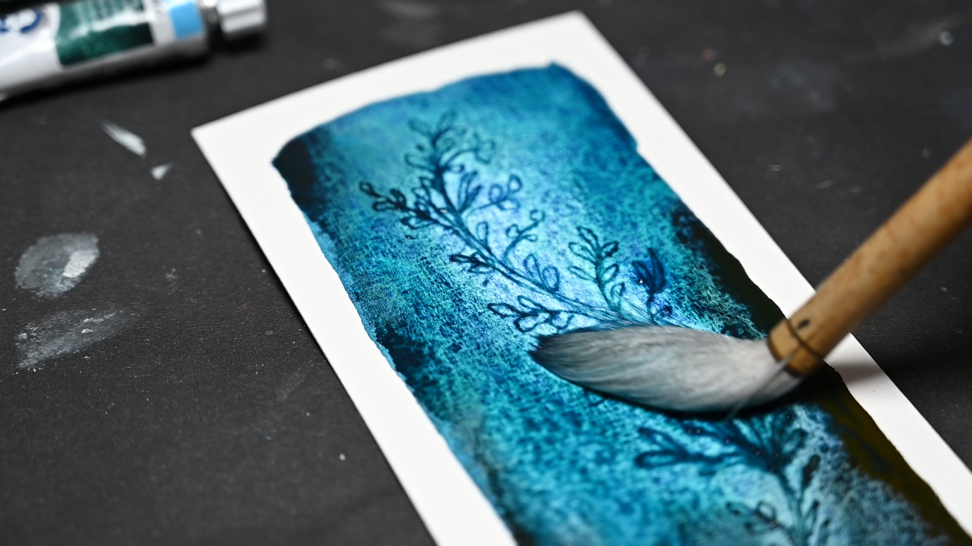
wet watercolor and scratch directly into the
painted surface with something as
simple as a dip pen, a skewer, or even the tip of
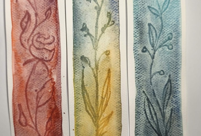
a small pair of scissors. The pigment settles into
those fine lines and creates a delicate print like effect with an almost
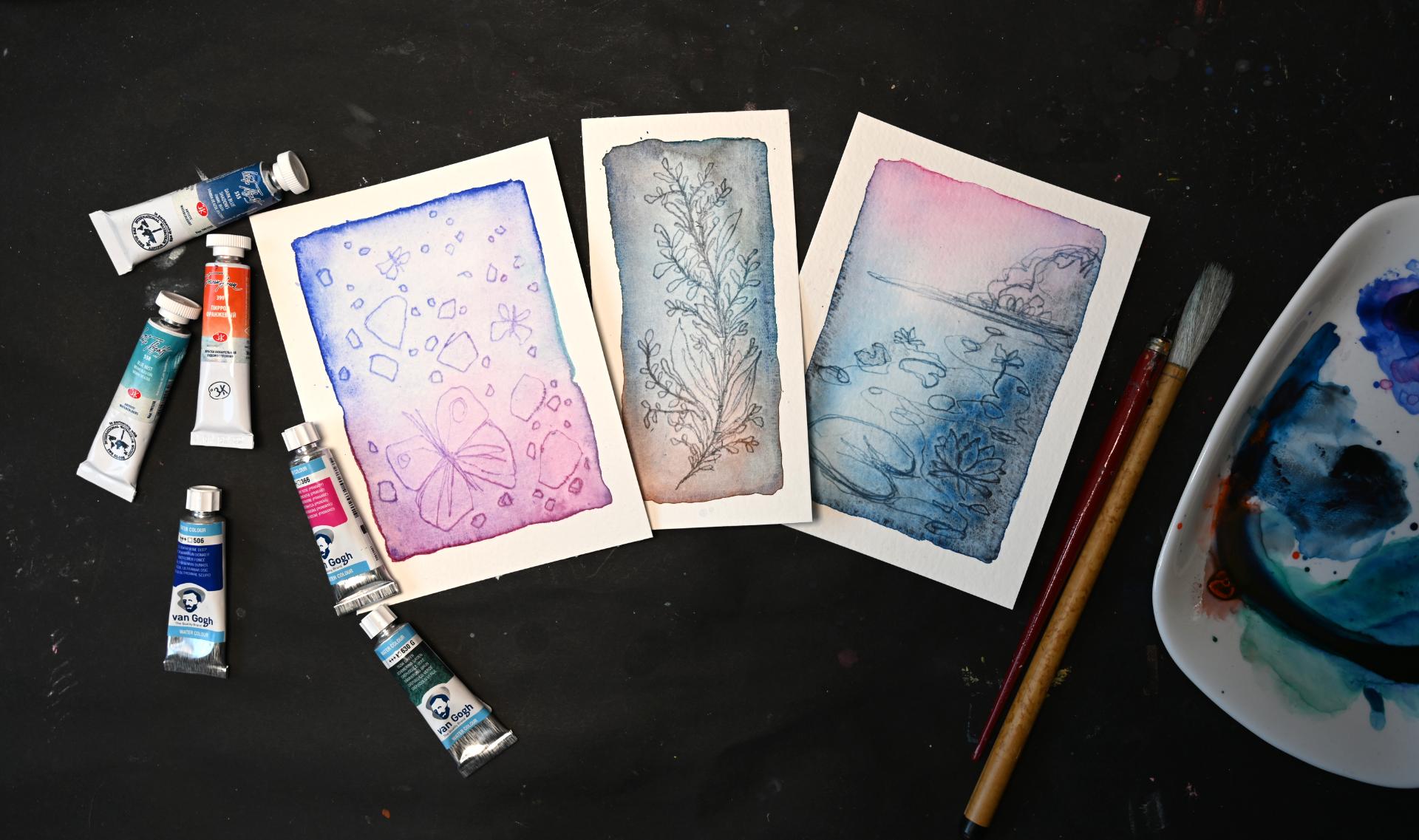
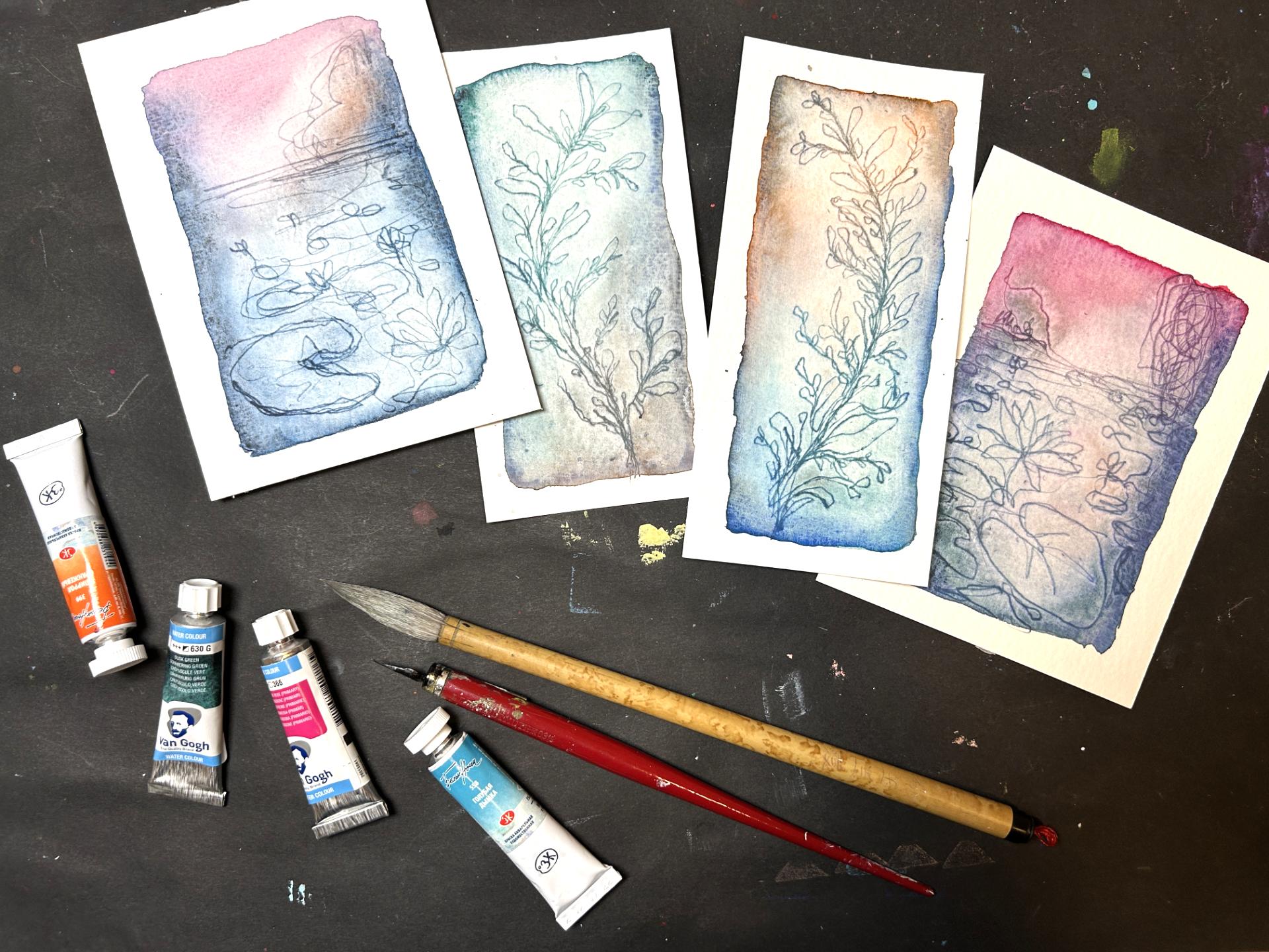
etched quality. Across three quick projects, we'll explore the technique
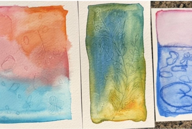
with different subjects. We'll start with a vibrant
semi abstract watercolor inspired by butterflies
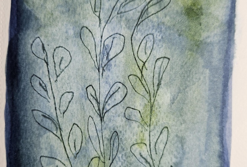
and organic shapes. Then create a vintage botanical with a softer, more
muted palette, and finally, an
atmospheric water lily with subdued colors
and a brighter sky. There's no complicated
setup and you don't need any previous watercolor
or drawing experience. It's really about learning an unusual technique,
enjoying the process, and adding a new way of working with paint and line to
your creative toolki. So gather your watercolors and something pointed
to draw with, and let's get started.
2. Create Three Faux-Etched Watercolors: Class project, you create your own fo edged
watercolor paintings. Throughout the class,
I'm going to show you the same process across three
different subject matter, so you can follow along or pick the one that
speaks to you the most. You can work completely from
imagination, like I do, or you can use your own
photos or reference images that are copyright free from sites like Osplash or Pexels. And when you work
from a reference, don't feel compelled
to copy it exactly. You can just look at the
general shape of a butterfly, the direction of a branch, or the composition
of a landscape and take that as a loose
guide and inspiration. The scratched lines work particularly well when they
are loose and imperfect. So this really isn't
about creating a precise, botanical or landscape drawing. Nobody's going to
count your leaves. As soon as you finished your
first piece or all three, please upload them to
the projects gallery. Show me what you
created and let me know which colors and
scratching tools you used. And if something didn't
work as expected or some questions came
up during the process, you can post them in your class project or in
the discussions. I'm happy to help. Now let's have a look at the
materials we'll
3. Gather Your Materials: Have a quick look at what
you'll need for this class. First of all, you need
some kind of sturdy paper. Ideally, around 300 GSM or more. You can use watercolor paper, mixed media paper, or the paper that I use,
acrylic painting paper. This one is by Canson, and it has 400 GSM, and this is what I have handy, what I have at home, and
that's why I use it. It works beautifully
for this technique. It's a very, you
know, thick paper. As you can see, it does not
it does bend a little bit, but not very much. I have also tried this on a very inexpensive 200
GSM watercolor paper. As you can see, it has
buckled quite badly. Even though I have taped it to a piece of
corrugated cardboard, which you have to do
because otherwise you won't be able to paint
the washes properly. So I'm going to use
this one and I'm going to cut it up
in smaller pieces. Then you will also
need a palette. I use a white plate for that and a piece of cloth to
wipe off your brush, which brings me to the brush. I'm going to use one of these Chinese
calligraphy brushes. This is a very inexpensive one that I have for, I don't know, probably 20 plus years, and it works perfectly
fine for this. If you have a good watercolor
brush, of course, use that. Then of course, you want
to have a char of water. Then of course, you'll
need watercolors. I like using watercolors from tubes for this
technique because I can quickly mix up a good amount of strong pigmented color without having to loosen the
paint from the pen first. But, you know, pens will
work perfectly well, too, if you have some patients. When it comes to colors,
use what you have. Just make sure that you have some strong pigments like
darker colors, vibrant colors. Using a yellow or a pale
pink or light green will probably not give you the
results that we are looking for because we need
strong pigment to, you know, color those
scratched lines. We'll be working in three
different color schemes from vibrant to more subdued, so I will show you how to do
that during the projects. And then one more
thing is missing. The most important thing
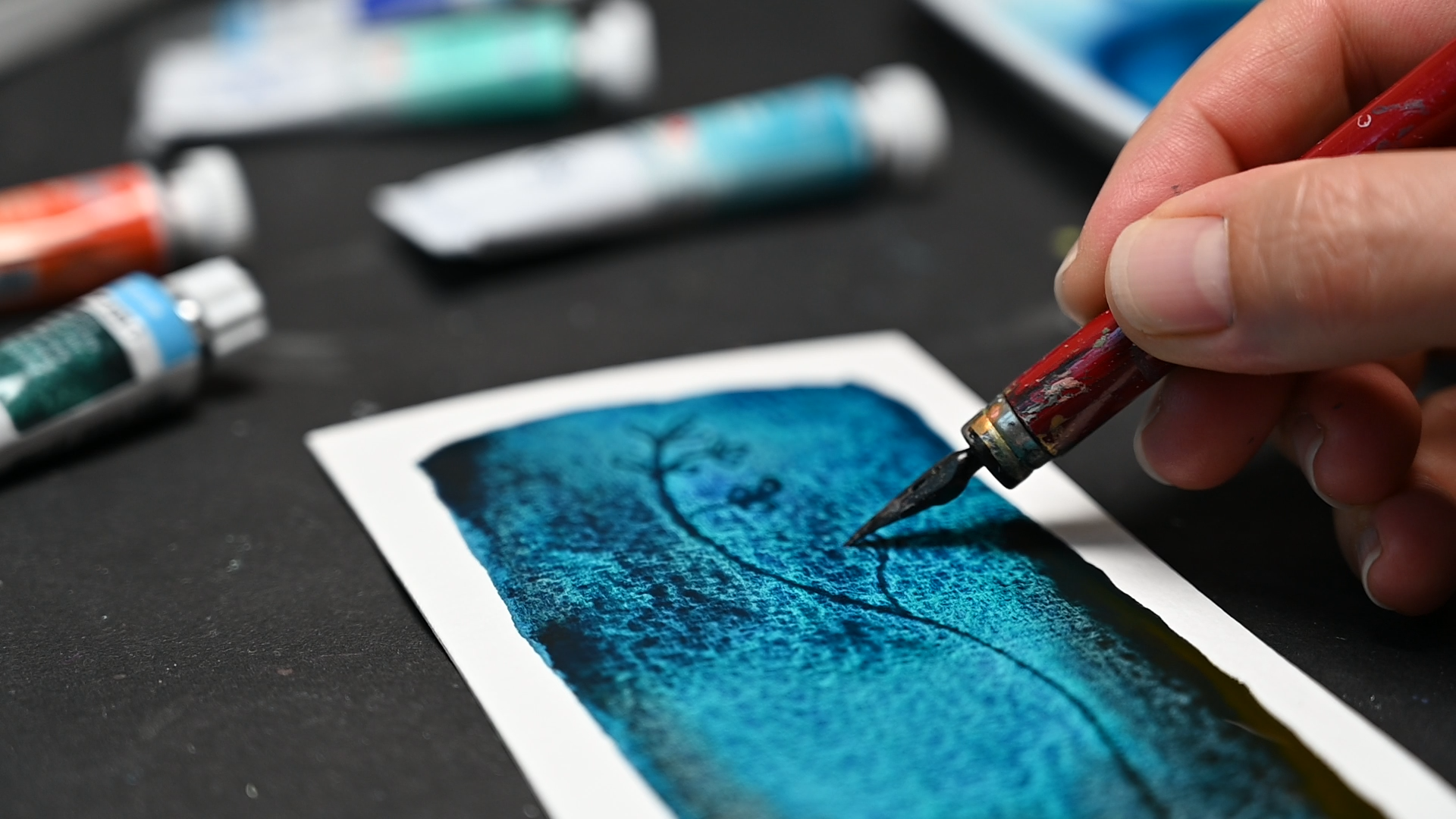
for this technique, and that is a scratching tool. So for the scratching tool, I like to work with a dip
pen or calligraphy pen. It has a nip, and with this nip, we can scratch into
the wet watercolor. And it's, you know, quite comfortable to hold and draw
with fills quite natural. But if you don't have that,
you can also, you know, use a wooden skewer or if
that is not sharp enough. I have one of those
silhouette scissors, which have a very sharp point
and that works as well. Or, you know, any sharp tool and all from the sewing kit will work as well.
That's really it. You don't need any
printmaking equipment. We're just faking
that print like look and in the next lesson, we are going to get started. Right now, I'm going to
cut up my paper into smaller pieces and then we'll see each other
in the next lesson.
4. Create a Vibrant Semi-Abstract Watercolor: First project is going to
be semi abstract and that allows us to focus on getting familiar
with the technique. I have put out the following
paints, ultramarine blue, cinacotumRose, which is the primary magenta,
basically, and mint. This is probably not going to
give us very strong lines, but I wanted to use it anyway, so we'll just try how it
goes and how it mixes. I'm going to start with a
vibrant wash of watercolor, so we need to loosen up
the pigment a little bit. And then we'll put it down. So what I want to do is I don't want to go right up to the edge. So this will create this look of a print
because when you would do an edging or a
drypoint print, you would have a metal plate, and that would be printed
on a larger sheet of paper, and you would have, you know, a white border
around your subject. I will go over this once more
because in the beginning in the paper soaks up the
paint quite a bit, so it will easily get
dry in some areas. So what I'm looking for
is pretty clear edges. Like, I'm using the paint right up to the edge in
comparison to having a or I can't demonstrate it now to having a
dry brush effect. Like that would be scratchy. I mean, there's no reason why you wouldn't have
a scratchy outline. It's just that it then won't
look like a drypoint print. So this is an experiment
because I have never used this paint
before for this technique, and I know that this is a quite unusual watercolor
as it's opaque, but I, you know,
wanted to try it anyways and see how it goes. So now I'm taking a
look from the side, see if my paper is still shiny, and that means it's wet. And now I'm going to
try this with a skewer. So if you don't have a nib
pen, you can use a skewer. And I'm starting with
my biggest element, which is this butterfly. I'm just going there, thinking of this more
like a one line drawing. So I'm not keeping so
much to my reference, but just playing around, making my second butterfly here. As I thought this will not
give me a very strong result. But here you can see
how it should look. I can still fix that. So if you have an area where
there is too light pigment, you can always go
over this area and, you know, add some
pigment and fix that. That was a risk, but also it's good for demonstration
purposes when you're running into these issues. So for the next
shapes like could be abstract flower shapes or rock shapes or whatever
you want to call them, I'm going to use this
pair of scissors. And I'm just scratching very
lightly into the surface, creating these differently
shaped oval circles, rectangulas, Here again, the
paper has completely dried, so it does not work at all. So I'm going to add
some more paint here. And when it starts to pull, you can't see what you're doing, you can pull a
little bit of it up and remove it from the page. So that was the scissors. Now let's use the nip pen
for the rest of the piece. So I have my basic
shapes in place. Now I'm not really looking. Even putting this away. Yeah. So I'm just adding
differently sized marks. It's always nice to have elements in different
sizes in your pieces. That's true for abstract, but also for representational. In this case, it gives us a feeling of depth of
things coming forward, being bigger, and things
going back, being smaller. When I do marks like these, I also think about clustering
them a little bit, so not spreading them
equally across the page. You can see again,
when things get dry, you can hardly see
the marks anymore. And also when the
pigment is too light, you cannot see it as well. Here, I suppose we
will see it once I mop up the excess water. And here it's too dry, it's not even doing
anything at all. Okay. So now you can
let it run either way, if you have excess paint and just let it mix and mingle or you can
use your brush for that. As you can see, this paper
does not like buckle, but it bends a little bit, so I can't bend it the other way now without
accidentally, you know, making droplets
jump off the page. So the next step to
make it more look like a drypoint print is to remove
some of that pigment again. So we are using a clean brush
and going over our page. Depending on how wet it is, you don't have to add water. You can just mop
up what you have. But if it's already dry, you can also add
some more water. And it's really up
to you how much you want to remove if you
want to have a very, you know, strong dark edge or don't have such
a strong effect. When I wipe out my brush on a piece of cloth
and it's dry, it's called thirsty brush, and we'll use that to pick up any excess water and paint
to create this effect. If you want to at this
point, you could, you know, add a little bit
more color pigment to your piece if you think that you want to
change the color, for example, have this
blue a little bit lighter. I think I will add a little bit more blue here
because I have this almost like a clean barrier between the pink and the blue. So I want to mix this a little bit more in order
to create a violet. I don't want to, you know, go over the edge too much, but if they have dried too quickly and you
get a sharp edge, like a painted edge where you
don't want it, of course, you can rewet it and go over the whole thing again. Alright. So the last thing I would have a look at is whether
you have pulling paint at any edge or
corner of the painting, which I would soak up because if it's too much pulling paint, it could result in a bloom
during the drying process. But I think we're
fine like that, and let me show it
to you close up. So in this piece, I have
used all three tools. I've used the skewer. I've used a pair of scissors to scratch, and I've used the nip pen. You can try what
feels best for you and have fun creating
your first piece.
5. Paint a Vintage Botanical: For our next project, we are moving into botanicals. I'm going to do a twig, and you can do it
in anyway you like. I've done some with larger
leaves or smaller leaves, very dense, you know, more sparsely, and
it makes sure. What we are going to do
here is we are going to mix complimentary colors. So I have the
following colors here, which is blue mist. I have dusk green, van gh. I have Pyl orange and blue and orange are
complimentary colors. So as you can see,
we also have green, which would be more
complimentary to red, but it's not an exact science. We don't want to
mix a neutral gray, so it really doesn't matter. But what will happen when we
mix these colors together, they will knock each other out. So they will create
some kind of grayish, brownish color, which will
create this aged look. You can, of course, do this in any color scheme that you like, but this is what I'm
going to show you. So I've put these out
a little earlier, but they are still not
completely dry, so that's great. Again, I'm making my border. As you can see, this is
a pretty vibrant blue. So before I use my orange, I will rinse my brush, and you can immediately see
what happens when we mix the two creates some kind
of a muddy color, which is exactly what
we want for this. I will use a little bit
of that dusk green. And I think, my
brush is lost hair. No it's still in there. Yeah, if we can't get it out,
it doesn't matter. We can get it out when it's
dry. Okay, we'll leave it. Also going to add a little
bit of that dark blue. And then we'll let this
run up a little bit. And remove some of
that color here. So I'm mopping up
a little bit of that excess water just so that it won't go over the edges. And now let's start. So if you want to, you can use a reference image, but I usually don't I, you know, just try to wing it. I usually start with
the line and then I use I go back and forth and
I add the leaves and twigs. And, you know, we'll add some
larger ones maybe first, so we get the feeling for the space that we
have, it's always nice, as I said in the
last lesson to have a variety of sizes and shapes. And nature is, you know,
perfectly imperfect, so nobody will judge
us whether this is a realistic plant
if this can exist as we create it or or not. So it really doesn't matter. And you can go
back and forth and add leaves where you
think they would fit. And every piece will
look differently. It's also fun to do
this a couple of times and you will
see that you will get looser the more you do
it and stop worrying about whether the leaf shapes are correct or if the
plant works like that. When I feel like there is
something that's not okay, I'm sometimes adding
just more of them. And sometimes that helps
and sometimes it doesn't. I'm not sure if that
was the best decision, but yeah, here we are. Maybe we can integrate it a little bit more. Okay. So the next step that we want to do is we
want to remove some of that paint again to give it a washed out look that's
darker around the edges. So I'm using my wet clean brush to go over this and pick
up some of that pigment. And the drier the brush,
the more it will pick up. And we want to weave some
of those edges darker. Okay, I think I will pick up a little bit of
that paint here just so that we don't want
to get the bloom also here. And that's already it. I have a couple of, you know, paper fiber pieces here, but that does not really matter. We can wipe them off
once that is dry. So I'm pretty happy with
how the colours turn out. And yeah, going to leave it to try and we'll move on
to our next piece.
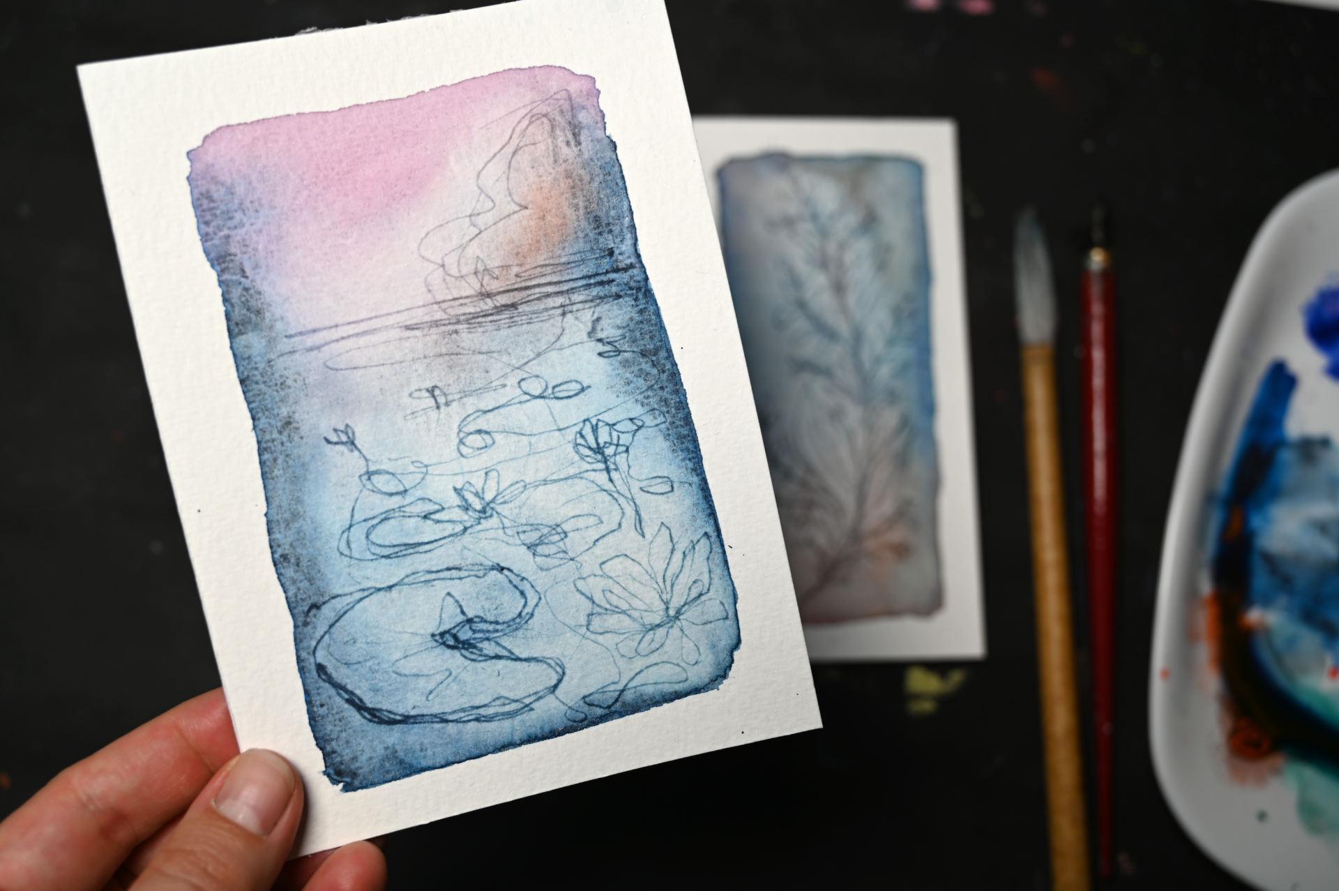
6. Create an Atmospheric Waterlily Pond: Final piece is going to be a
landscape showing, you know, a pond with water lilies
and some trees on the side. So this is what I'm, you know, aiming
for approximately. But, you know, every piece
is going to be different. I'm mostly going to be using
the unecodonose primary, which is magenta, and also the dark blue shadow,
which is this color. Maybe I will add a tad
bit of orange as well. So let's start with the
magenta on the top. We don't have to have it so intense because we are not going to scratch a lot
of lines into it up here, but still we need it
decently covered. So because I have not squeezed
out the paints right now, I have almost, like, the same condition as if I
was using watercolor pans, which means I need to activate the pigment before I can use it. Okay, so I like to do
the outline first and then quickly add the inside. We can always add a
little bit more pigment at a later point if we think it's not enough,
not saturated enough. We will want more
pigment to the right and to the left because we are
kind of doing a landscape, and that will help
us create depth. Now we have to make
sure that we still have wet paper everywhere because the first layer
really dries quickly. I can see it here already. We'll rewet it. So we want to have it a little bit darker here because that's where we
want to have the tree. So we need a little
bit more pigment here. So I'm going to start with a water lily leaf and then
we my way up as we go. So sometimes I like to go around the edges
a couple of times, also making it look like it creates some
kind of a shadow. For the water lily,
we want to make sure that we make pointed leaves. Otherwise, it will not
look like a water lily. At least not like
one that I know of. We are kind of just
overlapping some leaves. It does not have to be
exact exact science. Sometimes the leaves also
stretch more to the front. And yeah, then we are
also thinking of creating a one line drawing and sometimes maybe we can add more
a water lily that's, you know, coming
out of the water. I struggle a bit with
making pointed leaves. And, you know, for
the other leaves, we don't have to be so exact, going to move out
of the page here, and here we're going
to create a few lines, which will be our
kind of shoreline or I don't know what you would call that if it's just a
pond, probably not sure. And yeah, we're
creating some kind of shrubbery and trees. And basically, take a look, see whether we want
to add something, maybe we can move a
little bit over here and create some more lines here. I think we are already good. So now I want to make
sure to leave the sides dark and lighten up this
area, especially here. Probably my sky. No, it hasn't
dried, so that is good. Because now when
I want to lift up some of the pigment
and it has dried here, I would create an edge,
but it's still good. And, yeah, I want to make
this part lighter here. Moving down from
the lightest area can leave this a little bit darker because we
have the tree here, so the light would
not be there as much. Okay, let's pick that up. Okay, at this point, we can still add some pigment, let's have a look if it's wet. Yeah. I'm always
looking from the side. So it is still wet, so I can add a little bit of pigment here because
this would obviously, you know, be a
little bit darker. Maybe add a little bit of
orange to knock out that color. Make it even more grayish. Mm. I can also add that
in the reflection. And I can see it
bleeds into the sky. I'm I mean, we're not doing a perfect watercar
landscape here, but still, we can fuss
around a little bit. And I think I want to leave this part a little bit darker. We'll see how it dries. But I want to lighten
up this area. A little bit more, not too
much because as we said, it will create, you know, that feeling of depth. Maybe I've done that a
little bit too much. You can always go back and
add a little bit more. Pigment back. You can always tilt it a little bit if you want to
move the pigment. Just make sure it does
not run over your edge. And then when you have some
pulling paint somewhere, mop it up so you
won't get it bloom. I think this looks
nice as it is, and I'm going to
leave it like that. I think I need to remove
that a little bit here. Okay. I think now I'm good. Let's
have a look close up, and then we'll see how it dries.
7. Final Thoughts: Keep Exploring: And that's it. You have reached the end of the class.
I hope you enjoyed it. Maybe you even have
already created your own pieces or feel ready to give this
technique a try. We've used one simple
watercolor technique with three different subjects, a semi abstract piece, a botanical, and a landscape. Along the way, you've
learned how to scratch into wet watercolor
to create those fine, darker lines and how
different color combinations can change the mood
of the result. But these three projects
are just a starting point. You can try this with
so many subject matter. With flowers, with leaf, with portrait, cityscape,
simple objects, or patterns. So keep experimenting, try
different color combination, different scratching tools,
and different subjects, and see where this
technique takes you. If you haven't already, please upload your work to
the project gallery. You can share just one of
the projects or all three. I'd love to see
what you created. And if you have a question or something didn't
work as expected, add that to your
project as well. I'm always happy to respond. And if you enjoyed the class, I'd be super grateful
if you have the review. Reviews really help
other students find out if this class
is right for them. And it also helps me
understand what you enjoyed. You can also follow me
here on Skillshare, so you'll be notified
when I publish a new class or host a giveaway. Thank you so much
for joining me, and I hope this technique has given you a new way to reach for when you feel
like playing with watercolor in a
slightly different way. I'll see you in my next
class. Bye for now.
 Cornelia Zelinka-Bodis, Mixed Media Artist