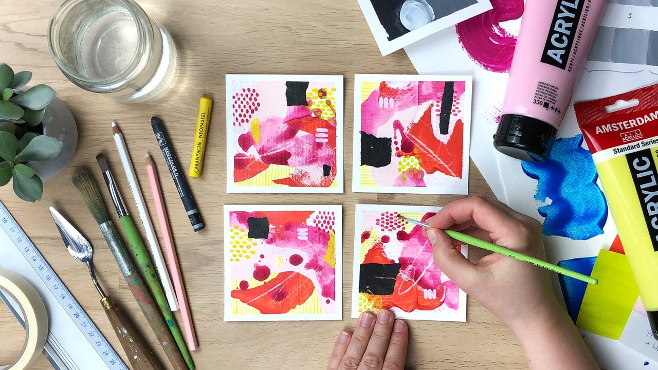
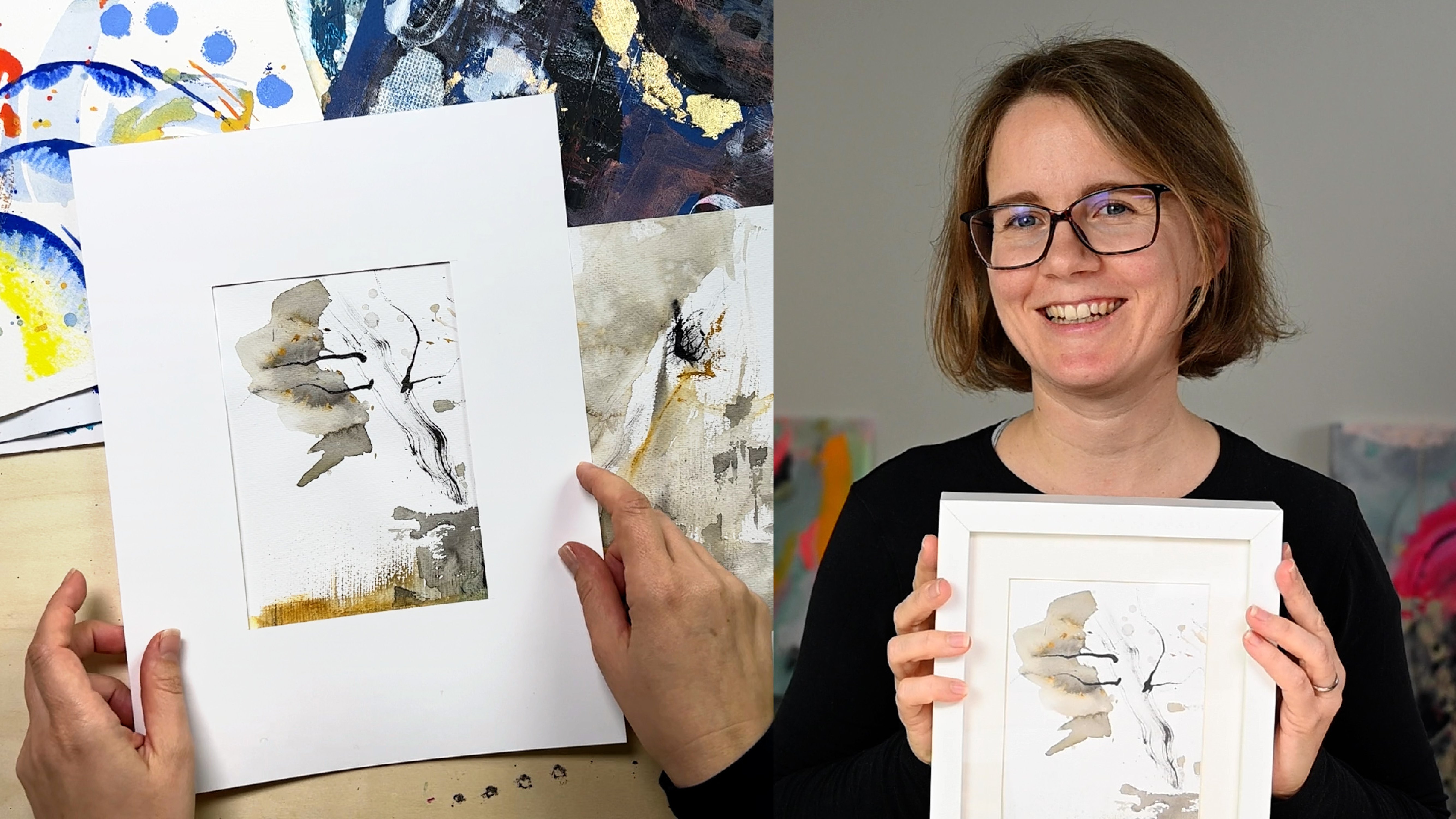
Transcripts
1. Loose Watercolor Landscapes: When life feels overwhelming, I find so much comfort in the small contained
projects that can be done in just one
city that allow me to be present and fully
focused on process. Wet-on-wet watercolor is
perfect medium for that. Hi. My name is Cornelia and I'm a full time mixed media
artist from Austria. In this class, we are going to create minimal
watercolor landscapes, simple, beautiful, and with
no waiting for layers to dry. We'll cover all the
materials and techniques you need wet-on-wet, brushwork
and composition. But the real focus is on
iteration over perfection. We'll create lots of small
playful pieces because that's where the joy is and where your intuition and
skills grow the fastest. I'm so excited to
share this with you, grab a stack of papers, find a quiet moment
for yourself, and let's make some paintings.
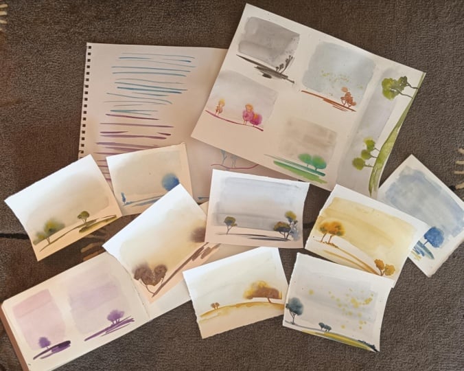
2. Class Project: Loose Landscapes: For your class project, I would like for you to do
five to ten landscape studies. Why a whole series? Because this is really
about practicing water flow, pigment ratios, and composition
variations and it will not happen if you
just do one piece. Practice progress makes perfect. You can upload a picture of your pieces to the
project gallery. And please also share which
one is your favorite pace and why and what you struggled with the most
and what came easy to you. This will normalize the
experience for all students. We can learn from
each other and I can also support you with
feedback and tips. Now before we dive into
the penning practice, let's talk a little bit about the materials that you'll need.
3. Simple Watercolor Materials: For years, I've been
encouraging people to use inexpensive watercolor paper if that is what they
have available. But recently, I have also made the experience using
more expensive paper like the gold standard, 100% cotton paper, but it does
really make a difference. Still, I'm going to do most of this class on drawing paper. It's a drawing paper that's definitely set to be used
for dry and wet media. Still not all drawing
papers will work, but you can really start with what you have
and if the paper is finding you massively, it might not be your fault, try a better paper. When it comes to brushes, it's really useful to have a larger brush and
a smaller brush. The large one we'll use
for the background, and it's just very useful
to have a larger one just because you
can get more water down more quickly if you have this brush in comparison to using a small one that would
take quite a lot of time. But it doesn't
really matter if you have a flat w or round one, just one that holds water
well, that's amazing. When it comes to the
smaller brushes, the most important thing is
that it has really good tip. This is a number six, but the numbers are not saying
too much that could be different with other brands and it's a synthetic brush. This is a number eight and it's called a
script brush, I think. It has longer bristles, as you can see, and it
can hold a lot of paint. Sometimes I find it useful
to use them because they take a little bit of
the control out of it. I find it more easily to make
smooth lines, not as shaky. The tips are really soft
and really adaptable. I'm also going to be using this really inexpensive one
for my kids art kit. It's not been used before. It has a fine tip the bristles
are a little bit lopsided, it's not high quality, but it still works. It does not really depend so much on the quality
of your brush. You can make it work as long
as you have a fine tip. We need that fine tip because we want to make those details like the trunk and maybe you want to do some branches
and things like that. When it comes to paints, you can either use
pens or tubes. I used to use just pens, but now I've acquired a taste for using the tubes
because you can immediately squeeze
out a good amount of paint that's ready to use. But if you're using pens, maybe it's handy to
have a spray bottle and just spray on pens before
you start using them. Basically, you just need
one color or two colors. Like this one was done, I think in the dusk violet
from angogh which is a special granulating color so that might also have added
to this effect here. Here, I've also just
used one color. I think it was olive green from these
white knights paints. But yeah, if you
have more colors, you have a little bit
more playfulness. So here, I probably use the red, I've used neon pink, and I think I added a little
bit of a violet as well. But you really don't need
to have all of that. Just start with what you have. The first pieces
that I did were not actually done on watercolor
paper, but on drawing paper. What I like about
this paper is that it has this really fine grain, and that really goes well with this concept of
common spaciousness. I've also tried a couple
of other papers here. This one is another
very smooth paper. It's a mixed media paper. So this one is actually an
acrylic painting paper. It's 400 sems so
it's really sturdy. And as you can see, it
has a stronger grain, almost like a watercolur paper. Why didn't I use
watercolor paper? Because I couldn't find
my watercolor paper pad, I use this one instead. Like this is even some paper that I had just found at home. I think it was not
specially made for art. I think I still have
it from my time as a graphic designer as it was a sample for paper that
would be used to you know, print maybe your business cards on or things like
that worked as well. I think this is on the same
paper as well as this. You can't say that
with this paper, you don't get a fuzzy bleed. You can also get a fuzzy
blade with this one. It really did not
depend on the paper. When you're using thinner paper, put something on top of
your pieces and press them. You could also wet them on the backside to get them straight again, which
I did for these. Now they are not completely
straight as you can see, but straight enough when
you look at them upfront. You need some kind of palette. This is, you know, just a
plate from the kitchen. You need water containers. I've left the dirty paint water from my last session in here. This is what I'm using for the background for
this very light color. But it also helps to have a
container of fresh water, and this is really
a dirty container because I'm using it for
my acrylic painting. What's also important to
have is either a piece of cloth or some paper
towel, to blot of, you know, excess water, to wipe off your brushes, and, you know, just have
in case of spills. So to sum this up, don't overthink your tools. Start with what you have. You
can always upgrade later. This class is about understanding
water and pigment flow and practicing and learning that and not about
the perfect supplies.
4. Finding Ideas for Your Art: So before I created these
miniature tree landscapes, I had actually been
experimenting on a large scale with acrylic ink and just making
loose brush strokes and playing with flow in
these minimal landscapes. But then at some point, I wanted to know, I think. I'm not quite sure, but I
think I wanted to know if I can make watercolor spread
as well as acrylic ink. I was doing this really
small experiment on a piece of watercolor paper and that's
what sparked this class. When I saw this, it reminded
me of the singular tree. And then I tried
doing these trees. And I did really, you know, did a lot of these
small ones in the beginning, like really tiny,
tiny compositions, just, you know, playing
with how the paint spread. So I liked a lot. So, you know, weren't
so successful because, you know, the paint
spread too much. So the paint was more contained. It was really a
long path and also had a couple of pieces where
everything went wrong. I get bladed out completely uncontrollable and the point is, there's always a
journey to arrive at a certain point and it's not been the result
of the first try. What is also a beautiful
reminder is that sometimes idea don't
come from planning, but they come from really
small experiments, small playful things
and from curiosity. That can spark a whole range, a whole series of artworks. We really should not say
that we always have to create something amazing
and beautiful and complex. Sometimes, it's just
about putting down the pain and just playing and
that will build momentum.
5. Mindset: Quantity Over Perfection: Tricky thing about
watercolor is, for me, at least, when you see
someone who has mastered it, it looks so easy. But when you're
doing it yourself, it's not so easy at all, I find. But for me, the trick
is in iteration over perfection because
I find it super frustrating when I sit
and I paint for 3 hours, 4 hours because there's all
this waiting time in between, and then I overwork it, I mess it up, for some reason, it's not what I expected it
to be because I've built up all those expectations
in the process. If you instead took the
time to sit down for 30 minutes for an hour and
create ten small studies, just one after another, you will build so
much momentum and there will be one or two
that you really like, and that is a huge success because that will give
you the confidence, that will build your
skills the fastest and that will make you want to come back to this
practice again, because it makes you feel good, it makes you feel happy. There's this famous
pottery study. That also supports this idea. There was one group
that was told to create one perfect pot like ceramics and
the other group to make as many as they can. Guess who make the better pots, the ones who made as
many as they could because they iterated and they learned with
each iteration. Don't aim for one perfect piece, but for ten experiments.
6. Water & Pigment Flow Basics: Watercolor everything
depends on how wet your paper is and
how much water and pigment you have loaded
in your brush to see what the right amount of humidity
looks like on your page. So I have a slightly
humid area here, like one that's more humid
here and very wet here. And now I'm using this pigment and
putting down a dot and, you know, seeing what happens. So what you can see when the
water is really pooling, you often get this halo effect, at least with this pigment here, it's not as strongly pronounced, but here we get a nice spread. What I have to say,
what I've noticed, is that it really
also depends on the. So like this gray was
a white knights paint. And now I want to try
with a Vangah watercolor. So you will see that the
spread can be different. You know, not all have the
same push towards the outside. Here you can see
when it's pulling, sometimes it does not
even move at all. Let's try another one of the
white knights paint paints. So this one, for example, has a really funny way of, you know, almost granulating. So you really can
tell you while to practice how your
paints will react, and it can also differ
depending on the paper you use. So let's use those pens. And see how they do. And you can see, again,
they react differently. Generally speaking,
it is better to be more on the
almost dry side for the spread than on
the wet side here you can see it like how
it should not be at all. So one thing you can
also do a little bit, but we're mostly not going
to be relying on that. We are just touching the sides it's going to spread
outward from there. But then you can all tilt
it a little bit and see it creates a little bit of a different tree shape when
you do that rather than, you know, keeping it
straight as it is. So now it did spread
really nicely. It also depends on how much pigment you
have in your brush. It spreads when I have
enough paint in it. I want to create
some kind of, like, a pressure by adding
and dipping down. And when I have too little, you know, it's not
going to spread as far. So I can, you know, by having more of
a pigment load, I will push it out more and I can dip and create this push
7. Master Loose Brush Strokes: Before we paint our
full landscapes, we need to practice our
brush control a little bit, get a little bit of warm up. So for this, you want
to make sure that your brush is fully loaded. You're like, soaking
it up with paint, and now you have to think about not doing
this as a drawing. If it's easier for
you to move your arm horizontally award,
that is fine. If you rather move
it at an angle, then you can, of
course, turn your page. And do that. You can put it down and
try if that works for you, and then slide it
across the page. You know? Just put it
down and slide it. And you can vary the pressure a little bit when you do that. It's just, you know, just sliding my arm. Okay. I did actually move
a little bit like that. I could move, like,
more parallel. If I, you know, if
I do it like that, I'm actually moving more like
a rotation from my elbow. But if I want to, like, keep my elbow still, I would have to for my taste, I would have to rotate
the page and then, you know, slide it like that. But you really have to find
out what works best for you. When it comes to brushes, you can really try
what works for you. So this is a script brush. This had longer bristles and it can hold a lot
of, you know, paint. And yeah, you can try
if that works better. Has a very fine tip. It's easier a little bit
I find with this one to get fine lines and thick
lines at the same time, like pushing it down, getting it up, pushing
it down, getting it up. Because these shorter ones, especially this one has a
little bit of a stiffer, synthetic bristle, so
that's not as easy. To use. Another thing, you don't have to put down your arm completely. You can also do that
with a lifted arm, like, completely lifted, like not
touching the paper at all. I like to do that when
I'm going back and forth. But you can also put down
just your small finger, kind of, like, to guide
you a little bit. It has a stretching sound now. But it helps me, you know,
keep the distance when I'm not so warmed up yet with
the brush and, you know. But basically, when I create
lines in both directions, I do like it when I have my
arm completely off the page, like it's 10 centimeters
off the page. That's how I'm
holding the brush. Like, there's a lot of space. And then I can't
control it so well, and that makes the lines a
little bit more natural. One more thing that
I want to show, maybe I can show that
with this brush. It's from my kids, you know, painting kit. It's
a really cheap one. So I just wanted to show
you that it works as well. Maybe first, I want
to demonstrate if it's not loaded enough, that's what's going to happen. Yet, your line is
going to break. That's the brush is too dry. And this one obviously is
not a very expensive one, but still you can
load it properly and, you know, get more. I went really further this time. No, I got it. So it really doesn't have to
be an expensive brush. You can also manage to do
that with a cheaper brush. Try it with what you have
and don't think you have to buy a script brush or any
special watercolor brush, you know, creating more lines, and we can add a
little bit of water beneath and let it wash
out if we want to do that. And just to be totally, you know, transparent,
this is my third page. Today. So this is
where I started. And like in the beginning, my lines were super
super wobbly. Like, the straightness
came from practice. So I would advise you to do
at least a page of these. Just, you know, practice that. It's not something that you will be able to do immediately. It really takes practice, and then you will improve.
8. Plan Your Landscape Composition: So let's quickly talk
about composition. It is such an overwhelming, intimidating concept for many. But coming from graphic design, we also call it layout, and I find that a lot
less intimidating. And what it really is, it's just the arrangement
of elements on a page. Just the way how you arrange it. There are no strict rules. There is no absolute
right or wrong. There are guidelines, of course. There are collective aesthetics that we enjoy that we like. But basically, what your
composition has to do, it has to support
your intention, your concept, and your idea. Let's dive in. So in this class, our concept is calm
and spaciousness. So if I were to add all
these elements on my page, that would not support
calm and spaciousness. So we really have to askselves does this arrangement
support my concept? Does this support come? And if it doesn't,
you leave it away? So composition starts
with intention. The next thing
that I always like to think about is contrast. Contrast can come in many forms. It's basically
about differences. One type of contrast
that we will be using a lot in this class is a
contrast in proportion. So if you have, like, a page and you are dividing
it right in the middle, I would do my horizon line and
the trees like right here. That would be totally equal. That doesn't create contrast. So we are going to move our
horizon line down so that we have a lot of negative space in contrast to a small area of
ground and trees. The second way we can use
contrast is through size. So when we have the trees here, and all of them
are the same size that can be your intention. Like if you live somewhere
like where I live, there are a couple
of country roads that have trees that are planted like that because they have all been planted
at the same time. But if you want
something more natural and also create a little bit
of perspective and depth, you can consider varying the sizes and create
contrast in size as well. So we have differently
sized trees. Another thing that
you can see here, like we are having the trees, you know, like that. What is happening here as well? We have the same, you
know, let's move this up. We have the same distance
between all of the trees. So now I'm not varying the size, but I'm just changing, like, how the trees are placed. That will create
already like something that's conveying a
different idea concept. And then, of course,
as you can see here, we have the different spacing
as well, but also the size. So in the end, you want
to stack up the contrast. One thing that always comes up when speaking of composition
is a focal point. But again, that goes with
what you want to show us. So if you want to portray
a beautiful large tree, like standing somewhere alone, and you put that
right in the middle. All the attention
goes to the tree, and if that is what you want to portray, that is
totally perfect. But if you rather want to
have a spacious landscape, then you're going wrong by doing that because this
is about the tree. So if we want to
have the landscape, we'll rather not have
something red in the middle, but have a focal point here and a focal point
here, for example. What you can use and what is a little bit of a guideline
is this rule of thirds thing. So it is said that if you
place things, you know, at the cross sections
or alongside these, that's an interesting plate
for things to be placed. So as you can see, this is
approximately, you know, here, but I have moved the ground
line down actually here, but then I had, you know,
the trees about here. And maybe, you know, some shrubbery around here. You don't have to
be exact with this, but it's a little bit
of a guideline that helps you to not put things
right in the middle. Another thing that you can
create contrast on is shape. So, for example, if you had the trees and all
of them are the same, and I like that a lot, but you could also
create contrast in a way that you have like
differently shaped trees. For example, here, we have
these elongated trees, and for example, here
we have a round tree. So that could create contrast
as well and variation. You can also create shape variation in the
way that when a tree, for example, is
sitting on a slope, it might not grow straight up, but more like to the side, and it might have
supporting branches. So you can create
variation in that as well. Speaking of that, you can
think of all the trees, tree shapes that you could do. You could have trees
that have, you know, two trunks, trees that
are more like that, lopsided and, you know, have supporting
branches that are, you know, going
off to the sides. So it's really up to you to create a little
bit of variation, and we will play with that
when we are doing our project. So to sum this up, when we think about composition
and contrast, we can play with ratio. We can play with size. We can play with spacing. The placement, shape
variations. Okay. And the shape variation
also includes the ground. So we can just line as a ground. We can have a slope,
something like a zigzag that would remind us
of a river or pathway. So that's something to
keep in mind as well. I hope that was
helpful and giving you a little bit of ideas
because when we are, you know, playing
with this technique, we can't move elements around. We can't just, you know, paint over the tree and
make it differently. It's just one shot with the watercolors and
this technique. So like, having a few
ideas in mind that you want to try upfront
can be really helpful.
9. Paint Your First Landscapes: Before I start painting, I make sure that I have
enough paper ready. These are eight pieces
of post cup sized paper. It's the drawing paper
that I mentioned, and I'm going to use it to
show you how to get started. I do have some dried
up paints here, so maybe I want to use those. So I'm going to
spray them a little bit with my spray bottle to activate them just as I would spray my pens if I
were to use them. We're going to create
our first piece, and we're putting everything
you've learned together. So if you have dirty paint water already from your practice,
you can use that. If you haven't, you know, just make this really light
wash on your palette, and you'll be fine. So we're just going to spread the paint or the water
here on our paper. When you do that first layer, you know, the paper starts
to dry really fast. So here, it's already
has a dry spot up here. So I want to go over
that again because we don't yet want it to dry. It also tends to
dry on the bottom, so that would not be
good for our purpose. So let's add a little
bit more water. Because I'm talking
so much then. I don't get the ratios right. If you have some water
pooling somewhere, you can also move your paper a little bit and let it flow. So now what you want to
do is you want to get some highly pigmented
paint on your brush. You want to fully
load your brush, really soak up all the paint, and then you want to
create your ground line, and you want to keep
a little bit of space between the
sky and the ground. You don't want to touch because that space is going to be
where our trunk is going to be I'm just touching, you know, the white area with my brush and everything
starts to spread. So, yeah, I'm actually going
to leave it like that. Now, I want to show you a second one where we
are actually going to try to have the ground touch the sky and create some kind
of a feeling of shrubbery. I'm actually going
to create a slope. So again, I need
to make sure that the paper is evenly humid. Shiny but not pulling. Now, I'm creating
the slope, and I'm, you know, touching some
of the water here. So I'm creating
some kind of, like, grass or, like,
shrubbery shrubbery. Kind of feeling. And then
I'm, you know, dabbing. Down and, you know,
feeding the flow, feeding the tree, kind of. And then you can also, you know, add a branch if you want to do that if the tree looks a little bit too static. The second project
we're going to practice is going to
be a single tree. But I just decided to do
this in a vertical format. That way, you know, the tree doesn't become so overpowering and the sky
is still very important. Pick up lots of paint. Mm. And while I was talking, I think this has already dried a little bit too much down here, so I'm just going over it
again, spreading the water. And here, I'm adding, you know, the tree. If we're going to have
some kind of larger tree, we can't just add, like, the paint here, but we want to actually
do a little bit of dabbing more to the outside so that we can actually create a larger
crown for the tree. And we can also, you know, use a little bit of the tilting to change the shape
of the tree crown. And I think that's almost as
huge as I want to have it. And if you want, you know, you can add a little bit more to the trunk if you think
it's not fitting the crown. And what I sometimes
like to do is, as long as it's still wet, I like to add a little
bit of pigment, but you have to make sure that the water and pigment load in your brush is a little
bit more than on the paper, so that it actually
starts to push. Otherwise, it will more
likely pick up some pigment. And this is almost too dry now to add this kind of paint here. So we'll see how that turns out. But I can't really
do anything about it anymore at this point
because you know, I can just hope that it
will spread a little bit, but probably I will
get an edge here. Like, just fuzzing around with it and moving the pigment
will just make it worse. So we'll hope for the best
and see how it turns out. So with these two, you
can see that here I added more pigment while it was still humid and I
created more darkness. Here, I didn't do that, I think, and it spreads. So it looks a little
bit more It's generally more lighter and has less depth, looks more like there
was a foggy day. I mean, it looks
really beautiful, but if you want to have, like, more of a darkness, it's important that you add a little bit to the other
still humid pieces.
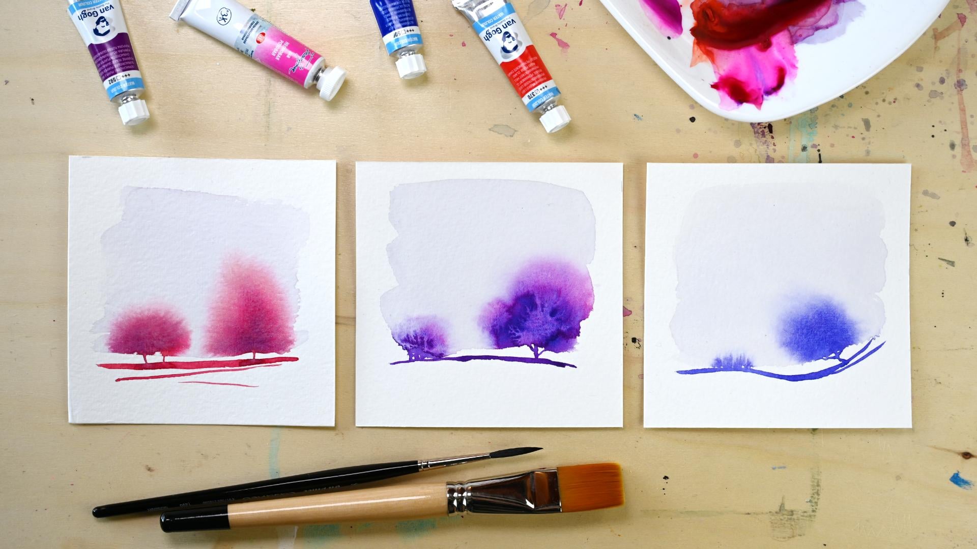
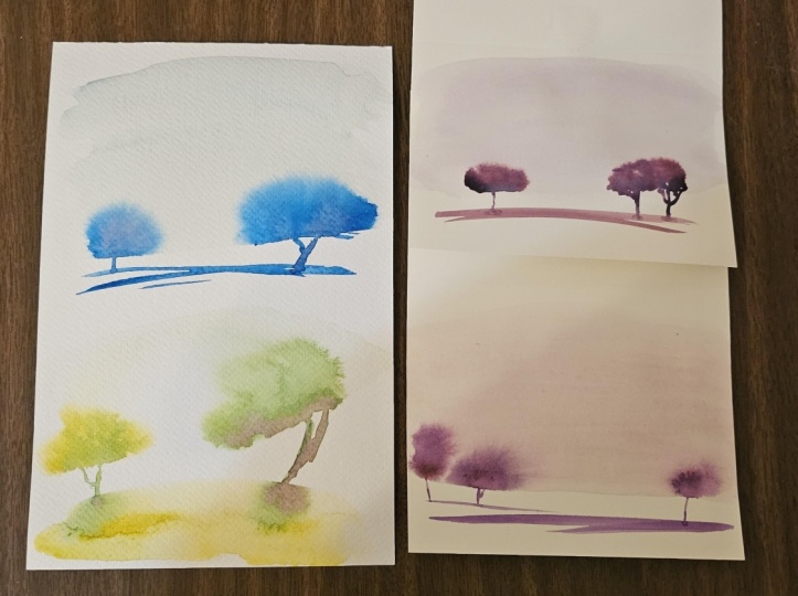
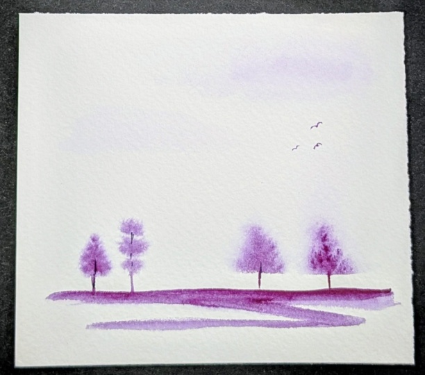
10. Painting Simple Tree Groups: Using a neon pink
from white knight and a permanent red light
from the Van Gogh and combine that with
unacrodon purple. Now I would maybe, you know, try to create a little bit of a differently colored
background so that it's, like, blending more
with my tree so that I have kind of
a monochromatic look just using pinks or reds. And if you have a wider
brush than I have, you can do that in one stroke. That would be great as well. But yeah, it works like that. You don't have to have
it exactly square. You could also, you know, make it a little bit
more organic looking. Okay, again, I'm spreading this because I see
pulling paint. When you have pulling paint,
you can also, you know, move this a little bit up and down and make
sure that it spreads. Oh, no, I should wash my brush. That's not a good idea. Mapping this up a little bit. Maybe we'll just
take the other one. It's dirty, as well. So
now I have to go back. So this is the thing. You need to be a little bit planned with what you do
because when it dries on you, that's not going
to make it better. And now my paper also
started to warp, which is not good,
but we'll see. Okay, so we want to pick up enough paint to
create the ground. And then the trees. And as I said, you
can, you know, create different like,
differently shaped trees. Just want to make sure that you do it while it's still wet. It's already dried here. While it's still wet, you
can add a little bit of a different color to the
base and let it bleed out. Now, we could add
also color, like, on the top and, you know, see how that will react. But, yeah, it's, you know, a little bit uncontrollable and it might work
out or it might not. That did, like, spread a
little bit too much for me. So now we have to
kind of the option of doing it even more
and letting those trees, you know, blend
together or, you know, just living with the result
that we have created.
11. Slopes, Ground & Bushes: Let's do a slopy one. So
when you do a slopy one, you also want to
apply your water in the slope because
otherwise you will, you know, not be
able to create that. Okay, let's do a dark one. So I'm just, you know,
creating that slope. I can, you know, touch
that orbit in some areas. I will create some kind of a
grass or brush like thing. And, you know, here
we have the tree. Just a single tree. I'm gonna add more of that blue. Not spreading so well. So I think it has
already dried too much here and we'll get a
pretty strong edge. Now I'm just adding water. But it would probably
the way it looks, create some kind of an edge because here it looks
really dry already. And here we have a lot of paint that's
still going to push. So I will lift a
little bit of that up because if that's
going to dry, we'll have a strong, you know, a strong edge in
the middle of the tree. Hey, now I want to
touch this a little bit and kind of create the
illusion of, like, shrubbery and, you know, have the trees here and
maybe I lopsided on here. And, you know, you
could always add a little bit more water here. This has already dried, so it's not going
to spread as much, but you could h add a
subtle layer of water. And sometimes when you add
the water and it's still wet, it will push upwards into
the almost dry paint and create some kind of grasses
or things like that. So I'm just thinking
of, you know, having a little bit of
darkness still here. I do like those a lot. But I think maybe a
little bit of dark here could be very nice. So that it looks kind of like we trees a little bit
more to the back. But with wet-on-wet, it's, you know, a little bit of luck if that's going to work out.
12. Fix Common Watercolor Issues: Let's see what happens
when I, for example, have added too much water, and I have, like, this
area of pulling paint. And let's see if we
add the tree here now, and we are like here, the water level is fine, but here we have
the pooling paint. We are going to
run into an issue. Now, when I want to add pigment, I need to make sure
that my brush is wetter than what's on the page. So I need to create some
kind of a pressure that it, you know, starts to move. So now we have the issue
of having a lot of water here and it's not
spreading in that direction. So what do you want
to do in this case, h want to wash out your
brush and wipe it off. And then when it's almost dry, you can use that to pick up
some of that excess water. Try to remove that
as much as possible. And then you could
maybe try to add a little bit more pigment here and see if
you can fix that. But whenever you have this
paint running out of control, it usually is because there is some pooling water somewhere, and the paint is
pulled towards or it's just reacting in a way
that's uncontrollable, and then it helps to have a thirsty brush and use it to
pick up some of that water. So here you can see, like, when I added pigment later, it did not fully
bleed out anymore, so I created this darker area, which looks kind of cool. Here, that was done
in one sitting, and it's really very
blurry and very nice. I like that. This one is well.
Here, the water was a little bit pulling. So when it pulls, it will
create some kind of edges. Here again, it was already too dry here,
so it did not bleed. So when I added more paint, it created sharp
edges here as well. That's what I was fearing if I left the
water pooling here, then it would pull out like
that and create these edges. It was probably a little bit the wet side because we
can see this halo effect. Here is, again, an image where, you know, it started
to dry on the outside. I was adding pigment, like re adding pigment, and then I got this
really sharp edge. Here, as well, here I first
flattered extensially, and then I thought it would
actually look pretty nice. But you would have to, you know, cover parts of your paper if you want to do
that because like, having them all over the place probably a little bit too much. Here you can see how it
ran into, like, the edges. That was not quite intentional. Here, also, it was too
wet, so it ran off. I blotted it off a little bit, but I couldn't contain it. Here, also, we had some
very wet area that, you know, started
to spread upwards. This was not exactly too dry, but this green pigment has
this funny way of moving. I like these a lot.
They were just added in one go and just one
pigment, as I think. Here, I had the issue of, like, it was bleeding
a little bit too much. It was just one tree in the beginning, and
then I was like, creating a few more
trunks that looks kind of like a bunch of trees. So, you know, I
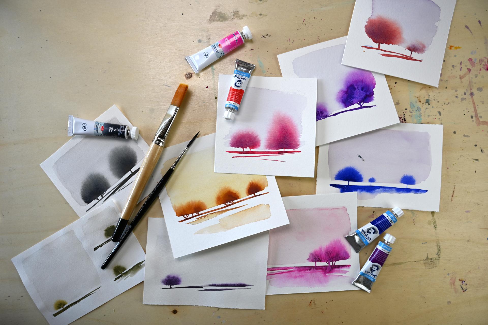
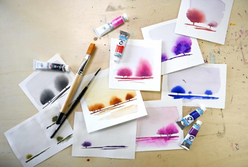
create lots of these, and I find these very relaxing. And you can do it in all
kinds of color schemes. It does I think it does work
better if you keep, like, to analogous or even like colors that are
next to each other on the color wheel or even the
same, like, just monoclod. But it can look nice also when you have two
different ones. So wrong right here. You know, I do
like that. So that happens when this is still wet. And then I added water, a line of water
underneath the wet paint, and then it bleeds upward, and that looks really landscapy. It's this one. I like
this one, as well. It has a little bit
more of a ground space. So I added this wash
later, as you can see, here it was dry already, and some areas were not as dry. So that worked really nicely.
13. Final Thoughts: Less Is More: Congratulations.
You have done it. You finished this class. Let's take a moment to
summarize what you've learned. We've started with materials and talked about how they
can be important. But what mostly defines your
result is your practice. Then we practice brush control, we looked at water
level influences. The outcome, and we talked about composition and how it
can support your theme, your idea through
the way you create contrast and space and
how you arrange things. We learned how water
and pigment interact and how wetness controls
the movement of the pigment and how
small experiments teach us something that
perfectionism never will. Now that you've finished
all your pieces, lay them out in front
of you and take a look. Reflection is one of the most important parts in the learning process
because it helps you build your discernment about what you like and
what you don't like. You can ask yourself which
pieces feel effortless, which feel overworked,
which you like better, and which you don't example, I will remind myself that I like those minimal pieces where there are hardly any brush strokes where everything looks
effortless and calm. And I can tell myself that when I'm working on something
and I'm thinking about, maybe I can add something, maybe I can fix this
because I don't like that. I can tell myself,
no, stop, let it be, let it flow, let
it do its magic, and don't overwork it. So that is my biggest takeaway. The beauty is in doing less, and I would be really curious what your biggest takeaway is. You can tell me in
the comments in the discussions or in
your class project. One very important thing is the pieces that you feel
are not successful are your permission to play even
harder to experiment even more because you have
nothing to lose and that is sometimes the best thing that can happen to
your creativity. You can paint over them with
opaque paints like gouache, you can add details
with cold pencil, use crayons, whatever
you would like to try. Sometimes the best pieces
come from those care free, playful experiments on something that was seemingly
failed and unsuccessful. So this is your permission to experiment and play and
make new discoveries. If you like the
class, it would be amazing if you could
leave a review that helps other students gauge if
the class is right for them and it's valuable
feedback for myself. I really appreciate you
taking the time. Thank you. If you want to be notified about new classes and giveaway, then consider
following me here on Skillshare if you are
not already doing that. Other than that, you can
also find me on YouTube and Instagram and I would
love to connect with you. If you have any questions, you can post them
in the discussions or in your class project, and I can't wait to
see what you create. I'll see you in my next
class, bye for now.
14. Bonus: Painting on Acrylic Paper: D
 Cornelia Zelinka-Bodis, Mixed Media Artist