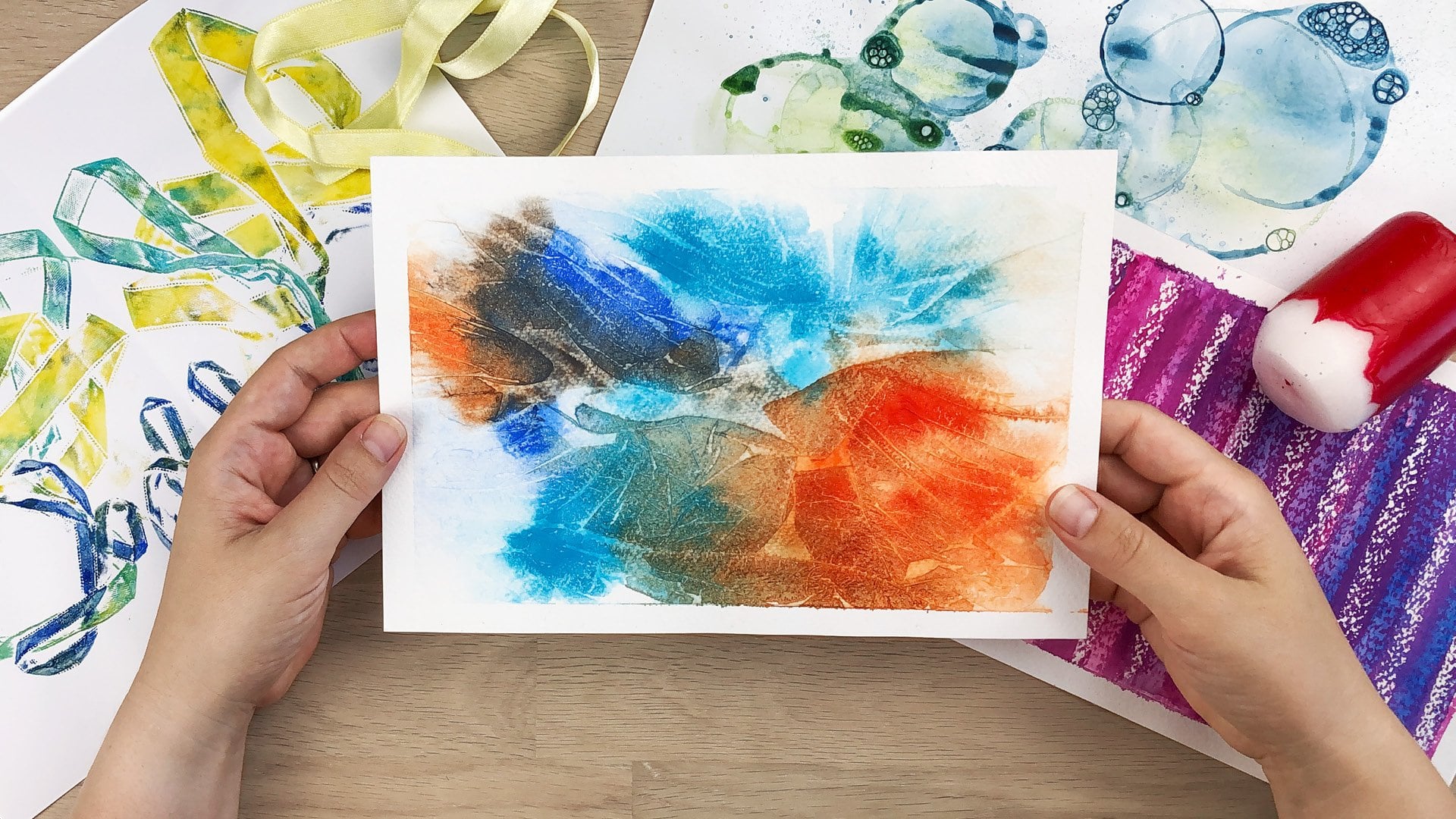
Transcripts
1. Introduction: Do you also have those piles of papers from exercise sheets, Artwork you have
started, never finished, or you're just not
happy with and you got stuck, or clash papers. Well, it might be not
good enough to hang, but it's also good
to go to the trash. You're just collecting
those papers. What if I tell you you
are already sitting on a trash trove of artwork? You just have to find
those hidden gems. In this course, I'm going
to show you how you can use few finders to
find amazing pieces. Just average work. Sounds interesting. Then
go tidy up your art space, collect all those papers, and let's dive in together.
2. Benefit from Using Viewfinders: As an artist, you are often creating work quite
intuitively like at least I am not thinking
about the composition. While this approach allows
for a lot of spontaneity, it doesn't always lead
to well composed pieces. That's where few
finders come in. Few finders are very
versatile tools that help you discover those hidden chants within your artwork or even
your practice sheets. In this tutorial, we'll explore how to use
few finders and the various options you have to incorporate them into
your creative process. If you find that is basically a simple tool made from
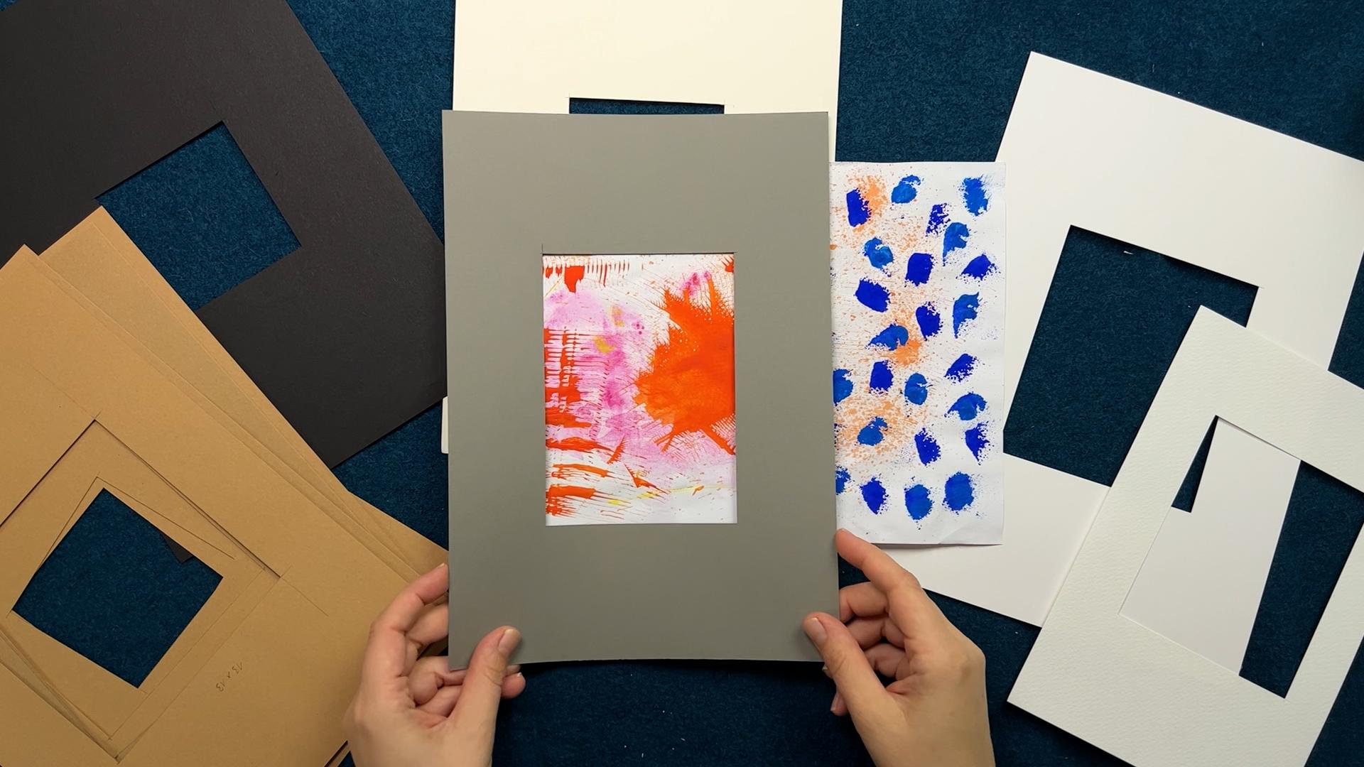
paper or cut board with a cut out resembling a net frame that you'd be
using to frame your artwork. It allows you to isolate and focus on specific
sections in your image, providing that framed
perspective and adding a calm border
to your selected area.
3. Try Standard Mount Sizes: If you're really thinking about having something to frame. The most affordable option
is to start working with standard mounts like
standard passport Du, that already have a cut out. Those are not very expensive. You could buy those,
but you could also research the
sizes and then cut the same size out of paper that you don't have
to buy it in advance. But you know, like when
you use your fuel finder, you will be able to
find a mat that will fit your section and also get an affordable
frame for that. Maybe you already have
a frame with a mat inside and then you could take that out and use
that as if you find, although I would recommend if
you want to have that size, I would measure it and
cut it from some paper because you wouldn't want to trace this because
it could get, like, dirty or get
fingerprints on it. But you could research those
sizes and then cut your own for like the
searching purpose.
4. Customize Your Viewfinders: If you don't want to stick to those available sizes because they just don't fit your vision. Because usually when you buy
a mat in this four format, you will get a pretty big cut out like this and just a
four centimeter frame. But maybe I want to
have like a frame that is that big and just have this little
image in the middle. Then you would obviously
have to make your own and then ordered mat or just use simple
cardboard to make your own. I have a lot of
them and I can try the different sizes and
see what I like the best.
5. Explore Unique Formats: For even more flexibility, You can cut two L
shaped paper pieces and you want to use a rather large sheet
of paper for that. Maybe even larger than the ones that I have
used right here, so that you are more
flexible on both ends. Now you can use those and slide them over your artwork to get
very different formats. You can get very
unusual formats. You can also go
from small things, look at it in square format, or how would it look if it would be more landscape formats? You're really flexible
with looking at your art and just finding
a section that you like.
6. Discover Different Framing Options: Now when you have found
a section that you like, you don't necessarily have
to put it under amount. Like you don't necessarily have to buy a
amount to frame it, but you could also cut
it out and put it on top of some paper
and then frame it. Or maybe if you want to
make some customized cards, you can just stick it
on top of this paper. You don't necessarily
need amount, but if you want to use amount, it's always a good idea to have. Like if you find the size
of your final cut out. Also have a second one that
is a little bit larger. It is recommended. Okay, This one is a
little bit larger but it's not completely aligned. You would want to have the cutout section centered
at the same space. But it doesn't matter so much. I can align it here
so that I have a bigger border
around my section. Now when I frame this, it actually looks good that way. Doing a frame like that,
just the second one on top, little bit of dimension. But actually what
I wanted to show you is that you can now, like you would keep this set
and remove the smaller one. Then you could take a pencil
and trace it and cut it out. When you frame something, you don't want to
have the same size as your cut out obviously, but you need to have
it a little bit overlapping and go
under your mat.
7. Start an Inspiration Book: Another thing is that
not all the sections that you may find in
your practice sheets will result in a grading card or an out that you want to hang. But maybe there is something
in it that you just want to keep and then you can
stick it in a sketch book. I have this little book
where I just stick in pieces of paper scraps that I had
left over from collage. Sometimes I add some marks and sometimes there was something
that I wanted to keep. I didn't want to throw it away. I cut it out and put it in here. Later on I refer to this, that's some new ideas. When I'm out of ideas,
I can look at it. And then I might get inspired by the pattern or the colors. And it will be there as your
self made inspiration board.
8. Create a Class Project: Your task is now to go and
research some standard sizes. If you're thinking about
framing something, you want to like research those sizes that are most
common in your country, whether it's in
centimeters or in inches. Then go ahead and
cut your own mounts. Or from cardboard
like card stock or thicker paper in the same sizes that if you decide to frame it, you can get them very
cost effectively. You need to use paper
that is opaque, that is not see through, so it has to be a
little bit thicker. You can use a variety of colors. Usually those mats also are available in a
couple of colors. The most common are obviously white and little
bit off white page. But you could also cut
those few finders in gray or black or
maybe those browns. Because it's fun if you have an artwork and you can try
those different colors, how it will change, how it will bring out
that artwork differently. Like how would it look
when I use white around? Or how would it look
when I use gray? Does it speak to the
colors that I use or not? This is a great way to do this. Now, I want to
challenge you to go ahead and look through your
drawers, your cupboard, wherever you put those papers, clean up your studio, clean up your work space, whatever laundry room,
wherever you paint. Go ahead and look for those hidden gems in your practice sheets and
unfinished artworks. I look forward to seeing
what you have found. Please go ahead and
post a class project so that I can take a look at all
the other students as well. If you like this, if
it was inspiring, please take the time
to leave a review. It's very helpful
if you do that. And it also helps other students find out if the class
is right for them. That's all I have for now. I hope to see you soon, maybe in another of my classes and have fun creating by now.
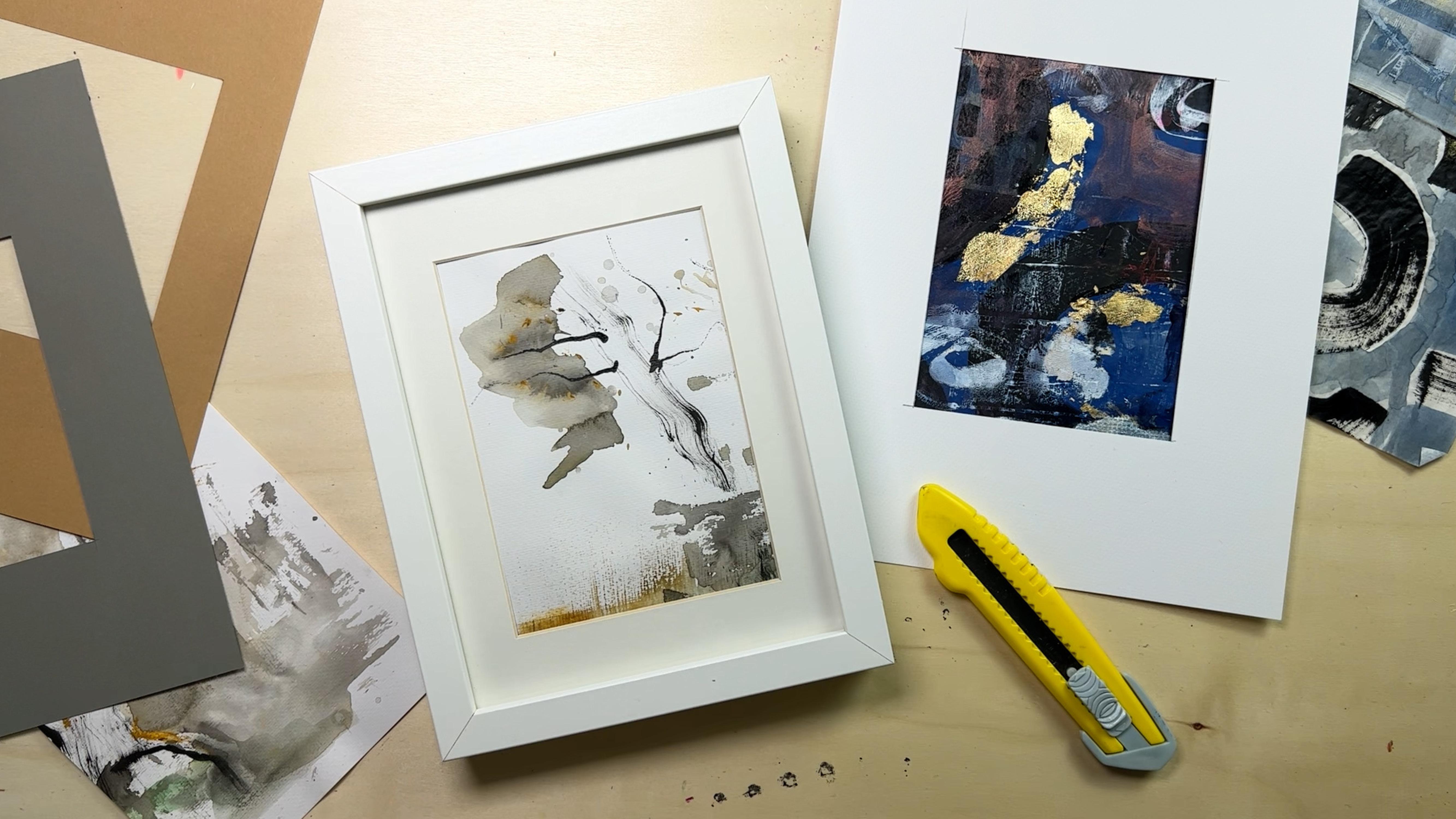
9. BONUS: From Sketch to Framed Artwork: In this bonus lesson, I will show you how I go from all my practice sheets
to the finished artwork, like to the framed one. I will let you listen
to my thoughts and just walk you
through my process. I have this old frame at
home that I want to use. I took the measurements of the mat and made
myself a few finder so that I don't get fingerprints
or anything on the mat. Let's just go ahead.
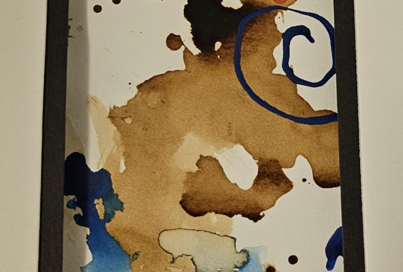
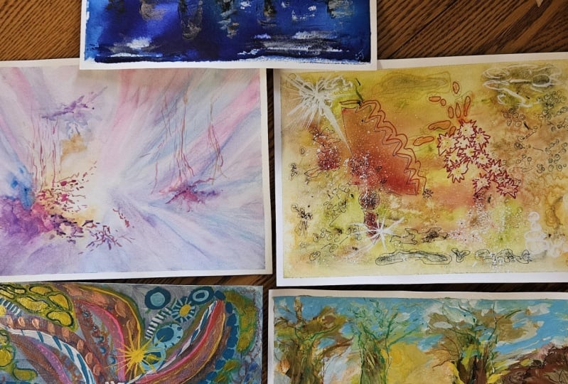
This is a scribble that I did during my life class. I think as a whole, it's not super interesting. I like this part, but this part is not
very interesting. The goal wasn't like to
create something finished, but to create
something interesting. Now I could go ahead and
look at it With my view, I can see interesting
compositions popping up. For example, I
like that there is this big shape and there
are these fine lines. It's very open, but on this
side it goes over the edge. You feel that there
is something more. This makes an image
very interesting. Let's take a look
at another one, this collage piece work example. Let's see, this is a little
bit shiny, probably. This wouldn't be a good example. Yeah. Would focus here
like this wouldn't be super interesting to
me because we have all these shapes that are
basically the same size. I would find this a
little bit interesting, like having this golden
thing on the bottom. And then having this pattern, this repetitive pattern here. And also this movement
through the whole piece. It has this diagonal
composition. I don't know if there's
anything in there. Let's see, it doesn't jump
anything at me right now. I don't like this piece a
lot, but not as a whole. I think here it's
not really fine. It really needs to be cropped. I think it would
look a lot better. But in this case, I wouldn't want to have
this with a white mat, at least not behind it. Maybe on top I would cut it, but then put it on
top of the mat. This will not go into the
closer consideration. I really love this one, but again, it's not
super exciting. For me, it's like it would be a very symmetrical
composition obviously. Yeah, I don't like
that too much, but it could work
for something else, and I really love that page. But when we have a fixed size, we want to find something
that really works well. This has a lot of movement, a lot of energy going on. See if it works better. This way, way, way. There's just a lot of things
going on for me right now. It's a little bit too much, it's a little bit
too repetitive. There's this arch
again and again, It can create rhythm, but it's really a little bit
too much all over the place. For me, this one is too small. Let's have a little at this one that could be interesting. But again, for this
size, it's too much. There is too much
of the same thing. Like it's very pattern. Yeah. You can also
turn to the side. When I have something blue
at the bottom, I would. Love to have it again
repeated somewhere else that you can use the
color to guide the eye around. But here I have the blue
chest at the bottom. That doesn't work
for me so well. It would work better
like that way, but then I would want to
have something red here. Again, this is really not the right size ratio
for this piece here, I have a larger one
that I know I've before done a section with
a square that very well, so I don't think
I will cut it up. Basically what we have as
a choice is now this one, which is pretty dark, but it would look
nice in this frame. This one, honestly, although I have a little
bit of white here, which makes this fit
better to the white mat, I think surprisingly I didn't expect that I
like this one the best. It's very calm, it's reduced. And I really love that. That's the section that I want
to use for my final piece. Now, if I had, if you
find that it would be a little bit larger I
could use to trace it. In this case, I haven't. I really want to just
take a look at the image. I don't need like to
cut it very exactly. I just want to have
enough overlap. I don't want to cut
it up completely. It's also not necessary for
the frame because there is some room around now, I need my cutting math. Now, let's just cut
this up a little bit. I will use the grid and
just align it here on the grid and cut through it. I start to like this,
it's lying there. Might do this. After all, you haven't tried this section because
now I have big shape here. If you don't consider
those separate ones, you have one big
shape or medium. And here you have a small, it's something that I
like to use a in my art. Now we're doing
this one, I didn't expect this loose sheets
to be like framed ever, but those are sometimes the best ones because
they are so spontaneous. Now, I think I'm just going to try moving this
around a little bit, but what I'm not doing is having something exactly at the edge of something like here. The shape really
touches the frame. You would want to go
out of the frame, but then in this case
we would have line here which would also draw
the eye immensively. We don't want that, we want to stay inside the frame also. This is a great contrast to have something that
doesn't go over the edge, and here we have things
that go over the edge. I also want to be a little
bit higher with this. I think I'm fine. I don't want to move
it around anymore. I will get some washing tape
and here it to the frame. Then I'll clean the frame. So now we can put
it inside the frame and take a look at how looks, and it looks really nice. This would be a second option
that I also like after all, but for now, I really
love this one. Here we've got the final piece. I think it's really minimal
and really lovely to look at. It was just a sketch, it was very loose
and spontaneous. And look at how nice it looks.
 Cornelia Zelinka-Bodis, Mixed Media Artist