Break Your Color Rut in Minutes – The Kindergarten Approach
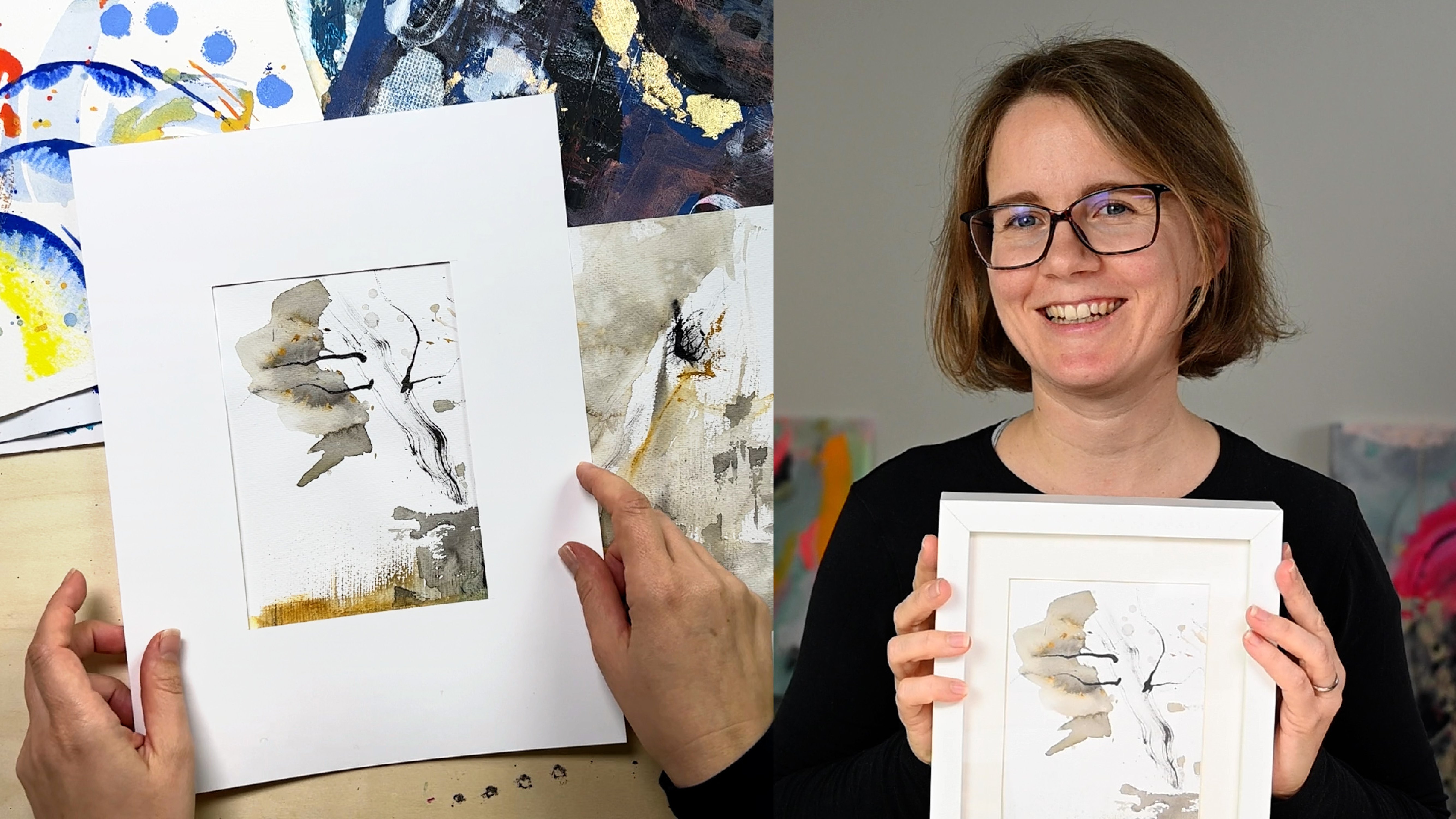
 Cornelia Zelinka-Bodis, Mixed Media Artist
Watch this class and thousands more
Watch this class and thousands more
Lessons in This Class
-
-
1.
Introduction
1:03
-
2.
Your Class Project
0:43
-
3.
The Materials You’ll Need
0:49
-
4.
Start to Play With Two Colors
6:36
-
5.
Add a Third Color
2:31
-
6.
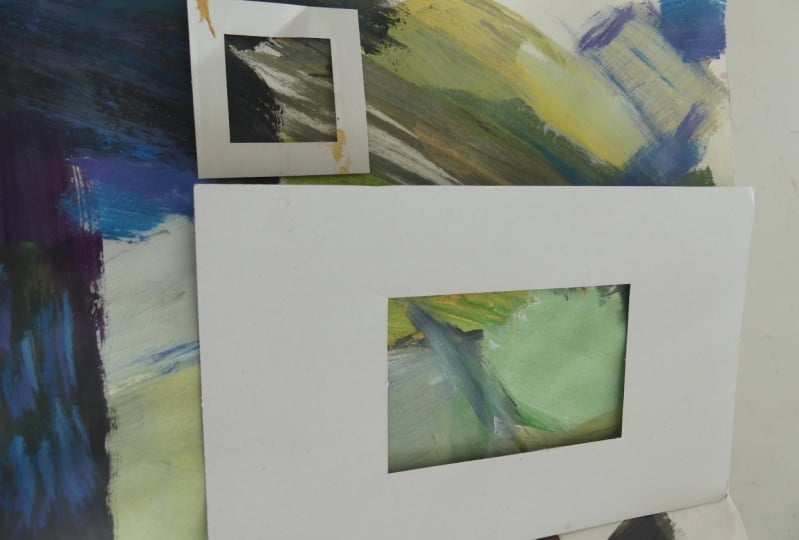
Find New Colors With a Viewfinder
4:28
-
7.
Creating a Palette & Final Thoughts
3:38
-
-
- --
- Beginner level
- Intermediate level
- Advanced level
- All levels
Community Generated
The level is determined by a majority opinion of students who have reviewed this class. The teacher's recommendation is shown until at least 5 student responses are collected.
100
Students
4
Projects
About This Class
Are you stuck using the same color palettes over and over? Always reaching for familiar paint mixes without exploring new possibilities? This class is designed to break you out of your color rut and open up a world of fresh, cohesive color combinations, using a fun, playful approach inspired by the carefree freedom we can see in kindergarten children!
In this hands-on class, you’ll follow an intuitive process to mix and discover new colors without overthinking. We’ll be using just a few paints, simple tools, and a bit of experimentation to create unique color palettes that inspire new directions in your work.
What You’ll Learn:
- How working with a limited palette of up to five colors, including black and white, can spark your creativity.
- The Kindergarten Approach, e.g. embracing playfulness in color mixing without rigid formulas or expectations.
- To use a viewfinder helps to isolate your favorite colors and color combinations.
- To create a color library for future reference.
- To develop a more intuitive approach to selecting and combining colors in your art.
Why Take This Class?
This method helps you break free from color habits and discover exciting new possibilities in your work. Whether you're an abstract painter, mixed media artist, or simply looking to refresh your creative process, this class will give you the tools to approach color with more confidence and curiosity.
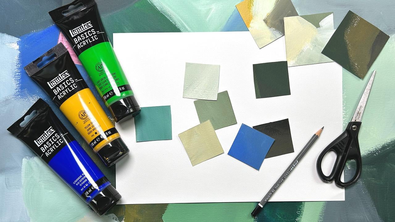
Materials You’ll Need:
- A selection of five paints (including black and white)
- A large sheet of paper (mixed media paper recommended)
- Paintbrushes
- A viewfinder (a small piece of paper with a cut-out window)
By the end of this class, you’ll have a unique collection of new color swatches, a fresh perspective on color mixing, and a fun exercise you can revisit whenever you need inspiration. Get ready to play, explore, and discover colors you never knew you loved!
Meet Your Teacher

Hi! I'm Cornelia, an abstract artist based in Austria. After over 20 years of experience as an art director and graphic designer in the advertising industry, I am now a full-time visual artist and educator. My passion lies in exploring mixed media techniques, primarily using acrylics, charcoal, pencil, oil pastels, and collage elements.
In my classes, I offer a diverse range of subjects including mark making, acrylic painting, mixed media, and collage. While most of my classes are held in English, I also offer two courses in German, my native language. My teaching style is focused on making art enjoyable and accessible to everyone, regardless of their skill level.
If you're curious about my latest projects and creative process, I invite you to follow me on Instagra... See full profile
Hands-on Class Project
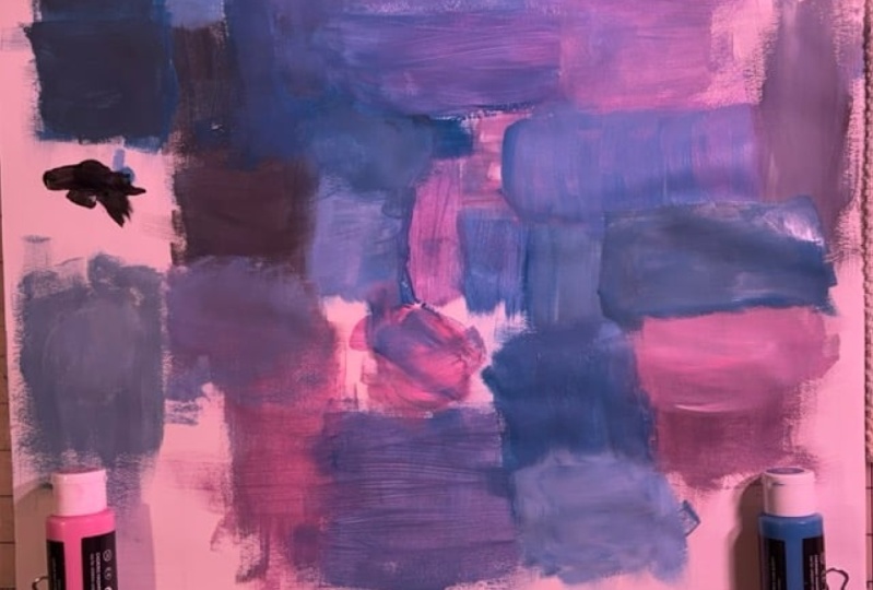
For your class project, create your own color mixing sheet! This simple yet powerful exercise will help you break out of your usual color choices and discover exciting new combinations.
How Much Time Do You Need?
You’ll only need about 15–20 minutes to complete your mixing sheet, but feel free to take more time exploring different variations. The more you experiment, the more interesting results you’ll get!
Here’s How to Get Started:
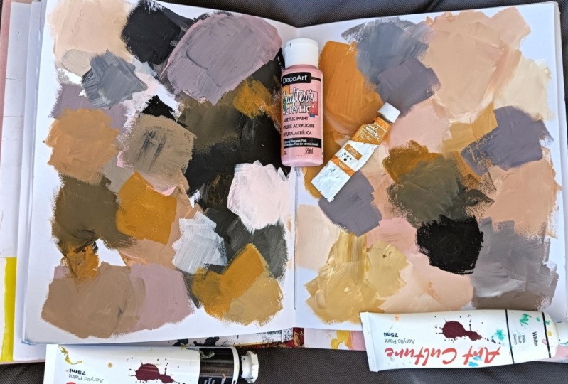
1. Create Your Color Mixing Sheet:
- Choose two different hues along with white and black to work with.
- Using a large sheet of paper, start mixing to create a range of tints (by adding white), tones (by adding gray), and shades (by adding black) from your chosen colors.
- Keep the process loose and playful – this is all about exploration!
2. Document & Share Your Progress:
- Once your sheet is complete, take a picture and upload it to the class project section.
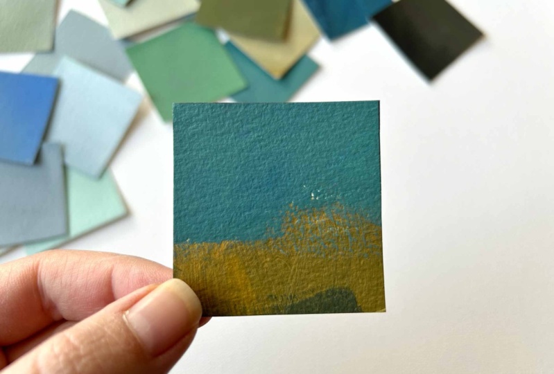
- If you’d like to take it further, use a viewfinder to cut out swatches of your favorite color combinations and arrange them into a small palette.
- Share any insights you discovered while mixing – did any unexpected colors surprise you?
3. Bonus Step: Create a Personal Color Library!
- Glue or tape your swatches into a sketchbook for future inspiration.
- Make notes on how each color was mixed.
- Use one of your new palettes in your next painting!
Get Feedback:
If you have any questions or want feedback on your color mixes, feel free to share your progress in the class project section or discussions – I’d love to help!
Let’s Connect!
If you share your project on social media, tag me @cornelia_zb_design so I can see and celebrate your work!
I can’t wait to see the colors you discover – happy mixing!
– Cornelia –
Class Ratings
Why Join Skillshare?
Take award-winning Skillshare Original Classes
Each class has short lessons, hands-on projects
Your membership supports Skillshare teachers
Learn From Anywhere
Take classes on the go with the Skillshare app. Stream or download to watch on the plane, the subway, or wherever you learn best.