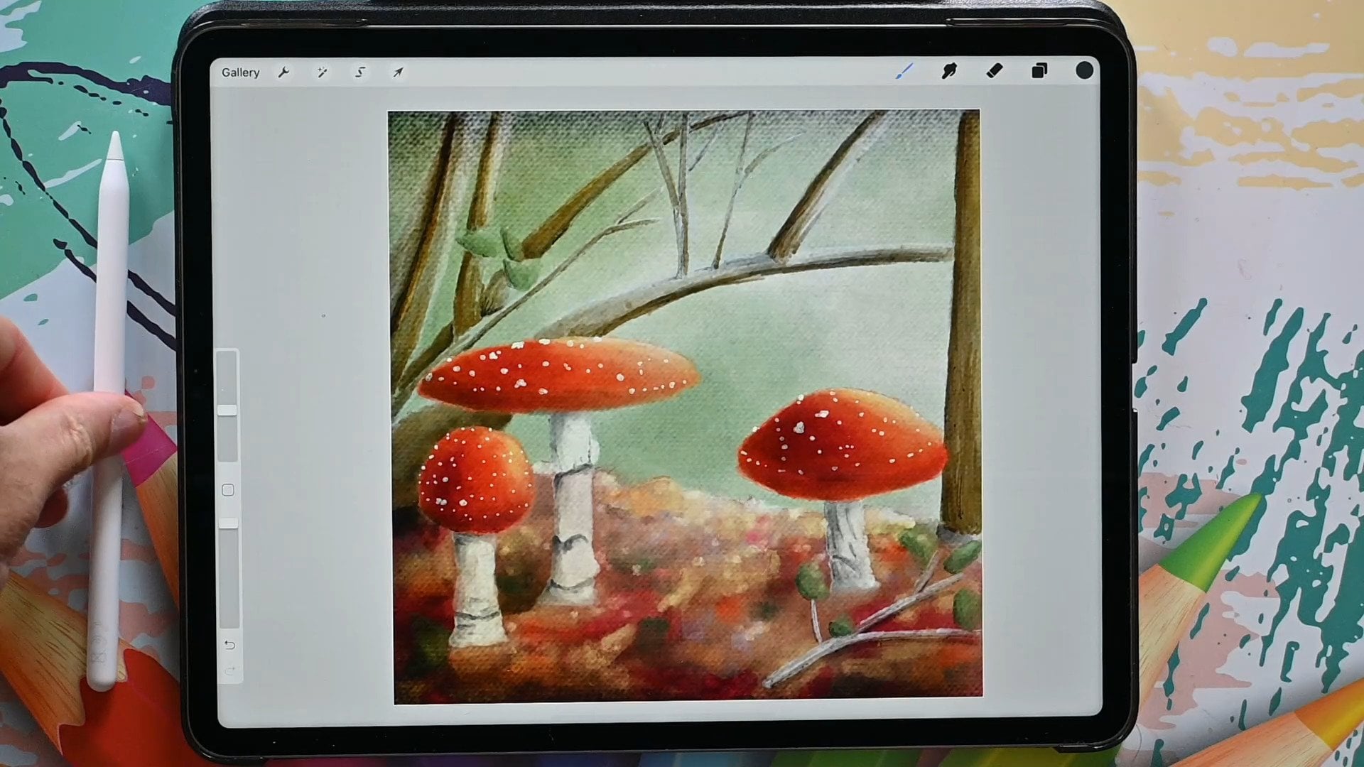
Transcripts
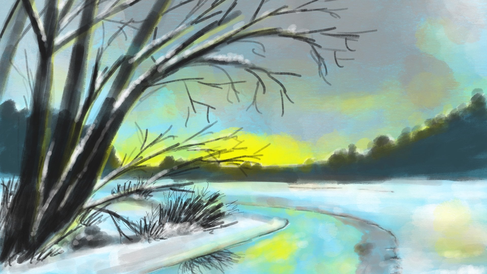
1. Introduction: With Christmas
around the corner, this is a great time to paint a nativity scene in Procreate. A winner just going
to paint. It is seen. What we're gonna do,
something special with it. We're gonna do some contrast
painting in procreate. Now that sounds
interesting, doesn't it? Now contrast painting
is a great way to do something special
with your painting. And we're going to take
you step-by-step through his whole protests and show you how to accomplish
this in Procreate. Now this will not only be applicable to the
painting we're doing, but you can use this for many other paintings or
illustrations and drawings. Once you gain this skill, you can apply it to
so many subjects. By using contrast painting, you don't have to worry about complicated ways to accomplish
depth to your scene. No, it's a way to quickly add
some depth to your scene. Now this class not only helps
you to gain these skills, I've also supplied
some materials to get you going right away. There's a sketch as a
canvas because some colors, and of course, some brushes
to get oil painting. While we're gonna do this with oil paint brushes in Procreate, you can apply this technique to your own style and the favorite brushes
you have in Procreate. But I'm just going to
demonstrate it with the oil paint brushes, supplies. And to be honest, oil painting in
procreate is really fun. And it's not a widely
spread technique yet. So on top of learning
how to contrast paint, you might gain some oil painting
skills in Procreate to. Now contrast painting is
already something special, but we're gonna do
something even more special with it in this class. But I'm not going to
refill that secret in this introduction to
discover that you have to go to the
next lesson and start contrast painting in
procreate with me.
2. Using the Supplies: Let's first of all start with what you're going to
need for this class. Now, obviously, you're
going to need an iPad with Procreate on it,
the Apple pencil. And on top of that, I've
supply some brushes, a canvas with a sketch
in it, color palette, and also the finished
picture as a reference. Now let me show
you how to get all of this into Procreate. Now if you know how
to download from Skillshare and install of this and how to do
reference picture. Then I would say just move
right away to the next lesson. If not, then stick
with me and I'll show you to get all of the supplies you're going
to need to go to this class. And I am in Safari, and that's the best way to
work to go to the browser and Safari and go to the class. Now here you see the class. Here you see these
taps about refused discussion and you
need to have this one, select this one, the
project and resources. And if you scroll a
little bit down here, this thing pops up. I gotta get rid of that. You see some resources
for resources, contrast, nifty painting, procreate
that the canvas and sketch. The oil brush set, the Nativity painting palette, and then the painting itself. That's what you see here. All right. I'm going to start
with the sketch. I'm going to bring that into Procreate if you press on it, it asks you to download that. Yes. I'm going to say
yes, please download it. Now it's downloading and you
see it here, this arrow. And when it just blinks
a little bit, it's done. You press on it and I see
the first download here. Now if I click on the Download, It's going to import this
right way into Procreate. Now you see a
different painting. This is from another class. Go back to the gallery and
the first painting you see in the gallery is the contrast
nativity painting. That is this one, and
that's the one we need. And we're going to
ignore this now for now, and I'm going back to
Safari to the class. And the next thing I'm
going to bring in is the AB oil sets
on a press on it. And this asks me to download it. Yes, I do want to download it. I'm letting it downloads
and now it blinked. It's ready. And I'm seeing this at the first the oil brush set and I'm going to tap on it and it
brings me to the File Explorer. Now somewhere here
is that file and the easiest thing to do
is to click on reasons. And it brings up the ones
you've downloaded last. And here I see that sets, I'm going to click on it and it's just automatically
importing into procreate and
how to find it. You just press on
it. And the top one is that new set with brushes. Okay, so we've got
the brushes too. Next thing is the palette. Let's go back to Safari, to the Skillshare class
and just click on the AV contrast native
painting this file here. Click on it. Then it's asked me if
I want to download it. Yes, Sure, I do want to download it and it
tells me it's ready. As with the other
one, tap on it, it brings me to the File
Explorer just somewhere. Click on reasons. And there is my ABB contrast
nativity at your swatches. It is clicking on it and it just opens this automatically
in Procreate. And click on the color
and how to find it. You have to go to the swatches. So if you're in your disk, you need to go to the pellets. And right at the bottom, there should be a new one called ABB contrast
nativity painting. Click on the three dots
and say Set as Default. There we go. And if I go back to my disk, there is the new one. All right, We're almost there. So we're going back to Safari and going
back to the class. And the last one
we're going to do is the contrast
nativity painting. We're going to click on it. And then it's asked
me what I want to do. Do I want to download
it or do I want a few? It's now in this
case, let me FUD. So we've cut this one and now the easiest thing to do
is to take your finger, press on it, hold it for a while and you
get some options. And I want to add it to
photos, add to photos. And you can close this
window if you want to. Now, I'm going back to Procreate and I want
this as a reference. And what you're
gonna do for that, you click on this wrench, you go to Canvas. And there you see reference. I'm going to click
on the reference. And what it does now is it takes this whole picture we're
making this painting. But I don't want that. I want an image. So I'm
clicking on an image. I'm going to say import image
brings me to the library. And the first one should be this painting, the
painting finished. And you can use this
as a reference. Now this is way too
large of course. So what you can do,
you can create it's a smallest Xuan the same as in Procreate on the reference. You can just make it a small reference and then
do it like that. Move it a little bit and there
you got a nice reference. And now we can start painting. If you don't want the
reference, of course, ignore this part and
if it is in the way, you can just switch it off. And if you need it again, you can just bring it back. It remembers the last
thing you've done. All right. Okay. Now, that's it. We've got everything set up
now and we're ready to go. So in the next lesson, we're going to start to paint beautiful activity,
contrast, painting.
3. The Background & Foreground: We've got everything
we need setup now. So now we can start painting. We're gonna do some contrast
painting in procreate. And it sounds interesting, doesn't it will get clear when we go
through these lessons. Actually, we're
gonna do a little bit more than
conscious painting. We're going to go
contrasts painting, monochromatic colors. Now, that's a
mouthful, isn't it? Now a lot of us use contrast
in real-life clothing. For example, when you decorate your house or
when you have flowers, you're going to
add some contrast. You're going to
offset one color with another color or various colors. But in this class, we're going to use
monochromatic colors. And that means we're
actually only going to use one color with a lot
of shades and tints. Now chroma is just a Greek
word that just means color. Mono means one color. Now, I'm not going to do
a lot of theory on this. I'm just going to show
you how we're going to do that and how this all works. All right, Let's
go to Procreate. So we've got our documents
and let's open the document. And now right away
you see a huge noticed there time-lapse
recordings of. If you wanna go
time-lapse recording, we need to switch it or not. It's very simple. You hit that wrench, you go to video and you
just slide this two on. Now it will be
time-lapse recording. Now the file is going to
get a lot larger now, but it will record
everything we're doing. If you don't want it,
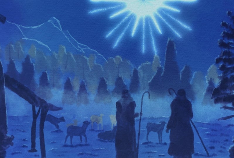
simply leave it off. So that out of the way, I can hide that layer. So I've got the sketch to
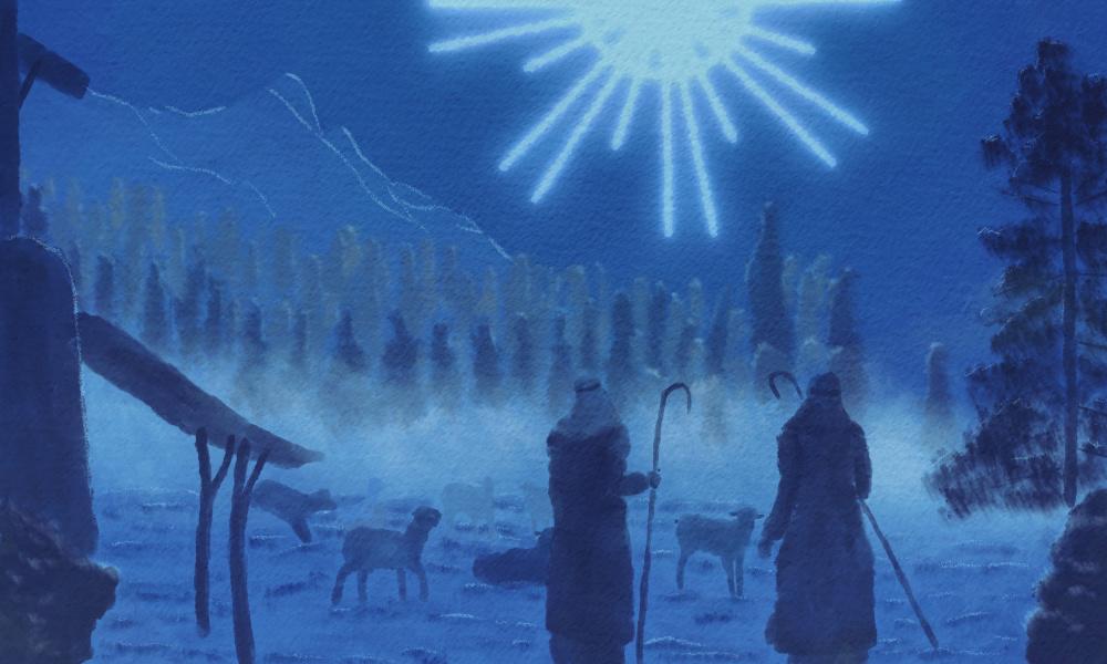
nativity scene is set up. I got some shepherd, some sheep. I got a little housing on here. And I got later on, we're going to create a ray
of light that's coming, that catch the attention
of the shepherds. And not only of the shepherds, but also offer fewer
of this painting. We got a color
palette and that is ABB contrast nativity painting. Now, as you can see
in this color pellet, there's only blues and
tints and shades of blue. This is basically
the basic color. And from there, by adding white, you get a tint that is
just a lighter color. And by adding black, do we agree of black, you're going to add shapes,
and that's called shapes. You get a darker color. Now in real oil painting, actually you do that
really literally. You just take your
blue and you add some white to get
the tint you want. And if you want to go darker, you add black to
get a dark tint. You can also add white and
black at the same time, and then you get another tongue, does what's called a town. Okay, Well, going
back to procreate, the first thing we're gonna do here is to create a background. Now we're not going to
paint the background. We're going to make it
ourselves really easy. And you see here a layer
called background. This is the one
we're going to use. Now what we might do first is to secure that we're not going
to paint on the sketch. And what you're gonna do
is tap on the sketch, slide it over and say, look, we're going to
keep this sketch on top. And this layer,
I'm going to lock 2 and the Canvas for now, I'm gonna lock as well. So I can't accidentally
paint on that. The background color. Now
I want just a blue color, just one blue color. So to get that color, I'm going to hit that color
and I'm going to pick the third color
here from the left. So 123, that third color. And I'm gonna select it. So I'm going to
select that column, drag it over here, and just let go and you get
that whole layer shells. Now up here you see color drop threshold that
is now a 97 percent. You can slide it over to
the left, to the right. If yours isn't 0, you may want to put it a
little bit higher, although we're filling
a whole scene. So it doesn't matter,
but if we will feel little parts of the
scene that we have drawn him than the threshold is
going to influence that. So but for this one, it doesn't matter now
I've got it on 50 percent and should still work fine. So filling the whole layer
background with one column. The next step we're gonna
do on top of this layer, we're going to add a new layer and we're going to
rename that layer. And renaming is by
tapping on the layer. We're going to say Rename. And what we're gonna
do. First of all, we're going to paint
our foreground. Now that we have a
background color, we're going to paint
our foreground. So I'm calling this
layer foreground. All right, on this layer, I'm going to start
just painting, and I'm going to paint
these shepherds. And what I'm going to do this is I'm going to pick
my round brush. I'm gonna go here. You need to find the
ABB old brushes. You're going to find the
round brush right there, all round brush. Tap on it. And what I'm gonna do is I'm leaving this
to a 100 percent. The size varies a
little bit of course, because we're going to get
depends on the figures. We're going to paint it
with this color and color. These. I'm going to
paint the shepherds. And we're going to
paint this bush here, this bush here,
and the building. All right, now I need to pick
a color that is of course different from the
background color. And what I want is
because the light comes from in front of the shepherds. So it would mean that the
light will be on their faces, but we're not seeing the faces. So the back of this, all of this would
be pretty dark. So we're going to pick
quite a dark color. And we're going to
pick this color there. That will be our color. And now the size, I'm just going to
check, well go for 4%. Let's see that status. Good enough. Let's start with the shepherds. And we're just going
to paint in and pressing relatively hard
for this are not hard. I'm not doing this
lightly and press, pressing a little bit. And I'm just painting
in this first Shepherd. And just roughly, and
let's see around there. And if I have painted
in the major parts, I'm going to go slightly
smaller for its hands. And we're not going to do a
lot of accurate painting. We're just going
to just paint it. Because this is more
or less silhouette of a figure, not his. You won't see many
details anyway. Now I've got this
now I don't know. I want to smooth this
out a little bit. So I'm going to put
this brush on 4%. And now lightly, I'm just
going to paint over it. And with that, I'm going to
smooth this a little bit. All right, That's that
one thing I wanna do. I wanna switch off that layer, lay you go Now I
can see it better. All right, now I've got
this first shepherd. Now I see I went outside
of my lines a little bit, so I'm going to correct that. And with that, I'm gonna do
the eraser and 40 eraser. I have an airbrushing. Here's a medium heart airbrush. You could do soft airbrush. And I'm just erasing that part. Now if you don't go
outside of the lines, then you don't have to erase. Now I do want a little bit
of contrast in the shepherd. And we're going to go
back to the round brush. I'm gonna go for 2%. And it's, had been here
that's too large to 1%. Then I'm going to paint in his head band,
again, bit stronger. And what I want to hear, I want this to be
darker than the rest. And up here, I'm doing hardly any pressure so that I can
get a little bit of contrast. I'm gonna do that here too. His arm, the ego, and with this arm I need to
do the same around the edge. There you go. Okay. And
at the bottom here, I do want to do the same, so I'm pressing a
little bit harder to get that dark color. And then I'm relieving
the pressure and get a nice transition
into the rest of the color. Okay. That's the
first shepherds. Now. A go I need to do his staff. Sorry. Say it again. I need to do his rod. And then I'm painting that into. And here too. And there we are. That will be the first shepherd. Now for the second ship it, I'm going back to 4%. Painting in him,
painting human roughly. They are little bit around the edge. And now I'm doing the same, but hardly any pressure, just smoothing it a little
bit there too, right? And now I'm going to 2%. And going again, yeah, right? And registers will do that
darker color right away. And as you can see
by smoothing it, what we did if you smooth
the color out lightly. It also gets you a little
bit of a lighter tone. Or really, we should
say a lighter shade him. The hand there. Let's do still. Nice and dark. All
right, Let's see. Needs some color there. Some color there around
this edge, a little bit. Around this edge, slightly. Now there I went outside. Little bit too much. All right. Here are a little bit
of a color hands here. I obviously missed
some here now. And I'm going to
darken this edge here. My callback to
ground free percent. That goes quicker and
then smoothing it out. Now here I've got a
contrast already. This is lighter. So what I'm gonna do is
instead of darkening this, I'm Madison, well, darken that. And instead of doing his arm, I'm going to go around his clothes and darken
those around that edge. And that should give
the same effects. Let's move this a
little bit nicer. Little bit smaller
brush that we go. All right, and it has happened. I want to do again 1%. And that should be our shepherd. Now is rot. And then we go and that we are. Alright, well that's the
shepherds that step one. The next thing,
doing these bushes and doing the building.
Let's do that. I'm going to go back to 4%, around 4% painting in
this main building first. And she can see that's
going quite rough. I'm doing the push with
it too right away. And today. And there we go. My needs, something
smaller in a second. But let's do this part 2. Now I'm lowering
it to 22 percent. Studios. Had just two. And I'm just basically
painting the whole thing. Alright, good. Painting that part. All right, I'm not going to do these now. I'm gonna do this in a minute. One side done these parts. All right. I think I've got the
building and now I'm gonna just go back to about 3%. And with a light pressure, I'm going to even this
out a little bit. Going a bit over here two. That gives me also a
slightly lighter shade, which I want to make use of. Now appear. Let's erase
something. All right, Now I'm going to
take a look at this. Here. I want to do this here and
this bush, I want darker. So I'm going to go with
another layer over this bush. By pressing harder, I'm
bringing in a bit of a darker shades, Degas. Now, that is nice. Now I'm going to do
these poles here. And we're going to go to 2%. And we're gonna make sure that these poles will be darker. Then going to 100 percent here. Then what I've painted
on the top there. All right. Same here. So adding a little bit
of pressure there. All right, I'm going
to 2% back again. That saves some time. There we go. Put up my sleeve a little bit
because my thoughts on this, making some noise. All right, and now the last
thing I gotta do here, going to the one-percent
pay in this painting, in this part, payer
painting this part. And there we go. All right, now, that is pretty much dead. The last thing we're doing now, this here is Bush. I'm going back to 4%. And really roughly painting
that in de, you go. Alright, now, then that
will be our first step. Let's get rid of the sketch
and look at what we've got. We definitely have some
nice shapes going on. We've got a building,
we've cut the bush in front of it, and that's it. Now later on, we're going
to add some light to this. We're going to add a little
bit of light effects. So that's some of the parts will get,
you see them better. They distinguished
themselves from other parts. We're going to do
that at the end, but for now we'll just
keep on painting. But this part is done. We've done the shepherds, we've done the foreground
colors and they're getting the most contrast,
the darker scholars. And when we move into the back, we're going to play a little
bit with lighter colors, alternating some darks and light colors to get
some layers going on and get some nice shading effect and get depth in our painting. All right, This first steps in contrast painting
in procreate. In the next lesson,
we're going to do some trees and mountains, are doing that large tree
and do the mountains, okay? If you followed
along and you can move right away to
the next lesson. If you haven't, you may want
to do this at any rate. I'll see you in the next lesson.
4. Mountains & Tree: We've got some shepherds now
where they're standing in a really empty space there just looking into nothingness, right? We don't want that. We need to add something. We're going to
paint the mountains and we're going to
paint that large tree. In this lesson, we're
continuing with the contrast. We're continuing with the
monochromatic colors. Adding our tins,
adding our shapes. And just building this scene
up until we've got a nice, Great, Well, what
was it? Painting? A Christmas card. Something nice. Alright, we're gonna continue. We're going to add a new layer
on top of the foreground. And we're going to call that, surprisingly, let's
start with D. What should we do? The tree? Let's start with the tree. We're gonna do that large tree, and there you go, a
new layer called tree. I gotta get my sketch back. Otherwise, I don't
know what I'm doing. And we want to paint
this tree here. Now, we're going to start, of course, with the trunk. And what we're gonna do is we're gonna sticking
for this one, we stick to the round brush, which Toccata, the round brush. The first one we're gonna
do is we're going to add a layer on top of
the foreground. So make sure the
foreground is like that. Hit the Plus and
rename this to tree. We're going to do the 3 first. So there's the tree. For the tree we're
going to stick to the same color we have. So that is that dark
color down here, not the ducks corridor,
but this color there. We're also going to stick
to the round brush, but we need a sketch back
to make sure that we see the tree was going
to start with the trunk. So for that, I'm probably
have to go to about 2%. And let's paint in the
trunk that would be too large, Calico, bit lower. And that is better. All right. And I'm painting in that tree. And we're starting
with that truck. Now this one, I can do messy. I don't need to make smudge
this nicely and evenly. Let's do some of these
branches to go to 1%. And just add some lines
like that for branches. Rights so that we get
that tree effect. Here's a nice one. And let's bring them a
bit more down than what it is in the drawing. So I'm going to go this way. One we want to go a little
bit down here, here too. They go adding some
of these branches. And the next step
we're gonna do, we're going to switch brushes. We're going to go to
the smudge brush. And we're going to put
it on, let's say 7%. Let's see if 7% works. And we're going to add the needles and
we're gonna do just paint this in like this
really quick and rough and just get that
impression of a tree. Go down here. I might even go a
little bit Docker, docker, going to 10%. And as you can see, I'm not pressing hard, hard for this reasonably, but not that hard. And there you go. Alright, and maybe want to have
a little bit here. And that's good enough for
the tree, that a tree is. Next step, we're going to
do the mountains for that. We're going to add a layer
above the background color. So new layer, I'm going
to call it mountains, so that I know where
everything is. There it goes mountain
see typeset for me. What we're going to
use these mountains, these mountains are
far away in the back. We're gonna give
them a light color, and that is what creates depth. Now, you could do this two ways. You could do your
foreground really light, and when you move back, it gets really dark. But in real life, if we look far away, things tend to get more hazy and lighter and less
have less contrast. So it goes lighter and that's the principal would want
to do right here two. And by adding a lighter color, we even creating a contrast
between the sky that is dark because the scenes at
night and the mountains, and the rest of course
to k, Let's do that. The mountains are here. And what we're
gonna do for that, we're going to pick
a different color. And for that we're going
to pick this color here. The second column,
the middle row, the second column from the left. That's what I want
on my mountains. I also want a different brush, so let's go to the brushes. I want a flat brush for that. I don't want that round brush. I wanna do a flat
brush and really create these mountains
relatively quick. And let's see, about
11 percent that is on I think I'm sticking
to the 11 percent. Make sure I'm on
the right layer. Oh, I haven't renamed my layer. Something went wrong. All right, Do that again. Mountains, the idea probably
hit Undo per excellence. And let's go paint
this mountain in numbers, going right there. And I'm painting actually
the whole thing. And she can see I'm doing
that really roughly. Now the mountain
doesn't stop there, it just goes on a
little bit like there. And there you go. And now you can see right away, see we're creating a contrast
between the shepherds, the background,
and the mountain. And we need some more up here, of course, there you go. Make sure painters in
nicely with the big brush. Alright, good. And now I'm going to
lower the brush 3%. And I want this. Now, this doesn't need
to be really accurate. It's okay if you go a little
bit outside the lines. Not too much as I do here. Later on with our lights. We're going to bring in some of the differences between
all the mountain parts as a mountain in the back
mountain and the front. We'll do that later on. All right, good. And we've got that. Now look at that soup. You get a nice contrast
between the back, which is a bit darker,
the foreground, which is really dark in
the mountains of course, which are far away. And they're a bit light. Alright? And that's it. But does not it. That's
it for this lesson. The tree and the
mountains are there. The shepherds are there. Next up. Let's do
something about the trees. There's more trees
there in the back, so we're going to paint
them till next lesson. Alright, do this one, and I'll see you in
the next lesson.
5. The Tree Line: We're getting a
little scene. Yes. We're also making a scene
while not in a negative way, in a positive way. But we need more. We need some elements that shows that there is a landscape. Now we've just got a mountain, we've got some shepherds. And now there's more,
there's some trees. We're going to add these trees. For these trees, we need
again, some contrast. We need to make sure that the trees offset
of the mountain, but not get as dark
as the shepherds. So we're putting them
somewhere in-between in color to create a
little bit of contrast. And automatically by doing
that, creating some depth. And even in the
trees, of course, some trees are in the front, some trees are in the back. So we're even going to play
a little bit of shades and tints to make sure
you get the idea of even some depth in
the trees that you look into a bit of a forest instead
of just a row of trees. All right, let's do that. For that, of course
we're going to need a new layer and we needed in front
of the mountains, so above the mountains. So I'm adding a new layer. I'm calling this one trees. And there is our new layer. Now, what we're gonna do, we're gonna paint in
the trunks first. And then we're going to
paint in the foliage. Now for the trunks, we're going to go back to the
round brush for the column. We're going to look
at the column. We're going to use
these columns here. So in the middle,
in the middle row, these three colors we're
going to use on these trees. Now for the trunks, what we're gonna do first, we're going to take
the middle color, that color, the third
K12 free third color. Let's do that. I want a brush on a
100 percent and 1%. And Let's check. Yeah, go see it's a bit, can't see it that much, but it definitely
something is happening. All right, we'll just keep on going with this worth my sketch. There you go. Now. So you will see
it a little bit, but not as good. I'm just painting in trucks. And once we're going
to hide the sketch, each trunks will
definitely appear. All right. There's
another trunk. There. There was a trunk. They are now that one we can
see better because it didn't go exactly on the line. There's one. And we
need that one too. There you go. Here's
another trunk. The trunk there too. I want some more trunks. Let me get some here. Some of their sum
in France here, I'm just adding a couple more than that are in the picture. One back there and I
want one there too. All right. Well,
that's our trunks. Let's do one more
than that one there. Alright, good. We've got our trumps now. Now we need our branches
and the foliage. But what we're gonna do is
for that we're going to go back to that smudge brush. And we've got a pretty
large Now I think I might go to 6% and play with
that a little bit. So what I'm gonna do, I'm
gonna start with this front, once the front trees. And for that, I need a
bit of a darker color. So I'm going back to my
colors and I've got this one, so now I want that one. So the second color,
the darker color, and I'm just going
to paint some of these trees that
are in the front. And there we go. And what I'm gonna
do is I'm going to shape them like spruces, a little bit shaped like that. Right? All right. Some of these trees here, I need that one. The ones in the front so that the ones in the front are
the ones that are down. So not the ones that are up. These are in the back, back. This is in the back. This is definitely
still in the front. And we may want to extend
them a little bit. This one is definitely
here in the front, this one to that one. And this one we're going
to have in the front too. All right. That would be the first
trees in the front, some large ones, small ones. Then we're going to go
now to a lighter color. And we're going to
pick this color here. And we're going to
just do the bag trees. And we're going to get now
some interesting contrast. All right. Make sure I'm not over
painting these front trees. I want one in the back there. This one here is in the back. And they go and
we're going to fill up that tree a little bit here, make it a little bit larger. And there we go. So
that is that for this. Or I might want to do a
tree in here to care. I've got that. I'll just put
some trees behind here too. Let's add a couple of trees
here to, there we go. All right, and now we get
a little bit of a forest. We're going to hide the sketch. And Stacy, we've got this sink and now we get the impression of trees. That's all we want. We don't want detailed trees, we just want an
impression of trees. Now what we can do now, we could do a third
color in here. Let's do that. Let's go. We've got these colors. We're going to see
if we can find a color that is
bit lighter than, different than the,
this column might work. Let's pick this color here. That second column down there. Let's see how that works. And fill up some of
these parts here. Yes, that would work
at a third layer. Just as if there's more
trees in the back. And that is just as you can see on some of
these parts there, see, now we're adding as if
there are some more trees. Now here I want some more trees going on
the song Going back to that fourth column
from the right. And I definitely want some
more going on here, right? All right. And now
I'm getting the idea. There is something going on. I'm going back to
my darker color. And I just want a tree there. I'm just going to fit up some
of these spaces here with a little bit of
impression of trees. I do that there too. All right, that's good. And now here too, we've got a forest, right? Okay. And that's not the
only step we're gonna do in this lesson. We're going to add some
haste to now right away. So now we have our
general trees. So we've got a nice tree line in the back looking like a forest. The next thing we're gonna do is add a haze k. Let's do that. We're going to add this
haze and that creates even more contrast
between these trees, the front and the back. And that creates a nice, we're going to just
create a nice line here so that you don't
see all this roughness. But it's just like there
is a haze on the on the ground which I'm blends
in with the trees, right? Let's do that. For that we need, of course, a new layer. And we're gonna do that
in front of these trees. So we need a layer
above the trees. And we're going to
call that layer Hayes. And for that, I'm going to pick a really light color
and a different brush. Let's pick the brush first. We're going to do some
dabbing with this. So I'm not painting,
but we're going to depth and we're going
to pick the oil paint, that one for that, and for the column
we're going to pick, we're going to of course,
pick a light color, but not the lightest color, because later on we want to
bring in some light effect. So we're going to
pick that third color from the top for a haze.
And for our brush. What we're gonna do is
we're going to put it to about 40 percent
because we don't want it to paint over it, but we want it to be as a hace. Now let's add that. I cut the brush on
how large is it? 24 percent. I think that might work. So let me dampen that, Hayes. And as you can see, I'm just dabbing and I need
to smudge this in a minute. Behind the tree some. All right, and now let's
use very little pressure. And I'm going to
specially on here, smooth it out a little bit. See you get that haze
effects now I want that little bit stronger. So I'm just going to add another layer on
there to rights. Let's add a little bit up
here too and back here. Alright, so I like that better. See, now becomes like a nice
HACE in front of the trees. I want to extend it
a little bit down. What we'll do is go
to about 25 percent. And there have been
at the bottom here. Some extra Hayes Diigo. Now I'm creating a
nice Hayes effects. I want a little bit
stronger right there to get rid of that
line a little bit. And there we go. Now, there's our haze. Now this is starting to
look really nice, isn't it? Quite interesting? Now once we put the
sheep in front of it, we're getting, again
a lot more contrast. So we're playing with
tints and shades now. In the back, we have not a dark, dark, but a reasonably
dark color at night. We've got contrast in
a lighter mountain. Then we have some
shapes here for the trees which are darker
than of course, the mountain. We've cut this
foreground figures which really stand out now
because it really dark. And we're adding a mid
range him in the middle, a haze to create really
a nice depth effect. And now you get the idea. Look, we're going really deep. All right, well, that
concludes this lesson. We're getting along nicely. Now. We just definitely,
you need some sheep. Shepherd without sheep,
just not shepherds. Alright, let's give a shepherd some sheep
in the next lesson.
6. The Sheep: Since we've got some shepherds, we're going to need some sheep, obviously otherwise sterile
occupation to hurt the ships. And now they have nothing. All the sheep runaway. Well, if she ran away than the shepherds are going to
of course, find them back. But we're gonna make sure
they have some sheep. What we do with that
is we're gonna make sure we have the
sheep in between, all the rest with the colors. Also, if the sheep were going
to again create some tones and shades so that you can even see depth
in the shape that. So sheep are in front and on the ships are, ships are hot. Amy and other sheep are
somewhere in the back. All right, Let's do that. For that we of course need
a new layer, obviously him. And where are we going
to put these sheep? We got to put the sheep
in front of the haze, but not in the foreground. So between the haze
and the foreground, we're going to add a new layer. We're going to rename it. I'm going to call it sheep. And there you go. And we've got that layer, or I need my sketch back and see the sketch day ago because now we're
going to zoom in. Now. We've got these 1, 2, 3 sheep in the front. But we're going to also
add that one to it. So this ship, we're
gonna do dark. Then we have some sheep
here in the middle, and then we've got some
sheep that are further back. All right? Now we need to pick
a color for that. We need again a range
of colors for this. Which color should I pick? A dark color, of course, but some color close to it. I'm going to pick this color. So that would be the
1234 fifth color there. And we're going to use this
for the shape for the sheep. I wanted that round brush
back and it's now 11 percent. I'm gonna guess
that is too small, I'm going to put it to 2%. Let's give this sheep per trial is I would
work well, right? Diego ship. And there's
our first shape. Now, as you can notice, since this paint is
slightly transparent, say, I make sure I don't
want that to happen. So I'm not going to go on the shepherd or
making sure I'm staying on the ship, right? Well, even this
out a little bit. And that ship is done. I only want this air going
to 1%, adding that air. And that's an important detail. You need that air to show
that this is really sheep. Let's hide the sketchy. And now this looks like
a ship without the air. It's not going to
look like a sheep. Bring the sketch back, right? Let's go for the sheep. I'm saying about 2% since his legs rights are under large. And you can see we're definitely not going to
go for detailed today, but just some nice
rough painting. An internship. I don't mind that there are some contrast going on
even between the colors. Hey, go right. I might do a little bit
of transition there. Next shape would be this one
has this little area there. Let's add his middle ear there. But then we need
to add the back of his heads a little bit, right? This shape here, going back
to 2%, painting it in. And you go, and now I
should see the last bit. I'm just doing a
little bit rounded. And let me add a bit
more on his head. Hence now going to 1%
and this back leg, front lack in this case, I'm going to darken
a little bit. All right, and now there's
one more sheep left. That is this one here. I'm back home to percent. All right. One lakh, two legs. I'm going too far with that one. All right. Now we're going to 1%
paint in his ears, give them the nice shape. Do his little tail. Going back to 2%. Yep. And making that circular
motion to blend this in. Just a little bit nicer. All right, too rough
for my liking. And we're going to
look at this legs to going outside too much. There you go. All right, Good. And we're
going to do that eraser. I'm going to erase that
middle point there, but making very small eraser. Hey, go check a little bit. I need some there. All right, I think I'm okay
with this first row of sheep. Let's check them. Hide the
sketch. Let's look at them. And there we go. Yes, definitely nice sheep. So we've got some
nice sheep now. They're not as dark
as the shepherds, but they're definitely standing
out from the background. Next row of sheep. We need a different
color for that. We're going to give them, of course, with lighter color. Pick from this
middle row, 1, 2, 3, 4, the fifth color, that column we started
with this color. We're going just
above to that column. And we're sticking
to the round brush. Not sure 2% would be good. I'm starting with this
sheep right here. And as you can see, that cats definitely
a different color. And since this
ship is more back, I'm not going to worry too much whether this gets
perfectly or not. But I wanna make sure 1% brush that I get those two years in. All right, Now that
should be a nice ship. We're going to do
the next one to 2% first and during the ship. Alright. Going to 1%, do his leg. But be careful that I'm not
going over this shape now. And one that she a
bit more like that. All right. Now I need to go
back to my color. Oh, there you go. All right. And now he needs an F2. And we've got to ship, and we need this sheep here too. I'm sticking to it
and 1% brush to make sure I've got nice control. And I'm not going to paint over the sheep too
much during his heirs. All right, good. Now I want that other sheep
column back because I want that to be a bit
like that better. Right? And I got them sheep. Now, there's one
sheep laying there, which you can hardly see. And there's one
sheep in the bank. And we need to do dose. We've got two layers
of sheep now. Now I want that last
sheep in the back, and I'm going to
give that a total different color than the rest, a nice blue color to offset
that from the other sheep. And by doing that, I'm creating the sense of depth, right? Let's do that. That last shape that is here. I'm going to pick, I've got
my colors ready already. Pick this blue collar. Totally different
than these colors. So I've got this color
more to the gray blue, this lighter gray blue tint. But I'm going for a nice blue on this ship to really
give that impression. Oh, he's lighter,
He's in the back. I've got that 1% brush
and I'm sticking to that. And I'm just painting
in this ship. And there we go. Now it needs to contrast
from the background, but not too much. And there we go. Now
that should be fine. That's the sheep. Let's check. Hide the sketch
and look at that. Now that sheep is
really in the back is, and it gave it some
more color right there. Alright. And the sheep in front of here, we're going to get
its color back. And I want that to be slightly
stronger. Day you go. Nice. All right, and now you get that
sense of depth Theta. We've got this dark
shepherds in the front. We've got some darker sheep, but then we get some light
sheep and really in the back, a very, very light sheep. And then with the haze there, you get this contrast
right away and from it, all right, we're
getting a nice depth. Well, that will be the sheep. This painting is coming
along really well. But we're gonna do some more
to it now we've painted all the major objects
except for one thing. We're going to
need some foliage. There's grass on the current. We're going to need to give
an impression of graphs, and we'll do that
in the next lesson.
7. The Foliage: Welcome back. We've got some sheep, but I can hear them. Are hungry, hungry,
they're very hungry. We need some kras. Let's give the ship
something to eat. All right, let's do that. So we've got all of our main elements and now
we just need that grass. We gonna do it on a lot of past. We're going to add
the hint of foliage. Let's bring the sketch back. We're gonna do that along
all these lines for that we first of all need a new layer. And we're going to do
that layer in front of the ship because grasses
growing and from the ship. So I'm adding a new layer, I'm going to call
that layer foliage. And there you go. We're going
to pick a different brush. We're going to pick
this brush here, the old app, oh, sorry, all the app for brush, which has some nice fringes, gives us the idea a
bit end of grass. We're going to set up our brush, a 100 percent opacity and 4%. And for the color, we pick some color that really stands out
nicely from the sheep, different from the sheep,
but won't overpower them. And that's what you always take. Need to take into account that these are supplementary
elements, but the main elements, these are only need to support the rest. So we're going to pick
something from this row, and we're going to
pick this color, a nice blue color. We've cut that light
sheep like that. We've got the other
sheep with this color. This is a nice color
that would support that. Alright? And we're just going to
paint that in a little bit. There you go. See
not overpowering, but still nice sum
in front here too. And I'm doing this as you
can see, quite roughly. And from the I2 writes
on the back there. And erase if I go over the sheep won't
have, don't want that. Here. Sum. Let's see
this sheep there. All right, Some there
on the back there. And there is some here. Let's add a little bit here. Could. All right, that is what
will be the first layer. And now I'm going to zoom in
and see what I'm doing here. And I'm going to lower this
a little bit too large. Right? And that is better. Diigo some in front of that one. Okay. Little bit there, a
little bit there. And some there. All right, that's the
first step of a foliage. Now we're going to put
another layer On top of that. Not a layer of a layer here, but a layer of paint
on top of that. But we're gonna do that with a different color and
a different brush. We're going to go to
that smudge brush. And let's see, we're going
to set that to 4% to, let's see if it's
on 4, 4% percent. And this stays on a 100 percent, but we're going to pick
a different color. And we're going to pick for
that slightly darker color. And we're going to go to
discover nice dark color. And that should give me some nice contrast
here in the Grass 2. And what we're gonna
do is we're just going to paint that in a
little bit like this. See, and now you
get some nice idea. A hint of grass, a bit under it, that too. I want to erase that a
little bit over that shape, a little bit of HER2. And now I don't need to cover. So I've painted this whole pot, but I'm just covering
the bottom a little bit. Alright? And we've got that
hint of grass going on. Nice bit here. A little bit there. And now we need
some data for sure. Also some hair. Alright, and a little bit there. And let's see a
little bit there too. All right, Let's remove
the sketch for now. Let's see what we want. Some, probably some there now
I'm not pressing too hot. I'm just pressing
really lightly. Adding some hints of
grass in-between. You go. It'll be down on the hair to maybe behind
there a little bit. Just a hint of grass there. All right. Now we've got a
nice hint of grass. All right, good. I might say the grass
might be missed the part that slightly too strong. So what I'm gonna
do with this layer, I'm going to go to
about 70 percent. All right, now it's
looking like a nice scene. I'm looking at everything
and I'm gonna say, well, I think I will
leave this like that. The next step would be
painting in some lights. But that is not for this lesson. I'm going to do that
in the next lesson. So we've got the whole
painting ready now. But now we need to show, hey, there's some light
coming from the sky. Later on, we'll paint
actually that light in. But we need that a
little bit indices into lighting certain areas to
make them more obvious. Okay, that's for
the next lesson. Let's do that in
the next lesson. So create this grass. And then we're going to
go to the next lesson. Play with light a little bit. Alright, see you in that lesson.
8. Painting hints of Light: Now we've got a pretty
nice painting already, but it's missing one
thing, hint of light. Later on we're going to add a nice bright light
from the sky. Angels are bringing the news to the shepherds that the Savior
of the world has been born. That's a Christmas scene,
of course, nativity scenes. So we need to have that. Now we're not going to paint
all these angels in what we're going to just
give an impression that there's something going on that catches the attention
of these shepherds. Before we do that,
we're going to already created the lights
that it's casting. Okay, let's do that. So we're going to
light certain areas, but not really add
a lot of light, but a hint of light. What do we do for
that? We're going to take this brush, the pencil. And we're going to add
some nice lines with that. Of course, we're going to need a nice light color for that, and we're just going to
pick the white for that. Let's do yep, let's pick the
white was not really white. It's still a bluish
white, but wide, wide. And what we're going
to do if we're going to add another layer, we're going to add this
layer on top of everything. So we're going to find that
tree that's the top one. Add a layer to it. I'm calling it soft light
because that's what I'm going to add some
soft light effects. I'm going to also set the
layer on a different mode. So if you press on this
end now it's on normal. What I want to do,
I want to bring in a nice, lovely soft light. And for that, we have a layer
function called soft light. I'm picking that up. So the layer is now not painting normal,
the strong colors, but as adding, lighting up, whatever I'm going to paint. All right, so I've
cut this brush, I got the color and
what I'm gonna do, I'm gonna do the mountains. I'm going to do the buildings, and I'm going a little
bit of the foliage. So we're going to
play with that. I do need to bring my
sketch back for this. Yes, I need to sell bring
the sketch back because I need to see what's going on in the mountains for this,
for the mountains. I'm starting at the
mountains. Depends. So I'm gonna put up 4%. Yeah, this, I'm leaving
at a 100 percent. And what I'm gonna do now, I'm going to add
these lines now, first of all, the light is coming from this direction
shines on the mountain. So what I'm gonna do like these, this here, that
part gets shining, catching some light here too. And it's just a little
bit of a hint of light degas here too. And with that, you already bring in the shape of
the mountains too. And they're a little bit bigger. Now, not back here. Not back here obviously,
but around here? Yes, for sure, a little bit. And of course, around here, this part end really of course, for sure That part two, now, hello, that's my mountain affects maybe behind there a little bit. And if I hide the sketch
now, look what happens. See, you suddenly get a hit
of mountains in the back. Really subtle, really nice. Yeah. So you have the
idea, some lights, some of these edges of the mountains are now
really a lot clear. I'm gonna do the same with the building to not everywhere, definitely not, but
only on one spot. And that is around
here. Around there. And around here. I want that. Let's go to here. I want this to stand
out from the rest, so only that not on this side. I don't want it there. Do I want it there? No, I really don't want it. I only wanted here. That's the only
thing I'm gonna do. And then what I'm going
to do is to foliage. What I'm gonna do is on
the top of the foliage, I'm going to add
some light color, hints of color like that. Yeah, hence of light to
create some interest in it. And I'm just pressing
really lightly some hair. And now you're getting
really that idea. There is actually
some grass here. We're letting the top of the
grass catch some of this, even back that some
of this light. Let's see. Who read
that bit there. Okay. Some that top of
the grass or adding this. Here too. Don't like that one. Better on the top, right sum, there we go. Let's see. We've got some up there. All right. It here in there. I think we're fine with this. Good works a little bit there. Let's add some lines here
to create sense of light. And there we go. All right, so we've got a hint of light on the
mountains, the building, and the grass now, but we want to do
that, of course, on the trees too, and on those bushes
in the front. So we're gonna do that too. But for that we are going
to work on a new layer. Alright, so let's add a new
layer on top of this one. Looks good. We're going to rename it. Let's do the trees
first, soft light. Uh, trees. That's good. We're going to put
that obviously on soft light as well, right? We're not going to
use the same brush. We're going to do this
with the smudge brush. So we're picking the
smudge brush that we are we using the same color? We're going to stay with
the same color while making sure the smudge brush
is on about 4% to. And what we're gonna
do is we're going to do work on these trees a little bit and on the foreground
bushes, Let's do that. Not on the victory on these
factories and on this one. Let's do a little
bit here first, just painting it in
smashing in sunlight. And there we go, That is good. And we're doing that here too. You could follow, of course, the sketch for this. But I'm okay with just doing what's picked
the sketch for this. And around the edges. So the light comes from here. So these edges would definitely
light up a little bit. And then some of the branch is just giving a hint of branches. Were having that here too. Just a hint of branches.
All right, good. So we've got these bushes now, a little bit of a hint light. Now we need to do that
in the trees too, but we're going to
go low for that 2%. And what we're gonna do
is so we have the sketch. Check that the light
is right there. So I'm going to hide that again. So we're going to
light the sites of these trees like that. And then one on the
top there, this one. And by doing that, we're definitely creating
more of a sense of that there are different trees
here. This one too. Let's see the lines around
there in the middle. So I will need some
light going on there. There are two. And let me bring that sketch back for a moment. This is the middle part. So from up here, you would get from that side. So now I can hide the sketch and now I
know where I want to go. These are right from the top. And by adding that, you add sense here two of depth. See it. Now you get the idea that there
is quite some trees here. Alright? And from this, we can add a little bit of a hint of two sides,
not just one. That's a little bit
small, larger eraser. I don't like that. Right? That, and I'm
creating a tree right there. I'm not pressing too hard for this. All right. We're getting there. That's the hint of
light on the streets. Let's see, come up a
little bit here to day go. Yes, faintly a tree, there is definitely
a tree there. This tree definitely
need some of that. Now let's sue Mr. Tree here. And definitely
there's a tree there. That's told three
that too. All right. Well, I think we've got that
we've got these this one. We need a little bit better. All right, now,
and that is now on the trees to light
at a little bit. We've got that now too. Now the scene as nicely lighted, what I wanna do next
is create some missed the midst gift at some hint of light to brighten
that a little bit. Alright, let's give that a try. For that we need a new layer
and we're going to put that layer above this. Yeah, definitely. And we're going to
rename that layer. We're going to call that missed. And we're going to add a missed, a lighted up Miss defect. Now as a color, what we're gonna do
that we're going to use not the white scholar, but a bit the one next to it. So that one, so we've got that. We're going to stick
to this smudge brush. We're going to hire it, not say about 7%. We're going to put this
layer on soft light too. We want some soft light effect, not strong light effects, but we want to
lower the opacity. Let's see. Let's try this. Let's see what happens on 15%. What I wanna do is
I want to light up some of these parts of the mist. And that's not enough. Now, let's go all the way up. And we're going to bring the
opacity of the layer down. Later on, I'm going to
brighten up some of this. Mist homeowner put really big
for 28%. That's too weak. Why not? Let's go a little bit
here. There you go. Some their brighten up dismissed
a little bit on the top, create a little bit of
a sense of mystery. Day you go now I'm going
over the shepherds. So I need to make sure I'm going to go
for a larger brush. Then I'm not going to do this over that
shepherds too much. All right. There you go. Now, that's nice. Now I want some being between the trees to want
to lower this down, just a round brush. Let's go about 8% or 11. Do a hint of mist between
some of the trees. Day you go and filling up a bit of
the gaps that are there. There are two. There we go. And we're going to
lower the opacity. And then minutes to get it not
that strong as it is here. There you go. All right, Good. Might want to do a
little bit around this bottom 21 we're
going to do now, I'm going to lower the opacity. So I'm going to my Layer Mask and I'm going to
go with this one. So now it's off. Now
it's totally on. Let's say in the middle of
our 50 percent. I like that. And now you get a little bit of more doubts didn't go right. Data, more of a sense of a
missed a haze going on, right? Okay, we're getting there. We only need that tree. That main tree has
no light on it yet. So we got to do that. Now. All right, That main tree, the main tree is, needs another layer
of soft light too. I'm going to put that
above the midst. I'm going to call
this soft light tree. Let's do that. Soft light tree. I'm going to put it obviously
on soft light to enter. There we go. All
right, now, let's see, we're gonna do this tree
and we're going to go back to that pencil brush. I want to put that on 4%. That is still on
4%, that is good. The color, of course,
needs to be white again. There we go. We're gonna do three, give it some lights, give it a hint of light too. Because now it doesn't
have any hint of light, of course, on the top. But remember, the light now
comes from this side there. So it is on these
topics a little bit there and this
branch a little bit. And just we're going
to add some on top of these branches to give the idea that we have
some branch is going on. There we go. All right, some of these branches there. And let's do add some here. Bit random ish, some there on this to create an
extra branch here. Alright. Now let's light up the trunk just
a little bit too. Up there you go. And let's adjust a
little bit here too. And these trunks, all right, now the tree is not
being left out, but it's run W12. Okay? But that's it. For this lesson. We've got all our soft glycine. Now we need that bright shining
light from the heavens. We're not doing that
in this lesson. We're going to do that
in the next lesson. So add your lines. Once you've done that, I'll
see you in the next lesson. Or Rihanna pretty
much getting close to finishing this
nativity painting. See you in the next lesson.
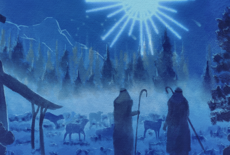
9. Adding rays of Light: We're going to add that
bright light for that. We're going to paint a
little bit with symmetry. Now. Procreate will
nicely help us work that we're going to set
up some things for that. So let's do that now. We're going back to the
sketch for a minute. And in the sketch, of course, you see that nice shining
light from the heavens. So we need that.
And to get that, we're going to go to tap on
the wrench, go to Kansas. And you see here Drawing Guide, we're switching that
are now we need to edit the Drawing Guide. And then as you can see, my drawing guide is pretty
much set up nicely already. What I want to do
is you wanna make sure you have these
options here. A grid, isometric, if you want to get some depth
perspective going, really creating depth
drawings, we want symmetry. The opacity we set to 41%, the thickness to 60 percent. Who's going to switch
on the Options? And we want radio. So you have the
vertical symmetry, horizontal in a quadrant. But we want the radio because the light is
radiating like that. You want to make sure that you
put on rotational symmetry to and assisted drawing, okay? And then this line here, you can set the color
to whatever works best. I leave it on black. The next thing you need to
do is this blue point here. Now probably yours
isn't where it is mine. So what do you need to do? See, if you look at it faintly, you can see here
those lines that is where the light
was shining from. So we want the light
to shine like that. So we need this midpoint to go on there and we
want to just straight, you can move it
the way you want. We just wanted to
straight down like that. Okay, We're seeing done. Now whatever line we draw goes from that point C that I
don't want this wiggly stuff, but to demonstrate that. All right, the next
thing we need depends on we've still got
it set on Panasonic. We just gotta determine
how thick we want. The pencil, the color
we want is just white. And what we're gonna do, I'm
gonna just from the point, draw a light,
sorry, draw a line. Draw a line. Now holds my pencil. And I'm going to add that light. See that line there. Nice. Now that is not thick enough. I've definitely
want this thicker. Let's go to 10 percent. Let's see if that
is not the same. I'm drawing a line now
I like that better. I'm holding it. And there you go. That's one line. I'm gonna do the same here. Hold it so that it gets
a nice straight line. I'm going to add this line
to an R1 some in between. Do it again, draw, hold it and add this light,
nice line in-between. And there you go. That's the first step. Probably don't have that
white color for this. Well, Let's turn off the sketch. Now. I cut that blue color for this. So that is not going not well, but we'll correct that. Okay. I'll leave it like this. Now we need to switch that off because I don't
want that anymore. So I'm going to go back
to the drawing guide. I'm not switching
it off like here. And we're going to into, edit the guide into the options. And I'm going to switch off
here, assisted drawing. I'm seeing done. And now
I'm going to switch it off. If you don't switch off
that assisted drawing, it will still keep on drawing
these symmetry lines. Now it should be okay again. Now the next thing,
what we need to add, we're going to add
a layer above this. Oh, I'm in the wrong
layer. All right. Let me demonstrate it. I'm in the wrong layer and
I want a different color. Now what we should have done is added a new layer
on top of all of this and call that
layer bright light, or shall we call it the race? Let's call it race.
These are rays of light. Let's call it race of light. Rays of light. Rays of light. So we've got our soft and recap the new layer light
array of lights. But we're gonna go back to the soft light tree because that's where
I made the mistake. I'm going to tap
this little ribbon. I'm going to put
this on a rectangle. I'm just going to draw a
rectangle around my error. And it selects this part. I'm going to go to the wrench
and I'm going to go to Add, and I'm going to say cut. Now that it's gone. Then I'm going
back to my rays of light layer and hit the
wrench here and say paste. And now there is my light again. Right, and now it's nice and
bright because what happens? This layer is of course, not on soft light. So I, and now it is corrected. This is what we want for now. Alright? But I want a little
bit of a halo in here. So what I'm gonna do, I'm gonna add a new layer on top of it. And I want a nice halo
here, half a circle. So what I'm gonna do,
I'm gonna draw it in, make sure you keep the pressure. And when I'm at the end, I'm just going to hold it. And now it creates a nice
shape for me, right? That is what I want, right? I'm not gonna do
anything more of that. The only thing and we're gonna
do is back to this layer. We're going to tap on it.
I'm going to say Merge Down. And it merges with
my rays of light. Right? These are my rays of light, but I don't like him this way. That is not, not really
nice, way too strong. What I'm gonna do with that
is I'm going to duplicate this layer twice. Nice. I'm going to hide the top of the race of life and
the bottom rays of light. And what I'm gonna do with this, I'm going to blur this a little bit and just a little bit. So what I'm gonna
do, I'm gonna go to this magic one there. I'm gonna say caution
blur, hit that. And what I'm gonna do, I'm
gonna slide to adjust. It says slide to adjust. And I'm just going to slide
my pen now it's gone. I don't want it that much gone, but see, I want it
a little bit gone. Like that. About 50 percent is good. All right. Now, that
looks already better, but not the way I want it. So what we're gonna do now, I'm going to hide that layer, that middle layer of
the reefs of lights. I'm going to select
the bottom one. Make sure it's on. Going back to that magic
want caution blur. And this one, I'm going
to blur even more. I would say around to our
12 percent would work Nice. And tap on the layer again. Now I'm going to add that one. See, now you get a
nice blur like that. And now I'm going to add
the original one to it. Also put what I'm gonna
do if the original one, it's too strong for me. So I'm sliding down the opacity
or 40 percent would work. All right. Oh, I'm on the wrong one. I don't know. I'm
on the right one. That's right. The top 140% blur. Okay, now I've got these free. What I'm gonna do, I'm
going to combine this. And the easiest
way to do that is select the top one slide. This one, slide that
one, say group. Tap on the New Group. And here you see
an option flatten, and now we've got it flattened. All right, well, we're
almost done with this, but this is a bit too strong. This is not what I want. I
want this light to be added to the scene and there is an option in the
layers for that too. So I'm gonna pick that one. So go to the layers. Now I have this new layer, rays of light. And I'm gonna just add
this to the scene. And there we go, Look at that. Now, dad is what I want now, not that strong, but
this is the idea I want. So I'm going to lower the opacity until it
gets where I like it. I would say about 50
percent, food percent. It's too much. Let's
go 45 percent. And now I've got that
nice rays of light here. All right, and now
they're looking to something which is
catching their attention. I was there, at least
with this lesson. We're going to
play a little bit. We're going to add some
other effect to this. Let's do that. So
we'll cut this now. I want to change
this a little bit. We're going to hit
that magic wand again. And there is an
option called bloom. That's a nice option. I'm tapping the blue option. And what I'm gonna do with that, I'm just going to play
with this a little bit. Now. This is set to max,
that's fine with me. Set set this to 40 percent
and my burn is 35 percent. So max size is 30 and
the burn is 35 percent. That's what it said
on so let's try this a little bit now
here are the same again, I'm sliding to adjust
and see what you get. Now how that is catching
my attention too much. But a little bit more like this. Though. This is pretty cool, isn't it? It's a bit too strong. I want to make sure the
halo is still there. Agar. And that's with me around 5%. But play with that a little bit. All right, going
back to my layers, what I'm gonna do is now I'm
going to duplicate this one. And how are you getting
some crazy lights? And we're going to
that bottom one. I'm going back to
that bloom effect. And I'm leaving this the same as is the max and 30 and 45. I'm going to nicely bloom
this one up to here. Another added 5%. All right, hit the layer, Good. Bring back the original one. And now this one, we need to bring back just a little bit 67 percent. I would say that is
pretty much good. Now we've cut that
interesting effect, might be a bit too strong
on the top ones tail. Let's bring that back. Blended in a little bit more. Rights around here. Now, that's not good.
Let's go to 40%. I like it like that. All right, I'm going
to leave it like this about 40 percent. Now we got a nice halo effect. Now. It's nicely strong. It's catching the attention. And then we'll see the scene. Okay, we've got this step. Now there's one more
step we need to do. We do that in the next lesson. We're going to
finish this painting off with Canvas effect, with some general light effect. And then we're totally
done with this. Alright, let's do that
in the next lesson.
10. Finalizing the painting: Welcome to the last lesson. The final step is adding
that Canvas and a little bit of a general light effect to
bring in some atmosphere. Now, this is a choice. You don't have to do this step by adding the canvas
we do anyway, but light effect is a choice. You can do it or you can
just leave it without that. Well, let's go to a painting. So we've got our painting, but the background
is really flat. There is no texture
effect and it is some paint brushes,
strokes in it. That is nice, but we want
this to be on a canvas. So what I have, I've supplied
the Canvas for that. That is this one not but
the moment it's locked, so I'm going to slide it from the right and unlock
it and open it. Now you see two layers in here. In here is a canvas. And if I put the first one on, this is the most important
one, the multiplying. And what you see here, you get a nice canvas effect. Then there's a layer above it, which is actually
exactly the same canvas. But I've set this to color burn, to really burn into Canvas and
add some atmosphere color. And now you get this. All right, Let's look at that. So this is our original painting and you can add
the canvas to it. And I would really makes a dark. It also blends in this color way nicer than it was before. You still get that
nice light effect, but not that strong effect
as it is without no choice. You have, you could
do you could do with our color burn and just do
detection. I like it that way. But there is another effect. We can add that as a
general light effect. And let's do that too. For that, we're going to just
add a layer on top of here. And this layer,
I'm going to call what should we call it
atmospheric effect. Yeah, we're going to play
with the atmosphere, atmosphere effects.
And there you go. Right? Now, what we're gonna do, we're gonna leave that
to normal for now. We're going to paint on this. We're going to paint
our light effect. And what we're
gonna do for that, we're going to pick
that oil painting. Let's see, let's pick this
one oil paint up for that. Good. And we're going to
add colors now. I'm got it on really large, wrong going to live in
a large, That's okay. The first thing we're gonna
do is pick some colors. We're going to pick
some of the colors, and we're going to pick
these colors here. And we're going to start
with the darkest color. And I'm just going to paint that color and that's
good enough, right? Then I'm going to
that second color. This is a bit of
a lighter color. I'm going to paint
that in, but I'm not going to touch the edges. Painting it in right there. Now, I want it smaller. Let's go for 40 percent. And around this edge, bring back that darker color. Right? Now. I'm going to add another color
that is again, a lighter. I'm going to leave
it on 40 percent. And I'm going to add another light effect
like that, right? And now the last one, I'm going to add
that lightest color, right where that light
is and how I get this. And now my painting is gone. So I need to bring
back my painting. What I'm gonna do next, I'm going to make a
color burn for this one. So I'm pressing on that M again, and I'm choosing another effect, and that is the Color Burn. Now, now I get this. Now, that is pretty dark. So I want to get that, of course, less strong
than it is now. And I'm going to set that
to about 40 percent. 40 to 40 percent. That would work for me. All right. And now let's
take a look at it. Now we have this painting. And if I set it off,
I'm getting this. The cooler colors,
the cool blue colors. If I set that color burn on, I'm getting a bit
still cool colors, but a lot more contrast, dark colors, quite different. Now, this is a choice. You don't have to do this. You can do without
if you say, Oh, I like it like this painted. Or I like to add that
color effect where it's lighter here and it's
going to darker there. So that's up to you. You can do it with or
without setting it to, oh, no, that's goes wrong. About 40% is good. And let's see.
Yeah, I like that. You could do it a bit less. Let's try 40%. Now that is nice, okay, I'm leaving it at
about 30 percent now. That's the wrong one. Yep, 30%. I like this effect. All right, if you don't
wanna do this step, then you could
live without them. Just want to bring
in some atmosphere, a little bit extra in it. All right, good. Well, that's it. That concludes my painting.
I got everything. So we've painted
from the foreground, going to the background, adding the middle,
and making sure that every step there is some
nice contrast going on. And now we've got a
beautiful nativity scene. All right, that
concludes this lesson. We don't have painting. We only have a project lapsed. So let's talk about the
project in the next video. That's another
lesson. That's video. All right. See you there.
11. The Project: All right, the last
video, the projects. Now the projects we're gonna
do really easy for that. The project is if all this, while you've created
this posted, posted in the project section, that's all I'm
gonna do with that. Now, of course, it would
be wonderful if you create more paintings in procreate
with this contrast. Adding the monochromatic colors. You don't have to pick blue. You could pick other
callers, 2k or green, or rats, or with yellows, all kinds of nice colors. And then create a
nice range of tens. So going lighter and some
shades going darker, never would, of course,
be a nice challenge. All right, well, I'm not going
to make this a long video. The main project is ptosis
so that we can all enjoy it. I can see what you're
making because I'm really curious to see what people do with all these
techniques I'm showing. And if you want to go on with
that and keep on painting, add a totally different scene or keep on playing with that. A keep on going with it. All right. Thank you
for being with me in this class and looking forward
to the project you create.
 Benjamin A, Art Teacher, illustrator Art by Benjamin