Transcripts
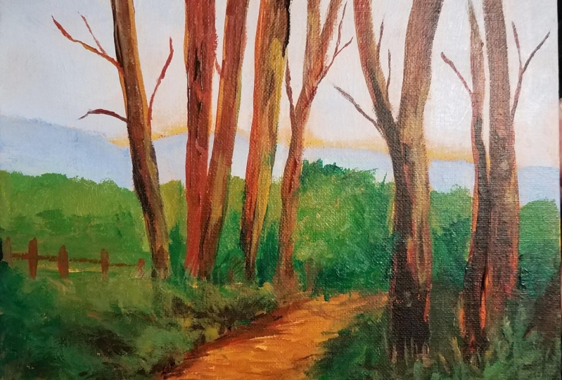
1. INTRODUCTION ~ Why This Is My FAVORITE Landscape Painting: Hi, I'm Tory Hangman. I wanted to introduce you to my all-time favorite
landscape painting called edge of the woods. And even though I did this
a number of years ago, it has remained my
absolute favorite. Anytime I finished
your painting, I like to take a few
minutes and figure out what was good
about it and maybe what wasn't so good so
that I can reproduce the things that worked and get rid of those habits
that were not working. There were quite a few things
about this painting that I really liked that I'd like
to share with you today. In hopes that you can then take those tips and tricks into
your own landscape paintings. Also love this painting so much. I decided I was going
to paint it again. And that way you'll get
to see how I did it. Stay tuned. One of
the things that I really love about
this painting is how subdued the sky is. I wanted this foreground, which is so strong to be front and center stage
and have all the drama. But that required putting in
a sky that was more subdued. Most of my paintings
have very strong scars. You'll notice in this
one I actually used a yellow layer underneath
and a very pale sky. And that yellow peeks through. And it was just real effective
at kind of gave a glow and just say a unique
look to the sky. I'll show you how I did that. The second thing that
I think worked really well in this painting
is the color harmony. Limiting my palette
to a few colors, really brought this
painting together. In fact, here's the
second painting where I limited the palette
even more and it just works. One thing I've noticed about other landscapes by different
artists that I really like is when they
have multiple layers of geography that
take your back. And if you'll
notice, the path is the layer that highlighted
field number two. Then there the woods
that are close up and then the woods
that are behind that. Then you have the
mountains and the sky. So you have six
layers of geography that really give a lot of interests in depths
to the painting. I think that worked really well. One of my favorite things
to do in a painting is to push the lights
and the darks. And oh my goodness, that was so effective
in this painting. We've got these dark, dark shadows and
the super light. I'll show you how I did those. I'll show you how I created the illusion of shadows
crossing those trees. It was a whole lot of fun and I think it
worked really well. I hope you'll take
this Skillshare course with me and you'll
get to see why we're so excited about this painting that I've done it a second time. I'll show you how I
got the drawing in, mixed my color
palettes and I'll talk you through every stage
of this painting. I hope you'll join me in this.
2. Supplies List and Preparing the Canvas: I'm going to be painting on a
24 by 24 inch canvas today, but you can use something
smaller or larger. If you don't have Yellow Oxide, you can use yellow ocher. And if you don't have Mars
Black any Blackwell day, I typically will put an undercutting of
gesso on my canvas just to keep the paint
from absorbing too much. And if, if I'm going to use
a color as an underground, I can either add it to
the gesso or I can wait until the Jesse draws and go
back over it a second time. I'm gonna be using Liquitex
Yellow Oxide as the color. It doesn't have to be very even. It doesn't matter if it's
not perfectly smooth. So there are a variety
of ways you can do it. You can put Jesse and your paint on the paper
plate and mix it that way. You can mix it on the canvas. For our purposes, I'm going to be real super loose about this. I'm going to lightly spray this canvas with the
continual sprayer so we don't want it too wet. And I'm just spraying
half the canvas and that will help this
just so they're warm. A lot easier. I'm just going to wet my brush. I'm going to dip my
brush into the chest so we'll put a good
amount on there. Then I'm going to
dip into my paints. Not very scientific, but
I'm just going to kind of crisscross, get
good coverage. We don't want to see streaks of raised places on the canvas. On second thought,
I don't want to contaminate my jar of just so, so I'm going to get
the jest out with one clean brush rather than dipping back
in with my color. So now that I have that
just so I'm just dipping, I'm using a big two-inch brush. This is a Blick essentials. I love these brushes. They're super cheap,
they're very thin. They're great for this
kind of application. Of course, when that
blends with the jazz. So it's going to
lighten it a little bit like it would with white
paint, but that's fine. Again, it doesn't matter that
it's not perfectly even. What does matter is just getting your strokes even so you
don't end up with big ridges.
3. Getting in the Drawing: Here's the photograph from
paint my photos that you can download and you can
sketch that in by hand. I decided to use a projector and just play
with the scale of it to see if I wanted to do it exactly
like the original or if I wanted to blow it up
or reduce it down. But if you've never used
a project or that's a good way to be able
to find good placement. And here I've just
lightly penciled in particularly the
angle of the road. The trees are very
lightly sketch, but I mainly wanted to get the perspective
right of that road.
4. Painting in the Sky: I have all my colors laid
out on a stay wet palette, but I thought for this Scott
might be easier for you. If I just mix this scar on a paper plate and let
you see what I'm doing. I have decided to use this big 1 " just it's a rough house brush. I've made sure that I have an
interesting mountain lion. So get back from your painting. You don't just want
a straight line. I like having a little bit
of a height right here. You don't want that peak to be right in the middle
of your painting. Have it all set a little bit. So I'm gonna take
a lot of white. And I'm going to start out with a tiny bit of ultramarine. And I'm just going to
swirl that together. That's not dark enough. I'm going to add a little more. I'm going to kind
of compare that to my original painting. I would rather err on the
side of this being too light. So I'm going to
add a little more white down here in the bottom. I didn't wet my brush first. Not sure how that would work, but I'm just going to try. So I'm just going
to lightly scrub. So I'm not putting
much pressure. You can tell by
the sound of this. I'm just lightly scrubbing. So start out with
just a small amount and you can always
add more blue, but it's hard to take away. So let it just, I would suggest that you do
it very lightly at first. Let plenty of that
yellow shade through. And if you don't like
it or you want more, be sure and get that top edge
while you're going across. You can always go
back and add more, but it's just almost
impossible to take away. Now that the paints
getting off my brush, I'm having to push
a little harder. So he might he might like having that much yellowish
shining through. He may not. That's fine. Your your call. Someone to get a
little more paint. My brush is really dry. I've not put any water on it. So I think I'm
going to just take a sprayer and very
lightly miss that paint. But you don't want to lose
the scrub ability of it. If it gets too wet, it's just going to
become two solid. I'm concerned on the canvas. I'm gonna go ahead
and puts more white in this pile at the bottom. So just that little
amount of spray has really made that paint
not quite as scribble. So be careful about that. And I'm not trying to get these strokes going in
the same direction. I'm just letting them vary. Being mindful of where
that mountain flow-on is. So k, If you go over
your trees a little bit. In my original painting, I left quite a line of
that yellow right at the, right above the mountain. That's your call if you
wanna do that or not. I encourage you to
get back from it often and just see how
it's reading to you. Let me step back and
see how that's looking. That's definitely wider down here than in the
original painting. It doesn't bother me
that it's lighter. So let me mix up a
new pile of the blue. So you want to make
sure if she makes a new pile that it's in-between
this blue and that blue. So that's a little darker.
5. Painting in the Mountain: All right, Next we're gonna
put in our mountains. And for this, just to
keep good color harmony, we're gonna use the
same ultramarine blue and white combination, but we're gonna make
it much deeper. And eventually
we're gonna go over this a second time
with some green, but we're just trying to
get in a fairly solid blue. You can leave a little of the yellow peeking
through if you want. I did not in the
original painting, I probably won't
for this either. I'm probably just going
to let that yellow show through in the skull, but that's, you might want
to experiment with that. I'm going to use
this rosemary and company classic long flat. This is a size eight. Again, I'm liking this because
it's got a rough edge. I don't want you using
something real sharp and precise or it's going to make
this painting look tight. You're going to lose this
impressionistic look. So I'm going to just
stamp in my brush. Take some of the blues, take some of the white, mix it on the palette. See how that looks to me. I think that's pretty so I'm just going to
start laying that in. I'm not going to hold
my brush like this. I'm going to hold it very loose. And when I hit that mountain, I'm just I'm just kinda pushing that brush and letting that paint kind of
scrub into the Canvas. You don't have to have
the same exact blue every place you can have some where it's a little bit darker, a little bit lighter. Again, we want to get an
interesting shape back here. So try to, we don't want
any role do straight lines. Kind of looking back at
my original reference doesn't have to be
exactly like that. But because I like
that painting so much, I'm trying to be mindful
of it just to make sure I can keep those elements that
I thought were so important. Here's my tree line right here. And just like with the
mountains very that tree line. So you don't just have
something repetitive or boring. Oops, I dropped
down into my trees. I was talking more than I was thinking what was happening. So this is kind of gives you
a feel for what it would look like if you left
some of that yellow. I'm gonna put a little
more paint on my brush. You can go back over it. Say now I've got a
lighter blue in there. I wouldn't have done this several years ago when I
did that original painting, I painted much more
tightly than I was curious to see what a difference it would make with
this painting. How differently I would paint and I do see a
difference already just I'm keeping this
much, much looser. Go ahead and paint the sides. So now I've got this
variation of blues, which I like very much. Not worried about
staying in the lines. We're gonna be going back over these trees with a
fairly dark paint. So don't, don't worry about
it if you if that happens, t just try to keep
some interest. I don't know if he can see, but I've got a lighter
blue and a darker blue. I just like having that. I think that's a lot more interesting than one solid blue. And if you're just mixing this, for some of my paintings, I mix all my colors
ahead of time. But for this one, I'm just kinda
mixing it as I go. And that's keeping a variety. If I mix this up ahead of time, a big pile, it would all be
the same color, but this way, we're getting a
little bit different blue every time I
put the brush down, which, which I like, I like very much. So we're just dropping
this in very quickly. Not a rethinking it, turning that brush a little bit, get the paint off
both sides of it. I am barely holding this brush between my thumb and forefinger. You can really bounce
it in my hand. Try to keep the, the less control that you're willing to
have with your brush, the looser your
paintings going to look. It. It takes some mental control to let go of physical control, If that makes sense, to take some mental discipline. If you're tight pain or like
I was I'm using past tense. I don't want to consider
myself a type pain or anymore. I went over that tree
line a little bit. Doesn't matter. Let me throw this out to you. Something I just thought about
in the original painting. The treeline was very solid. But in real life, you would probably have some
sky holes here and there. So I might go ahead. And as this those are mountains. You would probably well, you'd have some mountain holes. You would have some holes in those trees from
what's behind it. So I'm just going to drop a
little blue here and there. Just say, if we
decide we want to have a little bit of that mountain peeking
through some of those trees, will have, that, will
have that option. And then this group gets
a little more solid. So, okay, now I do have just a touch of yellow showing through
here and there. I think I'm going to leave that. That doesn't bother me. I hope everybody's okay. Take a breath. Now we're
gonna move onto these trees.
6. Mixing the Greens for the Trees and Grass: When I did this painting
The first time, I used a lot of hooker green
right out of the tube. And Hooker grain to me now feels a little
artificial looking. It's just a little too perky. I tend to use sap green, which is a real dark green
and I add things to it. But trying to say true a little bit to
the original painting, I'm going to use Hooker
green and sap green. And I'm gonna be adding
some Naples yellow to it, some cad yellow medium to it, some of this burnt sienna. And I'm going to come up with some different
piles of greens and something that I
didn't use when I did the original painting was
this slow dry medium, this golden slow
dry acrylic medium. I'm going to add
this to my Powell so that as I'm doing the trees, I can get a nice blending and look a little
more like oils. So let's just kind
of experiment with this and see what we can get. Let's try a little Naples
yellow with the hooker. See that still? Fairly harsh green to me. Add a little more. I added a lot. But I think that's a
pretty soft green. I'm not going to
blend it completely. I like having a little
variation there. Let's do that again. A little Hooker green. Let's add a little bit
of this burnt sienna. Say red is the complement of
green on the color chart. So if you're ever
trying to dole a green down a little bit and keep it from looking too artificial, adding a little bit of red. And I think this burnt sienna, burnt sienna is one of my face. Isn't that a beautiful green? I mean, that really
looks natural. So I like that very much. I'm going to mix a
bigger pile of that. I think that's just beautiful. Burnt sienna is just the color of the clay we have
here in North Carolina. And it just softens things up and makes things
look more natural. So you could take this and then add some Naples yellow to it, and just take these
different piles, add some of these
different colors. I think too, as long as you have this base of
the Hooker and the sap, you can mix a lot of
different greens, which is going to
make the painting look more interesting. But it's all going to harmonize because you've got
the same base. Let's do a little
of the sap green. I'm going to add some of this
cad yellow medium to it. The field, there's
one small section of field that's really
out in the light. That's very bright. It's almost fluorescent. I'm going to put
some widen this to lighten it even more
sick when you get that, that field color still way too dark room and a lot
more cad yellow. A little more fight. That's not the same. Green that was in the
original painting, but I like it fairly
close to them, will lighten it up just
a little bit more. I'm going to take half
of it and lighten it. And then save this other
Powell to add in some trees. There are some
darker areas that I wouldn't mind
dropping in just some pure sap green here and there. I might take a little
of the cad yellow, the Hooker and put some
point and it must seal. We get there. See, I think that's
just too bright. That would just jump out
too much for our scene. If we had some places in the trees that were really
being hit by the sunlight, I could see doing that. I do like to push the
values where you've got some real secret arts and
some real white lights, but I think that one's
a little too light, so I'm just going to add some of that hooker grain
back in to see if I can get to calm
down a little bit. You don't have to use
every Paul that's still think that it's
just too perky looking. I'm going to add
just a tiny touch of that burnt sienna to that. See if I can touch more
safe and get that. Just settle down a little bit. You don't want to
have all your colors looking very natural
and then have one just screeching color that doesn't look
like it belongs. I think that's still too bright. I'm either not want to use
it or I'm going to see if I can try one more time. See Fung salvage this. So that's pretty or insult
or so might leave that one. You can also use ultramarine is a great way to dark and your colors will
add a little bit. Do a little pile of
ultramarine and the hooker, ultramarine and sap greener. That's a combination I use a
lot and ultramarine amine, I'm sorry, sap green
and burnt umber. Let me show you what
that looks like. If you're looking for a
super dark in the base of the woods and you're just
trying to get something that's almost black without
using black, then you've got that color. So that's nice. We're gonna save that
black for some of the places on the trees. But I think this gives us the greens that we're
going to need to put in the mountain and then
the trees in the foreground. Let's do that. And then we'll put in the path. Last, we'll work on those color. So I'm gonna go
over to the Canvas and we're going to start out. I'm going to add
in, almost forgot just a drop of this slow
dry medium and each pile, just to give us a little
more working time.
7. Painting in the Background Trees: Alright, now we're gonna put
in this back range of trees. I'm using the same
size eight brush. And looking at my palette, I'm liking the soft grain
that we've got here. So I'm just going to, again, I'm going to lay it in the
same way I did the mountains. I'm, I'm using this
brush very loosely. You can let some of that yellow shan't show through or not. That's completely up to you. I can really tell a difference already between
these two paintings. How much looser this one is. Just the edge of the trees
between the mountains. It's so soft and it's just very loose and
impressionistic. I didn't mix nearly
enough of that, so let me remixed a
little bit of that. When I mix new pile, I mixed it very loosely. You can see there's darks
and lights and there, I think that's nice rather
than one solid color. I messed up my drawing a
little bit right there, so I'm gonna go
wherever that line. I think it's nice to have
that variety of colors. It's a forest of trees. You would have a variety. It's a lot of fun to play
with color that way. Don't be afraid of
playing with it. And if it doesn't look good, you can always paint over it. It's the beauty of acrylics. It's very forgiving. Don't forget to paint the sides. So this is a little
lighter and then this gets darker as
it comes forward. I'm gonna go ahead and put
in the dark of that tree. I'm going to use this this
darker concoction right here. And put in these darkest. Why safe and get that shape
a little more defined. Super low, super fun. Looking at the shadow, shadow line, how it comes out. Because back in,
we've got a tree, right layer, dark up under here. We can go back and adjust this. If you see that you don't
like the way that's going, then I'm going to
put in this lighter. So we've got this
tree that gets, has a middle value
and then it has a much lighter value
as it goes forward. So I'm going to, it looks very much like this. So I'm just going
to pick up some of this because it's got some
slow dry medium in it. We should be able to get a
nice soft edge right there. Actually, I forgot
to put some in that. Let me do that real quick. I forgot to put some medium
in my last big pile. It really makes a difference. I can, I can feel the
difference and just applying paint with
something with that medium, something that doesn't help
much more workable it is, it just moves smoother. Looking at that reference, we want to give a nice
interesting shape to this tree because it's, it's really in the foreground
and then it jumps back out. And it gets much
lighter on the end. So let's, I'm going
to drop to this, this green, this value. I feel like it could be
even a little more yellow. So I'm just going to alright, I might have gotten too much a little bit just on there and maybe put a hit or two of that yellow just on the edges
where it might be catching. But again, trying to keep an, an interesting outline
for that tree, let's throw it back
to this middle value right in here where
these values are mating. If you don't like
seeing that difference, he can go back in and just
soften that with your brush. You can blend those. Or if you like
having a strong one, just kinda play with that. I feel like I need another
layer of that dark. It just looks a little
too transparent, so I'm going to go back in. And darken that. I might take this darkest value. So go even a little darker. At the bottom. I have found
in my paintings where I really push the values and there's some super
darks and safer lights. It just makes for a much
more interesting painting. I'm going to pull this dark
out a little bit more. Please go back in and
kinda reshape these trees. But I like getting a
little darker in there. Alright, now we have
another tree line that's behind this light
line and that's a great place for you to
put in something real dark so that this edge is
going to be real defined. So I'm gonna go back
into or dark green. And I'm just going
to lay that in. You see, I made a little
boo-boo right there. That's just where some bristles we're sticking out doesn't bother me
if it bothers you, you can always fix it. So I need to give this a
little bit of interests since these are the tops
of trees through here. So we don't want to
just a straight line. We need to do something
kind of organic. But we want it to be Here's
our little sky holds. I don't I don't feel
like we need that there, so I'm just going to take that out. I'm going to paint over it. I'm gonna go back over
that spot with our dark. Just to give us a nice
contrast right there. And help it even more, even
more noticeable that this is really in the sun. B-roll sensitive to your edges, making sure that you get
some interesting edges. I don't like this. And you can fix that by
either carving in with the dark are going back over
the dark with the light. Go ahead and bring this dark in. Try not to fuss with it. When you get into a tight
little area like this, try not to get trauma clamped down too
much on your brush. And I think it's
always good even when you've got something
dark like that. Put a little spot of something here and there so
that doesn't look so solid. And that's something we can
go back over and tweak. I'm going to start dropping
in some darks in here, but I'm going to vary. Like I'm going to pick up, pick something out of this pile. Then I'm going to pick up
something of this pile, just slightly different. Mix these greens just ride on
the palette because they've got that that extend her in. It shouldn't be a problem. So we've got two trees there. We say The tree is getting
much lighter. Up in here. A place where we can
have a little bit of mountain peak in through. Perhaps we're gonna have tree branches and things
crossing over this. So this is not going to just
be solid green through here, but I'm just dropping some,
some different greens. It's what's nice to have
these different Paul's. It helps you to kind
of mentally make sure you're moving around and getting a variety of greens. Because in the forest you would have some
lights and darks. And I just encourage you to make sure you get
your darks dark enough. If you don't have the
darks dark enough, the painting can
really look flat. And that field is very
bright and fluorescent. So I'm going to try this, this brightest
screen that we have.
8. Painting in the Foreground Trees: My drop down to a next sauce. So this is a six, the same type of brush. And just looking
at my reference, I'm going to go back in. I'm going to mix up some the dark brown
and the sap green. And I'm just going to
go in and put my darks. And first, I'm just going
to get some real darks in these places where
it really drops off. They're actually not this
dark in the painting. There, more dark greens. But I like, I think one thing that I do as a
painter now is I push my, my greens and my darks quite a bit and I like
the effect of that. So I'm going to continue on. I'm just going to
block in some darks, try to get these established, these places where the Hill has dropped off and
it's just super dark. Then we're gonna
go back over it. It's important to get
the shapes right because this is going to show
the hill coming down. This is gonna be the shadow
going across the row. We're not going to get
into the road yet. So I'm going to take
some more of my greens. I'm going to put some
ultramarine in there. Ultramarine as a way to darken your paint without your
paint getting dull. If you'd like a little more
color in your paintings, which I really do. It's a way of keeping your painting a
little more colorful. I'm just taking some
of my darker screens. We've got some trees here that
have sort of disappeared, but there's a stand
of trees here. So this isn't
fairly dark shadow. Someone just drop that in. And I think that's a
beautiful color that green and ultramarine mixed in. Again, you notice how
loosely I'm holding my brush so I can't get a
precise line with this. It's very, very loose. Again, if you've, if you've
never painted this loosely, I just encourage you to try it. I think you're gonna love it. It takes a little
getting ISTE that. Gosh, once you do
get used to it, it's just really
hard to get back. Particularly if
you like a looser, more impressionistic style. It's just hard to beat. So we've got some
things that are dark because they are at
the bottom of this hill, but then we've got other
things that are just start because they are at the base of trees and we've got a really
strong shadow coming down. I think I was going to put
all this, this Graeme, and I think I'm going to
stop and put the trees. And because the trees help, you see where the shadows are falling and they make all this
make a little more sense. So I'm going to show you how the day the
trees in this next segment. I've added another color
to the color palette. And for the trees, I've got raw sienna, burnt sienna, burnt
umber and black. And I've still got a little
knife, full shell over here, but these are the
colors that I'm basically going to be using. And I'm just going to
be picking my brush up, laying some of that down, picking some of that up, laying my brush down. And I'm just going
to, with the black, I'm going to be using some
very expressive marks. One of the things
that you'll find is so effective
with this painting. One of the things
that I love is not only is the black
going vertically, but they're places
where I'll pull that black all the way
across the tree trunk. That shows that the light is being blocked by other trees. And I think that's one
of the things that made that so dynamic. Then there are
other places where the tree trunk is
in so much light. I'll probably add some
white to this raw sienna. And I'm just going to get some real extreme lights
and some extreme darks. And here I decided to
switch over to, oops, to a brush that's gonna give me a little more control with these tree trunk outlines. This is a Princeton
bright summit. It's a 6,100 B. So I'm gonna be taking this up and pulling
this right up into my sky. Notice they're
being mindful that this tree is going
to get a little more narrow as it comes up. If you just absolutely
mess it up, we can go back in with Scott and with yellow
and we can redo it. So don't be, don't be afraid
to do some big strokes. I really want to
encourage you don't get in there and do
this dabbing thing. Even though we're getting
to a tighter brush, you need to get
plenty of paint on your brush and just carry
that up in one stroke. Reload your brush, carry
it up in one stroke, then we can go back in and add these different
colors to it. But I just begging, don't be a dab or look
at your photograph or look at the reference
of the original painting. Decide where that stroke
is going to be and go ahead and just follow
that right on up. You can do this. We are brave painters
and we're going after this and we're going to have
a great looking painting when we get finished. Okay, you ready? So I'm going to start
with the middle value, which is this burnt sienna. I'm getting a fair amount
on both sides of the brush. This is a transparent color
so you're going to lose, I'm sorry, hit the tripod. So I'm going to lay this down at the base of this tree and I'm just going
to pull straight up, straight up, straight
up, straight up. This tree actually
forks the same tree. It's just got to split. Pull that thing straight up, straight up, straight
up, straight up. We're gonna go over
this many times. We're going to have lots of
layers of different paints. Just e.g. I'm going to
just drop in some of the burnt umber and just
show you what can happen. I don't have any medium in this. I'm just the paint is still wet. I'm letting Lin
will drop a little black here at the base. That black just kind
of blend in there. It's going to take a
little bit to cover that. Yellow that's underneath. You might want to
clean your water. My water has got so
much green in it. You don't want to
contaminate it. So let me just again, this burnt sienna is
very transparent. You can add a
little white to it. I'm going to put a
little raw sienna and burnt sienna together. I don't really like how
that came out so much. I think it needs to come down, so I'm just going to get it to where it
looks right to you. I don't mind leaving
some streaky places. I don't think you'd need to
blend everything together. That's your call, but this tree decide to quit talking when I did that. Kinda holding my
breath on that one. In the original painting, I like the shape
a little better. It went off to the side, which I think is a
little more interesting. I'm wonderful to see if I
can even wipe that off. Alright, I'm going to let that dry and then
I'm going to let this just veer off
a little bit more. This brush is not
holding a lot of paint, but I think just to get the
outside line in, it's good. And then we can switch
over to a different style of brush that would hold
a little more paint. So let's just, I'm
dipping this into the burnt sienna
and burnt umber. Oops, sorry, I keep
stepping on my tripod. Let's, let's go
over to this tree. Again. Try to keep the
shapes interesting. Then it can kinda veer off
when it gets to the top. This is a lot of fun, I think, just to play with and see what you can do with the
lights and the darks. It's not rocket science. It's nice to have a tree that maybe has
some highlights in it, some super light spots, and then add some
dark spots to it. Because we definitely
want to have some places where
the sun is catching. I'm gonna get back from this. Encourage you to get
back periodically. Make sure the shapes are
looking right to you. Let's go back and see
if we can you light. Let's see if we can fix this tree that I kind
of messed up somewhere. I have it just, just, I think that's nice. Little more interesting than remember that tree
is going to get a little more narrow
as it goes up. Don't be afraid to use
some black in there. That's what's going to
give it some punch. Here's an example where
I'm just going to lay in a really hard black mark. Let that go all the way across that paint underneath.
It's still wet. So see, that's not something I did with the original painting. The original
painting didn't have any slides or a
medium in excuse me, I just not something I ever. So my paints are
blending a little bit more than they would without it. So it's gonna give us a
different look. But I like it. I think it's making it
look a little softer.
9. These Things Needed Fixing!: One of the things that I
like to do with these videos is talk with you about
decisions that I'm making. I'm making him mistakes that
I'm seeing in the painting, things that I want to
change and how to fix them. So one thing that I don't like is I'm looking at the
original painting. This tree. I wanted this
to have an angle to it. I think it's angled too much. So rather than trying to fix that and fix the sky
and redo all that, I'm just going to have this
tree branch off right there and say that this doesn't
look, say veered off. Another thing that
I'm going to do is this darker woods that
look closer up than this. One of the reasons
they look closer, it's because they're larger. And the other reason is
because they're darker. I'm gonna go ahead and pull
that around to about here. I don't want it ending
halfway in the middle. I'm going to pull it around. And then if you'll notice this tree line slants
down so it makes it look like these trees are further away than these trees. So just the changing of an angle can really
alter the perspective. One thing I love about this
painting is that you do have this wide road goes down
to this narrow points. So you do have a
good perspective. I think I'm going to even this out so that this
looks like a forest. The trees are all about
the same distance, but I want it to be noticeably more in the background
than this far. So I'm gonna go ahead
and pull this up. I'm gonna be adding
some tree trunks, some stronger tree
trunks to this part. And then I'm gonna go back
with a liner brush and add some very small center, weaker color tree trunks
back in this view. Again to help push that back. So I just want you to
hear what I was thinking. This looks like someone
took a big bite out of it. So I'm going to have to
correct that a little bit. That looks a little
autumn and go ahead and pull that tree across here. And in the original painting, you've got good strong trees right here at the
front of the canvas, and I liked that a lot. I did not get that drawn
in correctly on this. So I may leave these
little trees in the back, but you're going to see me
put in something pretty substantial that's gonna
go right up in front, That's going to be larger. And again, that's
another way to get good perspective that the trees, the things that are
close up or larger and more precise and things get a little smaller
as they go back. So I may not I may not
talk through all of this, but I just wanted before
we went to this next face, I want you to hear my thoughts and what I think's working. I don't like this
being so sharp and I don't like that
being so straight. So I might get my my
blue out and I might rework this mountain
line just to make it a little
more interesting. I might have it go
back up a little bit. Right now. It's just we've got straight and straight and I don't think
that's very interesting. I would like to
add a little curve and maybe get that point out. So those are the things
I'm getting ready to do.
11. Painting in the Shadows & Highlights: In this next section, we're going to talk about the
highlights and the shadows. And when I film this, I was so up on the canvas when I got in making
these little marks, I just wasn't happy
with the quality of it. I felt like you were
saying my back and my arm more than you
were saying the canvas. And it just felt a little
boring to me watching it. So I'm going to just do
some close-ups of this. I'll show you the brushes that I use and talk to you a little bit about the colors and how I got into the
darks and the lights. When I first started out
doing these highlights, I was using mainly raw
sienna with Naples yellow, but as I got back from it, I just felt like it wasn't
giving enough of a glow. So I added some of this Liquitex rose pink into that
same combination. And you can see this. Now that you see that it's pink. It just gave me a nice
glow to everything. So it's real pleased with that. I use the small flat
brush for most of these marks and you can tell in some places it was a
pretty definite mark. And in the shadows, I always using black or burnt
umber or a combination. I think it's important. Some places you'll
have a darker shadow than others where
it's more brown. So it's important to vary those alike where you have two trees together and you can pull
a shadow across both. And so that tells you there's something overhead
going across both. This is a great example
of using a very dark, dark next to a very light light. If you put everything in
more of a middle value, these trees are
going to look flat and you're just not
going to get the drama and excitement as
you are when you put the lights next to the darks. And I would encourage you as she moves up to the
top of your trees, they need to be really light because they're
catching more of the sun. And that's where I just used the Naples yellow and a
touch of the Raul Santa. And I thought that
was real effective.
12. The Bank and the Road : All right, I'm going to
start on this foreground and I'm just going
to block this in. I'm going to put different
different greens just like we've
used in our forest. And as I go through, I'm just going to
mix a little of this and put a little
Naples yellow in there. I'm going to put a little
of burnt sienna in there. I'm just going to
get a variety of greens and I'm just going
to start blocking those in. They're going to get
darker as they move down. But even with the dark, I want to vary that a lot. I'm just using my big brush. I'm just scrubbing this in. And when we get a
little further along, we can always we will go back through with a different brush
and we're gonna put in some nice brushstrokes
that show that that's grass. We want to get these
colors a little realistic. We don't want everything
to be too perky. I think this kind
of middle green is nice for up here where
the light is catching. Just put in a
sense, super loose. It's nice when we go
back with other colors, It's gonna be nice to have
some good darks in there. Particularly there are some
areas that are really in deep shadow connected
to these areas. So we want to make sure we
get that dark enough and then we can go over it
with something lighter. I've included a little
sap green on my palette. I'm not sure if I had that on there earlier. Not
I can't remember. I've done this painting
over a period of days, but I did go back
in and drop some sap green back into these woods. It's just a nice
ready-made dark green. You can see how many
different greens I've got going here and
I'm just picking up a little of this and a
little of that off my off my palette. Just try to vary it. Keep the area that's in
shadow a little darker. Just trying to get the
canvas covered with some interesting grains,
keeping it loose. This painting looks so much
looser than the original one, and I'm, I really like that. You can add a little
ultramarine into your blue to get it even darker. Keep in mind just
the direction of your darks rather than
them going across. Notice that it's going
down with the hill. That can guess give
that illusion. Even more that this has a
bank and it's going down. The direction of a brushstrokes
really make a difference. So kinda funny how that works, but tells the brain that
it's going downhill. Okay, let's put a little, I'm looking at my original. In this. In the original, the foreground was catching
a lot of light right here. But it was pretty
dark back in here. But it got pretty
light back in here. That's a little too bright, but we can configure. The biggest problem that I had
with the original painting was the color of the road
and I don't know why. But I remember wrestling
with this road quite a bit. And if you'll notice, I've
got a really light color underneath the whole road. So I think I'm gonna
do that again though. I'm gonna go over the whole
road with this light color. Or you can go over it
with the middle value and then go back in and
add darks and add lights. I think I'm going to do that. So I think I'm just going
to pick a middle color. Um, and you know, your road can be gray. It could be in these in Brown's. Chose to have it
a little lighter. And I think I like
the contrast of having something like with
this dark on either sides. So I'm gonna I'm gonna keep
this road fairly light. So I'm going to just mix up a real light base
or medium base. For the sake of color harmony, I'm going to stick with the colors that
I have on my palette. I'm not going to
introduce anything else. So I think I'm going to take
a little Naples yellow. I've got to almost need
a new place to work. Some Naples yellow, some
of this raw sienna. And let's just put that in. I think that's pretty. And again, let's get the
brush marks going in the direction of the road. I'm not mixing this thoroughly. I'm just putting a dab of
this and a dab of that. We'll go back over some of these areas that are real dark. You could even these darkest areas where it's joining
grass that's real dark, just use the pure, raw sienna. And then as it gets out
into the road, it could be, oops, got a little that cad yellow on my
brush. That's okay. I think that's pretty even
even without our shadow lines, just getting a variety of things on your brush
and not mixing them. Not, not mixing these
colors together, but just letting your brush pick up an assortment of colors. It's just for an application
like this to me, it's just so much prettier than I'm a big believer
in spit on my finger, you may have noticed is just a quick way to
take care of something. Let me do that again. Must be one of the
reasons God gave pain are so many
fingers not you think. Okay. So let me just get
back from that and see. I think that looks really nice. So we've got this nice kind of mixture of colors on there. So while that's still wet, I'm going to continue on
with this rough brush. I just got paint all over
my face, dark green. I'm going to now dip
into this brown. I don't know how this
is going to work. This is such a
different brush than I did the original painting with. But I'm just going to put
some streaks in there. This is the burnt umber. I don't have a lot
of it on my brush. But let's just see
how that does. See if you like
it, if you don't. Now I'm mixing a little burnt
umber and the burnt sienna. I am very lightly holding
this very rough brush. So if you get a brush that
has a sharp edge to it, it's not going to
look like this. And you may want to experiment
with different brushes. I would say you're going to want some areas in front
of this tree, e.g. that are fairly dark. But I like having some areas
that are a real light. I would say just play with
it, get back from it. In the original painting, I used more of a
purple for the shadow, which I don't want to
do on this painting. I want to keep the color harmony
of what's going on here. I had a lot of shadows going different
ways and I like that. So we've got the basic
shadow is going across, but let's go back
with a smaller brush. I might go back with our bright. And let's try putting
some things in, going at different angles. And again, we're just trying to let the viewer think there's some branches going across. You've got to be careful
that you don't get them all going the same direction or you don't want it to look like
a tic-tac-toe board, which You know, that kind of thing happens pretty easily for me, at least where I'll just get into a kind of a
repetitive stroke. I think that's enough. I don't feel the need to go in and really
fill all this in this space in with
a lot of branches. A wife that there's this little wider spot here and there. I might put a little
lighter spot. In the other painting
there was this real hit of strong yellow at the
end, which I liked. Kinda pull your eye
back into the painting. I think I'm going to
leave this. I like it. I like it loose and I remember
was the original painting. I just groaned and
worked on that road, did it several times. I like that this is
loose. Let's leave it. Let's go back in and work on getting this to
look like grass. And we can always go back and tweak and
change any of this. But so far I'm, I
like where this sub been tweaking this
painting for a while. I've been adding lighter
lights and darker darks. I've gone in and added some shadow lines going
across the trees. Some of them I did unlike Brown, other side did darker and did in black just trying to variate, give that illusion of
branches casting shadows. And I'm getting ready to work on the bank a little
more and I'm going to show you what I did. I went back in since I last filmed it and where
they were darks, I made them more solid
and made them darker. And the reason I did that
is because we're gonna be putting grasses
over top of that. And it really looks
better to have some dark to light grasses
over top of the dark. So I just wanted you
to see what I did before we go back in with a round brush to put
in some grasses, I'm going to let that dry. And we will be back and
work on those grasses. I think it's looking good. I altered the shape of the
mountain a little bit. I kicked it up on the left and just varied the shape a
little bit on the ride. And I'm pleased with how
this is looking. Right now. We're getting ready to put
the grass in this foreground. And I'm going to try
two different types of brushes for this, both of these arounds. This one is actually
a watercolor brush, which is probably
going to be too soft. So I'm just going to
try this one first. This is a Princeton
catalyst round brush. It's very stiff and I'm going to put
plenty of paint on it. And I'm gonna do brush
strokes that will look like grass going and
particularly going in front of the dark spaces. So let's get plenty of paint. Again, I've just got this
mixture of different greens. I'm wanna make sure we were
getting a good variety. So right here, e.g. we want to remember, we want
to be coming down the bank. So I'm just putting
a little pressure on there and getting
some brushstrokes. I want to have some
that are darker. Let me see if I can get a
little more paint on here. Some that will look
a little darker. Clumps here and there. You want to, you
want to vary this. Now, when it goes in
front of something dork, that's when you're really
going to get the feel for it. Make sure in your dark spots
that you're dark is correct. Your grass is darker. And when you get up
in these light spots, you can get much lighter. I think it'd be nice to get some grass around those posts. Try to vary your stroke. Keep it keep it
kind of irregular. We get up in front of the trees. That can be a place for you
to get some good texture. Again, try to, try to vary it. This is not a yard that's
been mode and we'd eat it. It needs to have
some variety to it. Variety in color and in shape. And while you're
holding the brush, I want to be careful
down here not to get too much variety
because then I think it starts getting distracting and I like this general block in. So our colors should generally follow the
colors of the block in. Thank you. You may need
to mix a little white in just to get the paint thick
enough and opaque enough. So let's let's go down here. Still looking too bright. Put a little mark
number in that too. So I would say err on the
side of it being too dark, you can always go in and put
some wider brush strokes. As the grass gets further away, you should have less definition. So at the, at the foreground, this stroke should be bigger. It should be a little
more dramatic. But as it gets further
down the road, those strokes should be
smaller and less dramatic. Little more solid looking. Be sure and vary your
color a little bit. Particularly when you
get to lighter areas. It's nice when you've got some light going in
front of a dark. Just shows a little more depth. I've just taken
my green and I've mixed in a little more
of the Naples yellow. Trying to give that a little
more life up in here. You don't have to fill
it all in. To me. That just kinda looks like rock or dirt that's just
peeking through. I don't feel like I
need to cover that and something real dark. I am going to go in
down here the see if I can add in a little more. So right here in this
foreground, this is where i'm, I'm saying you would
see the texture, particularly right through here, so that needs to be
lighter, lighter, green. Let's see what we can do. I've got my paint fairly thick and I love that
in front of the trunk. Try to vary your
stroke so you don't, you don't want it just
looking real regular. This, this should
be something real, natural and you can have a little bit of
light green and then a little bit of dark
green mixed in. Try to turn your
brush a little bit. Put a little dark green
back in in there. I don't want to overwork that. I might go drop in
just a little bit of a darker grass here and there. Just to give it some depth. If you get too much
dark in there, you can go back over it. But again, I'm not
going to ever work that might drop a little more
more dark right in here. I want this to be
bright and interesting, but I don't want it to screen
out from the painting and
13. Comparing the Original and New Painting: And here we have the two
paintings side-by-side. The original is on
the left and the one we just painted together
is on the right. Gosh, I like them both so much, but I do see a lot of
differences between them. Particularly my painting style
has changed a little bit. Here. The original was on the top and the new one on the bottom. As much as I love
that first one, I do like in the second
one that the sky is a little lighter and there's
more mountain showing a light, that light Scott and more
blue coming together. I also liked that softer look by using the slow dry medium. It just a softness to
the one on the bottom. So while I love them both, I think the bottom one
may be my new favorite.
14. Class Projects: I'd like to present
three options. T, for a class project. The first would be
to try painting some trees using
the color palette, the raw sienna, burnt sienna, Naples, yellow, burnt
umber, and black. Don't mix the colors together is put a little of this
and a little of that on your brush and
experiment doing some tree trunks and see what
kind of effect she can get. Be sure to get plenty of dark, darks and plenty
of white lights. Those darts and highlights are what are going to
make it and try experimenting with getting
some shadow patterns going across your tree trunks. The next project would be to use a yellow background
for your painting. I would suggest Yellow
Oxide or yellow ocher. Get a good coat of that
solid color on your canvas. And then put in
your line drawing. Then you decide how much color you want to put on top of that, you can leave a lot
of the yellow showing through or just a little
bit peaking here and there. You can leave an outline around
objects with the yellow. You decide. The third project is to paint the
entire landscape. Why not go ahead
and give it a go? You can refer back to the reference photo and see
how you would interpret that. Or you can use my first or
second paintings as the god. I just encourage you
to give it a try. And I would love to see you post your projects at the end. Thank you so much for
taking this course. Reviews are super important on Skillshare and if you would
leave me a good review, it would help so much. Thank you.
 Victoria Hagaman, Joyful Art