Transcripts
1. What to Expect in Your Course: Hi, I'm Tory Hagen. And one of the things that I have struggled with the most in my journey as an artist is the fact that our
paint very tightly, really paint inside the lines. And that just seems to be the
natural bent that I have. But I see other artists who have such beautiful loose brushwork and an impressionistic style. And I had wanted so much
to be able to paint that way and just had not
been able to get there. But a few years ago I started incorporating five
different techniques into my paintings. And I was amazed at how quickly and what
a difference that may help them may go from
being such a tight artists, too much looser one. And I'm gonna share those five
techniques with you today. We're going to look
at the brushes that you're using and I'm
gonna share with you a very special brush that I have found that helps me
get a looser stroke. I'm going to introduce you to
a slow drying medium that I add to my acrylic paints that helps me to
get softer edges. I'm gonna do sort
of a before and after of a painting with
and without the medium. And let you see the difference. I'm going to talk to you about the size brush you're using. Are you using little
bitty strokes are big, juicy strokes. I'm gonna do a payer
demonstration for you from gonna do that payer in
just a few strokes and let you see what I mean. I'm going to share with you
about pre mixing your colors. This is something that I do almost all the time
now on my paintings, it's made such a difference. I'm gonna show you
a cow painting. That's gonna be the exercise. And how quickly and
easily that KL came together simply because the
colors had been pre-mixed. And then finally, I'm
going to talk to you about the principle of limiting
detail in your painting, an order to give it a more
impressionistic look. I'm gonna show you some
of my paintings that have great detail, very
tight brushwork. And then I'll contrast that with paintings with
loose brushwork and where I'm very
intentionally limited the detail and let you
save the difference. I hope you'll come try
this course with me. It's designed to
be very simple to follow and to be
fun and engaging. But I hope also it's
going to give you some real tools to go in
your painters toolbox. You can start
incorporating today and hopefully see the
great results of saying, I hope you'll campaign with me.
2. How to Choose the Right Brush!: When I first started painting, I didn't have any idea about what kind of supplies to get and particularly with brushes, I just bought one of h
and hope for the best. But years later in
my quest to get a looser, more painterly style, at the recommendation
of another artist, invested in some
brushes that were quite different than anything
I've used before. And I've been delighted with the results when I'm trying
to get a looser strike. I'm gonna show you a
little painting demo and I'm going to
introduce you to this very special brush
stating this next demo, I'm going to introduce
Xi to one of my very favorite brushes
when it comes to doing loose painterly strokes. These brushes are
made by Rosemary and company there called
a classic long flat. And if you'll notice the ends of these are little
splayed and Roth, particularly when
you compare this with a regular brush that has bristles that are extremely even and everything's
very precise. Now I've had these brushes
for quite a while. So if you ordered these, Here's a brush that I
haven't used quite as much. That's a little more
what you can expect. But if he scrub into Canvas
over a period of Tom, your brushes are gonna get
this warn look to them. And a lot of times we throw those brushes out thinking that they're no longer any good. But for this particular
application, it's just the right thing. So I encourage you to go
through your brushes, Say what you have that has
a little bit of a warm, rough look to it. Get those out and
let me show you just what you can do
with this type of brush. When I first started painting, I think because I
didn't know what I was doing and I felt the need for as much control as possible because I've
felt so out of control. My tendency was to pick
up small precise brushes that would give me
very precise marks. I think again, I think that was just a means for me
to feel like I had a little more control
in a situation where I felt out of control
with a brush like this, that brush isn't going anywhere. I don't want it too. You can put down
very precise marks. You can fill in the
lines very well. This is another type of
brush that I would pick up something very small with
a very sharp angle to it. See new artists often when you give them a choice of brushes, they'll pick up
something like this. And again, it's because
when you lay it down, you can get a very
precise stroke. You can get a thicker
stroke, a thinner stroke. And you can lay that
stroke right in, right where you want it. And there's a time and place
for these kind of brushes. And I use these types
of brushes with smaller, more
detailed paintings. But if the goal, which I believe that's why
you're watching this video. If the goal is to paint with looser strokes are
more painterly look, then we really need to go
up several brush sizes. And again, I love these
rosemary and company brushes. I love that the bristles
are so an even on the end. And you just can't get a
real sharp stroke with that. Let me take a small one of these rosemary and companies
and I'll lay it in right next to this rogue and let you see what a
difference this can make. Still have some control. But the lawns are a
lot looser and softer. There's a little variation. There's not this
razor sharp lawn. Let's go up Assad's. The larger the brush, the rough ER, the brush, the less control what you have. And for some of you you're thinking, well
that's not good. I don't want to give up control. But you're making an exchange when you're doing a
painterly stroke, you've got to give up some control to get
that loose or look, that's just that's
just the trade-off. So let's go up Assad's. Look at that beautiful stroke. I didn't mix my paints
to death here either. So I'm letting you see
a little variation. Let's go up even a size larger. And let's see what
happens to that stroke. What a beautiful
painterly stroke. Imagine that in your painting. I want you to consider
doing a few things. One is for the sake
of a looser stroke, I want you to let go of your small brushes that
give you tight brush marks. I want you to see if you've got some brushes with rough ER ends. I want you to go up two or three sizes from where you were. And let me mention
this when you're doing small detail work, There's a time and a place. Do you small brushes and
hold that brush like a pencil so that you can get
very precise brush marks. But if the goal is to have
a very painterly stroke, holding this brush like a
pencil is not doing any favors. So let me suggest that instead
of holding it like this, get your hand completely
off that feral. Hold this brush between your fourth finger
and your thumb. I'm not gripping it and
I'm not holding it tight. I am barely I mean, you could bounce that
brush between my fingers. And when I put this
bursts wrote down, I'm going to let
I'm going to give my arm permission to let my
arm God, that brushstroke. I'm not I'm not guarding
it with my fingers. I'm not putting any pressure
on my fingers whatsoever. I'm just giving my
arm and my elbow complete permission to pull this to push this
wherever they want. In order to get a super
loose, wonderful stroke. I encourage you to try
this with your paintings. You can do this with landscapes, with florals and see what a difference this
will make going way up, holding the brush loosely, letting your arm
God that brush and see what a beautiful
painterly stroke you can get.
3. See What a Slow-Dry Medium Can Do!: I've painted quite a bit
with oils and acrylics. I, the years, but I must
say I have landed pretty firmly with acrylics mainly
because there's no odor. The cleanup is so
easy. I love that. I don't have to wait days in-between layers
for drawing Tom. But the one thing I really miss about oil paints is
that you can get these beautiful
soft edges within an object when two values
are colors come together, you get this seamless
transition between the two. That's almost impossible to
get with acrylic paints. One of the reasons for
that is that acrylics dry so quickly with kind
of a hard edge. So one of the things I've
done to work around that, it's I've started adding a slow dry medium to
my acrylic paints. I'm going to do a demo with
two payers and I'm going to use a slow drive meeting with one pair but
not with the other. And I'll let you see these two side-by-side and see what a
difference that can make. Stating this next exercise I'm going to be doing to payers. I'm going to mix enough paint to do them exactly the same. Then the second pair
I'm going to be adding a little bit
of this golden open, slow drying acrylic medium. This is in the gloss. I love the applicator
tip of this. You can just put one drop of medium into each pile of paint. You can put too much of this and ruin the consistency
of the paint. So read the
instructions on this. I'm going to be
mixing three values, a dark, medium, light, and then there'll be a halite. Amazing cad yellow light cad
yellow, medium, sap green. I have a little burnt sienna, burnt umber for the stem, some ultramarine blue to do the shadow and titanium white. I'm going to mix these values. I'm going to mix
enough for two pairs. And then you're
gonna see me drop in and just go ahead and
paint the first payer. Then I'm going to come back
with this golden medium. I'm going to drop
it into each one of my pals premixed Paul's. Then I'm gonna do
the second pair. And I'm going to let you
see the difference where the darks and the light
values come together. How with the premix, with the medium, I can
get a much softer edge. I'm going to speed
this up for you. So hang on. I forgot to drop the halide in. Some women, go back to this original pair
and try to put this in because the paint has already pretty
much dried underneath. I'm only getting so
soft of an edge. Even after those few minutes. Look at the difference, went back with my brush
and I intentionally soften this edge in-between the Stork ER and medium value. And look how you
still see that sharp edge wherever here with
the medium mixed in, you just get a much
softer transition. Let's see what happens when I add the highlight in over here. Because the paint
underneath is still wet, I can get a much softer look without that
sharp edge to it. Wherever here you've just got a very definite
kind of white mark. This paint is still
workable, square. This edge is just got
some white on my brush, but it's, it's to a snot softening up where this image
is still very workable. I can continue to solve than
that and blur that edge. So you just get a super
soft transition of color. Let's say if I wanted
to go in and even add another halite, say right there, I could still do it without leaving this
harsh white mark because the paint underneath
is still workable. That I can blur that and
get a nice soft halite. Keeping it very loose and impressionistic may drop
in the shadow color here. This was a very super
quick exercise, but I hope you can see
the difference in where highlights her dropped in
without the slow dry medium, that width slider,
I'm medium-high, I can get that blend it. And so solved. The transition between two
values is much softer, which makes the
fruit look rounder. So I just encourage you with your next painting
gets some slow dry. I'm meeting different
manufacturers make it, it doesn't have
to be the golden. Add it to your paints. See what you can do with having a little
extra drawing Tom.
4. How to Get a Painterly Stroke: Loose Brushwork Demo: In my quest to become
a looser painter, I had to come to terms
with the fact that I had a very bad habit
in my brushwork, and I call that habit dabbing. Dabbing is when I would pick
up way too small of a brush. I would have way too
little paint on it and I would put down
timid little strokes. Rather than picking
up the big brush loaded with paint and
putting down big, juicy expressive brush marks. In this next demo, I'm going to show you what
it looks like today AB, and I'm going to show
you what you can do with a big brush loaded with paint, with some big
expressive brush marks. Stay tuned. We're going
to talk about dabbing. The first thing I'm
talking about is picking a brush that is just way
too small for the job. Instead of getting a
fair amount of paint. The tendency is to
take paint from the edge of the pile because you're trying
to conserve paint. And I get that. I'm
such a frugal artists when it comes to wasting paint. But when it's time to get
a big painterly, loose, impressionistic stroke, this is not the time to try
to conserve paint. So here's what
happens when you have too little paint on the brush. You put down a stroke and you're seeing the Canvas through it, which makes you want to start scrubbing to get the paint off. It just looks like you've darn near dab that
saying to death, what you need to do is go way up and brush
size, something. This, I'm gonna get really
bold in our experiment. This is an eight inch canvas. I'm going up to a
size eight brush. And I know that just looks
ginormous to some of you. It is. If I was
painting this painting, I would probably pick this six. But just for the sake
of this experiment, I'm going to jump way up
and get it to a size eight. I want you to pretend for
this exercise that we want to do this pair in the least
amount of strokes possible. Pretend that you're gonna
have to pay someone $5 for every stroke
that you take. So you're very
motivated to do this and absolutely the
fewest strokes possible. I want you to get enough paint
on your brush that you can lie down on a big
stroke. Keep going. Then you can turn the
brush over and keep, keep going with the stroke. This is just an experiment. This is just for
this demonstration, but I want you to see if you get a really big brush and loaded with paint,
what you can do. Now we don't want
to get paint up in this Farrell because that
would damage the brush. But I want you to go
in and load your brush at the tip and load
it on both sides. We want to have enough paint on the brush so that
when you lay it down, you can go for a fair amount of distance without that canvas showing through and to
make a continual stroke. So feel like we need
a little drum roll. Here we go. I'm gonna say how few
strokes I can do this payer loads more paint in there. I think that was three-strikes
in-between picking up, not going to clean my brush off. I'm going to go into
this next pile. And let me mention this too. When you're mixing your paint and your morning, a loose Look. We're not trying to stir this
light cake bed or to make sure that every single
gradient is mixed imperfectly, all like leaving the paint loosely mix so that you
have a little variety. Now we're going to go
into this medium green. Again, I'm going to get plenty
of paint just on the tip. We're going to see how
many have fewer strokes. Picking that brush up again, kind of wiggling a little bit. We're going to go into
our lightest green. Loaded again. Brush is not super claim. Wherever the tip. I'm going to fill in a
little bit more right here. Now I've got a ton
of paint on there. If that looks too separated, you can take your
brush and you can go back through and hit
those areas in-between. Soften that up. I'm going to go, when was the shadow color? Remember the shadow is always deepest right next
to the object, and we'll try to do
that in one stroke. Then I'm on goodwill, slightly lighter color as a pull out. Lost that dork someone
to get back in and drop that rule dork
in one more time. Even when you're dropping
the stem in and you're, you have to draw it
back to a lighter, I mean, to a smaller brush. Try to get enough paint on it. You're not going to
run out mid stroke. To be there again. I'm going to put in a
shadow side on that stamp. I have found when I'm
putting in a shadow won't stems a lot of
times that you end up getting the stem too wide, it's already pretty wide, so I'm going to go back
into the same mark. There. You have a very
loose painterly pair with very few strokes. I am going to drop that stem shadow there. And there you have it
with just a few strokes. So we have a role polyp of paint right
here and right here. You don't have to use
your paint that heavy. The exercise was just
to show you if you will go way up in your
brush size and if you will load that brush
on both sides at the tip so that you can get long flowing strokes without having to dab, notice that I didn't go back
in and do this kind of mark, you'll lose this
painterly stroke. If you do that, try this
with your next painting. You can do this with
florals, landscapes, anything, just go up to a
much larger brush size. Get your brush loaded and see how few strokes you can get. And gosh, what a difference
that will make and having a looser, more
impressionistic look.
5. Why You Should Pre-mix Your Paints: When I was a new artist, I was always so anxious
to get paint on the canvas that I did little
to no planning and it shade. But one of the things that I do nailed that
consistently gives me better results is that premixed my colors before I
begin my painting. It only takes a few minutes, but the end result
is so worth it. It does a couple of things. One is it forces me to really look at what are the
colors in this painting, what are the values? And it forces me to get
those things worked out ahead of time
rather than trying to work through it when I'm in the middle of the painting. It also gives me an
opportunity to look at my palette and the color
sitters air and say, Do I like these colors together? Are they playing
nicely together? Are the values
reading correctly? And again, went up,
premixed my colors, SEE a consistency
improved painting. We're gonna do a cow painting. I'm gonna show you how
a premixed my colors. And it's almost like
a jigsaw puzzle. Once you have the
colors pre-mixed, it's just a matter of picking
up that darkest color, putting it where it goes on the canvas and going
to the next color, dropping that in and it
almost paints itself. So I encourage you to get
your paints and canvas out. And Travis experiment with me. They think this is the cow picture from Pexels
that we're going to be using. And I don't normally go through this process when I'm
doing a painting. But for the sake
of this exercise, I wanted you to see how I think about the different
values and color. So I'm going to use
a felt tip pen. And I'm going to
actually outline on this photograph the
different colors and values that I see. For example, the nose
was sort here we've got this very light gray
area that comes around. A little bit here, goes all the way around here. A little bit of that
same color under the and over the right there, little bit right here. Then we've got this little
softer brown right here, a little bit of a softer
gray right in here. We get to a deeper gray
right through here. Then we've got this dark
charcoal, almost black area. We see it in the ears. We see it in the US. Decided not to put in these black markings on this side just to
keep things simpler. And then we have it
around the neck, kind of jagged right here. And all the way
down on the chest. There are also a
few places where there's some distort
marks dropped in. The next big shape that I say is this wider brown
that goes up through the middle of the nose where the sun's
hitting the cows back. There's a very light area. We see it right here. Then we have this middle brown, that's the rest of the
face surround the ears. It's a little darker
down in here. Notice on the neck we've
got the net coming down, but here's another area where the sun is hitting
that shoulder. We want to be sure
and pick that up. This basically when I'm
looking at the kale, these are the
different colors and values that I know
I need to mix. So I'm going to go ahead and
premix these colors and then it'll just be a
matter of dropping the right color into
the right place, sort of like putting a
jigsaw puzzle together. Stay tuned.
6. Pre-mixing Paints Demo: Let me sing a small masters
and stay wet palette that has a sponge underneath and special paper that's
been moistened. And so now we're going
to mix our colors. I have yellow Oxide, raw sienna, burnt sienna, ultramarine blue, and burnt umber and
some titanium white. I'm going to start first
by mixing the gray, the light gray that's
on the top of the nose. And you can use black
and white to make gray. But my favorite gray is to use ultramarine and burnt umber. It just makes a
prettier gray. I think. I'm using a little
bit of both of those and a fair
amount of white. If you want a cooler, you would add more blue. If you'd want it more warmer, you'd add more of
the burnt umber. Say that's too dark, rather than trying to keep
adding a lot of white to this, Paul, I'm gonna go ahead
and just pull some of that out and do a smaller
Paul and add more white. Looks too cool. Someone to add a little bit
more of the burnt umber. Let me say this. You
don't have to match the colors exactly
to your photograph, but the value should be
right. And they can be. A lot of times
I'll tweet colors. I'll make them maybe brighter than they really are
in the photograph. But still the
relationship of one color next to another needs
to read correctly. So I'm good with that for the
lighter part of the nose. I think this could work
with the middle part, but it still looks
a little too blue, so I'm just adding a
little more brown into it. Now we've got this super
charcoal black looking color. And again, rather than
using black, I'm gonna, I'm gonna get back to
our same combination of ultramarine and burnt umber. And you can get a very
dark dork with that. That will read almost black. I'm going to let that be bare. Quote unquote block. For this lightest
part of the cow. I'm going to start
with raw sienna. And just see how that looks. It's a little too dark. I'm going to add just a
touch of yellow ocher to it. So let me talk to you
about on the back of the calc where the
sun is hitting it. When you want something to
look like, it's in sunlight, if you can lighten it
with yellow first, that's preferable to just trying to make it
lighter with white. You'll get to a point
where you still may need to use the white. But that yellow in it
gets that kind of sun kissed look and we'll try to lightness just a
little bit more. And it's still a
little too dark. So I'm going to pull some out
and add some white to them. Might have gotten too much. This is a little
bit of a push and pull where you have to go back and forth just a little bit to get
these colors right, but it's still, it just
takes a few minutes. I'm going to go
even lighter still. The back of the cow. Add little more yellow to it. So that's gonna be a
very light golden color. On the back. I'm going to add a
little bit more of our original raw sienna to that. Still looks a little too yellow. It a little bit back in. Now I'm gonna make
this middle part of the cow, this rudder part. And I'm going to
use the raw sienna and burnt sienna combined. A little too dark. So I think I've gotten
the colors that I made. And I'm going to add a drop of our golden open slow
drying acrylic medium to each of these
pre-mixed Paul's. And we'll be ready to go.
7. Great Results from Pre-mixing Your Paints: Here we have our
finished kale that came together so quickly
and so easily, just because the
colors were premixed, I wasn't trying to figure that out in the middle
of the painting identified in my photograph where the lightest colors are. I went to my palette, pick that color up, and then I just dropped
it in right on this face. And I did go back in with some brush marks just
to give a little more texture in the direction that the hair might be going in. But again, it just
took me a few minutes. And this will work for
you with landscapes, with florals was still alive, whatever you want to do. I encourage you with
your next painting. Take just a few minutes to
mix your colors ahead of time and see if you're painting won't come together more
quickly and easily. If you did this kale
demonstration along with me, I would love to see your cow. I hope you'll paste it below.
8. How Limiting Detail Can Give You a More Impressionistic Painting ~ Lots of Examples: In our last segment, I'm going to show you
something that I think is kind of cool when its simplicity and it's the concept
of limiting detail in your painting to make it
look more impressionistic. I'm gonna show you a
variety of my paintings, some florals and landscapes, where I've put in crisp
brushwork with tons of detail. And I'll contrast that with paintings with loose brushwork, where I very intentionally
limited the amount of detail and let you see what a great difference
that can make. Stating wanted to show you this painting of
orchids in clay pots. And to assist an example of a very tight painting with
a great amount of detail. If you'll notice in the
center of the flowers, there's a great
amount of detail. Even though steak that's
holding the stem has Raphael. The edges of this
are very sharp. Every place where a pedal or
leaf meets the background, you see this super crisp edge at wanted you to see
this little blue pot. That not only is theorem, a lot of detail on the
markings of the pot, but even the highlight
is very crisp. Fall, I love this painting. It is not what I consider, consider loose or painterly, but it's very tight
with a lot of detail. So let's compare this to something with looser
strikes unless detail. This is a bridal bouquet
that I did recently, that I wanted it to be
impressionistic and painterly, but yet at the same time, there were certain flowers in the bouquet that I wanted too broad to be able to recognize. This is an example of where I've used a fair amount of detail, medium amount of detail with the flowers that are in the
center of the painting. But as you move off to the side, the details start to drop out. Let me show you what
happens as you go up to the very top
of this painting. The flowers at the very top, the petals are just
completely dropped out. This is a method also of
using a medium amount of detail and then dropping out to less and less detail as you get to the edges
of the painting. You might want to give
this a try with your work. Here's an example of a landscape with fairly tight
detail on the steps. And then let's compare this with this beautiful
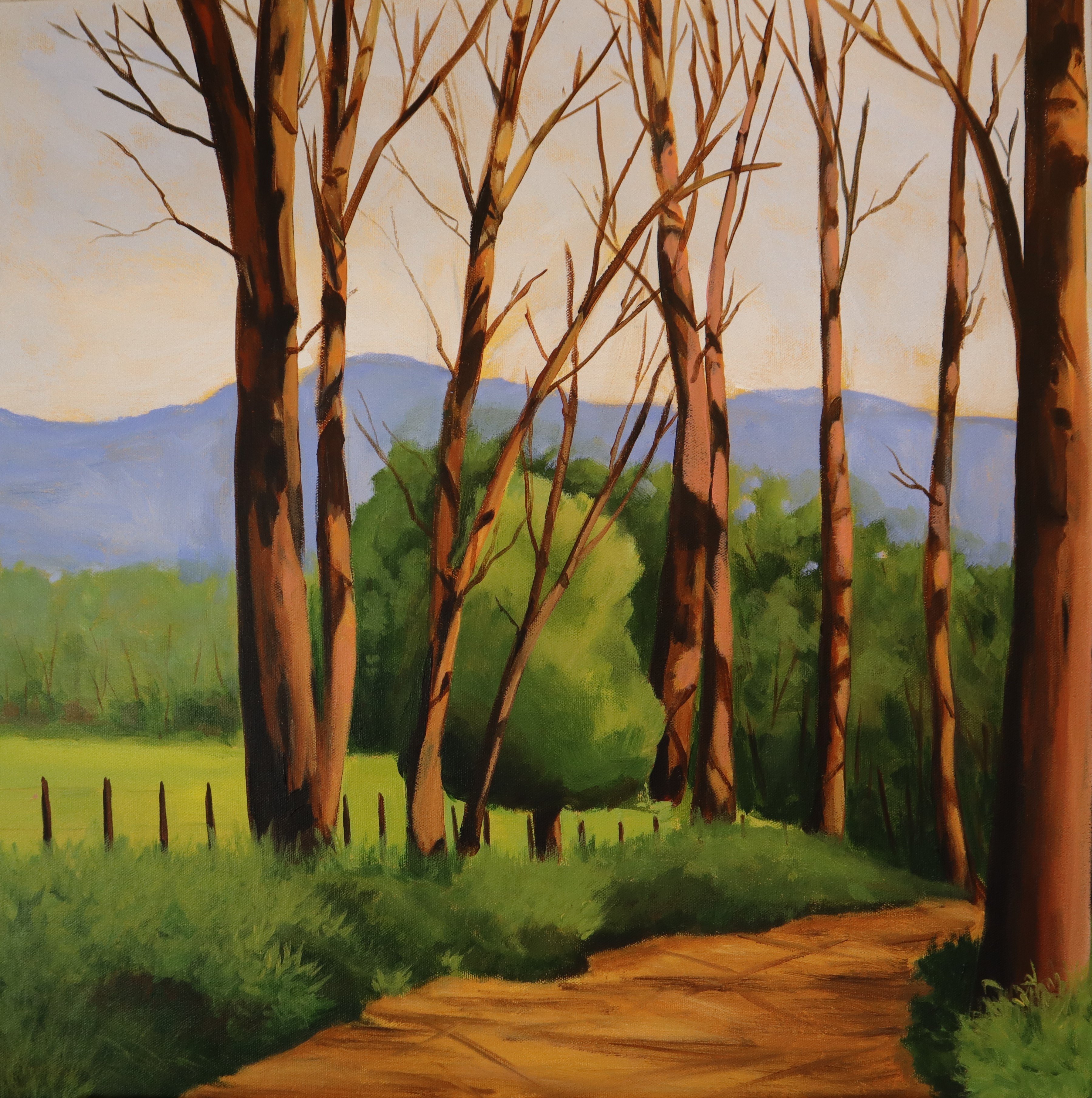
field and mountains and clouds in the background. Normally, even if the background
is fairly blurred out, you would have a lot of
detail in the foreground. And I chosen this painting
to blur all of it out. So I love how loose and
impressionistic this is. Next, let's look at this
still life of a green bow. And I wanted this to
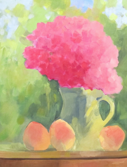
look very realistic. I wanted the highlights and the shadows to be very dramatic. And then we contrast that with this loose still-life of flowers and a pitcher
with peaches. And I just love this painting. It so blurred there, so little detail in any of the
elements in this painting, but yet your brain
tells you what it is. Here's a close-up of the page. Notice they're all the edges
are solved in the queer, the colors come together
within the object. They are so soft and so blurred. Let's look at this watering can. This is an example of putting some fun
detail around the can, the lines around the can
the shadow, that main two. But then the other flowers are less detail in our
little more blurry. This is a great way of bringing focus to your
painting where you use more detail and you
want your ADH and move out of the painting
using less detail. Lucky to look at
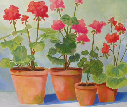
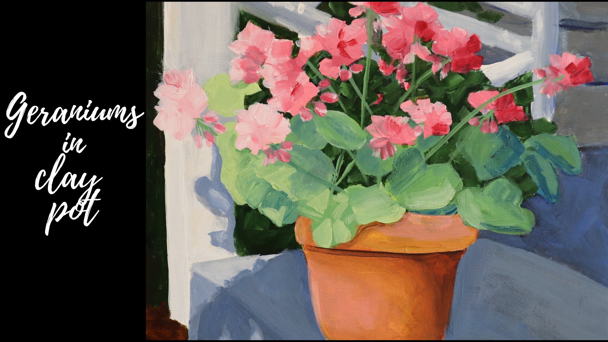
these two photos of the drainage and clay pots. This is one of my
favorite paintings. And you'll notice
that the geraniums, even though you know
they're geraniums, they're not really any
individual petals painted. And again, your brain tail, she knew that what you're
saying or geraniums, but it's really just
several different values of colors dropped in. I was mindful of
the outside shape, detail you what type
of flower it was. Notice that the
leaves are very soft, just layers of color
light in nothing crisp. And then finally, I want to show you a couple of
daffodil paintings. I've done a lot of daffodil
paintings over the years. Here are two that are very
tight, very, very detailed. Then I'm going to contrast
that with part of a painting that's
in the center of a bouquet where all the
flowers are blurred. I use lots of paint. Use that Rosemary
company kind of brush just to get
a super soft look. So I hope these
comparisons help you. As you're thinking
about your painting, you're thinking about the
brushes you're using. Eight, you're thinking
about the edges. If you're thinking about, if you want to add
a lot of detail or if you want to limit
a lot of detail that really is going to
have an effect on how painterly and loose your
paintings are going to look. This was helpful.
9. Closing Thoughts!: I just wanted to thank you
for taking this course. I hope it's been
beneficial for you. I do have an exercise
for you below that's intended to help you incorporate the different
techniques she learned. I hope you'll put
your hand to that. We'd love to see you post
your results at the bottom. And if your first-time eye out, if it's not sensational, don't worry about it. We build new habits by practice. And I'm sure if you
continue to practice, you're gonna see
these techniques really make a change
in your work. I'd love for you to leave a
review and I'm hoping to put more and more videos that on Skillshare and YouTube and hope you'll check
those out as well. Again, thank you so much.
 Victoria Hagaman, Joyful Art