Transcripts
1. Introduction to Course ~ Painting Geraniums in Clay Pot: I'm going to walk you
through the process to paint one of my very
favorite things, geraniums and a clay pot. We'll talk about composition
and let's face it, some arrangements are
just better than others. We'll talk about the
importance of shadows. Shadows can give lots
of information about direction of light in
the object itself. Strong shadows will give you
a more dramatic painting. I'll show you how to mix just the right colors for
the Terracotta pot of light, shadows, flowers and leaves. Then we'll look at
how important it is to get the outline right. If the outline is clear, your viewer doesn't
need a lot of detail. You'll get to see every face of this painting from
that initial block in. I'll show you how I
do my shadows and how important they are
to your composition. We'll talk about leaves and
how to paint leaves going in different directions to make
them look more believable. You'll see that
leaf for the big X. I'm also going to show
you mistakes that I made. Then we're going to talk about the outline of the
geraniums and getting that outline shape right so that the flower
is read correctly. Then you'll see me put in the subtle details,
the highlights, the darks on the leaves
and the flowers sitting in the stems and O those
terracotta pots. I'll show you my
special method of using multiple layers of color to
get that beautiful glow. I'll also provide you with my photograph that you
can download and you can paint along with me
and end up hopefully with a beautiful geranium
painting of your very own.
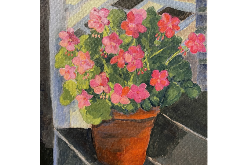
2. Composition ~ Great Lights and Shadows are Key: I had had my eye on this
big pot of geraniums on my front porch in thinking
about doing my next painting. But as I looked at the overall
surrounding composition, I was not excited about
big hole that was behind that POC or that
plane green shrub. And about that time the
sun kicked out and it eliminated that chip and
dale rail and I thought, oh my goodness, wouldn't that make a wonderful
background for this? So I moved it. The only problem was that light was not eating on the
pot are the steps, there were no interesting
highlights or shadows. So I had to wait quite a
while for the sun to me. But finally I was
able to catch it. This beautiful photograph, outlaw council hop
is illuminated. Look at that great
shadow pattern that's coming down the
front of the steps. And I thought this would
make a great painting.
3. Blocking in the Darks: The first thing I like to
do is put in the darks, the darks to me feel
like the framework, the basement, the support
system of the painting, and then let the lights come
and hang on top of that, I'm going to be using burnt umber, sap,
green, ultramarine. I'm just going to be
mixing these together, putting in a variety of kind of dark greens with a little
bit of brown mixed in. When I get over into this
part of the painting, That's actually the
signing of the house. So I'm gonna make
a dark gray there, again using burnt umber, ultramarine and white, and that should give us some
good color harmony. I'm going to use
a fairly limited palette on this painting. And I have found that limiting the number
of colors really, really helps to keep the
painting looking cohesive. Someone put some of this
burnt umber, sap green. I'm just going to
mix it together. I'm mixing a touch
of blue That's just going to give
it some super dark. I might even put it, I've got little bit of a cad yellow here. I might have a little Paul, just a little too much in there. Easy to take care of, just to have some lighter
greens mixed in here and there. So there's no science to this. I'm just going to dip my brush into different piles and I'm going to fill in
these darker areas. I'm going to be
careful to try to get, get things super dark
next to this post. Because that's where we
want to get good contrast. When we get down in here, we could do things a
little bit lighter. So we don't want it
to look polka dotty, but we want there to be some
variation here and there. Turn your brush, get
some different strokes. You'll notice I'm not fussing
with these brush strokes. I'm not dabbing. I'm trying to put
in some I've got a lot of paint on my
brush a fair amount. I'm trying to put in some
long single strokes. I'm using a big enough brush where it would be hard
for me to fuss with this. So you look right here and
I've got a bump right there. I can take care of that later with the white or I
can just leave it. I'm trying to have this
look a little looser, so I'm not concerned if something isn't
perfectly straight, in fact, I think that
might be, might be better. I'm just working around some of these flower heads
that I've sketched in. And now I've been here, I need to drop back
into that dark gray so you can use black
and white to make gray. But I think it's a lot
more interesting to use the burnt umber,
ultramarine and Hawaii. And you can get some
beautiful warm grays. You can make it a cooler
gray by adding more blue, a warmer gray by
adding more brown. See if we get this a
little bit darker. We've also got the step, which is slight, which
is a much lighter gray. So I've got several values of gray from very
light to very dark. So put that stuff in. So let me put this
shadow pattern in first. And back around the
back of the pot. It's super dark. This shadow pattern. It just doesn't have to be
exactly like the photograph. But I think it's important
that when you get to the edge, you've got this straight line and then it goes straight down. That's what really gives you the feel that there
is a step there, there is an edge there, and that shadow is
coming all the way down. Actually followed the wrong shadow there.
But that's okay. If you don't like the way the shatter shadow
pattern is reading, you can always go back
and fix it lighter, super dark back in here. Shadows are always darkest, closest to the item. So if this shed, it came out this way, it would give a little
lighter as it moved out. And it's very dark back in here, which is going to be beautiful when we put that clay pot in. It's really going to
help that pot to pop. So don't be afraid of
getting something too dark. I'd rather see you get
something too dark, then not dark enough. If you're painting
looks a little flat, it might be because your
values are too close together. You don't have enough dark, darks and white lights.
4. Blocking in the Clay Pot: Next we're going to
fill in the clay pots. So I need a super light place and then I need a darker place. My, my photograph, actually
that part, the third, that is geranium serene on my front porch is a huge
part and it's one of the plastic ones made to look like terracotta so
I can pick it up. I might show you
some pictures of some other terracotta paintings that I've done
where I use darker, richer colors, which is
what I wanna do on this. I've been kind of experimenting
on a paper plate, trying some different things. I think they're a little
brighter than what I want. So I have some burnt sienna cad yellow,
medium cad orange. And this is a Liquitex. Let me see what that is. That is called Rose Pink. Since the flowers are going to have some of the pink in it. I like to pull that same
pink into the pot sometime. So I'm just going to mix, mix a very dark value in a very light value and we'll put a little bit of the
pink and that mixture. And if we don't want it, we can do something else. It's looking a little too
orange and put that in there. And we'll just pull some
out of that same pile. I'm going to add
some white to it. It's just good to practice with color and
see what you come up with. This looks, This
looks a little muddy, but I think on the painting
it's gonna be good. The main thing is whatever. If you go more with
the pink terracotta or an orange or brown, just make sure between these two values that you've
got a great distance. You don't want these colors
being close together. One needs to be very dark and the other
needs to be very light. So I'm gonna just put these on the painting and let's
see how they look. I'm going to use this rosemary and company classic long flat. This is a size five. I really liked these brushes, so I'm gonna, I'm gonna put
plenty of paint on the brush. I'm gonna do some long
expressive strokes. I'm not going to dab, I'm just going to
try to do this and as few strokes as possible. I'm really just, I see this as doing the blocking
of this painting. I'm going to go back in and add a little variation
and all these. I don't want big
blocks of solid color. So I'm just trying
to really establish my values right now and get the first layer put in and get a feel for
where we're going. There is also the
same white color, bright around this room. And right up in here, and actually right here
along this top edge, if you'll notice, it
gets even lighter. So I'm going to just add
a little white to that. And I'm going to drop
that in right here. It gets a little like
down in here as well. I'm not going to try to put
in these grooves that are in that plastic pot and all these different
lines I drew that in. But the more I look at that, and I'm actually going to
go even wider right there. The more I look at, I
think it's just confusing. So I'm not going to try
to put that detail land. I really liked just
plain, smooth clay pots. It's just hard to beat that. So let's try this darker
color and see what happens. Again, I decided I'm not going to put that
extra groove in there. So I'm just, I'm
just painting over that big loose strokes. This may feel like too
large of a brush for you, but depending on the size
painting you're doing, I encourage you to get
the size brush that you think you want to use and
then go up at least one size. Because we tend to pick up
brushes that are way too small and that's where you get a real fussy looking painting. Over on this side. It is slightly darker. I'm going to add just
a little more of the burnt sienna to this, just to darken that up slightly. And that top edge actually
has a shadow of some leaves. So then all that's going
to be covered by leaf. So again, we're just trying
to get in that first layer. We're gonna go back
over all this, but just making sure
that things read, write that the values
read correctly.
5. Blocking in the Rails and Steps: I'm gonna go ahead and
get this light value in of the slate tile
here on this porch. I'm going to get
that established. Then I might even
put in this railing. I just want to make sure
that it's reading correctly and sort of leave this
like the cherry on top. So I'm going back in. We had our dark gray. I'm just going to make sure I've got a
real super light gray. And I'm going to
drop that right in. Again, big strokes. Confident strokes because
we are very confident. We're not scared
of this painting. All right? We are brave painters
were willing to take chances and just get it in as quickly as you can. Don't fuss with it. There's actually a little
bit wider edge right here where the light's catching
the edge of that step. We'll go back to her. This gray is actually slightly
darker, but not a lot. You know, there are places
in your painting where you need to see a
significant value difference like here and here. But there are other places where that value difference is
going to be very subtle, like from here to here. These are both in the light, but this is going down. This is, This is receiving the light coming directly and this is going to be
slightly more in shadow. When we get to the post, there's gonna be a white
and a slightly darker, like a light gray
for the shadow. And that's gonna
be a place where the difference is going to be
more subtle and the values. But sometimes that subtlety
can be very impactful. Sometimes you need
a big difference, sometimes you need
a subtle shift. If we decide later that we don't like the shadow patterns
and what's happening. We can always go back
and change those again, we're just trying to get
things kinda blocked in. I'm using a big brush
that's kinda rough. That is not allowing me to
do real precise things. If you pick up a brush that
has a super straight edge, if you use this type of
brush to put that in, you will get a razor sharp one, which is what you
may want to do. That's how I used to paint. Everything was very precise. Everything was razor-sharp. But now I work with these soft brushes that are
kind of ruffled on the end. They won't let me get
that precise look. And the paintings end up being a lot looser and more
impressionistic looking. And I'm so much happier with the finished
product and i'm, I'm enjoying the painting
process so much more with a looser look and
I'm not fussing with it and I'm having
more fun with it. So I'm just trying to encourage you and that you
don't have to paint that way. You may, he may rather have
real sharp edge brushes, but I think the final product, if you can hang with me on
this and just give it a try. So I'm going to take the slightest gray
Powell and I'm going to put a ton
of Hawaii in it. So it's gonna be a little
less than pure white, but it's still going to
be pretty pretty bright. Got some pine needles
going on, right. They're going to
just put that in. Then the walk the walk is
actually brick right there, but I don't want
to put in brick. I want the focus to be right here and I think that's
gonna be real distracting. So I'm just going to
kind of block that in, in the brown for now. And then we'll figure out what in the world
we're gonna do with that little, little corner. I'm just looking up in here
seeing if there's anything. This house, the signing of
the house goes this way. And then there's a
line going back this way and that's really
not showing here. So that's something that I'm
going to need to correct. I feel like the house is
reading a little too dark. And I want this line that's
the bottom of the siding, that shadow line, I feel like
it needs to be much darker. I might even get like a
black and brown together. And I feel like
that line needs to be a little more severe. And I might lighten up this
siding just a little bit. Just say you get a
little difference. I don't want the
house and the post in the shadows and the step all to look like one color
because they're not. So I'm gonna give
that some thought, but we can tweak that when we go back in with our second coat. So let me go and I'm
gonna go ahead and put in the rest of the
chip and dale rail. Most of it is in shadow. So most of it's going
to be this color. I'm going to have some
places where there's a little dabbled
light hitting it. And I'm probably going to
exaggerate that more than what you're seeing in
the photograph just because there's so
little light there. I don't want this to just
get so dark back in here. I think having a
little more dappling of white here and there
would be more interesting. We can always paint over
it if it's too much. So let me paint this in and we'll see what we
have gone down a size and brush just to see if I can get that in a little better. If you can try to do this
and as long as strokes as possible, you'll thank me. And I know I had been first thing about using
this kind of brush, but I think I'm going to use this just to get a
dark enough line. I'm just going put it right
in that ultramarine and see if I can claim that. So I'm going to look at my reference photo
and then I'm going to turn and see what kind of angle it's not as much of
an angle as I thought. So at least that'll kinda give me some placement. Okay. Let's carry that right there. See that line is not at the
same angle as that line. So this one looks
more realistic. I'm want to just
take this one off. Not a big deal. I don't really worry
too much about if these lines are
exactly like the photo. My concern is in looking
at the painting, do they read correctly? So I want to get this and
this at the same angle. Right angle that just
a little bit more. And again, we can go back
over that and fix that. But at least I've got
the framework for it. I've made an executive
decision here. Even the photograph, the value of this post in
this step are about the same. The post and the chip
and dale rail are white, while this is a gray slate. I'm going to lighten
all of this up to me. It just doesn't look like
quite would anymore. It's just kinda
requires that so gray. So I'm going to lighten
all of this up, but I'm still going to
keep these bright whites. And I'm still going to
keep these deeper shadows. But I think in some
of the rest of these, I'm going to just
generally lighten that up. Still have some
wider dapple places and we'll see how that reads.
6. Tips for Painting Leaves: All right, We're getting ready to learn how to do these leaves. I'm using just three colors. I have ultramarine blue, cad yellow light,
and titanium white. All three of these
are Liquitex colors and they are heavy body paint. There is a time to use less expensive Liquitex paints
that are just the basics. But I would suggest for this particular application we want to have good coverage. So I would go with
the heavy body. I'm going to mix a
variety of greens. And I'm putting the
white and just to help it be more opaque. So we're just going
to do, and I'm going to do some fairly big pile. So I've been experimenting with this and I found it was
taking a lot of paint, so ultramarine and cad yellow light and make
a beautiful green. So there's a medium tone green. Let's do a much lighter value. You can pull some of that
out as your starter. Let's see where
we get with that. That's reading far too yellow. Really. You can use blue greens, yellow greens, whatever greens
you want to use for yours. I'm looking at my my photograph and I'm wanting it to
read similarly to that, but it doesn't have to
look exactly like it. Put a little bit more blue when they're when you put white in, it can make something
look chalky. Let me show you what I mean. It cools it down a lot. But there are places
on our leaves where it's almost white, where the, it looks
so washed out. Alright, the other thing that
I wanna do with our paint Paul's is to add a
slow dry medium. They're different companies make something that's called a, this one is by Golden. It's called Open slow drying
acrylic medium in a gloss. Liquitex makes when
different companies make them that are maybe
less expensive than this. The reason I like
the Golden is it has this twist cap where you can put just a drop into your paint. And it's easy to put
too much of this and ruin the consistency
of the paint. So I like the ease
of that application. And what that's going
to do is give us a longer time before
that paint dries. It's the one problem with acrylic paint is it
tends to draw so quickly that sometimes you
can end up with hard edges. And when you're blending
colors like these leaves, they're going to, some of these leaves will have all
three of these colors. It's going to look a
lot softer and more painterly if those paints are sort of blending
nicely together. And I thought before we go
right onto our painting, let's experiment with
some of these leaves. And I wanted to
actually pulled one of the leaves off my plant. And I wanted you to
just see this is not like a cardboard circle
that you cut out. It has a lot of movement to it. It has a lot of ups
and downs to it. So as you're painting it, you're not painting
a flat circle. You're painting something
with a lot of waves to it. And when you're painting
geraniums and geranium leaves, I want you to be very, very mindful of
the outside edge. Because if the outside
edge looks right to the, to the person who's
looking at your painting. It will look very believable. So I'm going to draw several geranium leaves
in different positions. And let you see what I mean. I am using a number to Rosemary and company
ivory long flat brush. So I'm going to wet my brush, dab it off omega1 to
this lighter green. And just to give you an example, one of the things that we, the geranium leaf
always has that makes it so distinctive is this split. Sometimes the split overlaps
and you don't really see it. Sometimes the split will be
very far apart and it's very distinctive for our
purposes since we want people to know that
this is a geranium leaf, since we're not trying to
put in tons of detail, I'm probably going to exaggerate that split just so it'll be obvious that that's
what we're painting. So I'm going to paint
one leaf that's facing us. So I'm going to. I'm going to have a
pretty big split. So make sure you get
that distinctive be the geranium is
wider at the top. You could think of this
like wavy elephant ears. And then it's wavy but
smaller at the bottom. And it will read like
a geranium leaf. Don't worry if it's not precise. Even black right there where there's a little
sketchiness there. That doesn't bother me
because we're going to try to do this loose, impressionistic. Alright, now let's, let's
see if we can draw a leaf. So that's sort of looking
at the leaf head on. Let's see what it would
look like if the leaf was more up at an
angle like this. So I'm gonna, again, I'm gonna get that real
distinctive split. What you can do that I have
found helpful is to get, I get my split and then I get what's in the
front of the leaf so that the front of the leaf comes up in
front of that split. Now that looks kinda funny. Let's see. Remember this has a
little bit of wave to it. Uh, probably fill this in
a little more carefully. I'm going to exaggerate that just so people will
know that's the back. Yes, the back of the leaf. And you see right here
I can actually see the bottom of the leaf which
is wider and it's lighter. So I might even put that little stem in. To make that read
a little better. We can all say put
some, some shadow. We have been going
down into this. We can just drop some
ultramarine and do that. Alright, I don't like the
way this one is looking. So we're just going
to take that one out. One of the things that I
like to do with my videos, instead of editing
out my mistake. So it looks like I'm
a perfect painter and I know what I'm doing
100% of the time. I'm really want to show you the process that I go through. And I often, before I put
something on a canvas, I'll experiment with
different brushes. I'll try different
things and if I have something that doesn't
work, it doesn't work. So I wanted you to see. I thought that would work. I'm sure if I spent a
little more time on it, I could get it to look right, but I'm trying to
do these leaves pretty quickly and easily. So I'm just going to scratch that one and
say that's a bust. So let's do a leaf fits going
a little more at the side, a little, little more,
turn to the side. So the V, again, I, I kinda start with the V. There. You've got one
turn other direction. It's really important with your painting that
you do not have ten leaves all facing
exactly the same direction. It's just not going
to read correctly, but if you'll turn them, so notice when you turn it, this leaf is not
gonna be as full. It's going to look a little
flatter on that side. Let's do another
leaf where it looks like it is very flat. So let's me see if I can find one in
our picture to go by. There's just that
doesn't look like much, but it's got the split. That tells people where
the head of that leaf is. It's fairly flat. They know that there's
a stem right down in here and that leaf
is going out that way. Before we drop this
into the painting, let me show you what I'm also planning to do as
far as shadow there so many leaves and shadow because this
paint is still wet. Because of that
slow down medium. I can just go in and this
is pure ultramarine. And I can just drop that in. And didn't that beautiful. See that you get this
nice soft transition. You don't get this hard. Screech elan where this to me looks more like oil
paint. It's just beautiful. They're going to be
places where you're going to have dabbled light. Going across the leaf. Where there's a shadow
from the leaf above. Or there's just a
dappling somewhere. And we'll just go in with ultramarine right
on top of that. And then there are other
places where we've got this super light edge where
it's catching the light. And we'll use our
lightest color there. And we're just going
to drop that in. Let that sit on
top of that leaf. I think that's going
to look great. You can always smooth it out if you don't want that
much of a contrast, but I think that's
reading very nicely. So let's take this and we're gonna go
onto our canvas. Now. I've got a leaf right here. I'm keeping a little
bit of wiggle to it. I'm making sure I've
got that split. Because it's the
split that's going to tell you it's
a geranium leaf. If it's not perfect, don't worry about it. That leaf is almost
completely in shadow, so while it's wet, I'm just going to go in and drop this ultramarine. I like that. This is very painterly looking. It's very loose. It's not doesn't look precise. You're seeing the
brush marks in it. I'm going to zoom in
on this a little bit, see if that'll help
you to see these. Alright, the leaf
sits right above it. It's very, it's in
a lot of light. Say I think this contrast, these leaves so close together. It's got a real definite split that one's behind this one. That one's not looking
quite as believable. Just keep messing with it. You can always go
back over to a T, but I really encourage
you with these. Try to put down
some loose strokes and leave them and
don't fuss with them. Trust this process. Let's just go through and put the leaves in, put
the geraniums. And I'm planning on going back over a lot of this
with a second coat. And I'm going to show you some really pretty things
to do with this clay pot. But let's just kinda trust
this process and see if we can't get these
leaves and where they're very organic and very loose and
painterly expressive. Again, I'm going to kind
of exaggerate that split. This is a little bit
of a bigger leaf. So remember it's going to be
water in that first section, and then it's going
to be smaller. So remember your elephant ears. Another thing that's gonna
be real important for this. So I just went over that
I didn't really mean to it's important to have
your leaves overlapping. You don't want everything
having it same space. You need to have
a lot of overlap. So in this whole
section, we have, we have some flowers up in here, but really in this whole
section, we've got leaves. Doesn't mean we have to
paint in a 100 leaves, but we're going to put in
some leaves that are very distinctive where you
really see the outline. And then we're gonna put
in some darker things just to fill in to let
the reader or the viewer know that there are
other leaves back there, but we're not
painting them all in. Let's see what happens there. We'll just we might need to get some sap green to go
with the ultramarine. Me, try that to put
in that background. Because we want that just
to read like it's just so dark that you're not
seeing anything back there. So let me just try just
some pure Sap green.
7. Tips for Painting Flowers: The next thing I'm
gonna do is mix up several values for the flowers. And you could really
do those and read, or coral or paintings. Any of those three colorways
would be believable. But I've decided for
the lighter pink, I'm using this Liquitex, rose pink, amazing Liquitex, heavy body, Alizarin crimson. And then I'm using
titanium white. And I'm just going to make
several strings of a, a dark, a couple of
mediums and a light. So the slightest one, I've just taken white and a
touch of that light pink. I would refrain from
using pure white because I just don't think
it's going to read correctly, but the pale pink will read like it's completely
in sunlight. And there are different
ways that you can do this. We could try to paint in individual petals and show the variation within the pedal. My preference is to take big brush strokes and just
block in a good outside edge. If you, if you get
a variation as little square it off places
where it really varies, your viewer will read
that as a geranium. So that's, that's my plan. I'm going to show you
another painting of some geraniums that I did
with that same method, rather than trying to
do individual petals, I just focused on
the outside edge. I use several strong
values and I just left that interpretation to the
viewer as to the petals. And it was just a looser, more impressionistic look
that I was happy with. So that's what we're
gonna do on this one. You'll notice in our
photograph that some of the flowers have
larger rounder heads. Some are at an angle, some are just starting to open. They're at different degree. So we don't wanna do
round balls and we don't want to do them
all the same size. So I'm gonna go in first and put my deepest color in them, get plenty of paint on my brush. I'm gonna go into
this deeper. E. Notice I'm doing
nice big strokes. I'm turning my brush. I'm not worrying about
this being precise. I'm not trying to do
individual petals. I'm turning my brush. I'm mindful that outside edge. I want to keep
that outside edge. Really distinctive. Keep in mind that there is a place of greenery of
the stems underneath, so it's not a full ball. You've got to lay
place for those stems. I'm just putting in these
darkest values where I see them dropping some
in here and there. Now I'm gonna go
to my next value, which isn't that far from this darkness when these are not huge differences but there
enough that I think, I think it will read right. So again, isn't that nice, that lighter one next
to that darker one? Again, I've got plenty
of paint on that brush. I'm putting down a confidence
stroke and I'm leaving it. I actually have a little blob
of paint here and there. I think that's really pretty. I'm going to leave that in here. If you'll notice these
are going very quickly. I'm not I'm not fastened. I'm not going back in. I'm not trying to
massage those strokes. Just be mindful of the shape of the petals in that outside edge. You can get that outside
edge to read correctly. You've got half the battle. This is one that actually
wasn't in the photograph. I just drew that in. Oops. So let me again. Confident strokes,
confident strokes. Now I'm gonna go down
to the next slightest, which is just lists. Instead of going that
one that's so close, I'm gonna go up just ended this light pink that was
right out of the tube. The only problem with that is it may not have the coverage. These others have a little
bit of the titanium white, which is an opaque paint. So if this is too transparent, then we'll have two will
have to switch over. Let's see what happens there. Okay, I think that's nice. Seem to be getting
good coverage. I don't wanna get too
many blooms on here. And I can always go back. Said, That's nice Where I
accidentally picked up a little white and
I had some white and some pink on the same mark. And that's what's
happened right there. And I think that's really nice. So let's I feel
like Bob Ross that, that was a happy accident. So let's continue with this light pink with
this other mixture. So I've got both on the brush. I think that's nice. When we get way out here. I'm just gonna go to
this lightest one that's just white with
a touch of the pink. Remember to turn your
brush very those strokes. You want the widest ones
out here near the edge, this one, which is
in full sunlight. I'm going to even put more wide that I just
pulled from this pile. So that's just got a very
light touch of that pink. So that's really going
to give you that feel. For this next
stroke. I'm a very, it just a little bit. It's underneath that one. This is a place where just a subtle variation in color can make a
lot of difference. It doesn't look like
much difference on this, but it can, can really make a difference
in your painting. I'm going back to
my white there. So I'm trying to decide. I think the geranium blends really our way up
and above the foliage. And I'm going to put leaves in here and not try to get
those blooms down in here. I don't think they're
gonna read correctly. So I'm gonna go back in and
start filling in the foliage. Now there's one
bloom right in here, that's just the buds. I might see if I can
just put that in. So to do that, instead of putting
a full stroke, I'm just going to
use this corner. I'm going to dip the corner. So I've got plenty of
paint just on that edge. And I'm just going to Might even go a little lighter. Because they are,
they are lighter. We also have these little
buds on these other plants. I think I might, rather
than trying to put all those buds and I might go ahead and finish the leaves, put the stems, and then last we'll go back and
put those little buds. So one of the advantages of using a little stay wet
palette is I just took the lid off and there
my leaf colors again. So I'm gonna go up in here. I'm going to take
this medium value since we're kind of up here. Season big strokes, we're
not trying to we're just trying to get that
illusion of leaves. I've picked up a little bit
of pink on my brush there. Didn't mean to, but it's okay. I think that adds to
that painterly look, if that bothers you, you can wipe your brush off
in between each stroke. It's important to
have some leaves that are going behind flowers. Most of these flowers are
sticking out beyond the leaves. The leaves for the most part, need to read like they are
going behind the flowers. In some plants you'll have leaves going in front
of the flowers. But for this one, I think it's important
that they go behind. When you get to the top. The flowers are going to
stick up above the lease, so we don't want
to put the leaves all the way up to the very top. I think this is as
far as we need to go. And then we can go
back in and fill in some of these
background places. Actually in the photograph there was a flower way up there. I guess I'll put that in. It's right in the
middle of the painting, which you want to
try to avoid that. So I might bump that
flower over a little bit, so it's over there. But let me, let me finish
my greens real quick. I'm gonna go up to
my lightest green. Kinda make a statement
with this big one. Give that one a lot of shape. Put it out there in
that full light. Again, that's just helping
build that illusion that there's a lot of light
coming in right here. That one's going to require a second coat, but that's okay. Let's do another one
backup of this petal. Feel like we need one more here. Just to help outline
that flower. Just kinda making these up. You can go back and look
at your reference photo. There was also a
very light one that was where this pot is is light. There was one that was catching. And then it got very dark again as it went back up
underneath that leaf. Again, we're going back,
we're gonna go back over these leaves and
do a second coat. The, I don't know
what that law is. So that was just a
glob of paint that had dried and I just scraped
it off with my fingernail. You may choose to leave
something like that. I felt like it was really
kind of jumping out. So let's get back and pick that one last
flower up in there. Get back to my pink palate. Sure, your brush is real plane. That one is still in a
fair amount of shade. I'm going to turn
it a little bit. We'll leave a big
gap right there. I've gotten back from
this and I can't encourage you enough to get back from your
painting pretty often because it can read very
differently at a distance. And I feel like these flowers
can be a little bit bigger. So I'm going to just go back in and enlarge a few of these. Not going do anything
really crazy, but I'm just going to build
these out just a little bit. Again, being very, very
mindful of that outside edge. This is a really important edge because it's going against such a dark and it
is in the center of something very purposeful. To get a good, clean, interesting edge there. Lighten up again, some
edges here and there. Okay, So I think the
next step now is to go and we've got our
flowers established. I don't want to get carried
away with the flowers. Were the leaves. I think we have enough foliage. I think the flowers
are large enough. So I'm gonna go back
in and just fill in the spaces that are behind. One thing in looking at this, and I felt this way
from the beginning, even though this value of gray is reading correctly
to the photograph, it looks to gray to me, I want this to be very
obvious that it is a white rail behind it and I feel like it's
just looks too dark. I'm gonna go ahead and
carry this white all up into this rail and I'm going to re-establish some
white back in here. And then I'm going
to keep some of my real darks and put
in some white or white. So you're going to see me, I'm going to speed this up, but I'm want to rework that
rail and then we'll go in and fill in some more foliage
here, more background.
8. Beautiful & Important Details: I'm turning my brush. I've got some of the
sap green on there. But on the same stroke also have this original darker value. So that when I lay that stroke and I'm going to get
a little bit of both. I'm turning my brush. I'm using the full stroke, I'm using the corner, I'm using the edge. Just trying to, to get
some variation in there. We're not trying to paint
in all these leaves. We're just trying to
give the illusion that in that background, we've got some other
things going on. So I think that's softening this up a
lot too, where it was. You know, don't don't be
afraid to use a bigger mark. This is an area
where we actually see some stems coming down. Like this little brush. I'm using a Monte Bello. I have no idea where
this brush came from, but it's a flat and it's got
a fairly tight his old age. So I've got a kind of a little
sharp edge to it there. It's easy to put in
these little lines. So I'm kinda why
can help the stems are looking ahead and
really plan to do that yet. But let's, Let's drop in
a stem here and there. I think that looks too wide. That paint underneath
is probably still wet and what's not okay. So I'm gonna see if I
can just mark that off. No harm done, right? I'm licking it with my tongue. Probably not the
most hygienic thing, but I've just taken
care of that. What I need to do is really
go back in and finish these leaves before I start
painting to me stems on top, but I love how that's looking. So let's see if there's
anything else we wanna do. Just in that background. Just to break up that
dark a little bit. That just looks so much better. Again, we're just
going after that. A lesion of something happening
in the background. Okay. So before I put my
stems and I'm gonna get back over these
leaves one more time. I'm looking at my photograph. There are some
extreme lights and darks through here where
shadows are hitting. Now that I've lived with this, I'm not really liking the color harmony of
these all that much. I don't think this is the one that's bothering
me a little bit. I like these blue or green
and then this role light one. So I'm just going to kind of lay this back in one more time. And we'll do some really
light, really loose strokes. Might even. We've got some really
light defined places on these leaves separated by
some little dark marks. So there's no real
science to it. We're just trying
to kind of mimic. We can go back into the slight one and drop a little shadow. And that shadow, and at the back of this one. I'm going to go back in. I'm going to take that out
when I do the clay pot. I don't like that at all
and I like seeing more of the rim of the pot and the dirt. So I'm going to redo that. Here's one where it gets too
straight right through here. And to me that looks
like an AVI leaf. So I'm going to go back out and then I'm gonna
get back out again. Go back up into this
dark 11 more time. Oops. I could wipe that off for I'm
just going over it again. I'm just getting a little
darker up underneath the flower where it
would be in shadow. I'm just not I'm just trying
to get rid of that green. I'm not crazy about it. I dislike this bluer. Look. It's nice having a light
leaf next to a dark. Dropping in a little more. I'm just using some ultramarine
right there and just dropping in a little
bit of a darker edge. I don't really like that
solid navy line, but This hit that highlight
one more time, just make a little more
of a statement there. I decided I need a little
more drama and contrast. So I'm going back in to my Alizarin crimson and just picking up some of
that solid red. And I'm just dropping that
in just a couple of places. I don't want to overdo it, but where things are
really in shadow, I want to just get
that extra kick in the extra drama.
Just very little. I think that's gonna
be, gonna be it. But I'm just taking just different little
dollops of this and that, dropping it in here
and they're just trying to get some different
shadows and marks. Just trying to get a variety of colors here, variety of marks. And again, we're going
to take care of that. Okay, So I think we are
ready to go in and start putting in some stems and
start putting in the little. I need to figure out
what you call those, the little buds that are
beneath the geranium head. I know they must have a name. I will find that,
put that on here. So I'm want to go back and use this same little flat
brush that has a real chiseled in
unlocking that very much. I'm going to go into
this medium green. Make sure that your stems are not all just
going up and down. They need to be
coming to the side. They may make Thanks to have some curve to them to make them
more interesting. If he, if you mess it up, you can go back and think about where are you
going to start it, but think about where
it's going to end. Don't just start drawing it and end up in the
middle of your pot. You need to think
about like this one. Is it going to go, I think it's just going to go
behind that leaf. This one is going
to go into there. So that didn't really
show up very well. So I'm gonna, I'm gonna
darken it just a little bit. Try to do this in
one long stroke. It's good to let the stems
cross and you can let it disappear and then
reappear where a leaf is in front
of it or behind it. Just try to get a variety. Here's a pretty one because
it's going to be so long. And I like the fact that it's really going off at an angle. You could even have it going
across that other flower. Just play with it. See what makes your heart jump. If something happens
and you're not crazy about that's okay. Just go back in and fix it. This one really isn't
showing up very well. I don't know that I want
to get that much darker. So it may just be that
that one's not going to show terribly well. Little white will
need to get back in, in any place where
you've got white showing through the canvas, we need to get those
taken care of. So the next thing I wanna do, get our little bulbs hanging
down and we're going to do, I'm going to use a
little liner brush to make those little marks. This is a rosemary and
company ivory rigor. It's a size 0. It's designed to be used wet so you get some water
on your brush. You need to be able to
whip that thing around. If it's not whipping,
it's too dry. So put a little more
water in it so that you can get a nice loose
little stroke with that. You can add some
more water to it. Let's just give that a try. I'm not putting much pressure on this because I don't
want a wide line. I want a very narrow line. And these little flowers are not all exactly the same distance. And some of them even
go up at an angle. So be sure when you do this to vary this so it looks
organic and natural. That's not showing up at all. Let's go up in here. And some of your strokes
can go right in front of that stem and then we can put a little flower
right from the stem. They don't all have to
go out to the side. They're really nice
where you got it in front of something
super dark. That's another advantage of putting a real dark
background in. This one doesn't
really have a stem, so I'm going to put a
little more pressure on it, see if I can get
that little water. And then we'll put those down. Darken this one just, oops, picked up some yellow. Are also girl a lot
when I make a mistake. I think that helps to
make a girl sound. Again, it's one of
the things I just love about acrylics there. It's just say forgiving. If you mess up, you can just wipe it off. Go back over it. No harm done. It, maybe a little frustration, but okay, so now we need to
get back in and put those tiny little flower. So let's see what kind of brush we might want
to use for that. We might want to use a little round brush
or we might want to use a very small flat. So there's one way to find out, I'm going to try this as
a rosemary and company. No, it's not. It. This is a royal sable. Size eight. Looks awfully small
for a size eight. I'm going to wet my brush. I'm going to dip in this
pink and white together. And I'm going to try just
putting a little bit of a blobby look to that. Okay. I'm not wildly
excited about it. Let's not trying to make
any big statement here. We're just trying to see
I like that a little better because it looks a little unnatural and I liked it. There's some white
and pink combined. I think that looks better. And then just the so
don't overthink it. Just a little quick stroke. It's okay for one of those to go in front of another flower, to go in front of a stem. You don't have to put
it on every flower. Not everyone will
necessarily have that. This one I'm going
to do a little darker because it's in shadow, but I'm going to have
a variety. Again. Sharon, turn your brush and I may just leave that at that. I don't want to I'd rather
have too few then too many. I think that's good.
9. How to Paint the Clay Pot: Alright, I'm ready to work
on this clay pot again. And I ended up introduce
some other colors here. I'm going to use raw sienna. These are all Liquitex
and they're heavy body, so they're gonna give
us a lot more coverage. So I've got raw sienna, which is this camel color. I've got burnt sienna, which is this beautiful
color of mud. And then I've got a
little yellow Oxide to lighten it in areas
rather than using white. And I'm also probably
going to use some of our light pink in there as well. So I'm just going to play with this as I showed you with
some other clay pots. I like to just mix a
variety of colors. You can see if
you're getting this. You can lighten it
with the yellow ocher. You can add some
of the pink to it. And let's just put some
different likenesses in here. I'm going to use
some big strokes. I like that little
pink mixed in. The main thing is we want
to keep our values correct. So in this area
where it's lightest, where the sun's hitting it. We want to make sure
that reads correctly. This drawing is
off a little bit. I'm going to need to pull
that pot down a little bit. And that may take a couple
of coats to get that right. And I have a hair. So in the photograph
we were catching some light up here and I've covered it too much
with the leaves. So I'm gonna go back in
and try to cover that. Again. I might have
to add a little titanium white to my mixture. To get, to get the coverage, I need to go over that leaf. And then we can go back over
it with the right color. So that's going to take me
a couple of coats to get that leaf covered
up, but that's okay. I'm like Get a little of the burnt sienna mixture
with the raw sienna. I think that's just
a beautiful color. And I'm going to just see how
that looks for our shadow. I think that's just beautiful. It just looks like
a Terracotta pot. You can see where the, I'm eventually going
to go in and put a very dark line right
under that ridge, so it looks like a shadow. But I'm very pleased with this. Now you can also take
this a darker brown if you want to get a
really dark shadow in and just drop that in. On the far side. I like using a variety
of colors in my pots. I particularly liked the
parts that I have in real life that are old and got some personality to them rather than something that looks like you
just bought it today. We don't want that. Sum using the Sheila
oxide again with some ease in these three just in varying degrees of lightness. I'm not mixing it thoroughly
and I'm leaving it. I love having a little bit of
a yellow something mixed in because that does
make it look like the sun's hitting it a little bit. But basically I
just play with it. I don't like so you see how the rim of the pot
comes out and it cuts in. We don't have that over here. So I need to pull this
rim out a little bit. And that's probably going to
take some multiple coats. So to get there, I might
just go over that was white. And that white is going to
give me better coverage. And I'll let that dry and
then I'll go back over it. I'm going to draw up to some of the pink on top of this list. Let's see what that does. I think that's pretty,
I'm just getting a mixture of colors
going sort of loss. This outline here. In the photograph
It's pretty sharp. Doesn't necessarily have to be. You could just blend it out
into a little medium value. And then let it get
really dark over here. A little bit browner. It's okay having these other
colors peeking through, I think that makes
it more interesting. Another illusion to
help this look more realistic is when you have a
leaf coming up over a pot, is to put a shadow
line underneath that. So I'm going to take some of my, maybe my brown and
my burnt sienna. And I'm just going to I'm
not going to overthink it. I'm just going to
follow that line. And let that just be a shadow. Let's see if this has dried any. I'm going to put a little
more white over that just because it's not covering. I'm going to put a lot of
white there and let that dry. And then I'll go back over
it with our terracotta. Same thing right here. I think I'm trying to cover up that dark could
be a challenge, so I'm just going to put in some white correct my drawing. I'll let that dry and
then I'll come back. I might do the same
thing right here. I've gone over this with
several coats and it's just not covering wide is it's kind of counter-intuitive
that white would cover up, but it sure does. We'll let this dry for a few minutes and then
I'll come back to it. So I've gotten back from this, which I really
encourage you to do frequently and I
wanted to talk with you about things that I really like that I think
are working well. Some things I'd like to change, something that I just love is going in and putting
in that darkest red, even though it's not really
that way in the photograph. When you get back from it, that is just making it pop. And I'm going to go
in and maybe add a little bit in the
center of these. Even, I love that. I'm glad I got that more yellow, green leaf out of this. I like the color
harmony of the leaves. I think they're
reading really well. What I do not like is how these are in this
perfect little circle. I don't like the shape
of them particularly, but I don't like that there. So even this has better
when they come down. Because in real life they're not even in they are splayed out. So I'm going to probably
rework those a little bit, but overall, I'm very
pleased with this. I think this is
still a little wet. As soon as this gets dry, we'll go over the pot again. I do want to go over
the steps again. I want to vary
this a little bit. I want to put a
variation of grays in here rather than
looking quite so solid. I might lighten this
just a little bit more. Lighten this up just
a little bit more. I'm just trying to tweak it, push it so it reads
better as a painting. When I get back from
it, I love this piece of white that's
popping right here. So I might add a little
more white here and there. I might make that wider and
make that a little darker. Maybe make this shadow a
little more interesting, even though that's sort of
how it is in the photograph. Maybe put some individual
kind of leaf shapes here. So that just reads a
little more interesting. So I'm probably going to
speed all of that up, but I just wanted
to share what I'm doing and what my thoughts are. And basically I'm
very pleased with it. It just needs some tweaking. I think this part's already
looking much better. I'm going to put that dark
line in and you'll see me continuing just to add some little layers,
have some pinks. I'm probably going to lighten
up this highlight area in places a little bit more and probably darken this
up a little bit more. Again, just to get a
little more contrast.
10. Class Project: For your class project, I'd like to encourage you to try one or more of the
elements in this painting. Perhaps much uranium flowers
with leaves or clay pot. Or why not download the Phaedo and try
the whole painting. I would love for you
to post your project. Reviews are so important
for classes on Skillshare, would you take a moment
and leave a Ruby? I appreciate your time and hope you get to paint
together again soon.
 Victoria Hagaman, Joyful Art