Transcripts
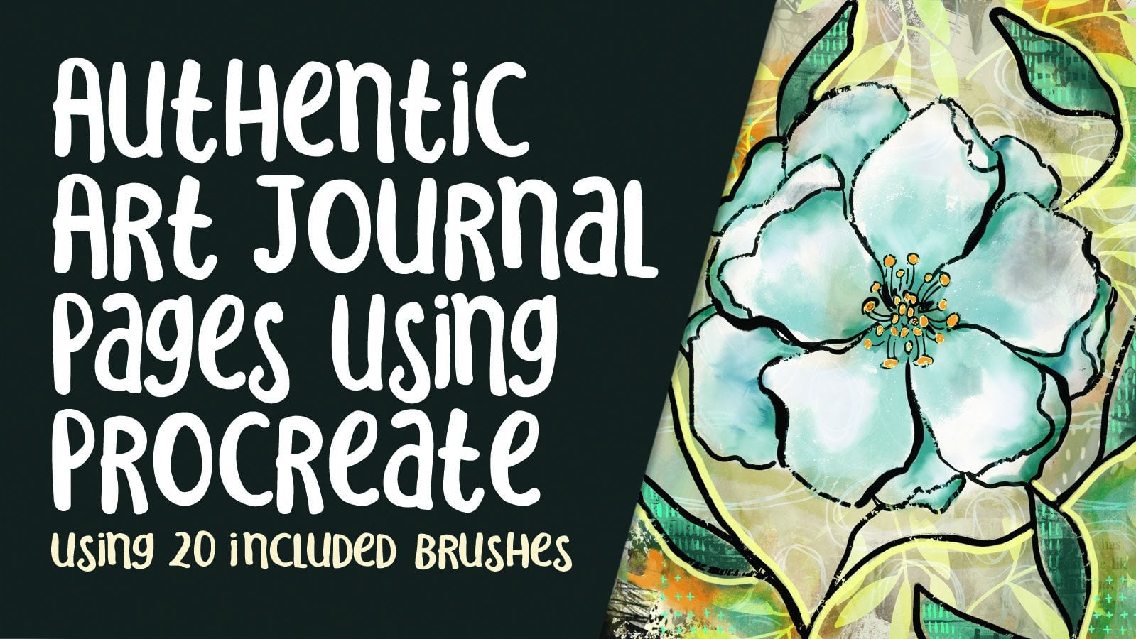
1. Intro to Multi Page Journal in Procreate: Hi there and welcome. My name is Dolores now screens. Now I'm coming to you from
sunny, Manitoba, Canada. So today I wanted to
talk about art journals. This is an area that I'm
really passionate about and something that I have
done for many, many years. I've shared some of
my journals with you in class when
it was relevant. And I'm gonna be showing you some of the things that
I use my journals for. There are so many different
types of journals. I think mine kind of falls more into the original category, but jumped journals,
bullet journals, even some forms of
scrap booking which fall into this category and into the sort of information that I want to share
with you in classes. And I say classes because
it's gonna be more than one. I can't possibly throw
everything into one class. So the first home we're
going to be doing is kind of an art journal,
junk journal Hybrid. We're gonna be using
photographs were going to be incorporating all kinds
of different stamps. Anything that I can think of to teach you in
this first level. And I really wanted to touch
on this today because now procreate has the function of being able to do a
multi-page document. We're going to definitely be covering all of that in class. I'm gonna be showing you how
you can do this yourself. So you'll create a document, write from scratch that
has multiple pages. And then I'll show you how I just went about and
created some of these sample pages that I
practiced with these feature, one of the brush sets
that I've just developed, and I shouldn't say just because it's taken
me over six months, I think to create this set, I've got hundreds of
different assets. Well at least 200. And amongst the things
that I have in there are some authentic background pages
right out of my journals. You're going to
see me using those and I'm gonna be showing
you all about it. And of course, I'm
going to give you a bunch of brushes
that you can play with just to get
used to the idea and learn how you can put
your art journal together. Now if you haven't
done so already, I'm gonna suggest that you hit that follow button up there. That way you will be informed anytime I post a new class here. I will also suggest that
you go to my website at Dolores Hart dossier and get your name added to
my mailing list. I do giveaway freebies, and the best way to find out about those is to have
your name on that list. I hope you're excited
about this class because I sure was that I really enjoyed putting together
all the materials for it in the lessons. Ready to get started. All
right, let's get to it.
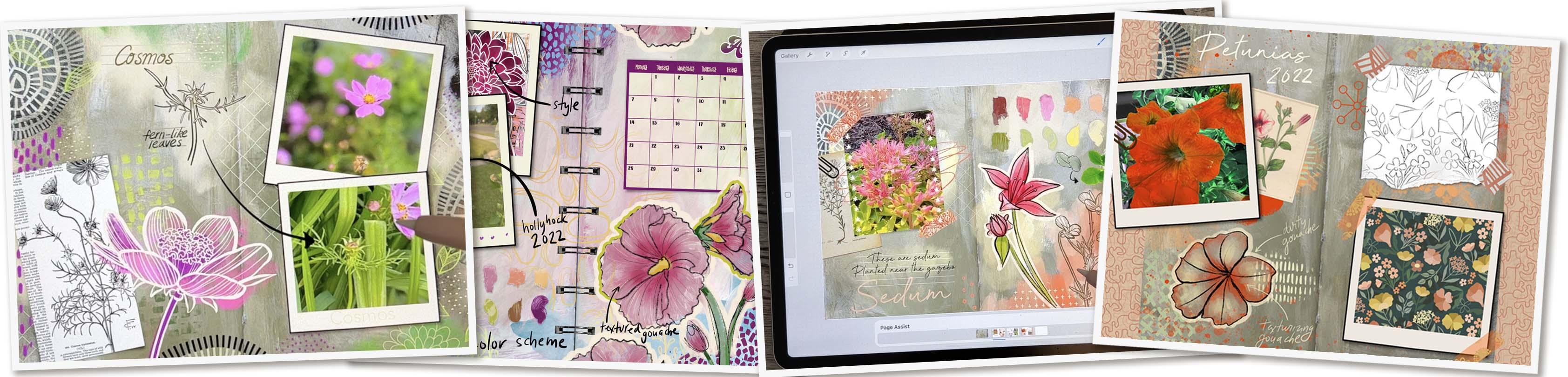
2. Lesson 1 Overview, Examples and Inspiration: Hi guys, welcome to lesson one. Lesson one here I'm
going to give you an overview and show
you some examples. Let's get to it. I've been working on this for probably six months
and these are all of the different documents and things that I've
been using to create brushes and set up this
whole class. And all. I'm doing a brush set
of course, with this. In fact, it'll be
several brush set. So I've got so many
documents here that I used to create all
the brushes and stuff. So something like this, e.g. has all of these layers
and these have all translated into brushes for the SAT like isn't that crazy? But that's what happens when you take months to do something. I have also got these
basic backgrounds from my own practice of creating
journals that was a cover. So we've got these. All of these are sort
of like what I would consider my base layer
for my journals. So I've created a real variety here so that there's gonna
be a lot to choose from. And then what I did is a
couple of practice ones. So here's one with, I guess I should
hide that little thumbtack that I was working on. This is my grandson
and I've practiced with adding in calendar
some pictures. I've got the coil in here,
which will be a brush. And the brush that
I'm the most proud of is a washi tape brush. So I've got a ton
of those included. I think there's 15. I'm going to also be
explaining throughout the series of classes how you can make your
own washi tape. And what's cool about it
is that it's two color. So that's something that I don't think I've ever
showed you before. It was absolutely frustrating, trying to figure out how
to create this brush. It was definitely a challenge. So there's that, that's what I'm one of the things I'm
gonna be showing you. And then of course I'm
gonna be showing you how to use all of this to create
a multi-page document. So my background is that it's one of my journal
pages that I just showed you. Then what I've done is each of the different pages
and you'll see how that background remains
there for every new page. So if I was to add a new page, now you see that it comes
up with that background. And if I were to export,
this would come, it would be printed with
that background on it. These are all amazing
things that I'm gonna be showing you
throughout these classes. And the very first thing is
setting up this document. So I think the first
thing we should do is what we always do. We'll take a look at some
inspiration and examples. Today is no different to
can tell you right now, I have several boards
here that I think would be good for you to take a
look at the find new ideas, I guess you'd say
for art journaling. If you've been in art
journaling for a while, you probably don't
need to do this, but you could take a look
here on my Pinterest site, I plot this art journal
folder 570 pens. I've got some intro pages
here for your art journal, so there's only about
20 pins in that one. And then this one I think is art journal pages with sewing, or at least I had started it to be art journal
pages with sewing, even if they don't
have sewing on them, you can share, learn a
lot by looking at these. There are so many
different ideas and so many things that you
could do within the pages. So definitely take a look through some of this
to get some ideas. I know you've been
practicing a lot of different illustration
techniques with me. And I think that
you'll be able to put a lot of what you've
done into practice. And when I say practice, I think that this is really what your art
journal is all about. It's your place to
really explore. And this might not be art
that you're ever going to use for any other purpose
other than learning. I have seen aren't
journals that have. This will be a
good example here, but art journals that have literally no drawing
on them at all. They're just collage
bits that are glued in, of course, very effectively. They're not just
glued willy nilly, but they create a layout. And that is one of the ways
that you can practice, just kinda learning
about composition. This one caught my eye and I thought it would be a good
way for you to take a look at because I like the combination of lettering
that's been done here. This guy, Richard false, I've looked his, his
journals many times. I love his style. It reminds me a lot
of early all vary. You've not looked at
orally all varies work. That's something
that you definitely need to take a look at. If I really love how he's
combined lettering, graphics, collage, doodling, all
of that hand-drawn, absolutely no
typesetting or anything. And I think for myself if I
had this book here and I was looking at this page a year from now or
two months from now, this would be a great
one for inspiration on pattern-making because
a lot of what he's got going on in
here is patterns. So these are the things that you keep in mind as
you are producing this multi-page document is what am I going to use this for? Is it just practicing? Am I? Actually recording some
feelings or some information. I like that this one is actually like a page and a bullet
journal with a calendar. So that one's kind
of interesting to me because I think that my journal is going to be a combination of bullet journal, art
journal, scrapbook. You name it. I have mainly in my
traditional journals just done straight artwork. They're literally just for exploration of
techniques and ideas for maybe future illustration or perhaps backgrounds that I can use in creating my
really nice wall art. Do a lot of layering
of my artwork when I'm working on a bunch of large
abstract art pieces, e.g. and so I will have
maybe combinations of one or two that I've created in a journal and I'll
composite them, or I will use them as the
base for an illustration. Oh my gosh, look at this work. Just beautiful. I love that bold use
of black in there and all of the different
details that she's put in. By contrast, you could just have a book that's very sparse. It, this could be, it
could be just doing some kind of a splash
or a splotch of paint. Little bit of texture, some lettering added in a
little bit of line work. It doesn't have
to be filled from corner to corner, top to bottom. Both Luxor really gorgeous. This one catches
my eye because of these little extra bits
that are put in the pages. I'm going to show you examples
of my stuff that I've done already on my new
journal on Procreate. You'll see that
I've done a lot of sort of combining of background, artwork and explorations of, let's say how to draw a plant, how to draw a flower, little parts of the
flower that I'm looking at to get some detail. I'll be going through
each of the ones that I did as well in this
lesson so that you can kinda see what it is
that I'm setting you up for. I want to teach you all
of the different steps so that it's not going
to be difficult for you to spend an evening creating a page
somewhat like this. This one is great because it
combines collage as well. So I love the middle
of this flower, how the little clock
has been used. That must be, I mean, maybe it's a piece of ephemera
that has been purchased, but it could also just be
cut out from a magazine. And you see all
these little things in the background
of the petals of a flower look like they're all collage as he kinda
like a stamp or something. The lettering itself
could have been done on a completely separate piece of paper and possibly printed, then cut out and put on there. I'm trying to find a variety here so that you get the idea. This style I've seen a lot of, I'm trying to think of
the name of the girl. Her last name is
balls Walzer seltzer. I will look her up in 1 s, But she does a lot of this too, where she puts in lines and has her type fit
between the lines. I love that. Look, I can't
remember her last name, but let's see if we
can find her here. Fault. I think it's
balls or design. Yes. Altered designs. Balls or designs. Nothing here, but I'm probably not going to
find her own work. These are just this
is her Pinterest. So these are things that she has collected and isn't
this interesting? A whole board just on
ways to make marks. So this is something that
we're not going to be hand painting and we're definitely not getting
our hands dirty. But I loved the idea
that she's exploring or taking a look at how a bunch of other artists create marks. And that could be some kind of a paper or something
that she cuts out and uses as collage work. I'm going to just
look her up to leave balls are journal pages, so it doesn't come up just
her but to her actual pages. So here's examples of
a few of her pages. So check this one out. I love that lettering
that's hand done. This to me. Looks like maybe a collage
piece that was glued on from some of that
paper that she was experimenting with making marks. This might not be hers, but I have seen this before where this is something
called found poetry. So this is just a
page from a book, some kind of an
old printed book. And just certain words in certain phrases are left visible while the rest of it is kind of obscured to give
emphasis to that. So that's really cool. I'm gonna go back
to my board here. So we've got to take
a look at all my pins in these different boards here. And I'm sure you're going to
find a ton of inspiration. Of course, you can just
use the journal as a place to store your
explorations for a class. One of the things I'm doing
is keeping my book to eight-and-a-half by
11.300 pixels per inch. I'm sure that very soon I'm
going to run out of layers. I'm going to show
you my documents now because I want you to see how many layers I can use.
3. Lesson 2 Setting Up With Page Assist: Hi guys, welcome to lesson two. Lesson two here is all about
using the page assist. So we'll be setting up our document and then
I'm going to show you how to import a page that
we can use as a background. So this is a double-page
spread from one of my own journals.
Let's get started. I want to show you how
to create this document. And there are two or three different
approaches that I kinda figured out when I was sort of messing
around with all of this, I found that one of the
easiest things was to have your background
already there and have it already sized at
eight-and-a-half by 11. So the way I would
do that would be to add my 11 by 8.5 document. Sorry, I was saying
that didn't help. I love him, but basically
it's a landscape of your basic preacher sheet, like you're a HA4. I think I did that just so that if I ever did want to print
this and maybe bind it, put it together, it could
be a ten-page book or something that I could do it just with my
regular printer paper. So with this already being
at eight-and-a-half by 11, what I would do is
insert ads a file. So in my case it
was insert a file. It could be a photo
in your case, but I'm going to
insert the file. And then what I had was art
journal authentic pages, and I would just grab whichever one it was
that I wanted to use. And of course, position
that the way I wanted it. Now as I enlarge this, what I'm doing is trying to get rid of any of this
other stuff on the outside that I don't want. So let's say I don't want
any of that showing there. I can just pull it along until I get it into
the right position. So what I'm looking
for is that this is approximately in the center. So once that is Central, what I do is turn on
my drawing guides. This could have been
done at the beginning, put my grid size right
to the very top. And you could increase the opacity and thickness of it so that you
can really see. And I have become really
good at ballpark. But it's not quite right.
This is a little bit crooked. So what I would do
here is hit Done, select it, and then go with
this story in this case. And I can just pull that corner just a little bit to
make my line perfect. Sometimes I had to use warp. It was just a variety
of different things. But as long as I got that
center line perfect, That's exactly what
I was looking for. Now I think this
could be definitely improved by brightening
a little bit. So going to your curves and mess around with it until
you get it to what you want. I've found that for myself. It was just mainly
lightening them up and this corner was
a little bit dark. So what I would do is also
go into my free form or free hand selection here and select a big part
of the corner here. And then also go
in and feather it quite a bit so that I don't
have a hard line there. Then go back with that curves and brighten that section
a little bit more. Not too much because
you don't want it to be really obvious, but I think right there
that improves it. So at this point, I could turn off my guides and that's right
in the center and it just looks like exactly what it is and open page
in an art journal. So then the next thing
I want to do is turn on the page as soon as
you see pages hist, you're gonna get this little slider thing down at the bottom. Now, I want this to be the background of
my entire journals. So if I'm gonna do that, but I need to do is click on the little thumbnail here
and toggle that switch on. So from now on, any
new page that I make will be with this
in the background. So let's just do that. Let's make a couple
of new pages here. I want to point out that
you can see them here, but you can see now that I
have also got my pages up here and they're
numbered according to the order that they are here, which is very helpful. In this case, this is
still called layer one. So what you might
want to do is go in here and name it background. And then what I also think is
a really good idea for you to do is to create
additional pages here. You'll see that they come
up here for what I want to do actually is to take, let's say these two
pages and group them. And you'll see as
soon as I do that, that these pages than reduce
down again in quantity. So the reason I'm doing a group is because I know absolutely for sure in my case that I'm going to have more than
one layer in each. I want to kinda keep it clear. So I'm going to add
another one here, take these two and group them. And you'll see as I do
that each time I do that, when I add the page,
it shows up here, but when I take them and
group them, it goes away. So then now this is page one, this is page two, and this is page three. You also might want to
go in and rename them. Page one is just scribble it out and then print your
new title there. And now we've got three of the pages that we could
start working on. Now at this point, you
can start having fun. My idea for my journal was to create a sort of a
gardening or flop flowers. I have in my garden
currently journal. So I went around my yard and I photograph some of the
different flowers that I have. Two things were
great about that. First of all, I was
outside enjoying the gorgeous summer day
that we had yesterday. The other thing was that
I stopped to really, really appreciate my flowers because God knows,
I love flowers. I love having flowers
surrounding, be outside, but I never really go in and take a super,
super close look. So I wanted to learn how to
draw some of these things. So I went around and
just took some pictures. How beautiful the pictures
actually turned out. This one is sytem. And so my idea was that, okay, what if I am going to
use this as an art work? I want to explore what I could do and how I could draw those. So I did a little tracing
of one of the flowers and added a little
bit of blood there. I think it might have been
this grouping right here. And then I pulled it over here and started just
randomly coloring it. Like I might consider doing
it as a finished artwork. So how would I color it? How would I paint it? Then? I also wanted
to make color swatch. I recall it color
palette so that I would have ideas for the colors for, if I did take this to make
a pattern with later, I also took an isolated
a leaf or a grouping of leaves just so that I
could really look at them to see how those
leaves are drawn. So just imagine this as kind of a precursor to doing pattern
designer and illustration. So for me it could totally
be that I'm going to do a pattern collection using what I'm doing in
this little booklet. So here I've now
got color swatches. I've got the technique that
I'm thinking of doing. I've got a reference from a line drawing that I did in the past. I've got a reference
of an old kind of a picture like vintage
that I found online. And then of course my washi tape to make everything look pretty. So. Those are different things to think about when you're
putting this together. This is, this was my idea. I wanted to do where I could really
explore some of the forums. I've done tons of line drawings of this particular
flower, which is a Cosmo. I love kosmos. This goes back to
my grandma's garden and she used to have
a farmer's garden. That was I mean, it was a block to
walk and it was huge. And all along the road she
had this set of shrubs, which is a beautiful flower
she planted every year. She collected the seeds every
year and then replanted. And I've done a lot of drawing of this flower because it's
something from my path. So in my yard I've
got lots of these. I took pictures of them. Actually captured a wasp, been a couple of other
pictures, or wasp or a B. So here is all my reference
that I might need for taking this and creating
an illustration or possibly surface pattern design. Remember that the background had these plain background itself, has these loopy things. Those are something
that I cut out of something and glued into
that original journal. And here I almost replicated it with one of the brushes that I
have in this set. So there's that. And then this page, this is something that I'm
actually working on right now. So this is a, this
is the flower, the petunia that I am
using it as my muse. This is referenced
or vintage photo. This is some of my
sketching here, and here's the somewhat
finished pattern. I'm still working on it, but this is a pattern that I have developed based on
all of this reference. This is washi tape, again that I put along the side, so cool that you can layer it. I'm gonna be showing
you all of that. And yeah, just a bunch of little things
in the background. You can see some spatter there. I've got some blobs of ink
that have been spilled. You can see these
x's and things and little extra fillers that I
put in, just some labeling. All of this stuff is
doable with brushes. So we're really going
to get into that. I was so excited working
on this like honestly, the last three or four
nights have been just so fun and relaxing to
be able to do this. So let's get into
the nitty-gritty in the next lesson of how to really start setting
up your book, okay, So you just sketch
book, your journal, whatever you wanna call it, an art journal, could be a scrapbook, but that's
what we're gonna do. We're gonna work on
this document here. And you're going to see
literally from ground up, I have not touched this. You're going to see
me produce pages right from this base document. Alright, so I'll see
you in the next lesson.
4. Lesson 3 Multiple Layers on a Page and Adding the Coil: Hi guys, welcome
to lesson three. Less than three here
we're gonna be adding things like the coil
and some other layers that actually end up
making each page have multiple levels that can
be done here in Procreate. There's just a little
bit of a trick to it, and I will explain every step. Let's get to it. I wanted to show you
a couple of pages in my own art journal, one of the art journals that
I'm using to show you how that works out with those kinds of backgrounds
that I've pre painted. So you can see that this
has a ton of layers. I've got some collage, some kind of a printed
thing over on this side. I think this whole flower here maybe have been a collage e, So I'm not sure anymore. So hard to keep track because these sometimes go on for years. There's another example. This one would be a really fun one for you to do
because you could grid your sheet or your
page off and then fill separate sections so that you can choose to do this
section for tonight. One night you're going to
work on that and the next night you're going
to work on that and so on and so forth. I worked on these flowers
many different times. You can see that
the background was this kind of a
dark peachy color. And then I inked
them in, in black, added a lot of this
kind of pink shading and then outline the whole
thing with a white posca pen. And then I even went in with, I'm not sure if that's
pencil crayon account looks like it feels a bit waxy. So probably with
pencil crayon in here to lighten up that background to make the flowers
really stand out. This is another example of
something you could do. This is collage, and of course, I'm gonna be showing you how to source some collage bits
that you could use. Personally, I would
suggest that you just go and photograph
a ton of stuff, find some around your house, anything like this
is just a pattern. This is an envelope that has some stamps on it
from the post office. This one is one of the ones that I actually
did as a class. So this is from scratch
class that I did that showed the entire process of
putting this girl together. So illustrating this girl, That's a class that
even if you're not into art journaling
the traditional way, you could go in
and take a look at the techniques and how
I actually did this. And here's an example with a ton of little collage bits in the background that were there before I even
started the floral. So once I had that background, then I worked around
and did the floral. This is a great place to practice doing
something like that. I think that without
my art journaling, I never would have
been able to really draw flowers as well as I do. Now here's a page
that basically ready. It's got collage and it's got the whole background and it's ready for me to
review something. What I would suggest
to that is fun for you to do is to go
through and create a ton of the backgrounds
before you really even have an idea of what you
wanna do in the foreground. Here's another similar already created background
that I could use. Lots of collage on
the outside edges, a little bit of doodling. And this was something
that I collaged in, but then I added
all the petals just using Posca paint marker. And yes, so this is another one. I think this was
wrapping paper or I got something with this paper. Maybe it was even
bid from a magazine, I don't remember, but it was
just such a beautiful peony that I stuck that in there. And then this is just an
artwork of my own that I printed off and
then glued down. So that's something that
you can keep in mind if you have a printer or
access to a printer, you can even go to a place
like Staples or Office Depot. They often have it print
department and you can print ten different things that
you want to use as collage. And you can do that. I think also at Walmart, I think you can upload things
and print them just on paper and then you'd
be able to use that for printing and
it's not expensive. I think it's like $2 or
something for a sheet, so it's not that bad. Those things in mind. My idea for this page that
we're going to do together is to use it somewhat
like a scrapbook. So we're going to, I'm going to show you how to do a photograph, how to import it
and make it work with the templates
that I'm giving you. And we're going to fill
up the rest of the page with whatever we can think
of as we're going through. So I'll open up this brush
set so that I can show you. Now this is my art
journal brush set, and you can see it is
very, very extensive. I think there are currently
over 100 brushes. You may have seen a
few of these before, but I've put
everything together in one set that you've got
everything you need to create. And you can see here I've got
all the parts for calendar. I'm gonna be showing
you that today. And I've got these are the week lots of little do Hickey
that you could put on there. That was the color
swatches that I did. So you can just stamp
that entire thing on there and I'm gonna be
showing you how to use this. I don't know how much we
can cover in this class. These are my
two-color washi tapes and I'm going to be
explaining two things, how to set the two colors. And I'm also going to be showing you how to create your own. And then we've got all of these other little thing by just regular inking pens
and markers and stuff. I'm sure there's
going to be added to. I'm gonna delete that
one of the better one. And this is a pattern brush that we're going to
use to make a coil. So this is one that it looks weird here because they're
sitting beside each other. But I photographed
the coil from one of my notebooks and then I isolated it and created
a brush out of it. So let's just take a
look at how that works. So line yourself up
to the top here. Actually you know
what, I'm going to tell you to do it
in a different way. Let's go to, we're gonna
go to page one here, and I'm not going to go
right to the very top. Let me switch to black so
you can see it better. I'm not going to go to
the very top and I'm going to do just
partial, a partial one. I'm gonna go a
little bit smaller. That might be a
little too small. So I'm not at the very edge. I'm partway in. And with this one, you can hold down at the end to line up that central line. Okay? So you wanna make sure
that the line is Central, even if it's not quite
following what's underneath, I've made it big enough that or I should say small
enough that I can enlarge it to fit the width or the distance
from top to bottom. You can see that I
have a little bit of a black line there that
I would need to draw, which would be the continuation. So for that, you can just
grab really any marker here and make sure that you're basically in
the right position. And I like the
thickness of that. So I'm gonna go do
the top and it's hardly noticeable because we have that crease in the paper. But that just finishes
it off really nicely. Right now, you'll see that it's actually not too bad in this case because our
background is light, we're still getting
these highlights that they're not pure white. So if you were really
concerned about that, which I'm not, but if you work, what you could do is get a selection,
automatic selection, and select the whole
background there, and then select inverse. So you're doing invert, you can add a layer. Let's just do it on this
layer, fill it with white. So back to that layer and Fill, now we've got white and
we can put that on top. Now, I never thought
that I should have had the inside of the
coil not selected, but I just wanted
to show you that then your highlights
would be in white. So to fix this problem, I can just go in now with
my automatic selection. Again. Select the
middle of the coil and move that threshold down a little bit because it
was giving me trouble there. So now I can just
select in this way and we can just make sure we're
on the white and touch. And there we go. So these two, I would take and group them. Now to add anything
else to the page, we're gonna need new layer, so I'll put that in right now. Let me just move that Up
and out of this group. So now the coil is
on its own there. So the one thing that you
might want to do that I don't have this as
part of my background. So the other thing you could
consider doing is being on the background layer
before you put the coil on because he's
next pages won't have it. So if you wanted to do
that in exact same way, what you need to
do is add a layer, group those two together. And you could drag your
coil down into that group. Now, it will show up on
any of the other pages. Okay. So even though it
says page here, everywhere it says page a page can be an actual group. Okay. So we're getting ready to
now add our photograph. So that will be the next lesson. Alright. I'll see you there.
5. Lesson 4 Using the Photo Brush Stamp: Hi guys, welcome to lesson four. In this lesson we're gonna
be adding a photograph, so I'm going to
explain how to use the photograph frame stamp. And we have to do some separator here and
creating some clipping mask. I'm going to walk you
through every step. Let's get started. Okay, so that's kinda fun. That coil, you can decide whether you do or
don't want to use it. If you don't want
to use it, you can just simply shut it off. It still looks like
double-page spread because of that crease. I think I'll leave
it on for now. I think I just liked
the look of it, but it's really not necessary if you don't want to go through the trouble
of doing that. So the next thing I want
to do is show you how to throw in a photograph here. I've got weed out here, a couple of frames that I've
created for that purpose. So I'm going to show
you how to use these. The color I want to use is black and I want to
just simply stamp, whoops, let's go to
what layer we're in. The right layer here, too big. So a little bit smaller, maybe a little too small. I prefer to start
big and re-size smaller just because the quality
will be better that way. So I'm thinking of positioning something
right about here, maybe a little bit
of an angle on it. And I want to bring
it in a photograph. So I'm gonna go to my
Add and insert a photo. And these are the photos that I took yesterday in my yard. And of course, I've got no shortage of adorable
children picks. That's pretty easy around here. Lots of grandchildren. One of the things I wanted
to draw as holly hawks, this is something that
I've had a couple of drawings of that but
haven't done that many. And my daughter took
these pictures somewhere because I asked her
if she ever sees any really cool flowers to photograph them for me
because I'm always looking. This one is gonna be fantastic. I mean, look at all
the different angles and all the different bits
that I can put in there. So I'm going to roughly
size it to what I need it. And what I need to
do here with this is to isolate the square. I was trying to figure
out different ways to do the inside square here where it would just
be one step for you, but I just can't figure
out a way to do that. So rather than worry
about it anymore, what I'm gonna do is just
show you the technique I use and it's really quick once you've done it a few times. So I select that
rectangle or square on the inside and
then cut and paste. That puts it exactly
where it was before, but it's now separate. And then this square at the
back, I want to fill it with. It's kind of a white but a little bit of an
off-white if you know, those old Polaroid cameras weren't ever really,
really white. So my photograph
is ready to go and all I need to do is make this
one into a clipping mask. It's going to disappear here. But that's okay because we know that we can
just bring it over now and it's going to be
easy to position it here. So you can do this with a photograph or you
could also import. Actually, you know,
what I'll do is I'll just go into my gallery here. But you could import an
artwork or something that you've actually
saved in the past. And I'm gonna go into my
flowers because I know I've got a ton of them there and I could take something like this. I'm sure it's gonna be
in 1 million layers, but I can group those. I'm going to
duplicate the group. Apparently I can't
duplicate the group. I can flatten it
though and copy it. And of course I'm going to
undo that because I still want this one to be in
layers just in case. Go back to the document
that I was working on, Paste and resize it to what I think would
be a good fit there. And of course, this one, I'll have to turn
off temporarily and I can make this into
the clipping mask. And you can see that I can move it around to whatever position I want and that
could end up being my content for this page. I'm going to shut that one
off and put this one back on. And I think I'm just going to
continue to work with this. So you've done your
first photograph and this is such an
easy way to do it. And especially once you've
got them separated like this, what you can do is
take and group those. And you can see it doesn't
affect the page at all when you put
things into groups, I'm going to duplicate
this group and then take it over
to this other side. And here I'm going to expose
that picture instead. So this could be for me. Okay. I'm using
this as reference to get the look of
the flower, correct. But this one I'm doing, I'm showing myself the final
effect that I want to have. Be a way of documenting
something that you've done. I think because I'm OCD, I'm going to go in and
change the hue and saturation on that artwork to work a little bit better
with what we've got. So this is a little
bit more purply. And then I would probably
do the same thing here, totally unnecessary
things, but it's just me. I like to, am I on
the right layer? Now that one's not
apparently going to work. Try it again. Human saturation. So can I shift it? Yeah, see it's not really
changing anything here, so I guess it won't
work on the photograph, but you can see how quickly you can start getting
your content in here. On one of my pages, what I
did is I did a little bit of a pencil tracing of one of the flowers just as
a sort of study. So here I would
add another layer, get black, and
then get a pencil. You can do it in King,
whatever you'd like. I'm going to just do
a pencil sketch for now and go in nice and large. And just kinda roughly a minute on the right layer,
clipped here. So I'm going to
unclip this layer and I'm going to clear
it a little bit smaller. But here I could do my little
tracing and copyright wise, I am completely
okay here because I took this picture and it is a flower in my my
daughter took this one. Actually, I'm lying, but I'm sure she would
allow me to use it. In fact, this is the purpose in which or purpose I described for her when I told her if she ever sees holly hawks
take a picture for me. And so I am perfectly
justified in drawing it. So I've got this and maybe
I'll do this one too, because I really quite
like this angle. And I'm being pretty loose and rough with this
because I want that particular style
simplifying anything that I see here so that it's easy for me if I use this one
to do some inking. So then I could take that pencil sketch away and
put it separately. And that can become
part of my layout here. So I'm going to actually
move this one up now so I have a little
bit more room, but you see how quickly you can actually start to put
together your page. Here. I might just kind of think about how I might want
to finish us off. Maybe I'd have a bud
here and abide here. And I kinda like that. There's this framing
with the picture, so that's something I might do slowly starting to get
my page together here. So this will be something
that I would then go on to either ink or hand paint will see as we progress
through the lessons, what it is I do exactly. And I'm thinking how fun
Would this be to have this as my month in one
Dr. one page here. So let's say this is
something I could print off and use as a calendar. And I think what I wanna do in the next lesson is to
show you how I would use some of the assets in this asset pack to
create the calendar. Okay, so we've got all of
these parts here we can use. So I'll see you in
the next lesson and we're going to add
a calendar to this.
6. Lesson 5 Creating the Calendar Using Stamps: Hi guys, welcome to lesson five. I thought for this lesson, it might be fun to
throw in a calendar. I'm gonna be showing you how to use some of the
assets in my kit. Let's get to it. Okay, so what I did here is I just slid that other picture underneath and we can move
it around again later. I'm not worried
about that too much. What I wanna do is add a
calendar blank here so that I can show you exactly
the steps that I take. So I've got out of order, I've got three
calendar grids here. One of them is, has a nice solid top. I'll show you that. It'd be better if I selected it first, this solid top, you could put your lettering in white on it. So that's something
this one is similar but also has little
squares where you could actually just write
the number n. And then this one is super
plane and could be used not only for this
but for other things like a grid for
anything that you need, you can put color swatches
in there or whatever. I'm going to use this one
here because it's got the most steps and I want to be able to show you
all of those steps. So I think I'm gonna go
with his deep purple. You want it on its
own layer for sure. So I'm gonna go above that
group and put it in. For now. I'm not going to change
the angle or anything, so it's going to make
it a lot easier for us to do the next step here. So what you need to do is figure out what is the first
day of the month. So I've got these in order. This is when it's on
Sunday or Monday. You can see that
the first number shifts, that's the
important thing. So the first is on
the first column, then on this one, the first is on
the second column, and then on this one the
third and so on and so forth. So the number 123, this one is out of
order that down 4567, those numbers tell you
on what day of the week. The first is if it's
on day of the week, then number six is
the one that you want to grab this month. We started on a Monday, so that would be the one
that I would choose. It depends how you
wanna do your calendar. I've also got the days of
the week with a Sunday being the first day and another one with the Monday
being the first day. But it doesn't matter as
far as the skills you need or the information
need right now, this is how we will do it. So I'm adding a new layer
to put my numbers on. I think in this case,
I'm going to go I mean, it's almost black but deep purply block and I'm
going to stamp it, and it's not going to be in the right place or
the right size. You just kinda have to
experimental little bit. So that's just a little
bit over halfway. It's pretty close. So I know. Well, it's actually
almost dead on. So look at your
positioning here. Line it up on this side first, and then you can just
enlarge it ever so slightly to create
your actual calendar. So you have it in
the right position. Remember that you can use taps to position
it if you need to. And I'm gonna do this
free forum so that I can pull this side and just
a little bit more. So that position
is that perfectly. Now let's grab the days and
I've got them separate. Because you might
want to use the days separate and have like
different areas for Monday, Tuesday, Wednesday,
Thursday, Friday. But I've also got them
here all in one line. So depending on
whether you want it to start on a Monday or Sunday, the two of them would
be together that are in the same type style. Most of these type styles
that I've got here are a little bit compressed and they're
a little bit bold, and they also all
look like they're hand drawn as if you let
her them in yourself. I am going to add
another layer here. And I think for this one, I would like to use a really
pale yellow and again, stamp it somewhere else. Sort of decide on your size. That's pretty close, then you can align it on this side again, I think I've got these all
aligned to the center. So if you align the first one approximately
to the center, have this on free form, and then you can shorten it. I guess it doesn't have
to be on free form. You can have it on uniform too, and then just
reduce it until you see that each of them is basically lined
up to the center. So we've basically created our
whole calendar block here. I think I'm going to make it
all a little bit smaller. I personally like to have a nice frame around
anything that I positioned. So I don't want it to be too tight and I think that
looks pretty good. And now we want to
make this opaque. So you can, you could individually
put it in your colors. You might want to put
a different color for, let's say somebody's birthday
or something important. I'm personally kind of lazy. So I'm going to do the
entire thing, wine colors. So I am doing my automatic
selection here as high as I can go as
far as threshold, and then I'm going to
hit invert so that only that is selected. I'm going to add a new layer. And I think I'm gonna
go even a little bit lighter with my yellow
and drag it in here. Of course it's in
the wrong order, so we're going to flip
that up there like that, but it's not lovely. I mean, it really stands
out and you can reduce. Opacity of that particular
layer so that you still do see some of that
artwork in the background. That's completely up to you. And now with this layer here, what I want to do
is duplicate it. I'm actually going to bring
mine up to full opacity. Maybe not 100% full. How about that on this one, I'm going to select it
and fill it with black. So it's underneath now
because I had that opacity reduced to 68% is showing
through the block, but I'm going to show you how to deal with that in a minute. Select the black layer. You get your selection tool. And in this case, what
you wanna do is the work. And we're going to ever so
slightly pull that out. And maybe a tiny
little bit here. I'm not going to do that corner, but you see just a little bit of it peeking through there, right? That one I've already
got I'm going to darken it so that you can
see it a little bit better, but you will be reducing it
down as far as the opacity. But you can see how it's
just barely peeking through. And I think to make it
look even more natural, I want to use the
Gaussian blur on it and I'm blurring it slightly. You see that? And I definitely
think it's too dark, so I'm reducing the opacity of it so you can just
barely see it there. And then I want to select
that yellow layer. That's the one I've selected. I'm going to do that
again because I need to for some reason that
document it's kinda frozen. Whenever that
happens, I just close the document and open it again in a lot of times that
will deal with it. So I want to go to my C. There's something
weird happening there. I can't even select
these things here. I am going to do a hard restart. So my sweatshirt, all
these other things down to the way we have
a lot of programs open. You don't realize how many
programs you have hope for some time until you to do this. And I should make a point
of doing it at the end of every day or something,
shut down the program. So I'm not using
because of course that takes up extra memory. I am going to go back
into this though, and it's probably
going to be okay now. Okay, So on the yellow
layer, automatic selection, Select Inverse, and
then I can go to the black layer and
use that to cut. So anyways, the end
with this shadow, I'm only left with just
the shadow itself. Okay, that's great. I mean, that's all I
want. And then that way my calendar itself, that block, I can put two whatever opacity and everything will
still show through. So here we can add
another layer. And let's catch. I did a bunch of months here. This is one type style. Of course you can set
your own type for sure. I'm going to grab that and I don't know what
color should I do? Maybe, maybe a green, I'm going to try that. So there's my August
go a little bit bigger and that's going to be
all grouped together. So I'm going to select
them all and group them. So that way this whole calendar
bit can be moved around. And I think I'm done that part, so that's it for this lesson. And I will meet you
in the next one.
7. Lesson 6 Rearranging and Experiments with Painting: Hi guys, welcome to lesson 66. Here would be showing you a
little bit about rearranging. I'm also going to be
showing you how to use color swatches or
create color swatches. So we're going to cover
a few little things. And let's get right into it. Already here. I've done a little
bit of rearranging. I'm thinking that that would
be nice to have right here. I am also going to
move my calendar up just a little bit so that
it's in that top corner. And I'm not really sure
about that lettering. Maybe I will. So I'm going to add a layer above it to make it
into a clipping mask. And I am going to sample that purple and grab a soft airbrush. So the soft airbrush is
obviously only one I use, honestly, hardly ever
use the other ones. I'm just going to add a little
bit of purple in there. So let's kind of a two tone
and I kinda like that. I think that's better. Can do all kinds of
things to that lettering. You could add a drop shadow, you could add an outline. You probably remember
how to do the outlines, so that would be duplicating, filling it with white, adding a Gaussian Blur and then filling it over
and over again. So let's duplicate it, will take the bottom
one, select, Fill. So now it's white. We're going to blur it. And remember we're only
going to three or four. Maybe I'll go to for
a nice thick outline. No, I think that's
gonna be too much. I'm going to go to, to
duplicate it a few times. Group, duplicate the
group, take them both. And what this one I'm
going to flatten this one. I'm going to flatten,
that's what I'm going to merge down and then select and then go
back and fill with white. And you see how it's given
us a harder line there. So I'm gonna do that again, select Fill, and yeah, I'm glad I only went to percent. So that really gives it a nice outline which really
does make it pop on the page. So I'm not unhappy
that I did that. So we've got our calendar, we've got our photographs. How about with these
photographs to we could clip them together. So maybe what I'll do
with this one here is pretty together like this. Or maybe I'll put that one
a little bit to the top. And this one here kinda
close to the edge. And then I've got a paperclip to find my brush set easily. I put a little emoji. They're like little book that
helps me find it faster. And somewhere here, yeah,
there's my paperclip. I've also got push pin and a
paperclip or a binder clip. A couple of thumb tacks here, good suggestions from students. And I'm going to take a black and a course on its own layer. And I want two of these, so
I might switch is duplicate and that gives me them
on separate layers. So in this case I could
take it over to this side, maybe rotate it slightly. And I think that just adds
a little character to it. In my opinion. Take it or leave it or do
whatever you want. You definitely don't have to follow all of my
instructions here. They do seem a little bit big and make them a
little bit more subtle. But I think that's kinda fun. And now that I've moved this up, I've got more room
for my illustrating, which then I would be able to enlarge that
illustration and beds. And it can go a little bit into the calendar, that
doesn't matter. And then this is where you start doing your actual painting, like what you really want to
do in your sketch book here. So what I did, I added layers above and below. So I had my sketch
on that one layer. You could go and really make it into a
final illustration. Now, I didn't do that. I was just experimenting
with this whole process. So I had you can take
whatever brushes you want. You have tons of brushes. I'm sure if you're anything
like me and I just used this thick wash
brush for a lot of it. And I think the colors
I want to go with, I mean, I kinda want to
work with this hole. Look that I have going on with this particular background. So what I'm thinking I would
do is to create a palette. So I'm going to go
to the palettes. I'm going to add a new palette and it's going to
be new from photos. I'm going to go to that. Holly Hawke. And which one do you think? Maybe this one because it's got some deep pink send it to, so I'm just going
to grab that one. And here it has created a
nice color scheme for me. Generally what I do
is I go through and I rearrange just by playing these around and
getting them from, let's say darkest to lightest. I might need some more
of these colors in here. So, I mean, I could
add another palette, do the same way, then go to that
actual, this one here. And that's actually
really great. I like that one too. So I think what I would do is definitely introduce a
little bit of purple into it, but otherwise this
palette will likely work. And again, I would go
through and rearrange this, which I can do and include
it as part of the class. But now that I have that, then I can get to work
on this painting. So I want to be on the
layer below for now. And I'm going to choose this dusty rose
color to start out with. And I'm just says if I'm going to be here
trying to figure out, okay, what can I do
for color scheme? What do I want and go through and use whatever brushes
work for you for that. I've also got some
really great oil brushes that I've purchased
called perfect oils. And there's some great brushes there that have a
lot of character. So I could use that to just
roughly fill my flower. I'm going to go
back to my own sent there the mixed media paints. And with that color, I think I would go into my disk here and just go a little bit darker as well and scumbling
a little bit of shadow. This, this is what the
journal is all about. It's all about doing
something that nobody else is going to see you unless you want to
share it, of course, but you're basically
doing it to figure out your own techniques that you might want to use on
a particular project. So experiment, go into some of those brush sets that you rarely use and just try them out. This would be a perfect
opportunity because you're just experimenting
at this point. So I'm literally just
going with the flow here. Not really quite sure
where it will take me. At any point, of course, you can start doing
things like blending. I really like how there's
that yellow in there. So I would probably go in and add a little bit
in here and there. These petals could use, these are kind of more
like part of the leaves. You can sample
colors either from the photograph or
from your background. And you can see how
I'm doing this. I'm just experimenting, I'm
just developing my idea. I'm not necessarily considering this to be a finished art piece, but more of an exploration. And so far I like that. I think that's really coming together. I think also what I'd like
to do on this page is to create a series of color swatches that
I might want to use. So I think that we can do that in the next
lesson and then we'll do some more work on the flower to really make
it pop on this page. Alright, I'll see you there.
8. Lesson 7 Color Swatches and Adding Painted Details: Hi guys, welcome
to lesson seven. Less than seven here
we're just going to continue filling out the layout. Let's get to it. Alright, so we've got a
couple of things we can do with our color swatches. You can, of course, just grab a marker, or this is a Molotov marker. So it's a kind of
a textural marker. And you could just go in
and just do a quick series of marks on your
page or you could also take my color swatch. I call it paint jobs. They're based on
actual acrylic paint. It. I don't know if you
can see them there, But the brush marks
and that you can put on in black and we'll put
that on its own layer. And again, you can go a
little bit bigger than you need and then position it. Now in order to use this, what you wanna do
is a layer above, so add a layer, make it into a clipping mask. And then here you could just grab whatever
paint color you want. And of course I can't
use that same brush. Silly me. I can go and grab whatever, any brush that is
quite opaque and just brush the
colors in over top. So I'm gonna go a little bit
bigger to make it faster. So I'm just sampling the color. And you can see here that
on the clipping mask, clipping to the swatches
or the paint dogs. And you don't just
decide on what you wanna do for your order on
your colors here. It definitely doesn't have
to have all the colors, but it's kinda just suggesting this is what we're gonna
be pulling together to make our final artwork and go with a really dark green, dark medium and light. And then maybe the two browns. This is totally subjective. Maybe uncle a little bit lighter and there's my
selection of colors. If you are pulling colors from your background, of course, you can definitely sample them and paint them in there as well, so that you've got an idea and you can have
this one over here, you can have one over there. You don't have to
have any at all. You could have them just with little circles.
But I don't know. I like this. I think that that kind of
adds to the whole thing. The other thing you
can do here is you can duplicate that back layer. I would select it and
then fill it with white. So they stand out
a little bit more. That's without and
that's with the white. And it looks like it didn't
totally fill because that's sort of a gray scale that
was in the original ones. So I would do that
again, select Fill, and that one's a little
bit cleaner looking now, you could do it one more
time or you can also duplicate it and merge it down. Sometimes that helps select
that one was just too much. So I'm gonna go back and
I'm happy with that. So that's my color swatches. You could go one step further
and duplicate that one, select it and fill it with
something for a shadow. So that's in behind
Gaussian Blur and slightly blurring it to give a bit of a
drop shadow there. You see that shadow. So you want that to be really
quite subtle and soft. So you could also reduce
the opacity there, that just gives it a tiny
bit of dimension eight, so there's color
swatches covered. Now what I wanna do
is do a little bit of painting over here
with my flowers. So I'm going to add a
layer below the flower and I'm gonna go to
a Molotov markers. So that's a textural marker
used by graffiti artists. I am going to sample that color, maybe a little bit more, a little bit more color into it. And I just wanted to color
kind of a border here. If you were in my art
journal, floral class, remember what I called it,
but it was pretty recent. You've probably seen me kind of go through and
do this sort of thing. So that's kinda
making that one pop a little bit more off the page. I think I could have stayed
with it being a bit brighter. So I'm gonna go into
hue saturation and brightness and
just brighten it a little bit, not too much. And I think I want to put some detail on the
flower itself. So this next layer will
be above the color. So the background color there, I'm probably going to bump
up that color a little bit. Let's try doing that just
with hue and saturation. So I'm back on the color
layer, hue and saturation, and I'm just going to
saturate a little tiny bit more and reduce the brightness just so that it's a
little bit deeper. And I think for my detail, I'm just going to use my
tapered pen pressure brush. And I think for now I'll do a deeper gray and I'll go into the other reds
or whatever it's, it's kind of a maroon color
and I'm just going to fix it. I'm going to do that in pencil. I'm just going to put some of my detail lines in here. Remember that we're
always trying to aim for that center
when we're doing this. And these lines are the
kind of thing that can really make your
petals look shaped. So I'm really paying attention to what would have been
the original curve here. And this is just helping
me really understand how this particular flower looks and how I would want to ink it. You know, you can always
go back and refer holly hawks have
tons of these lines. So I'm going to do a bunch in
block than or this maroon. And then I'm going to
also go in and do some in reddish color or even just
a white or cream color. So I've got quite a few
black lines in there. Now I want to sample that pink. I'm going to go nice
and deep with it. And you know what,
other than you guys, probably nobody
will ever see this, but it's just my
way of practicing. And you've seen me do this
in this amount of time. I mean, it's whole class take
me an hour or so to record, but that's an hour. I could have done this watching
TV at night or whatever, or should I say keeping
my husband company as he watches TV. But you can see that from
this kind of experimentation, you can really learn a lot. So I think I'm going to switch
to a cream colored now. And for that, I'm going
to more of like the tips of each of the petals and adding a little
bit of detail with it. So this light detail is
like highlights, right? So we're doing, I'm not
doing very much down in the bottom here with this color because probably
wouldn't happen, you probably wouldn't
see that there. I might go through this whole
thing and go, Oh my God, that's like the worst looking
thing I've ever seen. But I will have learned
rate, that's the thing. I want to go back
to that color layer and add just a little
bit of were yellow. Am I on the right layer? Yes. Go bit smaller and
brighten this up a little bit. Well that's the yellow. I'm gonna go a
little bit brighter. And then I'm going
to go really deep. So it can continue with
this little study, experimenting with
things like shading. And, you know, if
I went to actually complete this as a illustration, I could get so much information
from what I've just done. So I think that's the
beauty of an art journal. And you could take
a month to work on a page like this and every day just do a
little bit different. You've got your calendar here. You'd see if somebody's birthday coming up or if you
had an appointment. Those kind of things
you could just write in yourself with a pencil. And I really like how
this has turned out. So I'm going to group these and I'm going to
duplicate the group. And I'm going to merge it down or flatten it, I should say. And then I could actually
even use it to fill in any other area here that needs it like
that could work there. Change the angle a *****, remember that that one is
flattened so you could use your warp to further change it so it doesn't look
so much like the original. Sometimes it's hard to get rid of the ones when they come up. I don't want that there, but you get the idea. So we're moving things around, we're adding, we're filling. We could duplicate again, flattened and this time
do something like this. And you can see how
quickly we could fill up really at this point, I would consider this page
pretty much done except for a bunch of additional texture and
stuff that I would add. So let's do that in the last
lesson, I'll see you there.
9. Lesson 8 Adding Finishing Touches and Details : Hi guys, welcome
to lesson eight. So I'm going to call this
lesson the ephemeral lesson. I'm gonna be showing
you how to add some extra staff to
fill out your page. And of course, a little
bit of mark-making. Let's get to it. Alright, now we are
into the fun part, not as if this hasn't all been flying because I
really enjoy this. And I was doing one layout
or even two in an evening. So it just shows you
that it can be really quick and it can be
very satisfying. But I want to throw in some
mixed media elements here. So one of the things I had done with the other ones was to go and search out vintage. You can see here
in the background, I was already looking for that, but vintage in this
case is gonna be holly Hawke illustration and
we're not publishing these, were using them
absolutely simply for our personal use so
we can take images. I would imagine a lot
of these are already very old and might
be public domain, but anything that's being
sold on Etsy or in one of these sites for clip
art or stock photos. Those probably would be out-of-bounds
normally, but for us, using them for our personal use, we can easily grab one
of these to include. So let's just look for one
that looks really been to G. I like this one. And it's not even scan street
or anything like that. But I want to I could either let's see if
we can just save. It, will go to the
photo and probably not. So what I'll do is
just do a screenshot because it's not I don't
need it to be high-quality, so I'm taking my on
and off switch here. And the first volume
switched the two closest to the corner and simultaneously
pressing on them. That gives me a screen
capture and that I'm going to re-size approximately two what I need and hit Done and
save it to photos. And then I can go
back to my document here and add insert a photo. It'll be the last one
that I added there. And you can leave it
absolutely as is. But if you're a little
bit OCD like I am, you might want to do
some trimming and I think I would
straighten it out so I can hit distort here. Straighten it out. It might not be
at all necessary, but this is just so I'm going to actually use a rectangle
and select the area. It's still not really perfectly
straight on this side, but I think I'm going to
have it off the page anyhow. So I'm going to
select it inverted, so that trims
everything off nicely. And then I've got this that
I can add here as ephemera. Let's put that down
to the very bottom. Make sure I don't have it on
my actual background layer. And I've already had
put it to the edge, so I've cut, cut it off, which I probably
shouldn't have done. What I could do here before
positioning is duplicated, hide one just in case. And then I can take this
and how do I want that one to be and where I'm
running out of space here. So maybe I'll have it
over here somehow. I think I'll just leave
it pretty straight. I want to have a
couple of these things here because he's could
be referenced for me and that means that my color swatches would
have to be reduced in size. No biggie. This is after all, a I'm going to group
these actually. I'm going to flatten them too, but that's one of the
beauties of doing this digitally as we can
make these changes. And you know, you can decide
if you want that coil in the middle because it
does take up a lot of space. So you might want to just
nicks that completely. It's up to you. But now I've got a little
bit of ephemera added there. We can slip that to the back. Where did I put it? I'm gonna get rid
of that duplicate. And we're going to slide this
down below those photos. Oops, went too far. Really hard to get
to the very bottom. So I usually go to the
second from the bottom and then I rearrange afterwards. And with this, you could also do your little drop
shadow thing, duplicate, take the bottom one, select it, and fill it, and then do your warp or whatever to get your little
bit of shadow there. And Gaussian Blur,
blur it a little bit. See how that just gives it such dimension and
reduce the opacity. And really, when you're doing
this kind of a journal, you might want to be doing
flattening as you go along. Like so merging
this down so that the shadow is with
it at this point. I think I'm okay with the photos are gonna be exactly
the way they are. And the reason you'd
want to do that is because of your
layer limitations. So let's take a look
at the Canvas here. If you ever want to know
how many layers you have, I have 75 available for
this size of document. So I've probably used quite a lot like 30 of
them or something here. So I might want to be at this point considering
doing some of this stuff, like taking these three, grouping them and
flattening them. I flattened the color already. I could definitely
flatten everything to do with the label. So I've got these three group flatten if you're
absolutely for sure. Okay. With your calendar,
everything's okay on it. Same thing. Let's flatten it. So we're going through and I guess that was the
flowers. This is the calendar. I'm reducing the
amount of layers. There's no reason why this has
to be two separate layers. So merging that down, so significantly reducing
the amount of layers here. I probably just took. 20 away just by doing that. So now what I wanna do
is start working on my adding of mixed
media elements. From that, you know, what, what kind of stuff you have personally and you
know that you can go through and photograph anything you could create
your own patterns. The upcoming classes will focus on how to create
some of that stuff. But for now, we're
just going to use some that I already
have existing. So make sure you're
still on the right page. And that's a
question you can ask yourself because if
you're gonna be doing a bunch of additional
little accents, you could choose to it on
your background layer and that way you will have it on all of the consecutive pages. I personally don't like
doing that because I like each page should
be really individually. I just realized here that I
can flatten that coil down. And so let's take a look
at it with and without. And in my case, I think I want it without. So I'm taking that out
because I think that's gonna give us more space to play. I don't know. Maybe I'll leave it on for now. This class is getting
long enough already. So let's go into, you can go into whatever
sets that you have. I have created mixed
media elements, as you know, in sets. And there's that massive
mixed media set that I think a few of you
probably already owned. I'm working on the second
massive mixed media settings. So this is a ton of stuff
that I have created recently. You've got some of
these yourself. So definitely go back and find all of the texture
elements that you have. And let's add a little bit of detail in here so you
can pick whatever you want. This is your time to
have fun and experiment. I like this fine flickers, so I think I will maybe
sample that purple color and make sure I'm on the
right grouping here. I'm going to add a layer and
I'm going to put some of that in here and there the moment I'm
on top of that layer. So I need to pull that
layer above if I don't want this texture that I'm
putting in now and show up. So here's just some
quick little dots. I think something like
one of these little plant he sort of looking
ones would work. And I think with that, I might grab a lighter color to add some of that in there. I'm actually going to go in and on any of these you can go in and reduce the size
that that's drawing. So really, any of the brushes
that you've created for mixed media yourselves
can also be used here. I like collecting them
all in one place so that when it comes to
doing a project like this, I've got them the ready, and this is a color change in
one, so that's kinda cool. It's changed to a little bit of a greeny color here and there. This is always one of my go-to. I love this one. It's just does a
really nice job. And this would be a
good way to let say, tie some of the blue
over into this corner. And I would also want to maybe tie some of the
purple into this corner. So I'm taking it
and contrasting it. Here it's blue on purple and
here it's purple and blue. And you really know what
needs to be done here. You can be as
experimental as you want. What color have I not used? Probably a nice peachy
color would be good. Let's look at our colors here. Maybe this color might be nice to pull in a little bit of that. Right now it's going to be
showing up on top of the coil, which technically
you wouldn't want, you'd want your
coil to be on top. So in a case like that, I think what I would do is go to this layer, duplicate the coil, and then bring it in
here and put it above so that it looks like those are definitely on the back
part of the page. And then you can
definitely go in with just a plain marker. Here's my markers. And
choose one of your colors. I'm kind of getting gold
with a reddish purply color. I'm going to put this
on a separate layer because this is one
of those things that you could easily not
like what you're doing and want to
eliminate it later. So I'm just scribbling in a few lines here
for decoration. And then remember that
with that, any marker, whatever you can go in and
add little bits of detail, I'm going to go way
up to the top here, maybe that layer that
has half flowers. And you could go in and add
little details anywhere. Just think of this
as your art journal and all of the little things
that you might want to be doing in your art journal to make your page look a little
bit more interesting. This is the perfect
candidate here. Let's grab a different color. So I'm using this green
and I could go in and put a second
layer of color here. So think back of all the
classes you've taken and all of those little things that you've learned how to do. And you could just spend wonderful hours
experimenting and really dressing up this journal. And it is all for you. Era experimenting.
You're learning, you're making mistakes
and fixing them. That's what this kind of
art journal is all about. Alright, I'll meet
you in the wrap-up. See you there.
10. Lesson 9 Closing Thoughts and Wrap Up: Hi guys. I hope you're
happy with this project. I know it's just the beginning
and we've got lots of other stuff that we can
cover in upcoming classes. I love the fact that this kind
of method is so flexible. The fact that it's
digital gives us so many different
avenues of exploration. When you're working in a
traditional art journal, It's a little bit harder
to undo or to rearrange. So that's one of
the things that's a super big advantage of being able to do
it in procreate. I like is the fact that I have that sketchbook
handy all the time. And it's right in my iPad. So I don't have to take out
a bunch of different tools. I don't have to set myself up. Everything is right there. I can use brush sets
that I've bought. For whatever reason, I've
got so many brush sets and so many fun little things that I can incorporate
into these pages. And I think that the fun part
of it is that exploration. This journal is
meant to be for you. For exploration, you don't have to ever show it to anybody. It's just a way to
grow as an artist. Experimentation is the key. You'll build up
your confidence and you probably produce
some pieces that are perfectly salable are useful for other
things like gifts. I showed these to my kids
and of course they had a list of things
that they wanted to add to the collection. I think that I
could probably make the next ten years of Christmas gifts just
by this technique. I think it's just a
valuable thing to learn and a great way to start this whole exploration
of our journals. I have a really fun
class coming up next, and that's going to be
designing washi tape. And I've seen tons of
washi tape stamps before. But you've never seen
anything like this. These brushes paint into
colors and they're continuous. So you can make a really
long line is you're not limited by the size of the
stamp that was provided. I want to actually teach you how to make your own washi tapes. Now if you didn't do so at
the beginning of class, I want to suggest that you hit that follow button up there. That way you'll be informed of any of the classes
that I put out. And of course, any of the
discussions that I send out. Also, you might be
interested in adding your name to the mailing
list on my website. I sat in different
things out from that website and I want
you to be in the loop. Have your name on that
list will let you know when the follow-up
classes are coming up. I plan to do three or four
classes for sketchbooks. And I hope that you'll
be in those with me. Thanks so much for
hanging out with me today and I will see you soon.
 Delores Naskrent, Creative Explorer