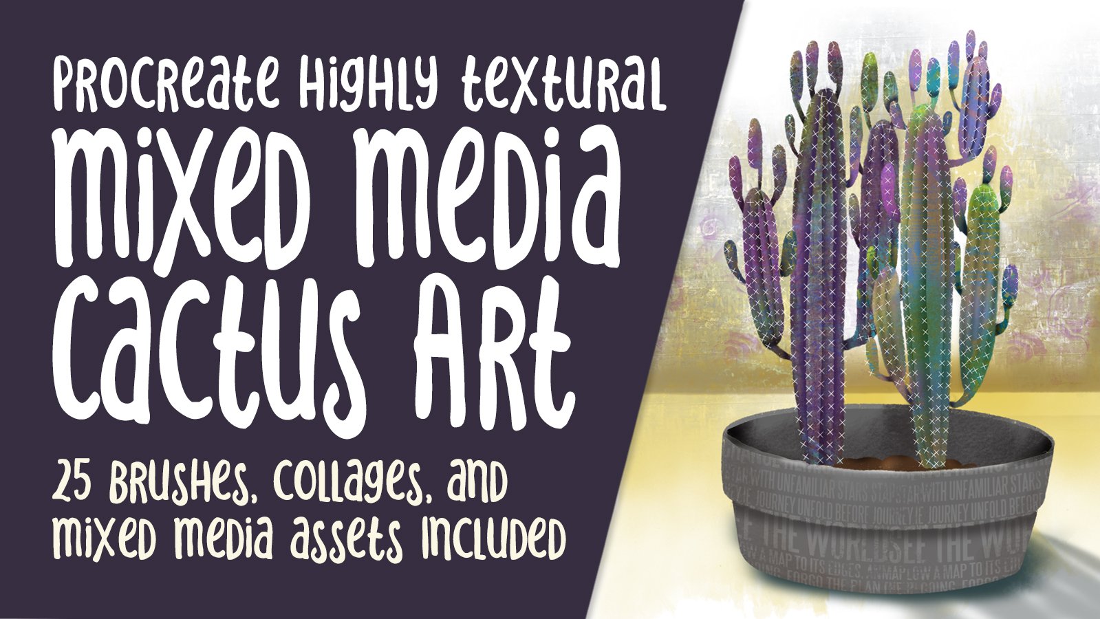
Transcripts
1. Intro to Art Journal Pages in Procreate: Hi guys and welcome. My name is Dolores napkins
and I'm coming to you from sunny, Manitoba, Canada today. But to bring you an
art project that kind of art that I
really love to do. I have in the past done a lot of mixed media
journal art pages. Basically, that's what I'm
going to be creating today, but we're gonna be
doing it in Procreate. It's the way that I
kind of got around that whole idea of trying
to create art every day. I just couldn't get my paints out and do
all that kind of stuff. In the evenings after I
had done a full day of work on my computer or whatnot. So I ended up making the decision and to
work with Procreate, to do my art every single day. This journal art page that
we're creating will be using a lot of the skills that
I've been teaching you. A lot of the classes that
I've done in the past. So it's a perfect
class to go along with the peekaboo mixed media
art class, for example. So today we're gonna
be producing a floral and it's going to be done
using a lot of layers. And it's gonna be based on some ideas that I have
experimented with, with natural media
in my journals. So I'm gonna be
showing you those. You can see a couple
of behind me here. These are the pieces that
we will be producing. I'm gonna be going
through and showing you some examples from
my sketch books. And I want you to just
keep that in mind as we go through the class for
the sake of comparison. Just so that you can see how authentic it can actually look, even though it's done digitally. I've included a bunch
of brushes here from one of the brush sets
that I am working on. It's very similar to the massive mixed
media collection of brushes that I have
created in the past. My new set is also going to
be a massive collection. So right now you're
gonna be getting 20 of these brushes to
play around with. And I'm gonna be
showing you how to use each of them in class.
So don't worry. Now if you haven't
done so already, make sure you hit that
follow button up there. That way you'll be
informed of any of my new classes
as I post them. This is the first-class that
I'm doing after my surgery. So please forgive my dark
circles under my eyes. The other thing I want to
encourage you to do is to get your name on my mailing
list on my website. Because I am just in the
process of finishing up, putting my school
of art together. I want you to make
sure that you're on the list so that you get any of the information that
I send out about that, including
artists resources. Alright. So you're ready to get started with
today's projects. Okay, Let's get into it.
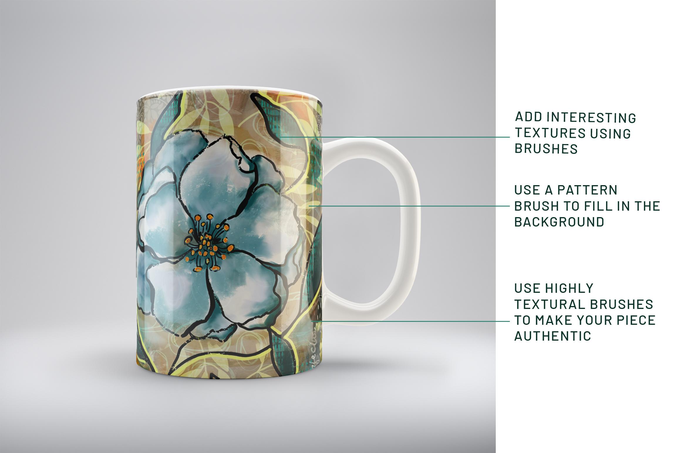
2. Lesson 1 Overview, Set Up and Base Layer: Hey guys, welcome to lesson one. So in this lesson we're going to start working on the background. After we take a look at some of those examples I was
talking to you about. I'm going to discuss basically the base layer that
we're going to put down. So it'll be the
underpainting and the use of collage and anything else that I can think of,
maybe blending modes. I'll throw that all
into this first lesson. Let's get to it. I wanted to start by just taking a quick look at some
inspiration here on Pinterest. And I'm gonna be
showing you some of my own art journal pages
done conventionally. Now in some of my classes, I've talked to you about an art practice of trying
to create art every day. And for me it's
really boiled down to working in Procreate to do that just simply
because of lack of time. I have a lot of
things on the go. And I've had these
health issues, so I find that that's really the only way I can keep up with a daily sketchbook practice and that's working directly in Procreate to achieve
these results. So I'm finding that I
have to really loosen up to get this kind of
art journal love. You could go on forever looking at these kind of
inspiration pieces. There are so many
artists here who have really inspired me the
kind of work that they do, the collage, the
addition of elements, the bold use of really
great line art like this. It's literally a black hole when you get onto
Pinterest and you start looking through some of the
other artist's work here. But really my
favorite art to look at is this kind of funky, casual, really textural, really bold and
really loose artwork. On my site, my Pinterest site, you can find a couple of boards. This one, the art journal pages is the one I was
just looking at. And then there's art
journal intro pages that doesn't have as many on there and I should
probably merge the two. I might do that before
you take a look, but definitely go in, take a look at some of the
stuff that you like so you get a good idea of what it is that
you're hoping to achieve. And I'm going to show you the look that I'm trying to get. I'm going to show you
my traditional methods in my art journals. And then we'll get
started in Procreate, setting up a document
that will work and it's going to
combine a collage, lots of paint layering, and definitely a
nice color scheme. And then a real build-out of
a foreground piece that will do that I think should be manageable by
just about everyone. If you're looking for
any particular artist, suggest that you check out
Mary Lou pithy marshal. Her work is definitely
an inspiration. I spoken about her in
other classes as well. This is probably the
closest to what I would consider our inspiration
would be for today. It's not going to look
too much like hers will definitely be making it our own. But this is an
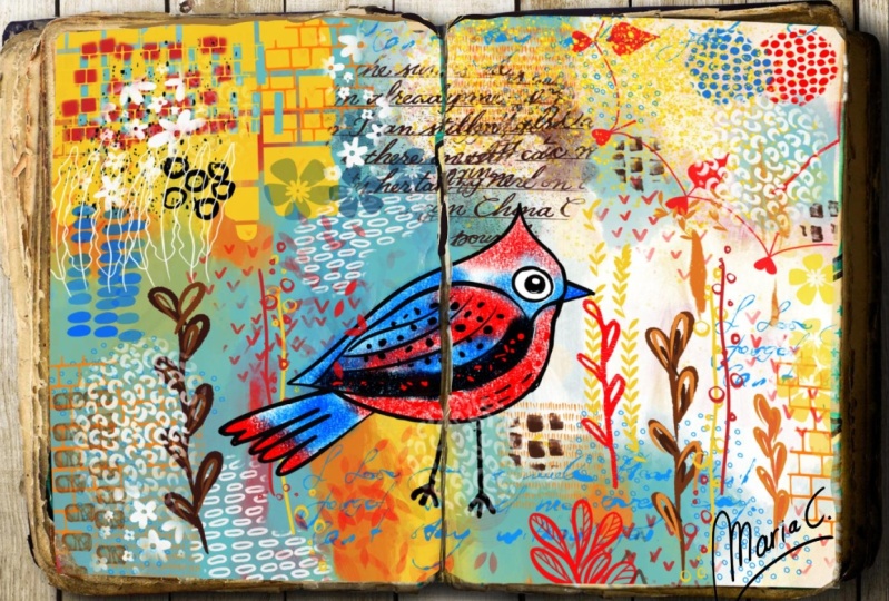
artist that I would strongly recommend that you take a look at for inspiration. So let's take a look at some of my actual art that I have existing that can
be inspirational. So I've got a stack of art
journal things I want to show you and don't let that intimidate you because it's intended to kind of give
you some inspiration. And I always found that with my art journals that
I love to sit for hours and just do all of
this detail work that you see going on
in the background. So a lot of them would
start out like, like this. This is a section that's actually breed itself
from its journal because of all the pole
from the paints and so on. But I would start
a page by laying down a bunch of border elements, doing some collage work. So this is stuff that I
would have just printed office catch from
already painted paper and also I had a
bunch of sheets. So this in fact, I just
came across a bunch of this in my flat
files the other day. Just stuff that I saved because
it's so interesting and I can cut it and use it in
a situation like this. I know now you can
buy all kinds of printables and tapes
and things where you can add details onto
your art journal pages. So I guess that's the way it's going now and this is just
the way it used to be. I'll show you another
one like that. In which weight is one go,
I think it's this way. This one is also just painted directly
onto an actual book. A book that I got probably
discarded from the library yet From the Library of one
of the schools I worked at. And in here are a lot of what I would consider
unfinished pages. So this is basically
just the background. So in this case, I didn't do any
collage because I had the print from the
book actually there. So I just used a lot
of techniques for adding paint in detail
on top of the lettering. So it looks like this stuff here that you can
see is paint that I squished on with
a plastic scraper like I think back then I was
using just old credit cards. I've since bought a couple of scrapers, a
catalyst scrapers, one of the ones I have and
that's one of the ones that I have developed
into a Procreate brush. And that's gonna be in the
set that I'm giving you. This book. Also full of backgrounds just waiting to be
made into final art. Just kinda reminds
me a little bit of what we're gonna
be doing today. The whole background was done
and then in the foreground, it looks like I've
used something like multiple marker
to paint over it. Multiple markers are really
great opaque paint marker originally made for
graffiti artists, but we can use them to write. So these are a bunch of
backgrounds and things just waiting to have
detail added to them. This is another one
that kind of reminded me of what we might
be doing today. And that's going to
include a lot of leaves. Leaves are main thing that I'm going to be drawing
leaves and the flower. I think I'm gonna be
showing you a couple of the finished
examples in a sec. And this is kind of the idea. And again, it's all lots of collage in the
background here. Then I added some marker lines, drew the bird did some painting, looks like I had some
watercolor going on in here. And that's one of
the beauties of this technique is that you can have all kinds of different
mediums together. That's what mixed media is and it's what
makes it so exciting. So I've got the collage, I've got acrylic paint, I've got watercolor,
I thought ink, all of those things
combined to make these really interesting and very intricate backgrounds that
are wonderful for then putting some kind of
a foreground item on lots of this is what I
would consider unfinished, but that makes it even
just so much more fun because I can take something
like this on the road with me and I can open a page
and add a ton more detail. And every time I'm looking
for artwork that I need for something in my surface
pattern design practice, I can take something like
this and extract all kinds of stuff that's usable
in the long run. So here's a page again, the background is pretty
much ready to go. I could do anything I want
in the foreground here. Now I've taken this
type of technique and I've also
applied to canvases. So this is a painted
canvas you can see. And there was a ton of background stuff done and then foreground items
painted over top. And I think we're going to
really have some fun with that type of technique
in Procreate. And yeah, there's another
example that just somewhat reminded me of what we would be
working on today. That's my inspiration
for you and I'm ready to dive right in and get started on that background. So in preparation
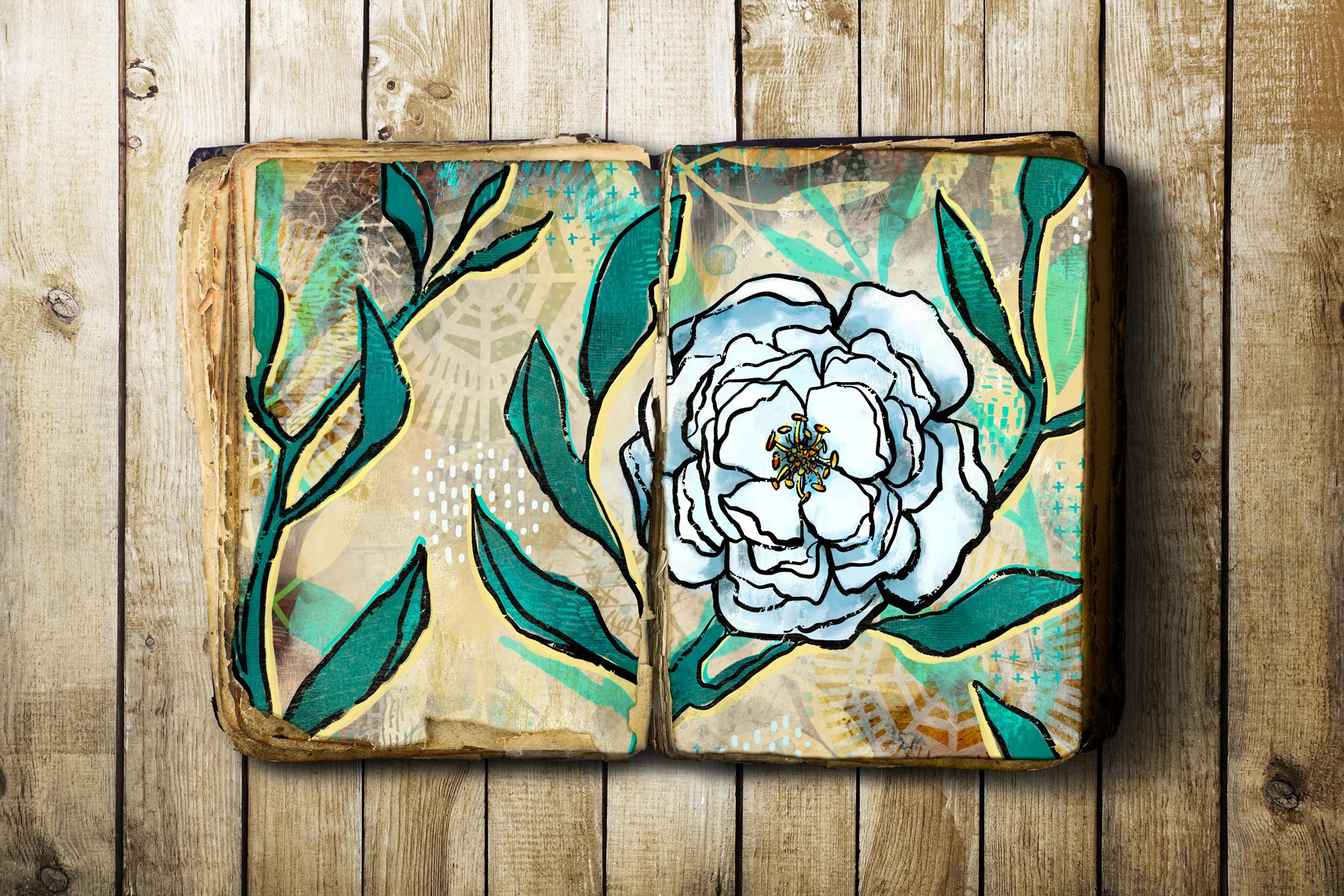
for this class, I did a couple of examples. I'm also creating these in
order to make a new brush set. Of course, this brush set
is partially going to be made up of the brushes that I'm giving
you in this sampler. So this sampler will
contain 20 brushes. I'm gonna be making
a full brush set that I'm going to have
available on my site. But these are the 20 that I've actually
used in class here. So this is the way
we're going to work it. We're going to start
with a background. So I'm going to turn everything off except for the very
first background layer. And you can see here that
I've done a bunch of collage kinda stuff
on the outside, similar to what I
do in my journals. Then of course, I just went through things to
the background, added some color,
some color overlays. I wasn't really sure which way
I was going to go with it. And the color scheme or the color palette that
I use is this one here. I can supply this pilot. I know that I've supplied
this one in other classes before because it's one of the pellets I
really like to use. So I went through
and added a ton of background stuff so that
those few layers there, and I should probably
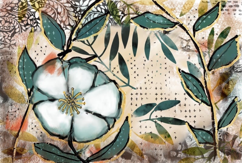
organize these into a group, then this is the foreground. Now one of the mistakes I
made was in accidentally adding the flower to one
of my background layers. That was my first attempt. So from this one I learned and on the next one I
didn't make that mistake. I didn't have the flower on the background that I
actually went through and got nothing on it and get
rid of that I went through and added additional
color to the flower. And you can see that that was done with a lot of
different layers. So I'll just go
through one by one. I guess that's part
of the background. So I could slide that in here. No, I guess I won't. There's a reason I have it there and that's just so
that it will get, that it would interact
with that layer. Then I added some leaves
that I have as a brush. I painted some lighter colors
on it and added this color. And originally I had this
more in the peachy tones. I ended up changing that with hue and saturation
partway through. Then I added the detail
onto the stamens. I added a background
around everything here, which makes sense once
I turn the leaves on. Now with that one, I've
got it as a Color Burn. I'm going to show it
to you normal just so you can see what it was like. It was just a dark beige color, but then I use a
blending modes to just darken the background. I don't know, just
to kinda give it an effect of shadow, I guess. Then I started to
colorize my leaves, adding more and more
layers and texture. And you can see here that I've actually put collage in there. So that reminds me
of that one example that I showed you where the leaves were all collage,
the one that had the bird. I added additional little
bits of detail on it, darken some areas,
added an outline. Or a shadow line. I don't know what you'd
call that highlight line. And that's done with
the multiple marker. And then just a little
bit of detail of some of those little textures that will be included
in your settings. Now with the
collage, you can see just how rich and
deep that is, that, I mean, could you tell that this is any different than what
I have in my sketchbooks? I can't I mean, I
think that it's very traditionally
done in the paints, that it uses an end, the manner in which I
actually put it together. That's that example. And then the other one, I wanted to use the
same techniques so that I was able to really hone in on the style
so that I could explain it to you as
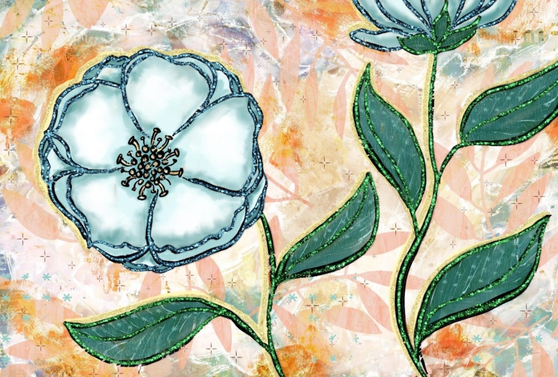
clearly as possible. So again, and look at all the layers I ended
up with on this one. I mean, holy cow. Let's just hide that
and the leaves. And now you can see
the background layer again collage lots
of different layers. You can see here in order to accomplish an interesting
underpainting or background, then I added, where
are the outlines? It must be, yes,
there's the outline, so I would have drawn
the outline next and then I went back
and worked underneath the outlines or some of
these layers you can see are underneath including the
color for the flowers. And I'll explain
that as I go along. It's a really nice way of
getting some nice sharp edges. Although what you can see
here that I'm being very casual about the way
I'm lining up and I'm leaving gaps and that sort of thing because
I think that's one of the things that makes it look
like an art journal page. So I'm gonna be taking you through step-by-step of creating all of the different aspects
of this mixed media piece. And we'll start with
the background. And it won't be a
complete background because we build so
much on top of it. And then I'll be explaining, showing you all the brushes
that I've used and I've got some really great
ones that really end up giving a very rough
and casual field to our final artwork. I really liked to is using some of the brushes to
fill in some of this. Then also doing some of
these by hand in order to get a very nice hand
done feeling to it. In this lesson, I think
we can still take some time now to start
working on our background. So I'm going to go into the
gallery and see I've got a vertical and horizontal layout because that's what I need for my brush set and I
actually need another horizontal to use
for my brush set. So I usually use this 12 by
eight size and I find it's a good size because it
translates well into screenshot for use when
I'm selling my brushes. So we're gonna get
started here by just starting to put some of that collage in the background. So this sampler here
will include a bunch of the different things
that you've seen in the examples
that I showed you. And I'm going to
start with black for this particular one because
this one is a bit smaller. This one is a
combination of a bunch of different collage bits
that I had put together. So the nice thing about
it is that it looks like I have collaged a bunch
of different papers here. So that's the way I start. I get that first bit
around the edges. You've seen that I've
only used black there, but you can easily
add a clipping mask. So I'm going to add
a layer and I'm going to go with
a clipping mask. And in a case like this, I can just go to something
like an airbrush. Let's go with a
soft airbrush and we can start varying
the color a little bit. So by using a clipping mask, I can go in and just
change the color in areas. So here I'm just
painting on some brown. I'm going to keep these
colors a little bit dark, dark and kinda
neutral because they are the underpainting after all. So I'll just maybe go
darker with that there. Then we've got a little
bit of brown, green, and these are all
colors that are within our color palette. Now, I have also in that brush set some really great
feeling kind of texture. So this would be what
you would have seen in the background on
some of the journals. And for that I'm
going to go just a little bit more neutral, maybe this color here. And I'm going to brush that in. And if you find that the grain of the brush
is a little bit too big, you can go in and
go to the grain setting here and just set
it a little bit smaller. You can adjust it either way. And this is one that
I actually scanned from one of my art
journals and it was one of the art journals that I
have that's made from recycled paper bags and there's kind of a mesh
in there that shows up. So I'm just going to
add that in here. Maybe I'll go darker
and a smaller brush, and I'll just add some
into this blank area. And it's roller texture
is quite nice as well. So I'm going to grab that
neutral color again. In this case, I'm going
to make a new layer. What I think about making separate layers for
this is that it's nice so that you can consider
doing blending modes. So here I could experiment, find a blending mode that is a little bit more interesting
for the background. So you can experiment with
that as you're going along. And having the separate layers just makes it that much easier. So I'm going to group these. I'm going to rename
this to be background. And we're actually
ready at this point to start doing our
foreground items. One of the things you
could also consider doing here is to add a layer. I'm going to actually
put that underneath. And on that layer there, I could just put a solid color. So let's try
something like this. Or you could, and of course you could reduce the opacity of it. But you see how unifying
that is to have that color throughout everything
and you can have it quite light on that one. I might consider using
the big texture riser. And in that case you see
how I've got that color, which is basically
this color here. I had lightened it a
little bit and now I'm going to just darken
it a little bit and then I can use that to
also add some texture. It's kinda hard to see
it because we've got so many textures and
layers built up, but there it is
running through there. I'm ready to start working
on the next lesson. And in that lesson
we're going to start drawing out our
foreground items. Alright, I will see you there.
3. Lesson 2 Setting Up the Line Art: Hi guys, welcome to lesson two. Lesson two here we're
going to start working on that line art. Let's get at it. For this lesson, what
we're going to do is set up that line drawing. So that's gonna be just a
simple flower and some leaves. This is the brush
that I was using. It's a really
coarse kind of ink. I guess you'd like it to
a dry brush technique, but you'll see it's quite
solid and then we end up going back and filling in
to make it more solid. So if you're a little bit
tentative about drawing, what you could do is let's
just that background. I'm going to add a new layer. And I'm going to start by just doing a really quick
sketch of what I want. You could do it with a pencil. My favorite pencil I
have here in my recents, I've got it pinned. So it's a six B pencil, and I'm going to do it in a brighter color so that
you'll be able to see it. So blue as my color of
choice for this usually, and I think what I wanna do
is run a bit of a fine along the side over here because I want to follow that
curve that's over here. And I think I'm going
to put my flower on this side this time. So I've got that vine kinda
running it in that way. I'm going to just
rough in some leaves. And like I said, they can be very rough. You could make some that
are a little bit more interesting in that they fold or how something happening
or overlap another one. A couple of these, I'm probably going
to just kind of make a bit of a cupped
fold on the edge. So that's what that
line represents. I want to change this one here, so I'm just erasing
that out real quick. I want this one to go in a
different direction, this one. So I'm gonna go
this way with it. And that gives me a nice
space here to do a flower. Now I'm going to make my
pencil a little bit smaller. I'm going to have a center maybe about here for my flower. I think I'll actually put
it on a separate layer just so that I can move it. So I'm going to have
a bunch of dots in the center and then some
stamens coming out. One of the things
you could do here to hide your background or just
lighten it if you wanted to. I'm not gonna go through
the trouble of doing that, but hopefully you can
see that well enough. I could maybe go a bit lighter, that show up a bit better. Okay, the flower I'm going to do is going to have five petals. So I'm roughly drawing
in five petals. This one, I'm going
to have a bit of a fold on the edge and
maybe I'll do that for a couple of them
so that the petals are consistently the
same type of flower. That second line there represents a kind
of a cupped fold. I'm going to change that one
to be not quite so Angular. And I want to keep this
simple so that it's really easy for all of us to do. And I'm glad I kept it
on a separate layer because I can also resize
it a little bit here. So that's what I'm
gonna do here. And then I want to run a
vine on that side as well. So I'm gonna put another layer. I'm gonna put it underneath
the flower for now. And I think I'm going to run
that other vine in this way. I'm going to erase the
part that's in the flower. Put a couple of leaves
here and there. And you don't have to
do a line by any means. So you could also do individual leaves like
this could have a stem and be going straight down to what would be
considered the ground. It's completely up to you. We've got quite a space here. So I'm going to throw in
another leaf on this, which is on a different layer. I'll go back to that layer. Generally when I
do this, I don't even do separate layers. I just wanted to show you that method just so that you can have that flexibility
of being able to move and resize your
different objects. So I think I'm good,
I'm happy with this. I'm gonna move this over
a little bit so that the vine kind of
goes a little bit more into where the center
of the flower would be. And I think I'm ready
now to start my inking. So I'm going to put
these three into a group because that's
something we're going to get rid
of at some point, they switched to
black and go back to that square bristle or
that coarse bristle, square, square, coarse bristle. That's a mouthful. And I'm going to
almost as quickly and roughly now do
my actual paintings. So I want to make
sure that I have a new layer here
for my foreground. And to test the
thickness of my brush, I want it to be pretty bold. And this brush here is
pressure sensitive. So we can see that if you
don't press too hard, you can get a certain thickness, but you can also vary the thickness by pressing
a little bit harder. I want you to look at the inspiration piece and we'll use one of mine here
as an inspiration. So with this one here, I didn't do a double line, so I didn't do the
thickness on the stem. And on this one I did do
some thickness on the stamp. So that's something to think about and ask yourself
which one you prefer. What I'm gonna do is I'm
going to go to my Canvas, have a reference photo here. And it is the image that, of that first vertical
one that I did. So I'm going to use that
one as my inspiration. So I'm not going to do a
double thickness on my stem, but that's completely up to you. It's your call. So I'm gonna go
back to the black, make sure I'm on
the right layer and I'm being really loose
and casual about this. And I'm also varying the weight that I put on
the leaf as I'm drawing it. So you can see some of my lines
are a little bit thicker, so I tend to do the bottom of the leaf a little bit
thicker and then go a little bit lighter for the inside
lines and the top line. And you can see how
broken that line is. So it's just super casual. I personally really
liked that look. If you don't like that
look in that set. I've also given you one
of my favorite incurs. This one is also pressure sensitive and it doesn't
have as much texture in it. So I do go back with this one and fill in some of the
lines at some point. You'll see that a
little bit later on. Now for this area, I'm going
to make my brush a little bit smaller and
I'm going through, and I'm drawing a bunch of really casual and
loose little circles and you can see how much
the line is breaking there. So that's something
that you might want to just go over some of the spots a little bit
more and the stamen, the main ones I do
as a double line. I'm curving them as I go, keeping the lines
quite close together. And then here I will
put some of these. They are, I can never
remember the different parts. I should have an
illustration here with a label for each of
these little parts. So I could actually
be talking about them intelligently
in-between these, I usually end up putting
additional little lines and I'm being really topsy turvy
with the angles of them. There's nothing straight. There's not one straight line in this entire illustration. And that's the way I like it. So you can go back and fill in if you feel like there's
too many gaps there, but I think that looks
the way I want it. And I'm gonna go back to
a slightly larger brush. And I'm going to go around the whole thing with
the heavier line. And then these inside
lines for the folds, I will do separately with
a slightly smaller brush. So in this case, I think I feel like that's
a little bit too thick, so I'm going to go
back and I can get thicker by pressing
a little bit harder. So that's the basic flower. And then now we can go through
and do the little folds. Now, I should have done
this on a separate layer, so I'm actually going to
select this right now. Use the free hand selection. I'm gonna do my three
finger swipe down and cut and paste so that my flower is now on
a separate layer. And I'm going to go through and just that inner kind
of a curl here. And on this one here
I did go in and put some additional petals in the back so you
can consider that. You don't have to
do it. The flower was fine just with five petals. If you want it to look
a little bit more, maybe like a peony or something. You can definitely go in and add some additional folds and things and additional petals
in the background. So that's like a peony
that is facing straight forward or that you're looking
right at. Straightforward. Now go back to this
layer to put the leaves. So all the leaves are ending
up on the same layer. Now if you look at the work of Mary Lou cuddy, Cuddy Marshall, you will see how good she is at drawing this casual flower. Her work is absolutely
amazing and she has lots of post videos that you
can watch as she goes through the process of creating this sort
of an artwork. So at this point, I think I can throw
away those blue lines. And now our next task
is going to be in creating that separation of the foreground items from
the background items. It's gonna be really important
in some of these areas here that are very dark
in the background. So I'll meet you
in the next lesson where we're going to
get started with that. Alright. See you there.
4. Lesson 3 Adding Main Color Areas : Hi guys, welcome
to lesson three. And less than three
here we're going to add some more detail to
that background. So we're gonna be doing
some of the underpainting. It'll be underneath
the line art layer. I want to just show you a few
of the tricks that I have. And we're gonna be doing a
lot of things like blending and just kinda building
up the layers. This is the way I work in
my art journals as well. Let's get to it. When you're creating art
like this in an art journal. One of the main things you
are going to do now is try to have your line art really
lifted from that background. I've kept the background really neutral and I haven't gone in and done a lot of this additional painting
and detailing, but I'm going to work on
my line art for us to start really bringing
it to the foreground. So let's go back
and take a look at that color scheme that we have. So this is the charge
or the palette. I'm going to move that
over here because I think it'd be nice
to have it just open on the side
here and you can see colors are a
little bit different. You don't see a lot of this
rather than peach in there. Although I did this flower
originally in those colors, but ended up going with
this color scheme instead. And I had done all the
painting, like I said, in those sort of reddish hues. But I went in with hue and saturation and change it
to the blues and the end. And it was just,
uh, I guess what you'd see an artistic choice. I want to start by doing
some of this line work around my petals and in my journal art
that you saw there, that's one of the things
that you saw me do a lot. I just find it really
therapeutic and fun. And the two types
of markers that I use on a day-to-day
basis when I'm doing in my journals are
Posca paint markers and I've changed
mine to Molotov. But the technique or
the texture and finish of those is based on the
actual real markers. So I'm going to start with
this Molotov and I'm going to go with this lighter yellow. And one of the things I
love is being able to go underneath my artwork. That's something that you
don't do in your journals. Of course, you've
got your black line laid down and you're
just going to have to be really careful when
you're painting and just painting carefully or
accurately along the edge. But in this case, because
we can work with layers, I can go underneath this
layer being underneath. You'll see that as I start to do my line work or my ink work,
and I lose that color. I can slip it in
underneath and you can see how it's
going to just see kind of sharpened and clean because it's
going under the black. Now I think that is a little
bit duller than I want. So I'm gonna go in here. I'm going to move this slightly over brightness
just a little bit, and let's see how that looks. Instead, not much of a change. Maybe I'll go even yellower and just kinda bring that
over this way a bit. And I kinda like that better. So I've got a bright
yellow and I'm going to stick with working on
that side of the line. So that means with the leaves, I'm basically doing the
underneath of the leaf. Now, if that's not
what you had in mind, you could definitely do it
the other way so that you have a highlight on
the top of leaf. And maybe you could do
this in a darker color. I've even done it
in the past where I have done the entire outline. So those are things that I would consider
artistic choices, and those are
completely up to you. And that's how you're going
to make this really your own. This is just the
choice I've made. You definitely don't have
to follow that choice. No, I lost that color.
Okay. Here we go. Already. Don't you find that that
is really lifted off the page I showed you
and underneath here. And especially in
spots like that, that the background
was really dark. It kinda gives
that little bit of a release that makes
it really stand out. So you can decide whether
that's where you want to stop. You can always go back later. We may add some detail
with Posca marker. And I'm thinking maybe I'm going to continue that on my flower. I didn't do that on this one, but on this particular one, I can think it just feels right. So I've got it as if my light sources from
maybe from over here. And that's kind of giving the highlights on the edge of the flower here and the leaves. Now I think I want
to do the flower itself and I want to do a
separate layer for that. And go back to our
color scheme here. And maybe I'll choose
something like this. Now, really in my drawing here, I've gone a little bit bluer. So I could pull that over
to be a brighter blue. It's really up to
you in this case. Again, it's just one
of those sorts of decisions that you
make along the way. Now I'm going to
start with this. I call it a Terp dipped
old house paint brush. So it's a rough brush, but it's got thinned out paints, so the paint goes on.
I'm gonna go brighter. You can see that the paint
goes on quite roughly. The texture of the brush is soft on the edges,
soft and rough. And you can go through
and basically do your whole flower in
the one tint of it. Then you can go smaller. I sample that color. And now what I can do is just
pull a little bit further in and I can get a darker
version of that color, could even go a
little bit darker. I think what I'm doing here is anything that's
in the background. She's a little bit darker. I'm painting very casually
and very roughly. And you can have little
bits of shadow running in this area here and
definitely in here. So nickel blue, bit bigger. And if you go really softly with this
brush, you can really. Use it for blending. So I'm kinda doing that here. And I'm gonna go quite a bit
darker, the very center, because I want that
to be dark so that those little details
in the middle here will really stand
out against that. Now I also want to go
really light in spots, so I'm switching to white. I guess it's a really,
really light bluish white. But you can see as
I'm painting how nicely I can use
it for blending. So it's like an oil paint, blends really nicely
like an oil paint. And if you want to make
sure you have a pure white, you can go and double-click on that dot there, the color dot. And with this brush, you can just tap
in color as well. And that's where you
can really start to see the textures. A really rough old brush. So tapping in some of that
extra texture in there. And then I can go back in with this color here and I'm
just sampling it by, I just have a single
tap as my set for that. You might have yours
as a holding tap. And here of course you, for me, it brings up my secondary menu, but I can do a single tap
and get that color back and then just kind of go back
and blend a little bit more. When you first put down the
color, it's the pure color. But then as you
start working at it, use, it does the
blending function. I think I'm going to
go quite deep now, but quite small
and go in and put in a little bit more
of the deep color. So I'm going underneath
my folds there. So it really gives that
feeling of dimension. I'm also tapping in some
extra deep shades in spots. So that might be on those
folds, for example, you can see how we've
really started to build contour on our flower
by doing that, if you feel it's too dark
or it's not blended well, then definitely go back with your lighter shades and a bigger brush and you can definitely blend
it in like that. Now as far as the
detail on here, we'll probably do that
in the next lesson. But right now I'm just going
to quickly go through and do the leaves in just
the main teal color. I'll probably choose this second from seconds
on the bottom row. And I'm going to use
that same brush. I'm going to add a layer here. I'm still underneath
the leaf layer, make my brush a reasonable size. And I'm just going
to quickly brush in the main first coat
of paint here. So the main first color, now you can see it's very dark. But I think I'm going to
work with that because I like the way I was able to get all my little
highlights and things to really stand out
on that darker color. Now on this one, you can see I actually even went in and added some additional detail with
some of my collage brushes. I'm not going to be giving
you the full entire set. I'm giving you 20 brushes, but this is actually part
of a sudden I'm developing. I have already done a
massive such that I have on my website for sale
and on Creative Market. This is another set, this is a new set
that I'm creating. Now if you did my
peekaboo mixed media and I think there was
another mixed media class. You will also have some of
those brushes from that set. So if you can mix the both sets, you'll come up with a lot of different textures and
things that you can add. And now we've done
the main colors. And in the next lesson, what we're going to do
is start adding some of the details like the
inside of this flower here and some of the texturing
on the leaves and such. I need to take a
little break right now and I'll meet you
in the next lesson.
5. Lesson 4 Textural Paints, Accents and Fills Areas: Hi guys, welcome to lesson four. Unless it for here
we're gonna be adding some texture and assets
and some of the details. Let's get to it. So in this lesson
I want to start adding some of these
other details. And I want to do all of
those on separate layers. For these statements here, I have to do it above
the flower layer or the painted flower layer
that's below the line art. So I'm going to
add a layer here, and I'm going to
go with a bright, kind of an orangey yellow. I'll start with this
one, but I can add other shades, of course. And the brush I'm going
to use for this is, I just realized I
have two copies of my sampler here for brushes, and I don't know why The
Wiesel is here in this set. What I like about this
weasel is that it gives some really cool highlights
if you look at this. So I'm going to be using
that for a couple of other details in
my illustration. I'm on that blank layer that I've created for this purpose. And I'm gonna go with
a fairly small brush and make sure that I'm
on that bold color. And it's hard to see the
texture that I'm talking about, but I was to do it here. You'd be able to tell that, see what it does is kind of a highlight as
well as the color. So it doesn't show up that
great in this small area, but I'm doing this
quite roughly. And so there's spots
where you'll see that color bleeds
beyond the outline. And that is by design. I actually want it to do that. I want it to be this rough. So I'm going through and
roughly painting this end. I kinda want to
speak to you about why I say that it's good
to paint like this. Sometimes we're painting today without a lot of
care, so to speak. But it forces us to
work a little bit faster or allows us to
work a little bit faster. And what that does is
it helps to build up our confidence when we are
presented with new projects. So it's a good way
to learn to work a little bit more intuitively
if that makes sense. So here I'm putting in a
little bit of the orangey or deeper color because
I just really like how that makes it look
this dimensional. So the thing about this Wiesel
That's really cool too, is it can add some really good painterly
textures to the background. So I'm going to go back into my background layers here
and add a layer at the top. And I'm just going to use a little bit more of a neutral yellow,
but it's kind of a, you can see here
it's in the yellow, orange kind of an area and it's neutralized because
I've pulled it a little bit more into the grays. How cool that is when you
add texture with this brush, you really get that dimension. You really get a highlight
on the brushstrokes itself. So I'm going to put a few
brushstrokes in here. And that's gonna be
the beginning of our neutralizing the darkness of the background to help
our foreground item stay even brighter and
more in the foreground. I'm going to also use
that on my leaves. So I'm going to take and
choose that leaf layer. I'm going to add a layer above. I'm going to make it
into a clipping mask. And I'm going to choose
one of my teal colors. And here I'm adding a
little bit of that in on the leaves and
look how much more interesting this leaf
is, then this leaf. That's such a quick thing that you can do to add interests. And that's just making it look like really dimensional
brushstrokes. Switch your colors and see
how each of the colors looks. You can go way lighter and in some cases just to
give some brightness. And I like the way that
turned out as well. Now we'd be ready
to go in and start adding a little bit of detail
to some of our leaves. So maybe what we can do
here is add another layer and make it into a
clipping mask and go into our textures
that we have here. So I've included all of
these different textures. You could use that mesh
kind of a texture again, or this roller texture actually turns out
really nice on here. So I'm going to go with a
lighter one to start out with. And adding that roller texture also gives some real
interests of leaves. You can go with a
smaller brush size. It won't change the
size of the grain, but it will allow
you to paint in some areas and
avoid other areas. You, I think that looks good. Now let's do a little bit more
work on that layer there. So that's the layer that I painted those
weasel strokes on. I think what we can
do here is go in with maybe this
super wet egg wash. I'm gonna go again
with a neutral color and somehow switched back
to my leaf layer there. And what I'm doing
here is just adding a lot more soft blending in
here so that can be done. And then you can go
back with the Weasel. And let's go with
something even lighter. So we'll go into the color wheel itself and go towards the white here and just kind of
softly add that in there. So we're working
with the two brushes in conjunction with each other. And you can even use that term dipped old house paintbrush or this creamy clear pool blender. This one's kinda
textured as well. And this is a nice
one to just blend the colors together and it's really fun how this one works. You can see how
it twists around. So that's a good way to
blend different shades together and get a really
nice soft look to it. And you can use it to pull
that out further if you want. Or you could take
that whole layer and have it in areas that you
would want to highlight more. The other thing you
can do here is go into your blending modes and
just experiment and see which ones might work for keeping the interests of the
underpainting so screened, for example, you can see that allows some of that stuff to show through, which
is really nice. And I'm thinking
this big gap here is kind of bothering me. So I'm sure at some point I'm going to figure out
something to put there. But basically at this
point I'm ready to start adding a little bit of color
into the background too. So I'm going to add a new layer. I'm gonna go into my
colors here and I am going to go to one
of these redder colors. And I've still got the
textured brush there. I think I'm gonna go to the
catalysts scraper this time just to have something different and look at how
cool that brushes. Look at the texture
that that's putting on. It's almost like a pallet knife. We can go a little bit
smaller here and see how I've just added it
here in certain areas. So I'm going to do
the same thing here. I'm not doing the whole
background by any means, but I'm kinda going in behind my focus items, my main items. In a case like that, you
see that's showing through opening on my flower painting. So I might go back in
there and fill that in after a little bit
smaller with that, I really love how this
scraper works and it's, it's one of my newest brushes. This one took a lot of work to develop and get it just
the way I like it, but I think that
that's really neat. And this is one of the ones that I would also use
a blending mode. I think on this one
I use color burn, but you can go through and
experiment the color burn, linear burn is
quite nice as well. Go through and take a look at
what all blending modes do. But I think the burn, the burns are the best ones for this particular thing
that I'm trying to do. So I'm going to put
it on Linear Burn, but I want to get it more
into these yellow tones. So I'm going to go to hue and
saturation and brightness. And I'm going to
change the hue here, so I'm sliding to about 57%. I'm going to saturate
it even more, and I'm going to
brighten it even more. So I've got about fifty seven, sixty eight and fifty four here to kinda give me
that effect there. And then I can go back
with one of my blends. I'm going to use that creamy
here pull blender and I can kind of work that down or
up a little bit around. And, you know, you can decide if that's going to work for you. I mean, I kind of like leaving that rough texture there too. This one's probably
going to turn out differently than this one, but that's what it's all
about, right? We're learning. You can also go in here and
reduce the opacity of it. So I think I'm going to go
down to about 85 or 90%. And I'm really quite liking the way this
background is turning out. So I think in the
next lesson what we'll do is start adding some of the detail like these
leaves and other things. Some of the small textures like that that I've
bought in there. So we'll do that in
the next lesson.
6. Lesson 5 Details and Finishing: Hi guys, welcome to lesson
five. We're getting there. At the end of this
lesson. We're going to have most of the details and finishing worked out.
Let's get started. So as I looked, I
took a little break. Of course, I had lunch with
my husband and as I looked at this when I came back
in comparison to this, I was right away
noticing how much heavier I did my
black line work here. So that's one of the
things I want to deal with in this lesson. I'm thinking maybe, maybe
we should do that first. So in a case like this
in my sketch books, what I would do is go with
a Posca paint marker, which is a nice sharp, clean line if you've
ever used them. And I would be adding some
additional detail to my stems. And in this case I want
to work on top of that. So I'm going to
add a layer above and I don't know
what color to use. I'm thinking maybe
I'll just start with this ready pinky color. This is I didn't end
up using that in this, but I can use it
in this for sure. And one of the things about putting it on a
separate layer is I can then go and experiment using hue and saturation
with the color. So in the case like
this, what I want to do is I'm gonna go through and actually draw right on top of my lines to break
them up a little bit. So this is different than
like I said, this piece here. This is one of the
things that I've done in my art journal is
quite frequently. Now I don't have
the stabilization set very high on this right now. If you are having a little
bit of trouble with getting the lines
nice and smooth, you can set those a little bit higher and then you
can go through, and you're basically just kinda going through the very center. And I don't mind that
I have a little bit of wobble leanness
here because really that's what happens
when you're working in your sketch books anyways, it's not like you're
looking for perfection. It's kind of an exploration
or experimentation. And a lot of what happens
in your art journal is maybe never even
gonna be seen by anyone is just for you and a
place for you to hang out and just clear your
head, experiment and learn. And I have really loved doing this sort of
thing therapeutically, therapeutically or for
relaxation like right now because I'm still
recovering from my surgery, I can't do a lot of
things physically, but this is one of the
things that I can sit and do either on my iPad like this
or in my art journals. I don't have to take
out a bunch of paints. I just usually grab a couple of markers and I go in and look at the art in my
journals and then just add little
details like this. Now if I didn't make a
mistake in my art journal, of course I don't
have the I can't just do an undo a quick on. Do I have to go back with a black marker or something to fix up if I've
made a mistake. But a lot of times you stop
seeing those mistakes, you don't even consider
them mistakes is just a way to add sort
of casual detail. And this is the kind of art
that I absolutely love doing. I am creating art that
may or may not be used. Sometimes, I go through
my art journals when I am looking for work that I could reproduce for art licensing, sometimes this
would become maybe a part of another project. But a lot of these
techniques can be applied to absolutely any sort of
professional work that you do. Producing work for
sale on POD sites, for example, that
might be a way to go. So what do you think
of that effect? I mean, I really think that's great and I actually
don't mind that color. I think what I do,
maybe I'm going to try doing a different color
on the flower itself. So I'm gonna go with
a brighter teal. I'm going to slide it
a little bit more into the bright saturated area there. And just in case I'm also going to do that
on another layer because I don't know if I want to have a
contrasting color, but hey, let's give it a shot. So here I go. Remember that you can
move your canvas around. If it's easier to draw
in a certain direction, then by all means move it to
make it easier for yourself. And I'm intentionally here doing sometimes a little bit of a more wiggly line along
where the fold would be. I still, like I said,
may go back and do some touch up on
the black lines. I don't think I'm going to
add any detail to that. This will pulled out
mine all the way down. I may add some
additional block in their mind the way that looks. So I'm gonna go back to my
flower itself and I'm going to take a solid inker and I'm going to just do a little bit of
additional work with my black. Maybe pull some of those
down a little bit and I'm just I don't think that
line is going to work. I think I'm gonna have to
go back to that texture. And I'm just kind of
thickening some of it up or pulling the lines a
little bit further down. And I really liked the
way that's turned out, so it's quite
different than that. But hey, that's
progress sometimes. Now I want to add a
little bit of detail on these leaves that has some of this kind of
hand-drawn texture. So I'm going to add a layer, I'm going to make it a
clipping mask again. And in your set I've included both little crosses
and little x's. So it's up to you which one
you want to go and use. But I think I'm gonna go
with this one and use it. I'm going to use the
x's on the leaves. So let's sample that dark color. And what we wanna do is
go brighter than that. So I'm going to pull upwards into the right so that I get a brighter color here. And don't think
that's bright enough. I think I'm going to go
quite a bit brighter. And now you can see that little x's are showing
up on the leaves. These would be something that
in my art journals I would have definitely
inked in by hand. But hey, we've got
them here as a brush, which I produce for
another class I'm sure, or for our brush set. And I think that's kinda cool. It's definitely turning out
different than this one, but that's sometimes the process when you're doing
this kind of work, that art journaling
kind of stuff. And I think in the
background itself, I want to add a layer
and use the crosses. And I'm going to go
quite a bit brighter. So I've got a
brighter green again. And in this case I want to make those processes
a little bit bigger. So this is another one that's in the grain that you have
to do your changes. And I'm increasing the scale. And now I'm going to go
in and you know what? I think that one's just
a little bit too blue, so I'm going to
green it up a bit. And now I'm painting these and just as if I would have
been drawing them. Now with this brush, you'll
notice that it does have a bit of a color
changing happening. And that could be when you tilt your brush,
that it changes. If you go straight up and down, it will stay the same color. But I've set this
one up so that you could get a little
bit of a variety. So you could be painting in
this color and then tip it down and get a
contrasting color. So that's another way of adding interest
to your background. And then I've got one last trick up my sleeve for the background. I want to add some
of those leaves. I've added them
to your set here. And in this case, you can see I added
it in a light yellow. So let's just grab
a light yellow and see how that's
going to work. I currently have it
on a separate layer and you can start
painting those in. You don't have to
paint them everywhere, but you sure can if you want to. And that's one of
the reasons I kept the leaves separate is
that then it could be on top and you
wouldn't have to worry about them covering the
leaves or anything like that. So I've got that drawn in the
background with this one, I can go in and experiment
with blending modes. And I think screen
is the one that I use lightened can work screen. I mean, go through
them all because even something like
overlay works nicely. I'll enlarge the art
here so that you can see as I'm going through
that soft light. And I think that the nicest
one that I saw with screen. So that's what it's
screened in the background. And we can definitely reduce
it down if we want to. And the other thing to consider is whether or not you want it below some of those other
highlight layers that you did. I think I'm going
to keep it on top, but I really like all of this extra little
detail that I've added. And I really think that that
finishes this off nicely. I think that I will still go through and probably
add something here. Possibly I could do
it with those leaves. Actually, I could add
another layer here and then maybe switch
to a teal color. And actually that's not bad. So maybe let's do that. Slightly lighter
teal and that kind of adds some nice texture
in the middle there. You can go in and go
into the gradient again and make it a
little bit smaller too. Because I found
that it was kinda leaving another
blank space there. And I've got my eraser set
as the Terp dipped brush. So that allows me to erase really softly
around the edges. So that can kind of
give a bit of a blend. So decide where you want the one to end to the
other ones who begin. You can reduce the
opacity of the brush so that it makes everything
kind of fade out. And then of course,
you can go through with your blending
modes here too. And I do want it to stay
kinda dark in there. So it's probably
going to be in one of these or one of these. So I think multiply and then I'll just
kinda reduce it down. And for me, I feel that kinda helps in that central
area a little bit. So I think I've pretty much done showing you what
you need to know, can definitely go in and
make other adjustments. I will probably do
a few adjustments here and we'll come back
in the next lesson. And I think I'll show you one of these on a sketchbook mockup, as well as showing you a quick time lapse of any of
the changes that I've done. Alright, It was fun. I really enjoyed this. So I'll meet you in that wrap up lesson. See you there.
7. Lesson 6 Timelapses and Debriefing: Hey guys, welcome to lesson six. So unless there's six here,
I really want to show you the finished layouts. We're gonna take a look at some time lapses
to start out with. And then I want to
show you how I put this onto a mock-up to make
it look really authentic. Let's get to it. I'm going to play
three time lapses. This first one is basically the playback
of what we did in class. But I thought you probably
find it interesting to watch the whole process evolved
and a sped-up form. So all the steps, everything we did is here. We're at the point here
where we're adding some of that color and dimension, doing a little bit of shading, filling in the leaves. And then of course, you'll see as I go into
the background here and add anything I could think of really to
make it interesting. And I have to admit that with the first few of
these that I did, I did a lot of experimenting. So the next two
time lapses kinda show you that where I
tried different things. So in this next one here, I did a completely different
method for the background. I mean, not really
a different method, but just quite a bit darker. And see me kind of hemming and high here about
the shape of the flower, but I kinda decide on
something and go for it and I add the leaves here just like I did
with the other one. These I had a bigger
or wider stem. And that might be a look
that you'd rather do it, It's up to you, of course. I would say do a few of these, like doing three
of them for me was a really good experience because I experimented with a lot
of different finishes. And of course here I'm using
a bunch of the brushes that I have in that new
set that I'm making. So it's not necessarily the
brushes that you're getting. So you'll have less of
a selection perhaps, but definitely go
back to some of the brushes that I've
given you in other sets. So that you can just kind of bump it up and do some
more interesting stuff. And I'd really love
to see you guys do stuff that's really original, maybe even producing your
brush or two of your own. So here I'm using markers to just add little dots and things and that's something we
never did get to with the one that I did
in class with you, but I would suggest you
definitely experiment with that. Now I use very
similar brushes here to the one that we did
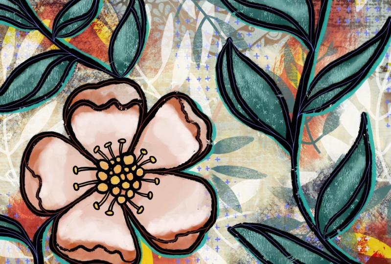
in class together. This is just one other
layout that I did, more of a vertical
layout and I think I ended up using this
in another class too. I think maybe the
frames class where we added lettering
in a text frame. Here of course you
can see that I did it in the reds first of all, and then I ended up
converting it right at the very end to a blue color. So that's basically it
as far as what we're doing here in class and the kind of stuff that you
could do your experiment with. And I'll show you those
mockups right now. With the mockups, what I tried
to do is show, of course, some really interesting layouts that I thought
complemented my artwork. So there's the one
with the sketchbook. So it looks like I
actually painted and drawn this right here
in this sketch book. And would you know if I had
showed you this, would, you know, I'm not sure. I don't think I would if I was looking at an artist's
work like this, I would just assume
that they had done it right there in
that sketchbook. And then this one
was just a kind of a neat old mockup that I found. I like the Friday old
pages and stuff is definitely reminds me of the
art journals that I have. For this kind of a thing. You just want to
find mockups that will really compliment
the look of your artwork. I guess that's pretty much
it for today's class. So I hope you enjoyed and
let's meet in the wrap-up.
8. Lesson 7 Conclusion and Wrap: Welcome to the
wrap-up, you guys. I'm so glad that you stuck
it out with me today and that you've got some
finished art to show for it. One of the things that I
would recommend is that you take some time to do
a bunch of experiments. I think that you can
repeat the process. You can watch the video
again and you can use all the same steps and still come out with
a different outcome. So it's kinda fun
to do that just to experiment a little bit and
really play with the paints. Now you've got some paint
brushes that you've thought and from other
classes that I've done. And I think you
could combine them and come up with some
really unique pieces. More brushes that you have, I think is the best
way to get around coming up with new ideas and new looks with these
kinds of artworks. Mixed media is so fun
because it's just that it's mixed so you can use
rushes from other artists. You can definitely try some of the resident procreate
brushes as well. Just have some fun with it and experiment with different
types of line art. Maybe you don't like
that really rough look and you want to smooth it out. Definitely try it out. And I'd love to see your
post here so that we have a huge variety
that we can compare. Different color palettes,
different textures, different styles of line art,
different subject matter. Once you do a bunch of these, you're going to really
feel like you've got a good handle on
this kind of art. And you could be using
your iPad everyday to have daily art practice. Daily art practice is, I swear, the best method to really develop your own
signature style. Now if you liked today's class and you haven't done so before, make sure you hit that
follow button up there. That way you'll be informed
anytime I post a new class, I'd like to invite you to also visit that Pinterest board
I was telling you about. And it's always nice
to click on an artwork there and you'll be shown
all kinds of related pieces. Also check out the resources
that I have on my website. I have a lot of free
resources there. If you haven't had a
chance to download them, maybe this project would be
a great place to use them. There are some actual
full backgrounds that you can take from some of my art journals and used to do as your base
artwork for example. Also, you can take
the time to look through my site and
check out what's happening on my
profile here to see all kinds of different
classes that I have that are related. Even some of my
older classes are still interesting to go
back and take a look at. We can also check out my stores. I've got one at Sawzall.com
and I've got one at cardial. That would be a
great place to use. Some of this artwork would
be to create greeting cards. Also, I have one on
society sits under my own name and then
I've got one as part of the out of
the blue group. So you can check that
out if you'd like. So I guess for now, I'm going to say goodbye and I will see you
in my next class. Thanks for hanging
out with me today. Buh-bye.
 Delores Naskrent, Creative Explorer