Transcripts
1. Welcome to Mucha Style: Hi, I'm Chloe. I'm a Pan
andk artist and educator. I'm self taught, and like you, I'm always looking for ways to improve my skills, techniques. One of the things
that's helped me the most in my journey to becoming a full time artist is studying influential masters. We'll begin the process
by noting what we observe about the key traits
of the art nouveau style. The legendary masters,
who made it timeless, focusing our attention on the characteristics of Muha's
commercial art posters. Based on those
initial impressions, you'll gather references,
sketch, thumbnail concepts, refine your top concept
into a draft drawing, and use that drawing
as a template to trace onto final project paper. You'll also have the option to trace my project drawing if you prefer to follow
the demonstrations more as a step by step tutorial. In the second half
of the lessons, we'll ink our project, then develop a color scheme as an exercise to deepen
our understanding of how Muha harmonized
his linework with color into aesthetically
pleasing designs. We'll then use colored
pencils to add the final touches to
our exciting project. It's not necessary to have experience using all the
mediums demoed in the lessons. Class is aimed towards
intermediate level artists looking to use master studies to gain fresh ideas from the Muha style. But of course,
beginners are welcome. The project can take
up to several days to complete work
at your own pace. You'll find the template,
progress shots, and list of supplies to download from the projects
and resources page. We'll go through the supplies that I'm using for the project. I'll also suggest alternatives so that you can use
what you have on hand. Great. So download the media and in the next lesson,
we'll get started.
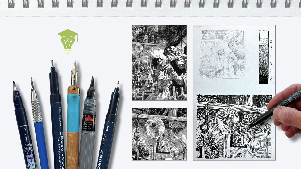
2. Tools and Supplies: The most important items will be your project paper and having access to a printer
to use the template. I'm using a 140 pound hot
press multimedia paper made by Strathmore. We want hot press because the smooth finish
is best for inking. A cold press caught in watercolor paper typically
has a rougher surface, which is ideal for wet mediums, but does not perform as well
for the ink application. The format is up to you. Anything bigger than
8.5 by 11 is gray. My paper is 11 by 14. The other items on my must have list are a needed
eraser and a ruler. F sketching and
drawing an H lead or HB pencil and sketching
paper for the studies. For the ink application, whether you're using
technical pens or markers, check that they have
waterproof ink. I'll be using
waterproof India ink with dip pens and brushes. Watercolor is something
I've recently introduced to my workflow because it pairs
so well with ink. I have the Cotman student
grade watercolor kit from Windsor and Newton. We'll be using a limited color
palette for our project, so any basic kit will do. Same with brushes. I'm
using student grade, synthetic round brushes for
the watercolor application. Number two, combined
with a four or six, we're not doing big washes, so you'll only need a
small detailing brush and another slightly bigger. Some water jars, I've got a cold and a warm
and one for my ink, paper towels or a rag,
and a mixing dish. For coloring pencils, again, we're using only a
handful of colors, so a basic set is Mine is a fiber castle, the polychromos artist set. If yours are watercolor
or pastel pencils, those will work as well. Optional but useful is a geometric template of
circles and artist tape. Different supplies will produce different outcomes,
like different brands, colors, and paper combos, but we'll talk more about
this during the exercises.
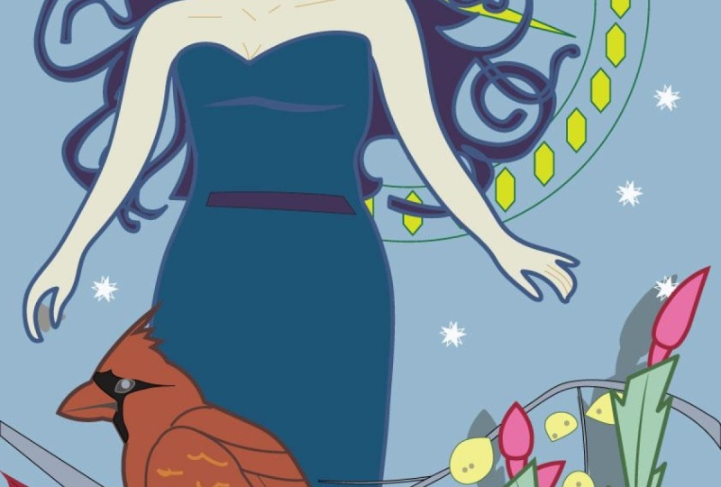
3. What Makes it Art Nouveau: Art Nouveau was a
design movement that began in Belgium and grew gradually everywhere throughout the late 1800s up to 1910, so not too long, but it had a remarkable impact. The style is characterized by an emphasis on fluidity
of line, geometric forms. Asymmetrical compositions
and a combination of structure and ornamentation. There are tons of resources
about the genre out there, and I suspect that
you're already a fan and eager to get drawings, so we will briefly review the key traits that make
this style so memorable. Alphonse Muja was a lithographer and one of the best graphic
designers of that time, and to this day, his posters exemplify the art nouveau style. There were, of course,
other major players in the art nouveau movement. They had one thing in common. In a nutshell, they were flat. Compared to what people were used to seeing from
the art world, this new style reflected
a refreshing simplicity, emphasized by the
two dimensionality of the figures which often had little or no shadow and are outlined with
clean contour lines. Arnvau subjects were stylized, embellished representations
of reality, inspiring and hopeful. The art before that was
stuck in well, grim reality. Then here comes Art nouveau with these joyful pastel
undulating curves with intertwining lines
growing out of everything, influenced by Japanese
woodblock art, motifs, and symbolism. Muha's subjects were ornamental and
elegantly exaggerated, mostly flora, fauna, and female. Funny. The first
thing that jumped out at me were the tendrils. Muha's compositions are
described as being asymmetrical, but they are balanced visually. He accomplished this by
arranging motifs, textures, sinuous curves, and
flowy abstract shapes that create the
illusion of symmetry. Let's take a closer look
at his series The seasons. I'm immediately struck
by the visual design. How these seductive
poses flow in curve, swirls and patterns that guide the viewer's eye in
a controlled rhythm. Note how the anatomy
of his ladies is simplified and
graceful postures. First spring, see
how her arm curves this way into the branch
that arcs the opposite way. Her hair swoops around to
the other side of her body, and here her dress is
caught in a branch. It's like a bunch of
Ss in the composition. All these little things create lovely counterbalances
for visual symmetry. With Summer, he's using
opposing curves in her posture to fill the space and to describe
the serene mood. So here, the tunic fabric is halfway in this barge or
whatever she's sitting on. Again, using a counterbalance of different elements to
harmonize the composition. After doing only two doodles, we already gain a sense
of how the master achieves flowing
fluid compositions. In the autumn sketch, my attention shifts to
the tones and values. Although the color
hues are muted, the darker tones frame
the line of action. The line of action is the
movement of the figure. There's tons of
little details and side stories happening
in this illustration, like the interweaving of botanicals and these
bunched fabrics, snag dresses that accidentally reveal more of the young
maidens body parts, which I assume would have
been provocative in 18 96. But the way he arranged the values and how
he uses line weight strategically is what I call ornamental yet
economical linework. A lot is going on, yet our attention is
pulled to the figure. That's where our eye goes
first. Same with winter. See? Even though
these organic shapes are in front of the figure, we almost don't register them. Or how about these little birds on the branch and the
one in our hand, even? Because of the tones and
line weight differences, the main attraction is still the lady in the bold outline. These sketches helped to
understand how the master achieves a harmonious decorative integration of his composition. The majority of
his illustrations, the outlines take precedence
over everything else, including the shape,
texture, space, and color for its
aesthetic value. As for colors, pastel
hues were predominant, and we will study color
choices in a later lesson.
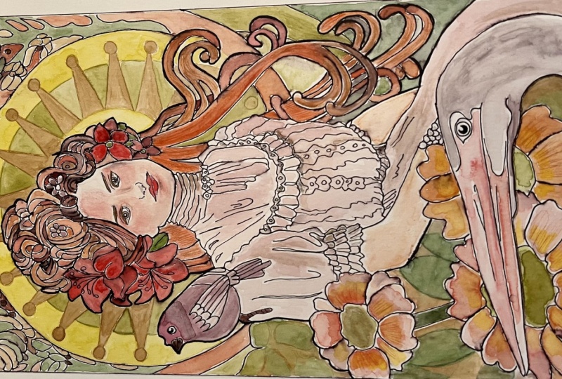
4. Theme and References: I'd like you to do a little
bit of research and collect the Alphonse Muha illustrations
that most appeal to you. Take note of what stands out. What aspects of
his collection of works you'd want to
incorporate in your project. Also consider a theme
for your artwork, like in the previous example
of Mohas season series. I'll show you how I
organize my project, and you can decide on the
direction you want to take with yours by the
end of this lesson. I gathered two sets
of references. The first folder are
the Muha illustrations that most appeal to me, noting what elements I want to incorporate
into my illustration. To assist your research, you'll find my references
in the workbook and also links to
my MohaPItSsbard, and to where you can download
higher resolution files. I settled on an autumn theme, then gathered seasonal
flora and fauna elements. So in my second folder
are botanicals, cute animals, and
vintage beauties to pose as the main subject. I found those on
royalty free sites. There's Pixube on splash. And for something like this, Pinterest is fine, as well. So, have a look at your handout. You can pick a theme
and gather references to create your own unique
Moha inspired design. Or you can follow along
and do the project that I demonstrate in the lessons
or a combination of the two.
5. Concept Thumbnails: Let's put the
references together to sketch our
concept thumbnails. Thumbnails are small doodles to quickly capture a concept.
They're rough doodles. But it's important to draw
these in proportion because our purpose at this stage is to design a
pleasing composition. Take a look at the paper size you'll be using for
your final art. Paper is 11 by 14. We saw that most of Mohas
posters are tall and narrow, so I'll be trimming my sheet to 8 " wide and
keeping the height. Determine the final
dimensions of your artwork based
on your paper, if it's different from mine, our mini studies will be in proportion to the final project. So eight by 14 in thumbnail size becomes two by 3.5
". We'll do three. Find the centers and roughly
quarter your frames. These guidelines
indicate a foreground, middle ground, and background. Using an HB pencil for this, begin the first thumbnail
with a circular halo. It's centered in the top
half of the composition. Then I'll center the head of our first vintage beauty with a hairdo that poofs out proportionally in the
halo to fill the space. Now moving quickly
to the forefront, I mark the center of the lower half of the
composition with a dash and sketch out the great egret to fill that section
of the layout. Then layer large circular shapes behind it to indicate flowers. Then the third flower behind
smaller to suggest that it is further away from the viewer going into
the middle ground, back to the main subject, we'll fill the halo some
more by adding a songbird. To balance out the bird, adding strands of
hair that flow out in that signature whipping
tendrils design. Now for the top border motif, I'm referencing more of those seasonal florals for
the autumn theme and just loading the remaining
space with strokes in various directions to give the illusion that there's
foliage in the background, like in the Muha references. Back to the main subject, adding flowers inner hair and loading the halo with
decorative elements. For the next thumbnail, we begin in the same manner, starting with a halo in the top half to frame
our vintage beauty. Oops, I want her face forward,
like in the reference. Making our way to the forefront, we've got another songbird on an oversized flower next
to a large leafy arrangement, adorned with smaller
round shapes to represent flowers or walnuts, then throwing in some values
to frame those elements. We'll address the hair
in a similar fashion, fanning out her tresses along with floral elements
for her hair piece. Moving on to the top border
with stylized floral motifs. And additional
decorations for the halo. Done. Onto the third thumbnail. Same steps, different
references. This vintage beauty has arms and a hand
holding a cute bird. For the forefront element, we'll go with a bunny ears, bigger ears sitting
in tall grass. Then some birch branches with those beautiful
golden round leaves bigger in the forefront and smaller as they fade
into the background. There's space to give her dress more prominence compared to
the previous two concepts. Muha loves to use fabric
as a visual element. A grape and vine
design for the border, and that's the process for quickly jotting down
ideas visually. Now we have three
potential compositions we could further explore. In the next lesson, we'll build our thumbnails to
define the details.
6. Project Mini Composition: At this stage of the process, I usually make a decision. Out of the three thumbnails,
do I have a preference? Are there elements I like best that could maybe be combined? If I'm not really sure, I redraw all three
slightly bigger, flushing out some of the details to help confirm my preference, as I did here, just to show you. For this lesson, I
have a preference, and so we will work with
thumbnail number one. If you're working on your
own design, use that. So to summarize
what we're doing, whether you assembled
your own set of references to create a concept that is different than mine, or you followed along with
the demo using my references. Either way, we'll use
that thumbnail as reference to sketch a
draft with more details. If you're wondering, why not go from thumbnail
doodle to final art? It's actually an important step, and I never skip it for
pen and ink projects. It's because of the
paper. You see? There's a huge gap in
completeness between this five minute doodle
compared to the final version. If we go from this to that even with a lot
of drawing experience, we're still going
to be making a lot of marks, repositioning
elements, tweaking proportions,
making decisions, then erasing, which
wears out the paper? We want to minimize traffic on the surface of our
smooth hot press paper. It's sensitive to
dents and dense, pull in the ink and water. Okay. So with that in mind, our next stage is to create a template for the
final artwork. In pencil going bigger than the thumbnail,
still in proportion. Measuring a four by seven
inch frame for the size of my paper and adding a
border with rounded edges. Find the center and
quarter the frame. So I'm using glassware for the double halo that will
frame our vintage beauty, starting with the main
shapes of the head, poofy hair, and her torso. I'm not so much paying attention to the photo
references anymore, but rather using the thumbnail as my guide for positioning. Deciding here to place
the egret slightly lower and larger than
in my previous sketch. Now, the large circles for the flowers in the front
and middle ground. Here I'm looking at both
the photo references and the Muha illustrations
to guide my drawing. I'm fighting with the
hair design a little bit. I'm aiming to balance
the space in the halo to match the initial thumbnail
concept, which I like. Now adding details to the
other stylized elements, the bird and the flowers
in the foreground. O. I see a problem with the
spacing in the top portion, which is resolved
by adding a halo. Sketching for inking or painting is different than
sketching for drawing. We're creating a map of where the edges and
values will go, measuring to put evenly
spaced dashes around the halo to mark the position
of decorative elements. I like these swirly
disorganized flowers in the autumn poster. It's a nice contrast with
the geometry of the border. It's a perfect example of Muha's asymmetrical
shapes arranged to suggest a repeatable pattern. After I filmed this
demonstration, I decided that I did
not like her hair. Unfortunately, I did
not film the revisions, but both versions
are in the handout. You'll see the second
drawing is the one that we're using for the final
project. Okay, great. Now that we've refined
our composition, all the elements are in place, and we're ready to transfer our map onto the artwork paper.
7. Project Underdrawing: For our pencil under drawing, which is the drawing
for our final project, you have a few options. But first, let's
prepare our paper. My sheet, again, is 11 by 14. The art is eight by 14. You can center the artwork or trim the paper with a blade. I'm ripping it by
applying pressure to a metal roller
for a torn edge. I keep the trimmings for
swatching or whatnot. Go ahead and add a border. Min measures a quarter
inch at the top and bottom and an eighth of
an inch on each side. And that's actually not
enough of a border around the artwork if you plan on taping it for the
watercolor application. So do leave more paper
around the border of your artwork than what I'm
showing here in the demo. To transfer the drawing onto
your sheet, options are, if you created a
mini composition, based on your selection of references in thumbnail concept, let's say this one's yours. Take a photo or scan
your thumbnail. And in any basic photo program, this one is preview on a mac, convert it to grayscale,
adjust the contrast, and then resize it to fit your project and
then print it out. If you're using my drawing, you can resize the separate JPEG and print it as a template. I'll be tracing mine. If you have a light
table, use that. Otherwise, the
window works well. Secure the print
out to the window, line up your sheet,
and tape it well. Turn the lights off to create a dark room effect
and trace gently, applying no pressure
on the pencil. I'm still using an
HB lead to create darker marks only so that
it shows up on camera. I advise you to use light marks with an
H lead if you have. If your paper is too thick
for effective tracing, method number two is
a graphite transfer. Let's pretend this is the printout and that
it's in the final size. You would use a soft lead, like a three B or six B or softer and completely cover the back of the printed paper. Tape it to your project paper, and with a regular
ballpoint pen, gently trace it without too
much pressure on your pen. Once completely copied,
pretend I did the whole thing. Remove the paper
and with an H lab, go over the lines gently. Graphite transfer, it's like a powder and it rubs
and messes your work. To avoid this, you
trace it again, then you lift the graphite
off with a needed eraser. Of course, whether you did
this graphite transfer or traced it from your window, you'll still want to tidy up the drawing before
the ink application.
8. Project Ink Application: For the ink application, I'm using a large dip pen. It's a 513 EF nib and super black India
ink all by speedball. Dip it in ink halfway
up the tines, not completely or
you'll risk leaks. Use spare paper to test the nib before
inking your artwork. Expect to get about eight to
ten strokes from one dip. Then spoil rinse and
water, wipe and reload. It's wise to keep the nib clean rather than re
dipping each time because the ink dries
surprisingly quick on the nib while in use
and can cause problems. If you're using fine liners
or other technical pens, go for a midwight like oh five. There is a sizing
chart in your handout. Holding the dip
pen approximately at a 30 degree angle
from the surface, I begin with the border. With the same size
nib, I apply the ink, traveling left to right, top to bottom, on
the picture plane. I'm right handed, and this helps prevent smudging
ink with my hand. I'm also wearing
an artist's glove to keep my skin off the surface. I'll sometimes use a small sheet of paper to rest my hand, but that can get in the
way of the wet ink. Drying time varies depending
on the ink and paper combo. I'm not inking everything
on the first pass. We'll address some
of the outlines later with a smaller
tip or with color. Reflect the Muha style where background elements are more
subtle with muted outlines. I'll point out what we're
inking as we progress. Still working on the top
half of the picture plane, I've switched to a
smaller nib equivalent to an h three technical pen for the vine like plants on
either side of the main halo. Back to the larger nib for the forefront to give
the top a chance to dry. For longer lines, like
on the egrets beak, I try to keep my wrist locked. Traditionally, we're
taught to hold our instruments with
a locked wrist, traveling from the
elbow and the shoulder. But I find that for details
within a 1 " square radius, moving just the hand and
fingers feels more precise. I rotate the paper to suit the angle I'm more
comfortable with. This is more crucial with ink since mistakes can be
challenging to fix. Continuing with the
front elements, again, leaving some gaps
in the outlines for later. Now for the main subject, still with the large nib, we'll noodle our way left to right or right to left
if you're left handed. So if you're inking
your own design, not this one, the
principles are the same. Ink the main outlines
and thicker ink and leave some of the back layers for thinner outlines or color. It's easier to go
thicker than lighter. So just leave anything
you're not sure about to revisit when more of the illustration
is complete. If you're wondering
about the sequence, whether it's preferable to
apply the colors first, then the ink, there's
no hard rule to this. Depends on the project, the materials, and your
level of experience. For this style, the
line work is complex. If you cover your
sketch with watercolor, the underdrawing is hard to see. So laying the ink first
is more friendly. However, it does
have some drawbacks, such as the need for
a hot press paper, which later in the lesson, you'll see that water
management becomes important. Go ahead and outline
this entire section of hair tendrils with
the thicker nib, but leave the halo for later. Now for the main outlines
of the lady and her dress. Back to an oh three line
weight for the contour lines, those are the lines within
the thicker outlines, decorative elements and whatever is positioned further
in the background. Moving on to the bird, as we noted earlier
in the lessons, the Arnivo style
is not realistic. It's more of a two
dimensional, not quite flat, but definitely more of an
illustrative representation of reality as a pen ink artist. It's really tempting for me to render every little detail. Some of the color will make the values appear
darker naturally, so that's also
something to keep in mind while inking the line art. Here I missed a couple of lines to show the
overlap of hair, so I'm adding that in now. Finally, the face. Oh, I'm switching
to a smaller nib. Use an 01 or smaller here
for her fine features. Again, leaving some of the pencil marks
for the next pass. A This part of the ink is done. For the iconic bold outlines, we'll apply those
at the very end. Leave all the pencil
marks for now. It's crucial for
the inks to be bone dry before we rub the paper
and proceed to watercolor. Otherwise, we'll get
this bleeding effect. I'm opting to let the
artwork dry overnight, but you could also
use a hair dryer. In the next lesson,
we'll decide on a color scheme and prepare a mixing chart
for our project.
9. Project Colour Scheming: When looking through
the Moha posters, were there color combinations that appeal to you
more than others? Mouha used a limited color
palette consisting of analogous and split
complimentary colors. We'll do the same thing. Before we get into
scheming our Muha colors, let's talk about
the pigments you have because as
mentioned earlier, different supplies produce
different outcomes. Color theory, we
know the primaries, traditionally red, blue, yellow. To get our secondary colors, we mix equal parts of two primaries to get
orange, green and purple. To get the tercery colors, we mix a primary
with a secondary, which should give us
red orange, red purple, yellow orange, yellow green, blue green, and blue purple. But depending on what's
in your kid at home, the mixing can give
unexpected results. For example, in this theory, this side of the
wheel is considered warm colors and this side cold. But here's a warm yellow
and a cold yellow. And what happens when we
throw that in the mix? My basic watercolor kit
says that cadmium red, cadmium yellow, and blue
ultramarine are my primaries. When I mix these primaries, my oranges, they
all look the same. The greens, they
have an okay range. But then the purples, they
look like burnt umber and mud. Confirm, I repeated the same
exercise several times, and it gave me the same results. Most kids come with at least
a few premixed pigments. So let's create a color wheel
with what we have on hand, aiming for a more vibrant range. Grab all the pigments
that you have available and everything you need to get started
for watercolor. Using the same paper
as for the project, trim a sheet approximately 8.5 by 11 to fit
all the exercises. Go ahead and make
the color wheel. There's a sample template for reference or tracing
in the handout. A note about neutral colors, white, black and gray. For our project, we'll use white of the paper for highlights. We already have a dominant black in the composition with the ink, and for shadows and muted tones, we'll be using the split
complimentary colors. Example, here's a cad red
with a black shadow layer, and here's the same cad red with its complimentary green
as the shadow layer. The red and green is
a complimentary mix and a closer match
to Muja's methods. I'm getting my cad red
ready for my primary. Some artists will
use magenta, cyan, and medium yellow for primaries, and if that's what
you typically use, then do as you prefer. For yellow, I'm opting for the lemon yellow as my primary, mixing equal parts of
cad red and yellow. For orange. This brand of hot press paper is
great for inks, but less performing when wet. Water easily pulls
on the surface, and that's something
to keep an eye on. Cad yellow becomes
my yellow orange, using sap green for
the complimentary, mixed with lemon yellow
for the yellow green. You can see I'm really
stirring those mixes using the belly of the
brush for an even mix. Keeping my dish clean for the next mix because
I also want to test a sample of the
cad yellow instead of the lemon yellow to
mix with my sap green. The cerulean blue makes
a vibrant primary blue. That's very close
to Cyan, actually. I'm organizing my
warm and cool mixes on opposite ends of my dish, testing the cerulian
with sap green, but I prefer to use
viridian as my blue green. Just for fun, I'm mixing
the cerulian with cad red to see that grayish
mauve that it becomes. Ooh, but I have a tube of
purple lake to save the day. Then the ultramarine blue
makes a nice blue purple, followed by crimson red
for an easy red purple. A, more. I'll also place my permanent
rose on this wheel, which could have served
as a magenta for mixing. There's also yellow
ochre in my kit, burnt sienna and burnt umber. Now, if you have an
extensive amount of colors, they likely won't
all fit on here. I'll assume that you've made
mixing charts in the past, and that you can reference that for the following exercise. Time to choose a color
scheme for a project. Going back to the MohaPosters, I mentioned he used a
limited color palette consisting of analogous and
split complimentary colors. Analogous are the side by
side colors complimentary, across from each
other, and split would be the colors next
to What's across. Muha likely four,
maybe five colors, maybe I think three as
the main local color. So here, orange,
mostly red for impact, then harmonize the
foreground and background by muting using the split
complimentary colors, probably a blue green and
a sap yellowish green, diluting with water to
get various tints and mixing with a
complimentary color to get different
values for tone. But just by looking
at the final product, it may not be that straightforward
to match his mixes in our project unless we have that exact color already
mixed in our kit. Let's give it a
try. Look through your references to identify three to five colors
that you like, and in the next
lesson, we'll make a mixing chart to
guide our project.
10. Project Mixing Chart: I'm going with analogous
colors, permanent rose, which is my version
of magenta, cad red, which is my red orange, and burnt sienna for orange. For the split complimentary
colors going across, I can't decide which
greens will mix best. I'll use this lemon
yellow green, sap green, and Vidian
blue green for my test. We want to see the
range of tints from each pigment by gradually diluting the saturation
of the color. At first glance, I already want to see more contrast in this. I'd love a burnt umber in here. So the next step will be
to document our mixes and see if our scheme will naturally produce
contrasting colors. That lemon green is out. Draw a grid minus five by five, list your colors at the top and as well on the side
in the same order. Across here is where the 100%
pigment will sit cad red, burnt sienna, permanent rose, VidianGreen and sap green. So on the left hand side
are the dominant colors, and I'm starting with sap
green with a bit of cad red, like a 65 35 ratio. Keeping my dish
clean and organized, going to sap green
with burnt sienna. Again, this whole row
is green dominant. You can make them a bit more saturated with additional
pigment in your mix. I just have too much
water on my brush. Repeat the process
for each row with the dominant color that's labeled on the left
hand side of your grid. This produces interesting
results depending on which is the dominant
pigment in the mix. And so this gives us
plenty of colors from just five and a guaranteed Muja style harmonious
color scheme. Also jotting down just
a few notes as reminder that if I want to shade a red
element in my composition, I'll layer green over
top and layer red on top of green will mute
that shade, and so on. We'll be using this
mixing chart a lot. Of course, these will look
different once dried, especially if you
leave it overnight. One last thing is to
match our color pencils. I don't have the exact
match, but close. I'll also set aside
a burnt umber, black and skin
tone just in case. Now we can be confident in our supplies and ready for
the color application.
11. Project Colour Application: I taped my artwork to cardboard instead of the table so
that can still rotate it. Let's begin mixing burnt sienna
with a touch of cad red. I'm mixing a good quantity and also diluted mixes for lighter tints and
testing beforehand, starting with the
background top frame. As we work our way through
this entire color application, aim to stay within the lines, but absolutely no worries if you go over a little bit
or leave white gaps, we'll address all the
white gaps later. Here I have the same tint
in terms of intensity, but I added a bit more cad red. So same tint, slightly
different color. We're in this
corner over here of my mixing chart using cad
red and burnt sienna. I'm using this to guide the sequence of the
color application, expanding from the top
left hand corner and out. The illustration is intended
to be two dimensional, not quite flat,
not quite three D, but we still have some shadows. And for that purpose,
we'll say that the source of light is coming from the top left hand corner, meaning our shadow
side is on our right. For the flower, I'm introducing a touch more red pigment
while the paper is wet. Okay. With the hot press paper, there's not enough texture
on the surface for the pigment to grab and
we'll get blooms in spots. You can see I'm moving the beads of pigment
to the corners or back up into the section so that it dries
with softer edges. Continuing with the same
burnt sienna cad red tint for the strands of hair, painting with the
side of the brush, try not to go back
and forth too much. Adding red to the tint and making sure my brush
is not overly wet. Using that mix for
the front flowers and paying attention to where
that bead of paint lands, coaxing it into a corner. I'm building the values wet
on wet for these paddles. We'll increase the density
of the tint, same color, going back to this burnt
Siena cad red mix, but slightly darker
with the application. For the hair, I'm referencing
the Muha posters. He uses different
intensities and hues for the individual strands
of hair here and there. Again, moving the bead of
colour gently to manage edges and blooms using a paper towel to dab
away any excess. Using that same tint mix for
the other forefront flour, here I am careful
not to get this red into our white
bird, going darker, adding more burnt sienna, taking excess off my brush, so it's not too wet for
the very foreground. I'm going around
these shapes that will later become leaves, stems, and here in the
middle ground some foliage. In the Moha posters, the background
texture is abstract, and that's the look we're building towards
back with the hair, carrying more of that
same tint on my brush. Now moving through
the illustration with a bit more cad
red into the mix. Okay. Now that it's dry, I'm staggering the values by reducing the tint in
our pigment gradually. So adding color, reducing water. I'm now refocusing on
light and shadows, applying deeper pigment to the areas positioned further from the light in
the composition. We're building monochrome
values with you and tint. We'll introduce the
complimentary colors at a later stage for that contrast using the
same colour protocol I demonstrated in
this example here. T. To help me keep the colors organized, I wipe the mixing
dish clean again, making a new mix of just cad
red to deepen the values. We'll continue to
build the pigments in the same approach all the way through the
colour application. Back to burnt sienna, introducing permanent
rose to mix a skin tone, checking the tint first, then applying the colour
in smooth strokes. Very light, even pressure.
Well, no pressure. Just gliding the
brush top to bottom, bottom to top in
a single swoop to avoid the pulling and
those tide lines. Though we can smooth out
any unwanted edges later. Adding a bit more
pigment to give the illusion of form
to the face and arms. And now addressing
those hard edges with a clean damp brush, very gently pulling
and smoothing. Increasing the permanent
rose intensity for the florals in her hair. Here, some pulling is okay to let the
watercolor do its thing, creating a natural
looking texture. It adds volume to the flower. Not too much realism, just to stay in line
with the Mura style. I hint to permanent rose to define her features
a little bit more. Smoothing out the edges again
with a clean damp brush. Mixing burn siana with permanent rose to glaze the
hair a little bit. Glazing is when you apply a thin layer of colour
over a dry colour. It changes the value
and creates depth. Of course, not too wet. We don't want to lift the layer below, including the black ink. Using the permanent rose
mix for the egrets beak, a few long strokes with color, then a damp clean
stroke over top. Blooms are welcome
for the section transitioning into burnt
sienna for a two tone beak, giving it a rounded appearance. You'll note I'm holding
the brush vertically here, using the tip for the smaller
details and longer strokes. I've now switched to my
detail brush number two, using a deeper ros
Siena mix for the lips, leaving a highlight in there, then adding a touch of cad red to the mix to
deepen shadows. Carrying that color over to the florals of the same colour. Okay, time to move
down the chart into our cooler
complimentary colors, adding a touch of viridian
blue green to burnt sienna. I make sure this mix is
homogeneous on the brush, then using a lighter tint of that same mix to start
filling in the top border. You'll notice I'm
going very loose with the application here
for an abstract effect. Muha uses this technique as not to distract the viewer
from the main subject. I've increased the burnt
sienna to the green mix for a more golden hue and using
that to start on our halo, even though this is
a geometric motif. I'm keeping it loose. Carrying that color
over behind the hair, where the design is
undefined, sort of, you know, how objects blur
together when they're further away for an atmospheric
perspective effect. Moving down the
picture plane with a more green dominant tint, creating loose texture to indicate vegetation
in the background. Still in the Viridian blue
green row on the mixing chart, but now with cad
red to mix to get a rich brown for the
songbirds beak and talon. And then I sprinkle that same
color into the top border. I added a touch of cad
red to that brown mix, then using a thin layer to
continue with the halo. I don't want to get
this in the hair. So there will be a few
white gaps here and there. We'll fill those in later. Again, this section is
pretty loose and muted. Carrying that same colour into the top border to
harmonize the composition. For these flour centers, we'll again go with the wet on wet technique
to promote texture. Just a thin sheen of water all the way to
the edge of the ink, then gradually working
in the brown mix, and there's a touch
more green in it, leaning towards the burnt umber. Cleaning my brush
for the next one, same technique, but with a touch more green to the mixture. Same color for the
flour next to it. Now taking that color
to the foreground. The contrast with the
stem is too strong, so I adjust it with
a glaze to make the foregrown appear in shadow
from the elements above. It's important to
adjust the values in relation to each other for
the piece to look cohesive. For the songbird, I got this
cool purple from mixing our viridian green with
a touch of permanent rose as I continue to move
through the mixing chart, dotting some permanent rose on the wings for tonal variety, then bringing the purple into
the florals in her hair. I'm looking for a
grayish purple, almost a pains gray
for the egret, which I find by adjusting the amount of green in
the permanent rose. Once happy with the color, I wet the bird, same technique we use
on the flower buds, then apply a very thin layer
of that purplish gray. I'm using directional strokes that follow the
shape of the bird, so that the pigment spreads in a way that naturally
describes the form. Taking that gray into the beak to layer in
the shadow values. Darkening with more green for the core shadow on the bird. Again, being mindful,
resisting the urge of realism to stay within
that intended two D style. This gray works well to
shade the songbird, as well. And the lady's face, careful
not to give her a mustache. A subtle indication of
volume in the face. Nothing too sharp or contrasty. Continuing with shading various elements in
the composition. We've already established
that green is the complimentary or
split complimentary to my warm analogous colors. So there's no fear of
creating dull mud. We're nearly guaranteed to
achieve rich muted tones. The only thing that can dampen our euphoria of colors is
if we overwork the paper, but so far it's going well. For the final mix in the chart
is our dominant sap green, which I mix with cad
quite thoroughly. So there's no pigment streaks, especially important with
these student grade pigments, they're not as smooth as
the professional kit. I'm using this for highlights and more as an impact color. It really brightens things up. Now mixing sap green
with burnt sienna to get a brighter gold to complete
our halo and using that color to fill in
any of the white gaps we left open in the previous layers throughout the composition. Moving on to permanent rose for mixing
with the sap green. Going with a super light
tint of that for the dress, going wet on wet
for some sections, so we can move the pigment
around on the paper. Layering a mix of sap green, then sprinkling in more
of the permanent rose. Back to the dominant green mix, a little stronger to emphasize
the areas of highlights. Then carrying the sap green mix over to the leaves in her hair. I've added more rose to
the green to mute it to finish the last bits of the
halo than her bracelet, leaving white to
indicate highlights. I added a touch of viridian green to that
rose sap green mix for a deeper version of a brown to punch up the
shadows in her dress. I'm going back to VidionGreen
just for a second to mix with burnt sienna
for a rich golden brown. With her face dry now, we can give her
eyebrows and deepen the tones in her hair and
face for areas of shadow. Then using a light tint of
that same colour to fill in more of the little white gaps in the bottom half of
the composition. These are the gaps between the elements of
different colors, not the white left
open for highlights, finishing with hazel eyes
for our main subject. Okay, now we leave the art overnight to see
how the colors dry. In the next lesson,
we'll finalize our illustration with the colored penciled
and bold outline.
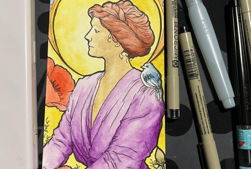
12. Project Final Touches: The idea with this stage is mostly to smooth
out transitions, fix little things that need more clarity or
enhanced details. I'm using a burnt umber
to darken her lashes. And to add a hint of value to the top half
of her eyeballs, where the lashes
would cast a shadow and just a few hatch
marks here and there. Muha's illustrations usually
have portions of rendering, so we can incorporate this
element here as well. This is where I try to
match the color so that the rendering doesn't
overpower or distract. It's subtle, but does
add a touch of texture. You can remove or
tone it down with a kneaded eraser if you're not pleased with the result
of the color pencils. Adding a hint of shadow for
her dress using a blue green, then the blue green
and sap green to outline a couple
of leaf shapes. Switching to burnt sienna to pronounce the foliage
in the middle ground. Then to hatch a few strokes
on the foreground flowers. Followed by red orange. Back to burnt umber to bump
the contrast just slightly. With the burnt sienna, we can suggest an outline
on the halo motif, keeping a light touch, not putting any
pressure on the pencil. Switching to the skin tone color for the circular
part of the halo. Then more hatch marks for the flower in
the middle ground. And finally, for the signature
iconic bold outline. You can use a marker for
a more uniform line. It doesn't it doesn't
have to be waterproof, but best use a good
quality marker. Not a sharpie. This would bleed into your colors and
discolor over time. I'm using a number
two watercolor brush to apply liquid ink. If you have a lettering
brush, that also works well. Aim for a uniform line, meaning it has the
same line weight all the way around
the main subject. The bold follows the very outer silhouette
of the main subject, which includes the songbird on her shoulder and
the hair tendrils. You can bold the
illustration border, as well, but I'm
leaving mine as is. You can see my brush
line is wobbly in spots, but it's easy to
even out with a pen. Now, grab a smaller tip pen, and we'll thicken some of the other main lines
on our subject, not as bold but thicker to
balance things out visually. Now, sign your work, and that completes
our Muha style Art Nouveau inspired poster in pen and ink and watercolor.
13. Project Conclusion: Thank you for spending
time with me. I hope that you
found the lessons valuable and that you'll continue to incorporate master influences
into your own work. As part of the process, we got to look at Art
Nouveau masterworks, and based on our observations, explore designs by
doing rough thumbnails. We then refined the concept
into a draft sketch, transferred that drawing to
keep our project paper clean, which made the ink
application go smoothly. We experimented with our
coloring supplies to plan a harmonious mix and transitioned it all together
with some final touch. Whether you followed along doing the illustration
design that I demonstrated or created
your own unique poster, I'd love to see your project. Be sure to share your work on the projects and resources
page of this class. It's optional to also include your color
charts and thumbnails, though helpful to others to see how you planned
your final design. If you're curious to learn about master studies or dive
deeper into dip pens, be sure to check out
my other classes. You'll also find
additional resources on my blog and YouTubes. Congrats again on finishing. Thank you so much. I'd love
for you to leave a review, and I wish you the best
with your future projects.
 Chloe Gendron, Pen and Ink Illustrator