Transcripts
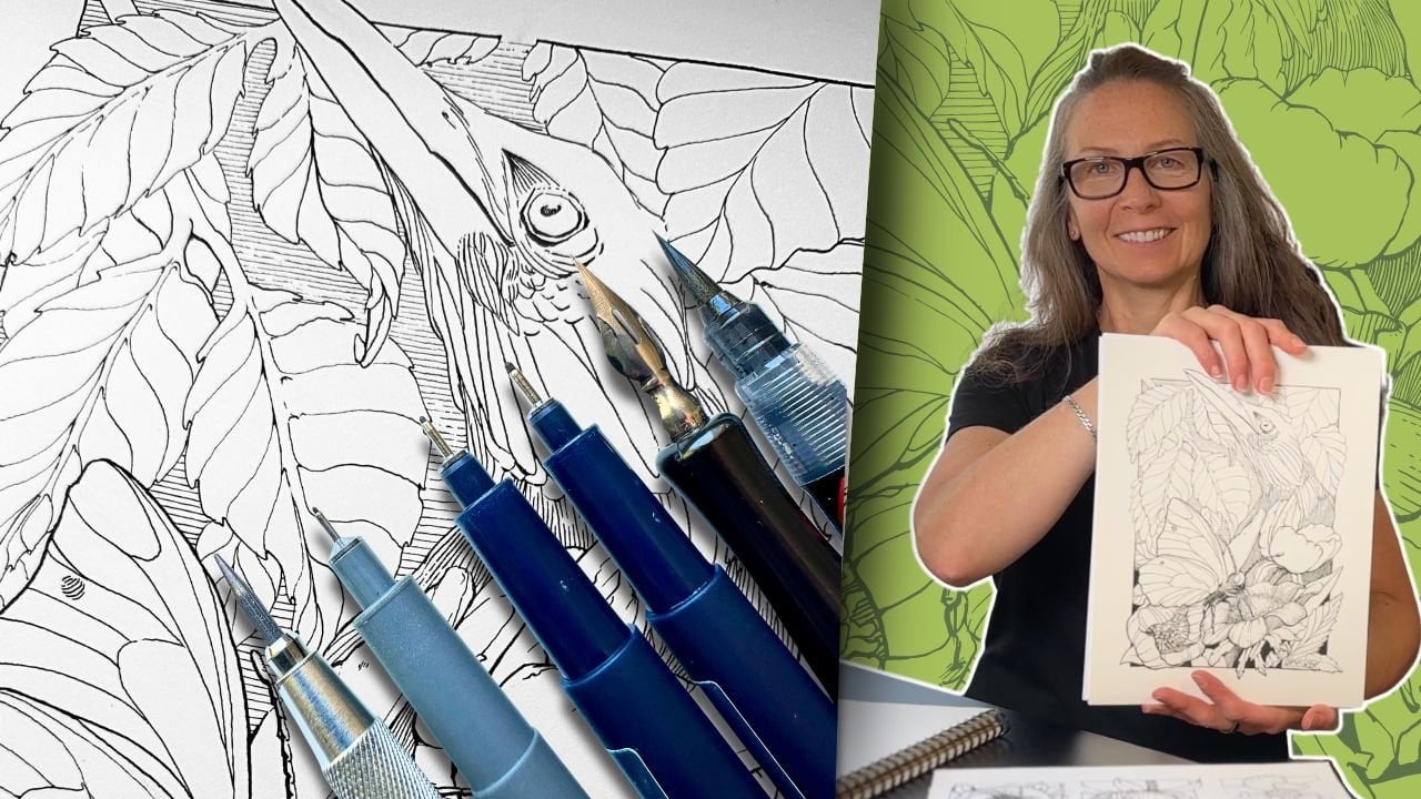
1. About This Class: Pen and ink is a drawing medium. Drawing is the ability to translate what you see to paper. What I love about studying
the masters is that it helps grow your
observation skills. Better observation skills
means more convincing art. But to get from observation
to a finished piece, there's decisions to make. And problems to solve. Today, you'll learn
effective methods to study masterworks that will accelerate your
decision making and problem solving skills
in your art projects. This includes an
observation checklist we'll use to analyze different influential
masters from various eras and genres. And based on those observations, we'll go through a series
of exercises to sharpen skills and grow
our understanding of the art fundamentals. A huge benefit of
this process is that it will inform your
steady blueprint. You'll be able to build
the steady blueprint. Use it as a custom
learning guide. You'll know exactly what
to work on so that you can progress to more advanced
projects with confidence. Hi, I'm Chloe, a
learning specialist turned full time artist, and I'm happy to share
my methods to help pen and ink enthusiasts
reach their goals sooner. For your class project, you'll submit an
exercise of your choice using the methods and fundamentals
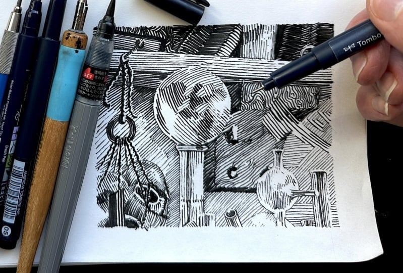
taught in the lessons. First supplies, you'll
need a pencil and eraser. If you have a circular template, you'll need a set
of fine liners, one with a thicker tip. Sketching paper, preferably a sketchbook that you can dedicate
to your master studies. Optional supplies are a
brush pen, a dip pen, some India ink, inking paper, a water jar, and a paper towel. You'll find a
comprehensive workbook and the master reference
PDFs in the resources. Gather your supplies,
download the media, and in the next lesson,
we'll get started.
2. Your Influences: Master artist is a professional. Someone considered
to have reached a high level in
their art practice. The purpose of a master
study is to grow knowledge and develop
skills through observation. Essentially, master artists
are visual translators. As mentioned, to get from observation to
a finished piece, there are decisions to make
and problems to solve. Decision making is
the planning stage of the creative process. This includes the tools, materials you'll use, and
what subjects to draw. Master artists go much
further with their plan. Extensive research.
They explore concepts, do lots of sketches and studies before even
going to the final ink. Problem solving can happen
at any stage of the process. The more experience you have, the fewer the problems. And learning about the
fundamentals grows your knowledge. Applying the fundamentals
develops your skills. But first, let's look
at your influences to get an idea of where you
want to go with your art. Think of artists whose
work you admire. What is it about their
work that inspires you? What stands out about
their style and techniques you would like to emulate in your own practice? In your workbook, write down who your top three Pen
and ink artists are and why you
admire their work. If you don't know any by name, recall a few of your
favorite art pieces, and what is inspiring
about those? In the next lesson, we'll
start putting that into context so that you can
build your steady blueprint.
3. Your Vision: Now that you've
reflected about what inspires you about masterworks, let's put that into
a vision statement. A vision is a general result. It's not super specific. But having a vision gives you a compelling reason to study, a purpose to practice regularly. The biggest hurdle for learners
is staying consistent. When you have a clear purpose, you're more motivated to do the exercises and to
finish your pieces. Your vision will set the direction of your
steady blueprint. In your workbook,
take a moment to reflect on your desired results. Again, these are more general. Common results might be to do artwork that
makes you happy, inspire others with your art. Be able to render
any subject and progress to advanced
projects with confidence. Earn income from
your art exhibit, publish, sell,
license, or teach. After you've reflected
where you want to go with your art,
in the next lesson, we'll assess how we
can bridge the gaps between now and where
you aspire to grow.
4. Self Assessment: In this lesson, we'll determine your general areas
for development. A gap in knowledge means you're missing information
to make progress. So you need to further your education.
There's more to learn. A gap in skill means you need more practice
in a specific area. From your most recent artworks, select the top three you're
most satisfied with. Select pieces that took an equal amount of
time to execute, meaning compare sketches to sketches and finish
art to finish. Looking at your best works
on a scale of one to five, rate your current skill level
compared to your vision. So if, for example,
your vision is to progress confidently to
more advanced projects, how close or how far are you
from being able to do that? How does your knowledge compare to that of
your influences? Looking at the masterworks
that inspire you, how close are you to executing
that level of mastery? Assessing your artwork, overall, what are you happy with. What are you executing well? In general, what would
you like to improve? One of the struggles of emerging artists is figuring
out what to practice, knowing what to work on to bridge those gaps of
skills and knowledge. Now that you have
a general idea of where you want to go
with your art practice, we can start filling
those gaps based on the hierarchy of the art
fundamentals for pen and ink. This will provide a baseline for what to practice
and to understand.
5. Fundamentals of Pen and Ink: And now we'll review
the hierarchy of the fundamentals for Penank. This will provide a framework
for your steady blueprint. When I talk about the hierarchy, imagine a pyramid in
order of priority. The primary fundamentals, shape and form,
support the base. Shape is the design of
two dimensional elements. Shape is the most important
because with shape alone, you can communicate the
subject to the viewer. Form is the dimensionality
of an element. So shape is flat and
a form is three D. Adding volume to a shape is what creates the
illusion of form. With pen and ink, you can convey volume through
the use of values. So adding gray tone with marks, such as lines or textures, this is our shading
and lighting, or you can convey volume
with line quality. In quality is the variation in thickness of the
marks you're using. So the line weight, it tells
the viewer there's volume, depth, perspective,
or even movement. For example, just varying the
line weight of this form, thick to thin creates a sense of depth
and dimensionality. The pyramid base is the widest telling us
where the majority of our practice needs
to happen before we can progress to more
complex fundamentals. To advance as an artist, this pyramid is a
valuable guideline to build your steady blueprint. Therefore, a beginner
would benefit most by learning and
practicing shape and form. Composition is how you organize
what's in your drawing. An effective composition guides the viewer to a focal point
on the picture plane. There's different methods
to structure a composition, and they involve most of
the other fundamentals, meaning they work together. There's a linear perspective. That's when you
converge lines towards a single or multiple vanishing
points on the horizon. Achieve atmospheric perspective with rendering techniques. For example, the elements further in the distance
would appear lighter and less detailed than what is positioned closest to the
viewer in the foreground. Perspective proportions and
visual storytelling are integral in
compositions to create the illusion of scale,
depth and dimension. We'll get into these in more detail in the
class exercise. Anatomy is what beginners
tend to start with. And as you can see from
this pyramid diagram, it would be challenging
if you skipped over everything else
to begin with anatomy. Last, control of
the instruments. This is your hand eye ability to render using
different inking tools. Control of the
instruments is likely what we notice first
in a masterwork, but the magic they create is built on that pyramid
of fundamentals. The goal then is to uncover how the masters executed each of those fundamentals so that we can learn from it. But
that's challenging. If we don't know how to
identify the fundamentals, figuring out what
decisions were made, what problems were solved, just by looking at a piece. You see, when you're
creating art, it's a different process
than when you're taking apart someone else's to figure
out how it was created. For that reason,
I've categorized the fundamentals in groups to make the analysis
process easier. Now lighting and shading
take priority and imports. Lighting and shading
is our form, our value and contrast. Composition is the next
most important and intertwined with linear
perspective and proportions, atmospheric perspective,
the arrangement of values, the arrangement of elements, and visual storytelling method. And then control
of the instrument, our ability to manipulate different inking tools to achieve desired
effects convincingly. So to grow knowledge, you would focus on understanding how the fundamentals
work together. We do this through analysis and self SMA
to develop skill, we would practice applying
the fundamentals. We achieve this through
exercises and projects. In your workbook, you'll find all the definitions plus
your observation checklist. We begin our studies
using that checklist. But first, I'll share some tips on how you would select artists.
6. How to Choose Masters: When you have a specific
learning objective in mind, for example, say you're working on your
values, arrangements, and composition, then search for masters who are renowned
for that particular thing. We'll talk more about how to set your learning
objectives later on. Otherwise, the great place to start is with your
general vision. If, for example, your dream
is to create a manga, you would therefore study
your favorite manga cas, but then look into
their influences. For example, Master
Hao Mia Zaki, the creator of Hall's
Moving Castle and Nausicaa, was influenced by Mobius, who was influenced
by Franklin Booth, who was influenced
by Gustave Dore, who was influenced
by Albrech Durur. And so on. What an amazing
roster to study right there. Typically, my next
step is to search online and at the public library for the best quality images. You would want pieces
that best showcase the breadth of the
master's genius. In the highest
resolution available, so the images are
not too blurry. We're not concerned with
copyright in this scenario because we're using these
images for self education, not for commercial purposes. There are several links to
resources in your workbook. One that will take
you to an online page where you'll find a list
of my favorite books. And one to the
Master Artist list I compile for you to download. This list gets updated
online periodically. You'll always have access to the most recent online document by clicking the link in
your class workbook. It's this green
button if you forget. I've already curated
historically influential Masters as part of your resources today. Our first analysis begins with
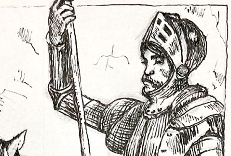
the Goat, Franklin Booth.
7. Analysis | Franklin Booth: It's not unusual to start a master study by researching what an artist is known for, what their processes or
who their influences were. There are pros and cons
to finding out about a master's process before you get a chance to
study their work. The advantage is, if it's to
meet a specific objective, it makes sense to study masters who are known
for that specific thing. The disadvantage is that the information may shape
your lens of observation, meaning you look for
what stands out about that master's work based
on someone else's opinion. That opinion may be
credible and valid. But it does influence
your perception. A way to get around
this is to research a master after you've done your study to verify
your findings. It forces you to check if your assumptions were correct based on what the
experts have said, or if you're missing something
in your observations. So research the master's
process before, if you have a specific
learning objective. Research after for a broader
learning experience. Let's say we have a
specific objective. We want to know more
about values in a composition because that's what Master Franklin
Booth is known for. His illustrations are recognized for their intricate
range of values, demonstrating prowess
in his control of tone in compositions. Value is how light or
dark something is. In Penank value is communicated using lines or textures that
fade from light to dark. Tone is the degree to which
a value is light or dark. How Franklin Booth
renders tone gives the impression that his
gradation scales are infinite. Some masters in the genre of Mike Mignola use a
three value scale, which is essentially white, black, and a little
bit of texture. The norm is a five
to seven value scale if we include white and black. But Master Booth
seems to use more. Something notable in
Franklin Booth's value scale is that he rarely uses black. You'll see zero values, which are the white of the
paper, but not the reverse. Instead of solid black, he meticulously
builds the tones, painstakingly
knitting each texture to describe individual
elements in the picture plane. His placement and spacing
of parallel lines produce multifaceted shadows
and luminescent highlights, giving the work a sense of
scale, depth and dimension. The balance in his
compositions hinge on extreme precision in the
allocation of the values. So superb control
of the instruments. It's well documented that
Master Booth developed his mark making style by recreating engravings with
Penank. That's right. He taught himself by copying
the masters before him. You'll recognize some
of Booth's influences, most notably Gustave
Dore and Albrech Durr. Let's go through the
observation guideline to confirm what we've just
learned about Master Booth. You can write directly in your workbook to complete
your observation checklist, or because we'll be using that same checklist for all the exercises,
you can make copies. A recommendation is to keep dedicated sketchbooks
where you'll keep your reflection notes,
your observations. And your exercises.
So it's all together. It makes it much easier to
monitor progress over time. The first and most important is to establish the
source of light. You find the source of light by identifying the highlights and the darks on the picture plane. Look for the high contrast areas where there are the
least amount of value. Here it would be the largest billowing
clouds in the center. Right away, I see highlights at the crown of the
characters heads. Where else are the
whitest whites, the lady's neck and highlights
in the folds of her dress? Now for the dark values, the bottom right hand
corner is the darkest. To establish where the
light is coming from, our best clue is the lady. Her neck and back are highlighted and her
face is in the shade. So I'd venture that the light comes from the
top left hand corner. It's important to find the
source of light because it informs the cast shadows
and how to plan the values. There more than one
source of light. Sometimes there's a
significant back light or bounce light reflected
that affects the values. To confirm whether there is
a second source of light, look for the cast shadows. If they're mostly
on a logical place, then there is only one
intended source of light. So here, there are
darker tones under the fellow's arms in the
front of his trousers, which makes sense if the
sun is more at his back. So he's taller than the
lady blocking her light. So there's more rendering
detail under her arms. The left arm that
he's covering and her left arm is
obscure by her body. I don't see a bounce light. The village below is rendered
with lighter values, but this has more to do with
the atmospheric perspective. When you focus on
lighting and shading, you can immediately
see how the master created v giving form to shapes, and it's in the placement of those values that the
shapes are defined. That's why we focus on
lighting and shading as the primary fundamentals when
we're in observation mode. Let's talk about
his compositions. Knowing where the horizon line is helps with understanding how the master communicated a sense of perspective,
depth or scale. In this case, it's easy because a landscape makes it clear to
find where the horizon is, which is in the middle
of the picture plane. And at a glance, the
elements on the page seem to line up with a vanishing point towards the center
of that horizon. Except for this
patch of rendering, but that's a booth quirk. I know this because
I study him a lot. Regardless, it's good to note any incongruities you notice. You can decide later what to
do with that information. From what perspective is the viewer looking at
the scene from above, below or at eye level? I'd say we're
looking at the scene from slightly below eye level. The couple is standing on a hill and we're below and near enough. Because we establish
the horizon line, we get a feel for the
linear perspective. The position of the viewer confirms that this is a
one point perspective. Also noting the
elements get smaller, lighter, with fewer details
further in the fissure plane. This is what we call
atmospheric perspective. How's the composition
structured? How's the space divided? How is the main
subject framed in the picture plane with
values or elements? This is one big question
because most masters use a combination of elements and values
to divide the space. Likely familiar with the
golden ratio and the rule of thirds guidelines to structure elements
in a composition. Such models are helpful when
you're sketching concepts for a layout to test how to
best frame the main subject. But again, here we're
looking at a final piece for clues of how the
structure is used. That structure becomes
almost obvious when you shift focus to
the arrangement of values. Where do you first
in this image. What grabs your attention first? The eye lands on
the lady's skirt, not only because it's in
the forefront center, but because it's rendered in lighter tones framed
by darker values. But then the viewers
attention is led to her head. We do this for two reasons. First, the eye does not linger long in an area with
little interest. The dress has some details, but not as much as the
character's faces. We're drawn to her face. Look how it's not only
framed by negative space, but also several elements. Cloud, which is a frame within another gray
frame, the sky. This dark tree and her companion note how he's rendered in
a darker tone, as well. This is an extremely
effective composition. Master Booth succeeds in framing the subject with
values, elements, and delivers on visual
storytelling by leading the viewer to an area
of focus in a narrative. The viewer first
looks at her dress, and we notice that it's windy. The eye then goes to her
face, her expression. You then notice her
mate. Looking at her. So you look at her again, then follow her gaze
into the valley. That gradation takes
your eye to the clouds. Then you look up and then
take in the entire scene. Brilliant. In the last section of our observation guideline, we finally look at the
master's rendering techniques. We said control
of the instrument was the mark making techniques,
the detailed design. This includes line weights,
stroke direction, textures, the spacing in between the marks used to
build values and edge. Edging is the transitions or boundaries between
elements or values. They're either hard,
soft or implied. Be sure to read the
definitions in your workbook. So what techniques were
used to build the values? Does the master
use mostly lines, cross hatching or
any unique textures? Are there changes in the angle of line direction,
so plain directions? If so, where? We can see
in the lighter areas, he uses mostly lines
to build values. And for the darker values, there are no crosshatches. He increases the density of the tones by a
thickening of the marks, and by reducing the
space between the marks, he brings the lines
closer together. He does use a lot of unique textures with
many plain changes, as you can see here
in the drapery of her dress and his sleeve, which are great examples. But observation
alone is not enough. In the next lesson, we'll check our analysis by
doing an exercise.
8. Study | Franklin Booth: Kick out your sketchbooks. We'll practice exercises to understand how master
Booth controls the values. Let's count the values. We have white, black, ish, then very light
and dark gray. I'm guessing three
more in between that makes around seven values,
potentially eight. In pencil, rough sketch a scale. Resist the urge to use a ruler. This is intended to be quick. We're just confirming
our observations. It's not a polished drawing. Grab your inking tool. Here I'm using a range of
fine liners, zero, one, 03, 05, and a thicker nib marker
for filling in the blacks. The first box is white. Then this looks like the
second lightest value. Imitate a sample of the value
with your smallest tip pen. Then look for the
next darkest value. And with the same tip, bring the lines closer together, reducing the space
between the lines. Repeat the process with value four lines a
bit closer together. For value five, I'm
jumping to my 05 tip pen. I'll keep the lines spaced
apart similarly to four. But because the tip is thicker, there's less space in between. Again, don't concern
yourself with the execution. It's a rough sketch to
figure out the number of values Master Booth is
using in this illustration. And actually, here
for the value five, he did it with a thick stroke, and the sky is nearly
the same tone, but he achieved it
with a double line. We'll double line for value six, since it looks like that's
what he did as well. F seven, I'm switching
to my marker. Wow, looks like there's
a midtone after that, which has a tight cross kit. Then finally black with nine. So, wow, at first glance, I saw only seven or eight, but there's up to nine, and there's likely nuances in the finished illustration
for the transitional tones. Let's see how he arranged those values in the composition. I had already started a
thumbnail sketch of the layout. Go ahead and sketch the
main elements on the page. This should take 5 minutes, Max. We're just using
this rough outline to map out the
arrangement of values. To fill the values, this time we'll
start by blocking the darks and go dark to light. You could use a pen and fill in the values
from your scale, but that is time consuming. Our aim here is to
get a snapshot of how he arranged those values to lead the viewer
to the main subject, as we observed in the analysis. My guess is Master Booth sketched that
couple on location, then quickly roughed in some
values in pencil either directly on the artboard or as we did on a
separate thumbnail. He would then have determined the value scales along
with the textures, then proceeded to
the ink application. I'm pretty sure he
didn't wing it. In your workbook or sketchbook, take a moment to answer the questions from
the self assessment. Might you apply this information to your projects or
studies in the future? For example, the values
arrangement exercise is a part of my planning process when creating an original piece. It's a quick way to test
different layouts and resolve potential problems
before rendering the final piece in ink. And, of course, I
create a values chart. What are your top
three things you learned by doing
this master study? Even if the learning
feels micro and not life altering, I
make a note of it. Or the opposite, if what
you learn from your study is discouraging
you, identify why. This is helpful for
objective setting. When you look back to your
notes a year from now, you'll be impressed
by how much progress you've made on these things. For example, I mentioned that beginners often
start with anatomy. My first ever drawing class was on gesture drawing
of the figure. I struggled so much
with it. I gave up. But then I discovered the
hierarchy of the fundamentals, and a year later, I
took that same class. I couldn't believe
the difference. Give those questions
some thought. Ideally, you'll reflect
on your learnings after each exercise to monitor your progress and
adjust your objectives. This is how you build
your study blueprint. You'll know exactly what
you need to work on and have full control of the pace of your learning.
Let's do another one.
9. Analysis | Montgomery Flagg: To kick start this analysis, I'll take you back to a
study I did last year of three legendary masters
from the Golden Age era, Charles Dana Gibson,
James Montgomery Flagg, and Joseph Clement Cole. Looking at their art side
by side, at a glance, it might be challenging to spot what sets them apart
from one another. That's because all three had similar styles,
constrictions and methods. All from the Golden Age, they drew similar subjects to appeal to popular demand for illustrations that
realistically reflected the lifestyle of that era. All began their
illustration careers quite young as early
as 12-years-old. They learned art making
primarily by studying the masters before them and
each other while on the job. All worked for the newspaper. Newspaper print quality was
terrible in the early 1800s, which was a constraint on the
quality of their linework. Even though they're from the same period as
Master Franklin Booth, there's no way they could
render such tight linework. The images would
print as black blobs. The other major constraint
was tight deadlines. They would sketch
at live events, then later ink their
drawings from memory. That's why there's so much
scribbly energy in the lines. Rather than methodically lay
down each line with polish, their approach was to capture
the pose and the lighting. In summary, the commonalities of these three masters were
that they started young, so they had a lot of
experience, lots of practice. They developed drawing
skills from observation. They honed inking skills
from daily practice. They rendered images that
focused on storytelling, and they depicted subjects that had a broad appeal
to their audience. Those are great tips for
us from the masters. But what sets them apart? I invite you to explore
this on your own. You can find
additional images for comparison from the
Master Artist list. Let's go through the
observation guide with this image from Master
James Montgomery Flag. From what direction is
the source of light? The highlights are over here, darks over here,
plus calf shadows. His contrasts match the
direction of light. Is there more than one source of light reflections
or cafe shadows from a different direction? No. The shadows are directly opposite to where we identified
the source of light. How is the composition
structured, space divided, and the main subject framed in the picture plane by
values or elements. Main subject is in the
center of the picture plane. She's framed by negative
space and lighter values. She's rendered with the
highest contrast with more discerning details than the other elements
in the composition. What technique was
used to build values? Does the master
use mostly lines, cross hatches, or
any unique textures? Are there any changes in the angle of line
direction? If so, where? The master uses mostly parallel
lines to build values, reducing the strokes between
the lines to build a tone. Similarly to master booth, unique textures on the dress, fabric, hat, and
background plants. Interesting use of
plain changes in the drapery folds in the
clothing of the characters. We can build on prior knowledge for estimating the values. At first glance, I count six, including black and white. Take a moment to know what you noticed during your analysis, what stood out for you, especially if we compare
to the previous masters.
10. Study | Montgomery Flagg: A few things stood out
for me from the analysis, primarily how the
master transitions the tonal values rendered
with energetic strokes. This is particularly
striking for how he renders drapery folds. If these were some of
your learning objectives, then artists like Master Montgomery Flagg
are great to study. In your sketchbooks using
whatever inking tools you have, we'll do three many studies, starting with stroke exercises, aim to capture the
energy of the marks. Pull towards the body or
push with a fast flick. It's helpful to lock the wrist and move from the elbow
with a natural flow. Now, do it again, but this time, aim for a continuous value scale to practice the
tonal transitions. So more gradual and dynamic than in the previous lessons
we did with master booth. Master Montgomery flag's style is scribbly, less calculated. He did use a dip pen and
brush for these strokes, but we can simulate
with fi liners by releasing the pressure on the tip at the end
of each stroke. Let's do a couple of sections
where there's a change in plane direction.
This fellow's sleeve. If you find this
method too abstract, to see the values
within the shape, crop your image to isolate
the section you're sampling. Like for the dress, I'll sketch in pencil first. Then I switch to my
marker for bolder lines. Focus on where the master
changes line direction. Aim to capture some of the
transitions of tone by varying the space between the strokes as we
have done before. Pay attention to what
you're noticing about the master's work as you're
imitating his strokes. Then take a moment to answer the master study
reflection questions. This master's style is the
complete opposite of mine. So one of my insights is that I enjoy observing a broad
range of masters. Otherwise, how would I get to practice all these different
styles of rendering?
11. Analysis | Moebius: Mobius is renowned for creating imaginative Sci Fi worlds. In an interview,
Mobius says that he spends a lot of
time planning and working on the pencil drawing so that he can focus
on the artistry of the inking rather than be distracted by the
problem solving. That's a great tip for
Master Mobius spend more time ahead before jumping
to the ink application. In your sketchbooks, do
a thumbnail sketch of the values arrangement
to see how he framed the main subject and
structured the composition. Follow that with a value scale. Check how many he used and how he addressed the
transition of tones. Just by doing these
two quick exercises without even going through
the observation guide, is there anything something about this master's execution of the fundamentals in
this piece that is distinctly different than
what we've studied so far? What stands out about this master's work?
Give you a clue. It has something to do with how he conveys the illusion of form. Go ahead and go through your observation
checklist on your own. In the next lesson,
we'll review it together and do a
steudy exercise.
12. Study | Moebius: What's inspiring to me about Master Mobius' work is his proficiency with
line techniques. I'm fascinated by
how he communicates light and shadow simply
with line quality. As you recall, line
quality can give form to shape by
varying the weight. Often in a single stroke from thin to thick or thick to thin, shape and form take on even more importance
here compared to the previous masters we
studied because of how this master uses sparse
rendering in his pieces. But also, if you noted, the shapes were more abstract in the previous illustrations, and the contours and outlines
were less emphasized. Mobius is known for clear lines. Therefore, control of the
instrument is a big factor. Let's quickly go through
the observations. From what direction is
our source of light? In this case, looking for the darker areas is more telling than seeing
the highlights. Look for the areas of shadows. They consistently
indicate the light is coming from the top left
side of the picture plane. No bounce light here. Note where there's
tighter rendering. There are darker values, deeper mid tones
at the bottom of these clouds in the back
of this character's cape, confirm a single
source of light. What did you notice from doing the thumbnail sketch
about the composition? There is some framing
with the values to show the overlap of
the front character. Yet, compared to the
previous masters, there's less emphasis
on values in this composition as there is in the division by elements
on the picture plane. The horizon line is over here. Then we have several
visual elements that frame the center of focus, which is the hand gripping the bow and this cloud
frames the wand weapon. Look at the placement of these twigs and
the winding path, which further
emphasizes the illusion of perspective and depth. The viewer is looking
into the image. To answer the questions
about technique, we'll do another exercise. We'll be using the
instructions from exercise four in your workbook for
the following three studies. I've cropped a
section of the image. The sample is slightly larger
than in the previous study. We'll spend more
time on this one. The pencil drawing
and rendering should take about 45
minutes to complete. When doing your study, pay attention to
how master Mobius rendered the folds and cloth
of the tunic and trousers. Compare that to how Booth and Montgomery Flag
interpreted these. Also how the lines get
closer together at the bottom of the
cloud formation for the gradation of tones, resulting in the
illusion of volume. The directional change of the rendering of the bow
as it follows the form, sparse rendering
in the highlights to accentuate the
marks that build tone. How intentional are
the shapes here? It's clear that this is
a foot behind a knee. You can complete the rest
of the image in your mind just from how accurately these shapes describe
the human figure. Most importantly, is the
role of line weight. How mobius communicates
light, shadow, form, distance, and depth
simply with line quality. For example, here
at the bottom of the cloud formation is thicker and note the varying line width on the outline
of the robe. The thinner lines indicate those areas are closest
to the light source. And these are the kind
of insights that we want to save in our memory
bank for future projects. Take a moment to answer
your reflective questions, note what stood out for
you about this master, and write down potential
objectives for your steady blueprint
as a result of the three studies that
we've done so far. Let's continue with
another comic book artist.
13. Analysis | Bernie Wrightson: Bernie Ritson was an
American illustrator, best known for the Swamp thing, Frankenstein, Cycle
of the Werewolf, and many more masterpieces
featuring his trademark style. Go ahead with the observation
checklist on your own. Build on what we've done so
far through the lessons. I encourage you to
practice any of the previous exercises
such as a value scale. See how many values Master
writes and uses in this piece. Note how he
transitions the tones, pay attention to how he leads
the viewer to the area of focus in the composition with
values, elements or both. Feel free to do a thumbnail
to explore your thoughts. The next lesson, we'll do a
study exercise based on what stands out about how Master writs and interprets
the fundamentals.
14. Study | Bernie Wrightson: By now, you're familiar with
the observation checklist. The purpose is to collect data. The exercises help you verify the findings
from your analysis. Moving forward, you'll do the
observations on your own, and we will not review
the analysis together. We're skipping ahead
so that we can spend more time
on the exercises. In your sketchbook, establish the picture plane in the same
proportions as the sample. Mine's approximately
four and three quarter inches across and 4 " tall. Use the objects
that are closest to the edges of the picture plane to determine the proportions. Then start building the elements on the page using rough shapes. For every element that you
add on the picture plane, estimate its size
and location in relation to the edge of the picture plane
and other elements. So here, eyeball from
two reference points. Feel free to leave out some
of the smaller objects. Once all the elements
are in place, start refining the shapes. Use tools if you have them. I've indicated the
direction of the strokes, also mapping out where the
darks and highlights will go. I'm not worried
about an exact copy. It is Bernie tson after all, we can't expect to best
his level in skill. Plus, he draws these panels
on a much bigger scale. I'm using my medium
sized tip 03. You're welcome to use a dipen. Oh, that's likely
what the master used. The trick is to render the
section without the outline. The outline will be one
of the last things we do once most of the
background has been added. Now I'm switching to my 05. Most artists would be tempted to follow the form
or cross contour, but tsin is all about
the parallel lines. And that's where these
tonal transitions are super interesting. Here he uses a
continuous stroke effect in the gradation of tones. I started with the
lightest at the top, then moved left to right. The post seems to have an edge, so I'll render that one next. Master Ritson uses a
linear gradation here. With the main object done, I'll now render the elements left to right on
the pitcher plane. The key is to be mindful
of not rendering the edges whenever it looks like the background
can do that job. So the left side of these
rope twines are white, which won't appear until we
render the layer behind it. Now switching to my large nib for some of the
darker toned areas. Then switching back to
my oh five to transition the shading continuing
with parallel strokes. The glass beacons are the
closest to the viewers, so I'm using the same linear
pattern as for the post. Go ahead and render the entire upper section
of the books. Then make our way to the wooden shelf support
with the cool pattern. I'm using my marker and
having some fun with it. For the shelf, the idea is to complete the contour
edge of the bulb. After you've rendered the
bottom section of the shelf, we'll make our way
to the support beam. Notice the sunlight
rendering from the window is layered
over the beam. So we'll render that first, then continue with the
wood grain pattern. Render the protruding knobs
and their drop shadows, then continue with
the beam pattern. Roughly indicate
the lighter areas in pencil if you'd like to. On the left side of the bulb, I'm adding a broken outline before rendering the remainder. You could do several
studies from the same image and notice
different things each time. Feel free to continue exploring the fascinating work of
Master Bernie Ritson. Write down your learnings, what you'll continue
to practice, and what you can emulate in your own work and
future project. In the next lesson,
we'll look at two of the top manga Kas.
15. Analysis | Miura and Inoue: Master Takehiko innue is best known for slam
dunk and vagabond, which are two of
the best selling manga series in history. Vagabond sold over
82 million copies. Master Kentaro Mia is
best known for Berserk, which has over 50 million
copies in circulation. Both masters have
a realistic style and followed a similar process. In the earlier editions
of the mangas, they would pencil by hand, partly render the
drawings manually. Then the gray tones, textures, and backgrounds would be done
digitally by assistants. For the ink application, most Mangakas use a Sagi or
G Neb and menso brushes. These tools require
expert control. There is a steep learning curve. Control of our
instruments to create art is something most of us
still strive towards. Let's agree we each have a natural way of making marks
that comes more naturally. I'm more comfortable primarily
pulling marks towards me. Some artists prefer to push
the marks away from the body. Master TakehikoEui
uses both motions, depending on what
he's illustrating. He adjusts how he holds each tool to get the
desired effects. He holds a brush
more upright than a dip pen and a little
closer to the tip. Might argue the tools
don't make the artist, but master Take hico
innue demonstrate that it can be advantages to control each instrument to
its full potential. Pencils, brushes, dip
pens behave differently. Same goes with how
these interact with the drawing
surface or the ink. It's good to watch how masters hold their
instruments in motion. We can gain a lot
by practicing what we observe to train
our muscle memory. In the previous lessons, we analyzed full scenes. Now we'll be looking at close
ups of the main characters. As you go through the
observation checklist, I'd like you to pay
close attention to mark making techniques. In the next lesson, we'll practice rendering with
dip pen and brush.
16. Study | Miura and Inoue: In this lesson, we'll
be changing supplies. If you don't have any of
these, use what you have. For my supplies, today, I'm using a pentyl arts
brush pen, a Tachikawa, gineb and holder, speedball, super Black, India ink, the leader, manga paper, a water jar, and a purple towel. I'm switching to this paper. It's made for liquid ink. Sketchbook paper
is typically made for dry mediums
with softer fibers, which will buckle when using liquid ing and tear
when using dim pens. Paper is less important
than exercises. However, since we're aiming to imitate the master strokes, we want all the
advantages to our side. Brush pens have
hair like tips to simulate the stroke quality of a traditional
hair bristle brush. A bristle brush is great for filling larger areas of
solids and for bold, flowy strokes, especially for
hair and special effects. The pens are amazing
for parallel lines and appreciated for being able to go thin to thick in
a single stroke. You'll want to use
India ink specific to drawing so that it has
the right viscosity. Otherwise, it won't stick to
the nimb or flow properly. Warm up by pulling
strokes towards you, varying the pressure to
change the line weight. Now push strokes. Hold a pen at a 25 to
30 degree angle from the drawing surface with your hand higher
up on the holder. Let's practice a section of
strokes from the characters, starting with master Takehiko Ius vagabond
character Musahi. On the section of shading
across Musahi's forehead, the lines are spaced equally
apart, but in length. They curve one way
then the other. The left side has a
bit of cross hatching. You can see by how
the scratchiness of this master's lines that he
hatches with great speed. That same energy is similar for master Mia Cantaro
with the strokes on the side of his
character's face guts. Let's also practice the
contour line of Guts profile. You can sketch it out quickly, then ink it to get a feel for
the thick and thin strokes. I like how Master Takehikoue renders eyes with a subtle
angle change for each stroke. This is how he expresses
the values here, dark to light and a linear
gradation for the pupil. Now we'll warm up
with the brush pen, holding it like
master Takejko Inu upright and closer to the tip, making strokes of
various weights. Tory a section of Gutz's hair. The image is cropped to isolate an area like we did in
the previous lessons. Now with Musahi, I cropton flip the image so that it's easier to
imitate the strokes. The idea is to build strokes gradually by changing
the angle slightly. I know it looks like
a crazy mess zooming into the strokes that close. Trust the process.
Once all the strokes are assembled into contexts, it does turn out okay. You can go a step further with these studies by sketching
and rendering a full image. In the next lesson are ideas of more exercises to
advance in your studies.
17. More Exercise Ideas: The analysis process becomes
much faster with practice. It boils down to the light, the values, and the composition. You'll be able to look
at masterworks and quickly jump to sketching
your observations. The idea is to build confidence so that you can
broaden your selection of masters to study and increase the level of difficulty
of the exercises. For the exercises,
copying is the best way to learn how the masters
execute the fundamentals. Far, we've copied smaller
samples of their work. You can copy an entire scene as long as you keep your
objectives in mind. It's time consuming to
copy a complete piece, time that could
be spent applying what you've learned to
your original works. I'll talk more
about the pitfalls of master studies
in the next lesson. In addition to copying, there are other beneficial
exercises, you can try. Tracing informs us about mark making and simulates the control of a
master's technique. It's a straightforward way to practice high quality marks. I like tracing because I
don't always have time to draw something from scratch
just to practice my inks. Tracing allows you to reach a higher volume of repetitions. It's a shortcut to
the inking stage. Another version of this, rather
than using tracing paper, you can ink a piece
directly by printing the illustration in light gray or what's referred
to as blue line art. You'll find a link in
the workbook resources to learn more about
that process. Advantages of tracing or blue lines are it's
quicker than copying. It's not complicated. You can go direct to ink, and it is good practice
for rendering technique. But disadvantages are it won't help with
other fundamentals. It won't improve
your drawing skills, and it needs to be
intentional for this practice to be an
effective learning activity. Another quick exercise
you can try is value scales with textures only of different master styles. Here's a cross hatch study
that I did of Mobius, Anki Bill, Franklin Booth, and Charles Dana
Gibson as an example. You can try the same subject
in different styles. Here, I drew the
same cloud formation five times in pencil
from a photo reference, then rendered each drawing
in a different master style. You could draw your
subjects in a master style. So after your analysis and
a few study exercises, you can further commit your
observations to memory by creating artwork in the style of the master you've
just studied. Example, here I applied Master
Minola'sillustration style to four different subjects, starting with a photo
reference from sketch to final links to match Minola's
visual design style. And here, from imagination
to a more complete piece, based on the styles of Master Harry Clark
and here Sergio Tobi. Or you can create
an original piece, but shift your focus from
style to the fundamentals, for example, atmospheric
perspective or visual storytelling to
emulate your influences. Rotating these types
of exercises provides different learning
opportunities so you get the most from
your study sessions. But just like anything
good in life, it's important to keep
learning activities balanced and master
works in perspective. In the next lesson, we'll
review the pitfalls to avoid.
18. Pitfalls to Avoid: Saying balanced and
intentional with your master studies
will help you grow as an artist
and avoid pitfalls. The danger is becoming overly
reliant on the masterworks, too, for all the answers. It's normal to seek
help if you get stuck on a problem
in an illustration, but we don't want to resort to copying masterworks
into our art projects. Master works are
intended as inspiration, a source of knowledge
and skill development, not to be regarded as a reference image for
our own creations. That can lead to doubting
your style or struggling to complete original
work without having to constantly borrow
from the masters. The exercises in this class are simply tools to train
our observation. The better the
observation skills, the more believable the art. At some point in my art journey, I became so enthralled
with the works of my art heroes that I couldn't ink anything without
referring to their work. Not only did it feel like
cheating on an exam, I also lost track
of my own style, and it eroded my confidence. To prevent this, a
good strategy is to implement systems that
help you avoid pitfalls. So to avoid pitfalls, my tips are remind
yourself that studying the masters is an activity to build fundamentals
for your own work. Remove the temptations
of reliance. Adopt a workflow that
naturally creates boundaries so that once you've started inking
your projects, the masterworks are put away. You don't look at them again until your project is complete.
19. Your Study Blueprint: A study blueprint is your custom learning
guide so that you know that you're working
on the right things to make progress
towards your vision, such as taking on more advanced
projects with confidence. In your workbook on page 16, you'll find a three step process to customize your
study blueprint. Now that you've
completed the lessons, have a look at the answers you wrote for each of the questions. Go through them again
to see if there are any reoccurring
themes that might inform more specific
objectives to work on. For example, if after each
analysis and exercise, you noted something
about line quality, then that's a straightforward
thing to practice. If, for example, you said, I need to work on my values,
dig a little deeper. Was it your ability to see
values or how to execute them? What exactly about that? Let's revisit the
rights and sample we did and compare the
masters to yours. That's a direct means of
feedback, right there. Do your values
match the masters? Did you place the contrasts
in the right spots? How are the transition? It's like having
the answer sheet to a test where you can readily gauge what needs
more practice and what is on track with what
you're wanting to achieve. Whether it's timid
linework or abrupt values. These could be related to
needing more practice with inking tools or needing more experience to
recreate what you see. So needing more practice, translating what you
observe into a drawing. In any case, now you have
more relevant information. And as a result, you can adjust your learning blueprint to keep growing consistently
as an artist. Next, in your workbook, complete the fundamentals
self assessment. Based on the themes that you uncovered and your
fundamentals assessment, answer the remaining
questions in your workbook. What specific skills are
you aiming to develop? What knowledge are
you still missing? Which fundamentals
will you focus on for your next master studies?
Who will you study? How will studying this
particular master bring you closer to your vision? In your next pen
and ink project, what will be your end goal? What will you
achieve? Keep track of your progress with
a steady schedule. See an optional tracking sheet template in your
workbook for that. A super easy way
to advance using your steady blueprint is to turn the objectives into your
next observation guide. For example, three
of my objectives for the next six months are
related to composition, such as visual storytelling, effective arrangement of values and control of the instruments. I want to get better
at brushwork. Would therefore look
at the works of masters in search
of those answers, such as master Takehiko Inui. Therefore, how does Master Takehiko Inui achieve
visual storytelling? What does he do that makes his arrangements of
values so effective? How does he use brushstrokes
to create such effects? And based on what I
uncover in my analysis, I can explore further with the exercises we
practice so far. You're all set to design
your study blueprint. But there's more than
one part to this. To accelerate your learning, an essential last step is to document what you did
differently after each project. Then it's easy to update your objectives as
part of your workflow. Keeping notes will give you
information about what worked well or what needs less effort. Date your analysis
notes and studies. You can repeat the process
with the same master later in your journey to see if you observe or interpret
things differently. Time your study sessions. For example, in 2022, this dip Pen and ink sketchbook
study took about 5 hours. Compared to this
similar study using the same tools in
2024 took 2 hours. That tells me that
the workflow I've been using is helping
with my decisions. Remember to also date
your final projects so that you have a year to year
timestamp for comparison. Those time records are super helpful when you retake
previous classes, rework old pieces, or revisit
subjects and masterworks. Keeping such records
will make year to year comparison
that much easier. Next lesson, we'll talk about your final project and wrap.
20. Final Project: Thank you for watching
the lectures, going through your workbook, doing the exercises,
and, of course, bringing it all together by submitting your final project. The methods practiced in this class change the
way that I observe and translate what I see onto paper into more convincing art. Feel free to share our view with your
key takeaways so that other students who
are interested in doing master studies
can learn from you. For your final project, submit a subject
study from one of the masterpieces that
you have analyzed. This can be from
one of the lessons or a different one from
your favorite artists. As part of your assignment, please include the
name of the master, the Master's Illustration
that you analyzed, the top three things
that stood out from your analysis, your study, and what you learned
fundamentals, techniques, methods
that you will practice and apply
in the future. I hope that you enjoyed
this learning process. Encourage you to maintain
your study blueprint, monitor your progress, adjust your objectives as you
advance in your art journey. For more pen and ink tips, be sure to follow me here as a teacher so that you know
when my next class comes out, you'll also find content on
my website and on YouTube. Thanks again, and I wish you the best with your pen
and ink projects.
 Chloe Gendron, Pen and Ink Illustrator