Transcripts
1. Welcome to Shading Essentials: My name's Chloe. I'm
a learning specialist turned full time artist. Pen and ink is the medium
I'm passionate about, and I've designed
this class to answer. The number one question
I get asked on the Internet is how
to make consistent, actionable progress
drawing with pen and ink. And more specifically,
how to draw cleanly without making mud. If you've ever wondered why some doodles look
like masterpieces, even though they're
essentially just scribbles, well, the answer has
to do with shading. Drawing is a skill, and, yeah, it can take forever to master
shading is a technique, and technique is something that anyone can learn and
apply right away. With pen and ink, shading goes a long way to making a
drawing look really good. The class is structured in three progressive
stages where you'll quickly learn what instantly makes a doodle more readable. The focus will be on
practice so that you can experience how
the techniques work, giving you more control over how your drawings
will turn out. We'll go through a
sequence of exercises in small achievable projects to gain confidence
through repetition. Whether you're just starting
out with pen and ink or looking for guidance on where to go next
with your practice, I believe you'll be amazed
at how much progress you can make in such a short time with just a few fundamental
techniques. You don't need prior
drawing experience. You just need to
believe in yourself because even though I place
emphasis on technique, we'll not be using
references or templates. We're just doodling
together freehand, straight to ink from theory
to action in creative ways. I'm here to present
options, not standards. I've developed a
simple approach that makes Penink easy to understand. If you see my work
on social media, you know that I
love to illustrate in detail, intricate
realistic style. But before I get to that stage, I do tons of
experimental doodling. In that doodling process, I gain confidence to tackle
more ambitious projects, and that's what you'll
learn in this class. I'll show you what each technique does
when you would use it, and how to make your
drawings look clean. For supplies, of course, use what you have on hand. I do recommend a smooth finish inking paper and one
or two inking pens. I will go through the
supplies in more details, especially if you're just
getting into pen and ink, and you're really
looking for what tools and materials to get. By the end of this class, you'll know a lot about shading techniques and how
they can bring clarity to your drawings and the confidence to keep progressing
beyond this class. Thank you so much for joining
me. Let's get started.
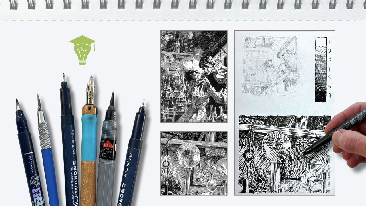
2. Pen and Ink Supplies: For supplies, you'll
find the list of my recommended tools and
materials in the PDF handout, as well as other
helpful resources. The lessons, you'll need a smooth finish inking
paper and one or two pens. Now, I'll be using a single pen. I'm using what's
called a sponge tip Calligraphy Pen that makes both thin and thick
lines in one stroke. If you don't have a similar pen, then you'll want
a medium tip size for all the shading
marks that we'll be doing and a thicker
marker type pen for filling in the solid blacks. This is all the information
you need to get started, then go ahead and skip
to the next lesson. If you're new to Penan or
looking to shop for supplies, then stick around. I
have recommendations. Put away your ruler,
eraser and pencil. We're going straight to ink. The number one question
I get asked on the Internet is what
kind of pen I use. The type of pen
makes a difference, but what matters
most is the paper. The surface of the paper is what has the most impact
on your results. Look for a smooth
finish hot press paper. The brand and format,
they matter less. Anything in the 80 to
150 pound range is great because you can use it for both exercises and
finish projects. Sketching paper is okay as long as it's
fine tooth surface. So brands like Strathmore
are categorized by quality. They use a number
202 500 series, 2-300 is the student grade, 400 and up is the
professional grade. Avoid using textured paper
because it eats your pens, and the ink will streak, smudge, it will apply unevenly
and not be opaque. This is especially true
if you're interested in using brushes or dip
pens in the future. A smooth finish is
always best for ink. Paper labeled as a bristle
smooth or bristle vellum or even a mixed media paper is good and it can be used
with inking tools, and it plays well with other mediums as well
when you mix them. These come in a pad
or a book format, and that is whatever you prefer. For this class, I'm using a bristle vellum of
nine by 12 sheets. I'll be using about
four to six sheets. It really depends on the
size and format that you have and how many
sheets you'll be needing. In general, I use
a smooth finish, student grade paper for
studies and exercises, and I save my higher grade
sheets for my nicer projects. My preferred doodling pens have a sponge tip with a medium
hard or soft point. Avoid those long floppy tips and hair like bristle brushes. Those are for painting, and they are more challenging to control. Make sure that the
pens you use have an ink pigment in them so that the ink doesn't
show through on paper. Like in your sketchbooks,
that's really annoying. So, have a look at the
handout for that information, and in the next lesson, we'll talk about what
makes a good doodle.
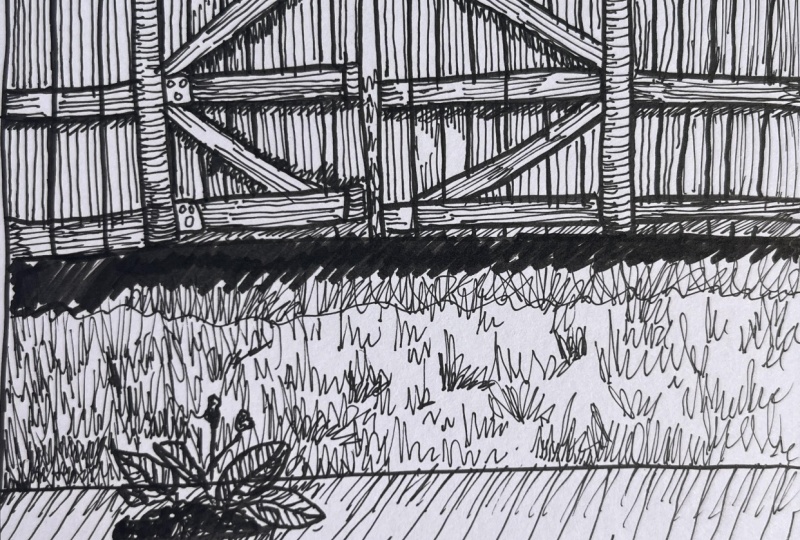
3. Great Doodles Vs Mud: To be good at drawing, the advice we generally get
is to draw from observation, either from life or
from photo reference. If you're aiming for
a realistic style, then being able to
draw shapes accurately becomes the most significant
fundamental to practice. Shape is what defines a subject. It's the visual container, the edges of what we see. But getting good at drawing
shapes is a lifelong journey. Sometimes you just
want to quickly capture what's in
your head on paper, or you want to quickly
sketch out your ideas or explore concepts with
effective thumbnails. In that context,
being able to shade your doodles is a great help because a great doodle will more accurately
represent your ideas. And that's useful because
anyone looking at your doodle will
know exactly what it is and be able
to appreciate it. You can refer back
to your thumbnails, and thanks to your
effective shading, your doodles become a
lot easier to refine into more finished project
or finished illustrations. And perhaps that doodle approach becomes your signature
drawing style. Like the historically influential
masters who have made that doodle style
legendary Heinrich Cl, Charles Dana Gibson. So what makes a great doodle? Two things confidence
and clarity. Confidence means being intentional
with your mark making. Intention leads to clarity. For example, you may be familiar with the term
chicken scratches, and fair enough, when sketching, using a pencil, we're
constructing a drawing. We're trying to find
the best lines. Then go over them
with an inking pen. At the end, the pencil
lines get erased. No one sees the chicken scratches that lead to
the finished artwork. When doodling, the
objective is to quickly capture what you
see or what's in your head. So why not take that opportunity
to go straight to ink? With ink, each mark on the paper communicates something
to the viewer. This doesn't mean each mark
must be perfectly executed. A confident mark is
more about economy. If you can use one
intentional stroke instead of a bunch
of tentative ones, then this communicates
confidence. For example, in this doodle, note how in the foreground, the master used only a
few confident strokes to describe blades of grass. Confidence leads to
clarity. Is clarity. Clarity is when you can immediately at a
glance, read a drawing. Your brain automatically
understands what's going on in
the composition. Even though there's no
refinement or details here, all of these marks are there
to suggest what you see. We can very quickly identify
what the objects are, what the subjects are doing, what's in front in
the picture plane, and what's positioned
further away. With Penini, you're working with black marks
and white space. And without shading techniques, objects that are drawn in front
of one another or behind, can turn to MD and
just be confusing. In the following lessons we'll progress through
shading techniques. You'll learn what makes a
doodle instantly more readable and gain confidence with your
skills through repetition. Starting with shading
combinations.
4. Stage 1 – Shading Combinations: In the previous lesson, I mentioned that
with pen and ink, we're working with
black and white. In this picture plane, we have a subject in the foreground, some mountains in
the middle ground, and the third layer is the sky
further in the background. The trick is to alternate
the overlapping layers, light over dark or
dark over light. Combinations that use solid
black or solid white work well for silhouette
drawing styles. Some are simple and
others more complex. Some combinations of black
and white don't work. Like the foreground and the background
overlap in a way that makes inking it overly complex
to execute with clarity. If we otherwise look at
black and white as values, then white means
100% in the light, and Black means it
gets 0% no light. Either the object
is in shadow or that object is actually
a darker color. Somewhere in the middle
we get a gray value. This gives us more options. The overlap principles
remain the same, alternating between
lighter and darker values, except now we have a third
option with this 50% gray. In this example, I rendered
the gray value using strokes. All going in the same direction. It works if you
alternate the layers, but our doodle turns to mud
if you go gray over gray. You might encounter this problem when drawing from observation. In this photo, the fallow
is a black silhouette. The mountains are also solid black and the sky
has lots of white, and the remainder of the
environment is gray. Visually, we can read
this doodle because of how the main subject is
framed in the composition. In the second photo,
the fallow is gray on top of gray with
more of the same gray, and now I have mud. A solution to this problem is to vary the stroke direction. Same, 50% intensity of gray, but by alternating
the stroke angles, the overlaps become
clearer to see. This stays true no matter what combinations you use
to shade your doodle. So if our guy was
wearing a green shirt, the exact same green
as the background, we could still doodle the
subject convincingly in pen and ink by simply varying
the stroke direction. Ah, but it still takes
a few seconds for the brain to separate the
foreground from the background. It almost looks
like he has wings. A solution to this is to
vary the levels of gray. Spread the strokes further
apart for a 25% gray. Closer together and
bolder for a 75% gray. Same stroke direction, but alternating the gray
levels in each overlap, and we gain more clarity. We can get even more
options by using a full range of grays combined with strokes that
alternate directions. The key to preserving clarity when mixing stroke direction and values is making
sure that the value levels all match in
the same intensity. So all the level twos
match one another, all the level three, and so on, regardless of the stroke angle, keeping in mind that having too many options can turn badly. But if you plan your values, then you'll get great doodles. So just black and white
gives us less options, but it's easier to
make things clear. Then we gradually
gain more options, but also more planning is
required to keep things clear. These shading combination
techniques are very useful when planning out
illustration projects. As we saw from these
two reference photos, we discovered potential problems by doing the thumbnail
experiments. Regardless of the illustration style that you're interested in, Dole or more calculated
like a Franklin Booth. Even Master Booth starts every projects by shading
thumbnail sketches. Grab your supplies
in the next lesson, you'll practice all these
shading combinations.
5. Stage 1 – Values Chart Practice: You'll now create your own
shading combination chart. Keep this chart when it's done. It will be a useful guide for all the lessons and
any future projects. In your sketchbook
or on a sheet, at the top left hand corner, draw a small rectangle. Leave it white, add
another next to it, and fill it with 25% gray
using thin diagonal strokes. In the rectangle next to it, bring the strokes
closer together, using a bit of pressure on the pen to create bolder lines. Then even more pressure
for thicker lines. If you're using fine liner
pens for the thicker strokes, just go over the lines a couple times and finish in the last
rectangle with solid black. Earlier, I mentioned that
white gets 100% of the light. White means a highlight because it's also closest to
the light source. The further your subject
is from the light source, the darker it gets. Solid black says the subject is blocked from the
light and in shadow. This is called a value scale. It shows progressive levels
of grace from light to dark. Go ahead and create another
five level scale below it. Switch the direction
of strokes from the scale above and match
the level two value. Add another below it. This time with
horizontal strokes, repeat the next scale
using vertical strokes. Go ahead and fill the other
value levels on your own, and I'll see you on
the next lesson to continue with our shading
combination chart.
6. Stage 1 – Shading Combinations Project: Our value scale has five levels. You'll see inking styles that
use two to three values, so black, white, and a
few rendering strokes. Some styles go all
the way to 12 values, but five levels,
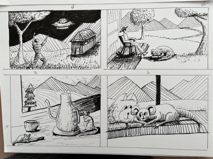
as we have here, is plenty for doodling. Let's draw our screamer
fellow together. The first combination
is light over dark. Repeat the same drawing. Oh, oops, I made a
bobo on this one. Now, dark over light. Repeat the drawing a third time and leave it blank for now. Next row, column one, combo, light over dark using
value level three, diagonal direction
slanting to the right. Referring to the first value scale, repeat the drawing in
the next two columns and label the shading combination
for the second row. In the third row, again, starting with light over
dark shading combination is still value three, but we can use any
stroke direction as long as it's at
value level three. In the fourth row, first column, multiple value levels,
one stroke direction, starting light on dark. Last row has multiple values and multiple stroke directions. You don't have to use
every single option. It just gives you extra
possibilities to explore. For your mini project, go ahead and
complete the shading combinations for your chart. I'll see you in the
next lesson and we can progress to stage
two from there. No.
7. Stage 2 – Light and Shadow Practice: Now that you've completed your
shading combination chart, which may look
different than mine. We can use that as a baseline to talk about light and shadow. The lighting starts to matter more when drawing objects
in three dimensions. With our light source on
the top left hand corner, according to our value scale, white is the closest
to the light, then progressively darker
further from the light. Solid black for the shadows. The same principles from the previous exercise apply here with the stroke direction. If the value levels make sense, the brain registers
that the object is three D regardless
of stroke direction. The thing is, we do
not see objects. What is visible to
us is the lighting. Most objects produce no light. Their visibility depends on the amount of light
reflected from them. So as an artist, how you use lighting
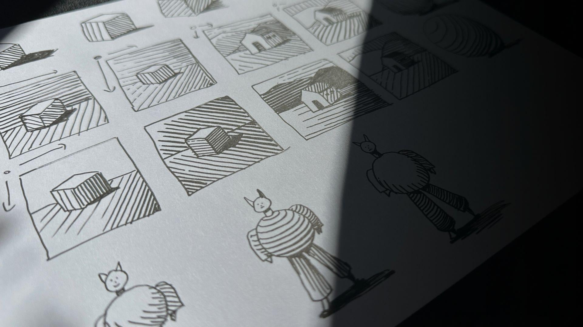
and shading can reveal a lot about your subject. When I turn our
box into a house, I'll shade the parts
that are furthest from the light and obstruct
it from the light, the front door, the
roof, the side windows, the roof overhang, and the shadow the house casts
on the ground plane. The ground plane plays a bigger role when your subject
is part of a composition. Saw earlier that different
stroke directions and value levels bring more clarity when using overlaps to
describe a foreground, a middle ground,
and a background. We said the light communicates by reflecting on the object. So how does the light source
interact with those layers? The solution with pen and
ink is to create gradations. Your marks fade
from light to dark. Use solid black for whatever's blocked from
the light, and from there, you can make decisions
about how you want to shade the overlaps using
the techniques that we practiced in
the previous lessons. The only difference is
how those layers of gray interact with the
direction of light. In your sketchbook
or exercise sheet, wherever you have space, draw a rectangle and shade
it using diagonal strokes. This time in a gradation from level one to level five value, then with vertical strokes. Diagonal in the other direction. For horizontal strokes,
the techniques for a gradual fade effect using lines is slightly different,
but not complicated. You add lines between the
lines to build the shading. Repeat the exercise without the rectangle to
get a feel for it. In your sketchbook or on a new sheet or wherever
you have space for it, draw a picture frame, a box in the center of it, and add a ground plane. One more time. Using any of the stroke
layering combinations and the gradation of values
that we just practice, go ahead and shade these two mini
compositions on your own. Pause the lesson for now, complete the exercise, then press plate when
you're ready to continue. Welcome back. We'll draw
the house composition now. Pause the video and
shade those as well. We'll review the exercises
together when you're done. First, we created a
shading chart using different combinations of value levels and
stroke directions. The purpose was to
bring clarity when objects overlap
in a composition. We then looked at shading three dimensional objects
based on the source of light. We then used various
gradations of values, which not only gave
us a foreground, middle ground and background, I gave our doodles
a sense of depth. So more clarity. Let's talk about round
subjects because light reflects differently based on the shape of the object. The linear shading
techniques we've used so far make this subject look flat. One solution is to leave white space to
indicate a highlight. Curve your strokes
around the form, and it becomes a sphere. Add a gradation of values and the doodle looks
pretty convincing. Let's practice the
gradual value scale using curve strokes in
different directions. We talked a lot
about how to bring clarity to your doodles
using shading techniques, and we've done many repetitions to train for more
confident strokes. Circles are more challenging, so let's take a moment here. The trick is to hold your pen vertically
and lock your wrist, aim to close the loop. Avoid crossing lines. It's hard to fix a
circle with cross lines. It's better to leave a gap. A gap can be easily
fixed to close the loop. With that in mind,
let's practice shading our round subjects. A circle for the head, triangles for the ears. A tube for the neck, big
circle for the body. I touch some arms and
triangles for the hands. Oh, another tube for the leg
and the second leg smaller, so it looks like he's walking
and attach some feet. We'll put some black under
the chin under the belly, and this hand would be all in shadow with the light source
on the top left hand corner. So the values fade
light to dark, left to right on the subject, and we're using curved strokes. Do another shading variation. We'll give this guy a
slightly longer neck, so the cast shadow
is more obvious. I use stronger highlights
and deeper shadows. More contrast makes the
subject look more round. Go ahead and shade the
third fellow on your own. In the next lesson, we'll do a mini project Shading round
subjects and compositions.
8. Stage 2 – Light and Shadow Project: I hope you had fun shading
your round character. I'm using a new sheet because we're going
to fill the page, starting with a vertical
rectangle as our picture plane. Draw a similar character to
the one we practiced before. Add a ground plane, also known as a Horizon
line and the mountains, similar to the ones from our
shading combination chart. The light source remains on the top left hand corner
for all the lessons. Start with the cast
shadows using solid black. Then a diagonal curve, gradual stroke, light to dark
for the character's body. I switched the stroke
direction for the arms. The curve degree is less
pronounced on the pants, which makes his belly look
more round in comparison. I am referring back to our shading combination
chart to help me decide on the values and stroke direction options
for these overlaps. The only difference is
we're incorporating the gradation of
values and using curve strokes to shade
whatever is round. We're just building
on the principles we've already practiced. While we're here, repeat a similar composition
underneath. You can change a character's
appearance, if you like. For the shading, we're repeating what we've
learned so far. But don't be afraid to get more creative with the doodles. Go ahead and shade
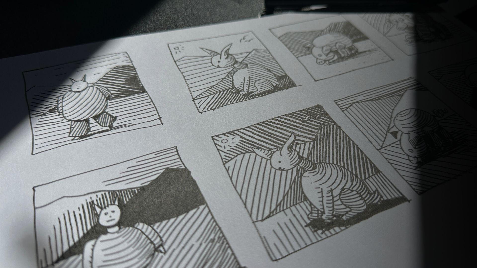
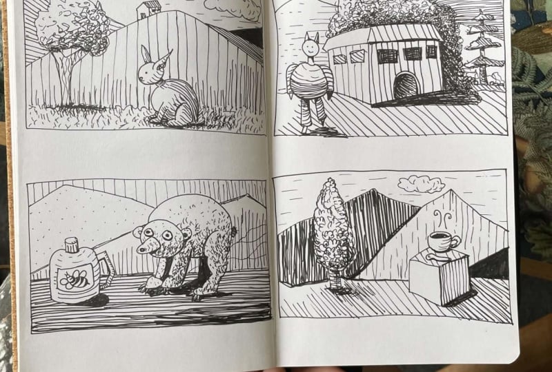
this one on your own. Let's do a bunny, a
semicircle for the head. In the gap, we place a big ear. Close the loop with
the second ear. A tube for the neck, another bigger semi
oval for the body, leaving space for a hind leg. A fluffy tail and
the front paws. The ground plain, mountains, and it's a sunny day. Now for the calf shadows. Then a value two using
a curved stroke, leaving white space for
the value level one, that's the highlight areas. Using a linear gradation for the ground and referring to
our shading chart again, to figure out what would look
best for the next overlap. A different direction, lighter, darker or both, a
gradation or not. As mentioned, too many
options means more planning. We'll put birds here instead of strokes to anchor
the background. Draw the bunny again and
go ahead and shade it. My overlaps did not
turn out as well, but my birds got a little loss. But this is exactly
why experimenting with thumbnail doodles is a good way to work out these
shading options. If you're keen for more practice with shading combinations, stay for a pig and a bear. You're also welcome to create
your own round subjects. These two are optional. When you're ready, join
me for the final stage, and we'll be shading
using various textures.
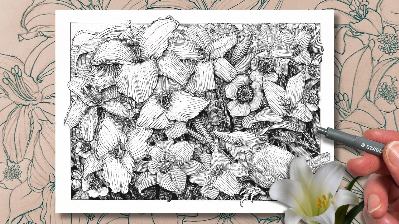
9. Stage 3 – Shading with Textures: Using a new sheet or wherever you have enough space
for three more exercises. Join me now starting
with a square. We're filling it with
a squiggly texture. This first texture establishes
our level three value. In the square above it, use the same squiggly pattern, but slightly broken apart, so the marks look lighter with more breathing
room around them. This becomes our
level two value. Below three is four. You're familiar
with this process. It's the same as with our
previous value scales. We built the tone
using thicker marks, bringing them closer together, aim to fill the white space
with the squiggly pattern. Some of the marks will overlap as the value transitions
to solid black. Let's practice this again, aiming for a smooer gradation. Can see that the squiggly
pattern is random. Some of the marks come
close enough to touch, but here we're aiming to avoid
overlapping those marks. We don't want to cross
the squiggle marks over one another too
much for our Level four. Using this technique
is what gives our scribble texture clarity. Level two was easier because there's more negative
space around it. But level four is where it gets trickier because some of the marks will cross
over one another, but you can see that when
those marks overlap, that area becomes darker and it makes the pattern look blotchy. You can see when I compare
column one to column two. In column two, the values
are a little less crispy, less clean because I
rushed and more of the lines crossed instead of squeezing them together
to fill the space. So take your time
when doing textures. Let's apply this texture
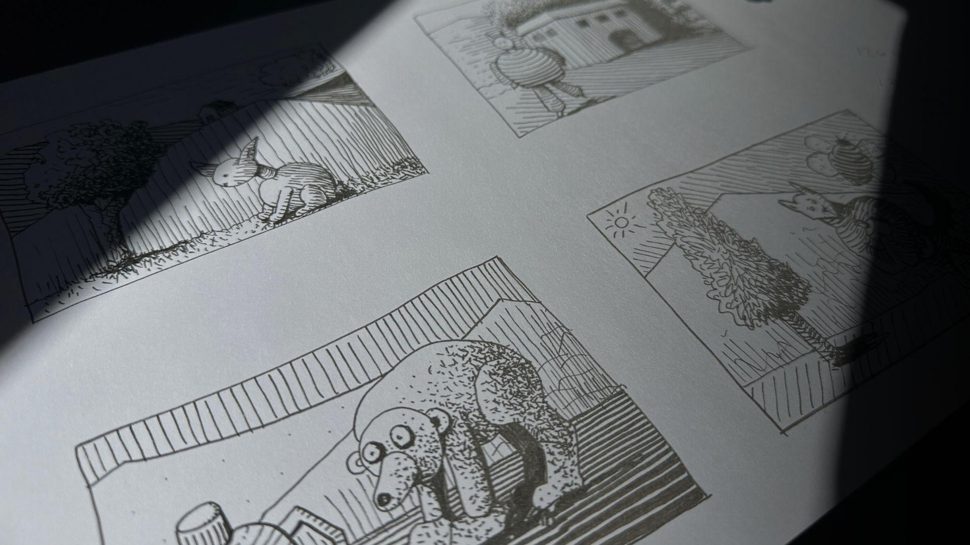
to a round subject. Draw a tree with me, following
the same sequence of steps we start shading with solid
blacks for the calf shadows. The top left area would
be the highlight. And then value level two wraps around all the way to
the right side edge. The squiggle pattern follows the direction that the leaves
would grow on the tree. Plus, the shape of
the tree is round the same way they would as
with a spherical object. For the darker values, I'm squiggling the pen
into the white areas, like we said, filling the
open gaps with the texture. In this scenario, yes,
there's black blotches, but they look more
intentional here because they're like little
shadow shapes for the leaves. For the trunk, it's got a
tube like cylindrical shape, and we can use squiggly
strokes running parallel to the form or curved
across the form. Using the horizontal stroke
gradation that we practice. So across the form
or along the form. Et's experiment with
another leafy tree texture. You'll notice that my
pattern is not entirely uniform because we're aiming for a natural looking Dole style. If you make your textures
perfectly uniform, it starts to look like
a technical drawing, and we're keeping it whimsical, putting all our efforts
on the shading, using values, and less
on the shape of things. This next tree is
more elongated. We're still mindful
of the direction that the leaves grow for
the texture pattern. The squiggles go up and
out and around the form. Building the pattern in
clusters tighter together in the areas of shadow and spaced further apart in
the areas of highlight. Finishing with contour lines
to shade around the trunk. A variation on this pattern
would work well for a spiky shrubs or
a coniferous tree. Let's doodle a
generic spike tree. The needle leaves will grow in a similar direction to
the previous trees, but the branch shape
is quite different. This will affect how the
light lands left to right on this tree and its branches that partially block the
light like umbrellas. Will therefore place
a value four to indicate where the branches cast shadows on the
branches below. Then fade from four to level three on the
shadow side of the tree, using the spiky
pattern to shade. The pattern points
more downwards, not up so much compared to
the value scale sample. The left side is in the light, but each branch is
dark underneath. Which then creates
a lovely contrast, making the tree more believable. Finishing with a dark trunk
to complete the illusion. These shading principles work with any pattern
that you create. For example, this one
would work for fur, grass or even a hard surface
like a concrete wall. Little circles for
scales or shrubs. Another spiky one,
you could apply it to a background environment
or cloth, anything goes. If the values make sense, then any texture you
create will work. I'll show you more texture
examples in the next lesson.
10. Stage 3 – Shading Surfaces: Another technique that
works well is blending loose abstract marks with regular strokes
when working with subjects that are more
technical to draw, like buildings or objects with highly reflective surfaces
like metal or glass. This teapot has a
hard, shiny surface. Plus, it's technical to draw
it accurately, the shape. Mentioned that drawing
accurate shapes is a skill that takes
a lot of practice, and it's best done from
observation using references. This teapot shape
is a little wonky. However, because
it's shaded with an abstract texture and
the values make sense, it visually sells this concept. The value range plus the mix
of strokes and scribbles, make this a believable teapot. We know what it is. Same with the second example. All of the values are in, and we might not know
exactly what this object is, but it looks intentional, and we can even guess that the surface is
partly reflective. Going back to D doodle,
the values, textures, and a few strategically
placed strokes are what make this
drawing a masterpiece, despite some of the
proportions and perspective being a little
off here and there. That's not the focus here. The intention is to tell a
story and describe a scene. How this master did the shading clearly and confidently is
what sells this doodle, not how accurately he
executed the shapes. So whether you're aiming
for wonky shaped designs, using doodles as thumbnails to plan out your
finished drawings, or doodling your way
into legendary mastery. Now that you know these
shading techniques, you'll be able to sketch anything with
confidence and clarity. In the next lesson, we'll
apply what we've learned from all three stages
into a final project.
11. Final Doodle Shading Project: I'm using a new sheet, and I plan to fit four
drawings on here. For this final project, I'd love to see at least
one final drawing that incorporates all of the shading principles
that we practice. The first doodle, I'll use the same subjects that
we've already practiced, plus when you think. You can do the same
composition as mine, follow along or create your own, starting with our
round leafy tree, the rabbit in the
very foreground. Now establishing
the ground plane, suggesting a grassy texture. We have our mountain in the middle ground with
the house on top. Another mountain and a fluffy
cloud for the background. I might add one
more mountain here. First, let's see how the
shading combinations work out with all
of these overlaps. So first, we filled the cow shadows for the
tree, and then the bunny. Create a level two
value in the tree, leaving ample white space
for the highlight area. Then after the other
values are in, add a texture for the tree trunk using parallel squiggles
with a gradation, so it looks like a tube. I'm using strokes for the bunny. A grassy texture for the ground. For the ground, we're mindful of the light source that shines brightest on the left hand side, but the tree and the bunny also cast shadows on the ground. This is a similar
shading approach from when we did the
coniferous tree with the long branches that
we're blocking the light. Then we're thinking
about the overlaps, light over dark or dark
over light so that we can clearly see what's
in front and what's behind. Going darker for the background plus changing the
stroke direction. The cloud stays white with
a bit of curved strokes on the bottom to make
it look round and a broken line for the sky, which gives us a lighter
value. Let's do another one. The round character in
the very foreground. In the middle ground,
I'll use a box shape that we already practice and
turn it into a building. The ground is on
the middle plain with a squiggly line
to suggest shrubs, a mass of leafy trees
behind the building. And one coniferous tree. It's a bit further back, and then more mountains to
anchor the backroom. Moving on to the cow shadows, planning the value
levels and stroke directions just as we did in
the previous compositions. The only difference here is that we've
introduced textures. I'm using little circles
for the leafy tree. And diagonal strokes
for the spiky tree. I use degradation of values on both the foreground and background from left to
right, left to dark. Note the white that's framing part of the coniferous
tree in the back there. Even though it's further
from the light source, the white makes it look like the coniferous is even further back in the picture plane and further from the mass
of trees in the light. Plus, this way, we
can see this tree. So for the next
two compositions, I once again encourage
you to create your own though you're
welcome to do as I do. Here I added honey
jar for our bear, and I use that same grassy
texture for his fur. I added dots and squiggly marks as textures
in the background, which you can see creates
sort of a half tone. It's similar to that
broken sky that we did in the first
doodle with the bunny. It's like a half value. Last one, really have
some fun with it. I'm using new subjects,
new textures. As long as the values make
sense and the overlaps are clear with the
shading combinations that you use, then it
will all work out. Great. We'll wrap this
up in the next lesson.
12. Conclusion and Beyond: I hope that you enjoyed learning about the different stages of shading techniques
and that you feel confident to make consistent, actionable progress with your pen and ink practice
beyond this class. We learned what
makes a clean doodle and how to avoid mud by using different combinations
of values and stroke directions to shade
overlapping layers, light over dark or
dark over light. We learned about how the
light source interacts with objects or several
objects in a composition, and we looked at textures
on various surfaces. We learned that these
shading techniques are useful to more accurately
represent your ideas, whether you're doing
thumbnail concepts or pursuing a dude approach as
your signature art style. Thanks again for
taking the class. I'm happy to provide
feedback or answer any lingering questions
about this class or about what other of
my classes to take next. If you have a moment, I would really appreciate you
leaving a review. I value your thoughts. I wish you all the best with
your pen and ink practice, and I'll see you
in the next one.
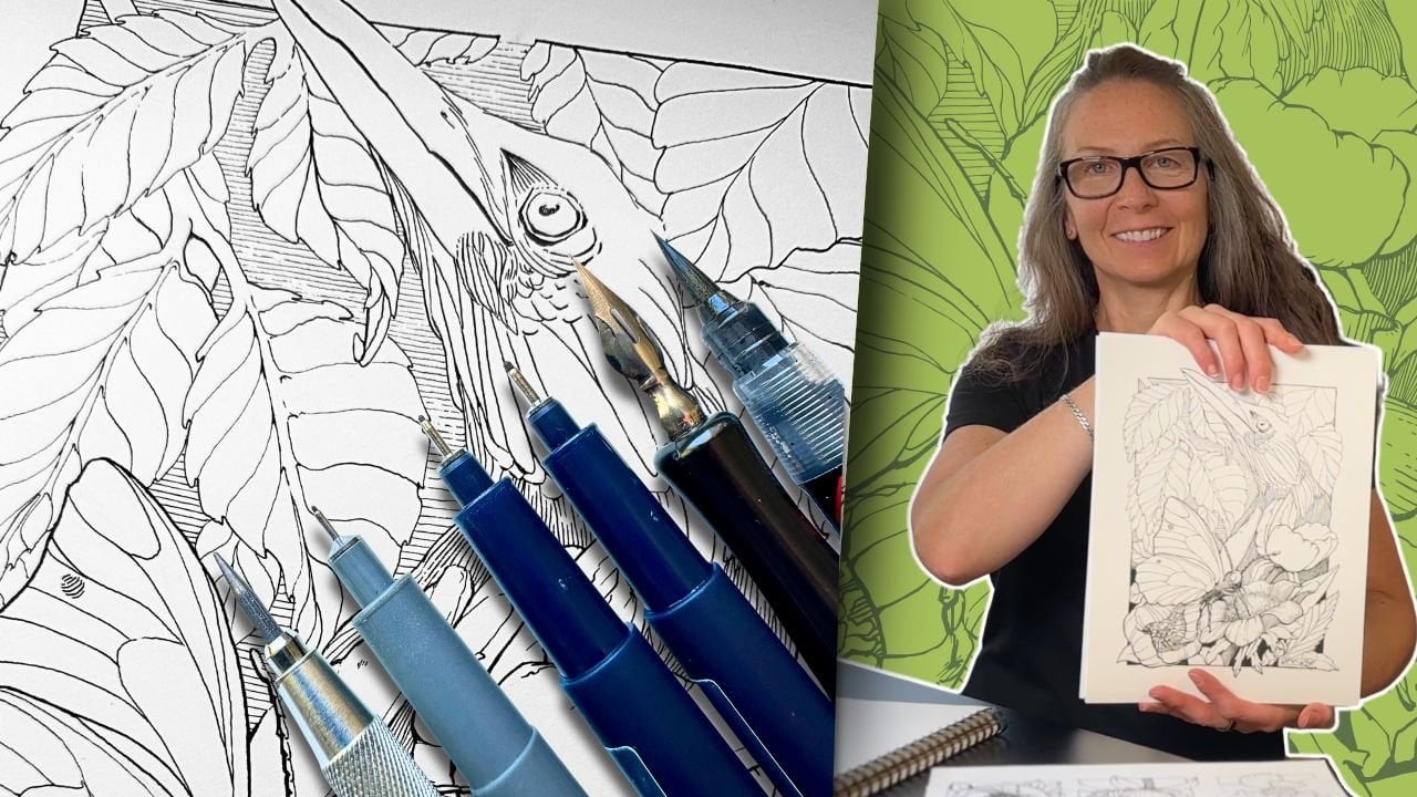
 Chloe Gendron, Pen and Ink Illustrator