Transcripts
1. Intro: I love drawing detailed
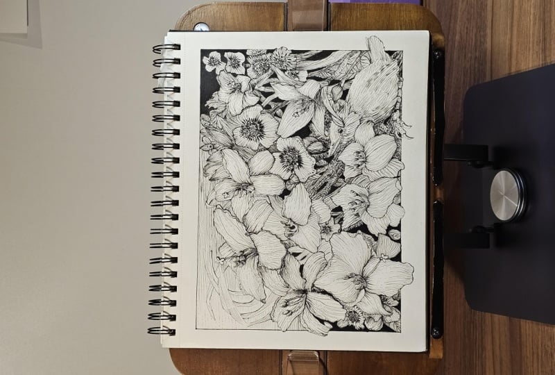
intricate linework like the Wild lily garden. A composition like this
can seem overwhelming, particularly working in
black and white with just lines where to
put the contrast, how to balance the values, and knowing when the
drawing is done, that fear of over rendering, I want to show you
that actually, when you break it down into smaller stages and build
your project into layers, it's not as tricky
as you might expect. As a matter of fact, I did this. Very similar composition in my sketchbook when I had just
started out in pen and ink. So I know that you
can do it, too. By following a few fundamentals, you can easily create detailed, perfectly
balanced artwork. My name is Chloe.
I'm the founder of Long Stride Illustration and a professional member of Speed Ball's Artist
Network for Illustrators. My work is featured regularly on social media and magazines. I exhibit at galleries
and at big conventions. I've helped tens of thousands
of drawing enthusiasts improve their penning skills on my YouTube channel
and on my blog. But here, I'll be going
into a lot more depth. Sharing techniques
specific to composing a complex project and talking you through the process
one step at a time. The lessons include exercises. Well, we'll take
a closer look at how to construct our subjects in various poses and
really think about how the source of light
interacts with gray values. Although this class is advanced, I encourage beginners to have a go because the
skills learned can be carried forward in any
of your pen ink projects. Go ahead and download
the provided resources, and then we can work through the process together.
Let's get started.
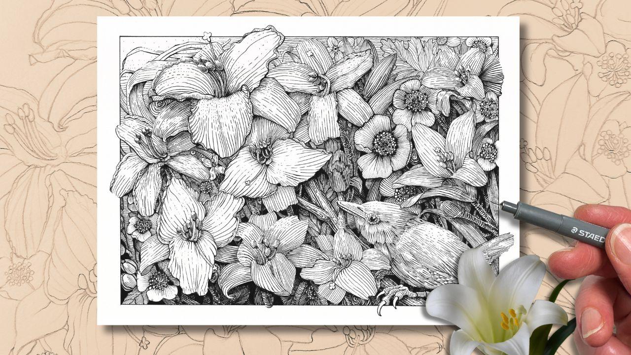
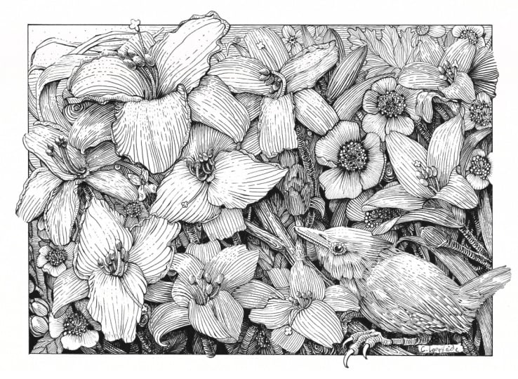
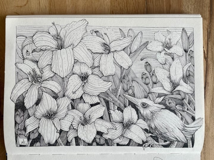
2. Class Project: We'll be drawing and inking this lily garden composition
using fine liner pens. I created this design
for us because firstly, it looks like a lot of details, but most of it is actually just a repeatable
linear pattern. So although it can
be challenging, once you get the
general concept, it becomes pretty
straightforward and gets you a finished drawing
that looks really intricate. And second, the viewpoint
for this composition is set at an angle that
adds a level of complexity, really making you
think in layers. Pen and ink is a medium that turns out best
with a bit of planning, and working this way sets
the drawing up for success. We'll go through each step
to draw this from scratch and how to customize it to make it more
meaningful for you. But if you don't want to spend too much time on
the sketching part, as mentioned, you can
ink from the template, which is in the
downloadable resources. You'll see there's a PDF
and it has the list of supplies and progress shots
and links to other resources. There's also individual JPAGs with the template and
the photo references. Forget when you finish
your drawing to upload it to the class projects. I would love to see
what you've done. Next up, we'll look at
the tools and supplies.
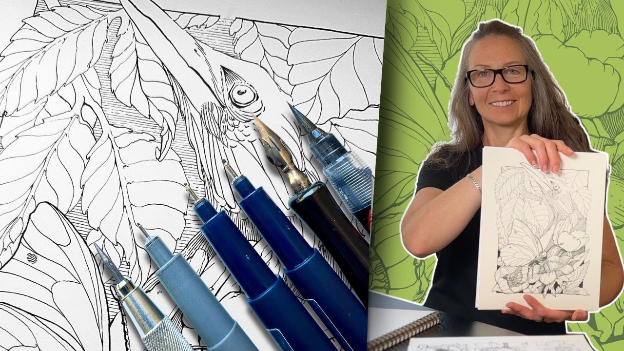
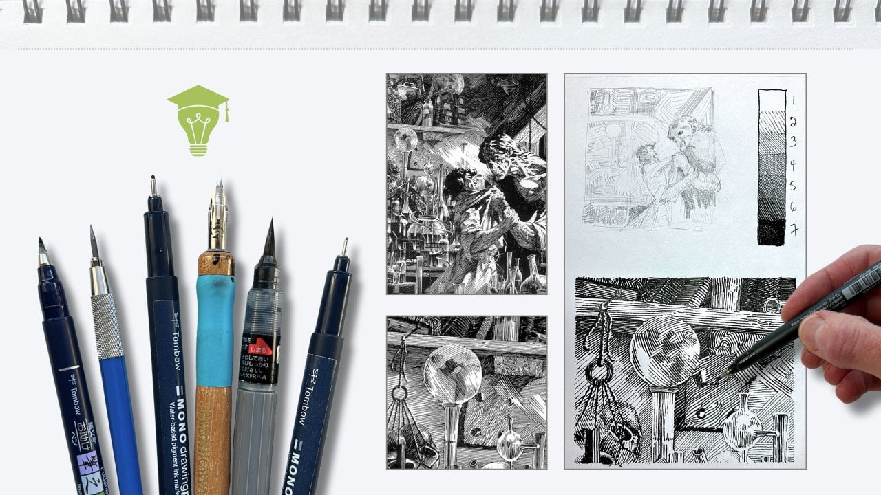
3. Class Materials: For materials, you'll find the complete list
in your handout. For the project,
I'll be using a nine by 12 close to an A
four sheet of paper, specific to pen and ink. It's a bristle smooth finish, professional grade paper
made by Strathmar. We'll be referring to and adding to the practice exercises
throughout the lessons. And for that, I'll be using a student grade
pen and ink paper. It has a smooth finish. It's made by Kansan. You're drawing along with me, you'll also want a
sheet of drawing paper for that lesson or print the template to size and use that to trace onto
the inking paper. You want an H or HB pencil
and a kneaded eraser. We'll be using a set
of fine liner pens. Any brand of pigment ink
liners will do four sizes, a thin, a medium, a bold, and a marker version
or brush pen to fill in the larger
areas of solid black, a ruler and some non stick tape. Using different materials can, of course, produce
different outcomes, though do use the
supplies that you have or alternatives
within your budget. In the next lesson, we'll
begin the first exercise.
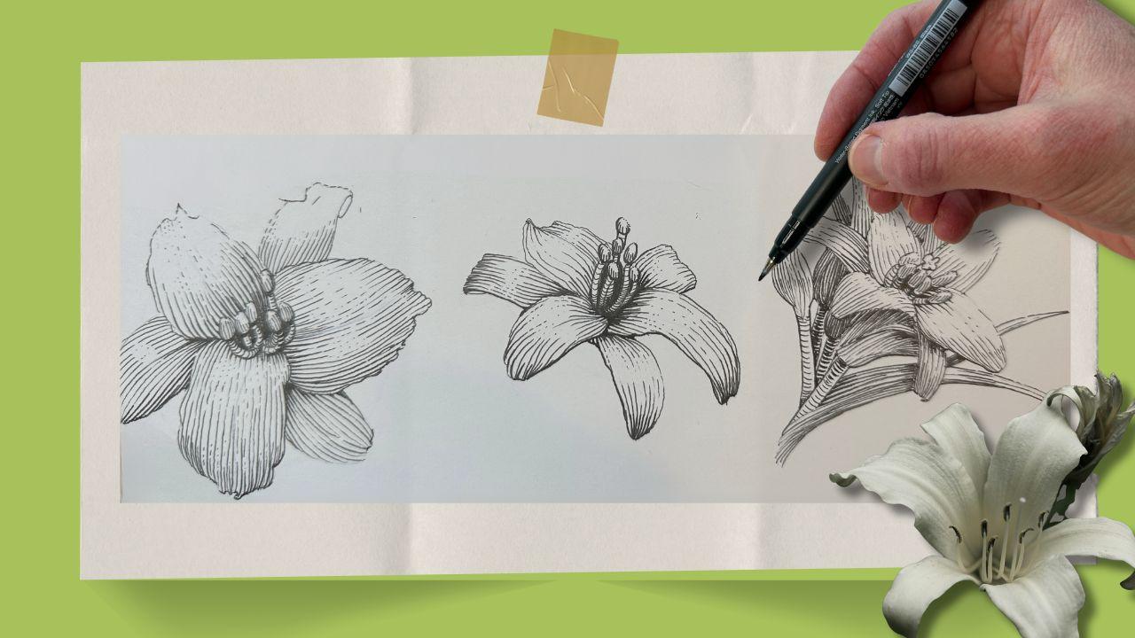
4. Lily Construction I: For the exercises, I'm using the student grade
paper for pen and ink. We'll be building on
these exercises as we progress through the
lessons and our project. The focus is on a garden lily
variety for a composition, and we'll therefore begin the exercises by
drawing out lily parts. Top left corner of the
sketchpad in pencil, start with the vertical line. This is the shape
of the main petal. There's three of them,
and they sit on top. We'll call them the top petals. Let's build a lily now
and place those petals. Start with a Y shape. Note that I'm using
a blue pencil. It's for demonstration
purposes only. Use your regular
pencil for this. Draw an oval shape in
the center of the Y, and the petals
will attach to it. Go ahead and add the main three
petals to the Y and oval. Draw another vertical line. This is the secondary petal. There are also three, and they
sit below the main petals. We'll call them bottom petals. Go ahead and add them
to your guideline. Next is the stamen. The top is shaped like a squished egg on top
of a tubular post. The pistol is shaped like a
tiny four fingered flower. I'm exaggerating the
shape a bit here. The post has more of a curve. The stamen bunch out from the center oval of our
lily from a single point. And the single pistol shoots
out nearly twice as long. Other parts to keep in
mind are the tubular stem. Its leaves wrap around the stem. The grass leaves also grow
in these gathered bunches. Go ahead and add the stamen
and pistol to your lily. Now, this is a simplified
view of the lily. It's a reference for the
parts because as you can see, it's flat, it's a one
dimensional shape. To make her lily shape
more convincing, we'll continue to build
it, given it form. We'll start with a circle. Use your pencil. My blue pencil is just for demonstration. This time the Y curves
out from the center oval, we can see in the top
view Lily reference that the petals curve
up and outwards. Draw on the first top
petal following the curve. The petal edges of this
lily variety are irregular. I'll refer to this as curly. For the third petal,
looking at the reference, I place a small marker where
the petals start and ends. Then join those. Now for the bottom petals, we can see in the reference how the bottom petals tend
to curl in themselves. Depending on the viewing angle, these bottom petals appear
to be more rectangular than oval compared to the flat lily parts from
the previous exercise. For the stamen, I start with the small ovals that
look like squished eggs. I'm looking at the
photo for guidance, but mostly positioning
the stamen intuitively. Imagine the source of light is coming from the top
left hand side. The stamen would naturally angle themselves
towards the sun. I'm darkening them here just so they show up
better on camera. Following the logic from
this first exercise, the little tubular posts connect in the center and
fan out from the stem. The pistol would come
out here in the front, but we'll leave it out
for this exercise. For a three quarter view, start with an oval
shaped guideline. The center oval here
faces the opposite plane. Then our Y curves
out from there. I'm putting small dashes
on the center oval as markers for where the first
petal starts and ends. Then giving the front
edge a small upward fold. Continuing with the
other top petal, emphasizing the irregular
shape from the curly edges. Repeat the process with
the bottom petals. Glance at the reference
and mark where the petal starts and
finishes, then draw it in. We're not aiming to match
the photo reference, just looking to make the form of our lily more believable. Okay. For the stamen,
we'll say the sun shines directly
above top middle. Use your needed eraser to pick up some of the
construction lines, then go over the pencil
lines that you want to keep. Our next reference is of the smooth petal variety,
not the curly ones. The angle is a bit
more challenging, though the construction
is the same. The main oval is narrower and the center oval larger
and the Y more vertical. Now, at the bottom petals, it's like they're shooting
out of a trumpet. Again, I'm using the
needed eraser to clean up the pencil lines
and refine the drawing, also making space for the
steam and bunch in the center. Our source of light is now on
the top right hand corner. For this section, watch
as I explained first, then you'll join me
for the exercises. To illustrate this concept, I start with a
simple value scale, white, gray and solid black. The sign closest to the
light source is white. The side that gets no
light is solid black, and everything else
in between is gray. Simple enough with
these basic shapes. But what about more complex
shapes like our lily? Well, it's the same. The further it is
from the light, the darker the values get. We saw in the previous
exercise that our flower has curvy angles going
in all directions. Round objects receive the light differently from flat objects. In an illustration, you
could shade a flat petal like this and it
would look fine. Then to shade the full flower, following the same principles
as shading an oval object, our lily looks
something like this. The purpose of doing
a shading exercise with limited values, is that it teaches us
to really think about the source of light and
where to place the contrast. Let's expand our value
scale to five levels. More values means smoother
transitions between the lightest areas and the
darkest areas on our subject. White and black levels
stay where they are on the scale as
does the middle value. But here, level two
becomes level three, giving us one shade lighter and one shade darker
for the mint tones. To go lighter, I use the broken line
spaced further apart. To go darker, I use the thicker line spaced
closer together. With the source of
light at the top, our values transition from
top to bottom light to dark. We've already established that the petals have a curve to them, and we'll illustrate
this by using hatch marks that follow
the form of the petal. Here's a sphere. If I shade it without following the
form, it looks flat. Shaded with hatch marks
that follow the form. Now it has volume. You can also use marks
that go across the form. Either way works,
it's a style choice. But for these lessons, we will primarily use hatch
marks that follow the form, mostly because we can see in the lily reference lines naturally run parallel
to the petal. We created the illusion
of volume with shading and lighting by varying
the value levels. And in pen and ink, we call
this rendering with strokes, hash marks, various
textures. That's rendering. To better understand how
light affects the values at different angles and planes or subject in the next lesson, we'll shape the lilies that we drew in the previous exercise.
5. Lily Construction II: Join me now for this exercise. We'll be shading with
values and hatching, following the form.
We're rendering. Grab your inking pens, and I'll be using
three tip sizes, an oh one oh three and oh five. These numbers vary depending on the brand of pen
that you're using. Just think of it as a thin, a midwight and a thick pen. Starting with my thinnest tip. For this lily, we said the
sun is right above it. The bottom petal is
curling towards us. And so the middle part
gets the most sun. The lightest is white, then the values transition
from white to gray to black. The way the hatch marks curve, they naturally create
darker values as the lines come closer
together on this first pass. Then I switch to
an oh three tip to thicken the hatch marks
at each end of the petal, where there's less light and
therefore darker values. This would be considered
my second pass. Oh. It helps to map out where the highlights go. Just draw them out in pencil. Then repeat the shading
process with the next petal. We'll do a first pass
with the thinnest pen, gradually breaking up the lines for the areas of high light. Then come back to add more
tone to the darkest areas. So that's a second pass. I add tone by either adding marks in between or
by thickening the marks. If you're wondering when to add marks or when
to thicken marks, thicker marks look more
bold and contrasty. Marks in between look
more gray and subtle. Either method gives
you a darker value, one is just more bold. I find that combining the two is visually
more interesting. Those decisions come
easier with practice, and we will get lots of
practice in the lessons. I keep glancing at the photo reference and
the values chart so that my hatch marks generally follow the form and make sense based
on the direction of light. We'll keep the centerpiece for last that way we can adjust the values compared to one another once we've
inked the whole lily. You'll also notice that I'm
doing the outline last. This technique gives you the chance to leave
gaps in the outline. It's called a broken edge. If you look at the values chart, a broken line is used to
describe a lighter value. So a broken outline just means the edge
receives more light. Use a broken edge
for the stamen at the very top to indicate
that there's more light. Once the ink is dry,
give it a few minutes, erase all the pencil lines so that you can better
assess the values. Stamen, because we're using values of the same
level as the flower, it's gray on top of gray,
and that won't work. A way to get around this is to change the line direction
for the hatch marks. For the stamen post to reinforce visually that
it's a tubular shape. This would be a good time to use a cross contour hatch the principles of shading
apply here as well. The top has a broken edge, then white, then gray shaded, more like a round shape. Then the stem goes
from light to dark. Reduce the spacing,
increase the line weight, gradually to deepen
the tonal value. O. At the very center of the lily is the
absence of light, so we can give it a
black value here. This achieves two things. The contrast brings
our attention to the center of the flower, and the black value
frames the stamen, making the stamen the center of attention in this
lily illustration. That's a composition technique we'll talk more about later. For the finishing touches, I darken the edges
that are furthest from the light and also
closest to the viewer, which gives the lily more depth. In the next lesson,
we'll look at shading techniques for
depth and a sense of scale.
6. Shading in Composition I: We're going to need more values. By the way, these value
scales are in your PDF, though you're welcome to
create your own if you like. A three value scale works
well to shade basic shapes. A five value scale works
well for a single subject, but our subject has lots
of overlapping parts, and what happens when there are multiple subjects,
like in a garden? It helps to have more
of those mid tones. You saw that I moved the middle value down to the center of the
expanded scale. The level three now
becomes a level four, and we continue with
the same method, making the lines thicker and gradually
bringing them closer together to increase the tonal
value from light to dark. I'm sneaking in a bonus value. It's just nice to have it. Say, this is the picture plane for our project composition. Lilies everywhere. And
tons of vegetation. The sun is in the
right hand corner. How would we shade this? It's safe to think
of a composition as having a foreground, middle ground, and a background. And the lily composition
could be layered like that, big flowers in the forefront, then smaller flowers
in the middle ground, maybe mountains and a sky in the distance for
the background. This is an easy
composition to understand, not a huge challenge to
figure out the shading. What about this composition? With everything sort of
on the same visual plane, the foreground is at the top, and the background is
underneath, at the bottom. I like to think of it
as layering a bunch of staggered umbrellas
with the light trying to reach the bottom. That's essentially
our challenge. Let's supply that principle in the exercise using the value
scale with eight values. The sun is in the top
left hand corner. Let's identify the
areas of highlight. It's brighter on
the top two petals. Assuming that the petals on top cast a shadow on
the petals below, the highlights get smaller. I'd started with the
back petal here, but a better habit is to
start with the top layer. It makes it easier
to visualize where the cast shadows will be and
plan the values from there. So we'll ink the stamen, starting in the
same way as before, leaving a broken
edge at the top. Using directional
hatches to shade. But this time, we're
adding a dark value below the little bulb to indicate a case shadow
from the light above. Using cross contour hatches and a full range of
values based on how close or how far from the light and factoring in what's in
front and what's behind. Next is the top petal
closest to the light, so I'm using values one, two, and three to start. Then transitioning
to a level four, where the petal starts to curl inwards towards the center and away from the light source. Moving on to the next top
petal using similar values. It's got a smaller highlight because it's further
from the light source. The front part of the petal
has a slight curve in. This is a good example
of where a mid tone is best rendered by
adding marks in between, for a more subtle, less
contrasty transition. Then thickening the strokes in the section of
the same petal, which gives a sense
of texture as well. Next, top petal gets more
light on its upper section. Levels one, two, then three,
transitioning to four. Adding level five value in the shadow area with
a thicker size pen. It's in shadow because it's
further from the light. Plus, there would be a cast
shadow from the stamen, plus the petal on top of it, then using that same logic
on the remaining petals. For the center, I'm
using Level seven value and the nearly block bonus
value behind the stamen bunch. Let the ink dry
for a few minutes, then remove the pencil mark so that we can assess the
values as a whole. The highlights in
the lower portion of flour are too strong, so I'm adding a bit
of value there. The stamen would cast
a bit more shadow, so we'll darken the
midtones in those areas. In this exercise, we were
more mindful of the layers front to back and cast shadows in relation to the light source. We might have been able to
do it with five values, So let's do another
exercise with more layers and use
all eight values. In your handout, you'll
see this version of the flower with the
extra elements drawn in. Go ahead and add those
to your side view lily, and then we will render it
in ink in the next lesson.
7. Shading in Composition II: Let's say this is the stamen. We established that it's
shaped like a squished egg. So far, we've shaded
these with white, gray and black calf shadow. Now we will also include
the core shadow. This is where the light
ends at its whitest. Then the stamen curves inwards. You'd think it would
just get darker, but light bounces on the
surrounding surfaces and makes the very edge
appear as a lighter value. Here's our Samin bunch. The gray hatch marks
stop just before the bottom edge.
That stays white. Then add the core shadows. It's just a bit darker. The rest gets shaded in the
same method we used before. The light source is now
on the right hand corner. Go ahead and shade the stamen with the reflected
light at the bottom. The seamen are a bit small
here for a core shadow, but keep the method
in mind because we will be incorporating the core shadow
technique from now on. It goes on the rounded objects. Design where the highlights will be and draw those
in as a reminder. We'll start with the first
pass with the lighter values, levels one, two, and three. Then moving on to the
leaves tucked behind. Here I'm distributing
the values, so the highlight is
still a value one, and quickly pairing that with a level three, four and five. The idea is that the
top petals are getting the most light and choking the light for
everything underneath. Those layers are
partly obstructed. It's like the staggering
umbrella example. Now getting into
the parts that have the least light using my
mid weeight 03 fine liner, value levels five and six. The bigger leaf in the front is getting some
light in between, and the values reflect that. Now moving on to the lily bulbs. Using my thickest pen for
the ones tucked behind, using a value level six. Now that the first pass is done, use your needed eraser so that we can better assess the values. Let's darken the shadow areas, blend the mid tones, and bump up the contrast
where it looks right. Like in the previous lily, these highlights are too strong. Well therefore increase
the tone there. This leaf would get a drop
shadow from the petal above. Maybe you've been taught to do a cross hatch wherever
there's a shadow, there's nothing wrong
with cross hatching. Either method achieves
a darker value. My preference is to
limit cross hatching. I use it when it's
the best solution to a visual problem
or to add texture. The round lily bulbs is where we would put
the core shadow. Just a few marks that
really makes a difference. Switching to a thicker nib, a thicker pen for the cross contour lines of
the stem in the very back, leaving the very edge white for that reflected light effect. Adding a core shadow, as well. Finishing with one more pass to deepen cast shadows
on the layers below. With a 01, my smallest tip, I'm adding a bit of
black to the edges that cross or that overlap for
a more polished look. Now that we've
established the shape of our lilies,
constructed the parts, gave them form with
directional lines, added volume with
highlight and shading, and use value levels to give her subject depth and dimension. In the next lesson, we'll
get into composition. But
8. Composition Structure: In this lesson, we'll look at composition structure and how to arrange the values
to create harmony. For structure, the
rule of thirds is the most frequently used
composition guideline. You would place the main subject on any of these
grid intersections, and the negative space
balances the composition. Except, we've established
that our composition is happening on kind of
all the same plane level, so this guideline is not
as effective for us. The golden ratio also
divides the page, but instead of
anchors on a grid, it gives us a spiraling you can place your
main subject in the spiral and structure all the other elements
along this swirling path. Already, it's more interesting than the first composition. You can spin or flip the ratio to try
different structures. Here I've placed a lily on the path and established
a source of light. Because we know flowers
like to face the sun, we organize the page from there with the various elements
of our lily garden. Using circular
shapes to represent lilies and other
flowers as we like. The structure seems
well balanced. The challenge is that
our main subject is not a single flower. It's not the bird. Our main subject is the entire
lily garden as a whole, and we want to lead the
viewer through the garden. This spiral structure
helps lead the viewer. It also helps us
arrange the values in a way that emphasizes that
structure in the composition. Using simple shapes
with only three values. In these three examples, the eye is drawn to
the very center first, then moves out from there,
then back to the center. You can vary that
combination even more when using an
eight value scale. I've decided to make the
underneath layer black, fading to gray, then to white as we get closer
to the light source. Then the elements
will be shades of gray that also get progressively lighter as they get closer to the top layer and
the source of light. Planning the structure in your composition will
guide your drawing, planning the values arrangement
will guide your inking. Both will contribute to
a pleasing composition. Building onto that,
the next pen and ink fundamental is
visual storytelling. A composition can
shift from good to awesome simply by
incorporating a narrative. What do you want to communicate with your drawing
with this project? Is there a meaning behind it? In the next lesson, I'll
share the narrative. Well, the story behind
the sketchbook drawing.
9. Visual Storytelling: When I first started on
this pen and ink journey, I decided I needed to improve my plan air drawing and so I created a little
challenge for myself. To draw the lilies that
were growing in my garden, every morning for
21 days in a row, I would do this for
30 minutes every day. One morning, my cat found a baby Robin and we
didn't know what to do, so we left it there
and the next day, the baby Robin was still
there and my cat stood guard over the baby robin
while I drew my lilies. And then Mother Robin
came and they flew away. What's meaningful to me about
this drawing was, you know, we were worried
about this Robin, and that's what the
little skulls are about. It was death looming
in the garden, and it's just actually
a story of hope. And so whether you're drawing
your sketch from scratch or using my drawing to trace as a template
to ink your project, you can still personalize it. I'm always motivated
to make art, but even more so when it has special meaning
attached to it. As you saw in my
first composition, the hidden skulls
were my easter eggs. You can change the
flower, not use the bird, or use a different
reference or plant some easter eggs in your
botanical composition. The Y shape we used to build the lilies works
for other things a garden gnome a butterfly
or fairy angel. Maybe an owl or penguin. An alien or monkey? I'm excited to see
what you come up with. And the next lesson,
we'll start with the pencil under drawing
for our project.
10. Project Underdrawing Top Layer: I'll go over the steps for how to create
the pencil drawing. If you're using the template and more interested
in the inking part, you can skip ahead to the lesson titled transfer the drawing. We want to keep our inking
paper as pristine as possible. For that reason, we'll develop our underdrawing on drawing paper and later trace it onto
the final project paper. My project will be on
Bristle smooth paper, measuring nine by 12 ". And so the underdrawing
will be the same size. Draw a 1 " border all around. The border is part
of the design. Then sketch the
composition guideline. There's a reference
of it in the handout. It does not have to
be super accurate. It just helps to position the structure from
our thumbnail sketch. Then just like in the thumbnail, we place circles
and ovals around the swirly guideline to
structure the composition. Okay the circles and ovals represent the
three lily poses that we practiced
in the exercises, and we'll build them
using the same steps. For more variety, I've included
the lily photos as JPEGs, and you can download
those as references. If you want to create
your own layout and play around with the
golden ratio in a program, also, this file is
included in the PDF. So build your own or use the
reference for this lesson. Once the lily shapes
are in place, we begin our construction, starting with the top
layer, the semen bunches. Just as a reminder, our
petals look like this. We'll build a top layer first, traveling top to bottom
on the picture plane. You can add more details here than we did
in the exercises. Take your time. I estimate
20 to 25 minutes per lily. Use light lines to sketch
out the main shapes, then use your needed
eraser to remove the construction lines as
you develop your drawing. Then go over the lines
you want to keep. The biggest lily is on top. Then the others flow from there, making sure the stamen for all the lilies gravitate
towards the sun. The sun is on the top
left hand corner. Continue to include additional
details such as folds and curls in the petals or omit details that
seem unnecessary. Aim to capture the main
forms of the subject. We'll add in other
information about the highlights and the shadow
lines at a later stage. We're using the photo collage
reference as a guide. We're not copying it. The objective is a well
balanced composition. So that means modifying
the shapes to fill the space as we develop the lies across
the picture plane. This lily hair was the three quarter view pose that we did earlier
in the exercises. That pose looks
good in the photo, but it's odd in the drawing. So I'm reworking it to
look more convincing, and I need more space for it. There. That looks nice. For the bird, I chose a Pacific wren because
they're in my yard. Take a rough measurement. I see the bird's body is approximately the same
length as the head, and the beak is half of that. Draw the main line of action. A oval for the body. Another rounder
oval for the head, rough geometric guidelines
for each of the bird parts. Refine the main shapes, erase the construction lines, then gradually
develop the details. This was the top layer
of the composition. In the next lesson, we'll draw the layers that
are underneath.
11. Project Underdrawing Mid Layer: We'll begin the underneath layer with your customized easter egg. Mine will be a tiny fairy, which could easily
be a butterfly or whatever that's
meaningful to you. We'll extend the
branch so that we can later attach bulbs
and leaves to it. And now additional wildflowers
to fill the space, mostly paying attention
to position and size, keeping an eye on the
balance of our composition. Aiming to add flower stems, leaves and other botanicals to fill the space in
a harmonious way. We'll add a few more flower
stems so that we have a base to add details
at a later stage. Something that helps unify a busy composition
is continuity. We achieve this with the stems, and we'll draw a few more of these wildflowers to
reinforce the visual unity. After we've inked the
first two layers, we'll assess the structure and values arrangement
of the composition. Then pencil in the bottom
layer to complete our project. To summarize what we're doing, we'll ink what's here first, then add to it some
more in pencil. In the next lesson,
we'll transfer the underdrawing onto
the inking paper.
12. Project Transfer the Drawing: Secure your drawing or the printed template onto a
window with knots stick tape. Then center your inking paper over top and tape it as well. Get comfortable. Take your time. I estimate about 30 to
45 minutes to trace. Keep your lines light
and avoid pressing down on your pencil to
prevent paper from denting. Some of the details might be too close together to
see on the drawing, and we can fill in anything we've missed from
tracing afterwards. Trace everything
except the border. When you're done, lift
the edge of the paper, keeping the other end secured so that you can check your
work before taking it down. Now you can fill in
anything that's missing. And refine any section
that needs more clarity. Draw a 1 " border all around. The border will be our
starting point with the ink application
in the next lesson.
13. Project Inking Top Layer I: Using a thicker tip,
oh five or oh eight, we'll ink the border outline. We'll go around these open gaps where the drawing sticks
out of the frame. It's best to use light pressure and go over the line twice. Remember to sign
your work as well. For the ink application, we'll continue to build on the techniques that
we've already practiced, especially the third lily
with the multiple layers. We can refer to the
photos for clues on the subject's form
and line direction, but not the shading, because it's a collage from an assortment
of different photos, and they have various lighting. In our composition, the light is on the top left hand corner, and we'll be mindful
of how that light affects the layers as we work
across the picture plane. Feel free to pause the
lesson at any time, and also refer to the
progress shots in your PDF. With the smallest tip 01, we begin the ink application
with the top layer first. Same as we did in the exercises. We can ink the stamen
with the values we already know using a
broken edge at the top, where the highlights are, and a thicker line at the bottom,
where the shadows are. Now switching to a middle weight to ink the outer
outline of the pedals. If you like, you
can draw out where the highlights will
land on the petals. The values for this lily are at the lowest level
of the value scale, so one, two, and a three range. The level three value
is for the petals that receive shadow
from the petals above. Here I'm using my
oh five tip to add a thicker line on the bottom
edges of the petal outlines, then back to oh one for the
folded parts of the petals. And to shade the stamen, remembering to include
the core shadow and the reflected light in any
parts that are rounded. Always thinking about the light, what's in front, what's on top, and how that affects the values. You can see I'm using a curved, gradual hatch and
leaving the edges white. The little posts in the back
get half a shade darker. Moving on to the front
petal following the form, it curves out a bit on the
edges here in the reference. So then changing the
light direction for the bits that fold
vertically or inwards. For this petal, I read it wrong. When tracing it, the
left side sits on top. So I'll correct that now. We can reinforce the illusion of how it folds by using
line direction. This top petal would get direct light. So we'll start with the
level one and two values. It's easier to go darker than to try to
lighten the value. Like here at the bottom, build the midtone by
adding lines in between. As mentioned, it's more subtle
than making thicker lines. The back bottom petal
gets a more even gray, so it's not too distracting. Now the left bottom petal. It's more rigid, less
curvy than the top petal. So the lines are also
straight across. But Same idea with the next bottom pedal. The first pass looks good. We'll come back later with
mid tones and shadows. Once more the piece is rendered. For the center, in the
exercises, we made this black. But here we'll keep
it gray for now. Just continue the hatches
for the petal behind. Next, we'll ink the two
lies next to this one, starting with similar
value levels, adjusting as we progress to address the
layering hierarchy. Once again, we can mark in pencil where the
highlights will go. We start with the
Salmon as before. One of the little posts
bends in two directions. We can help this illusion with the cross contour
lines like this. And this looks even better
with the value gradations. The post in the very
back gets a deeper gray, like a level five or so. This is just to show you. We'll continue with
our values in the one, two, three range on
this first pass. This is actually one
of the bottom petals, but with the lily fully bloom. There's no overlap in the front, only the little folds. For the top front petal, here we can change
our linear pattern to describe how it curves
out on the sides, then has folds
that curl inwards. We'll do a similar treatment
to the top petal above. Note how I'm leaving an
open edge at the very top. Leaving open edges
does several things. First, as mentioned, it's
like a level one value. White shows areas of highlights, but it's also a style thing. It looks more airy and leaves
more to the imagination. Or when we add the
layers beneath, the outline will naturally appear from the values
that we add below. It looks way more dynamic than just a solid outline.
It's an option. If later we decide the solid
outline is not effective, it's easier to add
than to remove it. The last bottom petal is
underneath the petal above. So the value here is darker, maybe a bit too dark. The idea with the first pass
is to keep the values light. That gives us more options
to make adjustments to midtones and shadows as we progress with the
ink application. Now switching to the 03 Tet. I'm bolding some of the outlines to make the
overlaps more obvious. This will be helpful
later in the second pass. For the center here, I'll introduce a new technique going thick to thin
in one stroke. It goes something like this, and we'll call it the
flicking method. Since the area is too small for a cross contour hatch
or a proper gradation, this is a nice solution. Next, Lily, here the stamen
are bunched facing downwards. I'm modifying the hatch
direction on each little bulb to emphasize the illusion that they're in a spiraling motion. Go ahead and render
the three top petals, same method as we practiced
on the other bottom petals. I won't be introducing any
new techniques for those, so you can pause the video here. And now the bottom petals, same method as we practiced
on the other bottom petals. This one is in shadow,
so we'll match it to the other ones that are
mostly a level three value. It will balance things out. Grab your 03 pen, then do the outline for
the parts that overlap, leaving some open edges. After a few minutes, making
sure the ink is dry, use the needed eraser to remove the pencil lines on
those three lilies. This helps keep
the artwork clean, and so we can better
see the values that we've created so far. In pencil, place highlights on the lies in the bottom
half of the picture plane. Go ahead and start with
the bottom one first, using the techniques
we've used so far.
14. Project Inking Top Layer II: Far. And here, using the 03 tip to bold parts of the outlines
for emphasis of the layers. For the second lily, what's different here is
the center is more open. We'll address it right
now with black and nearly black at the top of the opening where it's deeper in shadow. And use the flicking method for the bottom part
of the opening. Then going in with a no
three for the outline. This helps us keep
track of the overlaps. Next lily is one of the
smooth petal varieties. It's more straightforward to render than the curly lilies. For this top layer, we can
go a shade darker to go with our plan of transitioning the values to darker tones. For this top layer, it just
means smaller areas of highlights with more of
the even tone grays. Continue to use
directional lines following the form
or in this case, creating the form by curving the strokes and playing with the distance
between the lines. Lines closer together, build
a toe and look more flat. Lines that progressively spread apart make the petal
appear more round. This petal is at an odd angle. We'll add the missing fold now. Here we want to show the
pedal folding outwards. I'll mark the center
as a guide to follow. Now, for the three
bottom petals, going for a similar tone to
this other bottom petal. This one looks like
it's tucked underneath, but it's actually on top. It's curled in. We'll leave
the outline edge open for now and revisit when
we ink the lily below. The bottom petal on the left also has an interesting
shape and angle. Each lily is unique
and fun to render. We'll leave the lily
center as is for now and start with the stamen bunch of
the next lily over. It's below the lily we just inked and it overlaps the bird. Now we can clarify the overlap sections
by making sure there's no tangent lines in
the hatching strokes and by adding the
outline where needed. A tangent line is when two
objects are touching like this and their edges are at the exact same angle,
so that doesn't work. Or the rendering is traveling in the same direction as the edge
of the object next to it. It's confusing to the viewer, and we aim to avoid this. Next is the lily pose
we did in the exercise. We've learned a few more
techniques since then, so we can apply those now. For the values, we're now working higher up
in the picture plane. So lighter than the
lilies, we just did. As we build our peace, it's good to step back, think
about the source of light, the values arrangement
we planned, and assess and adjust
as we make progress. Here I'm adding tone to
the center because I went too light with the petals.
Not too much tone. We'll revisit this later. We'll use a darker tone
underneath the flower as well. This one and the lily above are the only two in this
three quarter view pose. I'm leaving the tiniest white edge with the
rendering here. It's called a halo.
Not to confuse you. It's similar to a
reflected light. Now, using the flicking stroke
for the roundish bottom. Next petal over is like a long cylinder that wraps around the
bottom then flops out. The lily above is similar. And here, leaving a
few open edges to address later when we have more information
from the layers below. And bolding the outlines
that emphasize the overlaps. We'll now quickly render
the bird the little wren. So as not to detract
from the main subject, which is the lily garden, we'll keep the first pass more neutral just to establish
the bird's forms. The bird's eye is
a little flower. And the feathers get a rendering treatment
similar to the lily petals. So that the bird blends
into the scenery. All the principles of
shading we've used so far lines closer
together for deeper tones, spread apart for lighter tones from the exposure to the light, the rounder the object, the more light it can reach. Use cross contour hatches
for the legs and talons. Same method as we
used for the stamen. That's enough information
for now for our bird. Returning to the first lily. We'll now address the mid
tones and shadows per flower. So a second pass. The top petals cast a
shadow on the petals below. So we'll add a bit
of tone there, one value level at the time. The petal above obstructs
the light. In this spot. It's quite dark, so I'm
thickening the lines, creating a shadow shape
on this petal as well, but not as pronounced lighter. Next, thickening the outlines where the folds lock the light. Thicker strokes if
the shadow is more pronounced and just adding a stroke in between
if it's a mid tone. Like we discussed
in the exercises, lighter values for
whatever protrudes towards the light,
a convex shape, deeper tones when curving
away, a concave shape, it's hollowed out, then black when the shape is
obstructed from the light. Essentially, for
shadows, think no light, make it bold, make it dark. If there's some light
filtering through, then gradually add
lines in between. You'll see after adding
the midtones and shadows that the contrast could be too strong on
the lighter petals, and now we can even those out by adding a few strokes,
dashes, and dots. Think of the light,
the overlaps, the values, and the
techniques we discussed. Refer to the progress images in your PDF if you're not sure. Et's continue with
the side view lies, adding more tone where needed. Next is the lily and the
lily beside the bird. And finally, the bird will add tone yet show restraint,
monitoring the contrast. As mentioned, the bird
needs to blend in. At the moment, the
highlights are too strong. Therefore, build the
tone gradually by adding strokes in between
what's already there. The beak can have a cross contour hatch to match the legs. I'm using a checkered pattern
in the wing feathers. To make it look natural, vary the length of the strokes, some short, some long, vary the angles by a few
degrees here and there, and thick in some
of the lines to indicate tiny irregular
overlaps in the feathers. Next, we'll add a
subtle coarse shadow to make the feathers look more round and reflective around the face, wing, and underbelly. Finishing with little
flex of bold here and there for more
volume, not too much. In the next lesson, we'll add in the mid layer beneath. H.
15. Project Inking Mid Layer: Now we can start building
the layers below. With an oh one pen, start with the center
stamen on this wildflower. A bunch of tiny circles on
top of tiny little posts. Layer some black circles
in between and on top of the bunch with
an oh three tip, give it a solid outline
all the way around. Then use the flicking technique for the hatch marks from the center of the
flower and out. Match that with shorter flicks starting from the edges
towards the center. Go ahead and render
these three wildflowers. We'll do the other two
bigger ones together, pause the video now. Still with the 03, do the little circles connected
to their little posts. Then with an 05, layer in black circles between and over
top of that little bunch. Add black dots in
the very center. Put a solid outline all around and still with the oh five, render the petals with
the flicking method, going down to an oh one size pen to put cross contour hatches on the little folds and to add a mid tone to the petals
using a short line, starting from the edges,
traveling towards the center for a subtle
highlight effect. Still with the oh one,
add a cross hatch to some of the posts and in between to tone
down the contrast. These two paddles are in
danger of tangent lines. Let's thicken the
outline for now, and we'll revisit it later. For this bulb, we're
starting with a level three, four inch value, aiming for
a range of darker tones. We want all the elements
on this mid layer to look three dimensional
with volume, but distributing the grays from the darker levels of
the value scales. The top layer we did earlier, we distributed the values from the lighter levels
of the value scale. This is essentially
the secret to adding a bunch of
details in harmony. It's this layering
of the values. I'm going back and forth with my oh three and oh five pens
for the bulbs and stems. For the stems, start with a cross contour curved
hatch using an 05. Then add the outline, leaving a bit of white on either side of it for
the reflected light. Then add the core shadow on
the shadow side of the stem. We'll do them all this way. Oh, I skipped over this
side view wildflower. Let's do that now with a 05 using directional lines
and a broken edge. It goes right over the border. Okay, now back to the
leaves, bulbs, and stems. For the branch our bird
is perched on we'll introduce a new texture
to suggest tree bark. Using an five, start
with the outline. For the bark texture, we're just building on the
techniques we've used so far, either spreading the
lines or bringing them closer together to describe
the volume of the branch. It's shaped like a tube. Adding more tone with a 01, minding the direction of light, reflected light,
the core shadow, and we'll add the
cast shadows next. Before that, erase all the
remaining pencil marks. Then work your way
left to right on the picture plane on the picture plane to address
any of the shadow shapes. On this wildflower,
since it's even darker at the bottom
of the composition, we can use a subtle
cross hatch here. Just a few dashes
on top and across. Continue to build a tone
in the shadow areas. On the branch, I'm making
the reflected light more obvious by adding an outline
over the current shape. In the next lesson, we'll
draw in the bottom layer.
16. Project Inking Bottom Layers: Our objective for this
layer is to create greater depth as if the
vegetation is really dense. We're creating the illusion that the vegetation beneath the lies is obstructed from the light, peeking out here and there. Essentially, we're filling
the space with lines and curves and a few
discernible shapes, leaves, blades of grass, more wildflowers, some bulbs, and maybe tiny berries. The progress shot is in
your PDF for reference. Otherwise, feel free
to improvise a little. September car Summers god do you think go me when
you're trying to sleep I let me a. As you recall, the
top left hand corner is where the golden
ratio spirals out. That's also where the
values are the lightest. So a good spot for a few
flowy, sweeping broad leaps. The stars above you. I'll be love you. If you know me we'll begin the ink application in the top left hand corners. This is our first pass
for the bottom layer. So we'll just focus on
the outlines for now. No rendering, inking
what's in pencil. It's got to be Oh, we can do the little
center circles now. A Call the Scotia T I call Call there Scotty. And once you've
outlined everything, erase the pencil lines. We'll start rendering making our way from the
bottom right corner, basically working
in reverse order. At this stage, we're
aiming to render each little section using hatch marks that go in
opposite directions. We're mixing cross contour,
diagonal, long, short, thick and thin strokes with solid black and cross
hatching in between. Awak morning with skin. Coffee cup begin. Don't go. Stay awhile. Slow it our values
arrangement plan shows solid black filling the background,
following a curve. That's the objective. We'll develop the background in sections and adjust
as we progress, working from the corner and out. To summarize, we're just doing the rendering using a
variety of stroke angles, interspersed with solid black
as the backdrop for now. We'll do calf shadows once the whole bottom
layer is inked in. There's lots going on
on the page right now, so just take your time one
little section at the time. T's no's Get space. For the stems, we're still
using a cross contour hatch, but there's no reflected light. The hatch mark goes all
the way to the edge. This layer is way at the bottom of the garden with
less light getting through. So still slow. Be Still Sly get slow down to top hold on to this morning watch some like boy keep me like
a picture friend. Still out don't go 'cause
we got time so ill. I call to the mountains, send across the bay. Oh men Coie steady this day. I'll take stside
sang the writ song. I think we've done
and sell the c Flowers in the planting in the view. So I'm adding little circles. They could be berries.
We want them gray. So here I'm using a
spiral pattern that gives them a texture as
well, just like a scribble. Now traveling to the left
side of the composition and filling in the last of
the solid black sections, we'll transition the backdrop from solid black
to nearly black, then gray and make our
way through the range of values until we reach solid white in the
top left hand corner. That's the goal.
Meanwhile, we'll keep inking in the same
methodical manner, adding more of those little spirally circles here and there. Places we have gone. Things we've done. Thanks to the CT T A All trees with orange
leaves a tin to place. Be by side I work night and day. Topos and falls and the wheel Okay, now we can render some
of the elements at the top. This vegetation is beneath the lilies yet nearer
the light source. So the values stay at a
level one, two, and three. For the backdrop here, we'll use horizontal
squiggly strokes. They're light gray like 2-3. In the top corner, the lines start to break apart and
they transition into dots. Okay, this big white leaf
here is distracting. This whole area needs
to be toned down. And yeah, now for the
finishing touches, grab your thicker tip pen. We'll go over some of the
outlines to emphasize overlaps and add in
the cast shadows. As we work our way
through the piece, we can smooth out
transitions and mid tones and bump up the
contrast for visual harmony. Not too much contrast, just a little. This part's fun. It's also where I often have to stop myself from over rendering. The lilies are the main
attraction together, but particularly these three
have the most contrast, and they're on the
spiraling path leading the eye in a
path from the bottom, all the way across
to the top corner. Uh, And this concludes
our intricate, harmonious lily garden
composition in Peniny.
17. Conclusion: Thank you so much for
joining me in this class. I hope now that you can see how this pen and
ink composition, when chunked down
into smaller stages, it's totally doable. I would love to see
your finish work and do share some
of the exercises as well for other students to see what you've learned
for more on styles, techniques or if you'd
like to get into dip pens, check out my other classes here. Let's stay connected. Follow me as a teacher. You can also subscribe
to my email newsletter to get monthly pen
and ink drawing tips. If you enjoy the lessons, I appreciate you
leaving a review. I wish you all the best
with your projects, and I'll see you
in the next one.
 Chloe Gendron, Pen and Ink Illustrator