Transcripts
1. Intro Engraving Style: If you love that
woodblock engraving style of drawing and pen and ink, then in this class, I break down that technique
into a few steps, starting with the masters who made that style so memorable, we'll practice
exercises, then bring it all together with this
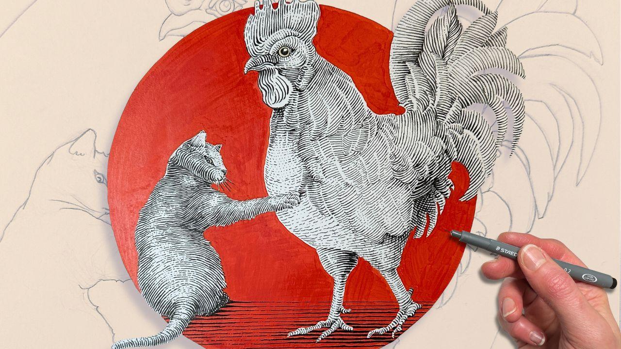
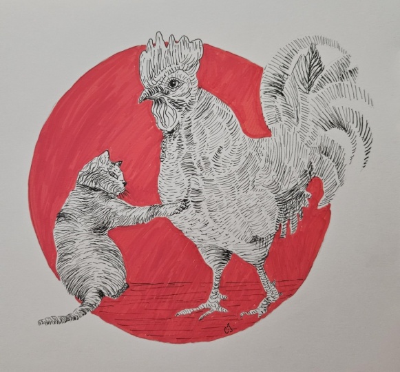
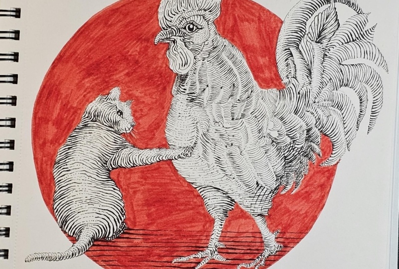
cat and rooster design. I'm inviting all levels
to give it a go. If you can do a line like this, then this definitely
do this project. Granted, you have adequate level of patience because we're going to be drawing a
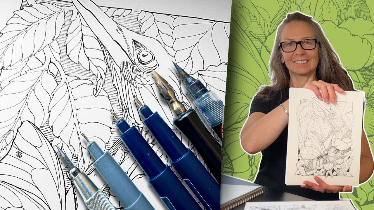
lot of little lines. My name is Chloe.
I'm the founder of Long Stride Illustration and a professional member of Speed Ball's Artist
Network for Illustrators. I've helped thousands of
drawing enthusiasts improve their pen and ink skills on my YouTube channel
and with my blog. But here, I'll be
going into more depth, explaining the
characteristics of the style and the mark making
techniques for pen and ink. There's no real drawing
in the lessons. The focus is all on
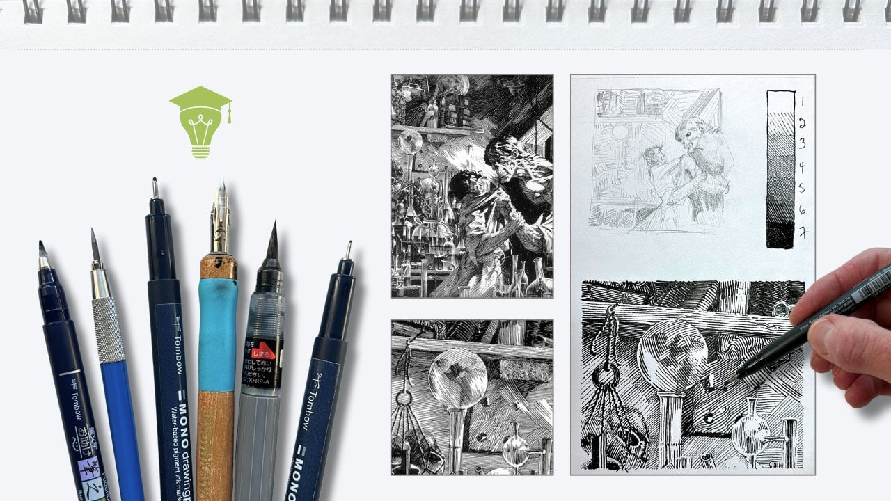
the inking part. For supplies, you'll
want a set of fine liner pens or even just one tip
size will do a ruler, graphite pencil eraser,
and some inking paper, and one color medium. I'll be using an
acrylic paint marker. However, gouache or whatever you have to color a
background will work. You'll see there's a PDF
handout for you to download. It has the list of supplies
that I'm using the artwork template for tracing the drawing and progress
shots as reference. Remember, when you finish
to upload your project, I would love to see
what you've done. I'm excited that you've
decided to join me, and let's get started.
2. About the Engraving Style: Engraving is a printmaking
process where instruments are used to carve an illustration onto
wood or a steel plate. The ink is then transferred onto the grooves
and onto the paper. We'll be practicing
the illustration style that mimics the
effect of engraving. Lighting and shading is the most important fundamental
when it comes to understanding the style
relies on a line quality. Line quality is the
variation of line weight, thin to thick, thick to thin. In some illustrations,
particularly in an engraving, we get the impression of a
continuous line that thins and swells as it snakes its way along and across the
forms in the composition. For this Gustave Dre engraving, you can follow the line
as it contours the folds. It swells to solid black in the shadows and thins
out in the highlights. So what determines the thickness of the line is the
source of light. For this, we need to
understand the principles of lighting and shading
as it pertains to form. In this Bernie
Writson illustration, again, looking at the
drapery of his shirt, whatever is concave, such as the bulges in the fabric is
closest to the light source. In pen and ink, a
highlight is often interpreted by using
sparse rendering or none, leaving the white
of the paper blank. Following that logic, the
areas that are convex or simply further from the
light source are then darker, meaning lots of rendering or
solid black in those areas. In simplified terms, using
this technique of mark making, the strokes are like bumpy
waves that thin and swell depending on their exposure to the light as they
contour the form. All the values in
between are there to describe how close or how far that wave is to
the light source. Then there calf shadows. But for now, let's see
how these principles translate to our desired
mark making technique.
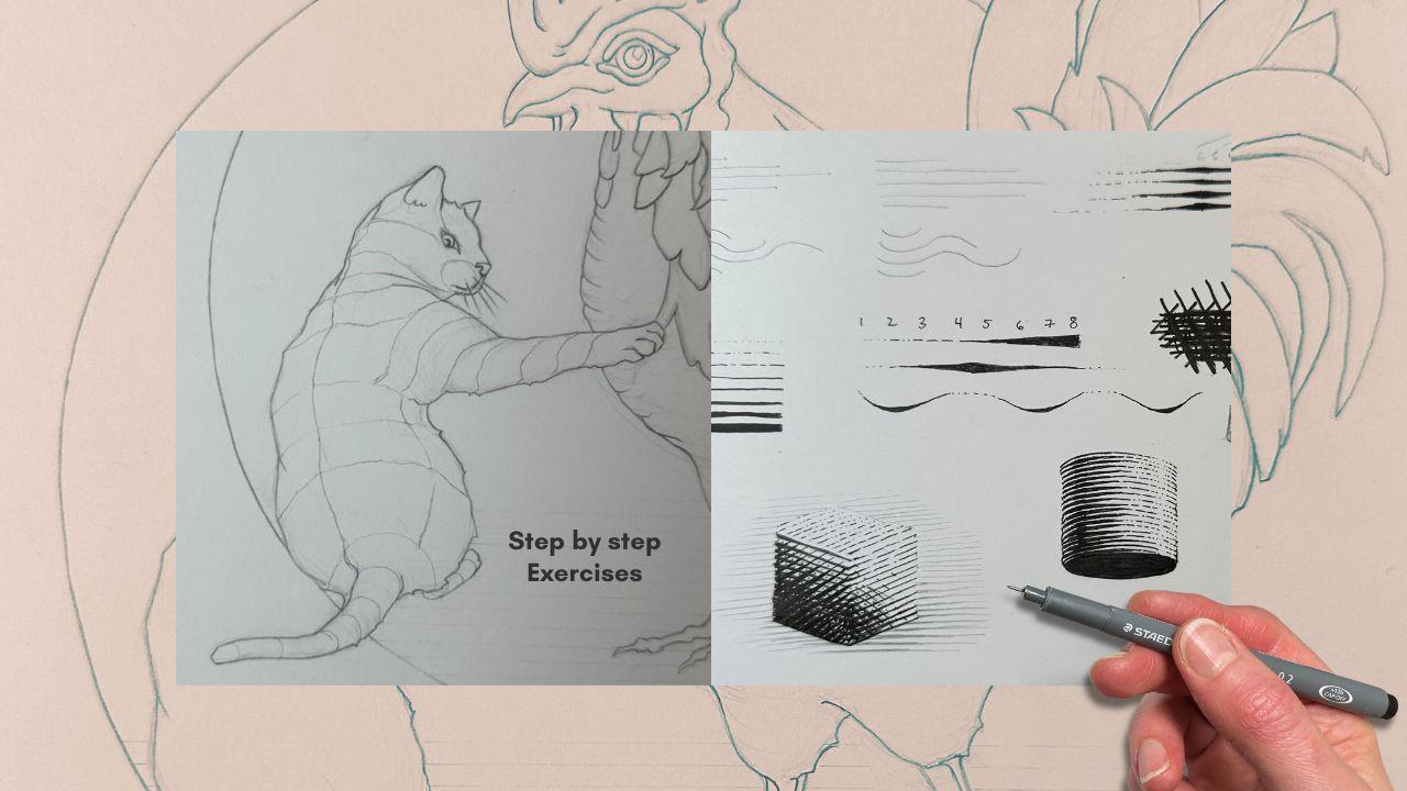
3. Mark Making Techniques: Let's do a mark making exercise. Using a ruler in pencil, place two dots on a
vertical plane at the top left hand corner
of your inking paper. About three quarter
inches apart. Then place five dots, an eighth of an inch apart
on the vertical plane, directly below the top dot. Connect the first row
of dots with a stroke, extend the second row
to twice its length. Estimate where the dot
would be and aim for it. Repeat the process
with the third row. Then in reverse, going
from long to short. In this exercise, we're
concerned with line direction. We're traveling horizontally
because for this style, you'll note that the majority of the line work is a
cross contour hatch. The lines travel
across the form. As opposed to a parallel hatch where the lines travel
along the form. Myself, I'm way more
comfortable drawing parallel lines in a
pulling motion top to bottom towards myself, towards my body, compared to a pushing motion
away from me, especially on a
horizontal plane. You can turn the paper, but sometimes it's not possible. That's why it's good to
practice in all directions. Now repeat the exercise
without the dots. So we're concerned
about line direction. Another trait of the style, you'll note is the even
spacing between the lines. Drawing multiple lines in
a row straight or curved, consistently spaced apart, free hand is kind
of a pipe dream. It said that it can take
decades to master this. But we can certainly
aim towards that goal, and these types of exercises really help for
gaining hand control. Let's try these again this time using a ruler to
create a guideline, so we can practice
starting and stopping our strokes in the same
spot with more precision. My rectangle is about
1.5 " long and I can fit four parallel lines running horizontally
within that rectangle. I'm aiming for even spacing
between the strokes. Still in pencil, repeat the exercise now
with a wavy line. We'll come back to
these in a minute. Cross contour, even space lines. This is a trait of the style. Let's not forget
about line quality. We'll draw another
rectangle guideline. This one stands vertically, starting with your
smallest tip pen, I'm using an 01. Our first line is made up of small dots spaced evenly apart. The second lines
weight is created with a short dash followed
by two dots. The third line is a mix of
short and longer dashes. Then line number four becomes a solid line to create
a darker value. Next, you can go up a tip size
for the next line weight, or if you have only one pen, just go over the line. Then we'll double the weight of the following line number six. Continue to increase the
weight, making it bolder, either by using a bigger
pen or going over the line. So now we have our line weights, but line quality only happens
when we vary that weight, thick to thin or thin to thick, in a single stroke.
There's a trick. It only looks like
a continuous line. We actually build the
line quality in it. It sort of has a wedge design. So you start out with
the lightest value. Number one, it's all dots, all the way up to
number four value, and number four
becomes your baseline. It's your first pass of
the ink application. Then on a second pass, you come back with
a thicker tip and gradually build the
thickness of that baseline. That's how it looks like
a continuous line that swells and slims as it snakes
its way across a subject. So practice the technique with a straight line also
with our wavy line. But how do we know which part is thin and which part is thick? Well, we talked about
the source of light. Let's go back to our
rectangles here. The spot that's in direct
light has the lightest value. That's the highlight. Our lightest line
weight is number one. The furthest from direct light, the thicker the line gets. Start with your first pass, value one, two, level four. Come back and build a line
quality in the second pass. A complex illustration
might take four to five passes for
smoother transitions. Here, if the sun
was higher and we were to extend this line,
it might look like this. Imagine that the thicker weights represent a concave area. This is more obvious
with a wavy line. I also mentioned cast shadows. So let's say the first wavy line is the closest to the sun, and it's also partially blocking the line
below and so forth. So now we're paying attention to the line quality that
fades from light to dark. Closer to the light
means lighter. Further from the
light means darker. Layers that are
positioned underneath another object will also
be progressively darker. This is just a flat
stack of lines. The fundamentals of shading
and lighting start to make more sense when you're rendering an actual subject
in three dimension. For this, we'll
want a value scale. This time we'll add in a
zero value, solid white. Number eight becomes
solid black. Then the other values
in between are created using the line
weights we just practiced. Go ahead and create
your value scale. Do it because it will be very useful as a guide
for your final project. As you get into
the darker values, the lines get thicker, but we're still aiming to keep the spacing between
the lines equal. Imagine that the lines
swell from the baseline, which on this scale
is a level four. Essentially, this entire value
scale becomes a baseline because there's one more
defining trait to the style, and that's the cross hatch
layers over top of these. The most common
cross hatch design starts with a horizontal base. Then the hatch crosses at a 30 degree angle for
a diamond pattern. You'll sometimes see a square, 90 degree hatch like this, but we want to avoid
a 45 degree hatch. It's not quite square, not quite diamond, and I guess it was less popular
at that time. The design of the cross hatch and when combined
with line quality, you simply match the
cross hatch line weight to the line work underneath. Same idea with a curved hatch
with a 30 degree angle. And since it's nice to
have additional control of your transitions of tone
from light to dark values, on your third and fourth pass, you can cross with
lighter values. So dots on dots,
dashes over dashes, then in two progressively
thicker lines going through the value scale. In some areas that
are nearly black, you'll have a bunch of passes, and it ends up looking
like a fine knit pattern.
4. Shading a Subject: I'll quickly review
the principles of shading with this little box, and then we'll do an
exercise together. With the sun shining from above, the top of the box is white. Underneath is black. That leaves dark
gray for the side, furthest from the sun and light
gray for the other plane. To shade it using the woodblock style or
the engraving style, the first pass looks the same as with
traditional shading. On the second pass, we add the wedging effect and a cross hatch on the
third pass if needed. Now that we know the steps, let's apply this to a bigger
box. Join me for this. We'll do a rough sketch first, then clean up the lines. Next, start mapping the subjects so that we can do
the first pass. For the front panel, we're continuing with the
cross contour lines, and for the top of the
box, it can go either way. The corner closest to the
sun gets a zero value. The top panel stays pretty light as we already established. Then we'll say the gray side
gets progressively darker, and the darkest panel also fades from dark to nearly black. I'll move the sun
a little bit to the left so that our
fade makes more sense. I use the kneaded
eraser to lighten the pencil marks so we
can better see the ink. Then starting with
the zero corner, transitioning to a value one, then two as we get further from the light
on the top panel. The gray side starts
at a value three, getting darker at the bottom, but this is still
our first pass, so not too thick yet. The back panel starts
at a level five, so we can use a bigger tip pen here or just double the line. On the next pass, we
start the wedging effect, thickening gradually as not
to go too dark too fast. It's easier to add ink
than to take it away. That's why shading in
layers is recommended. I'm removing the pencil
lines after the second pass, and now you can see
another defining trait of this style.
There's no outline. And so at the top, where
the value is zero, the box appears to
have lost its edge. And typically, the edge is created by adding a background. It's rare in an illustration
to not have a background. You'll at the very least
have a cache shadow. So I'll just quickly
add a case shadow in pencil just to show
you the difference. You can add one as well and
finish with a cross hatch. Plus a fourth pass for dots and dashes to
our cross hatch. At this stage, we can make further corrections
to smooth out midtones or bump up the
contrast where needed. Next, we'll look at the curved hatches
on a cylinder shape. The notable difference is
that the light reflects differently on a rounded shape compared to a shape
that has hard corners. There's a strip of zero value
and a strip of black well, it's actually nearly black since the bottom is solid black. But there's no light
at the bottom, then the value fades around
the form from there. This rounded form is very
much like our final project. Sketch a rough cylinder shape. Then tidy it up and
start mapping it. This time, our mapping
lines are curved. And then we'll add
the guidelines for the value seven and value zero. On the first pass, we
just follow the values. The edge of the right hand
side starts at a value one, then fades to zero
in that section, and then we go all
the way up to seven. Then it drops a shade as it reaches the left
edge of the cylinder. It's because there's a
reflected light on that edge. On the second pass, we'll fill in that little
section of value seven, and from there, the
wedge treatment is like the one we
practiced earlier. Before the cross hatch, we'd curve it over
the darkest section, aiming for that 30
degree diamond pattern. I've gone ahead and erased the pencil lines and filled
in the black bottom. When there's no background, you can add bits of edges, leaving some gaps, as well for a more dynamic
looking outline. And the cross hatch is optional. We will talk more about cross hatching and apply everything we've learned in the next lesson as we begin our
illustration project.
5. Project Cat Part I: The artwork template
is in your handout. You can use a window
pane as a light box to trace the drawing
onto your inking paper. The drawing is approximately
eight by 10 " in size. I'm using a sheet to protect the drawing
from smudging and we'll map the drawing together in preparation for the
ink application, starting with the cat's tail. We're creating a guide for the line direction
of the strokes. We don't need to
draw all the lines, an indication of the changes in plain direction and an
indication of the anatomy where the shoulders protrude
a center line for the spine and
around the hunches and continuing with the guidelines
that follow the form and essentially in the
same direction that the fur is growing. The sun will be on the
top left hand corner. So think of the cat
as our cylinder. I'll just flip the
cylinder here so that the lighting is in the same
direction for reference. It's a good idea to also
map out the areas of highlight like we did in
the cylinder exercise. Here I'm using a blue
pencil for this. If you have one,
it's easier to read the pencil map this way
with the different colors. We'll begin the first pass of the ink application with
values zero to four. Level four, if you recall, from the exercises
is our baseline. We're starting with
the tail because it's basically a long cylinder. So that's the easiest
for us to get a rhythm as we progress
through the drawing. The value zero highlight
is at the top, and from there,
it's dot dot dash, dot dash line, sort of pattern. Not too uniform. We want a bit of
variety line to line. Now moving on to the rump, still on the first pass. Here we're lining
up the highlight within the blue line boundary. I'm exaggerating the
highlight on the first pass. It's a good idea to leave more open spaces than we
actually need on the first pass. This gives us more options for adjustments later
because with ink, we can always go darker
later, but not lighter. For the longer lines, I'm using a subtle squiggle
rather than a rigid line. It looks more natural and
it's easier to fix mistakes. When looking at the
art of the masters, we're looking here
at very rigid lines, but keep in mind that although the illustration
was drawn by hand, print itself that we're
looking at was created with metal tools to carve into the wood or metal
printing plate. So in this Gustave Dore piece, those perfectly even lines
are actually made with, like, a little comb instrument. That's why these look
mechanical or done digitally. But the drawings were more textured like the one
that we're creating. As we move up the cat's body, we now start to line up the value zero
closest to the spine, so it's more obvious that the cat is in that
twisting position. When you reach the spot where the proportions on the map
are getting a little uneven, that's where we need to stagger
the lines to join them. On the cat, here
I'm joining a line. And you see at the
connection point, it's not quite touching because that's in an
area of highlight. But visually it lines up. Then the line afterwards can
continue its back on track. For the armpit area, the line starts at the map. And I'm following the
form of the anatomy. I'm not using a photo
reference for this, but I do have a cat
at home as my model. This is just a repeat of the long curving lines that we already practiced
in the exercises. Here I'm leaving
orphaned line for now to deal with the
divot in the arm. We'll connect all these
lines to the arm later. Now making adjustments to the pattern between
the shoulders, there should be a bit
more concave area here. It's a bit darker and on top of the shoulder convex
and in highlight. Now adding additional
highlights on the face and arm. Now for the upper arm, you see how we connect the
lines to the body. I'm staggering the
start of these lines highlighted from the highlighted
area on the upper arm. For the next section, there's another change in
plane direction, so we can continue with
our cross contour lines. Following our pencil map as we progress down the arm
towards the Baha. Going around the
individual fingers, leaving a highlight at the
top of each of those fingers. Then on to the
head. I'm breaking up the pattern for the
key features of the cat. I'm using parallel
lines instead of cross contour lines for the inside
of the ear and for the nose. Then a regular outline
for the eye and pupil. You'll note that he's looking
at us, not at the chicken. We'll get the whiskers, then back to adding
values zero to four as we circle around the face from the
snout to the ears. I accidentally spread
the lines a bit too far apart here on the snout,
if you're wondering. We are aiming to
maintain the spacing on this first pass equal
on the entire subject. That's the objective
as best as we can. There are a few tricks to fixing this even spacing
on the next pass, but overall aim for
visual consistency. The bottom paw will
be more in shadow. Since we know it will
be darker value, you can do the first pass with a heavier line jumping
from four to a level five.
6. Project Cat Part II: On our second pass, we'll work our way top to bottom,
left to right. I'm right handed, so
traveling this way helps to avoid smudging
the ink as it dries. Now we're working in value
levels five and darker. We'll build up the thickness
of the lines gradually, aiming for that progressive
wedge that we practice. I'm also evening out the transition of tones from light to dark in
areas of highlight. As mentioned, we left some
big gaps for that reason. The cat's face has
a cylinder shape, so I'm building up the values in the very same way that we did
for our cylinder exercise. And then I'm going darker under the chin and the neck where the light is
blocked by the head. Then going ahead and darkening
the left side of the body, making sure to keep
the very outer edge at a level four baseline to get
that reflected light effect. And then from thick to thin, fading up towards the area of
high light near the spine. Moving up towards the shoulder, we're still we're still
in our second pass. At this point, we're not
fully addressing the cats. Shadows will revisit
the darker areas when more of the drawing is complete so
that we can assess the transition of
values comparatively. It would be a little darker on the body parts that
are under the arm, since that's blocked
from the light. Darker, but not too dark. Again, we're building the tones
as gradually as possible. This is our second pass. It's sort of like the ugly face. We'll smooth everything
out near the end. For this bottom paw, we've already established
that it would be super dark, so we'll go ahead with that. Then on the tail, giving
it a rounded appearance. Then back up to the arm, moving all the way down
to the paw and fingers. Then back to the
fur on the shoulder and back of the arm or
front leg, I guess. It's not an arm. It's a leg. Now that the darker
areas are established, we can pull some lines, stagger them to fill a bit more gray value so that the highlight is less contrasty, more gradual, for a smoother
transition of the mid tones. Then back to the bottom paw
with a cross hatch texture. And with that, we can bump up
the contrast where needed. Note how the ink doesn't
go all the way to the edge where the head
is. There's a little gap. It's a highlight, and we'll see this highlight once we add
the colored background. We'll leave our cat
for now and start mapping the chicken. Okay.
7. Project Chicken Part I: Starting at the neck,
following the roundness of the chicken all the way down to the bottom of the front leg. Change the angle
for the back leg to emphasize that it's behind
and further from the viewer. Then changing the angle
again for the back feathers. This is still a
cross contour line, and the plane changes make the chicken look
three dimensional. Then with a blue pencil, we'll mark the highlights. Here, because a lot of
the feathers are on the same plane and will be assigned the
same value number, we really need those highlights to delineate
individual feathers. It will be a balance. We want a cohesive smooth value, not too contrasty,
but at the same time, we also don't want the chicken to look like a big
ball of fluff. If the highlights
end up overpowering, it's easy to fade them
out at a later stage. Continue to make your way from the neck down towards
the feathers. They start to break apart
where the highlights are from our blue
pencil outlines. We'll do the top layer first, then make our way
to the layer below. For the layer underneath, I'm changing the stroke angle slightly so that the
layers are more visible. This helps to create the
illusion of depth and volume. It gives the feathers
some dimension over the chicken's body. Same idea with the next set
of feathers underneath. Then extending to the
feathers of the rump. Note that I'm using that
squiggly line effect for the longer strokes
as we did for the cat. I'm still paying attention
to the highlights. For the highlights on
the tail feathers, the longer feathers
that are at the very back and outside the circle
don't have a background. So for those, we'll extend the strokes all the way
to the outer edges. So you'll see here feathers
that have a backdrop, whether that's more feathers
or the background circle. For those sections, we
preserve the highlight. Then I go to the edge for the feathers that
have no background to define their edges. You'll see it will
all make sense as we continue to
develop the drawing. And once again, I'm breaking the pattern for this
one fancier feather, giving it a leafy appearance, though, here my
spacing is too wide. Keep the spacing
consistent if you can. Otherwise, no worries. We will fix it at a later stage. Then carrying on to
the bottom wing, designating additional areas of highlight with the blue pencil. For the thighs, logically, they should be darker
because they're below the chicken and its body
is blocking a light. But those drumsticks
are super round, and we want to convey this. So we'll keep the
highlight area for now and adjust as needed
on the next passes. Same with the feet, leaving a highlight at the
top of the claws. The stomach and chest area
will be the lightest. I also want to show that the feathers there
are small and downy. So we'll communicate this with a squiggly dash pattern and dots where it gets lighter on the most convex part of the
chicken stomach and neck. Then a little darker
at the throat where the light is blocked
by the beak and the head. Making our way up to the head. The face of our main subject needs to draw attention first. So here, I'm changing
the pattern. Same as we did with
the cat's face. This puts more emphasis
on the facial expression. You'll notice that they're
not looking at each other. They're looking at us like we're interrupting an
argument or something. If you're comfortable, feel free to improvise a little here. As you can see,
I'm just repeating the stroke patterns that
we've already practiced. I'm just adding a few
more plain changes.
8. Project Chicken Part II: And we can dive into the third pass right
away with the head. I'm increasing the line
weight for the darker areas. In this section, the darker
areas indicate a divot, something concave
pulling away from us, or a section that's layered further from
the light source. Think of the wing
feathers as a bunch that's rounding around
the neck and body. Essentially, it's a big cylinder
on top of an egg shape, which means lighter as it rounds towards us and
where there's more light. Moving onto the rump feathers. Same idea, except the cylinder
is flipped horizontally. For the tail feathers, I'm darkening the bottom half
of the individual feathers. Then progressively
increasing the weight of the strokes for
the tail feathers on the bottom half of the bird, since they're more in shadow. And now we can start addressing cast shadows and bumping
up the contrast. The back leg and the bottommost tail feathers
will be the darkest. We can gauge the transitions of tones from there
as we continue to add cast shadows and touch up the contrast one
section at a time. Under the wattle is also dark and a good spot for
bit of cross hatching. Then we can bold the
mouth of the beak. There's no visible nostril. It's covered by the
comb or the crown. Then just a smidge darker, where the feather layers
where they overlap. Then the level two value cross
hatch on the underbelly. So just vertical dashes that cross other dashes
like we practiced. Now we can address the
highlights that are too stark. We can tone them down with
just a value four lines, so we preserve the effect
of a lighter value, but just with a
little less contrast. At the top, where
there is more light, just add dots instead of a line or dash to even out
the highlights. Well, we're fine the midtones in the next section after
we've added the background.
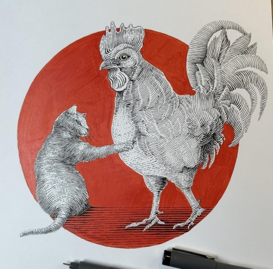
9. Project Final Touches: For the background, I had previously tested a yellow but ultimately
went with the red. So pick any color
you like, really. It could be gray, as well. There are three things
to keep in mind here. I'm using an opaque medium. So firstly, I'm aiming for a uniform application
with minimal streaking. It might need a second
application to achieve this. Second, remember the
highlights at the outer edges, so around the front of the chicken and the
left side of the cat. Third, again, because
this is an opaque medium, if you accidentally cover
some of your drawing, you can simply go
over those sections with your inking pen afterwards. Wait for the artwork
to dry completely, then remove all
the pencil lines. With the background now in, we can see the
edges more clearly. And with that, we can put
in the final touches. I'm adding a bit more tone on our cross hatch with
dots and dashes, then cleaning up the strokes
that need more clarity, making them more precise. Also, that fancy feather in
the tail, it was bugging me. So I'm adding dashes between
the exaggerated gaps. So now it blends nicely. You'll have noticed
that our subjects are still floating in space. With a background in place, we can now add a ground plane, using a ruler to pencil
and a guideline. Then a first pass, value
levels zero to four. And I'm using that squiggly
line effect because these are longer lines than building our wedge lines to bold the
calf shadows from there. And that concludes our engraving style Illustration
project in Pen and ink.
10. Engraving Style Conclusions: We learned about
engraving and how to create the marks that mimic
that illustration style. We warmed up our hand
control by doing a start stop exercise
with lines and curves. Then we focused on
equally spaced apart so that our strokes would be consistent throughout
our final drawing. We followed that
with line quality, building the thickness of a baseline and sort
of a wedge so that we could make our lines swell and thin based on the
source of light. We created a value scale, then mapped a couple
of simple shapes, which we then inked in layers, building upon a baseline of
values levels zero to four. Looked at the engraving
style cross hatch pattern, aiming for that 30 degree
diamond shape for our design. And the last key
technique that we worked on was to leave open edges and oversized highlights
to make it easier for further adjustments of values as we developed our project. Thanks so much for joining
me here for the lessons. I hope you enjoyed the style of illustration and that you'll continue to incorporate traits of the style into
your own projects. I would love to see your
finished artwork posted in the student projects.
Let's stay connected. Find me on YouTube, subscribe to my newsletter for regular pen and
ink drawing tips. And I wish you all the
best with your journey.
 Chloe Gendron, Pen and Ink Illustrator