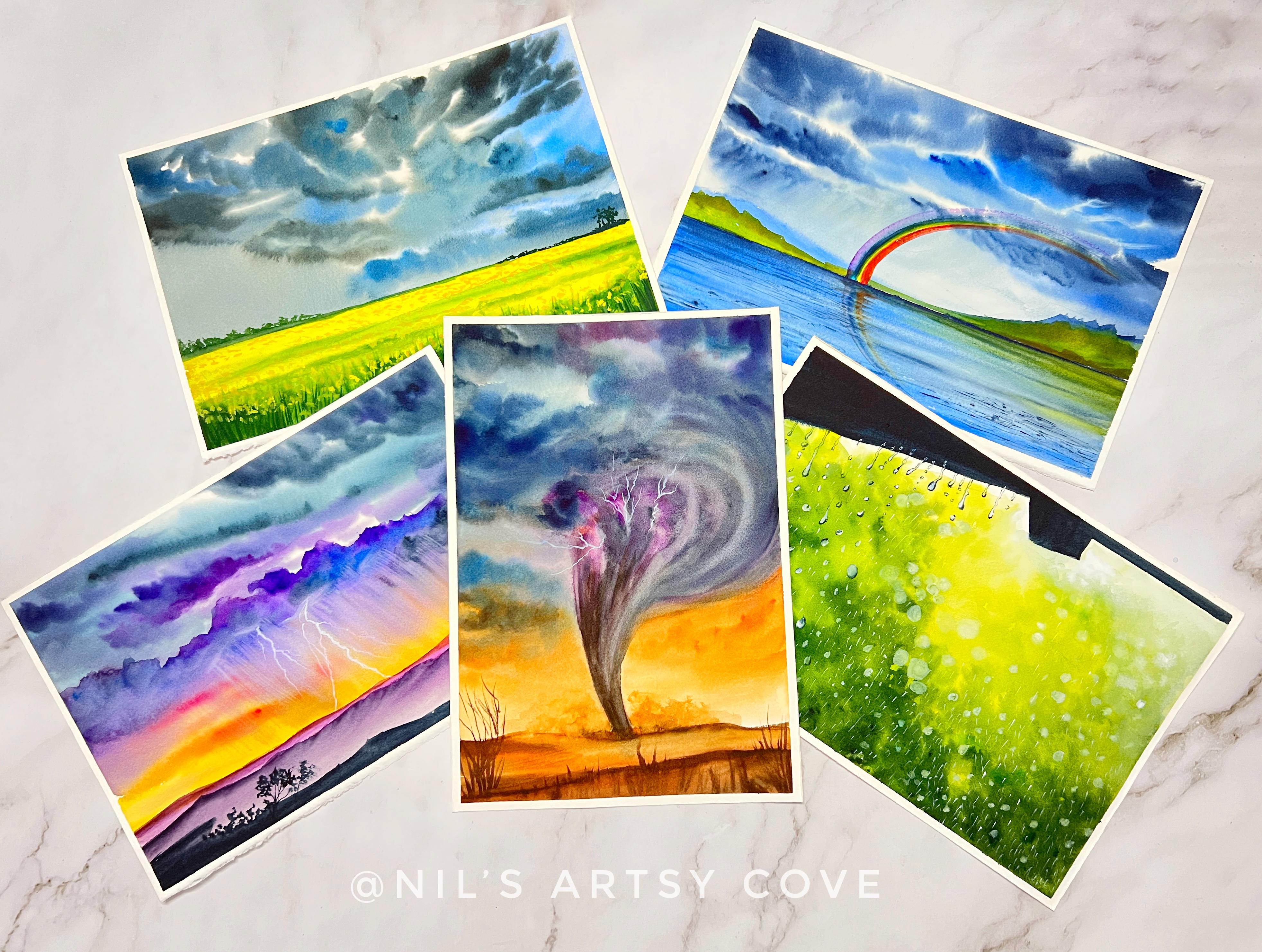
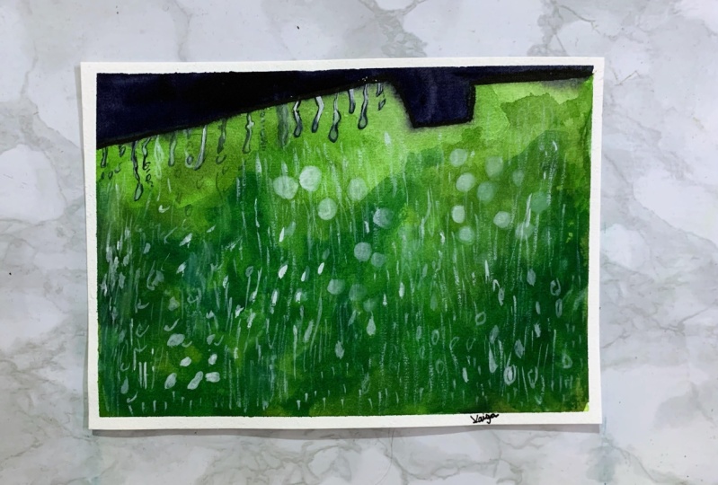
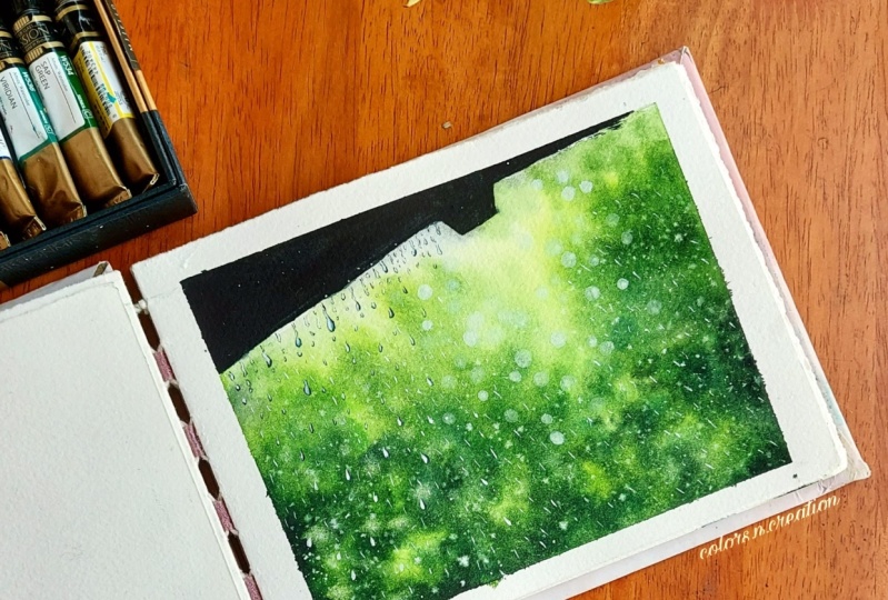
Transcripts
1. About the Class- Overview : [MUSIC] Finally, it's that time of the
year when the purged earth, size and relief with spells of soothing rains or
scorching summers. Monsoon is a blessing to all. It's a time when nature
replenishes itself and you get to see
large greenery around. Though I am not a great
fan of this season, but I definitely enjoy sipping a cup of hot tea
or a beverage with some pacoras or Fritos and watch the rain drip away
through the glass windows. If you are someone who loves this season and associate
yourself with rain, then this is the class for you. Hello guys, I'm Neelam Royan, artist and an art educator
based out of Bangalore, India. In case, if you
are joining me for the first time and don't
know much about me, I go by the name at the rate, nilsarartsy_cove on Instagram,
where you will discover my passion to paint nature with various mediums such as
watercolors and gouache. Though I have been
into watercolors for over three
and-a-half years now. Watercolors has become
my absolute love. Apart from Instagram, you could
also find me on Facebook, Pinterest, and YouTube, the link to which is given on
my Skillshare profile. I welcome you all to
another Skillshare class which is inspired from
the Vettii monsoons. This class is going
to run for five days, where each day we
will try to capture the essence of monsoon
through various landscapes. We're going to start with a stormy sky followed
by a thunderstorm, tornado, rainbow, and finish
it with a soothing rain. Does this look
exciting to you guys? If yes, then join me in and let's take you through
a quick class overview. We will be kick-starting
the class by discussing all the supplies
that we are going to need for creating
our class projects, followed by a section wherein I discuss about various
watercolor papers which are available in the market
and what to look for when you are choosing
the right watercolor paper. If you're an absolute beginner
or intermediate artists, I would recommend you not
to skip this section. This section would also
demonstrate how differently your watercolor paper
varies from brand to brand. I have also added in a cloud study section and if
you were someone who were always skeptical or didn't know how to start painting
different kinds of clouds, then this would be a best start. Pause this, I have added in this section wherein I discuss the color palette and the elemental composition before we begin with the
class projects. This would help you to be
ready with the supplies and the colors that we
would be needing for our class projects. Come on now, get
your supplies ready and brew a cup of
hot tea or a coffee, and let's start painting this beautiful monsoon
landscapes with watercolors. I look forward to seeing you in the next lesson of this class.
2. Types of Watercolor Paper: [MUSIC] In this section, we're particularly
going to talk about the various watercolor papers that are available
in the market. You might have entered a
store and you come across various different brands of watercolor paper along
with varying prices, and that often
leaves you confused. What watercolor paper
should I go for? Obviously being a beginner
or an intermediate artist, we all try to take a paper which is little economical
than the others. But in doing so, are we compromising
on its quality? In this section, I'm going
to address all of that. So here is an example, this watercolor paper by Saunders Ford is
fine grain paper. Now here in my hand, I have paper from Lanaquarelle. This is also 100 percent cotton, 300 GSM is the
thickness of the paper. But what is the difference? It is the texture
that the paper has. Now, this is also a cold
press watercolor paper, but it is rough. Now, let me show
you the comparison. So I have, on the other hand, Arches paper which
is fine grain. Now, when you compare
both Lana and Arches you see the texture of this
Arches paper is somewhat, very similar to
that of the Lana, but just by looking
at the texture, will we be able to
judge about the paper? No, we will need to try this paper out to
understand the behavior, how the paint and the
water is absorbed. Now here is another
example which is Fabriano's rough paper, just like Lana, how it was rough, but look at the difference
in the texture. Here in this paper, it is much more textured, it is much more groovy. Can you see the
tooth of the paper? It's so ingrained, it is so heavily textured. I do not prefer working in
such heavily textured paper, but if you are somebody who loves these rough
track textures, then maybe you
could try them out. It is always on our what paintings do we prefer and what surface we
prefer to work on depends. Now when you see the comparison, feel it through the hand. This paper from Fabriano is much rough than
that of the Lana. So this was an example and a comparison of how
different brands will manufacture different
surfaces of the same paper. That was the rough paper. You see, this is the
Lana's fine grain paper. So you can see the drastic difference
between the textures. The Fabriano paper
obviously is much more heavily textured than
that of the Lana. Now, this is just by
physical interpretation. Now, let's take a look
at another example. Which one do I go for? Yes, this Hahnemuhle's block. Now, this is also a
cold press paper. This is also 100
percent cotton paper, but what is the difference? You will see the
difference being here, mentioned as the matte
fine grained paper. So this is also a
cold press paper, but here the differences,
it is matte. Look at the texture. It is just like a
plain hot press paper, it almost feels like that. Now, this is another hot
press paper by Lana, I have not yet open it, but I will show you
some other example of how the hot press paper
surface will feel like. But this is not a
hot press paper, this is a cold press paper, but it is matte, but also the feel of the
paper is hot press. So this was from Hahnemuhle, see again the brand difference. So each of these paper
brands will have certain manufacturing
process due to which the texture and the feel of
the paper is very different. Now this one is from Etchr Labs, the perfect sketchbook, which is 100 percent cotton and 300 GSM is the
thickness of the paper. Now, Etchr sketchbook too
has lots of many variations, some are 200 GSMs, some are 300 or
lesser than that, also there are some
gouache papers also. So this one is particularly
for watercolors, look at the beautiful texture. The beauty of this
sketchbook is that all the pages have
the same texture, even though backside
of the paper, so you can paint on the front as well as on the backside
of the sketchbook. Now, another important factor that you must
remember when getting your own watercolor paper is
the thickness of the paper. So this one is from Arches, and here it is mentioned as
300 grams per square meter, which is nothing but the
thickness of the paper. Also, it is mentioned in pounds, which is one for TLB. The similar thing is mentioned on this
Saunder Ford's paper. Now here is a
handmade paper block. Now here also, the
GSM is mentioned, which is mentioned as 270 GSM. Now, this is a paper which
behaves like Chitrapat, and you can see how
lanky the paper looks because it is not 300 GSM, it is 270 GSM. So when you go for heavy
washes in this paper, the paper starts warping up even though it will
not tear apart, but it will warp and it will
bulge out for heavy washes. So this is the
difference and that is why it is recommended
that you go for 300 GSM as the thickness
of your watercolor paper. Also, one more specialty
of this handmade paper is that you have seen the surface or I'll
show you once again. So the surface of this paper is just one side of this
surface is workable. The reverse side
is not textured, so only one side
of the surface is textured and it will try to
hold or absorb the water. As you can see here, this side is textured. You can see the green, whereas on the reverse side, it is very plain. Now I will show you
some other brands. Now here I have this
paper from Brustro, which is 25 percent cotton. So mostly 25 percent
cotton papers are the ones which are often called
as student grade papers. Now Canson Montval is a
example of such paper. It is very, very
similar to this paper. As you can see, this is not 100 percent
cotton paper and this is not advisable to go with
watercolor paintings. For smaller watercolor
illustrations, yes, maybe you could use this, but for a full-fledged
watercolor paintings where heavy washes and wet-on-wet
techniques will be implied, this paper will not do good. [MUSIC] Now, the next brand that
I'm going to show you is from Neveskaya Palitra, their White Nights
watercolor paper. Now this paper is also
100 percent cotton paper. The front side of this paper
is all written in Russian, so you're in the reverse side, the backside, you will have
it mentioned in English. So it's a natural white
and fine-grained paper, 100 percent cotton, and let me show you the texture. I use this paper for very
small sky paintings, and I was not really very happy with the results
that I have obtained. Now, when you compare this matte finish paper from Hahnemuhle and this
paper from White Nights, you can feel the difference,
it's almost similar. There is no texture
at all in this paper. This paper will do very
good when you go for this glowing Northern
Light skies on this paper because the
inks will flow more easily here without any
resistance to the surface. So the skies will come
really good in this kind of a plane surface papers unlike the groovy and
the textured papers, where the paint gets trapped into those grooves and surfaces. So that was all the difference, and I have been trying and experimenting with
different watercolor paper just to find the best
compatible paper for my particular style, and I love Arches for
that very same and I grew very fond of Saunders Ford as well as this
Etchr lab sketchbook too. Now here is another brand, which is Stonehenge
Aqua cold press. Now, this is also 300 GSM
paper, as you can see, 140 is the LB
mentioned out here, and the other one is 300 LB, which is 600 GSM. So this is quite thick. Can you see how
thick the paper is? Even Arches has a
variant of 300 LV. These papers are really expensive and really,
really thick. The other is this
hot press paper. You can feel it. There is no surface at all. Just the paper feels heavier
because it is 300 GSM. So that's all about
this section. I'll meet you in the
next section where I will be talking
about and giving you a demo of some of
these papers and showing you the difference
between professional grade, student grade, and
academic grade papers, along with some other professional
grade branded papers. So I'll show you the difference, how the paper
behaves differently, what is the water holding
capacity and all of that. So see you in the next section.
3. Knowing your Watercolor Paper- Paper Quality: [MUSIC] In this section, I'm going to examine
different types of professional academy
student grade and various other brands of professional grade
watercolor papers. To start with our
examination, first, I'll just take you through the brands that I'm
going to select. For this student grade paper, I have chosen
Fabriano, 25% cotton. For professional grade,
I have chosen Arches, which is 100% cotton paper. For academy grade paper, I have this Baohong
watercolor paper, which is also 100% cotton and 300 GSM is the
thickness of the paper. This is how the paper
looks in general. These are the brands and
we're going to test it out. On my left, I have got
Arches professional paper. In the center, I have got
Fabriano student grade, which is 25% cotton, and towards the right corner, I have got Baohong
academy, 100% cotton. Let's begin testing our papers. I'll directly go with
wet-on-wet method because this is the real
test of the papers, applying a flat wash of
water on my Arches paper. The moment I start layering the paper
with this flat wash, I see that the paper is
absorbing the water really fast, so let's test it out with
my dilute paint and look at the spreading of that
colors on that paper. How beautifully the
paint is spreading, the paper is slowly releasing
and absorbing the colors. Such beautiful thing. Can you see the spread? This is how the
Arches paper behaves. Now let's test out
the second paper, which is Fabriano 25% cotton, which is a student grade paper. Instead of Fabriano,
you can also go ahead with any student grade
paper that you have. Canson and Montville
is also one category, Montville or Canson XL. Either of these, you can
go ahead and test it out. Now let's start. The moment I start
layering the paint, I feel that the paper has not
really absorbed any water. See the paper has this surface and the water is just sitting on the surface, and so it's a paint and hence the paint is also not spreading across the paper since
the water has not been absorbed at
all by the paper, how limited the feathering or the spread of the
paint is on the paper. This is how your student
grade papers will behave. Now, again, coming to the third category that is the Baohong academy grade paper. This is also 100% cotton paper. I'm making sure that the paper has no standing pools of water. Now let's start layering the
paint on this paper surface. This feels much better than that Fabriano paper since
this is 100% cotton paper. But yet I cannot see any bleeds happening
in the paper though. There is no spreading
of paint at all, so this is not how exactly you should be
looking for the paper. See how very limited almost the same as that
of Fabriano, isn't it? The test result is very clear. Arches is the clear winner
out here because of its beautiful
absorbing capability, as well as the spread, how beautifully the spreads are and such smooth edges
that we have got. Did you see? This is because the sizing of this
paper is just perfect, unlike Fabriano where the
sizing is just too much. They have used some
starch-like substance to size the papers due to which it is not really absorbing any water. The third one is our Baohong. This is almost the same
as that of Fabriano. A little better because
it is 100% cotton. Yet the bleeds are
not as beautiful as the Arches because this is an academy level and Arches is a professional
grade paper. Now, one thing that I
noticed in Baohong is that the paint started spreading a little bit more in a better way once I think the papers started
absorbing the water, but not like Arches. Arches paper is still wet, whereas the Fabriano
is just dry, and Baohong also feels very dry. Arches here has better
water holding capacity than all the three other papers. Now, here let's examine three
professional grade papers, all of which are 300 GSM in
thickness and 100% cotton. For the professional
artist grade, I am again using Arches
as one of the brands, second one is Lana paper, and the third one
is Saunders Ford or St Cuthberts Mill's paper. I have arranged it in
the following order. It's all labeled down
with the marker. The left-hand corner
is the Arches, the center one is Saunders Ford, and the last is Lana. Now for the Arches paper, I am again going ahead
with wet-on-wet technique. Wet-on-wet gives you
faster comparison as compared to the
other techniques, because this is the main test
of how good the paper is and how good its water absorbing and paint releasing
capability is. I'm wetting the paper at the
very same time and we'll start layering the paint on
the paper simultaneously. We're starting with the Arches. Now you can clearly start
seeing the results out here. Look at the spread and the
bleeding of Arches paper. Saunders Ford is
still not too bad, it is also spreading, but not as much as Arches. But yes, that's why Arches
paper is regarded as the best professional
grade papers and all watercolors
just love this paper. But Saunders Ford is
also equally good. You can see how
beautifully and soft edges that we have got for both
for Arches and Saunders. But for Lana, the result
was not that great. The spread of the paint, I would say it is a bit more irregular and uneven for Lana, but in Arches, it is beautifully and
smoothly spread out. See the beautiful bleeds. It has nicely released
the paint off the paper, and see in Saunders Ford
also nice smooth edges. But for Lana, the
spread is not that much because the paper is
quickly absorbing water, but it is not releasing the
paint as much as it should. This was the difference between these three professional
grade papers. Now you can experiment
this at home and find the best
paper that you own. In this way, you can always experiment and
find out which is your paper which is the best
fit for your paintings. Even in here, in the category of professional
or artist grade papers, Arches is the clear winner, second goes to Saunders, and third is for Lana. Now, I had coincidentally arranged the papers
in the same order. But anyhow, it was
a good session. I hope you will have drawn useful insights from this
exercise that we have done. Even though there is
a price variation in all of these three
professional brands, Arches being the most
premium than all the three. Yes, the quality of
the paper does matter. Hence, it comes with the price. I'll see you again in
the next lesson where we will be doing this
beautiful clouds study, which will be helpful in
the coming class projects. [MUSIC]
4. Materials Required: [MUSIC] I'm so glad to see you guys join
me in this section. Let's quickly get started
with the supplies. Let's get started with
our very first supply, that is a paper. Now here is a sketch book, a customized one from
my very dear friend, Ashwini, who is also known by the name as September
Fleur on Instagram. Also, there is this
website link in case if you want to get a customized sketchbook
for yourself, you could go ahead and
check out her website. The paper in this sketchbook
is a cold pressed, 100 percent cotton
paper from Fabriano. This is one of my
most favorite papers when it comes to
watercolor paintings. Now, the thickness
of this paper is 300 GSM and it is cold press, so it has got some
fine-grain texture to it. Now, this sketch book
I'll be using to swatch out the colors and to show you
the elemental composition. Now here comes the paper sheets, so the paper cutouts
for the class projects. Now, this paper too is from
Fabriano, the same paper. This is Fabriano
artistical paper, which is 100 percent cotton, acid free cold pressed,
fine-grain paper. Now the size of the
paper is A4 size, that is 28 into 19
centimeter, I suppose. I'll just quickly measure
it up for you guys. This is the breadth
and length so 28 is the length and
19 is the breadth. If you want, you can go ahead with the smallest
size paper such as this A5 size too would also work so it is totally
up to your choice. Choose any size of the paper that you
are comfortable with. Now, the next supply that I'm going to discuss is our board. Now, you would need
a surface where you can stick these
papers right work on. You would need a
non-absorbing surface where you can stick down
the paper and paint. I'm here using this
acrylic sheet board, which is a
non-absorbing surface. Since we are dealing with
watercolor paintings, you need a surface which is non-absorbing and
this is actually transparent but I
have just retained this brown cover on top of that sheet which comes from the manufacturer so I
just like it this way, so the brown color. This itself is also
non-absorbing, so there is nothing
to worry about. That's all about the board. Now, let's take a look
at the next supply. Next is a watercolor paints. Now the watercolor
paints that I'm using in this class is from PWC, which is from ShinHan art. This is a Korean
watercolor based company, just like Mijello Mission
Gold Class but I really like these colors because they are very vibrant, rich, and creamy. Now these are artist
grade paints, but feel free to use any watercolor paints which
are available with you. You need not go ahead and use the very same brand
that I'm using. Go ahead and use any watercolor paints that
are available with you. Now coming to the
colors, do not worry. I'll be showing you or swatching out all the
colors that we will be using for creating our class projects
before each project, each day so there is
nothing to worry about. You can get your
colors ready by then, or else you could watch the entire class and get your
palette set accordingly. If you're using
watercolor tubes, you would need to squeeze out
the paints onto a surface. Here, I'm using this ceramic palette
and a folding palette. Now, use whatever is
available with you. Instead of these pallets, you can go ahead and search
in your kitchen about some ceramic plate or any plate that would also
do the job of a palette. Now, we will be talking about
masking tape or washi tape. There's actually not
much to talk about it. You need something to fix or tape down your paper
onto your board. For that, we will be
using a masking tape. If you want to have this clean borders and to give a clean look
to your painting, you can use your masking
tapes or else you can just go free hand
without any borders as well. The choice is totally up to you. You can very well skip this part if you are
using sketchbook. Now comes the next
important supply other than the paper
that is our brushes. Here I'm going to be using this hockey brush or hake
brush from Silver Atelier. This is very soft, made up of goat hair and
I love using this brush because it really
gives nice effects. Because of the soft bristles, it is easier to do various
lifting techniques to give that more softer look to the skies and here is
a substitute of that. You could also go ahead and use Neptune series brush from
Princeton of wash brush. Now next would be
our round brushes. Here I'm using my all-time
favorite brushes, especially the ones from
Silver Black Velvet series. This is a Size number 12 brush, size number 8 brush and our size number 2 from the same series of
Silver Black Velvet. Now, apart from these brushes, I'm going to keep some
more brushes handy. That is my rigger or a liner brush from
Princeton Heritage Series. This is a synthetic brush. Now, I love this brush
because it has got a very long bristles and
one more a tiny one, which is for mini detailing. This is a mini detailer brush from a local brand stationary. That's all about the brushes. The other supply
is a tissue paper. Now this is very important, especially when you're
painting skies. You just cannot be
messing it out. Apart from this, we would be requiring two jars of
clean water one to rinse our brushes and the
other to lay flat wash with water when going for
wet on wet technique. Now, that is all, and yes, we will be needing some basic stationary such as a scale, pencil and an eraser to do preliminary pencil
outline or sketching. That is all the supplies that we are going to
need for this class. I'll see you again
in the next lesson.
5. Cloud Study: Types of Clouds: [MUSIC] Welcome back
and in this section, we will be discussing
about various clouds. Cloud formations happen at multiple layers in
the atmosphere, which is a defining factor of how clouds behave whether they form into a massive
weather system or just drift lazily along. Meteorologists have
classified clouds based on their shape and how high up they hover in the troposphere. Here is the chart
which classifies the clouds into three
main categories based on their altitude. The types of clouds
can be divided into three levels that is
the high altitude, middle altitude,
and low altitude, each in turn with its own
main groups of clouds. Here is an example of high altitude clouds which
is cirrus and cirrocumulus. cirrus and cirrocumulus are
the most common types of clouds and they're thin and crispy with chin
like appearance. The next is cirrostratus. The only white cirrostratus, clouds signifies
stored moisture in them hence indicating a
light shower of rain. This cirrostratus clouds when
they descent to mid levels, they form alter cumulus clouds, which are also known as social clouds because
they appear in groups and have grayish
white color with some darker portions
than the others. Next coming to altostratus, these are bluish or
grayish color sheets which cover all or
most part of the sky. Next is the cumulonimbus
or nimbus clouds, which are responsible
for thunderstorm. Coming to stratus clouds, which are again low
altitude clouds, which often appear
as gray sheet, which blocks out the sun and is responsible
for precipitation. Coming to cumulus clouds, which are my favorite. They are detached and
fluffy clouds with clearly defined edges and they
also have some gray areas. Coming to cumulonimbus, which is having a mountain-like shape, and they are responsible for hurricanes or severe
thunderstorms. Coming to the last one, which is our stratocumulus, which are rounded masses of clouds with gray
or white patches. Now that you know
different types of clouds, you are now certain that nimbus and cumulonimbus
clouds are the ones which are responsible for thunderstorms and dreams. The typical monsoon clouds. Come on now, so
let's go ahead and do some cloud study
with watercolors. I have divided my paper, which is an A3 size paper, into six equal squares. Now, going ahead with
the first square and I'll be going with
wet-on-wet technique here, we will be painting
our cirrus clouds. Wet-on-wet technique
means layering of flat wash of clear
water on your paper, pre-wetting your paper before
you start painting on it. Here with wet paint, I start layering the colors
and you can see I'm creating this thin lines
and strokes which are facing upwards with
just the tip of my brush, make sure that you leave
certain whitespaces or gaps in between to create those white sheet-like
appearance of the clouds. Since these are high
altitude clouds and form sheet-like appearance so I will be going ahead and using dab brush to lift
out certain areas or portions of my wet sky and to
create those fluffy clouds. Next coming to our
cumulus clouds, which are also known as
cirrocumulus and altocumulus, based on where they are
found in high altitudes or mid-level altitudes so I'm going ahead with, again,
wet-on-wet technique. This is my most preferred
technique because I love to have skies which
has smooth edges. I have layered my paper with nice flat wash with
water, a uniform one. Now with just the
tip of my brush, see the clouds that I'm trying to create over here leaving out certain whitespaces so this is the cauliflower effect
that I'm trying to create over here so use just the tip of your brush and go ahead
with ultramarine blue. That is the color of the sky, so just use the
tip of your brush, start with some angled strokes and in-between create
smaller white pockets. You create those
quality flower shapes. I'm going to repeat the same for the rest part of the
square so keep watching. Here's another cool
technique that you can use to create this
clouds so let it with an uniform code of base color and then
use your tissue paper, crush it, and then with very small rounded shape
of the tissue paper, try lifting out the paint from the wet surface and behold, we have our cauliflower
shaped clouds. Next we will be looking at
altostratus clouds here. There will be some darker
gray areas because these clouds are also responsible for some
amount of precipitation. I'm going with wet-on-wet
technique again so let your paper with
a uniform coat of water and starting
with the base of the sky here I have
used Naples orange. Now with your blue with long slanted strokes from the right corner or left corner, any side which you feel
like you start with this shapes of the clouds
and lead the paper, always remember to leave out certain whitespaces
in-between. Now we will start layering with my indigo with burnt
sienna mixed paint. See the brush movements. I'm using very long slanted
strokes and facing though, strokes little upwards and creating those shorter
strokes in between. Now using this dabbing motion, I'm just rubbing my wet brush on this wet surface or area. Once you are happy
with your sky, just leave it there. Do not try to rework or overwork when your paper
has started to dry because you will have this nasty hard edges and
spoil the sky in entirety. [MUSIC]
6. Clouds Study : Types of Clouds Part 2: [MUSIC] Continuing
with our cloud study, now it's time to paint
our nimbo stratus clouds. If you have known, nimbos is derived
from a Latin word, which means rain, and
stratus means spread out. These gloomy clouds are the
heavy rain bearers which form thick and dark layers of cloud that can completely
block out the sun. With that, you have an idea
what we are going to do. We are going to use some
really dark shades along with lighter shade to bring out that intense
dramatic look. Also we are going to go and work on wet-on-wet
technique because you need these clouds
to look dramatic and have those softer
looking edges as well. Here I have used
ultramarine blue and spreading it
out on the paper in certain random shapes and directions using just
the tip of my brush. Make sure that in all
this cloud study, you use our exercise
water control or use limited water
in your paint. Your paint should
not be too runny because then it will be a
total disaster or mess. Now, I am using my indigo. You can see the indigo. You can mix a little bit
of your browns as well, like that of burnt sienna or burnt umber into your indigo or your blue mix to create those darker tinge
of grayish cloud. I have mixed little bit of
my browns and my indigo. If you do not have indigo, you can go ahead and use
your paint gray as well. This is how we are going
to go ahead and create this dark and dense clouds
with just the tip of my brush, directing the colors to move, flowing, and freely
on the paper. Leaving certain gaps is necessary
because that will bring out the white parts
of the cloud as well, which will look
like the sun's rays are trapped into it and which
is getting illuminated. Because of that very same
reason we are leaving these little gaps or
pockets of whites paces. I'm going to go and make those white
pockets little bit more prominent by using
just the damp tip of my brush and lift
out the colors. Now, at the bottom, lower end, I will just go and use a little
bit of raw sienna to give the clouds a little streak of that sunlight color over
there and that's it. I'm not going to
do anything more. Now using just my
damp tip of my brush, the paper is still wet enough
for me to create this, again, movement in the clouds. To show the wispy
movement in the clouds, I'm going to go and use
this damp tip and lead the indigo color since the
papers is already semi wet. Now, if your paper has started
to dry out completely, avoid doing this step. Make sure that your paper
is wet for you to do this. This is exactly the same
way how we are going to create our clouds for
the very first project. Now moving on to our next one, which is a stratus clouds, which is also a low-level
or low altitude clouds. I'm going to go ahead and lay a flat wash of water on
my paper because again, we're going to go wet-on-wet. Do not Worry, the last cloud we will be going with
wet-on-dry technique. But for now, just lay
out flat wash with your clean water on your
paper and start with this random strokes with just the tip of your brush using any color of your choice. I want to make this color
cloud look little colorful. I'm going ahead and
using my nipples orange, but you can go
ahead and stick to your normal blues and grays of the clouds that is
totally up to you. Here, try observing my brush
movements very closely. I am not completely covering up going to the nipples
orange with my blues. I'm leaving some white gaps
in between for the colors to spread and blend beautifully because the
paper is still wet. Once you have layered
in your blues, now it's time to
create some of that darker clouds amongst
this group of clouds. I'm going to layer my
indigo or the mixture of my burnt sienna and
my indigo grayish mix into some of these areas and do the step only
when your paper is wet. My paper feels to be
drying up quickly, so I will just stop at this. My paper is starting to dry out. Can you see those edges of those darker clouds
that it has formed? Because the paper had
started to dry out. Now I will let it dry. Now it's time to go
with our cumulus, the cotton candy clouds. Here I'm going with wet-on-dry technique and
I'm just demarcating those cotton candy shape of the cloud using my
ultramarine blue. Now, I'll be filling out the top part of the sky
with my ultramarine blue. Whenever you are going
with wet-on-dry technique, always remember that you
make your paint mix a little watery so that you are able to cover larger surface
on the paper. [MUSIC]. Now it's time to
start with some of that grayish areas where
it is laden with moisture. For that I am again going
to go ahead and use the same indigo plus
burnt sienna mix that I had created and from just the right side of that curvy or the
cotton candy cloud, I'm going to layer this paint. Now here do not try to
cover the entire area, use the tip of
your brush to make some shapes and
contours to the cloud. Using the damp brush
just try to wet around these area's not bringing too much of water into it here, just the damp brush and you
move around the colors. In there I'll go ahead and
create some more shapes of those cotton candy shapes
in between those spaces. Now try to blend out
the hard edge that you have got where we had gone with wet-on-dry technique
and do not go near to the lighter edges
of those clouds. Retain it as such like that. This will give dark clouds
that beautiful 3D effect. [MUSIC] I'm just going and darkening some of that
right corner of that cloud. Now, do this very soft handily with just the tip
of your brush to give that cloud the 3D effect of
the grayish clouds in there. I'm loving how the cloud is coming to shape
and especially the white contrast borders
the edges that it has got. The cloud has really
come very beautifully. This is how you can create these clouds and in between
you can go lift out certain areas over there to create some more of those
cotton candy effect. [MUSIC] That's it, I'm not going to
overwork this cloud. I'll leave it to dry. My paper has dried thoroughly
and it's time to peel off our masking tapes or the washy
tapes from all the sides. I hope you have enjoyed painting this cloud
study with me. Do practice this because this is really going to
help you understand your paper that
you are working on and the wetness that
you need to work on. I'll see you again in the next lesson with
that Day one project.
7. Color Palette -Day 1: Hello guys, welcome to Day 1, and we're going to paint
this beautiful stormy sky with canola fields for
our Day 1 project. Without any further
ado let's quickly dive into our section where I'm going to explain all about
the colors that we are going to use for
creating our Day 1 project. I will be been using paints from Xin Han arts, PWC
watercolor range. The first color that
I'll be showing you is lemon yellow PY81. This is a very nice and light
fast, semi-opaque color. The second is cobalt blue. Also the pigment
information is PB28. This is also a very
transparent color. I love this using for my skies. The next is leaf green color. Now, this color is
totally an optional color and is made up of
three pigments. This is not a pure
pigment color. Now, the next is the
sap green color. If you have sap green
in your color palette, you need not go
ahead and use leaf green this color alone
will do the work. Next would be my blues,
especially indigo. I love using this for the
stormy depiction of the sky. This is PB66 and the other
one is Payne's gray. Now if you do not have indigo, you can go ahead and
use your Payne's gray. This is made up of two
pigments, PB66 and PBK31. Now here's another
alternative to your cobalt blue in case if
you do not own cobalt blue, you can very well
go ahead and use your French Ultramarine
blue also to paint the sky. [MUSIC] Now that you have brief idea about all the colors that I'm going to swatch out. Let's quickly do the
swatching study. Now in case if you're a
beginner and you do not own any artist grid supply where your pigment
information is given, this swatching
study, the swatches that I'm creating for
each of these colors would help you to choose your colors according to
the shape that I'm using. Hence, I have swatched this colors so that you can get a closer look at the
shades of the color. [MUSIC] Most of the other colors we have discussed in the
previous section. Now here I wanted to
show you how you can mix your darker shade of green just by mixing your sap
green along with indigo. Here is the shade that
you would obtain. Now, depending on the indigo
that you would be using, your darker green shade
would depend a lot on it. If you use an indigo
shade which is closer towards black or Payne's gray, it would be very much darker, like how I have obtained here. [MUSIC]
8. Elemental Composition -Day 1: [MUSIC] Thank you for joining in. In this section, here, I'm going to discuss
about the composition of our class project 1. Here, the sky is going to
be our main focal element, followed by the mid ground
and the foreground, which is going to be
our canola field. Now let's walk you through each and every
element step-by-step. The first element
that we are going to create is our main
focal subject, which is a sky with some
dramatic intense dark clouds, because here we're depicting a stormy sky using our
wet-on-wet technique, that is layering my wet paint
on the wet paper surface. We are going to go
ahead and create this dramatic,
intense stormy sky. Now, if you are joining me
for the first time here, I would recommend you that
you go ahead and take up my class on 15 Days of
Expressive Watercolor Skies, where I have demonstrated tips and tricks to
paint this gorgeous, and intense dramatic clouds. Now, whenever you are
painting clouds or trying to attempt to
paint a dramatic sky, always remember that
use a variation of lighter as well as darker tones to create the drama
in your skies. Here, for example, I have used that cobalt blue as
a part of the sky, which is not too intense, but a very lighter shade. To create the drama, I'm going ahead and adding this intense darker tones of my Payne's gray or instead
of Payne's gray, you can also go ahead
and use your indigo. This is just a demo example
for you guys to warm you up to the technique
that we're going to use for our class project 1. Do not worry, the sky will be in much more details when I
start with them in project. Now moving on to
our next element, which is the mid ground here, I'm going to paint some bushes or shrub-like
structures out here, you could also call
it some vegetation. Here we are going to go ahead
with wet-on-dry technique. If you want, and if you are an
intermediate artist, you know how wet your paper is, you can also go ahead and do this technique
when your paper is just about to dry so that it looks blurred in the distance. Now coming on to our
foreground element, which will be our
canola field, here, we will be using two colors, that is our sap green. We will be using a tonal
contrast of a lighter and a darker green values for creating the greenery
around the canola fields, and the flower of
the canola fields, we will be depicting it with
the help of lemon yellow. I have fore started with
the plant of the canola, so here I'm going ahead with darker tones in between
that sap green. Here, observe my brush movement, I'm trying to push the colors from down to the
upwards direction. See the brush bristles out here, my brush is just dry. I'm just trying to move
around the wet paint on my paper surface using
just the tip of my brush, and hence, I get those sharp, pointy strokes of
the grass blades. Now once you are
satisfied with that, we will be starting out
with the flower part. For the flower part, I'm
using my lemon yellow color, but I will suggest
to you that you have another color such as
cadmium, yellow deep, or mix a little
bit of orange with your white quash and create pistol yellow
or orange shade, which we will be
using just to create a little bit more dimension
to this canola flower, we will be just adding
those drops in between certain places
where we have left those white spots or gaps. [MUSIC] That is all about canola fields, I'm done with it. Now, this is how our
elements are going to come together and
make our landscape. We will be starting with sky, followed by a midground, and then painting
our foreground, which will be our last step. See you in the next lesson.
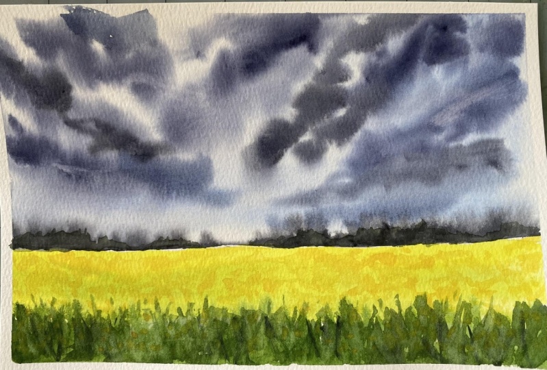
9. Day 1: Stormy Sky with Canola Fields: [MUSIC] Hello, hello. Thank you for joining
in and like always, I'm going to tape
down my paper on all four sides with the
help of masking tape. Here I have taped down my
paper on all four sides on this non-absorbing
board here I have used an acrylic sheet
board to tape down my paper and now to tilt
my paper facing down, I will be using a smaller sized masking tape
to just tilt the board as I have positioned
the board out here as you can see so that when
I start painting the clouds, the colors on the red background
start moving downwards. As already discussed in their elemental
composition section, I will be using two-thirds
of the paper for our sky, since our sky is the main subject element
in this landscape and the rest of the paper I will be using to create
a canola field. To create a horizon line, I have used this very
thin masking tape. Now I'm going ahead and layering my paper with a flat
wash of clear water. To lay an even coat
of flat wash here, I'm using my hake brush
from Silver Atelier series. Now you can use any broad flat brush that you have got and
do this process, make sure that your
paper is fully and uniformly wet before you start layering your
paint on the paper. Now here you would have observed that I have dipped
just the tip of my brush in water and I'm
trying to reactivate my paint. This would ensure that my
brush is not loaded with too much of water and I'm having
the right amount of paint, making the paint consistency
a little thicker, not runny or watery. Now, observe my brush strokes. I'm going ahead with some angled brush strokes at starting from the
right-hand corner. Before my paper starts
getting dried out, I will go ahead and quickly create my darker shades of blue, if you do not have indigo, you can use your ivory
black that you have got because it has
light brownish tinge to it and you can mix in any of your darker blues to create this darker mix for the clouds. My paint mix is ready now
it's time to paint clouds. I'm just using the
tip of my brush and some angled strokes to create this dramatic effect of the sky. Now here I will be using different tonal variation
of this darker mix. Sometimes I will just
go in and add in some of that cobalt blue with my mix. I'm not going to wash
my brush you'll see my brush is not too watery, the paint mix is at
the right consistency. It is not too watery, or runny because runny
or watery paint will eventually make this look faded out when it
starts drying out. Always remember and always keep in mind that
your clouds will start appearing more
smooth and have that dramatic look when
your paper is still wet. The moment your paper
starts drying out, you will be noticing that you will get some very dark edges, which will look
like some patches in-between on the paper. Try and do this step until
the time your paper is wet. It is very essential
that you know your paper right so
that you can time yourself and get
these things done at the pace where your paper will still allow
you to work on it. Towards my left
corner of the sky, you would have noticed
that I have left that white blank space. That's the area
where I'm going to show you guys how you can create that cloud burst effect when you have such dark clouds
hovering in your sky, especially at that left side. Can you see what I have done? I have used this
diluted paint mix, a little watery paint mix
and I've just layered it. Now, what I will do
is I will try to tilt my board this
way if you can, you can tilt it
downwards so that it looks that the clouds
have burst open and the partial area of the sky is holding onto the ground so that is what
cloudbursts means. I let that area be
because I'm really happy how that area
has turned out and my paper is still wet
enough for me to create some more cloudy effects
with the help of my brush. Just the tip of my brush. My brush is not
loaded with water, it is just damp for me to create those smaller utter strokes just with the tip of my brush. Now it's time for me to go ahead and do the
lifting technique. For that, I have just used
the tissue towel to dab my brush and remove the paint that I have
just lifted off. This would give that glow in between those darker
clouds, you know, and this would make the painting look much more
appealing to your eyes. It's time to begin a middle. In that meantime, our sky
will get completely dried, and then we can take off our masking tape from
the horizon line. I'm starting with
this intense tone of sap green color here to observe that I have not used too runny or diluted paint, I'm just going ahead with this intense pigmented values of sap green and my brush too
is not loaded with water. I am just going ahead and
using the damp brush. When it comes to
watercolor painting, exercising water
control is one of the very key aspect in
any watercolor painting. It can make or break
your paintings. That is why it is very
important that you know your paint and you know to
exercise water control. There is this water
control exercise which I have demonstrated in
my other classes, especially the one where I have released the
class on Skillshare, about painting 15 expressive
skies in 15 days. You can go check out the class. There I have discussed
in great detail about this water control and how it
can affect your paintings, especially when you are painting skies with dramatic clouds. To present the canola
flowering part of the field that I have
used, the lemon yellow. Now it's time to remove
our masking tape. Yes, the sky has
completely dried out. Now here I will again load my brush with this lemon yellow. Just see the water
control that I'm having my brush feels too
dry at the moment and hence I was getting those dry brush patterns so that is the way
that you would know that your paint needs
little bit more of water to be added to make
it flowy on the paper. You're making sure that my paint is not too
watery or diluted because it can start flowing into the sky
and ruin my sky. That is why I'm just
preferring to go with this color mix which is little
intense and concentrated, even though I have those
dry brush patterns. But just going to and fro
will sort this issue out. Now, we can again go ahead and create this layering technique
using our sap green mix. Now makes sure this time you use little watery mix than before. Now here on this wet background, I will be switching to
my size number two, silver black velvet brush, and mixing a little bit of
indigo into my sap green mix. I have got this darker
shade of green, which is closer to
that of shadow green, and just with some upward
strokes of the brush, I'm going ahead and creating these grass-like patterns for the foreground of the needle. [MUSIC] Looks like that my horizon line has dried out completely and
so has the sky. Hence, I'm going ahead
and starting to create this midground
element that I had shown in the elemental
composition section. I'll just go ahead and create these distant bushy
shrubs in the distance. Just using my silver black
velvet size number two brush and using just the
dabbing motion of the tip of the brush, I'm going to go ahead and create this vegetation over
on both the sides. Now, use a variation
of shapes and sizes. Do not go with the street
uniform [inaudible] because in landscape it is
never same symmetrical things. Go with a little variation
of ups and downs in this vegetation or growth and that is all with
that midground element. We will be very soon beginning to create some more details onto that canola field flowers using another little shade of cadmium yellow mixed
with lemon yellow. Now, this is totally
an optional step. You could skip cadmium yellow and just use your lemon yellow and on this middle part where we have painted
with this sap green, you can just go ahead and
create these dot-like shapes using just the tip of your brush and in
the distant needle too you can repeat
the same steps since you have used already a lighter shade of
lemon yellow to paint the distant horizon
fields of canola, you can go ahead and use
another darker shade of yellow to create the small
dots in the distance. I'll be showing you shortly how. Here I have used cadmium yellow to create
these smaller dots, and I'll be using the same
color mix to fill out even the distant horizon field and as I'm approaching
the horizon, as I'm closer to the horizon, I will be using very smaller
dots and dabs of my brush. Now, this is how our
field will look. Now using just a white
gouache mixed with sap green. I've created these
lighter tones. In-between these lighter tones, I'll just go ahead and use the shadow green mix
that I had created, mixing with indigo
and that is all. Here you go. Our paper has dried
out completely. I'm taking off the masking tapes from all the four
sides very carefully. Make sure that your paper
has dried out completely. To take off all these masking
tapes I keep on repeating this on each and every class because
this is very important. There were multiple
number of occasions where I have ripped out my paper because I was too impatient to wait for my paper to
get dried completely. Please do not do that mistake and wait for your
paper to dry out. This is how our
final painting looks like and I'm just
loving the contrast of the dark clouds with this
bright lemon yellow fields. I will meet you tomorrow again
with another dramatic sky. Until then, bye.
10. Color Palette: Day 2: [MUSIC] Thank you for sticking around
and joining me in Day 2. Let's quickly take a look
at the color palette. We are going to paint a
very colorful thunderstorm. I'll be showing you in a while the colors with their
pigment information. Now here I have along with me some shades of
yellows and oranges. It is not necessary
that you need to particularly stick
to those colors, but always make sure to go
with the pigment information. The first color that
I'm showing you here is permanent Yellow
Deep, which is PY83. Your names can be different based on the
brand that you are using. The next is Permanent
Yellow Orange which is PY83 and PO13. It is not the pure pigment, but a mixture of two, a one yellow and
an orange pigment. Now, the next is this
Cadmium Yellow Orange. Now you could use this too. This has a pigment
information on PY35 PO20, so either of the oranges
you can go ahead and use. Now in case if you do not
own any of these oranges, you can always use
your Scarlet Red, which has a PR pigment
of 48 is to one or PR9, or any warm red shade. You can mix it with
the warm yellow to create a warm orange shade. Now, the next color
is mineral violet, which has the pigment
information of PV23. Next is Crimson
Lake whish is PR83. Now instead of Crimson Lake, you can go ahead and use any permanent rose
color pigment too. Now, the next is
Permanent Violet. Now, this is optional in case if you do not own Mineral Violet, you can use your Permanent
Violet and mix a little bit of your Permanent Ross
or Crimson Lake to create a shape similar to
that of Mineral Violet. Permanent Violet pigment
information is PV3. One constant companion
that you would have for dramatic sky is your indigo
shade, which is PV66. Always keep it handy
in your palette. Now next, this color is
totally an optional color. You need not own this color. This is greenish yellow shade. When you mix your
sap green with lemon yellow or cadmium orange-yellow, you get this greenish
yellow shade. Now, this is a Sap Green color, which has a pigment
information of PG8. Now, you can create your own Sap Green by mixing your green to
your lemon yellow. Now, this is the
Prussian Blue color. Instead of Prussian Blue, you can go ahead and use
any darker shade of blue. Now let's quickly take
you through the swatching of all the shades
so that in case you do not own any of this
pigment information or it's not mentioned
in the brand's website, you can always refer
to the swatches and pick your colors
for the project. [MUSIC] I hope you have got your
color palette sorted by now. Keep your colors ready and let's dive into
our next section, which is our elemental composition
for our Day 2 project. I'll see you in the
next lesson. Bye.
11. Elemental Composition: Day 2: [MUSIC] Let's quickly get started
with our elements for our D2. The very first thing
that we're going to see is how we can paint
this dramatic side. We're going to go for
multiple colors for the sky. I have started on with my
permanent yellow deep, and then with some
of the scarlet lake, or if you have any bright
red, reddish orange, you could use that and create those streaks of
clouds over there. Now using your damp wet brush, you can just try to smoothen out the hard edges
that you have got. Here we are going with both wet on wet and wet
on dry technique. The first thing that I had
started was with wet on dry, meaning I had led my wet paint
on the dry paper surface. Now to give a little
bit more intense, dramatic look to our sky, I'm going to go with
my mineral violet, a little intense and use
just the tip of my brush to lay the intense color on top of the first layer that we had gone for that layer
of the cloud. Did you see that? Now,
I'm going to show you here a trick how
you can create that cloud burst effect using just your wet diluted paint
on the wet background, or just adding little bit
of your damp, wet brush and letting the colors flow
across the paper downwards, so that it looks like the cloud has burst open and
it is raining. This technique can be done
using your round brush, but you need to have a bigger sized round brush so that the belly
holds more water. Or the very same can be
done using a hake brush, which is just the perfect
way to do this technique. In case if you're an absolute
beginner and are not aware of the basic
watercolor techniques like what exactly is wet on wet, wet on dry, layering, blending and bleeding, etc, then I would request
you to go check out my other Skillshare classes. For example, my class on
watercolor sunset seascapes, where I have described in great detail about all these
basic watercolor techniques. Or you could go ahead
and check out my class, 15 days of expressive
watercolor skies. Now let's move on to
our second element, which will be the
misty mountain, which is our midground element. This misty mountain, will be
apart of our main project. I will also be showing along with this
misty mountains some other elements that you
could add to your landscape, apart from just the
misty mountains. Misty mountains is
nothing but going ahead with the layering
technique in watercolors, along with some tonal variation, just like how we paint in
monochrome landscapes. We start with the lightest
value for this background. Then as we start
coming closer to the foreground we increase
the tonal values. That is, we go ahead with
intense layers of colors, just like how I did
for the mountains. Here is another example of the other supporting elements that you can add
to your landscape, such as a road along with
the shrubby sidewalks. For the road, I'm going to go ahead with wet on dry technique. I'll start with an intense tone at the corner
curvatures of the road, and as I come to the other curvature I will
start to fade out the colors. The center part will be little
lighter than the curves. This is how you can add a realistic draw
to your landscape. Now going with the sidewalk. Now for the sidewalk, I will start with intense
tone and then feed it out using my damp diluted
watery brush. Now if you have
observed roadways, all the national highways or state highways will have
greenery all around them. That is what I'm going to add along the
sidewalks of the road. You could add some sap
green along the sidewalks, that is the fringes
of the sidewalk, and start with the
diluted lemon yellow. Since we are working with
wet-on-dry technique, use little watery paint for
you to allow the colors to flow on the paper without any dry brush strokes
seen on the paper. Now this is how you can do it. Use variation of greens and yellows and lighter background, and use the darker
tones for adding some trees or tree-like
silhouettes in the foreground. [MUSIC] Now my road
part has dried out, so with the help of
my Gelly Roll pen, I am going ahead and creating this center line that you
generally see on the road. The center line, white demarcation that
you have on the road. Either you can use a Gelly Roll pen or
your white gouache. Now my paper has
dried completely, I was waiting for the
sky to get dry to add in the last element
which is a thunder. For the thunder,
you can go ahead and add it with the
Gelly Roll pen. But this is one way that
you can add your thunder, but you can also do this step when your paper is
just about drying. That is when it is
little semi wet so that it blends beautifully
into the background. That's all about the elements. I'll be showing you
in much more details about all these things
in the final project. See you over there. [MUSIC]
12. Day 2: Evening Thunderstorm -Part 1: [MUSIC] I hope you have prepared your colors, and you are ready to
kick-start Day 2. Let's begin. The paper that I'm using here is 100
percent cotton, 300gsm is the thickness
from the brand Fabriano. Now, I'm going to
stick it firmly on all four sides
using my masking tape. Using a smaller sized or
a thinner washi tape, I'm going to use that
as my horizon line. We will begin with the sky. As you can see, two-thirds
of our paper is our sky. The remaining half
is our land area. I will begin first with a
flat wash with clean water. We will be going with wet on wet as well as wet on dry
technique for the sky. Whenever you are going
with this first coat of water on your paper
for wet on wet technique, make sure that your paper
is uniformly coated with water on all
corners and the sides. Now, let's start. I begin by spreading out the indigo across
the paper slanted, see the brush strokes. I'm starting from the
corner and moving in to the center of the
paper with just the tip, using some random motions
of my round brush. Now, I will be mixing some of that mineral violet
with my indigo and will go ahead and paint some intense dark clouds
on this top part of a sky. Look at the brush strokes
that I'm creating out here. I am using sometimes
just the tip and sometimes the whole
belly of the brush. Now, use varying pressure
when doing this because you need to make these clouds look dramatic and intense
at the same time. By varying the
pressure of the brush, with slight release from
your wrist or fingers, you will be able to create some beautiful strokes
of these clouds. Here, try to observe the paint
mix that I'm using here. My paint mix is not too watery. This is the reason why I'm able to create those
intense, dramatic look. If the paint mix is too
runny or too watery, your paint will
start flowing across the paper and the colors will start blending and
mixing together. In that way, you will
not be able to create this definite shape that you
would want for your clouds. [MUSIC] That area looks too
much with colors. What I will do is, I will go and use another wet damp brush
and I lift out some of the colors from there using just the tip
of my damp brush. Using my damp brush, I'm just going to
blend this lower part of the clouds so that there
is no hard edges formed. Now, it's time to paint
our lower part of the sky. For that, I'm going to go ahead with my Naples yellow mix. How you can prepare
your Naples yellow by mixing yard yellows
with white gouache. By adding more of
your white gouache, you will be able to turn your color to a more
[inaudible] shade. Can you see the dry brush marks? I'm going to fix it by using my damp brush and going over
those areas once again. Now here I'm going to go ahead and layer my
crimson lake color in some strike like patterns on this lower
part of the sky. Now, I will create a group
of clouds over there. We are using my mineral violet. Mineral violet and crimson
lake really go well together. You can just go ahead and use these colors together to
create some dramatic clouds. Now here, my paper has started
to dry out pretty soon. I'm going to re-fix those
areas by simply blending it into the background
using a damp brush. Here, remember I'm
using a damp brush, not too watery brush. Now we will start our center part of the sky and create
some more dramatic clouds. Here, when you go ahead, create a little watery paint
mix here, I'm saying little. Observe my color palette
over there and the brush, my brush has no too much of
watery or runny paint mix. Always make sure that you have the optimum consistency
of your paint mix. Do not use too runny, too watery and not
too intense as well. Just try to get a hang of how your paint mix should be when
creating these landscapes. You can go check out my class
15 days of watercolors, expressive skies where I
have shown in great detail what really could
happen when you use too watery or
too runny paint. Now, I'm switching
to my hake brush, dipping it in water and
making sure that there is not too much of water in it by
dabbing it on tissue paper. Just using dabbing
motion of the brush, I went ahead, and now I am creating this long slanted strokes from that area,
pulling it downwards. This would look
that it is raining, that the cloud has burst open. In between, I will just
go ahead and dab with just the tip of the
brush using some of that indigo paint
mix just to create extra drama in that
sky or the cloud, an extra layer of
colors in the clouds. That is how you are
going to do it. Now, I'll go and repeat the same process from the
bottom part of the sky as well. Just do this process
very slowly and gently without applying too
much pressure because in that way you will be
lifting out the colors. You do not want to
lift out the colors, but to gently pull
the colors down. This is the reason why I have chosen my hake brush
to do this step. This is because hake
brush is made up of very soft goat hair, natural fiber, which holds
lots of water and is soft. This will facilitate you to achieve this step
much more smoothly. Using my damp brush, I'm going to lift out certain areas from the
darker group of cloud. Why? Because when a
lightning strikes, a part of that cloud
will be eliminated. Just to create that effect, I'm going ahead and lifting out certain areas and
certain portions, random areas from that cloud. Now, using just the damp
freight tip of my brush, I'll go ahead pick up
some of that indigo, and I'll gently start creating
some clouds over there. Now, do not do this step if you feel your paper has
dried out completely. My paper was wet here, so I went ahead and
have done this. Now, using my damp hake brush, I'm going to pull
down the colors. Next it's time to paint thunder. For that, I'm squeezing
out some white gouache. Now in case if you do
not have white gouache, you can go ahead
and do this with your white watercolor
paint as well. Just remember to use a
thicker consistency of your white watercolor paint so that it is prominently
shown on the paper. Now, using a mini
detailer brush, I'm going to paint this thunder. It's very simple, let us just a crooked zigzag pattern that I'm going ahead and
creating this thunder. Here, just remember
that you need to have very thin
lines when you are approaching towards
the horizon line because if you have
observed thunder, you would have noticed
that when it starts, it is more prominent, and it fades out when it reaches or touches
the Earth ground. That is what we are
doing out here. You may paint your thunder when your paper is
still semi wet, and that way you will get
some very nice blurred lines. It will look really nice if
you try that out. That's it. We're done with the sky. Now, leave the paper to dry and then slowly takeoff
the washi tape.
13. Day 2: An Evening Thunderstorm- Part 2: [MUSIC] Let's continue
with the painting. Our paper has dried
especially the sky area, and we have removed
the washi tape that we use to create
that horizon line. We have got that perfect
straight line. Can you see? Either you can follow
that step or you can use your pencil outline and use that as your separating line between the sky and
your land area. Now, I'm going ahead and
creating these misty mountains. I'm going to go ahead
and use a technique which is known as the layering
technique in watercolors. I will start with the lightest tonal value of
my mineral violet to denote this furthest
mountain range which is almost fading out
in the background. Then I will be creating a
second range of mountains with little more intense tonal value then background mountains. I'm here trying to fix and
create some little peaks of those mountain ranges because right now it
is looking very flat. I'm just going ahead and using just the tip of my brush
creating these peaks. Next, I'll be starting out
with my second mountain range. This time I have
mixed little bit of my indigo and my maroon violet, and this is the resulting
shade that I have got. It's little darker ray. It could be similar to that of permanent violet
that you have. I'm just going to go ahead and create these peaks
of the mountains. You may try to
create these peaks bigger or smaller than the background mountains
that's totally up to you. [MUSIC] Now using
a very damp brush, what I'll do is I'll just
try to make these colors flow a little down and I
had messed it up a little. I'm just going to refix
those areas again. Just do not try to go over and over those areas because here we're working
on wet-on-dry. You will be lifting out the
colors in certain sections. Remember to go with
little watery paint at the very first core
and then do not keep going again and
again on that area. Now, we were a little
bit of Payne's gray. I am going ahead and creating
this foreground mountain. [MUSIC] I think I'm satisfied with how my foreground
mountains are looking. I think it's time
for me to start with the vegetation or the
growth on these mountains. With just the tip and dabbing motion with random strokes, I'm going and creating
some foliage lake shape to denote the vegetation or the plant growth on
these mountains. When you are creating
this foliage, you do not go with two running
or watery paint mix of indigo or Payne's gray or there might be chances that
you will get some big, big blotches or dots
of paint over there. Always remember to go with
the little thick consistency of the paint when you are doing this foliage or
tree-like shapes. I'll maybe add one more out here just to keep this
tree here company. Now, I'm going to add few
more to my right as well. The liner that I'm using here is from the
brand stationary. It's a local Indian brand, but I really love these brushes. They are very sharp and pointy. It's very great to do this fine detailing and that is all. I'll let the paper dry now. The paper has dried
up completely. Now it's time to peel out our masking tape
on all four sides. Always wait for your
paper to dry out completely and then peel
out your masking tape set in 45-degree angles to ensure that you do not
rip out the paper. [MUSIC] We have got perfect three saves and here
goes the last one. I'm crossing my fingers and yes, we have got those
perfect clean edges. That's all for today. I'll see you again with day 3. Here is a little sneak
peek for you guys. We are going to paint this
fierce tornado in day 3. I'll see you in the
next lesson. Bye.
14. Day 3: Color Palette: [MUSIC] Welcome to Day 3, we are here to look
at the color palette, and swatch out the colors, so let's quickly introduce
you to all the colors. The first color that I have with me is cadmium yellow orange, which has BY35, and PO20 as their
pigment values. The next is raw sienna, which is light fast color, and it is PR101. The next is burnt sienna, this too is a very
transparent color, and this is the bond form
of the pigment PR101. Next will be our indigo, which is PB66, now the indigo has been regularly used in
all the projects. The next is mineral violet, we have used this for our
second project as well, PV23 is the pigment information. Last but not least,
Payne's gray, which is again a combination of mixed pigments, PB66 and PBk31. That was all about the colors. Now, let's quickly take a look at the swatches of these colors. Now, I have been repeating this, I will repeat here once again. I'm swatching out for the
sake of those who do not have tubes or they do not have the pigment information
available with you, so in case if you
are one of those, these swatches will
help you to identify similar colors in your palette. We are almost done
swatching the colors. I think we are just left with two more swatches of
indigo and Payne's gray, and with that, we will be
done with the swatches. I will be meeting you again at the next section where I'll be discussing the techniques and the elemental composition
of our project. See you in the next lesson. [MUSIC]
15. Elemental Composition: Day 3: [MUSIC] Are you excited to paint with me a tornado? Come on, let's get into it, get your colors ready
and let's jump into this elemental composition where I'll be showing you techniques, how you can paint a tornado. Here I'm going to show you
a very simple and easy way, that is by going with
wet-on-wet technique, and going with
wet-on-dry technique simultaneously and
layering process. But in our main final project, I will show you
how you can create that intense dramatic look with layering process on wet-on-dry. Let's get started. Always remember that most of the tornadoes originate
into a funnel shape, narrower at the base
and broader at the top, so that's how the
shape of a tornado is. I am here going with
the base of the sky, which I'm going with
the shades of brown. Since here I want to depict that the tornado is sucking
in on the ground and it is creating the whirlpool of sand and the other soil
particles and it is going up, that is why I'm painting
the sky with brown, denoting the soil of the earth. Using the same burnt sienna mix, now I'm going and creating the funnel
shape of the tornado, I'm making the shape little
inclined towards the right. That is like denoting the direction or the
movement of this tornado. Now, here, one side of the tornado will be darker
than the other side, denoting that one side, it is not receiving light, and the clouds and
the other particles which are just sucking in is not allowing the light
to pass through it. So that area will be the
darkest part of the tornado. I'm trying to create the shape filling in
colors in the shape, here I'll start with
the darkest part, which is towards the right. So here, it's just about
your brushstrokes, you need to understand your
shape of the tornadoes, so I would suggest you Google some of the
images of tornado. Try and study, through, tornado, especially how the shape occurs and inside through
whirlpools of the tornado, there, you will get
the idea how you can go ahead and approach with different techniques
and watercolors. In painting or in art, your observation skills play a very important role because when you observe
things in your mind, you try to break down that image into techniques
that you are well aware of. That is how you can break down a composition and try
it in your own way. Now, did you see what
I am trying to do? I'm trying to
create here swirls. Now, my swirls are
from right side of the tornado going into my left, that is how we are
going to create that windy whirlpool of tornado, which is getting broader
and broader at the top. Use just one direction, if you are going
from right to left, use only that
direction or if you want the tornado to sway
from left to right, use the other way. So it's totally up to you, here I'll be showing
you from right to left. Though I started the process
with wet-on-wet technique, my paper is almost
about drying up. Here you can see
the colors are not spreading so it is almost
we're working wet-on-dry. I'll try to blend out
those hard edges. Now, I'll be starting with the building layers for that intense clouds at
the top of the tornado. For that I'm using my
intense dark shade of indigo and I'm trying to
blend it out towards the broad funnel of the indigo. Did you see I'm using
tonal variations of dark and light colors to bring out depth
because in a painting, you cannot do
everything too dark, it will not look appealing
to your eyes because it will be all very dark
and it will look flat. So in order to bring out
that 3D vector dimension, you need to go ahead and use some lighter values
and darker tones. Now, my base layer of
tornado has dried out, so I will go ahead
and layer it with a darker shade of
my mineral violet, indigo and burnt sienna mix, and wherever needed,
towards the left, I will lift off some of the
paint using my damp brush, not too watery brush
as you can see, I'm just trying to lift out
some of the areas over there. So that is where I
will be indicating that all the particles and the clouds are striking
against each other, producing friction which
is resulting into thunder. You can paint in
those wider gaps, thunder emerging out, that's the main idea. Now, I'm creating this whirlpool at the base of the ground. Okay, so for that, I'll be going with
wet-on-dry technique, and those hard edges, I'll be smoothening
out with a damp brush. Now, here at the
base of the ground, you can go ahead with tonal
variation of raw sienna and your darker shade
of burnt umber, or burnt sienna, anything which you have got in your palette. Towards that base
of the tornado, I will go add some darker tones of indigo into the browns, and I will be now
blending it again with a damp brush just to
create more drama near the base that
everything is getting whirlpool and sucked in into the tornado, that's the idea. This here is more often
impressionists style that I'm showing you out here to give you a rough idea how we are going
to approach this subject. But in the main final project, we will see it in very
much details about how to go and really create
a furious tornado. It's almost taking its form, now with just a damp
brush I'm trying to move around the soil particles
over there, did you see? There is no base of the
tornado that we can see, it's though sandy
whirlpool storm that is going on at the base, and I'm going to
prominently paint the ground surface
with little bit of darker tone of burnt umber, and going ahead again with that soil particles because
I think when it will dry up, it will dry out to be faded. That's about it, and that is how we are
going to create a tornado. I hope you guys are
excited to do this. Let's jump start and go create our tornado in
the final painting.
16. Day 3: Tornado Hits Part 1: [MUSIC] Hey, guys. Welcome to Day 3. I'll be starting with
a quick pencil sketch, a basic outline for our
tornado and the land area. Starting out with the land. Then I will be
creating the tornado, which will be
narrower at the base, and then it will be
broader at the top. This is going to be a
funnel-shaped kind. Roughly somewhat like this. Now I'm going to smoothen out those curves a little bit more. I'll be now marking
certain areas where the main causing whirlwind
of the tornado will be, so it will move
from right to left. I just temporarily marked that. Once you are done with it, the top part of the sky is
going to be much dramatic. Then comes the tornado. I will be taking
the direction of the whirlwind from right to
left as discussed earlier. That is how we are
going to go ahead, and now I'll be layering
flat wash of water onto the entire paper because I want the clouds not to
have the hard edges. It becomes really tricky
to fix those hard edges. Whenever you are going with
this flat wash of water, always make sure
that you go with broad strokes covering
the entire surface of the paper,
especially the corners. Make sure that you do not
use too much of water. You use your flat broad brush or an hake brush to
evenly spread out the water throughout
the paper surface that you want to go with
wet-on-wet technique. During this process, when
your paper starts bulging, this is the sign that the paper has started
to absorb the water. Next, I will be starting from the base of the ground
and move upward. I'm starting with my raw sienna. Now, if you do not
have raw sienna, you can go ahead and use your burnt umber or
raw umber as well. This is how we are
going to go with it. You'll observe the tonal value of the raw sienna
that I'm using. I'm going with a very
lighter tone first, and then we will be
building up layers, increasing the intensity
of the colors gradually. Now taking some burnt sienna and going with the street strokes just with the tip of my brush. Now, I have mixed some
indigo with my burnt sienna, and I kept that color mix ready. Now on my left, I'm going to start with some cloudy shapes
using that color. [MUSIC] Now I will start working
with intense tonal values of my shades of burnt umber and
burnt sienna just like this. Look how I'm trying to create those cloud movements
out here with just swaying circular motions
from the tip of my brush. Now, I'm going to mix a
little bit of mineral violet and my burnt sienna
or burnt umber mix. I will create this
perylene violet mix. But when you add more of browns, it will have that
violetish undertone to it. I'm going to use that to paint further the top
layer of the sky, but I feel my paper
is drying out. I'm just going with once more layering the paper with
flat wash of water, making sure that I
have uniformly coated all the areas that I
feel has dried out. One tip for you
guys to know if we have covered each and every part of the paper is to tilt your paper and see
the reflective sheen. Based on the reflective sheen, you will know where there
are some dry spots. My paper has now been covered
with flat wash of water. Now it's time to start
painting our dramatic sky. I'll be layering it with tonal variations of
browns and violets, trying to prepare my color
mix well ahead so that I do not have to go and prepare the mix when I'm
in-between painting. I'm starting with the swirls, which is moving
from right to left. Now I'm going with this
medium tonal values and some very lighter values at the top corner most
part of the sky. You can see my strokes, these are long and streaky kind. Now, using my indigo mixed
with a little bit of brown, I'm going to go with the swirls
again from right to left. Now, when you are going these, use some broader brushstrokes, use the belly of your brush, starting from the tip, then drag the brush belly
and then create the strokes. Using the same color mix, now I'm going to go ahead and create some dramatic clouds, making those swirls more
prominent from left to right. Now, I'm going to use another
damp brush and try to blend out those areas where I feel there are some
hard edges forming. Now with the other brush, I'm going to drag the brush
creating some more strokes. This is how I'm going to create the drama using mix of indigo, that brown and violet mix. This is how we are
going to go and paint. But make sure that your paper remains wet
because this is very crucial or else you will start having some very
nasty hard edges. Now keep observing my
brush movements and the usage of different
tonal values of colors. Somewhere I'm going
with lighter shades, somewhere I'm going
with darker shades. This is how you can create the dramatic effect
in your skies. Now, if you have noticed, I will just be going
with some more of that violet at the
mouth of that tornado. All my cloud strokes are
released upwards direction, if you have so noticed it. As you can see, I am
here using two brushes. One, where I'm layering
the colors using my size number 12 brush and
the other damp brush to lift certain colors to create
those white pockets so spaces and to lighten certain values
of the darker shades. Now, starting from
the top, again, I'm going to go ahead and start making this dramatic
clouds using the same mix of
indigo and my sienna. This is how I'm going to go
ahead and create the strokes. Look at the brush strokes
that I'm creating out here. [MUSIC] I am able to understand that my paper has started to dry out. I'll just quickly go
ahead and start creating some more clouds using my
purple plus burnt sienna mix. So keep creating these strokes. But do not overwork. Try to retain some
whitespaces as well because that will give more
beauty to the painting. [MUSIC] Now towards the left, do you see that space where
I have left certain gap? I'll just go using
my hake brush. I'll try to pull down the
colors from the darker shades. Because my paper has
started to dry out, I'm noticing that
certain areas or colors are not blending
properly into the background. For that, I'm going
very soft handedly with the damp tip of my brush
reblending those areas. Can you see the hard edges
which is being formed? Very lightly go over those
areas using a soft tip of your brush and softly try
to resoften those areas. Now starting with the main piece that is painting the center
part of the tornado. I'm going to go
and layer it with the base coat of mineral violet and a
little bit of indigo, very light tone of indigo in it. You can see now, I'll be going ahead with that brownish mix at the
mouth of the tornado. Since my brushes already
offloaded the intense values, now what I have is
the lighter values. Using that and taking
that as an advantage, I'll go and create the
shape on the left side of the tornado and
using a damp brush, I'll try to create some
whiter spaces in-between. Now, I will go ahead and add certain more layers and
depth to the tornado. Here you can see my
paper has dried up, but anyways, we are going to go ahead and do this on
wet-on-dry technique, so I'll be switching to
another size number 8 brush and gently try to
soften out the edges, making it some lighter tones. Now I'll be going ahead and adding some more of
that burnt sienna into certain areas to create that sense of depth
in the tornado. I'm layering this
burnt sienna from the base and taking it upwards because the base has
the sand particles and that's why I have used
burnt sienna to indicate that. I'll be lifting out certain
areas at the mouth of the tornado using my size number 2 silver
black velvet brush, use a damp brush. A water droplet had fallen. I will go over that
area with third round of layering using my indigo mix. I have not used full tonal
or intensity of my indigo, just a medium tonal value. I'm gently layering the colors. Be very careful when
you do this step, you should not be
lifting out the colors. You'll have to gently stroke down the colors onto your paper. Do not try to put too much
of pressure on your brush. In that case, you'll be lifting out the colors
rather than laying. We'll be repeating
the same steps using my damp brush size
number 2 and lift out certain areas just to create certain whitespaces in-between
those darker clouds. Now it's just entirely the game of layering the
colors one by one, letting the base
layer dry out and then going ahead and
starting with another layer. I'm going now layering certain indigo shades on
the top of that tornado, that is the mouth
of the tornado. Now you can see my paper
has started drying out. This will be a little hard. I might have to rewet
certain sections, especially the top
part of the paper, so that my blending is proper and no hard
edges are formed. I will be, again, repeating certain steps that is lifting off certain colors and
retaining certain whitespaces. That's it. I'll
meet you in Part 2.
17. Day 3: Tornado Hits Part 2: [MUSIC] Let's continue back. I'm going to go ahead
and smoothen out those edges and I'm trying
to revert this area. Particularly the lower part
of the sky once again, because as you can see, the colors have faded out
much than I expected. I'm going to go and layer
some colors all over again. Since I have wet
this area, again, it would be easier for
me to create that soft, smooth blends that I wanted. This time I'm going
to go ahead with rich and intense
tones because I do not want it to fade
it after drying. I'll just go ahead with some rich tones and
that's all about it. Same I'm going to repeat
on the other side as well. From this part now on, it is going to be all about
the layering process. I'm going to make this sky
look little bit more intense. As you can see, since we
worked on wet-on-wet, our sky has faded out
to be a lot lighter. I want to make it a
little bit more dramatic. I I go again and
redo certain areas, but making sure that I'm using
a soft damp brush to doing so and using or exerting
gentle soft strokes. Do not use too hard
strokes with your brush, you will lift out the colors. Now, during this
layering process, you might be covering up those white pockets of
spaces that you had left. The trick is to use a damp
wet brush and remove or liftoff the pains
from the areas that you want the whites
to be retained. Now, I'm going to go ahead and create more dramatic flowers on the left side of the paper. Here the paper is
still somewhat wet. It is semi-wet
situation over here. I'm just going to use my softer silver black
velvet size number 12 brush. With a very little damp, watery strokes I'm going
to do that sky once more. Makes sure it is not too watery or else you will
really ruin the pain. Wherever you are getting
those hard edges using just the damp
tip of the brush, blend out the areas. I'll be lifting out
some of the areas at this top section as well, because here I want to create certain whitespaces
or white gaps. Now I'm going to layer
a little bit more of my mineral violet in
that funnel of tornado. I'm starting with some areas where I want the thunder
and lightning to come out. Only on those areas I have
went ahead and use my purples. The final area is drying up. In the meantime, I
will be going ahead and trying to create
the dust cloud, which will be at the
base of this tornado. For that I'm using my raw sienna mixed with a
little bit of burnt sienna. Here I'll be using some of
that indigo as well and try to pull the colors up into
the funnel of the tornado. The right side of
the tornado radius has already started fading out. I will pull in the
colors over there as well using very
soft light strokes, gently trying to move
around the colors. I'll be redoing that
entire section, creating more dramatic and
intense look at that area. I'll be switching here
to my broader brush, that is size number 12
brush and I will start creating the shape of the
clouds using indigo mix. Now, make sure you use
little watery paint. It should not be too
intense or else you will get start getting
dry stroke patterns. Now, I will try to
fix those spots or areas by lifting out
some of the colors from there using
the same strokes. This whirl strokes, this is actually the wind which
is moving the clouds. That is why it is
essential that you have some lighter values also to denote the passing or the moving clouds
in that tornado. Now moving on to creating the dust cloud at the
base of the tornado. For that too, I'm going
with wet on dry technique. Here too layering process
will be involved. Keep watching, I'm going to go with different
tonal variations. Some adding darker
and lighter tones to this part of the ground. I'll be trying to blend out those areas using just
a damp brush and you can see the colors flow smoothly into that
wet background. Now, I will be creating another layer of dust
cloud over there. Just add the base of that funnel where the tornado
is actually originating. Use a mix of burnt sienna and a little bit of your
indigo, or Payne's gray, whichever you have
got and try to soften the edges using the
tip of your damp brush. Now using just the tip
of the damp wet brush, free the brush tips and
you will get this strokes. Load some more of
that burnt sienna and try to dab it on
that wet background. It will look like
the soil particles are swirling into the air. Now we'll create the ground which is closer to
the foreground. For that, I'm going
to go ahead with little bit of intense
tone of burnt sienna. Then I'm going to
fill that area using the same technique what we have done for the misty mountains
in day 2 project, remember. I'm going to add the intense tones at
the very first layer. Then I'm going to slowly blend it in with the help
of a damp wet brush. This is how it is
going to look like. I'll come back again to
that base of tornado. Here I'll just add in that darker mix of
brown and indigo, here over there
just a little bit. Do not worry this hard
edges will not be visible. I'll start to blend it with the damp wet brush and
this will be gone. Right there at the base of the funnel it is looking
a little intense. I'm just going to
use the Fred tip of my damp brush and I'm
just going to spread it out. It's now time to paint some shrubs here
at the foreground. I'll be using the
brush and strokes, which is like inclining
from my right to the left, just like how we did those swirl or the radius of the tornado. Because it is windy. All the shrubs are moving in
the direction of the wind, swaying in that direction. That is what I'm trying
to present out here. I'm almost done
creating the shrubs. Now I will go back
to the top part of the sky because it
has really faded out. Now using my size
number 12 damp brush, I'm just going to load some of that indigo color and I will try to create some
more dramatic effect. Here you need to be
a little patient. Or instead what you can do, you can lightly go ahead
and re-read that area using your hake brush or your broadest flat
brush that you have got and try doing this step. Now, when you are re-wetting
the paper or area, make sure that you are not
lifting out any colors. Do it very softly and gently. This is how it looks at
the end of that process. It is little time consuming, but layer by layer, if you start doing it, you will come to this stage. Do not lose out on patience
and always remember to use very soft light strokes so that you do not
lift out colors. Now using some white quash, I'm going to paint the
thunder in-between those purple white spaces
that we have left. Just to add them out
of that tornado. Over there, I'm going to
paint this thunder using the same technique like I
had shown in project 2. Small thin lines emerging out. For thunder I've switched to my mini detailer brush from stationary because it
has really nice thin, pointy tip and the
bristles are really nice. I get this smoother
thin lines at the end. I really love using this brush. That's how we're going to do it. We will paint three thunders emerging out from three
spaces that we had left. Our paper has dried already, it's now time to take off
our masking tapes finally. It was a long, tedious process. I know, but keep your
patience and you will love the end
result or outcome. We'll be taking off the
other side as well. I hope I get smooth,
the clean edges. I'm just crossing my fingers. Let's see what it is. The third one is about
to be peeled out. Yes, I have got
some clean edges. I was little worried because we were too many times wet-on-wet, but it looks like all is well. Yes, I have gotten
clean borders and I'm really happy with the
outcome of this tornado. Do try it out and upload your projects in the
projects gallery section. I would love to watch them.
18. Day 4: Color Palette: [MUSIC] Hello, welcome to Day 4. Let's quickly take a
look at the colors that we are going to need
to create a project. The colors that we are
going to need are, first I'll be showing you blues. The first one here
is phthalo blue, which has the pigment
information PB29. Next, is our Prussian blue, which has pigment
information of PB27, followed by indigo, which has a pigment information of PB66. Now instead of indigo, you can use any
other darker shade. Next is sap green, which is PG7, followed by a leaf green color, which is an optional color. If you have, you can use it, which has PY74, PG7, and PWC6 as the
pigment information. Next is lemon yellow, which has a pigment
information of PY81. Now when you mix your lemon
yellow along with sap greens, you get a color similar
to that of leaf green, followed by Scarlet Lake, which is a orangeish red color. Now, this has pigment
information of PR48:1 and PR9. Permanent yellow,
orange PY83, PO13. Lastly, mineral violet, which has a pigment
information of PV23. Now let's quickly
swatch out the colors. In this particular landscape, our main focus will
be our rainbow sky and that is the reason I
have chosen these colors. Our main sky will be
created with Prussian blue, a little bit of phthalo blue, and indigo so that when
we paint our rainbow, the contrast is
vividly brought out. Swatching out my
greens in monsoons, greens and blues really
go hand-in-hand together. Next is another
substitute of sap green, that is this leaf green. Now you can always mix your
two parts of lemon yellow and one part of sap green to create this leaf green color. Now, next is scarlet lake. Now this will be used
in the rainbow colors. Next is orange, followed
by mineral violet. Now these are all
our rainbow colors. Now, I'll meet you again in the next lesson where we will be learning techniques and or elemental composition
of the landscape.
19. Day 4: Elemental Composition: [MUSIC] Starting with the first
element that is a sky, I'm here working with
wet-on-wet technique. Lay a flat wash of water, pretty wet your paper and
then start with the clouds. For the clouds, I'm going
ahead and using Prussian blue for painting the mid and the
lower clouds and at the top, I'm going to darken it using some intense
tones of indigo. This is how you can achieve
a dramatic look to your sky. This is just an example out
here to give you an idea how we are going to approach a sky for the final
main project. I'll tell you in details about all the steps
in the final project. Now, getting started with
the mid-ground mountains. For this, I'm going to go
with wet-on-dry technique. For the wet-on-dry technique, I'll be using this
watery mix of sap green. Here too I will be using some darker as well
as lighter shades, I'll be using some
browns as well. Now, this is totally optional
if you want to use browns, you may go ahead and
use some browns or else use a contrast of dark
green and your sap green. Now, behind this
foreground mountains, I'll be painting some
blue mountains as well. So use a watery mix
of Prussian blue, but makes sure it
is not too runny. So the third element is a lake, but unfortunately my
camera went out of battery and I realized only
when I finished painting it. Do not worry the lake is fully explained in detail in
the main final projects, so you have nothing
to worry about. So let's take a look
at the fourth element, which is raindrops
and the ripples that it causes on a
still water body. So here I'm creating a
background of the lake, so I'm here going with
the wet-on-dry technique, now I will gently blend those
colors using a damp brush. Now here at the base you can see my colors are really light, so here at this point, I'll switch to our
mini liner brush and with the help of its
fine and pointed tip, I'm going to paint
here this drops and the ripples
surrounding those areas. So can you see my brush strokes? So use some smaller circles as well as some
bigger circles in nearby the surrounding areas to create that effect of
the ripples in water. Next coming to our fifth
element and the final element, which is our rainbow. Here, I'm going to show you one brushstroke technique
for the rainbow. So arrange the colors in
line using the word VIPGR. So you will know the
schematic arrangement of the colors and
create this shape. Now if you use too watery paint, like me out here, you will get this
smudgy rainbow lines, if you want that kind of
look to your rainbow, you can always go
ahead and do the same or else you can paint single strand of
this rainbow colors with the help of a
size Number 2 brush, or size number three brush. So this is how you
are going to go and fill in the rainbow with
each and every single color, makes sure that your
brush is not too watery, lift the individual colors
like the intense tones and start layering it
where you had stopped. So this is how you will get the final look of the
rainbow you painting, single, by single
colors of the rainbow. There is another way
by which you can do this one stroke technique
for the rainbow, that is with the
help of your sponge. So what you can
do is if you have any blender sponge
or any sponge, you can start layering the colors in the
VIPGR arrangement. Use your round brush and
make sure that you are using some little dilute mix of your pain because the sponge
needs to absorb it right. But always test it out in
a separate piece of paper, then you go and do it
in your main painting. So for the brush
you can either use this flat brush or an angle dagger brush anything
that you have got.
20. Day 4: A Thing of Beauty Part 1: [MUSIC] Welcome to Day 4 and today
we are going to paint a very beautiful landscape with the lake and the rainbow,
let's get started. The very first thing
that I have done is used my washy tape, which is a very thin one, and use that to denote
my horizon line. With the help of my pencil, I'm going to create
some rough outlines of these hillocks or mountains
which are in the mid ground, which will separate
the horizon line, especially the lake and the sky. The mountains which are closer to the horizon I'm going and creating some short ones
and the background ones, I'm going and creating
a little bigger ones. Observe my pencil sketching, view this point entirely, to help you with the
pencil sketching, pause the screen when you feel that you are ready to
go with the sketch. The pencil sketch looks good, now at this point, we will start by pre wetting
the paper for our sky. We are going to go wet on wet technique for the
sky but before that, I'm going to erase some of
those pointed tips from the mountains so that it looks like the clouds are passing
through the mountains. That is the reason
why I erased them off, let's get started. First, I'll be
layering the paper or pre-wetting the paper with
a flat wash of water. I'm using here my hake brush, if you do not have a hake brush, use any broad, flat brush that you have
got and do this step. Ensure that you are
layering a uniform coat of water through all the sides of the paper where you
want to paint the sky. Until you are done
layering this flat wash, we will start out with the sky. For the sky, we are going
to paint nimbus clouds and the colors that I'm
going to use is Prussian blue and indigo. Here I'll be going with two
tonal values of colors, especially the blues, I want the sky to look
the typical monsoon sky, which you see along
with some greens. I'll be using some darker tones of indigo as well as
some lighter tones, of Prussian blue to
show that effect. Here, try to observe my brush
movements and this brush movements will help you to get that dramatic effect
in the clouds. All this was described in
that clouds study section, which I have included
in this class. In case if you missed
missed it out, you can always go
back and refer to that section where
we have discussed about the types of
clouds and have done a quick cloud study session where we learn to paint six
broad categories of clouds. Just above this mountain areas, I'm very soft handedly spreading out the
colors, can you see? But when I'm going the
center of the paper, I'm using just the
tip of the brush, which doesn't have
much color in it, only at the sides, I'm going with stronger values. Now here, observe
the brushstrokes, I'm going with some
upward slanted strokes to denote that these clouds
are floating upwards. I think I have been repeating quite a lot in this class that, use a color mix which
is not too watery. It is very essential
or else what really happens is because
your paper is already wet, the color starts running down and it becomes uncontrollable. You will not get this
white spaces that you want to leave in
between these clouds. That is why it is very
important to go ahead and use an intense color mix
or a mix which is having less
concentration of water. I had gone ahead and used
my flat brush to go create or make those white spaces little bit more prominent
using lifting technique. Now, I have loaded my brush with some stronger tones of indigo, I think this have
become too deep, I will use the belly of the brush and create
these strokes. [MUSIC] Switching to
a damp, wet brush, whenever I say damp wet brush, I mean, damp brush, not too watery, damp brush. Always I dip my brush in water and soak up the extra water on tissue paper or tissue towel. Washing off my brush over here and using my damp
little watery brush, what I'm going to do next is, switch to my round
size brush number 12. Again, dip it in
some water and here, using just the tip
of my damp brush, I'm going to move the colors
down in slanted strokes. Observe my brush
movements out here, I'm just trying to place the colors so that it looks
faded out in that background. With some more indigo, I'm repeating the same step, but here the only
difference is my brush tip is loaded with little
bit of indigo, just a little
indigo and I'm just spreading out the
colors and using slanting motion of
my brush to show the effect of that drain
or that cloud burst. Here, I added in some more
darker tones and trying to just pull down those colors
in that same slanted strokes. Here we go, this is how we do this [MUSIC]. It's time to go paint
our mountains for that, I'm using very diluted tones of my Prussian blue or
instead of Prussian blue, you can also go ahead and
use Taylor blue if you want some brighter
looking mountains faded into the background, you can also do that and see just with the help
of my damp brush, I'm trying to fade
these mountains out. This is how you
will do this step, if you would have noticed, my mountains here were dry, this is wet-on-dry technique
that I'm working on. Whenever you are going ahead
with wet-on-dry technique, it means that you
are working with your wet paint on dry paper. Creating the other side
of the mountain here, I'm going to go with
very intense tone of my indigo and just
look at the strokes. When I almost touching
the horizon line, I'm diluting the
paint a bit more. Now, it's time to paint
the foreground mountains, which will be with sap green, this is how we are
going to paint it. That blue will look faded
out in the distance and the foreground
mountains will be with this sap greenish mix. Here, I have created
more darker tones for my right because here the
light is not passing through, but for my left, it will be like the
light is shining upon since you can see the
direction what I have painted. Based on that, I'm
going to use here some lighter tonal values and now towards the
base of indigo, I'm going to go and fill in with very some light tones of my sap green see the color difference between both the
sides that I'm using. This is how you can represent the light and the shadows
of any landscape. Just above this
greenish yellow mix, I'm going ahead with
the olive green shade, the recipe for this
mix is very simple. Mix a little bit of your
browns into your sap green, or your very light sap green mixed with your browns and
you will get that shade. Using the same brown shades
here at the right side too, here, because the right side, I'm going with just one
single motion of the brush, did you see I slanted from
my colors from top to down? Using that, you paint your
right and for the left, you just leave it at that. Now, I'll be taking
off this washy tape, which has created such a
perfect horizon line for us, it's time to start
painting on lake now. I'll be dipping my brush, that is size number
12 brush in water, soak off the extra
water in tissue paper. Now, I'll be going ahead and loading my brush with a
little bit of indigo, look at the paint mix
that I have created here, it is not too watery. Now, very carefully and gently, with the tip of my brush, I'm going to go
and start layering the colors just beneath
those mountains. Here, I'm going with
the darker tones because the mountains
are getting reflected on the water and it is
casting a shadow on the water because the right side absolutely has no light, this is the reason that I'm
going with this darker tone. [MUSIC] I am not letting this color you
can see to the right, I went ahead and created a
very small liner boundary. Now, towards the right, I will start using
my Taylor Blue, look at the mix, I'm here
using a medium tonal value. Here, I'm going with wet on dry technique
because I'm layering my wet paint on this
dry paper surface and hence this dry brush strokes
that you are getting. Now, with just a damp brush, I'm going to wet
around these areas a little bit where I'll be
starting to layer my paint, so that my paint
is easily flowing into this wet
background or easily spreads into this
wet background. That is the reason
I'm wetting around these areas to create a smooth, seamless blend of colors or
reflections into this lake. Observe my brush
strokes in here, I'm not going and
layering it completely, I'm leaving certain
white spaces or gaps and pulling certain colors
from other areas as well. In these whiter gaps
that we are leaving, we are going to paint the green reflections
from the mountains. Now, using a damp, dry brush, you can see how frayed my brush
tip is looking, I'm here using my flat
brush and lifting off certain areas where I want
the whites to be retained. I will start to create some water ripples using
darker tones of indigo, I'll use just the tip and
create some very thin lines, leaving in between
some spaces where those underneath base lighter
colors are shown through. [MUSIC] Towards the right side, I'm going to start layering my lighter shade of
this Taylor blue, leaving in between
certain white gaps. Similarly with same
long and short strokes, I have created the
mountain reflections. Sorry, this part had
stopped recording, this is how I went ahead with it near to the base
of that mountains. It will be a little
darker and as you come to the downward
part of the mountains, it will be lighter, that is what is also getting
reflected in the water. Using very thin brush
strokes, long straight lines, and some shorter straight lines, I'm going to create the shape of these
mountains and the ripples. You can see I'm going
ahead with this darker tones creating this
ripples very randomly, both on the left and right, making sure that
towards the left, my ripples are more darker at
the base of those mountains and in certain areas leaving out certain gaps of the
lighter shades as well. Wherever you see that
the colors have not blended in properly or are looking like
dry brush strokes, use just the damp tip of your brush and try
to blend it in. [MUSIC]
21. Day 4: A Thing of Beauty Part 2: [MUSIC] Let's continue with our ripples. I have here switched to a mini liner brush
because it has got a very nice pointy
tip and I love using this brushes for creating
any details into landscapes. Here am going ahead
with the smaller dots. Some that you can see are shape. For creating those ripples, I'm using intense
tone of indigo. I'm not going to go
ahead and create these circular ripples closer to those mountains or
near the horizon line because it is further away
from our perspective point. From here on, this is going
to be little repetitive, so I have fast-forwarded
this section. The same steps I'm going to repeat on my right side as well. If you want to
paint in real-time, you could slow down it from the Skillshare browser
using various options, that is 0.5X or something like that and you could
see it in real-time. [MUSIC] Here at this point, I think I'll be going
ahead with one more coat of my tailor blue just
near to the base, and I will blend it nicely
into the background. That is what I have done here. Now I'll be going ahead and creating those ripples
all over again. Just to make this a little
bit more prominent. Once you are satisfied
with these ripples, then we will proceed on
painting the rainbow. But before that, I'll just use little bit of white gouache
using this same brush. I'm just going to go and create the smaller ripples just underneath those
darker indigo ripples. I'm going to do it in just
few of the places and not all do not overcrowd
with white gouache. Finally, it's time to paint
a rainbow and for that, I've switched to an
angle shader brush. This is how we are going
to paint the rainbow, but makes sure your sky
has dried out completely. My sky has dried out
completely and hence, I'm going forward
with the rainbow. First I'll squeeze out all the colors in small
little quantities. You already know the
colors of rainbow. It's VIBGYOR that
is violet, indigo, G stands for green, which is our sap green
I'll be using here. Then it is yellow,
orange, and red. This stands for VIBGYOR. I squeezed out the colors in that sequence
starting with violet. I'll just use this
angle shader brush, just the tip load
the color, another. This is how I'm going
to go ahead and load the color in my brush. You can use another technique, use any sponge or
your round brush. Paint each of the bristle with their respective color and then go ahead and
create the rainbow. This is how it's going to look. Now create little watery mix
for this each of the colors, I would advise you to use a
separate palette or well for each of these colors because you don't want these colors to combine all together if you
use them little watery. I switched to half an
inch angle shader brush and I'm going to go
with the rainbow. This is how it's going to be. It is looking like it is
faded into the clouds. It is because I created some pressure
starting at the base and then released the pressure lightly when I went
into the clouds. This is how you are
going to do it on there. Now, same thing I'm going to repeat here at the lake also. Same principle, put pressure
at the base and then start releasing it once you
come into the other side. Now using the other
angle shader brush, I'm trying to create
those ripples just spreading the colors
out a little and that's all, so your rainbow is ready. [MUSIC] Now, that lemon yellow looks
almost hidden out. What I'll do is I'll go get my liner brush and taking
some of that yellow and I'll use this damp liner brush and I'm just going to go over that yellow strand
of the rainbow one more time prominating
this color. [MUSIC] Similarly, I'm going
to go and do ahead for that green strand
of rainbow too. I'm just using this liner
brush and I'll just carefully with steady hands try to make the color
more prominent. [MUSIC] Now with
my size number 2, Silver Black Velvet round brush, I'm going to go get some indigo and create these ripples on the left side of the rainbow
little bit more prominent. Use just the tip and use very fine thin delicate lines and just go on creating
these ripples. Drag them towards for this
left too and that's all. [MUSIC] Remember to use very thin delicate lines
for these ripples. Do not go ahead and create
some broad strokes. Once you are satisfied with it, just stop and let the paper dry. My paper has dried
already it's now time to peel out the masking tapes
from all the four sides. [MUSIC] With this Day 4, we have almost come to an end of our class just
one more day to go.
22. Day 5: Color Palette & Elemental Composition: Hello, I'm so glad that you
made it to the final day. Today is Day 5 and
we're going to paint this beautiful
rainy day scene. We will be using just
four colors in total. Here they are. They are sap green, leaf green, indigo and some of that lemon yellow along with
some white gouache. I'll be quickly swatching
out the colors in case you want to refer to their
pigment information, please scroll back and look out for the text
appearing on the screen, you will get to know the pigment information
for each of these colors. Now, in case if you do
not have this pigment information labeled on
your tubes or your pans, then you can look at this swatch shades that I'm swatching out here and choose your colors. Leaf green you can
prepare by mixing your lemon yellow along
with your sap green. The more you add lemon yellow, the closer you will be getting
a shade to leaf green. This is how you can
create your leaf green by using just two
of these colors, which are lemon
yellow, and sap green. That's all for the color palette or the color swatches
of this project. Here we are going
to paint this view. This view is like a
rainy day depiction, it's a view from a
veranda or from a shade, where the greens are looking little blurred
out in the distance and the raindrops are
falling from the shade. This is what we are
going to paint. First I'm showing
you here how you can paint this background
which is blurred out. For this blurry
black background, always remember that
you must be working completely on wet on wet
and totally on loose style. I have already laid a
flat wash on my paper, now I have squeezed out
some of that leaf green, we are starting from light, then we will be increasing the intensity of our greens
to some darker ones, to bring out that depth. Here just go with random
strokes using your colors. Do not go for a flat gradient
wash look over here. We want to show some irregularities of
some background trees, which is blurred out. That's why these
loose strokes are very important for
this landscape. Now remember that the
topmost part or the area will be closer towards light and from there light
is reflecting ray, so those parts will
always be very lighter than the rest
of the other areas, and towards the base, or the bottom part will
always be darker so use a little bit of
indigo into your sap green and create this
darker mix of color. That is how you are going to go ahead and create
this background. Simple and easy. We will talk about it in more details in
our main project. Now coming to the last element that we need to add
here is the rain drop, that is the water droplets. Here, you will have to
consider the light from where the light is getting reflected
on water and the shadow, the parts where it is being
overcasted with shadow. That is what we are
going to paint. One part will be darker, which is the opposite
part of the light. The other part will be lighter. This is how we are going
to create the rain drop. Since we will not be
masking this water droplets or the rain drops in our final project or
the main project, so there will already
be a background to it. You need not worry about that. You just need to
worry about where your lighter parts would be and where you need to
create the shadows. If you feel, it would
be a lot easier for you guys if you have certain reference image as the source image for you to understand how to go ahead and
paint this water droplets. Then go ahead and
search it in Unsplash, Pixabay or Pixels, or even in Pinterest. You'll get tons and tons
of this references. You can choose either of
them and try to replicate it or understand study the
reference pictures. The way the water
droplets will be, which part will be
darker and how the light is getting reflected on
that water droplets, so you can understand through
that reference picture. Study and observe the
references very closely. This would help you a lot when you approach your painting. Now, I'll be going ahead
and adding in some of that white gouache to denote the reflection from
the water droplet, the light getting reflected. I'll start at the
base of this droplet. Just observe how I'm doing it. It is looking a lot lighter. What I have to do is I have to increase the
tonal concentration or intensity of my upper
part of the droplet, the top part of the droplet. See, now it makes that
vividness pops out. [MUSIC] That's it with the droplet. I'm happy with how this looks, blending it a little bit
more and yes I'm done. This is how we are
going to go and approach our final project, I'll meet you in
the final project.
23. Day 5: A Rainy Day- Part 1: Welcome back. I have taped down my paper on this board along all the four sides like
I have been doing so far in all the projects
using the masking tape. Maybe prepare your paper, fix it down, and let's
get started together. [MUSIC] I'll be first starting out a very
basic pencil sketch. That is, we are going to create that roof for that kind of
a partial roof structure, which will be at the
top of the papers. Here I am going ahead with
a slanted straight line. Your little curve which
would be like a beam or something for the support
or shade protruding out. Anything you can call it. That's how we're going to
go ahead with the sketch. That is all about the sketching. Once you are done,
you are good to start with the painting. [MUSIC] Starting with
flat wash-off water, so here we're going to
go wet-on-wet just how I had explained to you in that elemental
composition section. Here I'm going to go ahead
and lay my flat wash on the entire paper
suffers apart from the penciled outlined
roof or beam of the roof. Apart from those areas, rest of the papers, we will be going ahead and uniformly coating the
paper with water. Do this step little patiently
because you need to uniformly make your paper wet so that it remains wet
for a longer time. It is very essential
because we are going to go ahead and create a
very blurry background. It is very essential
that your paper remains wet for a
longer period of time. Starting with our sap green, here I'm going
ahead and randomly layering my sap green
onto these wet areas. Now, make sure you are creating this upward strokes to indicate those tree foliage
in the background and going somewhere
around the corners, try to create some
rounded shapes as well. This would represent the bouquet that we would be doing later on. But also ensure that you are leaving out certain
whites-paces or white gaps and not covering it up entirely with the sap green. Here you may go ahead and use a mix of your leaf green
like I had shown you in the elemental
composition section or use your sap green in a very
diluted mix but not too dilute. What I mean here is
to go ahead with the lightest tonal
value of your sap green and create
these random shapes. For these purposes, I always tend to prefer the colors which are
squeezed out from the tubes because this allows me to have much more control on the
water that I'm adding. Generally in [inaudible] in order to activate the colors, you need to already
spray it with some water due to
which the color gets already diluted whereas when you squeeze the paint
out from your tubes, it is fresh and moist. You just need to add a little bit of water
to reactivate it. It can give you some intense,
beautiful color mixes. [MUSIC] You're dropping in some medium tonal
value of my sap green just in random areas
not covering it fully leaving certain areas
of that bright, refreshing green to pop out in-between those darker
mix of sap greens. Now, here I'm going with
the layering process you can tell with different
tonal variations of greens. First, I have started
with light and then I'm going with a medium tonal
value of sap green. Then, at last, I will be going and using
certain more darker pigments or darker colors at the
base and in-between some areas just like how
I have started doing it. What you can do is for
this darker color, you can mix your sap green
with a little bit of indigo or Payne's gray as well and create this darker mix. But remember to start working with this
technique a little fast because you may run a chance of your
paper to start drying up. When your paper
starts drying up. It will be hard for these colors to get blurred
into the background. You will be getting some
hard and defined strokes when your paper
starts drying out. As you can already see
at this right corner, my paper has already
started to dry out, so I will be very
quick out here. We're going ahead and dropping
in these darker shades. [MUSIC] My paper feels to be a little
wet on this left side, so I'll switch to
the right side. Oh my God, right side
has dried completely. Can you see him the
strokes that I'm getting? Here what I do is I
dip my brush with little water and try to use
here little watery paint. Even then it will not be blending out that
smoothly because the paper layer has already
started drying out. I'll just work here quickly. In this case, especially in
these blurred backgrounds, what you can do is you can
have a spray bottle handy with you and you can start
spraying the water. Not too much spraying of water, just a little bit of water
in places where you feel the paper has
started to dry out. Right now here I tried to re-wet those top
part of the area, but you can see my brush already had those
darker shade of green. I got that greenish
shade into here. What I'll do is I'll try you to refix that area
using my hake brush. I'll try to lift it out and dabbing that area
with tissue paper. Yes. I'm scrubbing
the colors off. Can you see that? Here, the paper might
be again dried out. I'll just go here and
quickly try to create these bloody edges because here right now the paper is wet. This will give me a chance to achieve the result
that I'm looking for. [MUSIC] I'm going
to work similarly in this manner until
I'm satisfied with how the greens are looking blurred
out into the background. Keep watching.
I'll join you back when it's time for
the next step. [MUSIC] Here, I had got pretty
bad heart edges. With just the damp brush, I'm trying to smudge
these areas out. I'm trying to soften
those hard edges. Next, I'm going to switch to
my Payne's gray or indigo. Now, if your indigo is having a little
bit of bluish tinge, then you may use your Payne's gray or neutral
tinge to do this step. Here Here I'll be using
little bit more watery mix. But while creating
that line or outline, I'll be very careful
while doing so. I need to have really steady
hands because I don't want some crooked or curves
or curvatures out there. This is the reason
why you need to go ahead and do the brush
control exercises, which I had included
in my previous class, seven days of vitamin C. If you have not
checked the class, you could go ahead and check it. This will give some steady
brush movements for you and build the muscle
memory for your hand too. This would allow your hand to have better brush
control or you will have better grip when doing or
creating straight steady lines. This is how I'm going to
fill these areas out. I'll be fast-forwarding
these areas a bit because there is nothing much more to explain and be just filling out the colors. [MUSIC] Now, here on my left, can you see that ugly, feathery spot that
has become maybe a water droplet had fallen and blend the colors over there? I'll just try to go and refix
using a watery paint over there making sure that I do not cover up the
whitespaces in-between. I don't think so. This is going to
work out because the paper has absolutely dried. What I'm going to
do is I'm going to here use my spray bottle, rewet the entire area, and use my hake brush to go over these areas very
smooth and lightly. This is how I'll be getting
these darker tones. I have started again with my
intense tone of sap green. I used the dabbing
motion or dabbing strokes of the brush
and created that green. Now it looks much better
than the previous one. It is very essential to have
your paper background wet. Now it's time to create
our bokeh effect. Using my white gouache, I'm going to go ahead
and create bokeh. Use little watery
paint over here and keep another damp
brush handy with you. I'll be using my size
number 12 brush just a tip to make sure that it is blurred
out into the background. This is how we are
going to create this bokeh effect
throughout the other areas, especially where it
is little white. Whiter tones are too much there. I'll be creating more of these patches or
the bokeh effect. [MUSIC] I will continue to create
these little round circles. I'll sometimes go with some overlapping circles
of different shapes and sizes until I feel that I'm satisfied creating this bokeh
effect into the background. This is how for the rest of the two
minutes or five minutes, we will be going ahead and creating bokehs,
so keep watching.
24. Day 5: A Rainy Day- Part 2: [MUSIC] Here too we'll be continuing with
the bookie effect. Now, pose these areas. This is repetition so I have fast-forwarded these
areas but you can always go back to your
Skillshare browser and change the speed
of the settings. If you want to watch
it at a slower speed, you can go ahead and select
the option for doing so. Here, I'm trying to paint
some rain drops as well. As you start approaching
the bottom of the paper, we will be painting these
rain drops so for that use smaller rounds and create
such oval droplet shapes. This is how the rain looks when your camera lenses focus on the rain when it starts
hitting to the ground. This is because of
the light refraction. Now we'll be continuing with
the same process till I cover these parts with droplets since I'm working
on a bigger size paper, which is roughly close
to an A4 size paper. This is going to take
a little time for me. But if you are working
on a smaller size paper, which is like an A5 or A6 size, you will be able
to wrap this step much faster because
your surface area to cover is smaller. I have switched to my size
number two brush and here I'm going and creating these
water droplet shapes. Some, I'm keeping it half open. You can see, right? This is how I'm going to create some other droplets here at the bottom of the paper also, some semi half open. This process of creating
each and every raindrop may feel very intensive so there is another
quick and easy hack. What you can do when your
background is still wet, especially when we were
going ahead and doing these greens and the second time when we have
reverted our paper, that time what you
can do is you can use your white little
diluted white gouache and start splattering it
across the wet background. You will be able to create this very faded-out blurred
effect and in between, you can also go ahead and add some water droplets
or water splatters. In that way, it will
be much more easier to create our background which looks with
little bit of bouquet. Now, with the help of my
intense Payne's gray mixture, I'm going and painting this, creating the shapes
of dripping water. Whenever you paint
the dripping water use certain curved lines and then make the drop of
water at the base rounded. That is how we are
going to go ahead and create this dripping
water from the roof. Now to create a volume at
the base of that drop, I'm going and creating
this shadow with my intense tone of
indigo, as you can see. Now with the help of
some white gouache, I'm going to go and
fill in some of that white gouache on that
drop where it bulges. That would look little
bit more realistic. I'll be going ahead and using
the same technique to paint more dripping water from the roof starting from the
right coming to the left. [MUSIC] Use varying sizes of this
dripping water outlines that you are making because
when the water drips it is never equally uniform
and symmetrical. There will be some shorter
dripping water formations and the longer ones so create
something similar to that, search for references
of this painting. You will be able to
understand and observe this dripping movement of the
water in a more better way. [MUSIC] Once I finish outlining these dripping water
shapes from the roof, what I will do is, in the same alignment where
the water is dripping, I'm going to go ahead and create some water droplets with the same liner brush
that I have got. I'll be creating the
same kind of technique. Bulging at one side
of the droplet. I'll be going ahead with
some broader stroke of indigo and the other side
will have a thin outline. That is how I'm going
to create the shadow and then I'll be filling in some of that
white quash later on. But first I'm just
going ahead and creating these droplet shapes. Now I'll be going ahead
and filling in some of that white gouache in
certain water droplets to create that
white reflection of the droplet so just
keep on doing this. Not for all the droplets, only in some of the few
droplets where we have made the bulge of the
droplet more bold. Go ahead there and do it. I'm trying to create
here a few smaller dots just at the inside curvature of the roof here so
that it looks like the dripping water is coming
at an angle from there. That's all. The small small little details that you add into a painting, makes it look more
realistic in real life. [MUSIC] Now, I'll be going ahead and using just the dam
tip of my brush, I'll be blending out
the other side where I want the whites not to be
seen that prominently. This would give that
very much realistic look to the water droplet, so only at the sites where there will be that bulge or curvatures use that brighter
white droplet and the other side just straight
to blend it and fade it out. That's all I'm going to do for the rest of the
droplets as well. [MUSIC] I'm done with the droplets now, it's time that I start
painting the rain. I have switched to my liner or rigger brush size number two, this is from Princeton
Heritage Series and it's a synthetic brush. I'm just going to go and use the fine tip of this brush and create these
small and longer, shorter strokes to create that rain effect
in the background. Now, I have reweighted that
area and I'll be going ahead with little bit of white gouache because the
area is already prevented. The white gouache will
blend into that area, and this will make this part of the top layer look
much more blurred out into the distance
and will look really very appealing to your eyes
at the end of the painting. For this part, try to use a little dilute mixture of pure white gouache
because you do not want this area to become
too intensely white so your green should also
be visible underneath. I will let that area get right now with the help of
the same liner brush, I'm going to go ahead and create some more smaller water
droplets towards my left side. Here your I'll again switching
to my mini liner brush with a very fine pointed tip
to create the rain effect. [MUSIC] here I'll be filling
up this kind of long and short-range strokes with the help of
your liner brush. If you do not have a liner
brush or mini liner brush, use a brush which has
a fine pointed tip, preferably size
number one or two, anything which you
are comfortable with. [MUSIC] Happy with how this
is looking right now. I will just go and add
a little bit more of details onto those water
droplets as you can see. Some of the areas I have created that shadow effect
using my Payne's Grey. If you're indigo Swiss more
towards the Payne's gray, you can feel free
to go ahead and use your indigo for the same
or instead of indigo, go ahead and use
your neutral tint. Your black or Payne's gray, either of these three
shades of black. I think I will just
leave it at that. I will not overwork it too much because the more you
want to create details, you might overwork and
end up ruining it. Just let the paper dry. My paper has dried completely and this is looking
indeed so refreshing. I'm really loving how this
has turned up peeling of the tapes at an angle and
very gently and slowly, making sure that I do
not rip out my paper. Always, always do this step, when your paper has completely
dried out flat like this. It will be much more
easier to peel out the stapes and here you go. Here is our finished painting. I hope you have enjoyed painting this monsoon
landscapes with me. Next is a bonus
lesson for you guys.
25. Bonus Lesson: Color Palette: [MUSIC] Hello, welcome to
the bonus lesson, and this is what
exactly we are going to create for our bonus project. This is something which I had created a long time back and you guys totally
loved it and wanted me to include this
as the bonus lesson, so I'll be using the same sketchbook
that I had been using. Here are the colors which
we will be requiring. Basically, I'll be here working with just
the two shades, but I'll be showing you
here two more other colors. In case if you do not
have those shade, you can always go ahead
and work with this. The first is Tetre Vetre, which is PB28 and PG8 pigments. Next is Shadow Green. Here it is PBk31. But in case if you do
not have this color, you can go ahead
with White Nights, green original and
mix little bit of Payene's Gray into it
to obtain this color. Payene's Gray we have already
used in our other projects. Here is another combination, you can mix either of your sub green or your White Nights, green, original color,
or that of viridian hue. The darkest Viridian in dense stone mix it with
the Payene's Gray or black shade and you
will be getting a shade which is very close
to that of shadow green. Let's quickly take a look
at the color swatches for all these color pigments
in case if you do not have the pigment
information as I have been repeating it throughout
all the projects. You can go ahead, look up close to these
shades and pick your colors. Now let's quickly take a look at the elemental composition. The first thing that we
are going to learn is to create the blurred background. Now, this technique
we have already discussed in our
project number 5, the very last project
that we had seen. Here too we're going to
do something similar. Here, we are going to be
painting a scene which is like in right middle of vegetation
or a forest you may call. There we are going
to paint the rain, which has been focused
on a particular subject, that is the rain falling on
the leaves and the drops. That is what is the
main subject element for this project. I will quickly show
you how you can go ahead and create
the background using tonal variation of our Tetre
Vetre and your shadow green. Now, in case if you do not have this colors, do not worry, you can always go and layer
flat wash with clean water. Now, do this step
properly because it is essential for your background to be wet for a longer
period of time to create this transition of
light and dark colors. I'm starting with
my lighter tone or the medium tonal
intensity of Tetre Vetre. Now, in case if you do
not have to Tetre Vetre, you can always go ahead and use your medium tonal or
lighter tonal values of your green original
mix from White Nights. Green Original is a color which will be very
close to this color. When you mix in that green original little
bit of your Payene's gray, you will obtain a very
darker form of green, which is close to black, so that would be
your shadow green. Now once you lay this
layer in-between, we will be going and
lifting out some of the colors to expose
the paper white. You will see why
we're doing this when we start layering
it with a darker shade. Now, I'll be preparing
my darker mix, so try to use minimum
of water when you are going and creating this
mix of your darker shade. Try to have a
consistent paint mix, it will be easier for you
when you start with it. This is how I'm
going to go ahead. I'll start from the left
corner and then I will go halfway in between to my center and just drag
the colors over there. Just see how I am
creating the strokes, releasing my pressure
halfway through the center. Just soft, nice, and gently. Try to go with an
intense paint mix of this darker shade in
the very first time, because these darker
colors tend to dry a little faded when the
paper starts drying out. Now, during this process, in case you have covered
off those white spaces, do not worry, we can
always go ahead and lift out the colors because
the background is still dry. I'm going ahead and
lifting out the colors. Lifting colors is
nothing but removing the excess paint from your wet surface
using a damp brush. Now try to go ahead
with a damp brush only and not too
watery brush because in case if you are
using watery brush, you will be adding
more water into your paper and you
will be ruining it. [MUSIC] Now, I'll be going ahead with one
more darker layer of my Shadow Green
because you can see the color is fading
out to be lighter. That's why I told
you to go ahead with an intense tone at
the very first time. The heart, you
need not go and do this layering process because by the time you come
to do this process, your paper already
might be getting dried, and once the paper dries, it becomes very
difficult to make the colors blend and you will have some
pretty hard edges. We do not want that, hence, we will try to work this background on wet-on-wet
as much as we can do. With exact strokes of my brush, I'm going to lift off certain areas one more time
and maybe I'll go with one more coat of shadow green towards my left to
make it more darker. This is how we are going to go ahead and create
a background. It's very simple and easy, so the next steps
I'll discuss with you in our bonus main project.
26. Bonus Project- Rain Drops In The Forest: [MUSIC] Let's kickstart our
bonus projects. For the bonus project, I have used an A5 size of paper and taped it down with
the help of my masking tape. Now, I'll be going
ahead and layering a flat wash of
water on my paper. Now, do the step very nice
and gently and uniformly. I've switched to my bigger
Size 8 brush so that I cover larger surface area because
using the other flat brush, it would have taken some
time to cover the area. Always based on the
size of the paper, try to select your brushes. This always helps you with covering the
larger surface areas. Now starting out with
the background going ahead and layering
it with my medium tonal intensity of [inaudible] You know you can go
ahead and spread it out onto your full paper starting from the
top or from bottom, any side that you
feel like to start, you can go ahead and
start using your strokes. Now, leave certain gaps here and there because we are
going to go ahead and start filling those corner edges with their darker
tones of shadow green, just like how we practiced in the elemental
composition section. Now switching to
my shadow green, and I'm just going
ahead and dragging the colors into the center
and releasing the pressure. Similarly, I'll
try to do the same onto my right side as well. Do not go and cover
the center area. You need those areas to have that blurred effect and to play that effect
of light and shadow. That's what we are
trying to aim for, to give that blurred background, that lighter and darker areas. That's why we have used two tonal concentration
or variation of green, that is our [inaudible]
and shadow green. I'll be going ahead and try to create this darker tones
and lighter tones. Keep observing and
watching my brush strokes. This is how we are going to go ahead and first create
a blurred background. Once the blurred
background is set, we will be starting
with our leaves. Now, in case in this
layering process, when you start with
the darker tones by mistake if you cover
up the lighter areas, one easy fixes, take any damp flat brush or your damp frown brush
and especially take a soft brush and try to lift out the colors and go with little
zigzag patterns in between. We do not want it to
look too symmetrical. Just go and have little
zigzag patterns of these whiter spaces in between
and we will be good to go. You can see because our paper is wet and this shade
of shadow green is a little granulating
so the upper part of the paper also the colors
are all blending together, I'm just going ahead and with zigzag motion of the brush trying to lift out
certain areas. I will go back and start layering with the darker
tones one more time. Now once you are satisfied
with the background, go ahead starting
with the leaves. I'll be using my
size number 4 brush and creating these leaves. This would be a
very simple leaf, just how you would
draw any palm leaf; it is something like that. With just the intense tone
of your shadow green, try to start create
these leaves but make sure that your
paper here is semi-wet. Not absolutely wet because
if your paper is wet, these colors will start
bleeding into the background. You do not want that. You want the leaves
to retain its shape. Either you can wait out for your paper to dry completely or else start working
on it when you feel your paper is
starting to dry up, and always go for this
intense consistent mix of color so that you do not spoil your background with
too watery paint mix. Now it's time to
paint our rain drops. For the raindrops, I'll be going ahead and creating a consistent thicker mixture
of my white gouache. Here, I have switched to
our mini detailer brush, the brush that I have
been using to create all details for the
other projects as well. I'm going here and creating
the drop. Can you see it? Now I'm going to fill in certain areas of that drop
using my same white gouache. Since our background is
already with a darker color, that's why for the drop
I'm going ahead with this white gouache
background for the drop. Using another **** brush
with just the tip, I'm going to blend out that white areas with
the darker areas. Similarly, I'm going
to go ahead and create drops around these areas. Again, just how we created the drops in
our Day 5 project. But here, we will be
focusing on the drops mainly which are emerging out from the leaves or are
falling down from the leaves. Yes, that's how we're
going to do it. Now use a damp type of the
brush and always try to blend out the whiter colors and the darker
areas a little bit. Now, I'm going to
create drops on the upper surface of
the leaves out here. Now remember, I have
started creating these drops only when
my certain areas, especially the bottom part
of the area has dried out. The upper part still is wet, so I'm not going ahead exactly and creating drops
in that areas. I will work with these
drier areas first. In the meantime, those areas will also get dried. This is how you can save time in your
watercolor painting. Wherever the areas are dry, start working on those
areas especially when you want to work with
wet-on-dry techniques. In the meantime, you will let the other areas to
also get dried. Now using just the
tip of my brush, I'm going to load it with
shadow green and just let it on that other side of the
drop to indicate the shadow. I'll be repeating
the same steps for the other drops as
well so keep watching. I'll be going in and creating these other
drops similarly, and this process is
going to be a little bit tedious because we are going to go ahead and create
these single, single drops every time. But do not worry,
keep your patience. We're not going to create
too much of these drops, just a certain of
these prominent drops, and then we will be going with starting with the rain
in the background. That's pretty much about the scene that we are
depicting out here. This is the part which might be a little time-consuming process, but rest assured we
will be done with it. I have here fast-forwarded
these sections because these sections are the
same repetitive process. Once you get the hang of
creating these drops, rest of the part will come
to you very naturally. Time to go ahead with
creating our rain. For that, I'm going to
use the same technique that we had seen in
our Day 5 project. We will go with longer
and shorter strokes, but always remember that go with just one direction
for this rain. Do not mix two types of direction when you
are going from left to right or right to
left to your paper. Stick with just one
direction of the rain. If you are going and
making your rain looks slanted starting
from right to left, just maintain with that flow. Now whenever you are going
ahead with this rain, always go ahead and
remember to use varying strokes with your brush that is longer and
shorter strokes. I'm done with the rain now
I just thought that I'll just go and create one
more drop out here. It's the same process. I outlined it first
in the shape of that drop and towards
the base of the drop, I'm showing it's a volume. That's why with the
white gouache and the upper parts I'm blending
it with my damp brush. Now, when we had started
out with the leaves, the paper was slightly wet so these greens had already
faded into the background, almost of the same color
that our background is. I'm just going to go ahead with a little bit more
consistent dark green mix one more time and prominently
mark out these leaves. This is what I'm going to do for the rest of the other leaves. I've switched to my mini
detailer brush again and I'm going with these rain
movements one more time. This is the last
and the final step. Now just here in the
overlapping leaves, I'm just going to
create this effect of rain splatter, and that's it. My paper has already
dried out so I'm peeling off my masking tape at an angle from all
the four sides. Always peel out
your masking tapes when your paper has
dried out completely. I hope you have enjoyed painting these monsoon
landscapes with me. I'll see you again
in the next class.
 Nilam Roy, Art Instructor