Transcripts
1. About the Class : Antarctica is the most
pristine location left remaining on
a planet earth. Photographs and videos shared by travel enthusiast,
researchers and scientists. Leavers marveling at the
craftsmanship of the knee to spread this appearance beauty of this surreal
location on Earth. Many researchers, scientists, and even travel enthusiast have described their experiences
to be otherworldly. Looking at this footages, even humid agreeing
rate. Hello guys. I'm million ROI and artist and an art educator based
out of Bangalore, India. You could find me on Instagram by the hand
and lame at the rate, Neil's RC underscore
record of where all my watercolor and gouache
paintings are displayed. Apart from Instagram,
you could also find me on Pinterest,
Facebook, and YouTube. The link to which is given
in my Skillshare profile. Welcome to my very
first class of 2022, where we're going to
learn how to paint this beautiful icebergs using watercolors before we
deep dive into our class, projects or small
section has been added wherein we discuss
and talk about how we can create our own
compositions with the help of reference pictures by
using the two-thirds rule. If you are someone who
has always been scared to try our subjects like
ice, snow or icebergs. Then this class is just for you. In this class, I'm going to walk you through
with all the list of supplies that I'm going to use for creating
a class projects, followed by a section wherein we discuss each and
every watercolor technique that we will be using for creating
our class projects. This basic watercolor
techniques section, I demonstrate to you how
you can paint white using watercolors just by adding a darker background and
retaining your paper white. We will also go through
that how by tweaking your color intensity or the tonal value of your color
and using the lightest mix, you can still make your object look white with
a dark background. In contrast, with the
help of this techniques, we are going to
learn how to paint this beautiful iceberg
landscapes in four days. Each day we will be trying out new color combinations and
hence having absolute fun. So join me in this class and let's have
some fun together.
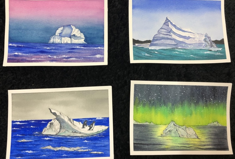
2. Class Overview & Project Composition: In this section, we are going
to talk about selecting a reference picture
and how to make your own composition with the
help of those references. Now when selecting a
reference picture, select a picture which is having a subject in
its mean focal point. Now what do you do if you find a reference which has
too many elements in it, but you don't want
that complexity level, but you want to simplify it. So this is where our two thirds
rule will come into play. And I am going to show you
exactly how you can do that. Now let me explain to you this method in a very
simplified version which I have understood. Suppose this is your paper. Now try placing
two vertical lines and two horizontal lines so that you get equal size
portion grids of boxes. Now try placing the main subject or the object that you want
to place within the grid. Say suppose I'm
placing my eyes book on this last grid and
I occupy it entirely. It is placed on my left
as well as on my right, but I do not find
it that appealing. But whereas I do the same in this center grid box and along
the lines of intersection, I feel that it is much more appealing and visually
pleasing to my eyes. So yours is another example. Suppose this is
the sheet I draw, again the same horizontal
and the vertical grid lines. Now I'm going to use this
box and I'm going to place my main subject or
the focal element right from left across to write. And I will try to make it intersect along the lines
of this grid boxes. So I like to do
landscapes are placed, my focal subjects are elements
in this particular format. Whenever I'm going for
painting landscapes, I hope this gives you a better understanding
how we are going to proceed Han with the composition
for all these projects. You can see, right, all
these four projects I have kept in mind about this two-thirds rule and all my icebergs are
recording replaced. I have not added only in here, I have added this two penguins as the supporting elements, but the main focal
element remains the same, whereas the background elements
are always in blurred. So see you in the next section where we will be talking
about the metadata fields.
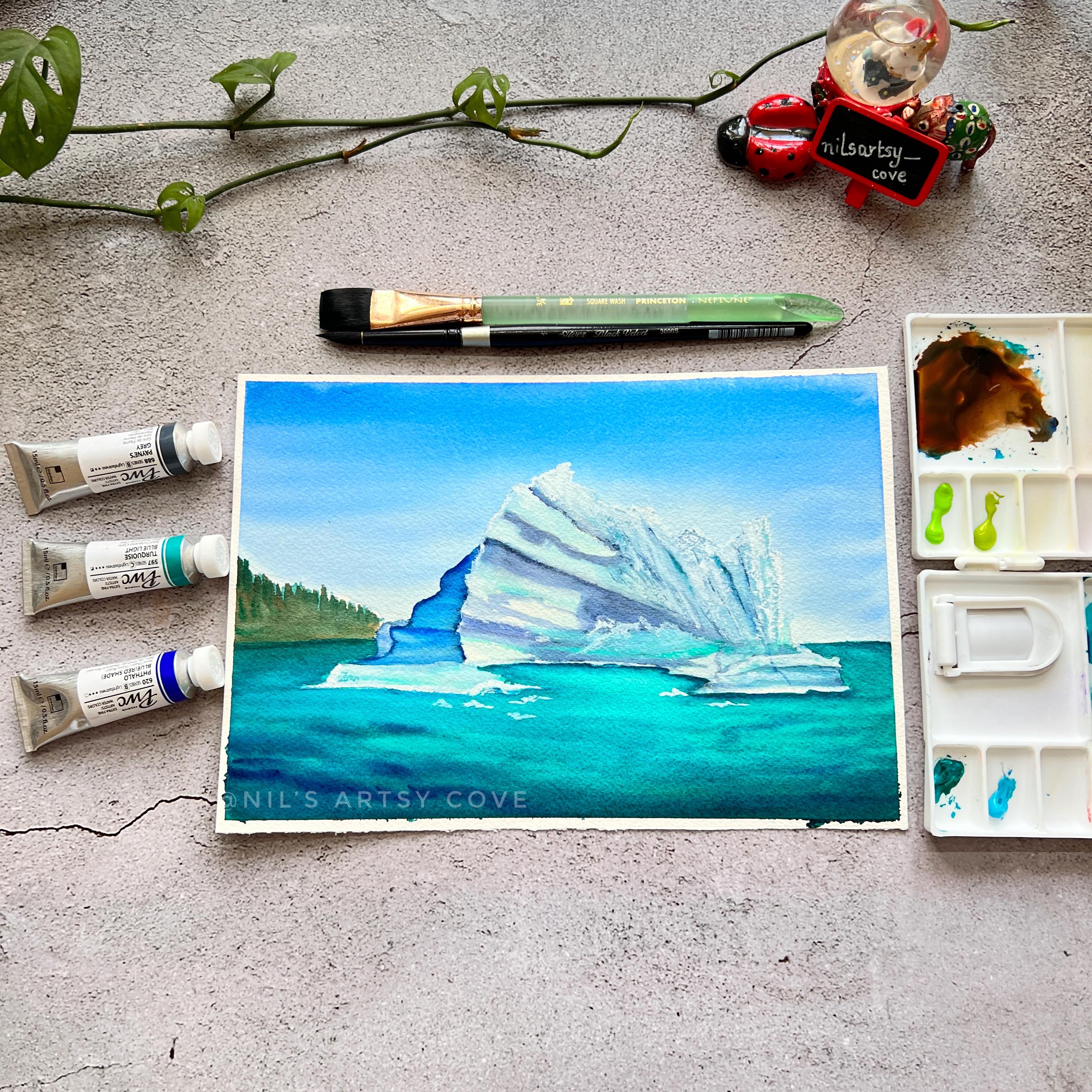
3. Materials Required: Let's quickly walk
you through with all the list of
supplies that we are going to need for our class
project, starting with paper, this is tending to 14
inch, a 100% cotton, fine-grained cold press paper, which is of 300 GSM thickness. This is from our cheese. Next coming to our
mixing palette. Today I'm going to use this plastic foldable
mixing palette, which is of 18 will palette. Now, instead of this, you can also go ahead and
use your ceramic palette. Dysplastic foldable palette
is quite handy to use because you have this
well-defined wells where you can squeeze out your
pins directly and folded and just take it along when you are traveling
handy, isn't it? This is also quite cheap. You have another variant
from medulla mission. Now coming to our paints now, this is my paint set from PWC. This set is 32 colors. Do not worry, you need not
have 32 color paints it. You can always work with any primary colors or primary
colors that you have got. Always, always choose
your watercolors set which consists of split primaries
because these are fundamental to your color
wheel and color mixing. So with this primaries, you can make
thousands and inlets of color combinations
and colors. Okay, Now coming to our brushes, these are the brushes
that we are going to use for our class projects. Now, I love these brushes. These are my absolute favorite, especially my silver black
velvet size number 12, 842. Now, this is
Princeton wash brush, which I'll be using for
laying flat washes. And now these are
my round brushes. So as I have told, I have got 12842 size of silver black
velvet round brushes. They are very good when
it comes to watercolors because of good holding
capacity of water and paint. Now the next brush that I'll use is this size
number four brush. Now instead of my silver black
velvet, size number four, I will use this long
round brush from Princeton velvet does
series of size number four. So I prefer, in my brush combination mixes
this one synthetic brush at least to have a better water control when it comes to certain detailing
aspects of the painting. Now next is the
two jars of water. Some tissue paper. Now instead of tissue paper, you can also go ahead and use any tissue paper towels
or your any rag clot, anything that you prefer. Now if you are
using a sketchbook, this won't be required. But if you're like me, like to have clean borders
around your paintings, you might be needing this
masking tapes or washy tapes. You can go forward any
size that you have, their various sizes
available in the market. The one inch and half an
inch and two inch tapes. Feel free with whatever you have got and you can use them. Now in order to tape
down your paper, you would need a surface. This is my surface where I'll be taping down
my paper always go for a non-absorbing surface so that the water
is not absorbed. Apart from these, we would
also be needing a ruler. So depending on the
size of a paper, you can go for a smaller or
a longer ruler in that case. Now pencil for getting the preliminary
sketch or the outline done on the paper and eraser. So these are the very
basic materials or supplies that we are going
to use for our projects. So grab them and join me in the next basic watercolor
techniques section.
4. Basic Watercolor Techniques: Hey, guys, let's get you started with the
technique section. So we are going to cover all the basic watercolour
techniques that you need to know for getting started
with our class projects. The first technique is
wet on red technique. Now, what does that on
technique essentially mean? It means that the red
the to it that you are looking at is your
white people's surface. So we are going to
read people dry, people surface with the
help of some water. Now the next word wet means your wet paint
pigments that you are going to reactivate your
paints using water. Now, when going forward
on Reddick, Disney, do important factors
that you must always remember is to exercise water control in applying your water to your
dry people surface, as well as, you know, applying water to
reactivate your paint because too much
of water in both of these cases will lead to a rather very
uncontrollable state. Now, what I mean
by uncontrollable is the point where you
know your paint and water will start
running across and you might not be able to get very, you know, gradient wash that you wanted to achieve in
the very first place. And also when there
is too much of water in both of these people, as well as in your paint, your paint will start
fading out a lot lighter when your paint starts
drying out on the people. So this is why water
control exercise is very, very important when it comes
to any watercolor technique. For a more detailed explanation about all these basic
watercolor techniques. I have got you covered. You can go check out my glass watercolor
sunset seascapes, where all these techniques have been explained in great detail. I am happy with my gradient wash that I have achieved using
this baton technique, the transition between dark
to light is looking awesome. Now let's move on to our next technique that
is wet on dry technique. Now, what exactly is wet
and dry wit your meaning, your red paint that is, I'm reactivating my paint
with the help of water, so not too watery, but the right amount
of water is needed because in this dry surface, you are going to
leave your wet brush, which is loaded
with your wet wind, hence the wet and dry technique. In this type of technique, we have much more control over
our paint because there is only one thing that we
need to control that is the amount of water in just
the paint that we are using. Our paper is absolutely dry and hence it gives you those nice, clear, clean and crisp
edges that you can see. So you're I am not showing
you a flat wash your rather, I'm showing you how you
can go ahead and use this technique to create
this kind of landscape. Even so, I'm here
trying to create this transition
between the dark to light and yet trying to
retain the boundaries that I am creating
of this mountains using my concentrated pigment. So with this technique, you have, you know, clear well-defined edges or out lines do whatever object
that you are painting with. Mostly, this technique is
widely used for detailing purposes or adding some details where you know you
want a precise, clean outline to your paintings. Now, in a very short while, you will be able to see
how precise my strokes are because I have exercised water control with the
water that I have, you know, used to
reactivate my beard. So can you see the well
defined lines forming trees? So these are the pine trees that I'm trying to create here and to give them a
feel of layering. You can call it a layering that is from light to
dark transition. I am using different
tonal values of colors. So yeah, I'm trying to show
how you can use all of the watercolor techniques in
your landscape painting and bring out the effect of
depth into your paintings. OK, so now let's move on
to our next technique, which will be another type of flat wash blending that
I'll be showing you here. This is also known as variegated wash.
And as you can see, I'm letting my people, but coat of water. So yes, this is going to
be a bet on the technique. So once done with courting
the people with water, now I will go with my brush, which is loaded with my
being two big men and just to one promotion
of the brush, I'm helping the color
spread out onto the people. And still here I'm going
to use this one color. And now from the bottom, I'm going to use another color. So mostly this kind of technique involves you to use
two colors one, maybe a lighter one and
the other the darker one. So here we go from light to dark to give you that
ombré kind of effect. You can see how beautiful
and smooth my transition is looking between the colors now to make it look
even more smoother. I'm going to go from the
top again and slowly come down to this
intermediate section where both the
colors are meeting, so to have a proper blending. To help you relate more
with this techniques, now I'm going to show
you how we are going to implement this techniques
in dual class projects. The first is a gradient wash of the flat wash. You can
see we have used it for the sky now for the variegated
wash using two colors. We are going to paint our first class project
using this technique. You can see right how
beautiful that sky is looking the transition
between two colors. So this is how we
are going to use. And now the third technique
which I'm going to show you in a while is the
dry brush technique. So you can see, right, the icebergs are having those distinct clear ridges or lines having some
distinct shape. So this is what will be
a layering technique. And the other, you know, the lines and the code
texture deep kind of pattern that you see is
the dry brush technique. Dry brush technique will be used in almost all of our paintings because that is how we are going to provide the iceberg that, you know, groovy eyes, texture that you often
see on the icebergs. So moving in quickly with the next technique that
is a dry brush technique, you can see how dry the
brush is looking right now, so I'll go wet it a bit and
make my brush just damp. I have soaked up the excess amount of water
in the belly of the brush. Now I'm going to load my brush with a concentrated
paint pigment value. You can see how much water was
there in the paint, right? So you need to use a little
concentrated amount of paint and less of water in your paint mixture to get
this dry brush effect. This dry brush technique
will be much more pronounced on your
paper surface, which just textured now all previous watercolor
paper already has this nice texture
feel to it, right? So you wouldn't get
this dry brush strokes when you try doing the
seam on a paper surface, which does not have these grooves or
texture on the people. If you are a landscape
painter like me, so I would always recommend you to go for people's office, which is texture that is the
cold pressed paper surface. Now, if you are the illustrator, most of the
illustrators approve of hard pressed surface as
their go to paper surface. Now it depends again individual to individual
artist or artist, because based on your preference and the way you love
your effects to be, you will choose your people. Also, when your
brush is, you know, almost exhausting its
red pigment or paint, you will be able to see that
your brush is producing this dry brush strokes automatically on a
surface like cold press. Coming to our next
technique that is the layering are
the glazing technique. This technique of glazing or layering may
sound complicated, but it's really very simple. Essentially, it is building multiple layers of paint
on top of each other, and you let one
layer of deep in to subsequently before you go ahead and coated with another
layer of paint. This technique is of very
much importance when you want to create
or add details or, you know, add sense of depth and your elements are the objects
that you are painting. You're in this demonstration, I have already led the
first initial court of a very light wash. With a very minimum tonal
value of the color, and now I'm topping it off
with another big minted value of the another color and creating or defining
and shape or structure, you can see right the how the
petal took its form or how the flower took goods from and just for reference that
I'm showing you out here. So when you go ahead and keep on adding in densities
are different. Tonal values of your color makes you always go
from light to dark. OK. And apart from this, you will always use
the pigment or color, which is transparent now in water colors that
will be transparent, semi-transparent or semi
opaque and opaque, right? So the more transparent
your paint is, the more easier it will
be for you to start with the lighter tone
and then gradually build the layers with
the darker tones. Getting started with
our very last Stickney, that is how you can paint
whites in watercolor. In this demonstration, I will
be showing you how you can make your whites look white
in watercolor painting. So the very first thing is
I'm showing you with the help of the sky because Sky is
my favorite go to subject. I'm going to paint a clear blue sky with
some fluffy white clouds. OK, so for that, I have use used the mix
of ultramarine blue. And now I'm just
darkening it a bit with the concentrated
pigment value and I'm leaving this white
spaces you can see. I'm kind of outlining
the shape of the clouds, but not filling it
with the color, but I'm filling colors in
the surrounding areas. So this is how this is
one of the way that you can go about how you can
make your whites look white. This type of approach is also
known as negative painting, where you retain
the white spaces of your paper and being
those surrounding areas. Now, in the next example, I'll be showing
you how if you add a Dockers stone of color in the surrounding area
and just, you know, try to bring out the shape of the object using just that
dark background color, how your color will
come to order, the object will start appearing more whiter
in appearance. Here I am filling in
the darker shade, the darkest dawn of
Indigo that I have around the object that
I have just outlined. So, you know, the object
will have its boundaries or the borders just around the background that you are trying to fill out with colors. So this is what exactly is
known as negative painting, and this is a very, very cool approach how you can
make your whites look even popping out and the white color just retaining the whites
of your watercolor paper. Now, another version
to it is when you beam the object inside with of
lightest color tone value of, you know, of a blue mix such as the ultramarine blue or even. I would not say totally yellow, but our raw sienna kind of makes color or
yellow ochre color. So that would give, you know, because white essentially is made up of all the colors
of the rainbow right. So that's how it works. So when you see and there is a darker color
in the background, when it fades out or
dries out, it fades out. So eventually the whites
of the paper start appearing still white, even though there is a tinge amount of
color present in it. I hope this examples
were helpful for you to understand how you can make your whites look
white and what color. Now, my beeper has
dried out finally, so it's time to remove all
of this DBS from the people. I hope you have
gone through each and every step of
this techniques and have not skipped this because
all of these techniques are going to come in handy when we start painting out projects. So I would advise or
suggest you, you know, do not to skip this part to see. And even so, you can practice it along with
me so that you have much more clarity and better understanding before
we jump start our projects. Join me for the next lesson, because we are going to start
with our class project one.
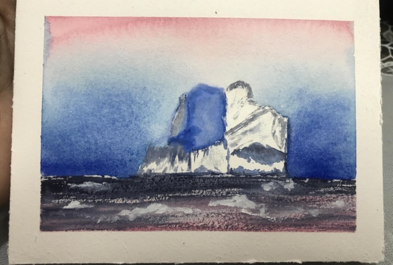
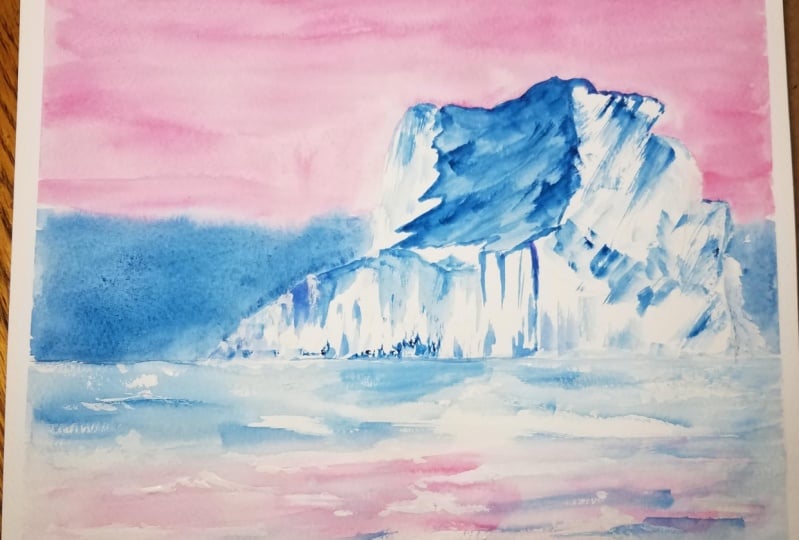
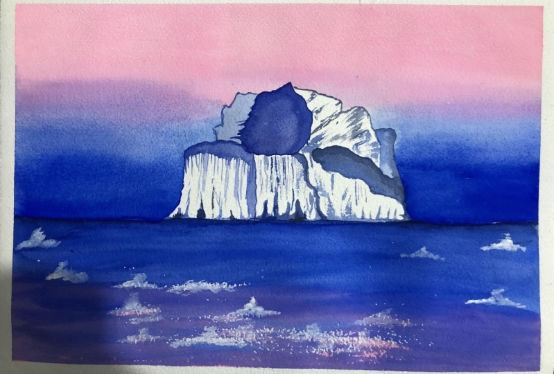
5. Day 1: Pastel Sunrise from the Iceberg: Part 1: So now let's quickly
take a look at the colors that we are going
to require for this project. The colors are
brilliant pink R.P. still pink. Now you could always make your own base
slipping by adding some white squash into your
rose pink are neon pink. Then we will be using some ultramarine
blue Prussian blue instead of Prussian blue. You could use Halo Blue. Any darker blue
would would be fine, and then we will be needing
some white squash to create some more icebergs floating
on the water instead of gosh, you could also substitute
it with white water paint. I hope you have got your
color palette ready. So now it's time to dip down
our people onto our board, so I'm here using a board. You could use any flat surface that you have
available with you. Make sure that it
is non absorbent. It should not withhold
water or absorb water. Now I'm dipping
down my beeper on all four sides with
the help of masking tape because I like my paintings to have
that clean and crisp, clean white edges and running my fingers along
to make sure that, you know, the masking tape has stuck to the paper properly. I have quickly grabbed
my pencil and my eraser. Now we will be creating a horizon line with the help
of our ruler, our scheme. So this horizon line, I am creating almost
three fourths of the paper that is towards the last one for the
budget of our people. So this is the kind of layout of the painting or the
composition now just right, not almost perfectly at
the center of the paper, but somewhat at the center. There will be an iceberg that
I'm going to create here. I'm going to create
your huge chunk of ice blocks basically
in the form of mountains. OK, so here you could see that. I'm just outlining. I see mountain block. OK, so that's in a
very limited language. And here I am, trying to sketch
out the areas of shadows and some cracks and
crevices in the iceberg. So when we start, you know, filling
it up with paint, it is easier for
us to, you know, notice or take into account
of all these lines. Are there detailing that we are providing with the
pencil skirt so we can adhere to this outlines and go forward when
filling it up with color? Now, do not worry, if your pencil sketch
is not perfect, this is just a mere
representation of the idea that we
are going to paint. So now let's get
started with Skype, so I'll be going with wet on
red technique for this guy. I would ask you guys to refer back to the technique section of this class to understand
what exactly is better on. But for those who have just joined and are lazy to go back and check
out that section, so I'll just briefly, you know, tell you about why don't read techniques or why don't
read technique is basically applying wet paint on your wet people
surface or any surface. So your since we are
working with water color, your surface is your people's
hands, stuff that people. So I hope you have a basic understanding of what went on with
technique is all about. As you can see, I'm making sure that my sky area is
sufficiently wet enough. For the sky to look very
small because we are going to go ahead and do a variegated
wash of the sky now, what do I mean by
variegated wash? I'll be using two colors to create the gradient
wash for the sky. So the first color that I'm
using is my brilliant pink. So this is a kind
of beast and shade from my Shinhan, our BWC beans. Now you could always
go ahead and make your own paste initiated
just by mixing white. Gosh, do your are any color? I have switched to my size number eight silver black
velvet round brush. Because I need to have
little bit more control when I'm going to paint the
sky around those iceberg, OK, because I do not
want the color to run into the white spaces
of that iceberg. Make sure that while
doing this step, you are doing it a little
carefully as well, as always, make sure that your paper is not
drying out soon. If you start to feel that
your paper is drying out, what you can do is
you can, you know, re-read the areas where
you have not been yet. And just, you know, apply a smooth layer or
coat of water on it. Not very watery. Just appropriate
water should be there so that once you
start, you know, creating this gradient blend, your colors should automatically start blending with each other. Now you are. You can see, right? My beeper has already
started to dry out, but do not worry, I will fix it back. So I will just go a little quickly over your
and I will try to, you know, fill it up
with the blue and then we will again go from. Top to bottom. Trying to blend and mix the colors and achieve that
perfect gradient blend. Now you can see that, you know, I have this distinct, less clearly
visible, so I'll fix that up using my size No. 12 brush. I have taken your my broader brush because it holds more water and
color in the tip, as well as more
water in its belly. So it will be easier for me to blend these colors
out thoroughly, as well as ensuring
that there is not too much of
water in my brush is the key when you are endured this kind of situation right in the middle
of your painting. OK, so this is how you
can fix your, you know, these hard edges
that you might get when your people start
getting dried out. I will go ahead with another
layer of this darker tone of blue because this would eventually fade out to
be a lot lighter ones, the beeper is completely dried. So before your paper is
dried out completely, you should go and do this step. If you feel that your blue has
turned already very light, so you need to understand your
tonal values of the color. That is why it is a good exercise to switch out your colors
right before you are beginning out your
painting to understand the tonal intensities your color may have when you
are using them, when they are wet and
when they go dry. Now, once we are
satisfied with this sky, we will move forward
and we will start painting those shadows
for our iceberg. OK, so we are going
to go with the, you know, areas that we had already marked with
the help of a pencil. So I am you're trying to mix the color for the shadow areas. I have mixed a little bit of, you know, the violet mineral
violet that they have. It's more or less
that publish violet, publish pink violet that I have got and I have mixed it with my, you know, ultramarine blue. So now using just
the tip of my brush, I'm slowly outlining in
broken lines these areas, and now I just try filling it out with the slanted
motion of my brush. Remember, here we are going
on wet on dry technique, wet being your paint and
dry being your people. So you're we want this clear and defined look to our eyes book
especially the shadows. That's why we are going
with wet and dry mentor to help us get the best results. One important aspect
that you must note when going with the wet on dry technique is that whatever you apply are in whatever you. I would say that you
apply your brushstrokes. Those strokes are going to
get retained on the paper. So it is very essential
that you take into account this fact and try to bring it to your advantage creating these, you know, shapes or coverages
that you want to give. There's, you know, a kind of left our definition
to your icebergs. Now I'm going to dilute the topmost part that
we just, you know, painted and I'll diluted and make the color
lighter and towards the periphery is the area where we want our
darker tones to be. So this is how we
will proceed on, you know, creating
this high light. Now it's time to create the high for this
part of the burg. So I'm you're going with long, elongated strokes,
shorter, some longer. So use different variations of your brush strokes
to create this, you know, cracks
or coverages that you absorb in those icebergs. Observe your reference photo closely to get an
idea about this. And in that way, you will be able to, you know, have a picture in your
mind that and also plan that how you should go
on with your project. Now, this is how we are going to slowly try and create
more of the shadows, more of these lines and
cracks or crevices that you see on an iceberg just with the help of the tip of my brush. So I'm here using my
rendre size number eight, which has very sharp pointed tip in spite of being it all round
brush size number eight. That's a speciality of the
silver black velvet brushes, and I absolutely
love using them. So this is how we are
going to go forward and we are going to add and create more of the shadows
some lighter, some darker, with
different tonal values of our color mix and create
this cracks and crevices. So keep watching. Observe this because
the entire iceberg will come to life just by
creating this, you know, cracks and crevices and
filling up the, you know, shadows of the burg, but it's keeping the other areas light as much as possible. Now, to us, the base
of the icebergs, I'll be going with
the very lighter tone of color as well as in between, I'll add in some darker strokes also like different like I said, different tonal values will give more depth to your painting. So you must always remember to use different tonal values or intensities of your color mix to create the depth
in your paintings. Now towards the base, I'll go with a very
irregular shape. And this is how we will carry on for the rest of the iceberg. OK, so keep watching
it very closely. Yes, you will have to have
a little bit of patience, but trust me at the end, you will just love it.
6. Day 1: Pastel Sunrise from Iceberg: Part 2: Let's continue
building our layers. Now what is layering
or glazing techniques? So when you build little by little layers in your
watercolor paintings, that is known as glazing
on layering technique. Now if you can see my brush
is not too loaded with water. I am just using the lightest
tonal value of my pigment. And if I feel that my brush may have some
extra water in its belly, what I do is I will use
my tissue Tavern or tissue paper to soak off the extra water that
is there in my brush. So it is very imperative
that you understand the exact water control
that you need to exercise when you are doing
this layering technique. Because if you are working
on wet-on-dry, right? So if the background is too wet, it will almost be wet on wet
technique and you will not be able to achieve the layers that you
are trying to build, thus creating the effect of different layers on the paper. So on wet-on-wet, everything
will get spread smoothly and evenly and hence the entire point of this
layering technique will fail. You can see right, How would the help of
glazing technique? I am building character
to the shadows and each time that I'm
letting the layer dry off, it is giving another
depth to this shadows. Now to outline the cracks
and crevices of this Burg, I'm going ahead and using
the dry brush technique. You're again, in dry
brush technique. Your brush should be absolutely
dry and you just should be scraping of the paint pigment that is there in your palette. Bear in mind if your paint is loaded with too
much of water, makes sure that you so-called the extra water that you just loaded with your brush so that you achieve this dry
brush strokes properly. Now to this left side, I will add this
slight tonal value of this ultramarine blue mix that I have to indicate that that's the paper white
that we are preserving. And also in the technique
section I have shown you how you can preserve
this whites of your paper, even if there is
a light amount of colour present in your paper
against a dark background. I will go ahead and add in some more dry brush patterns to our book so that it becomes
visually more appealing. Now I was not satisfied with the tonal value of
that shadow idea. So I went ahead and applied some more darker
mix of that value, the color shade that
I had used earlier, that was a mix of ultramarine blue and little
bit of mineral valid. Remember that we had used, I just darkened it
a bit and that's all I think for the iceberg,
I'm really satisfied. And I'm darkening the
cracks and crevices a bit more so that it
gives that highlight. The entire Berg comes to life. We lead this area's
get dried properly and we will be starting out
with a C. So for the sea, We will be exactly mimicking or replicating
the colors of the sky. Beyond the horizon line, we will go ahead with the pink. And now you can
see I'm trying to tape down my washi tape. Washi tape. I think there is
some problem with the gum. It's coming out again and again. It's becoming little problematic for me because I don't want the colors to run out or
leaked through the unit tape, ruining the clean
edges of the paper. So anyways, I'm trying
to try to work it out. Okay. I have started layering
the colors on the paper. And you can see right for the C, I'm going on wet-on-dry
technique because the white part or the
white for me part, which may represent
the icebergs, floating ice chunks in the sea. I want to represent them
with the white of the paper. That is why I'm going ahead with this
wet-on-dry technique where my brushes unloading
the paint off the paper, it is producing
friction in the paper and creating those
dry brush technique. So this is how we're
going to paint our C. And along the horizon line, I would want you to be little
careful about the amount of water that you have in
your brush because if you have excess amount of water, it may run into your sky
which you do not want, and there may be an ugly
patch of color over there. So you want to avoid
that at any cost. So please exercise water control in your brush when you
are doing this step. This is taking little time
but hold onto your patients. You may use a brush
which has a fat belly. So I will maybe switch to
my broader round brush, that size number 12
brush very soon. I will try to diffuse those layers as this that I
was talking about earlier. So I just simply use the
belly of the brush to load the pigment onto your onto the paper and
smear it across. But make sure that you retain those dry brush patterns
there at the center. Now with the help
of white gouache, we will be creating small, small floating
icebergs in and around the main berg that is
standing tall with the help of a synthetic brush because I want to exercise
little water control over so that my what gouache
makes us not too watery. I'll go ahead and create
dry brush strokes with the help of my synthetic
round brush size number four. And this is how we
can create small, smaller shape to
icebergs in and around. Just it's very simple. You can go ahead with little
bit of small projections. Are your options just like how you would paint,
see waves, right? Just like that. You go ahead
and do this step and yes, he will be done after your paper has dried
out completely. Now it's time to peel off our washi tapes or masking
tapes from all the full site. You'll need not do this step
if you have not tape down your paper or if you are directly painting
on a sketchbook, this is not necessary. But yeah, if you want
to have this clean, smooth the edges of white, then maybe masking tape or
washi tape is necessary. You can see how the paint has leaked through my masking tape or the washi tape
that I was using. So here is a tip
to quickly fix it. Use your white gouache in a thick consistency
to cover this up. And yes, you will have those
white clean edges again.
13. Thank you for joining : Thank you so much
guys for taking this class with me
and painting along. I hope you have
loved this class. If you have really loved the way I have taught
in this class, please do post a review. It would really mean and help my class to reach a
greater audience. Also do upload your
class projects in the projects gallery section, we would all love to take a look at each other's work
and appreciate. If you are uploading
the projects on social media like Instagram, then please do tag me. I would love to
reshared the works on my stories until
then, stay safe. Happy painting.
 Nilam Roy, Art Instructor