Transcripts
1. Intro to Dynamic Acrylic Painting: You may have gone years without really flexing your
creative muscle. Painting literally
works different parts of your brain and
other activities. It works your creative skills. Expanding new areas
of your brain. It fosters creative bro, and painting strengthens
memory and provide stressful. Hi, my name is cast
Madonna and I'm an illustrator and
ours I didn't Jersey. I'm also the honor
of the studio. My first experience with acrylic painting was
on a date night, or paint party back in 2014. And I haven't looked back since. I've taught so many classes and workshops
in-person, virtually. And now I'm ready to
share all of my secrets. This class is perfect for you. If you are looking to strengthen
your fine motor skills, maybe you're looking to build
your creative competence or you're looking to get a better understanding
of color mixing. As we create these
dynamic paintings, you can make them for your home, make gifts for those you love, or great paintings
to sell online shop. You'll also be able
to use the skills in this class views
on other mediums. We will cover color mixing
techniques like blending, creating textures, as
well as learning how to layer paint without getting
pools muddy colors. I'll also teach you how to add additional mediums
to your paint. So much to learn. Let's get creative
and jump right in. I'll see you the next lesson.
2. Your Class Project : Your class project will
have three components. One is the color Mixin portion. Two is all about creating
texture and using mediums. Your final project is a
step-by-step painting. However, you are
welcome to create and upload any painting
of your choice. I've uploaded several
for you to choose from, and you'll be able
to create your own on the canvas
of your choice. It can be large,
it can be small, can even be a canvas
tote bag if you'd like. I chose this as our
class painting project, as it has a few major elements I'd like to cover with you. It's a great start
for beginners when it comes to composition
and understanding how to set up your canvas and using a reference to
break down from photos, it uses some of the primary
colors and leaves room for artistic expression and interpretation or
advanced creators. It's great for minor
details like tree leaves, water splash, textures
and blending, as well as reflections through
the layering of paint. A few suggestions for setting
yourself up for success include, relax, have fun, grab a cup of coffee,
tea, or water, and play some background music to help you get into
the groove of things. I also want you to remember, there is no such
thing as messing up. You'll be able to
start over again, or even fixed minor mistakes. As acrylic paint
is very forgiving. This is certainly a project I've done in my own project pieces. And it's a great place to start, especially for beginners, while acrylic paint does dry quickly. I'd like to remind
you once again to have fun and if need be, take several hours or few days to complete your
project, to get started, download the resource guide and pull out all
of your materials, will learn all about
acrylic paint. Then dive in with
some exercises. You in the next lesson.
3. Review of Materials: Let's go over our materials. You'll need your color mixing grade a nice large jar of water, a paper towel, some aprons
to cover your work surface. Your color wheel. Some of the best brushes to use are a one-inch square brush, filbert brush around Tip brush. The detailed brush, you'll
need some palette knives, a paint palette, you're
painting canvas, or a heavy-duty
mixed media paper. You'll need the acrylic colors, Titanium White,
Ultramarine blue, brilliant red, cadmium yellow, ivory black, or burnt umber. And optional, just sell. Personally, I have two types
of gestures that I use. One is by Liquitex basics. It's white. And the second one is kinda
like a surface primer. This one's a little
bit thinner and this one is just called surface. Hi, I'm or by really help, I'll be sure to provide links where you can
get some of these. I want to go over why
you'll need an apron or an old t-shirt just in case you get paint on your clothing. You want to be sure that it's something that you're
not too in love with. As acrylic, those dry quickly
and it leaves things. Additional things to
keep in your toolkit. Or a water bottle spray. And you use this to re-wet
your surface area as well as Saran wrap to cover any
paint that you have not used. If you do not have Saran wrap, you can use foil or
storage containers for paint that hasn't been used.
4. About Acrylic Paint: One of the biggest benefits
of acrylic paint is that it dries faster
than oil and watercolor, the artists acrylic or more
concentrated paint pigment. So the colors display richer, deeper, more blended,
and then mixable. The craft acrylics have
a lot of medium added, which makes them easier
to spread quickly, but they're not as easy to attain different
textures with the paint. Also, most craft paints are not as archival as true
artist paints. Meaning they can crack, warp, or lose color when exposed to the sun
over a period of time. Now, there are many, many brands out on
the market today. And I suggest purchasing
What's readily available to you in your
local arts and craft store. If you're able to make
the investment into artist grade paint,
whatever the brand, I recommend purchasing
the primary colors, red, blue, yellow, as
well as black and white. Just remember, when it
comes to craft paints. The more liquid, the less paint. I want you to understand
the paint labels. Also, I want you to understand that opaque and
half opaque colors versus translucent and
transparent colors. When looking at
your paint tubes, sometimes the color will be transparent or translucent
or even opaque. Here are the definition
of these terms. Opaque colors are colors that do not allow light
to pass through the color layer and offer the best coverage
or hiding power. Semi-opaque. B's allow for some
light to pass through the color layer and sit between opaque and
transparent colors. Translucent or
transparent colors are paints that allow more
light to pass through them. They are see-through. Similarly, translucent
colors are transparent paints that allow more light to pass through them. They are see-through. Transparent colors
are perfect for glazing and watercolor effect. If you're interested
in learning even more about acrylic colors, check out the links
in the resource page.
5. Blending Primary Colors: So I know that we have
covered quite a bit of information in the
last few lessons. Now, we are going to
go ahead and grab our paints and get
a little bit messy. First, we'll go over the creating colors using
our primary colors, red, yellow, and blue. Then we'll go over how
to create some textures. And then we'll dive right
in with our sketch. Let's get started. I've gone ahead and print it
out my color mixing guide, and I pulled out my color. We'll have a small
pallet here of paint, acrylic paint that I've
preserved in order to use for my demo
of mixing colors. And this here is just a
regular sheet of paper. Feel free to print
on card stock or copy the grid and put
it in your sketch book. If you want to keep
this somewhere, say that my paper towel here, I've got my color mixing
wheel from my reference. And I've got my sample
of colors here. And it's okay that the red and the blue is mixing
just a little bit. So what I wanted to do is
put the original color here. Take a sample of the
two colors that I'll be mixing and the results here. And I have given you an excess of color
grids to choose from, so that you can play
with your blues, your red, and your yellows. And here we'll be playing
with our primary colors. I'm just going to
quickly try my hair back so that it doesn't
fall into the paint. Let's have some fun. Yellow is a fairly light color, so I'm going to put that
here as the original color, and this is going to
be my primary color. And you can have fun with it. You can paint in the entire
box or just put a sample. I've got multiple
brushes on hand. If you don't have multiple
brushes, remember, we want to have a nice
large jar to clean our brushes and I'm going to
play around with some red. My mix is yellow and red. And depending on how much red
and yellow I put together, will determine how
dark my oranges. So if you just look, I can make a red, orange. Dark orange, yellow orange. And if I add white, it'll give me a kind
of peachy color. I'm just going to continue
adding a little bit more yellow on this side so that I now where my orange stands when I add
more yellow to it. If you find the
color that you like and you want to
preserve that result. This is where having those
extra containers come in, you can go ahead and for
your excess paint into these containers and mix them and set them aside for one-year ready to
paint on your campus. Getting a really great purple
is sometimes challenging. So I advise you
to mix her bolts. I'm just going to pick
up where these two met. It looks like on my first try, I've got a really nice alum. And if I go in the other
direction and add more blue, Let's see what happens. Want to be careful
not to get any of that orange in your report. It'll turn a little
gray and muddy. And if you want to see, you'll take this orange. If you look at the color wheel, orange and blue gives you
that brown, muddy color. So as we move away from
red and add more blue, we get that blue violet color. Now we'll be playing with
foil as our primary color. This one, you want
to make sure you really clean off your brush. I'm just going to go ahead. Grab another clean
brush and grab more yellow quick
swatch over here. And then I purposely
doing a thicker swatch here so that I can
go in with my blue. Let's see, beautiful green
and beautiful forest green. And so here on this side we're basically getting our
secondary colors. So you might be wondering, what if I add green with a little bit
of light, our two colors. This is my basalt. And basically this
is exactly what this mic color
mixing grid is four, you have your color wheel, but then you want to go
ahead and take it into practice and see what
your results will be. One of my favorite
colors is a aqua blue. My color is going to be blue, white, and a little
bit of yellow. And these are the
original colors. And let's see what that looks like when we mix that together. This is not the result
that I was looking for. I think this is
where having one of these containers and a
pallet knife comes in handy. I'm going to go ahead and
lift a little bit of white. And I'm going to clean
my palette knife. After each pickup very tad bit. I'm going to mix
those two together. Again, if I was mixing
this for my painting, I would definitely be
mixing a lot more. I will do a speed
through video for you to see the colors that I'll be
using in my final painting. Well, now we're just going
to pick up a little bit of yellow and add it in there. So this is more in line of the color
that I'm looking for. A nice, beautiful teal blue. So I didn't realize that
I needed a lot more blue in order to achieve
this beautiful teal. Remember, you want to
continue experimenting and playing before going
to your final piece. You can make happy accidents. However, experimenting
and advance will help you learn how
to mix your colors. Don't be afraid to take
notes on this mixing sheet as well and have it
there as a reference. Now that I've gone over this really simple way of blending these beautiful colors. I want to see what
you come up with. Mix your primary colors to get your secondary colors
like I just did. And then go and experiment, play around with
the white and use your color wheel to see what combinations you
can come up with. I'll see you in the next lesson.
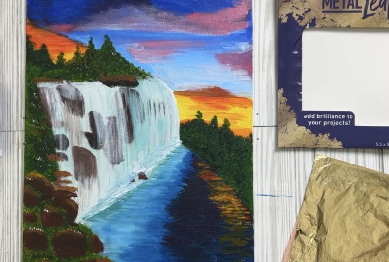
6. Creating Textures: Dry Brush Technique: In this lesson, we will
cover dry brush technique, two ways to create
splatter effect and using scrap materials
like paper or cardboard. So the truth is, you can create different
textures using the tools we paint with or by adding
additional mediums. Oftentimes, when I share this
waterfall painting here, people ask how I
created the textures. Some of it is through
layering the paints. However, knowing how to control the flow of your paint in the wetness on
your brush is key. Let's try a few demos
and creating textures. And remember to take
photos of your work and upload your samples in
the project gallery. To create my textures, I'll be using my heavy-duty
mixed media paper. Our first texture is a
dry brush technique. I'm going to grab my one-inch
brush and for starters, using mine sample
paint palette here. I'm going to, in my mind, I'm thinking of a wave. We're going to stay in theme with waterfall and doing
the dry brush technique. This will be slightly
different on our Canvas. This is what we see. There's a little bit of
texture on the sides, but our brushes
definitely super dry. And then to get
that wave texture as if water is thrashing. I did without cleaning
my brush into my white very lightly. And then I taught. And it will blend, which is perfectly fine. And I go back-and-forth
while my paint is still wet. You can go back
and forth between your blue and your
white to build up the wave effect
and that they sand in there and you can use
a little bit of that. Or burnt umber. Burnt umber and some yellow. Get some sand. I'm gonna go down
with a yellow first. Cleaned off my brush and add a little bit
of yellow, white. And I'm going to add a little
bit of that burnt umber. Just so you know, Earth
colors tend to dry a little bit quicker
than yellows. And blues is a great way to create a water textured
effect using dry brush. You don't have multiple brushes. You can always rinse your brush and tap it dry on
the paper towel. This is the end of
our first demo. Let's move on to
our second demo.
7. Creating Textures: Watercolor and Paint Splatter: Reading a paint splatter
effect is super easy. To do this, I am going to use another one of these empty cup. I'm going to grab
my spray bottle and just add a little bit of water in my brush. A little bit of yellow
and a tad bit of red. And I'm going to mix
this. It's my water. Beautiful orange color. This can be used for both my watercolor effect as well as my paint
splatter effect. So we're killing two
birds with 1 st. This liquidy texture here is how you can use it for
the watercolor effect. So as you can see, this has been extremely
diluted and I can just very lightly, and it works well on this mixed media paper as
if it were watercolor. Now what you see me
doing here is mixing more paint into my water to give it a little
bit more body. When it comes to creating
your splatter effect, you want to be sure that
you do have newsprint, vinyl, or something to
cover your workspace. Because making the splatter
effects does get very messy. So I've got a much
darker orange here. I would like my paint to
be much more heavy bodied. But just for this demo, I'm gonna go ahead and show you how to make
your paint spotters. So I've got my brush
nicely loaded with paint. Means my index finger. And very lightly and gently. Ladder. I even like how it's
falling in watercolor.
8. Creating Textures: Using card board: Bored or cardboard. Next step we're gonna be
using some corrugated board. What kind of textures
we can come up with. For this one, I'm going to use my gray matter's palette so that I have more
room to work with. So this needs to be shaken up. This is the medium that
they put in, pink. And this blue hasn't been
used in quite some time. Therefore, the
medium is coming up. I'm happy this
happened so that I can show you what I mean. That is medium added
to your acrylic. Shake this up. I will try. Okay, this
is not mixing well. I'm going to use a
different brand of blue. This is a cobalt blue. There's a little bit of red. Is blue, it's not
true primary blue. But we're going to make it work. I'm gonna go ahead and take
a piece of my cardboard and tape it into my paint. I'm reading my blue here. I'm going to pull it to look at these
beautiful textures. I hope you really
enjoyed creating these different textures
with just paint. If you come up with
something different, please feel free to share
them in the project gallery. And I'll have a conversation
with you There. You in the next lesson.
9. Using References: What are references and how is the best way to
go about using them. A quick Google search
gives me these results. The best practice is to create
your own reference images. Meaning you go out and
take your own photos. Or if you're drawing
people and need poses, you photograph them on your own, use your own body. News people know the
biggest issue creators run into is relying
too heavily on one reference image and
not citing their reference or not getting permission from which they
weren't inspired. To avoid all that, you can use. Images that are in the public domain or images
that are copyright free. Also, use multiple images
to create a new concept. You can learn more about using references in the resource
guide I provided for you.
10. Creating the Sketch Layer: Now that we have
gone over some of our basic concepts
from our materials, color mixing, layering, paints, as well as how to
use a reference. Let's jump in and start our
sketch for our final project. I'm going to take a few
portions from each of these photos and sketch them into a new concept
onto my canvas. Typically, my sketches are fairly light so that
they don't show up. However, I'm going to sketch a bit darker so that you can see my canvas and see how I
put my sketch together. Let's go ahead and
jump right in. So to get started,
you will have to decide on whether
or not you want your painting to be
vertical or horizontal. I am going to make my
painting vertical. So some of the elements
that I am looking to have in my painting is
that I want some water. I definitely want
the sun to shine. And that is because
of the medium that I'll be adding towards
the end of my painting. I'm not opposed to
having trees in there, but it's not necessary
get started. I'm thinking of the
direction which the sun will becoming in
my sinuses coming in. This way. Maybe there's some brushes. Usually where there's a
waterfall happening in some rocks underneath
water is coming down. Maybe there's mountains
in the background. Trees. Here. Area. I'm thinking. The sun has some clouds. Not to showing that yet. We'll decide that later on
we're adding in our college. I'm trying to decide
if I want trees, which is why I'm
drawing pretty lightly or barely anything over here. I think it's getting a
little bit too busy, so I think I'm going to
leave that there for now. But I do feel like something
needs to happen here. The distance. Now, this is what
our working life. And I'm just gonna
make some notes here. But these are trees, rock. And this is more like my river. And of course, I
know this is water. This would be the splash. What's happening? I hope this is really
simple to follow along. Feel free to slow
down the video if you need to copy it step-by-step, but it's really just
breaking it down. Hopefully this was really
simple for you to follow. It's really just breaking
it down step-by-step. Breaking down large pieces of your drawing into simple
shapes to follow. My rocks are pretty
much squares and breaking again these
things into smaller steps. If you are struggling, feel free to leave a comment in the project area and
I can help you there.
11. Guided Painting Demo: I've gone ahead and mixed
up my main colors that need to be mixed for
my final painting. I'll also be using some
of those primary colors. If there's any other colors
that needs to be mixed, I'm going to go
ahead and do that on the canvas after I've
layered my colors. In the meantime, I am ready to start adding some
paint to my final sketch. This sample palette here is
still nice and damp and wet. So I'm going to use the colors
from this palette as well. Just so not to waste
what I've been working with so far as I'm
looking at my reference, I noticed that I need one more color and it's
more of a light blue. So I'm using a cobalt blue
and a tad bit of white. I'm going to mix those together
and we're going to start painting the sky and
working our way down. For this one, you'll
notice that I didn't blend all of the blue and white. And that's really just
because I know that there's gonna be a little bit
of a gradient. And my sky. As I'm painting, you'll
see that I am taking my time and just using my brush back and
forth left to right, sweeping across my canvas. I enjoy using the filbert
brush to do this. But sometimes I also
use my one-inch brush. I try not to load too much
paint on my brush just to be sure that the
Canvas will dry evenly. Next up, we're going to
grab some green and start painting in the
area for the trees. You see me doing a
tapping motion as a way to see if I can add
my texture right away. But then I go ahead
and brush it in. And when I dip my brush
back into my green, there was some blue that
wasn't fully mixed in. I really like this deep
dark forest green. So I went over my first layer. I'm gonna go ahead and fill in all the areas where there's trees and build up the
layers in the next lesson. Now, I'm painting in the area where my sun is shining through. For this, you want
to make sure that your other colors are
dry, especially the blue. Otherwise, it'll turn
into this pale green. Next step, I'm
painting in my rocks. My Brown was a little bit dry, so I did add a little bit
of water to that palette. I also ended up mixing a
little bit of yellow and orange in there just to
change the color of my rocks. Here, I'm looking to
pull out the rocks that would be behind
the waterfall. Trust the process. I know it looks a little weird. However, once we
finish our painting, we'll be looking at something really dynamic and beautiful. I love the color of water, especially in tropical places. So I chose this teal
blue to paint the river. In order to blend on the canvas, you want to be sure that
your paint is still wet. Again, we're not loading
our brush too much with paint just a
little bit at a time, blending on the Canvas. And if you do find you have
too much paint on your brush, you can use a paper towel, wipe off the excess paint, and blend again on the canvas. In order to get a little
bit of a darker shade. I added just a tiny
little bit of black. Now I'm adding just a little
bit more green in-between the areas of my rocks and essentially filling
in those areas. I'm going over a
little bit of my brown with the green and again, just filling in
different shades of green to give it some
texture and depth. I'm going to let this dry for a little bit and I'll see
you in the next lesson.
12. Layering Paints and Fixing Errors: When it comes to
layering paints, there are few things you
want to keep in mind. First things first, you want to be sure that the
layer that you're applying your new paints
on is completely dry. Here in this demo, my first layer has
been completely dry before adding
additional paint on top. Second, you want to
be sure that you are using a very clean brush. The tip that I like to give to my students is when
cleaning your brush, you want to pretend that there's thick molasses at the
bottom of your cup. Or maybe there's some sugar down there that you're looking to mix to test if
your brush is clean, you can wipe it on your paper towel and see
if any residue comes up. If your water has become
too muddy and grainy, you may need to get a new
batch of clean water. Here I was painting
in my sky and I wasn't feeling confident about the color choice that I made. In order to correct it, I went ahead and used my paper towel and lifted the paint before
it completely dried. Following I added gesso and
waited for that to dry. Once the vessel dry, I was able to add a
new color on top. This is an easy way of fixing mistakes when acrylic painting, if you don't have
decile on hand, you can use white paint, just be sure to layer it on
evenly and not too thick. What I'd like to do now
is go ahead and add our final details over the rocks that where
the water is falling. I'd like to add
our final details in this layering process, where the rocks will be slightly
seeing through the water as well as a few ripple
effects in the river. So let's go ahead
and jump right in.
13. Bonus: Adding Gold Leaf Medium: There are many different
ways to create 30 textures on paper, mushy, dried food, or even
heavy body acrylics, but are of 30
painting is endless. However, there are other
mediums you can add as well. Thumb, you'd add before
you start your painting. Others you'd add right
before completing it. In today's painting and adding gold leaf
to add something, not enhancements to my painting. Let's jump right in. I have
my adhesive glue here, and I tried to put it directly onto my painting from the tube, but it's starting to
spill, enlarge spouts. So I grabbed my brush and then I began to add a few textures in places that I knew
that the sun will be shining and reflecting
across my painting. I wanted to give it the illusion of the sun reflecting
on my canvas. I'll give the glue
a little bit of time to set and get tacky. Then I'll grab my gold foil and apply it across my painting. Finally, I'm taking my brush and lightly feathering
it across my canvas. This is a soft bristle
brush and I'm brushing it across my Canvas to take
off any excess gold leaf. Now that our painting
is complete, I'll see you in the next lesson.
14. Celebrate : Congratulations, you've
completed the class. Thank you for spending
time with me today and creating a few key concepts
that we have covered, our blending, layering,
adding textures, and experimenting with mediums. I hope you had a great
time and don't forget, please remember to take progress photos of your work and upload them in the
project Gallery. This way, I can give you feedback and continued
encouragement on your work. If you have any questions, feel free to leave
them down below. And I'll be sure
to get back to me, follow me on social
everywhere at Nevada. Thank you so much and I'll
see you in a future class.
 Keshna Donia, Artist | Designer | Illustrator