Transcripts
1. Introduction: Hi, and welcome to
the Skillshare class on the simplification
of acrylic painting. I've been painting
for a few years now and I've learned some
tips and tricks that really helped me to move forward
and to simplify my life, save some money and a
lot of frustration. In this class, we're going
to go over all those tricks that I've learned to make
my painting life easier. In the class project, you're
going to be practicing some of the techniques and
making a very simple painting. So if you're a beginner or
even someone who's looking for ways to make your acrylic
life a little bit easier. I hope you'll join me and I really look forward to
seeing what you can do.
2. What are the different types of paint?: The first thing we're
going to look at is paint. If you ever go to the
art store and you wanted to get into
acrylic painting, you might have
noticed that there's a ton of different options. If you're just starting out, it might be a little
bit overwhelming, especially when you start to see the price tags of the
artist quality paint. As an example, here's a five ounce tube
of titanium white. This one cost me $22. If you compare that to this crafters paint,
this crackers pain, which is about two ounces
or four ounces, cost me $2. So what's the difference? If you're trying to save
money and acrylic painting, especially when
you're starting out, what should you start with? Well, let's take a look at the different types of
paint I have here. And then I'm going to talk about the differences between them. In the next video, I'll show you a demonstration where I use three colors from
artists quality, student quality, and craft
quality that are similar. And you're going to see what the differences are and
then how to use them. So the first thing at the very cheapest end is this
one, the crafters paint. You're normally going to
find crafters paint at a dollar store or at the cheaper
aisles of a craft store. Now, don't kid yourself, this is real acrylic paint. It works like acrylic. You can thin it down with water, even mixes with other acrylics. So this is what you can afford or this is what
you have access to. You'll be okay. There's some issues with them. For one thing, if you think
about how much pigment, pigment is really the
expensive part of paint. In each of these
different paints. The more expensive you go, the more pigment
you get into paint. What that means is the rest of the paint has
made it fillers, and generally speaking, is
not going to be as opaque. So if you're going to
try to do something where you cover a large area, you may have to go in for
three or four different coats. If you think about it. If
I have to put in, say, five coats of crafters paint
and one coat artist paint, then suddenly that
price difference doesn't really make much sense. However, if you just want
to practice with a color or if you know you use a lot of a particular color,
maybe for backgrounds. For me personally, it was titanium white that
I just use a lot of. So I went to the store and
bought some cheap titanium white for my background and
gesso and that sort of stuff. When I did that, I was able to dramatically simplify
my life and save me a lot of money using just a
crafters pink because I knew it was just for background and all the other paints we're
going to try and through. The next level up is something called student grade paint. And the one I have here
is from Liquitex basics, but it's not the only one. Amsterdam also makes want
and you'll find a number of different local brands as well
depending on where you go. The big difference
is that there's a significant increase in
the amount of pigment, but you also have a
lot more consistency. And what that means is
if you were to get, say, a Deco art craft is acrylic and then you
go to a different crafters acrylic
with the same color. You might find that
they're wildly different. They are different colors. There are different opacities
and everything else. When you go student grade, these have all of
the pigments that the artist quality paints have. They just have
maybe less of them or some of them
are not available. So as an example,
this one is called cadmium red medium hue. The hue means that it
is like a cadmium red. It looks like a
cadmium red medium, but there is no
cadmium red pigment in it because that's a
very expensive pigment. So this is made up of cheaper
pigments to look this. Now, the huge benefit of using a student grade
paint is that you can use a lot of it
without worrying. When I first started painting, I started with the
craft is acrylic, but I find personally
it did not work for me for anything other
than the backgrounds. So I then moved into
my Liquitex basics, which is my student grade
paint that I use quite a bit. What I found was I could
get four ounces of paint, so I could put a lot of
paint on my palette. I could experiment with
different techniques. I could do a lot
of other things, and I had access to some
really high-quality pigments. So if you can afford it and
you're just starting out, I strongly recommend a
student grade paint. It is fantastic and
great to learn with. I just started to progress with my student grade paints though I started to ask
myself the question, what am I not getting
in this paint? And artist quality paint, which is the next two
I'm going to show you, are some really
interesting things. So the first thing we
need to distinguish is when we're talking about
different types of paint, what we're really talking
about is the type of pigment and the amount
of pigment. That's it. So as an example, I have two different artists
quality paints here. This is just a golden acrylic, heavy body, and this has
golden Open Acrylic. If you were to pick these
two onto the palette. And I'm going to do that
in the demonstration. You're going to see that one of them is thicker
than the other. That doesn't mean anything. This one happens to
be heavier body. It is a thicker paint, but that isn't what
you're paying for it, you're paying for pigment load. This one is more
like a medium body. It's a lot more thin because it just happens to be
the way that paint is made, but it's still an
artist quality paint. What you're going to get
an artist quality paint is a huge amount of pigment. And actually when
I first started using the artist quality paint, I had a lot of difficulty controlling that
because it was so vibrant and so strong that
what ended up happening was, I would always make my
paintings look more like cartoons because I couldn't
desaturate them enough. They couldn't control the colors because the pigments
were so strong. So I had difficulty with that. And actually, I'm moving more
towards student grade paint even now because I liked the
ability to use a lot of it. And I liked the ability that I can desaturate my
colors and really work with those colors
rather than having them glaringly bright
on this painting. Now, when you move up to
a artist quality paint, what you might find in a
lot of artists had this, I had the same issue
is it's almost like a painting anxiety because
you've paid so much. This was a $22 tube of paint and it was one
of the cheaper ones. You get a little bit
scared to use it. So what happened was, I was afraid to put
too much paint on my palette and I kept on wasting more paint because I
would have to keep on remixing and mixing colors
with something I had to learn. So my recommendation with
artist quality paint is when you're getting
consistent results that please you with
the cheaper paints, the student quality paints. That's when you're
ready to move on. A lot of artists
asked the question, should I buy the good paints? Go ahead, give it a shot. If you really want to try
it out by tube of white and black and see what
you can do with just those monochromatic colors. But until you're getting consistency with the cheaper
paint where you can say, I know this painting is going to work the way I want it to. The extra expense of the different paints
may not work for you. Now in a later video, when
we talk about blending, I'm going to talk a lot
about golden open acrylics. This is something that you might consider moving into if you are having difficulty with blending and you want a
little bit more open time, but we'll get to that
in the next video. You're the later
videos. So those are the three main grades of
paint you're going to see. My recommendation.
If you're just starting out and you're ready
to buy a bunch of paints. Liquitex basics is fantastic. If you have a bunch of
craft paints though, and you just want to
get some paint on the canvas, go
ahead and use them. They are very,
very valid paints. If you want to try
something interesting, go ahead and buy a
couple of tubes of the heavier body or
artist grade paint.
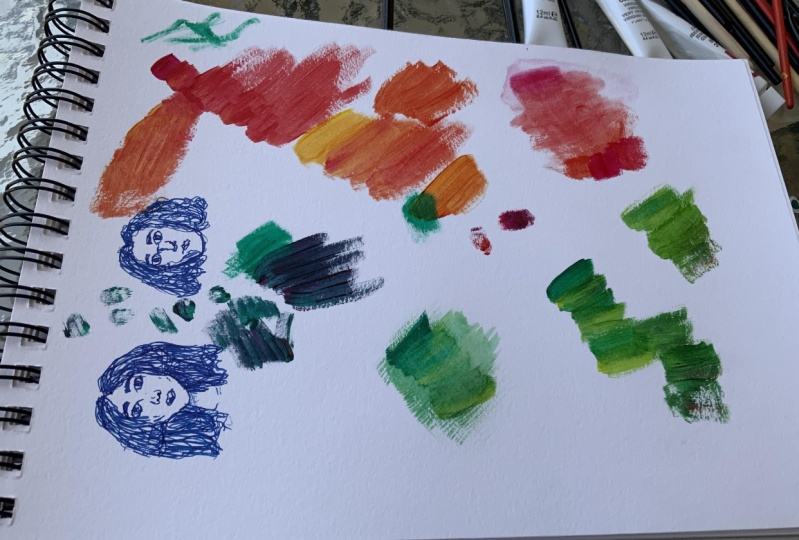
3. Demo of different types of paint: Okay, So one of the big
questions I always had was what's the difference between the different
types of paints? So I'm going to show you,
I have four paints here, starting at the craft
quality acrylic paint. This is just something
called a bright yellow. One thing about the
craft qualities is that sometimes you aren't really sure what kind of pigments
are in them. So this is just a
basic primary yellow, but it's the best I could find. This is Liquitex basics,
a student grade paint. It is their primary yellow but just called primary yellow. And then next to it I have primary yellow from
Golden acrylic. So this is now an
artist grade paint. And then just to show
you the difference, this is the golden Open Acrylic. This is a Hansa yellow
is the closest, again, that could get
to all the colours. So all of these colors
are very similar. And what I've done is I've drawn a line here using a black
pen, does a ballpoint pen. And what we're going to see
is the different opacities, how they spread and
everything else. I'm doing this on
mixed media paper, which we're going to talk about a lot in the next couple of videos because mixed media paper is fantastic for starting out. And then I'm just going
to use a basic brush. I have a number eight flat.
4. Choosing your colors: So you're just starting out. Paints are expensive.
Which colors you get. I'm going to run you through a couple of different
palettes that are useful for a couple
of different things. And every piece of advice I'm gonna give you is applicable to the
student grade paints. So if you only by the
student grade paints in the same colors, you
will do very well. I happen to have purchased some artist grade paints,
some student grade paints. So I'm all over the place in terms of the brands I'm
gonna be showing you. But the brands, no
matter the pigments are really what matters
for this discussion. The first thing, titanium
white and a lot of it. This was a five ounce to I bought it only a couple of
months ago and I'm almost out. And titanium white is probably the most used color that
you're going to have. And that's because it
does a couple of things. It cools a color down, that is to say it makes it
a little bit more blue. It saturates it, so it reduces the amount of
pigment that you have there. And it allows us to add atmospheric perspective
and a lightens the color. I don't think you can really get away without some
kind of a white. There are other types of white, but I've never really seen many people avoid
titanium white. So let's assume for every rest of the discussion that you have to pay any white. Okay? The first thing you might do
is you might go to the store and see that they have things
called the primary colors. This is primarily yellow, this is from Golden, but again, acrylics, they all
look the same. So this is a Liquitex
basics acrylic, primary yellow, the
same basic idea. Primary golden
calls and magenta. Every else would call a
colored red and primary cyan. And again, everyone would
call a colored blue. These three colors plus white will get you very, very far. So this is a really nice
way of getting into things. In fact, this is how I did it. When I first started, I got a big tube of Liquitex
basics yellow, white, red, and blue, and I just mixed from there. Benefit of using such a
limited color palette is that you have to ask
yourself the question, how do we get that
color from what I have? Rather than reaching
for a whole new tube of paint that happens to be
close to the color you want. This gives you a
lot more freedom. And if you stick to
three colors plus white, what you're going to do is
make your life a lot easier because you don't have to worry about whether
it's this blue, that blue, or whether
you have to add a little bit more green
or whatever it is, you only have these
three colors. You're going to really intimately learned
your color wheel. There are some downsides. So these primary colors are
known as synthetic colors. So there's nothing natural about these colors and they're not
the classic pigments either. The downside to that is they're extremely vibrant and very,
very hard to control. For example, this
primary cyan here, when mixed with the
primary yellow, if you put in too
much of the cyan, which has very, very little
less than you might think. Suddenly you just have blue that looks a little
bit more green. The yellow is really dominated by these
two primary colors because these are
such strong pigments and this one simply isn't, it's not a very strong pigment. So this is an option. What I recommend you do though, is you buy a couple of
pigments, red, yellow, blue, and some white, and then add a couple of
very useful colors. Let me show you what. This is raw umber. And I use raw umber
all the time. This is actually
my third tube of raw umber in the past couple of years
and every other too. But I think this is my
second tube of blue, second tube of
yellow, and I haven't even finished my
primary magenta. You'll see that there
are some colors. Once you start buying
a lot of tubes, you just don't use
them that much. And for me it's just
happens to be red. So given what I paint, this is actually my original
tuber primary magenta, because I simply haven't
used that much red. Romberg is an amazing color. It does a couple of things. First, it is brown.
It looks block. If you look over here, it has
a swatch, it looks black. Maybe I call it a warm black
really is it's a brown. But when you mix these
two colors together, you can control what
kind of black you get. And so what ends up
happening is you end up with a dark blue or a dark brown. And you can mix them
to various effects and you get nice graze
out of that as well. If you start mixing
and titanium white, this is a go-to
color that I cannot do with how it's really,
really, really fantastic. All right, but let's
say that you're having issues with
these three colors because they're too strong or they're not doing
what you want to do. A really fantastic
set of colors. And now I'm going to start
mixing my brands here. Cadmium red. In this particular case,
cadmium red medium, which is from Liquitex basics. This is a type of
cadmium yellow color. It's actually called
cadmium yellow deep because cadmium pigments, they are a little bit toxic. And so academy and free is
just a non-toxic version. This one is from Liquitex
and as the artist colony. And this is a cadmium yellow, cadmium red and yellow. And now you need a blue. Ultramarine blue is a
very, very red blue. It's almost like a purple. If you use ultramarine
blue, cad red, and cad yellow, which
you end up with is a really fantastic
landscape palette. Again, remember he's always
having titanium white. This palette here, because these two
colors are very warm. This is almost an orange,
that's almost a purple. When you mix them together, you don't get vibrant greens. You get a very dulled down green like you might see
an unnatural landscape. Similarly, when I mix
these two together, I don't get garish purples. I get a really nice
dark color and this is what takes
place of my black. So I mix these two
together and I get something that's almost a black. And finally, if I mix
these two together and a little bit of that,
I get all my browns. And so this is a really
fantastic landscape palette. If you add rock number, you are in fantastic shape because now you have
access to a brown, these to make fantastic blacks. And then you have some really
nice sand colors by mixing, say a raw numbers and brown
and a yellow together. So you have a really nice, well-rounded landscape palette. All right, but now let's
say that you've chosen a primary palette
and you want to add a couple of other colors. So I'm gonna go through a
couple of different colors. And now this specific
pigments don't really matter, but the idea behind them, and I'll explain what
I mean in a moment. This red called NAP fall, right? But there's many others, is a cool red. What it means is it leans a
little bit more to purple. So this is a very warm and in fact, if you
look at them together, this is basically if you want to use a
word other than read, you might say orange and this one here you
might say purple. So if I keep these two
together on my palette was going to give me the access is this will mix up
really nice purples. This will make some
really nice oranges. This one will mix up a really bad purples because it has all
that yellow in it. This one will mix up really bad oranges taken together though, I have a really nice gamut
of colors that I can use. Finally, you might consider
adding some earth tones. This is yellow ocher
and this is red oxide. So these are your yellows and reds if you're using
earth tone palette, if you're gonna do that,
and you have, say, an ultramarine blue, this is
a primary colored palette. It's really, really good from muted landscapes,
It's fantastic. Be aware of a couple
of things though. Number one, red oxide, if you really wanted
easy to use red oxide, find one called
transparent red oxide. This one is not transparent, it's very opaque and it actually dominates
many other colors. It's extremely strong. And next, keep in mind that if you're only using
these three colors, you don't have access to vibrant colors
because by default, these two are
already dulled down. This yellow ocher is much
more of a brown yellow. This red oxide is
again more of a brown and desaturated red. So you're never gonna get really stunningly bright colors. But if you're painting, say, a forest scene or
farms in the autumn, this is a really
outstanding palette. So what do I actually use
when I'm doing my painting? My palette right now typically
consists of the following. So it was moving these
out for a second. I do use a lot of cadmium red. I use both of my blues, right? This is a warm blue and this one just gives me access to some really bright
vibrant blues. I quite like it. I've been using cadmium yellow lot lately and so now I have my standard
palette here. And then typically
what I will do is I will add a for sure, my raw umber, there's no
questions to ask about that. Raw umber is always
on my palette, titanium white so
that I can mix things up a little bit and make
them wider or lighter. And then sometimes I will
bring in my primary yellow. And you'll notice a difference. If you take a look
at these two colors, I have almost an orange
and I have a nice, Very cool lemony yellow. So this again gives me
access to a cooler yellow. I very rarely will
bring in my cool red. It's just not something
that I tend to do a lot. And I very, very rarely will use my primary magenta because it's just too strong
at color for me. So I do tend to like
using this one here. When I'm doing the landscape,
I will bring in these two, my ochres and my red oxide, but they are very
much secondary colors and I don't tend to use them. Alright, so now you might
be asked some question. Well, what about black? Well, yes, I have a
tube blockage here. It's my Mars Black. And there are many
different types of black. But I found personally that I haven't really been able to
tell much of a difference. And you'll hear a lot of
advice to new painters saying, Oh, we should avoid
black because it does. And then there's some
sort of horrifying Cliff. You're going to fall
off of a fuse block. There's nothing wrong
with using black. There's no such thing
as the wrong color, but very few things in the
world are actually black. So I use this just
recently when I was painting a water bottle because I've water bottle was black, you need black to
do that painting. But if you think about like
a shadow, for example, black is going to say that that is so dark and
there's no color in it. It's very rare to
find a black shadow. That's why I used my blacks
only sparingly and when it's necessary when I'm painting something that is
actually black, something to your crew, for example, I'm going
to use my black. But if I'm painting, say
a shadow on the ground, I might ask myself
different questions like how do I make that darker color? Maybe it's shadow on sand. Well, how do you make
darker sand color? You don't really add black. Maybe you want to add more
raw umber because that's more reasonable for what the
shadow actually looks like. So that's why I tend
not to use black. Again, if you're
just starting out, you might find
yourself buying a kit, especially the Liquitex basics
comes into fantastic kit. It has a red, blue, yellow, black, and green,
phthalo green actually. And what that will do for you is it gives you a huge access
to a lot of colors. Okay? The final one that
I'm going to show you is they all agree. This is a very cheap green. That is to say that the pigment
is not expensive and it is an extremely strong green. You'll find that this
comes in a lot of kits. The Liquitex basics
kit has it and the golden open acrylics
paint has it as well. It just comes with
phthalo green. Be careful with it. So play around with it. It's really fun color
to play around with is a really nice bluish green. And when you mix it with a cool blue like my
primary cyan here, you get some really
fantastic seat bone colors. I love it. I started painting in
2020 during the pandemic. It is currently 2022. I bought my first
set of Liquitex basics paint in June 2020. This tube of paint
is from that set. I have struggled to use four
ounces a phthalo green. It has such a strong color, even a little tiny tip of it on the brush changes everything
to a greenish color. So be careful with your greens. I personally recommend
secondary colors like green. Don't get them at first. Learn to mix them. And you'll actually
see that all the colors I talked about were variants of yellow,
red, and blue. And then we have, of course,
our raw umber because that's just a magic color that
does everything and white. But I'm not advocating
getting green yet or purples or whatever it is until you're comfortable mixing
things together.
5. Different types of brushes: Alright, so now let's
talk about brushes. And what might surprise
you to learn is that there is a difference
between student grade, craft grade and
artist grade brushes. So I have a couple of examples and I'm going
to show you what the major differences are
between the three grades. Now, what you can do when you're just starting
out is go to Walmart, go to the dollar store
and buy a package of a number of different brushes and a number of different types. They're gonna be cheap. They're going to be low quality, but they're gonna give you
different types of brushes. You can practice the fan brush, you can practice
with the flat brush and a round brush
and everything else. If you do that, just be
aware that your brushes, we'll get to a point
where they start to really frustrated because
they're not that high-quality. But the benefit is that you can learn which brushes you prefer. I learned from that, that I love flat brushes and that's it. I don't use round brushes
or daggers or anything else because it's really
not my personal style. You might learn something
different about yourself. At the lowest quality here we
have a craft quality brush. Now this brushes came from
Amazon and it was originally a round brush with
a really fine tip. But if you notice there, It's not that anymore. It's spliced out. And really this brush is difficult to use
as a round brush. The reason for that is because the brushes as just not
high enough quality. So what ended up happening
was this was only using one or two paintings
and it just started to splay out and it's
basically unusable now. So that's what you're
getting when you go for the cheapest
brushes possible. It's great for practice to learn which ones are the
ones you want to use. But eventually you're
going to want to move up. I now have two examples of
student quality brushes. This is something that is
called the dagger brush. They're fantastic brushes
if you were to starting, and this is just a
regular filbert brush. It has a little bit
of a rounded tip. Once you'll notice, especially
in the filbert brush, if you look closely, is that
it is still splaying out. It's not exactly rounded. It is definitely having
issues with its shape. And this one was used probably
in maybe ten paintings. And this one here, I actually very rarely use it because
such a large brush. The idea behind this one is that it is again, a student
quality brush. It is going to start losing its capacity to hold itself
together much, much faster. And the bristles are really
just a cheap plastic. And so what you're going
to find as you move up in quality is you stop
losing bristles. These brushes will
still lose bristles, but they're not
going to do it as much as a craft quality brush. So a really fantastic idea, you'll actually see here it says level to this one
comes from Michael's. If you would have Michelson
get to level two stuff, which is the artist
quality stuff, which you're going to a
student quality stuff. What's you're going
to find is that it'll take you a really long way. So if you're trying to
save money on brushes, the level two or a student quality brushes,
they're pretty good. But now what not getting? If you don't buy the
artist quality brushes. So here's a really
fantastic type of brush. It's a Princeton catalyst. By Princeton, it is the brush
that I tend to use more now and actually have many
of these in different sizes. I only use flat brushes because that's really what
inspires me to paint, but there's a ton of
different options. The first thing you'll notice as you hold
them in your hand is the Brussels are
much, much thicker. They're stronger and
they're going to stand up too much more abuse. In fact, here's an example
of a flat brush and this one has been used over
and over and over again. And it's just now starting
to fray and you're just starting to see
some of the damage that I'm doing to the bristles. And I'm pretty hard
on my brushes. And this is a very
small flat brush, a larger five pressure. You're not going to see that
for a lot of paintings. The other thing you'll
notice when you hold it in your hands
because it is heavier, it's made of solid wood. It has a much better way of connecting the bristles
to the handle. And sometimes they will
come in different lengths. Handles, I just like
using larger handles. There's nothing really
special about them. So what you notice is
the difference between a student grade and a
artist quality brush is that they're going
to hold their shape longer and they're going to do exactly what is advertised. This is a flat brush.
It stays flat. Here in my craft brush
was a round brush. It's kind of turning into
a five-prime accidentally, and I didn't want
that to happen. So when you go for a
larger quality brush, you're going to get
that consistency. The higher-quality
consistency and longevity. That being said,
if you're looking to save money and you're going
with student grade paints, go with the student grade
brush, they're great. And what you're going to find is that student grade presses, first of all, they are
much, much cheaper. This one was, I think $2. And this one which is
of comparable size, a little bit smaller. This one is actually
divisible at $6. So a huge difference in price for not a significant
difference in quality. And what I personally find when I'm using my student
grade brushes is, I'm again, like with my student grade paints
a lot less conservative. I'm just happy to match it
in and see what happens. Sort of play around with the brush strokes with my
more expensive brushes. It took me a while to
trust them long enough. And so my student
brushes, I really enjoyed playing around with the other thing because
they're cheaper, is you can buy a large number of them in different types
and different sizes. And you can practice and see
what works best for you.
6. Different types of supports: Well, we've talked about paint, we've talked about brushes, but now what are we
going to paint on? I'm going to stick to him what mainly is used by beginners. I know there's a
ton of different services that you can paint on, especially using
acrylic paint here, because acrylic sticks to
many different things. But I'm going to choose to talk about three different things. The first one is acrylic paper. This is called otherwise
known as Canvas paper. And this one here is from Strathmore or were there others? And the benefit of using an acrylic paper is
that it is just paper. So you can see here it's
just a sheet of paper. This one happens
to be nine by 12. It's very, very thick and it
has a canvas pattern on it, but it's actually fairly loose. So if you think about
what this might be, if you're thinking about
the different smoothness of the medium you're using, then this is a fairly
smooth canvas paper. And normally they're fairly
smooth if you're good, if you want a lot
of canvas texture than you normally
tend to go to Canvas. And the huge benefit of these
is that you can rip them off and they are just paper and you can play
around with them. And they're really good
for quick studies. But I actually find them
to be rather expensive. So if you think about
this, this was ten sheets and this cost about
$20 as nine by 12. Well, for that price,
I can just go and buy cheap Canvas boards. So I personally do not
like using acrylic paper. It does exist and if
you have a bunch of it, that's what I had when I
first started painting. I just happened to
have a lot of it. So I started to use it. But I don't tend to use
this very much because it is not really that much
cheaper than a cannabis board. And it's a lot more flimsy and curls up when you start putting on your
acrylic painting. Now that being the case,
this is a painting that I did with my canvas paper. And you'll notice
that the ID has standing up very well
to the acrylic paint. This is a very heavy
application of paint and all of it was my heavy
body artist grade. And I find that this
paper was okay. But if you take a look,
you'll see that it is in fact curling and that's
because it is paper. So when the water from
the acrylic paint starts absorbing and
it starts to curl up. And if you do a very heavy
application in certain parts, It's going to buckle. And so if you find
yourself in possession of some of the
paper, that's great. Otherwise, realistically,
you can let it go. The next thing is a
standard canvas board. So this is a eight by
ten canvas board and it has the basic same
texture as the paper, the Canvas boards I've found, especially the cheaper kind, if you go to say the craft store and buy the bargain kind, they're going to be harder to put paint on in the beginning. So if you think about what this is and I start
putting paint on, you might end up seeing
splotches where it's just not working and you're not
exactly sure why and I'll show you what that
looks like right now. So let's take some
Liquitex basics. And I will put a little
bit of it on here. Then I'm going to take
my big giant brush. And if you take a
look at what happens, I start to get these
edges here where the paint isn't
exactly filling in. And that's because this
has, well a lot of texture. That texture is going to, some people like it,
some people don't. But what you may notice is that if you want to start painting very thin layers and you want
to do a very detailed work. Canvas board may not be for you, or even raised Canvas
because it is very coarse and that's not a
downside of the support. It's just the truth
of the support. So if you happen to
have canvas board and you're noticing that you're getting all these
splotches here. It's actually this
because of the board. There are ways around
that typically involves putting on
a coat of Jericho, which is sort of like a primer, and then sending it and
doing it again and again. But if you're gonna be
doing that, you're gonna be putting in all of that effort. You might as well
just go and buy a smoother surface to paint on, so don't waste your time, especially as a beginner, but this is definitely an option. And here's a painting that I've done just recently
on a canvas board. And you'll notice
if I were to put these two side-by-side, the canvas paper one
and the canvas board, you're probably not going to notice a significant difference. They both take
paint fairly well. I tend to use a lot of paint. And so at the end of the day, both of them are fine. But if you're a beginner, I'm going to recommend
to you something that is going to hopefully
change your life. A little bit of overselling it. This is mixed media paper and you can get this in
many different brands. This happens to
be from, uh, who, who I bought it on Amazon. But you can get a ton
of different ones. There's one really fantastic one called the Fabriano back pad, which comes in at about a
150 sheets for like $20. So it is very, very cheap and very inexpensive. It's a smooth paper
so you're not going to have that canvas
texture coming through. So if that is what you want,
maybe this isn't for you. But I found with mixed media paper is
that it lets me play. So I have 62 sheets here and a bunch of other
sheets and different pads. They did not cost me a lot. So 62 sheets for $20
compared to say, a canvas board of the same size, which might be somewhere
between 2, $3. So it's really,
really cheap and it's really excellent
for playing around and it does take the
paint very well. So here's some examples
of what I've done. So this is just a study in
paint and this is very thick. I can touch it and I have
all the ridges of the paint. The other huge benefit of Canvas ports is that you can
start writing little notes. It doesn't matter if you
finish the painting. It's just there so you
can play around with it. Now I do want to show
you, and also if you wanted to use different mediums,
you can do that as well. So let me show you though, going to this page here. This is what we've been
playing around on. And let me just move it over. The paper does act differently. So he's heard me talking about the canvas paper,
how it buckles. Well, this will buckle too. So really the benefit of this is that it's cheap
and you get a lot of it. But if you want something that isn't going
to buckle around the canvas board
really is what you're looking for and
maybe even somewhat. So I'm going to do
the same thing I did on the canvas board. Put a line of paint down
and then I'll show you. And this just makes
sure that this is empty of paint
as I can make it. If I do this, it's a much, much smoother brush stroke. And you'll see that I don't get, except over here much of the, as the edges as I had
in the canvas board. So if you're looking for a nice smooth
surface to paint on, mixed media paper is fantastic. A cheap surface to paint on mixed media
paper is fantastic. I loved doing a lot
of quick studies in this because
it's low pressure. I don't have to
worry so much about whether or not I'm
making a masterpiece. And if I just want to
play with colors and see what happens if I take almost dry paint in sort of a dry brush and what
happens if I do that? I guess I'm interesting, Mark, and I don't mind that I
just wasted essentially an entire sheet of paper
or a half sheet of paper because it
didn't cost me much. And it's just there
for playing around it. If you're starting out, I
recommend very strongly go and get yourself a bunch of really good mixed media paper, watercolor paper works as well, but it is typically coarser or more expensive if you
want the thought process, which is going to be smoother. So mixed media paper,
fantastic stuff. And he just what I
recommend that you use as you start your
acrylic painting journey.
7. Extra Helpful Supplies: Alright, now I want
to take you through some supplies that I
cannot do without. The next couple of videos, I'm going to show you
how to use some of these supplies to really stretch out your paint and
make them last longer and make it
clean-up easier. So hopefully, you're
going to learn a lot from this video. The first one that I'm going to show you this a little bit strange in is a pair of pliers. This is only really used if
you have tight sticking pink, and I'll show you
an example of that. So this here is my
primary magenta. I don't actually
use it very much. But what happens is it's
really difficult to get the lid off because
the paint acts like glue. And honestly sometimes
when that happens, I had to ask on Reddit
actually I said, Well how do I open my pink? And it's not opening. You take a pair of pliers and you clamp it
and you open it. And I actually thought that they were joking when I first
asked this question, and it turns out is a
legitimate thing to do. And golden paints happened to be very susceptible to this. So the paint acts very much
like a glue other paints. And here's my liquid
text, for example. It just talks open so you don't
need to worry about that. But whenever you
have a screw top, it tends to act like a glue. And so you're going to want
something to open this. So it's a little weird. I wasn't really expecting
to need to use it, but it was something that I had. The next thing is, I tend to draw a predrawn my
paintings in pencil. So I have a eraser, a pencil sharpener, and just an HB pencil, so nothing special. Some people don't like this method and
I'm just going to tell you and walk
you through it. If you'd make really
dark pencil marks and you're using some
fairly transparent paint, you're going to see
the marks through. Now, if that's not
what you want, you're going to want to
use something different. So something different
might be paint itself. A lot of people use paint
to do the under drawing. I personally don't because I like making mistakes
and erasing things. And so what I tend to
do is I will draw it in pencil and erase and
everything else. And then I will go
over with my eraser, with the flat side of my eraser, I'll just go over my drawing so it makes it as
faint as possible. And I find that I don't have any pencil lines
showing through. The next is a splitting bottle. It just sprays water
and it's a fine mister. So if you get one of those, the larger ones
where you have to actually use your two
fingers to push it, they tend to make a
two large droplets. And what tends to happen
is it just pulls up on, say, a palate or
canvas or whatever. And so that's going to
make it more difficult for you to get your
water where you want it to go and just
to sort of soak into the paint to make it a
little bit lasting longer. So I use this to
find this sprayer. This one came from
the dollar store. It's nothing
special. It's filled with just regular water. Um, and this is something I very strongly recommend
that you have. I use this to Tupperware and
it just stores my water. So this is to clean
up my brushes. Some people do use two of them, so they have clean water
to mix in with the paint and then dirty water they can
use to clean the brushes, whatever works for you. And then here is a
Tupperware containers, just a basic food grade
container, nothing special. And inside of it you'll
see that I have a reg, which is in this
case it used to be a napkin and then
I got worn out. So we're using this as
my rag for my painting. This, I'm going to show you, I'm going to use
it for two things. The first is just
wiping off brushes. I will take a wet
brush or a brush with paint and just wipe it off and I won't worry
too much about that. So that's just going
to act like a rag. The second though is, I'm going to show you in
the next video how to make something called
a stay wet palette. So stay with pallets are things that stay wet and therefore your paint last so much longer
in the state wet palette. And that's what this
Tupperware is four. So I'm going to show
you how to do that. This here is just a loofah spun, so this is a soft sponge. It's a natural sponge, but
you don't really need to use one. Using natural sponges. Don't use an abrasive sponge. And what I use it for is
to clean off my palette, which is plastic, which
I'll show you in a moment. And the reason for that is that acrylic paint does not
stick to non porous surfaces. So if you try to paint acrylic
on glass, for example, or my plastic palette, what will happen is it
can be easily peel off. If I were to use a scrub brush something that has a
more of a tooth to it, then I would start scuffing
the surface of my palette. And that's going
to make it so that my paint sticks in and
it's hard to get off. This is nice and soft and you can use again
to see the soft sponge. It doesn't really
matter, but it gets your palette clean
without having to worry about scuffing it
and therefore having all the painting.
Speaking of my palette. So here it is. It's just a plate. So if you're going to
the art store and you see there's many different
types of pallets. Which one do I choose? I have a plastic plate and
you'll see on the back, this has been very well used. I cleaned the front
of it religiously and make sure that there's
as little paint as possible. And you'll see I'm starting
to get some paint here. I'm starting to scuff it
so I may need a new plate. This one has lasted
me two years. It is a dollar store
plastic plate and I recommend using something like this is your first palette. It's white. You might want
to use gray, so gray, the benefit of that is
that it lets you determine whether a color is too light
or too dark against white, everything looks too dark. It looks like it's dark
no matter what it is. And that's a little
bit of an issue, but because I'm trying to paint on the cheap,
I like my palette. Again. I just run an underwater soap
and water sometimes and I use my sponge to get stuff off. The final supply
that I cannot do without is this stuff here. This is parchment paper, basic baking parchment paper. I use this for is two things. First, I just put it onto my palette and that way I don't even have to worry
about cleaning it. And I can just hold it up and throw it in the
garbage when I'm done. But second, this makes a fantastic paper for
a stay wet palette, which is the point
of our next video.
8. DIY Stay-Wet Palette: What are the most common
issues that beginner acrylic painters have is the
paint dries too quickly. It dries too fast on the support and it dries too
fast on the palate. So if I put paint
directly onto my palette, I have somewhere between 510 minutes before I have to
miss it again with my water. The more water I add, the more liquidy
my pink gets until eventually I have to go
and clean off my palette. I found two ways around this. I'm going to show you the two
different ways that I use. The first one is to take this and my parchment
directly on my palette. But then to make sure that
I missed the parchment, I'm going to show you
what happens if I were to miss this right now it's
going to start to curl up. So there's a little bit of a
technique you have to use. So I take my MR and I spray and I sprayed
it very liberally. And then I'm going to flip it over and I'm going
to spray it again. And you'll see the edges
are starting to curl up. If I put it onto both sides, then that won't happen. What ends up happening
is the water gets into the parchment paper and then the paint starts to
suck up the water from it. Now this still means
you have to miss it. So this is going to
give me, if I had five or ten minutes before
with just a palette, I might have 20 minutes using this and I still have to
miss it over and over again. I tend to use this technique when I don't want to
set up my palette, I stay wet palette or if I
need a bigger area to work on. But let's talk about
stay wet palette because they are life-changing. To make a stay wet
palette, you need something to put the paint on. And I'm going to suggest you use baking parchment paper
because it is cheap, readily available,
and it works great. You need a cloth and
this cloth is damp. So this is the same
cloth that was in here in the last video
and it's damped, but I can ring it and I'm
not gonna get any water out. So this is how you know that you've got it to the
right consistency. I put it directly under the sink and then
it wrong it out. So all the waterfowl out. And now I have
just a damp cloth. I have my Tupperware container. I recommend using something slightly bigger
than what I have. This is what is that I take with me when I'm doing
plein air painting. So it's a little bit smaller. But if you have a
bigger Tupperware, you probably are
going to benefit from using it and the lid. So what you do is
often, however, maybe a sponge you have, it doesn't really matter and you put it in now it's
nice and damp. And then I take my parchment paper and
I would've cut it to size and it is still wet. So the key is that
the cloth is damp and the parchment paper
has also been sprayed with the spray bottle. So now everything in here is damp and I'm going to spray
it a little bit more. And you're going to have to experiment with your
particular type of parchment paper and your
particular type of clot. But what you don't
want to have happen is water pooling in the
parchment paper. If that happens, then you're just going to mix
with your paint. And your paints is
going to become liquid, which is probably not
what you're going for it. You want it to be damp, you want to be able
to touch it and definitely feel that it's wet, but you don't want
that pooling water, then honestly what you do is you just put your paint down. So now this is my palette,
this is my mixing area. So I have my, maybe I don't know my primary yellow and I'll
take some cadmium red. And then I can just mix it like normal as though it's
Italian, everything is fine. So I take a little bit of red, maybe I'm going to mix some
orange and there is no. The huge benefit of
this is twofold. First, this paint is going to stay wet for a really long time. I'm talking like an hour or
more if you keep the lid off. But the amazing thing
about a stay wet palette, as I can put the lid back on. If I do this, I have had paint stay dry for
days, to stay wet for days. And this is going to help me
when I'm doing a painting that requires multiple sittings or maybe I just don't have time. I put the lid on and I still have all the colors
that I mixed up. I still have this orange, I still have all of
my paints here. And then I can open
up my lead and I can carry on where I left off. The stay wet palette is probably something that's going
to help you in blending. And it's also going
to help you to save more paint because at
the end of the day, if these two big blobs of
paint where to dry out and maybe in an hour or two if I had them on my regular palette, then what's going to
happen is I've just wasted all that paint in the
stay wet palette. They're not gonna do
that. So I can make my paint stretch a lot longer. It is something I very strongly
recommend that you get all the supplies for
and start working with because it will change
your acrylic painting life.
9. Introduction to Blending Techniques: So now it's time to start our
discussion about blending, which really takes us to
the end of the course. Blending and acrylics
is something that people struggle with a lot. And you'll notice right
here, this is actually another piece of indispensible
equipment that I have. It's a cardboard I
used to paint on. And this is what it looks like when you don't blend
acrylics it all this is obviously just a
bunch of paint that got splattered on or whatever
it is I've been painting. Before we talk about different
blending techniques, I want to show you a couple
of paintings that I've done that use those
different techniques so you can see what to expect. The first one is here, and this is a bunch
of aster flowers. In this one, I
don't blend at all. And you can see
that in the very, very harsh edges and the strong brushwork
that I used here. Now that was the effect
that I was going for. And a lot of people like this painterly
style and in fact, it's perfectly acceptable
style to use if you are trying to make this bold
brushstrokes, loose painting. To do this, you need to appropriately mix your
paint on the palette. You'll notice that I have
a lot of transitions. So I have, for example, it is darker here
and lighter here. And then in the middle, if
you really look in there, there's a third middle
value in there. To achieve that
effect, I use what I call palate blending
and I'll show you how to do that and its appellate management
technique that you can use to mix up multiple different shades
of the same color. And then you can use
those over top of each other continually adding
layers until it works for you. So this is what you might consider to be an
unblinded painting. The next painting is here, and you'll notice
there's a little bit more blending going on. So this is using what
is called a wet in wet technique and also
a lot of dry brushing. So those are two techniques that I use to make this one work. And you'll notice a difference because the wet-in-wet technique literally you have wet paint on the palette on the
canvas, I'm sorry. And then wet paint on your brush and you mix them together. And so what you end up seeing is this streakiness here
where the two meet. So you have this darker value, you have a lighter value. And then in-between where
I put a brushstroke of the middle value is actually just blending
into both the wet in wet, the dry brushing is here. And you'll see
that there's a lot of the canvas showing through. And so that's a nice way to blend if you like, that effect. Because what it
allows to happen is the one-color to shine
through over the other, almost like it is
overlaid been vector, that's exactly what it is. And finally, this is probably
the most blended piece. So this one was done with
a variety of techniques. And I'm going to show you how to get this background effect, which is where you
actually use water on the canvas and a
very loose brush. And then the other things I was doing here was using
my open acrylics. And I remember I talked about the open acrylics in
the very beginning. Well now is the time to start talking about how they're used. And if you don't
have open acrylics and you have a bunch
of other acrylics. I'll show you how to use a
slow drying medium as well. And so this is probably the most blended
piece that I have. It's not quite done yet. This really relied on the pink being wet, almost like oils. In fact, if this
were an oil piece, we wouldn't even be
having this discussion because blending and
oils is so easy. But because it isn't, because
it hasn't acrylic piece, what I had to do was make use of different techniques
and different tools in order to get this effect. So those three techniques
we have almost unblinded. We have wet and wet
and dry brushing. And then we have this much more blended picture
and we're going to show you each of
the different ways that you can achieve
certain techniques. And I'm going to show you
that on my mixed media paper.
10. Blending with Broken Color: Okay, so the first
technique we're going to learn is how to mix on the palette in a way that makes it the illusion of blended pink. But in fact, they're
never ever is. What I'm gonna do is blend
these two colors here. So this is a primary
yellow and this is a cadmium red medium hue. Both of them are from
Liquitex basics. So I'm using a student grade paint
for this demonstration. I'm doing the work on my wonderful mixed media
paper because remember, it, mixed media paper is cheap and we can play around with it. You'll also notice that I'm not using my stay wet
palette for this one. The reason is because
it's just easier to see on this particular palettes. So you can see all
the paints and what I'm doing with my palette. And I will be honest with you, when I first started painting, I had difficulty blending. I had difficulty mixing paints, and I didn't realize
the two things we're actually intertwined. So although we're not technically
blending in this demo, we're actually just using
layers to make it look like we're demoing, look
like we're blending. What we're doing
here is we're going to see how I manage my palette. And I want you to pay attention more to the palette than
the painting could. First of all, because the paintings is
gonna be a bunch of streaks that are
coming together. But second, watch
would I do with my palette and how I don't
fully mix my paints, and how I keep my brush
dirty and everything else. Now, if you're wondering,
remember that stay wet palette from a
couple of videos ago while it's actually
an hour later, I took a bit of a break and this is my state cleft palate. So I could be doing it here, but it's a little
bit harder to see. But I want to show you
something amazing. If I take my brush, this paint is still
perfectly workable. So if you're wondering, these stay wet palette
works very, very well. Okay. That was a bit of a
digression, but now you know, when I'm doing a mix on my support without
technically blending, what I'm going to make sure
I do is keep the same brush. I don't have any water with me because I don't want to
clean anything off yet. If I'm finding that one of
the colors is two dominant, and you'll see
that, for example, the red really dominates the yellow with
that means there's only a little bit of red is needed to change the
color of the yellow, but a lot of yellow is needed to change the color of the red. What I will do is
I will try to get the paint off of my
brush in some other way. That's actually why I have this messy board here
because when I just do it like that and get
the paint off of it. Okay, so what am I going to do? Let's begin with just
a stroke of red. So I take my brush, I make sure there's no,
none of the board there. And let's take some
red and put it down. And you'll notice I'm
letting the brush stroke. Now what I'm going
to do is mix in my palette a orange that
is more close to my red. So I'm gonna take this a little
bit of yellow and notice that my brush is
still dirty with red. This is the key to
this technique, is you want to make
sure that all of these colors stay on the
things you're using. So my palette, I'm going to
have that orangey color. My brushes going to have it. And now finally my canvas
here, my paper in this case. So I'm going to mix it and notice how I'm not
mixing it completely. This is the key
to the technique. I'm allowing the
orange to be there. I'm allowing the
yellow to be there. Eventually I'm going to
start putting more colors into this one and it's
going to expand outward. So I have multiple colors on my palette that I
can access and use. It's also my brush has
the orange and the red. So as I start coming in here, you're going to see
that I'm just putting in brushstrokes and you
get this orangey red. No, I want it more yellow. So I'm going to come in
here with more yellow. I'm just scraping it
directly from this. My brushes still dirty and I'm coming in
with more yellow. Know I personally want it to be more yellow, so what do I do? Well, I add more
yellow to my palette, but notice that I'm going to
keep some of that orange, so I'm a giant thing
of yellow and I'm coming in and mixing
it on the side. So it's now a much
more yellow, orange. My brush still has
all the stuff on it and I'm going to
start putting in here. Now I want it to
be say more red. Well this say I'm gonna
put rents down here. I come in again dirty brush, and I come up with some red
and I want to mix it in over here so I keep all of my colors. This is the key to
this technique, is I wanna make sure that I have all of my colors
still on my palette. Maybe I want a little bit
more orange touch of yellow. Who knows whatever
it is you wanna do? And it was my brushes
still dirty and I come in here and now I have
this red, orange. Okay. But now what if I wanted
to be really yellow? If I were to go in with
yellow, I'll show you. Let's just take a
piece of yellow and not even mix it
and try to put it on, I'll put it on over
to the side here. I still get the red. Now I want to keep this semi
blended multiple layer look, but I want it to be
a lot more yellow. So I'm going to take my paint. I don't want to
waste all my paint, although in this
particular case, and I really didn't have paintings. So maybe I will get as much
off on the palette as I can. And this is gonna be very
useful paint for me, especially if I'm using
to stay wet palette, that's going to stay wet
forever if it isn't. My handy spray bottle. A couple of sprays
and I'm good to go. Now I'm going to
on my messy board, you can use paper towel for
this, whatever works for you. I'm just going to sort of get
the paint off of my brush. There are still some
there that's okay because I still want that
mixture is coming in. You'll see a lot of
oil painters do this. They tend to take a towel,
something like this, and they'll just wipe your brush off and then there's still a little bit
of paint in there. That's fine too. I just like my messy work. I think it looks kind of cool. And now I take. Some yellow you'll notice now there's almost no red there. And I'm going to
add my yellow on. And now we have a much more yellow non-contaminated
color there. And you'll see that what
I just did now we're going into almost
completely yellow now. There's still a little
bit of red in there. And maybe I just
want to come on in and do a last stroke there. And so what I've
just done here is created a gradient from red to orange to a
very yellow orange, a little bit of red in
there, and then to yellow. And I'm allowing myself to
not really mix the paint. And it's just radiating because I've done a
couple of things. First of all, is
I'm not worrying about what these look like
here in the middle here. I really don't want
to blend that in because I want that
painterly look. If that's what I'm going
for here on my palette, I have all these
different colors. So now let's say that
this is too strong. Here. I don't like this transition. I want it to be a
little bit more red. Well, that's what this is for. That's why I kept
my palette dirty and that's why I have all
these different colors. So I want it to be a little more red than yellow.
So what do I do? Well, I go into, maybe here, maybe that's acceptable, maybe I want a
little more yellow, so I go into my yellowy orange. Maybe now I'm going to start
mixing a little bit more. And now I can put in my
transition color there. And this is just a
nice transition value. This may be taking me
closer to my yellow. Again, if I went too far, I can take my yellow, mix it in. And you'll notice that
what I'm doing and they will take a little
more yellow and I want it to be obviously
orange but still yellow. And now I still have all
of this gradient that I can use if I wanted to
come in and do more stuff, and I'm going to put in
my extra layers here. What are the most profound
things I've ever learned about acrylics is if you
don't like how it works, add more layers. If you think that you're not getting where you want
to be, add more layers. Let me show you that
painting again. This painting had so
many layers of pinks and magenta and blues
or even in there. And sometimes there's even some green in there, so some yellow. And I just kept adding more
and more layers until I was happy with it because this is
a great technique for that. If you're sitting
there saying, well, I'm not loving how this looks, don't stop then keep on going. If you have to let
your paint dry, add more layers when
everything is dry. Now, I'm still working so
everything is nice and wet. Okay, let's do a little
bit more over here. And this, remember this
was purely red and this was more of an orange and
that was this color here. So now I want to transition maybe downwards,
more toward yellow. Maybe I want to do
a double gradient. I'm going to take from here, which was fairly red and
mix into here, right? So I'm now mixing
down my gradient. So I did lose my
colors eventually. And I can start putting that on. And then I'm going
to mix it even more. I can put it on again. And I'm going to
mix it even more. And you'll notice that
when I'm doing where I am on my palette,
really, really matters. Maybe I want some more yellow,
I go ahead and take it. So where I started
mixing on my palate, notice I'm going from the
red to the yellow here. The fact that I have all of these different colors allows me that freedom to do this
multi brushwork technique. I really liked
this technique and now I'm just sort
of showing you what happens if you tried to get
all the paint off and you're getting into now,
no more gradients. All the paint is the same
as mixing on the brush. I really liked the look
of this and I tried to bring it into my paintings
as much as I possibly can, because I think that's a more painterly quality
in the impressionist ear, this would have been
known as broken color. But this is how you might manage your palate and your
support to do that.
11. Blending Wet into Wet: Okay, so the next method of blending we're
going to be looking at is a wet on wet technique where
you have wet paint going into wet paint and you're
trying to blend them together. And then something
called dry brushing, which is very similar
except that you have only a very little amount
of paint on your brush. What I've done is I've
washed off my brush, but I still don't have
any water with me, so I'm not going to worry
too much about putting water on my brush and washing it off between
brushstrokes that'll come later. What I'm gonna do though
is sprayed my palette. So now I'm adding a little
bit more water than I normally would if I were
just keeping the paint moist because I do want it to flow a little
bit better and to stay wet for as long as
possible so that it can blend. The other thing I'm going to
do when I'm doing a wet on wet blending technique
is I'm going to be aware that I
have other brushes. I'll just take this one
here for an example. And this is going to be
my clean brush to get my edges nice and
smooth and I'll show you what that
looks like right now. Okay. So let's do a wet on wet and
we're going to do a red. Let's just go straight
into the cad red. Another key too
wet on wet is you have to work relatively quickly, so I'm gonna put a
lot of paint on. This is the other key, too wet on wet is the more
paint you have, the better. Okay. Now I want to blend in a yellow, so I'm going to clean
my brush again, just using my message board
and take a lot of yellow. I'm going to start here. You'll notice it's still a
little bit of red on that because I do like that
painterly quality. And I'm going to keep on adding more yellow until they meet. And now you'll see they're going to start blending together. Now to do the wet on
wet blending properly, what I need to do is continually
move back and forth. And the direction I'm moving is the direction
the paint comes in. So if I start on
the yellow side, I'm bringing yellow into red. That means that I'm going to
fix this transition here. If I bring from the red side and bringing read into yellow. So if I find that
my transition area and maybe it's too yellow here, then I'm going to start on
the red side and go in. If it's too red here S on
the yellow side and going. But now I'm going to
leave my dirty brush. I'm gonna take this brush
which is nice and clean. And I'm going to
pick a direction. I'm going to particularly
go from yellow to red. And I'm just going to
very lightly blend it in. And then I'm going to
clean this brush off. And I'm going to do it again. Clean your brush off
and do it again. What you'll see is
that eventually I'm getting a nice smooth
gradient here in the middle. Now this is a
helpful, it's very, very good for me because
that might be what I want, but you'll still see there's a very strong transition here. Well, that's because
these two colors, they're not really
going to easily mix well and they dry
fairly quickly. And the reason is
because one is so much darker. So how do I fix that? Well, let's take in
some third color. That's why I still have
my palette like this. I'm going to come in here
with sort of an orange, maybe a little bit more red
than yellow, orange, right? Make sure my brush
is nicely orange. And since everything
is still wet, I can just put this in. My dirty brush, come
to my clean brush, make sure it's fairly clean. And then just work on
the transitions here. Okay, so I'm gonna
do that again, adding in maybe a bit
more of a yellow. Now I have a fairly
yellow orange, maybe a bit more yellow here. And I want to just work carefully on what's going
on here at that harsh edge. And then adding in more yellow, everything is still wet. They're going to blend
in really nicely. And then we're going to
take our clean brush, clean it off, and
pick a direction. I feel it's too red, so I'm going to go
from yellow to red. I'm going to go just lightly
and just touching it. So it does transition. That is going to be what we call the wet
on wet technique. The downside too wet
on wet is that you have to plan really well. If you know that you're
going to be doing it, then you can say Okay, first comes read,
then comes yellow, then comes orange,
whatever it's going to be. But if you're a more
spontaneous painter, that's going to be
a little bit more difficult for you to do the wet on wet because it does require
quite a bit of planning. But wet on wet gives you some really good techniques
to use for, for blending. Now, let's say that I want a
third color to come in here. And I don't really wanna do
all the wet on wet blending. So let me take a
third color out. Now going to take
out fallow green, they look green is a
very strong color. And what that means is that if you have only a very
little bit of it, it makes all of the other
colors really turn green. But just to touch if they
look green on there, and I'm not really concerned that everything is
mixing together on the palette now because
I'm gonna go clean it for the next demonstration. And what I'm gonna do
is take a new brush. This is the dry
brushing technique. And I'm making sure this
brush is absolutely clean and it doesn't
have any water in it. So I did wash this
off a long time ago, maybe an hour or two ago. And I'm gonna make
sure it isn't wet. If it is, I can
always use a towel, so I take my towel and just brush it off until
it's nice and dry. The reason I'm gonna do that
is so that the only thing on there is the color
I want to put in. Then I'm going to take a very
small amount of the color. It doesn't matter if
you put in too much. I'll show you what to do. Let's say I put in too much. Oh no, now this is never
going to dry brushing, right? You can take a scrap
of your support. Maybe I haven't done
that in this case. I'm just gonna put it
on the corner or on your palate or your messy
board or whatever it is. But what you wanna do is get it so you have
this happening. Remember, we talked
about ignoring that when we were on a canvas. The canvas, we wanted
to get rid of that. Now we want to
really lean into it. So the dry brushing technique
is where I come in with a basically dry brush
and I just lightly, lightly, lightly Come over almost like I'm
shading with a pencil. Keep my brush dry. Come in and shading.
Which you'll see that happening
is first of all, because I was doing this into
a little bit of wet paint. It does take a little bit
of the paint with it. But as I do the dry brushing, I'm getting this nice, smooth, almost like a layering
effect coming in. And the reason for that is
because I'm just putting in little tiny bits
of color over top. And so it's this
mixing optically on top so we can see it. So those are those techniques. The next technique we're
going to look at is going to use a lot of
tools and some mediums. And so what I'm going to do
is show you that separately.
12. Blending with water: Okay, so our next step is to figure out a
way to blend without having to worry
about whether it's wet on wet or planning
or anything else. I'm going to show you a
number of ways to do that. And in this video we're going to talk only about using water sprayed onto your support to do the mixing. I'll show
you how to do that. But first we have to talk about what you need before
you get started. You need to spray bottle
and you have to make sure that it is a fine
mist spray bottle. If it sprays very
large droplets, It's not going to work. What will happen is
it'll just mixing with the paint and you get
like a watercolor effect. If that's what you want, great. But if it isn't infused, want a smooth blend, you're
going to need to find Ms. Bottle. Then you're
going to need whichever brushes you're going to work with to apply the paint. I'm just going to
choose this one here, which is nothing special. It's a nice flat brush. And then you need a soft brush. I'm using a fan brush,
but you don't have to. It's really good for this is
actually watercolor brushes. Now, just be aware, there's a large difference between the quality of watercolor
brushes and the price. Don't go and buy a $60
squirrel hair watercolor brush and use that for this technique. It's a very bad idea and
complete waste of time. You actually want. This is a really soft brush. It's a cheap brush. I got this one from Walmart. Again, I can come back
to this one here, which is the brush I said was sort of falling apart and
all that sort of stuff. So this is the craft
level of breath. These are great for this. But the key is they
have to be dry and they have to be very, very soft. So three things. Water. You're advocating brush, a soft blending brush. Now
let's see how to do it. So I'm going to
start with some red. I want it to stay wet. So the downside is it has to
be a wet on wet technique. And then I'm gonna
go into my yellow. I'm going to put it
right next to it. And a little bit of
wet on wet blending now very quickly because I
want everything to stay wet. I'm going to spritz. So now there's water here
and everything is wet. And then I'm going
to come in and brush very, very gently. And then remember the
direction matters. So if I'm going to clean off my brush here and I'm gonna
go back into my yellow. I'm going to come back into my red and back into my yellow. And I keep on going
back-and-forth, back-and-forth, back-and-forth until I achieved
the blending that I want. Whenever my brush seems
to be getting too dirty, I'm going to clean it, I'm
using a towel for that. And then I'm going to
continue to brush again. If it's not working as well as it was before,
I'm going to spritz. I'm going to switch to a
different brush because just to show you what it might look like with a different
and this is again, a fairly soft brush. And I'm barely
touching the paint. Very, very, very gently
touching the paint. And now there's a lot of water here, so we have to be careful. I take my towel, I dry it off. I'm getting some paint
off as I do that. And then the direction I
go is the direction of the paint comes in from.
And then I go again. I get this nice blending
technique and nice, nice gradient that I can use. And you can refine that
the softer the brush, the easier it is to do that. Let me just get an
even softer brush. Now. Here's a really soft brush. It's very small and I'm gonna
go in circles to blend. And that just gets rid
of any brushstrokes. And the more I do
this, the software, the brush, the better
the blending will be. Okay. So what are the downsides
to this technique? First one is you'll see that
if I use too much water, which I've done on this
particular support, I have watercolor
paint coming up. The second is, I need a very, very soft brush to make
this really work well. Okay, Even if I, if I list a tagline brush,
It's quite hard. If I do that, I
ruin it completely. Okay, I just take the
take it and it just basically becomes like adding acrylic paint to something
and I don't want to do that. The other issue is that when you're working
with this technique, you have to keep things wet and you have to keep
on splitting water. And if you forget to do
that, it's going to dry. So in the next video, I'm going to show you another
technique you can use. This one will require a medium, but that medium is designed
to make blending easy.
13. Using Slow-Dry Medium: Alright, so the next technique I'm going to show you for
blending is to use a medium. Now, when I first
started painting, mediums were scary
and complicated. They are. But if you start
with one medium at a time and learn how to use it and determine if
you want to use it. So there's some mediums that I've tried and I
don't really like, this is a medium
that I do like to keep with me and I
use it sparingly, but when I use it, I
enjoy that I have it. It's a retard or otherwise
known as a slow drying medium. Now there's many different
brands that make them. So this is one happens
to be from Golden, but Liquitex makes them and
there's a ton of others. But it is actually is propylene glycol,
which is antifreeze. In fact, what it does is it prevents the water from
leaving the paint. So what we essentially do is we increase the amount of time
that the paint stays open. Open, meaning wet. I've actually replaced
the paint on my palette. So before I was using
Liquitex basics. Liquitex basics because
they're so medium bodied, don't really benefit too
much from this medium. And the reason for that is because this will thin them out. So what I've done
instead is I've used my golden heavy body acrylics
in this particular case, I remember you can get student grade heavy
body acrylics if you want to play with them. My magenta is actually
almost done and it's very, very stiff, so it's going to benefit a lot from this medium. Whereas my yellow
isn't actually, it's quite a new tube and so
it's nice and soft stone. So I take my medium. And when you're using a medium, you have to experiment with
how much of the medium you use to achieve the
effect you want. It is generally recommended
you do something between like 15% medium
at the very start. And so for me in this
particular case, that's a couple of drops. So I will go ahead and just drop it directly onto the paint. Directly onto. And then I should really
be blending that. I could do it with a brush. But then we're gonna get
all of that paint and stuff inside of my brush
and things like that. So what I will do instead is
use just a palette knife. So if you don't have
one of these honesty, a butter knife will do. It doesn't really matter. This just a little bit special because it sort of
comes down a bit. That's the design. A cutlery of some sort. It doesn't really make a
difference as long as it mixes. The benefit of this
isn't because it's some magic thing for the palate, but because it's
easier to clean. So watch this medium is
already on here and I'm just going to take it in
and start mixing it around. And you'll notice what's
happening is that the, as the medium starts mixing in, my paint becomes a
lot more pliable. Here. I want to make
sure that my medium is really mixed in very, very well. Or else I'm gonna get
pockets where there's a lot of medium and pockets where there's almost no medium. And I don't really want that because parts will dry
faster than others. Now we have all this,
this is waste paint. I can't really get
it off anymore. So I take my towel and I just
wipe it completely, right? This is the burial benefit of using a palette knife here is that there's now no more
paint on my palette knife. And then similarly
with the yellow, you'll see again the yellow
in my particular case is much more free-flowing
just because it is a newer tube of
paint and I think that my magenta to make
it leaked a bit. So it's a lot dryer. And so now this is
fairly well-mixed, who is a lot easier to mixing? And I will now just clean off my palette
knife and I'm done. So now I have my
two colors. Okay? Mixing. Now I can use the wet on wet technique because
these are going to stay open for a lot longer if they are going to
be on the palette. So you'll see these
are already quite dry. These ones here that we did
only a couple of minutes ago. And this one here is the last one we did
and it's pretty dry. I'm not getting any
paint on my fingers. These are going to stay
open for a lot longer, probably between ten
minutes to an hour longer, depending on a couple of things. It's gonna be the thickness
of my application and the amount of slow drying
medium that I added. I come in and I take some and
I put it in. There we are. Then again, just
using basic wet on wet techniques now
because it's essentially I've made it so that
my paint stays wet longer and so I can
mix in all that. I want nice gradients and
they're going to stay wet. Maybe I want even
more yellow here. And what you're going to find, I'm going to clean up my brush, is that this just gives
me so much more time to work so I can do all those other wet on wet techniques
we were talking about. And I just have longer
and longer and longer. So it's a great, great tool if you are having issues with the
paint drying too fast. But there are some downsides
to using this medium. The first one is that
the more of it I use, the more diluted
my colors become. It is almost like adding water. So you know that you can add water to acrylic paint
and that's fine. But the more water you add, the liquid urine becomes, and therefore, the less pigment
you have per brushstroke. The exact same thing is true
when you're using a medium, especially this one, it's
a nice clear medium. And so what's going
to happen eventually? In fact, here let me show
you what if I were to add a huge amount of media and
just a little amount of paint, maybe some yellow in there. Well, then you'll see that
my brush was still dirty. So now what I have is first of all a big mass because this is going
to take forever to dry. But second, it's almost like it's not really
there, right? It's very, very
watercolors, you might say. Okay, so that is a downside
to using too much media. And the other thing
is this is going to take a very long time to dry. So this stuff,
because I've used so much of my of my medium here. We're probably looking at hours, maybe days to dry. Honestly, I'm not convinced
that's even going to try. Probably on the, on the paper it will because
it's nice and thin, but this is going to
take forever to dry. But what you'll notice,
notice how this was fairly thin because we have this
blow dry media in there. It's still wet and still
tacky. I can move it around. All of this paint can
still be moved around. It's a really huge benefit
if you are having trouble, especially if you live maybe in a dry climate or
disingenuous when you have difficulty working fast enough for your acrylics to
blend a slow dry medium. They're not expensive. They're great and they do
everything that happened. In the next video, I'm going to show you
a type of paint that has slowed dry medium, built-in.
14. Blending with Slow-Drying Acrylics: Alright, so the last technique
I'm going to show you for blending is using something
called an open acrylic. Now this is a product
specifically from Golden. It's a golden is the only company that
currently makes these. And what it actually is is
a artist quality pavement, which means that you aren't paying the artist
quality prices. So these are about the same cost as they're
heavy body stuff. It's not a student grade paints. So again, if you're just
getting into things and you don't really want
to spend all that money. This may not be the
solution for you. But what it does
is it actually has this stuff in it in part
of its formulation. And you'll notice I have
two pieces of paint here. I have my yellow and
this is just magenta to mix things up a little bit. I'm not concerned about this
paint on my palette at all. It's going to take probably for this thickness
of application, if it even does dry, it's probably going to take
between 34 hours to dry. If I now take a brush, I'll take a whole a clean brush. And I'm going to just take
this nice black brush. And if I take my brush and
I move the paint over here, so this is a thin
application on my palette. And normally if this
was a regular acrylic, I would have severe issues. My palate would be drying over almost immediately
by this point, to be honest with
you, I probably have about ten minutes
on that application. It's super thin and I have
about ten minutes there. And you can even
see if I take this to another brush here and
I tried to move it around, that paint is still moving, gonna move for quite awhile. So the huge benefit of using the open acrylics
is that you don't have to worry about mixing in your mediums and mixing and all your water and
everything else. If you live in a
very dry climate or you go out painting outdoors, which is something I've just
started to do this summer. I found that the
open acrylics were a huge, huge benefit for me. So again, let's do a bit
of a demonstration here. So I just put some down. Now, something to know about open acrylics is
the thicker it is, the longer it takes to dry. Now that should hopefully
be obvious to you. But if it's too thick, golden actually recommends
that you'd never put it on too thick or thin to thick leaves about
a 16th of an inch. And the reason for
that is because either it will not dry or it
will start to crack. It will take too long. And I was gonna go
right on and we're gonna do a wet on wet technique. And this blends. So, so, so well, this is
almost like oil paint. It really does feel a
lot like oil paint. If you ever played with oils, you'll notice very, very
similar feeling as well. And so we have really
nice blending. I was gonna get some
off of my brush here, adding in maybe a bit more
yellow to come on in. And now I have minutes, many, many minutes that if I
want to blend this together, I have tons and tons
of time and I can get this really nice smooth gradient
and longer I work on it, the better it's going to look, maybe add even more yellow. Yellow isn't my
magenta is very much stronger than my,
than my yellow. And that is because of
how the pigments work. We've talked about this
in a previous video. But I can come on down and I can make these wonderful gradients because this paint is
designed for exactly that. It's designed to stay open.
In fact, take a look. This was on however
many minutes go, it's still perfectly wet and
perfectly viable as paint. So golden open are great. Remember the downsides are, number one, they
are more expensive. And number two,
interestingly enough, sometimes they take a
little bit too long to dry. So this is going to stay
wet for quite awhile, probably in this
particular thickness of application,
maybe 20 minutes. If you're, say plenary painting, you're outside and
you want to bring your stuff inside, what
are you going to do? You have to wait for it
to dry or else it's going to smear or whatever it is. Or you have to have a special case for
carrying their paintings. And so it is not a cure-all, but a lot of people
have found that using open acrylics
really makes their, their painting a lot easier. In fact, this guy here
was done entirely in open acrylics and
I was able to get some wonderful blends
and I was able to use multiple
different colors. Now I still manage my palette, so this is still acrylic paint. I made sure I had my big
gradient already on my palette, so I didn't have to
constantly be remixing, but it led me blend
his feathers in four hours and I was still
good to go when in fact, it was still a little
bit tacky when I put it away and I was concerned
it wasn't going to drive. So open acrylics
are great option, but they, again are not a cure all and they are a
little bit expensive.
15. Conclusion and Class Project: So we've made it
through the course. So what's your class project? What I want you to do
is experiment with a different blending
techniques that we talked about with your specific
palette of paint. The type that you've chosen,
the colors you've chosen. I want you to make yourself
a stay wet palette. This is a stay wet palette
that I was talking about when I first made it for
you and take a look. It's been now a couple of hours. I've been recording
for a long time. This paint is still
perfectly viable. It's amazing with a stay
wet palette can do for you. So your class project is make yourself a stay wet palette with materials you have available. Don't go and buy new stuff. And then test out all the
different blending methods that you can with
the paints you have. If you don't have open
acrylics, don't worry about it. If you don't have slow dry
medium, don't worry about it. So that's what you're
gonna be doing. And I will look forward
to seeing all of your wonderful
blended experiments. Thank you for watching.
 Michael Cooper-Stachowsky, Creative explorer