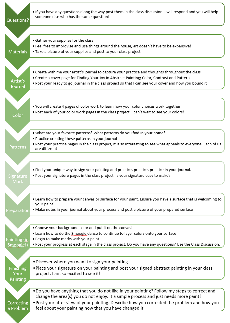
Transcripts
1. Introduction: I love abstract paintings. I love to paint abstract paintings. There's something about the patterns and the marks, the colors, the shapes, the contrast that I find unique to Abstracts. Welcome to Finding Your Joy in Abstract Painting Color, Contrast and Pattern. Hi there, my name is Cindy Rae Fancher and I'm an artist. I have been a full-time artist for the last year and a half or so. But before that, I painted for many years and was a crafter my whole life. I have two dogs, reckless and buddy. They keep me company while I'm painting. The only difficulty is trying to keep them not to refrain from barking while I'm recording. I live in Huntsville, Texas on Lake Conroe in a beautiful home on the water. I have an RV and I love to take the dogs on the road and paint while we're out. This last year has been a little tough to do, but it's so much fun when we do get out. In this class, you're going to learn how to create an artist journal. How to look at your colors, How to look at and make patterns and marks. What your signature mark should be. How to paint in this in the Smoogie way, and how to create your own abstract painting to Find Your Joy in Abstract Painting. This class is for every kind of artist. Those who know they are an artist, as well as those who just want to be and know that an artist is hiding within themselves somewhere. Let's help bring that artist out.
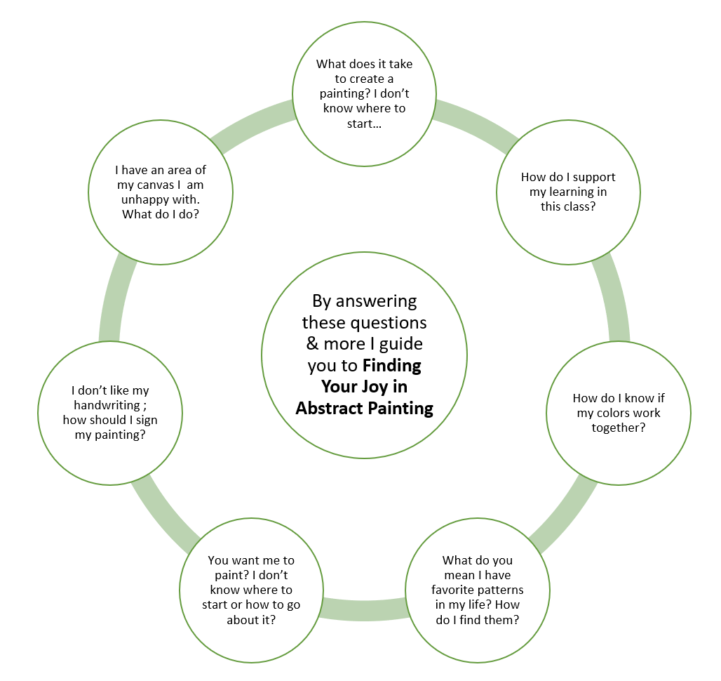
2. Class Project: Finding Your Joy in Abstract Painting Color, Contrast and Pattern. You will see that this class is full of activities for you to create. As part of the class project, you will create an artist's journal, which will be an important part of the projects that you'll do in that you will have an opportunity to learn how to create an artist's journal. You will learn how to use that journal to record your color journey and color thoughts. How to use it for capturing your interests and passions related to patterns and marks. And as a practice place to note your signature mark so that you can develop a personal mark for the art you create from now on. In addition, you'll prep your canvas. You'll paint the background, will paint the canvas itself with smoogie painting. And you will make sure that you have contrast and patterns and marks that you're happy with before you ever sign your canvas and then complete your painting. You will end this class with a completed abstract painting, an artist journal, and a world of thought to help you move forward on your artistic journey. I'll see you in class.
3. The Importance of Color: It's time for us to begin looking at color, how you want to use color, and what colors you want to use in your painting. We'll use our artist's journal for this. And this, the introduction to color will focus on the three to five colors that you're interested in using, as well as starting to look at those colors side-by-side. Let's jump right in. Let's do some color work. I put in the attachments, some guides for how you want to use your color pages. I've gone ahead and just taken a few pages out of my journal to make it easy to work on. The first page that I'm going to work on is called My Colors. And all I really want do is take and put all of my colors across the top of the page. I've got myself several brushes here so that I don't have to keep changing brushes and washing my brushes continuously, I'm just going to start out with everywhere I see a #1 on this page. I'm going to put this and I've also aligned my colors up 1 to 5. And I'm just going to put on this page everywhere I see a 1, I'm going to put a dab of my quinacridone violet. This will make this exercise go really fast if you work off a sheet. So that's all the places I have #1. So essentially I'm done with it for now. I'm going to go ahead and put that brush in my cup so it won't dry out. For the next color, I have some small cheap brushes here. That's all I'm using. My next color #2 is beautiful, they call it blue lagoon color from Golden. I'm gonna dab it down here. And what I'm doing at the top is I'm making my, my color legend to know what my numbers (1-5) relate to. So #1 is going to be my quinacridone viole, #2 my teal. #3 will be my light magenta, #4 will be my pyrrole red. And then #5 is going to be my light violet. So anyway, everywhere I see a a #2 now I am going to put a dab of the teal. And I've tried this both ways, doing it with a pre-made chart that you're just filling in, so to speak, makes it go much, much faster and you have to clean your brush a lot less. That's why it's faster. So now I'm going to pick up my #3. It's a great way to really know that the work you're going to do in your painting is going to turn out to be something that you're happy with because you're already going to know how your colors play and work together. If you did not do this, you're leaving it up to chance as to what's going to happen when you put them together. And as you'll see as we continue through this, there are some what might be unexpected results that would happen. But because I know it before I start painting with these colors, I'll be able to manage it. And that's the whole goal for you. Alright, so I have this one last #3. Ok. Now I'm going to do #4, which is the pyrrole red. Very, very strong color. You can see how easy this is with having this all mapped out for you. We have more pages to do and we can actually do all of them at the same time, but I think it gets confusing if we start doing all the pages at once. Alright, so I'm finishing up my #5. And again, all I am doing in this exercise is taking my base colors. And then I'm putting the them with each other so that I can visually see how they look side-by-side. Do I see any that I think, gosh, no, please don't or something that I say, hey, I really love that combination. Like one of the things that's very appealing to me is the #2 with the violet, also the pink with the violet, those are very good. Not so sure about the pyrrole red and the violet. I like the purple, always happy. I like, the red and the pink together. And one of the things that is good is you can actually put the colors next to each other. I didn't bump my colors up to each other, but if you take a bump the colors up to each other to put them side by side and touch one another. All right, so now we've got the color, your color, legend, and then you' know how they look side-by-side. So now you see hopefully what colors might be best for you. Perhaps you made a decision during the side-by-side work that you really didn't like a color you had chosen. That's ok. Feel free to change a color, if you do like them. that's wonderful, let's go on to starting to mix our colors and see what you think after you begin to mix two colors together. I'll see you in the next lesson.
4. Materials: Hi there. In this lesson we're going to talk about the materials you'll need in order to create your class projects, your artist's journal, and your painting. So let's jump right in. You will want some type of water color paper. I am using a Fabriano, 140 pound hot press paper. If you don't know, hot press means that it has a smooth surface. If you use cold press paper, it has what they call, tooth. And the tooth actually provides some resistance as you're moving your brush or your pen across the paper. So that gives you a little more drag and that's why they call it tooth. It absorbs the paint just a little bit differently. My preference is, particularly for an artist journal, is hot press paper. But don't feel like you have to buy it. Any water color paper will do. We're going to use this to create sheets that look like this. After we have torn them, each sheet will become four pieces. And this will be the basis for our artist journal. Another option, you could buy a pre-made journal or use something else you already have. This is a mole skin journal and would work out fine. You could certainly use this. I recommend you gesso each page before you use it, but it would be very good choice. Then there is this special journal that a friend of mine and gave me that I could use. But to be honest, I think it's a little bit small and so I am going to save it for some other project. But if you have something special, this might be the time to bring it out. Another of my favorites, I use them all the time, is something like this Canson mixed media tablet. It's awesome in a couple of different ways. One, the pages are very sturdy. They're made for some use of water and paint and all types of mixed media. The other thing is they have a nice perforation so that you can remove the pages if you want to and share them, or if you've made a mistake, toss it, and be done with it. These are great options, but hopefully you'll make your own journal this time because it will make the project even more special. There are a few things you do need for the journal, something to, to clip the pages together. I decided to use a large safety pin to help them to clip my mine together. And the reason I chose a safe ty pin; is 1 I am also a quilter and so I had some safety pins around. But the other thing is, after using it a little bit, I found that it's really easy, to move my pages around, to easily take them in and out and do different things. A lot of times I will want to work on my pages without them being bound. And as a result, this was easier to do because I just open the pin and I can move the pages forward and do whatever I want to do, and then pin the pin back in and it all works fine. Now last two things you want to to think of for your artist's journal are an awl or perhaps a hole punch. You will definitely want to punch holes in the pages unless you're going to use a binder clip or something of that nature to put it together that does not require holes on your pages. But the hole punch comes in handy for that and it makes it a relatively simple job to make your journal ready for use and binding. All right, so the next thing is your painting itself and what materials you'll need for your painting. I suggest either paper or canvas. I'm am using and happy with a 12" by 12" artist's canvas. It' is gallery wrapped with the spline tucked in the back. This is a very nice artist's canvas. It is inexpensive. If you're interested, you can certainly get these from Michael's or Hobby Lobby. They have their discounts and you can get them for really awesome prices. And then you end up with a really excellent, great canvas. You're going to need some brushes and I recommend some that are an inch across. And then you have a few brushes that have a smaller tip. This one, this one is a #1 rounded tip and this is a flat end and this is a slanted end brush. Here is a slanted brush and I love this little brush because I can easily make marks with it by putting the slant like this. Or I can do a wide stroke and get something covered quickly. These are the types of brushes size-wise and shape that I recommend. Nothing fancy. But the other thing, is that if you have foam brushes and you'd rather not buy new brushes unless you just want to buy the small ones. Foam brushes will work out in multiple ways. One, to do your background and prep your canvas. You could actually smoogie you paint with it. And 3 you can use the ends to make marks. Foam brushes are very versatile and can be helpful to your project. One of the other things you're going to want to have is a permanent pen. You could use a Sharpie for this if you wanted to, but I do not use Sharpies unless I'm absolutely sure that my product is not going to be for any kind of artist art for sale. Sharpies are usually not an artist grade product. So I am using a good micron pen to make all my notes it is permanent and they won't bleed or fade on my paper. And then you might want to include a pencil and an eraser. I also have Posca, acrylic paint pens and Arteza acrylic markers. These are excellent artist grade pens. They will be useful for things like making these marks and making things, highlighting things and making things stand out. They really come in handy for that and I highly recommend them. Then your paint. I'm using a Golden brand acrylic paints, five different colors on my canvas. You want to limit your color choices and we are going to talk a lot about this in the color lesson. But you want to limit your colors to three to five at most, and then white and perhaps black. I probably will not use anything black other than black Posca pen in my painting. I won't pull any black paint into it, but I will, unless I want to do the canvas edges, sometimes I will do the canvas edges black, so it just depends on how the painting looks. But these are my colors. I'm going to use red, violet, turquoise, pink and a lavender and a good gesso. And the last thing you'll need are something like Huggies or paper towels and then a cup of water. So that you can clean your brushes. In this lesson, we talked about the materials you'll need, things like paint, paper, your canvas, acrylic marker pens, pencil, and a few other things in order to create your artist's journal, and to create your painting. So now let's jump into the artist's journal and get it ready so that we can start moving ahead. I'll see you there.
5. Artist's Journal: Hey, there. Now it's time for us to make our artist's journal. If you've already bought a premade journal, then you can skip this step. But you might want to watch it just to see how to make a simple journal so that you can do it in the future for yourself or our friend. The artist's journal, is really critical to this project and your creation of a journal or utilization of a journal is key to your success with your painting. The one thing I did want to remind you is if you're going to choose something that is not watercolor or mixed media paper. Remember before you use it, you are going to want to coat those pages with gesso. So one of the things that I do to avoid having to do that is I use something like this Fabriano watercolor paper. It's a 140 pound hot press paper. You can also use in a similar way, cold press paper. It is up to you. What you want to do. What I do to start with is; I fold the pages in half. I just do this one page at a time because of the fact that they're quite thick. And then after I get a good, fold in it, which takes just a little bit, I go ahead and press it. And then I'll either use my bone folder or if you don't have a bone folder, don't worry about it. Because you can actually use a can or tub of paint, just something that is soft, on the edge and you know will not tear your paper, something that you can push with and pull back to crease your page. And then go ahead and flip it open and you're going to want to crease it on the other side also. And then we're going to tear it. This can be a little difficult to begin with, the way I tear it is, I put the heel of my palm up on the top of the page. Well, first I take it I try to start it just ever so slightly. And then I put my palm on the page holding it firmly, very firmly. And I start pulling it the other side toward me. And this would be true whether or not you're right or left-handed, you would do the same thing. That will result in a nice, clean edge, pretty even that gives me this little deckle edge that I love so much. Then I'm going to take and fold them again. I'm going to do the same thing. Try to even up the fold as much as possible. But because this is our artist's journal, we want it to be unique. just whatever we want it to be. It doesn't matter if it's exact. I press the fold. I flip it inside and out again so I can do it again. And I'm ready to tear, I start the tear again. And then just hold that corner and pull it towards you and you will wind up with a very nice tear. I chose to put these together with safety pins. It makes it very easy for me to take a page and put it in or take it out. I take a page out, so that I know exactly where the hole should go in the new page. Look how nicely that works to show me where to punch the hole. I now have a page here I can use and I am using the prior page as my example. There we go, success. I want to make sure I punch them out the exact same way each time if I can. Then add the pages back into my journal, making sure that I've got the flat edge is pointed in the same way and the deckle edge is pointed in the same direction. I may have just made a mistake, I punched one of the pages in the wrong place. If you do, you know what you need to do to fix that? You take the page with the correct punched hole and punch your hole again on the new page, in this case because we're not at the edge. It's not going to matter if the hole becomes a little bigger. I match the edges the way I want them to be. And I snap the pin back. And I have a journal that I can do my color work on. We put a simple journal together using watercolor paper, a hole punch, a bone folder, and safety pins of all things. There are all kinds of things you could have used to close your artist journal. I recommend you also create a cover page for your journal. I didn't do it in the lesson, but that would be a great thing for you to do. And I recommend that every time you use your journal, you create a cover page. And you can easily roll those new pages that you're working on up to the top of your journal with the method that we used using the safety pins, some type of binder clip or ring binder clip or whatever you choose. Something that you can open and close so that you can move your pages around. You will probably find it to be extremely helpful to be able to do that. And then your journal can keep growing over time. You could also take those pages and put them into some other kind of book ultimately, if you wanted to, as you get a bigger and bigger journal. It's only up to your imagination to define and decide how you want to go about binding it. But be sure to create a cover page. You will find it really helpful in the future when you look back on this. Anyway, I can't wait to see you in the next section where we'll actually begin to use the journals in order to begin understanding the colors that you want to use and seeing how the colors work with each other. Can't wait to see you there.
6. Color Mixing: In this session, we're going to look at what happens when you mix 2 and 3 colors together. It is going to be very interesting. You probably will find a few surprises. So let's go ahead and get started with mixing two colors. All right, so now we' have the color, your color, legend. And then you have how they look side-by-side. The next sheet we want to do is labeled 2 colors mixed. And you'll be writing into your journal because you want to play with this in your journal so that you can keep it. And what you probably want to do is put it your journal in such a way that you have the pages like this. And my recommendation is you use this page to do any kind of special playing you want to do with the colors or to make notes about what you do or do not like. Because again, you want this project to be part of your experience going out of this class so that you can take this information and use it in lots of different ways. Not just on this painting you are going to create, but on lots of work. Because it will give you a general idea as to how the colors work. We're gonna quickly get our colors again. So I'm going to use my #1 color spots, and I'm going to, and in this case, you would need to move fast and you need a little more paint because we're mixing and it's acrylic, it will dry. So you need to have just a little more paint. That's the only places I need #1. Make sure you have a dab so that it really shows. All right, so let me get my teal, #2. And before I mix the #2 with this #1 here, I'm gonna come down here and put teal everywhere I need to be able to be. And then as a last thing, I'm going to come and mix them so that I can see what they look like. And one thing that's nice about this is you can see while this violent is very, very dark, the teal is very strong. It's a very, very strong color. It's a solid. I want to show you this, see how the little bars show through the violet that's indicating how transparent this paint is. But when we look at the teal, you see no bars. It's a 100% opaque. This paint is actually stronger in its pigmentation than this paint, the violet, is. So as a result, when we mix them, the blue really takes the heavier hand and you wind up with this lovely purplish kind of blue. It's almost maybe a peridot or something like that. Not peridot. Anyway, it's, it's a very, very nice color of blue. It has some grey color and it would be great shadow color, great water. You can see that this is really, really lovely. Ok, so that is the rest of the #2, let's move on. Otherwise my paint will dry. So now we need #3. And the mixing, our turquoise with the red makes this gray, purply gray color. Now great color for smoke, great color for shadow, for building in the background. Really excellent for contrast purposes because it is dark and it's heavy. It' has a purpose. But for what I'm doing on this canvas, may or may not come in handy, but it's good to know. All right, so our next thing is we want to grab the #5s before my paints dry up. Okay. So I don't know if you can tell or not, but these are very rich looking colors. That one I would be suspect about using is this one. So now what you need to do is the same thing with your three colors. And what that is going to do is help you see how you can use your colors and where you get in trouble. Did you see any surprises when you mixed 2 and 3 colors together? Quite often you don't find too many surprises or mixes that you're unhappy with it. But when you come down to starting the mix 3 colors together, that's where it can get a bit dicey. And it certainly is interesting to see the results of putting the colors together. Hopefully you learned a lot. And in the next session, we're actually going to look at what mixing 4 and 5 colors does. It will get even more interesting. I'll see you there. Be sure and post your work in the class project. I'd love to see what happens with your colors when you mix 2 and 3 colors together.
7. Even More Color Mixing: We're going to mix 4 and 5 colors. And this session, if you do not have four colors or five colors, then you probably don't need this. You might want to watch it, just so you have some visibility as to what's going to happen when my colors are mixed, just for knowledge purposes. But if you did choose for four or five colors, you definitely want to include this practice in your artist's journal. So let's go ahead and get started with mixing four colors. So now what you need to do is the same thing you did for your three colors for your four colors. And what that is going to help you see how you can use your colors and where you get in trouble. I want to make a comment to you guys, after I mixed all my colors together, you can see they more or less became very much the same. This is the only one that really has much difference. That's something to be aware of. Especially if your colors are all wet and you are working them together, you can expect this result. When you colors are dry and you are just adding on, that's a totally different story because you're going to wind up with some pure and then you will have new color on it too. So that's OK. But I just thought this was a really good example of what can happen, how it all gets muddied together. There's no clarity in your colors if in most cases, you are working wet on wet, meaning wet paint onto wet paint. Be aware, you could end up with this if you have too many colors involved. That's where understanding what happens when you put two, any two of them together is really important. I just wanted to show you real quickly. This is my color of study. So here's my initial colors of the side-by-side, so I can confirm that everything worked well. Then I have my two colors mix so that I can see that there's still quite a bit of distinguishing characteristics and uniqueness amongst the colors. Then my three colors you can begin to see that begin to come together and mix limit. But I still have a lot of uniqueness and some of these colors are quite lovely and I might want to take advantage of them in my painting. And then the fourth page is actually where we have mixed 4 and 5 five colors. This is what shows you when you put it all together, you really lose all the distinguishing characteristics. It just the colors, certain colors takeover. And in my color choices, the violet or the purples really take control. And I wouldn't necessarily say they're a shade of purple or that I would want to work with all the time. Did you find anything that you didn't expect to find? Make sure you put a little note about it that in your journal so I can see it also. I think what it comes down and mixing those 5 colors quite often, they look very similar because they have so many of the same tones, but at the same time, there's always something that doesn't look quite right. I think when you do that or most of the time anyway, and it certainly comes up with a color that you probably would not use. Like I mentioned earlier, I think you'd probably want to use it for a shadow or something like that. If you start getting into the greys and browns. But it's just so interesting to see how those colors work when you start putting them together. Post your results of this exercise in your class project. I can't wait to see it. And let's go on and start taking a look at patterns. I'll see you there.
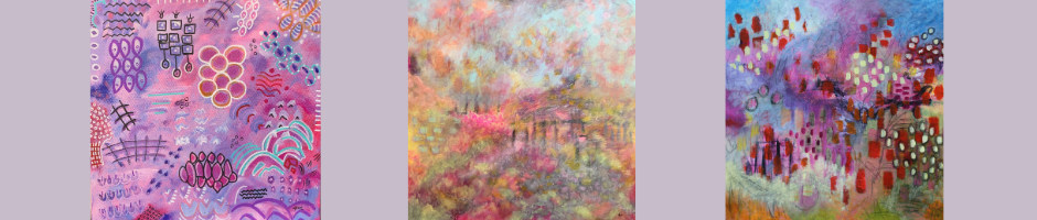
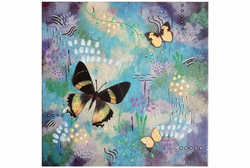
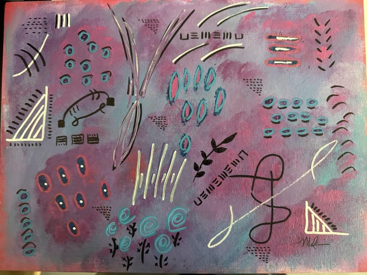
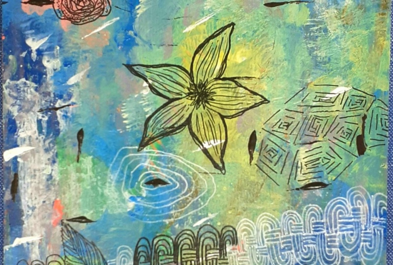
8. Finding Your Patterns: In this session, we're going to make some marks. We're going to actually start applying some marks and patterns to your artist's journal. We're going to do some practicing. We're going to look at what's important to you. What do you value when it comes to marks and patterns? And I can't wait to get into it. So let's just jump right in. You can see here in my sample painting for this class, I have quite a few different marks that I've included. Things I have made up, like this little dot with the three lines off of it and the hanging little things, you know, a squiggly line with marks in it. Little like mountains or Ms whatever you wanna call it a fence or something that looks like a tree. There are so many opportunities for you to come up with your own marks. And it may be intuitive to you that as you start painting, all of a sudden you start to see things and you want to add things in. That's kind of what happens to me as I'll just be painting and I will get to the point where I'm ready to start doing the marks. Most of these were made with a combination of paint and Posca paint pens. I try to work into my canvas some texture and marks with a brush. And then I come back and I highlight what I see or what I feel is there with my Posca pens. But anyway, this is full of all kinds of texture and I wanted to show you just a few of my other pieces because I think they will help you see that there's all kinds of marks you can put in. This is just a tiny little canvas, is actually a favorite of mine. Again, a Posca pen that I used. I painted the canvas first. But you can see it's got diamonds, you know, squares on edge. It has flowers. Something like a doorway. You know what, you could consider a waterfall or, you know, just all kinds of different symbols or marks that mean something to me. I'm a highly drawn to flowers and flower petals and leaves. I love to define animals as some of the shapes that I can pull out my paintings. I like repeating lines a lot. I use a lot of dots. You know, it's just, it's just kind of my style. And as I showed you some of these others, I think you'll see that. So here's one. Just again, a little tiny canvas. But I love trying to put shape in small places. This is really nice when it's kind of, I don't know, somewhat Indian perhaps. I really like it and I can never decide which way is up. Because the marks are interesting in both ways. You can see here I have these lines coming off with little dots on one side and I have a little bridge with a check background. Here's a painting that I've done recently that has quite a few marks and patterns, like here are little birds. I took circles and turned them into little birds, flowers. Here is a vine. I particularly love something like this where it shows something going behind and then popping out. So this, this is a really fun little paper work that I did. Here's another kind of crazy one that's kind of almost alien or science fiction, but the marks are interesting. See you have a circle and a circle in a circle of different colors. There are lines going up, I really appreciate and enjoy this type of thing. Over here, I have squiggly lines just filling that space was squiggly lines, you know, bars and dots. This was just a good example, I thought on a variety of different marks. And then here's another version of that other canvas, another paper that I put a little bird I've used binding, just various patterns. You know, here's a little alligator or something that I came out of it, just just what ever comes to me. And one of the things Marks and patterns are really important to me, I have recently begun this journal. A Zentangle Journal showing different tangles that I've made using the Zentangle method. I am a Certified Zentangle Teacher, a CZT. I use this journal to practice, This is a really nice one here. Practicing my marks is very important. And I'm drawn to marks in an extreme way. Hopefully you will find some marks that you particularly enjoy. What do you doodle? What do you, you do if you're sitting down with a pen, what is the first shape that comes to your mind? And if I say something like, what's the first geometric shape that you think of? Is it a square? Is it a rectangle? You can just see shape is really, really important in pattern. I love patterns. But back to my question. What's important to you when you think of geometric shapes? Do you think of triangles? Do you think of parallelograms, octagons? What do you think of? Ask yourself that question just out of the blue, you know, sit down and write yourself five questions about shape. What geometric shape do I think of? When I first initially popped into that question, what floral shape do I think of? You know, is it leaves or is it the petals, you know, is it round? Is it uneven? What do you think of? What, what type of dot do you appreciate? A solid dot, a dot that's empty and then has a circle around it again. Do you like fleur de lis? What patterns do you buy on your clothes? Go to your closet and you look at five shirts or five pairs of shorts or whatever, what patterns do you find repeated on your clothes? Those are patterns you're drawn to. I can tell you for me, there are so many patterns I'm drawn to, but swirls, they're definitely something I'm drawn to. Leaf shapes, vines. It's very clear when I examined my art, the kinds of things that I'm drawn to. Look at your furniture. Do you have patterns in your furniture? Those are all patterns you're drawn to. What I suggest you do with your journal is try to find 15 shapes that you really feel are meaningful to you. And just, just do it quick, I have an assignment for you associated with patterns and market-making. I'd like to ask you to go around your house and look at your home decorations and see what patterns, if any, you find in the pillows, the fabrics you're do they cover? And look at your clothes? What patterns do you find? Do you find any repeating patterns, things that you know from room to room, you'll find the sine same shapes. If you do. Those are patterns you're going to want to note in your artist journal. So your assignment is to mark in your artist journal what patterns you find in your home. You also might go ahead and note other patterns that while you didn't see them there, they're things you appreciate, enjoy, or come to your mind. Like we were talking about what geometric patterns and things like that. What comes to your mind? So be sure and post in your class project. I can't wait to see it and I will be looking for it. I'll see you there. Also see you in the next section where we pick up and do a little more work on pattern making.
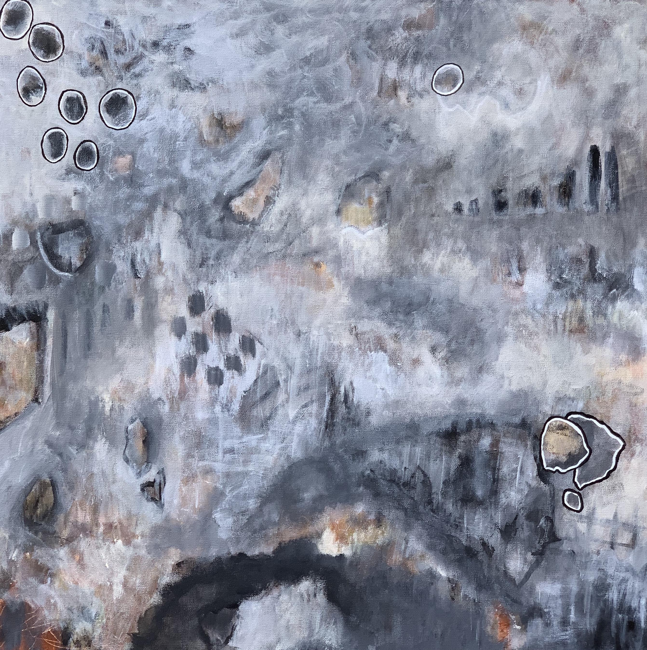
9. Practicing Patterns: So this is a second part of the pattern making and marks portion of the class where we're practicing and learning how to make patterns. I assume you did your assignment and you found out what patters means something to you from the perspective of marks. We're gonna do a little more work on that. I'm going to talk a little bit more about the marks that I find meaningful with the hope that they, and they will help you also think about marks and patterns in ways you don't today. So let's get started and start making some more marks. This is one example of a thing you can work into your painting as far as your shapes go. But they don't all have to end up being quite as bold. You will have the ability to do use your base colors and work back over your marks to tone them down. And let me, let me show you a painting. This is quite big so you won't see the whole thing. This is a 24"x24", but this is a painting that I did. And you can see there's a lot of shapes kind of underneath the surface. And this is one of the things I'm going to teach you also when it comes to pattern making, There are certain things I pulled out like this, I pull it out, I pulled this dot out. And the way I did it was I surrounded it with white Posca Pen and then surrounded it with black to really make it jump off the canvas. But what you don't really realize, although your mind kind of does, there's other marks these other, they are in here. They're just not, hit you in the face bold. Some are more subtle. You know, there are these shapes right here that look kind of like a shield or something that's run off the edge of the page. You know, there's all kinds of ways we're going to use your shapes in your painting. And some will be really outstanding and some will be like these marks. See how they're hardly there. That's what gives the depth to the painting, we are going to put things at different layers. So just think about your marks. Make some notes about them, play with them a little bit. Know that you won't do exactly what you have on your paper, but it gives you a place to start from and for you to be comfortable. In this session, we completed looking at the patterns and practicing patterns. We talked about Zentangle and different things that I've grown to love because of the patterns they bring into my life. We've talked last time about the patterns in your home and looking there for what interests you and draws you in, so to speak, be sure and do any additional work that you'd like to do in your journal related to making marks and noting marks that you appreciate and enjoy. You do not have to use all of these in your painting, but they'll give you ideas for how you can get started and use things that you appreciate that'll be meaningful for you long-term in your painting. There is one more type of mark that we need to take a look at, and that's your signature mark. I'll see you in the next lesson.
10. Your Signature Mark: Your signature mark is really important. It's your calling card for your painting. It can be little or big. It can be any number of things,many different ways. It's up to you. Let's talk about some of that and start the journey to figuring out what your signature mark is. I used to sign my full name, Cindy Rae Fancher. I did it very small, it was fine. I don't have any problem with my signature. I love using my middle name. So anyway, so I used to sign my full name and you can see it takes up a bit of space. And then I decided I wanted something that was a little more contemporary, little more modern. So I just went by Cindy Rae. Didn't stylize it or anything. I just use my regular signatures. So I've got work that has Cindy Rae Fancher on it. Some of it has Cindy Rae on it. And now what I've come up with, that I really like is a very kind of stylized see, very, very angular. And I use part of the C as part of my R. And then I do a very linear are ae. So that's how I sign my paintings now. And quite often it's very small. And it works really well. You can see quite a difference in that. But that's how I signmy paintings now. And the main reason is when I want people to call me and to use my name, I want them to call me Cindy Rae. And this seems like one way clearly to show how important the Rae is to me. And I've also had a lot of close friends call me CRae. And I have no problem with that. I like it. It works out fine. So y'all can call me see CRae, if you want to. Anyway, That's what I came up with. Your signature is your calling card or your business card. If you want to think of it that way. It will help people will know who made your work. Who is the artist behind this? Your signature speaks for you, so it's important how you do it, how you write it, what you say with your signature. And I want my calling card to put out there. This is Cindy Rae. And that's all you need to say. You know, I'm Cindy Rae and I'm your artist. What's your calling card? What I suggest is if you don't really know how you want to make your signature is use search in Google and Pinterest. Pinterest has a lot of if you just search by artist signatures, you can take a look at how some of the masters like Vincent Van Gogh, Picasso and other, other people who are magnificent artists signed their work. You can look at all kinds of signatures. And there's all kinds of ways to do it. Vincent Van Gogh was known for taking the end of his brush in a wet painting courses. He painted with oil and he would write his name. You know, basically with his wet brush across the whole bottom. I mean, really, let's say the painting was from here to here. He would like cover half of the painting with his signature. You may not want to do that, but I don't know that you don't want to do that. It is up to you and the style you represent. There's some very clear things you need to decide. What kind of style do you want to show with your signature? How much do you want it to stand off your canvas? Since I've adopted this, CRae, my signature is not nearly as obvious. Here's a little painting of one of my MU's. And you could see it's clear who did it. I put CRae right there. And it's obvious. But in other paintings, it may not be quite as obvious based on the color I use. And that's the thing you need to decide. How much do you want your signature to stand off the canvas. How important do you want it to be? Some people believe you should use the same color as other colors in your canvas and an actually mix it into your painting. Some people put in their signature well before they ever finish their painting. And you may not even ever be able to find it unless, you know, to look for it. Other people do like I do, it's a little more obvious and depending on the colors, will also determine how I paint my signature. And you can see I did use a color from the painting, using the white. It just seemed like the best choice to me. I usually do white or black signatures. That's pretty much my trademark. This one and this one I did a while back in 2015. But anyway, it's just got a very scratchy kind of CRae and it little less stylized so to speak, but it's still the same thing with the linear lines and everything. And I just put it down in the corner knowing full well that when because this is a paper piece, somebody would frame this, my signature most likely won't show, but I didn't want to take away from the picture. I love this so much. Look here. This goes to what we talked about in the mark making, right? A circle within a circle. And, you know, you can tell this is one of my trademarks because you'll find it over and over again. I don't do it consciously. It just winds up that way. I just keep adding the step. And that's kind of how your signature needs to be. It needs to be an unconscious action for you to create it. If it's something that's super difficult, you're not going to want to use it very often or it is not going to give you a sense of satisfaction perhaps when you put it down. Where as when I write my CRae, I feel like I've finished something because normally I reserve it for that completing and it's the last thing I do to a canvas before I say I'm done. And it's just kind of like a little ceremony that I go through to mark it and and make it mine to give it my signature, to give it my calling card, my business card, and my final mark. That's what I do. So I encourage you to do some playing if you don't already have a way that you want to sign your paintings. I encourage you to do some research on Pinterest to look at what a lot of other artists have done. Look at the art in your home and see what they've done. Think about how you like to stylize your writing. Do you like the angular? Things like I do, like this goes back very much to the fact that I appreciate triangles and lines. You know, that there's something about me that appreciates linear things, you know, the box and everything. So that's where my signature is a very, very natural for me to have evolved into this CRAE, this is very easy for me. That's what your signature should be for you also. And this lesson we looked at signature marks. I invite you to do some additional research if you don't know how you want to sign your painting yet. Look at other artists signatures, on Pinterest or Google, play around in your journal with various marks. See what feels good, come back tomorrow and look at it, see if any of them appeal to you. Making your mark needs to be relatively simple. So when you're looking at the marks that you've practiced or any of them over complicated, really difficult to make. You might want to rethink that. We're ready to get our canvas ready. Are you ready to get started? Let's prep our canvas. In the next lesson, I'll see you.
11. Prep Your Surface: I know by now you must be ready to start painting. We've learned some good things, so it's time for us to make our canvas ready for you to be able to start painting in the next session. So let's do our prep work and get that behind us. I always love this stage. One of the first things I'm going to do, I have my gesso and I buy it like this because as you'll see, I'd like to just plop it out on my canvas. And you'll do this on paper if you have watercolor paper, My recommendation is that you do three coats of gesso on your paper. And what I would also recommend is that you go ahead and do each one and allow them to sit maybe ten minutes between coats or use a hairdryer or heat gun on them so that you can start to curing process. And I also suggest that you just coat them a day or so before you need them. You don't have to. But I think that there is something about giving it a chance to cure on the canvas. But the reason I go ahead and just begin to coat my canvas, even though this is a pre primed canvas, I do it because this way the paint, to me, adheres in a way that I know it's a higher-quality. I think even though I'm using an artist grade canvas, I feel like if I put down the bottom coat, then I know what all my layers are. But I also, because I use this type of gesso all the time, I have a great understanding of what the paint feels like when it goes on. And you may think I sound silly for saying that it feels like something, but, but he does. It makes a difference. What is on your canvas. Make sure there's no lines. I just do this a couple of times and I both I do go ahead and do both the sides. And the top. Most important though, because the sides are just going to be painted to look like a frame or something. That most important thing is make sure your canvas is covered well. And you might hold it in different ways and make sure that you're not seeing anything like I'm seeing. When I do that, I see I did not have a good covering of Gesso right there. So now by looking at it and seeing that the color reflects off differently, I can more easily see where I might need to put just a little bit more. First of all, I also make sure they don't have any drips are runs around the sides. I set it aside for a few minutes. Like I say ten minutes or so, I let it dry or I take a heat gun or a hairdryer to it. But that's all you have to do to prepare your canvas. Two times with Gesso on the canvas. And three times with gesso on your paper. And you might find you want to even put a coat on the back or two. That way your paper is totally sealed. So now you've prepared your surface either by gessoing your paper or canvas, you're ready to go. In the next lesson, let's go ahead and start painting the background. Be thinking about what color you most want to be your background because you'll need that information. Post your prepped canvas or paper in the class project. Let me know if you had any problems. I'm here for you. I'll see you in the next session and let's paint the background.
12. Painting the Background: Okay, so it's time for us to put some color on your paper or your canvas, your surface. I'm excited to get this started. I know you must be too. We're going to start this lesson by going back and looking at your artist's journal. Let's look at your colors side-by-side and see which you really think is the one you want to stand as your background. I typically lean toward putting my dark color in first. So in this case, if I'm looking at my darks, that's either going to be this violet, the quinacridone violet, or it's going to be the light violet. And I think what I will do for the purposes of this course, you could also consider the red one of the darks. But for fun, I'm going to put the red in as my background. It will probably be a very interesting experiment. And that way, if nothing else, you will get to see what it looks like. It won't stay red very long, we will work in the other colors. Let's get started. I'm getting my red paint. I've got one of my brushes that has kind of a poor end on it. And I'm just going to start work in that color into the canvas. This is my prepared canvas. I'm just basically working the red into it and I'll just keep going back and getting a little more. I'm trying not to make it too thick because I'd like it to dry pretty fast, but I do want a complete covering the canvas. I want my whole canvas to be red. And then we're going to come in and we're going to start working in the other colors on top of it. Ideally speaking, will end up with the red showing through in some places and we may not actually have to use it again. And this may be the only time we use it, we'll see. But the good thing is if we remember when we were doing some of the mixing. So this one was #2 and #4. And so when we put the turquoise and the red together, it may kind of a gray, rusty kind of color. That to be honest, I wouldn't not want to use a lot in my painting anyway. And then also when I put the turquoise, the pink and red together, I had a similar kind of thing. It's kind of a dark blob. And I definitely wouldn't want to do any of these with five colors mix together. That it may be best for the red to be my base and then not pull it out again. Maybe as a highlight or I could use a red Posca pen or something like that. But all I'm gonna do is make sure that I cover the canvas. This is going to give a good undercoating to the painting that will add a good sense of richness to it. I think that it's always important to get your base a good, solid color so that it can stand up to what you put on top of it. Did you have any difficulty choosing your background color? It's always a bit of a gamble to me as to which color you choose. I'm not so sure it really matters in the end. As long as it's a color that's strong and will give a good solid surface, so to speak. It is a little difficult to call a color solid, isn't it? You want a good surface that where your other colors will pop off of it or blend in, depending on what you want todo. In the next session, we're going to do exactly that. We're going to start smoogie dancing. We're gonna smoogie paint and we will absolutely bring a lot more color to your surface. Let's get started. Let's smoogie paint!
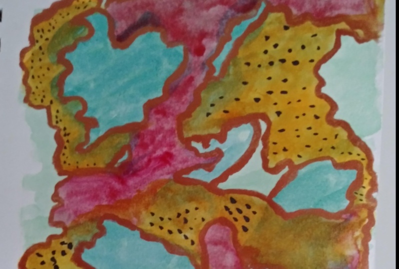
13. Let's Paint ie Smoogie Part One: All right, let's paint. In this lesson, we are going to apply a lot of different colors to your canvas. We're going to be working with all of your 3 to 5 colors that you chose. And we're going to start working them in, we are going to smoogie them onto your canvas or your surface. We're going to have a lot of fun. This is one of the best parts of any painting in my opinion. And I can't wait to share the experience with you. I have all my colors out that I plan to use. I've also brought my white and black to the table in case I want to use them. I know for sure I'll use the black, but I'm not sure about the light. At what I have here is my canvas that has its background painted and then my base coat so that I can have a level of richness. What I want to do. And, you know, guys, I want to tell you, I'm just like you, these colors look kind of peculiar to me. I don't know if they will work or not work. Now I do know from our color session that they look fine together, but this is a very different palette for me. And I'm excited about this. So I wanted to make sure that you thought about that with yours. If you're a little on the uncomfortable side, don't worry about it because it's only paint. At the end of the day, you can paint over it and do it again. And do you know some of my favorite paintings are like the third painting that's been on a canvas. It really can be amazing the more paint you lay on, the more deep your canvas begins to look and no richer your colors look and it just changes the feel of it. So never be afraid that if something doesn't work the way you want it to, to change it. But let's get going. And you know what? I dipped out my paint when my palette knife, I put out my paint on my palette. I'm just going to mix it on my canvas. Right now. I'm just going to put some splotches out and we'll see what happens. So this is how I roll! Pretty free form and I want you all to feel free also. Doesn't that just look like brown on the camera? It's not, but it looks like blood on red. So this is probably not going to be a color. I want to keep a lot of, my brush was too wet. I took it out of the water. I just began to use it without drying it. Again I have that kind of furry brush and I'm going to just start mixing some of this in everywhere. I put it on remembering that the acrylic will dry fairly quickly. So I'm just getting kind of a translucent coat and you will want to work in some color into your Canvas. Choose a color and jump in because we're just getting started. We've got plenty of room and road ahead. And you see, I'm not trying to make anything. I'm just kind of swirling it in different places. And this is what I call smoogie. I've got my brush. Kinda flat down. And I just begin moving it around and I've got a lot of color in that one place on when I smoogie over it a little more over here. And the reason I think of it as a dance is I think of my paintbrush gliding and dancing across my canvas with the paint being, I don't know the music that is leading my journey forward, like it does when you're actually dancing. All right, so I hadn't mixed all that in. And I've got some straight lines and different things. Not a problem, but I don't know that you can tell it. But when I'm looking at this is like blood across the canvas. It's really pretty funny. I wanted to mention to you guys, I have brought a couple of tools that you may find handy if you have them. These are both skewer sticks. One is very small, one is a little bit bigger. Find them really helpful for some of the stuff that we'll be doing and putting the colors on. I'm gonna grab some turquoise and start putting it in. This turquoise remember is an opaque color. So unlike the one I just put down, this one's gonna show through. I mean, it will hide what's underneath it. And it's not going to show what's there. So what I'm gonna do with that is I'm going to grab one of those skewers and I'm going to scratch into it. And this is what you could do with the end of your paint brush. And I'm going to get one of my paintbrushes and show you. So you actually, I actually get bigger. mark's doing it with my paint brush, which is not a bad thing. So just do your scratching to make layers. Remembering again, this is all part of just coming up with an abstract canvas that is meaningful to you. I like that. Put a little bit more on there. This canvas is so small, it's not going to take nearly as much paint as if you were working on something bigger. Okay, so now what I'm gonna do is I'm gonna grab some of my white. I put a splash of that down. Remember that your pink works as a type of white also. I am going to grab just a little bit of that original color and a little bit of white. And I'm gonna start move it, look at that, look at the color change by putting those together I'm going to back, back it up to the turquoise. And when I say back it up by me, paint into it. And I'm again, just smoogieing on the canvas, making sure that I really cover things. I'm going to grab my paint brush again. And this will be just something will do on and on and on throughout this whole thing. l can see that there's some really nice things going on at this point. I'm going to move another light over and see if that helps a little bit. But it's this is I'm noticing that something shadowing the screen, so I apologize. Anyway, how's that? All right, so I'm going to grab a little more of the white, and now I'm going into the pink and the pinks already kind of light. I've got the pink and the blue mixed together, so I probably should have cleaned my brush, but it's okay. We'll we'll ultimately settle this down to where it's a little more it's less harsh. The lines won't be harsh in it or anything. And when I say that, what I'm talking about and see how that the difference from here to here, that's a harsh line. But I actually kind of like where it's going. Let's keep following it. Again, smoogie. And I'm not trying to cover the whole red background, but if I do, that's okay. I could always bring more. When I scratch what I am doing is I'm bringing the red out. I can actually see it come through those scratches. Another tool I found is this little squeegee scraper thing from modpodge. You could take it, let's say I do this. Come over here and grab some pink. And I do that. I can then take this or something like it, a credit card that's no longer good or something. And I can pull it across it. And again, a totally different look. There's just all kinds of ways you can move the paint on your canvas and begin to make marks. See without even really intending to, we're beginning to work marks into our canvas. And that is all part of what leads to an abstract. Now there's some definite thought. Abstracts and other paintings, you do not want to put focal points in the center of your canvas, but there are definitely some things where some people make a dark line here and a dark line right off that center , you know, kind of like a T in some ways, going all the way across just to kind of offset the focal point so that you're not drawn to any one place. And what I typically do is I use a dark for that if I'm going to take that approach. But now I'm just smoogieing. I'm trying to mix these paints together. I'm trying to see how they look. I'm trying to put some marks in, trying to smudge it a bit. Just kind of checking it out and see and what I can do with it. And then we'll keep adding on. And what we'll do as we begin to move through this as will narrow our colors. Well, initially we work with all of them and then we began to narrow down and only work with a few of them. And I am again, adding some white in over some of this. I am using gesso for white. And we'll probably add some black accents and be careful about that. All right, so we've covered a lot of the red, but not all of it. You can still see it broken through in some of these places I like that. My middle is not obvious, my center is not obviously a center. Okay, so I'm gonna go, I'm gonna dab off my brush just a little bit. And I'm going to go in for the purple light violet and want to start bringing it in to it. So here I'm just kind of scumbling or smoogieing a different way. I'm just kind of lightly, almost as if I was making like a stand of blushes or something in that place, I'm going to do the same thing over here. One of the things that I feel is very important when you're making paintings and paint your paintings, making your painting? I guess in a way we make it. But you don't want to have just one of something. You want to have groups of odd numbers, like three things or five things. It's really important to the eye. And like I said, you don't want to work directly in the middle. You can see I kind of left off so that I wouldn't be working directly in the middle. So I'm going to add just another clump of those, whatever you wanna call them, my paint bushes in here so that there's just a little bit and see how my brush is nearly dry. So I'm just kind dampened splotches on, so I'm just going to get a hint of whatever. So it gives you a little bit different stroke. So I've got a little bit of places where it's dark. And then I have these places where it's just barely there. That will add interest also. Now, do you understand what I mean when I say smoogie? A lot of people call this scumbling or smudging. But I like smoogie because there's just something about it that, it makes me feel like that dance that I talked about that, you know, it's just a just a swaying us smudging of color into it. Lot like smudging. So if you prefer that, that's fine. But I'm gonna stick to smoogie dance for me. As a matter of fact, we have more smoogie dancing to do on our surface. So let's go ahead and you catch up. Make sure that you've worked a lot of your colors into your canvas. And let's move forward. First post where you are with the project in the class project. I'd love to see results and want to see how it's going, smoogieing and putting the colors down on your surface. Can't wait to see it. And I can't wait to see you in the next lesson. Smoogie, part 2.
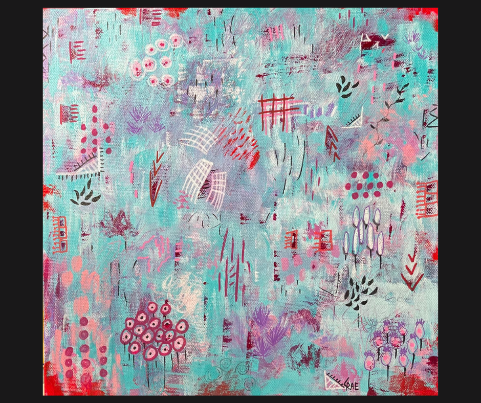
14. Smoogie Part Two: In this lesson, we're going to do some more smoogieing! We're going to look for areas on your surface that need color so that we can continue to build layer upon layer of color on your surface. And that in turn will build depth and contrast so that your eye will have different places to light. We're also going to start thinking about what your focal point on your canvas, what is going to call your attention? You're going to want to choose one of the quarters of your canvas for your focal point. In my picture, the end result is in the lower left corner. I believe this right here becomes the focal point. It's the place where your eye lands. Your eye starts somewhere so to speak, but your eye is caught by it, and so it becomes a focal point. And so that little grouping of Flowers stands out probably as much or more than anything else. You are going to end up with the same thing, especially after we've finished the marks. But you might start looking in your canvas or your surface to decide where is your focal point coming out. You might see it already. Let's get painting. Let's Smoogie, okay, so here's another thing I'm doing. See how I'm adding kind of white spots. I am going over some of this and some of it's quite bright white, some of it's very toned down because it has been mixed in. That's that's another aspect that I am bringing into this just just to add another layer of depth. So one of the things we'll do in the next videos, we're going to, after we get our base. And we will want to take and look at the contrast. The contrast is really important. So you can see I'm just kind of going over that. And you can again come in with your paintbrush and scratch through and you can see the layers kind of coming out. So that is very interesting long-term to your painting. This is when I really began to start trying to get some pattern and my canvas. And then like we talked about and practiced in your journal, We're going to put some more pattern into it, but I like to go ahead and start like putting in dots like this. And again, I count as I put them in. 3, 5, 7, that's what I want. I want an uneven number and then I'm going to add a few more, some brighter, some not. And again, I'm going to shoot for it being an uneven number. And I do things like add little stands. So like this. It's a grouping, and I build these groupings on top of each other. So here's this one in this one and then I had a disk and on top of part of it, and then I added this on top of that one. And I just keep kind of working layers in. And that's what ultimately will be highly interesting when you come back to look at it. I think what I am going to do now is add a little more that pink in. I'm just going to get a little bit on my brush. I'm going to treat it as being kind of dry. And then I'm going to start, I'm going to see, hopefully you can see it. I have pink underneath this violet. And now I want todo is I'm going to come up some pink on top of the violet and try to create some continuity but depth, because you can tell that there's pink underneath it. So you can see the three or four layers of paint and that helps make it interesting. And I wanted to take some of that pink. I'm going to come over here on this bright white, I just put it in and I'm going to start to cover this area.. So I'm just gonna do some dabbing things right now. And again, it's like I'm making little bushes. I don't know whether they'll stay or not. Sometimes, you know, one of my favorite abstracts looks like a flower garden with a path through it. But it's clearly an abstract. But there's that sense of movement that you have something you can move through and at which was, which is really good. It is interesting to the eye. Ok, so at this point, I'm going to go ahead and continue working on putting on layers. You can see what I'm doing. So what I've done is I've begun to make a line down the canvas. I'm slightly off-center on both sides. I have a little bit of center on this, but I began to make a a line across the canvas. And I think I'm gonna do the same thing in this area here. I'm just going to take and do this, mixing the colors together. And I'm going to go both ways on it. Said that I have kind of this constant that's kind of up and across the canvas. I'm sure there's some more technical terms for this. But in smoogie we, we just, we're just smoogie into paint. So I'm going to go ahead and put just a little dab up here. And what was nice about what I just dabbed on, it is three colors. It's the white violet, violet which is kind of magenta. And then it's that pink. And so they are blended together and made kind of a nice little extra color. And so hopefully you enjoyed continuing this Smoogie painting and you will add additional layers of color and interests to your canvas. We're going to see just how we're doing in the next lesson as far as getting our white, gray, blacks. Makes sure we see our middle tones.. See how we're actually making progress to having that layer of interest in our work.
15. Contrast: In this session, we're going to take a look at the contrast that you currently have within your painting and talk about how you can add some more and I'll show you how I added more to mine. You will use your phone or your iPad or a camera to take a picture that you edit and turn into black and white to support this experience. Let's get right in to checking out your contrast. I have taken a black and white of my painting and that's what you can see right now. In looking at it. I want to look for a variety of different levels of light and dark. And what I'm seeing is a lot of middle tone. And that's what you do want, that you want there to be. Middle, meaning kind of greyish when you're looking at the noir or the black and white version, you want a dark which will come up as black. You want more than one black dark spot. And then you want some things that are really light. And what you're going to do when you look at that photo is really try to figure out what's drawn your eye and what's the first thing that draws your eye? Do you like that? Your eye is drawn there. If you don't, then you need to change it. But if you do, then that's fine. And what's happening with mine? And I'm just going to go back to the painting now as you can see here, I've have the strips of dark, magenta red underneath them. They are coming out as intense blacks on the photo. If you look at the photo again, I have darks in this area here. They're a mid to dark black. And then I' have these little pops of the quinacridone violet that I put in. They are coming out as black. This little area here, because of that, is also coming out black. And then have some black coming out here a little bit here in the corner. I am not sure I find it totally pleasing, to be honest with you. One of the things I think is I definitely need to bring some more dark up into this area to give it a little more dimension. This area here, I'm kind of liking it because it has a good couple tones of middle gray in it, as well as it has a dark here. So I think this whole part here, down here, I'm not too unhappy with this. it is all right. I think it's this area here that bothers me most. So I'm going to have to add some more dimension into that with some darks I think. But I would say just a little more than half of the painting is the dark gray to black. And that, I think is pleasing because you don't want the whole thing to be light. If it's all light, just like if it's all dark, there's no definition to it. So what I need to do is I need to add some of my darker colors. And that means either pulling out some of my red again and putting it up here or using this violet, the quinacridone violet. So I think I will start with the quinacridone violet. Just kind of plug in in some. And I'm going to smoosh it around with my thing here and add some more. And you know, I just added in some of the little dots. I'm going to cover them over because you don't want everything at the same level anyway. So this is a good opportunity to kind of cover up just a little bit. I'm trying to get a brush that I can use this. So I'm just gonna take and kind of mix that around that darkness. And my brush was wet. But what it does is it just puts a light color of that on those dots. And then I'll come back in. Put a little more as I am mixing. The other thing you can always do, if you can take your towel and dry off something that you're not crazy about. So let me get just a touch more on them. And I'm going to bring it back in again. I don't want too much to be honest. So I'm definitely going to scratch some of that off and get down to those lower layers. I need to see what the contrast looks like. Let me take a picture of what that looks like. So now you can see from looking at the black and white that I have put quite a bit of dark back up in that top corner. So I'm going to go ahead and put just a little tiny bit more of the dark down here. And then we're gonna come back in and we're going to cover up some of that dark. Because it's actually too much it has now gone too far. This part here, I need to lighten that up just a touch. So I'm going to grab some of my lighter color. And it's Smoogie. Let's move it into the canvas. This is kind of a middle tone. So I'm going to try to do just a little bit of that down here into this blue also. Do you see the contrast in your painting? Did you see that there's three layers of light and dark tones? If you see that your painting is still one tone, please go back and work some additional dark colors unless it's all dark. Work some additional colors into your painting so that you've got lights and darks. And then middle of the road tones. You shouldn't have to add any additional colors, you may want to is add white or black to some of the colors you are already using. That is if you need to bring in more contrast. But I'll be honest, a bright red like I'm using in my canvas, is actually a dark tone, used the way I use it. The blue is a dark tone. Now there are tones laid over it. You can see various things like here's a light tone, this light pink added over it. Here's a darker tone, that kind of purplish magenta color. But the blue itself is both a middle of the road and my dark tone. It depends on how blue it is. If it's the super turquoise, it's my dark. The red is my dark. And perhaps that seems confusing, but it is that it becomes that base. It doesn't have to be black, I guess is my main point in order, for it to be dark and be contrast oriented. So look at your picture, your painting with a fresh eye and see what you think. Post your thoughts and where you are now in the class project. I'm really interested in seeing, and I can't wait to see what happens in the next lesson. When we go back and we start adding the marks we love and the patterns we enjoy to our paintings.
16. Making Your Marks: It's time to add our patterns. This is pretty exciting. We're really getting to the home stretch of our painting now. We've made sure that we have a good background for our painting. That we have layers of contrast of dark mediums and lights. Now, we're going to add our patterns to enhance visual interest and also to put our story onto the painting. We all have a story in some way that we want to tell through our art. It's your time to do that. So be sure and have your artist's journal handy. You're going to want to be able to access those patterns that you had put in there, because you really do want to consider what, if any of them you want to add to your canvas. I'm sure there's quite a few. Let's put some marks and patterns on our surface. So now I'm going to begin making some marks. I'm going go back to my sheet that I had used before that I've marked in order to kind of remind myself, which is what I suggest you do, remind myself as some of the things that I like to see and start looking at my canvas and trying to figure out where could I pull some of these marks into my Canvas. So immediately I see some things, you know, I did the dots and everything. I love dots. So one of the things I can do without even a second blink is I can take my Posca pen and I can begin to circle some of these dots. And what I'm trying to decide is do I want do that with blue, the turquoise, or the fuchsia? So I think what I'll do to begin with is I'm going to go ahead and start making circles around these with the fuchsia. It will give me some dark again. And even though some of them may be partly covered, I'm going to go ahead and do them anyway. I liked the circles. I can always add another ring around it. I can draw lines between, put something in then add more around it or smoogie over it. You know, they're, they're interesting and they become kind of a, I don't know, a clutch or grouping. And so that's a good first set a marks. So you can see that, what that does is it begins to make these stand out. Now if I had used a white around that, it would have really popped off the canvas, but I'm not quite ready for that. What I may end up doing is using a white and going around the whole thing and turning it into some type of flower. So that's a possibility. I'm looking at my canvas and I'm thinking what is another area? And I could do the same thing to these other areas where I put the dots of the same color to make them the same, or I could choose a different color to do that. So I have to think about that. Oh, these are interesting. These are just like little squares. When I used the scraper it made like little squares of this. So I think I want to pull those out. And the question is, what color do I want to use to do that? What color do I not want to use? I am going to grab my red that matches the canvas and just see what happens when I do that. And I'm just drawing little odd actually square's, little rectangles around it. They don't have to be exact. Your line, does not have to be perfectly straight. As a matter of fact, it'll be more interesting if they're not. And then you can take, and you can add different things to it. Like one of the things that seems good to me is to add just some little marks coming off of it. Kind of makes them look like, I don't know. Little eyes or something. I don't know. But that's part of what it makes it interesting. And if I wanted, I could take, and I could add a little dot at the end of each one of the lines. And basically I'm just trying to show you different things to think about. All of these are different approaches so they just kind of, it just kind of looks a little moon, interesting. This is one where going back to my my sheet, maybe I'll add some marks in here. This is a good spot right here that has just it has the squiggles on it and several layers of paint. But why don't I go ahead here and add in, you know, like these little leaf marks or something. And I'm just going to add a grouping of them. Go in different directions. If you don't like what you are doing, if you work really quickly, you can hurry up with a wet brush and take these out. Like if I said, oh, that's just wrong. I could do that. But I think it's fine. I have an uneven number. I'm going to leave them. I may come back over and do something else too with them. And you can see I didn't necessarily follow my artist's journal exactly, but the shapes are pretty much the same. You know what, I'm going to add a little black dot in the center of each one dots. See how that begins to change the look of it. It's amazing how just little things actually make quite a difference. Have you seen how interesting your marks can make your painting? It truly is amazing what a difference the marks can make. Whether you put a few or a lot. I tend to do both. On my bigger canvases, I actually put a lot less marks. I put bigger marks because the larger canvases need larger marks in order for it to be aesthetically pleasing, interesting, and to utilize the space on a surface more appropriately. But when I do a small canvas like the one we're doing here, usually use a lot of small marks. I don't know, there's just something about that I really enjoy. And I come back and I see that story we were talking about in it. So hopefully you are finding the level and the number of marks, the kind of marks and patterns that you want on your painting. Go ahead and finish that part of your painting right now. And let's catch up in the next session where we'll be actually adding your signature mark.
17. Making Your Signature Mark: At this point, we've done a lot of work with our painting. We've prepped it. We painted it, we added marks, we checked our contrast. And by the way, you might want to double check your contrast if you haven't already, now that you've finished your patterns and mark making, do you still have the contrast that you want? Is it actually improved as a result of the work you did with your marks and patterns? I bet it was. But now you're pretty much done. What's left is signing your painting. So hopefully in your artist journal, you have practiced a number of times how you want to sign your painting. You've done your research and you're ready to put that mark, that calling card on your painting. So let's do it. Let's make it yours. Hopefully you did your research and you checked out and practice your signature mark. We talked about it and you know how I go by CRae. And I'm hoping that you've been able to figure out something that's meaningful to you that will say something about you. Your signature is clearly one of the things that you want to know is there on your canvas before you ever finish your canvas or paper whatever artwork you're working on, it's, it's important. It's not done until it's there. So let me invite you to now think about where do you want it to be? And so one of the places that I sign quite often is in the lower right area. Probably going to have to get a thinner pen that one is too thick and I don't know if this one is sturdy enough. I can make it work. Just figure out where it goes. And so on this canvas I am blending it into the art. So that it's not as outstanding. You can make your choice. There are a lot of people like we talked about the other day that Vincent van Gogh would take like this half of his canvas and the, his whole name, his name would be across this whole part, he would do it when the oil paint was wet. Most people don't do that. But most people do either sign in this corner or they sign over here. You'll see a lot of people who do graphite drawings and everything they sign in pencil or watercolor. But it's really going to work best on acrylic for you to use a permanent marker, acrylic pen or use a very, very thin paint brush. I do suggest before you do it on the canvas, you practice it on a piece of paper, like a piece of your journal, you know, really practice how you want do it. If you're going to use paint to sign, go ahead and get you a good splotch of light black paint or whatever color you're going to use, add water to it. Not too much. Just a touch so that you can thin it out enough that it's easy to work on. And then if you have a brush that has a very, very narrow bristle to it, you could use that. You could also potentially use something like the skewer, the back of it as tip. Just be careful not to poke through. But you saw I work the canvas pretty hard with that. You know, a thin brush, this one's actually too thick to do a job. You saw what I did with this one. It made a pretty big signature. You could also use a Sharpie. It's just not light fast and artists grade. So it's going to be up to you what you want to do about your signature. So now you've have your signature mark on your canvas or your surface. I hope you're very happy to be at this point in your painting. When I arrived at this point in my painting, I discovered that I felt like I had an error, an issue that I had to resolve. In the next session, which is a bonus session. I show you how I fix that error. In the meantime though, be sure in sign your painting, place that signature mark and post it in the class projects so I can see, I can't wait to see it.
18. Correcting a Problem: In this lesson, I'm going to show you what I found in my canvas. A day or two after I had signed it, I came back to look at it and it it just became clear to me that I was not happy with some of what I was seeing in this upper area here. So I went ahead and recorded how I resolved the problem. I hope that you will find this useful. You should be able to use this technique, anytime you find an issue with one of your canvases, particularly in relationship to abstract paintings. I'm looking at the painting this morning and I really think this is too bold. So I wanted to give you just a quick little thing to see how you might go about fixing that. I'm going to go ahead and grab some the turquoise and the fuchsia paint. And I'm going to just try to dry brush some of that. And when I say dry brush, I mean, not very much. See you just have little teeny tiny dab on the paintbrush. I don't want to make any great big marks. I just want to come in and smooth a little bit of the turquoise over parts of this flower, maybe not the whole thing, but it's just a little too bold compared to everything else. And there's a lot of boldness and the marks that are on the painting. And I really like them a lot. Them are small. And because this canvas is small, I think that's really good. The problem with this flower, I think, is it's at a scale with everything else. And I don't have two or three of them in canvas. So I broke my own rule as far as that. So I'm going to see if we can't just fix this just by dabbing color. And what will hopefully happen is there will be parts of it that show in the background. But you see the whole thing. So you can see I'm just going to put some turquoise right over it. But it's, again, it's pretty lightly on my brush and it's totally dry. There's no wet on my brush. So that's key to being able to do something like this. What I might do is also take my marker and add some lines. I don't really want to work in the white while it's wet, but it might take. I've got these little marks of black. I put those and I really like those. So let's see if we can't put in a few more. Not, I'm trying not to go directly over the white. There's something interesting. They, they have a sense of movement. So there we go. I think now I'm comfortable saying this painting is done. I just thought you might really benefit from seeing, it's okay to change something after you think you're done. If you come back a day or two later and you're like, I don't like that with this type of the abstract painting. You can certainly fix it. You know, I added, remember more red here. I added some additional marks. I'm very happy with this now I think it's kind of interesting. I loved the concept of the paint growing onto the canvas, coming over the edge. I added these other two places here. I think that that really settles it in my mind as being something kind of interesting. Now there's all kinds of abstract paintings and this is just one kind. But hopefully you'll find that some of these tips will apply to any abstract you paint, so that you can find the joy an abstract painting through color, contrast and pattern. Hopefully now you feel more comfortable that if you ever have a painting where you've got a problem, you'll have an idea how to begin resolving it, particularly with an abstract, as I mentioned earlier. But I believe you could potentially use this with almost any type of painting. You'll just have to be careful about how much you you paint out and what you do. Perhaps an odd, slightly different way. But I, I believe that technique would apply. I hope this was helpful. In the next section, let's recap the class.
19. Recap: In this class, we've actually done a lot of different things. We created an artist's journal. We practiced and learned how to mix colors, how to look at colors side-by-side. And then how to mix 2, 3, 4, and 5 colors together. We learned to look at them with a critical eye and tp be able to figure out which we might want to pull into our paintings and which we might want to avoid. You learned a lot about yourself making patterns and looking at the marks and patterns that are prevalent in your life. You noted those in your artist's journal. You researched and figured out how to sign your work. You developed your own signature mark. Again, you did that work in your artist's journal. And after we did those things to make ourselves ready, we needed to make our work ready. So we've prepped our surface and then we began to paint our background. We chose a color that we thought would be a great background for our canvas or a surface. And we moved forward From there. We painted. We smoogied and learned how to smoogie paint mixing colors on our Canvas together and avoiding mixing where we wanted to by letting things dry so that we would end up with a multi-dimensional contrast rich surface that we could then move on and apply our patterns and marks to. After we applied our patterns and marks, we signed it, we made our project complete. We also as a bonus, took a good hard look at what I considered an error in my painting. I showed you how I resolved that problem. And hopefully from that, you'll be able to resolve any problem you have in this work or any future work. The key is not to be afraid. It's only paint. And we can always paint over and start over. I'm so thrilled. I am so happy you joined me for this class, Finding Your Joy in Abstract Painting Color, Contrast and Pattern has been a real pleasure for me to make. And I can't wait, really seriously cannot wait to see your work and your progress. And to get to know you. I'll see you in the class project!
 Cindy Rae Fancher, Artist, Faith Author, CZT