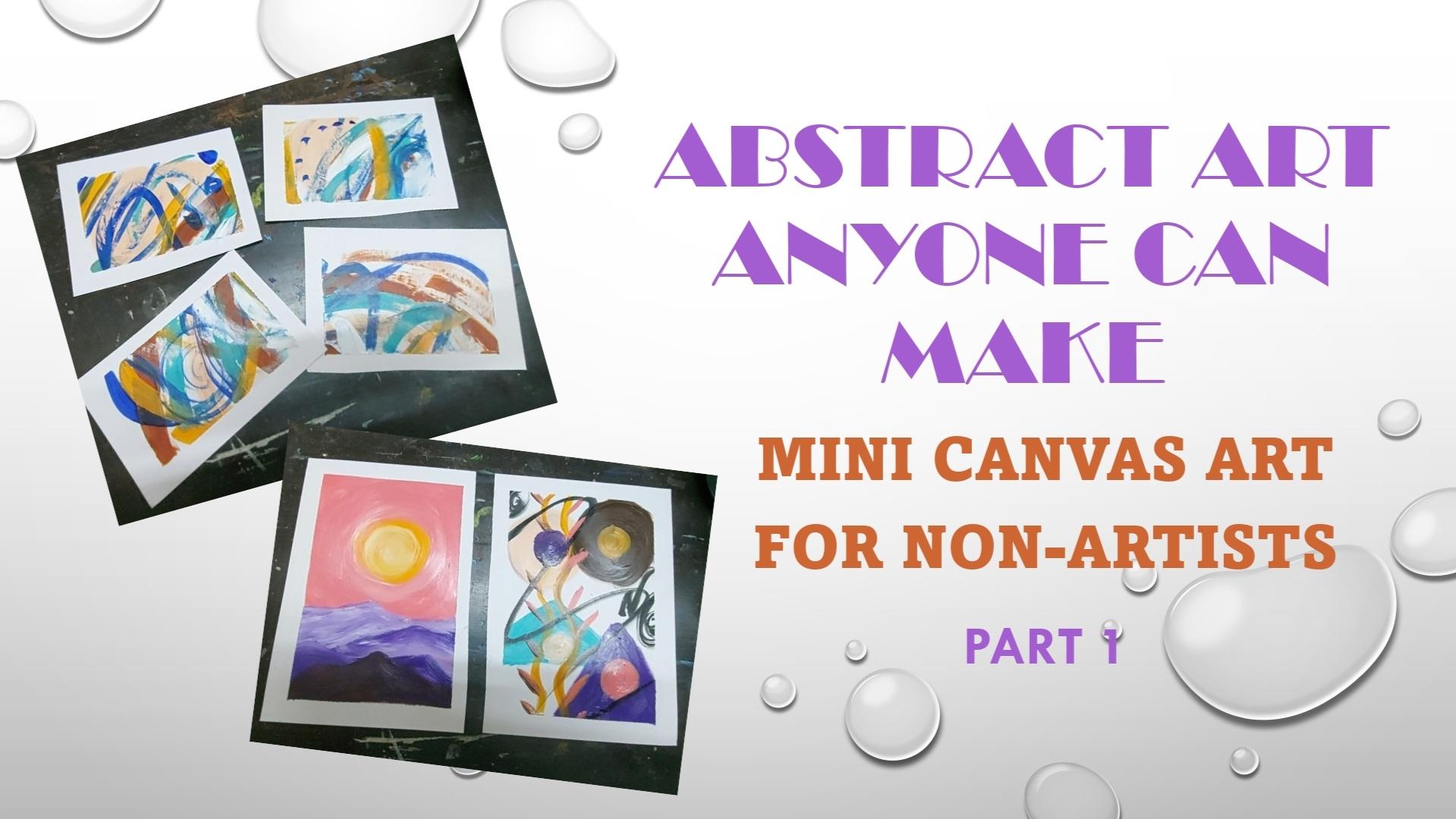
Transcripts
1. Welcome & Class Overview: Have you ever felt
overwhelmed looking at other artists
artwork and thinking, Oh my God, why can't
I make it like that? Have you ever been scared of
putting that first mark on the paper that
marks the beginning of any gorgeous artwork. Have you ever thought that
all these amazing artists are born with some special
talent which you don't have. And that's why you
can't be an artist. Or maybe it's some
special art supply that you don't have and that's why you got
to be an artist. Let me tell you, you can make amazing artwork using
just your hands. You don't need any
special talent or any special art
supply to be an artist. Because being an artist
is not a challenge. It's more like a muscle
memory that you can learn or develop at
any point of time. And so anybody, or
everybody can be an artist, my friend, even you. Hi, this is really easy to
revise the world from India. I'm a self-taught artist
and an art educator. Finally his bag, when I started my journey, It wasn't easy. I was full of yours and
miss believes that I cannot be an odd is because
of blah, blah, reasons. But let me tell you all those Ms. Belize and feels word wrong. Do they're very it's very
obvious to have them, but it's good as soon
as we get rid of them. And that's why I've
designed this series of classes where I want to help all the beginning
at is all the beginners and non-artists getting
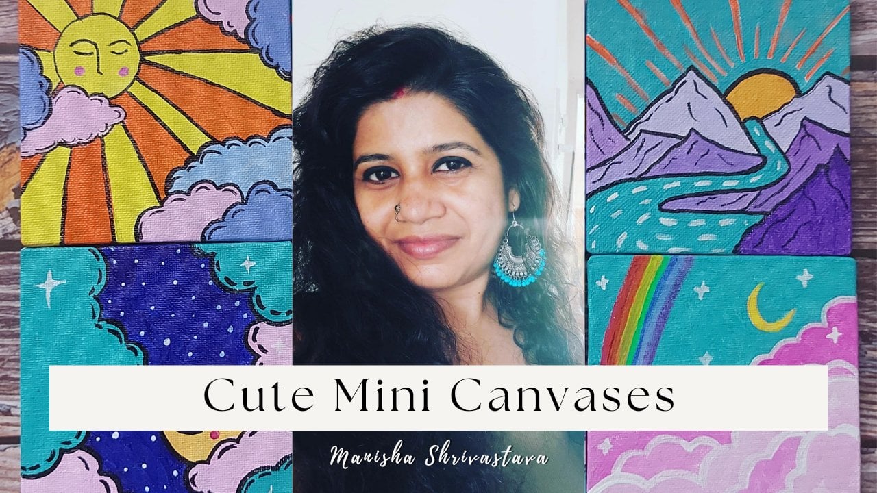
rid of those fears. And this deletes via many Canvas because many
canvas is our gouache. You get to see the end result quickly and you don't
get frustrated. Big canvases, big
artworks can be intimidating and scary
because you have no plan. You don't know what to do. And it's taking a lot of time. You don't get to see the
end results so quickly. So it's possible that you get demotivated or uninterested in the artwork and you
start making it. Whereas if you make
small ad consistently, every day, you can
see your progress. You can see the end result. And that keeps you motivated, that keeps you going, that keeps you on
that journey of art. Every week I will be
uploading a new class. We will start from making art, let just your hands. And then we will move on to using brushes and
other art supplies. Every class will be based
on a simple concept, a very easy technique. So you can learn
easily and you can show all of your
amazing our drugs. But before we begin
this first part, have a look at the
gorgeous artworks we are going to meet as a class
project of this class. All of this sounds
interesting to you. I will see you in
the next lesson.
2. Supplies We Need: Welcome aboard. I'm so happy that you're here. And before we start the
actual painting process, here are all the supplies
we need for this project. So pretty simple. This is a card stock
I'm going to use. It's a thick paper
with matte finish. You can also use
an acrylic sheet or mini Canvas like
this canvas board. Then for the brushes, I have the basic ones, small, round and flat brushes because mostly we are going to paint
with our fingers. Then we will need
a masking tape, a jar of clean water,
mixing palette. Then by Rogoff Claude, and some acrylic colors, which can be heavy body
tube acrylic colors. These liquid acrylic colors, anything that you have or anything that
you want to choose. So that's it. These are all the supplies
we need for this class. So as a task for this lesson, just grab all your art supplies and meet me in the next lesson.
3. Prepping The Paper: Welcome back. So before we start painting, let's prep the paper for that. Let us tape it to a surface, which can be a clipboard, or in my case, it's the table itself. So my paper is base 2. First thing, I am
dividing it into parts by using the tip in the
middle of the paper. This step depends on you and the size of paper you use it. Next, we are going to tape the all four borders
of the paper. This keeps the people
from moving by painting. And also it gives a crisp
border around the painting, which is pretty awesome. So let's do this as this is your class project
for this lesson. I am ready with my paper. Don't forget to press
the edges of the tape. As a class project TPU
people to sulfate. And in the next
lesson, we will choose the color palette for our
paintings. See you there.
4. Choosing The Color Palette: Okay, So choosing
the color palette is not as difficult as it seems. You can go with all
the colors you like, or you can keep it simple
with just the primary colors. The best way is to
look in the nature, look around you for the color combinations
you really like. Like here, it's yellow,
orange, and green. Or it can be lavender and paint. This is orange and green again, shows the boiling due in
green, yellow and green. And this is the
classic Santorini. So you can look around, look at the beautiful places,
locations and things, and draw your inspiration and use those color combinations, your favorite color
combinations in your painting. Here's an example. I used purple and pink
in this painting. I got inspired by nature. And again, this one is
the shapes of sky blue, dark blue and pink and yellow. All these combinations
are classic combination. So look around. You can also look
on the internet and then choose the color
palette for your paintings. Oh, here, if I go with
the bleach wipes, I will take this blue, this flesh tone, yellow, dark blue, and some shades
of brown, maybe like that. Another way of choosing
colors is to keep them side-by-side and see
what looks good, fit, What like this pink looks really good with
blue and green boat. Now there's green, looks good. Yellow. And this yellow
also looks good with pink. So you can keep the colors
side-by-side or you can, you can even swatch them next to each other
on a rough paper. Your exercise for this lesson is to choose what
colors you like. And in the next
lesson we will start finger-painting.
I'll see you there.
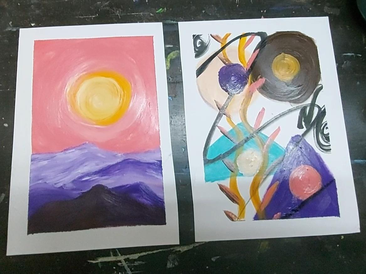
5. Finger Painting: Landscape: Finally, the actual
painting essence. So here we're going to paint a landscape with our fingers. I have already taped
the paper to my table, and here I'm starting
with yellow. You can also do that with
fluid acrylic colors. And the fear of putting
the color on people on a blank people is the biggest thing is shot with the shape you're
most familiar with. Here. The landscape is going
to be really simple. I started with the
sun and it's okay. I just wiped my finger there, but it's acrylic
painting with so we can easily hide such mistakes. So don't worry about it. And now I take white because
when I blend other colors, I want a smooth transition between the yellow
and the other column. I'm just giving middle ground for the two colors to merge. And that's it. And don't worry
about the colors. Like you can totally choose
the colors you like. It's more of an expressive
kind of painting. It's not realistic at all. So my son, in my case is yellow, orange, but in your
case it can be purple. That's absolutely fine. So choose the colors you like, choose the shapes you like. You can even make it a white
circle and depict the moon. That's absolutely okay. And that's entirely on you. I add in the bank and
I go around the sun. I have made just like that. There's no matching
technique here. It's just putting the paint on the paper with your fingers
and feeling the paint. And the moment when you
feel the paint with your finger, when
you're mindful. In this very moment. You can also tell that it's
very relaxing and satisfying. It's not just me. I'm sure when you do that, then you actually put color
video finger on the people. It's very, very relaxing
and satisfying, isn't it? It's concentrate on the
spread of the color. The concentrate on, just concentrate on what you feel
right now in this moment. Forget about every other things. Forget about perfection. Forget about the end result. Right now in this moment, just spread the
paint on the paper. Just like that. Now, I will
take purple for the mountain. Here. I'll show you how I will blend purple and white
right on the paper. I'm not using a mixing
palette because I want to create a
layer of mountains and the backdrop mountains
are supposed to be lighter, and the full ground mountains are supposed to be
darker in color. So here I put the paint, the purple color, and I will
use white on top of it. Then the paint is still wet. This process has to
be done quickly. And see. We've got
a lighter Popper. I mean, there's no rocket
science. Everybody knows. If you mix white in color, the color becomes light, right? We don't need a mixing
palette for this. Refers spread, what, purple. And then on top of
it, I put fight. And there we go. Now. I have to create a
slightly darker mountain. So I already have
fight in my finger. I will take a tiny
bit of purple. And with that, I will make
another layer of mountain. At any point, if I feel
that the color is too light or it's almost the
same as the previous layer. Then I will add some
more purple to it. And if I think it's too dark, maybe the front most mountain
is going to look like this. So I will just add a
little bit of white. It's about observation
and deciding how much light and how
much dark you want. I hope that makes sense. So just observe and see
what you want and if you, and how you can get it. Alright, it's the
matter of mixing white or mixing the color. There. I taught. The background
mountain was darker than I want. So I just added another
layer of white on top of it. And I'm blending the colors with my finger going back-and-forth,
back-and-forth on it. And that's all what you have
to do in this exercise. Maintain a gradation
from light to dark in every layer
of mountains. And don't worry
about the shapes. You can manage that also
later if you don't like, you can make a peak or
you can erase a peak. That's, that's totally easy. Just don't try to
make the peaks. One under the other leg. If you've made a beak
on the left side, and next time it could
be on the right side, on the lower Mountain ADA, or on the next layer, so that it doesn't
become a pattern and it states more abstract. And even if you end up making the mountain peaks on the
same side, even that's fine. It's all about you liking
it or not liking it. Now here, as you
see me using brown, so I thought the
front most layer of mountain has to
be the darkest. And I did not want to use
black in this composition, so I just used brown, dark brown on top of my purple, and I'm now blending it with my finger just going
back-and-forth on top of it and it will become very dark,
reddish purple. And that's what I'm aiming for. And once it's done, I will just leave this
painting for drying. I think I need some
variation in the sun also, it looks very flat, so I am now adding
right on top of it in the center so that
it's not very flat. It's dark and light at places. I think I can call it done. So I will just leave
it for drying. And the task for this lesson is, use your favorite colors to paint a landscape
with your finger. And in the next lesson, we will make this
abstract painting again with our fingers.
See you there.
6. Finger Painting: Abstract: Welcome back. So as the
first painting dries, let's move on to the
other half of the paper and do something more playful and freeing and not so
structured as the previous one. Okay, so here I'm taking
my favorite colors, like I'm going
with a beach vibe, so I'll use some flesh tint. Or you can call it a
boy to call it out, kind of a peachy
color, peach color. It's a pre-mixed color. And I'm again making a circle. I realized so-called is my
favorite shape, I guess I, whenever I have to draw a shape, some, generally I end
up making a circle. So you can realize your favorite shape and
it can go with that. You don't have to follow along
and copy what I'm doing, or you don't have
any other ideas, you can might as well
copy what I am doing. So it's totally up to you. What makes you more free? So now that you are free with your fake using the
finger on the paper, I want you to just go
all out, be playful, and make what you want
in this very moment. So just use the colors you like. I will now be using something. I mean, you can use
whatever color you want. You can use whatever
shape you want. Just be playful. Just put that color on the
paper and create a shape that, that comes to your mind. At the moment, I don't have any plans for this composition. I'm just going with the flow and making the shapes using
that color right there, right now in that sport, I encourage you to go have
fun and enjoy the process. I don't know what I'm making. I don't know. Four does it mean? I just know that I like these colors and I
like these shapes somehow placed are
juxtaposed on the people. And I'm just enjoying that. Now for breaking the monotony, we can also use brush markers, but that we can do
when the paint dries. So right now I am
using I'm going to use brush, paintbrush. And I am taking a completely
different color that contrasts with the colors
I already have on people. So that's beautiful. Orange. Look bad. I'm just randomly going to make any mark or any shape
you're free to make marks. You make p to make strokes. I'm here making this virus. And remember you don't
have to go over and over on the colors you already have because then it is
Blend and Make model because this is pretty
much the contrast color, not a complimentary color. To understand what
is complimentary and contrast follows you. Class of color wheel. And there are plenty of them. You can just have a look at them and understand what
the color wheel is, what complimentary colors are, and contrast color, colorism. Right? So there, Now I want to introduce some black. Do that. Okay? Now this, now you can tell how much I am in love
with the circles. And suddenly I want to make some leaf-like things are real
things but not on the Sun, but on these spirals I created. Like that. I'm alternating between
brown and pink. And as you see, I'm not
even cleaning my brush, do I have streaks of
black and pink and I mean streaks of
pink in the brown. And that's completely fine. In fact, that's what I like. I want. So there are streaks
of ground in my pink now. That's awesome. Yes, See this randomization. It brought everything together. Now, we will have
to leave both of these paintings for drying. And that's the that's some
movement, some fluidity. I added it. But my
watered down black color, you are free to skip this step if you don't
want to don't use it. I just wanted to have some
chaos in this painting, so I did that. So the most important
thing here, keep in mind is to
know where to stop. I know you'll leave tempted
to make as many marks. You won't create as
many sheets you want, but I don't do that. Just remember to stop
because less is more. So I thought this peach
circle was lost completely. So I just added this bulb
blue circle here on top of it to get it some
board and focus, but I guess that didn't work. So now I'm going to add
that same peach color. The flash team on top of this deal mountain,
our triangle. And there I got the
beach invokers, if not that circle, but at least the color
here, I call it done. So now let's feel the deep
for billing the deep, you have to pull it
towards you at an angle. If you just pull
it straight away, you might see other people
before pulling the tape, make sure that the painting
has completely dried. So our first one has
dried and the second one, I'm not so worried about because that is not a lot of paint. So that won't tell. I know that. And
that's the final look. We have these two paintings. We have to just cut them off. Like that. Feed for it, wait for it. Wait for it. Almost. Did. That is I told a little bit of
paper, but that's okay. So here are your two paintings that you created
with your fingers. I hope you liked it. I hope you enjoyed the process. So your task for this lesson is to make an abstract
painting with your fingers. And now you have two paintings. Just click a picture
of Buddhist them and shared it in the
project gallery. That's your class
project for this lesson. And in the next lesson, you will be making this beautiful mini abstract
paintings. See you there.
7. Preparing The Color: Welcome back. So before we move on to the next
painting exercise, we have to do some preparations. It's going to be more
like acrylic pouring technique or watercolor
abstract technique. So we need the colors
to be really fluid. So if in case your acrylic
colors are really running, you don't need to do this. But if they are not so runny, you can just use some
small containers and water them down like that. So both the greens, I'm going to use our 3D liquid. I don't need to order them down, but the flesh tint
and the dealer I'm going to use need
to be voted down. So there may come up. I am also adding
a lot of white in my french ultramarine because
I want a lighter blue. And then I will add water to
the mixture and make sense. Why I did not mix the colors before adding
the water because they wanted the white
streaks in the blue. If I mix the colors before
and then add the water, it will be a watered down
version of a flat blue color, which I did not want. So I am ready with these colors. Your class project
for this lesson is to get your colors ready, get them nice and r10. And in the next lesson, we will use these
colors to create beautiful abstract.
See you there.
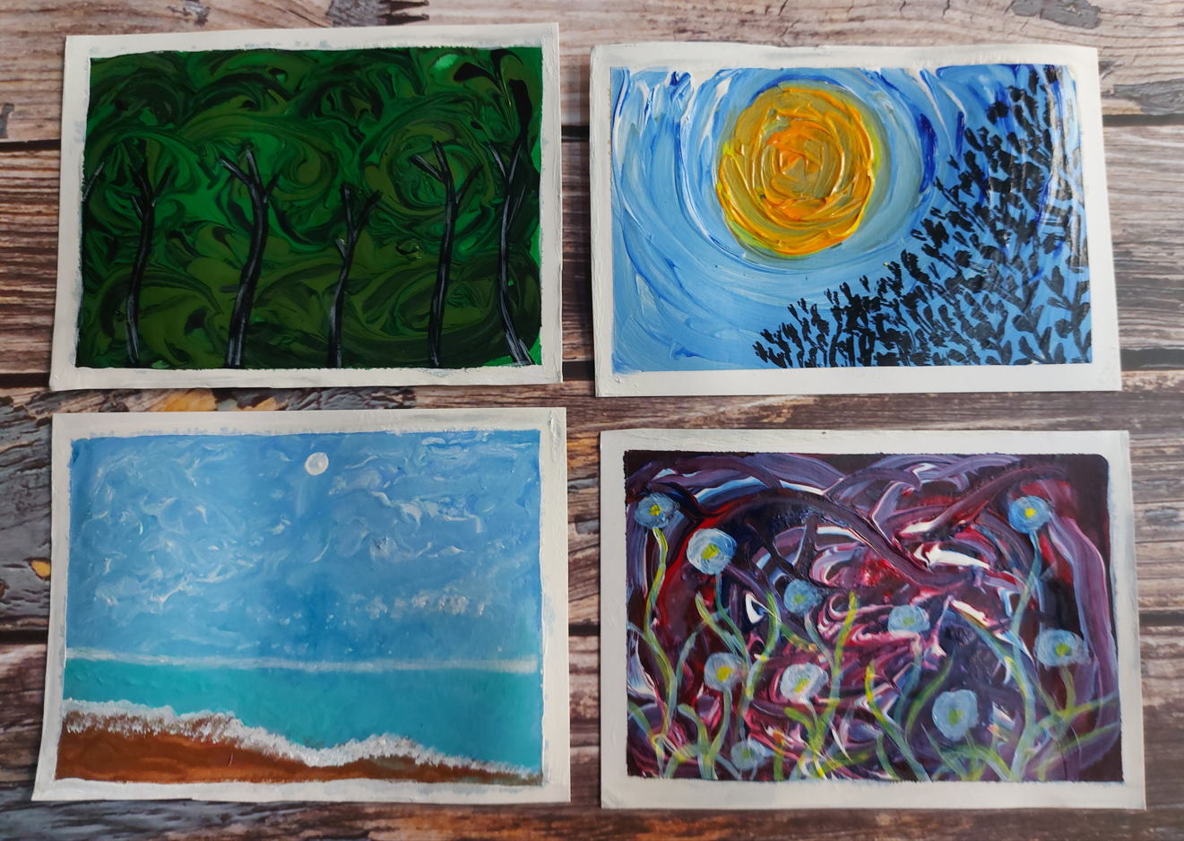
8. Free Flowing Abstracts : Welcome back. So now it's time to create
for many abstracts. I've already taped the
paper to a clipboard, and I'm using the
fluid acrylic colors. But before I want to make
the paper a little bit. So I'm using photo
just like that. In this exercise, the
gallows need to flow. So you see the make sure there's a sheen
of water on the paper. And now let's drop the color
on the paper like that. I'm using two
shades of green and then I'll be adding some black. You are free to use your choice
of colors that I'm using. Sap green and darker green. Now, I'm going to
spread the colors. Very, very red crash. Just like that. I don't have to make
Buddha greens blend. So I will also try to tell the clipboard and move it
like that to meet the colors, move on their own. It's kind of like like the
acrylic pour technique. And it's kind of like the
watercolor technique, right? I'm just experimenting with a credit and I'm just
playing with it. Here. I spread the entire
color on this section. Like so. And I feel that hello, We have marched, the
greens have more, so I will add them again, one by one, like that. And this time I'm not
going to mix them too much because I've already covered the entire surface
of this section. Either just push
and pull the color to get some streaks and strokes. Streaks and strokes. That's a nice name. Here. I'm adding some black like that. Now you see it, right? Yes. So little dots, black. I'm going to pull and push them also with the
help of the brush. And be careful not
to blend the black. So much advice,
the entire section will end up becoming black. We want the greens
also to be there. We don't want it to be black. That's fine. Let's bring in some green. Let's bring the green
black or not black back. Then. Also around. Okay, So now let this dry and let's move
on to the other part. Here. I'm going to go with the watery color
mix I have made. So here I start with a darker blue and I
put it on top of this. Like that. It's pretty watery. I think I should
have made it less watery because the
area is too small. It's going to bring
them together, the blue and the teal. And as you see the streets of white in the blue,
let them be there. Beautiful. They are
creating the cloud effect. See the paint is already very, very runny and I
don't want to dab it. I don't want to
use a tissue paper or a clot because that will
give a different texture, which we don't font here. There. And now finally, I will use
this flesh tint for the sand. It's going all over the place. And I see a big pool of colors
merging into each other, making no sense,
but that's okay. That's okay. Don't panic. I will take the heavy body brown and directly I'll put it here
at the bottom of the spot. There. I wanted this sand and with a wet brush
but not so wet. I'm just spreading it
because we have a lot of water here itself. I dry the brush, pattern it on rough plot. And with this, I am bringing
in some sand and now it, it does make a
little bit of sense. So I couldn't easily
edited this part out. I could have made a
fresh painting and showed you the
good part of that, but I did not want to
demonstrate just the good parts. You saw me struggling
with the green one and you are seeing me
struggled with this one also. But I wanted you to
see all of that. I wanted you to
know the struggles of I wanted you to know the accidents and how to keep calm vintage
accidents happen. Now I'm going to take a time
lapse and make the video faster as I work on the remaining two
parts of this paper, because I encourage you to
come up with your own concept and do what you feel like
doing at the moment. But this part of the people, alright, so you don't
have to copy me. You have to come up
with your own concept. As I was talking
about the accidents. If we stay calm, there's always a way of
fixing the accidents, but there are times when we can't fix them and
even that's okay. You have to be
easy on ourselves. We have to accept our floors, we have to accept our mistakes
and start a fresh if we just keep feeling bad
about what didn't go well. I don't think we can
move further in life, so it's better to leave it if you don't think
it can be fixed. And move on and start afresh, work on a different painting and learn from your mistakes. Remember what you
did last time that did not work or rent wrong, and don't do it this time. Make new mistakes. That's how it is. So I just can't wait to
see what you came up with. What is your concept. So make sure to share it
in the project gallery. I call it done and I'm leaving
it for drying completely. It's going to take a
lot of time to try your class project
for this lesson is to pick a picture of
your painting at this date and share
it in the gallery. I will see you in the next
lesson where we will add some details to these and see
what we have come up with.
9. Adding Deatails To The Abstracts: Welcome back, and let's
see what have we got here. So these are all dried. And I'm pretty happy
with the results. Every bar looks different. Every part tells a
different story. So let's see what can be
done by adding details. So it's, this exercise is like, like recognizing
shapes in the clouds. So I will start with this one. And this is pretty simple. It was more controlled
and guided. I've wanted it to be
a beach and it is a beach with a dry brush. I took some white
and I'm just lightly dabbing it over the
edges of this brown part to depict the wave of
the washing of the sand. But Jews dabbing the tip
of the brush lightly, just like that, making
a bunch of dots. Now adding some scattered marks to make it look more natural. And now with the same brush, I'm just making a line for the horizon that divides
the sky blue and teal. This line also, I am
making with the dry brush and I'm not making it
very, very proper. Broken. It's thicker at some
points and thinner at other points to
make it more dues. And naturally. Now I see Mark, like a dark blue mark
here, which I don't like. So I can simply cover it up with the same brush and white in it. So I'm not making it
intentional or anything. I'm just covering it up by
dabbing the brush over the but I want to cover up and see I smashed it with my
finger and it's all gone. Covered. Now, let's
add a white circle, tiny circle for the
sun. Just like that. You can also use the back of
your brush for this step. Simply dip it in, paint and dab it where you
want your moon or sun to set. Now, let's move on to this part. So this part looks very
enigmatic and full of mystery. And I'm going to play on the ministry part
a little more by adding these wispy
whimsical plants. Look at your artwork
and close your eyes and think what it makes
you feel like and what else do you
want to add in it? There are chances that you don't want to add anything in it. And that is also perfect. You have created something
that's perfect as it is. You don't want to add anything. See here, my whimsical art work is getting ready.
As you can see. I am adding these white
circles randomly, but I'm also trying
to add them there. There is too much darkness
to create a contrast. And these goods are very transparent and they're going to turn blueish when they dry. Now I'm going to speed up
the process while I add some wispy flowy stems
and branches to these. There, and now I'm
adding some light blue to give it a magical glow. No. That's it. Moving on
to the next part. And this part looks
like a jungle to me, while I have to do is add some tree trunks with
black. So here we go. I'm sure that your
artworks are different than mine and I'm sure you can see something else in them. I'm only giving you an
idea of how you can make sense of a completely
abstract painting. So now we reach
the final artwork, and I'm going to add some
leaves and branches. The silhouette of
them with black. That's what I'm going to do. But later when I
saw this artwork, I thought I could have added
a school of fish instead. So maybe I'm going to make
another one with fish. So this is what also happens when you look
at your paintings. After some time you realize, Oh, you should have taken this step, you should have
chosen that element. So for now, I'm only
adding the silhouette of trees and trees and
leaves and branches. And there is no
match of technique. I am only tapping the side of my brush like that and going for whatever mark
the brush is given. Here, I'm speeding
up the process. Enjoy. As you see, I'm not even making proper
leaves and just adding the side of my brush
and going forward, what Aramark it's giving me. And then I add some random lines here
and they're depicting the branches come as a
whole becomes the tree. And we're done. So we're completely
and finally done. Now it's time for the
most satisfying part, which is peeling off the tape
and revealing the artworks. There. Let's cut them. And there we have four
beautiful abstract paintings. I just can't wait to see
what you have created. Your class project for this
lesson is add details to your abstracts and
take a picture of them and share them in
the project gallery. In the next lesson, I will
show you what we are going to have for the next
class. See you there.
10. Thank You & Beyond: So I hope you enjoyed this process and I hope you're feeling a little bit
or more confident. Don't forget to share your
work in the project gallery. I would love to see that and keep making art, stay motivated. And next week I will upload
this beautiful glass. Many florals or non
ad is where we will paint these gorgeous many
floral canvases together. So follow me here to be notified
about my future uploads. I will see you in my next one.
 Manishaa Shriivastava, Artist, Art Educator, Author