Transcripts
1. Hello & Welcome Back: Isn't it fascinating to see how the small
ray of light makes the entire road glue with its shine through the
darkness of this guy. Hello everyone. Welcome back to a new
Skillshare class. With me. I must eat
the barrio chapter, the content and add this. And in our dedicated
based in India. In this class, we
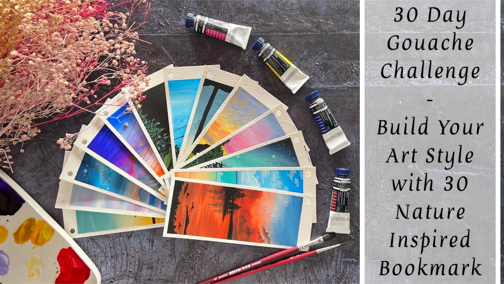
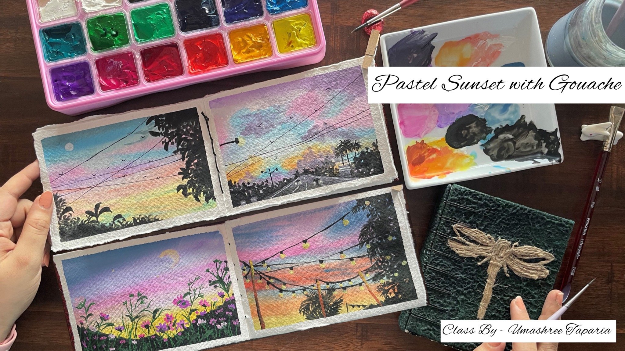
will be creating two beautiful glowing lights
landscape using wash. We're first going to dive into a misty forest view
with glowing car light, and then move on
amongst the mountains. Even be using wash as a medium to paint these
two class projects. Wash is a water-soluble medium, which has properties of both
watercolor and acrylic. If you want a big no-no, then working with
gouache is much easier than any other medium. Because gouache is workable. Workability unlike
any other paint, because it is water-soluble, brush can go back to soften edges or Lyft color even
after the paint dries. I will be guiding you
through each step, beginning from the materials that you require for the class, the different kinds of
paints that you can use. The alternative for
gouache paints. If you do not have
a gouache set, I will be guiding you
through the brushes, paper, and all other details
required for this class. After which, we will move on to a technique section where we discussed basic
techniques before we begin the final
class project. So if you are a
complete beginner, you can still join us and paint along with us step-by-step from the beginning of the base layer for both the class projects to finally going ahead to a satisfying tape field
for both the projects. So without further ado, come join me into this class and let's paint these
glowing lights together.
2. Materials Required: So before we move ahead further, let me discuss with you all the materials that you will be needing for this class. I'm going to use this Canson Montville
300 GSM A5 size paper. This is not a 100% cotton paper, but it is perfect for
gouache as forgot, you would not need a
100% cotton paper. I'm going to use this
effect size sheet. Let me show you the
texture of this paper. This is a cold press paper, but it has a little dark
green texture to it, which is perfect for gouache. A little closer view of
the paper and the texture. You can see it has a little drafting texture to it because of the cold
pressed paper that it is. Alright, we are going to use this paper for our
class project. This is 300 GSM
cold pressed paper. You can go ahead with
any paper which is at least 250 GSM and
about need not be 100%, partly because we are
going to work layers on layers to create the misty look for the first-class project. Next up, you would need a set of gouache paints I'm going to
use in these jelly cup push. You can go ahead
with any kind of quash paints or post
the colors that is available at your n. You
can either have them in this cup forms or you can even use the gouache
which are in new forms. Also do not worry, we do not need so many
sheets will hardly be using four to five of the colors for
each of the class project. So they are very basic colors which we are going to be using. And I will keep
discussing them with you as we paint both
the class project, you will be needing
a mixing palette to mix up the colors
while painting. If you are using the color
either from the tube, all caps like a pattern, these you will be needing
in some flat brush, some filbert brushes,
and some round brushes. I'm going to use this
set from the hemi me. I said already this is a set of pies brush I'm going
to mainly be using in the filbert and
the round brush and a detailer brush separately
for adding in the detail. Then next you would
be needing in two jars of clean water for
each of the class project. Because while walking on, the water jar seems
to get dirty, so you need to use clean water for adding in further detail. Next, you would be needing in masking tape to tape
down your paper. So I'm going to use in this masking tape to tape
down my paper onto a movable. First. I'm going to be using in
this tick board to tape down my paper so that I can easily move my paper
whenever needed. While the painting process, you can tape down your paper on any movable surface
using the masking tape, I recommend taping down your
paper on a movable surface. It becomes easier while
adding in the details and rotating the paper to
adjust your hand angles. Next, you would be needing
the tissue to dab off your excess paint or by
creating infectious. So make sure you have a tissue handy for
adding the details. So these are all the
supplies that you will be needing for this class. Make sure to grab all of them. I will see you into the next lesson where
we first discussed the techniques and then moves to a final class project
for this class. So see you guys into
the next lesson.
3. Project 1 - Misty Forest - Base Layer: So let's begin with
a post class project that's the glue in the forest. So I'm going to go ahead and begin with a very
light pencil sketch. So majorly, at the top, we are going to have
in the misty forest. And at the bottom we
are going to have in a small pathway where
we are going to be adding in a car and the car light blue that we
are going to be adding it. So now you're in the center, I'm going to begin adding in the pencil sketch for the car. You can see a very simple
layout for the car that I've added nothing much in detail that we are
going to go ahead with. Its very basic shape that
you need to get an added. Now when we begin
painting will try to preserve this space blank. But if in case you are not
able to preserve it blank, it's completely okay to enter the color in
the entire space. And then we will add
in the colors on top of this because since we
are working with gouache, layering light colors over the dark colors
is also possible. Now in the bag, now you're going to have
in some power line. So I'm just adding Nvidia
off mocking for these. Go ahead with very
light pencil sketch. Now since we are
working with gouache, there is no layer of water
that you need to add into via detective went to go
ahead and mixing our colors. I'm using in the
olive green color, you can go ahead and using this app pink color
in case if you do not have a green color. Now I'm just going
to mix in a lot of white with the
olive green color. So you can see it's
majorly white with a very little tint of the green that I want
for the misty loop. You can even go ahead and just adding a little
tinge of either brown or Payne's gray
or black color to your sap green color to
get a little olive green. Now with this lighter tone, I'm just going to go ahead and given the base background layer. So until the entire
space you can see I'm just running ahead
with this one color, giving you an, a flat layer of this color as the background. On top of this, we are
going to walk in with multiple tonal values of this same color by adjusting
the value of green, white, and black to get indifferent own values and create the misty
look into the sky. I've given this layer of color, even at the bottom space. I've just tried to
leave the space white, but in case if it is
difficult for you, you can go ahead and paint
this year on the car as well. Because as it is, as we move ahead further, since we will be working on layers and since we are
working with gouache, it's quite easy to overlay
even the lighter colors. Now using the same
olive green color, I'm mixing in a little tint
of the black color to it. And now I'm going to give him the base layer for
the pathway as well. So this is the between the
forest that is moving. Now this is just the base layer that I'm going ahead
with right now. Later on I'll be giving
him more depth to this. So basically if this
is just a kind of color blocking that I'm
doing much easier to understand wherein
we'll be having in the darker debts and there we have to pay it
in the lighter. Now, you can see I've covered the tires of the
vehicle as well, because as it is,
this is going to turn more darker and then
everything will get it. Then the only thing
that will remain is the light that we are going
to add in India's later on. Now next I'm going to go ahead with a mop brush and just begin adding in some darker layer in the sky to create
the misty forest. So you can either use
any regular round brush or you can go ahead and use
a mop brush if you haven't. Now I'm just going to add a
little of the olive green and the black to the mix of the
ways that we already have. So this is just one bone darker. Now using a damp brush, you can see I'm just very simply blending into
the background. So I'm just going to blend it well in the center space and we get rid of any sharp edges because on both
side of the edges, That's the left
and the right edge we're still going
to be having in a lot of white each coming in and then you won't have
the sharp edges there. But in the center with
a damp brush tool the top so as to get the
perfect blend your as well. So at the moment you
are working with a watercolor
consistency of gouache to begin getting in
layers out here. Now you'll notice when I'm
just adding individual of the layer and blending it
well in the bottom space. You can see I'm not
worried much as to how this bottom
layer is looking right now on how the views
are going into the car space. This is basically
what we are at. So just blending
it so that we have a foggy look from
behind the car as well. Now, next to this mix, I'm just going to go ahead
and add in a little more of the white color
and create a grayish, kind of a green tint. I'm using this color, I'm just going to go ahead
and add some foiling using the round brush
technique that we discussed in the
technique section. In the technique section
I discussed with you adding the foliage
with two brushes. That one is a flag dash
and one is a round brush. So first I'm going
to begin adding in little foil age with the round brush with
this lighter color. I'm just using three
colors but just mixing them in different
proportions to get into debt. So in the first layer, I was just using in the
mix of green and white. Then as we move further, I added in a little
tent of black. Now again, I've just added a little more of
white to this mix. Oh, black and green color and just gotten a grayish
kind of a green color. Lookout, you are now
closer to the car I've just added to offer
rough looking pine tree. You can see it's a kind of wet on wet that I'm
walking out to you. Now I'm going to
shift into their own. Gosh, I haven't dip
this brush in water. I'm going to directly
beginning with the paint out, you're just begin adding in this slide colorful village in the center to create
the misty forest. So majorly in the center space we are going to be
having in the foil, each of these lighter
color out to you. As we move ahead, Paul, from both edges, That's the
left and the right edge, we are going to be
darkening the tint of the layer and keep
adding in more depth. So this is called the photosphere
that we have added in. Now to this mix, I'm
adding a little more of the green and creating
one tone darker. And now from the edges I'm going to begin adding in
the dark of oil age. This time. It any black to this, It's majorly mix of the green
and a little tent of white. And again, just holding
my brush perpendicular, I'm just beginning
to create the foil. You can see I've not dip my
brush in water even one time. And plus for them or
color mixes, well, I have not added much of
water because of which I'm getting the color in
a good consistency, which is giving
me this dry brush DDL to create the
foil age effect. This is a quick and easy
method to create the pilots, which gives it a
natural look as well. Now when you're adding in the foil is with
this green color, make sure in the center
you maintain that blowing species do not add the darker foliage in
the center spaces. Now in the same VM going ahead
on the left side as well. I'm just beginning to
add in the village. And go to site on the inside. I'm just adding in fear
of the green color so that when we add in the
darker depth of religion, we do not have much of the
blank spaces behind Andy has the perfect transition
from the lighter to darker tones from
the inside to out, or from the darker tones to the lighter tones from
outside to the inside. Now, on this layer
we are going to go ahead and add in
further darker layer. For that, I'm going to mix in a little hint of
green and black. I'm going to go ahead
with the obesity. Of course. I'm just mixing
in both the colors. So I just thought the black is a little on the darker side, so I just added little
more of green because I do not want much of the
black look right now. At the end, after adding
in all the other details, we will be going ahead
with one more layer of a darker paint onto
the entire edges. But that is going to be at the end after we are
ready with the rest of the entire painting
so that that will be the find them
finishing touch. Now, I'm going to go
ahead with a flat brush. I'm going to go ahead and add in the details so fast I'm
not dipping it in water. I'm first going to go
ahead and show you adding in little foil it
with this flat brush. We had discussed this as well
in the technique section. So I'm just giving
you a rough demo, how you can add in, but I don't know
somehow I prefer adding in the foil is with
the help of the round brush. That gives it much better for. Now, I'm just going to take
the paint and going to fill in the entire space
on the edges first. And I can shift
into my round brush and begin adding the foliage. Now on top of this using the same color on the
edge, inside edge, I'm just adding in little of the loose village detail with the help of a round
brush to give it a look into the forest. If you notice a painting so far, you can see we've not used any DDL technique or
anything complex, which is not easy for
any of you to follow. We have just used
simple technique of just we have just been dabbing the brush to
create the pilot just pet. So we have been using a brush of the bristles of
which is a little spoiled or a little hard, because of which we are able
to get in the foil HDD. Now at the top species as well, I'm just adding in little
off the Docker file HTP. Just more immediately
add the top space, not getting it too much at the bottom area of
the center space. And right now,
I've just used it. I cannot round brush to
give him some DIBL foliage. Now I'm going to shift
into the spine to crash. And again, just given little more detail to fill
in the spaces quickly. Now in the scene, my head with a layer of it
on the left side. And now I'm just going to fill the rest of the left side with the darker tint and then it will again given some
finishing toilets, true. Now I'm just going
ahead with this mix of the color onto the
pathway as well. Remember the darkest
color that you have on the edges should
be the same color that you have on the pathway. That is the reason
I've gone ahead with this layer of color
out here as well. At the end, when we
will be giving in the final layer of
the darker color, we will again be running on
the pathway space as well. Now again, just giving in
some far less detail on top of it to give it the
perfect blended look, I do not want to show it as
patches of color separately. So that is the reason
after adding the patch, you have to keep adding
in these little dabbing on the outside so as to get
into perfect blended look. Now I'm going to go ahead
with the filbert brush. I'm just going to use the
damp brush and blend it out. You're closer to the pad space so as to show the foggy
look from behind. Now we'll wait for all of
these to dry out completely. And in the next lesson, we will begin adding
the details into this painting and
create the final look.
4. Project 1 - Misty Forest - Final Layer: Now everything is dried
completely and we're going to begin creating in the
details for the car space. I'm just mixing in a little tint of the light yellow ocher color into the green color and
creating a lighter grayish tint. Again, I'm just going
to go ahead with this color into the card space. I'm going to shift into a
round brush so that I can get in a little more precision
while adding in the details. Now you can just add in a little tint of the
yellow ocher color, green mixed in with a
little tent of fight. To get this similar color. Just go ahead and add this
color as the base layer. On top of this, we are
going to have in a lot of black colored detail which will cover up major spaces again. Now the bottom space of the car, I'm going ahead with the
darker tint of the same mix. You can see it's more
of green, black, white. And rather than adding in a little touch of the yellow
ocher to this as well. Now this is just the base
layer on top of this, we're still going to
go ahead with lots of details to create
the growing space. Now I've added in a
little more tender off the black color
and I'm going to begin defining the
details onto the card space. Now in the center here
at the top space you can see we have the
glass shield wearing. I'm adding in the outline
using the black color. And in the center of that, you have in the
details filled in with a very light base
color of the green and the white mix to show
that the behind view, which is visible from
the middle space now at the bottom space also have given him the edges
with the black color. And on the top side, I've added in the mirror effect. Now I'm blending
this black color. So now you can see I have drawn into the light spaces as well. But we need not worry as
we are going to go ahead with many layers to create the effect of the
light out there. So I just added little
layer of plaque at the bottom space to give in more depth to the bottom
space of the car. And at the top as well, just running with a
little lighter things of what is remaining
onto my brush. So in this glass P Now you're just running with
a lighter tint of the green and white
mix so as to show the background effect that is visible from behind this glass. Now to the rear of
the car drives, I have picked up a little bit
as the medium yellow color. And I'm just going to begin
adding in the light space in the pathway on the top of the green and the black
color layer that I have, I'm just running in a light
layer of this medium, yellow color to
begin creating in the glowing effect of the light falling on the path B as well. I'm just going to quickly
change the Jot off my water because the water jar is
completely off the darker tone, which will create a problem if I keep using the lighter
colors with that water. Now I've just added in a
layer of orange on top of it as well so as to create
the glowing light space. Again on top of that, I'm going to run with a
medium yellow color tint. You can see as you keep
adding it to layer on layer, you will begin getting in
much of the lighter effect. And in the diagram you
will begin creating in that light effect to showing
us the deflection again. Now just blending
it on the edges. Do not worry, we are
still left to add in the final layer of the
darker for an HDD, wherein we will cover up major
of this reflection again. And given the little deflection
looked at, we need it. Now the base here of the car is dried and using the
white color I'm first going to create
in the spaces for the light where we're
going. Glowing effect. So this is just the base layer
that I'm going ahead with. On top of this, we
are going to add it on five to six liters
of the orange and yellow color to create the growing space around the light and the
light effect itself. Now till this first
layer settles in, I'm going to go ahead and add in the further details
in the background. So I'm just going to use in
this light mix of the green, white, and black color. So basically the foil pouch that we created in
the first layer, that grayish green color I'm
going to use in your and adding some power lines in the background with this
lighter tint first. In the background, you can see using in this lighter color I'm just adding in the polls now
using in the darker tint, I'm going to add one pole in the focus onto the left
side of the car out here. So it's not exactly a black
color that I'm using him. It's a mix of the black
and the green color. But this is still a little
on the darker side. I'm going to quickly use in a
little bit of white and add over it and get into a
little grayish green tone. So just running the white on top of it and blending
it well to get in that greenish gray
tone out your butt in a darker consistency than the background tones
that we have added in. Now next, using in
the orange color, I'm going to add in
the second layer on top of this light effect. So just adding in
the orange color, you can see the
whitespace has turned out that because of the orange
color that you're adding in. Now when you keep adding
layer on layer out, make sure you do not
add a lot of pressure. Otherwise, the base near black colors will
begin activated with each layer and may create problem in creating in
that glowing effect. Now on the edges just using the damp brush and
blending both of these so as to keep creating in that background
growing space for the light. Now, I'm just going to
run ahead again with a little tender fight to make it go a little more brighter. Now next, using in
the medium yellow, I'm just going to run it
over onto this orange and the yellow or white color
layer that we have added in. You can see with every layer that you are keeping on adding the colors are turning writer creating in the glowing effect. After every layer, make sure you pick up
the damp brush and run it on the edges
so that it looks blended with the
background of the car. Now, see, we are going to create little light falling towards the left side so as to
show the effect of the light falling at
the backside out, you're just running with
little of the orange and the yellow color
as well to create that light shadow
effect falling. Now to lose Leo settling, I'm going to go ahead and keep adding into
further details. So I'm using the
pointed tip edge of the brush and
just going to add in some vials out your add some details to these polls
that we have added it. So make sure to use the same color consistency which you've used for the poles. Now for the background pools, I'm going to go ahead
with the lighter tints as we have used in the
lighter tones out there. And I'm just going to add in three back lights as well.
That's the street light. We will add those
slides later on. Now going ahead
with the lighter, I'm going to add
in little details to these back polls as well. Now first using
this lighter color, I'm just going to run a few of the wires in the
background cause then using in the darker then
I will run through of the wires for the
front cool as well. How easy it is to do and go ahead with the
layering technique when it comes to gouache, you can go ahead with
the lighter colors on the darker colors
as we are going for the light effect
in the painting. Or you can go ahead with
the darker colors on the lighter colors as we're going ahead for
the other details. It becomes so much easier
to work on layers plus, it's so easy to correct
your mistakes and you know, to give in more depth
wherever needed and make alterations in your
painting at any stage. So very randomly
you can see I've just added some virus out there. And even on the right side, just adding in some bias. But on the right side it's
with the lighter colors so as to show them in the
background and much far afield. And on the right
side it's majorly, on the left side
it's majorly with the Dakotas so as to
show more in the focus. Now using the white color, I'm just going to
go ahead and add in the first layer for the
street lights out here. Now, this is just the first
layer on top of this, I'm going to first go ahead
with the yellow color and create a little background
glowing light effect. And then again, we will
run the white layer to show as the spotlight effect. So just mixing in a
little yellow to this white and creating in that glowing effect
in the background, dabbing it quickly so as to give it a
little blended look. You can use a damp brush
and blend it as well. Or you can use your finger and Babbitt quickly to give it. Soft edge look. Now using the light
yellow color, I'm running ahead
with the next layer onto these headlight. So by now we are, I guess this is our
fourth layer of color. We first began with
a white layer, then orange and white. Then we went with
a yellow layer. And now we are going with
a light yellow layer. And just again going to use the damp brush and
blend it on the edges. You can see with every layer the background light is toning
more soft and more, right? And then on top of this, lastly, we will be adding in
the final night DD. So to create this
glowing light effects, you have to go like
these with neon layer only then you will be able
to achieve that effect. Now using the white quash, I'm just adding in the street light effect in the center of the yellow spaces
where we've created that glowing effect
in the background. So these are going to be a
little dull light effect, but still you can see because of the base layer yellow color, the widest standing out and giving him that perfect
look out there. Using the yellow, orange color. I'm just running
again a little into the background
spotlight space to give it another layer
out there and show the effect of the light falling
on the pathway as well. Now, I'm going to wait for
this to dry out completely and then go ahead
with further detail. Then I'm going to use in this darker mix and just
going to add in some branches out here at the top
space to give in a little detail look
in-between the foiling. So I'm not going to go ahead
with much of the detail. Look for the branches,
just going to go ahead with very
minimal effect out here so as to give him little depth to the
foil Asia as well. Now, majorly, the
branches that you keep adding on the
edges will get covered up because of the last layer
of the foliage that we will be adding once we are done adding in all the details. So for now I'm going ahead with very limited details out here. Most of this will get
covered up and then we will add in little
more detail if needed. So simply out, you're
just pulling out some branches of the
pine tree effect, giving in some detail
on both the sides. So this is again just giving in little detail to the villages, giving in more depth as well as a little
more detail look. Now when you're adding
in these details, make sure you do not cover the first two layer of the foil, which completely let them
also be visible in between. Only then it will give you
the misty forest look. Now my light effects pieces completely dried
and I'm going to use in this mix of the white and the medium yellow color and begin adding
in the next layer. Make sure before you begin
adding in this layer, you're basically are off. The light effect is
completely dried only then you will be able
to create this light effect. Now, again, using in
a little orange tint, I'm just going to
blend it into this. I'm using a damp brush. I'm just going to again
soften up the edges as well and create it and mix it well into the
background layer to create the glowing effect from behind the final light that we will be adding
on top of this. Now for the final
layer of the light, I'm mixing in the lemon yellow
color along with whitewash to get that light effect with
the yellowish light color. Now, make sure you can see with every layer that
I keep adding in, the species, keep
on turning smaller. That is, the first orange layer was a little bigger circle. As we kept on adding
in the layers, we decrease the
size of the circles so as to keep the growing
space in the background. Now you're again,
I'm just creating a little effect with this
lighter tint on the edges. But in the center you can see we have that glowing patch of this color mix to create the effect of light
with the same color. I'm just going to
give him little more light falling
in the background. I'm just going to blend it, not going to keep it
too bright out here. Now using this mix of
the green and black, I'm just going to cover little spaces out here
because we do not want so much of the light effect falling in and do not worry. We're still going to go ahead with the last layer that time. We'll cover up
almost everything, whichever we feel that
the light effect is more, or the reflection is falling. A little extra. We will cover all those pieces
in the last detail. Now on the edge here, I've just picked up
a little tint of red color and just giving him a little effect
in the background. You can see just blending
it into the backspace so as to create more of the
glowing light space of the center light. Now using a tissue, I'm just dabbing
this slide effect quickly so you can see
the lighter colors have blended with the
red color so well and created the perfect
glowing effect. Now, using the yellow
and the white mix, I'm going to add in the
final light effect. So you can see by just adding in that little red color tint, it gave a much better effect to the growing space
in the background. And then in the center finally added the final light effect. So that was the last step for getting the
effect of the light. Now just going to run ahead
with little reflections. And then we're good to go
with the light details out you're building the light effect was a little tricky part, plus it was quite
lengthy process because you have to keep walking layers on layers in
case if the space was white, as we discussed in the
technique section, it would be much easier to get the glowing effect quickly. But since we are working
on the darker background, if we have to build in their own layer to get
the details correct. So you can see we built in so many layers out there
to get that effect. Now, just using this green and black color mix wherever I feel, I need to give knitting
the reflection spaces, adding in little lines
in between so as to show that reflection effect falling
on the pathway perfectly. After this, we're just
left to add into r1 with the last layer of the foil is to give
it the perfect debt. I'm just running with
a little darker tint in the car space as well so as to give it the dark
of you very carefully, I've maintained that glowing
space of the light effect. So adding in the red color
was the right choice. And then quickly mixing it with the white and yellow
color mix using the dabbing technique
of the tissue created the perfect
effect out there. I would recommend you to try out this technique a little
on the roof space before attempting on the final
painting so that you get a little hand of creating
that glowing space, creating the soft
details layer on layers. Now for the last layer, I'm just going to mix in
the green along with black. I'm going to run
it on the edge and the entire path B and give
it the perfect blended look. And then just given
little foil h d, t, and we'll be ready to remove the masking tape from the edge of the top space till the
entire bottom pathway space. I'm going to go ahead
with this color mix and give all of it the
perfect blended look closer to the light space running carefully so that you do not cover up the entire light
reflection of the pathway. Let that be there a little and just fill in the entire
space on the edges. So you can see closer
to the pathway and running in so carefully and
giving him the details. Now I'm just going to
fill in the details on the left and the right
spaces of the foliage. And then I'm going to shift
into the round brush. And using in this
point round brush. I'm just going to
add in little find HDP to show all of these
blended well together. So on the inside edge
of this green foliage, I'm just going ahead with
little dabbing technique giving into detail
with this darker tin. So now you can see you have four colorful village detail
into your entire painting. The base light color layer, then a greenish gray color than the green color completely. Then a little mix of
the green and black, and now the darkest mix of the green and black that
we have created. And all of this looks so blended well with
the pathway and the light effect
looks so perfect and the glowing effect of the
light that is coming out now, the reflection falling
on the pathway as well. So that is it. We are ready
with the class project. So I could use a hairdryer and speed
up the drying process. And now when everything is dry, removing the masking tape, make sure that your painting
is also completely dried on the edges before you begin
removing the masking tape. Or else you will get the color onto your
edges and you make it. You may ruin up those
clean edges that you've tried to preserve with the help of the masking tape. You can see with
those white edges, the painting looks
more beautiful. And now the glowing
effect is looking so much more prettier along
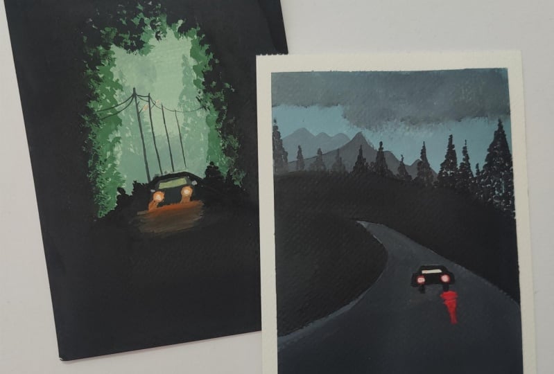
with that misty forest look. Our class project
one from this class, often Misty Rhoads
with glowing lights. I hope you guys
enjoyed painting this and understood the easy
technique of adding the foliage for the misty forest plus understanding to
create that glowing effect for the night working
layer on Lear and not giving up to
get a glowing effect. I will see you guys soon into
the next class project now.
5. Project 2 - Through the Pines - Base Layer: Let's begin with our next
class project for this class. This is the last class project. It is just a small class, but these two beautiful
class projects. So let's begin with the
pencil sketch first. So I'm going to be adding in the road way out here as well. So first creating the
space for the roadway. And now on the left
side we are going to have it moving
towards the left side. So the top space is going
to be this guy space and the mountains and the pine trees on the road way out here. We're going to add in the
car pencil sketch as well. Just a very simple one. This time we are
going to go in with a red light effect for the car. And in the same way, but a little different when it comes to the
reflection part as well. So this is the basic layout
for the class project. We are going to go
ahead with the colors. Now. Again, since we are
working with gouache, we need not have
any layer of water. This time I'm going to create a grayish blue color for that. I'm going to mix in
the sky blue color and white and black to get
all grayish blue color. Now in case if you do not
have the sky blue color, you can go ahead with the
civilian blue color as well. And that's exactly
almost the same shade. So I've mixed in white
first along with the blue. Now I'm going to add in
a little tent of black. Despite taking in a
very little tent, it is gone a little on the darker side you can see
it's a dark gray color, which is not exactly the
color that I'm looking for. I'm going to quickly
go ahead and pick up a little more of the blue
and white separately. And then to that I'm just going to add a little color from the mix that we created so
as to get the lighter blue, do not everybody that darker blue color mix which is formed. It can also be used later on for adding in
the dark or depth. But for now I want it
in the light on me. So I just mix in a little
more blue and bytes separately and added a
little tent from that. So using this darker tint, I'm just going to begin
painting the sky space. Still this looks
a little darker. So in-between I'm
just going to pick up little bite and blend
it on the wall. So if you want, you can add the white to the mix
and then go ahead. Or you can directly add in the white out your, as I add it. In this way, you will get little different
tonal variations in the sky as well and get transition between
different colors. That works better rather than
mixing in the entire color with the white and getting in one single shape for this guy. Now next I'm going to add in the base layer for the pathway. So for that I'm using one tone
darker than the sky color. I'm going to go ahead with
this codon the entire pathway. I'm going to try and leave the caspase blank here as
well as much as possible. So very simply you can see I've just added in a base layer. Now you may be
thinking why I haven't taken the sky color
completely till the roadway. Because at the bottom here as
it is going to be having in the black color
laid down because of the pine trees that
we will be adding. So I had the thought
of just getting the sky color till the
mountain green space so as to get in and easy transition
for the mountain range. Now using the darker color, I'm just going to
begin adding in little depth in-between
on the pathway. Then you simply just adding in little darker color and blending it with the
base layer color, giving in some darker
strokes in-between. Now, before that, I'm
just going to go ahead and add in little cloud
effect into the sky. Now this cloud effect, I am a little unsatisfied, so I'm just going
to go ahead and blend it well into
the sky again. So how quickly you can see you can correct your mistake and blend the details well using
the same base layer color. So quickly you can
see I just blend it. Now I'm just going
to go ahead with very little cloud detail. Again. I'm going to keep
blending it with this guy well, so it's not going to be
much of the cloud detail, rather than just
going to make it look like some strokes coming out of the dark or tend to
create in the cloud effect. Now using the darker tint, I'm just going to add in
little more details out. You're on the path,
we're just going to give in and blend it with
the base layer color. So major near the bottom space
you can see I'm adding in the darker tint and blending it well into the
background color. And if you need, you can
pick up the background, basically a color again for
blending the gaps in between. This is just the first layer of the three that
we're adding in. We're still going to go
ahead with another layer. After everything dries in and when we begin adding
in further detail. Now using 1to1 darker color than what we used for the sky. So I'm just mixing
this darker gray mix into this light blue mix. I'm going to go ahead with the first layer of the
mountain range out here. On the mountain range is majorly going to be visible
only on the left side. On the right side, we are going
to have in the pine trees moving about a mountain
range height as well. So just add it in
the first layer of the mountain range out here. For the next layer
of mountain range, I'm going to go ahead
with the darker tint. Now again, I'm just
blending in Digital of the cloud effect you're
giving him the stroke effect because I'm a little
unsatisfied with their Cloud to just
running a damp brush and trying to show it some
darker tint effect to give him the cloud
effect out here. So you can see how
simply you can keep collecting data or z or
even after layer on layer. I'm just using a damp
brush how blend and create the darker depth from the edges to give it
the cloud effect. Now I'll wait for this layer
to dry out completely, then move on and begin adding
in the further details.
6. Project 2 - Through the Pines - Adding the Pines: So now the first layer
of all the details is completely dried and I'm going to go ahead with
the second layer. So for the second
layer of mountain, I felt that I didn't little of the darker tone to
the lighter blue mix. And just two on the first layer, overlapping and going ahead with the darker tint to create
the second mountain range. So you can see how
easy it is again, to go on with the
layering technique, giving him the lighter or
darker depth on each other, creating in the
details step-by-step. Now along with this
in the rest of the whitespace that we have in between the sky and the pathway. I'm just going ahead with the black color filling
in the entire space. So even on the left side, I'm going in very
carefully closer to the pathway space and then
the rest of the space. I'm just going to go ahead with the deer off the black color. On top of this, we're
going to add in the pine trees
which are going to be crossing the mountain ranges. On the right side, it's going to go about the mountain
range height. And on the left side is going to be a little below
the mountain ranges. Now I've shifted to my
pointed tip round brush so that it's easier for me for
adding in the pine trees. I'm going to go ahead and add in the pine trees quickly
on top of this and keep blending them well with the black space that
we have added in your so I'm not going ahead with much detail
look of the pine tree. I'm just going to create
a lot of foliage. And as I reach towards
the bottom space, I'm going to fill it majorly out with the black color
so as to show it perfectly blended into
the bottom black space that we have created here. Now throughout,
across the space, I'm going to go ahead with different heights
of the pine tree. I'm not going to keep all the pine trees
of the same height. So now I'm just going to keep
adding in the pine trees. You can see the center pine tree was a little bit smaller. And again, the Third Frontier
tilde is a little taller. In this way, you have to
keep reading the heights of the pine trees so as to get
the distinction between them. You can see as I reached the
bottom of the pine tree, I'm just going ahead filling
in the space completely because we are going to blend it with the bottom black patch. And at the top I give it
a little detail view. Also, if you see the pine
tree takes the shape of a triangle. At the top. It has a pointed edge
and moving downwards, you keep increasing
the length of the foliage and accordingly it will take a triangular shape. Now, you can see
on the right side, the mountain ranges
are completely hidden. That is, the pine trees have
crossed the mountain height. But now as we move
towards the left side, we are going to make sure
that the mountains are visible from behind the
pine trees that we added. Now the remaining pine trees, I'm going to go ahead and
add them in a little mix of blue color along
with the black color. So in the greenish tint, I'm going to go ahead and
add the pine trees out. You are on the left side. First. I'm just going
to give him a little of discrete as our tour
at the bottom space blending in with the
row so as to give it a little color
transition and Bree and get all of them
sink together. Now I'm adding one
huge pine tree with this greenish tint out. You're at the bottom space. Now this may not be
visible completely because I'm adding it in a very
light consistency. But since it's a little
different color than black, it still has a little
highlighted view on top of the
entire black patch. Later on, we will add in further details
out there as well. For now, using this darker tint, I'm just going to
go ahead and add the rest of the pine
trees on the left side. Now after last edge
here on the left side, I'm just going to add
a half pine tree. That is half of the
pine tree is not an SI, and the rest half is visible, which I'm going to
add it out here. So just the foliage coming out from the edge of the paper. Now I'm just going ahead. I'm going to use this
darker mix and define the edges of the road and
the curves of the road well, with this darker tint using
in the pointed tip brush. Now after this, I'm going
to go ahead and add in further darker highlights
on the pathway as well. So I'm going to lay down the darker color patch and then blended into
the background, giving in some darker depths
to the pathway as well. So now false, using the smallest filbert brush in case if you do not
have a filbert brush, you can go ahead and using a round brush or a
flat brush that would make it as easy as just adding a few patches
of this black color, some lines and
some small patches so as to give him little dip. So you can see very randomly, I'm giving him the darker
depth on the path. I'm just giving him
the patches for us. Later on I will blend all of these EBITDA basically of color. So now before moving ahead
blending all of these, I'm just going to go ahead and
give him little patch out. After that, I will first add the details to onto
the car that we have. And then I will go ahead
with the darker color and blend all of these
well into each other. Now using the black color, I'm going to add in the
details into the car. So this time a car
is going to be completely off the black color. And later on, just
in the window pane, we are going to give
him the blue details to show the background
visible through the glass. And then we will just add the headlight details using the red color mix along
with white gouache. I've given the entire
shape for the car for now. I'm just going to give
him little villi. And to show the shadow of the car falling
onto the pathway, I'm going to go ahead and given lifted off the black color
spread of the tires out, you're underneath the car. So basically this shows the darker space
underneath the car. Because if the shadow of the
car falling onto the road. Now just using a damp brush and a little of the blue color, I'm going to blend all of these darker patches
well together. So now you will have a further transition
your road in-between, you will have some darker
patches and you will have some black strokes in
between because of the blending and the color
patches that you've added in. Now on the right side, that is the bottom right side, I'm going to add in little white color and make
this piece a little lighter. So as to show the
light effect from the car that makes
this piece look a little lighter as
compared to the rest of the space on the left side. So on the right side I'm adding in little
of the white quash lightening up this pace as compared to the left
side of the pathway. I told you the reason
because on the right side, I want to show the
effect of the light from the car falling
on the road as well. Whereas on the left side I don't want to show much
of the light effect, so keeping that path
a little darker. Now just on the edge, giving it the finishing touch
with the lighter colors so as to separate it from
the black space and blending it well so you
can see how easy it is to add another
layer of color onto any part of your painting even
after it dries out and so easy to reactivate
the base layer colors and blend them all
well together. So in case if you want, you can run the colors onto
the camera as well and then add the car shape later on again with
the black color. So whatever suits easy for you. So, alright, we're almost
ready with this painting, just little details to
add into the car space. And then we'll be ready with the painting for the second
class project as well. Now, let's wait for
all of this to dry and then begin adding
in the final details.
7. Project 2 - Through the Pines - Final Layer: So now everything is
dried completely. So let's begin adding in
the details out here. We're going to
create the glowing effect for the car lights. But first let's go ahead and add in the detail
in the class pain. So in-between your, you
can see the whitespace, that's the glass pane
where you're going to add in the same blue
color that you've used for the path we to show the same pathway visible
through that glass pane. So I'm just going to go ahead
and taking a little bit of white and going to lighten
up that space a little. Now I'm picking up the
red color and with the red color without adding
in any other color to it, I'm going to go ahead with the
first layer for the light. So this time we can see we've maintained the headlight space white so it will
become much more easier to get up
that glowing space. Because if the brighter background that you
already have it, I've gone ahead with the
first layer of red color, and this is just the background
Leo that we are creating. Now underneath this car as well. I'm just going to give him some darker deck to ask to show the reflection or the shadow of the car falling
onto the path. So just a little
underneath the car and the literature on the backside to give him the darker debt. Now to the first layer
of light, Jason, I'm going to go ahead and add flexion to the light as
well on the pathway. So I'm mixing a little
bit of white to the red color and just
to one of the light, I'm going to show the
reflection falling onto the road. For
the second light. I'm not going to add
in the reflection. So just simple lines
leaving gaps in between. And as you further move
towards the downside, I'm just going to decrease
the length of the reflection. So we began with a
broader reflection closer to the v. And as
we move downwards, you can see I've
reduced the length as well off the reflection. Now I'm just going to
use in the same mix. I'm going to go ahead with a second layer onto
the lights as well. And again, using the damp brush, I'm just going to
blend the edges. Now. Make sure in case if your water jar has stoned dirty, then please change the
jar because otherwise the dirty water will create muddy look and it
will not let you get in the glowing space easily. I wanted a little more
growing space out here, so I added little more
mixed of white to the color and gotten a
brighter space out here. Now using the white
color itself, I'm just going to
go ahead and add in little more detail onto
the car in-between the headlight giving in details for the backbone
of the car as well. Now I will wait for
all of these to dry out completely
and then we will begin adding in the second
layer of the details onto the headlight to create
the glowing light effect. So now my first layer
of light has dried completely and I have mixed invite along with the red color. And just beginning with this glowing red space
in the center area, giving in the light effect. Now to this center
light effect as well, I'm just going to blend it a
little into the background. So in the center you will have
that glowing light effect, but still at, will have the soft edges because
of the blended look. If you feel the need, what you can do is you can
blend this first layer of the bright light that you have added into the background. And then after this adding another layer to make it look as the perfect
light effect. So I just went
ahead with a little more of the red color to create the background glowing
effect because I felt that the background glowing effect
was still a little dull. So I just blended it a little. Now once this also
drives in a bit, I will just mixing a
little tinge of yellow as well to this so as to get it
more on the brighter side. So mixing in yellow, white, and the red color to get more of the glowing
effect to the light. So first you can see I've
blended into the background and created the perfect blend
for the glowing species. Now, I'm just going
to add little in the center once everything
dries out again. Now using the mics off the
red and the white color, I'm just going to add the final light effect
in the center. So this time you can see
comparatively we just used around two to three layers to create a background
glowing space. First, we went in with
the plain red color, then went ahead
with a little mix of the white and the red color, then hide it a little
tinge of yellow. And now the final light. Now using this light color, I'm just going to add
a little highlight to the reflection as well. Now giving some last final
touches to the car as well, some highlights and
some proper margins. And using the black color, just going to add in some small rearview mirror look as well from the front side. So just little details gives him more depth to your painting. And lastly, using
the black color, I'm just going to add in some pine trees towards
the left side of the road. And then we will be ready
with this class project. So in the background,
you can see that the first pine tree is
often little lighter color. So when you will add in the black color tree on
top of this lighter G, it will automatically
begin giving in the depth once
it begins to dry. So I'm just giving her head a little of the pine
tree details out here. Half of which will get blended
with the black background, but little will be visible. Because if the lighter
tree in the background. So we are almost ready with our second class project as
well for this lovely class, I hope you guys
could get an idea about creating these
glowing spaces on the pathway and creating
the glowing light easily into these misty
skies and Misty Rhoads. So now let's remove the
masking tape and see your final painting with
those clean edges again. Make sure your painting is completely dry before
you begin to remove the masking tape
so that you do not tear off the edges because
of the red borders. Also always remove your
masking tape against the paper so that you do not tear off the painting and the
color does not report. So you can see how beautiful
the red light effect is coming under
reflection looks so real. I hope you guys enjoyed painting these two simple class projects
with me in this class.
8. Thank You: Thank you so much to each one of you for joining me
into this class and painting along with me these two beautiful
glowing landscapes. If you have painted along, I would love to see
your class projects into the project
section of the class. And in case if you like the
class for whatsoever reason, do not forget to
drop me a review. Thank you so much once
again for joining me.
 Umashree Taparia, Artist, Art Instructor, Entrepreneur