Transcripts
1. Welcome to the 30 Day Gouache Landscape Adventure: Creating art can be a therapeutic process
in various ways. Art is more than just creating. It's a pathway to relaxation
and self discovery. With art, you can
unwind, express, and cultivate a habit that brings tranquillity
to your daily life. I'm Marcia Paria, a
chartered accountant, an artist, and a creative
business entrepreneur. I go by the name Creating
from the Heart on Instagram where you'll
find my creative journey, my creative practices, and all details about my
creative business. Welcome to the 30 day
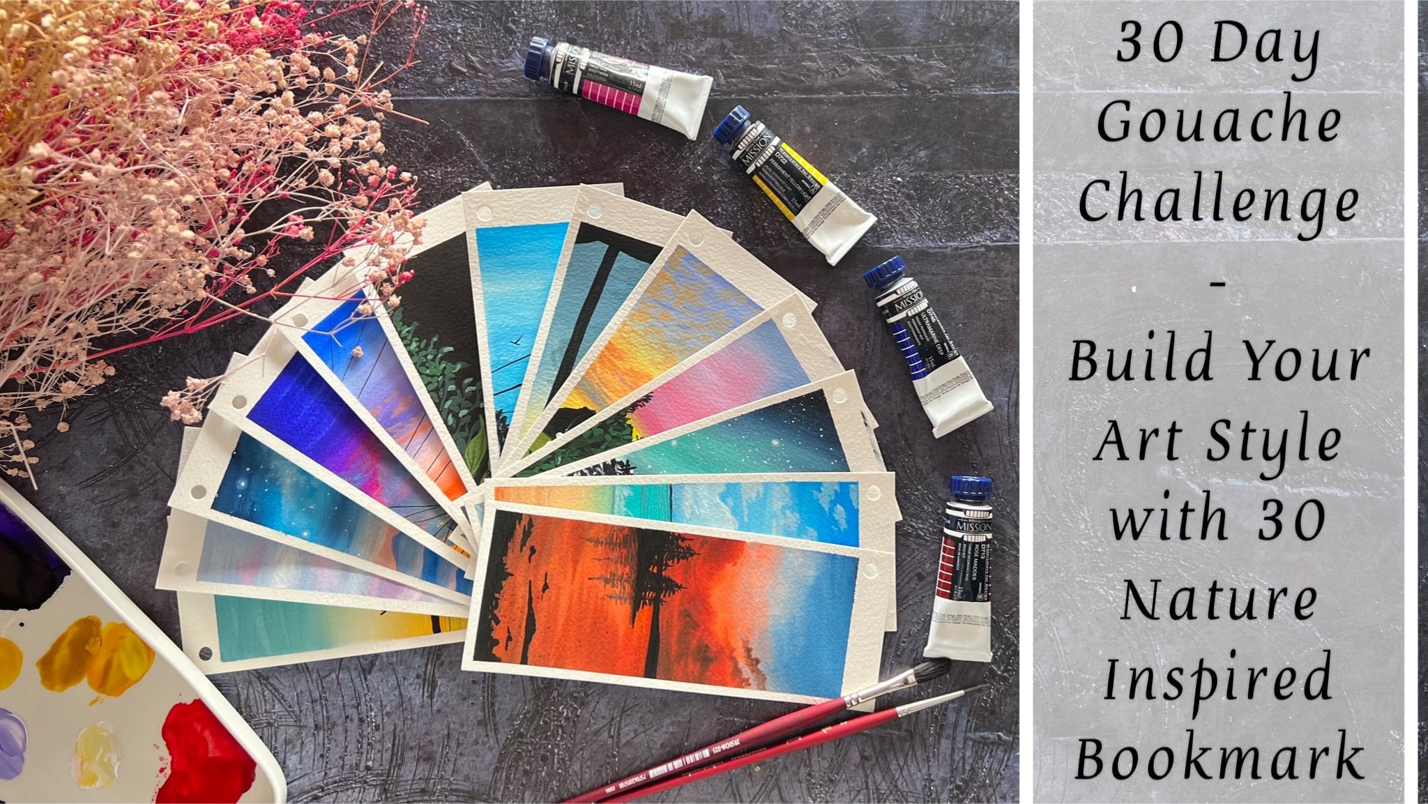
as adventure class. Over the next 30 days, we'll embark on a
colorful journey into the world of
quash painting, Creating 30 mini landscapes that capture the essence
of nature's beauty. Gauche painting, a
captivating blend of watercolors, fluidity, and acrylic opacity, offers artists a vibrant
and versatile medium. With its quick drying
time and rich mat finish. Gauche is perfect for creating expressive artworks filled with bold colors and
intricate details. Each day we'll dive into
unique color combinations, unveiling a spectrum of
hues to breed life into your miniature masterpieces from the serene to the vibrant
sunsets to lush meadows. We'll explore various scenes, as well as cover all essential
materials and project specific color palettes
before pining. We'll first dive into some basic techniques to elevate your kash
painting skills, as well as help you mastering the essential
techniques with kash. Whether you are a seasoned
artist or a picner, you can join us in exploring the versatility of
quash and unlock with us the secrets of creating he print and
captivating scenes. Join me into this
class and embrace the joy of painting and witness your artistic skills flourish in this exciting 30 day
quash adventure journey. Let this class be your daily
dose of creativity and your transformative
journey where your brush captures landscapes
both real and imagine. Without a further ado, let's bring these captivating
landscapes to life, one mini masterpiece at a time.
2. Materials Required: So before we dive
further into this class, let's have a look at the
materials that you would be requiring for
the coming 30 days. First is the set of Guh colors. I'm going to be using this twin cup jelly quash
set by the brand A Arts. It's the Jimmy Gauche set. You can use colors in form of tubes or in form of bottles, jars, or any other
format, or poster colors. Also, if you do not
have, uh, colors, my palette has around
36 shades here. And it has all kind
of shades of greens, blues, violet, red,
yellow, white. It's all in one palette. Go to palette. Now,
next for the paper, I'm going to be using
the 13 centimeter by nine centimeter polaroid
paper that I've cut. It's from a bigger
sheet that I've cut. These are 300 GSM, 100% cotton cansin brand paper. Using this round cutter, I've cut the edges into
these round shape, giving it that polaride look. So this is the kind
of paper that I'm going to be using for
the coming 30 days. It's 13 centimeter
by nine centimeter. Using this round cutter, I'm going to cut the edges into these round circular edges, making it look like a polaroid. Now you can use any paper
which says at least 300 GSM, if not 100% cotton. That will help you blend
easily and will not buckle up your paper while
blending or layering. I'm using 100% cotton
paper because I like it, the texture as well. I will be taping down my paper onto this black canvas which is approximately of the same size of the paper that I've cut. Now for taping down this, I'm going to be using
in masking tape, which is going to be a
simple masking tape. You can use any masking tape, a simple car painters
tape as well if you do not want to use
the printed masking tape. Next, coming on to the set of brushes that we'll be using. I'm going to be
using in majorly, all these brushes
from the brand. Princeton, and a few of the
other local brushes as well. For the brush, the main
brush that you would need is one flat brush
and one round brush. Rest of the brushes are optional or you can even
have alternatives to that. So I'm going to use this bigger
size round brush as well, which is a size five
Princeton velvet touch brush. Apart from that, you
would be needing a smaller size flat brush
or an angular brush. Even if you do not have this, I will show you an alternative to use the round brush itself. Apart from this, I'm going to be using this spoiled round brush, the bristles of
which are spoiled. Now, coming to
these two brushes, this is an oval mop brush, and the second one is
a round blender brush. Now, in case if you do not have these two specific brushes,
it's perfectly okay. And if you have these
kind of brushes, you can keep them ready. Going ahead further,
I'll teach you where we'll be using this and
how we'll be using it. But in case if you
do not have that, I'll show you the alternative. I'm going to be using this
ceramic palette for mixing my colors from these cups
out here onto my palette. Creating in pastel shades, color mixes, and easy
blending and consistency. You would be needing a char of clean water for each
of the class project, preferably two, if you wish to. You would be needing some
very basic stationeries, which is a black
pen, a white pen, pencil eraser scale
for adding in some pencil sketches and some rough details into
the painting as well. This is all about the
materials that you would need. You would also
need a rough cloth or some tissues to
dab your brushes for some dry brush details or for some cleaning of
your brushes as well. Now, I've already discussed the alternatives that you can
use for each of the paints, papers, brushes as well. Go ahead, grab the supplies
that's available at your end. Again, you need not
need 100% cotton paper. Any paper, about hundred 50 GSM, preferably 300 GSM, is best to work layers on layers so that your paper doesn't buckle up. Now I'll see you guys into
the next lesson where we first begin with the
very basics about quash, discussing some
techniques, and then moving on to class
project for day one.
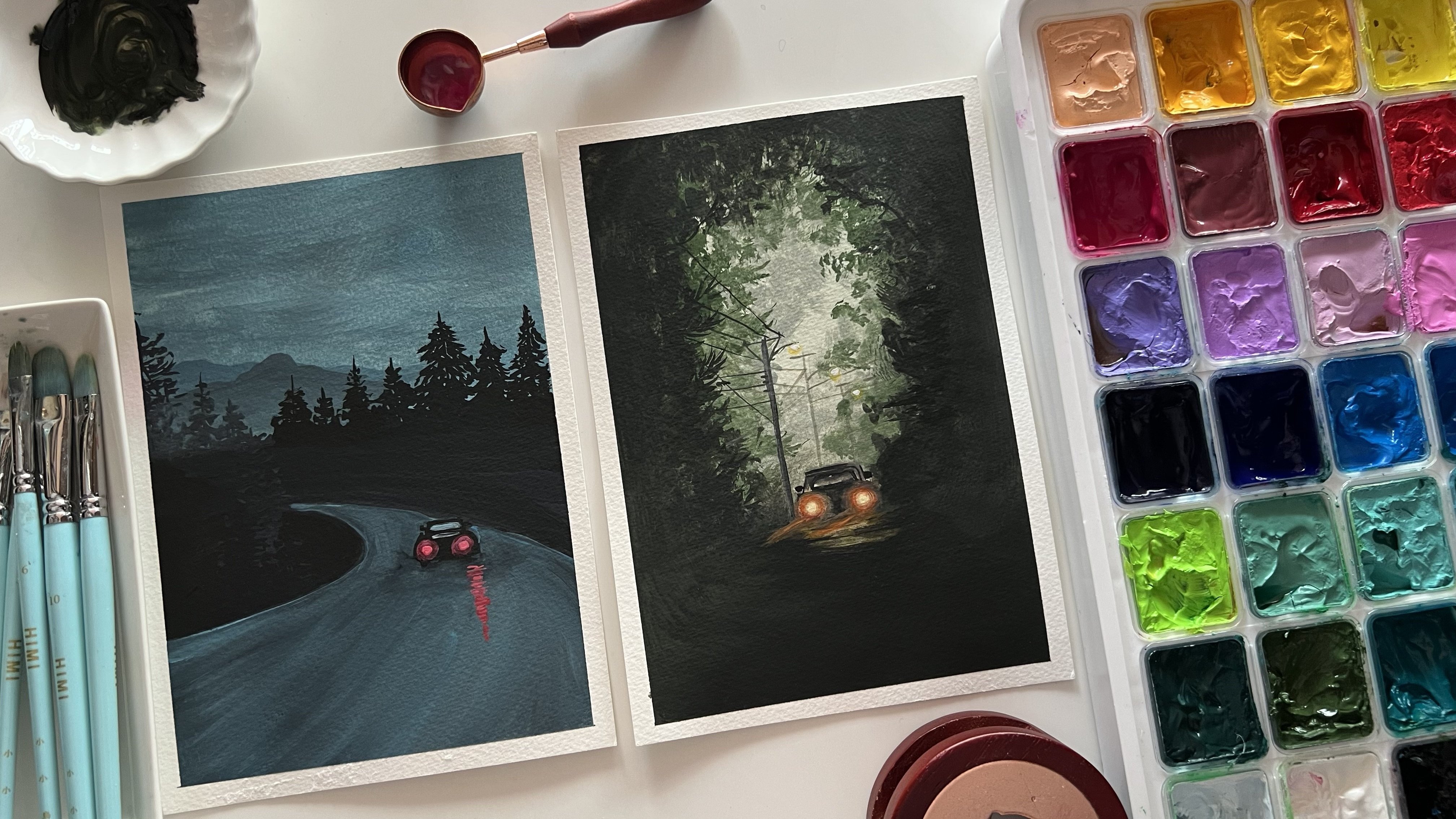
3. Day 1 - Night Sky: Welcome to day one. The colors that
you'll be needing for day one are crucian blue, sky blue, white, and black. In case if you do not have
the specific shades of blue, you can go ahead and
use one darker tint and one lighter tint of blue that's available
in your palette. I'm first going to
begin by cutting these piper into
some round edges. I'll quickly show you that for one class project and for the
next class project onwards, I'll keep my paper
ready taped down onto my canvas part on
all the four edges. Using the ten MM round, I have cut them into a
beautiful Polaroid format. Now I'm going to tape this
down using a masking tape. Same way, I'm going to
keep the paper ready for the rest of the class
projects like this with the round edges cut already
so that we do not spend time onto taping down and cutting the paper for each
class project. Now using a masking tape, I'm going to begin taping down the paper on all the four edges. You can use any masking tape that's available at your end. I'm just going to
make sure that I give the masking tape edge
of only around 0.5 MM. That's approximately
two centimeter towards the inside to leave them
as the white border. Now it's very
important that you use a good masking tape because if the tape does not
have enough glue, then it may peel off le painting because of
the water that gets laid over the masking tape again and again, vile blending. It's very important to make
sure that your masking tape is of a good quality
through which the pains and the water will not seep onto the edges keeping your edges
white and clean throughout. I'm done taping down my paper, you can see I'm running my
fingers on all the four edges, making sure that it's completely sealed on all the four edges. No loopholes left anywhere for
water or pants to seep in. We are ready with
our taping down. Now let's quickly bring out
the colors onto the palette. I will remove the colors on my palette and
keep them ready so that I have them ready in the right consistency
to begin blending. The first color here
that I'm squeezing out on my palette is the
Prussian blue color. It's a bold, dark blue. Next I'm going to squeeze
out the sky blue color. You can use Errelian
blue, sky blue, light blue by whatever name
available in your palette. You basically need one
darker tone of blue and one lighter tone of blue and white to dilute it
further till the bottom, to create in that
transitional or a wash effect from darker
blue to the lighter blue. The last shade here is the white color that
will be needing at the end to blend it completely and create further
lighter tones of blue. Sprucing blue sky, blue whites from top to bottom,
dark to light. Let's begin with the
darker tint first. At the top space, I'm cleaning
my brush from all the white and making sure I do not have any pigment
left on my brush. Now make sure you have
the paints enough and in the right consistency
on your palette. Otherwise, it will be difficult for you as the paints
may begin to dry. And you may have to
go ahead again and again trying to
blend in the colors. At the top, I have begun
in with the blue color. You can see almost one
third of the paper. I've covered it up with
this darker blue tint. Now next I'm going to shift, turn to the sky blue color
that's on my palette. And I'm going to blend
both of these together. Now these two colors
already you can see are lighter and darker
tints of the same family. In between blending these two, you need not need a white tone because these will
not be giving you any muddy tone or an unpleasant transitional
color in between. So you can easily blend
this color by just turning your brush to and
fro at the meeting point, creating smoother
transition from the darker to the lighter tint. Now at the bottom of space, I'm just going to pick
up white and blend it with the blues from
bottom till the top, creating in that
perfect transition and the blend happening. So you can see just picked up a very light tint of the
blue along with my white. And going to blend it
from bottom till the top. Running my brush completely from the last edge of
the bottom till the top. So that we have that
smooth transition and blend going till the top. Now in between, it's
very important to make sure that your brush
does not run dry. Because while
blending your brush may lose all the
water and paints. So it's very important that you drip your brush into water. Or paints again as per the need so that your
brush is not done dry. And if it turns dry, it will be very
difficult for you to blend and get in the
smooth transitions. Now I'm just going with
little more white at the top space to create
little lighter tints of the blue so that we have a more beautiful transition from different
tones of the blues. It's very important to
blend from bottom till top, or top to bottom
altogether at once. So you can see in the blending, we do not have any
rough lines in between. The blending is smooth and
the entire space creating in that entire transitional
effect in the blue color. Now, using some white, I'm just going to splatter
in some stars into the sky. For that, you can
either cover up the space around your
paper so that you do not have any white spots
left onto your table. I've just picked up the white in a right consistency on a brush. And using my fingers, I'm diving onto the brush from a little distance so that I get these splatters
to act in as the stars at the bottom for the silt we are going
to go in with a lot of pine trees with different
kind of details that we've already discussed in the technique section
of the pine trees. Now my sky is completely
dried and I have picked up a little of the
black color on my palette. I'm just getting it in
the right consistency with the right of water. Using this plaque in
a bold consistency with a smaller size
pointed tip brush, I'll begin to add in an entire
range of the pine trees. For the first class project, I wanted to keep it
simple with the blending, no cloud detailing, nothing. Just a simple blend
of colors from top to bottom with the help of white
or transitional colors. The pine trees
that we discussed, I'm beginning in with those
different kind of pine trees. I'm actually going to go in with medium foliage pine
trees here in between. I'm just going to use in
some simple branches with very simple small thorn effects to give in little dimensions. In between, creating in
more of a detailed look. Now, when you begin adding
in these pine trees, make sure that you do not add them all of the same height. Try to vary the heights of
these pine trees throughout, taller, shorter in between. You can even add in some
very simple bush detail or little foliage effect
if you do not want to go ahead with a lot
of detailed pine tree. With every pine tree, you can see the triangular shape coming to life from
top to bottom. At the top being of a thinner length and
moving downwards, increasing the length of
the foliage to create in that triangular
shape at the bottom. You will majorly notice I given a lot of black
filling to fill up the space completely
and make it look like a detailed
pine tree as well, with very simple techniques. Now I'm going to go ahead with
another shorter one here. And then again, we'll keep on wearing the heights,
as I told you now into these as well. You are free to follow in
your own siluhate pattern. You can go ahead with just some dense pine trees in between and just one thick pine tree or
one full filled pine tree. Or you can go ahead with the medium foilish
pine tree throughout. Or you can even go ahead with a mix of those spiky pine trees, which we discussed in
the technique section, trying to show in
that those pine trees are far from view. That is the reason in very
less detailed pattern for the first class project, as I told you, I've tried to
keep everything simple for you to begin and get into
the flow of quash painting. I've created a simple
blended sky of just one color using in different tones
of the same color. And then just corn ahead with
simple pine tree silohates, which we've already discussed in detail in the technique
section of the pine trees. So it's a very
easy class project to follow along and
would hardly take you 15 minutes to create a beautiful mini
masterpiece together. Now here I'm taking
one huge pine tree, which is almost half the size of the paper, as you can see. Now, I've deliberately
tried and not to keep the biggest pine
tree in the center, because if you keep the
largest element in the center, it creates a very different
view to the painting. But in case, if
you keep it either left oriented or right oriented, it gives it a more natural look. And does not the entire focus
onto just that pine tree, if it's in the
center completely, it will just be focused
onto that one pine tree. Again, here you can
see moving downwards, I'm increasing the
length of the foliage. I'm just going with simple strokes with
the tip of my brush, just making sure that I achieve a triangular
shape at the end. In between these, we'll be
adding in those branches. Once we are done adding in all of the pine trees together. Now I'll just add in one last
pine tree here at the end. And then we'll go ahead with
the details in between. Add a small moon silhouette
as well to a painting. And we'll be ready with
our class project for day one of this 30 days
landscape adventure. Now in between you can
see I'm just adding very thin branches
or bigger stems. And from that I'm pulling out
smaller branches to create in that detail and break in the monotony of
the pine trees, giving it a more natural
and realistic effect. Just some last bigger
branches here and then I'll be done adding
in these branches as well. After this, I'm going to shift
on to adding in the moon. For adding in the moon as well. We've discussed some silhouetes of the moon in the
technique section, as well as we've also discussed creating in that
glowing space for the moon. I'm going to go
ahead first pick up the white color and create a small glowing
space for the moon. For this class project,
to keep it simple, we won't be going ahead
with the glowing space, we'll just go ahead with the crescent moon shape
for adding in this moon. You can even use a white
Chellpen if you're not confident about
adding a tiny moon using a smaller size brush. But in case if you wish to
add it with the white quash, make sure you use a
smaller size brush so that you can get the
shape of the moon right. Making it with the
color will make it more bold as compared
to the white chellpen because that will
look a little dull as compared to the opacity
of the white paint. Now carefully, let's remove in the masking tape from
all the four edges. Make sure that you do not
remove the masking tape. If your edges are still wet, always hold the
white edge perfectly and make sure your fingers
are clean with the colors. So here's a final
painting from day one. A beautiful simple night sky with simple pine
tree silo heads. Learning in simple wash, getting in the blends, right? I hope you guys enjoyed
painting this today. I will see you guys tomorrow into the day two
class project with another beautiful
landscape painting into the 30 day Gauche
Landscape Adventure class. Thank you so much for joining
me into this class and I hope to see you guys paint for the coming 30 days with me.
4. Day 2 - Simple Pastel Sky: Hello everyone. Welcome back to day two of the 30 day
course challenge. Today we are going
to be requiring the shades of purple, sky, blue, pink, orange,
green, white, and black. We'll create the pastel
shades if you do not have already
in pastel colors. I have my paper taped down onto the canvas along with the
help of a masking tape. I have my jar of
clean water paints, palette, everything
ready to begin with. We are going to first begin picking up the colors
onto our palette. We are going to be
using the shades in a little pastel color form. I'm just picking up this magenta pink color
from my palette. I little white to this. Or you can even add in
a little pastel pink if you have in your
palette already, the next color is the purple
color or the violet color. You can use purple violet
or a pastel purple, lilac color, whichever
available in your palette. Next, I'm going to pick up the sky blue color
to this as well. Later on, I'll add
for the little white to create it more
into a pastel tint. These are the three
colors that you would be requiring for the paste
layer of your sky. Rest of the details will be with the
silohate for the colors. We'll first begin with the sky to pick up
a little more of the colors so that I
have enough colors on my palette in the right
consistency already. Now to this purple,
you can either mix in white already
on your palette or you can apply the color
force and then use white whole blending in that way you will not
have a much lighter tone. Because if you add white right
now, itself to the color, then while blending also
when you will use white, the colors may turn
a little extra light than what is required. In this way, you can maintain the tonal consistency by using
white only for blending. At the top, I've given a
little more bold violet color. One third is going to be purple, then pink, and then blue. Now next I'm beginning
in with this pink color. For the pink color as well, I'm laying down the color first, and then now using white, I will begin blending in the pink and the
violets together. You can see as soon as I
overlay a white for blending, it automatically gives me a pastel pink and
a pastel lilac, a tone because of the white
overlaying for blending. That is what I was
trying to emphasize, that you need not always mix your pastel colors beforehand. You can use white
for blending and create the pastel tones
by overlaying easily. Same way for the blue as well. At the bottom, I'm adding
in a small layer of the blue and leaving gap between the blue
and the pink there. Again, I will begin
with the white tone. Same way or lay
overlaying onto the blue. You can see it will turn
into a pastel blue. Moving further, I will blend
it with the help of white. Now again, what I'm going
to do is I'm going to blend all of these together
from top to bottom, or bottom to top,
whichever way you prefer that I have
a smooth glen. And transition happening
between the colors and no lines
anywhere in between. Now I'm picking up
a little bit of the pastel lilac color in
between the blue and the pink. And adding it in
the white space so that that white space gets
covered up completely. I don't want any
white past space for blending into my sky. This is how you can use ready
pastel colors as well for blending at certain spaces where you want to
aviden the white caps. Now you can see the smooth blend happening between the colors. No white patches having in those light and dark
pastel tones and different transitions of the
colors happening in very smoothly and the flow of
the paints moving smoothly. At the top, I'm
just adding little, a highlight of the violet color. Again, using a dam brush. I will blend it so that we have that smooth transition from the talks stint of violet moving downwards
to a pastel tone. This is for the base
layer of our sky. Now onto this, this
time we're going to add in very little minute highlight, the father cloud highlights. I'm going to use the
smaller size round brush, the simple strokes clouds that we discussed in
the technique section. I'm just going to add
in very simple clouds. Then we'll just go ahead
with a simple silo het, the further cloud I'm mixing in the white along with
the violet color, making it in a very, so that it's just visible on
the pink lightly. I'm just going to add in little strokes of the
cloud because we are going to step by step increase the of difficulty of
our paintings each day. With every day adding in
something new so that you learn something new
addition into your painting. Making it easier for you
to follow along each day. And keep on learning
and implementing new things into your
landscape painting. With the help of the pink
and the violet tones, I've just added a small patch
of clouds, you can see. I've used some
bigger strokes and some smaller strokes at the top. And that is eight
for the clouds. Very simple one. As I told you now on the left
side bottom space, I'm going to go ahead adding the silhouette
of some leaves. For that I'm going to use in the green and the black tones. First beginning
in with the black color for the base layer. Then on top of it,
we'll go ahead with little green leaf details. Then we'll just adding some orange highlight to
act in as the flower. Now you can either use this round blender brush to
create in that rough space, you can use that spoiled rum brush technique
that we discussed. Both of these brushes will do the same job because both of the bristles are
spoiled completely. Now, when you begin dabbing
in this black color, you need to make sure you try to get a shape that you want for this bush area or the greenery space that
you're trying to add in now with the same black color. Using in the smaller size brush, I'm japinging to dab in
with the tip of the brush, giving in little detail leaves. This also we've discussed in the technique section of
the grasses and leaves. Now I'm going to add in
some detail leaves as well. In between some branches, some stems popping out, giving in that natural effect. You can see these lines
are not straight, they're all curvy and moving
in different directions, different angles overlaying
onto each other to create that natural
effect on top of it. Once the black color dries up, we are even going
to go ahead with some green color strokes to
give in the greenery effect. I'm done with a
little of it now. I'm just going to
go ahead add in some bigger branches
randomly, here and there. Before we shift on
to the green tones. You can see how I'm just
using in the tip of the brush to add in these
fine details so that they stay in
proportion along with the size of the paper and the details that we're
trying to add in. Now using the green color, I will begin adding in the
leaves on top of these. Now make sure that
you use the green in such a consistency that it's
visible onto the as well. Now if you feel that your green is not visible onto
the black tones, you can add in a little
tinge of white to it, so that it will get a
little pastel color which will easily be visible
onto the black tones. Or you can even use a
lighter sac green color. Or mix in light green
and dark green to get a medium tone green so that
it's visible easily. Now with the greens you can
see I'm just adding simple leaf creating in little
leaf texture automatically. The black tones that we
added is beginning to act in as the shadow to the green
leaves that you're adding. Now, now with the
green color as well, I'm going to pull
out some branches and some detail
leaves after that. And on top of all these, once these try out, we'll go ahead with little
orange flower details. Now to my green, I've
added a little bit of the white to create a
further lighter green. And now I'm adding little strokes with this lighter green. So you can see two variations
of the greens as well. You can use a light and a dark green readily available
in your palette. Or you can use the same green
with the help of white, adjusting the tonal value. Now next until this tries out, I'll go in with the next detail using in this pointed tip pen, this is a 0.5 nib pen. You can go ahead with
any 0.3 or 0.5 nib pen. Or you can even use a
very fine liner brush and the black color or the pinscrey color to add in these details of the
wire lines into the sky. Now to these, we're going to
add in the light effects. I'm just adding in the
hanging part of the lights. The lights will
directly be adding in using in the white paint. This time we are not going to create in any glowing
effects for the light. We are going with very
simple street light details so as to begin in
the coming days, when we begin with
our further projects, we'll even go ahead with some glowing background
effect into the lights. Now, at times your
pen may stop working. In between, run it again
onto a rough sheet of paper so that it
again gets the grip. And then again, go
ahead and add in. Because of the paints, the
nib may catch in paints, which may make it difficult
for the pen to run on the pines. Now onto these. I'm just going to add
in little bold effect with the black color the lines. I'm going to keep them those
thin only if you want, you can add in another
line of lights as well. I'm just going ahead with
two to maintain it in spect with the size of the painting that I'm
going ahead with. Now picking up the white
color in a bold consistency, I will go ahead and add in
the light effect for that, make sure that you
pick up the white in a very bold and thick
consistency so that it's visible, perfectly
opaque effect. Just using the tip of the brush, you can see I'm creating
in a light effect. Giving in a circle
white dot to act in as the street lights to
each of these hanging. I'll quickly add in
these lights till then my green spaces will
be dried for me to add in the orange part or
the floral part that you can say into the leaf area. I'm done adding in
the light effects. You can see such simple details, but creating in so much more
depth into your painting. Now I will pick up the
orange color to this orange, you can either mix
a little tint of yellow to make it a
little pastel tone, or you can mix in
the white color. I'm adding in a little tint of the yellow color
to it to create a little yellowish orange
To now using this, I'm just going to add in
small dots into this space to act as F or as
the fruit details. If you want to
consider it that way, you can consider it
as an orange fruit, Simply consider it as
a marigold flowers. Just very simple dots that
I'm adding in between. Very simple but
still will make it look so much natural
and realistic. Was done adding in these
little floral details. You can see just simple dots, but they make it look so
much natural like flowers, I've gone ahead with different
sizes as you can see. Now lastly, I'm just going to go ahead add in a small moon. For that, I'm going to
use in the white quash. I'm going to add the moon
towards the top space, I first added in a white dot. Now I'm going to blend this into the background and create
a dull space for that. I'm going to use my damp
brush and create it as a dull white space to act in as the glowing
space for the moon. In the previous class project, we added a simple moon
to keep it simple. This time adding one more layer, creating in a glowing area
for the moonlight effect. Now to the center of this, I'm just going to add
in bold, white color. Make sure that your base
layer of the glowing space is dried so that this bold layer of the moon is
visible perfectly. So let's remove in the masking tape and
see a final painting. Make sure that your
edges are completely dried and always
hold your edges and make sure your fingertips
are clean while holding the edges that your edges
remain bold and white. Here's the final look
at a beautiful pace of sky with simple cloud
details and simple silo hat. For day two, I hope you
guys enjoy painting this beautiful painting into this 30 day course challenge. I will see you guys soon
into the next class project. Till then, make sure to paint along with me and keep uploading your class projects so that we can all share our
works together. Thank you so much for
joining me into this class.
5. Day 3 - Fluffy Cloud Sky: Hello, everyone. Welcome
back to day three. Today, we are going to be requiring the
shades of sky blue, orange, yellow, a bluish
gray color, white and black. Now, in case if you do not
have the bluish gray color, I will show you the
mix that you can make while painting along. I have my paper taped down onto the canvas with the help
of the masking tape. Now baking in with a very
basic pencil sketch, I will just mark
the horizon line to distinguish the
sky and the sea. The top will be the sky, the bottom will be the sea. You can see it's much
below the center line. Now I'm just going to begin
picking up the colors. So for the sky first, I'm going to begin
with a sky blue color. But to this I will add
in a little white so as to make it a little
more pastel, Sky blue. Always make sure when
you're picking up paints, your brush is clean and does not have any darker
tint already. Otherwise, your paints
may begin to get spoiled. Now, beginning in with
the blue at the top, this time we are
going to be creating in fluffy clouds into a sky. For that, we are going to be using in the shades of orange, white, and yellow later on. For now just laying in a
layer of blue at the top. And then using in the white, I'm just going to dilate
it further and create in a very gradient of the blue color till
the horizon line. Now in the remaining
space at the bottom here, I'm just going ahead
with this white paint, blending in along with
the details here of the blue tone and creating in a gradient of the blue
color At the top. You'll have a little taker
blue moving downwards. You can see I'm just laying in very light layer
because here we are going to create in that fluffy cloud effect with
the tones of white, yellow, orange as we discussed. Now just to make
the blend smooth, I'm going to run from till the bottom, or
bottom to the top, whichever way you prefer to create that smooth
blend happening between the sky and getting in that perfect transition
between the blue tones, creating in that
perfect sky color. Now to create in the
fluffy cloud effect, this time I'm going to use
in the round blender brush. Now in case if you do not
have the round blender brush. In the technique section, we've already discussed
the alternative use of a bigger size round
brush that you can do to create in these
fluffy cloud effect. Since I'm going to use
in both the brushes in different class projects
and show you the use in both ways for
this class project, I'm going out with this
round blender brush now. I've just picked up
the white color. I haven't dipped
my brush in water, keeping it damp and
dry and beginning into creating those fluffy
cloud shapes into the sky. You can see the pretty shapes that I'm trying
to blend in here. Now, when you begin this, you need to make sure
about few things. Your brush shouldn't
have excess water. Your paints need to
be good, opaque. Your paste layer
needs to be dried. And you need to go ahead
in the shapes that you want your clouds
to be visible into. So it's very important that you lay down the perfect shapes into the cloud so that the sky later on has that
fluffy cloud effect. Now next I'm going to pick up a little of the yellow tint, mix it along with white, and use it in a little
pastel consistency, and just dab it over the white a little to create
little blends here. Now in case if you
feel that here your blending is not happening
easily with the white. You can use your fingertip to blend in the white
and yellow together. Same way, I'm going to add in
a little tint of orange to this mix again and create
a pastel orangish color. And add in little highlights
of the pastel orange color. Now make sure that you
have very little tint. You can see that tint
seems a little too dark. So I'm just cleaning my
brush so that I do not carry extra tint along with
me of the orange color, because I want very little yellowish orange
highlights out here. Again, always you
can use in white to blend in these colors
into your base layer. But again, while dabbing, you need to make sure that you create in those
fluffy cloud effect. Now closer to the horizon line. I'm further going
to go ahead with a little darker blue tint to create in that
fluffy cloud effect on the horizon line later on. Again, going ahead
with little bowl layer of the white at the top. Again, main important trick here is your color
needs to be in a very thick
consistency to get in that opaque look of colors
on the taker background. And blending needs
to happen quickly, either using in
your fingertip or the round brush or the
round blender brush, whichever you are using in. Now I'm just going to
pick up a little color and define the edges of
these clouds a little more using a smaller sized
round brush so that I have more boulder cloud effect into
these fluffy clouds here. Now, in order to create
a bluish gray color, I'm just adding a little hint of the black color
to my blue color. And you can see I've got that bluish gray
color out there. Now to this if you
want, you can add in a little white
if it's too bold. And I'm just beginning
to add in in the fluffy cloud effect using in a smaller
size round brush. Because you can see this
space where I'm adding in the bluish gray int is very small depending on the
size that you need. The clouds, you need to
choose your brush size. If you wanted the first
layer of bigger clouds, you could have gone in
with a bigger size brush. But here, since you need in a cloud effect closer
to the horizon line, I'm going ahead with
this smaller size brush. Now on top of it, again, I'm just going to go in, blend in a little of
the orange clouds with the bluish gray clouds
as well overlaying. So again, it's not just once you've laid down everything
blends in easily. You need to work layers on
layers to create that effect. So again, with that pastel
orange laying it over, a little of the
bluish gray cloud, blending in, again
creating in that effect. And smooth transition happening between the clouds as well. Now I'll just pick up a little white and closer to
the horizon line, just adding a little
more white if needed. And at the top here,
I will just add in some small larger strokes
that we discussed for the clouds to act in as a perfect transition of clouds
happening into the sky. Now I'm just using
very little tint of the orange color
highlight here as well. And I will add in
little highlights with the orange color along with these white highlights that
I've added a very light tint. It's a very light pastel orange. You can see a yellowish orange actually just adding in here to create in that
blend happening in smoothly and giving in that
perfect flow into the clouds. Now for the sea area, we are going to go ahead with a little bluish gray,
kind of a tint. Again, I'm just going to pick up the blue color first and
lay it down completely. And just going to give in
the base layer onto this, we'll give in
little wave effect. We've discussed
the basic waves as well in the waves
technique section where we discussed that
the waves closer to the horizon line will be
very smaller in length. And as we move towards
the bottom side, we'll keep on
increasing the length. Now here you can
see I'm mixing in the black along with
the blue on my paper, directly with the help of
little white if needed, so as to create that bluish
gray background layer. Now I already have a bluish
gray color in my palette, but since many of you may not be having in
that shade ready, I have used in the basic colors to create in that
bluish gray color. For this class project. In the future class
projects in certain spaces, I may directly use
the bluish gray tint instead of creating
in this color. Now with the black color, I've given the
distinction point to the horizon line and I will
quickly go ahead use in little blue white if
needed or a damp brush and blend it so that that
line does not remain bold. With the help of the blue color, you can see I'm blending it in. Basically, that darker
line is to mark that distinguishing
point between the sky and the horizon area. Now using in a blue and
the smaller size brush, I'm just going to blend that black color
quickly so that it turns a little dull and creates a perfect view for
the horizon line. So you can see how with the help of the
lighter base stones, you can quickly blend
in the darker tints and create that smooth effect. And the transition happening in. Now at the bottom again, I'm just going to add in little darker hints of the bloom. And then we'll move on to the little wave details
into this class project. Now I'm just going to use my
flat brush and run it all over again so that the
blends look smooth and easy. I'm just using in a little
white so that it makes it easier to run my brush rather
than using a damp brush. Because it may lift up
the colors and create a little white patch
of the later on. Now mixing in the blue
and the black again to create a bluish gray color here, again for the waves. First, I'm going
to go ahead with a very light bluish gray hint. If you want, you can just add in a very small hint of the black or else you can
add in a little white. If you find darker, closer to the horizon line, you can see I'm adding very
smaller length of the waves. As I'll move towards
the bottom space, I will begin increasing
the length of the waves as these waves
become closer to our view. In between, I'm even
going to add in some thicker waves to create some crashing wave or
crashing water effect. That will be using a
very dark tint Here you can see I'm going
with a thicker bold wave, creating in that fat
effect to the wave as well as giving in that
long length effect. Now again, after that you can see I've shifted
into the lighter, bluish gray tone
that we've created. And now the length of
the waves you can see is increasing as I'm moving
towards the bottom side. It's longer and longer, crisp cross and blending
into each other. Then we are again going to go ahead with some more darker, thicker waves at the bottom
side, one or two more. And we'll blend them
into the base layer with the help of the flat
white and the blue tones. Now here again, you
can see I'm adding in this darker layer
of the black color, creating in that length detail. Now I'm just going to take one more wave here
at the top of eight, you can see I'm trying
to go ahead with a very curvy random wave effect, trying to show it as much
natural as possible. Again here just increasing
the length and trying to blend it into the
middle wave effect. Actually, now to
the bottom of this, I'm going to use in a little
lighter grayish blue tint and add in little details. So I've just added in a
few strokes here which I'm going to blend in with
the help of the flat brush. I'm just adding these here in the lighter way
so as to create that bottom shadow effect
just added in the color, but going to blend in using the flat brush so that
it becomes easier with the help of the dam brush. You can see I've blended it. Now I'm going to add in little lighter blue highlights as well. And blend the rest of
the waves as well. Now if you want,
you can directly use in this lighter
tint to blend. Or you can even use in little white color to blend
in into the base layer. You can see now those
darker strokes that have added are blended into the
sea again at the top as well. Softening it up a
little so that it has a perfect blended and soft look into the sea and does not have a sharp wave effect
using a dam rush. At the top and bottom
of these waves, you can blend and give it that
soft blend effect as well. Now in between the blue waves, I'm just going ahead with a little darker bluish, great tin, adding in some darker
wave highlights as well so as to reflect those darker wave effect of the sunset falling here onto the waves as well at
the bottom as well. Just going to give in little
wave effect in between these thicker waves or the crashing wave effect
that we've created. Now using the black color, I'm creating a very
fine mountain range here at the horizon line, you can see I'm not taking the mountain range completely
till the left edge. I've left it a little empty
out there so as to give in that break and not give it that natural entire
range of mountain. At the left edge, you
can see I've given a very fine line so as to make that horizon line prominent and differentiating a but major mountain
range you can see is on the right side going taller and taller as we move
towards the right edge. Now one last thing. I'm going to quickly add in a small moon in the white color
and we'll be ready with our class project
for day three as well. A beautiful seascape with
simple waves and learning in the fluffy cloud
techniques using in the round brush and
the round blender brush. Now adding in a small moon using in the white paint
here, if you want, you can create that
glowing space for the moon or simply just
add in the moon like this. This time I'm not going ahead
with the glowing space. Going with a simple
moon here again, be very careful while
removing in the masking tape such that your paper
is dried on the edges. And do not lay your hands
over wet paints and lay it onto the white edges that you've tried to maintain. Or else you may lose the
white edges and it may create a patch of the colors
onto those white edge. So it's very important to make sure your
fingers are clean. Here's a closer look at our
painting from day three. Those fluffy clouds and simple
cloud strokes at the top. A simple moon, simple seascape. I hope you guys enjoyed
painting this with me today. I'll see you guys soon into
the day four class project. Thank you once again to each one of you for joining
me into this class. And make sure to upload your class projects as
you paint along with me.
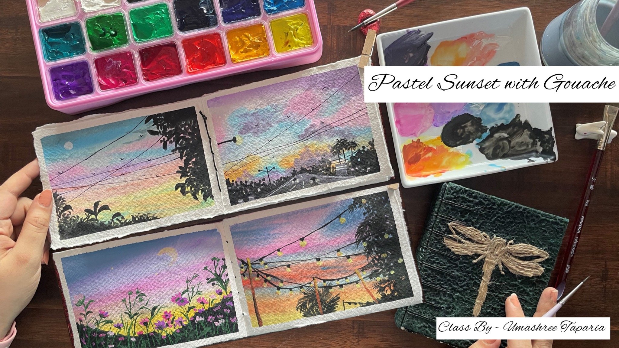
6. Day 4 - Pastel Sunset: Hello, everyone. Welcome
back. Today four. Today you will be requiring
in the shades of purple, orange, yellow, pink,
white, and black. We'll be using all
of these colors in pastel tones In case, if you do not have the
pastel colors ready, we'll curate them while painting the class
project together. I have my paper
taped down and we'll begin by first picking up
the colors onto the palette. There is no pencil sketch for
this class project as well. It's a simple one where we'll be directly adding in the details with the black paint later on. Now, I already have
a pastel lilac in my palette and a
pastel pink as well, to which I'm just going
to add in a little of the regular pink
and regular purple because these are
two light tones. Now in case if you do not
have these reddy colors, you can simply mix
your violet with white to get a lilac tone. Your pink with white to
get a pastel pink tone. Your orange with white
to get a pastel orange. And your medium yellow
with white to get this naples yellow kind
of a pastel yellow color. Now first we'll be beginning in with the violet
color at the top. So I'm going to begin
in with a layer of this lilac tone out
here at the top. I told you the mix already. You can just pick up your
violet or purple color and add in white and create
a pastel purple tone. To add in here to my pastel pink, I've added a little of the regular pink to get
a medium pink tone. It's not too dark,
not too light, but in a pastel consistency. Now these colors blend
well with each other. You can see the lilac and the pink blended well to each other. Now, even the yellow
and the pink go well in each other and blend well
and create a beautiful, a orangish peach tone in
between while blending here. In these cases you need not
use white specifically. You can easily blend
these colors because the third complementary
color that they create is in beautiful blend
with the other two tones. Now make sure that with
every layer of blending, you blend it till the top space. Now for the orange, I'm first adding in white here
at the base layer. And then picking up the
orange and going to blend in. You can alternatively
even create the pastel orange first and then go ahead
with the blending. This time for the clouds, we are going to go ahead
with simple strokes of the clouds that we've
discussed already. At the bottom here, I'm first adding in a little more
of the orange highlight. And I'm going to blend it with these light tones on
my paper already. Now the purple seems
a little light to me. So I've just picked up a
little of the bold purple. And I'm going to add it at the top layer and blend it
perfectly with the pink. Now, every time
when you blend in, make sure that you
blend completely so that you do not have any
patches left in between. Otherwise, you may
get in those rough, unblended patches creating in very unpleasant look
to your painting. It's important if you go
ahead with another layer, your blending goes in perfect, so we have the base
layer of our sky ready. You can see the transition
of the colors is so smooth. There is a smooth
blending as well as there are no muddy colors
being formed in between. Now, I'm going to further
create lighter tones of pink, violet, and orange to add
in the cloud details. So now I'm using a much
lighter pink tone. I'm going to dab off
the excess pigment onto this rough
cloth that I keep. And now I'm just going to begin
with those simple strokes that we've discussed in the technique section
of the clouds part. Now here I'm going to randomly keep on
shifting between violet, orange, and pink over the
pink layer of the sky. I'm usually going with the violet color strokes over the yellow
color of the sky. I'm usually going to
go ahead with a little of the violet strokes
and pink strokes, and then we'll add in
little highlights with her pastel orange
and a yellow tint. So I'm creating in a very
light pastel orange. Sure. Now, on top of the
pink and the yellow, you can see I'm
going to go ahead with little orange
strokes as well. You can see I'm simply adding simple strokes closer
to each other, creating in a little cloud
effect into the sky. Now in case if you want, you can even go ahead with further softer tones and
much more lighter tones. Now I'm adding these little highlights with
the yellow color. Over the pink, you can see how the yellow strokes are
standing out bright. When you add these strokes, make sure the color
is not too bold. Also, make sure that the
color is not too watery. Otherwise, it will
give a very dull look. And also make sure that the
pigment that you're trying to use will be perfectly
visible on the darker tones. So you need to make
sure the opacity of the colors is fine. Now, over the violet, I added the yellow tint. And I've blended it a
little into the sky. And now I'm going to go ahead with little
more strokes out there and blend in till the bottom layer of the
sky that we've created. I'm almost done with
the sky and the clouds. I'm just going to go ahead with little more pink strokes at the top to blend
in with the yellow, because only yellow out there may create
a little offflue. Here's a closer look. You
can see the yellow pink, the orange cloud details. Each color we've layered on such a way that it's visible
on the base layer color. Yellow on the violet, orange on the yellow and
pink and violet tones on the pink and
the yellow spaces, creating in that
perfect transition of the same colors with
the same cloud effect. So that is for the clouds. Now I'm going to
begin picking up some black color to begin
adding in the palm trees. Now for the palm trees as well, in the last section of
the techniques class, I've already discussed in detail how you can add a
detailed palm tree, or you can go ahead adding
in very simple palm trees. I'm going to go ahead with
the simple palm trees here, because we're going to
add in a bunch of them. Plus, along with the palm trees, we're going to be giving
in little details of those street lights as well. So I do not want
to add in a lot of detail and spend time on
adding in detailed pine trees. So I'm going ahead with a
simple first stem at the pace, beginning in with a thin line. And from that I'm
just pulling out simple strokes to act in as the foliage for
these palm trees. We've already discussed this in detail in the
technique section. In case if you want
any doubt or if you want to go ahead with
a detailed palm tree, you can visit the
technique section and understand the detail and
the easy both method. Now throughout the bottom space, you can see I'm going ahead with varied range of
these palm trees, some of them taller,
blending into each other as well as overlaying each other on the foliage
part as well. In between, I've left a little
space because there I'll be going ahead with a little of the bush detail in between, plus we'll be adding in
some street lights as well and some wireline details in
between these palm trees. Before that, I'll
quickly go ahead add in the last few palm trees
towards the left side as well, and then we'll move on to
the next set of details. I'm almost done adding
in the palm trees. I guess only one more would fit towards the leftmost edge here. And you can see I've gone ahead with the shorter
ones in between the taller ones
plus the foliage of the shorter ones overlaying
the stems of the taller ones, creating in that natural
effect of nature. Now, from the
leftmost edge here, I'm just going to pull
out little foliage, the stem of which is not
in our view at the moment, so just a little
foliage visible, giving in a little more detail. Same way if you
want, you can add a little of it towards
the right side, but do not add it at the same
length of the left side. Otherwise, it will look
like a copy paste thing. Try to vary the height. Now, I'm just going to add
in some smaller one here, randomly, before we move
on to the bush detail. Now, these palm
trees, as I told you, can be your choice whether
detailed ones or the simple ones plus how many
you want to add them. Now in between the space
that I've left there, I'm going quickly with
these bush details, creating a little foliage
effect for the bush area. Now I'm going to quickly add in the few poles for
the street light, and then using in
the white color, we'll add in the light
detail in between them. These poles have to
be very fine lines in case if you're not confident to add them directly
with your brush, you can simply use in
a black pen first to give in those fine lines
to which I'm adding in the horizontal line as well to give the street
light details later on. Now I'm going to take in
between these palm trees, a little taller one. And I'm going to add in the
light effect there as well. Now, your placement
and heights of the palm trees may be
different than mine. So you can go ahead
with the layout of these street lights as per
your layout of the palm trees, wherever in between you
wish to add them now, quickly using in a black pen, I'm going to add in
one bigger pole to be confident and to add
it perfectly thin one. I'm going ahead with the pen so that it makes
the task easier. Just add it in a fine
line with little details to create like an electric
pole, a structure here to the electric pole.
You can see I've simply added in some
wire details and some simple wiring work to show it as a
natural electric pole. Now I'm going to add
in the wire lines in between these palm trees using
in the black pen itself. This is a 0.1 nip pen. So you can see the fine
strokes that I'm getting in. That is the reason how these
waterproof pens are helpful. Make sure you use a
waterproof nip pen, otherwise the pins may spread. If you go ahead with any
overlaying on top of it, this black color may
then spread and create a very ugly effect
onto your painting. Now I'm going to pick up some white paint to begin
adding in the street light. For adding in the
street light detail, make sure you use the white
paint in a bold consistency and in a thick consistency so that it remains
opaque after drying. And given that lighting glow, I'm not going ahead with a glowing space for
these light here. Because I just want
to keep it simple. As in coming projects, we'll even be creating
in glowing spaces for the street lights and then
adding in the light effect. Now I'm going to quickly add
in a moon here into the sky. And we'll be ready with our
class project for day four. A beautiful pastel sunset
with the street effect. Before we remove
the masking tape, let me give you a closer
view of the clouds. You can see the strokes, the colors, how
overlaying, which color. Now I'm just going to add
in little more detail here and we'll be ready to
remove in the masking tape. Make sure you peel
off the masking tape. Once your edges are
completely dried, your palm leaves are
completely dried. And always peel off
the masking tape against the paper so that you
do not lift up the paints or tear off your
edges and make sure your fingertips are clean
and not fill in with paints. Otherwise, you may lay
your fingertips onto the white spaces creating in
patches of color out there. So here's a final
painting for day four. You can see we've created such a mesmerizing pastel sunset in just under 15 minutes
with so much details. I hope you guys enjoyed painting this beautiful
painting with me today. I will see you guys soon into
the day five class project. Thank you so much for joining me and if you'd like this class, then make sure to
drop me a review so that it can help me
reach maximum students.
7. Day 5 - Warm Sunset: He Everyone, welcome back to day five after 30 day
course, Landscape Adventure. For today's class, you'll be needing in the shades
of bluish, gray, orange, yellow, burn sienna
CPA, white and black. In case if you do not have
the exact same shades, you can use the nearest shade of the same color family and we'll try blending them with
the help of white. I have my paper
taped down and we're going to go ahead with
a little pencil ske. This time we're
going to be painting a pathway seen for
this landscape. I'm marking out the roadway
out here at the bottom space. It's moving from left to
right, increasing diagonally. This is going to be
the pathway on top of the pathway we are going to be having in two mountain ranges. Marking that out as well so that the top area can be the
sky for us to paint in. I've marked out the two
ranges across the pathway. Here we're going to add
in simple pine trees. The top will be the sky, then the mountains
and the pathway. Let's begin with the sky. This time for the sky, I'm
going to go ahead with little orangish yellow
and a bluish gray sky. Then for the mountains,
we are going to use in the brown tones, creating in little highlight
of the sunset effect. Now, I already have a bluish
gray color on my palette, I'm using that, but in the
previous class project, we've already discussed
the how you can create this bluish gray tint by
adding in your sky blue with a little tint of black
and white to create this bluish gray tone to this
dark, bluish gray as well. I'm going to add further white to dilute
it a little more. Now remember, this bluish
gray color and orange mixed together will create in
a muddy tone In between, for blending these two tones, it's important to
use in white so that the blends go smooth and do
not create any muddy tones. Now, closer to the
mountain range, I have very carefully tried
to mark out an orange space. Now I'm going to use in little, medium yellow tint as well, just above the orange. And then I'll go ahead
with the help of blending in by using in a
little lighter yellow as well, I can create a little
lighter tint still. For blending this yellow and
the bluish gray in between, I'm going to use in white. I've just created a
yellowish orange transition from the bottom of the mountain till the middle of the sky. Now from there I'm going to use in white and blend it along with the bluish gray color that
we have at the top and get a smooth transition
happening into the sky. In this way, you will see we do not form any muddy tones and still get in a beautiful and smooth transition in our sky. Now picking up a little
orange on my brush, I'm just adding in little highlights from the
edges at the top space, creating in those
little orange hues into the top white space that
we've used for blending. Now using a very
pastel yellow color, I'm going to begin creating
in the cloud highlights into the sky now as
much as possible, while adding in
the orange color, make sure you try
avoid adding it into the mountain range
because then it will be difficult for you to blend
in orange with the browns and create in that
glowing effect of the sky on the mountain
range as well. We are going to depict in
little sunlight effect of the sky falling onto
the mountain ranges. Now in this very
pastel yellow color, you can see I'm adding in
cloud strokes into the sky. These are simple strokes
that we've already discussed just using in little curvy
strokes closer to each other, creating in those shapes. We are further going
to go ahead with little more different tens
of orange and the bluish cre as well to create more
highlighted effect in between these clouds. Now you can either mix
in white to your orange or a little lightish yellow
only to your orange. And begin adding
in little strokes with a very pastel orange color. It's going to be much, but we need to create
in highlights. You can see how I have created
in the flow of the clouds, moving a little in
a zigzag pattern, This time leaving
alternatively each side empty. Now I'm just going ahead
with one more layer of the yellow highlights of the
clouds at the top space, creating more bold effect wherever I feel,
it's a little less. After this, we'll move on
to the mountain range. Now, the first
background mountain range that's on the
right into that we are going to show in
the sunlight effect just in the center there. We are going to have a little yellow and orangish highlight forming in between
the mountain range. And then blend it with the
brown tints of the orange. Let's begin this
mountain range here. I'm first going to begin with
a very light brown tint, mixing it with the orange. Now first using
the orange color, I will mark the outline of this mountain range so that we have it distinguished
from the sky. You can say I've used a bold
orange color layer. Now. Next, I'm going to use in this burnt sienna color and
add it at the top again. And blend in with the orange in the center space of
this mountain range. That is just where this mountain range is from behind the foreground
mountain range. There we are going to create in that little glowing space now to this second
mountain range. I'm just taking in
it very lightly. Now, with the help
of little white, I'm going to blend in the
orange and the brown. I'm using the smaller
size round brush. And you can see I'm just
trying to blend in the colors. The first mountain range is only in the background
and only half space. The second mountain range will cover up the rest of
the mountain range. That is the reason
we've just added this in the half area here. Only now using a little
darker brown tint, I'm going to add in at the
bottom space and blend it and just create in the
darker tints only on the edges, majorly in the
center of the paper, you can see I'm
still maintaining effect of the orange to show
in that glowing effect. You're again adding in a
little more white to create in that lighter effect
if you want later on, you can even add in
a small layer of orange there to create that perfect, glowing light effect. Now, the second mountain
range here is going to be of a very dark tint I'm
using in the CPA color. And I'm just going to mark
out this range as well. You can see how it's overlaying
the first mountain range. That is the reason I painted
the first mountain range very roughly and only
till the center space. Now I'm going to use in
a little black as well. Into this mountain range at the top just a little and
blend it with the browns. Now as we move towards
the bottom space, I'm going to dilute the brown And blend it well
with the black. At the top of this
mountain range, we want a bold, dark tint. And moving downwards,
we want to dilute it and create a gradient
of the brown color. Because at the bottom,
closer to the pathway, remember we're going to add in the pine tree details
with the black color. At the moment, it's
very important that you maintain a very lightish
brown tint here, closer to the roadway, because otherwise the
black color will not be visible on the
same black mountain. Now on the background
mountain range, I'm just going ahead with a little more highlights
of the browns. Because you can
see at the moment, it's too light as
compared to what we need in creating
little darker tints. But as I told you, I'm going to maintain little of that
glowing space effect, just adding in little yellow overlaying as well to maintain that light effect of the sky falling onto the
background mountain range. Now if you want, you can use a smaller size brush
and blend the colors well into each other by
just running smoothly. Now using a little
lighter brown, I'm just blending it here at
the bottom and creating in little details of the
lighter brown tint. As I told you, closer
to the roadway, we want a very
light brown effect. Now you can see I've left
that little space empty because there we'll be adding in the pine trees with
the black color. Now to my bluish gray, I'm adding in a little
tint of black again. And I'm just going to add in a little tint of white and get a little lighter tone off this bluish gray
for the pathway. If you want, you can
lay the color and then use white as
well on top of it. Only for blending like
I've laid this color. And after that, I'm going to use in little white if required, to just blend in and create
a further lighter tint. Now very carefully mark the pathway space
completely with this color. On top of this, we'll
given little details of the pathway markings and highlights later on once
this layer dries out. Now I'm just going to lift
up a little white tint and I'm going to add
it in the center of the pathway and blend it. The edges will be a little dark. The center of the pathway
would turn a little light, trying to show a
little of the sunlight effect falling onto
the pathway as well. Very simply, I've blended it while the pathway was still wet. Now this little white space
on the right to the pathway, I'm just going to add it
with the brown color, trying to show it as a simple, muddy space and
giving in shape to the pathway and the movement
of the pathway as well. I'm just going to add a little darker brown highlights
as well to this, so that it does not look just an different brown as compared to the
mountain ranges. Now using the white, I'm going to add in little highlights onto the background
mountain range and create a little
lighter effect. We need to wait
for the pathway to drive before we can
add in further details on the pathway measuring the center of this
background mountain range, you can see I've added
little white and created a little glowing spot trying to show in the effect of the
sunlight falling in here. Now I'm just going to swiftly
blend this white tint with the base layers so that we have that blended effect and the
white does not look patchy. Now let's add in the pine tree effect closer to
the pathway here. At the top of this, you can give in little pine tree effect. The bottom will completely be
filled up with black color. First, I'm going ahead with simple bush effect at the top, creating in very simple
bush details by just having in the tip of my brush and
the bottom till the pathway. I'm just going to fill
in with the black color simply we are going to take this completely
till the right end Very carefully. You
can see I filled in this entire space
with the black color, adding in the details. Now on top of this, we'll create little pine tree details
in certain spaces in between the bush to give in little more detailed effect of the bush and the
pine tree together. You can either go ahead with only the bush detail or you can just go ahead with
only pine trees. It's absolutely your choice. Carefully, you can see
I've gone ahead with a mix of the pine trees
and the bush somewhere. I've added very tiny pine trees. You can see somewhere I've just let the bush details be there. Now, in between the
bush somewhere, I'm just going to
give in little of those simple pine tree details. Not too detailed one,
just those simple strokes that we had seen in
the technique section. Now carefully I will
further just give a precise black line to mark
the pathway crisp and clear now using a very
yellowish orange tint, I'm going to go ahead and add in the details
on the pathway. It's a yellowish orange
brown hint tint. With this, I'm going to mark in the details onto the pathway. It's just going to be
simple lines to show the movement of the pathway which are then going
to merge here. At the right end, I've given the right end. Now from the center space, I'm going to mark out two lines, giving in little gaps, creating in smaller lines. Two lines at the bottom
merging into one, reaching the right end. That's how we've added it in the details onto the pathway. Now I'm going to use in a white gel pen to give in
the edges of the pathway. With the help of
the white jell pen, you can use white paint and
a fine line of brushes bell. But I find it easier
with the help of a gel pen because I can get in the precise and fine detail onto both the left and
right of the pathway. I've given in that
little highlight and in the center a bit, the last thing going to quickly adding the birds into the sky. You can see when the
project is closed, the highlights of
the light yellow and the orange clouds into the
sky that we've added over. The yellow, orange and
the bluish gray tint. Just two simple colors but
so much depth into the sky. Now for the bird effect,
you can see at the top, I've just given a little
dabbing with the black color, trying to show in a flock
of birds quite far from us. And the closer ones I'm adding in in much detailed strokes. I'm just going to pick up a little bright yellow color
because I feel the detail on the pathway with the
yellowish orange is looking at because
of the brown tint. So I'm just going to go with a bold yellow color on
top of it and add in a little highlight
stroke to create a little lighter effect
in the center of it. You can see I'm just
adding in a bold layer of this yellowish orange tint
which is much bright. Using a little of
the bluish gray, I'm just giving it a
finishing outline so that it looks well blended
and well settled. This is how you can
correct your mistakes and guash or go ahead with
simple overlaying with bold colors
again and create in and correct the edges and
give it a finishing look. Let's remove in the masking tape and see a final painting. We are ready with our class
project for day five as well, In just under 20 minutes, a beautiful mountainside
roadway view. Here's a closer look
at our painting. You can see the
glowing effect on the backdown mountain range that's in the center
of the paper. The yellowish orange light
that is showing because of the sky colors and the beautiful sky and
the simple roadway. I hope you guys enjoy
painting this with me. I will see you guys soon into
the day six class project. Thank you so much for
joining me into this class.
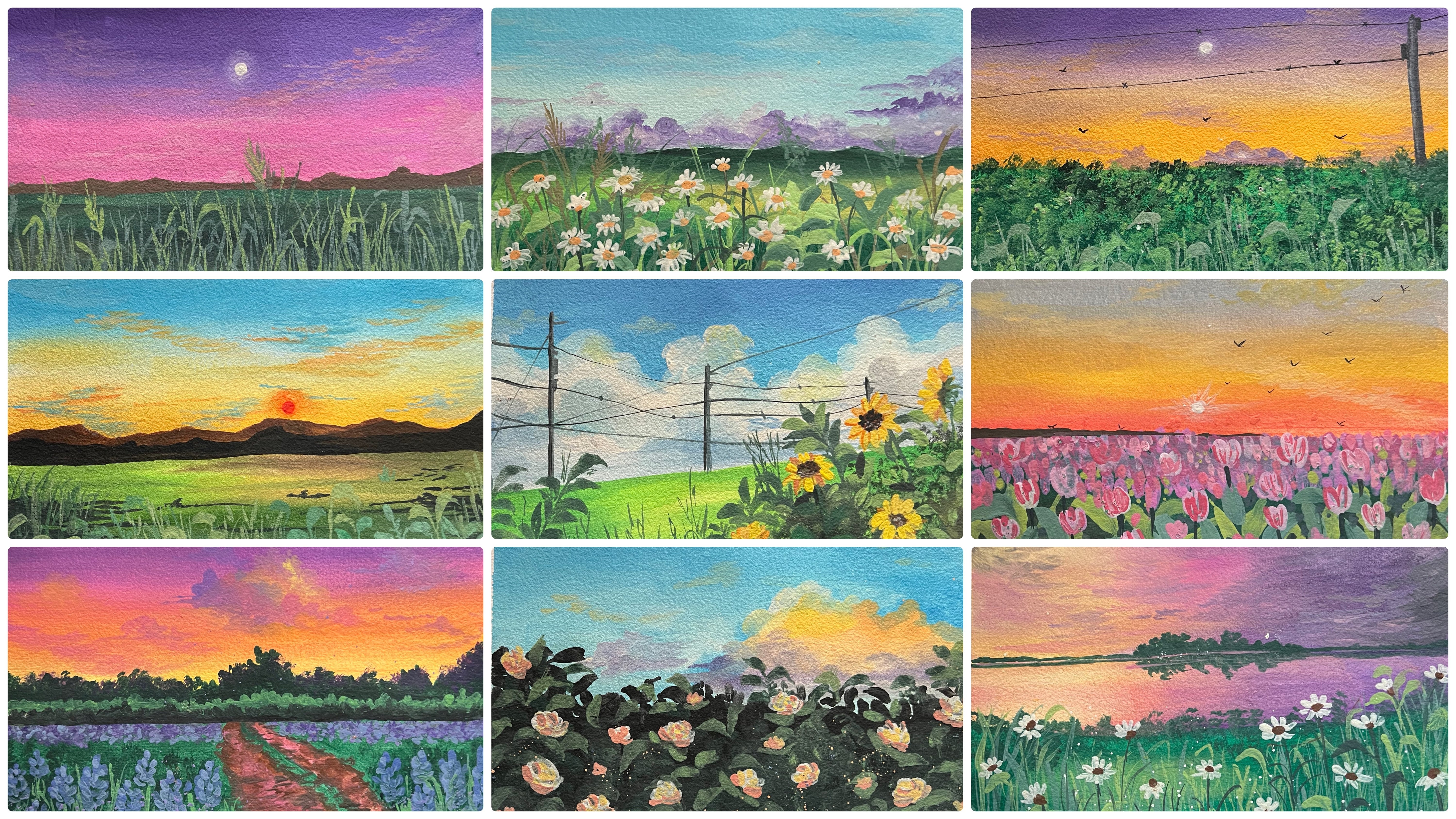
8. Day 6 - Sunny Day: Hello everyone. Welcome
back to day six. And today we are
going to be painting this beautiful blue sky
day with a field view. The colors that you'll be
needing is sky blue, yellow, burnt sienna, sap, green, light green, white, and black. Alternatively, you can
use any tones of greens. You need not stick to
the specific greens. Now I have my paper
taped down and we're going to begin with a
little pencil sketch that's just going to be marking
the horizon line to know the field and the sky space
on top of the horizon line. We're going to have
in the pine trees with the greens at the top, We're going to have
a bright blue sky with white cloud effects. So let's begin in picking
up the colors onto our palette so that we can get them into the right consistency. I'm going to pick up this sky
blue color for my palette. And to this, I'm going
to further add in little white to make it into
a little lighter tone. Alternatively, you can
lay this color first onto your paper and then
use white for blending. That's absolutely your choice. How you wish to blend in. I've added a little of the pastel blue so that it
automatically turns light. You can alternatively
add in only white, so I've got a pretty
pastel blue color, which is the perfect sky
color to add in here. And I'm going to add
this color completely till the horizon
line on top of it. We are going to go with
simple cloudy look with the white colors to show in a beautiful bright day effect. So make sure that you mix in enough color on your
palette so that you get the same color consistency throughout wherever
you wish to add in. Also the consistency
needs to be right. Otherwise you may get in
uneven patches of the tones and you may even get a transparent look of the color acting in
as water colors. So it's very important to have the right consistency
mixed up on your palette so
that you can have a smooth spread of
the colors going in. At this point, you can
see so many patches, so I'm going to run from the bottom till the
top altogether, so that I get rid
of all the patches and I get a smooth
transition into my sky. You can see running 2.4 completely from top to
bottom or bottom to top, makes everything go
in sync and creates a beautiful flow
of colors easily. Now I'm going to lift up
some pure white color. I'm going to use this in a
little darker consistency as in a little
thicker consistency, only to get in that bold, opaque effect of the white. And using in a smaller
sized round brush, I'm going to begin adding
in smaller clouds. Here we've discussed this method as well into the technique
section of the clouds wherein I thought
you to add in clouds using a round blender
brush or a round brush. First I'm adding in
smaller white patches. Then using in the dam
brush or your fingertips, you can quickly dab it
into the base layer. I'm using my fingertips. And at the bottom space of
the patches that I'm adding, I'm just dabbing it into
the base layer of the sky, creating in that flow
of colors happening in and trying to show the colors blending into the
base of the sky. You can see only the top part
of these clouds are bold. The bottom looks
blended with the sky perfectly showing in the clouds coming out from the sky space. Very simply, I'm creating in a flock of clouds altogether. Here you can see for every
cloud I'm laying down, the color at the bottom space, I'm dabbing it with my fingertip creating that dull white space, giving it that blended look with the pace layer of the sky. Trying to show that perfect, smooth transition
between the sky and the clouds. In
between the clouds. Also you can see I am leaving in enough space for the
blue sky to be visible. So you get a transition from the blue of the sky to a little lighter blue and then the
bold white cloud effect because of the
dabbing technique. Now towards the horizon line, I've not added much
of the clouds because there we are going to add
in a lot of pine trees. Now I'm going to pick up a
little of the blue color. And to blend this easily, I'm just going to add in a
little darker blue cloud. So this is a little
darker tint as compared to the tint that we've used
in the Baselaer of the sky. So just a little darker tint
and I'm going to add in little cloud highlights in between the clouds
that we've added in. In between that cloud effect. I'm just adding simple strokes
of this blue to act in as those darker cloud effect giving in that
smooth transition, again, happening between the
blue and the white tones. Now towards the
bottom space here, I'm going to add
in a little more of the Taka blue clouds trying to show in these clouds will come in from behind
of the pine trees. From behind the pine trees, you'll get the beautiful,
bold effect of these clouds. Now, before we move on to the
field, at certain spaces, I feel that the white clouds
have dried a little dull. So I'm just going to give in an overlaying effect
over the blues as well. In between just creating little white highlights
so that again, we have a beautiful
transition and move on happening between
the white and the blue, making it look all
natural and realistic. Now let's move on
to the field area. For that, I'm going to
use in the shades of yellow and green to
create in the base layer. And then we'll be adding in
very simple flower details. With the white, I'm
going to pick up this beautiful medium
yellow tint and I'm going to use in greens and blend in along with this yellow. First I'll lay down a little
of the yellow onto my paper. And then using the greens, I will blend in between just
closer to the horizon line, we are going to have in little
yellow highlights visible and the rest of the spaces will be blended with the greens. Now I first picked up the
light may green color. You can see it's a beautiful
light tone of the green. I'm just laying it at the white spaces remaining and blending it with the yellow, but making sure that the
yellow is still visible. After this, we'll shift
on to a darker green. You can use sap green, olive green, dark green, whichever darker tinted green is available in your palette. Also, in case if you do not
have a lighter green color, you can simply mix in
your dark green with a little bit of the yellow to get a little lighter
green color. In this way, you can mix
your colors and create different tonal
values depending on the kind of colors
available in your palette. Now picking up the darker green, I'll just begin to add it
from the edges in the center. At the top space, we are
going to maintain that yellow space glowing in now closer
to the horizon line. I'm just adding in a line. I'm just going to give
little darker green effects, making sure that we
have little lighter green and the yellow
still visible into the center space there
towards the right you can see I've left a little spot yellow visible given in a green line, creating in those parts into the field and giving it
that natural effect. Now for blending, if you want, you can use little of
the white so that you maintain those effects
of the yellows and the greens and you have a smooth transition and blending happening
between the colors. You can see I'm just
overlaying white onto the entire part to
blend in all of these easily so that I get in
that perfect blend and smooth transition
happening between the yellows and the greens. We are ready with the base
layer of the field as well. Now using a smaller size brush and the lighter green color, I'm going to begin adding in smaller grass strokes
at the bottom space. It's going to be very little. We are not going to cover up the entire field with
the grass strokes. We're just going to have in
very limited grass strokes and a little of the floral
details at the bottom spaces. Majorly, I'm going with very
random strokes of the grass, layering it very randomly. We have discussed
these grass strokes as well in the technique section of grasses and leaves where I've shown you these smaller
strokes as well. So make sure that the
color is visible onto the taker tint in case if you want to further
lighter up the tone. You can add in a
little white or a little yellow to your
green so that it's perfectly visible onto the darker green that we've
added on the base layer. Now at the top,
I'm even adding in some grass strokes with a little darker tint
as well of the green, so as to make sure that we have varied tones of greens into
these grass strokes as well, creating in that natural
effect coming in now to my green. I'm
just going to add in a little more white to create
a further lighter tint. I already told you this. You can use this
further lighter tint to add in some highlighting
strokes like these. You can see this color
is standing out so beautifully on the darker
green base layer that we have, creating in that perfect
grass stroke effect. Now at certain spots, I'm not satisfied with
the grass strokes. What I'm going to do is
using in a damp brush, I'll quickly blend
these strokes into the base layer with quash. You can see how easy it is
to correct your mistakes or blend in some details
into the base layer again, so that you can further go ahead again and add in the
details on top of this. Now using a darker green color, I'm going to begin adding
in some pine trees. First what I'm going to
do is add in a space completely fill it with the darker green color
till the horizon line. And now just on top of this, I'm going to give in little
pine tree structures. Now here also for the greens, you can see I'm going
ahead and adding in some lighter green,
some darker greens. And trying to blend in and
get in little, you know, blending and shades of green
in this space as well, so as to make it look natural. You can go ahead with
multiple tones of greens. Add in a little darker tint with browns or blacks as well. So I've just picked up a little
hint of the black color. And I'm adding it
at the horizon line here so as to give in that distinguishing
point and make it a little bold and separating
from the green. Now this line you can
see seems too bold. So I'm going to blend it with the greens in such a
way that it's just visible as a darker green shadow effect at the base layer. Now on top of these, you
can see I'm just adding in very small silohates of the pine trees using
in the green color. We've discussed these
smaller pine trees also in the pine trees section. You can see how
I'm taking it till the length where we have
the clouds beginning in. And now the clouds
are looking as if coming in from behind
of these pine trees. That is the reason closer
to the horizon line. We hadn't added much of
the clouds and waste the time because it was going to be covered in
with the pine trees. Also, you can see
simply just adding in that entire base layer green
and then on top of it, just adding in smaller pine
trees makes the task so easier and makes it look much more beautiful and
blended in altogether. Now one thing that you
need to keep in mind, make sure that you
vary the heights of these pine trees and do not keep them all off
the same height. Go in with some very
small tiny pine trees and some bigger pine trees
so as to maintain that natural and realistic
effect of the landscape. And you can see how the
blue clouds that we added with a darker blue
tint are now perfectly visible from behind of these pine trees
that we've added in creating in that
realistic effect of the clouds coming in from
behind of the trees. So we're done with
the pine trees. I'll just blend in a little
more lighter highlights at the bottom space, giving in that depth. Now lastly, we are
going to go ahead with little floral details at the
bottom in the field here. So I'm going to use in my
white quash and add in small, it's going to be pretty simple floral shapes that
I'm going to add in. Just using in the
tip of my brush, I'm going to add in
small flower silohts to create in the
flower silo het. You can see I'm just
adding in five dots, adding in closer
to each other in a little oval shape and I'm adding in them very
scattered look. You can see I'm not adding all the florals
close to each other, in the center of these
dots and oval shape. You can see I'm leaving
in little space there. I'll be adding in the bud
effect using in the brown tone, you can see some flowers. I'm adding very tiny ones trying to show them very far
away from our view. And some have added a little bigger as compared
to the others. Just around 12 to
13 flowers here and there Randomly spread
in to given that depth. Now here I'm just going to
add in some minute dots randomly trying to show in some buds coming in
or very tiny flowers, or some flowers very far away. So you can see how
beautiful it looks and gives in that
natural effect of the field trying to
show in the flowers of different sizes and at
different angles and positions. Now lastly, using
in the brown color, I'm going to add in the buds, to the center of
each of the flowers, just a very small,
tiny brown dot. Now make sure that
your white spaces are dried or you have enough
space to add in the brown. Even if the white is not dried only then you'll
be able to give in that bud effect or else the white may begin to
blend in with the browns. Now I'll just go ahead with some random grass
strokes more here and there before we peel
off the masking tape. We are almost through the
class project for day six, a beautiful, simple,
bright day field. Lastly, I will quickly
add in a few birds into the sky using in the black
color and the tip of my brush, some very small silohates
here and there. Randomly you can see
I'm just adding in much closer to the field
or the pine tree spaces. As you go far away, make sure that the birds are smaller and less detailed ones because they are
far from our view. That is it. I'm done
adding in the birds, you can see simple shapes to give in that
silo hete effect. Now let's remove in
the masking tape and see our final painting. Make sure your edges of the
field are completely dried, as well as your pine trees. Your fingertips are clean so that while peeling
off the tape, you do not ruin up the white edges because
of your fingertips. So here's a closer look at
our painting from day six. Those beautiful tiny clouds and those tiny birds with those little details
of the flowers. I hope you guys enjoy
painting this with me today. I will see you guys soon into the day seven class project. Thank you so much
for joining me.
9. Day 7 - Night Sky: Hello everyone. Welcome
back to day 30. Today is the last class
project of this challenge. The colors that you
need is violet, yellow, pink or red, orange, sky blue, prucian blue,
white, and black. So we'll begin painting in this beautiful night sky today. So there's not going to
be any pencil sketch. We are directly going
to pick in picking up the paints onto our palette. We're going to begin in
with the shades of blue. First, I'm going to pick up the Prussian blue color for the dark blue part
of the sky to create in that very evening night sky a look first pinning in with the Prussian
blue at the top. Make sure you do not add in a lot of water
to your paints, otherwise you will lose the
opacity of your paints. Now next I'm going to add
in the sky blue color. I'm adding in the sky blue here. I will use a little
white so that I can blend these both and get a
little more opaque look here. Right now, I've just added
in the blue at the bottom, but I want to lighten up
these shades a little. I will use white
on top of these. I haven't added any white to my paints while
layering it down, I will pick up
white and directly add it on the paper and blend in before the white moving
onto the violet color, just below the blue I am using in a medium tone of
the violet color here. And we are going to still add in white so that everything
turns out well. We'll do that at a later
step once we are done adding in some basic colors
here onto the sky line. Now for the bottommost part, I'm going to use in this
pastel yellow color, I already have a ready
pastel yellow in my palette. You can mix in your own pastel
yellow and add in here. Rather than picking
up the white, I use the same
pastel yellow brush and blended it till the top. You can see over
the purple color, you have that light
effect because this pastel yellow was
a very light stone. I use this, you can use a little bit of white to get the blends
between the colors. Right now, picking
up the black color, just adding in a little
hint at the top of the sky to create in that
dark night sky effect. Coming in very little
stroke that I've added, made sure that the
blue is still visible. Again, for blending,
if you need, you can use a little
of the base layer blue so as to get in those blends. Right now, we're going to begin adding in some cloud
details into the sky. For that, I'm going
to begin with my angular brush and begin
in with the yellow color. First, I'm going to use the yellow color
to begin adding in the cloud details over the
violet and the boot spots. So I'm going to hold my brush diagonally and just
using in the tip, begin creating in the cloud tip. This time I'm going
to go in with bigger strokes to
create in the clouds. Majorly going to be
adding in a lot of the cloud effect towards the right side because
on the left side. Later on we're going to have
in the silo head detail. Now over the blue color, I'm going ahead with a little of the pastel clouds detail. With the violet color, I've added a little white to my purple color and created
in a pastel violet color, like a lilac, a tone. And using this pining to add in clouds in
the same stroke, you can see I'm just using
the tip of my brush, holding my angular
brush diagonal. You can even use a fine
pointed tip brush. And adding these large strokes, I've shifted to my smaller
sized round brush. You can see it's such
a fine tip brush. And I'm going to begin adding in some fine strokes with
the violet color. Now, defining in giving
in more precise detail, make sure that your
color is opaque, you do not have excess water, and also that your base
layer is completely dried. Otherwise, the base layer color and this color will begin mixing into each other and will not
give you that opaque look. At the top here you can see I'm going ahead with small strokes, closer to each other, creating in the
depth into the sky. I'm going ahead very slowly building in the sky
here so that we do not overdo and we do not have to redo any of
the paths later on. Now, on top of the violet color, I'm going to go ahead with some yellow highlights
at the top as well. You can see I'm using
such a fine tip brush, hence able to carrying these very fine detailed strokes into the sky at certain
spots you will see. I quickly use my fingertips
to blend in wherever I want. Little lighter effects. Next, using in the
pastel orange color, I've mixed in orange with
a little bit of white. You can mix in your
pastel yellow with a little hint of
orange if you want to. I'm pinning to create in little highlights with
the orange color. Now you will see I'm
using the pastel yellow as well for blending
at the bottom for the orange. Because I do not want a very
rough random orange patch to blend in well with
the basler yellow, using in little yellow
highlights to create in that harmony and flow
between the sky clouds. Now I'm going to pick
up the black color and begin adding in
the silohate detail. For that, I've shifted into my smaller size down brush
and using in the black color, let's begin adding in the silo
heate at the bottom space. I'm first going
to just create in a random rough space
with the black color. I'm going to fill
this completely with the plaque at the bottom. On top of this, we
are going to give in little foliage
detail that will be detailed leaves and tapping in the tip of the brush to
create in that foliage effect. Now make sure this black
color space does not cover up your entire sky
of the yellow space. Otherwise, you will not have that little sunset
effect into the sky. So it's important
to make sure that the yellow of your
sky still be visible. Now quickly using
in this foil brush, I'm going to give in the
first layer of the foliage. Now when you begin adding this, you need to make sure
you try to get it into the shape that you
want to go ahead with. Here at the bottom, it's going to be
very small foliage, and then on the top
left we are going to have a detailed hanging
foliage effect as well. But he also, you can see how I'm trying to
vary in the heights. Now when I'm adding
in this foliage, I'm going to make sure
at the right side, I do not add it in
an extra height because I want the yellow
of the sky to be visible. As on the left, you
will notice measure of the yellow sky will get
covered up with the black. Only a little will be
visible in between it. Now, same way,
going to create in the first layer at
the top as well. And then we'll move on to the detailed foliage
with a detailed brush. I'm done adding in
the first layer. You can see how quickly this fills up the base layer spaces. Now we'll go ahead
with detailed foliage. Before that, using
in the violet color, I'm just going to add in
little cloud effect here, closer to the black space before we add on
foliage on top of it. Because in the
yellow space we do not have any cloud
effect coming in. Just adding in a little drama
here as well into the sky. Now again just using
a little yellow and creating highlight again on
top of it because you know, the violet color was moving a
lot towards the right side. So just blended it a little
bit, a yellow again, overlapping onto the
violet so as to create that effect of the
clouds happening in. Now using this
smaller size brush, I'm beginning to add in
the detail foliage detail here that we're going
to add in randomly. Going ahead with
some pine trees, some leaves, and some branch
details towards the right, I'm adding in pine trees, but you can see on the
right from behind, the yellow sky is still visible. So make sure that your yellow
sky still stays visible Now onto the left side here, I'm going ahead
with random leaves and foliage detail dabbing
in the tape somewhere, pulling out branches, giving
in detailed leaf effect. Later on, into the bottom black
space that we've created, we are going to try to show in some city light effect as well. We'll create in some
blowing lights popping out from between this
foliage effect first, let's quickly add in the
rest of the foliage. You can see randomly, I'm
pulling out these branches, giving in some detail,
dabbing leaf detail. You need to make sure
all of these are not moving in the same angle
or in the same way. Try to vary them so that it has all the natural looks randomly. Pulling out some
small branches as well in between the
leaves and giving in just some thorn kind of details coming out from
these branches as well. After this, we'll quickly add in some detail foliage at
the top as well and then move on to the
last city details and the moon for this painting. Now from the top here, I'm trying to show in the
leaves falling downward side. Accordingly, the movement
of the leaves is all falling towards
the bottom part. And I'm just going
to begin pulling out some detailed
branches here as well. The same way as we pulled
out at the bottom space. Similarly going to do
it at the top as well. It will be a mix of
branches, a mix of leaves, detailed foliage ing in the tip of the brush and
creating in the depth. Now one thing that I forgot was adding in some star
details into the sky. This time I'll quickly
add them right now. We should have actually
added them before beginning in with the black
parts, but not an issue. We'll add these and wherever at the black spots we have
in the white spots, we'll quickly cover it up
again with the black color. At this point itself quickly just platter in some white stars
using in white quash, make sure it's in a
thick consistency. Otherwise it will not give
you that opaque look. Now at wherever spots I feel that the white has
come over the black. I'll just quickly give
it another layer of the black again so that the
white spots get cleared out. Now to create in the
city light effect, I'm going to go ahead with the white quash and I'm going to add in some random dots
randomly at places. And using in the dam brush, I'm going to create
in a dull space using in this white color. Once the dull space dries up, we're going to use
in the orange and the yellow color to add in
the details of city lights. That is, basically, this is
a city area silo height, which is completely
in black because of the evening ideology
that we've taken in. And just the city lights popping out from between
the entire siloate. So now using in the damp brush, I'm just softening
up this white color. You can see I'm creating
in that dull space, blending the edges,
giving it a soft edge, blending in with a black color. So just the way as we have been creating in the glowing
spaces for the moon, same way we are creating in the glowing space for
the city light as well. And then we'll go ahead adding the detail light once
these layers dry out. Now for adding in
the light effect, you can either mix in red
with a little hint of white or you can mix in
a little bit of pink. Or you can just go ahead with
yellow and orange lights. I'm mixing in a very little of the red along with my white, very little white
and very little red. Getting in this beautiful, bold, red tone and going to add
in at certain of the spots. Now after this, I'll add in yellow and orange to some
of the lights as well. I'm just adding in a
little more white so that stands out bright onto these
spots that we've created. Now randomly in between
two, some of the spots, I'm even adding in the orange color at
certain other spots. I'm going to give in some
random spots without, in the glowing space as well, but that will be very limited. Now I'm picking up the yellow in a good thick pastel consistency. I'm going to add it to the
center of few of the dots. You can see how beautifully
this creates in that light popping out from
between the black color, same way with the
yellow as well. At certain spots,
I'm going to give in some small dots without
the glowing space. If I feel that these spots
will be too much later on, I can always cover them
up with black quickly. I went ahead with
another layer of the bright red color on
the spots that were left, because the previous layer was not being visible perfectly. After trying, it was
looking too dull. So I brightened up
the red by adding in a little more white to it. Now I feel that certain
spots are too much, so I'm going to quickly go ahead and cover them up with
the black later on. Before that using
in the white color, I'm going to add in a few
white spots randomly as well. Now I'm going to create in a glowing space for
the moon as well. This time we're going to add in a very huge crescent moon. For that, I'm firstrating
in the glowing space. I've added a very big white
patch as you can see. And I'm going to blend it and completely create in
a very dull space. It's a quite big dull space as compared to the other projects
that we've done so far. No, I'm just going to
go ahead add little more of the dullness on the
edges and blend in again, then we'll go ahead
with the crescent moon. Once this space
tries out completely at time, you can
see you may need two to three layers to get in
that dull space perfectly. So I went ahead with
another layer of white here to create in
that dull coming in. Now using the white in a bold consistency and my fine tip double
zero size brush, I'm adding a very
fine crescent moon at the bottom of this glowing
space that we've created. Basically at the top of this, you will be able to see in
that glowing space trying to show in the light of the
moon coming in at the top. I'm just adding in a
few fine dirty lines so as to create in that
texture of the moon there. Let me give you a closer view at the moon here and
the details as well, so you can see how
the glowing space and the crescent moon
is looking in there. Now, quickly using in the black, I'm just going to clear up a few of the glowing lights wherever I feel it's looking in excess. So that is it. We are done
and ready with our class, will check for 30. We are at the end
of this challenge and in the next lesson, we'll have a quick
flip through of all the 30 paintings we
did for this challenge. Here's a closer
view at the moon, the details and
the bottom details of the glowing city light. I hope you guys enjoy
painting this with me today for the
30th class project. Thank you so much
for joining me into this challenge painting along with me through the 30 days. Make sure to upload your
class project and drop your reviews and I will see
you guys in the next lesson, where we see a flip through of all the 30 paintings together.
10. Day 8 - Warm Sunset: Hello everyone. Welcome
back to day eight. And today we are
going to be painting this beautiful, warm sunset. The colors that
you'll be needing are shades of yellow, orange, brown, a darker brown, or a sepia color,
white and black. Now, for the yellow orange, you can go ahead with any
shades of yellow orange. We'll try to adjust them with
the help of white and red. Now let's begin
with the painting. I have my paper taped down. This time we'll be going ahead with a little pencil sketch. We'll first begin marking out the horizon line
and the sun space. Because the sun space, we are going to leave it
blank as we are going to create a very lighter
effect there with the help of the yellow and the white tones
trying to show in that glowing sun effect
towards the right side, I'm just marking out the sun
on top of the horizon line. I've left in the bush space that we'll be adding
in with the black, the top will be the sky, the sun, the bush
and the sea space. So let's begin with the sky. So we'll begin with picking
up the colors for the sky. Now you can go ahead with any medium tone of
yellow, orange. And if you do not have
a bright orange color, you can mix in a
little hint of red or vermilion to it so that you can get that bold orange color. A sky is going to be simple
of yellow, orange tints. I have picked up a little bit of the burnt sienna
and the red color as well on my palette so that I can mix it
with the orange. As for my need, because
my orange and yellow are almost of the
similar color tone to create little darker hints, I may use in little red with orange to create
that darker effect. Beginning with the
yellow in the center. And now just going to
pick up a little red for the top space and blend
in with the yellow. Automatically I'll
get a beautiful, bold, orangish color,
or a vermilion color. Now closer to the sun space, we have to leave
that space empty. So make sure while adding
in the color there, you let that space be empty. Now I've added a little white. And going ahead blending
in so that we get a little more lighter
tints of these colors. Now using this
lighter orange tone that I picked up from
my palette directly, I'm going to add it
closer to the sun space and into the rest of
the space of the sky. Now around the sun, you can see I'm going ahead
very carefully. Going to mark out the shape
and blend in accordingly. Make sure you leave
the sun space empty. You can cover it up with
masking tape, masking fluid. If you are comfortable
or else like this. You need to go in a
little carefully so that you do not add
in the colors there. And we are going to create
in the glowing sun there. Now again, to lighten up the colors and create
in those smooth blends, I have added up a
little white and simply blended in
all of the colors. At the top, you have the
vermilion color center. You have the yellow
and closer to the sun, you have the orange tint. We're going to add a little
cloud effects into the sky. Before that, we'll quickly paint in the base layer
for the sea as well. Until then, our
sky will also dry and our base layer for
the sea will also. I'm just going to pick up a little hint
of the brown mixed in with a little hint
of the orange and we're going to create a very
light base color. We are going to
majorly be going ahead with a lot of wave
details on top of it. I've picked up a little
black as well to, given that little greyish hint, but you can see I've picked up the black in such a
diluted consistency. It's just a small
hint mixed in with brown and the orange for
the base layer of the sea. It's basically a very small
hint of black mixed in with orange and brown that you're going to add in
for the base layer. And the base layer,
as you can see, is not too opaque, it's on a little medium
consistency side. Now let's begin creating in the details for
the sun space. I'm going ahead with the
mix of the white and the yellow color and
I'm going to mark it towards the outside of the sun
area that is into the sky. And using a dam brush will dilute this and blend
it into the sky. Now I'm just using the dam, it hardly has any water. And just using in the tip, I'm going to blend
it into the sky. You will see around the sun
automatically you've got a lighter ring of this yellowish
color in the sun space. We are going to use
in the white and the yellow tints and create
in that glowing sun effect. But the sun also, we need that effect of
the sunlight falling, creating in that lighter space. Now you can see the
line is very prominent. Quickly using the dam brush, you need to blend it into
the sky and soften up so that it does not look as if it's a different
stroke added. Rather it looks as a
part of the sky simply. Now into the sun space. I'm going to add in a
little light yellow hint in the center area. Now using in white, I'm going to blend it with the entire sun space so that you have that glowing
sun effect there. Make sure you use a
very bold white effect. Now I'll first wait for
the outside drinks to dry till then I'll go ahead paint in the details
for the clouds. For that, I've mixed
in my white orange and a little hint of brown. And I'm going to go ahead
with simple strokes into the sky to create
in the cloud effect. I'm just going with simple
strokes as you can see, just closer to each other. These also we've discussed in detail in the technique
section of the clouds part where I showed
you different ways of adding in the clouds
using in the round brush, these simple strokes, how you can add them
closer to each other or far from each
other and create in different and
bold cloud effects. Now at the top here, I'm using a little of the bold red color. And adding in small strokes, you can keep on using
different tones of the yellow, orange, and red to blend in with each other and create
in the cloud effect. Again, always as I keep saying, it's not important to
lay the same colors at the same places where
I am laying them. You can switch in the colors
depending on your choice as well as you can use in different tones to create
in the blending effect. Like I have just gone ahead with the red at the top and
bottom if you want, Along with the red, you can even blend in your
oranges and yellow. Now for the wave part, I'm going to pick up a little of the brown and black mix in, along with little red tint. And we're going to add
in the waves effect. It's going to be simple waves. We've already
discussed the waves as well in the technique section where I showed you the
simple wave effect closer to the horizon line. The waves are going
to be much small and tiny and as you move
towards the bottom space, it's going to be
longer, elongated, and much more pole because that's much closer to your view. In between, I'm even going to
add in some highlights with the yellow and orange
color to depict the effect of sunlight falling
onto the waves as well. But for now, majorly, I'm going to go ahead with this marinish tone that
we've created with the help of brown and red and the little
hint of black in between. Randomly, I'll keep on adding
little strokes with orange. Now, in between adding in some very darker tints with
a very dark brownish color, it's more of a CPR tone. Again, you can
either use directly a dark brown or mix in a
little hint of black to your burnt sienna or burnt timber color to get
a darkish brown color. Or you can simply add in with a little diluted consistency
of the paint screen itself. Now at the bottom,
you can see I'm increasing the length
of these waves and I've added a little more
white as compared to the red now to create
in that darker effect. And the transition happening
in from the horizon line. Basically, if you
always watch a sea, you will be able to understand
the waves that are very far off to the sky line
is hardly visible to you. It's just a simple
layer of water visible. But the ones closer to you, you'll always be able to view
in the darker wave effect, the color, the color
tones of the waves. So that is the reason
closer to the horizon line, we've used in very
lighter tones of the red. And moving downwards,
we further created in a bold shade with the more addition of browns
and black to the red. Now coming back to the sun
using in white and blending in this yellow and creating the
soft blend into the sky, creating in this beautiful
effect in the sun. Make sure that you
give the shape of the sun beautifully
and define it well. Once we add in the bush effect in the white space in between, you'll be able to see more beautifully how the
sun effect comes out. Now using in a little
hint of the white, I'm just defining in this
outline more bold and blending it into the sky so as to create that glowing
space of the sun. Make sure you give
it a very soft edge and do not leave
it as a bold line. Otherwise, it will not give you that beautiful shining
effect of the sun. Now with a very light
hint of the orange color. I'm just going to give
it a very soft outline and just defining that
sun space much more bold. Now again, this outline
also you can go ahead very softly using the damp
brush and blend it with that outer lighter
space that we've created, so that this outline
also does not look bold. Now you can see you have
that fine dark line, then the glowing
space of the sun. And in the bottom you
have that sun space. Now in the sun,
I'm just creating a little more glowing effect with the yellows and the whites. Now for the bush area, we're going to go ahead with the tones of darker
brown and black. And later on we're just going to add in little orange
highlight trying to show the glowing effect of the sun onto the
bush area as well. First, let's simply
just go ahead add in the top spaces
at the left area. Majorly, the orange space is going to be towards the
right side where we have the sun trying to show the direct sunlight
falling onto the foliage, which is creating in
that orange highlights. Now towards the sun space, I've picked up the orange
mixed in with black. That here we can show
in that highlight. On top of this,
we're going to cover it up with black also majorly, but laying down this color first so that we have these
highlight spaces. Now I'm going to
pick up a little of the browns as well and blend
in with the orange again, majorly on the
right side because the sun is on the
right, on top of it. Again, as I told
you, we are going to go ahead with
the black color. We are not going to
leave so much of the orange and brown spaces
now towards the left, I'm going to fill
the entire space completely till the horizon
line with the black color. Now moving towards the right, I'm going to begin
adding in the black in such a way that in
the center we still have the orange and the browns
visible now define the horizon line well
enough so that you do not mess in with
the sea space. We are going to be adding
in a huge pine tree in between from the sea into the sky now towards
the right side, as I told you, we
are going to let the orange and the brown space
be visible in the center, automatically, in the
rest of the spaces. I'm just going ahead with the black and blending
it with the yellow, orange, and the brown
details that we've added in. Now make sure this bush details, you add it in such a
way that you do not cover up the entire sun space. It needs to be there in such a way that the
sun is still visible. Using a dam brush, keep on
blending the black with the orange and the
brown highlights. Now on the right, you can
see how you're having in that glowing space trying to show in the sun effect
falling on the bush. Now I'm going to use a little
brown orange again here. And blending with the black so that it looks perfectly blended. You can keep on overlaying the colors until you get
the right way of blend. You can see now on
the right side how we have that beautiful
glowing space of the yellow orange highlights
trying to show in that effect of the sun
falling onto this bush space. Again, going to go ahead with
overlaying of the black so that we have that perfect
and smooth glowing effect. That is it. I'm ready with
the glowing space as well. I'm just going to give
in a little more details to the bush out here
and then we'll move on to the last set of
detail that's going to be the pine tree coming
out from the sea space. I am loving how
the glowing space has turned out in the bush area. You can see it's having a perfect blend of
the orange browns and the blacks and showing in that perfect glowing effect
only closer to the sun space. Now using in the black color, I'm creating in a rocky space, first into the center
of the sea area from where we are going to try and show a pine tree coming out. It's going to be, again,
a simple pine tree, not much of the foliage, but it's going to be of a
bold brown, blackish tone. You can use the CP color or mix in your brown
with the black color. Now using a dam brush. I'm going to blend in
the bottom of this into the sea area trying to show the shadow of these rocks
falling into the sea. You can simply use in a small line and then use a dam brush and
blend it into the sea. Under this, you can even add in some strokes of the
black color into the waves trying to
show in the shadow of this rock space falling
into the sea area. You can see as soon as you soften up the edge
at the bottom, it creates a shadow like effect into the sea of this rock space. Now I'm going to begin adding in that one bold pine tree
that we're going to add in. So I'm beginning in with almost the center space of the sky. I am going ahead with
a bold brown color as I move towards
the foliage space, that is the bush area. You may need to lighten
up the color so that the strokes
be visible again. You're also like the
last class project, I'm going ahead with a very
scarce looking pine tree, the foliage of which are moving randomly up and down crooked. And you can see I'm
trying to vary them, try not overlaying a lot of foliage over the sun
space or covering it up completely at the bottom
closer to the bush area. I will lighten up the
color and add in there so that it's visible on
the bush space as well. Moving downwards, I'm going
to darken up the color further and add it in a
bold blackish brown toll. Now, at certain spaces
in between if you need, you can add in a little more
detailed foliage effect. But I'm going to go in
with a little scars only and you can see I'm just
adding in simple dots. But the shape of
the pine tree is still retained to the
triangular shape. I'm just adding some
more foliage in between randomly trying to
add in more details. But still it has a scars
and a dense look only, and not a detailed one, just overlaying so that it looks and gives in
that natural effect. Into this class project, we're just going to be adding in one huge bird towards
the left of the sky. At the top, it's going to be a detailed bird look with
the wings spread across. Now towards the right
of the pine tree, using in the orange color, I'm adding little
highlights to the foliage. The foliage that is closer
to the sun to show in the effect of the
sunlight falling onto the pine tree
foliage as well. These are little details that help your painting
look more realistic, just majorly towards
the right side. And the center space of the pine tree is where I'm
adding in this high line where the sunlight is falling in directly towards the main
branch of the pine tree. Also you can see
towards the right part, I've added a very
fine orangish line to depict the sunlight effect falling onto that pine
tree line as well. Now at the top left here, I'm adding a detailed bird. I first added a small oval
structure and now I'm going to add in the wings on both the sides to the
wings at the bottom. I'm just going to
give in little shape. You can go ahead with
any detailed kind of a bird silo het that you wish to just pulling out little spikes to add
in as the wings. I will give you a closer
view so you'll be able to understand how to pull in
these smaller spike details. So here's a closer
view at the bird and the reflection on the pine
tree with the orange color, the highlights
that are trying to show in the effect of
the sunlight falling in. So let's remove in
the masking tape and see a final painting. Make sure your edges
are completely dry and remove the masking
tape against the paper. So here's a closer look at
a painting for day eight, a beautiful warm
sunset effect with that glowing highlights on the pine trees and
the bush space. I hope you guys enjoy painting this beautiful sunset with me and that detailed bird look. I will see you guys soon into
the day nine class project. If you'd like this class, make sure to drop me a review and thank you so
much for joining me.
11. Day 9 - Pastel Sky: Hello, everyone. Welcome
back to day nine. Today we are going
to be creating this beautiful pastel sky for which you would be
needing the shades of yellow, orange sky, blue, violet, green, brown, white, and black. We are going to be using
all these colors in pastel consistencies for
creating in the background sky. So first, let's begin with
a little pencil sketch. I have my paper taped down. Now if you want, you can mark out the space
of the pencil sketch for, you know, the street light
that we'll be adding in. But I'm going to
directly be going ahead with the
colors into the sky. So I'm going to first
lift up the colors onto my palette so that I can create them into the
pastel consistency, I first picked up the
yellow orange tone. Now next I'm picking
up the pink color, all these colors we
are going to be using. In the pastel consistency, I'm first picking up all
of these colors onto my palette and then I'll be
mixing in white accordingly. This time for the blending, we're going to go with a
little different style, because we are going
to be blending the colors not just simply
from left to right, but we are going to have in
small different spaces of the colors as you may have
seen in the beginning. Now I'll begin mixing
in white to each of the colors and begin adding those colors onto the palette. First orange color, I'm
going to add in here, only at the top left side. You can see I'm just pulling
it till the center space. This time the blending is going
to be a little different. For blending, you can either use the lighter tone again or
you can go ahead in white. Now next I'm laying
down the pink color, closer to the orange color, moving from the bottom of the left till the
top of the right. Now you can see at this point the blending
between the orange and the a pink tone looks a little weird because
of those rough patches. So those patches
we'll be cleaning up with the help
of white later on. Now using this oval mop brush, I'm going to begin blending in these with the help of white. From the orange till the pink. You can see I just laid a very light layer
of the white color. And you can see how the
blending has turned smooth. But I used a very light
consistency of white. That's a little
diluted consistency. Now you can either do this
for each color, part by part, or first lay down each of the colors and then blend
all of them together. Now I'm adding in the blue tone, closer to the pink again, bottom towards the left, and towards the right,
it's at the topmost edge. So you can see this time it's in a little quarter
circle positions that we're trying to
add in the colors. Now again, I'm going to
pick up a little white with my blender brush and begin blending the blue and
the pinks together. Now at this point, again, you will see a little
patches onto the pink. Now you'll again have to go
blending in with the pink. So I'm just going to run in, in a little circular motion over the pink space with
the help of white. And you can see how the blending turns in smooth again out there, giving in little
cloud effect as well. Now lastly, we are going to go ahead with the purple color. Now in case if you do
not have that oval mop brush or oval blender brush, you can simply use in
your flat brush or your bigger size round brush or a mop brush to
blend in these. Now for the violet color, I'm first laying down
the violet as it is, because as it is we are going to be using in white
while blending. So this will automatically
turn in pastel. So I do not want to
create a bigger or, you know, a very
lighter pasted tone. So that is the reason I'll go ahead with white on top of it. Now at the top as well, I'm giving in some
highlights with the violet color as you can see, blending in from the
left to the right space. And you can see how beautiful the highlights are turning out. But you can see the pink spaces
has almost got hidden up. We're going to add in
little more pink highlights moving further when we
begin adding in the clouds, but first beginning to
blend in the violet with the help of the
white till the top space. Now as I told you, the pink
is a little bit hidden now. So I'm again going to lift
up a little pink and lay it between the orange and the violet tints that
we have added in. And blend those again. Now you can see how simple it is with hash to go ahead with overlayering the
colors and getting in the right positioning
of the colors. You may have to run on a little layers when you do
not go with a simple blend, but rather go ahead with different placement
of the colors. But it's always possible
with kash because it's easier to blend in and
go ahead with the layering. Now at the top, I'm just
going to run the pink in a little circular motion
and then blend in again. You can see we automatically
begin to get in a little cloud effect
as we, same way. I'm going to run with the
orange again as well. Because you can see the
orange has also turned too light and I want a
little boulder effect. Now to these again, you can
see a little rough patches. So you can just
go ahead blending in smoothly with
the lighter tint. Or just run a very
damp brush swiftly on top of it so that you get
rid of all those edges. Now using a smaller size flat
brush or an angular brush, you can begin adding in
little cloud effect. I'm using the angular brush and I'm going to go ahead with simple strokes with just the
tip of the angular brush. Now you can even
use a round brush. If you do not have a
smaller size flat brush, you just need to create little cloud effects closer
to each other. With the angular brush,
the strokes going faster as well as going closer to each other as I
need to add them. Now, make sure that the
violet is just one tone lighter than the base layer of the violet that
you've used in now. Next in the same way, I'm going to go ahead with a little of the blue
clouds as well, creating in a pastel blue. You can see the blue in
the sky is almost hidden, so we're going to create
a little blue depths with the help of some blue sky. Now using a smaller size brush, I'll first blend in
the orange swiftly at the top because you can
see the patches out there. And I'll make sure I blend
them before they dry out. Same way for the blue
using a damp brush, just blending it into
the base layer of the purple as well as the
purple clouds as well. Just blending it into
the base layer here on the orange you can see as
soon as I ran the damp brush, those strokes are
completely hidden up and they're blended
well into the sky. Now in the same way I'm
going to create add in little some white clouds
and blend them as well. You can either use
your fingertip like this to blend in and
create that dull space. Or you can use a damp brush and blend it into
the base layer. Now the placement of the clouds and the color tones
of the clouds can vary as per your choice
or as per your liking. You can go ahead with more of the pink clouds instead of going ahead with a lot
of the purple clouds. Or you can go ahead with
some orange clouds as well. Same way at the bottom here, creating in one big cloud with the help of
white and violet. And using the damp
brush, blending in, creating in that
fluffy cloud effect, you can see how beautiful the sky is turning out with just creating in dull effects of the clouds into the
background base layer. Now on the orange, just adding
in some pink highlights because the pink again is hidden and there is bold orange color, just creating in little
pink highlights, blending in with the violet, but making sure the violet
cloud effects are still there. We are almost
through the sky just a little more of the
cloud detail before we move on to adding in the silo of the street light and the
leaves into this painting. Now using the smaller
sized round blush you can see I'm just going ahead adding in some
orange highlights of the clouds into
the purple spaces. Wherever I feel that the
clouds are turning bowl, I'm quickly tabbing
it with my fingertip and giving it a smooth
blend into the background, base lier of the sky. Just very little highlights on the violet and the blue tones. Not much of the
orange highlights. If you have a closer look, you can see the cloud effect. The different techniques
that we've used, The fluffy cloud,
simple cloud strokes, using the round brush and the angular brush and the blending between
the colors going in. Now using in a technical pen, first I will mark
the outline for the street light
so that I can fill in the colors and get
the straight line. You can even use a pencil and a scale to first
mark the outline and then fill in with colors
or and if you're confident, you can directly go ahead with the black paint and
a fine liner brush. But marking out with the help
of a scale and pencil makes the job easier to fill in with the black colors
and get the right, you know, proportions as
well as the straight effect. Now I'm going to fill
this entire space with the black
color on top of it, we'll take a fine line. So this is the main pole
for the street light ad it, we are going to have in a lot of the leaf effect with the black and the green tones onto this
pole of the street light. We're going to give
in some highlights with the brown tones later on. Now at the top here, you can see the lines have turned fine as
compared to the main pole. Now the light
effect we are going to be adding in depth this time. It's not just going to
be simple white light, we're going to add a
little yellow effect. Now make sure you do not take the pole till the orange
and the pink space, otherwise the yellow light
effect will not be visible. Try keeping the light area onto the violet
or the blue tones only so that the light effect turns out pretty this space. We'll first add in the light and then given the other
details later on. But we'll have to first wait for the black space to dry out. Now you can just
pick up a little of the yellowish
orange color or you can go ahead with the
yellow color directly. I've given a fine line with the yellowish orange
color and now picked up a little
lighter yellow tint, adding in the rest
of the bottom space. Automatically, the top space
acts in as a little shadow, giving in the darker effect. And the bottom of
the light looks in a little more brighter. Now this street light effect we are going to show
falling onto the pole, creating in the highlights. Till then, we'll just go
ahead add in the details for the leaves you can use
in different tones of greens that's available
in your palette. You can use different tones of darker greens,
lighter greens, and a little tint of black to create lighter
and darker ones. You can even use whites to
create lighter tints if you do not have much options of
greens into your palette. I've picked up a little
bit of the cream to which I've just added a little
hint of the black. Now I'm going to go in
with simple leaf strokes, pulling out the branches first. From these, we are going
to pull out the leaves. We've discussed in detail about different ways of adding in the leaves and the bush detail. You can even go ahead add
in a little bush as well. First, I'm just adding in some bigger branches
randomly, here and there. And I'm just going to add them overlapping the pole as well. You can see like this. And
then from these we are going to pull out the leaf
details from these branches, from the bigger
branches as well. You can see I'm pulling out
these smaller swift branches, creating in some
more tiny details. Now I'm beginning to add
in simple leaf details. I'm just having in the tip of
my brush and picking it up. Once I'm satisfied with
the length of the leaves, you can go ahead with a mix of some smaller leaves,
bigger leaves, thicker ones, or just some
tiny bush details as well. All of these
silohates can differ from each person to person as well as you can go ahead with different color combination
for the silohate if you want. You can even add in little floral details along
with the leaves. You can just go ahead with some pine trees or
you can even go ahead with just some branches or some simple bush detail
that we've discussed. You can even go ahead with detailed branches of the
leaves if you wish to. You can see all of my leaves moving in different direction. I'm trying to add them in different shapes and sizes so
that they look in natural. Some of them tilted, twisted, and you can see
I'm adding in some of the pointed leave
details as well. All of these we've discussed in detail in the technique
section of the grasses and leaves where I've shown you different basic ways of adding
them into your painting. Now I'm going to further create
a little lighter tone of the green and add
little highlights with this lighter green as well. Before that, I'll just go ahead
with some simple branches or darker leave details with
the darker green color. So you can see I'm just
pulling out some smaller, very tiny branches and thorn like details with
this darker color. And just added in some
darker highlights randomly here and there of
the darker leaf details. All of this adds
in so much details and realistic effects
to the painting. Adding these simple
thorny branches as well. In between, we've discussed in the technique section how
you can use these as fillers in between your bush
pine trees so that you can get in that
realistic effect. Now I'm going to pick up this lighter green which is on my palette and I'm going to add in some leaves highlighting with this color onto the pole. You can see this lighter
color is visible much more just adding in some
detailed leaves with this into
this entire space. Then lastly, we'll be left to add in with some
highlights onto the pole. So we are going to show the light effect
falling onto the pole, which creates in the highlight. For that, I'm going to use in a little bit of the brown color. I'm a bright burnt sienna color. Make sure you use a
bright brown color to add in this highlight. Just going to create some
small lines onto this pole. Automatically, this tries to show the light falling
onto the pole, because of which
this shining effect happens onto the pole. Now even onto the
hand of the light, I'm just adding in
a very fine brown, high light, trying to
show in that effect. These are little
details which make the painting look more
detailed and realistic. Now using a little
brownish tint, just adding an underline for
the light that we've added a very fine line to give it that shape of
the street light. Make sure this light is very fine and the yellow color
is completely dried. Otherwise, it may blend and create a dusty look
onto the light effect. Lastly, using in some white, adding in a small moon into
the sky on the purple space, I've not created a
glowing space this time. And that is it.
We are ready with our class project for day nine. Let's quickly add in some
birds as well into the sky. I'm going to use in
this small pen to add in very tiny birds this
time and very few of them. And then we'll peel
off the masking tape and see our final painting. Now if you want,
you can even add these birds with the
help of the black paint. But since I've wanted
them very fine, I'm using in this fine tip pen, let me give you a closer view of this bird look that we've added different silos and
different flight motions. Now let's remove in
the masking tape and see a final painting. Make sure you peel off the masking tape
against the paper. Here's a final
painting for day nine. You can see the closer
effect, the cloud details, the fluffy clouds
that we've created, and the blending into the sky. The highlight creates
so much more depth onto the pole as well. Thank you so much for
joining me into this class. I will see you guys soon
into the day ten C project.
12. Day 10 - Pastel Sunset: Hello everyone.
Welcome back to day ten of the 30 day quash
landscape adventure. Today we are going to create this beautiful pastel
sunset by the roadway. The colors that you would
be needing is yellow, orange, sky blue, violet,
white, and black. You would hardly be needing very little tint
of the blue tones. It's majorly going to be the
rest of the pastel tones. So let's go ahead with a
very basic pencil sketch. I'm just going to mark out the pathway area at the
bottom space of the paper. It's going to be a
very small pathway. This time also we are going
with a pastel sunset sky. We are going to add in the pine trees on
top of the road bay, and the top is going
to be the sky. And then they'll be adding a few of the street
lights to these. So let's begin picking up the colors onto the
palette so that we can create in the pastel
tones for the colors. Now this time for the sky, I already have the lilac
color on my palette. So I'm going to mix in the lilac with the violet color
to create a little, medium pastel violet tone. You can simply mix in white with your violet to create the
pastel tone that you need. Depending on the
shade of your violet, you can adjust it
with the help of the white color so as to get
in the right consistency. Now next, I've added in a little bit of
the pastel yellow. Again, you can use
a medium yellow mix in white to create
a pastel yellow. Same way for the orange as well. Now I'm first picking in with the lilac color
at the top space, at the topmost area, I'll just add in little
darker highlights with the violet color. Now make sure that you test in your colors how they
look after drying, so that you can understand
whether you need to keep the tones darker if
they dry out lighter. Every brand may have the
different properties of colors, so it's important to test them. Now, I've used up a
little white in between, just below the violet color. Because I'm going to add in the yellow and the orange
tints at the bottom. Remember, violet mixed in with orange can give
you muddy tones. So make sure to use
in white in between for blending closer
to the horizon line. I'm going to go in with a little further yellow tint so you can see this beautiful
pastel yellow color that I'm going ahead with
at the bottom space. This time we are going
to be creating in a lot of the cloud
effect onto the sky. So this is just the base layer which will almost be hidden with those detailed cloud effect that we'll be going
ahead for this painting. We are done with the
base layer of the sky. Now using in a little darker
hint of the violet color, I'm going to begin
adding in the clouds, make sure that the darker
hint of the violet is just one tone darker
than the base layer. Because if you'll go ahead with a very dark tint altogether, it may look a little out of proportion with the
colors in the sky. Now this time we are
going to go ahead with a lot of detailed cloud. We are going to go with a lot of clouds and cover up
most of our sky. Again, we're going
to keep on using in the different techniques
that we've learned. First, I'm creating in
cloud effect by just adding simple strokes closer to each other with the violet color. Wherever I feel that I need a little dabbing effect
to blend in the colors, I'm just going with
simple dabbing, blending in the colors together. We are even going to go
ahead with a lot of white, orange, yellow cloud
details as well. Now in case if you want, you can add in a
little pink tint to your violet
color so as to get in violetish pink tint so that it goes ahead and blends in well with
the orange tone. As you move towards
the bottom side, I've added a very
little highlight and quickly blended it with the
white in the base layer. You can see how slowly we are building up the detail,
look into the sky. Now at the bottom of the pink, I'm just adding in a little
yellow highlight so that it has a beautiful blend
effect in the base layer. Now I'm just picking up
a very little highlight of the black color and going
to mix in with the violet. It's a very little tint
that you need to add in to get a grayish
violet color. Now using this, I'm going to add in some bold cloud effect. To this, I'm going to add in a little more of the white color. Or you can add in
your lighter color, because it does not
have to be too dark, but it has to have that
little grayish violet effect. Now, this color still
seems to be a little dark, so I'm just going to go
ahead with a little more white into the
same mix and going to add so that it creates that beautiful
pastel look again. Now using this, I'm going to begin adding in the Akal defect. Now keeping in a
smaller size brush, ready to keep on
blending on the. So you can see I'm just going to go ahead with
this bigger brush, so you can quickly fill
in the space rather than going ahead with smaller strokes and then blending in. So these are small tricks
which you can use to make the process faster at certain spaces and
given different effect. So I filled in the major
space with the bigger brush. Now using a smaller size brush, just going to create in
the highlighted effect. If you have a closer look, you'll see how beautiful this
cloud effect is looking. It's not of the darker tin, but it's darker than
the top color sky, giving in that grayish
effect that we needed. Now I'm picking up
a little more of the pink color and going to mix in white and
create a pastel pink. And add in little
cloud effects in the bottom space just of this
color and blend in as well. Just using this damp brush, you can see I run
it onto the colors that I've added quickly
and violet is bed, it blends quickly into the base layer as well
as the other colors. You can even use
a brown brush or a mop brush if you do not
have a similar blender brush. Now picking up a little
more of the violet to add in a little more violet
clouds at the bottom space. And then we'll move
on to the yellow and the orange highlights just
at the bottom of space. I'm adding in this violet cloud
effect in front of these. We are going to be having
in a lot of pine trees, basically from behind
the pine trees, you'll be having
in the effect of these violet clouds coming in. Now using a little lighter tint, I'm going to blend these
darker clouds as well and create in little
lighter effects across these so that it looks
a little in harmony with the colors of the sky
that we've been using so far. Plus this makes the
process a little quicker because of the
bigger size brush that I'm trying to use in here now, using a little of the
white cloud effect closer to this so as to make it look perfectly blended with the yellow of the base
layer of the sky. Otherwise, it will look in
a little out of proportion because the colors are a
little pastel as you can see. Now again, the placement of these clouds may
vary for each of you because of the strokes that you use in or the
placements that you use in. But this is how
you can create in a detailed cloud
effect into the sky. The rest of the silo heed
that is the reason for this painting that I've
kept in very simple, simple roadway with no details
and simple pine trees. Because this class project, we were exploring more of
the detailed cloud effect. Creating in clouds with different color tones,
different patterns. As well as creating in so
much depth into the sky. Now at the bottom, just giving
in some orange highlights. Most of this will get covered
up with the pine trees, but wherever you will be having in the
smaller pine trees, so the background
clouds will be visible. So make sure you add
in the cloud effect completely till
the roadway line. Now at the top, going ahead
with the highlight detail, I've mixed in white to this yellowish orange tint
and beginning to add in the cloud details at
the top with this color so that it looks perfectly
going in the floor. We are almost through the sky. I'm just going ahead with little more lighter
highlights of the white at the bottom space
wherever I feel that the color needs a
little lighter effect and blending in quickly with
the help of the damp brush. Now again, all of
these may vary from each one because of the color consistencies
that you're using. I'm adding in a little of the pink highlights as
well on top of these. Now we're going to add in
the detail for the roadway. We are ready with the beautiful detailed sky for the roadway. You just need to
mix in your violet, a little tint of
white and black to create a little darker
grayish tint effect. Now, make sure you do not
use a simple black color, because it will not look
in harmony with the sky. To show the reflection of the
sky on the pathway as well, make sure you use a
little violet tint, but a little darker than what
we were using in the sky. And for the roadway, we are
just going to be adding in simple white lines in the
center space. No more details. So just a simple roadway of a
darker grayish violet tint. And on top of these,
we are going to be adding in a lot of
pine trees across the entire roadway and three to four street
light details as well. Using the black color, let's quickly begin adding
in very small, tiny pine trees across
the entire roadway. Make sure you use in a
bold black tone for this. And make sure that you use
a very small size brush, because these details
are going to be very small compared to the
size of our painting. I'm first creating in an entire black line and giving in that little filler
space in the bottom. On top of which, I'm
simply going to go ahead with simple pine
trees of different heights. Make sure you vary
the heights of the pine trees at the top here. Also you can see I'm not going with a straight white line. I've tried to create it
like a mountain range. Now on top of this, you can simply fill in with
the pine trees. For the pine trees, make
sure you add them in such a way that a little
off the background, orange sky, violet sky. All of them be visible, creating in the depth
into the painting. Now simple pine trees that you're going to be
adding in, in between, you can use in some simple bush or branch details as well
as the filler effect. We've discussed all of these in the pine trees
section as well, where I've shown
you different ways of adding in pine trees, some fillers, some bushes in between to fill in
the spaces quickly. Now I'm going ahead with
one big pine tree here. As you can see, it's such a detailed one
that I'm creating. It's miniature but
still looks detailed. And he in between, you can see I'm going
with simple branches and thorn details to
give us filler spaces in between the pine trees that this entire spread looks
natural and realistic. Now going ahead with one
more huge pine tree as compared to the last huge
pine tree that we added in. Now from behind the pine trees, you can see how the
orange clouds are also visible at the base layer of
the sky that we added in. That is the reason it was very important that you fill
in all of the sky and the cloud details
completely till the roadway line behind
of the pine trees, the sky and the cloud
details would be visible. Now again, in between,
you can see I went ahead with some
simple details of some very simple leaf
and grass strokes moving in here and
there randomly to create in that natural death. Because in between
these pine trees, we are even going
to be adding in the street light poles now and creating a glowing light effect. This time we are done adding in the
pine trees as well, just adding in some
very simple branches in between wherever
I feel the need to. Now, let's begin adding in the details for the pole
of the street lights. So I'm using in the fine tip pen to add in those
straight lines first. Now in the left center space, I've added one closer to the pine tree of the
height of the pine tree, a bigger one towards
the next pine tree, and the largest one towards
the rightmost side. So in these three heights, I'm going to be adding
in the light effect. Now, this time for the light, I'm going to create in
the glowing effect first. For that I'm going to be
using in the white color, creating that glowing space. And then on top of it
I'm going to add in a yellowish white light effect, a very beautiful light
yellowish effect that we'll be adding later on. So first this time I'm adding in white in an oval structure. I'm not going ahead with
the simple round shape, I'm going with oval structure
of the light this time. Now if you want for the
background glowing space. Also you can add in little
yellow highlights to these. I'm just adding little yellow
highlights now I'm going to use a dam brush and blend these into the
background base layer. And create in that dull
space so that it looks in as the glowing space
for the lights that we'll be adding on top of these. Now if you feel that in one layer you have
not got a bold, glowing effect, you can go
ahead with one more layer. So I'm just going with little
more yellow highlights into the glowing spaces before we add in the final
light effect. So make sure that you
can go ahead with layers depending on your consistency of the panes that
you've used it. Or you can always go ahead with another layer and create
in that glowing spaces. Now on top of these, we'll be
adding in the light effect. Now until the glowing space
of the light dries out. I'm going to add in the details on the roadway first giving in a pole straight black line so that you have that pine tree
line giving in distinction. Then using in the white paint, I'm going to add in the
details onto the row. You can even use a
white shell pen if you want or you can use in
a pole white color and a smaller size brush and add in these simple lines
leaving in gaps in between into the
center of the roadway. Now lastly, let's quickly add in the lights because the glowing
spaces have dried out. Now, use in a very thick, bold consistency of
the white just in the center of these oval
spaces that we've created in. To add in the light
details so that the glowing effect of
the light stays in. Make sure that you do not
dilute your white lot, otherwise you will not get in that glowing and the bold
effect of the light. I'm using it in a very
thick consistency without adding in
any water to it. You can see how
beautiful it's creating in that glowing effect of the
background yellow spaces. So make sure you
use in that little yellow in the background
because you can see how the glowing space is coming out to life
in the center. I've just used it more
of the white color, but make sure that
this white has to be smaller than your glowing
space that you've created. Only then the glowing
space will be visible. The main light effect is
smaller than the glowing space. Always. Now just this one light, I'm a little bit unsatisfied, so I'll just quickly go ahead with another layer on top of it. And then we'll be
ready to remove in the masking tape and
see a final painting. So I just created a
little more glowing space there and then added in
that bold, white light. Now let's remove in
the masking tape and see this beautiful
painting so far. This is one of my most
favorite painting from this entire class because of the detailed clouds that
we've created in this one, as well as the
glowing light spaces. You can see the close
effect of the clouds, how beautiful they are looking, the details that we've added in, the simple pine trees
and the light effect. I hope you guys
enjoyed painting this. And if you like this class, make sure to drop a
review and applaud your class project so that we
can see them all together. Thank you so much
for joining me.
13. Day 11 - Winter Wonderland: Hello, everyone.
Welcome back to Day 11. Today we are going
to be painting this beautiful winter landscape. So the colors that you would be needing is a pastel
shade of pink, lilac, violet, white and black. Now, in case if you do not
have ready pastel colors, you can just have
a medium tone of pink and violet and
white and black, and we'll create in all
the different shades. Let's begin with a very
basic pencil sketch, first marking out the mountain ranges for the Snowy Mountain. I'm going approximately a
little below the center line. I'm going with a very
rough mountain range. The top is going to be
a beautiful pastil sky with the lilac and
the pink tones. And the bottom, we're
going to add in a lot of mountain and snow details along with some pine trees
and some rock details. This bottom area is going
to be the snow space, and the top is going
to be the mountain. And at the top of the
mountain will be the sky. Now here we'll be adding in the pine trees as well,
with the black tones. Later on, we'll first
begin in with the sky. So let's begin picking up
the colors for the sky. Now, I readily have pastel
pink in my palette, so you can simply mix
in a medium tone pink along with white if you
do not have a ready pink. And for the violet, I'm going to pick up the violet
and the lilac color both. And mix them with
the help of white. So you can go ahead and mix in colors with
the help of white. And create in your
own pastel tones for the violet. I mixed in a little of
the pastel blue with the violet color to get
a bluish violet tone. Because now I'm blending it
with the pink as you can see, and it has turned into
a beautiful lilac tone. I had a ready lilac also in my palette along with
the pastel pink. But I preferred mixing
in the blue with the violet to get a little bluish tonal variation as well. Now after the
pastel pink, again, I've added a little layer
of this violet color. And at the bottom most pace, I'm going to go ahead
with the pink again. Now, this time to make the
pink one shade tone darker. I'm mixing in a little bit of the pink along with a
little tint of the orange. It's going to be very
little touch of orange. So you can skip that
if you wish to, and mix in a little
bit of white to turn this entire mix into a
pastel warm pink color. And add it closer to
the mountain range. Now make sure you do not add these colors in the
mountain space. You need to define the
mountain range perfectly, because the mountain
range is going to be of a very light tone, so we do not want these
darker tones there. Now we need to go
ahead blending, so I'm going to use in
white or the lighter tint. And go ahead and blend
all of these colors. You are a blended in
all of the colors. As you can see, with the help of the lighter tints,
wherever you feel, you can lay over
the color again to make the blending go
smooth and easier. So we have the same two colors
in two different parts. That's beginning in
with the violet blue, moving to the pink, then
again to the violet blue, and then again to the pink. So this is the base layer of
our pastel Winterland sky. Now we're going
to go ahead first with the base layer for
the mountain range. For the mountain range,
it's going to be white with just a hint of pink. It's basically a
whitish pink color that we're going to add in. You can see the hue of pink
in this is very negligible. Once this dries out, we'll go ahead with a little
dry brush on top of this to create in
that snowy detail on the mountain range. Now, in between if you want, you can mix in a little bit of the lilac as well for
the mountain range so as to reflect the colors of the sky reflecting
onto the snow. So the entire snow space, I'm adding in the base
layer of this color. That's the lilac, pink
and white mix in. Now again, your
color mix can vary depending on the color
hints that you use in. So I'm just going ahead
with a little bluish violet tint a more and again
I'll go ahead with pink. But you can see it's very light, almost a white tint and
very little color hue just to give in that
color effect of the sky falling onto
the mountain ranges. Now next into the sky, I'm just going to add in some
darker violet highlights. I'm picking up the violet
color itself without adding in any white color to it and using it in a medium
tone consistency. I'm just going to pull
out some strokes from the right edge towards
almost the left edge. But you can see as
I'm moving topwards, I've decreased the
length of these, just giving in that
little darker tint of violet onto the right edge. Now you can blend in, again, with the
help of the colors. Even on the left,
I'm just adding in little hints since my base
layer is almost right. But since I'm using a dam crush, the colors have blended and do not have those harsh edges. Now I'm going to shift into
my round brush and pick up some black color to begin adding in the details
onto the mountain range. You need to make sure that your mountain ranges are
completely dried before you begin adding in these dry brush strokes
onto your mountain range. We've discussed the
dry brush technique as well in the
technique section. That was the last
technique section wherein I've discussed the
technique of dry brush, How you need to add in the
consistency of the paint, the flow of your brush, as well as the angle that
you need to go ahead with. I'm first going ahead
with very fine lines. You can see I'm just using
in the tip of my brush, going in very slowly, adding in these little details. Now I will first just define the mountain range and the
rest of the snow space. So I'm giving in this
bold black line. You can see it's a little
diagonal moving from top, sorry, from the bottom
left to the top right. Now at the top spaces
of the mountain, I'm going to begin
adding in very small, tiny strokes with the
tri brush technique. Also, the entire mountain range, you will automatically
see I given a very fine black outline later on and it will be distinguished
from the sky perfectly. Now you can see I'm going with very random strokes
trying to depict in the mountains and
the white spaces will then be acting as the snow. So originally you first
painted the entire snow, now you're giving
in the mountain look in between the snow. You need to go with a mix
of some zigzaclines, cris, crust lines, and the
dry brush technique and some patches of
the color as well. At certain spaces, you
just need to add in smaller patches of the paint to create in a bolder
mountain look. And rest of the spaces
you need to give in little dry brush and
the stroke detail, you can see my brush is not having extra water
or extra pigment. Because of which I'm
getting in these strokes such easily and giving
in that perfect, beautiful view, creating in that texture onto the mountain. Now at certain spaces
on the mountains, you'll see that the
black marks are more. Whereas on the other spaces, we've given in very
limited detail. Now same way in the
bottom snow space, I'm going to give in some of the dry brush detail
trying to show in the rock or the space visible
from between the snow. The white area was
actually the snow which we pre added
and now we are trying to depict in the area in which actually the
snow has fallen in. As you will see, I'm going ahead with the
drybrush technique, but here the dry brush is much, much closer as compared to
the top spaces as well. I'm going ahead with
some patches of the black color as well to
create in some rock details. Now at the bottom
here, I'm filling it completely with
a black color line. First onto this we are
going to go ahead with some pine trees or a
bit of a fence detail. We'll be going ahead with a
pine trees in the center, black line that we've marked. And here we'll be adding
in a small fence detail. I'm just going ahead with simple grass details first here. Maybe we'll add the fence
in between Somewhere here. I'll just create in
a little bush area at the bottom of space. You can even add in small, tiny detailed pine
trees if you wish to. I'm going ahead with
very simple strokes here to fill in the
spaces quickly. Now, in the left
space here as well, I'm just giving in
little details. And now I'm going to add
in a small fence here, diagonally from the bottom left, moving towards the
right center line. I'm just going to create a small fence look in
between the snow space. So I marked out a line and now just adding in
the fence detail, these are little
details which makes the painting look more
realistic and natural. Now onto the center black
line that we've marked out. Let's quickly add in a lot of pine trees Now make
sure your pine trees are tiny and in such a way that they do not cover the
entire mountain range. The details on the mountain
need to be still visible. That is the reason at the
bottom of the mountain, you can see I've not added
much of the dry brush because I knew it's going to get
covered up with the pine trees. Now I'm going to
quickly go ahead add in some simple spiky
strokes in between. Look as the filler spaces. All of these also we've
discussed in detail in the techniques section
how you can use these filler elements in
between your pine trees, bushes, grasses, so as to
make them look detailed as well as a quick way to add
in your details in between. Again, you can go ahead
with some pine trees, some detailed pine trees, some scarce pine tree. Now one thing that you need
to be careful about is that you need to
vary the heights of these details throughout. Do not keep them of one single
height, because in nature, all of these would be varying
from one tree to the other, so no two trees will
ever be identical. So make sure that you vary them and keep them
looking natural. One last pine tree here and we are ready with
the pine tree range. I'm just going to add
in little more details at the bottom space with
the dry brush technique, randomly trying to show in little reflections
of the pine trees giving in these slant details. Trying to show the reflection of pine trees falling on
the snow space and in the rest spaces wherever I feel the need just giving in
little more black marks. Now again, all of these
would vary from painting to painting space to
space and size to size. Now using in a medium
tone of violet, I'm going to go ahead add in some cloud strokes into the sky. Now this violet tone
has to be one tone darker than your violet
tone in the sky. Only then it would be visible. So make sure you just use one tone darker than your
base layer violet tone, such that these strokes
are perfectly visible. I'm going with simple, larger strokes to build in
the sky diagonally, this time from left bottom
towards the top right. You can see I'll add in one more such layer at
the top space as well. And we'll be adding in
a little of the star or the falling snow
detail along with a little bit of the
moon effect as well. Now, quickly using in
the damp oval brush, I'm just blending in
these strokes a little, giving them a little soft edge. If you want to keep them bold, you can even keep those strokes bold and not blend in so much, but I just wanted to give in a very subtle blended look with some darker highlights this time because I wanted to show a beautiful subtle
sky with soft blends. Again, on top of it,
I'm going ahead with some smaller strokes as
well so as to add in, you know, little drama to the sky and little bold strokes. So I am going ahead with blend
of soft and bold strokes. You can go ahead with just
boldstrokes or blend of both, depending on your choice of liking for the details
of the clouds. You can see how quickly
I've created in that soft, darker effect into the sky with those bold colors of
the violet tones. And given them a soft blend with the help of the damp brush. You can simply use in even
your flat brush, to blend in. If you do not have such
an oval blender brush, it's easy to go ahead
with any kind of a brush. But it needs to be in a
damp consistency and a little bigger in size as
compared to the pace one. Now I'm quickly going ahead
with the white color, adding in some
little into the sky. You can consider it
as a snowfall detail or some stars into
the winter sky. And here I'm going to create in a moon effect for which
I've added in the moon. And now I'm just going to first blend all of these create
in the dull spaces. So this time I'm
going ahead with the glowing stars as well
as a glowing moon effect. So first for the stars you can see I added in
very smaller dots. And for the moon, I
added a very big dot. Because moon has
to be a bigger as compared to the
size of the stars. Now I've created the dull
space for all of these that's going to act in as
the glowing spaces for the stars and the moon. And once this dries out
to the center of these, we're going to add in
bold, white color. Now make sure the star dots
are very fine and just tiny because the moon has to
be the bigger glowing part. And the stars are just the accompanying part into the sky. So I'm going to use
the white paint in a bold consistency. Now I'm just going to
splatter some stars first. Now in these splatters, if little of these goes onto the bottom spaces also
it's perfectly okay. It, we'll act in as a
snowfall kind of filo, make sure your white paint is in a medium consistency
so that you do not get in very dull
effect of the stars. As well as make sure you do not have more color onto your brush, otherwise you'll get
bigger patches of paint. And always keep your
brush a little far from the paper and then splatter so that you get in
those fine star details. As I've caught in now
going with the white, bold color, all of my glowing
spaces have dried out. And to the center of those, I'm going to begin adding
in the star detail first. So very tiny dots you can see just to the center
of the glowing space. And automatically you can see the dull white space around it is creating in
that glowing effect, giving the shine to the stars. Now, in the same way,
just going to add in the glowing space for the
moon and the moon here. So we are ready with
our class project for day 11 as well. And let's remove in
the masking tape now and see our final painting. I absolutely loved working with the dry brush technique on this one and creating in so much of the glowing
stars and moon. Make sure your
edges are dried and remove your masking
tape against the paper so that you do not
lift up the colors and the tear off your edges. So here's a final closer look at our painting from day 11. A beautiful winter landscape. I love how the mountains
and the snow look is looking with those beneath
pine trees and the sky. I love the cloud effects, the soft, blended clouds. Thank you so much for
joining me into this class. I will see you soon
into the next one.
14. Day 12 - By the Lake: Hello everyone. Welcome
back to date 12. And today we are
going to be painting this beautiful
sunset by the field. The colors that you would be
needing is sky blue, yellow, orange, violet, shades of
green, white and black. Now for the shades of green, you can go ahead with two or three different tonal variations of the greens available
in your palette. Or you can adjust by
mixing in white and black accordingly to create
darker and lighter tones. Now let's begin with a little pencil sketch for
this class project. So we'll begin marking out
the horizon line first, which is a little
below the center line. And we're going to mark out that small waterflow space or that small lake in
between the field area. So I'm beginning in
from the top left, top right of the horizon line, moving towards the bottom left. And you can see for
the lake space, I'm going ahead with
a very rough outline and a very crooked be, not going in with a simple
straight lake effect. The center will be the lake. And towards both the edges
it will be the field, and the top will be the sky. We'll begin with
a pretty sunset. A view for the sky with the
shades of blue and yellow, beginning with the sky blue. Now again, you can go
ahead mix in white and adjust the need of the tonal
variations of your colors. You may not have the
exact same shades, so you can go ahead with
the best possible color, shades of blue and yellow. Make sure it's towards a
little lighter side and not too pinning in with the
blue at the top of the sky. Now I'm going to mix in
white while blending. So I'm not mixing in any white at the moment to my paint here. I'm just going ahead
with a simple tones. Because for blending,
I'll be using white. So automatically the color
tones would go a tone lighter. Now picking up white, overlaying
the white over the blue, and blending it till the
center space of the sky. You can see half of
the sky I have left empty for going ahead with
the yellow orange tones. Now in this way, you can see you get different tonal
variations of blue. Also, when you overlay
with white and blend in. Now going ahead with
this yellowish deep in a color and a beginning in from the horizon line,
I'll move topwards. Now remember blue and
yellow mixed together, we'll give you green tones. White blending, growth of these. Make sure you make use of
little white tones so that the blend and the transition between these two
colors go in smooth. I'm going very carefully
towards the horizon line, making sure that I get that straight line for the horizon. Look now picking up
the yellow color. Picking up the white color, I'm diluting the
entire white tone and blending it with the blue. And you can see we do not
get any green tones formed. Rather, we get the lighter yellow and the
lighter blue tones, making the blending
smooth and pleasant. Now, over the yellow
part of the sky, we are going to go ahead
with some orange highlights. Over the blue part, we'll go ahead with some darker
blue highlights, along with a little
violet highlights, but till the time it dries out. We'll go ahead with the
base layer for the fields. For the field, I'm
just going to go ahead with different
tones of the greens. First one, I'm going ahead with this little light
green effect here. And now towards the edges, I'll go ahead with a
little darker green. And blending in such a way that towards the center
space of the field, I have the lighter green effect, and towards the edges I have
the darker green effect. Now make sure to mark the
lake space very carefully, and do not add the greens there. The lake is going to be a
reflection of the sky color, so we are going to
blend in the blue and the yellow color itself
into the lake space. If you want, you
can first blend in the lake area and then go
ahead with the green spaces, because that may
help you to cover up any outlines if you are
an absolute pigner. Because now when you paint the lake space after
painting the field, you'll have to go ahead
very carefully using a small size brush only
towards the inside spaces, very roughly. You can see I've
just overlaid the greens. Now I'll just go ahead with little more lighter
greens and add it. I've gone with very
rough strokes. You can see this is just
a color blocking that I'm trying to do in for
the field spaces first. Now quickly using a damp brush, I'm just going to blend in and smoothen out these strokes, but in such a way that I do not run into the space of the lake. In case if you feel that
your movement is restricted, what you can do is you can
cover up your lake space with some masking tape
and shape cut out so that you can run your brush
easily for the field space. Or you can use a
smaller size brush as well and go ahead
with little details. Now using a smaller size brush. I'm going to begin in with
the lake area as well. For that first towards
the horizon line, I'm beginning in with
the white color layer to which I'll add in
little yellow effects. So closer to the horizon line, the first reflection will
be of the yellow color. That is the reason
towards the lake, towards the horizon line. We're going ahead with
the yellow first. And as we move towards
the bottom of the lake, we'll shift on to
the blue color. Now make sure here also
you are making the use of white color for blending
the blues and the yellows. Otherwise, you may
get in green tones into the lake space. Now, across the lake space, on both the edges
for the field area, we are going to give in
little darker shadow effect, trying to show the shadow of the field into the
water space as well. Now I'm begging
in with the light blue color at the bottom space, I'm going to blend
it with a yellow, making sure I do not get any green tones
in the lake area. Now. Again, I'm
mixing in a little of the sky blue along
with the white. But this time the blue
is going to be one tone darker than the base
layer of the sky color. I'll begin adding in
the cloud strokes into the sky, onto
the blue color. I'm going to begin adding in the strokes with the blue color. I'm going to create a
simple cloud effect. You can see it's just perfectly darker than the
base layer of my sky. If you want, you can mix in black and white both so that you get a grayish blue effect. Or you can simply go ahead with just one tone darker blue. Now it's onto you
how you want to go ahead with the blending
into the clouds. If you want, you can
have a little of the soft blends with the help of some round
brush blending in, or damp brush blending
or finger blending. Or if you want, you can have
in some bold cloud strokes. It's absolutely our
choice how you need to go ahead with these
variations at the top. Going ahead with some
clouds, you can see it. I'm moving in diagonally
and making sure that the lighter blue
of the sky is also visible now moving downwards, moving towards the right side, creating in a diagonal,
moving downwards. Now along with it, I'm
going to go ahead with some white strokes and add
in along with the blue. And create in blends
for this again, you can go ahead with little dabbing with your
fingers so that it looks blended with the
baselayer of the blue. As well as you can go ahead with an overlaying of the
white onto the blue so that you get that
blending effect and some different tonal variations
into the clouds as well. Now next I'm going ahead
with some lilac color. You can mix in your violet, a little tinge of
pink and white to get a little pretty
pastel violet tone. And using that, I'm
going ahead with some cloud strokes
over the yellow color. Now make sure when on the yellow you're using
the violet color. You go with a little light hand. Because again, yellow and violet mixed together may
give you muddy tones. So it's important to keep your light hand so that these
strokes will just stay on top and not reactivate your baselyer yellow color
creating in those muddy tones. I'm going with simple
cloud shapes here as well. You can see simple
strokes closer to each other in cloud shapes to
create in that effect. After this, we are going to move on to the orange color to add in some highlights into
the sky at the yellow place, closer to the horizon line. Now either you can
directly pick up the orange color or you
can mix in a little of your red or pink towards your yellow and get a
yellowish orange tint. I already had a little of
the yellow on my palette, so I picked up a little of the pink tint so that I can re, use the same yellow
color and not waste it. You can directly use a little
lighter tone of orange. You can see it's perfectly one tone darker
than the baselier, yellowish orange
tone that we have now going with simple highlights here with the orange color. But you can see
these strokes are much bigger as compared to the other strokes that
we were adding in for the clouds with the blue
and the violet color. So this is how you can use different strokes in variation, creating in much more detail
effects into your skies. I'm almost done with the sky. I'll just add in a
little more highlights creating much better transition happening in between
the clouds as well. After this using in a
medium dark tone of green, I'm going to begin adding in the bush effect on
the horizon line. Now in case if you do
not have darker green or just have two to
three tones of greens, you can mix in browns. Blacks, blues to your green to create darker
tonal variations. Using this darker green, you can begin adding in little bush detail on the horizon line. Now make sure you add these
in such a way that you do not hide completely the orange cloud strokes that we've added, you need to make sure
that these bushes appear in such a way that from behind of these the orange cloud
strokes be visible. Also, make sure to maintain the horizon line effect
and you do not ruin it up because then you will
have to cover up the space much more now
for the bush as well. You can see I'm
going with different heights towards the bush. Just dabbing at the top, creating in some effect and
blending it at the bottom, creating and filling in
with the same green color. So towards the rightmost end, you can see I've taken it much, much taller and created
at that detail effect. Now after this, we'll go in with little more details
into the field and the lake space and
we are almost ready through the class project
for date 12 as well. Now using a smaller
size round brush, I'm going to go ahead
with some strokes and creating in water movements
into the lake space as well. I'm going with simple
smaller strokes, moving from the edges
towards the center. Cris cross same way
over the yellow color. I'll go ahead with little yellowishorin strokes
just as in the sky. And using the same
blue here which we used in the sky for adding
in the cloud details, just creating in
little water effect here with some details
of moving water. After this, we'll just blend in little edges of the lake with the greenery space that
we've created to create in the shadow effect for the field area falling
into the lake space. I'm done adding in the
waves detail here. Now let's go ahead with
a very dark green or you can pick up even paints
gray or black color. I've just mixed in a
little hint of black to my green to begin adding in the shadow effect
to the field, into the water space. Now make sure for
this, you use in a very fine tip brush and using the color in a very
medium tone consistency so that you do not spread out. Add a very fine line following
the shape of the lake, creating in that shadow effect. Now as soon as you
add this line, you can see you have a
three D dimension effect to the and the lake space because of the shadow that's
falling into the lake area. Now, in the same way, I'm going to add it onto
the right side as well. Once I'm done adding it
towards the left side, you can see how thin the stroke is to create
in that shadow effect. Now, quickly using,
in a very damp brush, I'm just blending
in and softening in the edges of this
shadow that we've added so that it creates a much more natural
effect very quickly. You just need to blend
in little of this moving in towards the
water space from the left, you will move towards the right and the reflection
towards the right. You'll move it towards the
inside of the lake space, creating in that shadow blended effect into
the lake area. Now, I'm just going with one simple blend layer
into the field spaces. You can see I'm just picking
up little lighter greens and blending it over
the green strokes that I had added previously. And which I'm not satisfied with just giving in a
simple blend again, so that all of these looks easy. And a simple green field with no grass or no detail look
just some simple field effect. Now I'll quickly just add in a little more highlight to
the shadow effect here, which I was just blending in. We are almost ready through
the class project for day 12. A simple sunset by the field. Quickly using in the
pointed tip pen. I'm just going to add in
some ore lines into the sky. You can go ahead
and add these with a very fine tip liner brush with the help of some
black pants as well. I'm going ahead with the
pen which is 0.1 ni. You can see the fine details on the horizon line creating in
more depth into your sky. Let's remove in the masking tape and see our final painting. I hope you guys enjoyed painting this simple feel
with me for day 12. Let me give you a closer
look of the painting now here's a closer
look at the painting. You can see how beautiful the
clouds and the reflection of the shadow and the field
looks into the lake space. I hope you guys enjoyed
painting this with me today. I will see you guys soon
into the day 13 C project. Thank you so much
for joining me.
15. Day 13 - Setting Sun: Hello, everyone.
Welcome back to day 13. And today we are going
to paint this put full dark evening sky look almost a night
sky kind of a look. The colors that you would
be needing is a grayish, blue, yellow, orange,
white and black. You may even need a little tints of brown if you want to add in. We'll see as the painting progresses along.
So let's begin. We do not need any
pencil sketch here. It's directly going to be the
paints with the sky first. So I'm going to begin with picking up the colors
onto my palette. Now, in one of the previous
class projects as well, I've told you in case if you do not have a grayish blue color, you can simply mix in your sky blue with a little
tint of paints, gray or black, and a
little hint of white, and get a grayish blue color. Now first I've picked up a yellow color. It's
a medium yellow. And for the orange, I've mixed in the same
medium yellow with a little hint of vermilion color so that I get that
bold orange color, you can directly pick up
an orange color as well. For the grayish blue as well, you can see I directly have this grayish blue
color on my palette. But in case if you do not have, you can just mix in
a little hint of black and white
to your sky blue, erlian blue color and
get a similar tint. Now I'm further going to darken up this
color later on with the help of the black color
at the top and bottom a bit. Now first at the top and bottom, I'm going ahead with a layer
of this color in the center. It's going to be
the sunset effect with the yellow and orange. Now remember, while blending these colors may give you muddy tones with the help of white, go ahead with the blending
of the yellow here. So I'm just adding in a little
white layer over the gray, grayish blue color
on both the edges. Now in that center space, I'll begin with the
yellow and orange in the center. I added in
the entire yellow color. Now on the edges,
I'm going ahead with the yellow orange tone and
going ahead and blending. Now, again, for
blending, if you want, you can pick up
lighter tints as well. For blending. Now I'm
using a little bit of the burn sienna color at the
top and bottom for blending. Because it will make
the blending with the grayish blue much
more easier and smoother. You can use a burned sienna or any medium tone of brown that's available
in your palette. Now first I'm blending in the yellow orange and the
browns in the center. I feel that the yellow
was getting hidden again, so I just picked up a little
of the yellow to blend in. Now you can see as the yellow moves onto
the grayish blue, you get that greenish
hint that we'll cover up with a layer of the
grayish blue color. Again, for blending. Now at the bottom, er, it's majorly going to get covered up with the
black tint later on. I'm not worried much
at the bottom space, but I've just added a small
layer of paint there now, using in a little
bit of the white at the blending points of the
grayish blue and the browns, I'm going ahead with a little
white layer again so as to make the blending and
the transition smoother. You can even use a pastel
yellow like this to blend in. Because it will make
the blending go smooth. The transition happening between
the colors will not have any muddy tones like the greens that were forming earlier. Now at the top here, again, I'll just go with little brown because you can see
that greenish hint, which I do not need just
covering it up with brown. You can see how you
can use colors in between to make the blending and the transition go smooth. When the blue and the
brown mix together, they will not give you
any unpleasant tone. And the yellow and the
brown mixing together, we'll also give you a
pleasant sunset hue. So that is the reason
I've used in a little bit of the brown here for blending
it with the grayish blue. Because I did not want a
lot of white effect because I wanted a beautiful
night sky sunset look. So that is the reason
I've used minimal white and very less
of white so that, you know, we do not have that
light effect into the sky. And I've made use
of the darker hints of browns to blend in so that we do not get
any green tones. You can see all the green tones are hidden with
the help of brown. Now I'm going to go ahead
with the black color and begin adding in the
detail of the siloed. So I'm just going to first mark out a space at the bottom. I'm going ahead with
a very random outline with some bush
detail at the top. And I'm just going to fill in this entire space
with the black color. This entire bottom space, you can see I've
filled it up with the black tone now
towards the right side. I'm going to go ahead with similar looking detail for that. First, I'm going
to go ahead with this spoil round
brush and create in some dabbing effect dry brush detail
for the bush area. We've discussed this as well in the technique section of
the leaves and grasses, where we've in detail, seen how you can add in
these elements with the help of spoiled brushes or you
can use in a damp brush, so you can see how this space
gets filled up completely. And in a quick way then you can just go ahead with
little detail look of the leaves and grasses or bushes effect so as to have that
natural effect as well. Now when I'm adding in
this damming effect, you can see I'm trying to go ahead with a very
irregular shape, creating in that shape
effect into the sky on the left so that we have that
shape transition moving in, you can see how quickly the entire right side is filled in with this
dry brush detail. Now I'm just giving in
little shape outlines, pulling out some longer
details at certain spaces, creating in that
very natural effect for this foliage area. Now on top of this,
I'm going to move on to my smaller
size round brush, which has a pointed tip so that I can get in minute details. And using in the black color, I'm going to begin adding in some detailed leaves and
detailed branch details. Now we've already discussed
these detailed leaves adding technique or branches as well in the
technique section. Let's quickly begin
adding in them. Now I'm going to go
ahead with a mix of leaves and these
palm tree details. I'm just pulling
out some branches from that, I'm
pulling out further, smaller branches giving in some palm tree foliage
effect here. Same way. I'm just going to
quickly go ahead and keep on adding
in these details. I pull out a bigger
branch from that, I'm pulling out smaller
branches in leaf shape. Now, all of this is
very random and may keep varying from painting to
painting, detail to detail. I'm adding it in a closer
view so that you can see how we're going ahead creating in
the depth into the foliage. Now when you're adding
in these details, make sure you add
them in such a way that you do not cover
up your entire sky. We're painting minis here. You need to make sure
that these details are in such a way that the details
in the sky are still visible. You can see how I'm going ahead
with overlapping details. This time I'm going ahead with
more of these palm leaves, foliage, instead of going
ahead with those leaf ones. Later on we'll go ahead add
in a few leaves as well. But first I'm going
to go ahead add in this kind of detail completely
to the bottom space. At the bottom space also
we're going to create in little detail foliage
depth now into the sky. We are going to
later on just add in one bright sun setting effect, which is going to be with
a bright yellow color or a pastel yellow depending on what suits onto our color of the sky
at the top as well. I'm going ahead with little of the branch details
onto the black space. Now you can see the background black color that
we added in with the dry brush effect is giving
in such a detailed look, creating in the shadow,
as well as the filler effect to the entire foliage
that we wanted to add in. In the center, you can see how my beautiful sunset sky is
still visible with the yellow, orange, brown tones
and blending in at the top with a grayish
blue color perfectly. Now in between, I'm going ahead
with some dabbing leaves. These also we've discussed
how you can add them. Just dabbing in the
tip of your brush, press the belly of your
brush and then lift up. Once you're satisfied with
the length of the leaves, same way you can go ahead add in a few leaves
detail in between these branches that
you've added in to give in more depth to
your natural look. Now you can see how I'm
adding these leaves overlapping onto
the branches that we've added at certain spaces. Just on top of that, I'm
adding in simple leaf details, creating in that
overlapping effect, giving in that natural
interwined look to the leaves and
the foliage detail. It's not necessary always
that you need to put in all of these details
separately from each other, or each branch separately. As more as they are
overlapping and interwined, they will give in that
natural and realistic effect to your nature landscapes. Now on top here also, you can see how I'm
quickly going ahead with some leaf details moving
in different directions. That's also an important aspect because if you observe nature, everything goes in
different ways and not always in the same
angle or the same way. Now I'll quickly add in little details at
the bottom here. Now you may feel that you
know this black color. How is it visible onto
the base layer black? The base layer
black was one tone, a little lighter, and
this is bold black. That is the reason you can see these black details are even visible on the
lighter black layer. That's the best
property about quash the opacity if you use them
in the right consistency. If you'll dilute
this color while adding in this
detailed foliage look, then it will not give
you that detailed look. This will give you
a very dull look. It's important to
maintain the opacity by adjusting the consistency and the thickness of your paint. Now at the bottom space here, I'm just going ahead with
some random branches, scarce pine tree look, or some simple branches
with some leaf details. Now you also go ahead with a mix of different
nature elements, leaves, branches, bush, pine trees, or just simple diving effect for the bush to create in
that realistic effect. Again, here also be
careful about one thing. You do not move a lot into
the sky because we need to let the sky and the sunset
effect also be visible at the top here, you can
see how I'm dabbing in quickly and I've created
in a very rough line. I've not given in that
straight line effect here. Also, everything is of different heights and different movements. Now, before moving on to
the setting sun effect, I'm just going to
quickly go ahead add in little more
details here and there. And then we'll add in the
quick setting sun effect and peel off the masking
tape for our class project. Now in the center here, I feel like pulling out one
big branch, a very thin one. I'm going very carefully, make sure you do not cover
up this entire space. It's just a small scarce branch effect
that I'm pulling out, not adding much foliage
to that branch. So make sure that you do
not add a lot of foliage, otherwise the sky will
get covered up completely at the top. Also here I've pulled out one big
branch and pulling out very small
branches out of it. Now I'm going to move on and adding the setting sun effect. For that, you can use
a bright yellow color or you can use a
pastel yellow color, or you can even use
in a white color. I'm mixing in my white with
a little hint of the yellow, creating in a beautiful
pastel yellow color. Using this, I'm going to
add in that sun effect. It's going to be a
bright pastel yellow. You can directly
use a pastel yellow if it's available
in your palette, or you can just add in a hint of your deep yellow color to your white color and create in this beautiful pastel yellow. Now I'm not going to add in
any glowing space this time. It's going to be a
simple setting sun in between these bushes
towards the bottom side, closer to the brown
color effect. Add in a small rod sun
so as to show in that setting sun effect happening in between the nature landscape. That is it. Let's remove
our masking tape. Make sure your black edges
are completely dried. Otherwise, you may lift
up the black color with your fingers and late onto
your clear white edges. Here's a final
painting from day 13, a closer look at the painting, the details of the
foliage and the silo hat. This is by far one of my most favorite class
projects, so simple. Just under 15 minutes, with so much of depth and detail creating in that
realistic sunset effect. I hope you guys enjoyed
painting this with me and I will see you guys
soon into the next one.
16. Day 14 - Pink Sunset: Hello everyone. Welcome
back to day 14. And today we are going to paint another beautiful pastel sunset. The colors that you
would be needing is pink, yellow, orange, violet, shades of green for the
bottom field effect, white and black to adjust the consistency of the
colors for tonal variations. So let's begin with
the sky first. There's going to be no pencil sketch for this class
project as well. We are directly going
to go ahead paint in a beautiful, bold pastel sky. Picking up the colors
first on my palette, I have picked up a pink color. This time, the pink color is
not going to be too patil, rather it's going to be a little towards a bold pink side. So that is the reason
I'm just going to add in a little
light pink to this. Instead of adding in any white, I'm even adding in a
little hint of yellow to the pink color itself to create a little
neonish pink effect. A little orangish
pink kind of a shade. Now, after this, we
are going to use in the yellow and the orange
tones into the sky. I'm just going to add in a
little hint of flight to this pink because right
now it seems extra bowl. I want to just dilute it. One tone lighter for the sky. We're going to use in
this bold pink on that. We'll go ahead with a lot of cloud details as well later on. Now this pink seems a little
light to me while blending, I will add in direct little
pink color to create a little darker effect of
the pink at the top space. You can rather go ahead with
a pink color directly and then use in white to blend in and create a little
tonal variation. It's a reverse way also, that you can follow
half of the space. You can see I've covered
it up with the pink color, and the bottom is going to be that sunset use of
yellow and orange, picking up a pastel yellow
at the bottom here, I'm going to blend
in with the pink. Now this pastel
yellow and the pink blend very beautifully
with each other, so you will not need
in white In case if you do not have
a pastel yellow, you can mix in your
pastel yellow, your deep yellow
with a lot of white, and get a beautiful
pastel yellow. Now I'm picking up
the dark pink color and as I told you at the top, I'm going to create a little darker pink effect
by blending in a little bold pink with the pastel pink layer
that we've added in. Basically for the pink also, you'll have a
transition from the darker pink towards
the lighter pink. And then using in the
orange stones and the violet color will create little cloud effects
into the sky. Now for the bottom space, I've mixed in a green tones. I've mixed in black, along with a little bit of the green. And I'm creating in the
background layer for the field. You can see I'm going
ahead with very roughly creating in the
top layer for the field. On top of this, we
are going to go ahead with different
shades of greens to create in leaf and the field
details for the greens. Again, you are free to use in the greens available
in your palette. You can always adjust the
tonal variations of greens by mixing in yellow and white
to create lighter tones. And by mixing in brown blues or blacks to create darker
tones of your choice. It's always about
experimenting with color mixes to create
in that natural effect. Now at the top here, you
can see I'm creating a very rough edge at the
top to make it look, you know, the natural effect, the nature details creating
in those messy look. Now next I'm going to begin with the cloud
details into the sky. I'm going to mix
in a little hint of violet to the
pink on my palette. This will create a
pinkish violet tone. And I'm going to add
in little cloud effect with this beautiful pastel, pinkish violet color into
the right area of the sky. In the center space, I'm going to add
in a little hint of white as well if needed, but I guess this
will be too light. I'm just going to add in a
little more purple to it, so it's beautiful, pastel, purplish pink tone
that you need in here. Now for the cloud details, you can see I'm going
with very simple clouds, just adding in small
strokes closer to each other in a
different cloud shape, creating in the depth
here at the top. We'll go ahead with
little pink cloud details and towards the bottom space, we'll shift into a little of the yellowish orange tints to create in the cloud details. Now using a damp brush, I'm just blending in
this cloud softly into the base layer at the bottom so that it has that soft edge. Again, I'm just going to pick
up little pink and add in little pink highlight
effect with the purple color so that it goes well with the
base layer of the sky. And the blending in the
transition in the clouds also looks smoother
and prettier. Now towards the left edge, I'm adding in a little cloud
detail with the pink color. For blending this, I'll use the same pastel yellow that
I used from this palette. At the bottom of the pink
cloud that I added here, I'll add in a little yellow
effect so that again, this cloud looks well
blended at the top. Also, you can see how
I'm going ahead with simple strokes of the
yellow color randomly, here and there, creating in
more depth into the clouds. You're in between the violet
and the pinks as well. You can see I've added in little of the cloud details
with a yellow color. The cloud looks more
natural realistic with a blend of the colors of
the base layer of the sky. Now I'm going to pick
up different tones of greens and begin adding in
one layer of the leaves. Because we'll have to
wait for this layer to dry before moving on
to the next layer. Step by step, we'll keep
on altering between the cloud details and the
details in the field so that each layer can keep on drying while we add
the details into the next place for the first layer of the leaves, I'm going with a medium dark
tint of the green color. Now at this point, you may
feel that this layer of color is not visible much
onto the darker green layer. I'll agree with you, but this
is just going to act in, as the shadow for
the lighter leaves that we'll be adding
after this layer. Now, I'm not going to go ahead with a lot of detailed foliage, rather I'm going to go ahead with limited foliage this time. And you can see these are
much bigger leaves than what I'm adding as compared to
what we've been going ahead. This is much detailed leaf painting that
we're going ahead with. After this layer of leaves, we'll shift into a
very lighter green. Then this layer of green
leaves will act in as the shadow to the lighter
layer of the leaves. I've picked up a beautiful
light green color, mixed it to the
greens on my palette. You can even use it separately. Now using this lighter green, I'm going to go ahead with the second layer of the leaves. Now again, the placement
of the leaves, the size of the leaves can keep varying from person to person. Because this is nature, it can be of any size, shape, or angle movement
that you wish to. You can see how this
lighter green is perfectly visible onto
the taco layer as well. This is the best
thing about Kersh, that even the lighter colors are visible onto the taker colors. Because of the opacity of the colors and the
thickness of the pines, it's important that you use them in the thick consistency. Only then they'll be
visible on the taker tins. If you'll dilute
this color alert, then it will not be
visible. Now in between. I'm just creating in
little technique, giving in some lighter leaf or grass details
which is very far, so not much detail. Very randomly you can
see I'm going ahead with very random leaf and foliage
detail into the field area. Now for the next
layer of leaves, I've picked up a very
pastel green color. Now in case if you do not
have such a pastel green, you can mix in white with your light green
color and get a pure, full, bold, pastel green color. Using this, I'm going to go
ahead with some more foliage. Now, with every step, you need to be
careful that you add in the next color
foliage layer in such a way that the
previous layer colors are still visible
at certain spaces. You can go ahead overlap
them onto each other. For overlapping, you
need to be sure that the first layer or
the previous layer is completely dried. So here you can see my previous layers are
completely dried, so overlapping them is
becoming easier from behind. You can see how the darker
leaves are visible, creating in that shadow effect and the nature effect
into the painting. Now these lighter leaf details you can see are going to be much less as compared to the darker green details that we've added. Because we need
to make sure that the previous two layer of
the leaves are also visible. This layer has to be less as compared to the
previous two layers. Only then the previous two
layers will be visible. Now I'm just going
to go ahead with some random more green leaf
details here and there, naturally overlapping
onto each other. You can see how I'm creating
in dual tone effect into some of the leaves by mixing in and giving in two strokes. All of this, again, will keep on varying from
painting to painting, person to person,
nature to nature. Now with the lighter
then as well, just giving in little
diving effect in between creating as
the pillar spaces. Now using the bold white color, I'm just going to add in one or two floral details
into the field. I'm not going to go ahead
with much detailed florals. I'll paint in a simple daisy here using in the white
color, a smaller size brush. I'll just begin adding in
this to the center of this, I'll add in the bud details with either the yellow
or the brown to now to the center of this, I'm just adding in a
small yellow ocker detail to act in as the bud. Now I'll move on to a
little darker pink than the base layer of the sky color and begin adding in
some cloud details. With that darker pink at
the top here in the sky. It's just going to be
one tone darker than the base layer of the pink
that you're painting on. You can see it's
just very minutely. Now, I'm just going to create very small cloud detail here. Now at the top and
bottom of this cloud, using a dam brush and
the lighter pink color, I've blended it into the
base layer of the sky swiftly so that it has
that natural effect. Again, now I'm
going to create in the glowing space for
the rising moon here, I'm just adding in a
small white dot first. Using in the dam brush,
I'll blend this white, creating a dull white space. We've discussed this
multiple times. To create in the glowing
spaces for the moon, sun or the stars creating in that glowing effect from
behind of the main silo. I'm creating a dull white
space to the center of this. I'm going to add in a bold
white.in such a way that on the edges you'll have
this dull white effect creating in the glowing space. In the center, you'll have
that bold white moon. Now I just feel like adding two to three more
florals here and there. So I'll quickly add them
here into the sky till my glowing space for the
moon dries out completely. But these are going to be
very small and tiny ones. Again, to the center of these, I'll use in the
yellow occa color to create in the bud effect so quickly using in
the yellow ocher, I'll add in the bad
effect to these. You can see I've added
them in different angles, Some of them blooming
towards the top, some of them blooming
towards the down space. Accordingly, you need to add
in the bad details here. Now, I'll just improvise
a little onto the leaves, wherever I feel I need a little more foliage
effect on the edge. Just a little more,
not much of it. Now, it's completely
your choice, depending on your painting, if you wish to add in
more foliage or no, no. Lastly, using in
the white color, in a bold and thick consistency, do not add in a lot
of water to this. Picking up this, I'm going
to add it to the center of the glowing space of the moon
and add in the moon detail. Let's remove in the masking tape and see our final painting, a Puti, full pastel sunset
with that glowing moon. It's such a simple painting with such simple details but so
much more realistic effect. Here's a final look
and a closer look at the cloud details and the
paintings from day 14. You can see the glowing moon
effect that's coming in and the tiny flowers and the grass
details that we've added. I hope you guys enjoyed
painting this with me. We are almost halfway through
this class and thank you so much to each one of you for joining in and painting
along with me. I will see you guys soon
into the Day 15 project.
17. Day 15 - Rose Field: Hello everyone. Welcome
back to day 28. For today's painting, the colors that you
would need is red, yellow, violet, royal blue, shades of green, white, black, as well as a little hint of pink and yellow for adding
details into the sky. Let's begin with
the class project we are not going to be
having in any pencil sketch, we are going to directly go
ahead with the sky first and then move on to that
field detail for the sky. The colors that I'm
going to pick up is going to be firstly
the royal blue color. Now in case if you do not
have this color ready, you can mix in colors
and create this. You can mix in a little hint
of ultramarine blue with a little hint of purple and white to get a
similar looking tone. Now I'm going to begin with
this color at the top. At the bottom, it's going
to be the field space, almost half of the paper. I've covered it up with
this royal blue color. Now at the bottom, I'm just going to add in a little highlight of
the pastel pink color. Again, you can mix in
your own pastel pink by mixing in a shade of pink
with a little hint of white. Now at the bottom most space, I'm going to go ahead
with the black layer. For the first layer of the, the pink color here may majorly get covered up with
the details later on. But just in case, if in between the field space anywhere we
have the highlights visible, we'll have the perfect pink
coming in at the bottom, adding in the black color
in a bold consistency. Blending it with the pink now at the top, creating in a very rough shape
for the field space. Make sure it's not a simple
straight line because we're going to give in the
natural effect of leaves, grass strokes, and
then the rose field that we'll be painting in. I'm giving in a very
rough layout at the top. You can see I'm just
having in my brush randomly to create in
that natural effect. Now beginning in with a
pastel mix of the pink, I'm going to begin adding
in some cloud details. Now I have mixed in a
little hint of magenta, pastel pink and white. Wherever I feel if
the pink is too dark or not standing out
bright onto the sky, I'll add in a little
more white and turn it a little more pastel so that it looks and gives in that perfect highlighted
effect into the cloud space. You can see I'm using
two to three tones of the pink color by just adjusting it with
the help of white. Using the same tones. Going to add in a little more of the cloud effect at
the top as well. And then we'll move on
to a little more of the cloud highlights before we move on to the field details. Now I have picked up some
green color onto my palette, to which I will add
in a little hint of black to turn it
one tone darker. Now, as I mentioned, you can use various shades of greens that's available
in your palette. It need not be specifically
the same green tones. Now using in the greens, I'm going to begin adding in leaf details into
the black space. You need to be sure that your black space is
completely dried. Otherwise you will not get
in that opaque effect of the green leaves
as it will blend in completely with the
black of the base. At certain spots you will see, I'm just going to be dabbing
in the tip of my brush, creating in some bush
detail at certain spots. You'll see I'm going ahead with a lot of detailed
leave branches. After this, we are
still going to go ahead with a lot more
tones of the green. So make sure you do not use a
very light tone altogether. First, make sure
you go ahead with different tonal
variations of greens to create the depth into
the field space. Now with this green itself, I'm going to take out
some of the leaves moving up into the
sky space as well. We'll be adding in these leaves with different greens
further as well. So make sure you do
not add in all of the leaves moving into the sky space with
the same green color. Because we'll be
having in a lot of different tonal
variations coming in to create that natural
effect of nature here. You can see randomly I'm going ahead adding
in these details. I have even adjusted a little color consistency
with the help of place by adding in little darker tint to this center leaf part
that I'm adding in. Also, you will see all of my leaf branches are very
different from each other. I'm not going ahead with the same slot of the
leaves everywhere. Only then you'll be able to
get in the natural effect. Now, I have just added in the first layer once this
will try out on top of this, we are going to go
ahead overlapping the different green
tones to create the depth into the field space. Now let's wait for
this first layer of the greens to
dry out completely, then we'll move on to the
next layer of greens. Now for the next
layer, I've picked up a little pastel
hint to the green. So I've added in
a little white to the same green to which
previously we added in the black. You can see how
this color pops out differently onto the previous
green that we've added in. Now, same way, I'm going to go ahead with leaves
with this color, but this time you have
to be sure you do not add as many as the
previous layer because otherwise the previous
layer greens will get completely hidden with every
layer that you go ahead, the addition of the
details will be less than the previous layer so that
the previous layer is still visible in between this layer that
you're adding in. Now you can see they
are overlapping the previous green layer, and since the previous
layer is dried completely, it's not creating a problem while adding in these details, it's very important for
your previous layer to be dried completely. Now you will see that both
the green layers are visible. We are still going to go ahead with one more lighter
tone of green. So make sure you use in this second layer of
green accordingly, leaving in space for
the third layer to be visible and for that previous
layer still to be visible. So now as you move
into the sky space, you can see it's overlapping the previous layer
that we added in, moving very randomly to
create in that natural depth. Now for the third
layer of green, I'm picking up this
yellowish green color, which is a beautiful
light green tone. You can mix in a little hint
of yellow to your green to get a similar tone if you
do not have a ready color. Now with this color, I'm
going to begin adding in a little more of the
highlighted leaves. Now again, first color green that you added was 100% layout. The second green was around
70% details that you added. Now this green would be less as we want both the previous layer of greens also to be visible. So very randomly you
can see I'm going ahead with random
leaves here and there and some dabbing
details to create in little bush and wild
details very randomly, but making sure that both
my previous layer of greens still be visible in between these greens that
we're adding in now. Now using in a
little bit of white, I'm going to randomly add in a few strokes in between
to create in the depth. We are almost through the
green space of the field. Now we'll move ahead
with the floral details. Very randomly, you can
see I'm just adding in some white branches in between the leaves
that we've added in. Now I've picked up
the white color in a bold consistency and I'm just going to begin creating in rough patches
for the florals. Make sure that your
greens are completely dried at random spots. Wherever I want to add in
the rose flower details, I'm adding in white
patch as the base layer. You can see I'm creating
in a very rough shape. It's not proper circle,
neither proper oval. It has very rough and
unfinished curvy edges to given that natural
effect of the rose flow. I'm going to add in a few of these randomly at certain spots. Now, main important
thing to keep in mind on your green layer has
to be completely dried. Second, your white
color has to be in a good opaque consistency. Third, while creating
in the shape, make sure you do not follow a proper circle
or an oval shape. Give it a random natural shape with very random curvy edges. You can also notice
I've gone ahead with different sizes
and different playouts. I've not placed them all
together at one spot. I've just gone ahead very
randomly, a few at the top, a few at the bottom
in between just adding in some smaller
bud kind of details as well to show in
some of the flowers which are in their very
initial blooming stage. This is just the first layer
for the roses on this. We are going to go ahead adding the depth later on once
this white layer dries out. Now let's wait for
this white layer patch to dry completely, only then we can move on to
the next layer of details. Now my white layer
is completely dried. I'm beginning in with the pastel pink color and just creating in a spiral onto this white in such a way that the white
strokes are visible in between. You can see I'm going with very simple strokes
creating a spiral. You start with a small
stroke in the center and then move on across
eight criss cross. Trying to add in that
depth of the spiral. Look same way. I'm going to go ahead onto all of the white patches
that we've created. You can see I'm not beginning
in with the exact center, I'm beginning in from
the very top space. At certain spots, you can begin in from the
center as well. Again, on top of this, we
are still going to go ahead with a few more layers of
different color tones. Now onto the buds, I'm just adding in the pink
detail at certain spots. Again, here you can see
I begin with a spiral. A look at the top in such
a way that the pink, white strokes are visible in
between the pink strokes. You begin with a small circle. Keep on adding in strokes across eight, crisscrossing each other. In this way, we are creating in the depth for this flower. You can see I started from
a little center space, giving it a little
center alignment look. So I'm almost done adding
in this first layer of the florals to each of the white patches that
we've added so far. Just another two more to go, and then we'll wait for this
layer as well to dry and then move on to the second layer of colors onto these roses. Now for the second layer, I'm going ahead with a beautiful pastel red tone to my bread. I've added in a little
hint of the white to create in this beautifully
coming in pastel red tone. Very little hint of white
that I've added in. Now on top of the pinks, I'm going to add in details with this color in such a way
that in certain flowers, even the pink spots will
be visible in the buds. You can see I'm just adding in strokes in such a way that in between white and pinks are
visible onto the roses. I'll add a little of
these in such a way that even the pink strokes are visible and even the white
strokes are visible. Trying to show in the
different color tones onto the petals of the roses. Same way strokes
that I'm adding in, but in such a way that you
have all three colors visible. These strokes will be less
than the pink strokes, so that the white and pink
both are still visible. Now if you want, you can go
ahead with yellow roses, orange roses, or a mix of different color
of roses as well. You need not follow the
exact same color variations that I have followed in here. You can create in your own color field as per your choice, and vary the color of roses
in your entire field as well. Now quickly using in a
little bit of the pink, I'm going to add in
some highlighting pink strokes randomly onto the roses so that we have that pink highlight
visible at certain spots. Polly, now, at certain spaces, just having in small pink spots trying to show in very far off roses or flowers that are in distinct view yet to
grow up completely. Now lastly going to add in a small crescent
moon at the top, on the right side using
in the white color, you can see I'm just
using the tip of my brush very carefully
to add in this moon. So that is it. Let's remove in the masking tape and
see our final painting. Make sure you remove the
masking tape against the paper. Do not lay your fingertips onto the wet areas
of the paints, or else you may
ruin the edges by laying your fingertips
onto those clean edges. Again, here's a final
painting for day 28, a puri ful field of roses. I hope you guys enjoyed painting and learning the new technique
of painting simple roses. Thank you so much once
again for joining me into this class and
painting along with me. Make sure to upload
your class projects and drop a review if
you like this class. Thank you once again
for joining me.
18. Day 16 - Serene Sunset : Hello, everyone.
Welcome back to day 27. And today we're
going to be painting this beautiful sunset
by the seascape. The colors that you would
need is blue, grayish, blue, orange, a little hint
of yellow, white, and black. Now, in case if you do not
have the grayish blue color, we'll mix in the color with
the help of basic colors. Let's begin with a very
basic pencil sketch. I'm just going to mark the horizon line that we can distinguish
the sky space and the sea area At the top, very roughly, I've marked
the mountain ranges, and at the bottom, we'll be having in
the pine trees which feel directly added
with the colors. Let's begin with the sky first. For the sky, I'm
going to be using in the grayish blue color and the orange blending
both together. I will use white because both these colors blending together will give
you muddy tones and a very unpleasant
transitional color going ahead with the
grayish blue at the top. Now in case if you do not have a grayish blue available
in your palette, you can mix in your normal
sky blue color with a little hint of black and white and get a
similar looking shade. Now picking up the
basic blue color, I'm mixing in a little
white and adding it below the grayish blue
color so as to have a lighter transition
to the blue as well. Now, closer to the
mountain ranges, I'm going to go ahead with a
layer of the orange color. You can see it's a
bright orange color. In between the gap
that I've left there, I'll be using in
white for blending. Because remember, blue and
orange mixed together, we'll give you a
muddy brown tone. So it's important to use
white here for blending. To get in that smooth transition happening between the colors, creating in the perfect
sunset to night sky effect. I'm almost done with the sky. You can see a pretty
simple one that we've gone ahead with just blended
in the two colors. I've made sure we do not have any white patches in between
that we use for blending. Rather, I have the lighter
tone of the grayish blue and the lighter tone of
the orange while tend now into the space as well. I'm just adding a
very diluted layer of the grayish blue color. You can see it's a very
light layer that I'm adding in and adding in a little
light orange hint as well. You can see it's almost
equal to a water layer, not a thick, opaque layer
that I'm adding in here. I want a very light effect for the water space because most of it will get covered up with the waves and the pine trees
that we'll be adding in, just a very basic light tone
layer that you need in. I'm adding in the
colors to the bottom so that if in between
pine trees anywhere, the background is visible, it has a perfect view. Now, because we blended it in
such a watery consistency, you can see you did not need much of white here for blending, you could simply just use both the colors in a very
diluted consistency. Now using the grayish blue in a thick and dark consistency, I'm going to paint in the
background mountain range. To this, I'm adding in a little hint of the black
color to create a darker tone. But make sure that you do
not add a lot of black because the front mountain range is going to be one tone darker. I've just added in a little white to adjust the consistency. Now going ahead into the background mountain
that I've added in, just going to create in a lighter background
mountain effect. And then in front
we are going to add in a darker mountain effect to the background mountain. I've added in this
beautiful color. Now at the top, I'm
going to give in little spiky edges to create in the depth into
the mountain range. I'm just using in
the tip of my brush, giving in the details to the
background mountain range, creating in the
depth of pine trees out here on the
horizon line as well. Same way, going to go ahead
onto the left side as well. You can either paint
both the mountain ranges like you could
add this color. And then on top of this, go ahead with the second
mountain range or leave in the white space for the next mountain range
as I have left in. And then go ahead and add
the darker tone there. Now till the first
mountain range dries out. Let's go ahead with some details of the pine trees at the bottom. Space. For that I'm picking up the black color and I'm
going to begin creating in a small patch of a bushy
or a muddy space here at the bottom from which
we will be adding in a lot of pine
trees coming out. Now for the pine trees
that we'll be adding here in the sea
space on the left, we'll be adding a few
highlighted pine trees with the grayish blue
color mixed in with white to create some
highlighted effects. First, I've created a very rough patchy space
as you can see. Just gone ahead with
randomly at the top and filled it completely with
the black at the bottom. Now shifting into my double
zero size pointed tip brush, I'm going to begin adding in very small tiny pine trees here. Again, these pine
trees are very random. We've discussed the pine trees in detail in the
technique section. I'm just going to go ahead
with different sizes of the pine trees throughout
at the bottom space. Just when I'll be moving
towards the left end, I will have a little color
variations with the blue because the second
mountain range is going to be of
the black color. If the pine trees are of the height reaching
the mountain, they will not be visible with black color on the
black mountain. To make them be visible
on the black mountain, we are going to use in
the blue shades there so that they are visible on
the black mountain as well. If it may be confusing for you, let's wait. Go ahead. And then you will
see what I mean to say by using in
the blue to depict the mountains reaching
the height of the mountains with
the pine trees you can see. I'm just
going ahead with very simple pine trees
here closer to each other, wearing the heights of
these trees throughout. As I'm moving from
right to the left, I'm just going to keep
on adding in a few more. My first layer of
mountain range is also completely
dried in between. I'm going to go ahead and add in the second layer
of mountain range so that, that can dry out. Now, I will first
go ahead add in the second layer of mountain and then come back to
the pine trees, because we need to add in a few pine trees overlapping
the mountain range. For that, we need to first paint in the second
mountain range. I'm adding in more of the black
to this Gresh blue color. It's going to be an almost black color tone
that we're going to add in just with a little blue highlights
here and there. I'm just pining in with
the same black color. Going to go ahead add
in a mountain range a little overlapping onto the
first one at certain spots. Then on top of this as well, we're going to give in those
details at certain spaces. We're going to create in some glowing highlight spots into this second mountain
range that we're adding in first at
the horizon line. Very carefully, I'm
going ahead with a straight line so that I get that precise horizon line
and do not mess with it. On the right, you can see
I've used that grayish tint, which is a lighter tone
than the black color, creating in that
lighter effect space, trying to show the
effect of sunset falling onto these
mountain ranges as well. Now using my size double zero point tip
brush just at the top, giving in little details of pine trees on top of
these mountains as well. Pulling out very simple
spikes in different heights. Now some of these will be crossing the height of
the previous mountain that you've added in
so as to create in that natural effect
of these mountain ranges that we've added. I'm almost done
adding these as well. You can see in the
center, I've covered up the entire background
Blue mountain and showing in that perfect two mountain ranges
overlapping each other, giving in that beautiful effect. On the right, you
can see we have that little lighter glowing
space trying to show in that sunset effect
with the lighter tone. Now I'm adding in the rest of the pine trees here at the
bottom with the black first. Then on the right side, we're going to add in a few pine trees with a lighter tone of the
gray blue color by mixing in a little hint of
whites to there blue because these pine trees will be overlapping
the mountains. Now on the right, you can see on the left the pine trees
will be overlapping. Now on the left, you can see the mountain ranges
of the black color. On top of that, if
you will try to add in overlapping pine
trees of black color, they will not be visible. To make these pine trees be visible on the mountains
at the left side, we are going to use in a little of the blue
hints to create that overlapping effect and give a beautiful opaque look to these pine trees
on the left side, I'm just going to
mix in a little more of the white to this
grayish blue color using, in this very pastel, grayish blue tone, I'm going to begin adding
in the pine trees on the left so that these will be visible overlapping
the mountains as well. I'm using in the same
smaller size brush so that I can get in
the fine details. You can see this shade
is much different than the black color and it will be visible on
the black color. The only thing that
you need to be sure is that your
mountain range on the left has to be
completely dried before you begin the
overlapping process. Now at the top here,
I'm adding little of the pine trees overlapping
the mountain range. You can see it's visible on the black color because
this color is lighter and has a little
white pastel tint because of which it's visible
on the black as well. That's about as that
even the lighter tones are visible on the dark
tones like black color. I'm just going to
add in one or two more overlapping the
mountain range on the left. And then I'm just
going to add in little more black
pine trees here at the left bottom
space to create in that perfect blend happening in between all of the pine trees. You can see how I'm adding
in the black pine tree overlapping the blue at the
top on the mountain range. It's the blue pine tree
visible at the bottom. Again, you have a layer of the black pine tree giving
in that perfect transition and the color effect
for the pine trees on the left so as to show in
that overlapping effect. I'm just going to go ahead with very little random details
and then we'll move on to adding in little waves into the sea space and a small
sunset effect into the sky. On the left here, I'm adding in little highlights with the
blue at the bottom as well. The same blue that we use for
adding in the pine trees. Just creating in little
highlighted spots, trying to show in
the sunset effect falling onto these
pine trees as well. Make sure that your previous black layers are
completely dried. And use this grayish
pastal color in a very bold and
thick consistency so that you get in that
perfect highlighted spot. Now using the same color, I'm going to add in random
waves into the C space. It's going to be just
a little wave effect, very randomly, simple wave
details we're going to add. We've already
discussed adding in the simple waves into
the techniques section, so just going to follow that and add in simple wave effects. Now lastly, using
in the white color, I'm going to add in the
setting sun effect, just using the white
in a bold consistency. Going to add a very small sun setting from behind
the mountain ranges. I'm not going to give
it a center alignment, rather I'm going to give it
a right alignment so as to create in that beautiful
effect just on the right, giving in that sunset effect. Here's a final painting for
day 27, a beautiful sunset. I'm in love with how the details have turned out in this one. Delicate and beautiful. I hope you guys enjoy painting this beautiful
one with me today. If you like this class,
make sure to drop a review. And if you've painted
along with us, do make sure to upload your class project so we can
share it with each other. Thank you so much for
joining me once again.
19. Day 17 - Beachy Vibes: Hello, everyone.
Welcome back to Day 17. And today we are going to be painting this beautiful
beach painting. The colors that you would be needing is going to be sky blue, yellow, ocher,
burnt sienna, gray. Or we'll create a gray,
white, and black. Let's begin creating
these beachy wipes there. For day 17, I'm just going to begin marking out the horizon
line and the waves area. The horizon line is a
little above the center. This time at the bottom space, we are going to have in the sand space which I'm roughly marking
out so that we know until where we need to add in the waves detail and where we need to add in the sand details. First let's begin with the sky colors into the sky. I'm beginning in with this
beautiful sky blue color. You can use Erlin
blue, sky blue, a zod blue, any blue light which is available
in your palette. Or you can mix in white with your Erlin blue and
creates a beautiful shape. I'm going to mix in white now
for blending and diluting the color towards the horizon
line at the bottom here, you will see I'm just going
to use this blue and blend it to the horizon line
closer to the horizon line. We're going to have in
a lot of cloudy kind of detail with the help of
white and gray tones. So again, at the bottom, closer to the horizon line, I've just added a little of the blue hint blending in
with the help of white. Now in the same way
I'm going to go ahead adding the base
layer for the sea as well for the sea also it's going to be
the same blue and white. I'm first going
to roughly add in the blue color patch in the
center mausually of the sea. Now from the edges,
with the help of white, I'm going to blend in this blue and create the
smooth base layer. After this, we'll
begin adding in the cloud and the wave details. Now in the sea at the
bottom we are going to blend in the yellow occur
color for the sand space. So I'm going to blend
in with the blue. Only right now you can see I've roughly
added in the blue. I've not maintained that
line because we want that natural effect of the sand and water overlaying
on each other. Now, at the bottom space
which we have left in blank, we'll go ahead add in
the layer of the sand there you can use in a yellow occur color or
a medium brown tone. If you do not have a
yellow occur color. You can even mix in your
yellow and brown to get a little yellowish brown tone and add it at the bottom space. Again, for blending these two, I'm going to use in a little
bit of the white so as to dilute the color a
little into the sand tone. And blend it with
the blutal there. Now the distinction between the sand and the
water will be with the help of white quash later on creating in the
crashing wave effect. Now at the bottom, I'm just
going to pick up a little of the Pon Siena color and adding
little darker highlights. While this is still bed, just from the edges diagonally, I'm going to begin pulling
out a little of this stroke. You can see it's very
light color effect to create in that darker
effect on the sand as well. Majorly on the edges
at the bottom side. Now into the sky
beginning in with the white cosh to begin in
the cloud details First, with the help of a round brush, I'm just going to
lay down a layer of white color in a cloud angle. You can see I'm going
with very rough shapes. Now for blending these, I will either be using in the fingertips or the
brush, or a mix of both. Then on top of this,
we'll go ahead with a little gray highlighted
clouds as well. We're going to have a fluffy
cloud effect with the white and the grays completely
till the horizon line. The top will be
the blue sky that I'm leaving in the space First, just adding in the first
layer of the white clouds. Randomly you can
see I've added in the cloud shapes somewhere
lower, somewhere taller. Now at the bottom,
also adding in little white patches before
we move on to the gray, for blending in between
the whites and the grays, you can see at certain spaces, I'm just dabbing in
the white color, not giving in an outline majorly on the right
side, You can see that now I have a bluish gray
color as I told you. But in case if you
do not have that, you can simply mix in a little hint of the
blue that you used in the sky with a
little hint of black and white and get
a similar tone. Now I'm going to
mix this color with the white and create a
further lighter tint. And begin adding in little
cloud details in between the white in the same
motion with this color. Now you need to add
it in such a way that it does not cover up all
of the white clouds. Plus you need to keep
your hand a little gentle so that the blending with
the white goes in smoothly. And you get in cloud shapes for both of the colors that
you're trying to add in. You can even blend these, again with the help
of your fingertips. Now when you're adding in
these gray highlights, you can add in a few of the
darker highlights as well, with the same gray hind and some lighter with the
help of white color. Now you can see I've added them in such a way
that we have in the highlights of
the white clouds also visible now at the bottom. Again, I'm going ahead with some white highlights
over the gray color. But you need to go such soft handedly in such a
way that this color does not just go ahead
and blend in with the last layer color, but in fact,
distinctively stands out. Now at whichever place
you feel you need a little blending
or a shape outline, you can go ahead with the
colors of your choice. Basically, you just
have to create in a fluffy cloud highlight with the help of these white,
blue green tones. Now at the bottom, closer
to the horizon line, again, I'm just going with a
layer of fight clouds, you can see in between. I've made sure a liter of the
blue highlights closer to the horizon line is still
visible into the sky. Color tolls, Now
I'm just going to add in a little more grey highlights at the
bottom as well. And then we'll move on to
the next layer of details. At the top here, I'm giving
a very dull cloud effect. You can see I've quickly dabbed in the white with my fingertip, just creating very light
highlighted effect. If you want, you can add in
a little lighter blue tint to create in this
highlight if you do not want such
a bold highlight. Now for the waves, I'm
going to mix in the white, the color that we
use for the sky, that's a sky blue
color and a little of that grayish blue color to create in the first
layer of wave details. Now make sure that this color
is just one tenth darker than the base layer of your
sea that you've added in. Now with this, I'm just going to first begin at the horizon line. On the horizon line,
we're still going to have a black line creating
in a mountain range. But for now I'm just defining a fine line with this
taker tint as well, so that we know the
distinguishing point of the sky and the sea. Now using in this
smaller size brush, I'm just pulling out smaller
waves closer to each other, creating in the depths
we are going to go in with two to three
color variations of the blues By mixing
in white black to it and adjusting in
the tonal variation. So basically you
can just pick up the base layer blue color
of your sea and keep on altering the color
tonal variation with the help of black and
white consistency in it. So you know, the more you
add there it will be. The more white you add,
the more light it will be. Mix of both will give
you a similar gray tint. Now randomly I'm beginning into creating some wave details. You can see some
thicker thinner, some crashing wave effect. The major crashing wave
effect at the shore space. That's the meeting
point of the waves and the sand there
we'll be using in white quash later
on and creating in the crashing wave effect. You can see I've gone ahead very randomly with the
wave details here. Some thicker, thinner,
some very short waves. Now I'll go ahead
with some darker waves details as well later on. Now I've just gone ahead with almost a similar color tint. You can see I've gone
very carefully added in some thicker waves to show in more water movement
at those spots. Now next I'm just
going to add in more of the grayish blue color
to create the Daker waves. Now. So you can directly
add in a little more of the black color to your
blue with the help of white. And get in a grayish
blue tint to begin adding in some
darker wave highlights. Now you need to add these
darker wave highlights in such a way that you do not cover up the complete
lighter highlights. Now using in the white color, let's begin creating in
that crashing wave effect. Taking it a little below
that meeting point, trying to show the
crashing waves coming onto the sand space and creating in that foamy
effect of the wave. You can see I've given
in a very rough line now using in this white quash, in a thick consistency. Going ahead with the
dry brush pattern, I'm just going to begin
pulling out waves from the bottom of this
line towards the sea area. Very roughly, you
just need to keep on giving in some drybrush depth,
diagonally or straight. Now, make sure that your blue
layer of waves is dried, otherwise the colors will
begin to lift in to these. We are even going to add in
a little detailed waves. So now you can see I'm
just using the tip of my fine tip brush
and beginning to add in some criss cross
lines randomly. You need to make sure
that your white quash is in a thick consistency. You do not have
diluted white color, otherwise it will not
stand out opaque. Make sure you use a
very fine tip brush and just create some
veins kind of detail. So if you ever notice
veins in your body, they would be criss cross, just moving randomly, same way you need to create in this
crashing wave effect. If you ever visited a beach, you may have seen how the
waves come to the shore space, covering a little
of the sand space, creating in that foamy
effect across that line. So that is exactly
what we're trying to create in here with the
help of the white wash. Now just going ahead with
a few more white lines, you can see these
are much more bold, trying to make them go
criss cross to each other so that they have that
natural effect of the waves. Now using the white wash, I'm just going to add in another layer here at
the bottom line that we created such that
it's blending with all of those cysts lines
that we've added in. After this, we're going
to add in a shadow to the falling onto the shore area. For that, we are going to use in the yellow ocher color
and the Bonnciena color. First, picking up
the Bnciena color, add a very fine underneath line, The white line that we've added, it's going to be
a very fine line. Make sure you use a
very fine tip brush or just use the pointed tip of your brush to add in this fine line across
the entire white space. And then quickly
using a damp brush, we are going to blend
it into the base layer, creating in that soft blend
and the shadow effect. At the curves you can see I'm
giving a thicker line and then just going with
some thin lines in between for the shadow. Now quickly using the Am
brush at the bottom line, you can see I'm just
blending and creating a soft blend of the burnt umber, sorry, the burnt sienna with
the yellow ocher color. You can see how beautifully it's giving in that shadow effect. Now, using a little mix of the black with the
bone sienna color, you can directly use a
CPA color if you have so or just add in a very
little hint of the black to your bone sienna to get a very
dark brown color and given a very fine line in between the black and the
Bonn sienna color that you've already added. You can see it's
a very fine line, just like an outline creating in more depth to your
shadow and giving in more detail effect to the shadow effect that
we've tried to add in here. Now using the same dark
color on the horizon line, I'm going to go ahead and
define the horizon line. First, I'm giving a
much detailed blue line with the help of the blue color. Then using in either
the darker brown color or the black color as you wish. So you can just go
ahead and add in a very fine mountain
range on the top. Now you can see the blue line. I'm just going to
go ahead and again, here also create a soft
blend so that it does not stand out like a distinct
or an unwanted line. But has a smooth blend
into the sea area, creating in that perfect
distinctive point. Now, using in the black color, I'm just going to give in first some dabbing details at the top, creating in a small bush area at the bottom till
the horizon line. Just going to fill it. Make sure you do not add this
in too much heighted space. We need to make sure that
it's a very fine detail on the horizon line because this
is very far from our view. I do not want these
details to be very bold or big covering
up your sky space. A, make sure that your
bold fluffy clouds are visible and not covered up with this mountain or the bush
range that you add in moving towards the right side, you can see I've created this in a very fine length
and just giving a very fine edge towards the left end and not
taking it up to the left. Now let's remove in the
masking tape and see a final painting I love creating in the shadow here and
it looks so realistic. Make sure that your
edges are tried before you begin removing
in the masking tape. Here's a final
painting from day 17. A beautiful fluffy cloud with some detailed waves study creating in the
perfect beach scene. You can see the close
effect of the shadows that we've added into
the shore space. I hope you guys enjoy creating this beautiful beach
vibes with me today. I will see you very soon into
the day 18 class project. Thank you so much once again
for joining me into this.
20. Day 18 - Cityscape: Hello an welcome
back to date 26. Today we are going to paint this very simple
cityscape illustration with an evening sky. The colors that you will
need is red, yellow, brown, grayish, blue,
orange, white and black. We'll mix in alternative colors. If you do not have the
exact same shades, we do not have any
pencil sketch. We are going to
directly begin in painting the sky first and then add in the silo het with the black paint
for the painting. First, I'm going to pick
up the grayish blue color. Now in our previous
class projects, I've discussed
multiple times how you can create this mix by mixing in your sky blue with a little hint
of black and white. To get a grayish blue color, I readily have this
color in my palette. So I'm just picking in with
this color at the top. Now next to this, I'm going
to mix in the red color. But in between for blending, I'm going to use in a
little bit of white. So I'm picking up white
and adding it just below the grayish blue
color so that we can blend in these blue
and the reds easily. Having in a smooth transition, I'm picking a bold red color. Now I'm going to add in here and blend it with
the top blue color. Now again, picking
up some white here. For blending in
both of the colors, you will see there will
be no white cast left. Rather, you will have light
shade of the grayish blue and light shade of the red
color in between for blending, creating in the
perfect transition happening in between the shades. Now picking up the
pastel yellow color, I will add at the bottom. On top of which I'll be adding in a little
of the orange tones. Blending in the yellow
and the red together. You will already see a little
orangish hint coming in. Or you can add in a little of the yellow orange
highlights as well. Now at the top here, I feel the white is a
little more in blending. So I'm just going ahead with a light layer of
the grayish blue on top of the blending
point so that the white cast looks
a little less. Now picking up a little more
of the pastel yellow, again, I'm just going to add in here because it looks a little messy. Just going with one more
layer of blending so that the transition between
each color looks smooth. And even make sure you run
your brush either top to bottom or bottom to top depending on the color
tones that you've used. So that you have an even layer of transition
happening throughout. Without having any uneven
strokes or without having rough color
patches in between, we are done with the
base layer of the sky. Now I'm going to begin adding in the cloud details
For the first layer, I'm beginning in with
the grayish blue color. I've just added a little
white to the grayish blue. And I'm going to begin adding
in little cloud strokes over the red and the meeting
point of the grayish blue. I'm just adding in simple
strokes closer to each other, creating in random
shapes of the cloud. I'm going to go
ahead with more of the cloud details on the
right side this time because towards the left we're
going to be having in more of the black silo
hed coming in later on. Next I'm mixing in the
yellow and the red and got in a
beautiful peach tone. And beginning to add in
with the peach color, some cloud strokes closer and over to the
blue strokes again. Now I'm going to go
ahead with a lot of overlaying onto the
clouds so as to create the depth into the
sky over the blue tones. We are going to go ahead with pink clouds over the red tones, we already went ahead with
a little blue clouds. As we move towards
the bottom red side. We are even going
to go ahead with little brown cloud effect trying to show in the
perfect evening spot. Now at the top you
can see I'm just going with very rough dry
brush kind of strokes. With this beautiful peach color, you need to make
sure that you do not press your hand too firmly. Otherwise, the base layer blue
color will get activated. And the peach and
the blue mixing together may give
you a muddy tone. Instead of giving in this
highlighted peach effect, quash is like water colors, they can be reactivated. So you need to go in
very light handedly with this overlaying
strokes to create in the layers and depth
into the clouds. Now I've mixed in a little
of the brown to the red. And beginning in with this
dark color on the red tone, creating in some depth
of the brown clouds. As I told you, you can
see measure of my clouds is just moving towards the right side and
towards the left. I'm not adding much of the
cloud details because there we are going to go ahead with
a lot of the silo het, with the black color in between. I'm even going to use in only
the brown color to add in a little darker depth here to the clouds that we are
adding over the red space. Right now you can see it's
kind of a dark brown tone. Only now more of brown
highlight that I'm going to add in onto the dark red tones
that we've already added in. Over the dark red tone, I'm going ahead with a little darker brown effect
of the clouds. These are more of the
dry brush pattern that I'm going ahead
with to my brown. I've not added much of
water to my brush as well. I do not have much
of pigment or water. I've gone ahead with loose strokes to create in the depth. Now picking up more
of the peach yellow, I'm just going to add
in little layer under this brown tone and
blend and create in that smooth transition
happening in just adding in a small peachish cloud
here, overlaying the browns. Blending in using the dam
brush technique and going to add in little highlights over the brown with this peach color, just very little highlights such that it looks well blended. And, you know, moving
in transition, make sure you do
not add a lot and cover up the entire brown spots. Now let's begin with
the black color to add in the silo het. I'm going to go ahead with a bold consistency of
the black at the bottom. We're going to give in a simple cityscape kind of a silo het. I'm just marking the
outline first for the silo het that we're going to go ahead with the cityscape. You can go ahead with
your own silo het. It's not necessary to follow in the same silo het that I'm going ahead with for the cityscape. This can completely
vary from each one of you to each painting
that you want to create. Now filling in this entire space till the bottom with
the black color. Make sure to your black,
you do not add in a lot of water or
dilute it much, otherwise you will not get
in that opaque consistency. Now on top of this,
I'm going to begin creating in little
of the bush detail. So towards the rightmost side, I'm going to go ahead with a few random branches on top of the rooftop
that we've added in. Now to these rooftop randomly, I'm just going to add in little
of the foliage detail by just tabbing in the tip of my brush and creating
in the depth. Now in between the foliage, I'm just pulling out
some thin branches popping out from
between the foliage. Make sure you use a fine
tip brush for adding in these details because we are
working with many pieces, so you know, each
detail needs to be in alignment with the size of the painting that you're
going ahead with. The more the delicate
the details will be, the more realistic and beautiful the paintings
will turn out. Now towards the center, right here at the top, I'm just adding in little
branches popping out randomly. Very little because on the
left side we are going to have in the measure effect
of the branches coming in. On the right it's going to
be very minimal and limited. All of these techniques
we've discussed, you can see I'm just pulling out some branches and adding in by dabbing in the tip of my
brush some leaf details. We've discussed all
of these in detail in the technique section of
the grasses and bush. Now next I'm just going to define this rooftop
a little more. So I'm going to give in
little detail to show in the brick work happening
on top of the roof. Before that, I'll quickly go ahead add in some
more silhotes here. I'm just going to add
in a pole detail on the roof here at the
left, in the center. I'm going to add in
little bush detail by tabbing in the
tip of the brush and then we'll move on
to the brick detail of the roof in the center space. Now this entire space, I'm just going to fill in with the black color
completely at the top. I've given in the Bush detail by dabbing the tip of my brush
and creating in the depth. Now let's begin with the Bush
detail on the left side. I'm going to go in
very slowly here. We are going to have in a
lot of mix of the branches, bush detail, bit detail creating in little
detail leaves as well. Go ahead slowly and create in this entire big foiled space
on the left top of your sky. Make sure you do not
take it a lot beyond till the center space also
keep it a little left aligned only because on the right you can see we may surely have the cloud
effect coming in. And on the right as well, we've already added in
limited foliage detail, so I don't want most of the painting to get covered
up with only black. So you need to strike a
balance so that you know your sky gets equal importance
along with the silo. Hit very randomly. You can see I'm dabbing
at certain places, creating in black patches, pulling out branches, creating in very random foliage detail. Again, this foligh
layout may vary from painting to painting,
person to person. Your shape, your way of
pulling out the branches, your movement of the
branches, leaves. Everything can be different. And that's absolutely okay. It's more about
understanding the process of adding this and creating
in that natural effect. Now randomly I'm going to keep pulling out some
branches from this, between the foliage and creating those falling branch effect and given little detail
leaf effect as well. Make sure again
that you're using a pointed tip brush
for adding in these details so that
you get them right. Very randomly, you can see
I'm pulling out branches, just adding in the
tip of my brush. In random shapes, everywhere you will see somewhere
the length is short, somewhere the length is bigger. The curves are different.
That will create in the natural beauty of this entire foliage detail
that you're trying to add in, in between this foliage. Now I'm just pulling out some random branches here
and there creating in the depth from the
top as where I'm just going to pull
out some branches from the bigger branches. You can see I'm pulling out some smaller branches giving
in more depth, going in, slowly creating in
the delicate effects to this foliage space
that we've created. We are almost
through the painting just going to give in
a little touch up to this part and then add in the details for the
roof of the center. Then we'll be ready with the class project
for day 26 as well. So you can see I'm taking my own time to build
in the details here. I'm not going ahead with all
together just at one space. I'm keeping on adding in little little details at spots and then moving
to other spaces so that I can understand
where I need to add in more of the foliage or
the falling branch details. If you will just add in a lot together at one specific point, it may look overdue
at one point. So it's important that you keep a balance entire space so that you haven't
that natural look. Now let's go ahead onto the
roof detail from this roof. I'm just going to pull
out small strokes so as to show in
the brick work onto this roof that we've added in very simple strokes
that I'm adding on top of the roof top to
create in the depth. It's just pulling
out small strokes, in triangular shapes on top of this to create
the brick effect. I'll give you a
closer look of this. It's a little tagonal and
triangular that I've added in now. Lastly, using in the white, I'm going to quickly add in a small moon at the top
blue space of the sky. Make sure you use the white in a bold consistency so that you have that opaque
effect to the moon. Also, make sure you're using in a smaller size brush to add in this detail
so that you again, maintain the delicacy
of the painting. So that is it. We are ready with our
class project for day 26. Another beautiful
Evening City Escape. Let's remove in
the masking tape, make sure your black
foliage detail is completely dried or do not
lay your hands over them. Otherwise, you may mess up
with your edges as well. So here's a final
painting for day 26. You can have a closer
look at the foliage. You can also have
a closer look at the triangular
details on the roof that I've added to create in that brick detail of the roof. I hope you guys enjoy painting this beautiful
painting with me today. I will see you guys soon
into the next class project. Thank you so much
for joining me.
21. Day 19 - Northern Lights: Hello, everyone.
Welcome back to day 19. Today we are going
to create this beautiful Northern lights
painting for day 19. The colors that you
would need is sky blue, teal, pink, violet,
white and black. Now, in case if you do
not have a teal color, we'll be creating with the
help of blues and greens. Let's begin with
the class project. I'm just going to mark
out a horizon line first. Rest of the details is directly going to be with the paints
that we'll be adding. Just going to mark the horizon line a little below
the center line. Now for the sky, we're
going to go ahead with the shades of blue,
violet and pink. For blue, let's create
in the teal color. I'm picking up the
sky blue color. To this, I'm going to add in a little hint of
green and white. You can pick up a medium
tone of green color, make sure it's not a dark green. Just go ahead with emerald green or dian
green if possible. Now to this makes just
add in a little bit of a white color to get
that pistol teal color. Make sure it's not a dark
color that you go ahead with. And also make sure that you know your green is not
a muddy green color. Otherwise it will not give
you that teal effect. If you directly
have a teal color, you can use a teal
color directly, or you can use a
composed blue color, any bluish green tone which
is directly available to you. I have created in this color. To this, I'll just add a
little more green now. And we'll begin adding in
the colors into the sky. First, since I have the teal on my palette, I'll begin with the steel color. This time also it's going to be diagonal in swirl motions. We're going to add in pink
and violets across the steel and create in that
northern light effect in between the teals. You can see I'm
leaving in space for adding in the violets
and the pinks first, just adding in the swirls
with the teal color, while plending in the
pinks and violets. You can surely make use of
whites to make the plans go smoother as well as better without forming
in any muddy tones. Next, picking up
the violet color, I'm going to begin
adding in this. Now again, there are two ways
you can mix in a little of the whites to your violet right now while blending
it in the palette. Or you can first add in the violet and then use
white for blending. So that the blending
also becomes smoother as well as the color does not turn too light on the horizon line adding
in this violet color. Now you can see in between
the teal and the violet, I'm intentionally leaving
that fine white line because there will be using
in the white for blending. Now along with the
violet, at certain spots, you will notice
I've left more of the white caps because there
we are even going to be adding in pink to create in that perfect blend and transition between the violets
and the pinks as well. First at the topmost space, adding in the pink
along with the violet. At certain spots you can see I'm giving in little
pinker highlights. Now the rest of the white caps, we are going to go ahead with white and blend these colors. Now while blending, these
also go very smoothly. After each layer
of color blending, make sure to clean your brush so that your brush does
not have any color, which may, you know, create
in a very uneven transition. First, I'm just adding in little white strokes
randomly at all the spots, and then I'll go
ahead with blending. But even by adding the white, you can see I'm
cleaning my brush after every stroke where I feel the colors are
getting lifted up. Now, picking up a little
of the base layer color, Again, going ahead, blending in. You can see I'm going diagonally
from the bottom right, moving towards the top left. Now you can see slowly how the colors are
beginning to blend in. Now I'm going to
pick up white at this huge spot of the cobalt teal color
that we've created. And also, I've just lightened up that color a bit And
moving onto the whites. Moving onto the pink with
this white only to create that blend smooth each color, overlaying over each,
while blending. You will notice a little of the violet goes over the teal, little of the teal goes
over the violet at the top. That creates the
smooth blend and transition happening
into your sky. You can see how beautiful
the sky has turned out with just very simple pending
technique, but moving diagonally Now I'm just going to add in little violet highlights
over the teal, which is the bigger steel
space that we've added. But you will notice I'm
just using the tip and dragging the color from the
edges with the help of white. You can see it's just
a small highlight, kind of a thing that's getting created in between
the teal color, giving in those
more color strokes happening and forming in more glow into the
northern lights. Now moving to the base
layer of the sea, we are going to cope with the
same colors into the sea. It's going to be the pink, violet and the teal. But the blending
will be a little different as compared
to the northern lights. But almost similar strokes because we do not want simple straight
blending here as well. Now towards the right side here, we're going to have in the
reflection of the pine trees coming in a major
look of these swirls should be on the left
side here you can see I've blended in the
teal and the pink tones. After this, we'll add
in the violet tones at the bottom, towards
the right side. As I told you, major space
will get covered up with the black reflection of the pine trees that we'll be adding. This time, you'll learn a
new and a simple way to add in the reflection to those
pine trees into your sea, creating in that
natural blurry effect. Now at the bottomost
space of the sea, I'm just going ahead with a little darker
hint of the violet. I'm going to add it
there completely, very smoothly blending
in the violet as well with the cobalt
you can see we've got a reflection of the sky
colors into the sea as well. Now to my lilac color, I'm going to add in
a little hinge of b and C in that
gray violet tint. And with this gray violet color, I'm going to begin adding in little highlights
into another sky. It's going to be very
little highlights to create in those
glowing spots. Same way, using the same color. We're going to add in little
wave effects as well. Into our reflection sea, you can see the color
is not too dark. It's a very subtle color. It's very lightly visible onto our pace layer
that we've created. I'm just going to use a
damp brush and create a soft blend to a few of these with the help
of this flat brush, just using a dam flat
brush running on top of it to create in
that smooth layout. It's still visible,
but it's smooth and soft and blended into the
pace layer of the sky, giving in those
highlighted effect. Now using the same color, going to quickly add in
little wave details or wave highlights into
the water part. Now into the sea, I'm going to add in a little more
of the black color. And towards the bottom side, I'm going to add in a little
darker shadow effect, just going ahead with a small
black layer at the bottom. Now going to clean my brush,
I'm going to blend this. You don't need a very
dark black layer, so you just need a very small
highlight of the black. And blend in with the
violets at the bottom. You can see it's giving in that dark shadow reflection at the bottom, but
it's not black. The violet strokes are still
visible in between the. Now I'm going to pick up the black color in a
bold consistency and we'll begin adding
in the pine trees at the horizon line first. Once we are done adding that, we'll add in the reflection
to these pine trees as well. First, I'm going to mark out a very fine and straight
line on the horizon line. You can see since my paper is taped down on a movable surface, it makes it so easy to
just tilt according to my hand movement and my hand convenience and
add in these details. Now on top of this,
I'm going to begin pulling out the pine
tree structure. We've discussed this
technique of adding in these simple pine tree details
in the technique section, where we discussed how you can add in these simple
spiky strokes in different lens to
make them look as far off pine trees
closer to each other. That is the reason just adding
them in a simple manner. This makes your
edition of the silo quick as well as makes it look so much more
realistic and natural throughout you can see
I'm going ahead with ride hides towards
the rightmost side. I've increased the length a lot now moving towards
the right side, I'm just going to add in some detail somewhere at
certain spaces in between. Just adding in little detail
look of the pine tree. You can see this gives it
more realistic effect. You have a plan off those
detailed looking pine trees. And then in between you have the quick filler with these
simple spiky strokes. It's not at all the places that I've added in the detailed ones, just at certain spots now
towards the left most side, I'm going to keep the
length very small, just going to add in
very small details here. And then we'll begin
adding in the reflection, and I'll show you a quick
and easy technique to create very simple and
realistic reflection. Now for the
reflection, I'm going to add a bold black line, leaving a very fine line in between the pine tree
and this bold line. Okay? You just need to
add this bold line. I'm not going to
add the reflection till the left most space, so keeping that
pink gap visible. Now, using this flat brush, I'm not dipping it into water. I'm just going to pull
this black color line that we've added and blend
it at the top as well. When pulling it out,
and you can see, you get that reflection just
while pulling out this line. You need to make sure that you maintain the length as
per the top spaces. That is where at the top you
have the taller pine trees, you pull the taller pine
trees there where you have, you pull the line small. In this way you can create reflection in such
an easy manner. You can see it just took hardly a few seconds to create
in that reflection effect. Now I'm just going to add
in a little highlight with the grayish blue color
on to the reflection as well. Just a small cut
trying to show in that reflection line separating
into the sea as well. Now I'm going to go ahead
using the white color and add a few spots of stars
into the northern sky. You can splatter the
stars or you can add them manually in case if
you wish to splatter. I would recommend adding them
before you do in rest of the details in your painting so that you do not
cover up the spaces. But in case if you want
to add them manually, you can just go
ahead and add them. I'm going to cover up the
space till the bottom. I'm going to dab
in a little stars. I've made sure my white is not in an extra liquidity
consistency. My brush is at a little
distant from the paper. That is the reason
I'm getting in these minute details now. I'll just tilt it
a little and cover it up and add in at the
bottom space as well. I do not want my stars into the sea and the pine tree space. That is the reason
I covered them up at certain spots
where I'm feeling that the white is
too bold and big. And a lot I'm just using the tam brush and
blending it into the sky, creating in highlight spaces with the help of
that white itself, you can see how you can
just go ahead play with quash and easily correct
and rectify things now. Lastly, I'm just going
to add in one more time the same reflection so that the reflection
turns a little bold. I've added that
plaque line again. I'm just going to pull out
that reflection again. You can see it's
turned a little more bold and looks more realistic. You can see the spiky strokes. I'll give you a closer look. The important thing here is that your flat brush has to be damp. You need not lift any
color on the brush. You just need to go ahead, pull those strokes down still
the height that you desire according to the
height of silo height at the top. So that is it. We are ready with our painting. So here's the final
painting for day 19. You can see the closer
look of the reflection, the pine trees and the details
into an othern lights, the glowing spaces, and
those little highlights. I hope you guys
enjoy painting this, especially this reflection
space that you can see, the little highlight
that we've added with that grayish color to
lighten up the space in between and the
simple stroke method that we use to pull
out the reflection. I hope to see you
guys recreate this and learn this beautiful
and easy technique as well. Thank you so much for joining
me into this class and make sure to drop me a review
if you like this class. Thank you so much, once
again for joining in.
22. Day 20 - Window View: Hello everyone. Welcome
back to date 20. And today we are
going to be painting this beautiful
window view, sunset. The colors that you need for today's class
project is sky blue, yellow, orange, pink,
a little hint of red. If you wish to add in
violet, white and black, we're going to begin creating in the beautiful sky first and then move on to
the window shield. So there is not going to be
any pencil sketch first, we'll directly add
the window details later on once we are
done painting the sky. So let's begin picking up
the colors for the sky. So the first being the violet. Most of these tones we'll
be using in pastel colors. So you can form in
your pastel colors, with the help of white
and the basic tones, I have some of the pastel
colors ready on my palette, like the pink, the yellow. But in case if you do
not have ready colors, you can simply mix in white and create in your pastel tones. I'm first lifting
all of the colors, so I've got in the violet, blue, orange already
onto my palette. I need a little bit of the
pink and yellow as well. We are going to go
with very small spaces and very small
patches of colors. And blend them into each other. So while blending, you need to be sure about a few things. Like if the yellow and orange and the blue
mix in together, or with the violet, they
may create in muddy tones. So while blending, you need
to either make use of colors, which will create
a proper blend, or use of white such
that you do not get any muddy colors in between. I'm beginning in with
the violet at the top. I'm going to go with
very small spaces. You can see our paper is
already of a very small size. We want a pretty
pastel color sky with all the beautiful tones
that we are going to be working with in certain colors. I'm directly going to use
white while blending. Only that is the reason I'm not creating a
lot of pastel colors. Because then while
blending again, when you use white, the
colors turn too light. So I prefer sometimes just adding the
color first and then using white for blending as well as for diluting the color. Now, I added a small layer of white underneath the violet, but I haven't blended it yet. So cleaning my brush, I'm just going to go ahead
and blend it with the white. Now under the violet, I'm going ahead with
this blue color. Again, for the blue also, you can see I've not created a pastel color on my palette. Rather now when
I'll be using white for blending the
blue and the violet, it will automatically give me those pastel tones
onto the blue as well. This is how you can maintain your color consistency as well. That is, if you do not want your colors to turn into
light and too dull, make sure that while
using white for blending, you create these
into pastel tones, you can see how the blue has turned into a beautiful pastel. Now when the blue and the orange is laid
closer to each other, be careful that it will
give you muddy tones. So I'm just going to
add in a small layer of the orange first and going to blend in with
the help of white. Again, do not blend the
blue and the orange directly together because it
will give you muddy tones, which will create very
unpleasant scene into your sky. Now below the orange again, I'm going ahead with a
little bit of the violet. If you see my strokes, they are not in straight lines. They are a little diagonal
and a little curvy. Now in between the
orange and the violet. I'm going to go ahead with
white for blending in, because these two also
create in muddy tones. So I'm just going to add in
the white over the violet. And I'm going to go ahead with a little of the
pink tones, if needed, for blending in the orange and the violet so that we get in
little pink highlights as well in between the orange
and the violet. You can see I just
went ahead with pink on the right
and blended this. We're going to create in
a lot of cloud effects on top of all of
these. Do not worry. We're going to create in and add in the yellow highlights. Pink highlights more as well. Now at the bottom space, going ahead with
the yellow color, blending it again
with the violet, with the help of white. You can see despite blending
such complementary colors, we do not have any
muddy tones formed anywhere because of the use of white that we've
done for blending. Now, while blending the
pink and the yellow, you saw, I did not
use any white. Because pink and yellow blending together does not give
me any muddy tones. So it's okay to blend
these two together. So you need to
decide which color needs white for blending. Or which colors can go together and create pleasant
color consistencies. Now let's begin adding
in the cloud details on top of the sky that
we've created so far. First, pinning in
with the blue color. I've added a little
white to the blue now, because by adding in the clouds, you cannot create
the pastel color by adding white over it. For that, you need to create the color consistencies first
on your palette itself. I'm going to begin
adding in clouds with all the different colors
that we have on our palette. Now to the pink as well, I'm mixing in a little
bit of the white, creating in that beautiful
pastel pink on the orange. I'm going to go ahead with some pink highlights near
to the blue color as well, creating in the depth
and blending in the blue and the pinks
together as well. Now, these clouds can be absolutely of your choice
and your color tones, but you just need to make
sure that you add them in such light handed
manner that they do not create or activate
the baselayer colors. Creating in or giving you
muddy tones like say, if you're adding
in the blue clouds over the orange space. You need to go ahead with
such soft hands that the orange color
in the base layer does not get activated. And otherwise, if it
will be activated, it will give you a
muddy tone because of the blue and the orange
mixing in together. In order to avoid
those muddy tones, it's important to keep your hand light weighted
while adding in these clouds. You need to give in feather
like strokes, just moving in, quickly touching the paper, so that it does not
activate your base layers. Right now, I'm just
going ahead with simple strokes of the
blue and the pink. Now I'm going to go ahead and create in a pastel
violet as well. And go ahead with some
violet cloud details. Then we'll go ahead with some yellow cloud details as well. Now you can see again
for the pallet also, I've created that pastel
tone already on my palette. Because as I told
you, for the clouds, you need to create the tones
that you wish to work with. You can't create those tones on the paper while blending in. It's important that you create
these tones firsthand on the palette and then begin
applying them onto the paper. Now beginning in with
the yellow color, I'm going to create in a lot of highlighted space over the
orange and at the bottom area. We are going to
create in a lot of these cloud details in
this class project. And after this, I mean
silo height is going to be the window shield that
we're going to be creating for the window shield. We'll be just going ahead with simple pencil outline
on top of all of these. Once the dry, then using in the black color and
some fine tip pens, we'll give in the details into the window and creating
the little highlights. Now over the violet, you
can see how light handedly, I'm going ahead with
the yellow strokes. So those yellow strokes are perfectly visible on the violet. They have not diluted or reactivated the
violet color again. Otherwise it would have
given you muddy tones. Now, with the blue also that I'm going ahead on the orange, you can see I'm going
so light handedly, it's not activating the orange. And it's staying that pastel
blue that I'm adding in and not creating in any
muddy tones in between. Now this time, make sure
that you're adding in all the cloud details and the paint details till
the bottom of space. Because our window grid is
going to be at the top side, at the bottom, towards
the right corner, we're just going to give in a small plant detail that is also going to
be very minimalistic. Make sure that you have in your cloud details
completely from all the four edges and not leaving in spaces anywhere
for the silo het, because it's going to be
very minimalistic silo Het covering very
minimalistic part of the skies throughout. Now using in the
orangish yellow color, adding in little
highlights at the bottom. As I told you, the layout of the clouds can be
absolutely of your choice, where you want to place them, which color over which color, and how you want to blend them. You can see I'm going with
very random blending. I'm trying to blend in
the blues and the pins, the violets and the blues, as well as the blues
and the yellow. So that blending completely depends on your choice how
you want to blend them. You just need to be
sure that you do not create in any muddy
tones while blending. Now, I'm just a bit
unsatisfied here. Just quickly going ahead
and blending this into the base so that I do not
have that bold orange clouds. You can use a little
bit of white or the lighter violet tone
for blending in here. To blend that orange and create a little subtle effect
of the orange color. Now, once your sky
is completely dried, go ahead with a pencil
and a scale and mark out the three edges for
the main window grid. On the edge, I'm giving
an approximately 0.5 centimeter width
on both the left, right, and the top corner. I'm giving a pencil
outline so that then I can fill it with the
black color perfectly. So just a very fine
outline of 0.50 0.7 MM. As per the size of your paper. You can increase the
width of these edges. So this edge is going to
be only on three sides. As I told you, it's not going
to be at the bottom side. We are creating a window view in which our bottom
window is not visible. Just a small plant
siloate standing on the bottom window pane
will be visible later on. Now in the center, we are going to be having
in a lot of other details. I'll just go ahead and add in a small grid at the
bottom as well, trying to show a small window
pane visible here as well. Very small. Just 0.5 MM. Only now I'm going to pick
up this black bold color, which I already
have on my palette. And I'll quickly fill in
all of these four edges. Make sure you go in in a very straight line and go in very slowly so
that you do not know overdo it or move or create a thick line because it will cover
up all of your sky. Then you need to
go very patiently in case if you want
more precise detail. What you could do is you
could after the pencil mark, you could use in a thick pen
first and mark the outlines. And then fill in the rest
of the spaces with black. Now you can again see, since my paper is taped
down on a movable surface, it's so easy for
me to just keep on tilting my board and
adding in the panes, adjusting my hand
movements easily. I'm almost done adding in the grids of all the four sides. Now I'll have to wait for these grids also to dry
out completely and then move with the center details of the window pane
that we are adding in. Those are going to
be very fine lines. You can either use a thin brush or you can use a pen and add
in those details. But wait for this to dry completely and then we'll
move ahead further. Everything is completely dried. Now using the scale
and black pen, I'm going to go ahead and
add in those fine lines. I'm using a 0.3 nib pen. You can use in a 0.30
0.1 And I'm going to be using a 0.50 0.8 for
some thick lines as well. Now, make sure that your black
edges are perfectly dried. Otherwise the colors will
get begin lifting up onto the scale and from the
scale onto your sky, creating in very
unpleasant strokes of black onto your sky. Now approximately 0.3 to 0.5 MM lines that I'm
creating here in between, you can see it becomes
a little difficult in between to run your pen over
these thick layer of colors. You can again, run it
onto a rough sheet and then use in on
the colors again. So I'm just going to go
ahead and add in these lines completely till that
three fourth line that we've added into the sky. Then we'll be creating in
some vertical lines as well to give in more details
into the window Shield. Now I'm going to go ahead add in two to three vertical lines. Now these vertical
lines, later on, I'm going to thicken
them up with the help of the black color
or a thicker pen. First, I'm adding two
on the right side. And I'll add one more here. One line is bigger. You can see there we're going to add in like a lock for this. How you can just pull that string and close the
shield and open the shield, That lock we are going
to be creating on that large line that we've
created on the left and right. We've just added in 22 lines for the rest of the
shield details. Now using a fine tip brush
and the black color, I'm going to just thicken up a few of the lines that we've added so as to create that three D effect to
this window pane first, the bottomost line
that we've added. I'm just going to
thicken this up. You can see again how easy it is for me to just
keep on tilting my paper and adjust my hand movements easily to
get in these fine details. Right now, this pull string as well, just thickening it up
so as to show it as a perfect pulling out a string
that we have in same way, that line also, I'm
going to thicken it up. Basically you pull
this string and the window pane either opens
or closes accordingly. So that is what we've created
and highlighted that line. Now I'm just going to give a little thick line on
the left side as well. Now, in between to
one of the panes, I'm just going to give in a little more thick line to
give in a little more depth. Now you can either even
use a thicker size pen, say ten MM pen, or a 0.8 MM pen to
thicken up these lines. But using a black color
gives it a more precise and finished look than what a pen would have
normally given in. The only thing about
working with the color, and you know, a fine tip brush, you need to be very precise. Otherwise, if you go ahead
with thick strokes anywhere, it will be very
difficult to correct this because you're working
in with the black color. And then getting rid of that
black color will be very difficult because it will create a lot of muddy effect
onto your painting. So go in very slowly
and carefully. Now at the bottom,
I'm just giving in a small silo het of
the plant peeking out from the window pane that we've created, very simple branches. And from that just adding
out a few leaf details. Same using in the
black color itself. I'm adding in these
details here as well. So you can see I've gone ahead with a mix of some thick leaves, some thinner leaves creating
in a lot of depth here, just onto the bottom right side. We are going to be
adding in these again, for these also be sure
that you do not use a very bigger size in between. Now, I'm just going to pull out some rough branches
hanging in between. Now, lastly, using in
a white shell pen, I'm going to add a
small moon peeking through these window panes
that we've created in. You can even use white quash
and a very fine tip brush, but since it's a very small one, I'll go ahead safely with the white pen and create
in this it's going to be a crescent moon shape that
I'm going to add in here and say in case if you add the moon onto the
window panes line, make sure that you add
those black lines again crossing the moon so that it gives in that realistic effect. So quickly using in the pen, I will just blend those lines again on the
top of the moon again. So now you can see the moon is peaking out from behind
the window pane. Let's remove in the
masking tape and see our final painting for day 20. I'm in love with how the simple window pane sky
looks with simple details. So here's a closer look at
our painting from day 20. I love how the colors of
the sky have turned out, those simple cloud details
and simple blending. I hope you guys enjoyed painting this window
view with me today. And I will see you
guys soon into the day 21 class project. Thank you so much, once
again to each one of you for joining me into this class
and painting along with me. I hope you guys are enjoying
this class as well.
23. Day 21 - Nature View: Hello everyone.
Welcome back to day 21 of the 30 day cost
landscape adventure. The colors that you need for today's landscape
painting is sky blue, royal blue, orange, pink, violet, white, and black. In case if you do not
have a royal blue color, you can use a cobalt blue or ultramarine blue as well
with the help of white. So I have my paper taped down already and there's going
to be no pencil sketch. We are directly
going to begin with the sky and then using
in the black color, we're going to add
in the siluate of the painting first
pinning in with the blue. I'm picking up this
cobalt blue color. And to this I'm going to begin adding it from the
top of the sky. You can add in a little
white to this if needed, or you can add white
directly on the paper. I already had a little
white on the palette, so I am directly going to
add this color on the top. I'm going to add in a
little hint of violet as well to this blue to
make it a bluish violet. Toll you can directly use a bluish violet
color if you have readily available
in your palette. To this, I'm mixing in white so that I get a little
pastel hint to this. Here you can see
we've prepared in our own royal blue color
by mixing in violet, blue and the white. Toll, now I'll begin with
this color at the top, so almost half of the sky you can see I've covered
it up with this color. We're going to add in a lot of details with the
clouds later on. Now for the next color, I'm going to be mixing in a beautiful pastel,
orangish red tone. For that, I'm going to mix
in this light orange color, which is a yellowish
orange color to the red which was already
on my palette a little. I'm even going to add in a little hint of pink
to this and then white, so I'm using this
magenta pink color. And to this I'm going to
add in a little white and yellow to create
in that pastel effect. So basically, we've
mixed in four colors, red, pink, orange,
yellow, and then white. To create in the pastel tone, we've created this
beautiful yellowish, red, orangish tone. You can see how beautiful
it looks on the paper. Now, in between the
violet and this stone, I have left in little space because there we'll
be using in white for blending so that we do not have any muddy patches by any chance. So I'm just going to pick up white color and end
it here and blend in. I'm going to pick
up a little more of this color as well and add in till the bottom here.
I'm adding in with this color only
completely at the bottom. Later on then, we'll be adding
in the silo head detail. It's going to be with
the black color, only just adding in
this color here, blending in all to
create in that depth. Now at the top, I've just gone ahead with a little
more of the blue to given little darker depth at the top and blended
it completely. So you can see now we have
one single blend throughout. I'm just going to add a little
more dark blue at the top, so you can either
use ultramarine or cobalt without adding in white and just adding a little darker highlight
at the top again. Now while adding this again, you need to make sure
that you blend it again with the base layer
so that you do not have any rough patch or rough strokes in between
drying of different tones. Now shifting into the
smaller size brush, I'll begin mixing
in the pink color. So I'm going to mix in magenta
pink along with white. Or you can mix it with
a pastel pink color. Or you can simply mix in any pink tone with
white to create a pastel pink to begin adding
in some cloud details. Now with this, I'm
going to begin adding in the strokes
here at the top. I'm just picking in, adding
in simple cloud details. Now on the bottom carrot color that we've created on that, we'll be adding in cloud strokes with the blue and the
violets later on. Right now I'm just going in with one layer of the pink
clouds at the top. I'm going in very randomly. You can see just creating
in rough shapes, moving across very freely. I'm almost done adding
in the highlights with the pink color for
the clouds for now. Now next I'm going to mix in
the same bluish violet tone, in a little lighter tint
with the help of white. And begin creating in clouds
at the bottom space on the carrot color that we've created for the
bottom of the sky. You can even add
little highlights with that color at the top. Let's mix in that color
to the blue here. I'm just mixing in little violet and I'm going to add in
little white if needed. Now at the bottom here, I'm going in with one
big cloud detail, not just simple strokes. I'm creating in that
fluffy cloud effect by driving my brush
in circular motions, creating in those
fluffy cloud shape. Now at the bottom again, I'm going to use a
little lighter hint of white and blending, creating in one lighter tone. I'm going to blend in this
darker tint of the cloud, creating in multiple
color variations into the fluffy cloud as well. This way you can
try and create in more depth on one layer
with a darker tint. And then moving in
with lighter tint creating in more
depth into your sky. Now I'm going to add in this cloud effect till
the bottom space, because I want these to
be visible from behind the silo het that we'll be
adding at the bottom space. I don't want to miss out onto that because once we begin
adding in the silhouette, it will be difficult to cover
up here and add in details. Again, make sure that you add
in the cloud details till almost the bottom
space that even if they get covered up with the siloate at certain places, at certain places,
it's perfectly visible from behind
the silohate. Now using this color, adding in little highlights
at the top as well. Now I'll begin with
the black color for adding in the silhouette. We'll add on a little more
cloud details at the end. We'll wait for this
first layer of clouds to dry
completely and then see until then beginning in
with the black at the bottom, I'm just going to create in a patch of the black
color throughout. And then on top of
it I'm going to go ahead with a wheat
field in a loop. So I'm going to go ahead with simple grass strokes and
simple what field details. It's going to be
pretty simple one and we'll just be
adding them quickly. Ing in the smaller size brush, I've filled in this
entire bottom space with the black color
as you can see. Just created a very rough patch and gone ahead in a
very random shape, not gone ahead in a
simple straight line. Now I'm going to shift into a very small pointed tip
brush so that I can get in fine details for the rest of the silo head I'm using
in this fine tip brush, which is size two, but
it has a pointed tip. Now we are going to
have big strokes. The, you may have already seen the final painting at the
beginning of this class. It's going to be big strokes moving almost to
the top of the sky, pulling out one big
branch from that, pulling out the
smaller wheat field, kind of details in between, we'll be going in with simple
grass strokes as well. You can see I'm adding
in some strokes coming out from
the edge as well, the right edge overlapping
onto this branch. Somewhere from this
bigger branch, I'm just pulling out
some smaller branches. In this way, we are
going to go ahead with a simple kind of silo head
detail overlapping each other, creating in the
depth in between. You can see I'm pulling out
these smaller branches as well and smaller stem
and grass details, adding in very simple
random details. This can go ahead differently
for each one of you. It's a nature painting and
nature has many forms, many ways, many movements. It can be different for each
one of you in a similar way. I'm going to keep on adding
in these strokes quickly. Somewhere you'll
see I'll be adding in very big and huge
strokes somewhere. Just some grass strokes
in between overlapping onto each other so as to create that natural
look into them. Trying to show in that
natural effect of the movement of the
field into each other. In between, you can even
see I'm adding in some thick one stroke leaves by pressing in the
belly of my brush, lifting and giving
in that pointed dip. Now one thing that you need to be sure about as well is that not all of your strokes have to be completely till
the top of the sky. Some of them need to
be small like this, only moving till the center of the sky so that you have
the natural effect. Because not all of the nature's things are of same height, same shape, same size. They vary in movements, shape, and the height and length. With everything, you
need to make sure that each element is different from the previous one that
you've been adding in. So basically towards
the right side, I've gone ahead with some
bigger and large elements. Moving towards the left side, I have gone ahead with
simple grass strokes and creating in smaller length
details into the field. As I told you, you can
see towards the left. I've added them in
very small heights, but again, criss
cross to each other. Some of them moving tilted
towards the right side, some of them towards the left. Very random movements,
criss cross to each other. Some thicker cross
strokes as well, some thicker leaves effect
in between as well. That's how you are
going to get in that natural effect into this beautiful field that
we're trying to create in, with some simple strokes. I'm done adding in the
details into the field. Now I'm going to go ahead
add in little cloud details. So I'm just going to
pick up the pink color, but this time in a little
more bright consistency. Because you can see the pink
clouds after trying have turned out a little dull to give them a
little bold effect. I'm just going to go in with
a little more pastel pink, which stands out onto the blue color that we have
in the base Very carefully, I'm going to add in a
little more highlighted. So I've just created
a little more pastel effect of
this pink color. I'm going to blend in, create a little more highlights into
the space very carefully. I'm adding them in between the grass strokes that
we've already added in. I'm done adding in the
highlights with the pink color. Now you can see they are stand out more bold and beautiful. Let's remove in the masking tape and see our final painting. Make sure you remove
the masking tape once your edges are
completely dried. And always pull the masking
tape against the paper. Here's a final look at our beautiful
painting from day 21. You can see the
beautiful color sky behind and the clouds
effect coming in from behind off the field
that we've added in. I hope you guys enjoy
painting this with me. I will see you guys soon
into the next class project.
24. Day 22 - Scenic View: Hello everyone. Welcome
back to day 22. And today we are
going to be painting this beautiful road view
with greenery all around. The colors that you need for this class project is a
pastel sky blue color. Or we can create one with
the help of white, yellow, some shades of green, red, white, and black. So let's begin creating in this beautiful class
project together. For this one, we are
going to go ahead with some minimal pencil sketch, creating in the details. First, I'm going to mark out the pathway moving from
the left to the right. So the left is going to be broader, moving
towards the right. We are going to have in that diminishing effect
of the pathway, which is going ahead
into the greens that we're going to be adding
on top of the pathway. Just creating in that space
for the green on the top of the roadway at the left and towards the
right side as well, Across the road you
have the greens, and in between you have the
beautiful pathway moving in. And the top will be the sky. The details of the car, we'll be adding in directly with
the colors later on. No pencil sketch for that. So let's begin creating
in the sky first. Now for the sky, I'm going ahead with this
bluish gray color. To this, I'm going
to add in white and create in that pastel
sky blue effect. If you do not have
the similar tone, you can mix in your serene blue with a little hint of black. It's like 99% blue, 1% black, and then a
little hint of white. But since I'm using white for blending the
blue and the yellow, I'm not adding white
to the blue directly. I'm directly adding in the white on the
paper while blending. Now at the bottom,
I'm first going to go ahead with a
pastel yellow color. And then on top of it
I'm going to go with a medium yellow tint and create in the highlights
into the sky. Now at the blending point, make sure you
either use white or some pastel hint so that you do not get in
those greenish tone. Because of the blending
of the blues and the yellow I've created in
the base layer for the sky, a little of the yellow has
gone into the green spaces, but that's completely okay. Now using a medium
tone of yellow, I'm going to begin
pulling out from both the edges on
the yellow spaces, creating in the
highlighting space and the sunset effect of
the yellow color. Wherever you feel that
blending is difficult, you can use a little white or the lighter tints to create
in that smooth blend. You can see we have
that blue at the top, a little lighter
effect in the center, and then a bold yellow
effect at the bottom space. Now picking up the
same blue tone that I used at the
top of the sky, that's the grayish blue color. I'm going to add in little
white to this and begin adding in some cloud details of this color on
the yellow straw. So basically this
cloud will be visible from behind the green spaces
that we'll be adding in. Now just as the
previous class project, I'm first going to add in a line with this darker hint and then use in a lighter hint and blend it at
the bottom space, creating in more depth into this fluffy cloud that
we're trying to create. In at the top, we're going to have
minimal cloud effect. It's just that one cloud pole
that we're going to have in peeking in from behind of the greenery spaces
that we'll be adding. Now picking up white mixing
into the same color, creating in the lighter depth. I'm going to add in towards the bottom till the
green space line, so that the green
color will be a little overlapping onto
this cloud effect that we are adding in here. Now using the finger tip, I'm going to quickly begin
blending in a little of this cloud effect at the top and creating that soft,
smooth effect. If you want to keep in
a bold cloud effect, you can let it be bold. If you want to have
in that soft effect, you can go ahead with
little blending. Now again, using a brush, I'm just going to
define the shape a little bit more because of the tab with the fingertips you can see it lost
shapes at the top, just giving in that little
cloud fluffy effect again. Now with the same
grayish blue color, I'm going to paint in
the pathway as well. For that, I'm not going to be adding in any white to this. We're going to use this color
in a good bold consistency. In fact, I'm going to
add in a little black to this to create one tint
darker than this color. First, I'm adding
in a base layer of this color into the
entire pathway. And then I will just pick up black and blend it on top of it. So there are two ways. Always, you can either mix
the color on the palette, or you can create in
the base layer and then use in these colors to
create highlighting strokes. This way, you will get
different tonal variations blending into the space, creating in that
more natural effect. So now you will see, we do not have that same black
color effect throughout. Rather it's creating in
little highlighted spots in between the bluish gray
color that we've added in. Now next, let's move
on to the greens. For that, I'm just
going to pick up my smallest size brush for adding in the
first base layer. I'm picking up a medium tone of the sareen color and
I'm just going to begin adding in as a base layer into the right side
for the grass details. We are going to go in with
very simple technique. It's just going to be filling in the space and then using in that spoilt brush
and creating in the texture effect first
for the base layer. Going ahead with a
little darker hint marking out the shape
of the pathway. Well, with this color itself, I'm almost done adding
in the base layer of the green completely
on the right side. Same way we are going to go on the left side as well,
but on the left side, I'm going to give it a
little shape at the top, space overlapping
onto the cloud, creating in that natural
greenery effect. But across the pathway, make sure you define that
shape into a beautiful curve, creating in that more
highlighting space for the pathway as well. Now picking up a little of the lighter green color mixing
into this green itself and just going to begin creating little more color
highlight at the top here. Basically, now the road is getting vanished
into the greens. At the right side, you
can see the road is getting hidden and moving
into the greens completely. That's a perspective that
we're trying to create. The road is getting in
between the greens, which is not visible to us At the top just created
little lighter highlights. Now, with the white color adding the highlights
on the pathway, my pathway is completely dried. So on both the edges adding in those white highlights
on the pathway, creating in the depth. Now, using in the white color, we are going to be creating in the glowing effect for
the cars piece as well. I'm adding in a little
white to this pink, which is already on my palette. Or you can use a red mixed
in with white color. Basically, this was
that carrot color from the previous class project. Rather than wasting I'm
using in the same color. You can mix in your red
with white and create in. I've added in two dots, same way as we create in the
glowing spaces for the moon. I'm creating in a glowing
space here to create in that light effect for the car that we'll be adding
on this pathway. Now, again, just creating
in a small patch here, blending the edges
into the pathway. Once it dries out, we'll add
further details into this. So for now just create
first layer of this patch. We may have to go ahead
with another layer to create in that right
glowing effect to come out. Until then with a
smaller size brush, using in further a
medium tone of green. I'll just begin adding in little grass strokes
at the top here, giving in a little depth. I'm just going to create in a little bush effect or you can add in simple pine
trees as well. Now I'm just going with
simple strokes at the top to give in a little defined
look at the top area now with some lighter greens creating in some
strokes at the bottom. Now what I will do is
I'll quickly go ahead and use in my spoil tron brush without dabbing
it or into water. I'm just going to pick
up the paint and fill in this space quickly because
with this smaller size brush, the process seems to be a
little slow and not giving in that great effect so quickly shifting into that spoiltronrhw. We've already discussed how you can add in the
Bush effect with this, just as we discussed adding it with black color in
the technique section. Same way you need to pick up the green color and
begin dabbing in, make sure that the green
is in a thick consistency. Your brush does not have water. You just need to create a
little dry brush effect on top of the taco green that
you've already added. We're going to go ahead
with two to three shades of the green to create in
that natural effect into this bush space. Now in the same way,
going ahead with a little darker
green at the top, creating in that bush
effect on the cloud. Again, you can see how I'm just tapping in the
tip of my brush, holding it perpendicular with
different tones of green. This time I'm using a
little darker green hint, same way on the left as well. I'm going to create
in that detailed highlight at the top space. Make sure for this, you
need to be sure that your brush does not have
excess water or excess paint. Even after picking up paint, dab it onto a rough, tall or tissue paper so that the excess paint and
water is dropped out and you can get in
this dry brush effect. You can see I'm going with very different color
combinations of the greens. I'm randomly mixing in
sap, green, light green, and black in different ratios so as to get in
different tones of the greens to create
in this effect into the field or the
greenery space here. Now with this darker
green going ahead with little effect on this lighter green strokes that we added. Now you can see I'm adding
it in such a way that not all of the lighter green
effect gets hidden up. You need to be sure that
the different tones of greens are visible. Only then you'll get
in that natural effect into this greenery space. Now creating in this
pastel green color. Again, I'm going to first
dab my brush completely so that I do not have
access pigment and just holding
it perpendicular, picking up little pigment. Now going to add in this
light pastel effect, little onto this
greenery spaces. It's going to be very little. Again, these are just
highlights you need to make sure with every
layer of greens, your previous layers
of greens do not get hidden up
completely or else it would make no sense
working in so many layers if you had to hide all of
them with the next color. Now using in white, I'm just
going to go ahead creating second layer of
this glowing effect here. So added in white. Now again going to blend
in this white and create the dull white patch for the glowing space of the car that we'll be adding in here. Now, once this is dried
using in the black color, I'm going to add in a
car silt on top of this, but in such a way that we only have that glowing space visible in between
the black lines. That's going to
be the headlights of the car that we're
going to add in. Now for the head lights, you are going to be using in bold red color or mixing
in red with the white in the glowing space.
You can see I've kept in two circles of the light
effect and rest spaces, I've covered up with the black for the silhouette of the car. Now using a further lighter
tint of red and white mix, I'm going to add in
that bold light effect on top of those glowing
spaces that we've created. Make sure for this, you use in the red and white mix in a bold consistency such that it stands out now on
behind of the car. Going to add in a
little reflection of the light falling
on the pathway, it's going to be very minimal. Here's a closer look at the
car effect that we've created now. Quickly using
in a fine tip pen 0.3 I'm going to go ahead add in little silhouette of some power lines into
the greenery spaces. It's going to be very small. You can even add this using in a very fine pointed tip
brush and the black color. I prefer adding them with these waterproof pens so that I can get in
those fine details. It's going to be very minimal. You can see now pulling our three wire
lines at the top. This time from this pole
that we've added in. We are almost through
the class project for day 22 as well. A beautiful roadside view
with the car light coming in. That is it. Let's remove in the masking tape and
see a final painting. Make sure your green edges are completely dried and you do not ruin them up while
lifting up the masking tape. Here's a closer look at
our painting from day 22. You can see how beautiful
those skylights have turned out and especially the
greenery spaces with Simple. I hope you guys enjoyed
painting this with me today.
25. Day 23 - Winter Sunset: Hello everyone.
Welcome back to day 23 of the 30 day coach
landscape adventure class. Today we are going to paint this beautiful
Winterland sunset. The colors that you would be needing is a gray blue color, pastel orange, pastel,
yellow violet. A medium yellow,
white, and black. In case if you do not have the pastel tones or
the gray blue tones, we'll create all of them by
mixing in the colors first, with the pencil just marking the horizon line to distinguish the snow
and the sky space. I have a ready Naples
pastel yellow color here in my palette. But in case if you
do not have it, you can simply mix in
a light yellow with white as to get a
pastel yellow tone. Beginning with the pastel
yellow color first the major sky is going to be
of the pastel yellow color, to which we are
going to be adding in highlights with
the grayish blue and the orange tones using
in a smaller size brush. So I've covered the entire sky with the base layer
of yellow color. Now on top of this, I'm
going to go ahead with some tones of the grayish
blue and the orange tone. Now make sure that you use the pastel yellow
tone only here. Otherwise, when
you will be adding in the grayish blue
and the orange tones, you may get in a bit of
muddy tones coming in. Now I'm going to pick up
this yellowish orange color. You can simply mix in a
little bit of your orange to the yellow and get this
yellowish orange tint. And using the
smaller size brush, I'm just going to
begin pulling out smaller strokes randomly
from the edges. But it would be in such a
way that you do not cover up the entire glowing,
pastel yellow highlight. Now next I'm going to go ahead with the grayish
blue highlights. Now I already have
this color ready, but you can mix in your sky blue with a little hint
of black and white, and get a similar
grayish blue tint. Now I'm using this color in
a very light consistency. You can see very little
pigment that I'm picking up on my brush and just
dragging it from the edges, blending it into the base layer. My brush has very minimal plan
and you can see I'm going diagonally creating in
those highlighted strokes into the sunset space here. Now I'm just adding in some
highlights with this tone. And I will add in a few
highlights with the orange color. And then again, using
the base layer, pastel yellow color, I will
blend all of these strokes. So I'm just going to
create a pastel orange by mixing in white
to my orange color. And now I'm just going to add in a few strokes randomly
pulling out into the sky. Now when I add
these, you will see all of these looks very uneven. Or you can say very
unblended with each other and does not give in that great
look to your sunset view. To blend all of this, I'm going to use the
pastel yellow on top of this and blend
in automatically. These will just create in as highlight spots into your sky. Picking up the pastel yellow, I'm just going to lay over all of these colors and blend them all together with
the paste layer turning them into lighter tones. Now using the pastel
yellow color, I will begin adding in
little strokes into the sky to create in
some cloud depth. Again, you can mix in your pastel yellow if you
do not have one ready. Now you can see
this pastel yellow is light tone and I'm
usually adding it onto the orange and the
taker yellow tone so that this stands out
visible in between. If you want to this, you can keep on adding
a little bit of orange for some highlighted
strokes as well. These are going to
be very limited. You can see I'm adding them very randomly and creating in that
little depth into the sky. Now next I'm going to
go ahead and begin painting in the snow
area for the snow space. I've first added in
the yellow color at the bottom, only
in the center. Now I'm going to
pick up a little of the pastel pink
closer to the yellow. The reason of adding in pink
is so that the blending with the pastel violet
color will be easier without having in any
muddy or unpleasant tones. Just add in a little layer of a light pastel pink color so that you can have that
beautiful blend happening. Now for the pastel lilac color, you can either mix in. Violet with a lot of white. Or you can simply pick up a pastel lilac color if it's readily available
in your palette. I'm going to first go ahead
pick up this pastel color, which is already
onto my palette. First, I'm adding in a little
more yellow highlights, blending in the pink and
the yellow in the center, closer to the horizon line. You have to maintain in that
glowing yellow highlight to show the reflection of the sunset falling onto
the snow area as well. Now for the lilac color, I have mixed in the
pastel lilac with a little bit of the violet color so as to create that
little darker hint. Now you can see because
of the pink color, the violet blends
in so easily with the yellow without giving
in any muddy tones. Now I'm going to pick up a little more of a darker tint of the violet color
and begin giving in little darker hints to
the snow from the edges. This is going to be very much so just make sure that you do not use a very dark consistency. Plus go ahead very soft handedly so that you have that glowing yellow
space still there. Now adding in a little hint
of black to the violet to get a grayish violet hint and
adding it at the bottom space. Now again in the center, you can see I've
still maintained in that yellow highlight and the colors are blending in well. So make sure you use a smaller size flat
brush for doing this, so that you get in the details
right and get in easily. Now using the pastel yellow, I'm going to define in
the center space of the snow a little
more bold and bright. Now using this patil yellow
in a pole consistency, you can see I'm just giving in some highlighting strokes
over the purple color to create in that perfect
sunset effect color falling onto the snow area. Same way. I'm going
to add in very little of the orange and
the pink highlights. You can see these
highlights masurely. I'm adding only at the top
half of the snow space, not taking it much lower. Everything is very close
to the horizon line. Now, with the pink color, adding in these little
highlights on the edges, the top space is lighter
and the bottom you have the darker snow reflection with the darker violet tones already. Now let's go ahead and create in the first layer
for the bright sun that we'll be adding in here. For that I'm using
in the white color. This time the glowing space of the sun is going to
be a quite huge one. I've added a good pole
layer here and now I'm just going to pick up a
little off the medium yellow, orange tint and add
it onto the edges. Now using a damp brush, let's blend this
into the background and create in that
soft, glowing space. We may have to work in two to three layers to get in that background
effect of the sunset. This time the sun effect
is going to be quite and it's much closer to the
horizon line as you can see. Now this time I'm even
pulling out a little of the sun rays in the left and right edges
of this glowing space. For that, I'm adding
in a little of the bold yellowish orange tint across this glowing space
that we've created. And I'm going to blend this into the paste layer again
using in the dam brush. So just a little highlight to show that beautiful
sunset effect now till the time the first
layer of the sun rise out, let's begin adding in little
details at the horizon line. For that, I'm going to mix in the violet with a
little hint of black. Now make sure you do not
use a direct black color. Only try getting in a blackish violet tint for adding in this detail
at the horizon line. I'm first going to create
a very small line with this color and then at the
top in a very fine tip brush. I'm just going to pull out
some pine tree details. I'm going to be going ahead
with simple strokes in different heights to create
in that pine tree In between, you can see I've given a
small cut trying to show in that sunset effect
glow out there as well. Now you can see these details are very fine because
on top of this, we are going to go ahead
with fine pine tree details. So I'm going to use
this pointed tip brush. It is a size double zero, which is a very fine tip brush
using in a violet color, in a little darker consistency. So I'm just picking up
a little more violet, going to mix in a little
hint of black to this. So you can see it's basically a dark grayish
violet tint Now just going to pull out spikes from this area and create in that
small pine tree effect. So you can see how
quickly we could fill up this space and
you can see the length. It's very tiny, so
make sure you go in proportion because
we are working on smaller size of the papers. So we need to be sure that we
do not go out of proportion or else it will be very difficult to get
in those details. Now, same way, I'm pulling it out on the
right side as well. Plus you can see
since my paper is taped down on a movable surface, it's so easy to just tilt and
add in the details swiftly. Now you can see it's not a black hint that
I've used in here, it's a grayish violet color. Using the plaque,
we'll be adding in few pine trees into the
snow space later on. Now in the center, I'm adding in little highlights with the
yellowish orange color so as to show the effect
of the sunlight falling onto these pine trees on
the horizon line as well. Just a little highlight majorly in the center
spaces that I'm adding on top of this to show the reflection of the sunset. Now using the white, going to go ahead with the second
layer of the sunset. Again, I'm just going to
add in white and create in that dull space in case if in one layer itself you are satisfied with the glowing
space for the sun, you can directly go ahead with the final layer to show
in that sunset effect. But I'm going to build
this into layers now. Again, using a damp brush, I'm blending the edges into the yellow strokes that we've created on the left and right of this glowing space to show in that sunlight
effect falling into the sky now till
that layer dries. Let's add in the pine trees into the snow space using
in the black color. I'm going to add in these
tiny pine trees quickly. We are going to add in
a little reflection of these pine trees as well
into the snow space. First, I'm going to just begin adding in the pine
trees one by one. I'm going to go ahead with
very simple folige detail, not going to go ahead
with much detailed ones. I'm going to use a smaller
size brush for this as well, so that I can keep
the details fine and crisp, and delicate looking. So you can see I'm
not filling in the entire pine trees
with a lot of foliage. I'm rather going ahead with limited foliage details so that we have in that scarce
looking pine tree, because of the snowy weather, because of fish, the
foliage is less. Now, in a similar way, I'm going to add in four to
five of these pine trees randomly and create in the
depth of the pine trees. Some of them are going
to be the big ones. First, I'm going ahead
with the bigger ones, but still you can see
these bigger ones are also very delicate. And I'm adding them with
that double zero size brush so that I can get in
these details Fine, I'm almost done with the
second pine tree here as well. And now I'm going to add in two of the pine trees
towards the right side. And then we'll be adding in very small details
of some foliage into the snow space
trying to create in those dried grass
effect of the pine trees. Now make sure that all of your pine trees are
of different lens, beginning at different spots or different levels of the snow. Do not keep them beginning in one straight line of
the snow as well. With this fine brush, you can see how fine the details
are that I'm getting in. And I'm simply just dragging
my brush left and right, creating in these
simple strokes to create in the foliage for
each of these pine trees. Now I'm just going to add
in little darker foliage randomly to these pine trees
that we added previously. Just at certain spots. You need not give in a
lot of detail everywhere, just randomly at certain spots. I'm adding in some
darker spots wherever I feel that the spots were
drying a little lighter. Now, adding one more detailed
pine tree to the right. And then I guess
we'll just go ahead with some simple details
of snow and reflection. This last pine tree, you can
see I've given in a lot of detailed foliage
effect to this one and added in the foliage a
lot closer to each other. Now, as I told you, in between, I'm just going to add in some small random strokes and very fine pine tree
kind of details in between. In the snow land, very
small and tiny ones. You can see that I'm
adding in randomly. You can see very randomly, I've added in some very
fine details into the snow, creating in these pine
tree and grass details. Now let's go ahead and add in the reflection to
these pine trees. For adding the
reflection I'm using in the violet color
mixed in with black, which is one tone darker than the base layer
violet of the snow. I'm adding the reflection of the left pine trees
moving towards the left diagonally and off
the right pine trees moving towards the
right diagonally. The reflection effect is because of the sun
is in the center. The reflection of the
trees which are on the left is falling diagonally
towards the left side. And the trees which
are on the right are diagonally falling towards the right side to the smaller ones
that we've created. I'm randomly adding in
effect of reflection. You can see those
are very small ones. I just made a very big
reflection to one of these here. So I'm just correcting that easily now using in the white I'm adding
in the sun effect. Finally, now this
white you can see I've picked up directly
from the palette. I've not added any water. I've kept it bold, bright, so that it has that
opaque effect to this. I'm going to add in this little lemon yellow hint
so that it gives in that sunset effect and gives in that glowing effect
just on the edges. Adding in this yellow
highlight to give the sunset effect a
more bold effect. You can see the sun
is quite big than all of the class projects that
we've been adding so far, plus the reflections of
these class projects given so much realistic view to this beautiful
Winterland sunset. Let's remove in the masking tape and see a final painting. Make sure you remove the
masking tape against the paper so that you do
not tear off the edges. Also, be very careful
that your edges are completely dried so that you do not
lift up the colors. So here's our final
painting from day 23 of this 30 day challenge. You can have a closer look
at the sun, the beautiful, subtle reflections
that we've added to the pine trees
and the snow effect. I hope you guys enjoyed
painting this with me today. Make sure to drop a review if you like this class
and do share it with your friends and
family so that it can help me reach
a wider audience. Thank you so much, once again for joining me into this class.
26. Day 24 - Simple Cityside Sunset: Hello everyone.
Welcome back to day 24 of the 30 day cost
landscape adventure. Today we are going to paint
another beautiful landscape. The colors that you need are crucian blue, pastel,
orange, pastel, yellow, violet, magenta pink, or any tone of pink,
white, and black. It's a very simple,
basic sunset painting. Let's begin with the
painting directly. We are not going to have
in any pencil sketch, we'll directly begin
painting in the sky. Let's begin with the
Prucian blue color first. I'm going to begin with this
dark blue color at the top. You can go ahead with any
dark blue that's available in your palette if you do not
have a prucian blue color, or you can simply
mix in black to your erlian blue to get
in a darkish blue tone. Beginning in with this
color at the top, I'm going to mix in a little white to this
while blending, I'm not adding in white at
this point to the blue. I make sure that whenever I'm going to use
white for blending, I do not add in a lot of
white to my base color then, otherwise the colors turn
too light and pastal. Now I'm going to pick
up the pink color. I'm beginning in with
the magenta pink pink. Also, I'm directly adding
without adding in white. Because for blending
the blue and the pink, I'm going to be using in white. Now first I'm adding in little pastel pink
color in between. Because I have a pastel
pink to blend in, you can directly use
white for blending. If you do not have a
pastel pink color, it will give you an
almost similar effect. Now at the bottom of the pink, I'm going to go ahead with the pastel yellow color and
blend it with the pink. Now, since this is
a pastel yellow, I don't need white in
between for blending. And you can see
the yellow and the pink have blended
well into each other. Now using in a little of the
yellowish orange color on top of pastel yellow to
get in that sunset effect. Now at the bottom we're going to have in the silo
it with the black. But still I'll pick
up the pastel yellow and fill this space completely because a little will be visible from behind the bush details
that we'll be adding. Now in between,
you can still see some rough patches
because of the blending. So I'm going to go
ahead and blend in completely from top to
bottom or bottom to top. It's more preferable to blend
in from the bottom color to the top of the color
tones that we've used in. Now Next I'm going to begin adding in the cloud
strokes on top of this. For that, I'm going to
use in pastel colors. I'm going to use in a little
of a light blue tint, crucian blue mixed in with a little bit of white
pink mixed in with white and little
yellow strokes and orange highlights to create
in the cloud strokes. First, on top of the blue, I'm beginning in with
these light blue strokes. You can see I'm adding
them closer to each other, creating in rough cloud shapes. Make sure you go ahead with
very limited strokes and try to create in
these random shapes to give in that depth
into the cloud. The color has to be one layer lighter than the base layer
blue that you've used. Only then it would be visible as a highlighted stroke
onto the darker tones, onto the pink as well. Adding in a little of these
strokes on the edges, you can see I'm just pulling out some criss cross
strokes in between. The darker blue parts of the
sky is also still visible. Now I'm going to mix in. Furthermore, whites
to my blue and make in a further lighter hint. And begin adding in
little strokes with this lighter tone
onto the pink color. Again, you can see this
is one tone lighter than the previous cloud layer
that we've been adding. In. This way, you
will be able to build in a lot of layers and also get in the different
tonal variations into your cloud details
of the painting. Now onto the yellow
orange as well, adding in these little
highlights to the blue. It's the light blue color to not use it in a very
dark consistency. Also, make sure you go
in very light handedly, so that the base layer orange
does not get activated. Or else you may get
in muddy tones. You need to go in
very light handedly. I'm just going ahead with little dry brush strokes here to create in the
depth you can see this time I've moved
tagonally from top left to bottom right to create
in that cloud effect here. Now using the pastel pink color, I'm beginning to
add in the strokes with the pastel pink color here. Now I'm going to add in the pastel pink highlights
onto the blue cloud as well. But in such a way that I do not cover up all of
the blue spaces. You need to add them
in such a way that the blue highlights
still be visible. Only then it would make sense the reason of adding
in that blue cloud. So you need to make
sure with every layer the previous layers
still stay visible. You can see I'm building in the cloud detail
very slowly here, so that I do not
overdo the clouds. You can always go ahead and
add in more details later on. But in case if you add in a lot altogether at
one specific space, then correcting it may be
a little difficult task. Now, next I'm using in a pastel orange color and going
to add in the highlights. With this color, you can
mix in yellow, orange, and white to get this
beautiful past orangish color. Or you can mix in orange with white only if you do not
want to mix in yellow. Or you can directly mix in your yellowish orange tone with white and get in
this pastel color. Now, with this color as well, I'm adding in little highlights
onto the blue spaces, but I don't want
them to be too bold. After adding them,
I'm quickly dabbing them into the bate
layer so that they just given that little
highlight effect and not a bold stroke effect
quickly using a damp brush, you can see I'm blending
it into the paste layer, just letting it be there
as a highlighted part. Now next I'm using in the pastel yellow color
on the bottom space, adding in the cloud
highlight over the orange stroke
of the sky there. Also you can see I'm going ahead with random strokes
and moving topwards, I'm going to add
in highlights with this yellow color onto
the pink layer as well. After this, we'll be left to add in the silohate with
the black color we'll be having in
simple bush silohate and some cylight details. Now at the top here,
I'm just adding in a little more of
the blue highlights overlapping the pink because
I found the pink too bright onto the blue
color after drying out. Now I have picked up the
black color and I'm going to begin adding in the siloed
first at the bottom. I'm going to quickly
create in a bush area. For that I'll first
mark out a line, or you can just tab in the
tip of your brush and create in random shapes moving in
different height variations. Now make sure you
do not cover up the entire pastel
yellow part of the sky, let that be visible from
behind this black area, giving in that
perfect sunset effect at the top. I'm done giving in the effect with
the Bush details. Now I'm going to go
ahead and add in the black color and fill
in the entire bottom space from left to right
or right to left completely with a bold layer
of the black color itself. Make sure you do not add in a
lot of water to this black, otherwise you will get a dull
effect after drying out. Now using in the black color and my fine tip
double zero brush, I'm going to begin adding in little bush details at the top. I'm picking up the black color again in a bold consistency. And I've shifted to my fine
tip brush and I'm going to begin pulling out
some grass strokes from top of this bush area. Now these grass strokes, you can pull out either in the entire space or
leaving in some of the bush details in
between as it is and just pulling out in
center at random spaces. It's absolutely your choice. But again, make sure that
these grass strokes are moving in irregular directions
and of irregular heights. Otherwise they will not give in that natural and
realistic effect. Now at the left here, I'm just giving in some
bigger strokes. And randomly in between as well, I'll pull out a
few bigger strokes so as to give in that break in between and vary the heights and make
it look more natural. You can see I'm using such
a fine tush because of which I'm getting in
these details and very. Now using in the black color
and this fine tip brush, I'm going to add in one
of the street light pole. Now you can add this
pole first with a black pen and a scale
so that you can get in a straight line if you're
not confident about adding this directly
with the black paint. In previous class projects, we've used a waterproof pen
to add in these details. This time, I'm using
in a fine tip brush and the black color to
add in these details. Both of these are correct. It depends on your conveniency
and your confidence about adding in these fine details
directly with the paint. Now what I'll do is, rather than creating this to
be a street light, I will just add this one as an electric pole for
the street light. I will add in smaller
details into the Bush area. This big pole, I'm
turning it into an electric pole rather
than a street light pole. Now we are going to pull out some Vio lines into
this electric pole. Now for these wirelines as well, you can use a 0.1
n waterproof pen. Or you can add with the
fine tip brush like this. Again, this also depends
on your confidence. You need to make sure that these strokes are
very fine because these are wires which are very finely
visible into the sky. For adding in these wires, you can even use a lighter
hint of the black color by diluting it a bit so as to create more depth into your sky. Trying to show in that
those lighter wire strokes are actually far from your view, hence visible in a dull color. Then the black color. Now on top of these,
I'm just adding in some fine bird details randomly. So very little,
not much of it and a few of them into
the sky for that. Also I'm using in
this fine brush, adding in simple silhouette of birds in different
flight motions. Now I'm adding in
that light effect of the pole here
on the left side. I'm going to take these smaller, just adding in these
poles and going to, again, fine strokes
and I've pulled out the light hand now using
in the white color. I will give in the light
details to these poles Using the white in
a bold consistency without adding in any water. I've added in the light
effect to these poles. This creates a more
delicate effect because of these two pretty
small street lights. Now let's remove in
the masking tape and see a final painting. Make sure your black
edges are dried or do not lay your hands
if it is still wet. And always remove your
masking tape against the paper so that you do
not tear off the edges. So here's our final
painting from day 24. A beautiful sunset with simple street light details
and the power hole. I hope you guys enjoyed painting this beautiful
sunset with me. It hardly took us 15 minutes to create this beautiful
in depth sunset. Thank you so much once
again to each one of you for joining me into this class and painting along with me. I hope you guys
are applauding in your class projects to share it with the other
people as well.
27. Day 25 - Pastel Seascape: Hello, everyone.
Welcome back to day 25 of the 30 day Cosh
landscape Adventure. For painting Today's
beautiful seascape, you would be needing the
shades of pastel blue, pastel orange, pastel, yellow, red or pink shades of green, brown, white and black. We can create the pastil tones by adding in white
to a basic tones. So let's begin with a
very basic pencil sketch. I'm just going to mark the horizon line that also
in a very light manner, it's going to be a little above the center line
you can see because at the bottom we're going
to have in a little of the greenery and
the floral details. Now we'll begin with the colors. So I'm going to create a
few of the pastel tones. First, for the blue, I'm picking up the
blue color here, to which I will either
add white here or add white wile blending to
create in that pastel color. So I am adding in a little hint of the royal blue color as well. To get in that
beautiful bluish tone, you can simply go ahead
with any tone of blue and add in a little white to it
to create a pastel hint. Now, I'm not adding
white at this point, because while blending
I'm going to use white. So I will add in white directly on the
paper so that I can blend as well and not
get in any muddy tones. Because at the bottom,
closer to the horizon line, we are going to have in the
shades of yellow and orange. Yellow mixed in with blue
may give you green tones. So it's important to use
in white in between. For blending for the yellow, I'm using the pastel yellow, which is already readily
available in my palette. You can mix in your
own pastel yellow. Now you can see while blending, it has come out so neat
without any green tones, because of the white
layer that I add it closer to the blue first and
then blended the yellow. Now shifting into a
smaller size brush, I will begin adding in little
of the orange highlights. Now for the orange, I'm picking the yellowish orange tint mixing into the pastel yellow so that I have that little pastel
hint to the orange as well closer to the horizon
line on the yellow, adding in little
of this highlight. Now that is the reason you
can see I did not add white to the blue color while
blending automatically. The blue on the paper has got that pastel hint because of the white used in
between for blending. Now picking up a little
of the bold orange color, mixing in a little white, and adding little highlights with the orange color as well. Now I'm going to blend this
quickly using in white or the pastel yellow so
that we have that smooth blend happening in
again, just at the top. Again, to blend
the orange shades, I used in a little
pastel yellow. Now using a smaller
sized round brush, I'm going to add in little
more orange highlight on the horizon line. Because you can see
with bigger brush, it was giving in bigger strokes. Just using a small brush, I've added little orange
highlights closer to the horizon line And blending in with the help of white a bit. Now let's begin with the C. For the E, I'm going to go
ahead with the same blue mix. I'm going to mix in my
royal blue along with a little bit of the sky
blue color of my palette. And then I will use white directly on the
paper to create in the pistol and a tonal variation of the colors at
the horizon line. I'm giving in very gently a
line and I'm going to lighten up this line so as to create a very faded horizon
line view this time. So I've just added a little
layer now I'm going to go ahead with the white color and just create in
tonal variation. Beginning in from the bottom, I'm going to begin laying white completely till
the horizon line. You can see automatically
how the blue has turned lighter till
the horizon line. Now at the horizon line, I'm giving in a little of
these white strokes and I'm going to use a damp
brush and run it at the meeting point of the
sky and the sea to create a very blurry distant
view trying to show in the merging point of the
sky and the sea area. Now I've cleaned my brush, Now I am picking up
this damp brush. I'm diving off all the excess
water and just going to run a soft stroke at the meeting point of
the sea and the sky. And blend these easily, you can see the horizon line has turned very blurred
and distant here. Now next I've picked
up black color. And I'll begin with
the first layer for the details at
the bottom space. First, I'm going to build in a very rough layer
with the black color. On top of this, we'll be going ahead with shades of greens and then some very simple
wild flower details to create in that floral effect closer to the beach space. First layer, let's go
ahead fill in completely till the bottom with the
black color at the top. You can see I've gone ahead with a very rough shape with
the black to create in that realistic effect
of the grass there. And not given that
simple straight curve. Now, mixing in the greens first, I'll begin in with a
medium tone of green. Now for the greens, I am randomly mixing in greens
from my palette to the other colors
which are already in my palette so that I
can reuse those colors. So I added a little
of the green to the white and yellow
on my palette. You can go ahead with different
shades of greens that is available in your palette to begin adding
in these details. Make sure that your black
space is completely dried before you begin in
with the green details. Only then it would be
giving you that view. Otherwise, it will mix in with the black color and will
give you a different tone. So first going ahead with
some simple grass strokes. Randomly you can see I'm
moving very randomly, left and right at certain spots because there is a few
of the wet black spots. You will see different tonal
variations of the greens forming in because of the
green and the black mixing in. Creating in some darker tones
of the greens in between. Now in the same
way, I've picked up a little bit of the
brown tones as well, to which I'm going
to begin adding in some strokes at the
top of the green, moving into the sea
space a little, just some brown highlights in the background
that I'm adding. Before we move on to the next
tone of the green color, you can see I've gone ahead with very simple strokes
of the browns. Just created in some dry
grass effect with the browns. Now make sure you do not cover
up the entire sea space. You need to make sure that the sea will still be visible in between all of the details
that you're trying to add in to the brown as well. I've just added a little
hint of black and created a little darker brown color
and just darkening up some of the brown strokes to create tonal variations of
the browns as well. Now with the lighter green tone, I'm beginning to add in very simple bush detail by just abbing in the
tip of my brush. Now this green is a very yellowish green
hint that I'm using in. Again, you can go ahead with any tones of greens that's
available at your end. It need not be exactly the
same green shades as mine. You just need to strike
a balance between some darker green tones and some lighter green tones to
create that natural effect. And given those
natural green details. Now in case, say if you do not have a lighter green color, you can in your sap
green with a little bit of yellow and white to get
in lighter green tones. If you do not have
darker green tones, you can mix in your
greens with rows blues blacks to create in different and multiple
tones of greens. It's absolutely a little
trial and error if you do not have specific
shades readily available. You can always create lighter and darker tones
with color mixing. I've added a little
of the Bush detail, you can see by dabbing
in the tip of my brush. Adding in some leaf details
with the lighter green color. Now I'm mixing in
another tone of green. Again, it's a very
random mix of sap green, olive green, and white. And I'm going to add in a few highlights with
this color as well. Again, all of this will be overlapping each other as well. And plus at distinct places. First, I'm adding this
in between the gaps that I've left in now from
behind or between these. You are still able to see in those grass strokes that we
added in the first layer. Now using in the white, I'm going to begin adding in a few highlighted strokes
in between the greens. Now you need to be sure
that every layer is dried. Only then you'll be
able to work in with the next layer of colors and
get in that opaque effect. Otherwise, the colors will get blended on with each other. And it will be very
difficult for you to having that distinct look for each
of the colors very randomly. You can see I'm adding in some white highlights in
between the greens, Not just a few of
them here and there. Now again, moving
on with the white, I'm going to begin adding in the first layer for the florals. So very randomly,
I'm just adding in some rough shapes with the white color creating in the paste layer
for the florals. Now I'm adding them in the
way of wild floral detail, just creating in random
shapes with white. On top of this, we'll go
ahead with a little of the pastel orange
and pastel red tones you can use in pink tones
as well for your florals. Or if you want to go ahead
with a lavender feel, you can go ahead with
lavender flower details. You can go ahead
with daisies, roses, any floral of your choice, you can go ahead
and change in here. For now, I'm just creating
in some white patches. You can see at spots
my green color was wet because of which the white is not standing out opaque. So it's very important
that you make sure that your greens are
completely dried. And then begin with this layer of white so that
it gives you that opaque and that bright look of white for the paste
layer of your florals. I'm almost done adding in the
layer with the white color. I'm just going to
add in a little more at certain spots now, we will have to wait for this
white layer to dry first. Only then we can move
on with the next layer of orange or the red tones
that we wish to go ahead with. Let's wait for this to dry now. Until this is drying,
I'm just going ahead with little more
of the green details. I'm using a different
bold green color, which is still pastel, but different from
all the green tones that I've used in at certain spots where
I feel that I needed a little more
touch up to my greens. I've just gone ahead added in that now to my orange
mixing in white, creating in that beautiful
pastel orange color. I'm pinging on with the white, just going to add little
spots of these over the white in such a way that
the white is still visible. We are going ahead
with wild flowers, so you just need to dab randomly and create
in this depth. You need not have any
specific shape or movement. You just need to let in each of the colors be visible
and randomly. Keep on dabbing.
In these strokes, again, the two most
important thing, your white layer should
be completely dried. And make sure that
your pastel orange mix was a puriful, bold color. Now to the same mix, I'm adding in a little hint of the red color to create
in one layer darker tone. Now I'm going to go ahead
with some darker hints on the same flowers that
we've added in now. Make sure when you go ahead
with the darker hint, your previous two layers
are completely dried in. Now I'll add this darker hint in such a way that the
previous two layers, that's the white and the
orange, are still visible. So you need to add them in such a way that all
three colors in your wildflower
field be visible to each of the wildflower detail that you're trying to add in. We are not going ahead with
a detailed wildflower, we are going ahead with a
very simple technique here to create in beautiful
details with simple hacks. Now to certain flowers, I feel that the
white is too light. So I'm just going to go ahead with some white strokes again, at the top of the orange and the red tones to create in
the depth of the white. In this way, with
as you can always go ahead work layers
on layers and rebuild the layers so as
to get in the depth and the details right now. Next, let's begin with the moon. For the moon, I'm going
ahead with a white color. I'm going to first
create in a beautiful, dull space for the
glowing effect. I've added a white patch. Now I'm blending this, this
time I'm adding the moon towards the top left and not
the center space simply, I've just blended
the entire space created in that dull,
glowing effect. Now picking up the white
in a bold consistency, I'm going to add in
the depth to this. So I've added in
the bold moon to the center of the dull
space that we created. Now using the blue,
I'm just going to give a small thin line at
the horizon line. And blend it quickly
because at the moment, I feel that the horizon
line has been blurred out too much just to give
in that one distinct point. I'm just adding in that layer and quickly blending
in using the damp. You can see the line is still blurred but a little
detailed as well, trying to give in
that depth look. Now I'm just going
to pick up white in a little bold
consistency and add in a little more detail
to the floral field. And then we'll be ready
with this project at certain spots where the red
was not completely dried, I was still left to add
in the white details. So now I'm adding the white
with a bold consistency. You can see I've not added
any white water to my white. That is the reason I'm able
to get in this bold effect. So that is it. Let's remove in the masking tape and see a final painting. Make sure that you remove the masking tape once your
edges are completely dried, and always remove the masking
tape against your paper. So here's a final
painting from day 25, a simple seascape sunset. I hope you guys
enjoy painting this, Plus you can see how the
wild flowers look closely. Very simple technique,
just having colors on top of each other once
they try out each layer. I hope you guys enjoy
painting this with me. I will see you very soon
into the next class project.
28. Thank you for Joining: Let's have a flip through of all the 30 paintings from this 30 day gas
landscape adventure. We began in with very
simple paintings, simple silo heights. Each painting to cue around almost just 15 to 20 minutes
and some under 25 minutes. But at the end, we were able to achieve such mini masterpieces. I hope you guys enjoy painting
each of these with me. The different color
combinations that we explore, the pastel consistencies and the pastel blendings
that we tried creating in for
each class project. From working on sunsets
to sunrise winters, summers evenings and nights. I hope you guys have enjoyed painting each of
these paintings. Of course, I have a
very few special ones from these paintings, which are my absolute favorite. But I hope you guys enjoy painting each of these
throughout the 30 days. This is a quick flip through of all the 30 paintings that
we've done in this challenge. I hope you guys
have painted along. And if so, make sure to upload in your
class projects into the project section so that all of us can share our
works with each other. Also, do drop a review
if you like this class so that it can help me
reach maximum students. I will see you guys soon into
my next skillshare class. Till then, happy painting. And thank you so much, once again to each
one of you for joining me into this
landscape adventure class.
 Umashree Taparia, Artist, Art Instructor, Entrepreneur