Transcripts
1. Intro: In nature, nothing is perfect
and everything is perfect. From springs, hopeful
new blooms unfolds, exquisite array of
colors to Windows, magic and summers,
energy each season, or bounce with
different types of natural beauty to
explore an admirer. For me, nature has always been
the inspiration to paint. There's a whole world
out there right outside your window waiting to be
painted on your canvas. Welcome back to a new
Skillshare class. I'm almost hit the barrier. Charted accountant
by profession, and artists and art educator, a Skillshare teacher,
and an enterpreneur. If you do not do much about me, you can find me on
Instagram under the handle, creating from the heart, where I share all of my works, including works with
watercolor, wash it clearly. You will also find my handmade sketchbooks,
journaling supplies, handmade phone cases,
vintage theme, and other creative works that I do on my Instagram handle. Welcome to a brand
new 30-day challenge. After watercolors, if anything fascinates me to try
to paint is gouache. Unlike watercolors, gouache is a forgiving medium
and it's quite easy to revoke with gouache. These quash paints
are made up of pigments and gamma ray
big mixed together. And these come in water-based medium as well
as acrylic based medium. For this class, we
are going to be walking in with
water-based gouache. You can have a look at
all the pigment number of the gouache set that you have to understand the properties
of quash better. In this class, I will
be guiding you through 30 different nature
inspired bookmarks, step-by-step creating
in the details, working with gouache, understanding the
basic techniques, layering, and all the
details about gouache. Do not be intimidated. If you are an absolute
beginner with gouache, I will be guiding you through all the basic materials that you can use and the alternatives for
each of the material. After step-by-step guiding
you through the materials, I will be helping you out with the basic techniques of gouache, which will include understanding
the right consistency, the blending techniques, how you can create in the
tonal variations. And after we dive
into these basics, I will help you out with
each of the class project on day-to-day basis for
the coming 30 days. So without further ado, come join me into this class
and let's explore and build your own art style through 13
nature-inspired landscape. I hope to see you guys into the next lesson over
the 30 days journey.
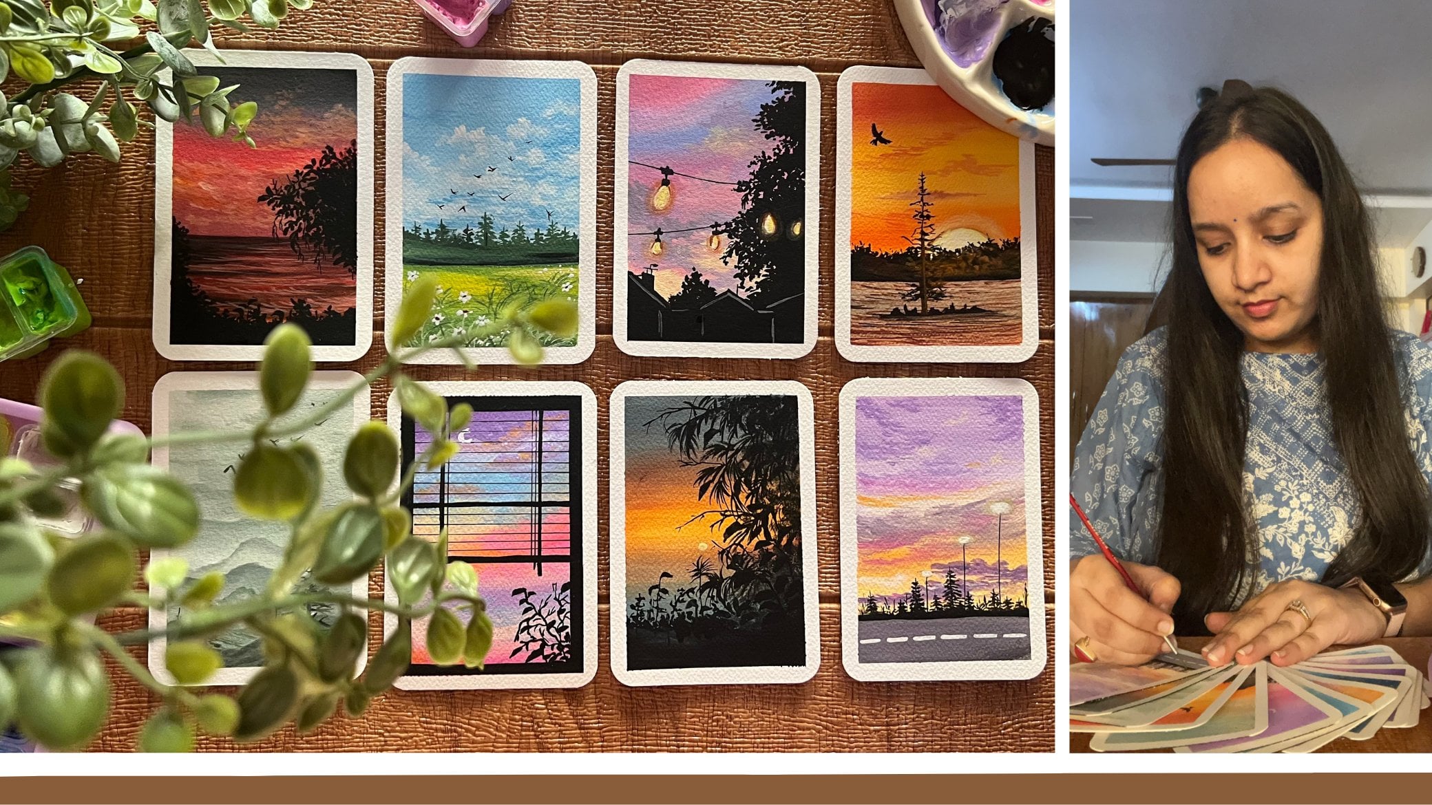
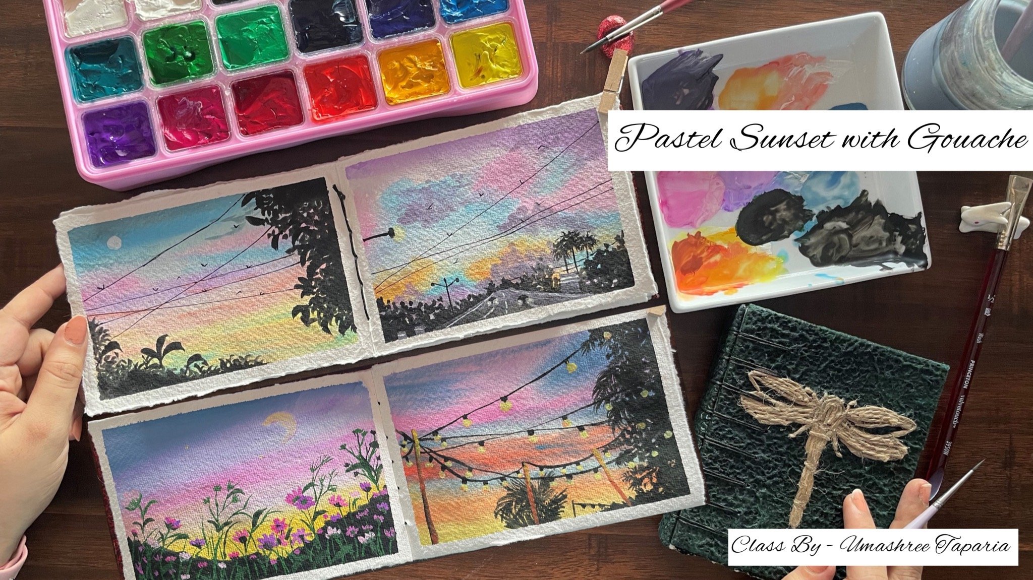
2. Materials You'll Need: So let's have a look at
the materials first. The first thing that we would
be needing is the paper. I'm going to be using
this Canson 300 GSM. This is a booklet of 30 papers. This is a mini art book. And this is perfect. For gosh, this is
not 100% cotton, but you can see the texture
of the paper is quite pretty and looks beautiful
for quash artworks. This comes like this
in a booklet form, which is tied up
through a screw. So you can just unplug
the screw like this, remove a single leaflet from
this paint and then you can again create the bunch of all of your paintings
together into this booklet. This is from the brand Canson. This is a 30 leaf booklet and perfect for the 30-day challenge that we are beginning today. So you can see these
aptly punched on one of these sides and how beautifully you can remove them easily. And again, file them all together using the same screw
that is provided along. Coming to the colors I'm
going to be using in this squash set from the
brand Magellan mission. This is a 34 colors set, and this is a
professional gouache set. And it is highly
pigmented and the colors are beautiful and they
are opaque in nature. Apart from that, I'm
going to be using in this separate black and
white quash because the black and white quash is
not included in this set. Plus I'm even going
to be using in the 56 set of the heme anemia. Gosh, said that I have so
far a few class project just to show you the difference I'm going to be using
in that as well. Then you would be
needing in a jar of clean water palette
to mix in all of your colors and to tape down the paper
I'm going to be using in this board and
using a masking tape. I'm going to tape down each
of the class project paper. Before each of the
class project, I will have my paper
taped down onto this. So you can go ahead and use any board or a
movable surface. Because at times having a movable surface underneath helps in the planning process. If you want to rotate
your board for better hand movement,
it becomes helpful. Lastly, coming onto the brushes, I'm going to be
using in the brushes from the brand hemi,
Mia, and Princeton. All of these are
synthetic brushes and perfect for gouache. So majorly, I'm going to be using in the filbert brush from the human me asset because it's perfect for blending
and the base layer. Then for detailing I'm going to use in the Princeton
liner brush, round brush, and some
other details brushes. So for every class project as I keep using which
brush and the size, I'll keep sharing them with you. So these are about the brushes
that you would be needing. Now apart from this,
you would be needing a few more of the other
stuffs as well. Which includes you
would be needing in a rough cloth for dabbing
your brush at places and for removing off
the excess paint and water would be needing a spray bottle to wet
your pains if they try because quash being a
water soluble medium, you can leave it it
using simple water. And next you would be needing in a pencil and an
eraser and a scale. That's some basic stationary
for some detailing work. Apart from that,
you would also need a black pen for
adding in details and white gel pen as well for adding in some
highlights at places. So this is all about the materials that
you would be needing. Grab them all, and
I will see you guys into the next lesson.
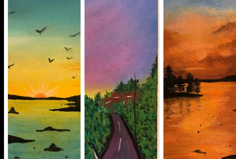
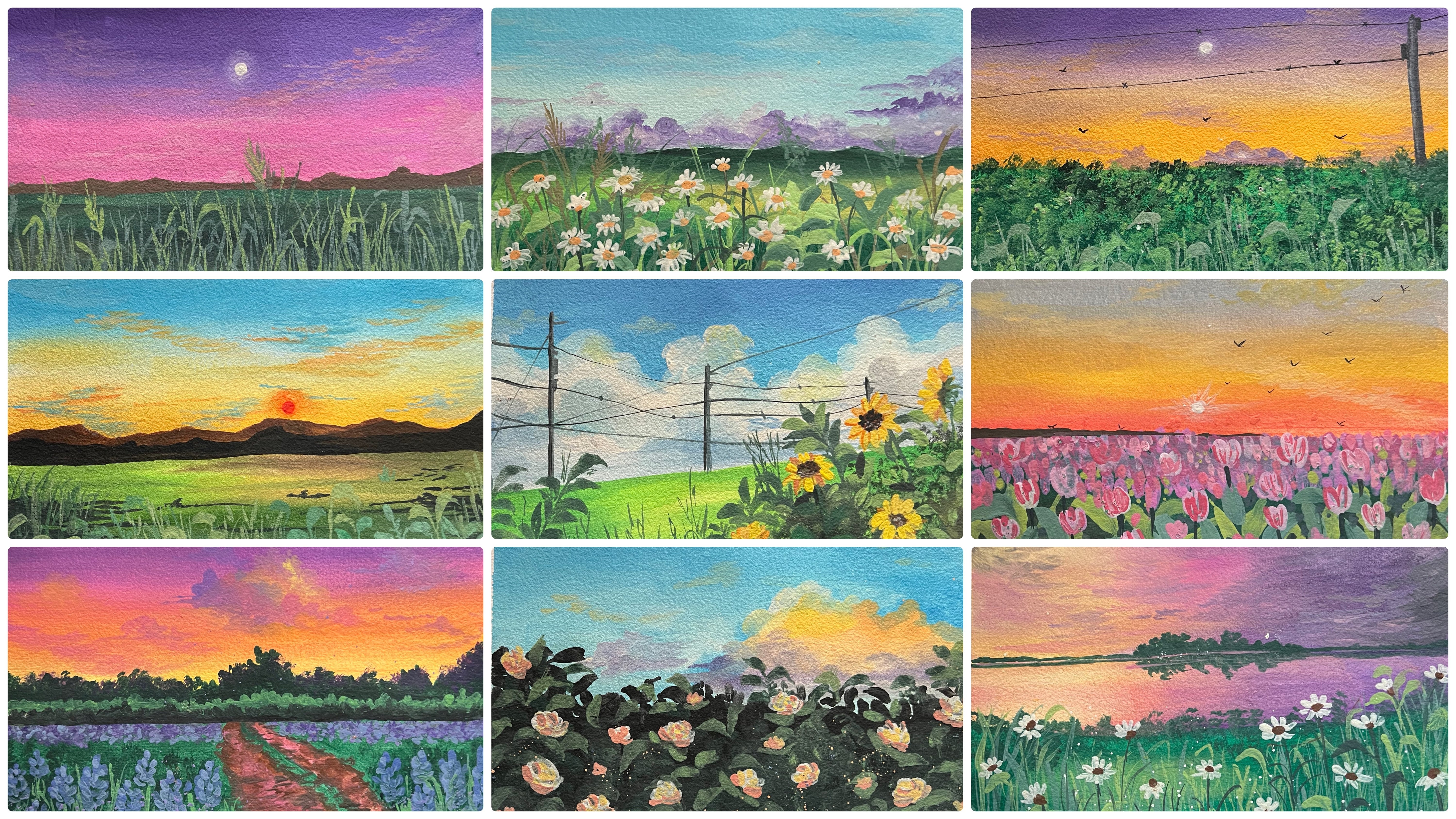
3. Day 1 - Sunset: So let's begin with our
class project for D1. So impose going to show you
how do I taped down my paper. So I'm just going to show this exercise for the
first-class project. And then from the
next class project, I will have my paper
taped done already. So I've just removed one of the leaf from this
entire booklet. And now I'm going
to use this board underneath so that it
becomes easier for me whenever I want to move the angles deep down our
paper onto the table, it becomes a little
difficult when you want to adjust
your hand movements, Poisson blending exercise, or
for some detail, adding in. Now I'm going to begin
taping down this paper. For taping down, I'm going to be using in the simple
masking tape. This is a half-inch
masking tape. It is available in
any stationary store or any carpenters store. You can get it easily. Now you can already see I have a pretty punched hole on
top at the left corner. So I'm going to make sure that I cover up that space using the masking tape so that I do not go ahead there
with the pain. I've left the small
gap out there at the top space and
at the bottom also, I'm just going to tape down. And you can see I am
using in like almost 2.5 MM space for
taping down the paper. Rest of the masking tape is on the outside on Buddha mode. Now I'm just going to go
ahead with the same sizing onto both of the left and
the right edges as well. Now after every year
of the masking tape, you can see I'm running
my fingers firmly across the edges and making sure that the masking tape is secured
properly so that there is no space for the
pains to see the edges. In case if there will be
gaps left in-between, the paints will move on
to those white edges that you're trying to preserve
using the masking tape, making those edges don't shabby. Again, it's quite important
to make sure that, you know, you are taped down
the masking tape very firmly and run your fingers firmly so that
there is no space, space left for the pains to see when we're ready
taping down a paper. Now let's begin with a first-class project and let's begin spacing
out the paints. There is no pencil sketch for
the first-class pressure. We are going to be painting a pretty simple sunset
kind of a field. And we are directly
going to go ahead and add in the details
using in the colors. So first let's have a look
at the colors for the sky. It's going to be a good,
pretty multicolored sky. So I'm going to use
the cobalt blue, violet color and
the orange color. Now, again, if you do not
have the exact same sheets, there's nothing to worry about. You can go ahead with the new array similar
looking shape. Because with quash, whenever you use in a lot of
white pulp blending, it does not make much
of a difference if the palate tonal value is one shade or to shade
lighter or darker. So I'm just squeezing out
each of these colors. I'm using the permanent orange, bright violet and the cobalt
blue color from this set. So now with this
cobalt blue color, you can see since the paint
has not been specced out, since a long time,
the gum arabic has come onto the
top completely. I'm just teasing out all
the gum arabic posed separately because it's so much a gamma ray which will
go into the color. It will make the
color a lot sticky, squeezed out the excess of
the gum arabic separately, and I've spaced out a little of that paint out there separately. So we are going to begin in, but the most important
color that you would be needing
is the whitewash. You can either these outlet of the white parts
separately and keep it because you
wouldn't be needing for each of the class projects. You can squeeze out
a little by little for each of the class project. As I told you, there
is no pencil sketch. We are directly going
to go ahead with the details for the
paints directly. So I'm going to use in this size three filbert brush for
the first-class pressure. Now this brush helps
in the perfect, basically a blending, quite easy to make the colors blend
and flow into each other. So fast I'm beginning with the cobalt blue color
directly at the top. Now I've just added very
small tinge of photo because I want to make sure
that the color stay opaque. So make sure you do
not add excess water. Otherwise, the
Bassanio white people will be visible underneath. Now I'm using the white
color to blend in with the blue and create a
little lighter tone as well. In between. You have already seen all
of these blending strips and Jake's in the blending
section of this class. In case if you have not visited
the blending section yet, I would recommend you to how you add the blending
section once, because it would
be very helpful in understanding why we use whitewash at certain
places to create the lighter tones and make
the planes cause movie. How you can avoid in
those muddy tones. And those are all brown tones that form because of the colors
blending into each other. So I've just added in the
violet color as well. Again, onto the top
of violet color also, since I want it to dilute that color and get a
little basal tone, I've run ahead with
the white wash and you can see I blend it till the blue color so that the color blending looks perfect
from top to bottom. Now, just underneath the
violet color, again, adding in a small layer of the white and now shifting
into the orange color. Because if you will blend the
violet and orange together, it may form a molecule. So in order to avoid
that muddy tool, I'm making sure to use
in white in-between, which will create the pasting
tones and will help us in avoiding getting in
those muddy tones by blending as well. For blending again, I picked up a little thing to off
the white on my brush. And you can see how
easily the blending goes. Plus the white is now covered
with a light orange tone. When you are eating in onto
the papilla, as you can see, there is no muddied only in palm despite the orange lending
in with the purple. Now again, I'm just going
to use a little bit of the white and theater
listen lighter orange, bottom side, closer
to the horizon line. And just adding in
a little bit more of the purple closer
to the horizon line. Now the rest of the bottom space is going to be the field space, which we will be covering
up with the green tones. So now for the field
space I'm going to use in the yellow ocher and the green color and create a beautiful simple
field area out here. So first I'm picking up the yellow ocher
color from this set, and I'm going to
squeeze out a little of this color out here
on my palette. Father, green tone.
I'm going to go ahead with the dark
sap green color. You can go ahead with any medium or dark tone of green which is available
in your palate. Also, again to mention if you do not have the
exact same sheets, you can go ahead with
the best palpating the colors available
in your palate. It is not necessary to have
the exact same sheets. It's more important to
understand the technique and then following with your own
color combinations as well. So now I'm going to pause beginning with the
yellow ocher color. I'm post-marketing of
the straight line. You can see that acts as
the horizon line out there. And now I'm just giving in a small layer of
yellow ocher color. And now I'm going to pick up the dark sap green color and
fill it in the bottom space. You can see I did not add
any water to the tag sap green color and it was giving
me those dry brush stroke. So it's important to have the perfect consistency
so as to get the blending and the movement of the colors is V. Now in-between, I'm just using a little bite, creating in little
lighter tones as well. So that you get in different color variations to the field, making it look more nitrogen. So very randomly you can see I listed middle of the
yellow coat color as well, along with the veins out. Now I'm just going to go
ahead and blend all of these well to each other from top
to bottom or bottom to top, that's completely your choice. Do not worry a
little of the green and yellow ocher laid over onto each other that will make the painting look more
natural and beautiful. So that is it. We are ready with the Bezier for the
sky and the fee. Now, let's meet for all of
these to dry completely, then even adding the
further details into this painting and
create the details. Now everything has dried
completely and I'm going to go ahead with the further
details on top of this. So first I'm going to go ahead and creating some Cloud details. The fact that I'm shifting
into my round brush. This is the round brush size two from the brand
Princeton business, the Evaluate tab series, which is a synthetic
series and is quite perfect for working
with gouache and acrylic. So first I'm going to
pick up a little of this background, violet color. So this is kind of a
shadow color that is used. I've just listed
very little tint of this color to
create in the Cloud. Now I'm going to use a little
tint of this color and added along with white later
on as well to create little mixed the background violet
color because it's locked the regular violet color and I'm going to begin adding
in the clouds out. Now in case if you do not have that background
violet color, you can just mixing a small
pinch off the Payne's gray or the black color with
your violet color and it was darker tone
of the violet color. Now in-between I'm going to add in little
lighter tone clauses by mixing in the white wash. Now you can see I'm just using
the tip of my brush, laying down the color, eating in those rough edges
to actin as the cloud shape. So now I've just mixed in a little bit into off the
white to this color mix here. And now, using this
lighter color, I'm going to add
in some lighter. So for the plaza cure and lending well with the
darker zones added. Now using the same tones of the violet that we have created, a little of the darker
and the lighter tones. I'm just going to add in some more random cloud
details into the sky. So very randomly you
can see I'm giving in some loose strokes randomly to create those
fluffy cloud effect. So you can see I'm just
using the tip of my brush and pulling up strokes to
create the cloud effect. Just putting them
closer together. I'm in the cloud
shapes so as to show those clouds sheets and those
rough edges for the clouds. Next time I've mixed
in a little tent of the white to my orange color. And using this, I'm going to add in some of the
cloud strokes with the orange color over on the violet and the
blue color space. Now you can see this
fight and adding the orange color over
the violet color. It's not forming in those muddy tones
because of two reasons. One, in the base layer also
we have used in the white, which is helping in
blending out here. And secondly, even in the orange color we had
added in the white thin, which is making it a
pistol tone and hence not creating in those
muddy and OB tones. Now using the orange mix, I'm just adding in some
clouds in-between randomly. I'm just dabbing
some colors using the tip of my
finger, creating it. The details for the
clouds as well. I'm just adding in
very random DBAs out. You're feeding in
some cloud effect. So over closer to
the orange color, you can see me using the dark
tones of the violet color. And over to the violet color we are using in the
lighter tones at the orange color so as to create a contrasting effect
for the Cloud DB. Now next I'm just creating in a litter of a
darker green thing. So basically, since I have the darker violet
already on my palette, I'm just mixing in that
taco violet and little onto the green color and getting
into this darker green to add in little glass strokes and details in the
bottom space in the P. In case if you do
not have the Wiley College, you can simply either
take the dark green color directly or if you already
have access of the green, you can also simply just
mixing a little bit of the black or blue color
to create a darker blue. Now using the liner brush, I'm just beginning to giving very simple grass strokes
in the bottom space. We're just going
to keep it loses time for the first-class
project so that it is not too much and
overwhelming with all the details that
we go ahead with. So I'm just going on adding in the grass strokes
layer on layer two, I began with approximately
a little below the little about the
center of the field space. And now I'm just going ahead
with layers and layers. If you want, you
can go ahead with the big 0 class strokes or for
the smaller brush strokes, depending on what kind of things you want
to go ahead with. Make sure you use
this one liner brush. Or you can go ahead
and add these details quickly using in a
fan brush as bad. Because in that it becomes
easier to add in the details. But open brush is not available
majorly with everyone. It is a speciality brush because of the
places that it has. So that is the reason
I'm going ahead with the liner brush so that it's easier for everyone
to follow along. I'm just pulling out
these brush strokes very simply you are, you can see how beautiful
the grass strokes at turning out to be. Now next time when
to squeeze out a little tint of the
brown color so as to add in little detail on the horizon line between this
guy and the field space. I'm going to go ahead with
the Van **** brown color. You can go ahead with any
darker tone of brown, or you can go ahead with the burnt sienna or
the bond amber color, whichever Brown is
available in your palette. Again, as I told you, having the same color
sheets is not important. It's important to understand the technique and you can use your own color combinations and create these beautiful
simple landscapes. So I'm just adding in the brown color using the
tip of my round brush. I'm distributing in
simple ******** vet. And you can see how
beautiful that space is turning out to be on
the horizon line. I'm going to go ahead
with different size of the bush deviance that
we are adding in. So you can see I'm just
having the tip of my brush creating in this bush detail,
giving him the details. Look here. It's
very important that you make sure that this color
is in a good opaque layer. Also be sure that your cloud storage is dried
completely otherwise, the bellows will begin to
bleed into each other and will not give you the form colonic off the brown color
because it will begin blending in with the BCL
violet or the cloud colors. And it will create a
little lighter tone then with gouache, it's
quite important that the base layer
is dry completely. And when you begin adding
layer on top of the base, you keep your hand very
lightweight it so that if you, if you will add it a lot
of pressure on the BCR, the busier Carlos
will begin to get activated because
we are using in water-soluble gouache in case if you were using
an acrylic based squashed than the BCL wouldn't get activated with water again. So it's important to keep in mind these little techniques. Otherwise, if you will
add in a lot of pressure, the base year fellows will get activated again and
will blend with the top colors that
you are adding in giving an organ for
the different tones. Now using the black pen, I'm just going ahead and
adding in some lines into the sky and you can see very random, yeah,
I'm adding them. In case if you do not
want to use a black pen, you can use your liner brush and the black wash and
adding these fine lines. But make sure that these
lines are quite fine. And in case if you're
using the technical pen, let me make sure you're using a work group one so
that these lines to not get spoiled
even if you have to correct any detail or
if water drops in. Now using the white quash, I'm just adding in a small moon closer to the violet color. It's going to be a half-moon that I'm going to add in your so just adding in some last
details with the brown color wherever I feel like giving
you the finishing touches. And then we are ready with
our class project for the one of this challenge. We are ready with this
beautiful simple landscape. You can see the
colors in the sky turn out to be so
pretty and beautiful. I'm just taking the brown color a little into the field space as well and just giving him a little touch of this
brown color on the edges, trying to show some muddy
spaces in between the feet. Same thing you are as well. I'm just going ahead
with a lifting the Dean of the brown colored the bottom space
creating in Little Rock the muddy space in
between the grasses. So that is it. I'm ready with
my class project for d1. Let's remove the masking tape. Now certain tips make sure you remove the masking tape
against the paper. So you can see I'm pulling it towards the other
side of the paper. So now when I pull the left
side masking tape the paper, the paper is towards
my left right side. I'm pulling the tape
towards my left side. And you can see it does
not wear off the edges. And plus it does not lift up the same way at the
top and bottom side, you need to be sure
that you pull it against paper so that you'll
do not tear off the edges. Also makes sure that your edges are basically completely dry. Otherwise, it will
be very difficult and you may lead the fellows
onto those white edges as the final painting for d, one of these that
VB art challenge. I hope you enjoyed painting this beautiful bookmark
with me today. I will see you guys tomorrow
into the D2 class project.
4. Day 2 - Black Sky: Hello everyone. Welcome back to day two
of the 30 day challenge. Today we are going to be
creating a beautiful night sky. So for the base layer, I'm going to be using
in this black color. Since there is no black color
in my Magellan mission set, I'm going ahead with
the black color to, from my hammy Oh gosh, set. I'm just going to mix in a little bit of the background
violet color to this. So astro, given a little
lighter tint to this color mix, I'm going to actually mixing a little tint of black
to the violet color. You can see. Now in case if you do not
have the violet color, you do not need to worry. You can just pick up pollution, new color or irregular
violet color and mix it with a
little tint of black. It's almost going to look
like a black color as it is, but that little tent will
make a difference in the color tone of the black
that you will be laying down. So there is no pencil sketch
for this one as well. We're going to go
ahead with a layer of black color onto
the entire paper, which is going to
actin as our sky. I have made shot and security
and all the edges so that the colors do not seep
in from the edges out there. And just going ahead with a thick ball layer of this
mix of the color that we have prepared and just giving in this flat layer for the
base layer of the sky. Now, since this is the base
layer and the final base Leo, make sure that you use the black color in
a bold consistency. Do not add much of
water, otherwise, the underneath whitepaper
will be visible. Also, make sure that the layout of the black
color throughout from top to bottom has the
perfect strokes and does not have any
deaf random strokes. Otherwise that will
be visible because this is the base
layer for our sky. On top of this, we're
just going to go ahead with green leaves
and the moon detail. So you can see I'm running
my brush perfectly from top to bottom so as to
get the blending go right. Now you can see it looks one single layer
of the black color without any rough strokes in between or any different
color patches. So this is it for
our base layer. Now before we begin to add in the leaf details and the
moon details on top of this. We need to wait for
this to dry out completely only then
we can work on this. Also, remember that
gouache reactivates, wait for it to dry completely, then move to the next layer. Sky is completely dry
it and you can see the beautiful bold black
color that we have gotten. Now I'm going to shift into the green color so fast
from the last exercise, I have a little of the sap green already out here on my palette. I'll use that first. Now, make sure when you begin
adding in these details, you do not add a lot of pressure
because adding a lot of pressure will reactivate
the base layer black color. And you will find
it very difficult to lay the details
on top of this. If you add in a lot of pressure and deactivate the black layer, I've just mixed in a little
tent off the white color, My us that sap green color. And now beginning from
the top left side, I'm just going to go ahead and add in some
simple leaf details. So you can see I'm
just dabbing the tip of my brush to give
him the leaf details. In case if you want, you can first pick up a
liner brush to add in some branches detail and then shifting and begin adding
in these little details. So you can see I'm building these leaf details very
slowly and gradually. I'm not adding a lot of them altogether at once,
paste together. I'm rather going on
slowly adding in details and little spaces
and then deciding it. Now at random places
you can see I'm pulling out bigger
branches and adding leaves to these branches
that I'm pulling up to give him little
more variation out here. At the bottom left space, we are going to have in quiet bigger detail
leaf on which we will show a little
reflection and shadow of the moon
light falling. As well as those leaves will be with the olive
green color and not the same sap green that
we're using for the top side. So very carefully you
can see I've pulled out some folded leaves from
the edges vary randomly. And you can see how beautiful, even though single color leaf is popping out on the black layer, despite that basically are
being off the black color. You can see how this color
is still standing out, bold and opaque, even
on the darker tone. So that is the
beauty, of course, that even the lighter tones look pretty on the dark colors. Now next time squeezing out a little bit of
olive green color. In case if you do not have
the olive green color, you can pick up a little
of your viridian green. You can mix in a little
tinge of the yellow to it or greenish yellow color and a little tent of white to
get a similar-looking tone. So I've just picked
up a little of the greenish yellow color and little of the
olive green color. And to this now, I'm mixing
in the white gouache. Now in case if you do not have the VD didn't green
color as well, you can go ahead with
your light green color. I'm adding a little tint off the white quash and use your
light green color itself. So before beginning to add
in these bigger leaves, I'll go ahead and add in some
branches this time first. So fighting in the branches, I'll shift to my
liner brush so that I can get those fine
strokes for the branches. And I'm just going to pick up a little tint of the
Van **** brown color, which is therefore my
previous class project. I'm just going to mix in
with a little tinge of the olive green color
and just add in some fine lines to
actin as the branches. So very randomly you
can see I'm pulling out the smaller branches as well
from the bigger branches. At this moment,
these branches may not be much clearly
visible to you because they're still
in the drying process plus they are very fine
branches that I'm adding it. Make sure you keep
these branches quite fine and delegate so
that it maintains the entire look of
the painting because the leaves on top of this are
going to be the huge one. As I'm going to show
that the top leaves are far, far from our view. Hence they're visible
in a smaller size and these leaves are quite closer to our angle
and hence they are visible in a big ball size. And plus the moonlight reflecting
on top of these leaves. Now using the mix of the olive
green and a white color, I'm just beginning to
add in these leaves. And you can see how
beautifully you can add in this
one stroke leaves. You can go ahead with
the random is shaped possible that you want to
go ahead with these leaves. You can add them in
whichever angle you want. It's absolutely your choice. You need not have the
same placement or same number of leaves or
the same design as mine. It's absolutely a
nature painting and nature has every different
kind of leaf possible. So if you notice my leaves, you can see I'm adding them
in all different directions, trying to pull them out in different ways from
the same branch. On top of this,
I'm still going to go ahead with some
darker tones to actin as the shadow spaces after we added the moon as well. The one advice that I would like to give you while adding in these leaves is that going
very slowly and patiently? Also, you can see I started with the leaves from the
bottom right side. And I have been adding
one leafletting, leaving in a little
space between them so that you do not add the
leaves at one specific place. A lot of the leaves
together going create a rough patch around and then see where
you should add in. A few more leaves are where you need to add
in the smaller ones for just filling in the spaces or what kind of
details would go. Well, now I have some
greenish yellow on my palette and I'm just going to get it in the right consistency. And I'm going to go ahead with a little detail with this
greenish yellow color. Now again, the important thing is if you will have excess
water in your pigment. It will activate the
base year as well. And then the colors of this layer and the
base layer will begin to merge into each other and will not give you
that opaque look. Rather, it will show
you as a blended color. So it's very important that you do not add a lot of pressure. And also the consistency of
the color should be thick enough so that it does not
reactivate the base layer. So very randomly you
can see I've just added few often needs with this
greenish yellow color. You can see though
this color looks almost similar to the first color leaf
that we were adding. That is the olive green
and the white mix. But still it makes a difference on the paper
over the black color. And you can see that
little thin difference that gets the beauty
to these, these. Now next aspect up the olive green color directly without mixing it any white. And I'm just going to add in some darker lines onto the
leaves that we have added. So basically these
darker lines represent the folded areas or
the shadow areas. So very randomly I'm going
to go ahead and majorly, I'm going to try and show
these darker depth on the top of the leaves to source some points on the leaves. Because of this, the
shadow is being created. After this, we will be left to add in the moon into our sky. So first in-between the
leaves very randomly, I'm just adding in some
more branches using the same olive
green color to show the connections and movements happening between the leaves. Now I'm going to
shift my liner brush and to some of the leaves, I'm going to add in
some vein details using the same
olive green color. So make sure if you are
adding in these windy days, you shift into a
detailer brush so that you can get
these details fine. Do not go ahead with a bigger size brush
for these details. Otherwise it will not fit in proportion with the details
that you're trying to add in. Also make sure that your
base here of the leaves are completely dry before you begin to add in
this vein details. Otherwise, again, this will not make any difference
and it will just look, blend it with the
base layer leaves. You can see, I'm
going ahead with the mix of the green
mixed with white gouache, along with a little tender
of the darker color as well. On some leaves I'm giving this self vein details using in the mix of the white gouache and
the green color. And I'm Sam, I'm giving him
the darker green details. Also. I'm not going to add in this vein details to
each of the leaves out. You're going to be
on a few bigger ones which are going to create the main focus closer
to the moon space. Now, before we move
on to the moon, I'm just going to go ahead
with some leaf strokes more. So because at the
bottom space here, I'm a little unsatisfied. So I'm just going
to go ahead with little more off the leaves with the darker tones so
that I can cover up this piece and
make it look perfect. Now let's begin
adding in the moon. So for the moon, I'm
first going ahead with the white gouache and I'm going to create a glowing space. So I'm going to add in a
small dot of the white color. And now using the damp brush, I'm just going to
blend this color into the background and
create a detail view. Now since the base
layer is a black color, you may need one or
two layers to create this glowing space because the black color will absorb it and make it look more dull. So it's important
to go ahead with one or two layers so as to make the glowing space bold enough for the moon to show in
as the glowing light. So as I told you, I'm going ahead with this
second layer now, this is not the final moon. I'm going to blend this into the background and create that
flew in space well enough. I'm satisfied with the
growing space for the moon. And now I'm just going to
use the tip of my brush, pick up some bold white
color without much of the water or making it in
a lighter consistency. I'm just going to pick it up in a ball consistency
and I'm just going to drop it in the center of this growing space
that we created. And now you can see that
how the moon looks like a little moon because of
the growing space that we created in the background
using the same white color. Now, lastly, I'm just mixing
in a little more of the white to this green color mix and using this lighter tone, I'm just going to add
in Some more often, I believe, detail
randomly because I am a little
unsatisfied and I feel that the leaves look a little dull and the moonlight
does not reflect well. So I'm just going to add in some strokes on some of
the leaves to make it look lighter to show
the glowing effect of the moon light falling
onto these leaves. So you will notice majorly, I've added in these lighter
leaves towards the top side, also has to show that the light effect is
falling closer out there. Now one last thing towards
the top-left leaves that we have added the smaller
ones out, you're there. I'm going to go
ahead and mix in a little more white to
that sap green color. And using this lighter color, I'm just going to add in some highlighted
leaves to show a little of the moonlight
effect falling on this part of the
leaves as well. So you can see very little
highlights that I've added in. You're not much of it. So just lifted so as to show in the little moon effect
falling out there as well. And that is it. We are ready
with our class project for D2 of this RTD mini
art challenge. I'll just go ahead and add in some more branches
before we remove the masking tape because
the branches seemed to be not visible in-between
these lighter leaves. So I'm done adding in
the branches in between. And you can see as soon as
you add in those branches, the leaves getting new life as in because the branches
make it look complete. Now let's remove
the masking tape and see your final painting. Make sure your edges
are completely dried before you begin to
remove the masking tape. And always remove the
masking tape against your paper so that you do
not tear off the edges. So here's the final
painting for D2. It's a pretty simple
painting with just two to three colors
that we have used. But you can see the impact
and the details that we have created using the lighter
and the darker tonal values. And also showing in the light effect falling
onto the leaves. I hope you guys enjoyed painting this beautiful bookmark
with me today. I will see you guys soon
into the D3 class project. Thank you so much once again for joining me into this class.
5. Day 3 - Pastel Sky: Hello everyone.
Welcome back to day three of the 30-day
gouache challenge. Today we are going
to be painting a beautiful pastel sky with
a very simple silhouette. I'm going to begin
directly with the colors. There is no pencil sketch. I already have the colors
from my previous exercise. I'm just going to rewrite these. So first I'm mixing in
the blue and the white and creating a very pistol
sky blue kind of a tone. I'm using the cobalt blue color along with the white gouache. You can go ahead with any blue color that is
available in your palette. So far, the base
layer I'm giving in this blue color on
the entire space. And then on top of this
we are going to give him some basal Cloud details
using in the pink, orange and the violet
color details. So I've given a good even
layer of the same color. I'm just going to
pick up a little more of the blue and
the white and going to run from the bottom till the top so that I haven't even
looked throughout. So at the bottom I will
still not satisfied. So I'm just running
with one more layer. I just mixed in a little more off the white
and the blue color. And I'm running
from top to bottom. And you can see when I run
from the top to bottom, I get a seamless
blending between the layers as well
as you can see, even tone of the blue and the white layer laid throughout. Now for adding clouds on these, I'm going to be shifting
into my other palette. And for that, I'm
going to be using in this mop brush,
one-fourth inch. Do not worry if you do
not have this brush, you can simply go ahead with your round brush and go
ahead Adam in the clouds. So now on the
palette here I'm for squeezing out a little
bit of the white gouache. And now I'm going to
space out the colors that I'm going to be using
for adding in the clouds. So the first one I'm going
to use in this brighter, paler color to all
of these sheets. I'm going to mix in
the bytes that we have added in the center space. Next from my previous palette, I already had a little bit of the bright orange
color on the palette. So I'm just lifted up little of the orange color and I've
added it to my palette here. Now for the first layer, I'm beginning ahead with a very light mix
of the orange and the white color so that we get a little
lighter tone base. And then on top of this
I'm going to add in the other colors so that
we get the glowing effect. Now have just lifted
a little bit of the brighter pair up in
color on the same brush, which holds the white and
the orange colors too. And just blending it and
same with the same brush. I'm just lifting a little bit of the violet color as well. I'm going to blend in
at the bottom space. So this is one big piece to color Cloud that
we're adding in here. Now at the bottom space, again, am going ahead with
the lighter mix of the orange and
the white color. Now I'm just going to clean
my brush and I'm going to dab off all the excess water. And now using the damp brush, I'm just going to
soften up the edges of this entire Cloud
and blended into the background so that we get a smooth-looking cloud
in-between the sky. Now in the same way, I'm
just going to go ahead and add in little more
of the cloud somewhere. I'm going to keep in the
pink color much in focus. Sound that I'm going to keep in the orange color in focus. So at the top space here, I added in a cloud with
a lot of pink in focus. And you can see I'm just using the tip of my
finger to blend in. So in case if you are
also using a round brush, you can use the tip
of your finger to blend the clouds into the sky. But whenever you are using
the tip of your finger, you have to be careful
about one thing. That after every time that you dab in clean your finger again, because the colors that get
lifted onto the finger will again be laid onto the other species where you go ahead with the
dabbing technique. Now I've just picked
up a little more of the orange and the white
color mix analytic love the pink color to go ahead
with the next layer of the clouds onto the first
patch that we added in. Now in the remaining
spaces randomly, I'm just creating a little of the Cloud details
using the white quash. So in the same way, even
at the bottom side, I'm just going to go ahead
bit some lighter clouds. And very randomly, I'm blending
some of these clouds into the bottom space and
in-between you will see I'm adding in some
random strokes as well. Now using the damp brush, I'm blending these white clouds as well into the
background so that everything looks very blended
and settled into the sky. Just as added in the highlights
using the white quash, I'm just adding in some
highlights using in the mix of the white and
the bright opera pink. And very randomly you can see those little clouds creating
in the glow into the sky. So all in all it's creating in the paste and look into
the sky that we need. Now, let's wait for the
sky to dry out completely and then we will begin adding
in the silicate into this. So my sky has dried
completely and I'm going to squeeze out a little bit of the permanent
yellow light color. I'm going to add into off
the street light silicate. And I'm going to add in the light effect using
in the yellow color. So false. Let's begin in adding
in the silhouette detail. So what I'm going to do is first I'm going to go ahead with the black color and I'm going to create the polls
for the silhouette. Then I will shift into this
mix of the yellow, orange, and white color that
I'm creating here for adding the highlights and as
well as the light details. So firstly, let's lift
up the black color. Make sure you use in a detailer brush to
add in these details. I'm going to be using
in my liner brush or my round brush size zero to
add in those Paul details. So I've shifted to my
liner brush so that I can get in those fine
lines for the moment. Later on, I'm going to
add in the highlights on top of this using in the
yellow and the pink color. And then I will give him
the finishing stroke using the black color. So I'm going to add into off
the street poles out to you. So I've added in these two
fine lines for now and now, I'm going to shift
into the colors that we have added
onto a palette. And I'm going to begin adding in the details with the
yellow, orange colors. So before moving
onto the colors, I'm just adding in
the light detail as well and just creating in the silicate and outline in the spaces where the
light will be added in. Now till the black
layer dries in. I'm just going to
go ahead and add in a few buds as
well into the sky. So I'm using the same
liner brush so that I can add in some
fine detail brush, sodium fine detail boats. You can go ahead and
add in simple but silhouettes and was indifferent
flight angles out here. So this time I'm adding
in a little detail than what I usually add in
the rest of my paintings. So just one board
that I'm adding, but a detail one
that I've added. Now, I'm going to pick
up the mix of the white, orange and the yellow color. I'm going to begin
adding in the details. So basically I want
to show the effect of the pasta's sky falling
onto these polls as well. That is the reason I'm
going to go ahead and add in a little highlight on
to the poles as well. So to add the highlight, I'm using the liner
brush itself so that I can get in
those fine strokes. Now in the same way
I'm adding it onto the smaller pool as well. Now for the light effect, I'm going to use the
same color and fill this entire light spot with the same mix of
the yellow color. If you want, you can
add in a little more of the white quash and created a little and paste
still in tone. Now next half mixed in the
pink and the white goulash. And using this color, I'm going to add a
little more highlight on the poll so as to show the effect of the
pink color clouds as well falling onto
the whole space. Now at certain
places I feel that the highlights are
looking to bold enough. So I'm just going
to go ahead with the black color and
give it a little covering up space
so that we have little of the highlights
on new visible. Now, before moving ahead
to the next layer, I will wait for all
of these to dry out completely and then I will go
ahead with the next layer. So I'm just a little
bit unsatisfied with how the polls are
looking at this moment. But I will wait for
these to dry and then add in little more details and adding some more silhouette. So now my layer of the pole is completely dried and
I'm going ahead with the same black wash
first and I'm going to begin adding in little
details out here. And then I will shift in and move on to the
other silhouette. So basically now I will just have to take in the
poll a bit because I'm a little bit unsatisfied with the highlights
of the poles. I'm going to minimize
the highlights by running black color and
making the poll thick. And then to cover up so much of the thickness
of the poll, I'm going to go ahead
with a little bit of the bush silicate at
the bottom space. So again, these are small
fix and trips how you can use rather than throwing
away an entire painting, how you can correct
your mistake to add in some details
that will help him covering up your
mistake and giving him the little detailed view again. So I've covered the entire pose with the black color again. And on top of this I will add the highlights
once they dry out. So until they try out, I'm going to go ahead and
add in the bush detail at the bottom space using
the same black color. So basically now you can
see that these bush details cover up half of the poles
because of which, you know, the thickness of the
pole that has gone to take at the bottom
space gets covered up because of the bush
and everything again seems back like in proportion with
the painting size and the size of paper
that we are using. Initially, when I started
with this class project, I had no intention of
adding in these bushes. It was just going to swap
out at those two poles. But since the poll highlights
didn't turn out as I've wanted to correct
those highlights. I had to thicken up
the width of the poll. So I was unsatisfied
with those take polls. So now to cover up those polls, I'm going ahead with these bush. And you can see how beautiful that polls are
looking coming out from in-between the bush and
the thickness also gets covered up because
of this bush detail that we have added in. So on the left side as well, I'm going to take the pushes
a little bit taller so that it covers up a little of the colon space on
the left as well. And then the black color of
the pole will also dry out. So I'm just going to give
him the highlight effect now first and then move on
to adding in the bush again. So I've just mixed in the white and then it'll tint
of the yellow color. And I'm just going
to go ahead with a fine line to actin
as the highlight. Now on the yellow
palette itself, I'm just going to go ahead with very little pink highlights
on random spaces. It's not compulsory to add the pink highlight on
the entire species. You just need a little
highlight to show the light of the sky falling onto
these polls as well. So I actually forgot to add in the rest of the
bush detail first, so I remove the masking tape. But after removing
the masking tape, I'm going to go and add in
the bush details again. So if you haven't removed
the masking tape as of now, make sure to first add in those books detail
and then remove the masking tape so that you do not mess up
with the edges. And in case if you
have also remove the masking tape and then you
are adding in the bush TJ. Make sure that you
go in very carefully so that you would not
do end up those edges. So as I told you, half of the poll out your
will also be covered. Now since you've
added the highlight, you can see in-between the bush, a little of the
pole highlight is also visible at
the bottom space, making the painting
look so much more real and the details
look perfect. Now, the thickness of the phone is also
majorly covered up and it looks all imbalanced with the size of the paper
that we've used in. So that's the best thing about gouache some way or the other. You can try either correcting your mistake or hiding your mistake using in some
more detailing method. That is a reason I love
this medium so much. Now just adding in some
more highlighted knees before I end this
class project for D3. So here's the final painting
for d3 of this class. I hope you guys enjoyed
painting this with me today. I will see you guys soon
into the next class project.
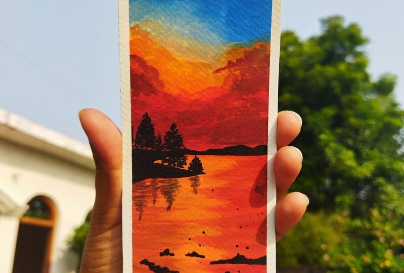
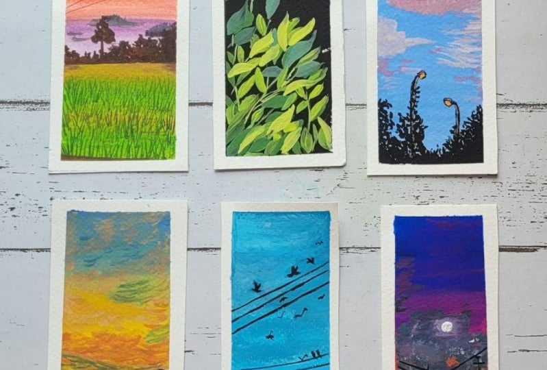
6. Day 4 - Daisies: Hello everyone.
Welcome back to day four of the 30-day
bookmark challenge. Today we are going
to be painting a beautiful DZ field with a
pretty beautiful sunset view. So I'm first marking
out the horizon line, which is a lot below
the center space. And on top of the
horizon line we are going to have into
mountain ranges. So I'm just giving a very
rough pencil sketch. The first mountain range
is going to be a big one, but the second one
is going to be just a small space behind the first mountain
on the right side. But the mountain ranges will
be off the different color. This is going to be a sky space, the mountains and
the field area. That is how our composition
is going to be. Now for this guy, I'm
going to be using in the ultramarine deep color
along with a yellow tone. So I'm going to squeeze
out a little of this ultramarine deep color out. You are closer to all of
the blues on my palette. For the yellow I'm
going to be using in the permanent yellow
deep or the light color. And then in-between
I'm going to use in the white quash for blending so that we do not have
any green tones. So I'm going to
use the deep color so that we get a little bold, beautiful yellow as well. So I am using the same palette that
I have been using from the first class
projects so that I can reuse the colors
wherever possible. Because gouache, we are using
the water-soluble ones so you can reactivate it with
just a few drops of water. So now I'm going to squeeze out a little bit of
the white as well, closer to the viewer, blue
out here on my palette. And now I'm going to randomly
pick up the little tent of the ultramarine deep
blue along with whitewash and beginning
from the top space. Remember if you
will try to blend the blue and the greens
without the help of fight, you may get in green tones in between because blue and green, blue and yellow mixed together
gives you a green tone. I'm just lifting up a little
more of the white only and I'm just going to add
in a little more space. And now I'm just blending
till the top so as to get a smooth transition
between the color completely. You can see as soon as you
run in the entire space, all of the colors look perfectly
blended into each other. And you do not have any hash or prominent color
strokes in between. Now, next I'm going to shift into the permanent
yellow deep color. And along with that as well, I'm going to lift
up a lot of whites. So I picked up the
white and then I just touched it into the yellow
color, as you can see. Now closer to the blue, I will still leave
a little space for blending with
white later on. So I've added a layer of the yellow color in
the rest of the space. I have left the mountain spaces blank because there
will directly add in the color in case of
little color seeps into the mountain range
also, it's perfectly okay. Now I'm just going to lift up your bite and in-between
add the blending point using the white I'm
going to blend and have a perfect transition
between both the colors. And you can see I'm overpowering both of the
colors onto each other. So little of the
yellow going towards the blue and the middle
of the blue as well coming towards the
yellow so as to get in the perfect transition and
the perfect evening look. So that cluster base
layer for our sky. Now on top of this,
I'm going to be adding in a lot
of Cloud details. And for that I'm going to use in the orange mixed in
with the white color has shifted to my
smallest size filbert brush so that I can
get the details right. Now, I'm going to pick up
the orange color from your, which is Alt key on my palette. In case even if you
have the colors from previous exercise
already on your palette, you can reuse the
same colors like this because since we're mixing
it with the white wash, it again gets us
opaque consistency. So I've mixed in a
little tent of the yellow, orange, and white. If you want, you can
directly use it. Orange color mixed in with a
little tend to often write course so as to get in that little blended and
the soft loop. Now just using the tip of
the smallest size brush, I'm just going to begin
adding in some Cloud details. So fast and adding a little
biggest piece of this yellow, orange color to blend
it into the background. So on the orange, oh sorry, on the yellow part of the sky, I want a little
orange space as Ben. That is the reason I added a little layer of
the orange color. And now just quickly
using induction. The finger, I'm dabbing
and blending it all. Now on top of this layer, I'm going to begin adding
in the Cloud details. And for that, I shifted into my smallest sized
round brush which has a pointed tip and so that it becomes easier to add
in the Cloud details. So I'm using my size
two round brush, but since it has a pointed tip, my work will be easier. Now I'm picking up the
same color which we mixed in for adding the
highlight over the yellow pad. And using this color
on the top space, I'm going to just begin adding
in small half C strokes. Now in case if you want to learn more details about the clouds, you can go ahead and visit my previous 30-day
quash class where I have discussed a
lot in detail about the clouds and the ways
in the technique section. So in case if you are an
absolute beginner and want to learn the different strokes
for the clouds in detail. You can go ahead and just visit the technique section
of that class. So very randomly you
can see I'm placing the half the strokes with
a mix of this yellow, orange and the white goulash. I'm just creating in very small details over
to the blue color. You can see because of
the opaqueness of quash. And since we've mixed
it with white quash, the orange is also visible
on the blue color. Plus you can see how beautiful the peaceful tones are looking because of the white quash. And they are not bombing
in any muddy tones. I'm going very slowly
and peacefully adding in these small Cloud
details at the top space creating in the depth
into the sky this time. Now for the bottoms piece, I'm going to add in a little
more tenth of the orange to this same mix because
we've already used this lighter tone
at the bottom space, but adding in the detail. So now with this
little darker tint, I'm beginning in with
the same strokes at the bottom space. And you can see
at the bottom I'm adding a little bigger
strokes as compared to the top space because
I want to put in more focus towards these
bigger cloud spaces out. Now I'm going to pick
up the mix of the ultramarine blue and
the white gouache. And using this mix, I'm just going to add in very little cloud stroke
to overdo the yellow just behind the
mountain range to give him blue sky details there. So you can see I'm
closing the brush so much closer to the
bristles space so that I get more precision
and control over the brush by adding in
these little details. Also at the top space
you can see we have the orange focus and very little strokes of blue that I'm adding at the bottom space. Then at the top as well, I'm going to give him little
of the blue highlights. Now at the top space you're
closer to the orange color. You can see I'm just giving him very little highlights
of the blue color. Wherever I feel that the spaces are turning to darker pool, I'm quickly dabbing it so as to give it a well settled and, you know, blended luck with
the rest of the details. So these are just
small tricks and tips that you can
use for blending in. Like you can use your fingertips
quickly for blending in. If you feel that the details
are turning to bold, you can use white gouache
and blend it into the background or a damp brush and blended into the background, like the clouds and the species. You can quickly go
ahead and blend it into the sky time to show it a blended look rather than
giving him the ball look. Now at the bottom,
you are closer to the mountain range.
I'm just blending. Extra blue, that seems to me. So I've just used in the
orange color to false, give it a basically a plane. And now I'm just going
to go ahead with the damp brush and blend it
again into the background. Now I'm going to begin adding in the details into the
mountain range as well. So I have some
background violet color which I had from the
previous exercises. And the end of the black and the blue color
that I'm mixing in. So it's basically are
dark blue kind of tone. If you want, you
can directly using the Prussian blue color or
an indigo color as well. But since I have certain
colors on my palette already, I want to reuse them. So the background mountain
color you can see it's still towards the
lighter tones side. And the front mountain that we will be adding is
going to be further off a darker tone
so that there is perfect distinction between
both the mountain ranges. Now for the foreground
mountain range, I'm going ahead with the
black color directly and I'm going to begin adding
in this mountain range, you can see the top of
the mountain ranges quite uneven and very tough so
that it looks more natural. So now I'm going to fill in this entire space
with the black color. And in-between if needed, I will just keep blend it
with a little tinge of blue to give him that little
the blue color as well. So you can see both
the mountain ranges are standing out distinctively. The background
mountain ranges of the dark blue tone and the front mountain ranges
of the black color, but standing or
distinctively from each other and having
a different view. Now let's begin adding in the details for
the fields piece. So I already have the sap green color again from my previous exercise as well. So I'm going to go ahead
with the sap green color. And along with that, the other greens that I
already have on my palette, I'm using a mix
of the sap green, olive green, and
the white gouache. And very roughly I'm creating in the base layer in-between. I'm going to use in a little of the white
gouache as well. So as to have little
lighter tones. Plus I'm using a little
tint of the yellow color as well to give him little
yellow grass details. Now closer to the mountain
range going very carefully because the mountain range maybe still wet and if
you run forcefully, you may run into the
mountain range and the colors may bleed
towards the bottom site. Now for the fee, this is just
the base we're creating. So I've picked up a little tint of the Van
**** brown color also, which is again line from my previous exercise
on my palette. And I'm just reusing multiple tones out here
to create the base layer. On top of this, we are
going to be adding in the grass strokes and
the daisy detail, which we'll be covering
up measure of the space. So this time you can call this as the color
blocking that we are doing so as to show in the
rest of the grass details. So you can use
yellow ocher color if that's available
in your palette. Brown color at any green tones that's available in your palate, it's not necessary to have the exact same tone as
I am using in your. So I'm done with the base
layer for the field. Now I need to wait for
this to dry so that I can add in the grass
details on top of this. So I'll wait for all
of this to dry and then we will move ahead
further with the details. So now my base layer for the field is completely
dried and I'm going to go ahead
and begin adding in the further
details into this. So I'm going to shift into
my liner brush so that I can add in those fine strokes
for the grass detail. Now for the class, I'm going
to use in the olive green mixed in with white gouache
so that it stands out boldly. Onto this space that we
have added, believe me, white quash serves as a magic while working
with quash for detailing, you mix it with any color
and lay it over any color. It will stand out
bold and beautiful. So in the base layer
you can see revolt. He used the olive green color. But despite that,
since I'm going to mix it with the
white quash now and use the same olive green and a white mix for adding
in the grass strokes. Standard, bold and
beautiful out here. And given the profit DD look and the background color will act as a perfect filling space
for rest of the details. So varied randomly,
you can see I'm going ahead with some bigger
strokes of the class. Some of them are even overlapping the
mountain space there, that huge that I'm
trying to show it. Now in-between,
I'm going to pick up a little more of
the lighter mids, just going to begin adding in some more lighter
strokes as well. Now you can see the brush
strokes are moving in all different angles as well
as some of them are taken. And now I'm adding some detail
ones from the bottom space so as to show some grass
strokes and major focus areas. Now you can see the
background brown, greens that we added is already acting in as
the filling space, trying to show that those
are also the dresses, but a lot behind Haden's not visible in the
detailed manner. Now I've just picked up a little more off the dark green color. And using this, I'm
going to add in some more grass strokes to this. I'm not going to add
in the white gouache, rather I'm going to just
add in some darker strokes of the grass so as to get some
balance into the painting. So just as we added
the lighter ones, I'm going ahead with this
darker strokes as Ben. Now, since my lighter strokes
are visible in-between, you can see at random places the dark green color
is not getting laid over and that's getting the more beautiful blend
into the grass strokes, trying to show the grass strokes and tangle between each other. It says, make sure to not overdo these
grass details. You can see I'm not
adding much of these. In fact, I've even left a
lot of gaps in between. I think that background color be the filling space and trying to show that there is class unmatched in the
background as well. So that is it for
the class strokes that I wanted to add in your, now we have to add in the
daisies on top of this. And for that, I'm going to be
using in the white gouache. So far, adding in the daisies, I have shifted to
my round brush, which is size three. And I'm just going
to begin adding in the audience with
the white goulash. Now before you begin
adding in these daisies, make sure that your grass
strokes are completely dry, otherwise the colors
will begin to blend and bleed into each other. I'm just beginning in
with the white gouache, adding it very simple
daisy details out. You're now at certain places, the green color
seems to be still a little wet because of
which you can see, I had to go ahead with one
more layer of the white color. Now I'm going to go ahead
with very random daisies. It's going to be somewhere
half some veggies petals, some web big ball Daisy. So you can go ahead with
your own mix as you like it. Now you can see at the top, I added a daisy in a
different angle views, which is making look the bottom side petals
a little smaller. So as I told you, it's not compulsory to
have all the petals. Are the flowers in
the same direction, same angle, are the same sizing. You can go ahead with any random size,
shape, movement, or. Angles of the petals. So I'm just going to add
in a few more daisies. I'm not going to add a lot
of them now at places, I'm adding very small
ones trying to show some of the disease just
file from our view. Because of fish, they are
visible in smaller sizes. Into all of these,
we're going to add in the center bar using in
the brown tones later on. For now, let's just add in the disease first and
then move ahead further. Now ready randomly
at certain places, I'm just going to
drop in a few of the small petal details as in the disease are
about to bloom in. So you can see a few
of the grass tools that we had taken towards
the mountain range. I've added very small
disease out there as well. But since those are
far from our view, you can see I've added them
in a very random manner, not in a much detailed view. Now I'm just squeezing out to little tint of the
yellow ocher color. And using this, I'm going to
begin adding in the buds. Now, it's not compulsory again to using the same
yellow ocher tone. If you have two browns
on your palette, you can pick up
the brown sheet as well and add it in
the center space. Now I'm picking up
a yellow coat color in a bowl consistency. And I'm going to add it towards the center
of the flowers. Now at certain places, the center of it maybe are
a little different because some of the petals are of the smallest size at
the bottom space. So depending on the kind of
flowers that you've added, all the angles
that you've added, you can go ahead and add
in the buds out there. Now, made sure that your white
flowers were a little dry towards the center space so that you can add
these buds easily. Otherwise, they may blend in
with the white color and it will be very difficult for
you to add in these details. So even to the smaller flowers you can see I've
added in those but details and given
the detail look to each of the flowers
that we have added in. Now. Lastly, using
the white quash, I'm just going to give him some splatters at the
bottom space trying to show some more very tiny daisies
which are about to bloom and giving it a little
more detail view to this field space. Make sure that you cover
up your mountain range and the skies piece if you are not confident about the
control of these plateaus. So that is it. We are ready
with a class project for D4. Let's remove the
masking tape and see your final painting
with those clean edges. Make sure to remove
the masking tape only once you're age is
a completely dried it. And always remove the masking
tape against your paper so that it does not tear off the edges and lifts
up the color. So here's a final painting
for D4 of this type. Dd, add challenge. I hope you guys enjoyed painting this beautiful simple
daisy field with me today. I absolutely loved
the sky of this one, how it has turned out. You can see this
talks of blue and orange creating the perfect
balance into the sky. Thank you so much for
joining me into this class. I will see you guys soon
into the next class project.
7. Day 5 - Day Sky: Hello everyone.
Welcome back to day five of the 30 day
wash challenge. Today we are going
to be painting a beautiful daytime sky with very simple
Bush seller heat. So again, for this
class project as well, there is no pencil sketch. We are directly going
to go ahead with the paints for this
guy this time I'm going to be going ahead
with the sky blue kind of a tone for
this class project. I'm going to be
using in this set of 56 colors from the
Nemea gouache set. So that you can
understand the difference between the top pains do paints that we have been using so far for all of the
class projects. So I'm going to pick up the
sky blue or the blue color. You can go ahead with acetylene, do color or a sky blue color, whatever available
in your palette. Basically a light blue
color from your palette. To this, I'm going
to be mixing in a little bit off
the widest spread. So fast I'm beginning with this blue color without
mixing in the white. Very than the mean between I'm going to just pick
up white directly and keep blending it out on
the paper itself, did it? So now I'm squeezing
out some fresh write out your on my
palette so that I can keep using it in
between and keep on getting in the
blends of forfeit. So this time this
guy's pretty simple. It's just going to be
a blend of the blue and the white color
very randomly. The lighter strokes and
rough strokes in between, I'm getting the blends right. Now you will see that I'm
going ahead very random leave, It's very random color strokes. I'm not going with a
setback in-between. I'm going to keep
some of those spaces white as well with the
help of white gouache. So as to show some cloud
Shining Path in the sky, giving in that cloud effect automatically with the
blended new color look. So you can see I'm going in
very slowly and very handily. I'm creating in the blue
and the right layout. I'm not worried about having the perfect blend or
the perfect transition, or the perfect same
colors pieces throughout. I'm just going to
randomly creating in the beautiful or daytime sky, blue and white color mixing. Now since we are using
in the white color, make sure that you know on the edges you have the bellows
made perfect p.stance. Otherwise, when you will
peel off the masking, you will see that color
has not been made there. So going very carefully, now I've picked up the
blue color directly without any Mixer five
for the bottom space. And you can see how beautiful
and bold effect bleeds into the bottom of the sky. So again, at the bottom, most things are blended
with the white color. Now from the bottom
till the top, I'm running my brush
once so that I can get a little
smooth transition. All you can see not much of
the hash strokes in between. Now I've picked up a little
bit of the new palette again, I'm going to go ahead and
given some darker details and new places where I see that the white is a
little over poverty. So you can see very
randomly just use brush, I'm just adding these
colors very naturally. I'm creating those blend and the transitions as
well as you can see, since my paper is
still a little wet, the fallows are blending well with the base colors already, giving you the
perfect blended look and do not have any sharp edges. And all of this
guy is looking up, blend off the white and
the blues together. Now at random places
I'm just using the tip and creating in
some more cloud effect. And you will see that just
using the tip of the brush, I'm adding some darker
strokes with the blue and very gently blending it with the base steel
back down so as to create a little blended
into the background. So that is it for us. Yeah, ready with the sky. Now the only detail
here and that's to add in is the 5-HT did. Now we will wait
for a few seconds for this to dry out completely. And only then beginning
with the foil HDP. For the for loop, I'm
going to be using in the black color on top of this blue color
details obviously did once everything dries
out completely. So make sure if your
paper has not dried out, you wait for a few
minutes for it to dry. And then I'll shift
into the black color. I already have a little of the
black color on my palette. I'm going to reuse from the
previous class project. I'm going to be
using in this point, brush to create in the
quick five-ish detail. So basically, this
round brush have been spoiled because of the usage
with the acrylic colors. So I'm not going to dip
the brush in water, I'm just going to
touch the tip in water and reactivate
this black color. And you can see I'm holding the brush perpendicular
since the beginning. Make sure to the black gosh, I spend you do not
add a lot of water or getting into a lot of
watery consistency, you need to keep the
color as well in a little ball consistency and the thick consistency so that you get the spoilage detail, the dry brush kind of
fibers that we are going to add it using in
this pointed brush. So very careful, yeah, back the brush onto the
painter last time. Now again, I'm holding the
brush perpendicular here. I'm just beginning to adapt the tip of the brush
to create the foil is now in whichever
sheets you want to see, the entire file is
moving your brush accordingly and create the
entire space accordingly. So you can see I'm
just going ahead with very random shape to create
in the foliage look. Now, going very slowly and carefully by creating
in this DDL, do not crush under not even
one flat single-line loops. That is not keep the height of the foil is same everywhere. Try to give it different sheets. I'm trying to move those spoilage come out
in different directions. Notice my foils are not
in one single direction. Do I'm holding the
brush perpendicular, but the point is, is moving in all different
directions possible. Trying to show that
the natural beauty of these voyages moving
up in all directions. Now in the same way,
I'm just going to go ahead with a little
more of the 5-HT did before we move ahead and added some more detail view
into this foliage. So you can see how I've
broken the foliage. On the left side,
it's the tallest or the space in-between you have lateral of the formulation
of smaller height. And then again at the right side you have
it in the smaller height. Now let's wait for all
of this to dry forest. So now my photosphere of
the coalition has dried completely and now I'm going to shift into my liner brush. I'm using the same black color. I'm going to add in some branch
details in-between these. So I'm just going to go
ahead and keep adding in some branches out you're
randomly in-between. The point is to show that all
of these four images coming up from the branches and then
hanging on the branches. So you can see very carefully, I'm adding in very
small branches in between all of these brushes
that we've added in. I'm going very slowly with a mix of some
smaller branches, some bigger branches so
as to keep the balance in between all of the details
that you've added so far. You can see I'm going ahead slowly pulling out
this thin branches. Make sure you use a smaller
size brush or a brush, or a brush that has
a pointed tip so that you've been getting
these fine details. Now on the screen it may
be visible to you that these branches are not
making any difference. But if you have a closer look at your own painting while
adding in the branches, you will see the
difference that it creates in-between the bush. Some of the branches may
not be visible right now, but when they try out, you will be able to see
the difference of them, even over the ******** as well. So I'm still going to go ahead and add in some more branches. So you can see I did not
overdo all of them together. Now I'm even adding in
digital detail was tedious. I'm just pressing
the tip of my brush, giving in some
detail bush look at random places from in-between
the branches that is just giving him those ones
strokes and can leave the name to bring a little
more detail look out. So just go ahead and keep
adding in some detail leaves as well in the grid so that it gives you a body didn't look. Now after this
meeting, the left to add in a few violence
and do this phi. And then we'll be ready with our class project per day five. A pretty simple class
project yet so much to learn about the dealing and how little details make
the difference. Always be careful never to add all the details altogether. You can always go ahead further
and add in those details. But removing off those details once added is quite difficult. So even when you started with the first step of
the bush layering, makes sure to go
ahead and slowly to just add in little
and then go ahead with the branches and the deed AND and then see if you
need to add in more of the bush details or if
you want to add in more of the detail leaves or
more of the branches. And accordingly as to what we're add more beauty
to your painting, you go ahead with that
kind of a detail. I'm almost done.
I'm just going to go ahead and little
more leaf detail. And you can see as soon as
I've added in these D1 least, it's making so much
more difference to that weak point is
that we have added it. So basically that
wakefulness eats to the speed of filling
in the spaces. Philip of majors,
please quickly. Now on top of that, we're
just going ahead with lids of the time you're given
a balance or the beam. Now lastly, I've shifted
to my liner brush and I'm going to go ahead and
add in those details. I'm just going to pull out
some violence into the sky. Go ahead and pull
out some violence. So I'm going to hit very
uneven these violence. They're going to be very random. So again, your as well, you can go ahead with
your own layout. For the bushes value need not follow the same
placement as mine. You can go ahead with
your own placement. Now onto these violent
very randomly, I'm just going to add in a few
bought silhouette as well. So at the top you can see
I've added didn't do off the detail looking worse in
flying motion and subnet, I've just added in the
simple ones as well. So some birds have shown
they're quite far and visible in a video on
tiny dot like structure. So that is it. We are ready with our class project for the five. Let's remove the masking tape and see your final painting. Make sure that your edges
are completely dried and always remove the masking
tape against the paper. And also be very careful when pulling
out the masking tape. Otherwise, it may cut
off the edges and lift up the fellows from your
painting space as well. So you also find that
painting for d phi of this study was challenge. I hope you guys enjoyed
painting this beautiful sky, blue and white color. And then just using
the black color. I will see you very soon
into the D6 class project.
8. Day 6 - Powerlines: Hello everyone. Welcome back to D6 of the
30-day quash challenge. Today we are going
to be painting a beautiful evening sky
with some simple solo hate. This time we are going
to go ahead between different layout of the colors and the clouds into the sky. So again, that is not going
to be any pencil sketch. We are going to go ahead with the colors and begin
building in our sky. So for this exercise as well, I'm going ahead
with the same hymn emia gouache set
off the 56 colors. So fast I have picked up the cobalt blue color mixed in with a little tint of
the ultramarine blue. And in-between for a
little darker tint, I'm picking up a little of
the Prussian blue as well. So basically you
can go ahead with any medium to dark blue tone. And I'm just going ahead with this color at the
top layer first. So the blue color
from this set is actually a little towards
a transparent site. That is the reason
I've gone ahead with the darker tints and gone ahead with multiple layers so as to get that beautiful
opaque loop. Now next time picking up the
purple color from this set. It's not exactly a violet color, but it's more towards
the purple side. So I'm just going
to go ahead with this purple color closer
to the blue color. Now you can notice
even this purple color is a little towards
the transparent site. That is the reason I had to go ahead with multiple layers. So this is what the difference it makes when you
are going ahead with a student grade
paints and then you go ahead with an
artist grade paints. If I would have been using my Magellan mission
set right now, it wouldn't have been this transparent and I
wouldn't have to go ahead with multiple layers of the same color so as
to get an opaque look. Now next to the purple color, I'm just picking up a shade
of pink color and I'm going to begin adding in
this pink shade out there. So I'm just going to pick
up the color first and activated well on my palette so that it spreads
easily on the paper. You can go ahead with any bright pink color which
is available in your palette. And I'm going to run
it till the top, blending in well
with the blue color. You can see the violet and
the purple mixed together. I'm making that layer much more opaque and I'm
blending it well to the blue color so as to get the perfect transition between
each of the color shifts. Now below the pink color, I'm going to go ahead
with the yellow colors. I'm going to use a
permanent yellow deep color and just go ahead
below the pink color. Now at this point they
for blending you want, you can use in a little
tent of the white quash, but I'm going to run the
yellow or whether things so that I get a little orange
tint as well in between. And you can see how beautiful the orange tint
creates the effect. Now below the yellow color, I'm again going to go
ahead with the pink tone, the same that we use
at the top space. You can see between the
pink and the yellow, the orange transition
creates a beautiful effect. That is what happens when
the colors are close to each other in the color wheel and go well with each other. That transition because
of the third color is being formed mix the
colors look very smooth. Now this time I've even added a little tint of a pistol
pink color to my pink. That is the reason you can see the palette is quite opaque. And now I'm just going to clean my brush completely and then go ahead using in a little tint of the
white for blending. So rather than
using in the right, I'll go ahead with
the orange or sorry, the deep yellow color
only and blended well. So now you can see above
and below the yellow color, both places you have a little of the orange tint form because
of the transition effect. Because this time we haven't used the white
in-between for blending. After every little time you can see I'm cleaning my brush so that the pigments do not get
moved from one to other. So you could see when I clean
my brush the last time it had a lot of pink and if I would have run that
over the yellow, it would have completely
hidden the yellow and turned it into an orange,
which I didn't want. So after a few little blending, it's quite important to
keep cleaning your brush. Now at the bottom
you can see I've just gone ahead with
a light cheat because most of that space will get covered up with the
silicate later on. So that is it for the
base layer of our sky. Now on this we are
going to be adding in quite dark clouds this time. I'm going to go ahead and mixing the color for adding
in the clouds. This time we're going to have quite ball looking clouds onto this pretty beautiful sky
that we have created so far. For speaking up a
little grayish blue, a tint you can just mix in a little tint of Plataea,
Prussian blue color. So it's a very little
tent or you can directly using or indigo color if you have a direct
linear palette. And I'm going to go ahead with a little lighter
tone of this first. So this time I'm using the angular brush and
I'm just going to begin creating in
the cloud shape using the tip of the brush. Now this color still
seems a little dark, so I'm just going to mix in
a little tender white to this so as to cut the
color a little lighter, make it look perfectly, are going in harmony
with the background sky. So as soon as I've added in
that little tent or fight, it goes back down into
the entire sky space. And now you can see I'm
just using the tip of the angular brush and creating random cloud shapes leaving
in spaces in between. Because then I'm going
to go ahead with some more other color
tones so as to get the blending and the transitions between the clouds as well. Now in the recipe
says I'm going to go ahead with these smaller
cloud details as well. So you can see we've
added two huge clouds and then from the edges and pulling out the smaller looking clouds. Now seeing that the
bottom space as well, I'm just going to go ahead with smaller clouds scattered
out urine there. Also be very careful
when you're using in the detailer brush
for adding in these, you can either add this using
an appointed tip brown dash or using an a flat brush if you do not have
an angular brush. But having an angular brush
makes the job easier. Now to the same mix
I've added in a little more of the white color
to get a lighter tint. And now near to
the bigger clouds, I'm going to run with this
lighter color and create a little blended
effect and have to transitional between
the color tones. So you can see between
the cloud says, when you get in those two
color transition happening in. Now using this lighter
color as well, you can add in a few
scattered clouds urine there if you wish to. Now I'm using my damp mop brush and I'm just trying
to blend in some of these clouds into the
background by just dabbing in there and making it
go into the background. Make sure you do not have excess water or
pigment on this brush. You directly just using
the damp brush for blending and making it look
settled into the background. So that is it. I've
blended that one big cloud into the background and
given it a little soft edge. Now, I'm going to go ahead
with the further details. So now I've shifted
to my round brush and using the lighter color mix, I'm just going to
begin adding in some lighter highlights
randomly into the sky. Now with the round brush, you can see I'm just
going ahead with the simple half C strokes
to add in those highlights. Now, in-between randomly,
I'm even going to mix in a little tint of
the violet color and given some highlights, mixed it with the same
blue and the white color. So you can see over
the violet color when you are adding in this
violet color highlights, it looks as a perfect
transition and going well blended
into the sky. Look. So what you can simply do is the colors that you've
used for the sky. You can go ahead with one tone, lighter or darker color for creating the highlights
and adding in the details. So I'm going ahead
with the same pink and the violet color mix to add in some highlights at
the bottom space has been mentioned yet the top
space you can see there's not much of the Cloud details
that I've added as of now. Now with the violet color, I'm just going to
go ahead and add in little details onto the
blue color as well, using in the mop brush and creating some
bigger cloud effect makes sure that you go in very gently because the
blue color out for me, yours is already transparent. So if I run too much or to
apply a lot of pressure, it will begin to turn
out to or lighter again. So I've just given
a rough overlay of the violet color to give him little transition there as well. Now let's wait for
all of these to dry then move ahead further. So now my sky is completely
dry it and I'm going to shift into my black color to begin adding in the silhouette. So I'm going to shift
into my round brush to begin adding in the detail. I already have the black color from the previous exercises. Please route on my palette. So I'm just adding in little
drops of water to this to reactivate the paint so
that I can reuse them. And paints do not copy stay. Unlike acrylic colors,
it's quite difficult to reactivate them and they go waste if they dry
out on your palette. But with gouache and watercolor, you can always reactivate them and use it in some
or the other way. Now I've gone ahead with a very opaque consistency
for the black color as well. And very randomly,
I'm creating it a very rough cityscape
kind of a detail. So in-between I've given a little bush details
and then in the center, just a small house roof
shape that I've added in. Now the bottom space, I'm going to go
ahead and fill it with the black color completely, since I had a lot
of black color. So even after reactivating, you can see it is giving
me that opaque love. But in case after the
activating your colors, giving you some lighter look, make sure to use
some opaque color so that you get the perfect
opaque look out here. So now you can see right in the base layer we had used
a very lighter pink at the bottom space
because it was going to be covered in with the
black color later on. Now I'm shifting into my
liner brush and I'm going to begin adding in the
further silhouette using the liner brush. In case if you do not
have a liner brush, make sure you go
ahead with a lighter, your detailer brush, which has a pointed tip so that you
can get in the fine details. Or if you want, you can
even go ahead and use in a black waterproof pen
which has a pointed tip. And adding these details, you could go ahead with a 0.2 or 0.3 pen because that will
give you these fine details. So I'm going to add in some of the wireline Paul
details out here. Now randomly to
some of the polls, I'm just adding in some
box detail so as to show the detail look to these are polls that we
are adding here. Now these details that
I'm adding are very random and not from a
specific reference. You can go ahead and add in your details to the power lines
that we're creating here. It may not be exactly
same as mine. Also, the placement can vary
according to your venture, according to the reference or the subject that you
are following ahead. Now connecting all of these
polls using in the y lines, again with the liner brush, you can see how
find the lines are. And I'm able to achieve these fine details with the
help of this liner brush. Now from one of them. I'm showing the lines
getting connected into the bottom cityscape that
we have added in randomly. And these violins again
are also very random. So you can go ahead with your own connecting
points and just create a, you know, a lot of
buyers out here so as to show a perfect
power line view. Now I've shifted to
my round brush size three and using the white quash, I'm going to create a beautiful moon out there
in-between the clouds. So I'm going ahead with the
white quash and I will create a small background which will
act as the growing space. Now using my round brush, I'm just softening the edges. I'm just going to blend it
well into the background so that it has a perfect
or glowing effect. Now you can see the
bottom layer purple color is also being visible because of the too much tab again blending. So I'm going ahead
with one more layer so as to get in
the growing space. Now, once you get into
perfect glowing space, I'm just going to
go ahead and add in a small moon in the
center of this. So I adapt that
space and create, added one more layer
of the white color. Now you can see
the growing space is looking perfectly fine. So at times you may not get
it right in just one go, but with multiple layers
usually get it right and it becomes quite beautiful
and perfect glowing low. In the center, I've added
a small moon and you can see how beautiful deploying
space is looking right now. We are ready with
our class project for these six as well. So let's remove the masking tape and see our final painting. Make sure you remove the
masking tape against the paper so that you do
not tear up your edges. And also make sure that your
paper is completely dry, especially the edges so
that the paints do not get lifted and not
ruin up your edges. So you always are beautiful, multi-colored
sunset for the day. I hope you guys enjoyed painting this
beautiful view with me today and learned blending in the colors without the
help of white gouache. I will see you guys soon into the day seven class project. Thank you so much
for joining me into this class and painting
along with me.
9. Day 7 - Seascape: Hello everyone. Welcome back to D7 of the
30-day quash challenge. Today we are going to be
painting a simple C ski. So we are going to be going ahead with a color
combination of t and the yellow color for
this class project as well. I'm going to be using in the same 56 color heavy
meal gouache set. Actually, I have or customize this palette according
to my own colony. You can get the ready
56 color palette, or even you can
customize and pick your own colors and
build your own palette. So going ahead with
the pencil sketch, I have first marked
out the horizon line. Now at the bottom of
the horizon line, I'm going to go ahead and just mark out a small folder line. So basically I just thought
of taking the horizon line a little more below than the
first-line that I marked out. That because on top
of that we are even going to be having in the
mountain genes still. And everything about
the horizon line is going to be the sky and below is going to be the seascape that we are
going to be painting. We're going to go ahead
with a very simple one so that you can get a hang of
how to paint in the waves. So to begin with, the colors that we're going to go ahead with is going to be the teal green or teal blue
color that you can use, along with a little
tinge of yellow. So I'm going ahead with this
teal grayish blue color. So basically this
is the blue color, but you can see it's a little on the darker side and not
on the pieces site, but I'm going to use
in little white quash. You can see when the color
is spreading at this moment, it is not that opaque and anti-B white paper is
still visible at places. That is because we are using
in the student grade paint. Now next I have picked up the teal green color
and I'm blending them both well so
that we can get a little opaque consistency. Now I'm going to squeeze out a little bit of the white
course so that I can go ahead with the blending all over again so that I can get
in that opaque layer. So I'm going to lift
up elitist end of the white quash now
and run from below though of cobalt teal green
color that we have added. So just one line below, and now I'm going to run
the top so as to get the blending and the
consistency right. So you can see as soon as we
ran with the white color, the entire color theme
turned to opaque. And plus the blending and the transitions look much
better with the help of white. Now I have picked up the
permanent yellow deep color and I'm going to begin with
it at the horizon line. And by the time of each closer
to the white color again, I will just pick up a
little bit into fight on my brush so that I
can get a transition between the white and
the yellow as well and get a little lighter
yellow tone in between. So you can see at the top
we have the green color. Then you have a very light tint of the teal green
mixed in with white, then you will have
a very light tint of yellow mixed in with white. And then you will have
the pure yellow color. I've lifted up the
white and now again, I'm going ahead with the
blending in the center space. So you can see with the
help of the white color, we've got such
beautiful transition or color composition going in. So when moving from the
lighter to the darker shades. Now let's begin painting in the base layer for
the CED as well. So I'm going to go ahead
with the same yellow and the green color that we
have used for this guy. So this E is
basically going to be an exact reflection of the sky. So that is the reason closer to the horizon line before
started the yellow color. Be a little careful at the horizon line so that
you do not run over the colors of the sky again and ruin the perfect blend
that we have coating. Also, you can see, despite using an, a
student grade paint, it is not always that you cannot create or turn them
into opaque paints. You can see just with
the help of fight gosh, how I could turn some colors
opaque and use it perfectly. And the consistency
was also perfect. Now, even in the area, I'm just going ahead
with the same text. Of using invite
in-between for blending. Now I'm just going to go ahead with the
cobalt green color a bit more and I'm
sorry, the team color. And I'm just going to run
from the bottom so as to give him little darker
That's at the bottom space. So we're ready with the base
layer of sea and the sky. Now I'm going to go ahead with the CVs buy-in by sea area is still a little bit because I want very soft look to my base. I'm going to go ahead with the same teal green
color that I've used. And I'm going to begin
adding in the V's. And for adding those fine
waves have shifted to my liner brush so that I can
get in those fine details. Now you can notice closer
to the horizon line, I've left a little space
in the sea area before. Big thing to add in
the views because they're going to go ahead
with lighter consistency and the color of
the v's so as to show and maintain that
yellow effect that we've tried to create the
show they effect and reflection of the
sky into the sea. So you can see I'm
adding the waves very randomly crisscross
to each other. And very gently you can see some of the waves are
quite thin and some of the visa and actually
turning a little thicker because of the quick
movement of the brush. Now I've again, she's due to my filbert brush and very
gently and just running it over the brush strokes
that we added for the V. Now you can see how settled
the waves are looking. They have such a soft look. Now because my background
layer was still a little wet, that is the reason the
waves have settled in. When I'm in class, I use the damp brush for
blending them into the bathroom. So you can see how
beautifully you can create the software blue now aspect of the permanent
yellow deep color. And I'm just going to begin
adding in some ways closer to the horizon line
using this color mix. So I added a tint of orange to the yellow color so
that it stands out well onto this yellow color that we've already added
as the base layer. So in the same day as I was running with the
green color waves now I'm running in
with the yellow color from top than the bottom. Now as I'm moving more
towards the bottom side, the yellow color visa
going to be more or less because the
sunlight effect is falling majorly closer to the horizon line and very little towards the bottom sides. I'm just going to give in very little details and that also medially in
the center space. Now again, I've picked up a damp brush and
now I'm going to run quickly onto the entire way so as to give them a soft look. Make sure you do not have excess water or any
pigment on your brush. Otherwise, it will
get laid out there. So you need to use a
damp brush so far. Using it, I quickly
they fit into water and then
clean it thoroughly with very little moisture
left on the brush and then run it gently onto the v so as to make it
give us set a loop. Even if your base here dries out and if you run
the **** brush, it will get settled in and
give you that blended loops. Because gouache gets deactivated when you run water on top of it. So when you're running that **** brush on top of the veins, the BCL also gets activated and it blends
well with the top layer. Now using the green
color have given very little wave details
closer to the horizon line. Now shifted. So my round
brush and I'm going to pick up the black color which
is already on my palette. And I'm going to begin adding in the mountain danger top
of the horizon line. I'm using my size
two round brush, which has a pointed tip. And we are going to be
adding in a very small, tiny mountain range
on the horizon line. You can either use
a detailer brush or a flash that
has a pointed tip. And go ahead adding
these details. Now again, you can see I'm using the same black color from
the previous class projects, but you can see it
is still standing autopay because there was a lot of color and I'm using very minimal water to
reactivate the paint. So it's very important to understand whenever
you are going ahead with the re-weighting
technique or using the colors on
your palette unique to understand whether
you need it in the opec consistency or a
translucent consistency. Usually when you need it
is opaque consistency. Either you will
have to squeeze out fresh paint or if you
have excess paint, then you can just play a
little of water and let it go. Oh, you know, paint get reactivated on its
own and then blend it using a brush that will help
in not using too much water. And it will get reactivated
in an opaque consistency. But that will require
a little time. So be careful so that you do not lose the opacity
of the paints. Now using the black color, It's going to go ahead
and begin adding in some random drops
into the sea space. So I'm going ahead with
very random placement of the rocks and in all
different shapes and sizes. So you can go ahead
with your own or either of reference that
you're following or anywhere, or how you wish to go
ahead with the layout for the rock to all the
details of the sea. Just be careful you do not
overdo any one kind of TDM. You need to make
sure that you go ahead and slowly building
in these details. Because once you begin
adding these details, there's no going back. You even have to go
and corrected somehow. Then. Now closer to
the horizon line, I'm just adding in a
small space kind of a detail connected to the mountain range
that we have added in. So you can see I'm slowly building in the details
in the z-space. I'm not going ahead with one specific kind of
a detail completely. I'm building in the
rocks as well at different places of
different shapes and different angles. Plus you can see how slowly and building in the
short space as well, depending on where,
what needs to go. You can go ahead with very different sizes of the
rocks like your you can see I've gone ahead with very tiny rocks at
the bottom space. Now using the black color, I'm just going to splatter
in a few of the droplets of the black color at the
bottom space to show some very tiny rocks
floating onto the scene. Now make sure you
cover up your sky. If you are not sure
whether you'll be able to control the
splatter of the black color. I've gone ahead with very little splatters majorly
at the bottom side. So be very careful otherwise it will ruin up your
sky completely. Two to three small
drops out yours. I'm quickly going to dab it with a tissue and get rid
of those. Summation. It's closer to the horizon line where we're still going to go ahead with the sun detail
so it will get covered up. But be very careful if
you're not confident about this intensity of this platter that you are going ahead with. It's always better to cover up your entire sky till
the horizon lines. And even a little of disease-based because
you need these platters usually at the bottom space to show some very small rocks. Now I've listed the white
quash and I'm just going ahead creating in a growing
space out there for the sun. And I'm using a little
tinge of the yellow and the orange color mix as
well. Along with it. With the same color,
I'm just adding in little cloud effect
randomly at places. So basically my son is going
to be in the center and on both the left and
the right side for the sun that we will be adding. I'm creating a growing space, trying to show the effect of the sunlight across it as well. So in this Endo, using the white gouache I've
added in a small son. Now using the white quash, I'm even going to pull
out some of the sundries. Now in case if you're
not confident about pulling out these
trees using the brush, you can go ahead and using a white gel pen to
pull out these risks. But make sure that you have a very fine pointed
tip fight pen so that you get
these details right? I have picked up a damp brush and from center I'm
going to pull out the white color
out in the form of this popping up
from the sun space. So I've just picked up my
liner brush to pull out these genes so that I can
get in those fine strokes. And I've lifted up little of the white quash as
well on my brush. Now from the center I'm going to begin pulling out these visa. So approximately just one
one-and-a-half centimeters plus all of these v's out
of different heights. Some of them are taller, some of them are shorter
so as to give him the perfect balance.
Sunlight effect. So you can see how beautiful the sunlight effect
is coming out to be. It's looking as if
the light of the sun is falling in the
form of rays outside. Now I've mixed in a
little more tender of the orange color to my
yellow color on the palette. And I'm going to use
this color and begin adding in the detail of the sun. So basically on the white
center patch that I've added, I'm going to go ahead
with this color. So that is it for the sounds p. So we basically created in the growing space
using in the course first and then add it in the sun effect with
the orange color, you can see the
background whitespace is looking so beautiful. I'm trying to show the light
of the sun into the sky. Now using the black color, I'm going to add in a few of the boards as well into the sky. So far the boards as well. You can go ahead with any kind of board that
you wish to add in. I'm going ahead with
a little detail view boards this time. So you can see
I've tried to give him little feather details, little body details,
all as well. But it's absolutely your choice if you wish to go ahead with the simple silhouette of the board and not
the detailed one. I've gone ahead with a mix of both kinds of boards in-between. I've added in some simple boards as well as some detail boards. So you also finally painting. Let me give you a closer
view of the sun effect. So you can see the
rays are creating the perfect sunset
effect and trying to show sunlight falling onto the sky in the form
of those genes. So that we're ready
with our class project. I'm just going to correct
this board a bit. So let's remove the
masking tape and see your final painting
with those edges. Make sure that your edges
are completely dried before you begin to remove
in your masking tape. And always remove
the masking tape against your paper
so that you do not tear off the edges
and the paints do not get lifted
from the paper. You also simple
seascape using in a very different color
combination of the teal green, teal blue and the yellow
and the orange sheets. I hope you guys enjoyed painting this beautiful seascape
with me today. I will see you guys soon
into the class project. Thank you so much once again for joining me for this class.
10. Day 8 - Walking through the Road: Hello everyone. Welcome back to day eight of the 30-day bookmark
wash challenge. Today we are going
to be painting a beautiful route side scene. So let's begin with a very
simple pencil sketch. First, I've marked
out the horizon line. At the bottom of the horizon
line is going to be a path v. And across both
sides of the pathway, it's going to be
a greenery space that we will be painting. The top is going to be a
beautiful pink evening sky look. Now on top of the horizon line, I'm just going to add in very
simple cityscape details. So I'm just adding
in the roofs of the houses and we're not going to give these
houses the detailed look. We're just going to give
it very simple loop. In the center we have the houses and on both the left
and the right edges, we again have the
greenery which will be blending in with
the roadside greenery. So as we begin adding
in the colors, you will be better
able to judge how the entire composition
is going about. Let's begin squeezing out
the colors one-by-one. So fast I'm spacing
out a little bit of the white gouache
because we'll be hearing that for
blending and for creating in some lighter
tones at species. The next color that I'm using is this bright red color from
the Magellan mission set. Now in case if you do not
have a bright red color, you can go ahead with a
scarlet color or any of bright red color or a
pinkish tone if you want, because I'm going
to be mixing in a little bit of white to
this and then using it. Next, you would be needing a little turned off
the yellow color. You can either use a
permanent yellow light, permanent yellow deep, whichever is available
in your palette, but not too dark tone. Go ahead with a
medium consistency. I've picked up a
little bit of the white and I'm mixing it with the leftover blues from the previous exercise
on my palette, you can go ahead with any medium tone blue that
you wish to go ahead. Or if you also have any of the blue leftover on your palette from the
previous exercise. You can just add in
a little tint of the white gouache and
use the same color. I'm just laying down the
little tins of the blue. On the right side,
you can see I'm just adding a little
towards the edges because on the rest of the paper I'm going to be
going ahead with the red and the white color mix and blend it well
with the blue tones. So now I'm mixing in white along with this
bright red color. And you will see a very
beautiful pinkish red tone that gets formed because of mixing of white with this
bright red color. The remaining spaces, I've added this bright red color
mixed in with white. Now in the space between
the blue and the red, I've just added in literal
sense of the white. And now I'm going
to go ahead and blend all of these step-by-step. So you can either first
go ahead and blend in the pink along with the white and then move
on to the blue. But in case if you're moving directly to the blue as well, then be very careful that after
every stroke you clean up your brush so you can see I'm blending the blue and the
white quash together. And now I'm going to clean
my brush in-between. You can still see the
unevenness and blending. So you need to go
with little layers so as to build in
the plantings right. Now you can see a little of the blue has been
overpowering or method. That is the reason I'm
running ahead with the same red and white
color mix one more. And now you can see the planting stoning much more better. So you may not get the
blending is right in one go. At times you may
have to go ahead with two to three
layers so as to get the blending and the transition between the colors
going in smoothly. Now again, you can
see I'm adding in little gluten from the edges. And since my pains are
already wet and there is white content in-between
both the colors. The colors are blending
in easily and having a perfect transition as well as smooth
going between them. Now, one last time I'm again
going to run little of the red color and getting
the blending is perfect. Now using the yellow color, I'm just going to
go ahead and given very small sunset
detail closer to the plenary and the cityscape
area that we have created. So I've just laid a little of the yellow color and now I'm just going to go ahead and
blend it into the pink tones. So in case if you want, you can use in a little tent of the white color
for blending in. Or you can even use the base layer red
and white color mix so as to get the blending and the transition well between
the yellow as well. So it's a very small tinge of
yellow that we have added, not match off the
yellow highlight, just a very small or
sunset detail to show it. Now next time we're
going to begin painting in the pathway, on the pathway as well. I'm going to go ahead with
the same colors so fast. I'm going ahead with the red
and the white color mix. Now on the pathway I want
to show the effect of the sky or colors falling
on the pathway as well. That is a reason I'm
going ahead with the same color mix here as well. So first with the red and the white color mix that
I'm going ahead with. Now, in the center you
can see I've left in the space where I'm going to go ahead with the black color. I'm simply reactivating
the black from my palette and I'm just
mixing it with the blues. So first I'll give
it a greenish tint and then wherever needed, I will give him some of the dark highlights using
in the black color. So basically this red
color that we have added is going to go
ahead and blend in. And then you will just
see the highlight of the red color being
visible on the gray tones, which will act as if the light of the sky is falling
on the pathway. So what we have
done for the road right now is just
the color blocking. We still have to
blend it and getting the perfect field and the transition and the
glowing effect. So I'm just going to use my
biggest size filbert brush. So I've just dipped it a
little bit into the water. And now I'm just
going to go ahead and blend in this gray
and the reddish tone. So you can see both the
colors are getting laid over each other and that is
exactly what I want. And now you can see the red color is only
leaving a small highlight on the pathway trying to show the effect of this guy
colors falling in your. Now I'm just going
to go ahead with a little more darker tint
off the gray colors. I've added in a little more of the black to the white
and the blue mix. And I'm just going to give in darker effects at
the bottom space. So majorly in the center part, you need to have in
those red highlights, the top and bottom you need to have in those crazy things. So that was about a pathway. Now let's begin adding
in the greenery species. So for the greenery spaces, I'm first going to go ahead with the black color as
the base layer. Remember, since we are
working with gouache, even the lighter
tones will be visible perfectly on the darker
tones that we added. So go ahead with the
black color first. I'm just going to create a very rough detail
with the black color. So at the top I'm
just dabbing in the tip of the
brush and giving in some kind of a detail
at the bottom space. I'm just going to go
ahead and fill in this space with the
black color completely. The same process I'm going to be following at the
left side as well. But in-between the
cityscape space, I'm going to leave it blank. I'm not going to add in
the black color there. Then we will go ahead with another base TO colors so as to begin adding in
the details there. Now in the same way, I'm beginning on the
left side as well. So first at the top space, giving in a little
detail bush loop, then the entire bottom space, I'm going to fill it
with the black color. Once these black
color dries out, we're going to go ahead
and add in the leaves with two to three different
color tonal values of the green color
that will stand out even on the black color because of the properties of squash, that since the
colors are opaque, it stands out even
on the darker tones. I'm almost done
filling out this pace with the black color on
the left side as well. Now you can see only
in the center we have a little of the
space left for us. I'm just giving it a little bush DID and at the bottom
space as well. Now, I'm going to go
ahead and fill in that cityscapes space as well. So for that, I'm going to use
in the burnt sienna color. You can go ahead and use in any brown tone which is
available in your palate. It may not be exactly
the same color as mine. I've just created a
rough roof detail and I'm filling the entire
space with the brown color. As I told you, we are not
going to be giving in much of the detail
view to these houses. Rather, I'm just going to
give him very simple details and highlights with
the white gouache or white gel pen later on. Now let's move on and
create our greens. So first I'm going to
squeeze out a little bit of the dark sap green color
out here on my palette. And then into this,
I'm going to begin adding in the other
color mixes as well. So we're going to create
some lighter tones by mixing in the white color to it and some lighter
tones you can mixing the yellow color as well. So I'm first going
to go ahead and pick up this tag,
sap green color. And directly using
this dark sap green, I'm just going to go ahead
and add in some leaf details. Make sure that your black
color layer is completely dried before you begin to
add in these green details. Otherwise, both the black and the greens will begin
marching into each other. And once you're black is dried and you begin adding
in these greens, you need to keep your hand
and the pressure very gentle so that you do not
add in a lot of pressure. You need to make sure that your hands are gentle
so that it will not reactivate the paisley a black
color because we are using water-soluble gouache
and because of too much pressure and the
wet color on top of it, it may get reactivated
and again, blending and will not let you
get in those green looks. Now at the top as well, just using the tip
of the brush I've given in some detail
bush and the grass know, with the green color as well. Now till the bottom space, I'm just dabbing in this color. It may not clearly
be visible to you at the moment because the
green is yet to try out. And still we are
going to go ahead with much more lighter
tones as well. Now, in the same
way, I'm going ahead quickly on the
left side as well, and then we will shift
into the next green. So adding these leaves maybe a calming process
for some people. It may be a tedious
process for some people. And since we're
working with caution, if you're finding
it too tedious to add on all the layers
of leaves together. You can add in some, take a small break, heavier coffee, and then come
back and go ahead with it. Because unlike watercolors,
you can take breaks in between by working with gouache
in watercolors as well, you can take breaks, but only when your layer is drying out or you're
going to walk dry, wet on dry details only then you can go ahead
with the wedding. But if you're
working wet on wet, you can not taking
breaks out there. Otherwise it may ruin
up the entire painting. And me give you a sharp edges. Onto the pathway liners by just giving it some
finishing touches. So you can see the
path we closer to the horizon line is almost diminished in-between
the bushes. That is exactly what we
want to show in the pathway coming out from somewhere which is not visible to our view. Now on top of these
houses as well, I'm just going go ahead with little of the greenery details to showing some background
trees from the houses as bad. Now after this, I'll wait for this first layer of the
green to dry out completely and then go ahead with
further lighter tone of the green color so that the details stand out
much more better. So let's wait for
this to dry and then go ahead with the next
layer of the greens. So my first layer of
the greens has dried completely and now I'm going to go ahead with the next layer. So for the next layer, I'm going to go ahead and mix in a little tinge of the white
to my dark sap green color. You can either go ahead and
mix in a little tent of the yellow or use a lighter
green directly. You can even use a
greenish yellow color, a light green color. Or you can simply mixing white and yellow and get
a lighter green if you want to reuse
the same green that is already out
on your palette. Now with the same
dabbing technique, I'm going to go ahead and
add in some green details. So this is a beauty when you
have to add in the grasses, you do not have to
worry about any shape. You just have to go
ahead randomly and keep dabbing in the tip of your brush to get in those green details. And when they come
in all together, they look in as a bunch of the green grasses or the green
bushes out there together. Now you can see how beautiful this lighter green
is popping out on the dark green and
the black color and the background darker
tones of the green and black that we have used
acts as the shadow to these lighter green
grasses and mix the space looked filled
up completely. Now in the same way I'm going ahead on the other side as well. And on the other
side you can see random PM even adding
branches of leaves out there. So as to give it a little
more different detail to these details that
we are adding in. You're also, you can see I'm holding the
brush much closer to the present so as to
get the precision and comfort while adding
in these details. So I've quickly gone
ahead and added in the details almost onto
the left side as well. Now for the next
layer of the greens, I'm going to go ahead and
pick up a little bit of olive green color and
mix it to the greens on my palette and create a little more different
green tone and go ahead with the next
layer for the grasses. So I've just mixed
in a little tinge of the olive green to the right
and the sap green mix. And I'm just going ahead
with the text layer of leaves on top of
this layer itself. So now you can see some
of the lighter greens are also getting covered up
with these darker green. I'm creating in the
perfect detail. Look for the leaves as Ben. So on both the sides
I've gone ahead with this green tone and a little bit towards
the top side as well. Now using the black color, I'm going to add in
tuples by the roadside. First one, a bigger
one on the left side, which is going to act
in as the street ball. And then on the right
side I'm just going to add in sorry,
on the left side, I'm just going to add
a very small fence, kind of a poll just
across the road side, in-between the greenery spaces. Now using the black color, I'm just adding in
little more detail view for the grass onto the
left side as well. Also, I forgot to
mention one thing. If you remember, we had added a very small yellow
tint in the sky. You can see I've made
sure to not cover that up with all the grass details
that we have added it. You can see how beautiful
that little sunset color is looking from behind these green bushes
that we have added, toning the sky into a beautiful evening,
night sky transformation. Lastly, using in
the white quash, I'm just giving you some
highlights onto the road me and other details and
onto the houses as well. In-between the grasses as well, you can see very
little highlights that I'm going ahead. Now. Lastly, using the black color, I'm just going to go ahead and add in the pathway line so as to make the distinction between the pathway and the
green grasses clear. Lastly, using in the white
and the red color mix, I'm just going to add in some highlights on
the roadway as bad so as to show in the
traffic movement as well. Now, make sure this
color is very light. You can see I've added
in a lot of white to the red color and use this so that the skylight
effect is falling on the entire roadway as we
are trying to depict it. So let's remove the masking tape and see your final painting. I hope you guys enjoyed painting this beautiful roadway
with me today. Make sure and be very
careful while removing the masking tape because you can see how quickly
it got pulled up. So here's a closer look
and the final painting for the aid of this
30-day gouache challenge. I hope you guys enjoyed painting this beautiful one
with me today. I will see you guys tomorrow
into the next class project.
11. Day 9 - Through the Window: Hello everyone.
Welcome back to day nine of the 30 day
in cross challenge. Today we are going
to be painting yet another beautiful landscape. And this time it's going
to be a window view. So I have the three colors
from the Magellan mission set. This is a bluish gray color. This is the medium yellow tone, and this is a sky blue
towards the basal side. So I'm going to be using
in these three colors. Now, do not worry
if you do not have these sheets for
this blue color, that's the grayish blue color. You can simply mixing
your occlusion blue with a little tint
of white and black color. And you will get space
to grayish blue, kind of a tone to this as well. I've just added a
little more off the white to make it more
towards the lighter side. And now I'm going
to begin adding this first at the top space. Make sure that you
do not add a lot of water because we want
these colors to be quite opaque enough so that the bottom underneath white paper
does not stay visible. So at the top of this guy, I first added in this
grayish blue kind of a tint. Now next I'm going to shift
in this lavender blue, royal blue, kind of a
tone that I have here. You can go ahead for the
lavender color if you have, or even for this royal
blue color tone, if you have either of
it or you can simply mixing ultramarine blue with white to get this
similar-looking tone. I'm adding this tone just below the grayish blue color
that we have added in. Now again, before shifting
into the yellow color, I'm going to go ahead
with a little bit as white below this
royal blue color. And then I'm going to shift into the yellow
color so that there are no greens formed in between
with the help of fight, the blending will
also be smoother. So adding the white below
and I'm just going to run my brush till the top so as
to get the tones perfect. And even over the white
you can see I'm giving in a very little highlight
of the blue color. Now in the entire bottom space, I'm going to run in
with the yellow color completely and make sure
that you blend well. And if needed, you can
go ahead and using the white color in
between for blending. This is just the base
here of the sky. Onto this, we're
going to be adding in a lot of Cloud details using the same colors with the little thin distance
with the help of bytes. And then we're going to
add in a window to this to show the sky coming
out from a window view. So now you can see I'm
blending from top to bottom, that is from the yellow
to the blue color. And you can see the
yellow color being overpowering over to the
blue color that we added. And it's giving him
that light tint over the blue shades as well. And it is not forming
a green because we've used white
in-between for blending. I'm absolutely in love with the blending of the sky
and how this guy, Carlos, have turned out lending
in well with each other with the help of those
lighter tones in-between, with the help of byte codes
that we use for blending. Now, next I'm going to begin
adding in the Cloud DNS. And for that I shifted into my round brush and I
told you the Cloud DNS also we are going to
be adding in with the same colors that we used for the base
here of the sky, so forth, beginning in with the grayish blue color and
using the round brush, I'm just going to go ahead
and add in hussy strokes closer to each other to create
the depth into the Cloud. So first on the
yellow color space, am going ahead with this
darker color clouds. But in-between, I'm even
going to reread this color by adjusting in the white
proportion in the color mix. Now in the same day using
the lighter tones as well, I'm just adding in some
low cloud details. Now make sure you
do not cover up the entire yellow space
at the above area. The reason I'm giving in
this one big cloud out here because then we are
going to be having in the black color
window grills. Which will try to show that these clouds are coming
in from the sky. And then from behind you have the yellow
glowing light that will be falling in in-between
again for blending again, see I'm picking up littleness to darker tones and
just going ahead, layer on the lighter tones in between and giving
him the blends. Now after adding in
that one big cloud, I'm going to go ahead
and smaller clouds. Now all of the clocks that
I'll be adding will be quite small as compared to this one big cloud
that I've added in. Now in between, if you want, you can keep our flat or a
filbert brush in your hand if you want to make the clouds look soft and blended
well into the sky. So I'm going to use a
mix of both the Cloud. Some of them are going to
stand out bold and vibrant. Some of them, I'm
going to blend them quickly using in
the filbert brush. So you can see I'm going ahead with both of
the techniques. And using the filbert brush, I'm just blending in the
edges into the diagram, giving in the soft loop
and turning it lighter. You can see how
smoothly blend into the background and gives
you an acetal look. Now at the top space as well, I'm just going to head with the darker tone and
I'm going to blend it. And given some subtle
Cloud looked to trying to show in very light
clouds at the top space. And then later on we'll add in little highlights to these. So you can see how slowly we are building in
the entire sky. Now in-between, I'm using the mop brushes bell and just
giving in little detail, sorry, the round brush
and I'm just blending into the sky and giving him
very dark cloud shapes. You can see I'm not giving in this setting and the soft
cloud look completely. I'm going ahead with very
rough and, uh, you know, sharp strokes as well, and lethal type
rash detail as well so as to give him the
aesthetics to the Cloud. Now next time mixing
in a little bit into fight to the yellow color. And I'm going to use
this lighter tints to add in some
further highlights. So I've swiped off
excess of the pain so that I do not add in
matches the highlights. You can see I'm going ahead
with very light tins of the highlight just underneath the blue clouds
that we've added. Now feel that these highlights
are quite prominent and just quickly blending them into the bag don't base layer again. So that is it now
for our first layer. Now let's read through
all of these to dry out completely and then go ahead further with the next
layer and further adding in the details for
today's class project. So let's wait for
this to dry now. So now my size drive complete. Yeah, I'm going to
squeeze out a little tint of the black color out
here on my palette. And we'll begin adding in
the window panes first. So using the black color, I'm going to begin adding
in the window pane. I've shifted to my size two round brush so that I can get in some detail lines to match the outline for the
window grill first. So at the bottom space I'm
going to have in a small city scape as very visible
from behind the window. So first I'm just adding in
the outline out there and then I'm going to
fill the entire bottom space with
the black color, which will include the
cityscape black as well, as well as the window grill
black at the bottom space. Make sure you're using
the black color in an opaque consistency so that the underneath
layer is not visible. You need to make sure that
you've not add a lot of water. Or pick up the color in a
very loose consistency, you will not get the opaque. Now you can see the effect of those blue clouds
coming in from behind the cityscape area and then
shifting into the yellow sky, giving in all of the depth to our sky and then
die of painting. Now I'm going to go ahead and mark out the window
grill for the top space. So what you could do is
you could first wait and watch out the entire
outline that I'm giving it, and then go ahead with your own window will
layout, if you want, you can go ahead with the
same layout for the window, or you can go ahead with any other silhouette audit
scenes of your choice. If you have any. If you're not
confident about adding these lines directly with
the help of a brush, you can go ahead and
use a marker and mark the outlines and then fill in the spaces with the black color. You can go ahead and
slowly and just have a pencil sketch and then go
ahead filling in the details. The fine lines. You can even use article marker and directly add them with the help of
a scale and MacArthur, who do not wish to go
ahead with the brush. You're going ahead
with the brush. Make sure you are using
in detail brushes. I'm just going to go ahead with the pencil and the skin and just mark out one of
the lines so that even I can have a little
ease of movement. But in case if you're
using in-between, make sure that the black
color is still wet. So you have to lay off scale and the pencil
very carefully. Now this bends in
line may not be visible to you because
it's over on the color. But it's visible to me and I'll quickly fill in
the space so that you can accordingly
determine the speed. So now the entire left side is going to be filled in
with the black color. That is the reason
you can notice I have not added much clouds
on the top left side. I have kept that space very empty and minima
because I knew it does as it is going
to be filled in with the black color
of the windowpane. Now before beginning to fill
in with the black color, I'm just going ahead with
some more detail line. You can see I'm taking the line in-between going in very slowly. Plus since I have my paper taped down on a movable surface, you can see how does for me to adjust the angle of
the board according to the comfort of my hand
movements and then adding the details very
carefully accordingly. Now filling in this
entire call-outs with the black color, but given that thick
windowpane detail, just giving him some
finishing touches as Beth was to make these lines look
perfect and bold enough. So before moving ahead, I'm just going to go ahead and
give in more detail lines. That is, I'm just
going to define the line street and crisp again and just run on the edges so as to give
them the perfect ETA. Now at the bottom
left side here, I'm just going to go ahead
and add in some bush didn't, because you can
see the blue cloud is taking too much of
the space and focus, which I want to reduce a bit. So that is the
reason I'm going to go ahead with some bush tea. Then I'm just going
to go ahead with the simple technique for
cuff adding in these bushes, just having in the tip
of my brush and then the bottom space I'm going to select some leaves me
with the black color. Now just filling the rest of the bobbin space with
the black color. And you can see how
beautifully we've introduced the effect of that bigger cloud out there in the background. Now after this, to add in
the city light detail, in the black color spaces
at the bottom space do not, but even the city
lights will be visible over on the black color as
well because of the property, of course, the
opacity of gouache. So let's begin creating in the first layer for
the glowing lights. And for that I'm going to use in my whitewash with a very low
content of the yellow color. Before you begin to add in this, make sure that your black
space at the bottom, that is the city cityscape
area, is completely dry. Make sure your brushes
clean if you're using the same brush and it does not have any
previous color tint. To the right, you can see I've added a very small tinge of yellow color and form Linux
image kind of a thing. And now I'm going
to first create in the glowing spaces
for the lights that we will be adding in photo. If you have been following
me for a while, you know, I love adding these
glowing lights to my moon, to the city light effects and then adding the final details. Because this creates
in the growing space. Now using a tinge of
yellow and the damp brush, I'm just blending it into the background so
that's at dries up completely and then add in
the city light on top of it. On the edges, as you can see, I'm running my ****
brush so that it has a soft and a blended look
into the background. Now let's move for
this photosphere of the growing space to dry and then we'll add the final details and removing the masking tape. Now I'm going to
squeeze out a little of the permanent yellow,
orange color. And I'm going to go ahead using this color to adding
those bold light effect. My first BCR is completely dry. I'm just going ahead
with the next layer. And we are almost through the class project for the night. So I've mixed in and it
didn't end of the white along with the orange
color and just mixing it with the
yellow out here so as to get a yellowish
orange light tone. Now in the center
of these drawings pieces I'm adding in these bold, vibrant, light, opaque
consistency of this color. And then other places I'm
adding invidious one box, two sources of light for which we haven't created in
the growing space. But you can see the ones that we created
the growing space. How distinct leads
standing out because of the glowing background space
that we have in Europe. If you want, you
can go ahead with a few more of the growing
species as well, and then some smaller
lights group. You don't have a balance between the glowing lights
as well as the LDL and the background lights. You can see some of the lights
I've added in very small, very tiny trying to solve them. I'm just mixing in
a little more of the white color and
going to go ahead with sunlight at all nighters and some highlights as well. So I'm just adding in
these little highlights here you can see to mark out the edges of the
building to show the effect of the glowing
lights falling in. And do the glowing
lights as well. I'm adding in more detail
so as to show as if these are the street lights in-between the entire cityscape. One last highlight,
you're on the pole of the window pane to show the light effect falling
out your as well. So that is it. We're ready
with our class project. Let's remove the
masking tape and see your final painting
for the night. So you also final
class project for D9 of this statistic
was challenged. I hope you guys enjoyed painting this beautiful color
combination for today and enjoy eating in those glowing light
space as well. As well as giving him
the details for clouds. And you can have a
closer look and see how beautiful that little
cityscape is looking. Thank you so much for
joining me for this class.
12. Day 10 - Into the Clouds: Hello everyone.
Welcome back to day ten of the 30 day
cause challenge. Today we are going to
be painting one of my most favorite from this
Saturday class project. Today we're going to be painting a beautiful sunset seascape. Let's begin with a very
simple pencil sketch. The first one is going
to be marking out the horizon line almost in the center this time that
I'm going ahead with, this time for the sky, I'm going to go ahead with a very different
color combination, which is going to be a blue, brown and orange
color combination. Then in the Sierras bear, we're going to go ahead with
the same color combination. And then we're going
to have a lot of misty pine trees on top
of our horizon line. Plus has taken up a
small beach area, or you can say the short space closer
to the horizon line. And then we're going to add in the reflection to
the pine trees. I've gone ahead with a very
simple pencil sketch because most of these will get covered when you begin
adding in the pains. So this was just for
your overview and how the class project is going to go about and what elements
are we adding? I've gone ahead with the
simple pencil sketch. Now, let's remove in the
colors that we will be using. The first color that
I will be using is going to be the
Prussian blue color. You can go ahead with any medium to medium dark tone blue, whichever is available
in your palette. Next, I'm going to squeeze out a little bit of the
brown color as well. So for the brown, I'm going to go ahead with the
burnt sienna color. You can go ahead
with any medium tone of brown or even a
light red color. So I'll go ahead with
this light red color instead of the
burnt sienna color. Because this tone will
match in much better with the orange color
tone that I will be going ahead with. Do not worry. If you do not have the
same light red tone, you can simply mixing
a little hint of your bright red or permanent red with a little bit
of the bond sienna, and get a brownish red tone. Next for the orange, I'm going to go ahead with
the permanent orange color. So I'm going to
squeeze out a little of the permanent orange as well. So these are the
three colors that we'll be going
ahead for the sky. Now, let's begin
adding in the sky. So I'm going to be using
in this mop brush. This is one-fourth
inch oval mop brush from the Velvet Touch series
from the brand Princeton. Do not worry if you do not
have the exact same brush, you can simply go ahead with a nominal smaller
size mop brush, because this time I'm going to be creating in the Cloud in a very sky actually in a
very rough, loose manner. So first beginning with
the Prussian blue color, I'm going to go ahead and
very round patterns this time to create the depth
and the details in the sky. Now, next time lifting
up a little bit of the white color and I'm going to begin blending it
with the blues. And then again, I will go
ahead with some darker blue at the top spaces and
creating the blends. Now I've lifted up the
same dark blue tone again and I'm going ahead with the dark blue color at the top space again and
blending it with the white. This time you can see
I'm going ahead in circular motion for creating in the depth into the
sky and the clouds. Rather than going ahead with this simple flat
blending method. Again, going ahead with
a little bit of phi to add in that trauma
into the clouds. So now I've just blended the white and the blue well enough. And I've given them a little flat or detail as well for now. Because when I go ahead with
the orange and the browns, I'll again the blending
all of them together. Now I've mixed in a
little tent of orange to the white color and I'm going ahead closer to the
blue color first. Do not go ahead with
directly the orange color closer to the blue because then you'll make it in muddy tones. But since we've mixed it
in with the white color, you can see we're not
getting any muddy tones. Plus the color blending
is going in fine enough. Now next I'm going to head with a little darker tint off the
orange and the white mix. And I'm just going
to go ahead and begin adding it
below in the space, just underneath the
blue color space. And again, you are also, you can see I'm going to add in little circular angles so
as to get those blend. And the effect on
depth into the sky. Now next aspect that
orange color directly and applying it closer to the mix
of white and orange color. Now you can see because of the white and orange it
between the blue, we're not getting in any muddy tones plus b or
having a smooth transition. Now, I have cleaned my brush
and just using a damp brush, I'm gradually going
to begin blending in the blues along with the
orange colored tones. Be very careful
after little spaces. Make sure to clean up your brush so that the blue color
that gets lifted does not create
any muddy tones by the time that you reach
the bottom layer, orange, you can see I'm laying
down a little bit of light blue color mix on
the orange color as well, so as to show the
transition, oh, you know, shifting
from one color to the other, going in smooth. You can see I'm using the same circular motion angles so as to blend and
getting the depth. Now next I'm going to shift
into a little thing to off the light red color
and begin adding. Get closer to the orange
color at the bottom space. Now with the light red color, be very careful that
you don't go ahead with a very dark tone of
the brown color. Because if you will go ahead
with a very dark prone, it will not set in well with the orange color
that we're using in. So make sure that the colors
go well with how many in each other and chosen
as a perfect transition. Now see, we have just
added in middle of the orange color till
the horizon line, sorry, the brown, red color
till the horizon line. Now I'm going to
pick up a little of the brown red color
and this begin adding in little depth and little strokes as well
at the bottom space. So you can see I'm using the same mop brush,
but very gently, I'm just using the tip so as to add in these strokes
and creating the debt. Shifting to my smaller sized
round brush so as to add a little more depth into the
sky with some darker tones. So I'm just going to mix
in a very small tinge of the black color to
this red brown color. So as to add in just a very
little darker effect as well. I'm going to blend all
of these well into the background and not let
them be this prominent. Now using the mop brush along, I'm just going to blend these
and give them a soft edge. So I'm using the damp brush and just very quickly blending them at the bottom space into
the bottom of base layer. You can see now these
clouds are adding in a different effect on layer two, the entire painting out
here. In the same way. I'm just going to
add in a little more of the darker depth
at the bottom spaces. So in this entire painting, you can see as chi is not a
simple flat layer blending. Rather we have in the circular
motion blending this time, you can either use
a mop brush or bigger sized round brush or even a flat brush
or a filbert brush. And just keep moving your
brush in circular angles. So in case if you're using
a flat or a filbert brush, you will have to
keep your brush oh, you know, the inner sleeping
angles so that you get in the flat side of the bristles to move ahead in circular motions. So very slowly you can see I'm building in the depth
with the brown color. And I have kept blending all of them using
in the mop brush in-between wherever I added in the colors at the bottom space, I blended it using
the damp brush and make sure that after every
blending you clean your brush. Otherwise the colors
will get lifted. Now let's begin adding
in the sea area. So we'll add the details on
the horizon line later on. Let's begin adding in the CAD or false so that all of
these tryout together. So in the C majorly, it's going to be the orange and the brown color that
I'm going to go ahead Wake Forest going ahead with a layer
of orange color. Now, in the remaining space, I'm going ahead with another
layer of orange color, but with a little
mix of the white. You can see this is
one tone lighter than the previous orange that we use closer to the horizon line. The reason of keeping the orange dark closer to the
horizon line is because you can see just above the horizon line it
is the brown color. So to show that reflection
of exactly that, it's going to be in the
reverse proportion. So we're going to show in the brown details more
closer to the horizon line, which will be just about the darker orange
color that we've used. Now I'm just going to go
ahead with a little layer of the blue color here because it may not be visible to
you on the screen, but on my paper I can
see the underlying. Or white paper tone
still visible. That is, the blue layer
is not that opaque. So as to have in
the opaque loop, I'm going to quickly add
in one more layer of the blue and quickly blend them
into the bottom space. So this is again the
beauty of gouache. Even if the paint is dry, you can quickly run in
another layer and again, blend them using
with the help of a **** brush and the
same colors again. So now again you can
see two so as to get the blending with
the orange cosmo, I'm just using in the mix
of the orange and white again closer to the blue to
give in the cloud effect. So if it costs, you can see how easily you can go ahead
with another layer. If at any place or
any specific point, you'll feel that the
blending or the opacity of the colors is not what
you intended to have. Now using the light red color, I'm going to begin adding in
the depth into the C part. So I'm just going to begin
with this light red color, much more closer to the
horizon line first. And then moving downwards, I'm going to keep it
towards the edges. And you can see as
I'm moving downwards, I'm darkening the
color lighter by not lifting any fresh color. I'm just dragging my
brush with whatever color remains on the
top of the brush. So closer to the horizon line, you have to give him
the darker death. And as you move towards
the bottom side, just pull in light of
waves from the edges. Now, I'm going to mix in a little tent of the
black to my brown, red, light red color. And I'm going to begin adding in some more darker depth as
well into the vape pod. And then we'll go
ahead and add in the pine trees and the
details for the painting. But make sure you do
not pick up this color. Not too thick consistency
or too dark consistency. You can see on the palette
of colors still seems to be a little darker than what it is getting applied here. So I've made sure that while picking and adding in the color, I've gone ahead with
the lighter tones. And I'm just laying down
the colors for now. And then I'm going
to go ahead and blend all of these
well together. So now at this point,
if you see these all seem to be just
patches of color. So now I'm going to lift up a little of the orange
mixed in with the white and add it
in the center and then begin blending
all of these together. I've lifted a little
of the orange mixed in with white
and I've just laid there and make sure you keep cleaning your brush if
the Brown gets lifted. Now I'm going to go
ahead and blend all of these well together
for the background layer. So I just had a little of the orange and the white
color on my brush, and I've blended
all of these well. You can see now we
have more of the brown colored the bottom side and
closer to the horizon line. Now on top of this again, I'm just going to go ahead
and add in further detail. Now first I'm going to pick up the orange mixed
in with white and lay down this lighter tone in the center space
of the sea area. Because in the sky as well, you can see in the
center of the sky, you have the light to turn off the orange and the blue color. So to reflect that
your raspberry I've just added in
the lighter tones. And now again from the edges I'm blending it all well
with this lighter tone. And you can see the
edges also turn one tone lighter and in the center as value getting that lighter tone. Now I'm again going
to squeeze out a little bit of the
nitrate callout on my palette because the
previous light red color is completely mixed
in with black, which I do not want that
darker tone as of now. So I'm just going
to squeeze out a little of the flesh tone again. And now from the edges, while the base layer
is still a little wet, I'm just adding in little
strokes to actin as the vase. And you can see this
time it's quite light as compared to the
background darker tones that we already have. So now the background tones will act in as a little bit of the shadow to these
lighter wave tones that you are adding right down. So that is it. Now let's
wait for all of this to dry and then add the final pine
trees into this painting. So now everything has dried completely and I'm
going to go ahead and using the black color and begin adding in the pine trees
into the painting. So we are going to be adding in the pine trees majorly
on the left side. And then we're going
to even add in a very simple reflection
to all of it as well. So foster distinguish the
horizon line I've given in a very small
mountain range at the horizon line and even the bottom-left side closer to the horizon line,
which is white. I'm just filling it with
the black color because I'm going to show in the pine trees coming out from that space. So on the right side, I'm not going to be
adding in the pine trees. That is the reason on the
right side you can see I'm defining the mountain range
quite well and crisp. Now beginning from the center, I'm going to begin adding
in the pine trees. So beginning from the
bottom short space that we have added just
below the horizon line. You can see very simple
pine tree details. I'm not going to go ahead
with the detail looking ones. You can go ahead with the
quick pine trees out here. Also, if you notice I'm going ahead with different
heights of the pine trees. I'm not going ahead
with the same height. Plus in-between them you can see the background is still visible closer to
the horizon line, giving him the details look to the painting and the pine trees. Now in the same way, I'm
just going to go ahead and add in a few more pine
trees on the left side. And this big one, I'm going to add it in
a little detail manner and create little
focus out here. In-between you can see again, I added in the
smaller one so as to balance the type of
details that you add in. I'm almost done adding
in the pine trees. Now let's add in the reflection
to these pine trees. So the reflection
is going to be in the bottom space and it's
going to be very simple one. So far the reflection, I'm
not using the black color in a very dark consistency
and I'm dabbing it quickly so that I turn it
towards a lighter tone as well. And further deflection,
you can see the foliage I'm adding
in very quickly, just moving left
to right quickly. So you can either force, dilute your color and get it to a lighter consistency and
then added or you can just dab in after
adding in so that it turns lighter and you'll get
in the reflection tones. So very quickly you
can see I added in the reflection and in
a very rough manner. It's not at all a
detailed reflection. Reflection is always
easy because of the moving water or the
motions of the water. So make sure that you
keep the reflection very casual and very simple
so that it looks natural. Now using this orange color mix, I'm just going to give in small caps in-between
the reflection so as to show some water
reflection on there as well. Now using the black color, I'm just going to add
in small rock and oh, you know, spaces
in-between the CAD as Ben. So at the bottom you're again, I'm giving you a small
short space so you can see the bottom and filling it completely
with the black. But the outline of
the shore I've given in a very random
and a rough shape, not a detail, one of very loose shapes so as to depicting the sun
space out there. And lastly, before
removing the masking tape, I'm just going to
lift up a little of the black color and
going to splatter it at the bottom space to
give him some tiny details. Make sure that these patterns do not move into your sky space. So if you're not confident about adding them or to
a limited space, you can cover up
your sky space using graph paper so that these
plateaus do not go out there. And very roughly I'm
just going to add in some smaller details as well. So that is it. We're ready with our class project for the ten. Let's remove the masking tape
and see the final painting. I absolutely loved how
beautiful this painting has turned out and
especially the sky part, the cloud effect coming
in so natural and real. So here's a final painting
with those clean edges for the ten of this 30-day
bookmark challenge. I hope you guys enjoyed painting this beautiful sky and
the sea with me today. I will see you very soon
into the next class project.
13. Day 11 - Beach Vibes: Hello everyone.
Welcome back to day 11 of the 30-day cost challenge. Today we are going to paint a
very simple beach painting. And let's begin with the
pencil sketch first. Very simple markings so as
to understand the area, the sand area, and the sky area. So just a little below the center line is the horizon
line that I've marked out. And below that again, I'm marking out the small line. So the area between
the horizon line and this line is
going to be the area. The bottom space is going to be the beach and the science piece. The top area is going
to be this guy space. So this is how a painting
is going to go back. We're going to go in with a
very simple blue cloudy sky. And then the beach colors. For this class project as well. I'm going to go ahead with my gouache set off
the 56 colors. You can go ahead with any gouache set that is
available with you. I will be discussing with
you the colors that you need ortho alternatives
that you can use if you do not have
the exact same sheet. The first column
I'm going to pick up is going to be
the sky blue color. Now in case if you do not
have a sky blue color, you can simply pick
up your series in blue color mixing
a little bit of the white gouache
to that and get a pretty paste to sky
blue looking tone. So I have also
picked up a little of this Evelyn blue
color out here. Onto this. I'm going to go ahead and mix in a little bit of the white course
so that I get in an opaque look to this color. But I'm not going to go ahead with much of the
darker tone because then in the cloud part I'm going to go ahead with the
darker tones as well. So I'm just going ahead
with the first layer of the cobalt blue
color directly at the top space without
any white to it. Now, I'm going to
go ahead and mix in a little tender fight to this
and create a lighter tone. So basically you will have a
transitional sky moving from the darker color at the top towards the lighter color
at the bottom side. So now I have
picked up the white and the blue color
mix and laying it exactly below the blue color and going ahead with the
blending till the top. So automatically you can see the transition happening
between the color. Now closer to the horizon line, make sure you do not go ahead with a very
light color tone because the clouds
are going to be off the white color
on top of this. So make sure that the blue
color is a little visible. So again, closer to
the horizon line, I'm going ahead with a little darker tint of the blue color. I'm going to blend in well with the lighter blue in
the center space. Now, let's go ahead and
paint in the beach area. So the best thing
about gouache is that you need not wait for one space to try to go ahead with the other space until and
unless you're going ahead with the color blocking
and if you've used the color in a very
liquidy consistency, or if you're going
ahead with layering, then now next I have picked up the turquoise green
color from this set. I'm going to begin adding in
this turquoise green color. Now in case if you do not
have a turquoise green color, you can simply just go ahead and mixing a little tinge of your
green to your blue color and a little bit
of white and get a greenish blue tone
for this area out here. Make sure you're
using the paints and a good thick consistency so that you get the perfect
clearing out here. Now the last piece
is this an area so forth there I'm going to use
in the yellow ocher color. But the yellow ocher
color from this set is a little bit translucent
and not to OP, I'm going to mix in a
little bit of white to it so that I get enough
good opaque consistency. Now using this color, I'm going to go ahead and added in the remaining
bottom space. Now the meeting
point of the SCM, the sun has to look in very
blended with each other. So after adding this signed
area now using a damp brush, I'm going to run it at the
meeting point of the green and the yellow color
space and create a smooth blend and transition between
both the colors here. So that was about
a basically offer the sky and the
sea and the beach. Now I'm going to
go ahead and begin adding in the Cloud so my sky is completely dry it and I can go ahead with the
details on top of it. So I'm going to squeeze out some fresh white gouache
color because I'm going to go ahead with very fluffy white clouds
for this time. Let's begin adding in
the white fluffy clouds. So I've shifted to my
smallest size filbert brush, you can either use a round brush or a flat brush or a mop brush, but in a smaller
size, because one, I'm going ahead with a
very small size of paper. Secondly, even in
that small size, there is a very small space in which I have to add
in those clouds. So make sure you select your brush size accordingly
and have to according control so as to add in the details in the
limited space and size. So you can see I'm just using
the tip of the brush and creating in those fluffy
cloud shape first. And then I will go ahead
with little blending at the bottom space is to show them looking well blended
into the sky. So at this moment I'm just
laying down the colors I have. I haven't blended them yet. At the top space you can
see I'm just using the tip and adding in very small
miniature clouds urine there. Now I've cleaned my
brush and you can see I'm running over
those spaces where I've added in those
white patches and blending it into
the background, giving it the dull
and blended look. You can see the white is turning a little towards the dull side. Now I'm using a little
of a grayish blue tint. So I mixed in right, along with that grayish
blue already on my palette. You can just add in a very equal to naught end of the black color if you want and get
a grayish thing. Now, after adding
the grades ten to the bigger clouds out
at the bottom space, I'm just going to
blend them into the background
using a damp brush. You can see the bottom
of the clouds look well settled into the sky and look as if they are
coming in from between the sky and even
the bigger clouds. You can see how
using a damp brush, I'm just dabbing it on the top so as to blend
it into the background. Now at certain places, I'm just giving a
little opaque details of the white gouache randomly. So you can see how
simply we have created in those fluffy clouds as well. You can see I have
gone ahead with different techniques to
get in that fluffiness, one must first adding
in the colors, then blending it
into the background, then adding in little
opaque spaces, not in the complete Cloud space. And then giving you a
little blending with the finger to create that
fluffy effect as well. Now I'm shifting into
the black color. I'm going to begin
adding in detail on the horizon line using
the black color. So I'm just going
to go ahead with a very tiny mountain range
on the horizon line. So you can see the mountain
range is quite a tiny one. Make sure you do not go
overboard with these details. These are just my new details
so as to add more beauty. But the main focus is the
clouds and the beach space. Now I'm mixing in the
cobalt, turquoise, green, and the white, along with a little bit
of the grayish blue. So you can just mix in
a little bit of the blue and the small tint of the black color, just to 10,000. You just have to
touch your brush with the black color and mix
it with a lot of color. And using this
little darker tint, I'm just going to go ahead
and add a little wave t-test. So these waves will
basically look kind of a self wave detail only as the color is not going
to pop out much. But if you have a
close-up view of it, your eyes closer
to your painting, you will be able to see the color difference of the
waves and the base layer. So right now, the camera, you may not find
much difference in my base layer color
and the waves color. But if you observe
it closely now, you can see how the color is just one tone
darker and giving in that self wave look settled in well with
the base TO color, yet standing up distinctively. So in the same,
I'm just going to quickly go ahead
and keep adding in little more of the details here before moving
ahead further. So closer to the horizon line, I had kept the wave smaller. And as I move towards
the bottom side, I had increased the
length of the veins. Now I've lifted up little of the light wash and I'm going
to give him some caching may be dealt at the
meeting point of the green and the
raw umber color, sorry, the yellow ocher color. So I'm just going ahead
with very fine line first and now I'm going to
pull out very tiny waves. So basically I'm
trying to depict in the crashing waves
at the shoreline. Alright, I'm using my
liner brush only two given these details so that you get in those crisp looking details. Now as soon as the white
color that's popping out, you can imagine
the crashing wave. Look at the short space if you've ever visited
a beach nearby. So you can see that effect of those white waves
coming in as the foams. Now I'm lifting up a little
bit of the red light, red color which is
already on my palette. You can simply lift
up a little of the burnt sienna color or any
little medium brown tone. And just given little dry
brush detail very randomly on the shore space to depict the difference and the
texture of the sand as well. So go ahead with
very little details and blend it well into
the base layer as well, so that you get in that sand
looked like of a texture. So you can see this
pop off the red light, red color that I've used. It is giving in such
a beautiful pop to the same space and giving
it that little detail view. Just very simple technique
that we've used it. Now underneath the
white shore line, I'm just adding in a shadow. So the same color that
I used for the veins, I'm using the same color and I'm just adding a
very fine line just under the whitespace
so as to show the shadow of this
caching waves out here. Now lastly, before I go ahead, you're moving into masking tape. I'm just going to go ahead with little more opaque Cloud Loop. So I'm using the
same smallest size filbert brush and
the why question, a thick consistency and just
adding in some white details first and then I
will give them a little blended look
into the background. So now I'm just blending the bottom space
into the background. You can see I dab in form enough so that it blends
into the background. So that is it. We are ready
with our class project. I just gave the clouds a little
touch up with a gray tone as well at the bottom space so as to have the
perfect blend it. Let's remove the masking tape carefully and make sure you remove the
masking tape once you register completely dried and always remove the
masking tape against your paper so that
you do not get off the edges or lift up the
colors from the edges. So you also final painting and a closer view of the waves, the beach, the Crashing
Waves and the clouds. I hope you guys enjoyed painting this beautiful yet and easy
beach painting with me today. I will see you guys soon into the date 12th class project. Thank you so much
for joining me into this class and painting
along with me.
14. Day 12 - Northern Lights: Hello everyone. Welcome back to day 12 of the
30-day gouache challenge. Today we are going
to be painting a beautiful northern
lights using gouache. We have always painted the northern lights
using in watercolors. And I know painting in
the northern light effect with the help of quash
may be a little tricky. But let's go ahead and try out a hands-on painting this
beautiful and other light. So I've just given in a
small pencil sketch that is going to be the mountain
range at the bottom side. And at the top we're going
to have in another and sky. At the bottom are
the details we will directly be adding in with
the Paine's later on. So let's begin adding the
colors into another and sky. Now, unlike watercolors, we do not go ahead with a
base layer water. You're so be directly
have to begin picking up our pains and begin
adding them into the sky. So the first color
that I'm going to be using is going to be a mix of the Prussian blue with
a very small tinge of the black color to
create an indigo color. Now the indigo color seems
to be a little dark, so I just added in a
very little tinge of the white color to it so as
to get a little lighter tone. If you want, you can even
add in a little more off the Prussian blue color and
not adding the white color. I've added a small layer
of the indigo color here. So basically I'm mixed into fruition blue
analytics end of the black to get this darker
blue tone out here. Now next closer to
this indigo color, I'm going to go ahead
with the white color and adding just closer to the
indigo color and blend it well to create the little lighter
space so that we can move on to the
green color tones. For the green I'm going to be using in the turquoise green. Or you can go ahead and using
the cobalt green color, lighter green color
in my palette here, I'm going to go ahead
with this color. This is the cobalt green color what we have in watercolor. So I have that same color
in my anemia gouache set. Now in case if you do
not have the same color, you can use the
emerald green color mixed in with white gouache, or you can use in
the green, blue, and the white color mix to
get a similar looking tone. Now again, with
the help of white, I'm going to blend
these two colors well. So that is you need to
have a perfect transition moving from the blue till
the green color tone. As well as you can see, my blending is going diagonal. It is not in the
straight line or in the horizontal or vertical
lines specifically, I'm going in little
coffee motions out here. Now between every blending
wherever you feel that you want the color
movements to go and smoothly, you can either using the white color or the
next closer color to it so as to get in the
blends smoothly and the transition between
the colors happening. Well, you can see I used in the bite force
to blend and then added a little bit of the blue
on top of the white because it was a lot of
white which I did not want. Now in the same way at
the bottom side again, I'm going to go with a
little of the white and then shift into the
same blue color again. So you already, you can see
I've added in the layer of the blue color again and
now again for the blending, I'm going to go with
the same method. This time. Since I have to move towards the
green color side, I lifted up white and the cobalt green color so as to blend in and get the
transition smooth. So the only difficult part that comes to painting
another light using gouache is the blending between the colors
and the transition. Because if that isn't smooth, it will not give you the
another night effect. So at times you need to use the white and multiple layers so as to blend and get
the transition right. Now at this point you can see how uneven the blending here is. And now as soon as
I added a little more of the blue
color tip out here. And you can see how
smooth blending becomes with just
one more layer. So at times you may
have to run from one layer or from one patch
to the end part again, so as to get the transition and the movements
happening in smoothly. That all depends on how you are adding in the base
layer colors and how you're blending each colors and between every color shift, how you get in the
transition smooth. If you would have noticed for every transition I have used in white and the previous
color that we used on the left
side to blend in. So when I added the fourth layer of the
cobalt green color, you could see I uses, I use the Prussian blue and
the white color to blend. Now I'm just running my
brush wherever I feel that I need to add little more of the color tones or
the blending strike. But overall, you can see
we've got a very smooth, clean blend with every
color that I kept adding. I made sure to blend it with the previous color
there and there. So that means my job easier. Now wherever I feel
that there are more of the white particles and I
want little color tint. I'm just going ahead with
the darker tones that we have used along with
the white colors. So as I told you, the
only difficult part would be getting in the blends. And it may require layers of blending so as to get
the transition smooth. Now in-between vary randomly. I'm adding in some small
lines using the same, basically a colours
so as to give little more movement and
effect into another lights. Now this is completely
optional because it depends on how much color movement and the color blending
you want into your sky, and how you want the things and the movement of the
northern sky colors. Now these colors
strokes that I'm adding is completely
optional as I told you, because this can get a little
tricky for you if this is your first time painting
in northern lights using the gouache colors. So be careful to not
ruin up your main space. Or if you want, you can try
out little smallest pieces, post on rough pages and
then moving your right out at because pieces before ruining up
your main painting. Now, after every
color that I add in, you can still see I go
ahead blending in again so as to get in the transition
smooth between the colors. So you can see I'm
going ahead with so many layers of blending. I'm not necessarily using
in colors in each layer, but I'm still running
smoothly so that the transition between the
colors happen in smoothly. Now let's begin painting
in the bottom space. And for that again, I'm
going to squeeze out a little bit of the white
quash, the bottom space. I'm going to show it
as a snowy area rather than going ahead with
a mountain range. So I've squeezed out a
little bit of the white and I'm just going to mix
in a very small tint of the cobalt green
color that I used in the sky and I'm going to fill in this entire bottom space. Also, one more trick
that just clicked me is in case if you do not have the gouache color
of the same green tone, what you could do is if you have a cobalt green watercolor, you can mix in a small
tint of that along with white course that will make
it an opaque gouache color. Use that for blending it
with the indigo color. So that's how you
can use a watercolor as a gouache with the
help of white gouache. I've given a very
small snow layer here. Now I'm going to just pick up a little of the dark
coating of the same green which we had used for the previous class projects. So that's already on
my palette a bit. So it's basically
the cobalt green, mix it with a very small window of the black and
the white color. And using this darker tint, I'm going to add in
the shadows effects at the bottom spaces out here. So from the bottom you
can see I'm pulling these strokes
diagonally and giving you the effect out here
and making this pieces look like the shadow spaces and the darker effect of the snow. For this, no other visa enough, not using simple white color
was to show the effect of the northern sky colors falling on this
null space as well. So majorly from the
bottom space you can see I've pulled out
some darker details, not too dark, just
one tone darker than the base layer snow
that we have used it. Now after this, we'll
be left to add in with the pine trees and then the snow effect on
the pine trees. For that. Before moving ahead further, I'm just going to add in the star effect
into another light. So my sky is completely dry
it and I've squeezed out some fresh white gouache
and I'm going to splatter some stars
out on the sky. So from a distance I'm just tapping on the tip
of the brush closer and you can see the splatters of the white color
coming in as task. You can either use a
brush to tap in again, or you can use your fingers. When you use your fingers
to tap and it gets you more precise control
over those plateaus. That is, we are ready with
the Skype out completely. Now we will be left to add in some growing spaces later on. But before that, let's add in the pine trees so that they can dry and then we can go ahead and add in the snow
details later on. Now I'm going to just quickly
pick up some black wash. So I already have
some black wash from the previous class
projects on my palette. I'm just reactivating that. But whenever you are
reactivating colors as well, make sure you do not
add a lot of water, otherwise they will
not remain open. So it's very important
to reactivate the colors with
very limited water. So as to get into details. Right now, I'm just
going to begin adding in some pine trees very
randomly into this nose. So I'm going to go
ahead with pine trees of different heights
and different angles. Some of them are even
going to be tilted ones. So let's begin adding
them one-by-one and see how everything
goes ahead. Again. The pine trees as well. I'm not going ahead with much
detail ones because we're still going to be adding in this more detail on top
of these pine trees. And then most of the black color will also get covered up with snow deposits on the pine trees that we'll be showing
using the white color. So right now I'm just
going ahead with very simple shape of the pine tree that
it should come up. And then once we begin
adding in this naughty days, we'll try giving in the pine
trees a little more shape. So as I told you,
I'm going to go ahead with very
different pine trees, so they're not going to
be of the same height. Plus you can see some
of the pine trees are very small and just located
in the ISPs completely. And I'm going to go ahead with a lot of them closer out there. Also, the best thing about gouache is that if
you feel tired or if you're bored about adding in the same details altogether, you can take a break, have a cup of coffee,
and get back to it. Because with gouache, you know, a problem like watercolor is wet and if you're
working wet on wet, you cannot skip
anything in between. Otherwise the details
will make a difference. But with gouache, since
you walk on layers plus the drying of any specific layer does not make a difference. You can simply take
breaks in between and get back to it
whenever you feel like. So I've added one big
pine tree out here. Again, you can see
my pine trees are not much detail as I told you. I'm just going ahead with
very basic PR because we are going to be adding in the
snow details on top of yz. Plus I'm going to add in very small shadow details
as well to these if needed. So I guess this will
be the last pine tree that I'm adding towards
the left-hand year. After that, we'll go ahead
with this node it is. And we will also add
some glowing stars into our sky to make our northern
sky pop out a little more. Now in-between a random places
wherever I feel the need, I'm just going ahead
with some small details, just some quick details
that I'm going to add in coming out from
in-between these pine trees. Now using the black color, I'm just going to add
in some dry brush TDL, most paste from the bottom, just moving in diagonally. So from the left-hand,
I'm moving towards the right and from the right eye will
move towards the left. And you can see, I'm adding
in very little dry brush TD, make sure you do not have excess paint otherwise
you will get patches of the
black color instead of these light dry brush TTS. So this is a show. More
details on the snow out here. Now let's move on to a white
quash and begin adding in the snow details on
top of these pine trees. So I'm going to begin
using in the right course. So you can see very simply in between the black color
of the pine tree, I'm just adding in
some white spots to actin as this new
collected on the fly. I let you off the pine trees. Now in the same VM
going ahead with this no deposit on the rest
of the pine jesus bank. And you can see as soon as you begin adding in the snow DDS, even if you have a messy
black space of the pine tree, it begins to look in
detail because of this, no details that you
add on top of this. Now I'm just going to blend in a little off the bottoms pieces of the pine trees into this null space
trying to show them. You don't blend it in
with the snow area. Now, I'm going to go ahead and splatters are more snow so as to show some snow falling onto the top of these
pine trees as well. I'm going to use
in the whitewash and begin adding
in some splatters. So you can see
your, it feels like the perfect snowfall
happening out here. And now the snow drops around the snow and the
pine tree spaces as Ben. Now random here I'm
going to select some because spots out you're in the skies piece and just going to create glowing space
using in the right spot. And I'm just going to create a dull white background first and then going to add in details there to actin as
the glowing stars. If you have washed my
galaxy class on watercolor, you would have known how
we create these spaces. How these add to the beauty of the night skies
and the galaxies. In case if you want a perfect detail about
these glowing stars, you can visit my 30
days of galaxy class on Skillshare and visit the
technique section that I've shared in detail about creating these glowing stars
for adding in details into your galaxy
and the night skies. So you can see the pop that these glowing stars create and the effect because of the growing spaces that we have created using the dial details. Now lastly, I'm just going
to cover up a little of the black spaces because I
find them a little extra. Then we will remove
the masking tape. So we'll just go
with one more layer because it's looking a
little extra dark so you can see how easy it
is with gouache to go ahead with leering even after you are done adding
in all the details. And if you want to adjust the color tones
again, it's so easy. Now one last thing I will
just given the glowing stars a little more effect
because I've seen them a still, a little dull. So just going ahead
with one more layer. So let's remove the masking tape and see our final painting. Make sure you remove the masking tape once your
edges are completely dry. You can see how beautiful the northern sky is looking
with those glowing stars. And the way it is a little
tricky and you know, many layers to get
into Blending, right? But you can see how beautiful it looks once it's all
blended and well together. So here's a closer look at the blends and the pine cheese. I hope you guys enjoyed painting this beautiful class
project with me today. I will see you guys soon
into the d 13 class project. Thank you so much
for joining me.
15. Day 13 - Mountains: Hello everyone.
Welcome back to day 13 of the 30-day
gouache challenge. Today we are going
to be painting beautiful mountain ranges
and a beautiful evening sky. So let's go ahead
with the sky first. As always, we're not
going to go ahead with any pencil sketch
because, uh, you know, even if you were to try to
add in the pencil sketch, they will all get
hidden as soon as you begin adding in
the color layers. So it's rather better
to go ahead directly with the color tones
and creating the debt. So the first color that
I'm going ahead with is the Prussian blue
color at the top space. Now I'm going to go ahead
with a white color. And just as in-class
project ten, we had created some
fluffy cloud effect using in the round motions. I'm going to go
ahead with that kind of strokes out here as well
later on with the white. Now next I've picked
up a light blue, surreal in blue color. Or you can go ahead with any lighter blue that's
available in your palette. And I've just added
a little below the of Prussian blue color. And now I'm going
to lift up again the same color and go
ahead with the blending. Now next time squeezing out a little bit of divide caution. Go ahead with the lighter
tones on top of this. Make sure that you have
an opaque consistency of the colors and the underneath
paper is not visible. So I just added little
tinge of white below the blue color and granite
till the top space, giving in the plane's
going in smoothly. Now the other reason for using byte just underneath
the blue and getting in the lighter tone is because
I'm going to go ahead with the orange color at the
bottom space of this guy. Now you can see I ran my brush
with the blue color on it, onto the orange color and that has made the entire color muddy. I'm going to pick up
some fresh orange color and mix it along with whiteout. You're on my palette. So fast, close it
with a white color. I'm going to add in this mix of the white and the orange color. And then I will add in a very small layer with the
orange color as well needed. To this, I'm adding in
a very little tinge of the red color as well so as to get a little
reddish orange tone. So just underneath
the white color you can see I've
added the orange mix. Now I'm using a
damp brush and I'm going to go ahead and
blend it well with the white color at
the top space and get the blending and the transition
between the palace mood. If I would have used a direct orange color
closer to the blue shade, I would have gotten a lot
of muddy tones by blending. So in order to avoid
those muddy tones, I went ahead with the
white color in-between for blending so as to
meet the blending goes smoothly
between the colors. Now I have squeezed
out a little bit of fresh white gouache
and I'm going to go ahead with the
cloud effect as I told you in the skies piece. So I'm using my mop brush here, but you can go ahead and
use your flat brush, round brush, or if
you have a mop brush, then a mop brush. I'm going to blend
these blue white clouds and do that blue color and try to show it as some
fluffy cloud effect out there. So now using the damp brush, I'm just blending it
well into the sky. Now, even on the edges, I'm going to go ahead and blend
this into the background. So you can see I'm just running my brush in circular motion, making it look well settled into the background
and giving him that effect of the smoky
cloudy effect out there. Now in the same way,
I'm just going to go ahead with some smaller
cloud effects as well. And given the plain sight, you can see all of these
are in circular motions, giving in the fluffy
cloud effect out there. Now on to the white space, I'm just going to run in with a little more of the white and blue so as to get in the plane with the fluffy
cloud space as well. So you can see the
transition between the cloud and the blue
space has happened smoothly because of
the colors that we ran again, how they're blending. As soon as you reach closer
to the orange color, be careful to not run only with the blue
color you can use in a little white in-between so as to get the plans right. Now again, I'm going
to run in with a little bit of the
white effect onto the blue layer that
we add it so as to show the transition
happening in smooth. Now I'm lifting a little bit of the Prussian blue color and just going to give him little
darker effects as well. So this is just a bit practice
that you will understand how you can use the lighter and the darker tones to give him
the effect in the clouds. You need to go ahead
with layers on layers to build in the effect. That is if we are ready with us. But I'm just giving in the last blending of the
whitespaces wherever I feel by just
dabbing in the tip of my finger. And that is it. We are ready with the sky. Now. We're going to move
on to the mountain ranges. So I'm going to begin adding in the mountain ranges one-by-one. Now, in the mountain range, we are going to be
creating definitely also of the mountain
first layer. I'm going to hit with the mix of the purple and blue color. Along with that, I'm
going to give in a little off the orange and the
white mix effect as well, so as to show the effect of the sky closer to the
mountain range as well. So first let's beginning
or step-by-step. So I've added a very
small layer and the outline of the violet
and the blue color mix. I'm just going to go ahead
with a little more of the blue color tones so
as to have it perfectly, you know, going in sync
along with the sky. So just running over the violet color with
a layer of the cobalt. Hello. Now I'm going to pick up this mix of white
and orange color. I'm going to very carefully
just add it closer to the civilian blue
color and you can see how easily it has gone in there. Now in case for
blending, if you need, you can use in a tinge of
the white color as well. So as to get the blend
and the transition between the blue and the
orange of the mountain range. Smooth. But I'm using
in a little tinge of the red color as
well so as to get in a little pinkish
tone out there. Now even using a little bit of the white tinge so as to get
in the perfect transition. So this was the first
layer of mountain. In the same day we
are going to go ahead with three to four
layers of the mountains. But as we move towards
the bottom side, we even begin reducing the orange space because the mountains that are
closer to the skies, peas are going to have
in more effect of the orange color because it's the orange color in the sky. And as we move towards
the bottom side, the effect of the orange and
the red tones will go on diminishing because of the
distance from the sky. Now I have mixed in more of the blue with
the violet color. And I'm going ahead with
the next mountain range. Now you can see
my mountain range are all uneven and different. I'm going to follow
the same process, but slowly step-by-step, I'm going to reduce the space of the orange color in this layer. You can see I've already
added more of the blue color. And now I'm going
to go ahead with the red, orange, white mix. Now going ahead with the
blending using a damp brush, or if you want, you can use in a little bit of
the white as well. So this time I have
not taken much of the orange color so as to get into little pinkish
tone out here. Now I pleases, you
will see I ran again with the blue color as
the second layer at the top so as to give him those finishing lines to the
top area, mountain ranges. Now seeing the am
going ahead with the next layer of
mountain range. And as we will move
further downwards, you will see how we will be taking in the shapes
of the mountain. So this third mountain
range you can see I'm not touching it completely
till the right side. As well as I'm darkening the
blue color with every layer. In the first video, we had a lighter tone mixed
in with purple. In the second, it
was more of blue. In the third layer, your, I added a very little tinge
of the Prussian blue color. Now using little white
at the bottom space. And now I'm just going to go
ahead with the next layer. So far, the next layer, I have lifted up the
Prussian blue color. And this time I'm
going to begin in from the left edge
and the right end, which we hadn't painted in the last layer till then I'm going to take in
the fourth layer. So as I told you as we move
towards the bottom space, I'm going to stop using
in the orange color. So we use the orange and the red tones on in the
first two mountain ranges. Now it's going to be only blue, which also we will
keep darkening step-by-step and use little bit of white so as to show in the transition between the
radiation of the color. Now you can see on
the mountain range, I have a very uneven blending with white trying to show in slopes on the mountain range as well and try to keep it natural. Now for the next layer, again, I've lifted up the pollution
blue color and I'm going to go ahead with
a very dark paint. So I've just added
a very little tint of the black color as well, so as to get a
darker blue tinge, but make sure that you
do not add very much of the black color otherwise it will turn completely black. Secondly, make sure that your previous layers
are a little dry. Otherwise the colors may have a very soft edge or you
may have to run with the second layer so as
to make the colors and the top mountain range have
a specific cut and sheep. So I've filled in
this dark color till the bottom
space completely. Once this dries, I will add in little details with the black
color at the bottom space. Now I'm squeezing out a
little bit of the flesh, white gouache and
I'll go ahead with some details in the sky until my mountain ranges die for me to add in the final
black details. Also in this class project. By the end of the class project, I'm going to show you the
reference picture and how I break down the reference and consider
it while painting. So make sure to watch this class project till
the end so as to see the reference that I used on the painting that we
created out of it. Now using a rough
piece of paper, I'm going to cover up
the mountain ranges and splatter some
stars into the sky. Actually, you could
have done that before painting the
mountain ranges. You could have added in the
layer of stars in the sky. But since I missed to add it, then you can simply cover up your mountain range and
then splatter these tasks. Make sure that you splatter the stars from a
little distance. You do not have excess
liquidity color on your brush, otherwise you will
get bigger patches. Also make sure that
you've splattered it from a little distance so that
you get spreaded star look. Now randomly to some
of these patches I'm going to create in the
growing spaces so as to add in little glowing star
effect and make it look like a beautiful galaxy
kind of look as well. So what I'm doing is off the white patches that we
have from the splatters. I'm using them itself for
creating and deploying space. I haven't added in
fresh white spots to create in the growing
space this time. Now let's wait for
all of this to dry completely and then we will add in this platter and the final detail at
the bottom space. So now everything is
dried completely and I'm going to go ahead and add
in the further details. So first I'm going to use in the white quotient that
thick consistency and begin adding in this task on the glowing spaces
that we have created. So you can see as soon as we
add in these glowing stars, the entire space gets
a beautiful look, and it turns out so beautiful. I'm adding in a small moon in-between the
clouds here as well. Now at the bottom space
you're using the black color. I'm going to go ahead and
adding small details. So first I'm adding in a small mountain space are
using the black color. Now from top of
this black space, I'm just pulling
out small strokes like these two
actin as the trees. So I'm not going to go ahead
with the detailed low pass. These strokes and I'm pulling out are going to be
off different heights so as to get in the natural
look of these pests. So you can see somewhere I'm
going taller till the top mountain ranges and
somebody or smaller, confined to a closer
space of the black color. Make sure that if you're using the color that is deactivated, it is opaque enough. You can see I've been using the same black color since
the past class projects, but I'm making sure that
the color is opaque. So I do not use a lot of water for reactivating
the color. I add in some water
there and wait for it to reactivate and then use it so that it remains opaque
and thick as well. Now let's remove
the masking tape and see your final painting and then see it along
with the reference that I chose for
this class project. Make sure your edges
are completely dried before you begin to
remove the masking tape. And always remove the
masking tape against your paper so that you do
not tear up the edges. So our final painting for d 13 of this 30-day class project. I hope you guys enjoyed painting this beautiful mountain
range with me today. Now, let's compare it to, along with the reference that I chose for
this class project and how I selected the sheets and went ahead with the
entire class project. So here's the reference that
I selected from Pinterest. And now you can compare our painting along
with the reference. So you can see we have that glowing light just
beyond the mountain range, for which I've used in the orange color instead
of the pink tones. And same day in the
mountain range, I use the same orange
color highlight which I used in the sky. And then you can
see the mountain ranges that we have created. Even in the sky. You can see the glowing space of the white color and
the star details. Plus I added the moon on my end. So that is how I select a
reference and then create according to my visualizations. Thank you so much for
joining me into this class.
16. Day 14 - Meadow: Hello everyone. Welcome back to day 14 of
30-day cross challenge. Today we are going to be
painting a beautiful field, and this is one of my
favorite class project from the 30-day series. So let's begin in with a very simple pencil sketch that is just going to be
mocking the horizon line. So the topic is
going to be a sky. The bottom media is going to be filled and on top of
the horizon drying we'll just be
adding in little of the bush effect has been
lifted on with the greens. So you don't even need the
pencil sketch for that. That is just to show you the thumbnail of the painting that we will be going ahead. So now let's begin to squeeze
out the colors one-by-one. So the first color that I'm
going to squeeze out is going to be a little bit
of the background indigo. Now in case if you do
not have the same shoe, you can simply just do
your pollution blue with a little tint of the black color and you're going to get
a darker blue tone. That is all what we need as one of the colors for
painting in the sky. The next color is the
Prussian blue color that I'm squeezing out. You're a bit. So these are the two shades of blue that
I'm going to be using. Now after this, I'm going
to be using in some shades of pink and yellow as
well into our sky. So let's squeeze out the rest of the colors as well
and then move ahead painting so that we
do not have to wait in between for the thing. I'm going to head with
the rose madder color. I'm just going to squeeze
out a better fit. You can go ahead with any bright pink color that
you have to these as it is, we are going to be mixing in a little bit of the
whitewash to get admitted pistol towards so that the blending between the
colors also happen smoothly. For the yellow, I'm going to use the permanent yellow deep
color to this as well. I'm going to be mixing
in a little fight while blending or into
the paint directly. Squeeze out some fresh
whitewash already on my palette so that in-between while blending
and adding the news, I do not have to
wait in between. Now that the colors are
video tour on my palette, Let's begin adding them
directly one-by-one. The first color that
is the indigo color. I'm just lifting up
a little of this and I'm going to begin in
only in the top space. Now just below the indigo
color that I've added, I'm going ahead with the
Prussian blue color. And at this moment,
if you see both of these colors looking very dark, but when you begin adding
in the rest of the colors, and when you will blend each
of the colors together, the white will come on top of these and make it look perfect, right? Evening sky color. Now I've lifted up lids off the white and
I'm just going to lay it below the blue color and going to blend
it till the top. So you can see as
soon as little of the white is moving on to
the Prussian blue, I'm the indigo color. The colors are getting
upright pasting yet beautiful evening loop. So half of this guy is going
to be these blue tones. And rest of the half, we're going to go ahead
with pink and yellow tones. And then they're
giving you a little of the cloud effect has been. Now I'm done with the blue
color and the blending. You can see how beautiful and smooth the blending
of the blue sides. Now I'm going to shift into the rose madder color and
begin adding in this cargo. So just underneath the blue, I've left a very small gap where I'll be using in the
right color for blending. And rest of this piece I've
added in the rows middle. I've cleaned my brush, and now I'm going to pick
up the white gouache with my fresh brush and apply
it in the space in between and then blend the blue and rosemary are using in
the white color in between. And you can see the
transition from the blue to the pink happens so smoothly because of the white
color in between. Also, in the pink color,
you get beautiful. Dawn of the light pink
as well in between. At the bottom space again, I've added a little bit of the white and gold ahead
with the blending. Now in the rest of this piece, I'm just going to go ahead with the yellow and the white mix. So now in the remaining
space out your I've just gone ahead with
the yellow color and you can see how
beautifully it has blended because yellow and
pink go well together. So it's not necessarily that you need to use invite everywhere. If the Hallows go well with each other and if you do not want
to have lighter sheets, you can simply blended. Now at the horizon
line completely, you can see I've given
in the yellow layer because the green color will still be visible on the yellow color when
we added later on. So you need not worry about leaving in some
species out there. Now I'm just using little
bit of the white to give him little white highlights
closer to the horizon line. So that's from behind the
green spaces that we will be adding on the horizon
line you have beautiful light sunset view. Now. I just felt like
lightening up the colors a bit. So I'm just going
ahead with little more of the white
and just going ahead with the blending before beginning to add in
the Cloud details. This is another benefit that even after adding
all the panels, if you feel at any space you want to lighten
up the sheets. You can go ahead and
add in the details. I'm also adding in little
cloud effect using in the white color but in adult
consistency as you can see, I'm just using the tip of this filbert brush to
add in these Cloud. Db is just moving the tip of my brush and
blending it as well. And you can see every time
after picking up the color, I'm dabbing it off onto
the rough travel so that the excess paint is absorbed
or based on the time. And I have very little pain so that I get in these
Gulf cloud effect. Now, for the next
layer of the clouds, I'm going to mix
in the whitewash along with the
Rosemarie dark color. And I'm going to begin
adding in the clouds with this light pink color over
on the blue color space. Again, as soon as I listed in the color you can
see I dabbed it onto the roof tiles so that all of Texas paint
is laid out there. And I have very little paint so that I can get
in these lighter, cloudy days and not much of the prominent color
patches that we want. Also my BCA is not
completely dry. That is the reason
I'm able to achieve these soft look into the Cloud. But in case if your
paper has dried and you can simply
use a damp brush. And if you want to soften up the edges and blend
it into the background, you can do using a damp brush. So even at the
bottom yellow space, I've given it
enough of the pink. What effect does not everybody, some of these may get it
in with the green tones, but from behind when you will
see these clouds coming in, they've been making
perfect sense out there. Now next I'm going to go ahead with the green
tones and adding the base layer for
the field space has been by us guide
dries completely. I'm just going to squeeze out a little bit of the
olive green color. I already have a greenish
yellow on my palette from the previous class projects
which we may use later on. For now I'm just going
to begin using in the olive green color and begin adding it at the bottom space. So I'm just speaking in with the base layer on top of this, I'm going to go ahead with some grass strokes as well
as little of the Florida. Now in-between, I'm randomly
adding in little dots of the black color to give him some darker depths as
well in the field space. So make sure you do not go ahead with a monotone is green tone. You can go ahead and mix in any two to three tones of
the green layer on layer. So not necessarily
that, you know, it has to be in a
perfect set padding. You can simply just begin
adding in one green. Then use white in-between for lighter tone or a lighter
green if you already have it. Or as I use a little
of the black tones or Niko color I used from your, given the darker green effect, you can even mix in the black tone if you
do not have an indigo. Now at the bottom space, I'm going to give in for the
darker death. In between. I've just given a little
white and going ahead with the blending till
the top and you can see how smooth the
transition looks. Now I have the bottom space. I'm going to go ahead
with a darker tone again. I'm going to blend
it. So in-between just a little lighter
effect with the Whitehead's into getting abbreviation
again in the bottom space. So you can see how beautiful this piece is looking right now, even if you just
add in little bush on the horizon line
and leave this page. You are, it will
still look out so beautiful because of the
blends in the green color. Now I'm just going ahead
with little drops of indigo and just giving him
the darker shapes randomly. You can see just adding
the color on the edges and blending it with the greens giving in the darker effect. Now if you do not
have the indigo, I told you you can either
use a darker green directly. All go ahead with any darker
blue tone or black color. But make sure to use them
in very little quantity. You just need to get at them as highlights and not as
the predominant species. Now given the grass effect, I'm mixing in a lot of whites to the greens out
here on my palette. So this is mix up
the yellowish green, olive green, white, and a
little tinge of the indigo. I've shifted to my liner brush. This is a size three by
zero liner brush from the brand Princeton velvet
touch series brush. So using this liner brush, I'm just going to
begin adding in the grass strokes for that. Make sure that you're basically out of the field is completely dried so that you can
get in these strokes. Now after one or two strokes, you may have to see
whether you need to add in more of the
white goulash or no. So I feel I need a little
more off the white tones. I'm just we'll go ahead with a little bit more of
the white color. So the white color, you can get an opaque
consistency of the lighter tones which will be visible on these
darker tones as well, easily even if in smaller sizes. So very carefully I'm just
going to go ahead with fine strokes to actin as
the grass strokes here. And you can see just very
casually I'm going ahead. I'm just holding my
brush perpendicular and going with
very random calls, strokes as well, and just giving in the natural look
as much as possible. So adding these classes can be a slow process as well as you need to go ahead with little patients so that
you do not overdo the DTs. Also, you need to keep in mind the variations that
you add them in. You can see I started with a base layer and moving upwards, I started adding in some
bigger ones as well. So it's very important that you go ahead with the variations. Now you can see somewhere I'm
adding in some thicker ones as well so as to get into balance in between
the fine strokes. Now I'm just adding
in a little more of the white to the same
mix so as to get one phone for the
lighter to add in some more highlighted
strokes in the fields piece. So now you can see the base
Leo was the doctors to one. On top of that you added
in the class talks with two different layer
of the palate tones. And you can see
this already begins to look like a
completely full spend. Because you already have it in the darker tone in
the background, which acts as the shadow
order of filling space for the lighter strokes of the class that
you have added in. Now I've just mixed
in the olive green, indigo, and very intelligent
of the white color. And using this darker color, I'm going to begin
adding in the grass, the deans on the horizon line
till my grass strokes dice for adding in the flowers
with this darker green tone. Now the reason of mixing the
colors is because I already have a lot of
different colors on my palette which I can reuse. That is the reason
I'm mixing the colors from my palette to get
in the darker tones. But in case if you
do not like that, you can simply just squeeze out the darker tones
if you have them or create your own tones depending on the
color mixes possible. And if you want to reuse
the colors on your palette, then simply you can add it new color tones to your green
to get in the darker tones. Or you can even add in brown, DO pain to get in
darker green tones, or even at the end of plaque. So that is how you can reuse the colors on your palette
and not waste them. Plus that helps you in getting sometimes very
different color tones which you may not have
readily in your palate. And those color tones come out as beautiful color combination. I'm trying out like this from the colors available
in your palette, you come across
much more new color mixing of proportions
as bell and plus, you get an insight
of what possibility of color combinations as possible using in the
fallows available. And so on the horizon line up just giving a little
darker death using in the black color a little more so as to give him
the darker effect. I'm just going to
give all of these are perfect blend and then
go ahead further. Now using the right flush, I'm quickly going to splatter some stars into this file
before moving ahead further. Now if you want, you can
cover up the field space so that the splatters are
only in the skies piece. And if you are short of
having the controls factors, you can just plug it in there. And major legal status
is going to be just at the top dark space of this guy and not much at the bottom side. Now I'm spacing out
a little bit of the permanent red color for the florals in the fields piece. So I'm going to be using in
this permanent red color and a mix of the permanent red and the white gouache to
add in the Florida, I've shifted to my
size two round brush, which has a pointed tip. And I'm just going
to go ahead with very simple poppy field
kind of a detail out. You're also, you can see I'm not going ahead with much of the detail puppies. It's very simple patches that
I'm creating into actin. Now make sure to leave
in little spaces in between because we are going
to go ahead with one color, lighter tone as well. That is, we are going to be
mixing in the white color to this color mix so as to
get one tone lighter. Now I've just mixed into white, wash out your and
I'm going to begin adding in the light
of Ella flat. So I've mixed invite
along with the permanent red and you can see to stand out such a
beautiful red tone. And using this, I'm going to
add in the poppies inbetween so as to get in the follow-up
up enough in space as bad. Now carefully just going to go ahead with some
red splatters in the field space as well to
show some very tiny flowers. Now to be careful, I'm just going to
go ahead and cover my skies piece because I do not want the red splatters to go into the sky space, I thought. So. Be very careful about
these little things otherwise. So red dots will look very
weird in your sky space. Now be careful and make
sure you have the funnel in a good medium consistency so that you can get
the splatters easily. So that is it. We are done
with the field space as bad. Now I'm just going to go ahead with a little more detail on the horizon line before moving ahead and removing
the masking tape. So I'm just going
to use a little of the black color and
define this line bailout. We're ready with our
class project for the 14 of this fatigue
was challenged. Let's remove the
masking tape and see your final painting
with those clean edges. Make sure to remove the masking tape once you
register completely dry. And always remove the
masking tape against your paper so that you're
not tear off the edges. So you also closer look at our
final painting for the 14. You can see how beautiful the sky looks and the
symbol feel the day. I hope you guys enjoyed painting this beautiful one
with me today. I will see you soon into
the D 15 class project. Thank you so much
for joining me for this class and painting
along with me every day. See you guys soon into
the next class project.
17. Day 15 - Sparkling Waves: Hello everyone. Welcome back to day 15 of
the 30-day cost challenge. Today we are going to
be painting one of my most favorite
cityscape painting from this 30-day challenge. So let's begin with a very
simple pencil sketch. This is going to be quite different from the
rest of the water escapes that we may
have painted so far in any of my classes. I have absolutely loved
the result of this one. So let's begin in
slowly step-by-step. If at any point you feel it's difficult for you to get in
that texture, the field. Oh, entire loop, I would
recommend you to go in slowly. You can rewatch this specific
video multiple times so that you get in a bit of clarity and understanding
of the process. Now the colors that you
need will be yellow, orange, and a little
tinge of brown. So I have to yellow and
orange on my palette. I'm just going to squeeze out the light red color as well. And so if you do not have
the light red color, you can simply using a little bit of the red
mixed in with ground. Now next, I'm even
removing in a, a bit of the Van
**** brown color for the darker brown deck that
we will be adding in. So it's going to be
a very hot evening, dark sky and the sea that we
are going to be creating it. So it's going to be a
very warm painting today. So let's go ahead and beginning with the
details one by one. I already have a little of the white butcher
tour on my palette. And I'm going to begin in with
the white color this time. I know Miss EMA little viewer beginning in
with the white color. But believe me, as you move ahead for the antique,
having a look, you will get into detail as to why we are going ahead with
which color and how. Next I'm going to lift up a
little of the orange color. And in case if you feel that your colors are too thick or
if you're using the colors, make sure you do not
add lot of water, otherwise you will get in or translucent consistency
which we do not want. Now I'm just beginning to add in little off the orange color very carefully on the horizon
line that we created. This time, you can see the
horizon line is not straight because if the
wave movement that we're going to have
a head further. Now again after the orange, I've lifted little of
the white and blending it well with the white
again at the top. So just very little orange patch that I needed closer
to the wave line. That is what I've added. And again, blend
it with the help of white at the top space. Now I've lifted up the
permanent yellow deep color and adding it at the
top of the white area. Now again, I'm going
to lift up white. So in this class project, you will see after every little piece I go ahead
with white for blending, adding in the whitespaces, creating in very light tones. You can see the white hadn't eaten touch of yellow as well because I did not clean my
brush and that was purposely. Now I'm picking up the
vendor brown color and I will begin adding the brown
at the topmost space. First. I'm pulling up the
brown color from the top space a
little diagonally. I'm even lifting up, lifted off the dark black
thing that's there. Just very little on the same brown color and pulling
it out downwards. Now at this point,
if you see this is just adding in the or color out, you are, we're still
going to go ahead with the blending and the
TDL's in the sky as well. So do not worry as to
how the things are, the blending or looking
at this moment. Now, next time picking up
the light shade color, as I told you in case if
you do not have this, you can use one sienna mixed in with a little
tinge of the red color. Now I've just added
this lighter tone closer to the darker tone. We very carefully
for your brush, lifts up the darker tone, you clean your brush and then
lift up this color again so that the darker tones to not leak it on the
lighter tones again. Now, let's again begin blending these
one-by-one so forth. I'm lifting up a little
of the white and blending it closer to the yellow
on the right side. Now you can see my
brush has a little tint of that light red color
alone with the white. And you get in this very
light skin tone because of the help of the white color that we're using for blending. So in this way, I'm
going to go ahead and now blending
till the top space. And now very
randomly in between, I'm going to create in
some cloud-like texture. So that is the
reason you can see I'm running my brush just using the tip and creating those fluffy cloud
effect in as well. Now again. Let's go ahead with little
blending from the yellow till the brown color so
that I can get in the transition between
the colors also smooth. And then again,
I'll go ahead with the Cloud details
as well in between. In between for blending, you can see I lift up either the white
color or at the top, I lifted a little off the
brown color so that I do not lose the darker
depth at the top space. And now some pages as well, you can see I'm simply
pulling out little of the darker strokes now, but given that bold
effect to the sky, I've lifted a little
of the light red color again and just adding
it up at the top space, giving in that effect and going ahead with the
blending as well. Now, bowhead very slowly with
these details because if, what do a lot and if you
run with too many layers, the paper will
begin to tear off. It's very important
to go in very slowly with the color
depth Fouchier. Now you can see at the
top space you have a very dark brown
color. In the center. You have in the effect
with the white color, and then you have the light
red color on the edges. Again, I just ran and
little of the white on the bright light colors as well so as to give it a
little lighter effect. And again, blended it till
the yellow color well, and you can see
at the bottom you have more of the light
effects because of the white color that we've used a lot with the yellow
and the orange Canvas. Now using the vendor bound
in a very light consistency, I'm just going to
begin adding in little details at
the bottom space. So you can see I've added very
little color and I'm just blending into the
background and the revenue. I feel that the color is excess. I quickly clean my brush and lift up a little of
the color as well. So this is how I'm just
going to begin adding in little cloud
effect into the sky. Now let's open places you
can see I use my finger quickly to dab off the paint and creating that
mistake effect. So at the bottom left side
I'm going to give a little of the brown detail because
they feel going to have in a beautiful
sparkling wave effect. So there, I want that little darker effect
in the background. Now I've just mixed in a
little bit of the white color, and I'm just going
to begin adding in little more Cloud effects on the lighter orange
pieces with this mix of the black bended brown,
and white color. So again, this is going
very much layers on layers. Now I've lifted a little
of the orange color and adding a little of the
orange cloud effect at the brown spaces. Working with
gouache, you can see even the orange color is
popping out right enough on the red tones and creating the perfect growing species that we want in the Cloud space. Now Ivan keep alternating
between the orange brown and the vendor account
color and creating such effect for
the Cloud effects. So you can see very randomly just using the tip of my brush, dabbing it in circular motion, creating in those
fluffy cloud effects. I'm just going to hit blending, blending these
pieces one by one. Because I liked a little bit
to offer set and then clouds rather than those boards
or sharp line clouds. So that is the reason
I usually prefer blending the edges using
the damp brush quickly. So you can see how
slowly rebuilt in the top space of this tie
giving in so much debt. In the same way I'm
going to begin adding in the depth now at the
bottom spaces as well. I'm using the same small size filbert brush and just
using the tip of the brush, you can see we can add in so
many of the details quickly. Now, I'll wait for this to dry before adding in further
details in the sky. Let's begin painting in the base layer for
the c. For that, I've just squeezed out a little bit of the fresh
white because you will be needing this as well
a lot in the area. Now in the CVA, going to go
ahead with the same colors in the base layer and then adding a lot of the
details later on. So first I'm just adding
a little bit of the white and now I'll go ahead
with the yellow, orange, brown sheets
one-by-one and created the depth for the C. So
closer to the horizon line, I'm going to go ahead with
the oh, yellow color. Now in the center as well. I'm just adding in
a little bit of the yellow space and keeping in. So this is just the base
layer on top of this. Now I'm going to go ahead with the orange and brown sheets
and create in the deck. So basically he
has, is going to be a reflection of this
dye colors will need. So the same colors that we had been using,
we will be using. The planes. And then going
ahead with the wave details, now I'm just adding
in the colors first, and then I go ahead with
the blending step-by-step. Again, the key here
is while blending, you can either using the
base layer colors or the white color to create
the blending easily. Make sure that your color
is in a smooth consistency. At times you can see
that the colors do not spreading smoothly because
of the consistency. And I quickly use a
damp brush to spread them well enough if it's
already made on the paper. Now I'm just going ahead
with the blending using in the damp brush so
you can see I've just blended in the brown color, creating a smooth blend
with the yellow color out. I'm just using the damp brush. And you will notice after
they've been little space, I clean my brush because a
lot of the palace get lifted. And if you keep blending in with the same brush
without cleaning it, it will so happen that
all of the yellow will get covered up
with the brown tones, which we do not want. So it's important to keep
cleaning your brush in between. Now next, I'm going to head
with little more of the white in the center again so as
to create in the blends. Now wherever I feel that the brown is a
little overpowering, I'm just going ahead
with little yellow again from the edges
and blending them well. So at the bottom you can see again with the help of layering, I've given him a little bit
of the yellow color effect. Now, wherever I feel, again, to lighten up the brown tones, I'm just running my brush and lightening up the tones as well. This is just the base layer that we're still on for the CV and still be adding a lot of the wave details and
the blending as well. So again, using invite, just creating little blend
at the bottom space. Now to blend in this top space I'm using in the
yellow color again, and you can see now the
blending with the yellow. So now at the top you will see
major yellow overpowering. Then in between
you have the brown and the white color
and add the bottom. You have the brown and the yellow color
blends happening in. So that is about
the base layer now actually fit to my
size two round brush. Begin adding in further details using in the mix of the
brown and the Venn diagram, black and the vendor Chrome. And I'm beginning to add in
it's lots of details now. So at the top space
I'm going to add in the beads in a smaller Lynn. And at the top in the
center where we have that little mountain
shape happening because of the water splashing waves that we're
going to show it. I've left that space a little more towards
the yellow side. And very randomly
you can see I'm beginning to add in
these wave effect first. Now at certain places
you will see that I have in effect coming in a lot of waves together at
certain places I have in very small ways all
think you'll see from the left and the right
side both the angles, the waves are moving in metal enough Colby are
tilted manner towards the center site creating in a semicircle kind of
look towards the center. So in this way, I'm
going to go ahead with this darker tone first mix of the brown and the
black color and keep adding in little
of the wave effect. At certain places you
will see bigger patches of the vape detail
in-between again, you can see going
ahead with very small weight filling
in the spaces. So you need to have
in all our balance of all the kinds of details so as to get into perfect
looking detail out. Now again, at the bottom here
you can see how I'm going ahead with the larger waves as very filling in the spaces. Now in the same way, just as we filled
in the top spaces, I'm going to go ahead and
fill in the bottom spaces. The bottom space here, I've given it a bigger
batch of the data door. And in the rest of this base, I'm going to go ahead
with the similar way as we have been going
ahead at the top area. But as I'm moving
towards the bottom side, you will notice the
length of the waves is increasing much as
compared to the top side. Because these waves are
much closer to our view, hence giving them a
little longer way. So adding these views
can be a tedious task, but do not rush because this is going to be the beauty
of this painting out to say it's very important that you go ahead
very slowly with these details so that we'll
do not overdo as well as to not miss out
onto these details. Now, very carefully I'm
just going to go ahead creating that we've line at
the top space carefully. And then we are going to add in a lot of splashing
movement here has been in-between vary randomly. I'm going ahead with
neutral love the dry brush strokes at the
top space as well. Now you can see how the base layer is creating
in the depth Gautier. At the top are
closer to the line. You can see the yellow
color overpowering. Then you have a little
of the black color look. Then at the bottom
you have the yellow and the brown color
blend in the CSP. Now everything is
dried completely. So I'm going to go ahead
with the further details. So now I'm mixing in the
white and the orange color to begin adding in the further
details in the wave space, make sure that your first
year of the waves and the base theory is
completely dried before you go ahead
with this teal. Now I have to add in little
bit of the highlight. So fast I'm going ahead with some random dots with the
orange and the white color mix. So basically I'm
going to show in a little crashing wave lookout for which I am going ahead with these details to show in this
plateaued off the water. So this is the first layer of this plateau that
we're adding in. After this, we're still
going to go ahead with some brighter tones
as well to create in the depth for this pattern out to in-between. I'm even going ahead with niche
loved the VBE highlights. As you can see, our sky has a lot of bright
orange colored as well, which we did not use in the
base layer of OSI because I wanted to use them
in the wave to add in the highlights
into a wave spot. Now I've added a little more of the white to the
orange and white mix. And going ahead with this
further lighter tone, I'm adding in the second
year of highlight. So basically the
splatter of water, I'm going to show him one at the bottom space and taking it's going to be at the top line out there that we will be showing
in the water crashing in and creating in this plateaus and those bubbles
at the top space. I've just added little
orange highlight at the top area as well. Now next time mixing in a lot of bytes to the yellow
color as well. And I'm going to begin
adding in the details or TR they handle on the white mix. So same thing. I'm going to go ahead
with little splatters and little details has been
so very randomly you can see just creating and very little highlight
and that also much more at the top space
and very little at the bottom and in the center spaces to add
in as the highlights. So at the top you
can see I've given a lot of the yellow
highlights this time and giving you a little dry
brush stroke as well so as to create in the
depth in the center. Now you can see I'm
beginning to create in that splattering
space of the wave, the crashing we've looked at. I'm trying to show
in your, alright, so I've just picked up a lot of yellow and add it in those dot, dot, dots at the
center space of there. Now I'm going to cover the top space and I'm
going to splatter literal thick
yellow-colored dead so as to show that
crashing wave effect. Make sure that your sky
is completely covered, only that little
space in the center, but you have that little
mountain look of the wave. Then we are going to show
in the crushing weight that that space you have to add
in the yellow splatters. Now I'm going to add
in this plot does with the same way with the orange
and the white color mix. A little of this plateau
will be at the top here, and a little will be in the top area of the
beef, please. Alrighty. So in the crashing wave effect, and those are bubbles
of water splashing. Same, they're doing
the same process with the white color. Always make sure
that you're using smallest size brush
for these plateaus so that you do not have bigger
size of the splatter. And also make sure
that your paint is not in an extra
liquid consistency. Otherwise you will get
because part of the Palo, instead of getting in
these small splatter. Now I'm just lifting up the mix of the brown and
the black color. Brown, black and white color. And I'm just adding
little splatter with this calendar as well. So since our water effect is also with the
colors of the sky, that is the reason this platters spin up on ahead with
the same formula. So we have been majorly using the same colors for the
entire class project to create an all of
the kind of details including the spicy
and the water effect. Now you can see how those
splatters are acting in as the watery effect of crashing wave effect at the
shoreline Plaza. It's looking in
perfectly after you remove that whitespace
and see that area. Now I'm just going to go ahead with little more of the details before we removing
the masking tape for this class project. I'm just using the white and the yellow color mix and giving a little wave effect out your, which I'm trying to show as
if the waves are moving up. And you might even be, I'm going in that
crashing movement. So just giving them a
little rough loopOut, you're at the horizon lines
so that they will not have that straight line
look and try to look in as the splashing effect. Now again, I'll
just go ahead with little blending out to her and given the details again to
show in that unsettled. So you can see the wave is now not having in that
straight line look, it's giving you that crashing
wave effect kind of a loop. Now using the white
color as well, just giving you
little details out, you're at the bottom
space where we added in the orange and the yellow
Carlos previously. Also randomly on little of
the vape details as well. I'm just going ahead
with little of those white dots to
create in the deck. You can see how beautiful these white dots
are looking as if they are creating in the
shining effect of the sky. Onto the v is in the light
sparklers on the water area. So just added and it
didn't highlight with the white candidate has been the center space
on the wave speed. So we are almost ready
because class project just a little more of the
yellow touched randomly. Because I've seen the white
dots are a little more. I'll just cover them a
little with a yellow color. And then we'll be ready
with this class project. Now how beautiful the
sky looks in this one, and then how the
splashing wave effect has gone out in this one. At the bottom is when you're, you can see I'm creating in that sparkle look of
the water for which we've added in all of these dots trying to show the
water splashing, crashing and creating in all those sparklers
and the flow of water. Same beaches going to add in little more splatters
of water TO, to show in the sparkling effect. We're ready with our
class project for day 15. Let's remove the
masking tape and C are fine and painting with
those clean edges, make sure you remove the masking tape once you
register is completely shy. I'll give you a closer look of the painting so that
you can see how beautiful the details of the waves look closer
to the horizon line. So you also final
painting for the 15 of this statistic
was challenged. And Joseph, closer look
at all the splatters. You can imagine how beautiful and the effect of the
crashing deep that we were trying to build in
it that took a lot of time, but the result is
quite beautiful. And I hope you guys enjoyed
painting this with me today. Thank you so much for
joining me into the class.
18. Day 16 - Floral Spread: Hello everyone. Welcome back to Day 16 of the 30-day
gouache challenge. Today we are going to go ahead with another
beautiful field, kind of a painting variant. The entire focus is going
to be the only field. So let's begin with the colors. The first one that
I'm going ahead with is the black color
for the base layer. There is no pencil
sketch as it did, everything is going to be
covered up with black. So let's begin with a layer of an opaque black color
on the entire space. Make sure you use
the black color in a good opaque
consistency so that you do not have the
white layer off the paper underneath visible on, under the black tone. So this is just going to be our base layer on top of this, we are going to go
ahead with a lot of green tones for adding in the leaves and the grass detail. And then we'll go ahead with some flower details
on top of this. So now I'm just going ahead with the second layer so as to
get the blending straight. You can either blended
all horizontally or vertically depending on the type of blending that you want. This is just the base layer, so it wouldn't make
a difference whether it is vertical or horizontal. But I'm just going ahead with a clean blending so that everything looks pretty
even underneath. Now till the base
layer settles in, I'm quickly going to squeeze out the green tones that we
are going to be using in. So we're going to use in different color green
tones for adding in the detail so that we have a little color pop
on this black color. So the first one is the
greenish yellow tone, which I'm going to
squeeze out a bit. Now in case do not worry
if you do not have so many of the green
shades readily available. We can create all of these
shades by mixing the colors. The next color that I'm removing is the dark sap green color. Now you can just have
either a sap green or a medium green tone,
whichever available. And through that
you can create the lighter and the darker tones. Next, I'm going to squeeze out a little bit of the olive
green color as well. Since I have multiple
green color options, I'm squeezing them out directly. You can go ahead and
mix them as well. And lastly, I'll squeeze
out a little bit of the white color because
I'll be further forming variations with these colors
with the help of fight color so that they stand out well enough on these black
color background. So first I'm using this
greenish yellow tone. Now in case if you
do not have this, what you can do is you can
pick up your sap green or a medium green color
and mixing a little bit of your permanent yellow deep or permanent yellow light or any tone of yellow color to the green and get this
greenish yellow tone. Next up is the sap
green color too, which I'm mixing in a little
bit of the white as well. So that I get a little brighter looking green so that it stands out on this
black background. So beginning with this mix, I'm first going to go ahead and very randomly created
in foil age effect. So you can go in very freely. Your, you know,
it's the best part wherein you do not have to
worry about the placement, the shaved, the layout. You do not have to
worry about anything. Just freely go ahead
and keep adding these. So you can see I'm
going ahead with different kinds of
details somewhere. Going ahead with leaves, some wages dabbing in
the tip of the brush. You can add in the
Grass talks as well as the leaf effect
a little longer. So it's completely your choice. Again, you are free to add in your creativity
as you wish. But make sure and
be careful about one thing you do not fill
up the entire space is completely with
just the one color because we are going to go ahead with multiple
different colors after this as well. You can see I'm leaving enough spaces in between
and adding these in very random angles
and random shapes and somewhere I'm just dragging my brush to
give him that effect. So that gives you an unwritten
natural effect as well. Now the reason of leaving
such pieces is as I told you, we are going to go ahead with different shades of green to fill in your and create the
depth and for the foliage. So make sure you do not
overdo with one color. You can later on
go ahead and add in the details with
any color again, if you feel the need to. Now for the next color, I'm picking up a little
bit of the white and going to mix it with
the olive green color. I'm going to use this little
basal olive green kind of a tone for adding in the
next layer of details. Now if you feel that the mix of white and the green is almost similar to
the previous one. You can add in a little more of white and get it more 1to1 lighter so that it stands out right enough onto the space. You can see my green
is looking different than the first layer
green because the base, I have used an olive green. Now in case if you do not
have to olive green color, you can just go ahead and using a lighter green tone out here instead of the
olive green color. Now, you can see
for the foliage, I'm going in very randomly. I'm moving my brush very roughly so as to get those details
as much natural as possible. So you can see compared to
the first layer as well, I'm going ahead
very randomly this time I'm going ahead with
more of these grass strokes. And you can see very random
movement of my brush. I'm trying to keep it
so much natural so that all of these turns
out looking very natural. With the second layer, you can see how beautiful everything is turning out to be and
getting in the natural shape. This is the main focus feel
that we are painting today. And you can see how beautifully, without any specific direction
or any specific shape, you can create such
beautiful paintings with messy things as well. Now again, at this
layer as well, remember to not
overdo the things. Make sure that you stop at a certain limits so that
there is enough space for the other details as well
to pop in and you do not have one fallow overpowering
the entire painting. Now for the third color, I'm going to mix
in a little of the yellow to the light
green already. So I had picked up the
greenish-yellow color. And to that as well, I'm for the adding little bit more
of the yellow and white so as to get it
for the 1to1 lighter to add in certain more highlights
onto the entire space. So you can see this color
is a little different as compared to the previous
tones that I've used. Make sure that all
the three colors stand out differently. Now, in case if you do not have three different
greens, do not worry. You can simply mixing yellow to get in
your lighter tone of greens and white for one
color or combination. And you can further
add in little more white and yellow to
get a different color. With this last fallow, you can see I'm adding in very listen highlights vary randomly and just going in very casually here again as well so as
to add in the details. So adding these leaves can be
a tedious task altogether. So if you want in-between, you can take breaks after
each layer or if you are finding a joy and peaceful to go ahead with
these loose strokes, then go ahead and keep
adding them altogether. I absolutely find it very
peaceful and calming to just sit and keep adding these random leaves moving
in different directions. And then you can just beautified this entire painting with the kind of flowers
that you liking. Now lastly, I'm just going
ahead with little splatters so as to add in some
very tiny grass details. So very little splatters on
the entire space, majorly, more towards the bottom side, and very little at the
top space as well, so as to make it look
everything balanced together. Now after this, I'm going to begin adding in the flowers on top of this and then we'll be ready with this class project. So for the flowers,
I'm going to use this permanent red color which
is already on my palette. And to that I'm just going
to add in white color so as to get it a paste
and red pink tone. Now in case if you do not
have the permanent red color, you can go ahead with Scarlett, Carmine rose matter, whichever shade of red
or pink that you want. But make sure to not add too
much of white altogether because we're going to add in the flowers as well
into color combination. So it's going to be one with this little darker tint
of red and white mix. Next one, I'm just going
to add in more white to this color mix and get
a further lighter tone. Now I'm just going ahead with a very simple flower
shape you want. You can go ahead with roses, daisies, or any other flower for that matter of your choice. And creating that depth. These flowers as well. I'm going to go
ahead and add them in little different
angles as well. But first let's begin adding
in the flowers slowly. Make sure you do not
add one specific kind and size of flower
closer to each other. Make sure to keep them
all at a distance. Because as I told you, we are even going
to be adding in the flowers with the
lighter tone as well. So there should be enough
space to balancing. Plus we also need to make sure that the
underneath gracilis and the leaves are
still visible because that was the whole
reason of adding them. Otherwise, it
wouldn't make sense wasting time to add
on those leaves. So very slowly, I'm
going ahead with these flowers
one-by-one adding in. You can see I'm leaving
in enough spaces. So I'm mad, I'm adding
two closer to each other so as to show them as a
bunch coming out together. I'm going to be taking
these flowers till the top. Now at places you can see I'm changing the angle
of the flower. Somewhere. I'm just adding
half of the flower and some there I'm adding in
full the full of the flower. So it's just an angle
perspective view as to from where you are viewing it and
how the flower is visible. So you can see I've not gone
ahead with a lot of flowers. I've kept it a little
minimalist so that the leaves are still take the
major species and you know, the main focus will
be on the leaves. Now with this lighter tone, I'm just going ahead with some more flowers closer to
each other so as to form in bunch and some darker and lighter tones
popping out together. So to this, a mix I had just added in the
white you could see, and you can see how just
one tone lighter color also creates a different
impact and adds into the color pop off the
entire picture and creates a beautiful gradient as
well between the flowers. So just going ahead
with some flowers more until I feel
that they are enough. And then after this,
we'll just be adding in small buds to
these flowers are randomly and then they
will be ready with this class project
for D 16 as well. Now for the buds, I'm going ahead with this white
color to which I just added a little tinge of
the orange and yellow color. And to all of the flowers, I'm going to go ahead with
the white part so that they pop out on the green
and the black background, if you will go ahead
with a yellow, but it may get mixed up with the leaves and may not
stand out that right? That is the reason
I'm going ahead with a white color because
even brown color will not pop up much because of already the under
layer darker tones. I'm almost done adding
in the buds as well. Now lastly, I'm just
going to go ahead with some green
color details again. So I'm just going
to pick up the mix of the sap green and
the green color. And randomly I'm just
going to add in some of the leaves coming out from the flask piece along with
the flower so as to show them or joined with the
flower details as well. So very randomly,
just some leaves closer to the floss
and connected to them. Make sure you do not overdo these leaf details going
very little and just, you know, not too
much to cover up the entire bottom spaces
that we have created so far. So that is it. Let's
remove the masking tape and see your final painting
with those clean edges. Make sure to remove the masking tape once your
edges are completely dry. And always remove the
masking tape against the paper so that you do
not tear off the edges. So here's our final painting for day 16 of this 30-day
gouache challenge. I hope you guys enjoyed painting this beautiful simple
painting for today. I will see you guys soon
into the next class project. Thank you so much
for joining me. And if you are liking this
class for whatsoever reason, make sure to drop a review so that it can reach
maximum students. Thank you so much
for joining me.
19. Day 17 - Sunset: Hello everyone. Welcome back to day 17 of
the 30-day cost challenge. Today we are going to be
painting a beautiful landscape. It's going to be a
pretty simple landscape with a little road side view. I had actually painted
one of these for real. And I absolutely loved
how it turned out. So I thought of turning
it into a class project for you all so that even
you all can paint along. So I'm going to
be using in Miami or he may gouache
set for this one, which is a set of 56 tones. So first I've picked
up a little bit of this editor in blue
and the white color. And I formed a pretty
sky blue kind of a tone beginning in with this sky
blue color at the top space. And you can see, I have made sure that the
color is quite opaque. The underneath white
paper is not visible. And in fact, because
of the white color, the color tones more opaque. Now after adding
in the blue color, the next color that
I'm going to shift in is going to be a pink tone. And after that I will be
shifting into a yellow tone. Now the reason I was using in
a pink color in-between is because if the yellow and the green will be
blended together, they may form in a green tone. I do not want that. One. Little pink highlights of the in-between my sky of
the blue and the yellow. So this set already has a pastel pink color
readily available, but in case if you do not
have it, do not worry, you can simply mixing by two any of the things
available in your palette. It can be crimson
Rosemead, right? Or para, whichever pink color that is available in your set. I've blended the pink and
the blue well together, do not worry after this, we are even going
to be adding in the Cloud effects
on top of these. But with each layer, make sure to go ahead
with a clean blending. Now the next color is going
to be a pistol yellow color. Again, we did not go ahead with any pencil sketch for this class project
because I'm going to add in the details directly with the paint
rather than giving in a crisp line with the help
of a pencil or marking. Now, I have just added in
the pistol yellow color. If again, you do not have
to pay cilia locally, you can simply pick up
your yellow light or yellow deep color and add in a little bit of the white quash. This will make sure that
all of your color tones are in the same color. Theory. If you will see even our blue and pink is in the pastel tones. So it's better to go ahead
with a little pasty yellow so that it all looks well
in harmony together. Now this blending it with a little bit of
the pink as well. So that was the base
layer of the sky. Now I'm going to
begin picking up the blue color and I'm going to begin adding in
the cloud effect. So I'm just using
the tip of my brush. This is the smallest
size filbert brush. Again, this brush is also
from the Mia, he said, and this is perfect for
wash blending specifically. And I love using these
billboard brushes because they given so much ease in
adding in the detail. So onto both the sides
I've added in its love the cloud effect using in the blue color over
the Ping space. Now I'm going to go ahead with the pink color as well and begin adding in little cloud effects with the pink color as well. So on the yellow from the
edges you can see him. We're going to add in the cloud effect with the pink color. Basically you can see I'm just dragging in the
tip of my brush, giving in those strokes to
form in the cloud effect. I'm using only the tip
of my brush and I'm making sure that my base
layer is almost dry. Otherwise it will
begin to blend with the top layer and
you will not get in the opaque look
of the clouds. Now using the same pink tone, just adding in
little highlights of the clouds even on
the blue space. So I'm done adding in
the Cloud details. Now next I'm going to
shift into my green color. So I'm using the sap green color which is already out
here on my palette, you can use sap green, olive green, or any
other darker green tone. Now using the same
filbert brush, I'm just going to create
little bush space. So you will see a very irregular
shape that I'm creating, trying to show us the
bush effect later on, on top of this, we're
still going to be adding in details
with the black color. So this is just the base layer that I'm creating right now. Now I'm going to go
ahead and add in a perfect straight line out
here so that we get a little, you know, perfect spacing
for the green area. Now underneath this green space, we are going to
have in one pathway which is going to go diagonal. And then the next
green path again, which will also be diagonal. And then again a pathway which will also be
a little diagonal. So as I begin adding
in the colors now, you can first have a
look and understand the diagonal movement of the details that
we'll be adding in. So for the pathway, I'm going
to use a grayish blue tone. Now this grayish blue tone is already readily
available in my palette. But in case if you
do not have it, you can simply pick up
your occlusion blue color, adding a little tint
of the black and the white and get a
bluish-gray kind of tone. You can make sure that you only added a very neutral
tint of the Black. Otherwise it may turn to data. And you need a little bit
of white to get it into the gray tone from the
blue and the black. So now you can see the
diagonal angle that I have taken in your four
adding in the detail. So that is what we
are going to go ahead with the second layer
of the grass as well, which will be just
below this pathway, which will also be
going diagonal. And then again a pathway which will again be
a little diagonal. So I've just marked
out the space and now I'm going to fill in the top space with
the green color till the pathway space, going a little carefully so that you do not run
in the pathway. Later on, on top of this green
color or area in between, we're going to add in little lighter green details as well, which are going to
be very simple one. So you can see, even without the help of a pencil or a scale, you could simply get in the details plus they look
more natural rather than having those straight lines
or with the help of pencil and then restricting
yourself to those lines. Now in the bottoms piece again, I'm just going to fill in this entire color which we
use in the top layer pathway. So I'm done adding in the
bottom layer as well. These are just the base layer. Now on top of all of these, we are going to be
adding in details to get the depth into the
painting at this spot, we are done with all
the base layers. And now it's the time to begin adding in the
details one by one. So for the first detail, I'm picking up the light
green color and I'm just going to begin
adding in random strokes on top of this
center greenery way and given some light
green stroke effect, so very randomly,
just some light green strokes, nothing specific. You can go ahead randomly
and just add them. I'm using the
greenish yellow color in case if you do not
have it, you can. Mixing a little
of your yellow to your sap green color and get this slight
greenish yellow tone. Now next I'm going to shift into my spoiled round
brush for adding in the foil is detail with the black color on
the top graph space. So I'm going to quickly shift
into my round brush and I'm going to pick up some
black color which I already have on
my other palette. Now, make sure when you
begin adding in this detail, you do not have excess water on your brush and even the
paint has to be a little thicker as compared
to the rest of the times so that you get
in the dry brush effect. So now holding the
brush perpendicular, I'm just beginning to add
in the bush detail on top of the green color
with the black color. So I'm just using this
pointed round brush and using the color in a little
dark, thicker consistency. Plus I only dip the
tip of my brush in water because my paint
was completely dried. I did not add any additional
water to my paint. I just use the tip of my
brush and began dabbing on the paint so as to reactivate the paint and add in
this dry brush detail. So at the bottom side,
closer to the pathway, I'm going to give him
little darker death and I'm going to add another little black detail there more with the
help of another brush, trying to show in some darker
details there and giving it a specific straight line so as to distinguish
it all well. Now again, using in the
lighter green color, I'm just going to add in for the highlights onto
this center pathway. Sorry, the center greenery space because all you're I
guess the color did not stand out well because
basically I was still wet, so it's settled a bit
into the base layer. So now again, using the
same light green tone, I'm just adding in little
of the highlights again. Now I've shifted to my
smaller sized round brush which has a pointed tip. This is a size two velvet
touch Princeton series brush. Now using this, I'm just
going to begin adding in little detail for each at the top species with
the black color. So if you notice, I'm just going ahead and dabbing in
the tip of my brush, adding very small detail
and giving in the deck in the same way, even
on the left side, I'm going to go ahead with the violates detail and
begin adding them and creating the depth and a little detail look
to the foil age. So you can see since we are
using water-based squash, I can easily reactivate the paints which are
on my palette and reuse them depending on the kind of detail
I wish to work on. But whenever you are
diverting the pains and using make sure that you
do not add a lot of water, Otherwise they will
lose opaqueness and Marathon transparent
like watercolors. Now using the black color, I'm just adding
in a form line at the separation point after this, I'll just be left to add
in little details on the pathway using it a lighter tone of
the same gray color. But before that you can see at the bottom space with
the black color, I'm adding in some more
darker details so as to give it a little more
depth and the shadow effect. So I'm almost done adding in this darker depth of the
green and the black color. I picked up a little of
the green as well and blended it with the black
color at the bottom space. Now you can see the bottom
space tries to show the shadow of the top spaces giving in the darker
depth out there. Now to the gray that we use
on the path we have just added in a little more white to that to create a lighter tone. And now using my liner brush, I'm going to begin adding in
the details on the pathway. So I'm going to give
him those details of the path we're trying
to show in the directions. I'm using my size three
by zero liner brush. Again, this is also from
Princeton velvet that series. And this is perfect for
adding in these fine details. So I'm just adding in little
more white because they find the colors still a bit darker as compared
to the base layer. So to make sure
that these details pop out on the darker
tone of the base layer. I'm just going ahead with
photo one tone lighter. So just added a little
more of the white to the same mix to
get the lighter tone. So first across
the greenery way, I added in a thin line, leaving a small gap in
between both of these. And now in between, I'm just going to go ahead
with the smaller lines. In the same way at the
top space here as well. Just going ahead
with the fine lines and now just going to give a little more detail closer to the green Bay
as belly button, thin line as you can see. That is it, we're ready with our class project for these 17. Let me give you a closer view of the details so you can see how beautiful
everything is looking. Let's remove the
masking tape and see your final painting
with those clean edges. Make sure to remove the
masking tape very carefully and always remove the masking
tape against the paper. And also make sure that
your edges are completely dried before you begin
removing the masking tape. You can see since my paper is taped down on a movable surface, it's so easy for me
to rotate, move, and getting the details
right as well as removing the masking tape
becomes an easier task. So here's a final painting or detailed close view of
the entire painting. Another very simple landscape, but a beautiful one. I hope you guys enjoyed
painting this with me today. It just took us 20 min to create this beautiful landscape. I will see you soon into
the next class project. Thank you so much
for joining me into the class and painting
along with me.
20. Day 18 - Dreamy Landscape: Hello everyone. Welcome back to the 800s of the 30-day
gouache challenge. Today we are going to be painting yet another
beautiful landscape. And believe me, this landscape, the result of this is so mesmerizing and I absolutely
loved the outcome, and this has become my most
favorite class project. Let's begin squeezing out
the colors one-by-one. So first-out you
are, I'm spacing out the permanent
yellow light color. You can go ahead
with any medium tone of yellow that is
available in your palette. I'm using the Magellan
mission set here. Next, I'm squeezing out a little bit of the
permanent orange color. After this, I'm going to be
squeezing out a little of a pink tone and the
violet color after that. So you can go ahead with any bright pink that is
available in your palate. I'm going to be using in
this bright or para color, which is by the name
bright pink in my palette, you can go ahead with
any medium tone of pink, or you could simply
use crimson or rows middle with a little Tinto fight to get a little
lighter tone of the pink color to this as well. I mean, adding a little of
the white color if needed. And lastly, I'm going to use
in the violet deep color. Now this violet deep color. I'm going to mix it
with a little bit of the ultramarine blue. So I'm squeezing out a bit of the ultramarine blue as well, because the violet
color from this set is a little towards
a very dark side. So to cut that out a bit, I'm going to mix it with a
little of ultramarine blue. Ultramarine blue is also in the tone of a little
of the violet color. So it helps in getting all midtone of the violet color when mixed in with the
darker violet tone. Plus it maintains the charm of the violet as well because of blue colors used in the pigment
for the ultramarine blue. And lastly, squeezing
out a lot of fight because that is what
is main needed for blending out and getting that little paced field
to the entire painting. That is about the colors
that you will need. Now coming to the pencil sketch, I'm just going to mark out to horizon line nothing
beyond that. If you want, you
can even skip that, but just so as to
give you the detail of where the sky will
be invade the sea. I'm just marking this
distinction line which is a little below the
center line as well. So first I've mixed in a little bit of white
along with my yellow, despite picking up
a medium yellow, I'm still mixing in a
little off the white to get a more beautiful
pigment out there. I'm using my smallest
size filbert brush and beginning to add in
the colors one-by-one. So I've actually turned
off the yellow color and now picking up
the orange color, I'm going to add it closer to the yellow color
and blend it well. Make sure you do not
cover the entire yellow. You can blend in
step-by-step slowly. Now for blending, I'm using
a little of the yellow color so that the orange does not overpower the yellow completely. So you can see at
the blending point, I used up a little yellow. Now I'm mixing in a little of the white to the pink color. So you can see I've got
a beautiful pink tone. And now using this, I'm going to begin
adding it closer to the yellow and
the orange tones. Even a little over the
yellow and the orange color. I'm just adding little
highlights right now it says so as to keep on adding details, as in when you are
lifting up the colors and just very little closer
to the horizon line. Now next I'm beginning
to mix in the ultramarine blue and a little
tint of the violet color. And to this, I'm going
to add in a little tint off the white color to get
it in the pistol tint. Now make sure, as I told you, you don't need a very
dark violet tone. So according to
that, what kind of color composition that
you have in your palette, you can decide whether you
need to mix in the ultramarine blue or whether you can directly
using the violet color. So you can see I've got a pretty pasty lavender
kind of a tone, but a little towards
the darker side. I don't want exactly
a lavender color, but a little dark paste
till violet color. The purple tone. Now with this color and beginning
up at the top space. I've added this color out, you're at the top
space now onto this. I'm just again going to go
ahead with the pink color, just below the violet color, and then move on towards
the bottom side. So for the pink again, mixing in white
and the pink tone, and I'm going to begin
adding it just below the violet color and blend it well with the violet
color as well. Now again, after the pink line, a little bit of
the violet again. So that is the reason
you can see when I added the pink tone closer
to the yellow orange color, then I did not pick
it up completely because I had to
take these steps. That is violet, then again
pink, then again violet. And now again, I'll go
ahead with a little bit of the white and the pink
tones so as to blend the violet with the orange and the red and the pink layer. Now in this, if you
will go ahead and directly without the white
color or the pink tones, what will happen
is the violet and the orange tones blending together will give you
a muddy tones a bit. Not much because we've used
invite in each of the colors, but still in order to avoid
any muddy tones being formed, It's always better to
use invite gouache for blending in a small space
in-between the two colors. Now, over the white,
I just added a little of the pink
layer as I told you, because I did not want that much of the
whitespace out there. Now I'm just going to go ahead with the colors over again, wherever I feel I
need a little of the blending and
the details, right? So this is the sky space
that we are painting. My Sea area is going to be exactly a reflection
of the sky colors. So indices pays for style beginning with the orange
and the yellow tones. Then I will add
in the violet and the pink tones and
blend them well great, together with the help of the
white and the pastel tones. Now, you can see I'm just going ahead with
little of the orange and the yellow color
tones depending on what is needed
for blending in dry. So you need to go
step-by-step and understand what is
needed, where and when. And then decide as to how you need to go ahead
with the blending. Now using the yellow color, I'm just beginning to create in some highlights into the Cloud
space with rough strokes. So I'm just using the
tip of the brush and adding in some clouds
strokes randomly. Now in the same way
with the pink color, I'm going to go ahead and begin adding in
the Cloud stroke. So I've added in the
pink and the white. And you can see
just using the tip, I'm beginning to
create in the debt. Now in the sky as well. We are going to have in
a lot of black foil h on the top side and the
right side majorly. So you will notice,
I'm not going to add in much of the
Cloud details on the right and the top side because they are asset
is going to be covered. But we need to add
in a little detail so as to show those
details popping out well from behind
those bush details do not leave it
completely blind, but rather just adding little
details to be visible. Now I'm going ahead with
one bond darker color of the violet color to
add in some violet cloud. You can see I've been using that same brush for adding
in all the details. Whenever I want to
add in the clouds, I just use the tip of the brush for adding
in those details. Now I've just mixed in a
little bit of the pink and the violet color to add in little highlights at the
bottom space as well. You can see very
small cloud detail and highlights that
I'm adding in Europe. Now let's begin adding in
the details in the sea. So I'm beginning in
with the orange and the white mix at the
bottom right side of this, at the top right side
actually of the sea space. So just a small patch with
orange color directly. I'm not going to add in much of the yellow in the
sea at the moment. We'll see later on if
it will be needed. Now next I'm going
to add in a little of the pink closer
to the orange color. Now the blending of the C may be a little tricky
for some of you. If you are an absolute
beginner in gouache, it may take you a little time to get such blending, right. But believe me, with practice, you can absolutely
get this as well. Now, in the remaining spaces, I'm just going to add in
the violet mixing with the white quash along with a little bit of
ultramarine blue. And I'm then going to go ahead use and white and
blend all of these. Believe me, this blending was a little tricky for me as well. So in case if you do not get it right in one God do not worry. Another simple way that
you can go ahead with. You can have an entire
line of the orange color, then the pink and
then the violet color just as we
went in the sky, exactly mirror reflection
of the same in this area. I have gone ahead with a little different blending
of keeping only small space, pink and orange on
the right side. But in case of you are
not confident with that. That is another way
that you can try out. Have a complete line just in the z-space of
the orange color, then blend it with
a line of the pink and then move on to
the violet tones. But makes sure to use in white colors in between
for blending if needed. Now using the white color, I'm first blending in the
violet and the pink selected. Now from the orange side, I'm pulling out the white color towards the violet color tone. You can see a little
of the violet color gets lifted on the brush to
make sure if it is excess, you clean up your brush. I'm just blending in from the right towards the
left side now first I blended the pink and the violet and then the
orange and the violet. You can see there are
no muddy tones form. So I've got the Blending
right and easy. Now let's begin adding in the details with the black wash. I'm going to squeeze
out a little of the black wash-out you're on my palette and begin adding in the details with
the black gouache. I'm using my round brush and using in it
perpendicular motion. I'm just beginning to add
in the foil edge detail. So this is the first
layer of the foil age. After this, I'm going to
add in little of the detail for each node using my
smallest sized round brush. But you will notice
I'm trying to give him the shape to
the foil age as well. Some that you will
see my foliage is moving more towards
the center somewhere. It's restricted towards
the right edge. So when you begin to add
in this dry brush detail, make sure you give you a village the shape that you
want it to grow into. And this way I'm just going to go ahead and
add in this layer. Make sure that your base
layer of the sky is completely dry before
you begin to add this. And by lifting up
the black color, you have to be careful
that you do not have excess water on your
brush or in the paint. Plus your brush has to be a little extra dye so that you get in
this dry brush detail. Otherwise you will begin to get in big 0 patches of
the black color, which will not give you
this spoilage look. Now from the top
side as well as I told you we are going to
be having in the foliage. I'm just beginning to
add in the foliage. You can see somewhere I'm taking it taller, somewhat shorter. And accordingly, when I'm going to go ahead
with the detail look, you will see how everything
takes the shape. This is just a filler details that I'm filling
in for us so that we save in a lot of time and effort while adding in all
of the detail together. This helps in filling up
the space completely and also gives in a much
better natural look. Now adding a little bit of this foliage on the
horizon line as well, we will define the
horizon line later on when we shift into our
smallest size brush. Now at the bottom
most right side, I'm going to add a little
of the foil pouch. So basically this file is, I'm trying to show
in the reflection of the topmost spoilage or some of the foliage
at the top side, which is not enough view, but the reflection is
visible in the sea. That is what I'm
trying to create here. Now I'm shifting
into my liner brush, which is the velvet
touch Princeton series. Oh sorry, Princeton velvet
touch series liner brush. This is three by
zero. I'm using this. I'm going to begin adding in the detail for each loop now at the top and the
bottom spaces and give this painting a
more detailed look. So first time beginning
to add in a few branches, you can see very simple branches that I'm pulling
out, very thin ones. Make sure you use a very
fine brush for adding in these details so that
everything stays in proportion. One or size of paper
is also very small, so we need to plan accordingly. Secondly, we are trying to
create very delicate lookout. You're so even that
you need to maintain the sizing of the details
that you wish to add it. Now, adding in branches very randomly into the
entire foliage first, then we'll go ahead with
the detail for each loop. Now when you're adding
in the foil age or this branch details as well, you have to be
careful that you do not go out of proportion. So near the top
space you could see I added in bigger
branches and then the rest of the spaces
I maintain the lens till the foil age and the
shape that I've added in. So you need to maintain
everything in balance. Now onto this, I'm
beginning to add in the detail looks and I'm just dabbing in the tip of the brush the same liner brush that I'm using and giving
in this smaller, tiny village detail
onto the branches. I'm not going to add it
to all of the branches, just to some of them
at the top space first and then a little
on the right side. So you can see how
beautiful these detail for each loop gives him. So j is going to keep
adding a little more. And then we'll just
define the horizon line. And we're almost ready with this class project
for the 800s as well. Now on the right side as well, I'm beginning to add a little
of the detailed foliage. Look towards the center space. You can see how beautiful as soon as you begin to
add in these details. For LH, it gives him so much more depth and
detail to your painting. Now you can see I'm
holding the brush much closer to the
Brazil so as to get precision and more control over the brush for adding in
these detailed look. So just adding in these
spoilage detail out, you're at the top space, undiluted at the bottom
space as well. Not much. You can see how quickly we
could add the detail look in case if you hadn't
added the foil it first with that
spoiled round brush, it would have been very
difficult to add in all of the detail without smallest
size brush in a detail. Look. Now, with
the help of this, you can add in just
a little detail look and rest of the
thing is taken care by that violation technique that we use for
filling in the space. Now using the liner brush, I'm just defining the
horizon line a little bit. After this, we're
even going to add a little reflection to these details on the
horizon line as well. So just adding in some
last details out, you're at the top space
before we move on to the reflection and then
removing the masking tape. So randomly even
on the right side, I'm just going ahead with a
little more foil each detail. You need to decide
when you need to stop and when you are
completely satisfied. I just feel like adding
in a little more. So I'm just going
ahead with a little more of the details out here. Now I have picked up
a dry filbert brush and I've lifted up a little of the black tin
just on the tip of the brush and adapted clean. And now I'm just pulling
out a little from the top, closer to the horizon
line into the sea space. To add in the reflection to the grass detail that we have added on top of
the horizon line. So you can see where
the grass detail was told that reflection
is also called. As you're moving forward, the deflection is turning
shorter because it's the grass details also turning
short-term in-between. I'm giving in very small thin
lines using just the tip of the brush so as to give him that the water moving
motion effect as well. So you can see how easy it is to add this reflection as well. Now make sure you do not
add much of these lines. You need to strike a complete balanced very
randomly at places, again, at the bottom
space as well. I'm just adding in
some of these to give him the moving
water motion. So you can see just as soon as you added in that
little reflection on the horizon line and goes very little light,
white, black lines. The water has got a new life
and that moving motion. Make sure again, when you are beginning to add in that
black color reflection, you do not have excess water in your brush when
you are adding in those guidelines are to actin
as the moving water effect. Just use the tip
of your brush and the black color and a little
lighter tone consistency. So you could have
noticed that I had dab my brush on the paper towel after as soon as
I had picked it, lifted up the black color on my brush so as to get
goes lighter effect for the reflection and those cutoffs when we're ready with our
class project for D 18. This is absolutely my favorite from all the class
projects till now. Such a simple one in
just under 25 min. And yet such a beautiful outcome with those lively details. I hope you guys enjoyed painting this beautiful
landscape with me. You also closer view for all the details
about this painting. Thank you so much for
joining me into this class. I will see you guys soon
into the next class project. Thank you so much once
again for joining me. Make sure to drop a review and upload your class projects. If you're painting
along with me, I saw on into the
next class project.
21. Day 19 - Night Sky: Hello everyone. Welcome back to D9 of the 30-day
gouache challenge. Today we are going
to be painting yet another beautiful
northern light, but it's going to be
quite a simple one as compared to the previous
northern lights that we painted. It's basically more of a nighttime scene rather
than another enlight. Maybe. Let's begin with
the pencil sketch. This time we have a
little pencil sketch first mapped out
the horizon line, a lot below the center space. You can see it's almost towards the bottom space that I've added in three
mountain ranges. Now the top space is going to be the sky where we are
going to be painting, then the mountain ranges and the bottom-most piece is
going to be ASI space. So this is how our
structure are. The basically out of the
painting is going to be now for the sky I'm going to use in the background
indigo color. So basically it's actually
are indigo color, but it's a little more
towards the darker side. So to get this tone a bit
towards the lighter side, I'm again going to use in another blue so as to
get in lighter tones. Because if I use this background indigo
directly from this set, it will act almost
as a black color, which is not what I want. For that I'm going to use
in the Prussian blue color. Next, I'm going to squeeze
out a little bit of the white as well because the white on
my palette is already over. So I'll be using in these three colors for
painting in the sky. And then the
reflection of the sky with the same colors
in the z-space, then the mountain
ranges are going to be a smoky blue so that
we will be using in black and the white
question giving in the dry brush detail
later on after that, at the bottom line of the
mountain ranges that's at the horizon line will be
giving in some light, glowing light details of the living spaces closer
to those mountain ranges. And then some reflection. First beginning in with the indigo color
at the top space. You can see, as I told you, it's almost like a black
color from this set because that is the
reason the name goes the background indigo. Now I've added in
a little bit of the Prussian blue just
below the indigo color. And now after this I'm going to use and only white color and get the gradients to this from the
top till the bottom space. So now using in
the white you can see I'm beginning to
get into gradient. Now I'm going to
pull this up till the top space and lighten
up the top spaces as well and getting a
perfect blending and the movement and the
transition between the colors. So you can see how quickly when you blend in with
the help of white, you get a perfect transition
and the flow between the colors as well till
the mountain range. I'm going to go ahead
with this color now. I'm going to lighten up
this blue color closer to the mountain and get it into
a further lighter tone. Because from behind
the mountain, I want a little of that
glowing light effect. That is the reason I'm going
to go in with fresh white just below the closer
to the mountain range. Now, if the color goes
a little into the tip of the mountain ranges,
it's perfectly okay. We'll be able to cover
them up later on when we go ahead with the
details in the mountain range. So for now you do not
have to worry much about the colors going
into the mountain range, but as far as possible as
much you can avoid it. Avoid it so that you do not
have to be a lot careful. Mind going ahead with
the layering technique. Now from the top, closer to the mountain
range till the top space, I have gone ahead with
a one layer blending. And you can see the
different tones of blue that we've got with
the help of indigo, Prussian blue, and
the white color. Now, mixing the
same three colors, I'm going to go ahead
in the z-space as well. And in the sea I'm not going to have much
of a transition, but just little darker tones
at the bottommost space. And in the C later on we'll be adding in little details with the white color
so as to give him a little of the wave
movement effect. So we are done with the base
layer for the C now using the white color and just using the tip of my smallest
size filbert brush, I'm just going to
begin adding in some texture in the
sea very carefully. Just going to add in some very small white
details for now. You can see very roughly I'm just creating a little texture. So just going to go ahead with a little more texture
on the edges as well. So this is just a little
movement of the water and little texture so
as to show the effect of this skylights falling
into the sea as well. Now next let's begin painting
in the mountain ranges. So for the base here
of the mountain, I'm going to go ahead
with the black wash. I already have a
little bit out on my palette from the
previous class project. So I'm just going to lift that
up and I'm going to first define the shape or the
edge of the mountain range. I'm going to make
sure that it is a very natural random shape and not going to go ahead
with the straight lines. So you can see I'm
giving him those coffee and unfinished
shape out there. Now this first mountain range, I'm filling it completely
with the black color. The second mountain range. I'm not going to fill it with
the black color, rather, I will later on given the dry brush detail and the
tall mountain range, now, I'm going to go ahead
and fill it with the same black colors we filled in the
first mountain range. The third mountain range is
going to be the smallest one and the one you're
at the right edge. Now to lease Leo's off the
mountain range dry in. I'm going to go ahead, pick up some white gouache on my round brush and splatter
the stars into the sky. If you want, you could
have splattered it before moving on to the mountain ranges
so that it does not go on to the mountain range. But since we're going
to add in little of the dry brush detail with the white color on the
mountains as well. So even if a little
splatters go in there, you can always cover them up while doing in the
dry brush technique. If you want, you can
cover up the space from the mountain range
and disease-based so that these plateaus
do not go there. It's absolutely your choice
how you wish to go ahead. Remember when you splatter
through brush like this, you can see the mess that gets created on the rest
of the space as well. That's around on the table. But you can absolutely
clean it up quickly using in a
wet towel or tissue. Now just adding little more, blending details at the
bottom space your variable, the splatters have come in, I'm just blending it
into the background. So we've done adding in this platters into
the sky as well. Now moving ahead further, let's begin adding
in the details in the center mountain range first. So I've shifted to
my angular brush, which is the Princeton velvet
touch series angular brush. Now first I'm going to just
define a little off the shape using the black color and then randomly just
going to go ahead, add in little dry brush detail onto the center mountain
which we had left blank. After this, we're still going
to be adding in a lot of light effect using in the white and the yellow and
the orange tones. So make sure you go ahead very slowly and do not rush
with the details. Now next one to the two mountain ranges that we painted black. I'm going to go ahead with
the white color to add in the dry brush detail to
give him the snow cave loop. So for that I'm using
in my round brush and I picked up the white color in a good thick dark consistency and adapt or fall off the excess paint as
well so that there is no excess paint and I do not
get in patches of the color. Now make sure that your layer of the black color is
completely dry. Plus f shifted into a
smaller size brush so that I can get the details
a little more fine. Now I'm just going to begin adding in the dry brush detail. You can see I am. Dabbing my brush so that I can get rid of all
of the excess paint. And now you can see how
beautifully I'm getting in those dry brush TTL to actin as the snow loop or to
these black mountains. Later on we'll be adding in some good bold white
lines as well. So as to actin as the
perfect nor deposits. And now you can see
these white lines which we are adding
it in the bold we are looking in as that could deposit of the snow
out there altogether. In the same way, I'm
just going to add in little detail onto this thought
mountain range as well. So in the center we have more of the snowy mountain and
on the edges we have those mountain look
wherein this noise less that is the reason more of the black color is visible. And in the center mountain, we added good dry brush
with the black so as to show very less of the
mountain being visible. Now in the center
mountain range as well. I'm just defining
the details well, that they look
perfect and they'll blend into each other
amongst all three mountains. Now just going ahead with a little more detail
of the white color. After this, we are going
to begin adding in the details for creating
in the light effect on the horizon line
and then a little of reflection of those
into the Z space. So finding in the light, I'm going to go
ahead and mix in the white quash along
with a yellow color. You can use any medium tone of yellow that's available
in your palette. And I'm mixing in both to
create a bright shining yellow. And using this, I'm going to begin creating in the base layer for the growing space off the lights that we
will be adding it. So along with the yellow, I'm just mixing in a little tent of the
orange you as well, which was on my palette. And I'm creating it
very small circles. First, I'm going to blend all of these into
the background. So this is just the base
layer that I'm creating. Once we blend this
and give it a soft. This will act as a background growing effect for the final lights that
we will be adding. Now using the damp brush, I'm just going to blend
this on the edges and make it go look blended
into the backspace. Same way on the
right side as well. I've just lifted a little of the yellow and blending this piece. Because on this right side I'm going to show in more
of the light effect. And on the left
side I'm going to show the scattered light effect. So if you'll feel for blending, you need a little bit of
the white color as well. You can simply using the
whitewash as well so as to have it the perfect blended look with the
background mountains. Now again, I've
lifted a little of the orange and creating
in this glowing space. Now to add in the light
effect on top of this, I'm mixing in the white
and yellow color. And I'm beginning to add in the reflection effect
in the z-space. So let's pieces where
we've added the white in those spaces, in the z-space, I'm just
adding in small lines, pulling out lines to
actin as the reflection. Same way I'm even going to use an orange color as well to given these
highlighted effect. So now with a little
tent of the oranges, well, just going ahead
with those same lines. So in the top space, see if the height of the light is longer in the
reflection as well, the height of the light will
be longer at that space. So you can see accordingly the heights of the
reflection waiting. So it's exactly in what the
deflection of the lights on the horizon line looking
out into the sea space. Now my background
spaces has tried in, and now I'm going to
go ahead and adding the final details so fast. I'm mixing in the orange and the white color and
mixing in both of these, I'm going to begin adding in a few of the light
details with this color. So just using the
tip of this brush, I'm just going to
begin adding in very small dots onto the growing spaces
that we have created. Just going to show them
as the light effect. Now you can see as soon as
you add in these bold dots, the background blurry space begins to actin as
the growing space amongst the light and everything begins
to look so pretty. Now into this, we're still
going to add a little of the light effect with
the yellow colors as well. Now this light effect
on the left side, it was looking a little dull. So I just went ahead with one more background layer and then add it in
the light effect. Now randomly in the rest of the space is closer
to the horizon line. I'm adding in a little more of the light effects to which the reflection we
haven't added in. Now, I will give you, for those of you of all of this, once we are done so you will get a much better view of
the lightings as well. For now, let's begin adding in some details using in
the bowl yellow color. So this time I have not added in much white to the yellow, but I've picked it up in a ball consistency
so that we get an opaque layer on top of older layers that we
have added so far. Very randomly in the
center spaces as well. Just going ahead with
a few more dots. And that is it. We are almost ready with our class project. Lastly, just adding
in some light effect with the pure white
gouache color as well. So you have three
major light effects, yellow, orange, and the white. Now, wherever I feel that I need a little more
blending or dabbing, I just use the tip of my finger so that I can
blend it in quickly and given the soft law randomly at the rest of
the horizon line as well, just giving in some white dots. Now you can see how beautiful the background snow-capped
mountains are looking after. They've dried out with
all the dry brush effect, the black and the
white alternatively. Now one last thing, I'm just going to add in some shining stars as
well into the sky. So what you can do is
you can either add enforced dots off white color and then blend it
into the background, creating the glowing spaces. And once they're dry, you
add in the details to them. So I've quickly
added in a few dots. Now you can see using
the damp brush, I'm just blending this into the background and creating in bigger dull white patch to
actin as the growing space. Now to one of these, I've just added a
little yellow effect. Now in the center of this, I'm just going to go ahead
and add in white dots and you will see how beautiful these glowing
star effect looks. If you want to learn more
about these glowing spaces, the glowing star, glowing moon, you can visit my
Skillshare class about the 30 days
of galaxy therein. In the technique section, I've explained in detail
about the glowing spaces, how we add in
unpleasant that class, in lot of class
projects we've used this technique to create in the growing space
in our galaxies, as well as creating and deploying
spaces across the moon. So you can see two, such
a simple sky as well. Those glowing stars have added so much more depth and beauty
to the entire painting. Now, I'm just going to add in some shining stars
as well quickly. And then we'll be ready with
this class project for D9. So here's our final
class project for D9. Let's remove the masking tape carefully and see
your final painting. You can see the reflection of the light we've only added for the major rights-based and one little light
on the left side. The rest of the smaller lights, we've not added reflection and we need to let
it be like that. Removed the masking tape very carefully so that you do
not tear off the edges. So here's a closer look off
our final painting for D9. You can see how beautiful
the light space across the mountain and the
horizon line is located. I hope you guys enjoyed painting this beautiful one
with me today. I will see you guys soon
into the D20 class project. Thank you so much once again
to each one of you for joining me into this class
and painting along with me.
22. Day 20 - Countryside : Hello everyone. Welcome back to day 20 of the
30 day gouache challenge. Today we are going
to be painting another beautiful sunset and a beautiful sunset
by the countryside. So we'll just have a
little pencil sketch to give in the country
how countryside, hard detail and a
little of the foil HDD, little below the center space. I'm just going ahead with a
very simple pencil sketch. The details will be adding
indirectly with the colors. Now at the bottom side, we are going to be having in
a lot of the greenery spaces coming over and overlapping
the headspace as well. So I'm not marking out
the border details. Plus here on the
house, as I told you, will be using in the
different colour shades off the colors that we'll be using
to give him the details. Now the colors that
we'll be using this time for the sky we are
going to use in the yellow, orange, and the gray tones. And for the bottom
greenery space, we are going to be using
in the green tones along with for the house will be
using in the brown tones. Let's begin with
the sky first and then we'll squeeze
out the other colors, whichever we need for the class project
as we move further. So I just marked a little
of the greenery space so that I do not have to add
in the sky colors there. Now first beginning in with
the orange mixed in with the white colors I've used in the permanent orange
color from my palate, mixed in with a little
bit of the white and got this beautiful paste till
yellowish orange tone. And using this beginning
in just about the house, Analytic all of the
greenery space. Now next time using the medium
tone of yellow directly closer to the orange color and blending it towards
the top side. So basically just religion of the orange tint that we
have at the bottom space. Now I've lifted and it's
loved the white color and just getting in a
gradient of the yellow color, moving towards the
top side of the sky. Now the next colors that
I will be using in for the sky is going to be the
shades of pink and brown. So I'm going to squeeze out a little bit of the brown color. You can go ahead
with any medium tone of brown that is
available in your palate. I'm not add any pink
in-between rather than directly go ahead with the brown mixed in with a
little bit of white. So you want a very light
brown shade of any pistol, kind of a brown shade
exactly that you need. And I'm just going to
add it at the top space. You can even use in the yellow ocher color
directly if you want, with a little tint
of white to it. Now along with that, to give him little off the gray tones, I'm lifting a
little of the black in-between you can
see and adding it along with the white
so that you have little gray tones closer to
the yellow color as well. Now using the brown tones
and the gray tones, I'm going to begin
adding in the sky, the Cloud details as well over to the yellow
color as well. So just adding little highlights of the brown color as well. Now using the mix of the
black and the white color, that is the gray
color that we formed. I'm going to begin adding
in the Cloud highlight over on the brown color at
the top space as well. So you can see we are using
in very simple strokes to add in the Cloud details to create
in the depth into the sky. So skies going to be
pretty with the base of the sunset color with those dark hovering
clouds on top of it. Now the little pink and white mix that I have on my palette, I'm just using a
little of that out. You're closer to the
orange color to add in little highlighted clouds
over the orange color. Instead of using the gray
color here to give it a little break and getting a little softer tones
closer to the sunset view. Now next I'm squeezing out a
little of the sepia color. You can go ahead with any
medium or dark tone of brown. And using this along with
a little Tinto fight, I'll paint in the base
layer for the house first. And then we'll add
in the highlights or the picture on the
house later on. So just beginning in
with the base layer, with this sepia color into which I've added a
little tinge of brown. If you want, you
can directly use of burnt amber color or a bunt sienna color
directly as well. Now fraud the front
space of the house, I'm going to further add in
little more of the white. I'm going to go ahead
and define the shape. So now you can see
as soon as you're using the two color variations, you automatically get to know little of the details
of the house. So this is how we are
going to go ahead. And then when we begin adding
in for the texture details, we'll go ahead with the darker
tones on the light color and the lighter tones on the dark color so
that they're visible. Now I'm pulling out
the palette here. I'm just going to
quickly squeeze out the green color tones and begin adding in the detail
for the grass. So fast here I'm using in
the greenish yellow color. You can go ahead with two to three different tones
and values of the green, one towards the lighter side, one towards the medium-sized and one towards the darker side. I'm using my mop brush here, which is from the series
Princeton velvet touch series. And I'm just going
to begin adding in very simple layer of
this green color. You can see I'm going ahead in a very round circular
motion giving him that fluffy effect so as to show the bush detail as how I'm beginning to
add in the green tones. I'm going to fill in the
entire whitespace with this, basically a green color. First. On top of this, we are going to add in a lot of different tonal values of clean. You can see how
roughly I'm moving in circular motions to give
that grassy effect as well. Now you can see
the houses looking perfectly coming in from
behind of these grasses. And they did not need that extra straight line to
show the bottom of the house. Now from the left
side here as well, I'm just pulling out a
little of these strokes to actin as the grass details. So we're done with the
first period of the clean. Now I'm going to squeeze
out the next green color. So which is the dark sap
green color from this set, you can go ahead with any medium tone of
green for this layer. Now I'm going to shift into
this point round brush, which is my magical
wand actually. Now, using this in a
perpendicular angle, I'm just lifting up the color. You can see I did not add
any water to this color. And my brush also does
not have any water. In case if you need, you
can just dip the tip of the brush so as to get
the paint moving easily. Now, I'm just going
to go ahead and begin adding in these
details out here. And given the grass detail in a dry brush
effect matt pattern, I'm just going to go
ahead and hold my brush perpendicular and keep dabbing
in to create the effect. So you can see the effect
that you're getting in using a simple brush plus it's
filling in so quickly. Now if you feel that
the paint is excess, make sure to dab your brush
on the rough towel or paper tissue so that
the excess paint and water gets absorbed
by the paper towel or the plot and you get in the
dry brush stroke easily. Now next time I just
mixed in a little bit of the white along with the
dark sap green color. And I'm just going to
go ahead and add in this lighter green little
detail at the bottom, space out your and fill in the rest of the
lighter green tones. Now, you may feel the reason why we might have added in
the bottom darker green, light green tone actually. But if you notice
in-between the dark tones, a little of the
lighter green tones is still visible
in the background. And that is what will add into the filling effect
of the background. If you would have
directly gone in with this dabbing technique, you would have gotten
white background, white spaces in the background, which would have looking place in the entire painting.
So that is the reason. We had to go ahead with the background layer off
the green color for us. So that was basically kind
of color blocking layer that we did before beginning into adding the texture
for the grasses. Now next using the black color, I will begin adding in
the further details and given the details to
the heart space first. So first I'm creating in a darker space out
here so as to show it, you know, the space which is
not actually in the heart, but the background
darker space visible. And the rest of the
details as well. I'm going ahead with very
simple random detail. I'm just creating in an
entrance and I'm going to add an attitude
or detail to this. You can go ahead
with any other kind of detail that you wish to
go ahead for the house. It's not necessary to follow in the same detail that
I'm going ahead width. Now for the rest of the detail, I'm shifting into the darker mix of sepia and the white color. And I'll begin adding
in the details on the lighter tone
with this darker color. So as I told you, that darker color will stand out well on the lighter tone. So you can see the
details coming in, out. Now on both the sides of the black space that we've
created as the entrance. I'm just adding in more details. So that is the reason
I've created in a very simple block detail out there to actin as the door. I just added a little more
darker highlights out there. Now using the lighter color mix, I'm just giving in
very random details at the roof space of the house. So very simple details. You can see nothing
much in detail, just simple details to
give him that texture. Because there also we are
going to add in a little more of the green details
moving ahead photo. Now I'm going to begin in with
the dark sap green color. So just using the tip of my
smallest size round brush, I'm beginning to
give him the detail look to the Bush
at the top spaces. So you can see I'm just
dabbing in the tip of my brush to give him
the details out here. And creating in the
detail look for the grass strokes are the
bush space at the top area. After this, we'll be adding in little of the
grass talks with the mix of the white and the green tones at
the bottom space. To give it a little more detail, look at the bottom area as well. Now to the same green color. I just added a little
tinge of the black and the white color and gotten
this beautiful lighter tone. And using this, I'm
going to begin adding in the details on
the left side now. So on the left side,
I added a little of the branches moving
towards the top side. And now I'm adding in
little of the bush detail. Now again, I'm just adding
little more of the black to get the color little
on the darker side, so as to have little
color variations in the green tones on the
left side as well, just about the heart space. So you can see how beautiful
the details turn out when you just use different
color variations of the same color. You can create in
different color tones using in just one
green color as well. Say if you have the
sap green color, you can mix in a little tone of the yellow color to get
in a lighter green tone, which is a yellowish
cream color. You can add in brown
are the blue color or the black color to
get a darker tone, you can add in y to get a
little pasty, bright tone. You can even mix in
white and yellow to get a paste the
light green color. So that is how
using in one color you can create in different
color variations. Now next I'm going to squeeze out a little of the
olive green color. Now in case if you do not
have the olive green color, you can just mixing
a little of your brown green and a
little tent of white. Because I'm mixing
unilateral of the white to the olive green color. And using this, I'm going to begin adding in
the grass strokes. So using my liner brush, I'm just beginning to add in very random grass strokes
from the bottom space. So at the bottom is when
you had seen earlier, we added in the middle
of the grass details by just dabbing in
the tip of the brush. So very randomly at all spaces. I'm just giving in literal of the details with this green, olive green and the white
color mix and creating in the depth as well as giving in one more green tone variation. Now on the right side
of the heart space, I'm just adding in little of the bush detail overlapping
the heart space as well. So as to give it a little
more adept out there. So on the heart space
I've shown as if a bush covering the front
of the house as well. We'll add in further details to that once the base layer dries. Now using in the mix of
orange and white color, I'm just adding in
a small space out here to add in the sun space. So I first creating in
the growing space for the sun with the help of the
orange and the white color. And blending it into the
background and creating a very big patch and
giving it a little look. So I've just listed a little more of the orange
color to make it go bald and visible clearly. Now using a damp brush, you can see I'm blending the edges into the
background and creating in that soft effect out there to give
him the details. Once this dries, we'll add in the detail of the sun out there. So for that I'm mixing in the white along with the yellow. And using the bright yellow mix, I'm going to add a
sun in the center of this orange space
that we have created. So now basically you can see the background orange color is acting as the light of the
sun coming out from behind. That is the reason we blended
it into the background and gave it that del,
glowing space effect. So that is it. We're ready with our class project for date 20. Let's remove the
masking tape and see your final painting
with those clean edges. Make sure to remove
the masking tape once your edges are
completely dried and always remove the
masking tape against your paper so that you do
not tear off the edges. So here's a closer look
at a painting for D2L. Yet another simple landscape, but such a pretty
countryside view. I hope you guys enjoyed
painting this with me today. I will see you guys soon
into the next class project. Thank you so much
for joining me into this class and painting
along with me.
23. Day 21 - Cotton Candy Cloud: Hello everyone. Welcome
back to day 21, cos Theta dy dt
equals challenge. Today we are going to be
painting a beautiful sky. I'm just going ahead with
a rough pencil sketch for the Cloud space because
this time we are going to be painting
of cotton candy cloud. Look, I want to keep that space empty because
while painting the sky, I will try and keep the space
empty as much as possible. In-between, we'll be
having in some more lines, which is absolutely okay
not to mark right now. So let's begin painting
the sky first. So for this guy, I'm
going to go ahead with this simple cobalt
blue color with a little bit of the white tone. For the cloud effect, I will be using in the
permanent orange color, yellow color, and
a little bit of fight along with a little
bit of the blue itself. So I'm just squeezing out and
keeping all the colors Jedi so that we can go ahead
and paint and altogether. So first mixing in
a little bit of fight along with the
cobalt blue color. And I'm going to pick up this light blue tone and
add it to the entire sky. Now I will try to mark out
the cloud shape as much as possible and try to create a rough outline for
the pencil sketch, what we have added in. So around the pencil sketch, you can see I'm going ahead
very carefully and just creating in that
space rough shape. Actually, rest of the
details can be corrected while adding in the color
tones of the clouds as well. But as much as possible, try to create at
least a rough shape. Now, I've got a little darker blue,
which was on my graph. So I've just picked up
a little more of the white and creating in
the detail out here. After adding in
the cloud effect, we'll just be adding in leaf effect for this
painting into the sky. I have my skier ID
at the top space. Now at the bottom space also, I'm going to go ahead with this same color and
creating the outline space. Now the rest of the species, it's either going to be the
leaves or the cloud effect. So let's wait for the base
layer of the sky to try out. Only then we can go ahead with the Cloud details so that
the colors don't mess up. So now my base layer is completely dry it and
I'm going to go ahead with the further
details and begin to add in the details
into the Cloud. I first picked up the mix of the yellow and the white color. So it's the permanent
yellow light along with a little
bit of white. And now I'm just
beginning to create in the outline for
the clouds first. And you can see I'm
going ahead with a very rough shapes so as to give him the natural
look to the Cloud. So in the entire
outline you can see I'm going ahead very carefully
creating in the rough detail. Make sure you go ahead very slowly and swiftly so that you do not blend in a lot with
the blue of the sky space. Otherwise you may have in
legend off the green tones. Now, next mixing invite along
with the orange color and beginning to add
in little detail with this color mix as well, creating in the depth. Now wherever you feel the need, you can see I'm using my tip of the finger to blend in
with the yellow color. So it's absolutely your
choice if you wish to use a mop brush and
other round brush, flat brush, or how
you want to create in that soft transition
happening in between each layer of the color. Now I'm picking up little
of the white color. I'm going to add closer to
the orange color and again, blend all of these
well together. Later on we're going
to add in little of the blue details as well
into the Cloud space. So now I'm again lifting up
blue mixed in with white. Now in the remaining space
of the cloud out here, I'm just creating in
the depth using in the mics off the blue
and the white color. And you can see how beautiful all of the details are
coming in together. Still will be blending in
the blue and the orange is where we've just laid
down the color so far. And now I'm going to
use in the damp brush and you can see I'm blending
at the meeting point. And at the top I added a little white so
that the blending goes in easily and we do not
have any muddy tones formed. Now at the top here I'm
just going ahead with a little bit of the orange
and the yellow tones so that there is a
distinction line between the cloud blue and
the sky blue color. So now you can see
this entire patch that we have created looks
like a separate cloud. Will still go ahead with a little more blending
and beautification of this space before
moving ahead further to adding in the details
with the green tones. Now I'm just going ahead
with a little mix of the yellow and orange
color and creating in those little Many cloud inside the big cloud detail
very little you can see. And I'm going to blend these as well so as to get
into settle effect. Look. So you can see using the round brush
and the tip of my finger. I've tried to blend
these as well into the background
creating in the deck. Now I already had the sap
green color on my palette. I'm using the same
color and beginning to create in the depth
at the bottom space. So closer to the Cloud
or the sky space, I've gone ahead with
a little detail, look for the leaves, and then the rest of
the bottom spaces. I'm going to quickly fill
it up with the green tones. So very carefully just going ahead with some
detailed leaves first, add the top line
so as to show them perfectly overlapping on the
Cloud and the sky space. And then the rest of
the bottom space, you can fill it completely
with the green tones. Now you can see I'm filling up the entire bottom space
with the green color. That is the reason
I left it white and not added any of
the sky color there previously because I
knew we are going to be covering it up completely
with these green tones. Now you can see on top of
this entire green patch, those few detail
leaves are giving so much more depth
and detail look. Now I'm squeezing
out a little bit more of this green tone. And now I'm going
to begin adding in this olive green color along
with a little bit of white. And I'm going to
add in furthermore, bigger leaves on the right side, closer to the cloudy sky
that we have added in. So now at the top space here, I'm beginning to add
in the detail leaf. I'm using my size two
round brush and I am pressing the belly of the brush so as to
get these leaves, I beginning with a pointed tip, press the value of the
brush and lifted once I'm satisfied with the breadth
and the height of the leaves. So depending on the
lens that you want, you can keep dragging
the belly of your brush and increase the length
as well of the leaves, beginning with a pointed tip. So this is basically called
the one stroke leaf. Now, very randomly, I'm going ahead with these
leaves in-between. You can see I'm going ahead with fine strokes to actin as the
branches among the leaves. Now just adding in
a few of the leaves moving out from the
top space as well. And then majorly, the entire
right side is going to be covered up with these kind of leaves till the bottom space. And you know, the right side of this cotton candy cloud will be covered up
with this leaf, giving it a much better view. So very carefully and slowly
you can see I'm going ahead with different color tones of
the same olive green color. So sum then I'm using the lighter tones mixed
in with white somewhere. I have little of the
darker tones there enough mixing very little of the white color to get in different color variations
as well into the leaf. If you do not have to olive green color, no need to worry. You can simply go ahead with your sap green color and to get in different color
variations to your leaves, you can simply mixing yellow, white to get into lighter tones, and you can mix in brown and blue to get in
some darker tones. Now using in this lighter color, I'm even adding in some
highlighted leaves, even at the bottom space here. Now CMV at the top
space as well. I'm just going ahead
with some of the darker, lighter leaves so you
can see as soon as you use a second color to add
in those popping details, everything begins to have such
more detail look and plus, you get them more real
life to the details. Now slowly I'm going to go ahead and add in the
further details. Moving towards the bottom side, I first went ahead
with watercolors so as to see as to how much more I need to add on the
right side to get it to the down space and whether
it's needed or how much. So you can see I'm
still building in slowly and not filling up the entire right the
leaves because I'm planning to leave a little of
the space blank if needed. So I'm just going ahead with a little more leaf
detail out here. I just add a little more of the dark blue tone at the bottom side of
the cloud detail. You can see I missed a record
that small little part of adding in the
darker blue tones, but in case if you are satisfied
with your Cloud detail, you need not add in
that more blue tone. I went ahead and
added that first so that I can add in
these leaf detail. Now, you can see
I've got the leaf completely till the
bottom right side, making it blending along with the bottom
side, Bush details. So now you can see
the entire connection between the bushes and
how it is moving till the top side yard as well. I've gone ahead with
two color tones of the leaf is one
darker and one liter. I have used in the olive
green color and only used in the white fur getting
in the tonal variations. Now just going ahead with
some more leaf detail before moving into
masking t. So that is it. We are ready with our class
project for day 21 as well. Make sure to remove your masking
tape once your edges are completely dried and always remove the masking tape
against the paper. And going very carefully while
removing the masking tape. Or it may tear off
your edges as well as your entire painting
that you've created. A simple painting for day 21 are beautiful glowing cloud
and the leaf effect. I hope you guys enjoyed
painting with me today. I will see you guys soon
into the D22 class project.
24. Day 22 - Let it Swing: Hello everyone. Welcome back to day 22 of the
30-day gouache challenge. Today we are going
to be painting yet another beautiful landscape. And this is again one of my favorites from this
30-day challenge. Let's begin in with
the colors directly. So the first color that I'm using here is a
grayish blue tone. For this class project, I'm using the
hemophilia gouache set. Now the next color
that I've lifted is a little bit of the
ultramarine blue color. And I'm just going to add in a small Leo closer to
the bluish gray color. Now in case if you do not
have the grayish blue color, you can simply mixing
your Prussian blue, a little tint of the black and the white color to get
a grayish blue tone. Now underneath
ultramarine blue color, I'm adding little bit
of the white color. And now I'm going
to blend all of these three colors and
getting a perfect gradient. This time we are going
to paint beautiful swing hanging in the sky with
the help of a tree branch. So the details are
going to be quite easy. You just need to follow in step-by-step and go
ahead painting in. So I've just picked up
a little more of the white and going ahead
with the blending. Now the next color
that I'm going to lift tap is going to be the
shade of yellow color. In case if you do not have a lighter tone of
the yellow orange color, you can just simply
mixing your yellow, orange and white color. I already had little of the orange from my
previous class projects, so I quickly lift
to add it in little white and using in this yellow, orange mix, I'm just blending it well with
the white color. So that is the reason
I had used in white in between the blue and
the yellow orange tone, so that we can get an easy
transition between the colors. Remember, whenever two colors do not go well with each other, you can use white for blending and it makes a
transition between the colors easier and you do not get any muddy
tones in between. Next, I'm picking up a pistol
yellow color from this set. You can simply pick up a yellow light color with a
little tent of white in it. Just blended it well
till the orange color. You can see the
transition happening between the colors
going in smoothly. Now next again, I'm going to lift up a little of
the orange color and just add in highlight over the yellow color
at the top space. Again, we're still
going to be adding in a lot of the cloud
details this time. And then the main focus will be the silhouette
of this painting. Now next time using in
the vermilion color just below the yellow color and
I'm going to blend in. Now, you can see whenever
I'm adding in the colors, the colors are not
spreading in smoothly. The reason for that is I haven't gotten the colors in a
perfect consistency. What I'm doing is I'm directly picking up the colors
from the palette and adding it on the
paper and then using the damp brush and blending
it well on the paper itself. If you are not confident
about using this technique, you can simply first pick up
the color on your palate, get it in the right consistency, and then apply it out here. But since my palette is already a little messy and I do not want the colors to having on melatonin between or
not mixing in properly. That is the reason
I'm going ahead with the colors on the
paper directly. Now underneath
orange color again, I've gone ahead with
the grayish blue color. And I'm just going to add in a little tent of the
ultramarine blue as well. And now I will
blend all of these well at the top space together. So now using the damp brush, you can see I'm blending it
well with the orange color. Now this time, the
reason why I have not gone ahead with the
white color is because I wanted a little off the
muddy tones in between the orange and the blue color to begin giving in
the cloud effect. That is the reason I did not add any the white color in-between. And I'm blending these
two colors together. So you can see
in-between a little of the dark moody
tone getting formed. Now with the help
of white-collar, just added in little
highlights at the planning point of the
orange and blue as well. So you can see that lighter
brown tone being formed. Now let's begin adding
in the Cloud details. And for that I'm going to use in my smallest sized round brush. So I'm using my size
two round brush, which is from the velvet
couch Princeton brush series. I'm using this, I'm going to begin adding in
the Cloud details. So for the Cloud, I already have a little of the
violet color out. You are on my palette,
so I'm just reactivating the same color with a little
tint off the gray color mix. And using this,
I'm just going to begin adding in
simple Cloud detail. You can see whenever I begin
adding in the Cloud details, after lifting the color, I dab a little off my brush
onto the paper towel or the rough clothing that
I'm using so that all of the excess paint
gets lifted in there. And I have very limited paint on my brush so that I can
get in the details right, and not excess of the
colors dropping in some beginning to add in these
Cloud details slowly here. Now next time also
removed a little bit off the grayish blue color
that I have been using. And now I've shifted into my filbert brush and over
on the yellow color space, I'm going to begin adding in the cloud effect with
this grayish blue tone. So I'm just going ahead
with very simple clouds this time you can just follow along and
keep adding in this. Make sure to not
overdo a lot of cloud because our main
focus is going to be the silicate that
we'll be adding. So it's very important to
go ahead very carefully and slowly and add in minimal
details of the clouds. Now next time picking
up a little bit of the orange and white
color mix to add in little more Cloud
details closer to this blue color tones that
I've added in Europe. In the rest of the
space as well. You can see I'm just adding in little cloud details and just giving it a
little more depth. And then we'll shift
into the main part of this painting that's
creating in the silhouette. I'm sure you're going to love everything in this painting
once it's completely ready. Now at the top-right space here you can see I'm just going ahead with a very
big cloud space and at the top there
is no blending. Do not worry, there
will be adding in the black details for the
bush area and the greenery, or sorry, and the bush detail
that we'll be showing in. And that will get covered up well out there at the top space and you will see why that cloud makes a
difference out there. So do not worry about
that one big cloud that we've added at the top
right side unevenly. So you can see this timer Cloud
details are very minimal. At the bottom we've gotten just the very tiny cloud
details in the center. We have loved this big
clouds and then at the top, just little patches the clouds. Now I'm going to shift
into my magic wand. That's the spoilt round brush. And using the black color. I will begin adding
in the detail. Before that, I'm just
going to go ahead and quickly fill in the bottom
space with the black color, which is right now white. So I'm going to
fill in this entire bottom space with
the black color. You can see at the top, I've given it a
very uneven detail. That is exactly what we wanted. Now let's shift into
the spoilt round brush. I'm not going to dip
my brush into water. I'm going to directly
dip it into the paint out here and holding
it perpendicular. I'm going to begin adding
in the detail for the bush. Now, I would recommend
you to first see as in how much detail for the bush that I'm
going ahead with. And then go ahead adding in. Because firstly, we
are working in with a very small space
that's a bookmark size. So we do not want
the entire paper to be covered up with
only this black color. So we need to have in proper proportion for the
details that we are adding in, going very slowly
and just add in the details and limited
spaces. At the top. Now you can see the
black color has over, overlaid on the orange cloud that we added on the right side. And now you can see that
cloud popping in from between off between off the bush
details that we have added in. That is the reason
why I've told you when you will begin adding
in the detail there, it will all turn out
beautiful out there. So you can see I'm just
creating in the depth slowly. So the entire right side, you can see how thin I'm
taking in the details. Because further
there we are even going to add in few
of the details. Look along with the detail look with the help of the
smallest size round brush. So that is the
reason you have to go in with a very fine detail. Now you can see I've not
taken it completely till the bottom side of
the Brightspace. I've left it to the center area. Only. Now I've shifted to my
smallest sized round brush. This is a size two round brush from the Princeton
velvet series. And you can see I'm just
beginning to add in the details. Look with a round brush
so you can see in the black space on the sender side that is
the side which is visible. I'm just beginning to add in
the detail leaf out here. So you can see as soon as you begin adding in
this detail, lift, your entire black space begins to get in so much
more of the detail, just with simply
smaller leaf details that you begin to add in. The reason of using
the round brush first fulfilling in this
piece is because that helps in getting into details easily out there and filling
in major of the space. Then you just have to add in
this plaque detail only on the edges for getting
into the detailed look. So in the same way,
I'm just going to keep adding in these
detailed leave till the top space and then we'll go ahead and add in the
spring detail as well. And a little of the
detail bush effect at the bottom black
space as well. Later on, going very slowly
if you feel tied in-between, you can certainly
take a break and come back because
working with gouache, it's very easy to take
a break in-between and leave the painting as it
is and come again further. Now from the top space here, you can see I'm pulling out
simply some branches as well, giving you a little more
of the depth look there. But in the center do not add in much of the
details because from there we're going to add in a rope and the swing hanging in. So this may at times be a tedious job in adding
in all of the details. But you can see as soon as you add in these details, look, the entire painting begins
to look so much more detail. Now using the liner brush
and further pulling out some smaller branches to
give a little more depth. Even on the right
side here you can see I'm pulling out little
of the branches detail. Now using the liner brush, I'm going to add in the
detail for the swing. Now in case if you're not
confident about adding in the detail with this off the swing directly
with the paint, you can first go ahead
using a scale and a pencil and mark out the space for the swing and then
using the color. I'm also going ahead
with the same method. I'm first going to mark out a very light pencil sketch using a scale and a pencil or
a black pen you can use, I will use an appoint
one tip black pen so that I can just add in the swing lines first
and then I will run it with the color again so as
to give it a ball look. Now for this wing
detail as well, I would first tell
you to have a look at the complete swing and then
go ahead and paint yours. So that again, you're as valued, not go out of proportion. So I have marked out two lines, each, leaving a gap in-between. And now at the bottom space, I'm going to mark out the
shape of the swing as well with the black pen and then fill it in with
the black color. Now the two lines that
I have marked will not be filled in with
the black completely. We are going to have
in two ropes each. So basically we are
trying to show us swing, which has four ropes, two on each side, hanging at the top, meeting at the top point. So you can see as
we're moving further towards the top side
of the bush space, the swing lines are
meeting each other. Alright, so that is
what I'm going to show him now using the liner brush, I'm just marking
out these lines. So you can see when
you use in our paper which has been taped down on
a surface which is moveable. It's so easy to Tilton
and just adjust your hand accordingly and
getting the movement of the brush and
the flow easily. So now you can see
the four swing groups that we have added in. Now the bottom swing, I'm going to fill it completely
with the black color. And from the bottom space, I'm going to move out some smaller details
as well to show up the rope nuts falling at the bottom space
off the swing. So very randomly at the
bottom and at the side, I'm showing in some
very random notes to show him the end of the rope that we have added and the knots two doors now at
the bottom black space, as I told you, I'm
just going to go ahead with a little of the
detail bush effect. So using in the smallest
sized round brush, I'm just adding in those
details here as well. So you can see as soon as we've added in that swing detail, the entire painting has gotten
such beautiful plus the, such a simple silicate, but you can see the effect
of it along with the bushes. The details look to the bushes, the black details that we created and using in
this coiled round brush, everything together is coming
out as a beautiful picture. After I painted this one. This one also
happens to be one of my favorite from
the 30 days so far. So absolutely love few of the class projects
so much that I'm just in all with how this
turned out so beautiful. So that's it. Let's
remove the masking tape. Make sure to remove
the masking tape once your edges are
completely dry. We adjusted days away from
closing this challenge. And I hope you guys are
enjoying painting this easy, but bookmarks and just
like under 20 min, yet such beautiful and
easy outcome for anyone to follow along easily using
an easy techniques. So here's a closer view now
of this painting for you. You can see how pretty
the details are looking in the Cloud
details altogether, the swing, the bush details at the top and this
little leaf details. I hope you guys enjoyed painting this beautiful one
with me today. I will see you guys soon into the next class project tomorrow. Thank you so much once
again for joining me into this class and painting
along with me till now. Hope to see you guys into
the next eight days as well. Thank you once again
for joining me into the class and painting
along with me.
25. Day 23 - Palm Leaves: Hello everyone.
Welcome back to day 23 of the 30-day cost challenge. Today we are going to paint a pretty simple piece of
sky with some palm trees. So let's begin adding in
the details directly. There is no pencil sketch. We are directly going to
go ahead with our pains. So I'm just going
to begin mixing the paints out here
on the palette. I already have a little
dark lavender kind of a tone from this makes
me or he may wash set. But in case if you do not have
this ready paste to color, you can simply mixing
your violet color with a little bit of white and get this pasted lavender
kind of a tune. So at the top I first gone ahead with this pasty
lavender color. Now, the next color
that I'm going to go ahead with is going
to be a little bit of the white color
that I'm going to pick up and blend it along with this lavender color
mix that I already added and get a
little lighter tone. You could even mix
it in white along with this color on your
palate and then go ahead. But I wanted a little
radiation so you can see at the top you will
have a little darker tone. And at the bottom where you added the layer
of white there, you get a little lighter tone. So basically you get color
variations like this. That is the reason I
did not directly mixing the white force to the
piston color itself. Now next test picked up this pastel pink
tone from this set. Now again, if you
do not have this, you can simply mixing your
Rosemead or carmine color along with whitewash and go ahead and blend it
till the top space. The meeting line of the
purple and the pink color. So you can see in
between where you add in the white color just below
the purple tone there. When you blend the pink color, you get radiation from the
violet to the pink tones. So you have to violate
the lighter violet tone, then a lighter pink tone, and then the pink tone creating
in the radiations into the sky giving or tonal
variations as well. Now next I've picked up a little of the
pastry yellow color and directly adding it below the pink color and blending it. Well. Now again, if you do
not have the pace helping, you can simply mixing your
yellow light color along with a little bit
of the white color. Now at the bottommost space, I have again added a
little of the violet tone. And you can see I've left a little gap in between
the yellow and the violet. Then I'm going to lift
up a little bit of the white color and go ahead and blend it till
the yellow color. Now, before letting this dry, I'm just going to
go ahead with what, little more of the
yellow touch and given a little more blending between
each of the colors and quickly than my brush
from top to bottom so as to get all the Leo's
blended well with each other. Now let's begin adding in little of the Cloud details for that. I'm going to pick up a little of this violet color that I already have on my palette and mix it with a little bit
of this piece to blue, which is already on my palette. So basically you just need to mix in a little bit of
the ultramarine blue, white, and the violet color. The blue and violet
things have to be very literal because we need
them in phase two tones. Now using my smallest
size filbert brush, I'm just beginning to add in
very simple cloud effect. I'm just using the
tip of the brush. You can see I dabbed off
all of the excess paint on the paper or on the
plot tile already. So that takes us paint is
dabbed out there and I get very little mineral color to add in these minimal
cloud effect. You can see I'm adding in very little cloud effect
with the same color and creating in very
spreaded cloud effect somewhere very smaller ones, I'm very little
bigger ones as well. Now I've picked up a little bit of the violet color and just adding in little color tone
mediation to the clouds very randomly below at the bottom
side of the cloud set I added in and giving it that little touch of
the violet color. Now using a damp brush, I'm just going to go ahead and blend this all well together so as to give them a
little soft subtle look blended into the background. So you can see I'm
just using the tip of this **** brush and blending the bottom space
into the background. If you want, you can use the base layer color
as well to blend in. Now using the pink color, I'm going ahead with a little
bit of blending as well. So as I told you,
whichever base layer color you have closer to that cloud, you can use that color for
giving in that effect. At the top space on
the papilla has value. Can see I've added
very many cloud effect with the pink tones. Now next I will shift onto
the greens that's already on my palette and begin adding
in the bush details. So I'm just using in the
filbert brush and first creating in a very rough feel
detail at the bottom space, giving in the bush
detail altogether. I'm using a mix of the sap green and the olive
green color here. In case if you do not have
an olive green color, it's completely okay to only
using the sap green color. And as discussed in
the previous projects, you can create lighter tones and darker tones with just one
tone of the green color. For the lighter tones, you
can just mixing yellow. And for the darker tones you can mix in either black, brown, or blue, and getting different variations of
the green color itself. Now next I've
lifted a little bit of the sepia mixed
in with white, which was already on my palette. And I'm just adding
in little darker that at the bottom
space of the green. Again, if you do not
have a sepia color, you can simply use in
any medium tone of brown out there and add a little
depth into the bottom space. Now I've shifted
to my liner brush and using the black color I will add in the palm
trees and then we'll be almost ready with
this class project. I'm going to add in two to
three of the palm trees, but going to go
ahead very slowly. Also, since I'm re-wetting the color which was
already on my palette. I'm making sure I do
not add a lot of water. Otherwise the colors
will not stay opaque. So it's very important
that you use the color in a good ball consistency so
that you get the opaque loop. And in case if you're
going ahead with the rewriting of
the color tones, then make sure that you do
not add a lot of water. What you could do
is you could spray a little bit of
the water and keep it for it to get activated and then blend it with
the help of a brush. In that way, the color
will stay opaque and the color will not
turn to liquidity. So you can see my palm tree is having a perfect opaque loop. My black color has
not turned out too watery or transparent. The first G I'm adding
towards the right side, It's a little tilted. I'm using my three by zero. Well, with that series
from the brand Princeton, this is a liner brush and
it helps and adding in these fine details
easily you can see how fine the palm leaves
lines are coming out to you. I'm almost done adding in
this false story out your, I'll just add little more of the depth and the
foliage effect here. Now after adding the foliage, you can see I'm just giving you some bold lines as well so as to make those central lines of the palm leaves come out strong. Plus I'm adding in little more of the village effective as a second layer
randomly so as to show it up nicely filled up tree. Now the next tree I'm adding here on the left
side, this tree, I'm trying to show it as
from behind the bush space, the tree on the right side, you can see I had added it in front of the bush space,
trying to show it. The position is in
front of the bush. This tree is behind
the bush space, plus it's a very smaller ones. So you can see the details
also I added in very quickly because I'm trying to show that this tree is a little
far from our view. So just visible in
minimalistic details. Now you are, I'm just adding in little bush detail
with the black color, trying to show a
little of the foliage of the trees which are not
visible completely to us, are just very little
foliage details. Now on the left side, closer to the center space, I'm going to just add in
some of the families, again, trying to show the tree is not completely
visible to our view, just some of the leaves
that are visible. So you can see very slowly, I'm just going ahead and
adding in these leaves out to you are trying to show half of the tree
view out to you. Now. I'm just adding
one small tree out. You're at the right
side and then we'll be ready with
the palm trees. Now after this, the
only detail will be left to add in is
some grass details. So for that I'm going to mix, invite along with
the green tones and go ahead and using
the liner brush, I'm just going to add in some grass details in
the greenery space into the green colors that
were already on my palette. I'm just mixing in a
little bit of the white and I'm beginning to add
in the grass details here. So you can see very fine
lines that I'm adding in with the green color and moving in different angles and
different direction. Now in case if you feel that your green is still
on the darker side, you can just mix in a little bit more of the white color so that it pops out well onto the bush space that you
have already added in. So very randomly you
can see I'm just adding in little of
these grass detail. And after this
will be ready with the class project for D2 and D3. We are just seven days away from closing this 30-day
gouache challenge. And I hope you guys are enjoying painting all the 30
different bookmarks with the different
color combinations and the different silicates
that we are painting alone. Now lastly, let's add a small moon in the
center space here. And then we'll be ready to
remove the masking tape. So I've added a very
small mini half-moon D. Then you can see, now in case if you want, you can add this with the help of a white pen if you're not confident of adding
it with a brush directly. So that is it. We are ready with
our class project for day two and T3 are pretty simple pistil sky with a pretty
rising moon effect. Let's remove the
masking tape and see the final painting with
those clean edges. Make sure to remove
the masking tape only once your edges
are completely dried or as it may tear off your paper and lift up
the paints as well. The final painting for day 23. I hope you guys enjoyed
painting this with me today. I will see you guys soon
into the D24 class project. Thank you so much
for joining me into this class and make
sure to drop a review if you love this class for whatsoever reason so that it
can reach maximum students. Thank you so much once again for joining me and painting
along with me. See you guys soon into the
next lesson of this class.
26. Day 24 - Country Side 2: Hello everyone.
Welcome back to day 24 of the 30-day
quash challenge. Today we are going
to be painting, get another beautiful landscape. It's going to be kind
of a countryside look, but this time it's going to
be more of a field space. So let's begin with a very
simple pencil sketch. The first thing I'm marking
out the horizon line. Now next I'm just going
to mark out a little of the gauche space just
above the horizon line. And on top of that, I'm just going to add in
ovaries, Small house detail. It's going to be
a very tiny one. Now the second line that
I marked just about the horizon line is
actually not the bush line, but then we're going to add
in a fence line at the end. So these details, later on, you'll have to add them
directly with the paint. And the pins are the markers, whatever you use it. Because when we add
in the colors there, it will all get hidden up. So this is the basic
pencil sketch. Now as chi is going
to be off the wall, blue, orange, and yellow tones. Alright, so let's begin
with the sky first. So far. So I'm mixing in
a little of the orange, yellow and the white tones, and I'm just going to add in little of the color tones here. Now, going very slowly for
building in the sky because I'm going ahead with a
little different kind of blending this time. So it may take you a little time to get into blends, right? In case if that is.
So what you would do is try it out
on a rough paper, see what works best for you, and then go ahead
with your main thing. Now, next I've picked up a little bit off the
surreal in blue color. I'm just adding in
little of the tones. You can see just adding
in little random patches. And now I will pick
up white color and begin blending these
all well into the sky. So now on my brush, I've just lifted
up the white color and you can see I'm
blending all of the blues. The reason of going ahead
this method is you will see different tonal values of the blue being
formed in the sky. When you go ahead
with such a method, I'm filling in the blue color completely till
the horizon line. I will just try and leave
the house space empty in case if a little color goes there as well,
Do not worry, we'll collect it on later on because since we are
working in with quash, you know, it's an
opaque medium and it's easy to get into
blends right easily. Now using a white itself, I'm going ahead blending
it till the top speeds. And then I'm going
to clean my brush and blend it with the
orange color as well. So I've cleaned my brush
and I'm picking up a little of the white and applying
it over the yellow, orange mix, I'm
pulling it towards the blue color and
blending all of this. So now you can see at the top
space you have a little of the orange and the yellow space blending in with the blues. On the right side. We're still going to add in more
of the cloud effect. And then all of these
look much more prettier. But at the moment
you can see how you have different blue
tones in the sky. Some basic tones are quiet, lighter because of the more of the white tones somewhere because of the
basically a blue color, there is a lot of
a darker blue tint giving different
variations in the sky, making it look more natural. Now I've just added
a little more of the white tend into the
same yellow, orange mix. And I'm beginning to add in the cloud effect on
top of the blue color. The reason of adding in
a little more bite is because the orange will
mixing with the glue. It may give you a
little muddy tone. So you have to go
in very carefully. But since we've used
in a lot of fight in the blues as well as
in the yellow tones. So the muddy tune, chances going very less. The next color I have made up
a little off the grid tone. So I mixed up a little
of the black on my palette with a
little tint of white. And I'm adding in little
of the cloud effect with the gray color at
the bottom space, and using the damp brush and blending it into the
background space as well. Now again, you are,
I'm going ahead with little of the darker
tie-ins for the gray tones. So you can see for
the gray as well, I've gone ahead with
different tonal values so as to create in
the depth out here. Now using the same gray mix, I'm just going to go ahead with a little bit of the
gray cloud effect out here at the blending point of the orange and
the blue tones, creating in the
depth very randomly, you can see how slowly. Entire sky has come together with different
Cloud effects coming in, different color
variations coming in, and the different details
creating in all the loop. So now randomly, I'm just going ahead with some last details, adding in little more of the random cloud
effects urine there. Before we move ahead
to the Father, you can see every time
that I pick up the paints, I make sure to dab it on the cloth that I have
beside that all it takes is paint is laid
out there and I have very limited paint on my
brush to spread out to you. Now to this cloud
I've just added, lifted up the darker tones at the bottom space to create
little more effect. So at the top I have the
light tones and then at the bottom I created
in some lighter tones. So that is it for the sky. Now let's move ahead to
the field space for us. So for that, I'm going
to directly pick up a dark green tone
from the palette. So this is kind of an olive
green color from this set. And I'm just adding in randomly. And now I'm just picking
up a liter of blacks who has to give him the darker
depth at the bottom space. At the top again, I'm just
going to go ahead with the green tones or till the
top horizon line space. Very carefully, I filled in the entire space with this
base layer of the green color. Do not worry if you do not
have the exact same green, you can simply go ahead with any darker green tone that's
available in your palette. Now at the bottom
you can see I've picked up a little of the
black tones and added in little darker depth
at the bottom space by just blending in the black
and the greens together, creating the darker space
at the bottom media. Now to this brown color that I already have on my palette, I'm just adding a lot of fights. So basically I'm just picking up a little tint of
the sepia color, mixing it with a lot of white and a little bit
of the yellow ocher. And using this creamish
kind of a tone, I'm going to paint in the base
layer for the house first. So basically you can just create a pasty looking cream tone for the base year of the house. And then at the top of it
we'll be adding in the details with the black color once the base layer dries
out completely. Now for the roof, I'm
using the black color, marking out the
outline first and then filling in the complete
space with the black color. Now picking up a darker
tone of brown color, I'm just marking the front piece also with this darker tone. So now you can see you
have three color tones. The reason of making this
side, the darker one, is so as to show the
effect of the lights as well and turn it a little
on the darker side. Now, after this dries, we'll add in little more
detail to all of this. Then I'm going to begin
adding in the grass details. So I'm mixing in the white and the greens on my
palette randomly. Since I have a lot of green, as you can see, I do not
want to waste the color. You can go ahead and form
your own green tones. It's absolutely your choice. And I'm just going to begin
adding in the grass strokes. This time the grass strokes
are going to be a little longer because this piece is also quite a big enough space. Now you can see how the color pops up even on the
darker base layer. Because if the white
color and Plaza creates an opaque look
onto the entire space. So I'm just going
to keep adding in these details quickly out you. So just keep adding in some
of these grass strokes. And now you can see some
of the grass strokes. I'm taking them above the
horizon line as well. And just that I'm
not taking them much overlapping onto
the house space there. You can see I'm trying to keep them below the
horizon line itself. Now. Some of these
cross strokes, I'm adding them a little
more in the boulder way. So I added a little
more pinched off the white so that they turn
out more bold enough. So that is it. I'm done adding in the layer of
the grasses here. Now on top of this,
I'm going to add in very dried flower
kind of an effect. So I'm going to use in the brown color mixed in
with a little tender fight and adding very dull look onto these grass strokes that
we've already added in. So just using my liner brush, I'm creating little of
the wheat field lookout. You're giving in those green
details, very simple ones. You can just go ahead
and simply add in little of the brown grass
strokes or if you want, if you do not want
to go ahead with the detail looking
field out here. Now at the top space, I'm just dabbing
in literature of the pains you can see
so as to create that these are far from
our view and hence just giving in those
little details out there. Now I further added little more of the white tint and just going ahead with little more details with this further lighter tone. So you can see very dull kind of a detail that I want to
create on this field area. Now lastly, I'm even going to splatter a little of
this brown tone and underclass field space
so as to show a little of those tiny details
of these plots. So I've just shifted
into my round brush and lifting up the color. I will quickly a
little out here. Now let's begin adding in the other details on top
of the horizon line. So for that I'm
going to shift into my black color and begin adding the details of the
bush closer to the house and
creating the details. So very carefully you can see at the top space added in the
detailed look for the bush. And in the rest of the space, I filled it up with the
black color completely. Same way on the
left side as well. I'm going to go ahead
with this detail or closer to the horizon line. Now you will see
the horizon line. All of those grass strokes
may get covered up because of this bush detail
that we add in right now. And that's perfectly okay. So on the left side a
little of the bush effect, you can see I'm adding it overlapping the
frontispiece of the house, trying to show that this
house is a bit hidden behind the bush
space on one side. Now the bottom space
till the horizon line, I'm going to fill it till
the black color completely. Now with the black color itself, I'm adding in the details of
the windows into the house. You can see with
such simple details, you can get in
such a detail view to all of the details that you add in little by little when all of
it comes together, it turns out a
beautiful picture. Now at the top space here, I'm just going ahead and giving in little
more detail view, pulling out some branches,
some PolitiFact, giving you a little more of the details on the horizon line. You very simply, you
can see I'm adding in very tiny details at the top
space of the bush and just added in some poll
details as well to act as the ball's in-between
the entire Bush space. Now my black space for the
bush area is completely dried, so I've just lifted up a
little off white color out. You're using this I'm going
to add in the fence detail. You remember the
second line that we added on top of
our horizon line, I told you it's going
to be the fence line. That is the line now, but I'm going to add
in with a white color. Now if you want, you can
add in that line using in a white gel pen or a
white marker as well. But make sure that your black
space is completely dried, otherwise, the white meat
on into a grayish tone. So closer to the
house you can still see a little of the
black is still wet. I'll just go ahead and add
in very carefully there. So I've added in
blue lines first and now I'm going
to add in some of the vertical lines onto these horizon line to
actin as the fence. So you can see closer to
the black which was wet, closer to the house piece. I've gotten very carefully
and now I'm adding in these vertical lines to create
the fence look out to you. So that is it. We are ready with our class project for D24. Let's remove the masking tape
and see our final painting. Make sure all your
edges are completely dry before you remove
the masking tape. And always remove the
masking tape against your paper so that you do
not tear off the edges. A little careful removing
the masking tape. You also final
painting for the day 24 of the 30 days
quash challenge. I hope you guys enjoyed painting this pretty
cute bookmark. Here's a closer view. You can see how the
field details with the brown color are looking very simple but yet so beautiful. I hope you guys enjoyed
painting this with me today. I will see you soon into
the next class project.
27. Day 25 - Monochrome: Hello everyone. Welcome back to day 25 of
the 30-day cost challenge. Today we are going
to be painting a very simple
monochrome painting. So let's go ahead with
the colors directly. We won't be having in
any pencil sketch. We are going to be painting in mountain ranges in
the monochrome color. Along with the color
that I will be using. I'm going to use
in little of the black to get in
the darker tones. So first I've just picked up a very light tone of
the black color with a little extra water and added a little layer at the top space. Now I'm going to pick up a bright bold pink color
from this palette and begin adding in in the rest
of the space and blend it at the top along
with the black color. And that will
automatically create in the taco depth at the
top space of the sky. Now moving down further, I'm going to use
in a little bit of white to get in
the lighter tone. So the three colors that
we will be using for this class project is
going to be black, white, and this pink tone to create in different tonal variations and getting different transitions in-between the entire painting. Now at the top space, I'm just adding in a little
more off the black to get in further darker debt and getting in the Blending
right as well. So you can see at
the top you have that dark pink look because it's the black color
that you've added in. Now I'm just cleaning my brush thoroughly because I'm
going to lift up a little of the white color just below the pink and blend them well. So make sure you do
not have any black, otherwise you will get
integrated out there. Instead of getting in
this lighter pink tone. Now, moving from
the bottom again, I'm just going to
go ahead and blend in all the transitions so as to have a smooth layer of color and transition throughout. Now at the bottom, I'm just going to add in a little more of the pink tones so as to get in a little more darker
variation out here. And then we'll be adding in the mountain ranges at
the bottom space. So at the bottom you
can see I've now, I'm not much worried
about adding in the color details
correctly out there. So I will just go ahead with
a little moping because I feel that the bottom space
is still a little light. So I just want to
make it go a little more towards the darker
side to just giving in little pink
highlights whenever I feel to having little
of the darker details. Now if you feel satisfied
with the layer of the color, then you can stop here. But I still feel like having
a little more darker. So I'm just running quickly with one more layer of
the same colors so as to get a little darker
effect in the top space. And at the top now you can see along with the
black and pink, the color has turned
quite dark and giving enough perfect
dark pink tone out there than painting in the sky space. Now on this, I'm
going to add in a lot of splatter of
this task for that I'm going to use in a toothbrush this time for
splattering this task. So using a toothbrush
and the white quash, I'm going to begin
splashing in this task. Now when you will
begin splattering this task with the help of
the tooth brush as well. Remember, it may create the
table space around messy. So you can either lay
out some rough tissues around so that the
splatters gone to the tissue and your table
does not be in a mess. Or you can go ahead with any other method for
splashing in this task, whichever you find inconvenient as per your method of choice. I'm just quickly going
ahead with this one because I want different
variations of this task. Plus in this method, this task greatly vary
randomly and you can see. The different
consistencies as well. So I've added in a ton
of these with this. Now I'm going to even add in little of the splatters using my round brush
because I've gotten very fine splatters as of now. I want a little
bigger ones as well. So for that, I'm going
ahead with my round brush. I'm done flagging
this taus as well. Now I'm going to begin adding
in the mountain ranges. So for the mountain
ranges as well, I'm going to be using
the same colors. I've picked up the same thing
that I used in for the sky and now I'm going to begin creating in the mountain ranges. So this is the reason why we used white at the bottom space. So now you can see at the bottom that pink color is
of a lighter tone. So for the first mountain range, I'm going ahead
with this tone out. You're without adding any
white or the black color. As we move ahead for that, the bottom space
will go ahead with different tonal variations
creating in the deck. Now for the next mountain range, I added a very little tinge of the black color to
the pink color. And now I'm going
to go ahead and add in the second
mountain range. So the first mountain range
on the right side you can see I added a very smaller one
and just halfway through. Now creating in the
second mountain range. Now for the third
mountain range, I'm going to further add in
little more of the black to the pink color and go ahead with for the
12b1 darker color. I'm just giving you a
little finishing touch to the second mountain range before we move on
to the third one. Now for the third
mountain range, instead of going ahead
with the pink tone, I'm directly going ahead
with the black color. I'll fill the entire bottom
space with the black color. And then on top of this are
given very simple tree kind of detail but just spiky strokes directly without giving
it any detailed look. Now I'm shifting into my
smallest sized round brush, which has a pointed tip. And I'll give him the details
at top of this black color. Now, as I always tell you, since I have my paper taped
down on a movable surface, it becomes so easy for me
to just tilt out my paper or the board on
which it is taped down and quickly
add in the details. So I'm just going
to go ahead and swiftly adding these details. Now as I go ahead, I'm going to keep on
varying the height of this tree details
that I'm adding in. I'm not going to keep them
all of the same height, going very slowly, and
make sure that you're basically a pink color of
the second mountain range. He's completely dry so that the colors does not turn light. So I have these midway
through and I'm going to go ahead in the same way
till the right edge. So you can see I've got the
pointed edge at the top side and at the bottom space it's blending with the
bottom black space. Now I'll just give a
finishing touch to the black space along with all the spikes
that I've added. So that if there is
any color variation, all of that will get
blended to each other. Well, with this black layer, you can see the
different height of those spikes that we have
added is creating in the beauty of the trees
that I'm trying to show in front of
the mountain range. Now using the white color I'm
going to create in some of the glowing stars and some of the biggest star
details as well. So I've just added in
some of the white spots, and now I'm just going to blend
them into the background, create a double-space, and then add in the
glowing star effect. Once this dries
out, you may have. By now, if you've been
following from D1, UV have created in the
glowing stars quite a, quite a few times. And I am sure you would
now be acquainted with this technique
of creating in the growing space for
this task or the moon. As soon as you add in these
glowing stars pieces, your entire galaxy or
the night sky begins to get in a completely different
look and a charm in it. I absolutely love adding in
these glowing stars whenever I'm painting in the night
skies or the galaxies. Now I'm creating one big
space for the moon as well. Until the spaces for
this task dry out. You can see for the
stars have created in this space to be
dull enough so that they act as the growing
space menu add in the final stars
just in the center of these glowing spots
that you've created. Now using the white gel pen, I'm just creating
little glow around the moon with the help
of this gel pens, I'm just adding in
small spirals around the moon so as to create
that eliminating effect. So this glow around the moon
that I'm creating using in the white gel pen may not be clearly visible
to you right now. Maybe I'll give you
a little closer view going ahead further
when we remove the masking tape so that you
can see the details that I've added across the moon to create in that glowing space. Now since I'm walking on guage, little of the quash gets lifted
onto the nib of the pen. That is the reason
I'm cleaning it and I'm pointing it out
onto the roof clots so that all of the x's pain that's getting onto the nib
gets cleared off and I get the white paint or the white gel pen
effect as needed. Now lastly, I'll quickly adding the stars and some highlights
across the moon as well. And then we'll be ready with
this class project for D 25. A pretty simple one, but yet a beautiful
one to understand the different tonal variations and radiations of one color. Just using in white
and black gouache. You can see as soon as
to the stars you are adding in the
glowing star detail, the entire background that look is spreading as if a
shining light around. So this is how we've created
in the glowing star effect. Now that is it. We're ready with our class project for day 25. I'll just add in a
few more because past randomly and we are done. Let's remove the
masking tape and see the final painting with
those clean edges. Make sure all your edges
are completely dried before you begin to
remove the masking tape. And always remove the
masking tape against your paper so that you're
not tear off the edges. Otherwise the color
may rip the paper off. So here's the final
painting for D 25 years. The closer look for you
from top to bottom. So at the bottom, even the moon details the spiral
that I had created. I gave it a little highlight
touch with the help of a very fine brush and the
YJ white color as well, so as to make it bold
and bright enough. So that is it for day 25. I hope you guys enjoyed
painting this easy, simple monochrome
landscape with me today. I will see you guys soon
into the D26 class project. Thank you so much for joining me into this class and painting along with me will see you guys soon into
the next lesson.
28. Day 26 - Winter Landscape: Hello everyone.
Welcome back to day 26 of the 30 day challenge. Today we are going
to be painting a beautiful simple winter
landscape with a snowy effect. It's going to be a
pretty simple one in just under 20 min with very simple details for
anyone to follow along. And getting this noise effect. There is not going to be
much of the pencil sketch. I'm just going to mark
out the horizon line. Top of page is going
to be the sky space and the bottom of which is
going to be the snow area. And on the horizon
line later on, we'll be adding in the pine
trees using the black color. So now let's begin with
the fellows directly. So this time we're
going to go ahead with the purple and pink tone sky. I'm going to squeeze out a little bit of
the white gouache. I already have a little
of the purple out on my palette from the
previous class projects. And I'm going to
reuse that color, mixing it with bytes
so that I do not have to waste that color
out on my palette. So this is how you can grieve at your pains and reuse them. And it's quite easy to reactivate water-based
gouache paints. But make sure if you have
any other color besides, like you can see in my palette, that is a lot of black
and other tones as well. Some mixing in very carefully so that I do not lose
the violet color. Now beginning with
the violet color at the top space first. And then I will further go ahead with a little
bit more of the white to get little
more lighter tones to this violet color. Now I'm just lifting up
more of the white paint and just adding it below the
violet Leo that I've added in. You can see despite
the color being on my palette and
being reactivated, the color is quite
opaque enough. Again, I've taken a layer of the darker tone at
the bottom space. And now at the bottom, the whitespace that we have till the horizon line there will
be adding in the pink tones. But first just getting
in the plains and the tonal variations
in the purple tone. At the top and bottom
you can see we have a little darker tone and in the center because
it's the white, we haven't introduced
the lighter tones. Now I just squeezed
out a little of the rosemary dark color out
here and do that as well. I'm going to add in a
region of the white tint. So I've squeezed out and it
lost the white as well again. And now I'm going to
mix both of these. And you need very little
touches the pink. So since my pink is
too bright and bold, I've just picked up a very
small paint on the tip of my brush and mixed
it along with white. And now using this mix of
the white and the pink tone, I'm going to add it just
below the violet color and then add the top
with a violet color. Now at the blending point, I'm using a little bit
more of the white and pink and overlaying it
over the violet color. Because as you can see,
the pink space has turned very small closer
to the horizon line. And since there's
going to be a lot of pine trees that will be
adding on the horizon line. I don't want the entire unit pink color to be covered
up with the pine trees. I'm just going to
increase a little of the Ping space so that after
we add in the pine trees, I have a little off or, you know, pink tones
also visible in the sky. So as you can see, I've
taken the pink tone a little below the horizon
line, just approximately. Half to 0.75 or more
below the horizon line. Now I've squeezed out a
little bit of the white more. And now to this white, I'm just going to add in
a very small things of the violet colors
you can see I'm going to apply it at the
entire bottom space, which is going to actin
as the snow space. So you can see I just
have a pinch off the violet color and
rest is the white color. Now the reason of adding in this tinge of the
violet colors is to show the reflection
of this pie colors falling on the snow as well. So very carefully
tilt the horizon line I've given in the violet
and the white mix. And you can see
it's more of pilot, very immoral fight, very
less of the violet. I'm just going to
go ahead and define the horizon line a little well. Now using a little darker
than the violet color, I'm just going to
begin adding in little highlights
in this nullspace. So you could see I just touch
the tip of the brush on the violet color so
that I have very little thin and not go ahead
with much darker. So slowly just adding in little details in
the small space with the darker highlights. Now in the same way
with the violet color, I'm just pulling
out a little bit of a violet tones from
the edge as well. And you can see just creating a little more texture
in the snow space, giving in some dry brush detail using in the violet color. Now these little highlights
seem to be too bold, so I'm just going to
quickly blend them into the background and
turn them lighter. Now next, using in the mix of the white and
the violet color, I'm just going to add
in some highlights into the sky as well
with this lighter tone. So very simple details
that I'm going to add into showing some cloud effect as
well into this winter sky. So I'm using my size two round brush which
has a pointed tip. And you can see how
easily I'm able to add in these fine details
creating in the depth. And you can see it's very
less details of the clouds, just little urine
there as highlights in-between all of the dark
details that we haven't. So you can see randomly, I'm just creating some outline of the clouds sheet
giving ingest those highlight of the
outline and the rest of the cloud remaining
as the base layer color. So just a little more
off the cloud highlight before we move on to adding
in the pine trees, now, make sure that the violet
color that you're using in for the sky is just one tone lighter than your base
layer of the sky. Otherwise it will not
pop out and engage. If you will have an
extra brighter color, it will stand out very
distinctively and not blend in well with
the entire basically all. You need to have
a balance between the tonal values so as to get a perfect blending as well as a perfect transition between the sky and the clouds as well. Now next I've squeezed out a little bit of the black color. This black color, I'm going to go ahead and add in little of the pine trees on
the horizon line as we discussed
in the beginning. So now using the black color, I'm going to add in very small pine trees on
the horizon line, which are going to be covering a literal of the Ping
space of this guy. And then to these pine trees, we'll add in very little shadow
effect in this new space. That's very neutral
black line details, not of the detail of reflection
that we'll be doing in. So first on the horizon line, I'm giving you a very
small Bush space, which I will be covering it up completely with the black color. Then in front of this I'll
be adding in the pine trees. So let's going step-by-step. If you want, you can
first wait and watch the entire thing and then go ahead and begin
adding in details. So I'm done filling in this entire space with
the black color. Now, let's begin adding
in the pine trees. The pine trees are basically
going to be coming out from this new space and not
exactly on the horizon line. So you will see I'm taking the pine trees and little
in the slowest pace. That is the reason
at the horizon line, I'd given in that bush
area with the black color first and now showing in the pine trees coming
up from the snow space. So to these pine trees that are coming out from
this null space, we are just going to add in little shadow effect
at the bottom. From there, the pine
trees beginning. It will just be giving in
very simple black lines and details there to
actin as the shadow. So you can see I'm
going ahead very slowly adding in the pine trees, giving them a lifted
didn't look not much but very little detail look not
rushing with those details. Also, you can see I'm wearing the height of the pine
trees throughout. We're going to add the pine g's from left to
right completely. So make sure that
you keep on reading the height of the pine
trees accordingly. Some are taller,
some very short. In case if you get
bored in between, then you can simply take a break and then
join again Leto. Now at the bottom
you can see I'm just giving him very simple
black lines now on the right side I'm
adding them pause so that you can understand
the shadow effect, what we're adding in. So just very simple lines
at the bottom space. If you want, you can use a damp brush and blend
it into the base here, either a store effect and
give it a little dull, grayish look out there to act as the shadow of these pine
trees on the snow space, creating it a grayish
kind of an area. So we're just left with last two to three of the pine trees and then a little more texture
effect on the snow space. And we'll be ready
with our class project for the 26 as well. A very simple winter landscape. So I'm done adding in the pine trees now I'm just going to go ahead and give it a little
more of the shadow effect. So using in the damp brush, I'm just going to blend in
a little of the base here, black into this null space, creating in some
lighter gray effect blending in with the snow area. You can see the gray
color being formed, blending in with the violet
white of the snow space. Now with the black color
just adding in little more of the dry brush effect in
this little space as well. To give him little details, make sure that you go ahead very slowly with these details. Do not rush or add them
to bold or uneven manner. Now, last P in-between
the pine trees, wherever I'm feeling
the need to give him little foliage detail
or filling details. I'm just going ahead
with very simple foliage for the pine trees and filling
in those gaps in between. So that is it. We are ready with our class project
for D26 as well. Let's remove the
masking tape and see your final painting
with those clean edges. Make sure to remove
the masking tape once your edges are
completely dried, specialty or pine trees. Otherwise, it may
rip off the paper and we spoil your
entire painting. Going very slowly,
fold the paper or the base at which you are taping it down firmly
so that it is not, you know, mishap
by peeling it off. You also find painting for the 26 are pretty simple
winter landscape. You can see the reflected
shadow that we've added for the pine trees
at the bottom space. Just very little
black highlights. I hope you guys enjoyed
painting this with me today. I will see you guys soon into
the day 27 class project. Thank you so much
for joining me into this class and painting
along with me.
29. Day 27 - Roses: Hello everyone.
Welcome back to day 27 of the 30-day
gouache challenge. Today we are going to paint a pretty simple
or landscape with a beautiful sky using this
ultramarine deep color. So I've just squeezed out a
little bit of the fresh paint along with this I'm going to be using in the white gouache. I'm going to squeeze
out a little off the white gouache
has well later on, using this color, I'm going to paint in the entire sky first. And then on top of this we're going to go ahead with a lot of leaf detail using the
black and the green tones. And then we'll be adding in some roses using in
the pride chip colour. Alright, so let's begin in
painting the sky first. I'm first beginning in with the ultramarine blue
color at the top. I have not added any white or any other color at this point to the ultramarine blue color. Now I have some white on my palette separately
you could see, and I've just used up that
white and added it just below the ultramarine
blue color and run a layer of fat on the
ultramarine blue color as well. Now, since the
ultramarine blue color stoning a little light
because of the white layer, I'm just going ahead
with another layer. So basically what I want is two to three different
tonal values of the ultramarine
blue color in the sky. So majorly at the
top and the bottom, it's going to be
the darker tones of the ultramarine blue color and add the plot centers space. I'm going to keep it
a little light with the white color
because I want to give him a little
moonlight effect there. So the reason of keeping the center space on
the lighter side using white is to show the effect of moonlight falling
onto the sky. Does that area being a
little off the lighter tone because of the moonlight effect and the top and
the bottom space, I'm going to keep it a little
towards the darker side. So at this moment, if you see my blending is not looking even. It has all different kinds of strokes moving
horizontal, vertical. Now till the bottom,
I've added the color, and now from bottom
till the top space, I'm going to run in one layer
so as to get the blending and evenness
in-between the layers, as well as transition
happening in smoothly. Now while getting
the Blending right, you can use either
the base layer color again to get the blend stride, or you can go ahead with
a damp brush as in your, you can see I just ran
with a damp brush. Now in the center a
little about this. And actually you can see the whitespace shining out
there because there will be adding in the moon
effect trying to show the moonlight making
the sky look alike, little lighter on that space. So that is how we've
created in our sky effect. Now we'll just wait
for this to settle in. Until then, I'll just get
all the other colors ready so that we can begin adding in the green leaf effect as well. So the false color
that I've squeezed out is a little bit of
the black tone. I already had a
little on my palette. I just squeezed out a little
more of the black color. Now my skies dried out, so I'm just going to pick
it in with the black color and creating the base
layer which will act as the shadow for the green
leaves that will be adding and also acting
as the philosophies. So I'm just going ahead with a rough space to be filled
in with black completely. So now the bottom space of this line that
I've mapped out, I'm going to fill it
with a ball layer of the black color completely. Then using the same black color, I'm going to be adding in
some of the leaf details as well so as to show
the bowl leaf effect. Now, the important
thing is to be kept in mind is that makes
sure that you're using the black color
in a bowl consistency. Otherwise, if you use it in
a transparent consistency, the bottom layer blue
color will be visible, which will not give
you a nice effect. The second reason of adding
in this ball layer of plaque is when on top of this you will be adding in the
green leaf effect, there will be a
lot of space which would have been left
blank otherwise, and the black scar, the blue
sky would have been visible. So as to add in the
blue sky effect, I've just added a black layer which will act as the shadow. Now in the same way,
I'm just going to go ahead with some
detail leaves at the top space using
the black color first before we shift
into the green color. So you can see I'm
going to go ahead with very random branches,
very random placement. You have two options. You can go ahead with
your own layout to oscillate for these leaves
that we'll be adding in. Or you can go ahead and follow
along as I'm adding in. I'm going to go ahead with different lens of
branches of the leaves, different shapes, different
angle, different proportions. And it's all going to be
very random to create in the depth into the sky
and the foliage effect. So at places you are, you could see I added in detail leaves on the left
side and then I fill the entire right side with the black color quickly dabbing
in the tip of the brush. Now again, I'm going ahead
with a little detail branch. And you can see here again, I'm going in slowly. So it absolutely
depends on how you get in the balance between
the kind of details, some details you can go ahead dabbing in your brush quickly filling in the space
and some detail. You can go ahead and add little detailed
manner like this so as to strike a balance in-between the details
of your painting. Now you're again, you
can see to create a little different
structure of the branch. This time I'm going ahead
with a different technique. I went ahead with
two bigger leaves at the bottom space and
then at the top, I'm creating in
that branch detail, giving in those
little details often leaves coming out and just use the dabbing technique there. Now similarly on the
left side as well, I'll just add in a little off the leaves with the black color and then we'll move on to the green color
layer of the leaves. Also, since we are working
with quash the green color, we'll still pop out
on this dark layer of the black color because
gouache is an opaque medium. And even the lighter tones
pop out well enough on the darker tones
until unless you use the colors in a very
translucent consistency, they won't pop out. So it's very
important when you're working with
layering in gouache, your color has to
be opaque tape, but still in a such a
consistency that it can move on Feeney for helping
you to add in the details. So you can see, I'm
slowly building in the details with
the black color first, go ahead very slowly. There is no need to rush. Rush. You will not
get into detail. Look as I'm trying to get in, because in rush you'll just be able to add
in the formulation a very simplistic way so as
to create the depth here, I'm going ahead
slowly and building in the details very carefully. You can see I'm not
overdoing a lot of it because later on you
can always add more. But subtracting will be very difficult because
you'll have to hide it completely with the help of the base layer and place. It is going to be
a tedious task. Now shifting into the green
color I'm going to use in this olive green color from
the Magellan mission set. Now in case if you do not
have to olive green color, It's absolutely okay
to use in any medium prone to dark tone of the green that's available
in your palate. It need not be exactly
the same shade as mine. It's always important
to understand the techniques and
the color sheets can be absolutely your choice even for the base
layer of the sky. Say if you did not have an
ultramarine blue color, what you could do is you could pick up your cobalt blue color, adding a little pink
and white to it. And you could get in a
little purplish tone. So if you notice an
ultramarine deep color, It's a little towards the
purplish blue kind of a tone. Or if you have a purple color, you can just mix in
a little tent after popular and cobalt blue
and a little tinge of white to get a
similar looking tone. Now let black layer
results almost tried using the green color, olive green color mixed in with a very little tint of white. I'm just beginning to add in leaves and random
details out here. Now you can see as soon as
I'm adding in these leaves, the black color is acting as
the shadow to these leaves. And same day when
we'll be adding in the leaves at the
top layer as well, you will begin to
understand the effect of the black color that we
added in the base layer. So very carefully now I'm going ahead at the
top space as well, beginning to add in
the green details at the top area as well. Now, if you want, you
can go ahead with two to three tonal variations
of the green color as well. So I'm just going ahead with the first layer and then
moving ahead further, I'll see if need be, I'll go ahead with
one more layer. After this, the details
that were left to add in will be the
details of the rows, which is going to be
quite a simple one. And then Moon as well, so as to show a complement the light effect that we've
already added in the sky. And then we'll be ready with this class project
for day 27 as well. So just going ahead with some leaf details at the
bottom space here as well. By now you could have understand the different strokes that
I'm using in somewhere. I'm just dabbing in
the tip of the brush and creating in those
details somewhere, just adding in little
patches like this, some little detail looking leaf. And now when you see all of the green color
on top of the black, you can see how
the black color is creating in the shadow
effect for the green leaves, giving in that perfect detail. So you can see I just added little highlights with
a lighter tone of the green color and very
little of it, not much. Now for the roses,
I'm squeezing out a little bit off the
rose, my dark color. So you can go ahead
with the shade of carmine rose madder, any pink or pinkish red tone that's available
in your palette, you need a very little tender feet because
we are going to be using in white to get
into effect out here, mixing it with the white color, I'm just going to create a very pretty shade for adding in the first
layer of the roses. It's going to be
pretty simple one now, in case if you're not confident about adding
in these roses, you can go ahead with any
other flavor of your choice. It does not need to
be the same Florida, it's about again, uh, you know, creating in the entire
composition using in the color combination theories or the detailing technique. So I'm just mixing in little tint of this
color with the white. And now we are going to
create in very simple roses. So this is going to be
the first layer of roses. Now I'm using my size
two round brush, which is again
from the Princeton velvet touch brush CD's. Now I'm going to begin
adding in the roses, makes sure that your black layer and the green layer
is completely dry. So basically you just
have to begin adding in half C strokes and
creating the rose pattern. Once you add in the first
layer of the half C strokes, in the next layer, the C strokes are going to begin from the
center of one petal, move to the center
of the next petal. Both the edges of the petals
are going to be pointed. And for the center of the petal, you are just going to press
the belly of your brush. I'm going to add these
roses in a very small size, and I'm just going to keep
adding in a few of them. So you can see how I'm
beginning in from the center of the two petals for
the next layer and going till the
center to center. So with this darker tone, I'm just going to
add in a few more and then shift into a
lighter tone as well. Now in-between, I'm just
adding in very simple detail to show some of the flowers which are not completely blown, just a few petal details,
urine, they're randomly. So just in-between
you can see I'm just giving in very
small dots as well too. This is to show that some of the flowers
which are not even yet bloomed about to bloom
and not just a small detail. Or these flowers are
basically far from us. So you can see the different
tonal values that I've been using some better or
they are a little darker, so I'm very little lighter. So I've just been adjusting
it with the help of the white color and the
rosemary dark color. Now we're not going to be
adding a lot of these as well. So you can see I'm
going very slowly so that I do not go much
out of proportion. I'm just going to build in a
very small detail of this. I'm almost done adding
in the roses just a little more before we move
ahead to the next detail, just giving in some
color variations. So if you notice
major and he had the top side I've given in
the detail flower look. And at the bottom side
I've given him more of a fido flower loop trying to
show him that these flowers are actually a little far or
not bloomed incompletely. So at this top
leaf here as well, I just gave in some dark
details trying to show that some flowers just about
to bloom in same way. Just going ahead with these
last details of the flowers. I'm done with the
details of flower. Now I've squeezed
out a little bit of the fresh white quash color
firing in the moon detail. I've made sure that
my brush is clean. And now using this, I'm just going to go ahead
and add in a small moon closer to the whitespace of this guy that we've
kept in light. So I'm just going to go ahead
with a half-moon detail and asked me using
my white gel pen. I'm just going to add in
some study deal as well. Now you can go ahead with your white gouache and the
pointed tip of your brush. But I want these
quite small ones. So I'm going ahead with
a white gel pen so as to have these very
tiny stars out here. So that is it. We
are almost done with our class project for day 27 of this Saturday
quash challenge. Let's remove the masking tape
and see our final painting. So just two of the stars that
I've turned them a little bigger in size so as to make
them a little more focused. Lastly, I'm just giving
you a little highlight to these roses before we
removing the masking tape. Now let's remove
the masking tape. Make sure you remove
the masking tape once your paper is
completely dry. And make sure to
remove it against the paper so that you do
not tear off the edges. Our final painting for day 27 of this 30-day
gouache challenge. I hope you guys enjoyed painting this beautiful one
with me today. I will see you guys soon into
the date 28 class project.
30. Day 28 - Snow Mountains: Hello everyone.
Welcome back to day 28 of the 30-day
quash challenge. Today we are going
to be painting a beautiful snow-capped
mountain change. So let's begin with a very
simple pencil sketch. I'm just going to mark
out the mountain range. The mountain range is going
to be quite a big one. And from behind the mountain, we are going to give him a
peaking yellow moon effect. Are left to the bottom space is going to be the mountain range. Now on top of the
mountain range, we are going to have in sub movements for
the snow as well. So I'm just giving you
a very rough lines so as to help you understand. There will be giving
in the darker effect and the darker details of
the dry brush details. Now towards the right side
from behind the mountain, I'm going to be adding in
the moon peaking effects. I'm just adding in a moon
roughly at the bottom of the moon is going to be hidden behind the
mountain ranges. Now you can use a
protractor or sorry, you can use in those
circumstances, or you can use an accomplice to draw in this moon
detail out here. But I'm just going ahead with a very rough sketch for now. This is how our moon is
going to be looking. And this is all about the pencil sketch that we
are going to be doing it. Now let's begin forming in the colors that we'll
be using in the sky. I'm going to use in a
bluish-gray kind of a tone. So I'm going to mix that color. And majorly for this
entire class project, we are going to be using
in only three tones. That is going to be the
Prussian blue color, black color, and
the white color. And then lastly for
the sun will be using in white and
the yellow color. That's all the
colors that we'll be using in to create
the entire detail. Now I'll quickly squeeze out the rest of the two
colors as well. I've squeezed up all
the three colors now I'll keep mixing them in
different proportions. So first I'm going to
form a grayish blue tone, wherein it's going
to be more of blue. A little tint of the black, very neutral tint, and
a little bit of white. So you can see we are getting
an a grayish blue tone. Now I'm just going to add in
little more colors to this because I want it in a
little darker consistency. Plus I want the color
analytic quantity to paint the entire
base layer of the sky. So my grayish blue
color is ready and now I'm going to paint it
in the entire sky. I'm going to leave
the moon space empty. So going a little
carefully there, as well as I'm going to
mark out the shape of the mountain range as well and not adding the colors there. So very carefully, I'm adding
in the color to the sky. This is going to be the
base layer of the sky. On top of this, I'm
going to be adding in little of the Cloud
details as well. And then we'll shift
onto the mountain range. Now in case if you're not confident about
adding this color around the moon using the flat brush or
the filbert brush, you can simply shift into a
smaller sized round brush, marked outline of the moon and then fill in the
rest of the space. Now the reason of
securing the moon here is because the moon is going to
be awful quiet light tone, which is going to be the
white and the yellow color. And since it is a big
space of the moon, if you'll have in the
blue layer there, it will be very difficult
to hide the blue with the overlayer of the yellow
and the white tones. So that is the reason
as far as possible, I'm trying to keep
it white so that it becomes easier to add in that
Dr. looking moon effect. Now I'm picking up a little
bit of the white color. And I'm using my smallest
size filbert brush itself and I'm going to begin
adding in the cloud effect. Now make sure you do not have access of water or excess of the white paint you
have to create in very light cloud
effect out there. So that is it for the
cloud effect that we had to add in a very simple one, just little cloud
details with the help of the white tone onto the
grayish blue column. Now when mixing in white with a grayish blue
tone that we have created and using
this I'm going to paint in the base layer
of the mountain range. And then on top of this
we'll add in the debt. Now make sure this layer
or this color that you created for the
mountain dangerous is very light and consistency. You can see it's majorly white, just a tinge of the blue color. Now I'm forming the top
shape of the mountain range and I'm going to
fill it completely with this color first. Now I've just squeezed
out a little bit more of the white tone because I have
fallen short of the color. And this is the base layer
of the mountain range. On top of this,
we're going to go in with a lot of patches
of the colors, well as dry brush detail. This class project is going
to be quite different from the rest of the class
project because in this one, we're going to use
in an abstract or a painting method to create the depth onto
the mountain range. To be the regular style
that I usually walk with. It's going to be
an abstract kind, giving in the strokes on the mountain range
to create the depth. Now to the white mixing in
the blue and the black, I've created one tone
taco then the base layer, and I'm creating a
little foggy effect at the bottom space. So at the bottom of the
snow-capped mountain, basically I'm just going to show in a little foggy effect. That is the reason I'm
using just one tone darker. And then again at the
bottommost space you can see I'm using in white color to
give him the second view. And you can see I'm just
dabbing my brush to create in that very foggy kind
of an uneven look. Now gently dabbing the tip out here and bending it
into the background of the mountain range to settle down the fog effect that
I'm trying to create it. Now further using the
little darker tone of the same color mix, I'm just going to add in
a little more depth to this fog effect that we
are trying to create it. So now you can see the
two tonal variations for the fog effect that
I'm trying to create. Now, let's move ahead further. Adding in the further details. Now makes sure that your mountain range
dries out completely. Till then, I will go ahead with the first layer for
the moon as well. So I've squeezed
out a little bit of the light yellow color. Next I've squeezed out a
little bit of the white color. Now I'm shifting into my
round brush and mixing in a little bit of the
yellow and the white together and using
this base layer, light yellow color
as the base layer. And I'll begin painting
in the moon first. So this is going to be the
first layer for the moon. On top of this, we're
going to add in a little texture with the
different tonal values as well. So going very carefully and just fill the entire
base layer of the moon with this color of the mix of white
and a yellow tone. Now my mountain ranges
completely dried and using a 1D or darker tone that we use for the second year
of the foggy range. I'm randomly adding
in some spaces, creating in the darker debt. And you can see I'm quickly dabbing it with my fingertip to show it a little settle and well blended
into the background, giving you the little much
better blending effect. So I've just added in
some darker depths, which will act as the shadows based on the mountain range. Now going ahead with a grayish kind of a
tone which has little less of the blue and more of the white
and the black tone. It's not exactly a black donuts. You can see a very
dull grayish tone that I've been creating first. And using this I will add in the first layer of texture
on the mountain range. So the line that
we had created in the center of the
mountain while adding in the pencil sketch the same line I've marked out with
this grayish tone. And now I'm going
to begin adding in some random texture detail. You can follow along
with me or you can wait, see the entire
mountain range coming to live and then go ahead with your own kind of texture or movement that you want for
your snow-capped mountain. This is very random that
I'm going ahead with. So the two kind of details that I'm using here, if you notice, is one, I'm going to head with some very random lines
on the mountain range. And then in-between randomly, I'm using the dry
brush stroke to given the depth and texture
to the mountain range, somewhere you can see
I'm creating in a lot of darker and thicker patches
with this gray tone. After this, we're still
going to be creating in some darker depth using
the black color as well. So this is just the first layer of the texture on
the mountain range. I'm first defining the top
space of the mountain range. Well, that is the top lines distinguishing it from the
sky and the moon space. And the center line
that we had added. You can see from there, I'm showing the
texture connected to that center line moving
towards the bottom side. And from the top line, the picture moving towards the bottom side
and very randomly just adding in texture going in forward
creating in the deck. Again, creating these texture
on the mountain range can be a tedious job as
well as overwhelming. So going very slowly, you need not rush
with the details. You can follow along any different reference
if you wish to, or you can go ahead with your own layout on
the mountain range. So basically what you have
to do is you have to create in patches or to texture effect
using N1, the gray color. And then next will
be the black color. And very random texture. You can see my textures
are not having any specific shape,
movement or replacement. I'm just going ahead
very randomly filling in the spaces with different kinds of structures
somewhere, patches, somewhere lying somewhere,
dry brush somewhere, or a laugh cluster together in branches format sandwiches,
dry brush strokes. Now I will move on to the next
color that is going to be the black color
without adding in any white or a blue color to it. And now using this darker tone, I'm going to go ahead
with the second layer of the details on
the mountain range, but this layer is going to be a little less as compared
to the first layer. If you see forced to be added in the lightest tone of the
white mixed in with blue, which was on the complete space. The next color that we
used was one tone darker, which was again in little
lesser space as compared to the first layer that we went ahead with the
texture of the gray color, which was much more or less so, but in a different manner. And now finally, the details
with the black color, it's going to be in much more, less space than
the gray details, the reason of this beam so
that all the four layers that we've added be visible
and have the effect. Otherwise, it would
be no point adding so many layers if they had
to be hidden out completely. So going in slowly, I've added in these now
we're going to go ahead with the abstract method and create some abstract look to these
mountain ranges as bell. So I'm going to shift into my filbert brush and move
ahead with the details. So first using the damp brush, I'm just blending
little of this texture giving some of them
are little soft edge. Now till the layer of
the mountain settles in, I'm going to go ahead and add
in the detail to the moon. So I'm going to squeeze
out a little bit of the yellow ocher
color to give him the darker depth into
the moon's piece. Make sure that your first
layer of the moon is completely dried before you beginning with the second layer. So using the yellow ocher color, I'm just adding in
small patches on the moon trying to create
the texture on the moon. And you can see I'm quickly dabbing it with my
fingertips so as to give it a little
blended look with the base layer of
the moon as well, fitting in the texture effect. So on the left side of the moon, I have more of the texture
and on the right side I've kept it very
limited and little. And now I've mixing the yellow coat color
along with the white tone. And using this lighter color, I'm just going to add in little
more depth into the moon. One more thing makes sure
that your fingertip is clean. We may have dubbed a lot of times onto the mountain range. If you're using the
same thing or you may have some blue black
tones on your fingertip. And then using the
same fingertip are filled up the yellow color, the blue black color may get get laid on the yellow space, making it go up very
muddy and adult bone. So it's very important to make sure that your fingertip is clean before you
go ahead with the dabbing on different colors. So that is it for the moon. Now using the white quash, I'm going to begin creating in the abstract detail on the
mountain range, as I told you. So using the filbert brush
and the white quash, I'm just going ahead
with random strokes on the mountain range
with the white color. And you can see going ahead very randomly creating in
the abstract look. Also at places wherever I feel I'm not satisfied
with the gray tones. I'm giving him more of
the white patch detail just as the top space
closer to the moon, you can see the gray
tones are still visible, but now this white color
is acting as much detail. The snow effect on
the mountain range. That is exactly what I
wanted to create your that is the reason I went ahead
with this abstract pattern. First went ahead with the basic pattern of
creating in the details, and then went ahead with
this abstract style. So now you can see underneath the white color religion
of the gray tones are still visible because you've not added a white completely. You've just added them patchy way using just the
tip of the brush. So that is it. We are ready
with our class project, a pretty simple snowy landscape. Let's remove the masking tape
and see our final painting. Make sure that your edges
are completely dried before you begin removing
the masking tape. We are just two days
away from closing this 30-day class challenge. I hope you guys enjoyed painting all the 30 beautiful
landscapes and learned much more about quash
with every class project. So here's the final
painting for day 28 of this 30-day gouache challenge
or snow-capped mountain. I'm just going to go
ahead with Lipton. More darker tones are
closer to the moon space because they feel it's turned
a little too extra white. Just some abstract
patterns there. But any which ways we're ready with our class
project if you are satisfied with your mountain
chains to not overdo it. Let it stay there for a while, come back with a fresh
mind and I'm sure you'll fall in love with the
creation that you've done. Thank you so much for
joining me in to the class. I will see you guys soon into
the day 29 class project.
31. Day 29 - Bold Evening Sky: Hello everyone.
Welcome back to day 29 of the 30-day cost challenge. This is the second
last class project. Let's begin squeezing
out the colors. First. False color
that I'll be using for today's painting is going to be the ultramarine blue color. We're going to paint a
pretty simple evening sky and some little cityscapes. Hello, hey, that's it. What's going to be for the
class project for today? Next, you would need a lot of fight gouache now
coming to the rest of the colors I'm going
to be using in the shades of orange and yellow. So I'm going to squeeze
out a little bit of the permanent orange color. Now, orange and blue together
may give you a muddy tones. So in order to avoid that, we'll be using white
in between as well as a little of the
pink tone so as to avoid any muddy tones
in-between if needed. So I've even squeezed out a little bit of this
red color tone. So I'm mixing this
with the white tone. I will get a pinkish that tone. Now the next color
is going to be a little tinge of the
violet deep color, which I will be using along
with the ultimately in deep color so as to get transition and gradation
between the tones. And lastly, it's going to be the permanent yellow light color which I'm going to be using in. So let's begin with
the ultramarine blue mixed in with white first. Now make sure you squeeze
out only little of the tones because when we're walking on a very small size of the paper, and since we are
going to be using so many color tones in our sky, you will not be needing
much of the colors. Even a little pigment does a lot of the job
because you will be needing modified to get in the color tones and variations. So along with ultramarine blue, I will even squeeze
out a little tint of blue and use a little
different variation as well. I'm just going to
quickly squeeze out a little bit of the
civilian blue as well. Now in the same vein, mixing a little tent off the white
along with the serine in blue and adding it below the ultramarine deep
blue and black. And now using a damp brush, I'm going to blend
both of these well. Now you can see before
moving to every next color, I'm using white
in-between for blending so that we have a
smooth transition. We do not have any muddy tones or unwanted tones being
formed in between. Now the next color that
I'm going to use is going to be this red
mixed in with white. You can see we've got a
beautiful paste to tone, which I'm just adding
in below the blue tone. Now when this will
mix in with the blue, you will automatically get
a little violet shade. And you can see I've used in white to blend it
till the top space. And now that little
violet color being formed in between the blending
point of the city in, in blue and the red tone. Now just below the red tone, I'm directly going ahead
with the orange color. Now the red and the orange when mixed together
will not give you any reward or
unpleasant tone. So you can see when they
bought blending together, they are having a
perfect transition and go well along
with each other. Now again, below the orange, I'm adding in a little
tint of the red tone. And then lastly at
the bottom we'll go ahead with the yellow color. So at the bottom I've given in the layer of the yellow color completely and blended it
well till the orange tone. Now on top of this, we'll begin adding in
the Cloud effects. I've mixed in a little
tint of the yellow, orange and a little tint
of red color altogether. And you can see we've got a
little neon kind of a tone. Now using this,
I'm going to begin creating in the
cloud effect slowly. So you can see I'm
just using the tip of my filbert brush
and beginning to create in the depth
into the sky. Now on the red tones, I'm going to go ahead with
the violet color Cloud. Now when you use
the violet color over on the orange color, be a little careful and mix it with a
little bit of flight because orange and violet do
not go well with each other. And they may give
you muddy tones, which is not what we want in
our sky and cloud effect. So be careful when you add the violet color over the
orange and the yellow tones. But when you add the violet
color on the red tone, it will not give you
that muddy tone. So you can see I'm
using the color tone in different color variations
somewhere light, somewhere dark and just
creating in the cloud effect. Now using the yellow color, I'm just going to add in some highlights as
well into the sky. So just mixing in
a little bit of fights so as to get
a bright color. I'm just going to add
in little highlights. After this, we'll just be left to add in the cityscape detail. So this time I'm
going ahead with a very bold cloud
effect in the sky. And the main focus being the entire bold effect of the clouds in a little
abstract pattern. In the center. You are, I'm a little unsatisfied, so I'm quickly
blending the colors well together a bit
so that they have a little look and look a little or blended
into the background. So just adding some clouds
over on the yellow color as well with the mix of the
orange and the red tone. At the bottom, we are going to be having in the cityscape, which will cover up most
of the stuffs out there. The place where the
blended the yellow and the purple tone there I have a little muddy tone on
which I'm just going ahead with a layer of the retina again to hide those muddy tones. And you can see how easily I could hide them with
the gouache colors. Because gosh, being
an opaque medium, you can go ahead and correct
your mistakes easily. Now on the top clouds, I'm just going
ahead with a layer of the lighter tones
of the clouds, of the orange color. So that is it for a bowl
sky for this class project. Now the next thing
that we're going to go ahead with is going to be the little cityscape
detail that we are going to add at
the bottom space. It's going to be a
pretty simple one, not much in detail. We are directly
going to be using in the black color for
adding in those details. So now using a smaller sized round brush
and the black color, I'll just quickly begin adding
in the details out here at the bottom space and create
the detail for the cityscape. Now, make sure you do not cover up the entire yellow space. Let a little of the
yellow sky be visible. I first added a black
patch at the bottom space, and now I'm just going to
begin adding in the detail. So I'm just going to create one big house and then
add some palm trees out till now for the houses. Well, I'm going to
define the Windows well, and I'm going to leave
the windows blank, not add the black color. So automatically you
will be able to see the background sky
from the windows. In this scene we
decide space as well. Also, if you notice the
structure of the house, I've tried to give it
a little 3D effect by taking the side
angles out there. One palm tree I'm
going to show as in from behind of
this house pace. So just adding it
on top of the roof. I'm just going to give
him very simple details. The other one out here
on the left side. Now first I'll add the foliage
effect of both of these, That's the palm leaves. And then after that we'll see
if we need to add one more. Or rather I'll add
one smaller one as well on the left side. Now to all of
these, I'll quickly add in the palm leaf effect. Make sure you're using a smaller size brush and
you're using a brush which has a pointed tip so that
you get the details right on the left side, instead of adding
in the palm tree, I've added a pole to which we'll be adding in
the light effect. And on the rightmost
side here again as well, I've added a silhouette
of the street light pole. Now quickly let's begin
adding in the palm leaves. So for that I've
shifted to my size one liner brush so that I can get the fine details
for the leaves. And then after this we'll
just be Add to add in the light effect to the street
poles that we've added. So you can see we're not
going ahead with much detail. Look up the foliage,
very simple details that we are going ahead with. So I'm going to quickly go ahead and add in the details here. I'm almost done adding in the
details to the palm trees. You can see very simple foliage
effect that I've created. Now I'll shift into my
smallest sized round brush. I'm using the mix of the
white and the yellow tone. I'm just going to add
in the light effect. So I already have a
yellow on my palette. I'm just going to mix in
a little white and get a yellowish white effect more or fight very little tend
to off the yellow color. And using this color
in a bowl consistency, I will just add the light effect to the two poles
that we've added in. So this time, I haven't given in any of the glowing
effect to the lights. Very simple, basic light effect that I've added
in. So that is it. We're ready with our
bold evening sky, along with a very
simple cityscapes. Hello, hey, let's remove the masking tape and see our
final painting for deep 29. We are just one day away from closing this 30-day
gouache challenge. I hope you guys have enjoyed painting all of
the 30 paintings. And if so, make sure
to drop a review for whatever reason you've liked this class or what
could be improved. I would love to hear from
you in the review section. So you'll also find a loop for our class
project for day 29. I hope you guys enjoyed painting this bolt
sky with me today. I will see you guys soon into the last class project
of this class.
32. Day 30 - Glowing City: Hello everyone, welcome back to data t of the 30-day challenge. We are finally on
the last bookmark. And today we are
going to be painting a beautiful and simple seascape. So let's begin in with
a little pencil sketch. I've just marked
the horizon line a little below the center space. And now I'm going to mark out the beach space for the
C that will be painting. So this area that we are
marking out on the right side, it is going to be
the entire cityscape where we'll be painting
it completely with a black color and
a little tint of blue and then adding
the light effect. And on the left side
it's going to be the area which will be giving
in simple watered effect. And the top is going
to be a sky area. So let's beginning with the sky first and then move on further. For the sky, I'm
going to squeeze out a little tent off the
Prussian blue color. I'm going to mix
it with white so you need a very little tint. Next time squeezing out the resultant of the
background indigo color, which I will be using
in for adding in the details for the darker depth of the sky that is
at the top space. Next, I need a little tint of the yellow and the red tones, which I already have
a bit on my palette. And that much will be
enough because that also will be adding in
a little white color. Now let's begin
painting in the sky. So I'm first going to
mix in white along with the Prussian blue color and
beginning with the top space. So you can see I'm not
adding a lot of water. The color is quite opaque
and I'm just going ahead with a little layer of
this color at the top space. So almost 40 per cent of the sky is covered up with
this blue color tone. Now picking up the
background indigo color, I'm just going to give
him little darker That's at the top space
and blend it with the Prussian blue and the white color makes
that Vivaldi be added. So you can see how easily
I've just blend it a little of the darker background
indigo color at the top space, giving in the darker depth
at the top of the sky. Now I'm going to pick up
a little of the white. I'm just going to add it
below the blue color. Now, make sure you do not lift a lot of
yellow color there. Since my wife was on the yellow, I have gotten a little
yellow on my brush, but I have made sure enough that there's
not excess yellow. The blue and the yellow mixed together gives you a green tone. Now next I'm mixing in the yellow and the
white on my palette. And I'm going to add it just below the yellow
whitespace that we added. Now you can see this
is a little bright in color as compared to
what we added first, closer to the blue space. So in that way you can
avoid in the green tones, that may be fun because blue
and green mixed together, oh sorry, blue and yellow mixed together will give
you a green tone. So in order to avoid that
at the blending coin, I used more of white. Now closer to the horizon line, I'm going to go ahead
with the orange and the red tone mix for which I'm squeezing out some fresh
white gouache to mixing. I had a little bit of the permanent storage covenant read, and I mixed it in
white and I've got this beautiful pinkish tone. Now using this at
the horizon line, I'm going to blend it
well with a yellow color. So for blending you can see I'm using a damp brush
because I do not want to leave most of this red color over the
yellow and cover it up. That is the reason just use
the damp brush and you can see how beautiful the blending
has turned out there. Now let's begin and move
on to the Prussian blue and the white color mix
and paint the z-space. So I'm just going to paint
this area carefully. Now, if a little of the color
goes onto the right side, it's perfectly okay
because the right side is going to be covered
up with the black color. So I will still try to map out the space as
much as possible. So for the entire area, I'm just going to go ahead with the simple layer
of the blue color. But at the bottom, I'm going to lighten the colors. I'm just going to
lift up a little of the white color and blend
it till the bottom space. Using the Prussian blue color, I've just got a gradient
wash for the Z space, moving from the top
till the bottom space, giving in a very light effect of the blue as we move
towards the downside. So that is it for us,
the area as well. Now I'm going to
add in little of the Cloud details into the sky. For that, I'm going to mix
in further a little tint of the white and the
blue tone and use this lighter color
over the yellow and the red species and given very little minimal
cloud effect. So you can see I'm using the blue color in a
very light consistency, much of white and very
little of the blue tone and creating a little cloud effect closer to the horizon line. First, I'm going to be adding in very
minimum cloud effect much closer to the horizon line. So you can see very
light and very little that I'm going
ahead with slowly. Now moving further
towards the top side, just adding in very
little effect where you can see very minimal
and simple Cloud, very simple lines
that I'm adding into acting as the
Cloud details. Now these top clouds that I
added over the yellow space, I'm just blending them
a bit so as to give them a little settle
look into the sky. So that is it for us, sky and disease-based for now. Now, let's begin and move on to the bottom space of
the cityscape area. Then I'm going to first add in a layer with the black color. So make sure you use
a bold black color. I'm going to use in
a little tint of the blue as well first
at the top side. So first time mixing in the
background and they go and the blue color so that I have a little bluish effect
at the top area. Remember the pencil sketch that we have added a button literals the blue color had seeped in because we were painting
this area loosely. Now I'm just defining
the shape first. You can see I'm going ahead
with a very rough detail. Now I'm picking up a little of this blue mixed
with white color. That's the pollution
Bluemix than that. Why? Because at the top area, I'm going to give in a little blue effect and moving down, I'm going to create a different space with the black tone. So in order to get
this blue variation, I'm going ahead with the mix of the blue, black and white. So basically in this space
you can see I have added a pencil sketch at
the bottom area marking in the
distinguishing space. So that means that the top area here we are going to have in a little of the blue tint
along with the black color. And as we move towards
the bottom side, it's going to turn
out more darker. So in our cityscape as well, you're going to have in those two to three color variations with the blue and black
tones creating in the deck. Now I'm picking up for the
1to1 darker color of the blue. So in the previous year
you can see there was a little off the
white tin that we added in to get
that lighter tone. Now, I'm going ahead with one more darker tint that's
only blue and black. That's more of blue, very
little of plaque so as to get this darker tint and painting
in the second layer. So you can see now the distinguished that is
being formed between the color tones
helping create the distinguishing Leo's
of the cityscape. Now for the last layer, I'm going to go ahead with a bold black color layer
completely and fill the space till the bottom area quickly with the black tone. So filling the entire bottom
space with the black color. Now you can see the
three different layers in-between the city
space as well. Getting into depth through
the color variations by just altering the
three color mixes in different proportions. Now till the blue
species die in for us to add in the
city light effect. I'm just going to
go ahead and add in little off the
crashing wave detail. So I'm using invite coercion, giving it a little
dry brush detail closer to the sea line trying to show in the waves crashing effect closer to
the shore space. So very little you can see as soon as I pick up the color, I dab it on to the top so that all of the excess
paint and pigment is absorbed out there and we have very less pigment to get in the dry brush details
right and easy. Now first mixing
in the white and the yellow color to begin adding in the city light effect. Now, make sure when you
begin adding in this, your blue spaces
are completely dry. So I'm just beginning in on the spaces which have
tried out completely. I'm using my size
one liner brush which has a pointed tip. And very randomly you
just have to keep adding in very small
dots of different sizes. You can see some are very tiny, some are a little bigger sum of the medium sizes and
just keep adding them, but make sure you
do not add a lot of them altogether
because we're still going to be going ahead
with the orange and the white tones to create
these light effects. So you need to go
ahead slowly with a little of the color tones
of the yellow force, then a little of the orange, and then a little of the white. And then if needed, you can further go ahead with the same tones and fill
in the empty spaces, but do not overdo all
of them together. Otherwise, it will be very
difficult to undo them. Now, moving further even
at the below layers, you can see I'm going ahead
with a yellow color first creating in the depth of
the cityscape light effect. And then we'll move on to
the orange color together. You can see in between I'm leaving in so much of the gaps. I'm going ahead
very randomly with random spaces giving him
the yellow effect first. Now next I've mixed in the
orange and the white tone, and I'm going ahead with some orange lights in the cityscape. In the same way as I went
with a yellow color. I'm going to go ahead with
some of the orange lights. Some of them are going to be
in-between the yellow tones, somewhere separately
from the yellow tones. It's going to be a
mixed so as to show all of the light colors
popping out together. You can also see very randomly some of the spaces
I've left it blank. That is the base layer of blue and the black tones are visible, especially in the
black color tone. You can see I've
mentioned he added the light effect only
at the top edge, at the bottom space. I've kept it majorly empty, showing it as the dark space
without the light effect. So make sure you have some empty spaces as well
in between so as to have that mountain effect or the Sure effect or around
this area as well coming in. So we're almost done with our class project for date 30th. This is the last class project
for this 30-day challenge. I'm just going to add a little
of the light effect with the white color and then we'll be ready with this
class project. So in between the
yellow and the orange, I'm just going ahead
with little of the effects with
the white color, just using the tip of the brush, you can see how beautiful
this area is looking. You can imagine from an airplane view the satellite effect that you have
at the nighttime. That's perfectly what
I'm trying to create a near but not from an eye view. So let's remove the
masking tape and CF final painting for data. Make sure to have a look
at the next lesson, wherein we see all
the 30 paintings together at a glance and see all the beautiful
creations that we've created along the
period of 30 days. I hope you guys have
enjoyed painting all of the beautiful paintings
with me each day. And here's the
final painting for data t of this 30-day challenge. I absolutely love the simplicity and the beauty of
this class project. I hope you guys enjoyed
painting this with me. I will see you guys
into the next lesson where we see all of our
paintings together. Thank you so much for
joining me into the class.
33. Thank you: So let's have a flip through of all the 30 paintings we did in this 30-day
gouache challenge. I hope you guys enjoyed
painting each of these beautiful different
unique landscape bookmarks for the period of 30 days. I hope this helped you
explore your medium gouache, in case if you were a
beginner with this medium, I hope you enjoyed learning this medium and painting
with this medium. I loved each of these Class Projects and
I would love to see each of your paintings as well into the project section
of this class. And in case if you liked this class for
whatsoever reason, I would love if you could drop me a review into
the review section of this class so that it can help me reach maximum students. Some of the class
projects are really special to me and I
loved the outcome of the same because it was the
first time even me trying out something so integrate
yet easy to paint alone. In case if you do not wish
to paint all of them, I would love to see
your most favorite ones from this entire class
into the project section. Each painting has something different to learn
about gouache. And with every painting we have different
color combinations, different techniques as well. Thank you so much once again for joining me into the class.
 Umashree Taparia, Artist, Art Instructor, Entrepreneur