Transcripts
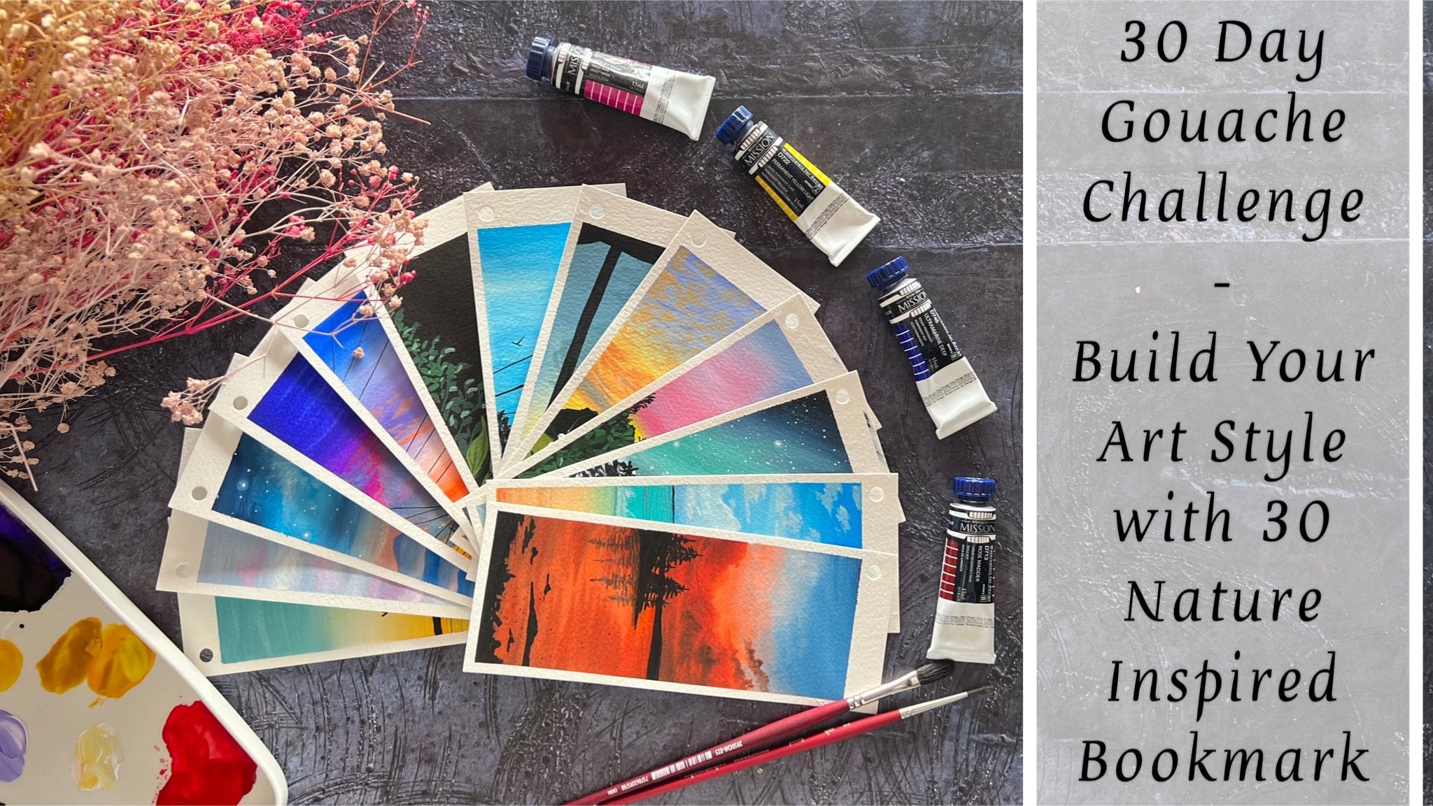
1. Welcome to the Class: Gouache is a versatile
and vibrant medium that has captured the hearts
of artists for centuries. Its unique properties make it
a favorite among painters, allowing them to
create stunning works of fat with depth of richness. Artists can achieve
subtle variations in hue and tone by mixing
gouache paints on a palette, allowing for endless
possibilities in creating different moods and
atmospheres in their artwork. Hello everyone. I'm
mashing Taparia, a chartered accountant
by profession, and an artist by heart. You can follow me on Instagram under the handle
creatingfromtheheart, to follow my Creative journey. You can also visit
my store page, creatingfromtheheart
store, but you will find our handmade and
journaling supplies. I welcome you all to the Beginners Meadow
Painting Class with Gouache. In this class, I will guide you through the
step-by-step process of creating ten beautiful meadow
landscapes using gouache. Each meadow painting will
showcase different elements, such as rolling
hills, wildflowers, trees, and peaceful skies, allowing you to explore various aspects of
landscape painting. By the end of the class, you will have a collection of ten stunning meadow
paintings reflecting your newfound understanding of gouache techniques and your
unique artistic expression. These artworks will serve as a testament to your growth as an artist and inspire you to continue exploring the
world of painting. Throughout the
class, we will cover essential techniques,
color mixing, brushwork, and composition, ensuring
that beginners feel comfortable and confident
in their painting journey. So you do not require any prior painting experience
to join this class, as I will be discussing all of the Basic Techniques in the
beginning of the class for you to practice and
join us directly into the class and Paint these beautiful Meadows along with us. Gouache is a forgiving medium and hence font to
play along with. So come join me for an enjoyable and
Creative journey into the world of meadow
painting with Gouache, unleash your creativity, learn
valuable skills and create beautiful landscapes
that will bring joy to both yourself and
those who behold them. So without further ado, I will see you guys into the
next lesson of this class, wherein we discuss all the
Basic Materials and Basic Techniques before diving into the Class Project for day one
2. Materials Required: So let's have a look
at the materials that you would need
for this class. The first thing, I'm going
to be using this sketchbook. This sketchbook is made of
270 GSM, 100% cotton paper. The sketchbook can be
used on both sides, and it is hand stitched. You can find similar sketchbooks
as well on our website. So I'm going to be
using this sketchbook for each of the
paintings of this class. If you have a closer look, you can see the
texture of the paper. It's a little rough grain, 270 GSM, but 100% cotton paper. You can use any paper, which is 250 GSM and above, but need not be 100% cotton. It's okay, even if it's 50% cotton paper since we
are working with guash. So I'm going to use this A five size landscape
paper sketchbook for each of the class projects. If you want, you can
even use loose paper of any preferable size that you wish to go ahead for painting. Coming to the next
important material that's going to be the pins. We are going to be
using in gauche panes. I'm going to use in this set of 25 color gauche set from
the plan flash panes. You can use any gauche
pines in the form of tubes, jelly cars or these
bottle gauche panes. If you want, you can
even use poster colors. Make sure you're using
them of a good quality so that you have an opaque look
and not a translucent one. Next, I'm going to use in a masking tape or
a washy tape for taping down my paper for each of the class projects for
the coming ten days. You can either use a masking
tape or a washy tape, whichever is available
at your end. Coming next to the palette. I'm going to be using in
this airtight palette, wherein I will pick
in the colors from the jars and mix
it on the palette. I do not clean this
palette frequently because these paints can easily
be re wetted and re used, so I do not wish to waste them. Coming to the brushes, I'm going to use
in these brushes from the brand Princeton. It's going to be a flat
brush, some round brush, and a liner brush, or you can use a detailer
brush, whichever you wish to. I'm even going to use in a spoiled bristle round
brush for adding in details. Next, you would need jar of clean water for
each class project. Make sure you have clean water. Otherwise, the paints
may turn muddy. I would be needing a rough
cloth or a tissue to d excess paint or a dab of
excess water from the brushes. So these are all the materials that you would be needing for the coming ten days for
each of the class projects. You can either use a paper, and in case if you're
using a paper, make sure you have a surface
to tape down the paper. Make sure you tape down
on a movable surface so that it's easy for you to adjust as per your
hand movements. For the paints and
palette as well, you can go ahead
with whichever brand is available at your end as it's going to be more
about the techniques rather than the
same exact sheets. So grab all your materials, and I would see you guys
into the next lesson and discuss some basic
techniques about guash.
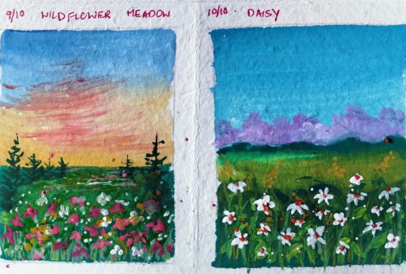
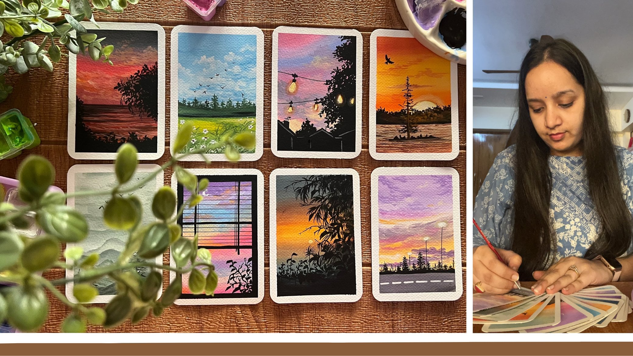
3. Day 1 - Evening Meadow: Let's begin in with our
class project for the F1. I will begin Masking down the paper on all the four edges. I will just be doing this
for the first Class Project. For the rest of the
Class Projects, I will already have
my paper taped down. So I'm going to use in
this printed Masking Tape, which is actually a washi tape. You can even use the simple
carpenter Masking Tape. That's the cream or the
white tone masking tape to tape down your paper
on all the four edges. Make sure after you add in
the layer of Masking Tape, you run your fingers
firmly on all the edges of the masking tape so
that the paper and the Tape are attached to
each other firmly. If there will be any loophole left in-between the paper
and the Masking Tape. The paints will flow into the edges and may
ruin up your edges. So it's very important to
make sure that the paper is taped down firmly
on all the four edges. I'm first going ahead with
one of the larger site, then decide exactly adjacent, exactly opposite to that, and then the rest
of the two sides, while removing in
the Masking Tape, also makes sure to go
in very carefully and remove the masking tape
which was laid last. I'm done taping down my paper. Now let's begin picking up the colors for this
Class Project. For this Class Project, I'm going to go ahead with the
shades of violet and pink. So in this set, I have two tones of violet
and tone of pink, which is the magenta color. Apart from that, I will
be needing a little bit off the white color later on, the green tones we
will discuss when we begin painting
the field space. Now I'm first going to beginning with the
darker violet color. I'm not going ahead
with any pencil sketch. We are directly
going to go ahead with the paints and
adding the details. I'm first going with
the darkest tone of the violet at the top. Now in case if you do
not have the light of pistil violet or a
lavender color already, you can simply mixing white
to this violet color with a little pinch of pink to get
a lavender kind of a tone. I'm first going ahead with
the darkest color at the top. Make sure you get the color in a perfect consistency so
that it glides smoothly. But make sure you do not
add in a lot of photo. Otherwise, it will
begin acting like watercolors instead of acting in as opaque gouache paints. Now I'm picking up this lighter lavender color and I'm going to apply it Next closer to the violet color and blend
both of these colors. Now since both of these colors will blend into
each other easily, I'm not using white in-between
them to blend them. In case if you do not have
the lavender face till color, you can use in White along with your violet to get in a lighter
tone of the violet color. So I'm taking the lighter color till a little below space, and then we'll move
on to the pink color. Now this is already
a pistol pink, magenta color that
I already have in. But in case if you do
not have a pastel pink, you can simply mixing
white to any of your pink tone to get a
little piece subtle pink, but make sure you do not make
it to pasting or too light. Now I'm going to pick up
the pink color and begin blending it with the
lighter violet color that we've added in. Now, make sure again, you do not put in too much
water into the paints. Pick it up in a little
bowl consistency so that you get an opaque look. Now, I'm just going to go
ahead add in the pink color below the lilac color and
blend in both together. It may take in a
little while for you to get the Blending stripe, but make sure to go ahead understanding the techniques
that we already discussed. Wherever you feel you need a little bit of
white to Blending. You can go ahead use in white instead of avoiding
in any muddy tones. You can see how I've taken
the pink a little over the lighter violet
tones and blended it well and just add it
onto the edges as well. Now I'm just marking a
clean pink line here because the rest of
the bottom space is going to be a field space, which I will be going ahead with the green tones I'm giving
in a very straight line. So two-thirds of our Paper is the sky and one-third is
going to be a field space. Now for the field,
you can go ahead with any green tones that
you wish to work with. I am using in the sap
green color from this set. And I'm going to add
in a little tinge of the black color which is
already on my palette, and mix it to the Clean to create a little
darker green tone. You can directly use a darker green color if you
have so in your palette. Now, using this green mix, I'm just going to
add it completely as a base layer onto the entire whitespace
that is remaining. If you want, you
can go ahead with 22 shades off the
greens as well. For the first-class project, I want to keep it pretty
simple and easy to go with. I'm just using in green tones
and I am just picking up little different
tonal variations of the same green and adding
it into the entire space. So now towards the top
side you can see I'm using a little lighter
consistency than what I've used towards
the bottom side. Going in very
carefully closer to the horizon line where
the sky is ending. So as to add in the base
layer for the field. I've just added a very
simple base layer for the field and the sky first. So for the sky, we
went ahead with two tones and for the field we went ahead with green tones. Now I'm just picking up a
little of the lighter green, which is on my palette
and giving him let him lighter shades as well
into the field space. So very randomly
I'm just adding in some lighter Strokes and
blending it with the base layer. As I told you, you can go ahead with multiple tones of greens. And the field is such a
natural space that you can have any greens on any place and it will still give
in an actual look. Now we'll wait for all
of these to dry first. So now my sky is completely dry it and I'm going
to pick up a little of the white and mix it along with the violet and the pink tones to create lighter tones
to begin adding in the Cloud details
into the sky. Make sure that you
begin adding in these details once your sky
is completely dried in, I'm going to pick
up the color in a little softer consistency so that it blends easily
into the sky as well. I'm using a smallest
size brush and just using the tip of the brush, I'm going to go ahead, add in simple Strokes into the sky to actin as the clouds. I'm going ahead with
simple half see kind of Strokes
closer to each other. So closer to the violet color. I'm going ahead with this
lighter pink stroke. I've mixed in a little more off the white to the
pink color to get this lighter consistency
so that it's visible perfectly onto the
violet color Strokes that we are adding onto. You can see I'm going ahead with very light strokes closer to each other and just creating
little cloud effect. If at certain spaces you want, you can use a damp
brush and blend these into the base
layer as well. Whenever I'm lifting any
color from the palette, I'm dabbing it onto a tall so that the excess
paint is dropped off. Now I'm just using
a damp brush and blending a few strokes
into the base layer. You can see wherever
I'm using a damp brush, the clouds are
having a soft edge, yet a blended look, but still they are visible with the lighter tone that
I'm adding on the top. Just the edges are
looking blended into the base layer
having a soft edge. Now similarly, I'm
just adding in little cloud highlight towards the left side as well on the lighter purple tone
that we've used it. I'm using in the pink mixed in with a little bit of white. So basically you have to use a little lighter tone then
the already pink color that you use to in
the sky so that it stands out onto the pink
and the violet tones. You can see this color
is standing out even on the pink tone because they've added a little
white to this pink. Now, I have further added
a little more white to get a little more lighter
tone to add in little cloud effect onto
the Ping space as well. Later on, I will go ahead
using a damp brush and blend. These are little, so I'm just adding in little Strokes first. And then using a damp brush, I will just blend the edges into the base layer so that it
has a little soft edge. You need to go with a
very light hand adding in these Cloud details so that you do not activate the base layer. Remember you are
working with quash, which is a reactivating medium. If you will, add in a lot of pressure that basically
of colors will get activated and blending with the top layer colors that
you are adding, creating in Third color forming rather than having in the cloud
effect there. So make sure that you go ahead, add in these layers very soft
handedly so that the base Leo's do not get activated and all the colors stay intact. So using a damp brush, I've blended the bigger clouds that I have added
on the pink tone. And now I'm just going to add in little highlights
onto the Ping space. You can see I'm not going ahead
with a lot of highlights, just little highlights that I'm creating it on the right side. And after, We'll move on to
the details into the class, feel less bad for this
first day of the meadow. I'm going to keep the
field very simple with just the Grass Strokes
without any Florals. So closer to the horizon line, I'm just going ahead with little more details
of the clouds. You can see I've been
using simple Strokes, have see Strokes and little cloudy shapes to add
in these Cloud details. I'm going in very soft, candidly and very slowly so
that I do not overdo these. And after every step
wherever I feel, I need to blend these clouds. I'm using a damp brush and
blending in the edges well, now to the green color that I
already have on my palette, I'm adding a little bit of the white and black color to get a little basal green color, which will stand out onto this darker green peace
Leo that we already have. And using this mix of the green, I'm going to begin adding
in this simple Grass talks. So I'm going to use
the second type of Grass Strokes that we had discussed in the
technique section. That's giving him very
loose Grass Strokes will be adding a little
offer leaf structure as well in-between. So far beginning, I'm just going ahead with loose
strokes like these, moving in different angles. Make sure you use the
smallest size brush. I'm using a brush which
has a pointed tip, or I will shift into the liner
brush if needed to get in much more thinner strokes so that I can get
the details try. But through this Brushes, well, you can see I'm getting in
very fine Strokes closer to each other to create
in the grass effect. Now I'm not taking the height of the class completely
till the horizon line, just in-between a
few Grass Strokes. And I'm taking till
the taller space till the horizon line. Rest of the Class Strokes
you will see it's only in the two-thirds pays off the field area that
we have mapped out. I'm going ahead
very loosely with these Grass Strokes
crisscross to each other, moving in different angles
and directions altogether. Makes sure that you add them entangled into each other
to give in that notch, to look, do not add in
simple straight lines. Keep them till twist it turned around so that it has
in that natural look. I'm almost done with
the first layer of the class talks after this, as I told you, will be adding in a little off the leaf details in-between these Grass Strokes. We won't be adding in any
Florals for the first two days. We'll just keep it pretty
simple and easy to go. Now in-between you can see I'm adding in some of the
Tico Grass Strokes, adding in some thick volume to these Grass by just
dabbing in the Brush and also pressing the
belly of the brush and lifting it once I'm
satisfied with the land. So we are ready with
the first player now for the Grass Strokes. Now to the photosphere of the Grass talk is drying around. I'm going to go ahead, add in a small mountain
range onto the horizon line. For that, I'm going to use in the brown color which is
already on my palette. It's a bond sienna
color mixed in with a little bit of a
yellow ocher color. And I'm just going to add in a very simple mountain
range on the horizon line. I'm going to add a
very smaller one. Does not add it to bag because we're just
going to showing that this mountain range
is quite far from the view In the center, I'm
going to decrease the height of this
mountain range further, you can see throughout
the horizon line, I'm keeping the height
of the mountain varied and not
keeping it the same. I'm trying to vary the height and tried to make
it look natural. In case if you want, you can add in two layers of
the mountain by adding in, one with the brown tone and one with a darker brown
or black color. Once the brown tone dries out. I'm done adding in the mountain range
on the horizon line. I will just define it
a little more well, so that it's ready. Now for the next
layer of the leaves, I'm picking up the
sap green color, mixing it with a
lighter green color. You can go ahead mixing a little bit off your
lighter green tone, or you can add in yellow to your sap green color to
get a light green color. I am adding it a
little bit of white to my already existing light green. Adding in a little bit of the sap green color
to that to get a little lighter tone
of the green than what I have previously used
in for the Class, true. Now, using this color, I will add in little
Grass talk highlight and then begin adding
leaves with this color. So basically this is a lighter green mixed with a little bit of bytes so that it stands out opaque onto the darker
spaces as well. You can mixing yellow along with your sap
green color with a little bit of white and a little tint of black
to get a similar color. In case if you already have
a lighter green color, you can simply mixing
a little tinge of sap, green and white to that to get a lighter green tone to begin
adding in these Strokes, Grass Strokes, I'm going
to add in very limited. Along with that, I'm going to begin adding in the leaf effect. Now, I'm going
ahead with a mix of leaves with this
lighter green mix, you can see it's
standing out right onto the lighter green stroke that we already used in the first
layer of the grass. So you need to have these two to three variations
of the greens. Now I'm just taking
a few Strokes about the mountain range and overlapping the
mountain space as well. Just a few of them, not much dressed all
of them you can see it's into the grass
field space only. So basically we have used in so many different tones of
greens in the base LEO, we used a very darker green
mixed in with the black tone. Then we went ahead with a little bit of the
white and the green. Then we went ahead with a further lighter green tone to add in for the
highlighted space. Now in the center your, I'm taking one stroke a
little into the sky as well. I will just shift into a little darker tinge to add in the village
to this because the lighter one is not visible clearly into the sky like this. You can take one or two
strokes into the sky as well to show the variations
into the field as well. But not a lot of it. It's not necessarily to have the exact same green
tones that I am using in. You can go ahead with your own combinations
of the greens. This class is more
about playing freely with whichever color tone
is available with you. It's more about understanding
that technique and going in with the concept rather than following the
same color tones. Now I'm going to add in a
small moon into the sky. So first created a
very small white dot. Now using a damp brush, I will blend this into the sky beginning
in from the edges. So I have removed the excess
water now with a damp brush, I'm beginning to
blend and create a glowing space into the sky. Once this dries
out in the center, we will add in the moon space. So you can see I've
created a dull whitespace. Now to the center of this, I'm adding a small so-called, which is acting the moon. And rest of this piece
on the edge will begin acting as
the growing space. Make sure that you have a beautiful looking
glowing space. I'm just adding in
little more white into the growing space first and then I will add in
the moon space, you just need to use
a damp brush and very gently blend the edges
into the base Leo. So you will see the
edges begin to have a very soft blended look with the base layer color of the sky. You need to go in very slowly
and carefully with this. Otherwise, the edges be turnout sharp and entire base
color may get activated, turning it into a
paste violet color instead of this
glowing whitespace. Using the white
thick consistency, I will just add a small
circle in the center to act as the moon.
Around the moon. Now you can see a
dull whitespace, which is automatically acting as the glowing light
effect of the moon, which we have perfectly blended into the sky on
the edges as well. So we are ready with
our class project for day one already. Let's remove the masking tape. So as I told you that
Masking Tape that you added last
will go out first. So accordingly, go ahead, pull out all the
four Masking Tape. Make sure you pull the masking
tape against the paper so that it does not tear off the edges or lift up the colors. So you also closer. And the final look at
our painting for DB, one of these ten days meadow
challenge using gouache, you can see the beautiful
glowing space of the moon and a pretty simple grass
field that we have created. I hope you guys enjoyed
painting this for the one. I will see you soon into
the T2 Class Project
4. Day 2 - Sunset Meadow: Hello, everyone. Welcome
back to date two. I already have my
paper tape down, as you can see, and
we are going to begin picking up the
colors for the sky. This time for the sky, I'm going to use in the blue color, which is a sky
blue pastel color, and this yellowish orange tone, which is a creamish
yellowish orange color. So I'm going to pick up
both of these colors. And in between for blending
both of these colors, I'm going to use in
the white color. So I will keep the
white as well ready. I'm going to take a little of the colors on my palette
as in when needed. I already have a little of
both the colors on my palette, so I will only remove
excess how much needed. Now, I'm just marking a rough
horizon line this time, so it's going to be two third
is going to be the sky, one third will be
the field space. I'm going to begin with
the blue color first. Okay. Now, as you can see, this is already a
pastel blue color. But in case if you
do not have one, you can simply mix
in white along with your Cilian blue to get in a
pastel blue color like this. At the top, I'm
beginning in with a bold layer of this blue color. I'm going ahead with an
opaque consistency of the color so that I do not
see the underneath paper. Otherwise, quash pins will begin to act in as water colors. Now, next, I've picked up a little bit of the white color, and I'm beginning
to add in the white underneath the blue and
blending both of these. Now the reason to add in
white in between here is because when
the yellow orange and the blue may mix together, they may form in a
little greenish tone, which I do not want in my sky. That is the reason I'm using a little bit of the
white color in between. You can see it's a
very light blue tint that's coming along
with the white. Now, when I'll go ahead with the yellow orange color at
the bottom space of this, you will see there will be
no green tones forming in. I'm going to pick up
this yellow orange tone and add it into the
rest of the sky. Again, I will pick up
a little white and then blend it with
the top blue space. In case if you do not have
this yellow orange color, you can simply mix in
ermlion light yellow and a little bit of white to get this pastel yellowish
orange tone. I have added it
very carefully on the horizon line defining
the horizon line well. Now I am going to
clean my brush pgin white and then begin blending both of these at the top space. Make sure you lift up white
in between for blending, only then you will get
a smooth transition. Now you will see the
lighter yellow orange going towards the
blue site creating in the perfect transition from the darker tones towards the lighter tones at
the bottom space. Very carefully, you can see, I'm just blending
the sky and getting in a good transition
into the sky. For clouds this time as well, we are going to go in
with simple strokes just as the day one. For now, let's begin with the
base layer for the field. We are going to go ahead
with the green tones. Now again, here you can go ahead with any green
tones that you wish to. You are free to use in lighter whichever tones you wish to. I'm going ahead with a bit of the light green color
towards the left side. Now, picking up a little of the yellow occur towards
the right side, and then I will move on to the darker green and
the brown tones. Using a little off the
burnt umber color, which is already
on my palette and adding it towards
the right side. Basically, you can see
I'm just going ahead with random field tones here and blending them all in
to get in effects. Now, in the rest of
the bottom space, I'm just going to go ahead
with this darker green color. If you want, you can mix in a
little bit of your black to your sap green color to get
a little dark green color, and I will blend all of these layers well
with each other. This time, also for the field, we are going to go ahead with
very simple leaf details. We won't be going ahead with florals for this class
project as well. From the next class project, we'll begin adding in florals
as well to our paintings. Now, using a dam brush or
the base layer colors, you can just go ahead and blend all of these
well into each other so that you have the perfect transition instead of having in patches
of the color. So you can see I'm just
lifting a dam brush and blending the lighter
green with the darker green, the yellow ca with the green, the browns with the
yellow c and the greens, as well as I'm adding
greener tones onto the edges on both the left and the
right side at the top spaces. That is how you can create in little natural effect into your field spaces by blending
the colors into each other. You can either use damp
rashes or you can use the base layer lighter or darker tones to get the transitions. Now let's wait for this
to dry completely. Now, my sky is completely dried, so I'm going to go ahead, add in a mountain range on
top of the horizon line. For that, I'm going to use the same burns the
burnt umber color, whichever you wish to use in, and I'm just going to begin
adding in a mountain range on top of the horizon line
just about the field space. So I've just lifted
a medium round tone, and I'm going to begin adding in on top a the horizon line here. And again, here you can see, I'm going in with a very
rough shape of the mountain. In the previous class project, the mountain range was of
a very smaller height. This time, I'm going ahead
with a broader mountain range. I'm going to show in a sunset effect behind
this mountain range. So I'm going to
show a setting sun this time behind the mountains. Now, to the brown, I'm just mixing in a little tint
of the black color, and I'll add little
darker effects to some of the mountain range
on the right side because you can see blending
in with the yellow. It's turning a little lighter, so I just want to give in
a little darker effect. So now you can see it's looking kind of two mountain ranges
front and back as well. Make sure that your
sky is completely dried only then you add
in this mountain range. Otherwise, the base layer
colors begin to get activated. Also, you need to be
sure that you do not add in a lot of pressure while
adding in the layerings. Otherwise, the base
layer colors gets activated again because
this is water based quash, and they get reactivated
easily with water. Now, next, I'm going to
lift up a little bit of the black color or you can pick up a very dark green tone, and I will begin adding in
little effects into the field. So I'm going to add
in little stones kind of a detail into
the field space. So using a smaller size round
brush and the black color. I'm just going to create little patches of the
black on the greens here. I'm going to go ahead
very roughly and naturally to create a
natural looking effect. I'm not going to add a
lot of it at one space. I'm just going to show in some rocky or muddy effect into the field space like this. You can see I'm working in very loosely and creating
in this effect. Now, similarly, I'm going
to go with a little of this effect onto
the left side as well. You can see I'm going
ahead very roughly. Now, I'll directly take you to the leaf part of this painting. So I've quickly added in
the first two kind of leaf effect that we had seen during the
technique section. So I'm just going to go ahead, add in little more
layers on top of this. So I've basically used in
different tones of green. I will just show you on a
rough piece of paper as well, the different strokes for
the leaves that I've used. Basically, the simple
one stroke leaf that I thought you in the technique and the simple grass strokes. I have just used in two to
three different green tones to add in this effect. Okay. So a two minute clip of this could not be recorded. That is the reason I'm
showing you again in a rough sheet wherein I can show you the kind of
strokes that I've used in. It's just simple strokes
of the leaves that I've used in like this that we discussed in the
technique section. You can see and I've used in the simple grass strokes that we discussed in the
technique section. The only thing I've used it only at the bottom of the
field, as you can see. Plus, I have only chosen
in different green tones. As I told you, you are free to choose in your green tones, whichever go perfect with
your color combination, as well as which are
available in your palette. For overlapping,
always remember, let the first layer be dried completely and then go
ahead with a second layer. Do not rush with two
layers together. Basically, only these simple strokes that are used in here in the field space after adding in those
black rock details, you can see they are there on both the left and
the right side. Now I'm going to squeeze out a little bit of a
fresh black color. I've just lifted a little
of the black color, and I'm going to go ahead with a little more details
into the mountain range. I'm just going ahead with one
more layer of the mountain, as you can see in front of
the brown mountain range. I'm using a bold black color. My first layer of the mountain
range is completely tried. I'm not adding in a lot of
pressure onto this one. I'm going very light handedly so that the
brown layer does not get reactivated and mix
in with black giving in a darker brown tone
instead of the black tone. So going in very lose here to create in this
second mountain range. So done adding in the
second mountain range. Now let's move on to the
details into the sky. So for the sky, first let's
begin with the cloud details. So it's the same strokes that we used in the first class project. I'm going to go with
the same strokes using in a smaller
size round brush. So I've picked up the yellow orange color without any white, and I'm just beginning to
add in smaller strokes. I'm just taping off the
excess paint which I felt was on my
brush onto a cloth. You can either use a
tissue or a cloth tile, whichever you find convenient. Now I'm just using
the tip of the brush, and you can see I'm adding
in very simple strokes. My hand is moving
very light handedly. I'm not adding in any pressure. Now using a dam brush, I'm just going to run
it towards the edges of these so as to blend it
into the base layer. You can see I'm just
dipping my brush into water and using this
dam brush on the edges to blend it into
the base layer of the sky so that it has
a blended cloud effect. Now, similarly, I'm
just going to go ahead, add in little of the
strokes here as well. Then we'll move on to
little of the blue strokes as well and then add in
the setting sun effect. We're almost through
the field space. It was again, a simple leafy field space that
we were painting. This time we did a
little difference in the base layer of the field. We used in two to three
different color tones. Then we added different
mountain ranges, and this time,
instead of the moon, we are going to have
a setting sun effect. Now, to the yellow orange color, I've just mixed in
a little bit of the white color to get
one cone lighter effect. And now using this
lighter color, I will begin adding in
little highlights as well. You can see the
movement of my brush. I'm moving it in half s strokes, a little curvy strokes and very small strokes closer to each other to
create a cluster. And then quickly
using in damp brush, I'm blending these strokes
into the base layer so as to create a very well
blended effect of the tones into the sky. Now I'm using the blue color, and I'm beginning to add in this blue color stroke
over the yellow color. Now to the blue as well, I've just added very
little tinge of white so that you do not
have any green tones. Go in very light handedly with the blue over the yellow as well so that the yellow color in the bat does
not get activated. Closer to the mountain range, go in very carefully
if you're adding the cloud effect completely
till the mountain range. So the same way as
I was adding in the cloud effect using in the yellow orange color
over the blue tones. Same way I'm using
the blue tone over the yellow orange color
here to create in the cloud effect
into the sky over the yellow spaces closer
to the mountain range. You can see I'm trying to use in different shapes
of these clouds. I'm not adding them in
the regular cloud shape. These strokes, also,
I'm not adding them just in a simple
pattern something. You can see I'm just
trying to vary them every space so as to
make it look natural. If you ever observe the sky, you will see the
clouds are all in different patterns moving
in different directions. Now I've picked up a little of the orange mixed in
with white to add in little highlights with
the yellow orangish color onto the yellow tones along
with the blue color tones. Now, using a little
darker blue tint, I'm just picking to add in little cloud effects closer
to the blue color as well. So I've just picked
up a little of the blue added a little
tint of a darker blue. You can add in a little tint of the pc or the cellin blue, whichever you feel right. Or if you directly
have a cellin blue, you can just use it one to then the baser sky color and add in little highlights over to
the blue tone as well. Now, again, if you do not
want to use a darker tone, you can turn it one to further lighter than
the basier sky color. On the right side here, you can see I've added a little more of the white and turned it into a lighter tone than
the basier color. Now using a damp brush, I'm just going to blend it on
the edges into the sky and create this lighter cloud
effect at the top space. That is it for the
cloud effects as well into the sky,
pretty simple one, simple strokes, just
blending and going in smoothly and with very low
pressure on the brush. Now let's begin creating
in the sunset effect. For that, I'm going to
use in this orange color. I'm just going to
pick up a little of the orange color
onto my palette, and we'll begin
adding in the detail. Now, for adding in
this sunset effect, go in very slowly. Just as we created in the
glowing space for the moon, we are going to create a glowing space for the sun as well. So I'm first going ahead, adding in a small
orange color circle. Now, using a dam brush, I will blend this into the background and
create a glowing space. Onto the edges, I'm beginning to run in with the dam bruh. You can see the circle
is turning larger. It's going. It's
having a dull look. It's blending in with
the paste layer. I'm going to pick up a little more tint of the orange color, add in and keep on blending. If you want, you can even pull
out little strokes to show in the sunset effect and the
moving light of the sun. Now, the most important
thing here is that your edges should be very
well blended into the sky. They should not stand out sharp. You can see on the
edges, the orange color. I'm just going ahead
with a dam rush, blending it perfectly into
the base layer of the sky so that we do not have that dull
space looking separately. Now, I'm just pulling out a little strokes towards
the outside as well, trying to show a little of
the Sunday of an effect. With a dam rush, I'm
just moving that around. Now in the center, you
can see slowly I'm beginning to form in a
little darker orange space, which is going to be
the actual sunset area. Now, I've just added a
little orange yellow tint, and I'm just going to blend all of these again and turn it, you know, a little
more glowing space before we add in the
final sun effect. You can see it's a
little tedious task to get the glowing space right because the glowing space edges, you want them to be soft
and blended into the sky. You do not want them to
stand out as you know, very rough edge circle. So it's very important to
go ahead very carefully and build in this glowing space
with soft edges. Okay. Now, finally, to
the center of this, I'm going to add in a
bold orange circle, which will act in as
the sunset effect. You can see the entire
light orange space that we created around this is looking as the sunlight effect falling onto the
top of around it, creating in that perfect
sunset kind of an effect. M. So I'm finally done adding in the sun as well. You can see how pretty
this is turned out, and especially the
glowing effect around it is making it look as
the perfect sunset effect. So now let's peel off
the masking tape. Go ahead very carefully. You can see I pulled it
towards the paper side, so the paper began to tear off. I will pull it very
carefully against the paper, and you can see I
could manage to just handle it well
towards the left side. I will just give it a
little correction with the purple tone because I pulled it towards
the wrong side. So it's very important to
pull the masking tape very carefully and that your paper isn't wet and the edges
are completely dried. That's why it's very important. So here's the final look at
the painting for day two. You can see the glowing
effect of the sun, the very well blended edges of that glowing sunset
effect into the sky. I hope you guys enjoy painting
this day two with me, a beautiful sunset meadow
with very simple details, but something new to learn,
something new to create. Okay. Thank you so
much for joining me. I'll see you guys soon into the Day three class
project till then, make sure to upload
your class project and drop a review. Okay.
5. Day 3 - Tulip Meadow: Hello everyone. Welcome back to T3. After ten days Meadow
Painting Class. Today we are going
to be painting a beautiful sunset Tulip
Meadow for the sky. The two colors that I'm
going to use in is going to be the three and the
yellow, orange color. Now for the gray color, you can just mixed
in a little tint of lack and a little tint of
blue to your white color. For this yellowish orange color, or a deep yellow color, you can either mixing
yellow, orange, and white. You can simply mix in a little bit of dark yellow
with a little tint of fight. Now both of these colors are in a little pasty consistency, but still in Blending
of both of these, I will be using
white in-between. I'm beginning with
this light gray color at the top space. I'm using the color in
a bowl consistency. I've just lifted a little of
the color from the jar onto my palette so that I can
spread it across smoothly. We haven't been doing much Pencil sketch for
this class until now. And even in the future, projects will have very
minimal pencil sketch. So now I'm going to pick
up a little tint of white with a very little
tint of the brown color, Justin, top of fight, and begin adding it in the center space and blend it
along with the gray cover. Now, when you will add in the deep yellow color
just below this brown, you will have a
little orange-ish transition into the sky, creating in a pretty
Sunset effect. I'm just blending in both
the colors very smoothly. You can see with the
help of the white color, blend go in very smooth without any sharp edges or unevenness. Now using the yellow,
orange color, I'm just beginning
to add it below the brown and white
tones that we've added. This Class Project as well. To start off, our paper
is going to be the sky and one-third is going
to be the field space. So I'm just going ahead
with a yellow tint and I will define the horizon
line as well soon. But I'm just going to use the yellow color
and blend it all. Now I have a little of the reddish orange color
already on my palette, which I'm using below
the yellow color. You can mixing a
little tint of red, white and orange and get this reddish orange color
and blend it with a yellow. You can see this is giving
a beautiful sunset hue and it's having
in the warm tones of red and orange forth. So this is going to be at
our horizon line here. Now using this
color only you can see I'm trying to define
the horizon line, taking this color into
a straight line, your, the rest of the bottom space is going to be the field
space where we will be Painting very simple tulips and adding in the
greenery spaces. So far the base layer
of the field and picking up a little of
the sap green color. And I'm just going to blend it with a little bit
of the black on my palette here and
just add a very basic, basically a color of this greenish dark color into the entire
bottom field space. You're also, if you want, you can go ahead with multiple tones of green
into your base layer. I'm adding in a little tense of brown as well onto the edges. And now I'll pick up
a little more off the darker green tint
additive to the rest of this piece and blend this
all suggest in-between. You can see I've added in
literalistic brown patches to create little drama into the
base layer of the field. If you want, you can
avoid this step as bad. Because later on we'll
still be adding in a lot of color variations
into our feel. Now at the rise in line
going very carefully define the horizon line well so that you do not run into the sky. This is just the base layer for the field will be
adding a lot of Florida that in most of these green colors
will get hidden up. So do not worry,
even if you have little white caps
left in-between, it will get easily
covered up when you begin adding
in the two lips. Now I will just pick up a little of the brown
tint and add it onto the edges of the field
here and blend in a little Any simply just very
little effect Blending in these brown on the edges
along with the green color. Now my sky is completely dried, so I'll go ahead adding in little cloud details
into the sky. For that, I'm mixing in White along with the deep
yellow color that I used in the sky and creating in a
lighter pastel yellow color, I will begin adding in
the details into the sky. So quickly mix both of
these colors on my palette. That's the deep
yellowish orange color, along with a little
tent of fight. And go ahead adding
very simple clouds. The process for the clouds
is going to be the same, going in with simple Strokes
closer to each other. And then using a damp brush
blending in a little of these edges of the clouds into
the base layer of the sky. Right now, you can see I'm just adding in very small Strokes. Make sure you do not lift up
a lot of color altogether. Otherwise, you'll get in
bigger patches of the colors. Pick up little
Colors path by path, so that you haven't smallest
Strokes and you do not lay down a lot of color at
one specific place. Also be a little careful. The field area is still wet. If you lay your hand
onto the field, that colors will get lifted. So that is the
reason I'm trying to maintain a little
distance from the field and my hand and going ahead carefully adding
in the sky space. If you want, you can wait for
your field to dry as well, and then beginning with the
Cloud detail into the sky. So using this yellow
and white mix, I've added in a diagonal line of cloud effect into the sky. Now using the damp brush, I will quickly begin blending
this into the base layer. I've just blend it a little of these clouds into
the base layer. Now I'm going ahead with
a little more details of the clouds into the
top area of this guy. You can see I'm dabbing
my brush onto the plot. So that takes us
paints on my brush are put in there and I do
not play excess paints. I'm going ahead with
better limited colors, blending them into the base
layer as well very carefully. Using a little
yellowish orange color here without adding any White, I'm adding a little
patch as a cloud and now using a damp brush and
a little tent of fight, I'll blend this
into the base layer and create a little cloudy, yellowish effect into the
gray area of the sky. Using the damp brush you can see I'm just running
on the edges, smoothing out the edges, Blending it into the sky, creating a jumbo Cloud onto
the gray space of our sky. One important thing to keep in mind whenever
you are Blending the edges using a damp brush to not add in a lot of pressure. Because if you will add
a lot of pressure that basically are colors
will get activated, then both the colors
may mixing together and you will not get
into soft edge loop. You may at times even
getting muddy tones if the colors do not go
well with each other. So it's very important
to keep your hand very light handed when Blending
Acrylics layer on Laos, Sorry, Blending gouache
layers on layers so that the Fazio does not get activated
creating in a problem. Now I'm going to add in
a small white spot and create a glowing space out
of this and keep it there. Later on, we'll add the
details into this aspect. In the last two Class Project, we have just been adding a very simple flowing space
got for this Class Project, I'm going to go ahead
create and little trees of this glowing space to show
a setting sun effect. So just created a very rough
fight patch with some ways, as you can see, will add
the details on this. Once this dries out
or settles in a bit, you can create
trees in any form, any angles as you wish to. I'm just adding in little
more of the white to create little more brightness
into this glowing effect. Now, using the tip of the brush, I'm just pulling out
little of these rays into the sky space
like this to create that glowing effect
will be adding in the details sun look onto
this once this dries out. So this is just the
base layer that we are preparing to add it. Now using intellectual of
the pistol orange color, I'm just going to
add it a little into the center space here
to create a sun effect. Very simple, small sun in the center of
the growing space. Now using this Detailer Brush, you can see the fine tip. I'm going to pull out little of these orange trees as well. Be very careful by
pulling this out. I'm pulling it from the center
towards the outside side. And just pulling out very small raise as compared to
the white length. You need to make sure that
it does not go an extra long as compared to the
White growing space that you've created
in the background. Now, let's move on to the field. For the field, I'm
going to beginning with the pink color
for the tulips. So I have this magenta pink
color and I'm just going to pick up this color and put
it out onto my palette. You can see it's already
a pastel pink color. Now for the Florals, you need two to three different
variations of this color. For the first layer, I'm adding it a lot of
white to this pink still. It's already a pastel
pink you can see. And to that as well, I'm further
adding in little more of the white color to create a lighter color
for the base layer. Now I did not discuss
this flower in detail in the technique section. So I'm just going to give
you a quick way to add it. Firstly, closer to
the horizon line, we are going to
add in a bunch of flowers which are not
clearly visible to us. So it's just going to be very
simple patch of the color. Suggest using a size five and a size six brush
using in the Tape and the calendar bowl consistency
just keep dabbing small oval shapes
like these to make them look as Florals
in the distance, which look like a
cluster altogether. Now the reason that I'm leaving space in between
these is because I'm going to use different
color variations to fill in-between these two, add a little more effect. Now as I'm moving closer
towards the bottom side, I will begin increasing
a little proportion of these Florals to make them
much more closer to our view. Now, make sure with this you do not add a
lot of pressure. Otherwise, you will see
that the green calendar basically begins
to get activated. Also, you need to make sure that this color does not
have a lot of photo. Otherwise, it will not dry, opaque and it will not
give you that bold look. Now as I'm moving further
towards the bottom side, you can see I'm increasing
the length of these Florals. You can take a little off the Florals overlapping
the horizon line as well, which I will be doing with the next layer of
colors as well. For now, we're just
beginning in with the simpler ones closer
to the horizons line, you can see very
simple patches that you've added to actin as
the distance Florida. Now let's move on to a little
bit of the green tones. So I already have a lighter
green mixture on my palette. It's the light green mixed
in with a little tint of sap green and
the white color. As I told you, you
can go ahead with any green tone
that's available in your palette or that
you wish to create. You can create very
different green tones using in a little tinge of blue, black, brown, mixing in with your green color to get in different tonal variations
of the green tones. Now, I'm beginning to add in very simple ones talk
leaves out here. Then on top of this
will be adding in the closer Tulip effect. You can see this time
I'm going ahead with very bigger leaves
and the thicker ones. But again, these are
kind of one stock. I begin with a pointed tip, press the value of
the brush and lift up wherever I'm satisfied. I'm going ahead with
a lighter consistency of the green as you can see. So I will quickly
add analysts love these leaves into
the bottom spaces. You can see I'm going in
different angles of the leaves, not keeping them all
in straight angle and killed creating different
kinds of punches together. Now using this little
different green tone, I will begin adding
in a few more leaves with this different
green color variation. It's a mix of this sap green, white, and black color. You can create, again, any green tone that you want and using your to add in the details Now very light handedly, you can see I'm
overlapping a little of these leaves as
well onto each other. Most important thing
again, you're, is that you need to keep your
hand very light handedly. If you will, add in a
lot of pressure that basically a green color
will get activated. And both the leaf colors
will mix into each other. Instead of having a
distinctive look, I'm just adding in random small leaves us where
we are still left to add in the main focus tulips at the bottom of the field. Now to this pistol pink, I'm just adding in a little
tinge of the red that's on my palette to get a
little darker color. And I will begin
adding in little of this darker strokes into
the spaces that I've left out you to create in the next layer of details
of the tulips at a far off. So basically in this to
the horizon line view, you are just going to
have in a batch detail of different tones of the pink to make it look
like a Tulip field, which is very far from
your view because it fits. You can only see a
pink color patch. So you can see the
different tones of pink closer to each other. Those are visible you now I'm adding in
a lot of white to the pink and I'll begin
adding in the main tulips. So make sure this is a very light color for the base layer. I've just added in
to leave kind of details very close and
stuck to each other. In the center, there is
a little tripping point, kind of a heart shape with a little circular at the bottom. So this is the first layer for the tulips that I'm adding. Now, these tulips that I'm adding are very
close to our view. That is the reason
we are going to add little details on top of this. Make sure you use this color
in a very bold consistency. Do not add a lot of water. Make sure the color is thick enough only then it will stand out visibly and gold
onto the green spaces. Onto this, we're going
to add in some Strokes using in the darker tones to
make it look like a tulip. Now, very randomly you can see I'm adding in these
bigger tulips. We'll even add one or two onto the entire pink
patch that we've added. You're at the top to
make a few tulips overpowering or covering
the background species. So I'm just adding
in this false veer off the two lips,
as you can see, after you add in this
thick layer of the tulips, make sure that these layers
are completely dried. Only then adding the Strokes that will be adding
in for detailing. Otherwise, the colors
will get mixed up and you will not get a
little distinctive low. So you can see I've just added in a few tulips urine there. Now I'm just going to
pick up a little of the green stores and add a little leafy effect inbetween at the top spaces
you are as well. Just very little detail. And again, I will overlap it
with a little hint of pink trying to show in little
leaves Asbell in-between. Now I'll wait for
this tulips to dry completely and then move on
to the next layer of details. Now my tulips are completely dried and I'm going to beginning with the detailing on top
of this now 40 dealing. I'm going to use a liner brush and I'm going to
pick up a little of the crimson color and
mix it along with the thing tone to get
a boulder pink color. And then begin adding
in the Strokes Now for adding in the detail, make sure you use a brush
which has a pointed tip so that you can get in the fine
strokes on top of the Tulip. So now onto this lighter layer, you can see I'm just
adding in some Strokes, creating in the details
onto the floor. So basically you can just
add in three Strokes analytical at the top space to give him the detail
to these two lifts. You are, as you can see, I'm just adding in little
details at the top, in the center and both the edges creating a little
depth into the tulips. So simply just adding
in very simple details. We're not going into
the detail Florals out. You're just as simple
ones to create in debt. Now if you want using this
reddish pink color as well, you can add in little of
the Tulip details to create little depth at certain places and give a little
more color dimension. Now to this pinkish red
tone I have just added in a little bit of fight and
created a reddish light pink, white tone that I'm using to add in little more
detail into the field, which is far of view. Now you can see two to
three different pink tones in the fire of view. And the Florals that we've
added in a little detail, banners so much closer. Using this, I'm just
going to add in little more Florals at the bottom space to create
a little more depth. So you can go in
the reverse manner as Pen adding in the dark obese, then using in a lighter color on top of it to give
him little Strokes. You can use a mix-and-match
of Puerto patterns to add in the details so that you can get a little more depth
into your field, making it look natural. If you have a photo
or a reference, you will see in our Florals feel the color
variations are endless. Each flower will vary
from the other ones. Some may have lighter Strokes and may have darker strokes. The beauty of the
entire field is going very loosely with whichever
color you wish to, using in different
tonal variations of the color to
create the depth. Now using in the white color, I'm just adding a little space out your For the sun effect. We've already added orange
highlighted in the background. Now again, I'm just going to
blend it into the Bezier. Hello, these strokes
to create the depth. And now finally to
the center of this, I will just add a very small so-called to actin
as the setting sun, if you wish, you can use a
lighter orange color as well. But since I've given the
glowing light effect with the orange color in
the background of this. I'm not going with
the orange color, you rather I'm adding the sun effect with
the white color only. Now using appointed to Pen, all using in the black color
with a very tiny brush, you can add in a few
buds into the sky. So I'm going to use
my technical pen size 0.3 to add endless love
the boards into the sky. You can see I'm adding
very tiny birds and just trying to show them in different flying
or fleet motions. I've even added a few closer to the horizon line using
a little thicker brush. That's the 0.5 nib brush. I'm just going to add in little ball boards
effect as well. Not much of them you can
see, be very careful. You can see I just laid by
hand onto a wet Florida. So you need to be very careful or you can simply just tilt your paper or the books so as to make it convenience
by your hand as bad. So just adding in some simple or bought details
as you can see. Now. Lastly, using in a
brownish black color, I'm just adding a very
fine mountain range on the horizon line. It's a very fine, small one as you can see. So moving to the center, I've taken it very
fine and just ended it almost towards the
center right side. Now let's removing
the masking tape, going very carefully. Always pull the masking tape
against the papers you can see and make sure that your edges are dry
before you pull them. Otherwise, it will lift up the colors and tear
off the pages as well. You also close up view at our Tulip feel you can
see the small boats, the Cloud details, the
sun details the tulips, the detailed tulips,
the leap effect. I hope you guys enjoyed painting this pretty simple Tulip
field with me today. I will see you guys soon into
the day for class project
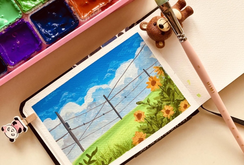
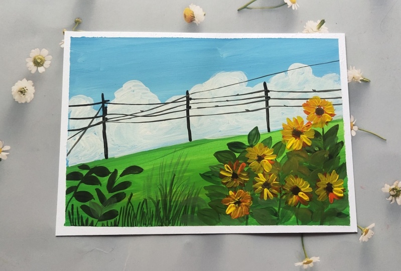
6. Day 4 - Grass Field: Hello everyone. Welcome back to day four of the ten days Meadow
Painting Class. Today we're going to go with
yet another simple Field. We, I'm going to be using
in the violet color, along with a complimentary color that's going to be
the orange color. Now these two colors to not
go well with each other. So we'll be using white
in-between for Blending these. I'm using the yellow,
orange, cream tone. You can simply mixing orange, yellow and a little
tend to fight to get a yellowish orange tint. I'll beginning with the
violet color at the top. I'm not going ahead
with any pencil sketch. Again, it's going to be a pretty simple Grass Field
that will be Painting. I have just picked
up a little bit of the violet color
on my palette and I'm going to keep the
white color ideas better and pick up
a little white, mix it with the
violet if you want, you can directly use a paste or violet tone if that's
available with you. At the top, I'm
beginning in with this violet and Vitamix tone. Then I'm Photo going
to use invite below this violet color mix
that we are lying already and blend in
with a violet color. And then later on
shift into the yellow, orange color that we are
going to be using in now using the white your, I'm blending it
with the violet and getting a further
lighter violet tone. Even when I'll begin in Blending
the yellow, orange tone, I will use in more
of fight that time as well so as to avoid
them or the tone, the technique section, we
already saw the blending of these two colors and how
they create a muddy, brownish tone
in-between, if blend it together without the
help of a white color. Now I'm first going to lay
down a layer of this yellow, orange color and then using White and blend
these two, again, two third of my
paper is going to be the sky space and one-third will be the field space later on. Now again, using in the White, I'm beginning to blend
both of these at this meeting point
again and creating a smoother transition from the violet to the orange
and orange to the violet. You can see we do not have any muddy tones
formed in between. We have a gradual
smooth transition from lighter to darker tones. And with the lighter tones
blending in-between easily. We have done with the
base here of the sky. Now I'm going to pick
up the green tones and begin adding in the base
layer for the field as well. This time we are going to go
with a simple leafy Field. Again, if you want, you can add in any kind of
Florals to this as well. But this time I'm
going to go ahead with a little different
and detailed kind of a leaf space that will be adding in basically
the grass area. I'm mixing in the
sap green along with a little bit off
the light green color. And using this lighter tone, I'm going to give
him the base layer completely for the field space. Again, you can go ahead with
a darker basically or if you want whichever green tones
you want to play along with. So in the entire bottom space, I'm just giving in
one flat layer. Make sure you do not
add a lot of water, otherwise you can see
it will not stay open. Right now, my layer, you
can see it's opaque. The base Paper White
is not visible. It's an opaque thick layer on the field that I've added it. Now defining in the horizon line well with the green tone, no matter, will
still be going ahead and creating in little bush
effect at the top as well. So even if you do not have a straight line at the horizon
line, It's perfectly okay. We'll, as it is,
be covering it up. Now using in the brown tones, I'm just giving little
darker depth on the edges and in the center I will keep it a little towards
the lighter side. So I've just lifted
the brown tones and began adding
it from the edges, blending it with the green
tones that's already there. Now let's wait for
these base layer to dry out completely then
move ahead further Now my base here of the
sky is completely dry, so I'll begin adding in the
Cloud details for that, I have picked up the yellow, orange color mixed in
with a little bit more of the white to get a
little lighter tint. I have tapped off the
excess paint from my brush so that I do not
lay excess paint over here. I'm going ahead very
casually, very lightly. I'm not adding in a lot
of pressure to the Brush. I'm going in very smoothly just laying my hands giving
in the Cloud details. I'm using a size two round
brush which has a pointed tip. And very gently,
I'm just adding in very light strokes,
light handed Strokes. And at certain places
using a damp brush, I will just blend the edges into the base layer of the sky. Now you can see with
this lighter tone, I can even create me to cloud effect onto
the violet color without having any muddy tones because we already
have a white tone. Make sure you're also, you do not add a
lot of pressure. Otherwise the
basically you will get activated because
we're working with Gouache and this
is a water-soluble and water reactivated medium. So even if you want to
reactivate your base layer and if you run a wet brush
over the dried paints, it will be deactivated. So you need to go in
a little carefully while adding the layering
details with Gouache. Otherwise, the base us, we get activated
and you may get in third muddy tones that you may not want in certain places. Now in the same V, I'm just creating a very light
violet tone and I will begin adding in
little cloud effect over the orange spaces. Again, you're also, I'm going to go in with a very light hand. Firstly, at the horizon line, I'm creating in a cloud shape with the help of
this violet color. I'm going to further lightened APA color a bit and go ahead and clear two to three color variations into
this cloud space. So you can create two to three different tonal variations of the violet color to
create in the depth into the clouds at the
bottom space here. In the same way, I'm going to add one more cloud out here. Now you can see I'm going ahead with a different
shape this time. I'm going very loosely as well as I'm not adding
a lot of pressure. So you can see my base layer
is not getting activated. The violet is visible nucleoli
even on the orange tone, without forming in
any brown tones. Now very light handed here, I've just given little
more strokes with a violet color over the
yellow, orange piece. It's the same Strokes for
the clouds that we are gradually falling in each
of the Class process. It's just that, you know, the placement of these
clouds or the movement of these clouds are different in
each of the Class Project, as well as in this one, we've added a little
cloud shaped one as well. In the forthcoming
class project, we even even be creating
in cotton candy clouds, going step-by-step,
learning more in details to blend the
colors as well easily. So you can see I'm majorly Blending all of
these clouds with lighter colors and using the damp brush so that they
do not have very sharp edge. I like a little blended
look off the clouds. But in case if you're someone
who prefers bowl look, you can skip the Blending part. So be ready with the sky. Now let's move on
to the field space. For that, I'm going
to move on to this spoiled shown Brush. I'm not going to
dip it into water. I'm directly going to
pick up the veins. I have already discussed this in a technique section where
when we discussed the, you know, foliage details
and the first method that we discussed using in
this spoiled Round brush. So I'm just going to
pick up the green color directly and begin
adding in that detail. Now if you want, you can create two to three different
color variations of the green color by adding
in black to your green. Or you can add in blue or brown, still green to get in different
tones of the green color So the most important thing for this technique is that your
brush should be damped, you're paying, shouldn't
have excess water. You need to try to hold
your brush perpendicular by beginning to create in
this dabbing technique. Plus your brush should not
have excess paint as well. Because if it will have
an excess paints also, it will be very difficult
to achieve this. You may begin getting in
patches of the color instead of this dry brush kind of
an effect for the Grass TO. Now you can see this Grass took, I'm covering a little off the horizon line to
make it look uneven so that it gives in a
natural look and does not have that straight
horizon line look. So in the entire field space, I'm going ahead with
this first clear, as you can see, later on, I will go ahead with
different color variations and adding little more of the, you know, different green tones, a leaf effect as well. So I've easily created
in the base layer, you can see it's
beginning to look like a greenery Field space
with very minimal effort, you could just add in the entire layer just
using a spoiled Brush. Now, I'll go ahead with this
lighter green color and begin adding in the second layer with a lighter green tone. Now with this second layer
of the lighter green color, I have to go ahead and
such a way that I do not cover up the entire basically
are that we added in force. So I'm going to add this
a little scattered so that we have the BCL
green tone also visible. You need to make
sure that you have all the green tones
visible around. You can see I'm adding
them in a lot scattered. We're not covering up
the entire base piece. I'm just trying to get in more color variations
into the field here. So you can see this begins
to look in so much nutshell, as well as giving in that you don't feel Space loop because
of the different tones of greens and giving in that natural Grass kind effect using injustice Gouache brush. Now I'm going to
pick up little of the white mixing with the green, create a for the different
variation of the green. Because so as to, you know, I didn't little leafy
details as well to this. So I have mixed in sap
green, light green, white, and black to get this
olive green color. Now again, you are free to experiment with different
tones of greens. You can adjust the variations of the green tones with
the help of white, yellow, blue, brown,
and black tone. So, you know, various
greens can be created using in the mixes of these colors in
different proportions. It's absolutely your
trial and error that you need to go ahead and see what
green color to do the best. Now very simply, you can
see I'm just beginning to add in little off the Grass
kind of details here. And I'm using a different
tonal variation of a green which will be visible
on the base layers as well. And you can see I'm just adding these Grass details in
the low-lying spaces. I'm not going overboard
till the top speed. I'm going to use in the mix
of all the different tones of the different styles of grasses that we discussed in
the technique section. And use them all
here together to create in the bottom
base layer effect Now just beginning to add in some simple ones talked leaves that we discussed as well and creating in the details here. So you can see, I'm
going ahead with these leaves in
different directions. I'm not going overboard
with these leaves as well. At certain places I'm just taking the Grass is
a little taller, giving in a little depth, taking some of them a little more towards
the horizon line, but majorly have kept the Grass effective
the bottom space, not taking it too much till the top space, as you can see. Now next time mixing
in the violet, White and the black color to get a grayish violet color
to add in a poll, effect into this field space. So that is going to be a
little add-on silicate. But I'm creating in
this gray colors, you can see violet, white, and black so that we can show the effect of
the sky falling in your on to the poll
that we are adding in. So it's very important
to mixing and deflect the sky color effect shadow
falling onto these little, little details that we added. So I've just added a poll
on to the right side here. And I'm going to
add in little off the wire lines for
that I'm going to use in a technical pen. If you want, you can use
a very fine tip brush and a black color to
add in that as well. I'm going to go ahead and
using my pen later on. I'm just giving in a
little more detail defined look to this pole first before moving
ahead further. Now I'm using the
0.1 technical pen. I'm going to go ahead very carefully adding a
few wireline DTS. Now, make sure your
pen may stop in between because of the
thick layers of paint. So you can just
run it again onto a rough paper and
then reuse it again. So at times I, you know, in-between automatically
the ink may stop coming in and just dropping
it onto a rough paper again, it works perfectly fine. Again. Shifted to another same size. As I told you. You can
even go ahead and using the black color and a very fine tip liner brush
in one of the Class Projects, I'll even be using that. I'm trying to show you how
to add in with that as well. Now, into this one, if you want, you can add in more polls, more white lines as well. I'm going to add a few more
moving the head further. But for now let's
go in step-by-step. Now, let's add in
a little bit of the details onto
the poles as well. So I'm just going to go
ahead quickly pick up the black color and
adding little variations. I just added in a little white highlight as
well on the poll. If you can see. Now onto the white lines, I'm just giving it a little
off towards or knob details which are there. So very small and tiny
ones that I'm giving it. So you need to
make sure that you use either a smallest size brush on a smaller Detailer thing to add in these details swiftly. Now to make it look
like the poll is perfectly coming out
from the field space. I'm just going to go ahead
with a little more off the green tones or onto
the poll space as Pen. So just a little bit of the overlapping and you can
see the poll is looking as if it is perfectly coming in from the bottom Field space. Now I will quickly
use a 0.5 nib pen and adding a little bird
details as well into the sky. After which, I'll just
go ahead and add in a small moon in Britain between the violence
that we've added in. So let's quickly and swiftly
adding these bullets. If you want, you can even use in a Black Pen your as well, or a black color as
per your convenience. Now using in the right color, I'm just beginning to add in a small moon into the center
of these white lines. I'm trying to show us
the moon in-between the wires Huo to
create in that depth. So as always, force creating in the glowing space for the moon. And then I'll add in the
wound to the center of this so you can see
across the moon space. Around the moon space you have that glowing light
effect trying to show in the light of the
moon falling on the outside. And then to the center of
this I'm going to swiftly just adding the moon. So just added the moon to the center of this
and you can see the effect of the
glowing light space that is being created. So that is it we are ready with another Pretty
simple Sunset Field. Let's remove in
the Masking Tape, remove it very carefully because if you are painting
on both sides of the paper, you need to be a little
more careful so that you do not tear off the
other edge as well. And always remove it against the paper so that you do
not lift up the paints. I have a small white cap you, which I will swiftly
cover with a violet color and give it a finished
line loop. So that is it. We are ready with our
class project for day four of these 10-day
Meadow Painting Class. I hope you guys enjoyed painting this pretty simple Meadow
Field with me today. You can see the Grass
detail looks so lively and saw real with
just simple techniques. I hope you guys
enjoyed painting this. And if so, make sure
to drop me a review so that it can help me
reach maximum students. I will see you guys soon into
the day five Class Project
7. Day 5 - Pink Sunset Daisy Field: Hello everyone. Welcome back to day five of
the ten day middle class. Today I'm just beginning in with a very basic pencil sketch before we move on to
painting today's middle. So today we are
going to be painting a seascape along
with tomato sauce. I've mapped the horizon line a little about the center line. On top of the horizon line, we are going to have in a
smaller bush space for which we will be having the
reflection in the area. The top will be the sky, the center will be the C, and the bottom will
be the middle space. We will be painting a
daisy metal this time, but are in a pretty
beautiful pink sunset view. So now let's begin in picking
up the colors for the sky. I'm going to be using in
the yellow, violet, pink, and a little bit of white
and black for this guy. I'm going to begin
picking up the colors a little by little
onto my palette. This time we are going to go a little different way in the sky. So I'm first going
to beginning with this light yellow color
towards the left edge. The blending may be a little different this time
because we're going to go In section blending instead of the simple blending
that we go every time. In case if you
find it difficult, you can go ahead with just a simple blending
from left to right. Instead of going in this section vise blending
that we are going to go, I'm beginning with a yellow
color on the left side. This time we're going
to go ahead with the vertical blending instead of the horizontal
blending that we have been falling for the
previous class project, we are going to apply the paint vertically in sections
and blend them together, creating in the sunset
effect between each color, I'm going to just drop in
some white like this loosely. But in the first step, I'm
just dropping in the colors vertically and then I'll begin
blending them one-by-one. If you are someone who's not comfortable into
blending in vertically, you can go ahead with
horizontal layout beginning in with the
violet at the top side, then moving to the pink and
then to the yellow tones. But I just want to show you
another method of creating indifferent look into your sky using this vertical
blending method. Now as soon as I've
added in the pink color, I'm beginning to blend
it in with the yellow, adding it a little overlaying the yellow
at certain spots. This is still not the blending
how it should look in. I'm just going ahead
with the layers first. I'm even using this light
violet color in between. You can just mix in
white to your violet if you wish to use the color. And now on the rightmost edge, I'm going to go with a
dark violet and it's love the black tint on
the dark violet tone. Now at this point, if you see everything is looking
just as a patch of color, not blended well
into each other. We're going to go
ahead blend all of these where I'm
adding in a little of a black tint towards the
rightmost side to get in that little sunset effect coming and the night
sky also peeking in. Now I'm going to begin
using in this brush. So this is like a blender brush. This is from the
brand Princeton. Now, using this in a
damped consistency, I will just begin blending
in the colors here. I'm beginning in with the light color moving
towards the darker tone. This is again just the
first layer of blending. I will still be going ahead
and blending in a lot. If in any case you'll feel that your brush has a lot
of color picked up. You need to clean your brush
so that you can get clean, finished blended look again, so you can see I blend
it two to three colors. Clean my brush. Now again, going ahead with little
bit of the blending. Now from the right side you can see I'm pulling
the darker tones towards the pink color and blending them all
well into each other. On top of all of these, I'm still going to go ahead
with a lot of Cloud details. So then the blessings
will go and write. Again, I picked up a
little pink so that I can blend in the violet
color again properly. You either need to pick up a damp brush or pick
up little color on your brush so that
the planning process becomes easier and smoother. Now we need to
blend in the yellow and the white,
yellow and the pink. So I'm going to go
ahead picking a little yellow or
white if needed. So I'll just pick up
little yellow and blend it well with
the pink color. So I'm just running
my brush multiple times again so as to
get smooth blending, you can see I'm
going part by part not blending from left
to right completely. I'm only blending
between two colors. Then again, cleaning my brush and then blending
in the next two set of colors and see where you need to just run in
two to three times. To get a smooth finish between
your color transitions. So we are ready with the
base layer for the sky. Now, we're going to do the reflection process
into the CSPs, but in the z-space, I'm going to keep it less
complicated and just go ahead with the acrylic
blend of the colors. So the C is going to be an exact reflection
of the sky colors. So I'm using the
exact same colors of the sky into the sea as well. I'm going to blend them in the same way and
creating the Dept. So following the
same process I have created in a base
layer into the sea. Now I will just
quickly go ahead and blend all of these in the sky. We are still left to add
in a lot of Cloud details into the sky and create
the depth in the sky. So do not worry if
at certain spots you feel that you are
blending or your transition between
the colors isn't smooth or perfect enough
because with the help of class, you will be able to
cover them up and creating the smooth transitions. Now, I'm going to go ahead
with the green color in the bottom field space will
separate the horizon line. And this guy perfectly
later on with the Bush and additive
flexion to that as well. Now using the sap green color, I will begin in with the base
layer in the field space. Now, you can go ahead with the various green
tones here as well. I've just marked out
a small space there to add in little brown
tones there as well. I'm going to use
in different tones of green with the
help of brown and black to create in the tonal variations for
the green color. Now ready to flee and marking the field lines will still be going ahead with the grass and the floral details
on top of this. Now I'm picking up the yellow ocher color and I will fill it up in the center space that
I've left empty if you want, you can go ahead with any
other method of layout. I'll just go ahead with
little more of the brown as well and a little more
of the yellow ocher color. So as to get a little
highlighted space here. Now I'll wait for all of
these basically us to dry completely and then we'll begin adding in the
layer on layer details, make sure that everything is completely dry before
you begin the layering. So now everything is
completely dried and I'm going to begin in
with the clouds first. Now into the clouds, I'm going to go ahead with
the same colors of the sky, but just either in a lighter
tone or a darker tone. I'm for spinning in with the violet color and
I'm beginning to add in little cloud strokes moving from the pink towards
the violet side. Again, when you're going
ahead with these clouds, you need to be sure about the British that you've
put on layering. You need to go very light handed lead to not add in
a lot of pressure. Otherwise, it will be very
difficult for you to blend in because the colors will
begin to get activated. Now I'm just picking
up a little of the white mixing
into the violet on my palette and creating a further lighter tone
of the violet color. And I'll begin adding in little of the strokes on top of this. I guess it's too light, so I'll just add in
little more violet again. So this one cloud here, I'm creating it in a little
cloudy light space here. So just added in that
little violet color. And now I'm blending it all. Now with a lighter violet
color only I'm just beginning to create a
little more depths of sky. So that is the
reason I told you. If in any case you feel
that you are blending in the sky aren't good enough.
In the first layer. You can easily cover them
all up with the help of these details and
adding in the details. So far, the clouds.
I'm going ahead with the same simple technique
that we have been following since our
class project for Dave. One simple half, see Stokes little curvy strokes
using a damp brush, blending them into the
base layer if needed, and adding in very
simple layers. So you can see I used a lighter tone over
the violet color. In case if you
want, you could go ahead with a darker
tone as well. I'll just go ahead blending a little with a little
darker tone of the letters by because I do not want to bold lighter
skies as well. So I've just added a little
tense of the lighter tone. Now next over the yellow
color space as well, I'm just going to go
ahead with little tint of the darker strokes
of the clouds to create that perfect
sunset effect. So I'm going to go blend
that darker tone as well. Again. Now you need to be very sure that you go ahead
with very darker. Do not go ahead with too much of the darker tones is
where you need to maintain the consistency of the tone that you
want to add in. Now along with the gray
tones that I've added, I'm just adding
in little off the pink tones as well so as to have that perfect transition in the yellow space of
this guy as well. So you can see, I'm going
ahead with blending of the clouds into the
sky with every layer. I do not want sharp
look for my clouds. So that is the reason
with every layer, I'm going ahead and blending
it in with the base layer. Now adding in little
highlights over the pink color of
the sky as well. And then we'll move on to the
next layer of the details. Just going ahead with lastly, one of the highlights
I just adding in little pink color highlights over the violet color as well. And then will almost be
ready with the sky and then move on to the next layer of details for this class project. This class project is a little different in a lot of
bees beginning from the blending of this guy into a different pattern to
adding in a seascape, creating in little
reflections as well as we move ahead further. It can be a little
tedious at times when you're going ahead
with a lot of details, but you can always pause when you're working with
gouache because you can rework and there is no issue even if
the paint is dry out, you can simply
reactivate them as much needed and go ahead
with the detailing. So it's always better
to stop in at any point if you feel that it's becoming
overwhelming for you. And then continue with a
fresh mind rather than adding up and spelling
out the entire details. Now next half mixed
in a little bit of the green along
with the black color. And I'll begin adding
in the bush detail into the sky first. On the horizon line, I'm creating a very small
bushy area in the center. I'm just going to
take this bush area a little taller in height. But you can see I'm
going ahead with very simple dabbing technique
to create in the detail. And now after this, I'll be adding in a reflection of this into the sea as well. For the C, I'm going to
keep it pretty simple one, I'm not going to add in a lot of t. It's going to be majorly
the reflection that I'm going to be
playing along with and very little wave
details if you want, you can add in that. I'll try to skip that as well. So just in this anti took this class pace a little longer, and then in the
rest of the space, I've kept it small
as you can see, and now I'll go ahead and add in the reflection of
this into the sea. When you're adding a reflection
of this into the sea, keep a fine line in-between both the top
and the bottom space. So you will see a yellow
line that is visible. That is the space that
I'm keeping in-between the reflection in
the entire way. So in the center you'll see
a little pink line visible. And as I move towards
the rightmost side, you'll see a little
purple line visible. Now I'm just beginning in, adding in a little off the reflection detail
into the area. And it's going to be a simple reflection just as
it was in the top space. You have to add in a reflection that is wherever you feel. You have taken the
grass a little taller, you need to keep it a taller
in the reflection as well. Now, I'll wait for
the first layer of the reflection to dry
out and then I'll add in a little or much
clearer center line in-between with a
different tone. Now, let's begin
with the field space for which I'm going to begin in with these coiled round brush to begin adding in the detail. I'm just going to go ahead
and begin dabbing in this darker green
tone at the top to create in a very
bushy area detail. So very simple method
to add in your This entire line,
I've just gone ahead and added in this detail with the spoiled crash
so as to give him that little realistic
effect of the grass, I'm just going to
add in little of this effect into the
base layer as well. Later on we'll just
be adding in a lot of DD daisies into this field. I've added a little of this in the bottom
fields pieces bell, I have not added much of it over the yellow ocher
space, as you can see. Now I'm going to shift into
a smaller sized round brush and using in further a
different tonal variation, green, I will begin adding in some leaves strokes as
well, very randomly. So using this lighter color now, I'm just going to begin adding
in some simple strokes. I'm using a liner
brush so that it becomes easier to add
in these long strokes. Make sure you use in
different tonal variations of the greens so that you
have all the effects visible. If you will stay restricted to one single color
of the green tone, you may not have all of these
details visible easily. I'm taking a little of this
class talks overlaying over the z-space as well to show
it in a nutshell look. So I'm going to go ahead with
a little of the leaves into the entire bottom
space before we move on to adding the disease
into this field, I'm going ahead with very
simple leaves stalks, that grass strokes that we discussed in the
technique section. I'm just using indifferent
tonal variations of the green. You can see all the
different greens visible in the field space, giving it the natural effect. Now next after this, I'm going to pick up a little
of the lighter green as well and adding little off
the lighter green strokes. So this was a lighter
green that I created, adding in white and black, creating in an olive green, dull kind of a green color. I'm going to use in the bright, light green color now and
adding little strokes. I've just picked up a little of the green color on my palette, and I'll begin using this green color to
add in little strokes. I'll again shift
into my liner brush, just mixing a little bit
of the white as well to the screen so to have a
bright green color effect. Now with this further
lighter green tone, I'm going to go ahead with similar strokes overlapping
onto the previous one. So you will see again one
more tonal variations of the greens visible
into our field space, as well as you will see the overlaying creating
in the natural effects. Now make sure you do not overly onto the entire space
that we've added in. We need to let the
greens also be visible. You need to add this layer
in such a way that all of the previous videos
that you've added get equal importance and
equal visibility. I'm almost done adding in the Grass talks just a little
more on the left side. And after this, we'll be moving on to the disease
which is going to be The main attraction
for this field space, very simple daisies that we've discussed in the floral
technique section. In case if you've missed the florals part of
the technique section, make sure to visit that
because in there I have detailed discussion
about the disease, the different angle
of the disease, and adding in the bud details or the different perspective from which you can view the daisy. So make sure to
give it a visit in case if you visit,
if you're not, if you missed, I'm looking at the technique section
of the floral spot. Now I'm just adding in
some thicker leaf details with the green color before
we move on to the disease. So one bunch of these leaves, I've taken them a little
taller towards the sky, towards the water
space as you can see. So this makes it look
natural because in nature, nothing is permanent
or nothing is same, everything is different,
everything is beautiful. Now using the white color, I'm beginning to add in the DZ, make sure you use the white
color in a bowl consistency. I'm using a smallest size brush. I'm holding the
brush very close to the Brazil because I want a very smallest strokes
and very precise one. You can see the
different perspectives of the disease that I'm
beginning to add in width. Again, I will remind
you in case if you've missed a
discussion about all of these angles or
perspectives of the disease you can visit in the technique section
of the floral part. Then you can get in all of the perspective view
and how we've added in, and how you'll be adding
in the bud to all of this. Now I'm adding in these daisies a lot scattered as you can see, make sure you add them a very auspicious lead to not add them all close
together at once. At them all, defining them into the entire species in case if you want to
add in furthermore, disease, you can always add in, but you cannot undo
a fancy of added it. So it's always better to go step-by-step
little by little, rather than adding in a lot
of it together and then making it look like a cluster altogether instead of
a beautiful field. Now one or two daisies, I'm taking it till the top space towards the sea area
as you can see, trying to show them
reaching till the seabed. Now let's begin adding in the butt to these
daisies for that I'm picking up the burnt sienna
color and using this color, I will just begin adding it into the center
species of the flower. Now, every flower will have
a different bird species. We've discussed all
of this as well in detail in the
technique section. So I'm just quickly
adding in the buds. Then I'll see if I
need to add in for the more disease or this
much would be enough. So I'm done adding in
the bud details for now. Now I'm just going to go ahead with a little
darker green tones. I'm going to pick up a
little bit of the black, mix it with the
green so as to get a very darker green tone to add in the stem to
each of these daisies. And I do show them coming
out from the fields piece trying to join a connection between the grass
and the disease. So using this darker
green also am adding in little grass
books randomly in between. So you can see one
more tonal variation into the grass field effect. So I'll quickly just adding these and I'll just go
ahead with two to three more DC's into the
field because I feel the field looks
a little empty. So just real quickly add in
a few more of these disease. So before moving on for that, I'll just quickly
splatter little off the white color so as to show some very mini
daisies far off, which is, you know,
very tiny out. Now I'm covering up the sky. As you can see, that these white splatters do not go into the sky and the CSPs. So you need to make sure you can either cover it up with a tissue or a clot or with your
hand just as I did it. Now, I'll quickly go ahead, add in little more detail. Using the pink color. I'm just defining in
this line out here, the center line that
I told you between the reflection and the
actual Bush space, so as to show it as a
realistic reflection in that reflection area as well. I'm just adding in some
pink cut lines to show the moving water or detail
into the reflection. Now I'll just quickly add in a few more disease
as I told you. So I'll just quickly
add in a few of them here and there details as well. I'm not overdoing
with the daisy, so I do not want to
create a huge cluster. Just added in two to
three more of these wherever I felt a
little empty space. And that is it, just adding in the last details with
the darker green tone? And we're ready with
our class project for day five as well. Let's remove the masking tape. Make sure you peel off
the masking tape against the paper and once your
edges are completely dry. So here's our class
project for d5 are pretty pinks,
DC fields, Sunset. The sky is what I love the most. If you have a closer look, you can see the
details in the sky. The blending look so
perfect that reflection, the cuts that you've
given in the reflection, the pink line in-between the
bush and the reflection, making it look realistic. I hope you enjoyed
painting this and I will see you guys soon into
the D6 class project. Thank you so much for
joining me into this class.
8. Day 6 - Sunflower Meadow: Hello everyone.
Welcome back to day six of the ten day Meadow class. Today we are going to go with a pretty blue sky and then go ahead with beautiful
cotton candy Cloud look with the white color. Let's beginning with
the sky forced for that I'm going to use
in the sky blue color, white and a little tent
of a darker blue color. I'll just mark out a cloud space this
time so that you know where you need to leave the
species White precisely. So I've mapped the middle
space at the bottom first. Now at the top of the Meadow, I'm going to have a huge white cotton candy cloud
effect varying. I'm marking out a very
rough cloud shape. You can see I'm going ahead with very rough outline and not keeping it off the
same how high throughout? I'm trying to vary
the height as well. Now, in the top area of the sky, I'll beginning with this
light blue color first. Later on, I'll pick in a
little White and dilute it towards a lighter tone
closer to the Cloud space. But just going ahead with appalled layer of the color
in a thick consistencies so that the colors are
visible and opaque. Instead of having a
white piece look. Now around the cloud shape, I'm marking the shape with the help of the blue
color precisely. You need to go ahead a little
carefully at this point, you need to make
sure that you have that perfect cloud
shape outline. If a little off the colors go inside the outline, that's okay. We'll be able to cover it up and we add in the Cloud details, but as much as possible, try maintaining an outline and leaving the bottom
Cloud space White because we'll be working with a very bright cloudy day effect. So I'm just going ahead with
this blue color layer first. Now I've picked up a little
of the darker blue tint. I'll quickly blend in with the lighter blue on
my palette first, and then adding a
layer of this on the top of this guy and blend it with the
light blue color. I'm not going to add it in a much darker consistency
as you can see. I'm going in with a
very light layer you. So you can see I have not
added much of a darker tint, just little highlighted the
top and blended it well. Now we'll paint the clouds piece that I'm going to go ahead with. The white color has shifted to my Princeton
blender brush. This is a smallest size blend, a mop brush you
can simply use in a similar style of Round
brush or a mop brush, beginning in forced with
the pure white color, I'm beginning to mark
out the outline for the Cloud defining the
shape and the edge. You can see I'm
going very carefully and slowly defining
in the shape. I'm using the white
color without adding any water because I wanted
opaque layer of the same. I do not want a
translucent color or make the bottom
basically or White visible. So going ahead very
carefully adding in a bolt Leo at the
edge, you can see, since the white is blending with a little tint off the blue, it's automatically creating
a perfect transition into the sky from the blue towards
the white clouds piece. So first into the
entire Cloud space, I'm going to go ahead
defined in this space. Then we'll go ahead with little blue highlights
as well into this whitespace and a
little yellow highlights to show a little Sunset effect. So fast means that defining
the entire cloud line, you can see I've defined
the cloud shape. I've given those COVID tones, not giving it a
simple straight line. So filling in the
entire base Leo with this white color
layer, as you can see. Now, I'll just go ahead define a little more of the
details at the top space wherever I feel the
definition can be a little more stronger
and bold enough. You can see I'm going
with very rough shapes, not keeping it simple coves, trying to vary the
shapes throughout so that you have a natural
look to your cloud line. Now I've picked up
very literate end of the sky blue color and
in-between the white randomly I will create a small Cloud
with this blue color, blending it with the
base year White. That is why it's
important to add the white in the entire base layer. Now I've picked up a little
hint of the gray color, and in a similar way, I'll add in little gray
highlights on the other side, blend well with the white
color in the base layer, creating in a
perfect transition. And the blending effect. Again, using a little
of the blue tints, I will begin adding
in little highlights and creating a little
more blue cloud effect. You can see, I'm trying
to blend all of these on the goal with the help of the base layer White that
we've already added. It's very important
that you make sure you have a white
layer completely in the entire bottom
space so that you have this perfect effect
of the blended look. I'm just going ahead with
little more highlights. And then we will move on to the little yellow highlights that will be giving into this. If you want, you can skip in the yellow highlights if you
do not wish to add them. Now to the yellow that's
already on my palette. I'm adding in a little tint
of white and I'll begin creating in little yellow
effects into the sky. This will basically
show that it's a pretty sunset sky
because the fridge, you're having those
little yellow highlighted space into the sky. So very little on the
edge that I've given in the center and adding in
little yellow effect your, you can even use a little
orange tint if you wish to give him upright
effect of the sunny day. Now very gently,
I'm just dabbing in some smaller cloud
effects as well into the sky very little, just with their little Paint
which is on my brush left. Make sure you do not
add these clouds in a little too bold manner. Just go ahead with very
simple light layers. So that is it for the bold sky. Now let's go ahead with the
base layer of the Meadow. I'm going ahead with
very simple green tones. This time I'm using this
bright green color because I'm showing a pretty bright
sunny day, kind of a field. And we're going to
be going ahead with the details of the
Sunflower Field this time, I'm going ahead with
very bold layoff or the base area of the field. Now defining the horizon line. Well, as you can see here, we are going to keep the field
a little empty this time. Just going to add in little
leaf details and little of the details with the sunflowers. Now to the edges of
the Meadow space, I'm going to go ahead with
a little darker green tint, which already on my palette
and just add it on the edges, blend it well into the
light green tones. So as I always see, you can go ahead with any
green tones of your choice. I'm just going to use
in the ones that's on my palette wherever possible. I'm, you know, by now I just mixing black and browns to
adjust the green tones. And if I need some
lighter tones, I adjusted using
in the yellow and the white tones to
just on the edges. I've added in the
Colors and blended it well into the Meadows space. Still in the center you can see the bright glowing
space in the field. Now, let's wait for all of
these to dry completely. So now everything is
completely dried and I'm going to pick up a little
tint of the black color, mix it to my green
and begin adding in little details are further
into the field space. I am going ahead with
my spoilt Round brush. I'm just using the tip. I'm going to begin adding in little green details
on the right side. First. We're not going to cover the entire Meadow space with
these details this time, so do not overdo it anywhere. We need to make sure and go ahead slowly filling
in the spaces. I'm majorly adding all of
this onto the right side. Onto this, we're still
going to be going ahead with a lot of the
Meadow details, which is going to be majorly the Sunflower and
the leaf details this time. So majorly the sunflowers are going to be on
the right side. So that is the
reason I'm building this entire based
on the right side. On the left side will
just be giving it a little off the leaf
effects later on. Now using a little
lighter green tint, I'm beginning to add in little highlighted leaf effect onto this space
that we've painted I'm going ahead with very
simple leaf details. You can see I'm using
the light green mix, which is on my palette, which is a mix of the
light green sap green, white, and the neutral
tint of the black color. So I've just added in
simple leaf effects. Now you can see the background
darker color is acting in as the shadow to all of these leaves that we
are adding in now. Now I'm taking a few
of the leaves taller towards the top space
into the sky as well. You need to maintain
the color theory such that the colors
are visible on top of each other wherever
you feel that the colors are looking a
little light are not visible. You can darken or
lighten the tone depending on the variation
needed as per your painting. Now let's begin adding
in the Sunflower. For that, I'm going to
pick up the yellow color. I'm going to use the
light yellow color from this set and I'll begin
creating in the sunflowers. Also, I have already discussed in detail
about the sunflowers, the angles of perspective, the method in which I'll
be adding all of them. So in case if you've missed it, you can visit the
technique section so that it's easier for you to understand how are we adding in the sunflowers in the
different perspectives. With a pencil, I've
quickly marked out the buds space for the
first Sunflower so that I know around where I have to keep adding
in the petal details, using in the yellow and a mixed off a little
tint of the yellow, orange color as well. I'm beginning to
add in petals with different tonal variations of the yellow and orange tones. As you can see, I'm going ahead with very simple petal details. Nothing complicated,
nothing difficult. Just laying the petals
11 closer to each other. I'm just trying to very literal tonal variations in
between as possible. So I added in a little
orange tint into a few of the petals and rest of the petals just let
them be yellow. The center but space
I've kept empty for now. We'll add in the
detail there as well. So using in the brown color, I'm just adding in
the bud detail. Later, we'll be adding in
the highlighted space for the petals and the next layer of petals to it wherever needed. Now we're going to be adding in two to three more
of the sunflowers, one of which is going to
be in the side angle view, which we've already discussed in the technique section
and the perspective. For that, I'm just lifting
a little of the yellow, orange color as well so as to have listened
color variations. Now, again, I would recommend if you have missed in the
technique section of adding in the Florida Visit in that part so that it's
easier for you to understand the perspectives
and why we are adding them. Now, you're, I'm adding in a small Sunflower which
is just at the bottom, so just half of it
will be visible. Now in the same V, I'm
going to quickly go ahead adding two to three
more of the sunflowers. And then we'll move on to the right space for
adding in the details. So again, with the
help of the pencil, I've just marked out
the space that is the a side angle view that
we're painting this time. So I've just added in
that side angle view. Now, I'll just be
adding in the petals. In the side angle view only. I've just added in
the first layer of petals data as well. Remember this is all just the first layer of each of the Florals
that we are adding. I'll still be going ahead with
a lot of layers onto this. Now one more flower
that I'm adding yours, I'm just giving in a rough
sketch for the buds space. Now around this, I'll be
adding in the petals bus. This time, I'm going to keep the top petals small
and the bottom petals a little taller one so as to show a different perspective
for the floral as well. All of these, again, we've discussed in the
technique section. So in case if you've missed it, It's time for you to go check it out so that you
can understand about the perspectives and
angled view of these Florals. So now adding the butt
to this flower as well, you can see the top
petals are smaller, the bottom petals are taller, giving it a different
perspective, a different view. Now I'm adding one Sunflower in the center of all of these
leaves that we've added it. And your unique to go
in very carefully, you need to make sure that you do not add in a lot of pressure. You need to go very light handedly so that you
can add in the details. And basically a green
color also does not get activated because
since Gouache, It's a water-based medium, the colors get activated if
added too much pressure, and then the base
layer may begin to again be activated and blend in with the
details that you add in. Now. Now, this one more flower that I'm adding here
onto the edge here. Now till the first layer
of the Florals try in, I'm going to go ahead with
the next layer of details. So I've picked up a gray color. I've mixed in a little bit blue, black, and white to
get this grayish tone, you can even directly using the gray color from the
set if you haven't. I've mixed in this
ready gray color which is available with a
little bit of the black, but you can mixing black, blue and the white color to
get a similar grayish tone. And I'm beginning to
add in little while and pulls into the sky and
the field space area. So I'm adding in
straight lines using the liner brush on the left. I've added the taller ones
moving towards the right. I'm going to keep on decreasing
the height of these. So just adding in
little more details to all of these will be adding in via lines to connect all of these polls with
each other later on. So first you can
see I'm adding in very simple details
to each of the pole. Nothing much, just
simple boxes or simple, or details for the poles to show in as the poll detailing. Now using the black color, I'm going to add a
small DACA highlight on the pool towards the
left of the poll. I'm just adding a very fine
line with the black color. So now you can see as soon as
you add in this black line, you have the duotone effect
on the poll trying to show in the light and shadow effect creating in the depth
onto the poll space. So very simple line
to create this depth. Now using in the black color, I'm beginning to add
in the wire lines. I'm using the brush this
time and the black color, I'm using the liner brush, you can see the fine lines. It's not a bold black
color that I'm using. It's a little grayish tint
that I'm using in your, now in one of the
Class Projects, I told you that we will be
using this method as well as the second way
you can either use a pen or using a
brush like this, it's a little tricky to
go ahead with a brush because you need to have
that control whether Brush, Latino lines, the detailing. So it's absolutely your choice. However you find it convenient, you can go ahead
with that method. Now just adding a few lines
crisscross to each other. You can see I've not
taken them all straight. I've tried to bury them, have tried to make them a
little tilted at certain spots. One thing to keep in mind, neither the pole is not, the wires are off
completely black color. You can see it's a little grayish tint that I've used for both of
them and just used in Black forgiving
in highlights to the poles creating in that
depth effect into the polls. Now your one line I'm taking towards the
top area of the sky. Again, you can see it's
of a lighter gray tone. I am using in the
fine line brush because if page I'm able to
achieve these fine strokes, you need to be careful
about these small things so that you do not go
out of proportion. Now moving onto the
Sunflower again. So first to the Sunflower, which is off half view, I'm just beginning to add in the leaf details to
the back of this, all of this as well. Again, we've discussed in
the technique section, each of the details adding in
the leaves on the backside, adding in simple leaves
to the Sunflower as well. So I'm going to pick up a
very darker green color, adding the stem and
some leaf detail as well to the sunflowers
that we've added in. Now I'm just taking
out a few more darker leaf tones out
your very randomly, you can see I'm
trying to maintain different color variations
now I'm taking, trying to take some of these leaves towards
the sky space, overlapping a little of the
wireline details as well. But again, simple
one Strokes leave, but you need to make sure that you maintain the proportions so that it does not look
out of the Painting. Now using a little
lighter green tone again, I'm overlapping
these darker leaves as well to give it a little
more natural effect. So you can see two
tones of the leaves in this Brand bunch of leaves
that we've added as well. Now using a little orange tint
and the fine liner brush, I'm just adding in little
highlights to the Sunflower. We discussed two methods for same as well into the
technique section. So you can see as soon I'm just adding in the highlighted lines, it's beginning to get
in more detailed look and much more depth to
the sunflowers as well. We have still gone ahead with very simple Sunflower is
not much detailed ones, but just trying to give it a little detail look
wherever possible. So we're almost through this Class Project just
we are going to add in little leaf details or the class details on
the left side as well. And just a little highlights
to the remaining Sunflower. And then we'll be ready with
this Class Project for D6. If you want, you can add in more sunflowers,
are if you want, you can add in the
sunflowers to the entire Meadows P. Martins. I wanted a little variation
in the Class Projects. I've kept this
Meadow only towards the right side and not
taking it completely. We've tried indifferent
Meadows only leave Meadows Meadows completely
at the bottom space, only different Grass details. So this time keeping
the Meadow space majorly on one side
and trying to have a different view with a lot more details in
the Cloud this time. With the help of
the black color, I'm just tapping into
the center of each of the bud to adding the
details to the bar. So you just need to use the tip of a smaller
sized round brush and keep it dabbing
in the center space to give it little more detail. Now using different
tones of green, I will quickly begin adding in little leaf details onto the
left side as we discussed. Now taking some of
them a little taller, that is towards the skies piece. I'll just be going ahead
with simple leaves and some Grass details. You're not much of the details
and I'm going to keep the center space bright and green with the base
layer that we've added. Mentioned, you can see
I'm just trying to create in some leaf branches. I'm just going to take
them a little taller and adding a few
more leaves to this. Now at this piece as well, you are free to go ahead with different
tones of the green. It's not necessary to stick to one single tone or the
same tone as I'm using. Because this tone also, as you can see, is a mix of different colors
on my palette. It's not already tone
from any of the, you know, color tabs
that I haven't. So I'm just going ahead with very random green tones that
is making the field under Meadows in each class project look more natural because I'm going with various tones of green color with the
help of the white, yellow, black, and
brown tones to create in multiple
natural green tones. Now at the bottom
I'm just pulling out little Grass
Strokes like these. I'm not taking it completely to the top because as I
told you in the center, I'm going to let that
little lighter green fields please be visible as it is. Towards the right side as well. I'm just pulling out a little of these Grass Strokes
randomly at certain places. And then we're almost ready
with the Class Project. So I'm just adding some
highlighted leaves using in the black color to give
it a little more depth. So you can either use a very
dark green color on mixing a little tinge of
green to your black to add in these
bold leaf detail. Now I'm not finding that last a Sunflower onto the
right-most side, are you not to happening? So I'm going to cover that up as well with the green color. Even in the center your I felt that it was too dark tones, so I quickly blend it
all of that and added in little lighter leaf effect
on top of it again. So I'm just covering up this last Sunflower with the
green leaf details again, because I do not
want that Sunflower visible because I find
it too overwhelming. So now let's removing
the masking tape. Make sure you remove
the masking tape very carefully pulling it
against the edges, and make sure that your
edges are completely dried before you begin
pulling off the masking tape. Yours are pretty
Sunflower Field for D6 of these ten day
Meadow Class challenge. Let me give you a closer
view at the Cloud, the details of the cloud, the details of the field
and the Sunflower. It's pretty simple way of
sunflowers that we've added. And I hope as a beginner,
if you've joined us, you enjoy painting these simple details
with simple techniques. And the sky looks
stunning and I love it. I'll see you guys soon
into the D7 Class Project
9. Day 7 - Lavender Fields: Hello everyone.
Welcome back to day seven of the 10-day
Meadow Painting Class. Today I'm going to be going ahead with the pencil
sketch for the meadow first, because today in the middle, we're going to be adding in a small muddy pathway as well, so forth and FAD it in
the horizon line on top of page we're going to
have in a mountain range. And towards the
right side a bit, I'm going to take the
walking pathway that's going to be a muddy way
that I'm going to debit. Now, you can go ahead for this placement at any
place that you wish to. I'm just taking
it moving towards the right side as
you can see you. So we have a basic
pencil sketch steady, and that's all we need. We are going to be Painting
a Lavender Fields today. So let's begin with
the colors first. For this guy, I'm going to
use this bright yellow color along with a little bit off
the Pink and the violet tone. This time I'm beginning
from the bottom space. Usually you have seen
me beginning and from the top space and then
moving to the lighter tones. But to keep it different and new methods for
everyone to learn. I'm going ahead with a
different approach today. I'm beginning in with the lighter color at
the base where I wish. And then I'll move on to the darker tones
and begin blending from bottom to top this time
instead of top to bottom. Now in-between I'm even
picking up polygynous, this yellow cream color for blending in with the
pink tones together, a little orange-ish
highlighters. Now on top of this, I'm going to go
ahead with the pink. So basically, you
remember for day five, variant B had painted
in a sky wherein we had the vertical Blending in
case if you're someone who's finding it difficult to go ahead with vertical
Blending still, you can use this
horizontal Blending method of the same colors. We've used these same colors
for day five in the sky, but we've blend it vertically. It's a little tricky method
to blend it that way, but once with practice, it becomes quite easier. Now picking up the
violet color and beginning to blend it
at the topmost space. Now I will just take a little
bit of the Pink more and blend it on the
edges of the sky. The rest of the DDL
sets a Cloud details. I'll be adding later on. I'm done Blending the sky. A little of the colors
you can see has gone onto the mountain ranges
when and that's okay, that will get all covered up
and became the mountain G. Now I'm picking up the green
color for the Meadows piece. I'm going to go ahead
with the green and brown. Brown is going to be
the path-based piece that I will be blocking. First, I'm just lifting up
alliterative, the green, adding a little hint of brown to get a multi-gene kind of color. This is going to be the Meadow space on the left and right, the center pathway
area that Piedmont, we're going to go ahead
with only brown tones. They're first beginning
in with this green color. So I'm just basically
giving a basically, or that's a color
blocking for now, we're going to go
ahead with a lot of leaf details and the Lavender Fields
details on top of this, we've already discussed
the Lavender flowers as well in the
technique section. So in case if
you've missed that, you can visit that to understand the leering further
Lavender flowers that will be Painting today. Now on the rightmost side, leaving those three
lines in between, I'm adding in the
green color datas. Now in these three lines, two are going to be
pathway in the center. We're again going to have that little green 3D space coming in-between
the pathway as well. So into this center line, I'm marking out the green color again to actin as the pathway. Now next I'm going to mixing a little bit as
to Black along with the green to add in that bush Detailer on
top of the horizon line. I'm not going ahead with a mountain D danger and
rather going ahead with Day because it's going to be quick and easy and I guess that will look better because we've already added a lot
of mountain scapes, the other Class Projects. So let's go ahead with a bush
line on the horizon line. So I've created a very dark
green color, as you can see. Now using the tip of
the brush at the top, you can see I'm just dabbing the brush to
create this bush effect. I'm trying to vary the height. I'm not keeping
the line straight, so make sure that you
varied throughout. Also one more thing, make sure you did not cover
up the entire yellow space. You want that legend Sunset
effectors well into the sky. So make sure that
you do not cover the entire yellow
space while adding in this push detail with
the green tones. So basically, as you can see, post I'm just marking the outline of the bush
space in the center. You can see I've taken
it so much taller and on the edges I've
kept it into low-lying, still trying to vary
the height throughout. Now the entire space, I'll fill it with this
darker green tone completely defining the horizon line
will be a little careful, go a little slowly
and now filling this entire space with
this darker tone. Now after filling in
the entire space, wherever I feel the need to
add little more details on the top space to define the
shape of this bush space. I'm just going ahead with the
tip of my brush to add in all very uneven look to
make it look natural. Now using the burnt
sienna color, I will begin adding into
these bite-size pieces. Now, I'm not going to map out the edges in
a straight line. You can see I'm keeping a
very rough edge towards the green dye to keep it drafts so that
it looks snatched. I'm adding the little pink
highlight intended of this mud lines so as to show
the little reflection of the sky falling
onto the mathspace as to just dabbing a little
Pink and blending it with the brown in
the center space on the adjustment will be going ahead with the next
layer of grease will give it a little
more defined edge. For now, this is
just the base layer color blocking that
we are going for. Each area in the same behalf filled out this line as well. Now using the brown color, I'm just adding it roughly
over the pink again to show it a little only
in the center spaces. So brown on the edges, a little pink highlight
in the centers piece. That is what I've done for now. Now shifting to my
spoils on Brush, picking up the
darker green color that we used in the bush space, I'm going to begin adding in
the darker green effect out. Now, make sure you need to
keep certain things in mind. Your brush shouldn't be wet, your paint shouldn't
be too watery and you try to hold your
brush perpendicular, remove the excess paint, only then will get
the dry brush effect. Or you will get very
simple patches of the color instead of the
natural grass effect. Similarly, I'm doing it
towards the left side as well. Now you can see I'm not covering the entire Meadows piece here. I'm keeping a little of
this piece at the top, closer to the horizon
line empty for now. Because after we
have to Florence, the Florence below to go a
little towards that space. So you'll have
this in variations as well in the field area. Now let's pick up the light to Jean Carlo for adding
the further details. So I'm going to pick up
this light green color. If you do not have it, you can simply mixing
yellow along with your V. Do this,
I'm adding in the Your darker green color that
we have to create a folder. Now it's not exactly
like the previous one, not exactly like
the lighter tone. You can see it's a mid
tone that we've created. Now, with the help of this, I'm going to add
in a next layer of details on top of
the horizon line. The first Bush didn't
that we created. On top of that, I'm
going ahead with a lighter range of
the Bush as well, which is on the horizon line, but it's smaller than the first bushy area that
we've already added. So quickly on the
entire horizon line, I'm going to add in
the second year of gouache like this in-between, I've picked up little more off the lighter tone to show
a little more variation. So simply you can go ahead with endless tonal variations of the green color as
per your choice. Because if you observe nature, you'll see endless
possibility of green in every strobe that's placed
close to each other by nature, it's absolutely okay
to go ahead with your own green tones are
your choices of colors. So on the left side here, I feel the green's
a little dolphin just running one more
layer on top of it. Now you can see the
two Bush effect that we have on
the horizon line. Now next time picking
up the Lavender color, mixing it with a
little the white. So that's the violet mixed
in with white to get the Lavender can begin adding very small dots of
this color closer to the horizon line to show these Lavender flowers which
are far from our view. So just, just as we
went in the Tulip fee, simple dabbing of the color, that's the same
process and falling. And for the next layer, I'm picking up a little of
the lighter one as well. And I will just begin adding in these lighter strokes here as V1 line of the Florals on
the right side as well. So basically these are
the flowers which are far from our view and not
visible completely. So just added them in. Adapting methods to
create that far off effect will be adding in
the close Lavender flowers, as we have discussed in
the technique section, will be falling that
and adding them. Now to begin writing in
the Lavender flowers, I'm going to pick up the royal
blue color from this set, which is a wild dish
blue color color. This is the marine blue
color by the knee. You can go ahead with a royal blue orange it in light blue tone and
mix it with violet. I'm going to pick up a
little of this color, mixing it along with the violet
your using this athlete, a beautiful Lavender to this. If you want, you can
add an adjustment of White Asbell for the phosphate. I'm just going ahead with
this color directly. That's a royal blue color, violet mixed in with blue. And I'll just beginning with the first layer of the Lavender. So this is a simple
dabbing technique. I'm using a size
two round brush. You can see I'm just
having creating an oval shape your
dabbing in these tools. We've already discussed this in the technique section
of the Florals part. In case if you've missed it, I would recommend you to just
go ahead, give it a loop. You will have an
easy understanding of adding in these Florals door. This is just the first layer of the Florals that
we're adding in. After this, we'll
be going ahead with the next layer on top of
these ones. These dry out. So this is just the base
layer for the Florida Now you can see in-between are certain places I've left off the green spaces to be visible. We'll go ahead with little lighter strokes after we're done adding in the flask complete leaving be adding in
the stems to these. Till then let's add in little
detail onto this pathway. So I'm picking up the
black tone and I'm going to mix it along
with the on my palette and create a darker brown than the brown that I've
already used in the base color and begin adding it onto the edges
creating in the depth. Now you need to go
ahead carefully, just run on the edges, blend it well with the
green sites to create a pathway look well blended
in-between the Meadow space. So you can see I'm running
the darker color in just a zigzag pattern on the edges creating
in that age effect. Now make sure you do not go ahead with a very dark colored halting need to maintain the harmony of the colors
that you're using. So I'm going ahead with just a little darker brown
than the base, still proud and putting it
on the edges to create in that pathway effect very blended with the
greens in the base. Leo now picked up a little bit into more of the
grayish tone and adding a little on the pathway to show
some rocky effects as well. Just very little,
not much of it. You can even use just the darker green color
if you wish to you. Now you can see as
soon as I've added that zigzag pattern on the
edges of this pathway. It's smoking, looking
more realistic and giving it more natural look
to the entire pathway. Now I'm picking up some white, I'm going to mix it
to this Lavender and the blue color mix that we have created and creating in
one tone, lighter shade. I'll begin adding in the
details onto the Florals. That's the next layer of details that we love to excess
paint first beginning into adding onto this detail that we've added closer
to the horizon line. That's the Florals
which are far away from abuse and just dabbing in the lighter tone your as well to create needs and
highlighted effects. Now in the same VM willing to create the dabbing
effect towards the right side Burrus Pen and quickly add in the
Florida details. Now, we're still left
to go ahead with the second layer of
the floral details. I'm just going to blend in these greens are bit
because I feel it a little, I'm blended and a little
shabby so quickly running in a damp brush you to have it a perfect blended and
the layout effect. So as I see, it's very easy to undo your mistakes
with Gouache. You can see how easily I could correct in
that booth space, which I was feeling unsatisfied with and given
little highlights. Again, because this is
a water-soluble medium, it's easy to leave
medium and you know, just draw over and
over it and correct your errors in cases
you're using acrylic wash. This may not be possible because it has the properties
of Acrylics, which does not let
it review it again. Now using the lighter color, I'm adding the second
layer on the Florals, the same Strokes just
with a lighter tone. So you are, I'm just
going ahead with the next layer of
details on top of these, as you can see and
just dabbing it. But I'm making sure
that the base here, darker tone is also visible. Do not completely hide the darker strokes that
you all to be added. It's important with every meal you maintain the balance
of the first layer. Because of course you've
added the first video for a reason and not just
for the sake of it. So it's important
to make sure that both the layers
are visible close Now I'm just adding in little
more highlights your again. Now with every layer
that to go ahead who need to make sure that you're
basically gets stripe. And then you go ahead
with the next layer. Because if you can go
ahead with the layer before the previous layer
has dried and it will be very difficult for
you to get into details because the
colors will keep on blending into each other instead of giving you
the layering detail. Now I'm going to go ahead with
the lighter green colors. I've just picked up a little
more of the lighter tone. I'm going to add in a,
It's happening color. And using this, I
will begin adding in little details in the bottom
closer to the Florals as I've just added in some
stem to the Florals and adding in little Grass
Strokes between the slaughter. So you can see as
soon as you add in the Strokes with the lighter
color you feel again, has one more variation, giving it a little more hi light and life to
your entire future. Now, towards the pathways piece, I'm going to add in little of the Grass Strokes overlapping towards the pathway as well, trying to show in some
of the gases glowing and overlapping the mud
space that we've added it. Now in the same be even
I will add in a few towards the right side as
well and a little towards. So basically with
disliked the tone you've added the stem
detailed as well as the details of the Grass
a little overlapping on the mathspace you can see in the center creating the effect. Now let's move on to adding in little details into the sky. So this time I'm
going ahead with a bold big yellow sky or whether Pink and
the violet species. So I've added in a little
layer of the Pink. Now I'm going to pick
up little violet, blend it along with
the yellow your. Now I'm using the violet
mixed in with white. That is the reason I even not
be getting in muddy color. But you need to
sure that you have enough white into your
violet so that you do not get in the muddy
tools because otherwise violet mixed in with yellow or orange will give
you muddy tones. Now in between, I'm
going to pick up little paints so that the
Blending becomes easier. I'm not going ahead with the simple stuff clouds
this time as you can see, I'm going ahead with a big bold cloud in the center of this guy
with faulty colors. That is the same
colors that you've used in the base
layer of this guy. I'm using in your to
create in the Cloud space. So you can see how the blended
effect is looking at your, we started with the yellow
on the pulpal space, so it's highlighting there. And then we move to the pink and the violet that is
over the orange piece you can see you have the
pink and blue violet color creating the Cloud defect. And at the bottom for
Blending it a bit, I'm using the yellow
color so that it has a little blended
effect with the base. To. Now let's begin adding in little off
the cloud details, but these lighter tones are in the rest of
the space as well. Now, this is going to be simple Cloud details that
I'm going to add it to. Basically, I've added
one big cloud effect in the center space and now on
the edges on both sides, just adding in little
highlights for the cloud ETFs. On the side here I'm using a very nice mix of
the Lavender color that we created to add in little highlight over the
violet and the pink tones. If you want, you
can go ahead with just simple strokes in
the left and right side. But since we are creating cloud-like structures this time, I prefer creating all of
the Cloud details with the same style so that it has a little flow
into the sky as well. Now using the pink
color and beginning to add in little highlights over the yellow and orange piece of this guy gesture eating in very simple cloud patterns here. So make sure you just go ahead
alike on the yellow tones. Go ahead with the tones off
the top color of the sky. On the top of color of the sky, you can see I've got more with the yellow tones so that they
are visible on each other. Now from the edge Yoda is bad. I'm just pulling out
little of these Strokes. We are almost to
the Class Project just a little more details before we begin to peel off the masking tape for
this class project. I'll just pick up a little more of the yellow color because I feel this yellow at the top
here looks a little Delphi. They just gave a little
brighter yellow effect and blend it will quickly. So using the damp brush, I've quickly blended it into the base layer of the
Cloud that we've added in. So you can see how easy
it is again to just correct and blend and create
highlights in gouache, which is not the same in case
of acrylics or watercolors. So I just forgot to add in a little more highlight
on the horizon lines. I'm going ahead with a
darker green line again. So basically on the top of the horizon line you'll
have three bush stayed going ahead with a darker
one because that will define the horizon
line much more detail. So I've added the baseline
now on top of that, I'm just blending in again. So basically the top dark green
color that I've used them using the same darker green
on the base layer as well. So now you can see
three different details of Bush onto the horizon line, darker in the center, you have little lighter effect. And then again on
the horizon line you have the dark bold effect. So now yours to closer
look at our painting. You can see how beautiful the Cloud is looking in
the center and the center myopathy is giving such
a realistic effect because it's the loose
strokes that we've added. I hope you guys enjoyed
painting this with me today. I will see you
soon into the day. Each class project. Make sure to upload
your class projects and drop a review if
you like this Class
10. Day 8 - Rose Meadow: Hello everyone. Welcome back to day eight of the 10-day Meadow
Painting Class. Today we are going to paint a beautiful small
cotton candy Cloud with mixed Sunset Canvas and
then add in a Rose Meadow. I've marked out this cloud
space on the right side. It's going to have one
cotton candy Cloud. So for this guy, I'm going to go ahead with this sky blue color. And now I have marked
the Cloud space, so I'll try not adding this
color into the Cloud space. I'll just create an outline
for the clouds roughly. So almost off the page I'm
going to have in this case, P is now on the right. I'm roughly mark now
the Cloud space. I'm not adding this
type blue color. I'm going to pick
up light blue tone. But as I move closer
towards the horizon line, so roughly on the
right side you can see I'm marking out
the cloud shape. Now on this left side, I'm going to pick
up little of the white along with the
blue so as to get a lighter blue gradients towards the left side as you move
closer to the horizon line. I'm just trying to blend in
the colors when you can see a lighter blue color as we're moving towards the bottom side. Now, at the bottom, we are going to have in Meadows, please bear in will be
heading in Roses this time. So I've left out that right
space for the Cloud area, which will be adding once
this dries out a bit. This guy joy is, let's add
in the PACF are the Midwest. This time for the
BCR of the middle, I'm going to co-head
with very taco tones. Some picked up the black color
directly along with that. If you want, you can add in
a little of the green hints. But we are going to add in the green leaves on top
of this black color. Now in case if you are an
absolute beginner with Gouache, you may be confused whether how the greens will be visible
on top of the black. But understand that gouache
is an opaque medium. Even the lighter tones are
visible on the darker colors. You just need to wait for the base layers to
dry completely. And you need to go very
light handedly with the layers so that they are visible even on
the darker tones. I'm just adding in
a simple black wash at the bottom space. Now I'll shift onto way
round brush and picking, adding in little details. But before that will even
be Painting that cloud. So using a round brush, I'm just beginning to give
him some dabbing detail for the bush and the leaf
details, very simple ones. We'll even be going with
little detailed list. Look once we move ahead for the, this is just the
base layer that I'm trying to set in for
the Meadows piece. Now on the right side, make sure you do not take
it towards the whitespace. You need to keep
that space empty. And if you want, you can
first go ahead and move on. Move a little forward into this video and paint
the cotton candy sky, and then move on to
these black tt's. Because if you are an
absolute big knife, maybe difficult for you
to blend the cloud out there easily with the
black tones already there. So it's absolutely your choice how you wish to go ahead with. Now just using in this simple leaf
strokes that we've discussed in the
technique section. I'm adding in these e's with
the black color as well. Later on we'll even
be adding them with the green tones closer
to the right side. I'm keeping it very
minimal for now because first I'll paint the
cotton candy clouds, and then on top of that, I'll be adding in the
overlapping leaves. Now when wade through all
of these to dry first. Now the base case chi and
Meadow have tried completely. So I'm going to go
ahead and begin painting that
cotton candy Cloud. For that, I'm picking up
this light yellow color. I have to smaller size blend a mop brush from the
front Princeton. I'm picking up a little bite
mixing into the yellow. Now I'm going to begin
very solely step-by-step. Make sure you go ahead
slowly with these Blending. First, beginning in with the
yellow closer to the blue Now I'm not adding the
yellow to forcefully. I'm going to very
light hand because of, if you will add in
a lot of pressure, you may get in green tones. So again, between the yellow
and blue and picking up only fresh White and beginning to add in little
more white first. And then move on to the yellow tone so that you
do not get green tones. I'm bringing up a little
bit of the yellow, orange color as well
and beginning to add in little highlights closer
to the yellow color now. Now again, shifting into the
white color and beginning to add in the White Claws to the orange Blending
each of these. So you can see how blended the yellow first with the white, then the white with the yellow than orange
and again the white. Now when you're moving
closer to the bottom space, be a little careful if you've already added in
the black color. Again, moving to a little bit of the yellow at the top over the orange to make the blending suppose smooth and easier. Now I'm picking up
this violet mixed in with the white color and I'm beginning to add
in a little bit of violet effect at
the bottom space. For Blending this again, you can use in a little
bit of the white, the pink tones to
make the blending and the transition
smoother and easier. I'm using in a little bit of
the white to blend it again, the orange with
the violet tones, you can see a smooth
transition happening in. Now at the bottom
space do not body with the unfinished
effect of the cloud. At the bottom-most piece, I'm bringing very carefully only till the little black line, not much closer because I'm going to be adding in
leaves overlapping a little of this cloud so
that empty space between the cloud and the Meadows piece will get covered up easily. Just adding in little more highlights with
the violet color. You can see I'm not getting in any muddy tones
because I have gone ahead with a lot of white in-between for blending
in these clouds. Now, just using the same color, adding in little more
lighter Cloud effects randomly and blending it into
the base layer of the sky. I'm done with the clouds almost. Now. We'll be adding the details into the
Fed Meadow space. We have to add in a lot
of greenery details, as well as the rose flower
that will be adding in. I'm just adding in
little yellow highlights randomly into the blue
space of the sky. Just very little,
not much of it. I'm going to give it
a well blended look. I'm not going to
keep it bold effect. Now shifting into
my round brush, I'm picking up the black
color again and I'm going to begin adding in
the simple stock leaves, taking it a little
towards the Cloud space, trying to overlap it on
the Cloud so that we have a perfect transition
happening out there as well. I'm not going to take
it much and cover up the entire Cloud just
at the meeting point of the cloud and the black
line because you can see a little of the uneven
blue space in-between, which I do not want. Now, next on top of
this black space, I'm going to go ahead
with the green colors and begin adding in the
overlapping green effect. Nice for that, you have to be sure that you're
Black space first is completely dried only then
beginning with the green color are the ones you will not get the effect of the green
on the black tone. So I'm going to hit
with a medium tone sap green color, which
is on my palette. Just blending it well,
make sure you use it in a bowl consistency so that
you have the effect visible. Now, I'm going to just go ahead
and adding simple dabbing leaves like these onto the
entire Black space somewhere. You can see I'm just
going ahead with a lot of green dabbing
closer to each other. This is very natural, very random and very moods effect that you have to add in. Now again, this is
just the first layer of the green that I've added in. You can see towards
the bottom side, I've given in more
of the dabbing. And you can see that effect of a fully clustered
Grass space. You can see Now picking up a little
of the lighter greens, I'm adding in little lighter
dabbing effect as well, very little, not much for now, just going ahead slowly building in the basically
of other Meadows. We still have to
add in the roses and then I'll listen
more leaves as well. So this dabbing
also, you can see I'm just using the
tip and dabbing it. I'm not blending it
all too wet, Kader. I'm just keeping
it grow and loose. Now using the
smallest size brush, I'll begin adding in little
leaf details as well. I'm just going to begin pulling out simple Strokes and adding in simple leaf and just beginning to add in little, little
Strokes step-by-step. Similarly on the
right side as well, I'll just begin adding in simple leaf strokes
like this to begin adding in the depth of the
leaves to the Painting. Now in the center as well, I'm pulling out little of the List stores overlapping
the Cloud space, but our nature I
do not see go too high and cover up the
entire sky or the Cloud. You can see I'm going
with simple ones to police by pressing
the barriers, the brush, and then lifting
it up once I'm satisfied. Now shifting into the
lighter green color, I already have a lot of
hydrazine on my palette. I'm just going to go ahead with the same light key and begin
adding in some strokes with the light green
color overlapping the darker green strokes
that we've already added. So now at the bottom
also you can see I'm beginning to add in these
leaves very loosely. You can see now the base TO greens that you've
added is automatically beginning to add
in so much depth to the painting when
you're beginning to add in these simple one
stroke leaves out your. So towards the
left side as well, I'm quickly adding in
little of the leaf Strokes and then I will move on
to the layer of roses. It's going to be
Pretty simple as we've already discussed in
the technique section. Just very simple,
lighter basically are. Then going ahead with spiders. Again in case if you've missed
the Techniques Set shinny, I would recommend you
to first go ahead, have a look at the
Florals technique section and the leaf technique section, which will help you understand
all these different types of leaves and the Grass
elements that we've added, as well as help you understand the method for
adding in the roses. Now I'm picking up a
lot of the white color. I'll begin adding in the
layer for the roses. So I'm just picking the
white separately and I'm going to pick this up
in a bowl consistency, not going to add in much of what also makes
sure that you are basically of greens
are completely dry before you begin
adding in these roses. So you can see for the
base layer I'm creating in very just random shapes
out here for the roses. This is going to
be the base year for the rows on top of page. We're going to add in the
details to these rules. Now again, be sure of
one thing that you do not add a lot of it altogether. I didn't notice in
a scattered mannose so that, you know, oh, you know where you need to
add more and you do not overdo any specific one space. So it's important to scattered
and add in part by part, we can always add
more, but, you know, removing anything ones
added is a difficult job. Now I'm quickly adding
in some more roses here. And then we'll wait for this base layer of
the roses to dry completely and then move on to the next veer off the roses
to add in the detail. Someone was done adding in
the base year for the roses. We'll have to wait for these
roses to dry completely. Also, you can see
I've added these in different sizes,
different angles. I have not kept them off the same size or
the same direction. Now my base year of the
roses are completely dried, so I'm going to begin
adding in the next layer. Now you can go ahead
with any color choice of your wish for adding
in this next video. I'm going to go ahead with a little bit of
the yellow first. And I'm just beginning to add in the simple spiral that we had discussed in the
technique section. I have discussed this in details in case if you want
to can just go ahead, watch that part and understand
the layout of these roses. After this layer also, I'm going to be adding
in one more color layer on top of these roses
to add in more depth. So this is basically
the second layer that I'm just adding you. Now again, I will wait
for this yellow spaces to dry forest and after
they are dry completely, move on to the next layer. So for the next layer,
I'm mixing in the pink, orange and the white color to get a neon pink
kind of a camera. Once the yellow layers are dry, I'll begin adding
in the details, the same spiral look
with this color now. So my base is almost dry. That is the reason I'm beginning
in with this color now. I'm just going ahead
with little strokes of this color mixing chart at
the White and the yellow, both are visible giving
the depth to the roses. Adding in the details. After this, we'll see if
we need to add in anymore roses at any specific space
or dispatches, good to work. Now randomly at whichever
space I feel that I need to add in a little more
just of the color methods. I'm just adding in
little color topless to show some of the Roses
still in the booming stage. So unit you can just drop in such small color droplets like this to actin as the roses, which are just a depth
norming stage and hence not visible in detail. I'm done adding in the roses, and now I'll quickly go ahead pick up a
lighter green color and adding little leaf Strokes
to these roses as well. Like attaching a few leaves
to the roses randomly. It's not necessary to attach
to each of the roses. You can randomly
attached to a few of them to give him the details, look through the rows
as well and trying to show it perfectly
into the Meadows. Now again, you're
free to use in as many color variations you
want for the green spaces, all the roses, you can have all multicolored Meadow
space of the Roses. And you can go ahead with a
single color if you wish to. It's absolutely your choice. You are free to go ahead with
the colors of your choice. The most important thing is about understanding
the technique and the methods rather than the color combinations
that you wish to go ahead. So we're almost
through this painting for the ETA as well, just some last week least
stores before we be lost the masking tape
and see you find them painting for day eight. Now lastly, I'm just
going to add in a little splatters at the bottom space with
a yellow orange color. And then we'll peel
off the masking tape, make sure you cover up the side. If you feel that, you know
the splatters me go into your skies piece
for using my graph cannot have just covered
up the entire skies keys. I'm just going to add in
little random splatters out. So that is it. Let's remove the masking tape and see
your final painting. Make sure to peel
off the masking tape against the paper in
case if you're using both sides of the
sketchbook coin very carefully so that you do not
tear off the other side, which you've already painted. Our final painting
for day eight, a beautiful Rose Meadow. I hope you guys enjoyed painting this easy meadow
and easy method of painting these roses in an abstract pattern and
the cotton candy Cloud. I will see you guys soon into
the last two class project. If you've joined this
class and if you live like this class
for whatsoever reason, please help me interpret,
review so that it can help me reach
maximum students. Also, if you've painted along, do not forget to upload your class projects we would
love to see altogether. Thank you so much
for joining me.
11. Day 9 - Wildflower Meadow: Hello everyone.
Welcome back to day nine of the 10-day
Meadow Painting Class. We are just two days away from closing this ten day challenge. Today we are going to
paint a pretty T sky tone. So I'm going to be using in the blue and orange
color combination this time for the sky. So I'm going to use these
Pretty pistol sky blue color. Along with that, I'm going
to be using this orange, which I'm going to mixing
white to get a pistol orange. You can even use a yellowish
orange color if you wish to. Directly beginning
in with a Colors know Pencil sketch, nothing. Painting in with the blue
color at the top of the sky. Now, orange and blue
mixed Gibson muddy tones. I'm going to even use a little bit of light
in-between for Blending. Now, our blue is
Altarpiece still blue, so it may not give him
that much muddy tones if we directly mixing
up face to orange. But in order to not have
any issue later on, it's better to use in a little bite in-between
for Blending. Now underneath the blue, I'm blending in
with a white color. And I'm just going
to go ahead and get a little gradient to the blue and then move
on to the orange color. Now for the orange, I'm forced Mixing invite
with the orange on my palette so that I have a pistol yellowish orange color. I already had a little
of the yellow in that same Pan where I'm
mixing in the orange color. So if you want, you can
directly using a little bit of orange color or yellowish
orange tone directly. Now I'm just adding
in a layer force. Now I'm going to define
the horizon line as well. To start off, this piece
is going to be the sky and one-third bottom is going
to be the Meadows piece. Now, Blending between
the blue and orange, you can see it's very rough
at the moment. For that. I'm going to pick
up little White and Blending both of these now. So at the meeting
point very carefully, I'm just going to run with a white color blending in
both of these together. So we're ready with a
Paisley of other skies. Now we're going
to beginning with the base year of the middle. We'll add in the
Cloud details to the sky once the
sky BCR is tried, that middle space, I'm going
ahead with this green color. Now, as I have been telling you for all of the Class Projects, you can go ahead with any tones of green for the
base here of meadow. You can create it a multi-color basically over the Meadow space. It's absolutely your choice. Color variations
with the greens is a plea that you
can go ahead with. Now very carefully have defined the horizon line with this
green color so that I know this basement father sky and Meadows pasteboard
separately. Now I'm just going to go
heavy for both of these to try and then move on to
the next layer of details. Now my base here of the
sky is completely dried, so I'm going to go ahead with the details of the
clouds into the sky. For that, I'm picking up more of the white mixing into
the same yellow, orange mix that I had to create a further lighter mix to begin adding in
the Cloud details. Now so that the colors of visible already on
the Bezier Carlos, you either need the dark in
the BCL colors are lighter, the PC0 Colors as
per your choice. And for speaking up a
little darker consistency. So this is purely
orange mixed in with white without any yellow. So you can see it's
visible onto the yellow, orange color layer that we had, and it will be visible onto
the blue color layer as well. Now when you begin adding
in these details with the clouds unique to go
in very light handedly, make sure that you're paints do not have in a lot of photo. So I'm just going ahead with very little small strokes
you can see creating in the Cloud practice at
the age is I'm going to blend these into the base
here as if you want. You can keep them cold enough, standing out onto the sky. But I like a little
bended look off the clouds on the edges into
the base layer of the sky. That is the reason
I'm going to blend these clouds into the
base layer later on. Now, next, going
ahead with a little Orange onto the blue color. Now when you go ahead
with the orange tones on the blue boy with a
little light hand, I'm picking up the
yellow, orange mix now for the
blue colors piece, because even this will be
visible on the blue colors. I'm going very light handedly, if you will, add in
a lot of pressure, that Bayesian color will
begin to get activated and then it will mixing with the top layer that
we're adding in. So it's important
while during you go ahead with a very light hand with all of the Strokes so that the BCL color does
not get activated. Because we are
working with Gouache, which is a water-soluble medium. If you add in a lot of pressure, the base you will
get activated again. Now beginning with the blue
color and beginning to add in Latin of the Cloud
details into the sky, you can see very simple flower shapes closer to
the horizon line. Then we add in the details
into the Meadows piece. A little of these clouds
will get covered up. So make sure you add it accordingly that after
the green and add, the Cloud is still visible. So just two small clouds
onto the horizon line. Now just adding in little
more blue tones to these. Now with the same blue color, just adding in some
lighter strokes on the orange color as well. To give him the blue
depth of the clouds. I'm using a very
light orange tone and closer to the blue, I will blend these as well. So you can see just
the same colors that we're using button,
different tonal variation. The highlight on the cloud
effect into the sky. And you're using Pretty simple strokes to depict
the cloud effect. Now with a little
darker blue tint, I'm beginning to add
in some clouds Strokes over the blue color with
this darker blue dot. Now quickly using a damp brush, it just blend these little into the PCR because
as I told you, I've not want a bold look. I wonder you get blended effect. Now using religion of
the darker blue color, I will begin adding
in little highlight onto this blue cloud
that is added. So just with a little
darker tint on the edges, I'm just giving in
some brown Calvi heat to add in little more
detail to these clouds. Now next let's beginning with the base layer
for the Meadows. And I will go ahead
to the next layer. So I've picked up
another green tone now. Now this is a sap green
color from this set. Now using this file, Round brush and using
this sap green color with a little mix of the black
in a bowl consistency, I will just begin dabbing in giving in the dry
brush Grass effect. Now for this Grass
effect as well, you can go ahead with vitreous color combinations
of the green of your choice. You can see I'm
overlapping it on the horizon line that
is taking this into this ISPs as well
so as to give it an actual loop
because if you will add it in a straight line, it will not give a
natural log of the fee. So quickly adding in a base here of this into the
entire Meadow space, we're still going to
go with a lot of DTAs. Even be adding two to
three pine trees this time Next, using in this
cytokine mix on my palette, I'm beginning to add in details
out you're very simple. Dds does emotion just
to different colors. I told you. Give it
a little more depth. Now I'm shifting into my
smallest size down Brush, and I will begin adding
in little details, but this darker green color mix, which is a mix of the sap green along with the black color. Now what first beginning
to add in the pine tree? So I'm going to
add one pine tree on the left and
one on the right. So I'm just marking
out the space for us now quickly using in this
point Round brush again, I will add it a
little less detail, then added little detail for
List with the round brush. So you need to make sure that your pine tree takes the
shape of the triangle. By the end of year two, you begin with a pointed
tip and moving downwards, you keep on broadening
the length of fit of these pine tree it
to form a triangle. Now using the round brush, I'll just begin adding in
little detail foliage on top of this are quick
foil is that we added it. So you can see this makes the task very easy
and then you can just add in little highlighted for light effect like this. Now I'm going to go
ahead with some tiny by Nietzsche's at the horizon
line, your very randomly. I'm not going to
cover the entire horizon line with
these pine trees, just a little space. But make sure that you let
those blue clouds be visible. Even if you're adding in their, make sure you added
in such a way that the blue cloud highlight is visible from behind
the horizon line. Now you can see I'm adding
very tiny pine trees. Your, I'm making sure that I
vary the height throughout. I'm not keeping them
off one same height. So you need to
make sure you have the variation to make
it look natural. Now picking up this
lighter green color, I will begin adding in the next layer of
details of the three. So I'm picking up this
coiled round brush again and with this green color, I will again add in little foil, this affordability
of our little dry. A little will then be
added in the pine trees. Now with this lighter color
going with the same motion, I'm done adding in
the light of Vena. Again, you can see
it's a battery or lose kind of a detail
that we've added it. Now, mixing into the greens, a little bit of the
white and the greens to get a little paste
and bring a tone. Now again, as I told you, you can go ahead with
any green tones. I'm going ahead with
very random color of greens on my palette. I'm not even valid
which greens are mixed into this origin
of black, white. I just want different
variations of the green color to make my Meadows piece
look more nitrogen. Now with this green tone, I'm going to begin adding
the foliage effect. I'm just going to add in little more of the white because I feel this color is not visible on the base layer that
I already have in. So as you can see,
I'm going with very loose Dwarf only at the bottom space means
you're not covering the entire Meadow space
with these Grass talks? Because of, I need
to make sure that basically are all
dry brush technique that we've added
is also visible. So I'm just going to go, heck, is the center of the meadow or a little about
the center line of the Meadows piece and
adding these Grass torques. Now I've picked up the
lighter green blue, which I'm mixing a little
of the white again. So now you can see that it's
still visible perfectly. Now along with the
Grass Strokes, you can see I'm going ahead
with very simple leaves as well in-between very
loose leaf details. I'm going to quickly go ahead, add in little more
off the lightest of details with this
different tones of three. Now I'm not specifying
the greens because I've already told you you can go
ahead with any green makes. You just need to make sure
that they are visible on the basis on which
you're adding them. This time for the Florals, we're going to add in very
simple Wildflower detail, which is going to
be pretty, pretty, pretty simple once just
adding in the color randomly, like it's just flatten
off the colors that you want to add into actin
as the wildflowers. Now, just adding in some
one stroke leaves that we've already discussed
in the technique section. But I'm just making sure that
the colors of visible on the Grass Strokes as well as the PC0 green details
that we've added in. Just added in more of whites to this green to again get a little lighter beam so that I can add little more highlighted
Strokes after Grass, you're in the Meadows. Now I'll wait for this
entire Meadows piece to dry and then we'll begin
adding in the Florida DPS. Now let's begin
with the Florals. Before that, I will just add in little lighter green
highlights at the top space. Again, you are because
I feel a little unsatisfied at the
top space here. You can see if it Gouache, It's so easy to go ahead
with the layering again and adding the details and
correcting or leering. And you're not covering up
any detail that you wish to. Now without further
lighter green color, I'm just adding some
leaves talks you can see how this
lighter green is popping onto all of the green details that
I've added so far. Adding in so much more
variations to the field space. So we don't Meadow while
working with Gouache, It's just FUN playing along with different
tones of greens, adding layers on layers,
creating in the depth, working with different tones, working with different
details of the meadow, the dabbing technique, the simple Grass Strokes,
these leaves Strokes Now let's begin adding in
the details of the Florals. So I'm beginning
with the pink color. Now this is already
a pistol pink color. So for the first layer and beginning with this
pink directly, for the next layers,
I'm going to add invite to this pink to
add in the details. So I'm just using the tip of my brush and you
can see simply I'm dabbing very random shapes
on to actin as the Florals. So that is the Wildflower Field that we are going to
add in this time. Again for these Florals also, you can go ahead with any color combination
that you wish to. It need not necessarily be the
pink tones that I'm using. You can go ahead
with combination of yellow, blues, pinks, violets, whichever color you wish to further
Wildflower Field. So you can see how quickly
I've added in the first layer. Now I'm going to mixing white to this Pink and get
a lighter tone of the pink color and begin adding in the next year off
the wildflowers. Now this next year you can
see I've added some their overlapping the first video somewhere separately
from the first. So you need to add it
in such a way that it makes it look like
a wildcard feet, you can go ahead with little overlapping and a little
distance as well. Now for the third
layer of the Florence, I'm going to go ahead with
this white color over the pink color to add
in more of the details. You can even use in a little bit of a
yellow if you wish to, as I told you, along
with the pinks as well. Now this White also
you can see I'm adding in such a
way that somewhat, at some places it's overlapping onto the
pink balloons and another places it separately
from the pink tones. So it's absolutely your choice
how you wish to take it. Now, I'm keeping
the wildflowers. You can see on the,
at the bottom side, I have not taken it much
towards the top side. If you want, you can just add in a few drops at the
top species as well. Or if you want, you
can keep it clean at the top or closer to
the horizon line. Now I'm just adding some darker pink highlights
at random places. So I have a little dark
pink on my palette, which I'm using to add in
little highlighted effect. We're almost through
this Class Project, a pretty Wildflower
Field for D9. I left the sky. I love
how news and random. These are dried flower, Wildflower effect. Look, say. Now to merge
everything together, I'm adding it to leave Strokes closer and blended along with the wildflowers who
asked you to all of them in sync with each other. And I think you to lose
Grass Strokes and spell at the bottom space to blend
all of it together. Now using a little
darker green also, I will add in little highlights. Now. I'm taking some
Strokes taller, but I'm making sure that the
clouds are still visible. So very loose strokes that
I'm taking towards the sky, but you can see that blue
sky is still visible. I'm just adding the
last highlight with the leaves and
then we'll quickly removing the masking
tape and see your final painting
for the nine. So now let's peel
off the masking tape and see your final painting. Make sure you peel off
the masking tape against your paper so that you do
not tear off the edges. Also make sure that
your edges are completely dried before
you begin peeling off the masking tape
so that you do not lift up the colors and
tear off the edges. Yours. A closer look
at our painting for D9 of these 10-day
Meadow challenge. You can see the Pretty
clouds in the sky, the orange highlights
onto the blue. I hope you guys enjoyed
painting this with me today. I will see you
guys tomorrow into the last class project
of this series. Thank you so much for
joining me into this Class.
12. Day 10 - Daisy Your Way & Thank You: Hello everyone. Welcome back to day ten. Today we're going to paint a beautiful day sky
using in the blue, white, and the violet tones. We're going to begin
with the blue color for the sky and moving towards the bottom side for
the clouds will be using in the violet
color later on. So let's begin with
the blue color first, I'm using this sky blue color, which is already a pistol
tone of the blue color. In case if you do not
have such a color, you can simply mixing
white to your surrealism, blue and getting a similar
looking light blue sky shade. This time also the
bottom space will be the Meadow space and the
top will be the sky at all. So approximately two-third
and one-third is the ratio that I'm going to
go for this one as well. Now we're on to the last
class project of this series. And we've tried to Paint in quite different kinds of
Meadows with different details, but the techniques
coming in same. So closer to the
horizon line you, you can see I've lightened
up the blue tone a lot and created a very light
blue tonal variation. So at the top I have the dark blue moving towards
the bottom side. You can see I've used in a
lot of fight and diluted the blue color to get lighter tones of the
same blue color. Now at the bottom space will be the Meadow space will be using that lilac kind of a color for adding in the Cloud
effects later on. So now beginning in with the green color and I'm mixing
in a little tinge of the black to the screen
and I will begin adding in the base layer
for the Grass true. So just going to add in a flat layer and define
the horizon line as well. So as you can see this time, I've not taken the horizon
line in a flatline, rather, I've taken it a little in a curvy manner because
we're not going to be having in any mountain ranges on the horizon
line or anything. So I wanted to keep the
Meadow space a little natural by keeping it a
little crooked and shape. Now this time for the Meadow, I'm going ahead with
Section paintings. I'm going ahead with
the light green color on the left side here, on the right side are closer
to the light green color. I will go ahead
with a little bit of the yellow ocher color. And then at the
bottom space again, I will go ahead with
the light green tone. I am blending the colors
one-by-one to get up, but later on I'll blend
them all together as better without any sharp lines
are uneven edges. So just giving this
a little blend. Now I'm going to go ahead with the darker green
color again that I used at the top and fill up
the entire bottom space. So I've mixed in the green and the black color to
get such a tone. Now you can go ahead with any tones of green,
as I told you. Now, just using a light hand, I'm blending the
colors well with the dark green color so that
I have a smooth layout. This time for the Meadow space, I'm going to keep the leaf and the floral details only towards the bottom,
darker green side. I'm going to let this
Meadows pays off the light green and yellow
ocher color be visible at the top to give him the depth
to the Meadow this time. So you can see how I've
blended all of these slowly together by lifting up whichever colors
was needed again. So you could see I
picked up a little of the yellow ocher again while Blending so as to get that
Blending smooth, ongoing. Now using the violet color
and the light purple color, I'm going to begin adding
in the Cloud details. So you can just
create in that lilac kind of a tone by mixing
in a little bit of violet, pink and the white tones So using this color, I'm beginning to add in a cloud line closer
to the horizon line. Now closer to the green color, you will have to go in a
little carefully because this time we do not have
a straight horizon line. We rather have a very curvy
kind of a field space. Now in-between, I'm
picking up a little of the darker tone
of the same mix by just adding in
little violet color so as to have little transition. In the same way, I'm
going to keep on Blending lighter and darker tones to
create depth into the sky. Now closer to the Meadow space, you can see I'm going very carefully just using the tip of the brush and blending things very smoothly into each other. I'm going to add
this cloud line with the violet color through
the entire horizon line. As you can see, I'm going
very carefully in-between. You can keep on changing the
tones of the violet color. You can see I'm just adding
in little bite or the violet more to keep on creating
lighter or darker tones. I'm using the
smallest size, Round, more blending brush so
you can see I'm able to get in those draft
cloud shapes at the top. You can even use a
filbert brush for same if you do not have
a similar mop brush. Now at certain spots, I'm going to just add in
White creating lighter tones in between to create little
more depth into the clouds. So very randomly you can see
I'm picking up White and breaking the clouds in-between
to create the depth. Now just adding in
little cloud effects, just about this cloud, very smaller ones using the tip of the brush and just
very little paint. I'm not even lifting
much of the paints. Now I've picked up a little of the white tone and I'm going to add in little white highlights
over the top blue space. So this is not a violet color, it's rather just a very, a whitish blue tone that I'm using your to add in
little cloud depth. Now using the damp brush, I'm just going to blend a
little of these edges into the base layer so that it has a little blended
look into the sky. So I've just lifted a little of the white tone and I'm just
blending the edges into the base layer on the edges
you can see somewhere I've kept the sharp
edges and some that I've just blended them a bit. Now using indifferent
tones of the green color, I will just begin adding
in Grass talks like this. I'm using a liner
brush this time so as to get these fine strokes, I'm going ahead with
a lighter green tone. You can see it's visible perfectly on the
darker green color. I'm going very randomly with these strokes
as you can see, and I'm trying to move in all different directions
in-between randomly. I'm even adding in some
thicker strokes like these, some smallest Strokes
and bigger Strokes. Now some places I'll
take the Strokes or little taller moving
into the sky as well. And closer to the light yellow and the
yellow ocher space, I'll try to maintain minimal
details because I want to want one dose basically
has to be visible in itself. Now using a different
tones of the green, I'm going to go ahead
with the same step. You can see I'm taking a
few often Strokes into the sky space as I
told you previously. And I'm going ahead with very different tones
of the green color. Now, I've taught in space, I'm adding in little off the foil effect as well
to these Grass Strokes. I'm not going to add
in much to all of them just to fool a few of them. Now for the grassy area, the main thing is going to
be the color variations and the beauty that you try to get in by making it look natural. So you will notice,
I'm going ahead with very random
tones of the green. Again, this is just
the photosphere of the greens that
I'm working in width. I'll even be going ahead with a lot of lighter green details and then move on to the floral details
for the Meadow space. Now this time before I move
on to the next green tone, I'm even going to add in little highlights with
the brown color into the Grass pays the same Strokes that we're going ahead
with the green tones. We're going to do the
same with the brown tone. So I already have a little
of the burnt sienna on my palette to which I'm
mixing in a little bit of the yellow ocher color and a little bite thin so as to get a little basal brown
color so that it be as visible perfectly
onto the green tones. You can see, I'm
just adding in these as a kind of highlight
in-between the green tones, some dried grass stroke effect. This is creating in
such a different view, as well as a depth into
your Meadow space. Now randomly in-between you can see I'm even
playing along with the tones of the brown by just lightening it a bit and
darkening it a bit. Now, in the same way, the details that I added
with the green color, I'm going with the same kind of details with the problem color. Some of them are overlapping
on the green tones. Some of them are
visible separately. So that is how you're
going to get into the natural beauty
of the Meadow. Now I'm picking up this
lighter green color to add in little lighter
green effects as well. I'm going to go
ahead bit lighter green similar Strokes now. Now as soon as you add in these
lighter green highlights, you can see the actin as the highlighting stroke onto
the entire Meadows piece, as well as creating
in that bold, the effect into the middle, giving in that pop of color. Now with this lighter
green stroke, I'm going to go ahead a little less and I'm because
I do not want to cover up the entire brown
and the darker green spots. So you can see
first green color. We went ahead with
lot of details. Then with the brown, we
added lesser Strokes. Now with the lighter
green color, we'll be adding in
further lessons Strokes. So as to make sure that all
the three Calloway ideations that we've been using so
far be visible clearly. Now with the same green tones. I'm just beginning to add
in some leaves us, well, you can go ahead
with different tones of greens for this as well. Absolutely your choice. So I'm adding one
bunch of leaves your Now randomly at other species
you can see I'm pulling out simple one stroke
leaves that we've already discussed in
the technique section. Now using a different
tone of green, I'll go ahead with some
more of the leaf Strokes. So I'm just going to pick up
this darker green tone now. I'm just going to go ahead with similar Strokes randomly
at random spots. Now for the leaves
also you can see I'm going ahead with the
overlapping technique. You need to wait for the
first layers to dry. Or else you need to
go in very carefully such that each layer
color is visible distinctively and
does not create just a mix of a random color Now using the white color, I'm beginning to add in
very simple daisies. Now I'm going to
keep the disease majorly at the bottom side here. I'm not going to take them
much towards the top side. So we've already discussed
the disease as well in the technique section
of the Florals section. We've also added daisies to one of our previous
class project. So you know the different
perspectives and angles of adding
in these daisies. Now again, you are
free to change the color of the Florida
as per your choice. I wanted to keep it wide
because with the blue sky, the white Florals when looking
very pretty and bright. So that is the reason I've kept the color of the
Florals as white. But if you want, you can
go ahead with orange, white or yellow daisies, whichever you wish to. Now, as I have been
telling you since the past ten days, again, one more thing that do not add in a lot of
Florals altogether. Go ahead slowly adding in the
details with the flowers. Go ahead, add in
a batch of laws. See if you need to add anymore, because you don't want
to overdo a detail. It's very difficult to turn back and, you know, cover it up. But once you've added less of anything and then you
wish to add more, you are still free and you know, possible to add in more details. So it's always
better to go ahead with details step-by-step and slowly rather than rushing with one similar kind of
detail altogether. I first added in the DC
scattered and then wherever I felt the need to add in the disease to fill
up little spaces. I went ahead with the
next set of disease will be adding the bots to
each of these daisies as well. Also, if you notice, I've gone ahead with different
sizes of the disease. I have not kept the disease of the same size or
the height. To us. I've tried to be the
height as well as the size throughout so as
to make it look natural. Now my Daisy is a
completely dried, so I'm going to go ahead with the yellow ocher color to add
in the back to the Florals. With a yellow ocher,
you can add in a little tint of
the brown if you need to get a little
lighter burnt sienna color. Now to the center of
each of the Florals, I'm going to quickly
add in this bad detail, even adding in the
bud detail we've discussed in detail in
the technique section. So in case if you are new or directly Joining in into
our last class project, you can first go visiting the
Florals techniques section, wherein you're getting
all the details about the Florals that we've
used in these ten days, that different kinds of
Florals, the angles, the perspectives and viewpoints and how we're adding in these
details to the Florals. So I'm done adding in
the budget as well. Now I'm again going ahead with the white color and
at random places wherever I feel I need to add an algal more of
the Florida detail. I'm quickly going ahead with a little few more disease you are in there wherever
I feel the need to. Now again, when I'm adding
in the next layer of disease also you can see I'm going ahead with different angles
and perspectives. I'm not keeping the
Daisy's of the same size, height, or the angle. Now quickly to these
new Daisy says, Well, I'm just adding
in the details of the buds and we're almost
through the Class Project. It's the last class
project of this series. Now using the
darker green color, I'm quickly adding in
little stem detail to all of the disease that
we've added some just pulling out smallest
times like this into the bottom space with a
little darker green tone so that it blends well
into the Grass piece as well as he gives him that
stem loop to the Florals. So randomly at
certain places you'll see me adding in
some extra strokes with this darker
color to show all of this well blended
with each other. Now make sure you add
these in such a way that you do not cover up
the bottom Grass trend, the leaf Strokes that
you've already added in. Now using in the white color, I'm quickly going to just add
in little cloud highlight. So I'm going to blend these
into the base layer to create little lighter
spots into the Cloud. So I'm just adding in the
layer of the white in a little cloud shape and then quickly using the damp brush, you can see I'm
blending the edges into the base layer of the sky. We're done adding in
the little highlights as well into the clouds. Now let's remove our
masking tape and see your final painting
with this clean edges. Make sure you remove
the masking tape against the paper and once your edges are
completely dried or else it may feel
of your edges. So you ask the final
class project for this ten days Meadow series
using in the gouache paints. In the next lesson, we're going to have a quick flip through of all the ten paintings
we did in this challenge. If you've joined me into this class and painted
along with me, makes sure to upload
your class projects into the project section. If you've loved this class, make sure to drop me
a review so that it can help me reach
maximum students. Thank you so much
for joining me.
 Umashree Taparia, Artist, Art Instructor, Entrepreneur