Transcripts
1. Welcome to the class: Imagine you're
painting a portrait with just plain colors, no lights and no shadows. It feels flat, right. Now picture the
same image that is a portrait with
proper values added. You can see the difference.
That's the magic of painting. Hi, everyone. I'm Ana Kashudas, a self taught portrait
artist from India. In today's class,
we'll be taking the next step in our
portrait journey. So if you have joined me
in my previous classes, you might be aware that we were covering the fundamentals
of sketching portraits. Now that we have
covered almost majority of it, let's move on
to the next part. Now before we dive into the
world of colorful portraits, let's take a step back and
start with the basics. This time, we'll be
doing a value study. So once you master values, you'll find that
moving on to full page colored portraits becomes much more easier and more natural. In this class, we'll be working on monochromatic portraits. Where we'll learn
how to study colors. Basically, it would be an
introduction to color theory, following which we'll
understand different values, basically a value study. Then we'll see how light and shadows affect portraits
using simple shapes, and then we do a full project
on monochromatic portraits. Class is for anyone
who loves sketching, painting or just wants to explore portraits
in a simple way. If you have ever felt
painting intimidating, especially with such a
wide range of colors, well, this class is
perfect for you. We'll start with
values so you can gain confidence before moving
into full colored portraits. And of course, it's also for anyone who's excited to
learn something new. By the end of this
class, you'll have a strong foundation in values, making your portrait
journey much more easier. So without any further delay,
let's get into the class.
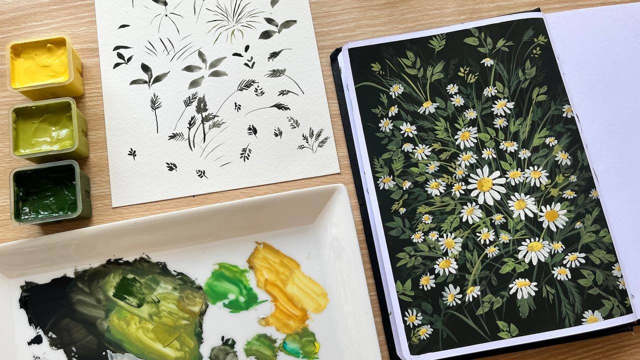
2. Materials you need: Let's talk about the materials
required for this class. You can use any
sketchbook or paper. Since we are working
with Gauche, it should preferably
be around 200 GSM or thicker so we can work smoothly without
damaging the sheets. Next, we need a pencil
for the sketching part. Then I need a eraser. And as for the paint, I'll be using this Him
Mia jelly gauche set. You can use any gauche brand
you're comfortable with. Now for the brushes,
I'll be mainly using a few flat brushes and a
few round ones as well. Next, you need a mixing
plate to mix the colors, and finally, a jar of water.
3. Let's paint the Color Wheel: In this lesson, we
are going to explore one of the most important
foundations in art, which is the color theory. We learn how colors
interact, how to mix them, and we'll actually paint our
own color wheel together. So by the end, you'll understand what terms like hue, primary, secondary, complementary
colors really mean and how you can use
them in your own painting. Now, let's start with
a very common term. You'll hear a lot in color
theory, which is hue. Hue simply means the
pure form of a color, like red, blue, yellow, green. You'll also hear about
value and saturation, which we'll be exploring in
depth in the later class. But for now, just remember that hue is the identity of a color. Now let's begin by understanding the building of our color wheel. The first step is to place
the three primary colors. It's going to be red,
yellow, and blue. These are called
primaries because you can't mix them
from any other color. Instead, these are the bases that helps us mix
everything else. Now, before we get
into color mixing, let's quickly take a
look at a few basics. As you can notice, we
have a lot of reds, different set of yellow and
different varieties of blues. So if we divide colors
into two categories, we can broadly classify them as warm colors and cool colors. The warm colors are
on the side of red, orange and yellow, while the cool ones belong
to the other side. Now, the warm colors remind us of sunlight, fire, and warmth. Now on the opposite side, which we have the cool colors, namely blue, green, and violet. These remind us of
water, sky shadows. They normally give us that calm, peaceful and soothing vibe. So if you look at
this set of reds, you can see that this one
is more close towards blue, which goes to the cooler side, while the other becomes more
towards the warmer side. Same way, you can differentiate the colors you can see in
yellow and blue as well. So in the next class, we'll focus a lot more on this part. So as for our color wheel, I'll be using these
following colors that is red, yellow, and blue. And for the brushes,
I'll be using these two. I already have the sketch
made for the color wheel. You can take a look at
the resources tab below. So let's begin with
the primary colors. But before we begin,
let's gently rub off any dark pencil strokes
that are showing through. So this way, the paint
will look clean. Now, I'll paint this part
of triangle with yellow. Now always remember when
you're working with gouache, dilute your paint just
enough before applying, so it spreads evenly
and also smoothly. Once that's done, we'll
move on to the color red. Finally, we'll add blue to the remaining section
of the triangle. And with that, we have
our three primary colors. These are the base colors we can't mix from anything else, but they'll help us to create all the other
colors in the color wheel. Let's see how it happens, starting off with the
secondary colors. So secondary colors are formed by mixing equal amounts
of primary colors. That is, if you mix
equal amounts of red and yellow, we get orange. So for this, make sure you're
mixing equal amount of each and don't forget to wet the brush for the
smooth application. So in between red and
yellow, in this triangle, I'll be adding orange, as this was the color I got when I mix these two primaries. Next, if you mix
equal amounts of red with blue, you'll get violet. You can place this color in between red and blue over here. Next is yellow and blue, which will be giving us green. So these are called
the secondary colors because they are created
by mixing two primaries. Now, to complete
the color wheel, I will be marking the
recently mixed colors in the respective
boxes, as you can see. Once the primaries are done, I'll move on to the
secondary colors. Now, we have the primaries
and secondaries filled. Next is for the tertiary colors. So if we mix primary with
its neighboring secondary, we get what is called
a tertiary color. So red plus orange
gives us red orange, yellow plus orange
makes it yellow orange, and so on around the wheel. So this gives us six more colors and completes our 12
part color wheel. So I'll be mixing
each primary and the neighboring secondary in the same way to complete
the color wheel. You can take your time and paint along with me to complete the V or even pause the video
and resume once it's done. And with that, the color
wheel is all done. Now, if you look at
the color wheel, you can clearly see
the division here. We have warm set of
colors on this side, while the cool ones
on the other half, I'll quickly mark them as well. And additionally,
here's a quick recap. Next, let's talk about
tints, shades and tones. So these are simple ways on
how you can adjust any color. Talking about tint, that's
when you add white to a color. As you can see, I'm slowly adding more white
to this color red, which gives us
various tints of red. In a similar way, you can obtain tints of various colors
that you prefer. Now, if you replace is white with black and repeat the same, you're going to get
different shades of red. And when you add gray instead, you'll be getting
different tones of red. Next, let's talk about
monochromatic colors. Mono means one and
chroma means color. So monochromatic painting is
when we use this one color but create different values by making it lighter or darker. So you can say that it's
a combination of hue, tints, tones and shades
of a particular color. Next up, let's see how
colors work together. These relationships are
called color harmonies. First up is analogous colors. These are neighbors on
the wheel like yellow, yellow orange and orange. They create soft and
harmonious combinations. Next would be the
complimentary colors. They sit directly
opposite to each other, like yellow violet, red, green or blue and orange. So when placed together, they create contrast and
make each other pop. And also, do you
wonder what happens when we mix these set
of colors together? You'll end up getting
a muddy brown. So that's the introduction
to basic color theory. We have painted the full color wheel, learned about primaries, second read tertiary colors, and discovered how they
work together in harmonies. You can also add this
for your class project, as it can be handy anytime when you start with
your painting journey. In the next lesson, we'll take these ideas further into
values and value studies, so get ready to apply
what you have learned.
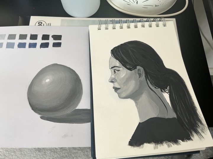
4. Value Scale: In this lesson, we are
going to explore values. One of the most important
concepts in art. Colors make a
painting beautiful, but it's values that
make it look realistic. Value simply means how
light or dark a color is. So if you get the values right, even the simplest drawing would look three dimensional
and believable. Now, let's create a
quick value scale. This helps us see the
range from light to dark. So on one end, we have white, while on the other
we have black. So in between, we have
a series of mid tones. So you can make a seven step or a five scale depending on how
detail you want it to be. So you can start by
taking a wet brush, and I'll be using white first. You can add a bit
of water to it as well and start filling
the first box. Now, slowly in the
proceeding box, you can add a bit of
black to this white. So you should be showing a gradual increase
in the darkness. I should have taken only a
very little bit of black, but I'll be adding more
white to keep it light. Now, once the color is ready, I'll fill in the next box. Now, you can add a
little more black to this to darken it a little bit. So we'll basically be
repeating the same process till we gradually shift the
color from light to dark. The main idea here is to add a little more black as you
move to the next box. Now, finally, in the last box, you can simply take the
plain black and fill it. Now you can see the
values from the lightest to the darkest
in the same scale. The lightest is the highlight while the darkest is
going to be the shadow, and in between, you have
a range of mid tones. Now using the same concept, you can try using
a different color to create a new scale. Now I'll be using blue here. I'll be using the same palette as before to make
the next scale. Now to this white,
I'll be adding a little bit of blue to
start the first box. Next, we have the
lighter set of gray. So to this, if you add blue, you'll be getting
the next color. In the similar manner, you can simply repeat the same process till
you reach the last box. Now, for the final box, I'm mixing blue with pure black to get the
darkest value of blue. So in the same way,
you can also create different value scales
by using black, white, or even any
other color. Oh
5. Light and Shadows: Now let's understand value in depth by studying how
light affects an object. First, let me show
you what happens when a light source hits a
sphere in this way. So the light is hitting here. Now, in order to understand this before we get
into the concept, you'll have to know there are five different things you'll need to remember while
doing this thing. First, we have the highlight, which is the brightest
part on the sphere, which is directly
hit by the light. Then we have the light area, the area which
receives the light. Next, we have different areas of mid tones or even half tones. So this area between
the light and shadow is going to be a
smooth transition zone. Then we have the core shadow, which is going to be the
darkest part of the sphere, and this is placed exactly in the opposite direction
of the light source. But here, after
marking the shadow, we have a soft light ret
inside the shadow area, which is actually caused by the light bouncing from
the surface below. Also, make sure you mark these areas according to
the shape of the object. Then finally, we
have the shadow, the sphere cast on the surface, which is known as
the cast shadow. It's actually darkest just under the sphere and gets
lighter as we move away. I hope you have understood
the basics now. Now, let's paint the sphere together step by step
using black and white. Now, I'm using the same
light direction here. You can also mark the
direction of light with a small arrow
as we did earlier. Now, let's start by mixing a mid tone for filling
the entire sphere. So for this, I'm using
an intermediate gray to fill in the entire sphere. Instead of using a thick paint, I'll be using a light wash. You can very well use a bigger
brush to fill this area. So after you have
filled the entire area, let's keep the
highlights for the last. So here you can start by taking white and mark the area
that receives light. As we already have
gray underneath, the color automatically
becomes light gray. Oh Next, you can gradually
add black to get these mid tones in
the following layers. And most importantly, make sure the paint
consistency is good, so the blending
happens smoothly. As you can see, I'm trying to
blend the layers in between and don't forget to
keep your strokes that are similar to the
shape of the object. Now, gradually darken
the opposite side to form the core shadow. So as you are painting, it can be difficult to blend. So make sure you first
mark the values, and later on, you can
blend the final one. Now, for adding the
reflected area, you can slowly add a softer edge of light
within the shadow area. Now, as you can see, the
blending isn't that great. I'll go for another
round of blending. Here again, I'll darken the core and blend it towards
the highlight area. Now, as I'm shading, you can very well
notice how values define the form more
than the outline does. Even without strong lines, you can very well
tell that this is a sphere just because of
light and dark areas. Now, let's finally paint the shadow, which
is on the surface. So there was a small error here. Instead of placing the
entire cashado in one color, you could have lightened the edges which is further
away from the sphere. Finally, you can
add the highlight using plain white to
finish this study. Now, here's a quick recap. So we have this direction of light falling onto the sphere. So where the light hits directly is what we
call the highlight. Now, as we move away, this light gets darker, giving us mid tones
and half tones. And then we have the core shadow the reflected
light from the surface. And finally, the case
shadow on the surface. So that's going to be our study
of values using a sphere. Once you master this, you can apply the same logic
to any object. I hope now it's clear regarding the basics of
lights and shadows. And with this concept, let's move further and apply
it in a portrait study.
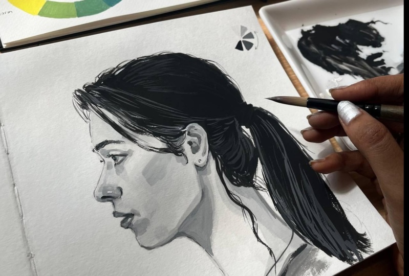
6. Let's Sketch the Portrait: This is going to be the
reference of our painting. Now, let's break down the sketch step by step
using Lumi's method. So, as usual, we'll
start with a circle. I'll make sure the
circle is big enough, so it fits within my sketchbook. You can always take
your time to shape the circle as it's going to be the foundation
of your sketch. Now, as you can
see, the person is looking exactly to the side. So in that case,
we know that this is where we should be
placing the sliced side. So to get that circle right, I'll make sure to
mark the center of the circle and then proceed
with the sliced part. After that, let's mark
the central axis. As you can notice, it's
not exactly straight. It's slightly tilted inward, that is towards the chin. Next, let's mark the vertical
line for the sliced part. So for this angle, the
horizontal division will give us the eyebrow line. Following which I'll also
mark two parallels above and below to mark the hair line as well as the nose
line respectively. Now, at an equal distance
below, you can mark the chin. Next for the eyes,
you can divide this part into three equals, and the first line would
give us the eyeline. Next for the mouth, you can
divide this part into half. The nose is projecting outward in the shape
from the eyeline, so you can mark accordingly. Now you can connect this
tip to the chin directly. So this will be a
useful guideline for the mouth as everything will be falling
within this space. I'll explain it
later as we proceed. Moving on, let's now bend
and connect the jaw line. Now with these guidelines, we can start shaping the face. Now, for the mouth,
follow the guideline and keep it simple using
simple lines and curves. So whenever you find
anything complicated, make sure you break it down into simple lines and shapes to get a better
understanding of it. So you can see that
I'm approaching the lips in the
easiest way possible. As I had mentioned earlier, you can see that the lips comes within the space
which we had marked. You can now connect the chin using a small curve like this. Once you have marked the chin, you can extend it to shape the neck. Now, here
we have the year. I'll first mark the hairline and then proceed
with the detailing. You can follow the
guideline carefully from the reference so you
get the details right. Now that the overall shape
is done for the hair, I'll also add a few
stray hairs like this. Next, let's get into the details. I'll
start with the year. Next is the eyebrows, which are placed along
the eyebrow line. You can shape the nose and then connect it this way
to start the eye. As I had told earlier, it's pretty easy to sketch
using simple lines. So this is how I'll
be sketching the eye. Now, this would be
the cheek plane. After that, you can proceed with the detailing in the nose. We had already marked
the lips, so it's fine. You can correct
anything if required or else proceed
with the next step. Now that we are
done with a sketch, you can erase the dark lines
before starting or painting.
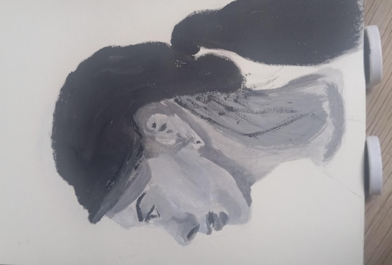
7. Monochromatic Portrait Study: Like we did earlier
with the spear, let's paint the portrait with a light gray wash. For that, you can start by mixing white and black with plenty of water. I'm using a thicker
round brush here, so it's easier to
cover the entire face. And once the color is ready, I'll go straight in
for the base layer. The reason we begin with
an intermediate color is that once this
layer is in place, you can either increase or
decrease the values as needed, instead of starting directly
on a white background. Uh now if you look
at the reference, you can see that the
highlights are clearly visible at a few particular places
like around the forehead, above the eyes, on
the nose, cheeks, above the lips, chin, ears, and a little on the neck. And in contrast, the
darkest areas are the hair, eyelashes
and eyebrows. Let's begin by marking
the dark values first. So for that, I'm mixing black with a little
touch of white, since we may need the pure black for
further detailing later. So keep this mixture a bit
lighter than pure black. So I'll start with
the hair first. So using this color, you can fill in the entire hair area. Once that's done, I'll
add a little white to the sa mixture to create
the next lighter value. And with this, I'll shave the eyebrows using a thin
round brush for accuracy. In the same way,
I'll paint the eyes, and while painting the details, you can keep the
eyelashes delicate. So based on the detailing, you can actually change
the brushes that you use. So here I'll be using the thin round brush
for this purpose. Now, moving down, I'll also mark the nostrils with
the same color and also a few other places where I feel that they all
share the same value. Now that most of the dark
sections are covered, let's move on to
the lighter colors. For this, I'll prepare
a fresh light gray mix. For this, I'm using
another flat brush. Now, using this flat brush, I'll block in the soft shadows
visible around the eyes. You can see a few
around the nose. So just like we did earlier, you can identify the
areas which share the same values and you can
paint this accordingly. Now, if you look
at the reference, you can find that the neck area is pretty darker than the face, so you can plan the
colors accordingly. Now, what we have done is simply blocking the color
based on the values. Now, in order to blend
this value with a face, I lighten it slightly
and then merge it into the base layer
we had applied earlier. Now you can take your
time with this step so you can blend it smoothly
without rushing. So as you can see, as I apply white to this
previous color, you'll get a lighter version. And using that,
I'll blend it with the early layer that we
did in the beginning. If you notice I have left
the top of the cheeks untouched because that's
for the highlight area. Now that the light
values are in place, let's move to the
next darker value where the shadows appear
a little more deeper. So these areas fall in the
same region as before, but this time, the values start defining the features
more clearly. So take a look at the reference before you start with this step. So especially while painting, carefully observing
the reference is a very important step. So defining features at
this stage is very crucial. Give some time in analysing the reference along with their values and then
start with your painting. Now I'll add more
black to this mixture, and it goes to the
neck area now. Now that many features
are established, we can refine the ear with colors which are already
present in our palette. Next, deepen the mix slightly again and repeat
the same process. So identify where this value belongs and you can
paint accordingly. Now getting into more details, I'll now finish the ice. You can either use a thin
brush for control or adjust a flat brush to
handle the details. Now with the next dark value, I'll add the remaining
smaller shadows. Now, for the hair, I'm using pure black with a thin round brush to paint the strands which are
falling onto the sides. So this thin round brush is very helpful for
minute detailing. So as you can see, I'll
be using the same brush to define the fine strands
that's running behind the ear, and I'll also continue using it for the remaining
hair details. Now, since the hair
is already dark, we'll bring it to life with adding lighter values
for the highlights. You don't really have to
draw every strand of hair. Instead, you can denote a few waves of hair
here and there. And here's a key tip. You don't really have to
draw every strand of hair. You can simply
suggest a few waves here and there that
would really do the job. Now, instead of sticking
to one lighter value, you can mix slight
variations from the palette to create
the depth and texture. So I'll be using different colors from this
to define the hair details. You can also refine
the outline of the face with a thin line. It's not that important, but it does help in
defining the overall shape. And finally, the last step is adding highlights
with pure white. You can look at
the reference for a better understanding and place this color
wherever required. As you can see, mostly it
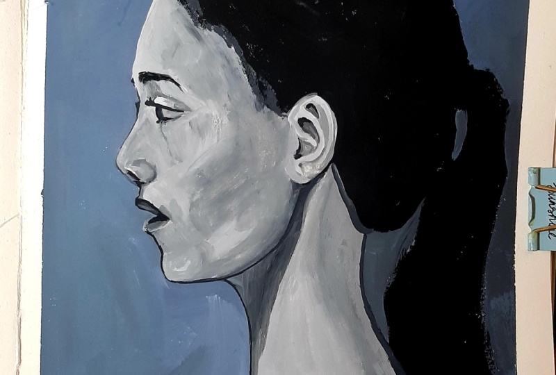
would be present at the nose, above the eyes, lips. I'm also adding a little bit here and there around the hair. And with that, we have completed our monochromatic value
study of a portrait.
8. Thankyou for joining!: That's a wrap. Thank you so much for joining
me in this class. I really hope the class was
informative and it gave you confidence in exploring
values in your portraits. I'm very excited to
see your projects, so make sure you complete
your projects and upload it in the project
gallery, as you can see here. It would also mean
a lot if you could drop a quick review
below I feedback really helps and encourages me to keep creating more classes
for you and with that, we are winding up the class. Once again, thank you so much for joining
me in this class. I'll see you soon in the
next class where we'll be stepping into the world
of colorful portraits. Until then, have you painting.
 Anagha Sivadas, Artist, India