Transcripts
1. Welcome to the class: A sketchbook is not
about perfect art. It's about showing
up and creating with one page at a time.
Hi, everyone. I'm Anagha Sodas, a self
taught artist from India, and I'm so happy
to have you here. So welcome to my ongoing Gouache Sketchbook Series
where we are painting an entire sketchbook
together with one painting at a time while gradually
building our skills. This series, we have already
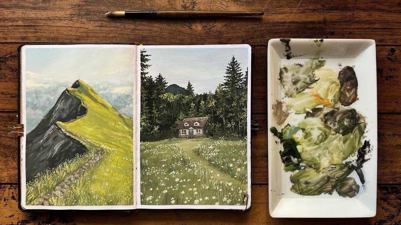
completed a few classes. We started off with
floals then moved on to a green spread focusing on hills and a cozy
house in the forest. After that, we explored
a winter theme where we painted our first snow
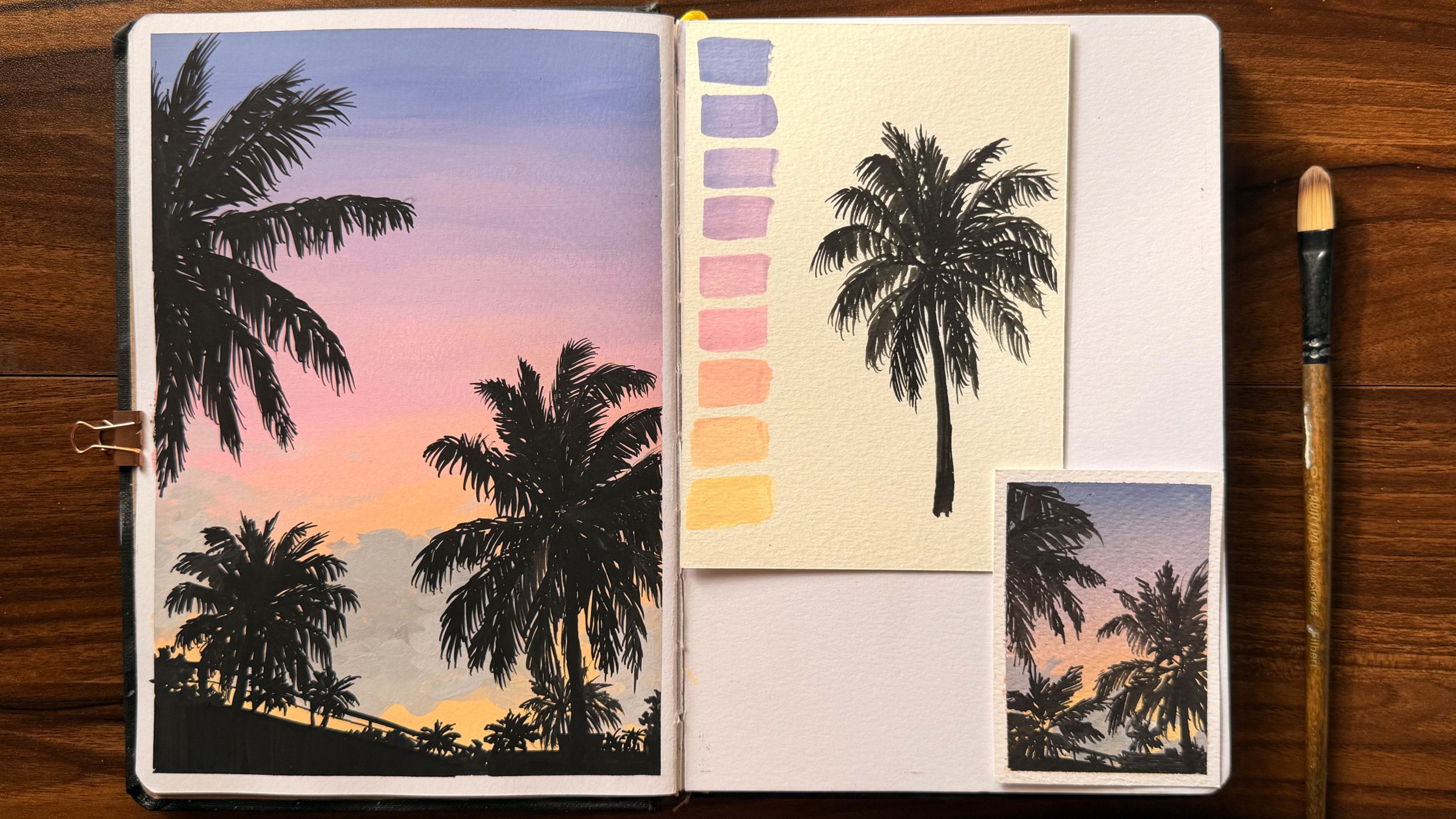
with a winter landscape. And now, in this class, we are going to paint
a beautiful seascape. This class is open for everyone, whether you're a beginner
or someone with experience. Even if you have never
tried gouache before, you can still follow along. And if you are completely
new to this medium, you can check out my short class where I have explained
the basics of gouache. It's a very simple
and crisp class that covers everything you
need to know to get started. In this class, we'll begin by going through the
materials that we need. Then we'll understand the
reference, and step by step, we'll start painting
from the background and gradually move towards
the final details. And you can approach
this class in two ways. You can either watch
the class first to understand the entire process
and then paint on your own, or you can paint along with
me as we go step by step. So with that, let's get started.
2. Materials: Now, let's get started
with the materials. So the very first one
would be our sketchbook in which we have already done
our previous classes. So the sketchbook is of 245 GSM, and you can also
get a similar one. And then for a few
practice demonstrations, I'll be using another
sheet of paper. Now to sketch, I'll be using this mechanical
pencil from Brotro. Then we need an eraser. Now, for mixing colors,
we need our palette. Now for the brushes, again, we'll be using the two types which are flat and round ones. Then we need a jar of water and a few tissues
to clean our brush. And most importantly,
we need our gauche. I'll be using the Himia
jelly gauche set, but you can use any gauche
that you're comfortable with. And with that, let's get
started with our glass.
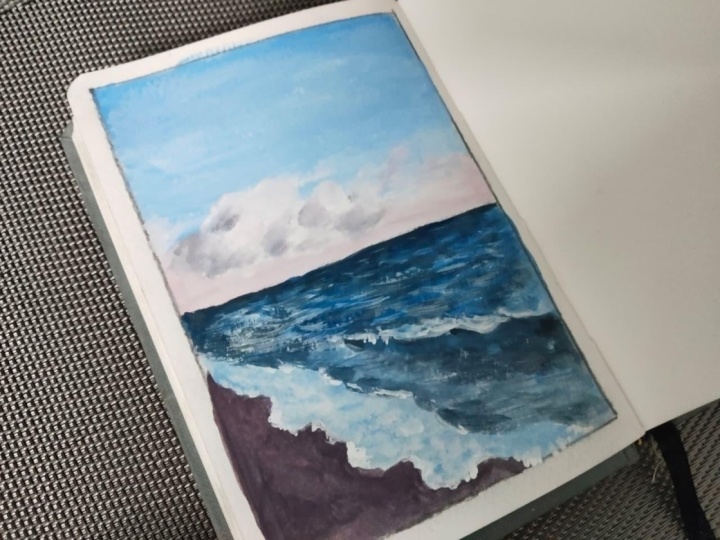
3. Reference Study: Now, before we get into
the painting part, let's understand the reference. So for that, I'll start by marking the edges
with a washi tape. So once the sites are secured, let's start with this
side of the page. Now, let's begin by
understanding the reference. So like usual, let's start
by dividing the page. But here we only need to
divide it horizontally. So roughly here, this is
going to be the middle. Now, this would be the sky and the bottom part
would be for the sea. And here we'll have a
transition of colors. We'll start from blue slowly
going to a light blue, and at the bottom, here, we'll have some yellow,
while at the very bottom, we'll have a light cream color. And just below the
middle of this part, we'll have some clouds. Then in the bottom
half the painting, not exactly from
the very corner, but slightly below that. If you draw a curve diagonally towards the
corner of the page, but not exactly in the corner, but slightly away,
we'll have the waves, so you can roughly
mark like this. So here I'm drawing
two sets of lines, that is two sets of curves. So one above the corner and the other meeting just on the
other side of the corner. And here, this would
be a part of the wave. So here I'll be marking a line which shows
a prominent wave. Now for you to
understand this better, let me show you more precisely. So imagine these
two other points, and you need to draw a wave. I'm not simply drawing
a very slight curve, so I'll curve a little
from the very start and make a wider curve as we move
towards the closing end. Now, regarding the
painting part for the sea, the very end would be dark, and wherever the waves
are prominently seen, the colors would be darker. And here we'll have the beach, which would be dark
brown in color. So this is going to
be the basic layout. Now, before we move on
to the painting part, let's remove the dark pencil
strokes using an eraser. Now, once everything
is removed, here, the only line we need at this
point is the central line. So let's mark that.
And after this, let's move on to
the painting part.
4. Background Sky: Now, before we start painting, I have covered the other side of the page using a baking sheet. So now let's start with
the background sky. For that, we'll be
starting with blue, and slowly as we move
downward, the blue decreases. And around here, we'll
have a light cream color. So it's a transition
from blue to light blue, and then to light cream. First, we'll do
that and for that, I'll be using a flat brush. The very first color we
need would be white, so you can take a good amount
of white onto your palette. I'm taking the colors
from light to dark. So next we'll need some yellow. Next, we need some cream. We need sky blue and
ultramarine blue. Now let's start by wetting the brush and begin with white. As we are not using the same
deep blue for the full sky, we'll use a light
variation of it. So let's begin with white first
and slowly you can mix in these blues and blend
the colors until you achieve the kind of
blue you want for the sky. Here, as you mix more and more
paint, it can get thicker, so make sure you use water in between to make the consistency right and also
create a good amount of paint so you don't
run out in between. Now, once the color is ready, I'll start with the
very first layer. So using this color,
you can layer the paint for the
first part of the sky. Now slowly, once you have done the two layers
of this color, let's start blending
with a lighter blue. For that, I'll
take the same blue and add a little bit of white to this mixture to show
the transition from the current blue to a
lighter variation of it. Now, as the paint
is still not dry, we can blend it with
the previous layer. As we move on the sky, we need to add more
and more white. So always make sure you blend the previous color with
a lighter version of it. Once we have read just
below the center, I'll take some white directly because we need a very
light color here. Now, using a wet brush, I'll blend the white with the light blue above
so that we can get a smooth transition from
blue to a very light shade. Now let's move to the
bottom part of the sky. For this, we need a
fresh batch of white, and I'll be using yellow, along with a little cream to
get that light warm color. So on this corner, I want it to be slightly
more yellowish. Once that's done, for
the remaining part, I'll add a little more cream. And using that color, I'll create a thin line. Now to blend these colors, you can add more white, just like how we
did for the blue. So using white, I'll
blend this color. So it's important not
to blend directly blue and this warm color because mixing blue and yellow
could give us green. So make sure that
doesn't happen, and that's the main
reason why we are using white to blend these two
colors in transition. And with that, our
background sky is now ready. Let's wait for this layer to dry and then move on to
painting the clouds.
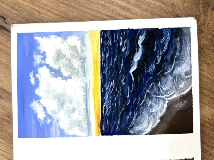
5. Clouds: Now for the clouds
to study them, I'll be using a
smaller flat brush. So for the clouds,
we'll be using the same colors that
we have already used. There is the blue along with
the same cream and yellow. So here, let's first
see what colors we get when we mix this blue
with this cream color. And here's a quick note. If you mix any cool
color with a warmer one, you'll get a muddy color, which can either be more
towards gray or towards brown, and it depends on
the colors you use. So here, when you mix
these two colors, we are getting a sort
of grayish blue color. Well, it depends upon the amount of blue and cream you use. So the cream color we are using here is similar to a skin tone, somewhat like a mix
of orange and yellow. So when I mix these two colors, this is the kind of color I get, and it's more towards
gray color here. Now we can paint
directly with a brush, but let's first understand
the concept using a pencil. Now imagine this to be a set
of clouds along this line. So let's first mark
a line and place a few ovals or rounded
clusters like this. So this is going to be the
overall shape of the cloud, and the outline will
give us a rough idea. So with this idea, let's
try to paint the clouds. I'll show you how to paint them. So using this color, I'll
first draw the line like this. Now let me demonstrate it first. So I'll use this color to roughly outline the
shapes that we drew. Here, I'm not defining
the shape exactly, but keeping the edges
irregular like this, we can paint the clouds. So let's paint the clouds
this way by having clusters of ovals and rounded shapes as
our base reference, and then letting the
paint brush do the rest. This can be very random. So if you have a reference, you can practice a
few on your own. I'll actually help you
improve your painting. So here I have
sketched it first. Now using these colors, I'll start with one side. I'll be using this color on the left side of the
clouds because I'm planning to keep the sunlight hitting the clouds
from the other side. So this part would
be the shadow part, while the other part will
have the lighter colors. So on every rounded shape
that we have drawn, I'll mark only the left side
to add the darker color. Now, as I go ahead, I'll add a little bit of blue. Now, once you
understand the concept, you can add as
many colors as you want to make the clouds
look more lively. Now I'll slowly bring in
a transition of color. So to this dark color, I'll make some white and add
it in a few places like this before we add the
final highlights where the sunlight hits. Now, clean a brush and
take some cream and yellow color along with a little white to add the
warm highlights. And not everywhere, but on
the right side of the clouds, wherever I have space, I'll add this color. Now, I'm using white here. In this case, I'm
not using pure white directly as our background
is already white. But in our main painting, we can use white directly, since the background
will be blue, so it won't be a problem. So here I'm adding white
to the light green, and I'll use that color to add further details to
the clouds like this. Once this is done, you can slightly blend this
color with the shadows. And also, if required, you can further
lighten this color. Now, with this concept in mind, you can explore by
adding other colors. Usually sunset colors
include orange, yellow, red, pink, and sometimes
some cream tones. So I'm adding a little
bit of pink here. It's not necessary, but once
you understand the concept, you can use any colors that you feel would work
well with the clouds. As we have seen in
the previous classes, mixing yellow and pink
gives us a soft orange. So I'm trying that here. Remember, we won't be doing
this in our main painting. This is just for
a demonstration, so you can simply watch and
understand the process. Now with this concept, let's start with
our main clouds. So here we already have some blue and cream
along with yellow. So let's add what is not
present, which is white. So let's start with dark color. So I have added a little
too much of blue, so let's slowly add cream now. If you want to lighten it, you can add a little
bit of white. So gradually, you
can mix these colors until you get a nice
bluish Greek tone. Once you mix the colors, you can check it
on a rough sheet. To see if it's the
color you need, I'll just quickly cross check
it with our main painting. And when I compare it
with the background sky, which is the light blue part, I feel I need to add
a little bit of blue to this cloud as the previous
mix looked too gray. Now, this color looks much better and more on
the cooler side. So I'll fix this color, but I'll create more of it. Now, before using this color, let's first sketch the
clouds with a pencil. So just above this line is where we'll mark the
base of the clouds. Here you can draw a few
clusters of circles over it. So this is roughly the
middle and just below that, you can place the clouds. And here, I'm not fully
drawing the circles, but I hope you
understand the idea of how to keep the reference
for those clouds. You can very well keep
the reference sketch in your mind and start with the paint directly if
you're comfortable. Otherwise, you can sketch
first and then paint. Now using this dark color, I'm marking the sides of
the clouds with gray. You can first absorb how I'm painting and then go
ahead with yours. So here on one side, we'll have the shadow parts. So that's why we are using this gray only onto the
left side of the shapes. And also, I'm not extending the clouds all the
way to the right. I'll stop it roughly over here. Now, I'll add the
next lighter color by mixing a little
white into this. Using a few straight
strokes like this, I'll add the clouds
that are further away. So below this cloud layer, I'll mark a few
strokes like this. And then using this
lighter version, I'll add the transition color. Once that's done, let's add the light highlights
for which we need white, cream and yellow. Again, I'll just check if
this is the color I need. Now, I feel that I need a color that's much
lighter than this, so I'll add a little
bit of white. And once the color is ready, I'll add the
highlights directly. As you can see, since our
background is already blue, adding a lighter
color here is not a problem as it shows
clearly over the blue. So using the tip of the brush, you can outline the
clouds as you like. Once you're done
with this color, you can lighten it
further by adding more white for the very
tip of the clouds. You can slowly see how the
colors build up in layers. I'll also add a slight highlight by mixing a little bit
of yellow and white. And these are very minute
details in the painting. Next, I'll gently blend the shadows into the
highlights using a wet brush. Now for the bottom part, which represents the clouds
further behind, I'll use the same strokes
to add these colors. Now using a thinner brush, I'll take white directly
and use it to highlight the tips of the clouds like
this for a better definition. Now, this part is complete, but let's take a
light colour and add a few scattered layers of clouds like this
on both the sides. M. Here, I'm using a dry brush technique, so I'm not using much water. The paint is quite thick here. So with that, I'll add a few strokes like this
to show these clouds. You don't have to
overdo this step. You can skip it if you want. But if you're interested, you can very well give it a try. Now, if there's anything
that you want to adjust, you can do it at this
stage of your painting. I'll darken a few clouds
using our dark color. I'll not fully redo it, but only in a few places. And once it's done, we are ready to
start the weaves.
6. Waves Part 1: Now to begin the waves, we need the following colors. We'll start with white. Then we need sky blue. Here, I'm taking
some Prussian blue. And we also need black. For this, let's start
with a bigger flat brush. So we can begin by wetting the brush and starting
off with the blue colour. For that, I'll take a little
bit of white, and to that, I'll add Prussian
blue along with a little bit of black as we
need a darker blue here. And also, make sure that you use a very little amount of black as we don't want it
to turn to gray. So using these three colors, mix them until you get
the desired sheet. Now to understand the color, I'll do a patch test first. Here I think I'll go ahead and add a little
ultramarine blue, which we had previously
used for the sky. So here, if we mix that, we might get a cooler
and more vibrant blue. So let's take a little
bit of that blue first and mix with
our existing color. As you can see, the blue looks much brighter and
more vibrant now. Okay. Now that the colors
are almost ready, you can first do a
patch test if you want, or else you can go ahead and
start with the painting. So I'll start by marking
the end line like this. Here, the furthest part
of the C would be darker. So slowly take your time
and mark a line like this. On the end as well, you
have a darker color here, so I'll be using the same
color for this side. And remember, we had marked
a wave here earlier, so I'll define it
using this dark color. Also, I'll use the same color to define the waves which we
had initially talked about. So this you can simply
border it this way. Now using a lighter color, let's fill the remaining
portion of the see. For that, you can mix
a little bit of white with the colors and fill
in this blank space. Mm. Also, in a few places, I'll blend this
dark color as well. And here I'm adding it in
the front area like this. Since the paint
is not fully dry, I'll use this to blend
the color smoothly. Always remember not to add
too much of water because blending won't work properly if the consistency is too thin. So make sure the
paint consistency is good for the blending. Now that we almost have
finished adding the colors, I'll go ahead and mark the
darker areas once again. Now that you have an
idea, let's do it again. That is, at the very end, it should be darker, so
I'll add dark color here. Now, this is going to
be our base color, so it won't be fully dark, but let's also give some
light base color as well. So for that, just
below the clouds, we can add some high
light values to the sea. So for this, you can
mix a little bit of white with the light blue color, and then you can
add the same way as I'm doing it
on my sketchbook. So as I just mentioned, this is going to be
the base layer for the waves before we
define them with details. Now, after you finish
filling up the space, let's wait for this layer to dry before we move on
to the detailing part.
7. Waves Part 2: Now that this layer is dry, let's start with the detailing. For that, I'll mix
a shade darker than our previous dark blue by adding a little black and Prussian
blue to our earlier mixture. Here, I'm using a round brush because it has a pointed tip. You can also use a thin
liner brush if you prefer. So using this color, I'll just show you how
I'll be doing the strokes. So here, this is the shape
that we are going to make. It's a broad u shape. That is a wider curve. So this is the kind
of curve we'll be making to
represent the waves. You can practice this a little before moving on to
the main painting. Now, let me make this
process a little more clear. So let these two colors
be the ones present in C, namely the color one
is the darker blue, and the color two is
the lighter blue. Now, there will be two types of highlights here to
demonstrate the waves. One is the dark highlight while the other is going
to be the lighter one. For the darkest
highlight, we'll be using a shade darker
than color one, as it should be visible over both color one and color two. So that is why we
are using a shade darker than color one for
our darkest highlight. Then to add light
highlights, for color one, which is already
dark, we can use the color two itself to show
the lighter highlights. But for color two, which is
already a little lighter, we cannot use the
same color again. So we'll be using a
lighter version of this color to mark the
lighter wave highlights. So this is going to
be the concept that we'll be carrying out
throughout the process. So using this idea, now let's use the dark color
to start defining the waves. So now that the color is ready, let's start using
this color in places where we had already
marked our dark values, which means we'll be
starting from the very back. Once you have
finished that layer, let's slowly start moving
towards the front. Here, you can do a few more
rounds of the same process. And if it's not clearly visible, let me just show
you what I'm doing. As the waves are not clearly defined because of the distance, I'll use very thin small lines
like this to define them. So for a few layers while
moving towards the front, we can add these details
to show the waves. Mm. Next on the lighter
part of the base color, I'm also adding a
lighter version of this dark color
to show the waves. So I'll be repeating
the same process till I reach the front. You can keep the wave small
till around the middle. Now as we reach the front part, I'll be defining the waves
in a much better way. You can use the same curve, but here we'll be using two sets of such curve to
indicate a wave. So this is how we'll be
drawing the waves now. You can also add a set of these lines together in order to indicate the waves
that we are going to paint in the middle
part of the sea. So don't keep the brush strokes too big as I'm showing here. You can keep it size bigger
than the previous one. Here, wherever I feel the
need to define a few waves, I'll use this concept. Now to darken this
side of the sea, I'll add more details over here. That is, I'll be adding
more waves in this part. Now, as we're getting closer, let's define the
waves a little more. So here, I'll show you
how this is painted. We can first add one
side of the wave like this and then
mark the other side, but not too clustered. So you can see that one side has horizon part of the wave
while the other one is flat. So using this concept,
you can paint the waves. That is, one part is more detailed while the
other one is kept flat, giving an illusion of a wave. Now for the bigger
wave in the front, I'll first mark the
wave like this. Then on the front part using
the same curved lines, I'll fully fill this side
and on the other side, I'll just keep it flat. So here you can see it is
giving an illusion of a wave. Now let's do this in
our main painting. I'm adding a little
bit of black to this mixture to get
a darker color. So let's go ahead and first mark the outline
of the Big Wave. Once that's done, let's fill in the dark side using
these strokes. Then on the other side, you can lightly
add flag details. Apart from that,
just in the front, you can add a few
details like this. The shape I use is
the same throughout. The only difference
is how I place them. So you can practice a
few on a rough sheet before you paint it in
your main sketchbook. Mm. So in the front, I'm using the same concept and adding a few waves
here and there. H. Now that the darker portion is done and the paint
is almost dry, let's add further details. And slowly, you can see that the sea is getting better
with the waves in the frame. Now let's add the
light highlights, as we discussed earlier. For this, I'll use this
lighter version of blue, especially for
highlighting the base, which was lighter initially. So here on the side and
just below the clouds, I'll add a few light highlights. And not just there. In a
few places here and there, I'll add these highlights. Also, on the other
side of our big wave, I'll add a few
highlights behind. Now, once this
potion is complete, let's allow this to dry and
move on to the next part.
8. Final Details: Now let's move on
to the final part, which is to add the
sand or the beach. For that, I'll be
using burnt umber. If you don't have this color, you can go ahead and use
brown along with some black, and also I won't be using
this color directly. Instead, I'll mix
this color along with a blue that's
present in our palette. Here, you can directly use a flat brush to
apply it like this. If you remember, we
had initially drawn a curve like this while we
were explaining the reference, so you can stop the
brown at that curve. Now, add some water to fill
the remaining portion. So I'll be using a light wash of this mixture that I
have on my palette as an underpainting
to add the tip of the wave where you can
see the form of bubbles. Mm. Once this layer is fully filled
using a light wash, I'll go ahead with
a lighter version of this color by adding some white before this layer dries so that I can
get a good blend. So here, using this light color, I'm going ahead and
painting this portion. M. Now, before we add details, I'll further enhance
the layer that meets the base by
blending in some blue. Next, let's define it further
by mixing a darker blue. We don't need this
much of black, but I'll be correcting it
by mixing other colors. Now using this dark color, I'm further detailing
the waves in the front. So take your time and define the wave much more neatly now. Once the dark color is done, using a lighter color, I'll
add a few more details. And not just that in
the new area as well, I'm slightly mixing
this blue to show that this part is an extension
of the wave itself. It's just the tip of the
wave that has curved back. So now to detail
the remaining end, I'll use a lighter version
by adding some white to it. First, I'll be defining the borders using some
rough lines like this. And now throughout the space, I'll add some rough
strokes like this. Then at the very tip, I will add more white to this
color to define the border. And using the same color, I'll add a few
more rough strokes like this to mark the details. So basically, I'm
taking the paint, removing the excess water, and rubbing it on the
page this way so that you get a rough texture.
So this is what I did. Now, once that's done,
I'll use white to add a few dots to show
the form of bubbles. Now to show the highlights
of the sunlight reflection, I'll use some cream along with the white to add
a few highlights, especially where
we had previously added the lighter highlights. So also this step, you don't have to repeat
on every light highlights, but you can do this in a few places in the
middle like this. And also you can add some here. Now for the last step, I'll take some black and
mix it with brown. Then at the end of each curve, I'll just highlight just below the wave to give it more depth. Now with that,
we're almost done. But before we wind up, if you feel that you need to
work on a few places, you can go ahead and do that. And now that I feel it's
all done, I'll stop here. And with that, we have successfully completed
our project.
9. Thanky you: And that's a wrap. Thank you so much for
joining me in this class. I really hope the class was informative and
easy to understand. So for your project, you
can paint the seascape, click a good picture,
and also you can click a few pictures of
your progress as well. Then upload them in the project section,
as you can see here. Apart from this, feel
free to drop a review. And if you have any suggestions
regarding the classes, do mention them as well. Definitely look into it.
And if you're new here, feel free to check out
the previous classes from the sketchbook series
and give them a try. And once again, thank you
so much for joining me in this class and for being a part of this
sketchbook series. And I'll see you soon in
a new class very soon.
 Anagha Sivadas, Artist, India