Transcripts
1. Welcome to the class: Every painting is
a step forward, no matter how simple it
may seem. Hi, everyone. Welcome back to our
sketchbook series, and I'm Anka Shoda, a self taught artist from India. So if you're new
here, welcome to a series where we slowly fill each and every page
of our sketchbook while learning and
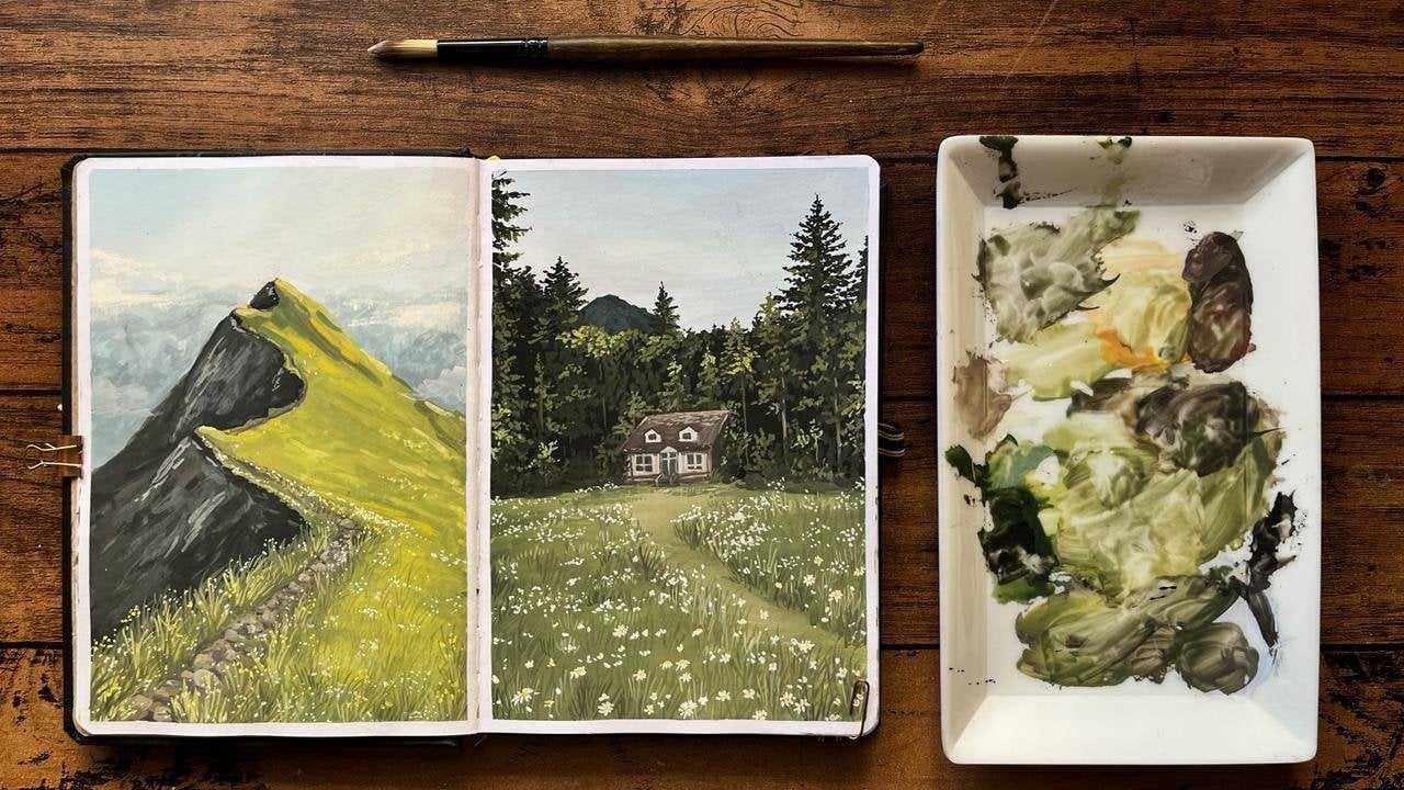
exploring gouache together. We have already
completed a few classes, starting with a floral spread, then a green landscape with
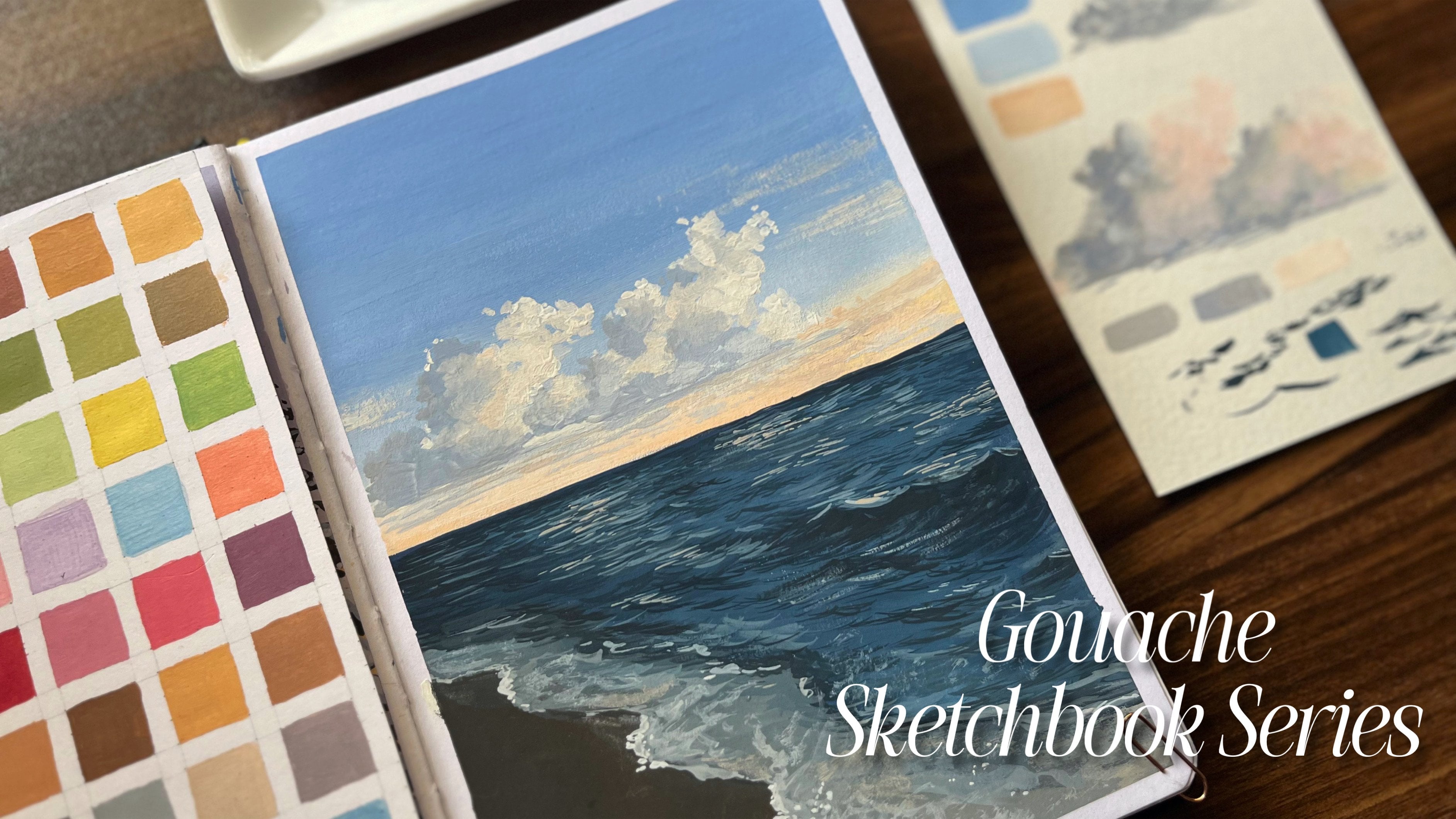
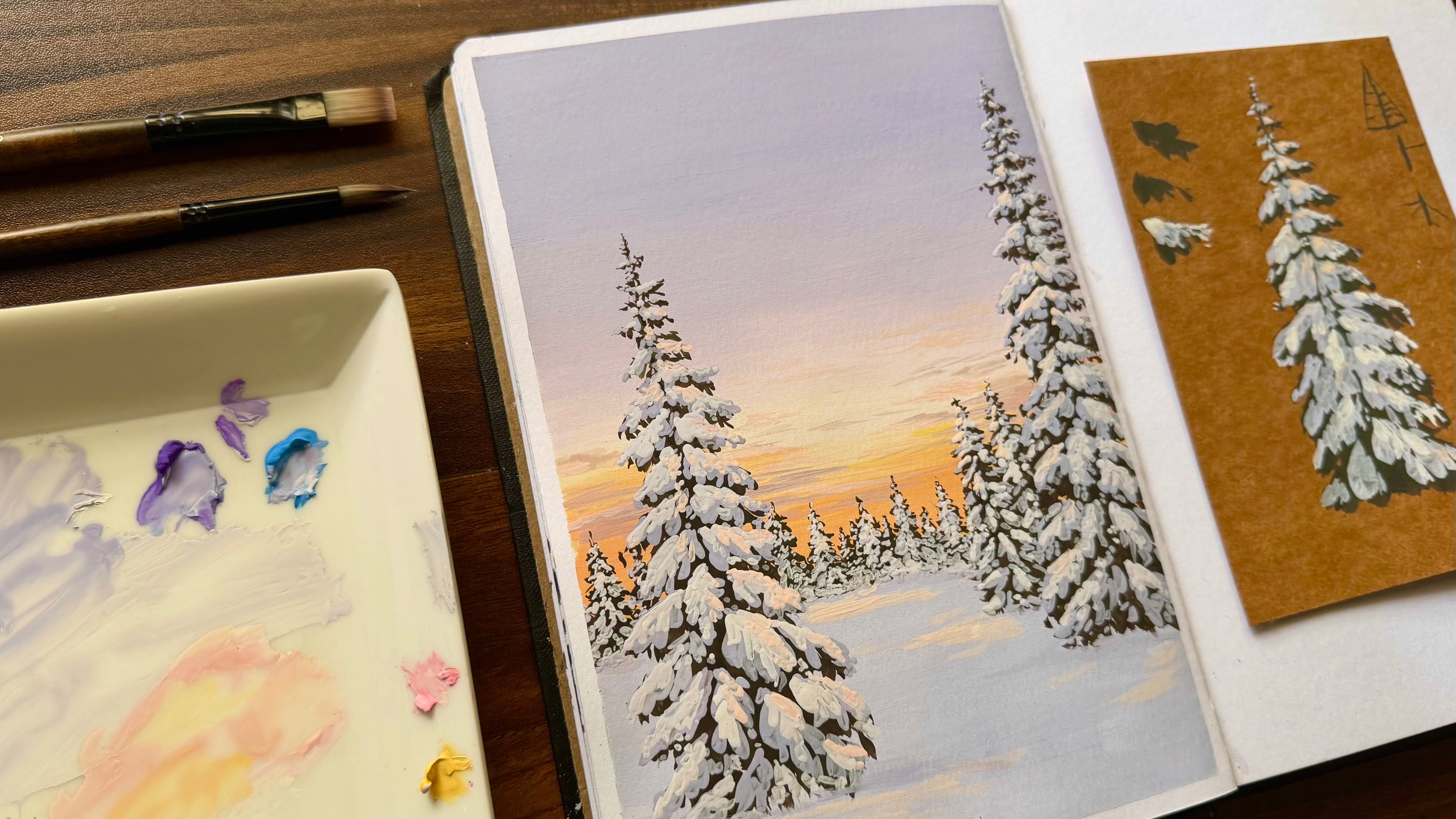
mountains and forest cabin, followed by a snowy winter
scene and a seascape. With each class, we have
been improving step by step. In this class, we
are focusing on a much simpler yet important
concept, which is blending. This is a quick and relaxing
practice session where you learn how to create smooth colored transitions
using Gauche, and along with
that, we'll also be painting a coconut
tree silhouette, giving you a new element to
explore in your paintings. So this class is perfect for beginners or anyone who wants to practice blending without feeling overwhelmed
or in general, anyone who loves gouache or even anyone who
loves painting. So it's simple, informative, and a great way to build
confidence with Gauche, so feel free to hop in.
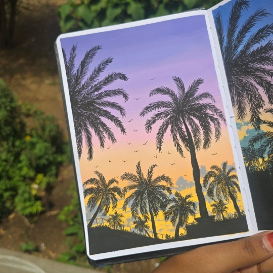
2. Project: For this class
project, let's quickly understand how we'll be approaching the
painting step by step. First, you'll need a few basic materials
for this project, namely your gauche
paints, brushes, sketchbook, water,
and a mixing palette. Once you have everything ready, we'll begin with a background. We'll start by creating
a soft blended sky. Here we'll work with transition
of cool to warm colors. Basically, we'll be beginning with a pastel violet at the top, gradually blending into a pastel pink around
the middle area, and then slowly moving
towards the bottom, we have the pastel yellow. So this step will mainly focus on understanding
smooth blending. After that, we learn how
to paint a coconut tree. We'll cover all the basic steps required to make this tree. So you can basically use
this method to paint coconut trees anywhere in
any of your paintings. Next, we'll also
learn how to paint simple clouds using colors already available
on our palette. Once these elements are clear, we'll start building
our final composition. So we'll begin with the
background elements, adding distance buildings, and then the trees that create more basically, you can approach
this class in two ways. You can either paint
along with me or you can watch the class first and
then try it on your own. I would recommend giving it
a quick watch before you begin so that the concepts feel much clearer
while painting. And with that,
let's get started.
3. Background sky: Now, the first step
is to start by marking the border
using a washi tape. As for the colors,
we require white, so you can take a good amount of white as we need
quite a lot of it. Then I'm going to
take medium yellow. I just need a warm yellow color. Following that, I'll take
a light pink colour. Next, we need these
school colors, namely violet, ultramarine blue, and a little bit of black. So using a flat brush, you can go ahead and start
by mixing the colors. For that, I'll be using
these colors first. So always start by
taking white first because we'll be
having a pastel sky. So for that, we need
a lot of white. So start by taking a
little bit of white, and then to it, you can
add small amount of violet and also a
tiny bit of black. Once you mix these two colors, you can slowly add
in the blue as well. So if you find this
mixture quite dark, you can very well use
white to lighten it. And once you're satisfied
with the color mixing, take a piece of paper and test it so that you can start
with your main painting. So this color is all good, so I'll take a good amount in my brush and start
with the first layer. As you can see, here, I'm going with one big
layer of this color. Next for getting
the smooth blend, you can gradually move to the next step by adding
in a little bit of white, following which you'll be
adding the required color. Here I'm adding in a
little bit of white, and the next color
would be pink. So take a little bit of pink. Once the color is ready, you can do a patch test and then go ahead with
your main painting. And as you can see,
I'm only slightly changing the color to bring
in that blending effect. Once this is done,
in the same way, let's slowly blend
in some more pink. So as mentioned,
after every layer, add some white and then go
ahead with the next color. So this is what I'll
be doing throughout this entire background
sky process. Once the color is
mixed thoroughly, we can test it and then move
on with the next layer. Now slowly, do not
wet your brush, but instead using the
same paint brush, you can blend this paint
with the previous layer. Next, let's add a little more
pink and a bit of white. Also use white in
small quantities. So we'll be repeating the step until we get a good pink colour. So, till midway, I
have used this color. Now let's transition
it directly to pink. For that, I'm adding pink
and a little bit of white. From around the middle, I'll
be using this pink color. Now, in order to get a pure pink without mixing the
previous colors, let's take some pink
along with white and then go ahead and
paint another layer. So now we'll be slowly
transitioning to the warmer side, which will occupy the
bottom part of the page. For that, we'll use colors
that are combinations of pink, transitioning to orange
and then yellow. So let's start by mixing
some yellow with pink, and as we did earlier, add in
some white to this mixture. I'm also taking a little bit of the previous residue so that, you know, you get
a smooth blend. So do the patch test and then go ahead with
your main painting. As you can see, mixing
these two colors, you got a slight orangish color. So this color is going
to be the one present in between the pink
and the yellow layers. Now let's use the same
mixture once again, but make it a little
more vibrant now. Now, I won't be taking
it all the way to the very end because we'll have a few houses
at the very bottom. So just before
reaching the bottom, I'll add in some yellow and white to get a nice
pastel yellow. So as you can see, this is the transition we'll
be getting. And
4. How to paint coconut trees: And now to understand how to paint a coconut tree silhouette, let's start by taking
a thin liner brush. First, we can begin
by wetting the brush. We'll be using plain black here, so add sufficient water to
get a good consistency. Make sure the consistency should be such that the paint
is neither too watery, which can make the
black look transparent. So don't add too much of water. Now let's quickly paint a coconut tree silhouette
for our sunset. First, I'm starting
with a trunk. Coconut trees are
usually slightly curved, so don't make it
perfectly straight. Start thin at the top and make it a little thicker
as you come down. So this tapering will actually
make it look more natural. Next, at the top, I'm just
adding a small thick area. So this is where all
the leaves grow from. And also, you don't need
to overthink this part. Consider this just to
be a reference point. Now for the leaves,
from the top point, I'm drawing long curved
lines spreading outward. You can consider the
shape as in a firework. As you can see, some can go sideways, some
slightly downward. Make sure to keep
them a little uneven. So that's what makes it
look a bit more realistic. Now, once this base
structure is ready, let's start by making the
leaves for which I'm adding small quick strokes on
both sides of each line. So once you do this, this
is what it would look. So just light flicking motions with the tip of the brush
would actually work for this. And also, you don't
have to overdo this. Just a few strokes are enough. So this way, you can
repeat it for every leaf. And as you can see, all
these individual leaves, they normally they tend to, you know, face downward
because of gravity. So keep that in mind
and follow the line. You can take a minute
to observe this class as this is quite important
for our reference. And as for detailing
in the top part, make sure that your leaves
are not facing downwards here because here the leaves
are tightly attached, so as a result of which, they'll be facing upward, but it would be, you know, obviously having a slight
tilt on either sides. And with that, we
have completed it. Since this is a silhouette, make sure you're using
thick dark paint and not too much water, so it looks bold
against the sunset. Now let's move on
to the next lesson.
5. Clouds: Now, before we move on to painting the trees
for the background, as you can see here, we'll
be adding a few clouds. In the lower part,
we'll add a few clouds. And for that, I'll be
using a round brush, though you can also
use a flat brush. So based on the color wheel, we have two complimentary
colors here, which are yellow and violet. So if you're mixing
these two colors, you'll get a dark neutral color. So as you can see, mixing
these two gives a muddy color. And if I add a little
bit of blue to it, I get a slightly grayish tone. And to that, when I add
a little bit of white, we'll be getting the color
required for the clouds. So you can actually
go ahead and use the same colors left in your palette to
create these clouds. Try mixing these warm and
cool colors together, and you'll be getting
what you require. So you can mix the color, and then once the
color is ready, take a good amount of it and you can start making
a few clouds. I'm randomly creating shapes
using this mixed color. The shapes can be very random, but make sure to keep them towards the
bottom of the page. So once you have
filled the shape, in order to highlight them, I'm adding a little
bit of white, and I'll use this color, this light color to
mark on one side. And here I choose to go
ahead onto our left side. And now in the same way, I'll add a few more
clouds here and there. So the clouds I have made looks a little bit big,
but while painting, make sure that you
try to keep them slightly smaller,
and in any case, most of them will be
covered by the trees, so you don't have to worry too much about the details now. Just add a few touch ups here and there, and then
we are good to go.
6. Painting silhouettes : Now, let's start by
taking some black. As mentioned earlier, begin by adding a little
amount of water. At the very bottom of the page, since we didn't fully
finish the part, I'll add a thin layer
of black like this. Next, I'll be adding some roofs. To get an idea of how it's done, you can refer to the reference. So first I'll
outline the rooftops and then fill in the space
with the black color. This part, you can
do it on your own. You can choose any
reference you like or simply follow the same
as in this painting. Once the buildings are done, before moving on to trees, I'll first mark the
positions where I'll be adding the trees
that are further away. So I'll just add a few
points here and there. And for these trees, you don't
need to add much detail. You can simply create the shapes using a thin
brush that would do. And here the approach is same. You'll first add the branches
and then add the details. Uh You also don't have to add as many
trees as I'm doing here. You can easily minimize the
number based on your comfort. So once you finish all this, you're done with the first
part of the background. Next, we'll move on
to the main trees.
7. Completing the project: Now for the main tree
in the same way, I'll mark a few dots to indicate where the center
of the treetop should be. So using this, we'll
start off with the trunk. And then following that, we'll continue with
the same method as we did in the
previous exercise, which is to start
marking the leaves. First, you can add a
few lines like this in the form of a firework and
then get into the details. So we'll be repeating
the same step here in both the trees. So if you're not sure
about the technique, you can visit the previous
lesson and try it out once before you get
into your main painting. Mm. There is one tree
here at the top, but we'll be doing it later. So once this is done, you
can start adding the leaves. So take your time for this step. Now I'm repeating
the same process till I reach the very top. And especially while
adding the leaves, make sure you make the leaves point in
different directions as you move towards the top and don't make them
look too uniform. As you can see, this method of detailing is quite
time consuming. So what I'm doing is, if you
notice a previous painting, the center part is quite dark, so you don't actually have
to add details there. So instead, la fill
in the center, which is the starting
point of each branch, a little bit darker, and then add the details
only at the edge. So in this way, you can save time and still get
a good result. I believe once you
practice a few trees, it would be easy
to sort this out. Here I find the
background a little, you know, plain, so I'm
adding another tree. So moving on to the next one, I'll be carrying out
the same process. Next, once this is
done here on the side, I'll add another tree. Here it's not fully visible. Only half of it
is visible to us. Once you have
arranged these lines, you can start by
adding the details. Here you can also experiment
with a different brush, but I prefer using a liner brush to get these defined leaves. Also here, if you look closely, you can see how I'm trying to position the leaves in
different directions. Also, as you can see, there
was a small mistake here. So in order to correct that, I'm extending the length
of this branch a little. And with that part, we have
completed our project. The
8. Thankyou: With that, we have come
to an end of this class. I really hope you found
it simple and easy to follow and thank you so much for being a part
of this journey. It truly means a lot. I hope you're enjoying
the series so far. If you're new here and
this is your first class, feel free to check out the
previous lessons as well. We have already some
beautiful student projects, and it's always inspiring
to see everyone's work. Feel free to check
those classes as well. Now, once you finish
your project, don't forget to upload it
in the project section. For that, you can first take a good picture of your project, and then you can click
on the Create Project. You can then upload
the clear photos of your artwork and add a short
description if you'd like. I always love seeing your
work and sharing feedback, so make sure you upload it. So I'll be back soon with another simple spread to fill the next page
of our sketchbook, so stay tuned until then take
care and happy painting.
 Anagha Sivadas, Artist, India