Transcripts
1. Welcome to the class: Sketchbook tells a story, not of perfection, but of practice, patience and progress. So tell me, does your 2026 vision board
include a sketchbook? Well, don't worry, I've got
you covered. Hi, everyone. I'm Sivadas, a self
taught artist from India, and I'm so happy to
welcome you back to another class in my
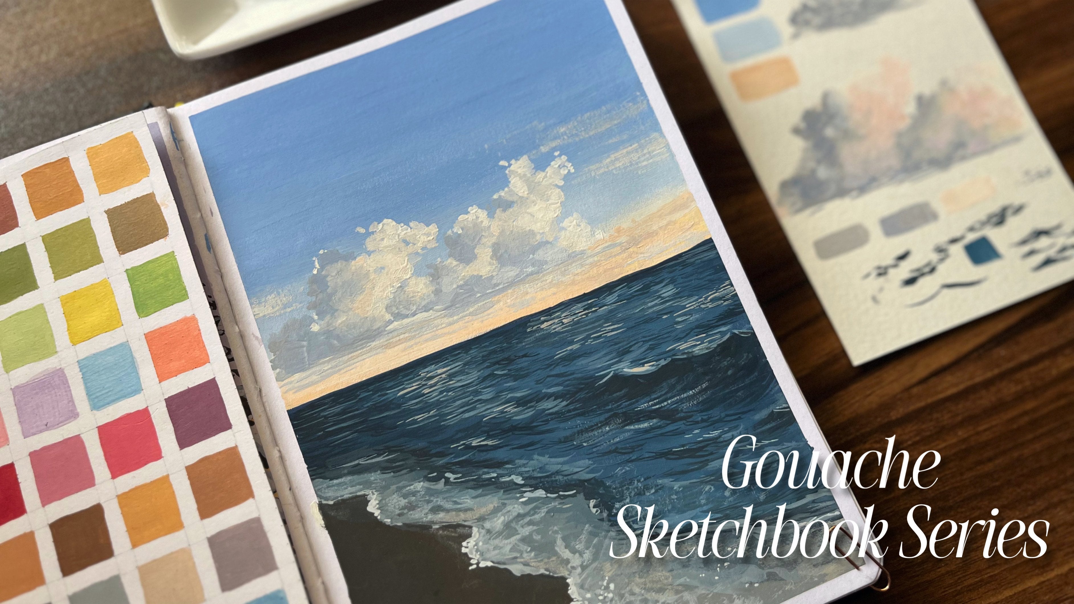
Gouache Sketchbook Series. So this is a series where we
don't just learn gouache, we practice it and we build consistency through
sketchbook paintings. In this class,
we'll be working on two beautiful sketchbook
spreads where we'll focus on learning Gauche
step by step while also developing a habit of
maintaining a sketchbook. This is a beginner
friendly class. We'll be diving into each step in a very detailed
and structured way, so you don't have to worry if you're still
learning the medium. That said, if you're
completely new to Gauche, I highly recommend checking
out my previous class where I introduce the medium in a
very beginner friendly way. You can also explore my
earlier Gauche classes where we have practiced simple and
foundational techniques. This class is perfect for anyone who's interested
in learning wash, anyone who wants to become
more consistent with painting, anyone who loves
maintaining a sketchbook, and anyone who wants to build a creative routine through
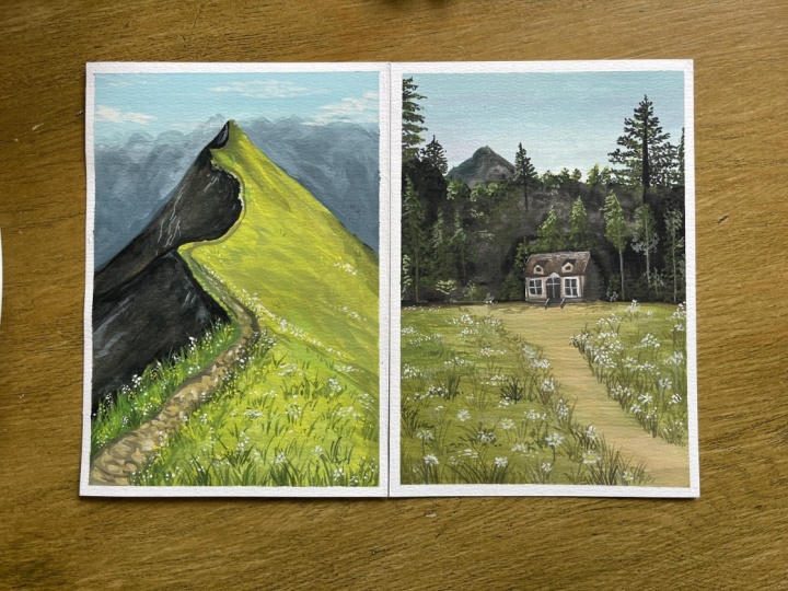
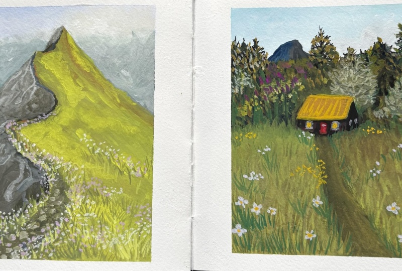
simple structured projects. In this class, we'll be painting two complete sketchbook
spreads as our main projects. You can follow the
class in two ways. Either watch the lesson first, understand the process,
and then paint, or you can also pause the video and paint along
with me step by step. Both approaches
work beautifully, so choose the one that
feels comfortable for you. And with that, let's
not wait any further. So let's begin with
our first project and start building our
sketchbook journey together.
2. Materials Requires: Now let's begin
with the materials. For the surface, I'll
be using a sketchbook. This is a mixed media
sketchbook from an Indian brand called Zensunga. As you can see, we have already started the sketchbook
series in this one, so I'll be continuing
in the same book. The pages are of 245 GSM. So if you're working with Gosh, you can very well
use the same GSM. Now, if you're not comfortable
using a sketchbook, you can very well go ahead and use single sheets
for this class. Secure the edges, you
can use a washi tape. The one I have is a bit thick, so you can cut it according
to your preferred size. Now for the sketching part,
I'll be using this pencil. You can use any pencil as
it's just for the sketching. You'll also need an eraser, moving on to the paint brushes. I'll be using a set of flat
as well as round brushes. The flat brushes
come in two sizes, one small and one larger. Similarly, for the
round brushes, I have a regular round one, a liner brush, and also
a thick round brush. Next, we have a mixing plate
for blending the colors, along with a jar of water to clean the brushes
from time to time. For the paint, I'll be using the Hi Mia jelly gouache set. It offers a wide
range of colors. If you have this set, you can very well use it.
But don't worry. Even if it's of other brand, you can very well
go ahead with that. So that's all for the materials. Now with that, let's move
on to the sketching part.
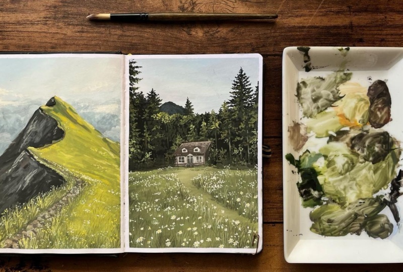
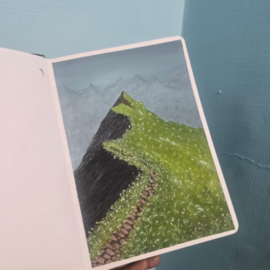
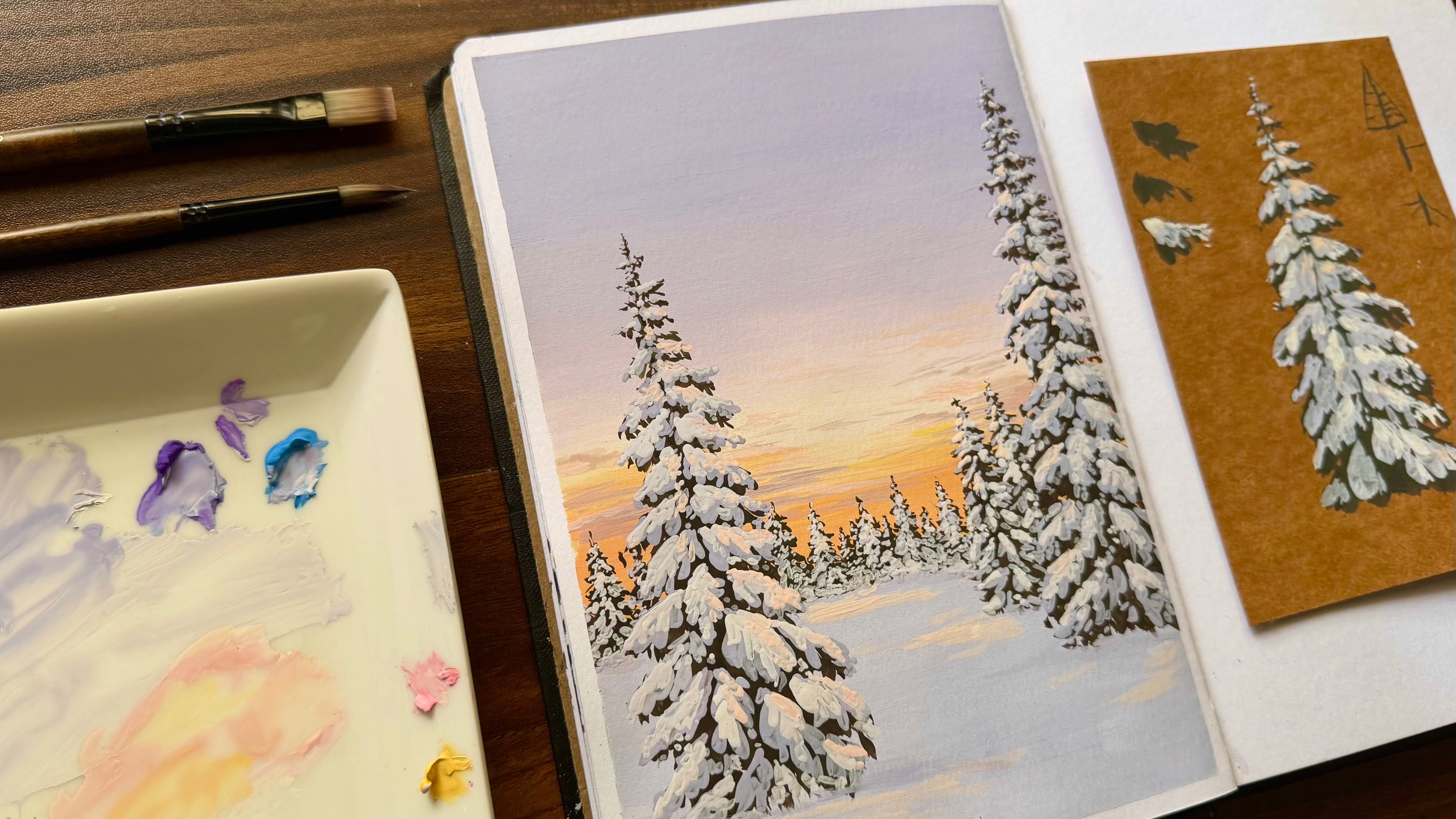
3. Sketch1: So the very first step here
is to start by masking the page so that you get a
similar finish as in this one. We'll be painting
these two sides today, but let's begin with
this part first. Using a masking
tape, you can mask the sides based on
your required width. I'll also be covering
this side too. Now, let's start with
the sketching part. Our first reference
is of a mountain. Before going directly
into the sketching part, let's understand
the proportions. So this page is roughly
of three to four ratio, so you can adjust the same
in the reference as well. We can begin by dividing
the pages into half, both lengthwise, as
well as width twice. As per our reference,
if you look carefully, the mountain part won't
be in the lower section, but will be halfway
through the upper part. So you can start by marking
the mountain this way. So this sketch is going to be
the base of your painting. Make sure you don't
rush this step instead, give some time,
understand the reference, and then start sketching. Also, in the background, you can see we have
more mountains, so I'll be marking it this way for the
background mountains. So let's start by marking the mountaintop that's
at the back first. As you continue with the shape, make sure you're using
rough zigzag lines for the rough terrains. Next just in front of it, you have another slope, and around the middle, you can mark the final one. To understand it better, let's consider the shape of the mountain to
be of a triangle. Now, if you make it
into a three D form, this is how it's going to look. You can actually draw
this three D version from different perspectives. So this is one example. And if you compare
our reference, the one that I'm
currently drawing is somewhat similar to it. So the shadow part here can be assigned based
on the light source. And in the reference,
you can see that the light source is
coming in this direction. So one plane of the
triangle will be receiving light
while the other side would be obviously dark. So as you can see, this part
would receive the shadows, while the other part
would receive the light. Now let's connect the
tips of the mountains using free lines like this
based on the reference. I'm actually indicating
the shadow part here so that you
don't get confused. From the end, it's
actually a path. So you can start with
a thin line and slowly increase the width as it
turns from around this area. And with that, we have
the pathway ready. So this is going
to be our sketch. You can also take your time
to refine the details. Now, before moving to
the painting part, use a kneadable eraser to
remove the dark lines. Once done, we are all
ready for the next part.
4. Colours: Now as for the colors,
we require white, black, olive green, sap
green or any light green, medium yellow, teal,
ultramarine blue, sky blue, brown,
and earth yellow.
5. Base Layer: Now let's start
with a background. For that, I'll be
using a flat brush. To start, I'll need
a lot of white. So take a good amount of
white onto your palette. Next, we'll also need sky blue. Comparatively, we have a very
little space for the sky, so you don't have to take
a large amount of paint. So this much of color would
be enough for the sky part. First, I'll mark
the sky this way so that we can understand
where the sky is. The sky here is actually a
gradient from blue to white, which goes diagonally like this. So let's begin with a
light variation of blue. For that, you can add white to this blue mixture until you
get the required color. Always make sure your
paintbrush is wet enough. This entire step is all about blending. So blend the colors well so that you get a
good gradient effect. Now, once this first
layer of blue is done, clearly, at every step, you can keep adding white. From time to time, if you need, you can wet your brush and regain the consistency
of your paint. If you feel you need to
blend in some more blue, you can do it at any step, but make sure you be
careful while doing it. This step is optional,
but if you feel like adding a little more color,
you can very well do. Here, as you can see, I
have added a little bit of pink to bring that slight
violet tune in the sky. It's not that evident, but still you can try. Now for the background
mountains over here, I need a darker palette. For that, I'm using a
little bit of teal. Next, we need a
little bit of black. You can mix all the colors
in your palette now. So this part is
in the background as a result of which
the details won't be much clear to us so
that you can go for a very light wash of this color to indicate
the background mountains. Along the borders of
our main mountain, I'll mark the dark color, and as we move towards the top part of the
background mountains, I'll add the lighter
version of it. As I had mentioned earlier, you don't have to overdo it
as it's just the background. After this, let this part dry, moving on to the main mountain. I'll be using the sap green. Since we are working
on a green mountain, it's better to start
with an underpainting. I have used this green colour
as it matches very well with the other greens that we'll be using for the
detailings later. So the main goal
here is to simply fill this side of the
mountain with a green colour, as this is the part that
receives the sunlight. Also this is going to
be a very light wash so that you just get the overall green colour
on your page. Now for the shadow part, I'll again, use a darker color. For this, you can
take some black, but we won't be just
using black here. You can add in some olive
green, as well as some brown. Now, this is a little
too much of brown, so you can dilute the paint by mixing the other two colors
along with brown. That is enough
brown, not too much. You can dilute the
paint and then start by adding this
color onto the shadows. The shadow looks a little light, so I'm adding in
some more black. And again, I'm going ahead
with the shadow part. Once the shadow area
is fully covered, you can darken slightly
along the border like this. Also, even in the shadows, you can add a little more value here and there
wherever required. Now, let's go ahead
with the pathway. You can use a thin round
brush for this instead. You can start with a
very thin line and then widen it as you
come towards the bottom.
6. Greens: Oh. Now as the painting
is completely dry, let's move on to painting
the background first. For that, I won't be
using this flat brush. Instead, I'll go ahead
with a smaller one, which is much easier
for application. For this part, I'll be starting
off with a dark color. It's going to be a light,
bluish dark color. So as we move upward, it'll slowly start
getting lighter. Now, to the blue mixture that we already have in our palette, I'm adding a little
more of black. I'm not using too much of black, as you can see, a little
bit of black would do. And once the color is ready, you can start by marking
it along the slope area. You don't have to work all
the way up towards the top. You can simply follow the
steps as I'm painting. Now, once I have covered
this bottom part, I'll dilute my paint
a little more and then blend it with the layer
that we had painted earlier. H Once you're satisfied with the detailing, you can stop this step
and let this paint dry. Next, let's start by
taking out some green. Here, we'll require a wide
range of green shades. So apart from this green, you can use any light green that you have in your
gouache palette. Oh. Now along with that, I'll use a darker version. For that, I'm going
ahead with olive green. You can actually take a good
amount of these paints. Also, before mixing,
you can add some water and remove the excess
paint that's on the brush. Next, I'm going
ahead with yellow. Here I'm using medium yellow. Now for a cooler touch, I'm
using ultramarine blue. So this area here would
be receiving light. As a result of
which we'll have to go ahead with warmer colors. Also, to show the
ground in a few places, you can also use brown. For that, I'm
mixing a little bit of brown along with the green. I'll start off with this color, but here I'm swapping the
brush with a rounder one as the application
process can be much easier using a round
brush in this case. Now for this portion,
we'll be mixing different greens that we
have in our palette and then proceed with strokes
that resemble the hill texture. So
here's a quick note. Blue plus yellow gives us green. So whenever I take blue, I'll add a little bit
of yellow to it so we get a cooler green shade
to paint the grasses. So before directly
painting the side, I'll block the areas that have almost the same values that is around the
borders like this. I'm also extending this
color towards the pathway. So on both sides of the pathway, I'll add in this color. Now, once this is done, we'll move on to
the warmer side. For that, I'll use this
green. Not just that color. I'll also add a little
bit of brown to this in order to increase the
warmth along with yellow. Currently, I'm not blending
all the colors together. Instead, I'm just blocking
wherever I feel it's right. So wherever you see there is
a need to show the ground, that is the texture
of the ground, you can add this color. Oh. Now for a wider application, I'm moving on to a
bigger flat brush, as we'll be covering
more areas now. So take a good amount of this light green and start
painting the remaining areas. Always make sure that the paint is not too dry and
not too loose, and also it should neither
be too thick nor too watery. So by making the
consistency right, you can easily block in
the colors this way. Now I'm taking all
the olive green from the palette and mixing it with
our previous light colors. I'm not using this
olive green fully, but applying it slightly on
the top or in the corners. Oh. As my light green
is completely finished, I'm taking it a little
more onto my palett. Now, again, after
correcting the consistency, I'm adding a few more strokes like this to indicate the slope. So for this application, I'm using the brush
in a tilted way so that I'm using the side of
the brush to get the strokes. So as you can see, the
slope is in this way. So you can bring the strokes in this particular direction. And not just that, I'm also adding a little bit of
brown to this mixture. Next to darken the
olive green color, I'm adding a little
bit of black. So another quick
color theory note, you can mix black with
yellow to get ole green. So that's the reason why
I'm adding black here. So I'll be getting
a darker shade of green that is darker shade
of ole green in this case. So here I'm enhancing the
values using this dark color, especially around the
pathway area and the sides. Now, to lighten the
greens a little more, I'm adding a little
bit of yellow, especially in the area
where the light falls. I'll need this color. So the main aim here is to not make the
surface look flat. So that's the reason
we are blending different variations of yellow, green, blue, and brown. So you can also try. You can experiment
it the way you want. Also, if you have any doubts, you can check the reference
that I have attached below. I'm slightly introducing a
new color which is steel. Again, I'm not using it to
cover the entire portion, just a few strokes
here and there. So you can repeat this
process until you feel satisfied with the
greens that you have painted. I'll go for a few more
rounds and then stop.
7. Shadows: Now for the shadows, let's
start with some black. Along with black, I'll be
using ultramarine blue. So here we won't use black directly in any
of our paintings, so that's why we have
introduced blue. And also for this painting, it's completely fine to mix this current mixture with the previous paint that was
already in our palette. I'll also need a
little bit of brown, so I'm using the remaining
color that's already here. Now, after mixing the
color and getting the right consistency,
let's start painting. So I don't want this
color to be too dark, so I'll add in a little more
colors from the palette. So here I'm adding
in a little bit of green to lighten the shade
and reduce the contrast. Once I'm satisfied with
the color mixture, I'll start blocking
in the shadow area. I'm using the same flat
brush for this one. But if you're not comfortable, you can first outline it
using a round brush and then go ahead with a flat
one to fill the colors. Once you have
marked the outline, simply fill in this color. So using this color, you can fill in
this entire side. Once I have blocked the color, I'll use a round brush
to get the details. I'm using the same dark
colors from the palette. You can try adding texture
in the same way we had done previously for the
slope on the other side. Once the color is done,
I'm doing a rough test. As you can see, the color
seems a little dark. I'm adding some white
to bring it down. So in order to get the details, and as this color
is already dark, we'll add in light colors to bring it down and
then add the details. Now, just like we
did for the slopes, you can also add textures here. Now, as the slope is
on the other side, the strokes will be in
the opposite direction. You might be wondering
where these details are going as it's not
visible in the picture. Let's give some time and slowly, you can see the
paint coming into picture once the layer is dry. Even if you're painting along
with me, at this stage, you won't see much
difference because the paint hasn't
dried completely. So don't overdo it. Simply indicate a few
strokes here and there. That would do. Ir. Once the first layer is done, I'm adding a little more
of white and extending the strokes this way to
get a deeper detail. This tip is optional, so you can stop detailing
the rocks whenever you want. At this point, I'm simply
experimenting with it. Next, once this
part is complete, I'm using black to darken the colors that are already
present in our palette. So using this color, which is dark, I'm
highlighting the corners. First of all, it's
completely normal if you don't get the
exact color in one go. So keep mixing until you find a shade that feels right
for your painting. Also, this area over here is
slightly darker because of the shadows and also due to the angle from which we are
viewing in this reference. So I'm adding some details
here using this dark color. You can always refer
to the reference image to get a better idea on how
this outcome would look. So if you keep the
brush slightly flat against the surface and
brush it like this, you'll be getting these strokes. Now using the same technique, I'm adding the texture using
a lighter color this time. And in case if you're not
really sure about it, take a rough sheet, try it out, and then use it in
your real painting. Also, you can try
different strokes which would enhance
the texture here. Now using a much darker color, I'm differentiating the two
hills and also the borders. Also, take your time and
let the paint dry slowly. Once the paint dries, you'll have a better
idea of whether to add more details or to stop.
So give it some time. Now that the shadow part
is almost complete, I'm using a lighter version
of this dark color, which is almost like a dull, light grayish brown shade to indicate the pathway that
we had sketched earlier. So using the tip of
the round brush, I'm marking the pathway
in this manner. Now to detail the pathway, I'm using earth yellow. You can take a little bit of
it along with some white. Now you can blend
these two colors in the same palette to get a lighter version of the color that we had painted
for the pathway. So here I'm blocking the
pathway using different shapes. You can consider that these are stones or rocks lying
on the pathway. So don't go for any strict
round oval or square shapes. Just play along with it. And whichever shape comes through your brush, let that be. Now, once the dark version
of this color is done, I'll add in a little bit of
white and repeat the same. So here, again, as you can see, I'm not fully making shapes. I'm just working over it, especially around the corners or the sides of the
previous texture. So here we are simply pressing the brush onto the paper
to get this texture. So basically, we
should start with the darker values and slowly build up with
lighter values. Also, you don't have to
stick to just one mixture. You can always
pick up the colors from the sides of your palette. As you can see, I'm adding
a little bit of black to bring in a light gray
touch to the detailing. Also, don't overdo it because sometimes
due to excitement, I myself end up
overdoing things. Now, once this step is done, I'm moving ahead with a
round brush, a thin one. Using this, I'll detail the rock particles
that we just painted. I'm not covering
the entire shape, outlining one side would
do to add the definition. You can actually
watch what I'm doing and then proceed
with your painting. O So this pathway will mostly be covered later
while painting the grasses. So I think this much of
detailing would be enough. You can simply add a few
details here and there because they'll partially be covered anyway in the next step. So by this time, the shadow area
must have been dry. You can use the same brush
to add in some more details. Or if you want to
stop, you can stop the detailing process.
It's all up to you. Along with that,
I'm also marking the pathway using a
dark brown mixture. As you can see, the pathway
is now becoming more clear. And with that, this
part is complete. Now let's move on to
the final detailing.
8. Project 1: Now let's start
with the detailing. To get the greens, I'll be using the same palette and mixing
a darker shade of green. Now using this, I'll add
the grass details here. You can also use
different greens to add variations to the grass. The basic idea is that when your base color is
relatively light, you can show details using either a darker or lighter
version of that base color. In this case, since the
base color is light, I'm using a darker green to indicate the grasses so
that the value looks right. I won't be using just
one shade of green. I'll mix different
variations of green that are already on my palette along
with a little bit of black. So first, I'll be
adding this dark color. Also, here the brush I'm
using is a thin round brush. For this portion here, I'll first fill it
completely with green as it's quite
a large area. Later on, I can add
more details if needed. So only along the edges, especially near the path, I'll add all the grass strokes. So I'm doing the same on the other side of the path as well. Since this area is
further away from us, the grass appears smaller, so you don't need to
add too much detail. Just two or three strokes are enough to indicate the
presence of grass. If you observe closely, the grasses slightly overlap the path from our point of view. That's why I'm adding the grass
strokes over the pathway, so partially blocking
it like this. You don't have to add
grasses everywhere. Instead, add a few here
and there, that would do. For time being, I'm using the same color to fill
the grasses here. Also, here we are not showing the entire
length of the grass. Only the top portion
is what we need, which is why I'm adding
small strokes like this. So moving on to the bottom part, I'm adding bigger
strokes here and also, this one is slightly darker
than the previous color. So as I had mentioned earlier, you can mix a little bit of
black to darken this color. So the grasses closer to
us will have more detail. So I'll fill this bottom area completely with grasses
and above that, I'll also add a few details. Even in the background,
you can add a few strokes in a few places. I'm taking light green in
order to refill my palate. No. Now to lighten the grass, I'm using some medium yellow along with white to
this light green. So mixing these
three would give us the light shade of green
that we need for highlights. Now, after getting
the lighter shade, I'll start adding
details where we had previously filled the area
with this dark green. Again, you don't have to show the entire length of the grass. Just add a few strokes in
the same way we did earlier. In the same way, I'm also adding a few strokes on the other
side of the pathway as well. As you can see, light colors
work well over dark colors. So that's the basic
concept here. Similarly, over light colors, you can add dark colors
to enhance the details, especially in the darker areas. I'm using this light green to
bring out the grass effect. Not just this
particular light green. You can also use
different shades of green from your palette to
mark these details. So not just in the front part, I'm extending it throughout the pathway to add more details. Now that the details using
the light colors are done, I'll move on to the
darker version. For that, I'm using
olive green mixed with a little bit of
black to get more depth. Again, I'm not using
this everywhere, but only highlighting the
areas where we had painted. So wherever it's required, I'll add the details
using this colour. Now, if you're not comfortable
painting these strokes, feel free to take
some time to do some warm up before you
start the original painting. M Now, let's use white to
indicate the few flowers. You can simply do this
by placing a few dots together to form small
clusters or groups of flowers. So wherever you like,
you can add these, especially along both
sides of the pathway. As you can see, I'm doing
this in small batches. You can observe or go through the reference to have a
better understanding here. So once my white
flowers are all placed, I'll move on to yellow flowers. Yellow here works well with the painting, which
is why I'm using it. But you can choose
any color you prefer, maybe red, purple,
anything that you like. And you can repeat the
process in a few places. Make sure the dots
are very small, and as you can see,
I'm not giving any details to these flowers. Now, as the shadow
areas completely dry, I'm detailing it again
using a lighter color. This step is very optional. Only if you really need to do, you can try this or else you can stop
with the floral part. And finally, using a flat brush, I'm taking white to
add a few clouds. They may not be very
visible in the video, but if you feel the need, you can add a few
here and there. And with that, our first
project is complete. Now let's move on
to the next one.
9. Sketch 2: So let's begin with
our second project, starting with the sketch. I'll start with the
division part by dividing the page both
horizontally and vertically. The ground is almost around at this point in
the bottom half, so this is how I'll
be placing it. Here we'll have a house
approximately in the center, and behind it, we'll have
the background mountain, along with some trees. So the house is
roughly placed here, not exactly in the center, but slightly towards one side. And as I said earlier, we'll have the trees
and the mountain. And here we have the sky part. We can also include
a pathway like this with a few flowers
here and there. So this is the rough
sketch that we need. We won't be adding any
details at this stage, as we'll be adding them
gradually while painting, especially for the background
as well as the ground. Now using a Nader bear razor, I'm removing the
sketch completely. What we really need here is just the house with
its basic details. The rest will be developed
during the painting process. For that, we can start sketching the house using simple lines. And here, as you can see, I'm using simple lines and
shapes to sketch it out. Also, make sure that you don't have to make
the house too big, as it's slightly far
from our point of view. So keep it small and add
necessary details like windows, doors, whichever you
feel like adding. And now, after I have
finished the house, I'll remove the dark
lines using this eraser. So we have the house ready, and let's move on
with the painting.
10. Background 2: So let's start
with the sky part. It occupies almost this area, so it'll begin with
white for the sky. You can take a good amount
of white on your palette. I'm using a flat brush for this. Next, we'll need sky blue. Once you have these two colors, you can start mixing them in order to get a light blue color. Once the color is mixed well, you can start marking
the sky like this. So once a few layers are done, I'll add a little bit of white using the same brush
without cleaning it, which helps in blending
the colors smoothly. You can also blend
these two colors in this way or else
you can take white, mix it along with the previous palette,
and then go ahead. Now, to add a little
more interest, I'm adding a touch of pink to get a slight violet
tint in the sky. Even though it's not very
visible, I'm still adding it. Next, we have a mountain here. So it's better to add the mountain first
and then move on to the trees because the mountains are in the background
of the trees. So let's start ahead
with the mountain. For the mountain, I'm taking a little bit of black,
not pure black. So for that, I'm adding a
little bit of teal to it. Since the color is still
dark and similar to black, I'm adding a little
more of teal. Now, once the color is ready. Not exactly at the center, but slightly towards the side, I'll add a mountain so that only the tip
of it is visible. So to add some more details, I'm using a little more of deal to one side
of the mountain. A now for the background trees, we'll start with a darker color. We'll begin with darker
values and then slowly build the color from dark
ole green to lighter greens. For this, I'm taking black
as well as olive green. So this is going to
be our base color for the background before we
get into the details. So this is roughly where
the ground area would be. First, I'll mark that following which I'll start
outlining the house. And after that, you
can start filling up this portion using
the same color. Also, don't add any
details to the top part. You can simply
fill in this area. Now, I'm switching the brush
to a thin liner brush, and using the same color, I'll start adding
a few trees here. First, I'll draw a straight
line for the trunk. Now, once that's done,
I'll add in the details. First, we'll go
ahead with marking the branches and
then the leaves. So start by structuring
the tree first. So at the tip, it
will be very small. That is the branches
would be very small. As we move downward, it
becomes bigger in size. And also the branches are
facing upward in this manner. So once the structure is ready, let's get into the details. For that, you can use
the tip of the brush, create leaf like texture by simply pressing the
brush onto the paper, and that's what I'm doing here. The same idea works
here as well. That is, for every branch, the tip part would
have small leaves while it gets bigger as we
move away from the tip. So you can repeat the same throughout the entire structure. M Once this tree is done, we also have another
one that is not fully visible with only
the sides showing, so we'll add a little bit of
detail to that tree as well. Next, almost in the center, we have another tree. For this, once again, I'll start with a line, not a perfectly straight one, and then we'll slowly
start adding the details. Here, I'm not using the
previous technique, as you can see. Instead, I'm directly adding the leaves without making
the branches first. Once you're familiar
with the process, I think you can easily go ahead and directly start painting
the trees like this. Now, apart from the tall
trees in the remaining areas, I'm adding the details to indicate that there
are many trees here. So in the same way, we'll also add more trees on the
other side as well. Now, at the very end,
we have a bigger tree. Since it's closer to
us, it appears larger. Now you can detail that as well. With that, the base color
for this part is complete. Now let's wait for this layer to dry and then move on
to the next part.
11. Trees: And once this layer
is completely dried, let's start with the detailing. So we'll begin by
working on the trees. For this, I'm using olive green, sap green, medium
yellow, and brown. So you can take all the
pin onto your palette. The basic idea here
is that we have already started with darker
shade for the background. Now we'll gradually move
towards lighter values. So we'll begin with a dark
green and then slowly lighten it by mixing in lighter greens and other colors
from the palette. Starting with the
next dark color, we'll mix olive green
with a black that's already on our palette to
get a dark green shade. So we won't be using
this color to fully fill the area that we
had blocked earlier. Instead, we'll use it
only for detailing. Starting with a
tree on the side, you don't have to add
too many details. Just highlight the leaf areas. In the same way,
I'll add a little of this new color to all the
tall trees in the background. I'm going ahead with this
round brush for the details. Again, keep this in mind. We are not covering the
dark base completely. Instead, we're using this color to highlight a few leaves. The color may not
be very visible right now since the
paint is still wet, but once it dries, you'll notice the details more clearly. Once this dark color
layer is done, I'll add some light green to the mix to get the
next lighter value. Now for the remaining areas, I'll start using
these colors to mark the trees that we
indicated earlier. In order to show the trees
in the remaining background, I'll start by painting a few lines like this
using the green. For this, you can also
mix a little bit of brown with a dark colour
along with some white. So you can mark a few lines like this around the
house in this way. Now, using these lines
as a base reference, we'll start adding reas to the trees with a green
that we had just mixed. And most importantly, make sure your paint has a good
consistency to work with. Now, if you look at
the background now, you can see that the
details are becoming more visible as the top
area started drying. So don't worry about the colors. Once the color is dry, you can see the difference. And also for the detailing part, you don't have to
always make trees. Instead, you can mark a few leaves here and
there, maybe bushes, small plants or anything that you feel would
fit the picture. So don't just stick
with one color. You can always mix a
little bit of brown or black into the green
to create variations. Now using the shade,
you can repeat the same process
and make sure you don't completely cover
the dark background. Leave a few gaps here and there so the depth
remains visible. Once you're done
with the dark color, move on to the next
lighter value. That is to the same mixture, add a little bit of light green along with
some medium yellow. For detailing, I'm using a
thinner brush this time. So with this lighter color, go over the same areas that we painted earlier and
start highlighting them. In simple terms, you're just
using the lighter value to enhance the details on
top of the darker base. Oh And just like before, don't fully cover
the previous layer. Use this lighter color to
add further leaf details. Now, as you can see, since the background paint has dried, the details are
much more visible. Now, wherever needed, you can continue with the detailing. Here, I'm not just
marking the leaf shapes. Instead, I'm simply
pressing the brush onto the paper to create
that leaf texture. Once you're done with the shade, you can always
lighten it further by mixing in a bit more yellow, especially at the tip
of the tall trees, use these lighter values. Here again, don't stick
to just one single green. Mix different
variations to create a more natural look for
the background trees. Next, to further lighten it, I am adding an olive green with some medium yellow
along with some white. I'm highlighting a few areas
using this light color. So you can use this
color sparingly and only in selected spots, don't forget to add
some details along the sides and near the
bottom areas as well. So the light area is visible only when light hits
on these trees. So especially at the top part, you can add this highlight. Uh Again, here, don't forget the sites. You can mark the details
on the sites as well. Here at the bottom, I'm also adding a little
brown to the mixture because leaves and trees are
not always in pure green. Now, once you're satisfied
with the details, you can stop and
let this layer dry. Moving on to the ground area, I'm adding white, brown and
yellow to the seam palette. And I'm adding water to
dilute this mixture. And using this, I'll start filling the
center of the ground. So the brown would
be in the center, and on both sides of the
pathway, we'll have greens. So this is just a base wash before we get into the details. So for that, you can
fill in this entire area with a light wash of
green from your palette. You don't have to
mix any new colors. Use the same colors
on your palette and simply wash the ground area. Uh Once you're done, let this layer dry completely, and then we can move
on to the detailing. Oh
12. Ground: Now, once this layer is dry, let's start with the ground. Starting with the pathway, I'm adding a little bit
of brown with white. You can mix this color, as you can see, it's too brown, and I want it to be
a little warmer, so I'm adding a little bit of medium yellow to the
mixture, along with white. I want a very light shade, so I'm adding in more white. And once I get this color ready, I'll first mark the
pathway in this manner. And with the same brush, I'm gently blending the edges. Next for the side
areas, we need green. Starting with ole green, I'm mixing it with the colors already on the palette,
along with white. Now, let's fill the sides and
blend them with a pathway. In a similar way, you can
complete this entire portion. Now, once the greens are done, blend them again with
the middle part, so both the colors merge
smoothly in the middle. Now I'm adding a few more
values to the greenery. Now that the base layer is done, let's move on to
the detailing part. Now to begin with the details,
I'll start from the back. For that, let's begin
with some dark colors. So take a little bit of brown along with the dark
colors already on the palette and some green and you can mark the
background like this. Once that's done, I'm again redoing the ground
part using different greens. Now, the ground part
looks very dull. That's the reason why I
am working again over it. So once you're happy
with the base layer, it's okay to start
with the detailing. I'm switching to a
thin round brush to get the details
done for the grass. So the idea is the same
as what we did earlier. That is, we'll start with
a darker green first. So I'll mix in a little bit
of black with the greens from the palette and start
painting the grass like this. Just like how we painted
the grass in Project one, we'll repeat the same
process here as well. You can continue this on both sides until you feel
there's enough grass. Especially in the bottom area, you can add more
grass since it's closer to us and
needs more detail. Along the sides of
the pathway as well, you can add the details. On an important note, don't just stick with
one particular green, either be it for a darker
value or a lighter value. Feel free to mix
any color that's present in your palette to
get the required value. In front of the house as well, I'm adding a little
bit of greenery. You don't have to overdo it. Simple strokes like
this would be enough. Now I'm taking an
even darker shade by mixing in a bit more black. Using that, you can add additional details
in the background and also for the grass. So you can keep working
on the grass with different values until you
feel it looks complete. M Again, don't use only greens. You can bring in a little
bit of brown as well. And once the dark
colours are done, you can add some
light highlights over the grass using a
lighter shade of green. And as we move further away, keep the grass strokes shorter, and as we come closer
to the bottom, make them a little longer. So keep this in mind
while painting. So you can repeat the process
for painting the grass in this way till you are satisfied with the
overall outcome. Oh Next, let's mark some flowers. Just like we did earlier, I'm taking a little
bit of white and grouping the flowers
using small dots. You can add these
wherever you feel like, but try to place them
in clusters rather than spreading them
uniformly in a line. So this will make
it look like there are groups of flowers
scattered here and there. So with this idea, I'm repeating the process till I reach the bottom
part of our page. Now, since some flowers are closer to us as we
reach the bottom, you can add a little bit
of more detail to them. For the ones in the foreground, I'm adding a few
tiny petal strokes to show more definition. You don't have to do this
for each and every flower. Just a few would be enough. Next, I'm taking a little bit of yellow mix to mark the
center of each flower. Again, not on every flower, but just a few visible ones. Now, for further detailing, I'm taking the dark
colour and drawing thin strokes on a few
prominent flowers. Next, before moving on, let's do a base painting for
the house in the background. Starting with a roof, I'm
mixing black with brown. Now using this dark color,
I'll shave the roof. Now, just below the roof
because of the shadows, the area here would be darker, so I'm adding in
more black there, as well as on the side part. Then I'll add some
white to the mixture to block in the remaining part of the house and also the windows. And with that, the
ground area is complete. Now let's move on to
detailing the house.
13. Project 2: Now we have reached
the final part of our second project,
which is the house. So let's start by working with the darker values for
the roof and the sides. I'm starting off by
mixing black, brown, and a little bit of white
to create this dark color. And once this color is ready, you can start using it on the sides, as well
as for the roof. Now for the roof, as you
move towards the top, you can slightly lighten the color by adding a
little bit of white. Now for the borders,
I'm again lightening the shade by adding white
to the same mixture. Uh, Now for the body of the house, I'll go ahead with
a lighter color. Using the same palette, I'm adding a little bit of white to this to get
this light color. Next by adding more black to
the earlier dark mixture, I'll mark the windows
and also the door. Now, I'm also using
this color to define the shadow area
just below the roof. Once the paint is dry, you can also highlight
the roof slightly. Now, with a very light color, I'm going ahead
with the windows. I'll also add details using the light color in
the windows and door. Feel free to design the
house however you like. I'm simply going over it
with a rough idea in mind. Oh. Now, going over the
dark color again, I'll add more definition
to the top window. And once that's done, I'll darken the bottom part
of the house, as well. You can also add a little bit of greenery on both
sides of the house, similar to how we did
the background trees. I'm also marking
the doorsteps here. Et the paint dry.
Meanwhile, I'll add a few details there is light details on the roof
using a lighter sheet. You don't have to overdo it.
It's just the highlight. Now, as the bottom part is dry, I'll add a little detail
for the doorsteps. And with that, we have
our final project ready.
14. Thankyou: With that, we have come
to the end of this class. We now have two beautiful
sketchbook spreads as our final projects. First of all, thank you so
much to each one of you who stayed till the very end
and painted along with me. I truly hope the class was informative and
helpful for you all. Even though these two lessons
included a lot of details, I hope the process
felt enjoyable and rewarding as we slowly saw
the paintings come together. If you're new to my classes or if this is your first
time learning with me, I'd also recommend checking out my previous class where we began the sketchbook series
with a floral spread. You can definitely give
that one a try as well. For the class projects, you
can paint these two spreads, click a clear and beautiful
picture of your work, and upload it in the
project section, like I have shown you. And please don't worry if
your painting doesn't look exactly like the reference,
that's completely okay. This series is all about
learning and growing. I'm also excited to share
more tutorials with you that will be coming away
in the next month or so. Now, before I wrap this up, I have a little
bonus for you all. I have added an extra
process video where you can watch how I painted the
second page of my sketchbook. You're also welcome to try that as an additional
project if you like, but if not, completing these two projects is more
than enough for this class. I hope you enjoy painting these projects and I can't
wait to see your work. So stay tuned for
the next class, and thank you so much for
painting along with me.
15. Bonus: [No Speech]
 Anagha Sivadas, Artist, India