Transcripts
1. Welcome to the class: Winter skies, snow
covered trees, and calm cozy colors. If that sounds like
your kind of painting, you're in the right
place. Hi, everyone. I'm Ana Kasuda, a el
taught artist from India, and welcome back to our
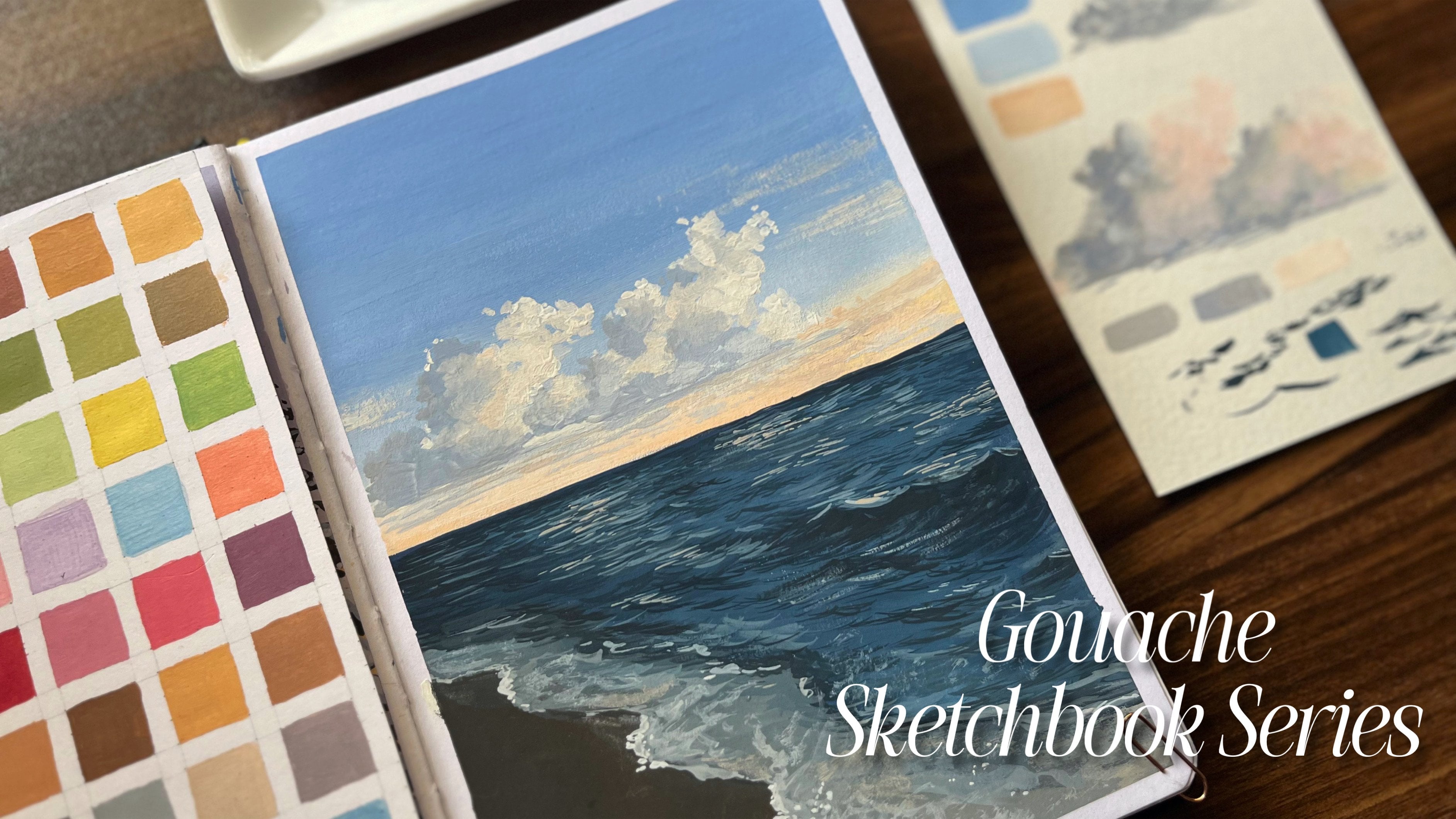
Gauche sketchbook series. So this class is a part of our ongoing sketchbook series where we focus on
simple subjects, smooth colored transitions, and building confidence with
just one painting at a time. In today's project,
we'll be working on a calm winter scene
with a soft sunset sky, snowy ground, and layered trees. I'll walk you through the entire process step by step from understanding the reference and color choices to
painting the background, trees, and also
the snow details. This class is perfect
for anyone who loves gauche and most
importantly, for beginners, as well as intermediate
artists who want to improve their
gauche techniques, especially when it
comes to blending, layering, and creating
depth in landscapes. Also, you don't
need to be perfect with gauche in order
to start this class. The goal here is to
enjoy the process, understand how colors
work together, and slowly build your
confidence with every layer. So grab your
sketchbooks and let's paint this cosy
winter seam together.
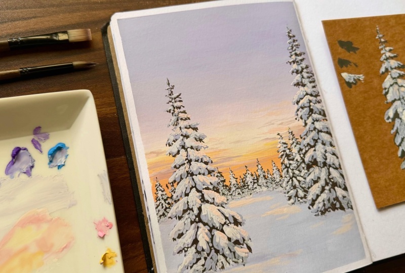
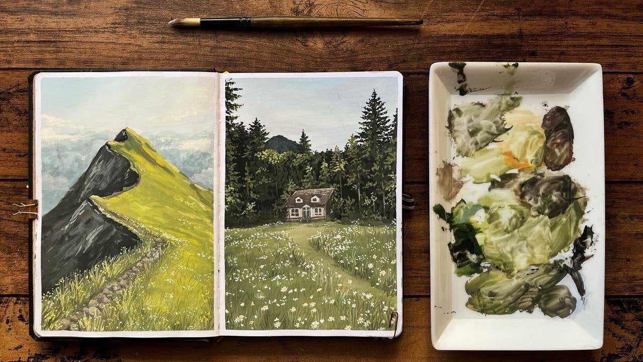
2. Materials for the class: Starting with the materials, since we are doing this
sketchbook series, I'll be using the
same sketchbook we have already started
the Gasch Series in. This is an AFI sketchbook from an Indian brand called Zensanga. The pages are quite thick, so make sure you use a
good quality sketchbook, preferably 245-300 GSM. Apart from that,
I'll also be using a 300 GSM brown sheath for
demonstration purposes. Next, we need a pencil
to sketch our reference. Here I'm using Brutro's
0.5 MM mechanical pencil. Now to remove these
pencil strokes, we require an eraser. We also need a masking tape in case you want to
secure the edges. Next, we need a mixing plate. Next, as for the brushes, we'll be using two types, flat brushes and the round ones. You can also have an
extra piece of cloth to dab or remove excess water
from the brush or to clean it. Next, we need a jar of water. You can also have
another jar in case you don't want to mix
light and dark colors. Now, last but not the least,
for the gauche paints, I'll be using this
Hiimia jelly gauche set, but you can go ahead and use any brand of your choice or anything that you're
comfortable with. So with that let's get
started with our project.
3. Reference study: Now, the very first step
here is to mask the sides. I'll be painting on this
side of the sketchbook, so I'll mask the edges using
a masking tape on this side. Now, once the masking is done, let's study the reference. And as per the reference, we have a background
sky, the ground part, and a few trees, two
prominent ones in the front, and a few small ones further
away in the background. Now, to understand where
to place the ground, we can divide this
length entirely. So for that, I'll divide
it into three equal parts. So roughly you can mark three
equal sections like this. And the top two parts
will occupy the sky, while the remaining part
will be for the ground, though I'll slightly
reduce its size Once you have understood and mark the reference
line for the ground, you can remove the
excess strokes and neatly redraw the
lines once again. So this will be a reference line which differentiates
the sky and the ground. Now using this, let's start by filling
the sky part first.
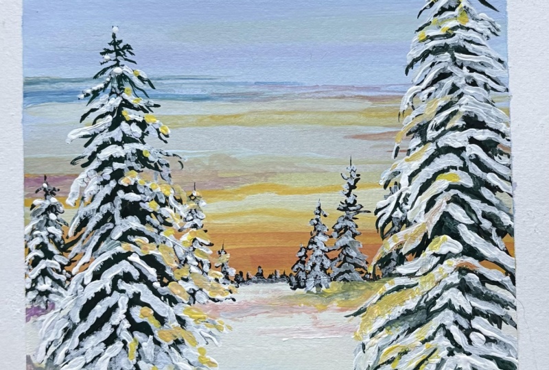
4. The Background sky: Now to start with
the background sky, the very first color
we'll be using is white. We'll take the colors
starting from light to dark, so you can start by taking a good amount of white
onto your palette. Next, we'll need these
following colors, which will be purple, sky blue, some pink and yellow. And apart from that, we'll also need a little
bit of orange. For this, we'll be using a flat brush since we need
to cover a wider area. So this is how the colour
transition will go. We'll start with purple and
slowly around this area, we'll begin the blending part. It will transition from
purple to purple pink. Then to yellow and finally
to orange at the bottom. So now we'll start
with a purple color. It's not going to be dark. It'll be a very
pastel like color. So take a good amount of
white and add purple to it. Always, make sure your paint
is in good consistency, so you can add water
if you feel the paint is too thick and also make
sure while adding water, don't make the paint too loose. It should be in a
perfect consistency that is not too thick
and not too loose. Now slowly, you
can add in purple. So I'm not just adding purple. I'm also adding a
little bit of blue. So this color won't be
pure pastel purple, but a purple with
a hint of blue. Now for this, take
your time as we need a good amount of paint
to cover the sky area, so slowly mix the colors until you get the
required color. Once you have mixed
it thoroughly, you can now go ahead
and apply this colour. The top portion will
be completely filled with this colour and
only halfway through, we'll start the blending. Now, to begin the transition, take a small part of
this existing color and lighten it using white. Now, we incorporate
the next color, which is going to be pink, add a little bit of pink
to the same mixture. In this method, we're simply
adding the second color into our first color in
small quantities to achieve a smooth blend. Using this color, you can go
ahead and do a few layers. Oh And once that layer is done, to lighten it a little further, we can add white without
cleaning the brush, since the residue of
the previous color will help with the
blending part. Next, let's move on
to a lighter pink. For this layer, I'll add some white along with pink directly. So make sure the
paint consistency is right at every point. That is, it should not be
loose because it can disturb the previous layers and not too thick as it won't
blend properly. So make sure to check the
consistency from time to time. So this blending part
comes with practice. So you can try it
on a separate sheet if you're not confident enough, but make sure you
try it at least once if you're a beginner who has never tried
blending before. Try it on a rough sheet, and then go ahead and start
with your main painting. Next year, I have slowly added yellow to
the same mixture. As you can see, you're getting the next transition
from pink to yellow. Since the entire transition
looks too pastel life, I'm brightening it further
towards the bottom, so I'm adding in more
yellow this time. Now, here's a quick tip that is. When you mix yellow with pink, you're going to get orange, but it's going to be more of a cooler orange
than a warmer one. Now I'll be using this color to add a subtle touch
at the bottom. Now, to make it more warmer, I'm using the direct
orange from the palette. Here, as you can see, I'm not
adding too much of water. I'm directly using the
paint from the palette, so the consistency remains
the same throughout. I'll be using water
only to mix colors. So in order to get the
consistency right, make sure you use a
good amount of paint. Now, for the sky part, especially to create
abstract clouds, this is what I'll do. Keep your brush flat but
pointed, and as you can see, you can make a few
strokes like this to create those cloud textures. Now here, I'll just
explain what I'm doing. As you can see, the purple
layer at the top is not fully filled because
as the paint dried, you can see a few
patches here and there. And also, since I have some
paint left, I'll redo it. So this step is very optional. So if you don't have this issue, you can simply skip this step. But in my case, it
was clearly visible. So that's the reason why
I'm redoing a few strokes. And especially if
you're a beginner, try to correct it in
the first go itself. As reworking later can
sometimes get messy. Now, let's start
with the clouds. For this, we'll be using the same colors
from the palette. So by mixing them, we'll create clouds that actually
match our sky. For this, I'm mixing purple with some warm colors
from the palette. You can mix them in
different ratios. So as I mentioned earlier, keep the brush flat and make horizontal strokes like these in order to paint the clouds. So using different
ratios of these colors, I'm adding clouds
here and there, especially on the sides. So to be precise, I'll
mix purple with pink, yellow and orange, along with white to get these
different shades of clouds. You can make these clouds in this manner till
you're satisfied. Now that the sky
part is complete, let's move ahead
with painting trees.
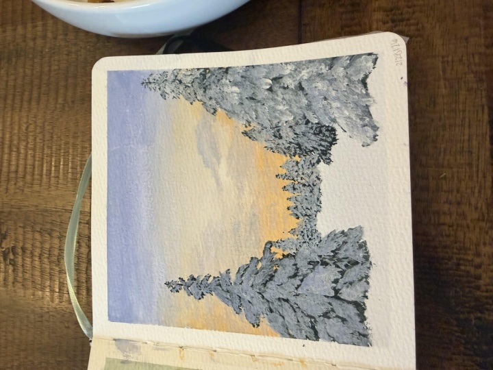
5. How to paint a tree: Now, for this part, we'll
require the following colors. We need white for the snow, so take a good amount of white. We already have purple
and blue on the palette. Apart from that, we need green, any green you prefer,
and then black. So for this lesson, I'll
be using a round brush. So we'll be starting
from dark to light. For the first step, we'll structure the tree
using dark color and then add the snow using
a lighter color later on. And always remember, when
starting with a dark color, never go with pure black unless it's really,
really required. We rarely get to see pure
black in nature, right? It's usually a dark mixture
of different colors. So that's why here
for the dark sheet, we have mixed black and green. And once the color is ready, you can start with
the main trunk. So the idea here is that the
tree would take a shape of a pointed triangle like this one with a
trunk in the center. So to get the triangular shape, you can add branches
in this manner. So applying the same idea here, you can slowly start
adding small branches from top and you can increase their
size as you move downward. A, the branches don't
need to be uniform, and you can add them
randomly to create natural look and also don't draw straight perpendicular
lines from the trunk. You can always till the
branches in different angles. So you can either
follow along with me or create your own versions. Now, as I mentioned, as we move down, the size
of the branches increases. Now we have the structure ready. Now think of these lines as a reference line
for the branch. Now using this reference line, you can simply scribble
to mark the leaves. So here, think of these lines as reference for
adding the leaves. Now if you observe carefully, I'm pressing the
brush onto the paper just like this to create
the leaf light texture. So here, I'll repeat
this process for the entire tree
from top to bottom. Now, since the top
part is further away, it should appear smaller, and as we move down,
the size increases. So keep this in mind while
painting the leaves. That is, add a very
little detail in the top while you can increase the
details as you move downward. Now, as I said earlier, follow the reference
line and add the leaves without
overworking the details. Here, let the brush do the work. In the middle section,
you can actually fill it completely so
there are no gaps. So you can do this first and then add the leaves
on the sides. So for the remaining part, you can continue the same process. Now, once you're
done with this part, let's wait for a while. Let this layer dry completely, and then we'll start
the snow part. Now slowly, you can see
that the paint is dry, so dark colours usually
dried light up. If you rewind the video
by about 5 seconds, you'll notice that the paint
looked darker earlier, but now that it's dry, it has become lighter. So that's one
property of gouache. Now, moving ahead with the snow part, let's
take some white. As you can see, I'm mixing the same colors from the palette that we made for the sky, that is white, along
with blue and purple. So the snow here won't
be of pure white. Instead, it'll be the
reflection of the sky colors. So that's why I'm
using the same colors which we had used for
the sky part earlier. The snow usually
settles on the top of the branches as it's the
branches which holds the snow. So based on this idea, we'll add the snow only on
the top of each branch. You don't have to cover the entire branch and
leaves completely. You can simply add a
little on the top so that a small portion of leaf
underneath is still visible. Now, in this way, I'll cover the entire tree with snow
using the same color. On an important
note, we must know that not all branches
point sideways. Some branches face
towards us as well. Now using this light color, we can now add those branches which we couldn't paint
earlier with the dark color. So as we move
towards the bottom, we can now add a few
branches like this. Once this layer
is done, wait for a little while and then
move on to highlighting. For this, use an even lighter
color by adding more white. So every time you
add highlights, use a smaller quantity
than the previous layer. So the pure white
should be added very minimally just
here and there. Now, to show the
reflection of sunlight, I'm adding a little bit of pink and yellow along
with some white. And once the color is ready, you don't have to paint it
everywhere instead only at the top part of the tree
and slightly on one side. This is simply to show the
reflection of the sunlight. So before this, I had
added white layer right, but it didn't have much of an
impact, so I'm redoing it. You should actually
do this step way before adding the
sunlight details. Now, as you can see,
the more white I add, you can see the effect
coming into life. And with that, we have come
to an end of this study. Now using this idea in mind, let's move on to
our main painting.
6. Base layer: Now let's start with
the original painting. So in order to begin, we'll go ahead with white
for the snow filled ground. So for that, take some
good amount of white. Next, we'll need purple. And also sky blue. Now, let's mix the colors
and fill this area. The reflection of the sky would definitely have an impact
on the color of the snow. So that's why we have
used the same palette. Here, the same
palette is nothing but the combination of
these three colors. So start with the very
light one, which is white, and slowly, once you
get the consistency, right, you can start mixing
the remaining colors. So the only thing that
you'll have to focus here is that the sky color
was pretty dark, but for the ground part, we are keeping it much lighter, so you can add in more white to this mixture to get the
ground color ready. Also, take your
time while blending these colors and also
while mixing the paint, keep the consistency right by adding whatever
whenever required. Now, as you can see, the
color turns out much lighter. So if you're comfortable
with this color, you can go ahead and
start filling the ground. Just make sure that the ground part is lighter than the sky. Other than that, if you're
ready with the color, you can simply fill the
entire area using that. For snow, we generally
go ahead with white. But here for this painting, let's keep it more lively and
add in some extra colors. So once you see
the final outcome, you can actually
understand why we use these colors instead
of white directly. Once fully done, wait
for this layer to dry. Now, based on what
we learned earlier, let's start painting the trees. So first, let's begin
by taking the colours, starting from the lightest ones. We have white, then
purple and sky blue. I'll also add a little bit of water here so that the
paint doesn't dry. Now for highlighting part, we need pink and yellow. Then we need sap green, brown, and a little bit of black
to create the dark color. Here, in this case, you can take a small amount of
black that would do. Now we'll be using a round brush to start with the dark color. So take a small amount
of black first. And as we mentioned earlier, we won't go directly
with black in our paintings unless
it is really required. So go ahead and
add some sap green along with brown to get the
darkest color out of it. It need not be very dark. Just keep it a little dark
in the overall palette. So you can take your
time slowly mix the colors until you
get the desired one. Now, once the color is ready, we can start painting
the trees directly. But here, instead, we'll be sketching the part
first using a pencil. So just below this layer, you can start by adding small trees that are
in the background. So don't increase the
height too much here. Instead, you can start by drawing small lines
like this to mark them. So over here, you have
one set of trees. Just in front, you have
further two smaller ones, and then just in front of them, you have a bigger one. B Now, on the other side, further in the front,
I'll add another one. And for this, try to keep it a little away
from the border, and I'll fix the
height till here. Once all the reference
lines are done, let's start by
marking the branches. You can start
adding the branches just like we did in
the previous lesson. Also, feel free to
try it on your own, or you can follow along with me. This surely is a fun step, so try doing it
yourself as it'll be a great practice for
your future paintings. Oh So in the same way, I'll add branches for
the other trees as well. Keep in mind that the trees in front will have bigger branches, while the ones
further away will be smaller in height and
have finer branches. With this concept, you can complete the sketch throughout. And also, in case you have any dark strokes or
unnecessary lines in between, make sure you erase
those and also try to go ahead with some
light pencil strokes. Now that the sketch is ready, let's start with a dark color. So take a good amount of paint and begin painting
over the sketch, starting with the branches. So before getting
into the details, our first step here is to structure the tree
using this paint. As you can see, don't miss the trees on both sides
of the bigger tree. And for the background trees, you don't have to
be very precise as the details won't be
visible in that distance. So the same way you can repeat the entire process to finish
the structuring part. Once the structure is ready, you can start adding the leaves. Now at the top, you
don't have to add too much of details as the
leaves are smaller there, and as you move downward, you can slowly add more
details to the leaves. And if you have followed
the previous lesson, I believe that this step
will be much easier now. And here, as we move down, I'll start adding leaves
in the visible areas. As mentioned earlier,
a few leaves will be facing towards us, so I'm indicating that here. Even though some of this
will be covered later, it actually helps in
understanding the structure now. Once that part is done, you can go back to
filling up the tree. I'll work from one side
to the other so we can start by covering the background trees on
this side first. And here for the
trees and distance, don't keep their
heights uniform. The further the trees are, the smaller they should appear. So keep this in mind
while painting. And most importantly, make sure there are no gaps between
the ground and the sky. So this area should be
completely covered. Once you're done with
the background trees, move on to the trees
in the foreground. So we have these two trees next. Now, here, again, it can repeat the same for the final tree. And here, since it
is closer to us, we can get into more details. Lastly, you can add a
little bit of black to give a dark tone to
certain parts of the tree, especially in the middle. This step is optional, but it helps add
depth if needed. Now, once this part is complete, let it dry for a while. And after the layer has dried, we can go ahead and add
the final touches of snow.
7. Project: [No Speech]
8. Thankyou: And that's a rap. Thank you
so much for joining in. I truly hope the class
was informative and you found the process
relaxing and also helpful. There are two ways in which
you can approach this class. One in which you can
paint along with me by pausing the video
from time to time. And the second one
would be to watch the entire class and then take your time and
do it on your own. So you can go ahead and try it in any way that's
comfortable to you. Once you're done
with the painting, click a few clear photos of your final work, not
just the final one. You can also go ahead and click a few shots
of your process. Then you can go to the projects
and resources section, as you can see
here on the screen and upload your project here. I would love to see your work and share feedbacks with you, so feel free to give it a try
and submit your projects. Also, if you're new here, check out my previous classes
from the same series, and you can give
it a try as well. Once again, I want to thank
each one of you for joining this class and stay tuned till
we see in the next class.
 Anagha Sivadas, Artist, India