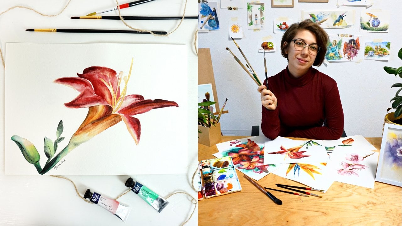
Transcripts
1. Let's paint a yummy strawberry cake!: Would you like to
paint pastry so realistically that your
mouth starts to water? Well, you better don't be
hungry for this artwork. Today, you will discover all the tricks and
secrets of creating mouthwatering food art by painting this realistic
strawberry cake. My name is Yana, and I will be your guide on this
delicious artistic journey. As a watercolor
artist with years of teaching experience both
online and offline, I've crafted a
method that merits solid theoretical knowledge
with hands on application. This approach empowers
artists like you to paint with confidence and purpose,
not just guesswork. Whatever you work on will
turn out, as you imagined, because you'll grasp not just the how but also the why behind watercolor
application and features. In this class, we'll
explore a range of basic techniques to
paint realistic food art. We'll use wet and wet for
smooth color applications, layering to add depth. And harness negative space to make the strawberries,
pop off the page. By the end of the sure, you will know the secrets of painting various textures from glossy marble plates to juicy strawberries
and soft spongy cake. We will even create the illusion of white cream without
using white paint, putting color theory
into practice. We will start by discussing the appropriate art
materials for this project, then the composition, the make or break elements
of your painting. And then we'll plan out color
palette and color mixes, and layer by layer, we will build our
appetizing masterpiece. This class is ideal for intermediate boy colorists who are familiar with the basics. But hey, if you're
just a beginner with a sweet tooth for food
art, don't fall back. I'll guide you
through each step, explaining my every
move and motive, ensuring you can follow along. No speed up pleasant or pre
recorded voice overs here, only real time videos
at my commentary. So are you ready to
create a watercolor cake so tempting that you might
just want to take a bite, grab your brushes, and let's
meet in the first lesson.
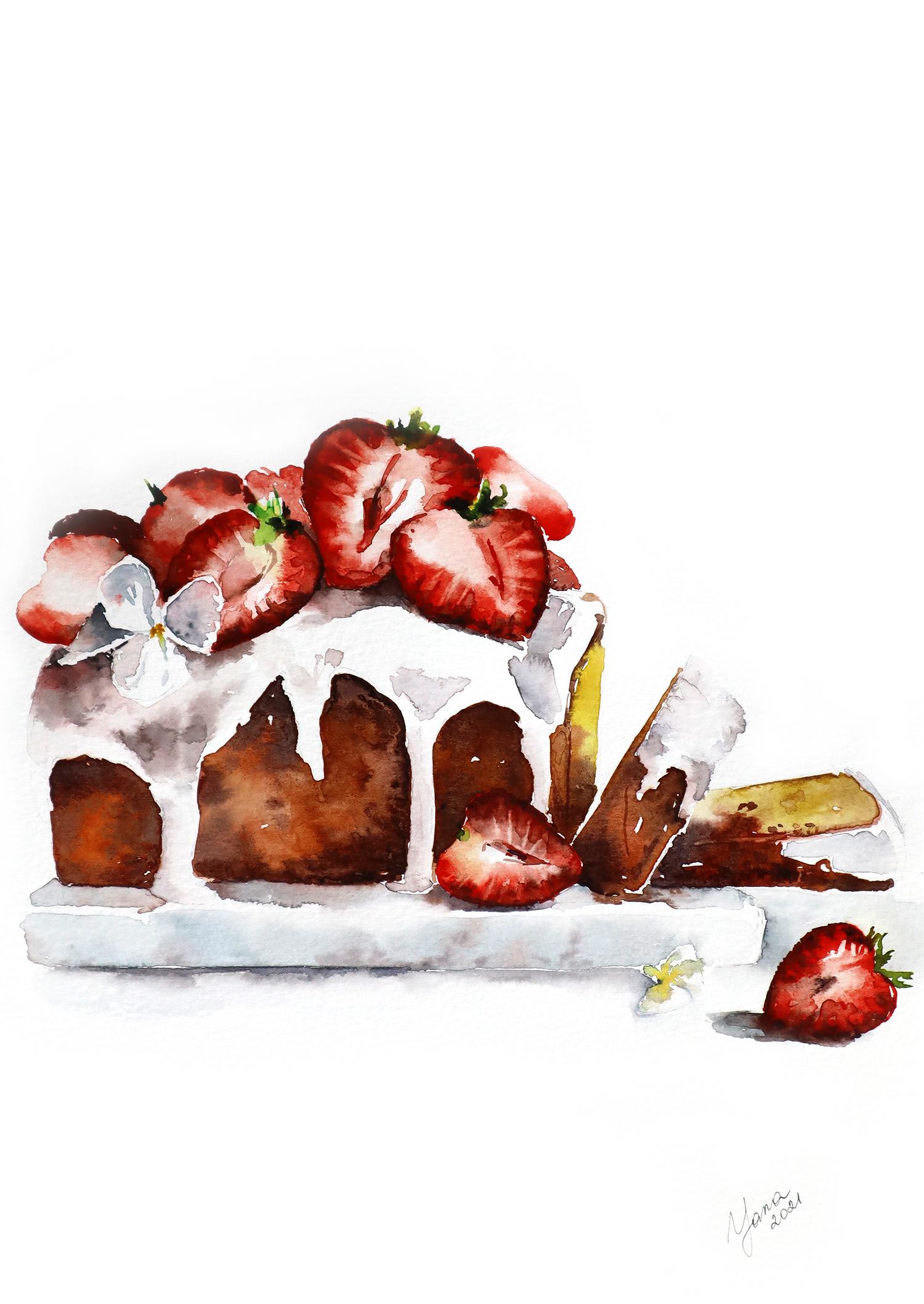
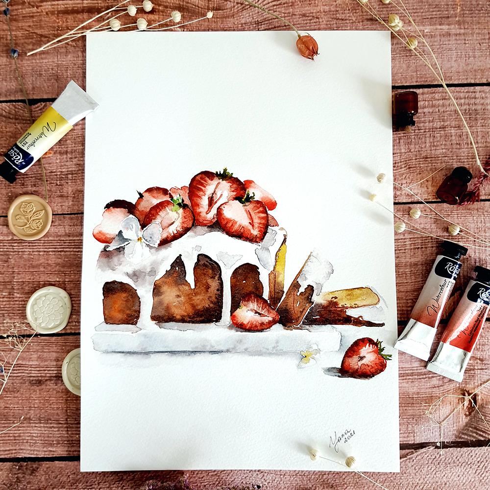
2. Your strawberry Class Project: Project, will paint
strawberry cake that is so lifelike that you will
want to grab a fork. This isn't just a
painting exercise. It's a chance to practice your newfound skills and create a piece of art
that's uniquely yours. So why strawberry
cake, would you ask? Well, it's the perfect
subject, I think, to practice a variety
of textures from glossy strawberry to
fluffy cake sponge and smooth white cream. It's challenging, sure, but so satisfying
when you nail it. Now, let's break
down the process. First, you will work
on your color palette. This is crucial for getting
those realistic tones. Then we will sketch
out the composition and don't worry if drawing
isn't your strong suit, I've got you covered with a downloadable outline that you can trace directly onto
your watercolor paper. Speaking of materials, this is what you'll need
watercolor paper, your favorite paints, brushes, a pencil, and an eraser. As we progress
through the class, you will build up your
painting layer by layer. Take your time with
each stage because there's no rush to
the finish line here. And I want to see
your creations. Upload your finished painting
to the project gallery. And even if you're halfway through and proud
of your progress, please also share it. I will offer my
constructive feedback to absolutely everyone who
shares their creation. This is the best way for
you to improve and grow. Your first step is simple. Open up the reference photo attached to this class project. If you're feeling confident, grab your pencil and
start sketching. If you would prefer
a little help, download the outline that I prepared and trace it onto
your watercolor paper. Remember, every
masterpiece starts with a single brush stroke. So let's pick up those brushes and create
some delicious art.
3. Reviewing materials: Let's start our course from
discussing the materials. You're going to need
to paint this artwork. And let's start from paper? I'm using Kansan Kansan Montil. It's a cellulose paper, very high quality
cellulose paper that behaves very close
to cotton paper, and yet it really is very
reliable and easy to maintain. It's very predictable. You don't have any weird, unexpected results
with this paper. So I really recommend you
if you go with cellulose, not cotton, take a ut while. It's 300 GSM thickness, so it's pretty 30. I'm not going to attach it to the table or to the board
or anything like that. Plus, we're not going to use any wet techniques
or anything heavy. Today, that's why I don't
really need to stretch it. It's not going to
buckle or move. However, if you
like nice frame or you think you're going to use more water and wet
technique today, by all means, use the tape and attach your paper
to the surface. And well, the texture
really doesn't matter. I like to work with cold press. It's my favorite texture. It's a little bit of a tooth, but not too much
and not too little, like in hot press or
in rough for the, you know, noticeable texture. This is like a middle
ground. I really enjoy it. For food art, it's
probably also pretty good, especially considering
we're going to paint. Um, the bread with the particular texture of this
bread and the cake, right? So that's going to work for us. I'm not going to use this
whole big page, of course. I'll use, like, a half of it, and it's a comfortable size. I always suggest to work on
bigger pieces so you can have more possibilities
to throw the paint. But yeah, half of the
sheet is also good enough. Then, um, for the pencil, I'm using automatic pencil. It's pretty thin, sharp. If you use regular pencil, use the one that's hard. H two, he four. Also, I would suggest you
to use kneadable eraser. It's a very reliable eraser that doesn't damage your
paper when you're trying to lift your
pencil sketch. And today, I'm going to sketch pretty hard so that you
can see it on video. And then I will remove the
line with this eraser, and it doesn't leave any mark. Lift the line easily and
doesn't damage the paper, which is the most
important part. Then for brushes, actually,
I'll just use two. My synthetic brush is my
most important main brush. I'm going to work with it only cover pretty much
everything with it. And with the flat
synthetic brush, I'll just do some
particular details lifting the pigment from strawberries and
stuff like that. So this is for special effects. Then the paint, I'm using
my selection of paints. It's mostly Rosa, watercolor
brand, professional grade. And I also have Windsor Newton, St., Shinhan, and other brands in here
some colors that I like. But most of them are Rosa. All of them are
professional grade. However, you don't need to use professional grade if
you don't feel like it. It's not for you yet.
It's totally fine. It's not going to affect much of the work we're
going to do today. It's really the paper that changes the results in the end. Also, you will need a piece
of paper where you will practice your color mixes. So we're going to try and find the best color combinations
for this painting. You need a separate piece of
paper for that so that you don't make mistakes
directly in your painting. Of course, you'll
need some tissues or paper towels, water, maybe a spray to revive
your watercolors, and that's pretty much
it. Let's move on.
4. Selecting your colors: So, guys, let's talk
about colour pullet. As usual, I have a
quick selection of paints that you can
use in this painting, or you can find
your own selection of colors that you
think will work better in this painting. So I have a piece of paper, not the one that I'm going
to use for the painting, but just like any old piece of paper used on the other
side doesn't matter, just to work on our colour plet. So let's start
from strawberries. I think best for the
strawberry will be to use Cadman bread. It's bright, juicy,
colorful, concentrated. Over here. If you want, you can use
a different type of red. For example, I have
a fire red color. I think it's more lenient
towards cold tone, so it's kind of pinkish. But you only can see
compared to cadmium. If you don't have cadmium
and you only use that one fire red on its own, it's going to look very hot. Anyway, I might switch between those two.
They're pretty nice. For the shadow part
of our strawberry, I will use our old way of achieving darker tone,
which you already know about. It's using a complimentary
color, which is green. So I'm adding a little
bit of green to my red. Of course, it's important to
find the right combination, so it doesn't turn into green. We need just a little bit of green and most of
it should be red, so we have darker
tone, red, like here. Looks perfect. And for the tip of
our strawberry, we will use sort of green color, but I want to make
it more interesting, not just like pure green, but I want to use a mix
of green and yellow. So let's say here I have
aoline and with line, I can use a dip of yellow. Oh sorry. Green. And we'll achieve this translucent and yet very bright and eye
catching green color. You can as well try
to use, for example, lemon yellow or
Cambog If you don't have Olin, this is Cambog. You can even go with cadmium. Cadmium is just much warmer
still mixed with green. Gonna look still, you
know, bright and vibrant. So that's the look
I'm going for. I want to have vibrant color. Alright, so that's
the strawberry. And now let's talk about
the bread, the cake. So the cake will
be a mix of Brown. You can use arsiena. It's a very typical
color that you can find in pretty much
any watercolor set. Or in my case, I'd like to try Royal brown. It's a new color in
Rosa watercolor set. It's pigment, brown 25, just one pigment in its content. And yet the color
is really nice. So here is our royal brown. I might as well just
mix it with a tiny drop of burn sienna for the variety. So we don't have just one
flat color in our cake. We use different tones
and slightly warmer or colder for the interesting feel and more complicated
look of the painting. And also, of course, we
have shadow in our cake, which we will achieve by mixing the same brown that
you use at your base. In my case, it's royal brown
and a little bit of blue. As well, make sure
that there is more of brown and less of
blue to achieve Tarke tone of brown, like here. And well, that's it. Also, you might want to use
a little bit of ro sienna, for example, for the
light part of the cake. I just realized
that we have this, slice of the cake that
fell on the table. And for the lighter part of it, we can use raw sienna. That's going to
be a good choice. If you don't have roiena, you can technically
mix, for example, yellow, cadmium yellow with
your brown that you will use. For example, burn sienna. And you achieve
lighter tone, warm, something that can also
work for the cake, the light part of the cake
that's, you know, inside. The dough. Anyway, let's move on. So we covered the cake, the strawberry, and the last part that's left
to talk about is the cream. The cream is white, and
we know that the best way to paint white and watercolor
is just not painted, so we can leave the paper blank. But in our case, it's going to look
quite flat because we want to show how Um, the cream is flowing and
kind of dropping and moving, and it also follows the
shape of the cake, right? So because it follows
the shape of the cake, we can see shadows that define that the object has
a volume. It's not flat. It's three dimensional. So to show this three
dimensionality, we need to play with shadows. And the best way to paint
shadow is to create great color gray color,
great, gray color. How do we do that? Well, we have the rule if we
mix three main colors blue, yellow and red together
in the balanced way, we can achieve nice gray tone, so we can achieve neutral color. Let's try that. I'll
take cadmium yellow. Then I'll take cadmium
red and ultramarine blue. Here, it's kind of brownish, so add more of blue to
get more into gray feel. Maybe a tiny drop of red. Here we go. We
have a gray color. In my case, I actually
do have gray paint. It's already in my tube. I'll just use that to
speed up the process. I'll show it to you
here. This is my grain. You can compare they look a little different.
This one is lighter. However, my grade that I mix by myself, I
can just dilute it. And get a lighter
tone here, see? So it's very similar,
not exactly the same. I can't reach exactly
the same color, but mixing by myself. Otherwise, it would
make no sense to produce a big man in the tube. But if you don't
have a gray color in your set, it's fine. You can mix it by yourself.
I'll just show you how. As well as I actually
want to have my gray leaning towards this
reddish kind of tone. Towards this strawberry feel. So it looks like a Yumi cream and not just something,
you know, gray. I don't know. I just want to show the warmth of this shadow
because essentially, what we are painting here
is the shadow on the cream, and I want to make it warmer. With the same gray, my shadow can also
lean towards blue, and it can be as
well ultramarine. But ultramarine
granulates quite often. I mean, always. So we can as well take
erleium into the mix of gray. So if you're going to mix
your own gray by yourself, make sure that you
take the time, have a separate piece of paper, and prepare your color. You find your best combinations because it's not always
working out perfectly. So if you take, for example, um, Oleine as yellow, and
then cadmium as red. And then I don't know,
some bright blue. In the end, you might
achieve something muddy instead of gray. Like, so not exactly
the desired gray tone. Of course, it's a matter of correct proportions
of each color, but still it's also
about the color. So here, it's leaning towards
yellow and kind of brown. Make sure you try combinations of those
three main colors in a different ways in different proportions
before you find your perfect gray. It
might take a while. So when you do find
it, write it down. So next time you
don't have to lose time trying to remember
how to mix your gray. Anyway, that's it. I think that's all
we need for today. If you want, you can use
a tiny drop of black. However, vertical artists do not usually use black.
Just remember that. Black is good to make color
slightly tiny bit of darker, just to add the tone,
but please do not use black as a main
simple one color. Okay, enough of colors. Let's sketch.
5. Sketching the cake: Okay. So the way I'm going to sketch this cake
is going to be a little bit different from
what we see on the reference because
on the reference, you see that the
part of the cake is kind of going
out of the frame. And this is nice
on a photograph, but not going to really work
well. In the piece of art. So what I'm going to do
when I will draw my sketch, I will move the cake and
put it more centralized. Not exactly in the middle, because we know the rule that nothing should be
exactly in the middle. You should split the page into four equal parts and
place your object anywhere, but not in the exact center
for the harmony of the image. But I do not want to have part of the cake
being out of the frame. So let's define
where is the bottom. Here will be the plate. Then the actual cake
will be somewhere here. So as you understand,
the left part of the cake will be imaginary. You just have to finish
it up by yourself. Here will be the strawberry. Right now I'm just
really carefully marking main elements without
pressing the pencil much. Just want to know where
things are going to be, but not necessarily
will be just yet. Because, for example, if
I want to fix something, it's going to be much
easier for me to remove a super thin line
instead of trying to erase a very
dark pencil line. So I extended the
plate here, marble. I also decided to locate
our front strawberry here. A little quillser.
There's a cute flower. Okay. So this is the slice that fell. This is the slide that
is aiming to fall. Because of the perspective, the image is a
little bit deformed, here we need to cut it this way. Here we need to cut it this
way to show the perspective. Then lo here, maybe
a little less. So larger strawberry here. There are some pieces there. And the stuff on the
back is kind of blurry. We didn't really see it much. So I'm not going to draw
much of a detail there. The hearts of the strawberry, I'm not going to
sketch them as well. The important part
here is to actually define that first of all, the table, the plate the marble plate is probably longer over here
on the left side. And then this line is
the line of the plate. It's not the line of
the bottom of the cake, so here is the
bottom of the cake. That's important because we need to create the
feeling of depth. So between the bottom
of the cake and the line of the plate, there's some distance. Okay. I hope you see my
sketch. It's clear. For you, if you worried that your sketch is
not what you want it to be, do not worry because as usual, we offer outlines to the note, so you can just
print it, sketch it, trace it directly on the paper, and just covering
without struggle. Now we can start painting.
6. Start with the first layers: wet on wet: Before we start painting, we
need to erase dark lines, especially me because I was trying to I was
actually pressing the pencil a lot to make sure that you can see my
sketch on the video. That's why now I need to make it much, much,
much lighter. Especially considering
we have a lot of white in this painting. With Nisb eraser like this one, it's really easy to just remove dark lines without
damaging the paper. Okay, much better.
And let's paint. So I think we should start with the red with
the brown part. Even though in
watercolor, you know, we start from the
lightest to the darkest, which means we should
start with the cream. But in this painting, I would like us to do sort
of negative space technique, which means that we will paint the brown part of the bread of the cake and paint
around the white cream, which means that we are
going to literally leave those white space and create the shape of the cream by outlining it with
the darker color. Okay, I am taking the brown. So Bern Siena Royal Brown, whatever brown that you
chose for this painting. And I'm going to
play with Burnsiana mixed with Royal brown. And just carefully
coloring right away, I'm going to mix a darker tone. So I'm going to add a
tiny bit of blue into my brown and right under the creamy part, because cream is naturally casting shadow on
the bread loaf. So right under the creams
going to be darker. We can also see it on
the photo reference. My brush is very watery. The pigment is really light. And I'm just injecting
two colors, basically. I'm switching
between Versiana and Royal brown to achieve this sort of playful
look of the painting. At the same time, while
the paper is still wet, I am adding darker tone. If you do it while your
first layer is still wet, the mix will be soft. You have no dark sharp and
dry edges and outlines. You also might want
to come back to the previous one and add a
little bit more because, as watercolor gets dry, it loses the vibrancy and
intensity of the color. So you might want to add
a little bit more shadow. Especially here at the top, the shadow is the darkest. So don't be shy and add another drop of
shadow if you need to. While the paper is still wet, everything is just going
to blend smoothly. So you don't have to
worry about, you know, cut out feeling like in a
coloring book kind of thing. It's going to be all
soft and natural. Also, I'm dropping
small patches of paint here and there just to create the texture
of the bread. And yeah, I feel like if
you drop a tiny bit of pigment into your still wet
layer of this brown color, you will get this
more kind of blurry and a little bit
stretched out color, which will look like, you
know, like red texture. So that's nice. And here I'm carefully
going around the cream, which is on top and
the strawberry, which is here in the bottom. And by doing so, I am literally creating the shape
of this strawberry. This is the part of the cake where the bread is
much lighter inside. So I'm taking rosena. Maybe even drop a tiny
bit of yellow in there. But just a little bit. And here on purpose, I am touching the
first brown layer over here and allow it to blend. I think this is going to
create more natural feeling of this shadow part
that's going away in the perspective because
we don't see everything. And since it's out of focus, we don't see all of it, it would make more sense to
allow the paint just blend. Also, when it will get dry, we will be able to
correct the shape at the shadow and make it look
the way we needed to look. All right. So our first part of the cake, the bread loaf is done. I might add a tiny shadow
here just for the intensity. I Of course, it's important to not overdo it. Do not accidentally
make it all black. The shadows are still
need to be mild and within the color scheme and tonal scheme
of the painting. So do not overdo it. Do not make it too dark. And we also will have a
chance to get back there and add another layer later on
using glazing technique. And now we can move to
our two pieces that fell.
7. Adding new layers: glazing technique: So the two slices that
fell, same approach. Plain with two brown colors. If you want, you can
even use orange instead of brown Bnciena for example. What I want here is that we
don't use one pure color, and that's it because it's
going to look really flat and not interesting,
not realistic. And we're not aiming
for hyborealism, right? But for us, it's important to give this feeling
of the dimensionality, give this feeling of, you know, the texture of this
bread, that it's yummy. You want to try it. Here, I'm careful because I remember that there
is a strawberry, so I am going around it. And also quite on purpose, I leave those white blank spots. I don't try to, like, paint around or anything,
but with my brush, sometimes it leaves like a tiny tiny white
spot blank spot. And I think it
kind of gives more of a playful feel
again to the painting. So I like to leave it there. This final slice that has
the darkest brown loaf, the baked part, and
red, it's the darkest. So I am going to try and show it as well
with a darker shadow. And here I have
more opportunity to showcase the inside of the cake. So I'm mixing rosena with
a little bit of yellow. I just a little bit,
I touch the border of the cake on purpose with the brown outline to make
it bleed a little bit. I think it's going to
give us more of like a watercolor filling,
more artsy filling, not just like a photographic
look of the painting. And as well, we
can leave this to rest and move to a different
parts of the painting.
8. Painting a marble plate: So here I want to
continue actually in a bit not traditional way. I want to now paint, the marble plate underneath, and maybe some of the pigment is actually going
to leak into this plate, and this is the effect that I'm actually looking
for because I think it's going to be an interesting
feel for the artwork. I took my gray and here I'm adding the shadow
right under the cake. And since the previous
layer was still wet, I kind of catch some of
the paint, and it licked. So this way, at the same time got the reflection of the
cake into the marble. But in a natural way, I didn't have to paint
it artificially. Here, the paint was already dry, so I can just add it
manually, this reflection. Make sure that your
gray is not too dark. It's not like lenient to black. And also the important
part is that the bottom of your
gray line should be also smooth and blurred. So the edge should not
be sharp over here. That's why I am blending it right now with
the semi red brush. Also at the same time,
I'd like to quickly add the shadow right
under the strawberry, which we didn't paint yet. But the shadow is here. It's a good opportunity
to add it right now. While the layer is still wet. So here you can see now, we kind of created
this outline of the strawberry without
painting a strawberry. So now that I have done
this part of the marble, here, I'll correct the
line a little bit, so it doesn't sink. Now I'm going to continue
painting the marble, but from the bottom up. And you will see why. I'm also adding a
tiny drop of water on the whole surface of the marble plate,
just pure water. And after that, adding drops of gray to create the
texture of the marble. And also, in my color of gray, I mixed in a little bit of blue. Here I remember I have a flower, some painting around it. And that's it. We have our mark texture. So why I started
from the bottom? Because bringing the color up, I created this tiny
thin white line in between this
part and this part. Here and here, which
I did on purpose because this creates the feeling of an edge like the plate, this is the width of the plate, and then this is the actual surface surface of it where the cake
is standing on. This way, we created
the shiny edge, the corner of the
plate and created this three dimensional
feeling of the set plate. And to finish up this
feeling of the marble, I'm just adding a
couple of spots and drops of darker tone
to get the texture. And it's important to do it while the layer is
wet, otherwise, it's going to look too sharp. At the same time while it
is actually still wet, we can add the shadow.
I'll take blue. Make it darker with brown. And with this mix, I will just carefully
wave the shadow. Right under the plate. And with the semi wet brush, I'm diluting the edge of it, so it doesn't look like
just one dry line. I'm also going all the
way close to a flower. And since we are at the flower, I might as well just add
shadow under the flower too. Here, be careful. You
don't want to overdo it. You don't want to
make it too large, that shadow. Just a tiny bit. Just to show that it's there. And the same under the
four between the battles. All right. We also have a strawberry here, and it would make sense
to while we're on the shadow part to work on
the shadow of the strawberry, under the strawberry, excuse me. It's line here on the side. Remember, it's the same
strawberries in the reference. I just move it a
little bit closer. But the idea is the same. So let's define shadow. Like so. And that's it. We can
as well separate, kind of show the edge of
this side of the plate here. And also at the same time
mark the shadow from this slice of cake that fell because it's naturally
also going to cast shadow. And we also can use
this opportunity to outline the
strawberry a little bit. Not that we need it
because it's red, it has enough color
to show for itself. Here we are. Okay, so here it's
important that all your shadows
are super light, very, very transparent and airy. And after my painting will dry, it's going to be even lighter. So please do not overwork it. Keep it light. And now we're moving to well, how about painting strawberries?
9. Painting realistic strawberries: Now the fun part, that's
paint strawberries. And well, first, we need to discuss how we're going
to paint the strawberry. And you know that all
the strawberries in our reference, they are cut. So we see the inside
of the strawberry. And the way we're going
to approach it is that we will paint the outline of the strawberry
first and then blend the color inside using
gradated wash to make the color move from very bright and vibrant to lighter
lights lighter transparent, disappearing in the middle. So this way, we're going to show this heart inside the
strawberry. Let's do it. I'm tempted to start
from this shrubbery, but it will make more sense to move from left to
right so you don't accidentally smudge
your painting and destroy your
layers with your hand. So let's start from this corner. Using cadmium red, I will start. So I applied a color, and now I am blending it inside carefully with the semivod brush every time I rinse it
against the tissue. And with the remaining moisture, I am moving the pigment into
the heart of the strawberry. So I take a darker tone and add a little bit tin
you drop at the edge. And right away, it's a good
moment to add the shadow. And also here, I'm very
careful because I have to paint around the
flower, around the petals. So by painting
around the petals, I'm creating the
shape of the petals. We use a negative space
approach today quite a lot. Okay. And actually, right away, I probably will paint that
strawberry that at the back. It's noticeably darker. But it's also going to
be an opportunity for me to outline a petal of the
flower from another angle. At the same time, I'm moving
towards the next strawberry. P the dark down, I'm showing
the decre here on a side. Remember, if it doesn't turn out the way you plan from the start, it's fine because it's
just the first layer and you will be able to
intensify the color later on. Here's what I remember about
the petal, the flower. You can see how my pigment
is moving by itself into the wet area, and that's actually
playing really well into the surface
of the strawberry. Tiny drop of yellow. Okay, so I'm going
to touch that one. Gonna move to the next and fix the texture of the
strawberry later on. I applied the outside line, the border line, and
moving the pigment inside. At the same time, it's a good opportunity
to add the shadows. Mixing my darker ton of red
with tiny bit of green. So I'm just dropping the
pigment inside to let it flow. But again, we will define
the texture inside the strawberry later on
with our second layer. And couple of more, and we're done with
the top strawberry. Same approach.
Drops some pigment, rins the brush. Move
the pigment in. Okay, so finishing up this
final strawberry on the top, and we can move to the bottom. Actually, we can also
add a couple of more here. It looks quite empty.
10. Painting white cream: Actually, you know what?
If your strawberries are still wet, the
layers are still wet. This is the best time to
create shadows underneath. We're going to use the
same technique we used here when we will touch a
little bit of the bottom to allow the color from the strawberry leak a little
bit into the shadow because naturally the shadow will be
colored in with red tone. And even though my
strawberry got dry already, I will still do my best
to catch that moment. So if your strawberry doesn't
bleed into the shadow, then you can add reddish color by yourself
artificial like I just did. Also, this gray is not
how would I say it? Well, simply put,
it's not too dark. Not dark enough. Like here, in between the strawberries, it's really, really much darker. So I'm intensifying
it with a tiny, tiny drop of black in
between the strawberries. It's really much better if your layers are wet so that
it will allow the paint to flow naturally without
creating dark, sharp edges. What you can do
instead is you can wet your brush and just put some water first in the place where you want
to have the shadow. And then you can take your color and drop it into this area, allowing the water kind
of guide this color. And now we're just building up our cream by painting
the shadows of it. If you use a watery pigment, it will be easier for you
to define the shadow. It won't look too dry. At the same time, it
will be really light, but has some color in it. Okay. Now here, I'll first apply clean water to create the
space for our pigment to flow. And now I'm dropping
the pigment. As I mentioned
earlier, my pigment, I use already pre made gray, and it's coming from the tube. And I mixed in a tiny bit of red in it just
to colour it with this pinkish sort
of half tone to give this feeling of red
reflecting on our cream. Also, I need to
avoid sharp edges. I'm diluting them
with a semble brush. And with the darkest tone, we need to show the shadow
between the petals of the flower and the shadow
right under our strawberry. Here it is the texture
of our cream is ready. Again, if you see too
much of a sharp edge, you can always dilute it
with a semi wet brush. Just be careful not to
drop too much water. We can move to this part.
11. Finishing up the layers: Let's finish the cream
on our cakes over here, so we're done with this part. Again, I'm taking very watery gray and just dropping
it in a few places. My gray is mixed with tiny
touches of blue and red. Make sure that your
shadows are not dry. They don't have sharp
outlines, sharp edges. If they do try to dilute them. And I can move to this one. First, I'll put some water. H. And then pigment
and just let it flow. This one I don't want to put too much of a shadow,
just keep it light. Maybe just show here to mark the outline where it finishes because it can't
just go into the thin air. And the same here, we can't
just leave it white and go into the background because I don't want to paint
the background. So what we can do is to
finish the bread over here and maybe show a tiny side of a
strawberry at the back. Okay. So this way
without outlining it, like in a cartoon, like
in a coloring book, we created the edge of the cake without
outlining the cake. And well, since we're here, we can as well paint Oh,
let's paint the flower. It's in the same color range. Kind of gray. Let's
make it bluish. So I mix gray with blue. In your case, if you
mix your own gray, just add more blue to your
mix of your three colors. And here, very carefully, I'm just marking the
shadow on the petal, but I'm not coloring
the whole petal in. Here, it's very important to keep the white space
of the flower. M I drop sometimes I drop red because of strawberry
that cast red shadow. It reflects its own
color on the petal. And yet our petals
should be very light. Very transparent
and minimum color. Keep it more white than colored yellow in
the middle. Cool. We can do the same with this
flower here in the bottom. I'll drop yellow right away
and start with the petals. Here is the same. It's more about And the white space. The white space is the
most important part. It's what makes the whole
flour airy and light, well, white because it is white. Okay. And here we can add our strawberry I just cover it in with a very, very transparent light layer and add red just to sink in
the more concentrated red. I also try to not let the color move too
much into the center. And yet we need a
darker tone of red. It's better to add
it right away. So I'm mixing darker tone. And going to add here at the
corner the edge. I mean, just let the color sink in. We will add the diesels later. Here you can add a tiny drop of yellow in heart. Yeah. Okay. There's that. And well, looks like our first layers
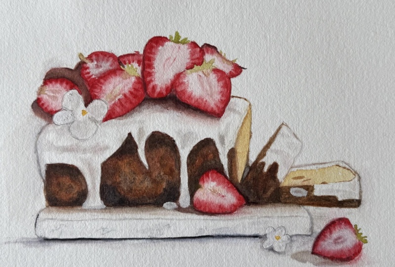
are pretty ready and we can wait for the whole painting to get completely dried before we move on to paint the details.
12. Textures and details: Okay, so we're almost done here, and now it's the right moment to take a step
back, take a break, get some coffee, and
evaluate your work, decide where you need to
intensify the shadows, where you need to
add tiny details, where you need to add texture. If you need it, it
doesn't mean you have to. That's why you need to
look at your picture with the fresh eye and decide
where you want to bring the focal point and
where you want to kind of leave it be leave it
blurry and less defined. That's very important because
you can't put a focus on every single strawberry
on every single, I don't know, part of the bread, because then it will become
more of an illustration. And here, we're working on painting where
everything is united. And there's a few accents, a few points that
bring attention, but everything else just to come together and create
one whole image. So I'm looking at my painting. And I think that I will add, well, first, I need to add
the top of the strawberries, the green and yellow
parts and some texture and some hearts of
the strawberry and also a little bit of a
texture on the cake. That's what I'm
going to work on. So add more clear texture to
the biggest strawberries. Basically, I'm just
intensifying the color. I'm not really adding
anything new or exclusive. I'm intensifying the color, making shadows darker and some parts more visible. Also, I want to clear the heart, the center a little bit more. And I'll do the same with
the strawberry nextard. Another more natural way
to create this texture, this type of texture is
to lift the pigment. Can't say I like the
way I do it now, so I am gonna use the
lifting technique. So I'll take my flat brush
and make it slightly wet. So it's not dripping wet
but it's also not too dry. And I will just
lift the figment. Here we still have to adjust the final color
that we achieve. Need to adjust the heart. But overall, we've got the
effect that we wanted. I might as well do the
same with a big one. Make sure your brush is
clean, doesn't carry paint. Otherwise, you just instead
of lifting the pigment, you just kind of move it
from one place to another. Okay. I'll also define this strawberry because it's kind
of it's frontal. So usually when people
look at the picture, that's what they
see first, right? Something that's closer to you. So let's clarify this
strawberry, too. Should also remember
about shadows. The same way, just lift. Make sure you don't
change the shape of the strawberry and w a
13. Adding realistic touches: So let's work on
this stronger now. A I'll push it a little bit into the shadows. Maybe I'll define this
one just a tiny bit. Okay. So now what
we have left to do is add tips of strawberries. And we agreed to use
yellow with green. So I'm going to prepare As you can see, I'm not
placing them everywhere, but I feel like
here, for example, we could have add a little bit, even though it's not
on the reference. Here, accidentally, I left white spot where the shadow was. So I am blending it carefully. And here we go. Definitely, well, that's it. Maybe a bit of a shadow
for the contrast. Okay. Could have misted. That's a good catch. Can drop some texture on the
bread and also the fine. Define this side of the bread. Maybe show the
texture a little bit. Here it's better to lift the pigment to
show the shininess of this corner. Cool. Okay. Well, I think that's it. All right, so here we go. Our painting is done. I think it's oops. Pretty good result. Again, don't rush. Take a step back, take a
break, look at your work, decide if anything needs to be fixed or you need
to place an accent. Sometimes a really tiny drop makes the whole
painting stand out. So think if there's
anything else you would like to add or lift, remove if needed, and please do submit your work to the academy. It's in the assignments
in the end of the class, and I will be very
happy to look at your work and give you feedback or help you out if you
have any questions.
14. Final words: You made it to the finish line. Give yourself a pat on the
back because you deserve it. First off, a massive thank you for joining me on
this artistic journey. Whether you're putting
the final touches on your masterpiece or still
working through the layers, you should be proud of yourself that you accomplished
this stage. There's one thing I hope
you take from this class is this Watercolor
isn't about perfection. It's about understanding. When you know the why
behind each technique, you can confidently
tackle any subject, be it a strawberry cake, a sunset landscape, a portrait. Now, I'm dying to
see your creations. And if you haven't already, please share your project
in the project gallery. Whether it's a work in progress
or you finished painting, I can't wait to check it out
and offer some feedback. And if you enjoyed
our time together, I would appreciate if you could leave a review to discuss. I'm always cooking up new
courses absolutely intended. And your support is crucial. Until next time, painting.
 Yana Shvets, Professional watercolor artist