Transcripts
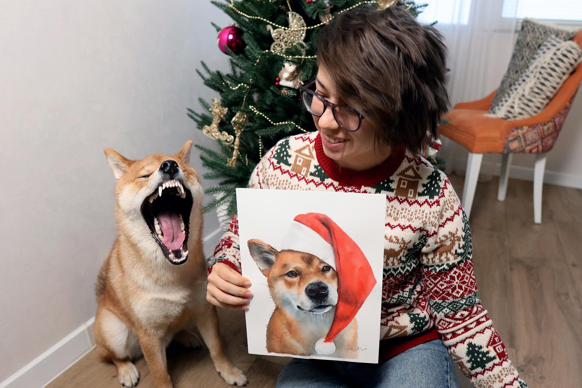
1. Introduction: pet portrait magic: My fluffy fluff, my
foxy, my little demon. There are not enough
words to express all that your pet is
and means to you, the whole world, no less. I realized this when Kaiju, my naughti Shiba
bounced into my life, turning my world and
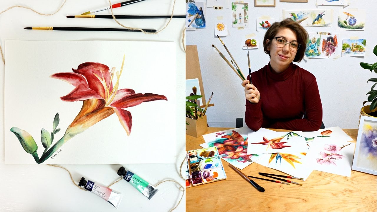
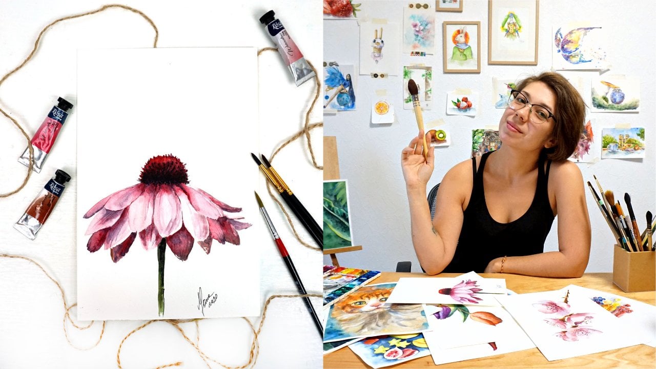
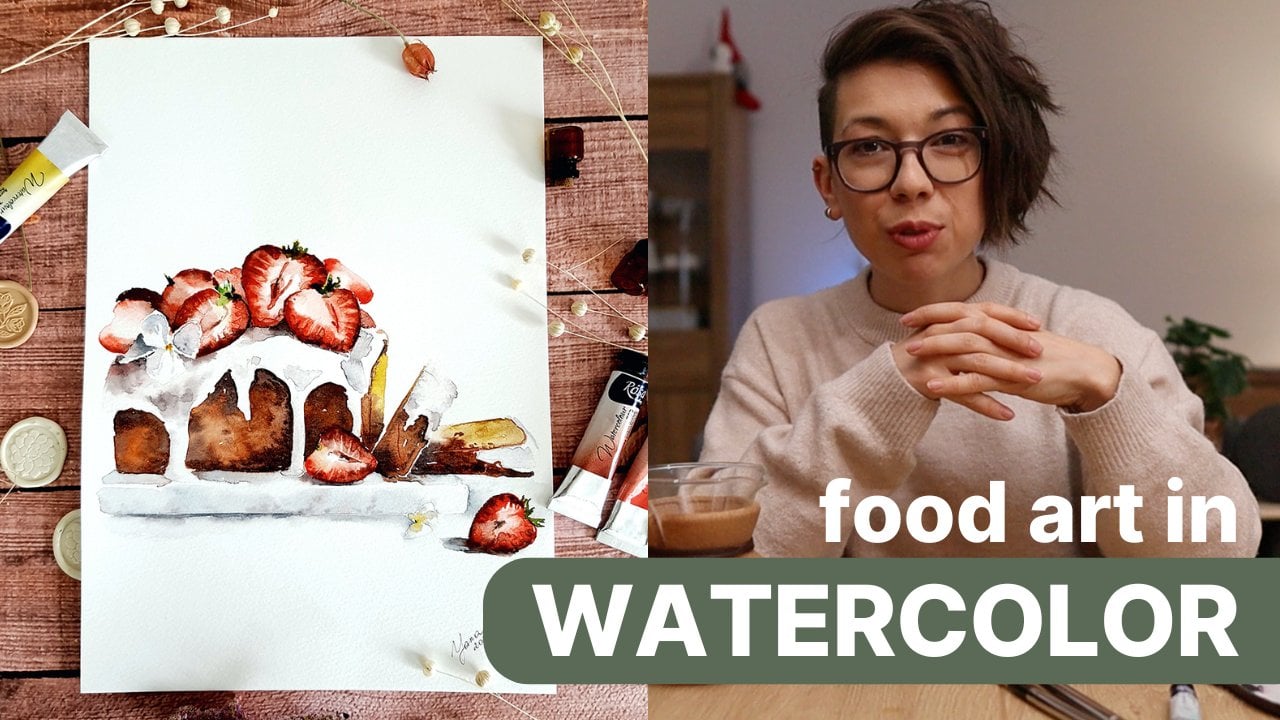
art upside down. My name is Jana. I have been painting
with water color all my life during the last 78
years, professionally. From hosting in person
workshops around the world, to having my originals in private collections
across Europe and the US. My art has been a
journey of exploration, heavily affected by
nature and my travels, with the appearance of Kaiju, my focus shifted to capturing the unique expressions and
personalities of pets. Getting to know each animal, their little quirks and
happiness they bring to their humans helps me better portray their
essays on paper. Besides, it's incredibly
rewarding to hear from Kays who are happy
to see their pets. So come alive in my paintings. I'm excited to guide you
through my process of painting a pet portrait with the
example of my Shiba Inu Ku. Whether you want to
paint your dog out of pure love or you wish to make a thoughtful gift for
a fellow pet owner. Or maybe you even aspire to start your own
pet portrait career. This course will
be your getaway. We'll start with the reference. I'll share tips on how
to make your pet pose, which shots work better for portrait paintings
and which to avoid. I invite you to try
and take a photo of your own pet to use as a reference for your final
project of discourse. But you can always download the photo of Ju
and work with it. Then we will tackle
the sketching part. It is really crucial for a successful
watercolor painting. Don't worry if you think
your drawing skills are more of a stick figure
than a Renaissance. I've got bulletproof
tips to help you draw a recognizable portrait of any animal and correct
your own mistakes. If you prefer to skip
this part entirely, I've got you covered
with a quick guide on tracing images directly
onto watercolor vapor. The tracing guide, pet
photography tips photo and the pencil sketch
are available to unload the PDFs in the
resources section. Finally, I'll explain
and demonstrate all the major watercolor
techniques such as wet and wet, wet and dry, dry and dry, which you will need to
create a realistic portrait. You will discover
the secret tricks I used to make this portraits, not just realistic, but
a life as a balance. We will add Christmas spirit
to this adventure because it is the most wonderful
time of the year. By the end of this course, you will have more than
just a painting. You'll have a portrait that captures the spirit of your pet. A perfect gift for
a fellow pet lover, or even the first step in your pet portrait
artists journey. Join me and Kaiju as we explore the joy of painting
pets. Let's get started.
2. Asking your pet to pose: There's no way your dog, cat, or another pad will sit still for the duration of
your painting process. It might be possible
to quickly sketch them still up and have fun working on your
dynamic brush strokes, But for a realistic portrait, you definitely need more time to be able to work
on those details. Let's take a photo of our model. Photography in your pad
for future painting is better than searching
from existing images on your phone because you
will be keeping in mind how this pose or
angle will look on paper. You will be surprised how your
dog curled under a table. Looks cute in a photo, but absolutely weird
in a painting. If you're working
on a commission, ask a customer to send you a
bunch of different photos of their pad for you to get a
better feel of the animal. You don't know them
as their owner. Do you need more
points of connection? Now, I will ask you
to pose for a photo. He's a Shiba. He doesn't
really like to obey. That's why I've got some
treats in my left hand while holding a phone with an open
camera app in my right. I lower myself down to be on the same level as my dog so that the shot is not
taken from the top. I'll call his name and keep the tree slightly
above my head. This will give me a
nice turn of head up and look relatively
into the camera. First, I take a
few shots and only then release a treat as we don't need the
chewing portrait. If you don't like the photo, you can wait till the dog
has finished his food and try again for more
interesting angles. You can ask your
dog to lie down, turn your phone upside down
for an interesting shot, and take a few picks like that. Using life mode on iphone can be beneficial if your
pat moves a lot. This way, even if the
photo turns out blur, you can still pick a better
shot in the life mode.
3. Pet photography tips: Now tips for pet photography. The high quality of a
photo is essential. Your pet must be
clear and in focus. Do not accept blurry or
dark images from customers. If you're working
on a commission, national light is
better than artificial. Try to take a photo outdoors
during the golden hours, which is early morning
or sunset time. It will also show the color of the animal's colt
more accurately. In winter, the light is softer and there's no direct sunlight. So you can technically
do it anytime, avoid shooting from the top. While such photos
might look cute, this angle will not translate
well into a painting. Face will look flat and the rest of the body will be
disproportionate. Instead, aim to
photograph your pad at eye level and from a
three quarter angle. Also, try to avoid close
up shots where the face looks larger than the body due to the perspective
distortion. On a photo it's
quite interesting, but on the painting weird, if your dog or a cat
has a long nose, a three quarter angle looks better than a
full face portrait. Flat nose breeds
on the contrary, look better in a
full face angle. At the end of the day, the angle is rather your
personal preference. I often pick a photo reference where I feel the
animal's personality opens up the most and consider
the turn of their head. After in this portrait, I picked a client photo
with a cls up face looking straight into the camera because this is the feature of Jamma, she's an Instagram
and Tiktok star. This is how people know her. And that's why I picked this photo over a more
traditional image. Do not worry if the whole body
doesn't fit into the shot. Our primary focus is on the
face details on the eyes, nose, mouth, the ears. For the same reason, ignore
your photo background. My portraits by defold have white backgrounds to not
the shot from the subject in the center and keep minimalistic style
to fit in any home. But as artists, we can add any background we
want with paint. Stressing out about background on the photo is quite pointless. Now you're ready, go get
some shots of your pet and share them in this class
project as your first step, if you're unsure
about your photo, you can always ask me
for feedback here. Below in resources section, I share the PDF guide on
taking photos of your pet. It's convenient to take
a quick look while you're shooting
your pet outdoors so you don't forget anything. I will explain
what we will do as a final project in
the next lesson.
4. Class project: easy steps: The final class project will be to paint a portrait of your pet. Okay, if you prefer, but I know it sounds like a lot, especially if you're
just starting out. I will break it down into small, easy to follow steps one, follow my instructions in
previous lessons and take a photo of your pet that you
will use as a reference. As we already know,
the perfect photo isn't always the
most obvious choice. To submit a photo of. Your pencil portrait sketch
is a very important step. We will focus on it quite
a bit in the next lessons. Don't stress out if you're
not a drawing expert, I've got handicips to get
that sketch just right. Finally, if sketching
isn't your thing, check out my
downloadable guide for tracing images directly
onto watercolor paper. I try to make this step as easy as possible for you Three, set up our workspace. Organizing your materials
can make all the difference. I'll walk you through setting up for the best
painting experience. No need to submit proof of it. But if you want, I'll be very glad to have a sneak peek
into your working area. Four, the final deliverable
watercolor painting, we'll dive into
various techniques to bring your sketch
to life and color, achieving realism and
capturing your pets essence. Just follow my steps and
share your results here. You can also share your
paintings with me on Instagram and I will proudly
repost it in my stories. My handle is the same on
every social media platform. Yana Travel Art, that's it. Don't forget to download the pet photography
tips and tracing guide. They might come handy as well. Remember, if you have questions or doubts at any stage
of this process, do not hesitate to reach out to me here I respond to everyone.
5. Setting up your space. Art materials: Project, you will need
a basic watercolor set. Paper pants, three
or four brushes, pencil eraser,
paper, towel, tape. These are also listed in
a course description. Now I always recommend using 100% cotton watercolor paper. It is a professional
quality paper that has amazing absorbing qualities and allows you to work
in layer technique. Today, I use paper from Enson 300 GSM with a slightly
noticeable texture which is cold press. Hot press is also fine, but I like to use the texture of the paper surface to my
advantage when painting fur, you can always use
cellulose paper. However, keep in mind that the watery washes will
mostly stay on the, the paper and
create sharp edges. When drying Montello
los paper brands, I recommend using
Kenzan, Montval. Professional grade
watercolor paints are always recommended. However, student paint
is also a good choice. If you are at the
beginning stages of your watercolor journey. I use professional grade
watercolor from Rosa, Ukrainian brand as
well as paints from Benzer and Newton seller
and a few other brands. You will need six or
seven colors to paint. Ju Burnsiena, Rosillena or
cadmium orange for the fur. Cadmium red for the hat. Indutrin blue for highlights
and mixes on ****. And neutral black
for darker tones. White bush for details
and highlights. I will need three or
four brushes to paint. Ju middle sized natural round
brush for large washes, especially when working
with button wet technique. Middle sized
synthetic round brush for better control of my washes. Small round pointed brush for
details and small washes, I use synthetic one for extremely delicate
details such as whiskers. I like to use a
rigger brush that allows me to get those
thin, unbroken strokes. Recently, I have been given my preference to an
automatic pencil to produce thin lines and have
my sketch light and crisp. I always suggest to go
with a soft pencil. Any type of B pencil
will work fine. You will also need an eraser. I always recommend using a nedable eraser that doesn't
leave traces on paper. You will need paper tissues
to dry your brushes, a monk or two with clean
water and a tape to attach your paper sheet to a table if you're not
using a paper block.
6. Bullet-proof tips to sketch any pet portrait: Before we start, I would like to point out the importance of a sketch when we need to
paint a pat recognizable. But the owner sketch in
their face is crucial. It is the foundation
on to which we will tailor color later
in water color. Now I don't want you to
worry about it as I'm not good and anatomical
drawing myself. After painting hundreds
of pet portraits, I figure out
bulletproof techniques to draw and correct
myself later. After all, all my portrays
look like their models, and this is what customers always point out
in their reviews. First and foremost, composition. I got myself into
trouble a few times. Drawing a face and all of
the details and even shadows to later wake up and notice that the face was actually
not in the center. While the golden rule is
important in landscapes, and stellife in pet portrays where the pet is the
main focal point. We want to keep their face
exactly in the center. How do we know where
the face will end up if we start drawing
from the eye, for example? Well, lots of artists will
tell you to first draw the main circle of the face to place it in the right
position on paper, and then fell in the
eyes, nose, and so on. I do not like that approach
because even with that, I still not always get the
proportions of the head right. In the end of the day,
not all dogs faces are perfect ovals or circles. Instead, what I do, I pick something from
the face that will serve measurement two.
Usually it's an I. Then I measure how many eyes fit in the face,
moving to the right. Then I measure the length
of the face moving down. Now I have a clear understanding of the proportions of the face. Because my measurement tool is directly related
to the subject, I will use this method
throughout the whole lesson. Now the initial advice for the approximate oval
makes more sense. When we can measure
the width and length of that oval with our perfect. I will use the eye every time I need to
double check myself. The distance between
the eyes themselves, the distance between
the nose and chin, length of ears, the length of the whole face
from top to bottom. Next bullet proof
tool, parallels. When your drop sketch is ready, you can check
yourself by drawing a virtual or even physical line from one point to another. For example, if I'm not sure that the nose is
in the correct place, maybe it needs to shift a bit. In my photo reference, I can draw a line
from the place I know for sure is well
measured and correct, like the eyes, for example. Down and see what part
of the nose it will hit. Then compare it with my sketch. It will give me a
precise location of the nose relative
to the eyes. You can use Photoshop to
place lines over the photo at the main points of the portrait to help yourself
see those parallels. Many times when my eyes get
used to the drawing too much, I would miss small
details and make certain elements of the
face larger or longer. Checking myself against
parallels has been a blessing. Next, take a picture of your drawing and look
at it in a mirror. In a reflection, both will immediately reveal
mistakes in your sketch. I also like to take a photo of my sketch and quickly drop it on the reference to
have both images in one place and look
for the differences. These are three golden tips that help me draw
a perfect sketch. But I also want
to share with you some general sketching advice. Just real quick. Always
keep your drawing light. Do not press the
pencil on paper, because when you
need to erase lines, they won't go away entirely as the pencil line
is way too dark. Try not to use an
eraser too often. It ruins the surface of water. Cool paper, Take breaks and come back and look at your sketch
with some fresh eyes. Often, sketching
takes me good 30% of the whole painting process as really take the time to
make sure it's perfect. Even 40% when you will
paint it with water cool, there won't be an opportunity
to correct the drawing. Okay, ready. Let's move to the next lesson and draw
an actual sketch together. I will demonstrate how everything I said
applies in practice. Remember, if this is all too overwhelming and you just
want to paint right away, you can take a look at my tracing guide in
the resources and simply trace the image of your pad on watercol
paper directly. It will be identical to
the photo guaranteed.
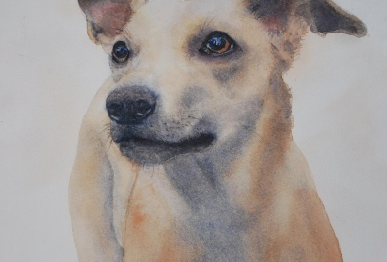
7. Sketching Kaiju's portrait: Let's draw a pencil
sketch of our pet. I will use a photo of Ju. You can follow along or use
a photo of your own pet. Photo of Kaiju is available
in the resources section. I want to point out that every pat has its
own iconic feature. Maybe the tiny wrinkle or quirky smile or a special
shape of the eyes. Catching that signature in your sketch will
guarantee 50% of success, as it is something that
makes your pet recognizable. All right, let's
start with defining where the head of the
dog is going to be. Just generally, I would like to have his head right in the center
because it's a portrait. Carefully, I'll
just approximately where the face is
going to be and I will also mark the head in my sketch, I will move the head a
little bit towards the ear. It doesn't have this distance here between the
ear and the head. I think it's going to
be a bit better now. I understand that
the main action is going to happen here now, because I don't know the
differences between the eyes and nose and general
proportions here. I will start with
first drawing an eye, essentially it's just a circle. But because Kaiju has this
black outline around his eyes, it makes it visually look
like an almond shape. It's going to look
something like this. Now, this is my main measurement
tool for the painting. First, I will measure
with the pencil, how is our E here? It's important to not
touch the screen of the phone so it doesn't
zoom in or zoom out. 122 eyes is going
to bring us here. This is already going
to be a beginning of another E 12 here. However, it's
important to note that the eyes are not located
on one line here. You can see if I put a
pencil or even a ruler, you will see that the eyes are on the curve and not
on the straight line. We need to do the same place, the second eye, a
bit higher up here, it follows the curve. Now let's see how many
eyes are going to fit in to reach the nose. It's going to be one eye to reach the beginning
of the nose over here, one more eye until
the bottom again. Now I measure the eye
that I drew on paper. One eye is where the
nose is going to start. The second eye is where the
nose is going to finish. Approximately. I'm drawing
the shape of the nose. I don't know exactly
how long it's going, but just approximately
I mark it like. So the width of the nose is exactly the
distance between the eyes, so let's check the width. Okay, so the eyes
can be located a bit further away
than in my case. Now I would like to
double check myself with the rule of parallels. If I draw imaginary line down from the corner of the eye here, I will reach this
place. Let's see. All right, but then here I think the curve should
start a bit sooner. Like so, if I draw a
line from the spot, it will be right in
the middle of the eye. Now I'm good. All right. I realize that
here should be the bottom. I made it way too long, so I made a mistake somewhere. Just like the eyes, everything, because of the tilt of the head, everything is located
on the curve. And you can also easily check yourself by placing
parallel line, and you will see
that the nostrils, for example, they're
not on the same line. The one on the right
is a bit higher up. In order for the head to not go outside of
my picture frame, I will make this
part a bit smaller. I also think it looks
more harmonious way, there will be folds
on the tissue, the rest can be done
directly with color. I'm not stressing out about the. Details. Don't forget that here we still should
be able to see the body behind the head. Do not make the head
over here too thin. Should be gradually
getting thinner. But it's very thin over here. And now I think we
should take a photo and evaluate a picture. A photograph at the painting. A photograph against
the drawing. Also, it's a good
idea to stand up and look at your drawing
from the distance. And also on the photo
reference from the distance. You might notice other things
that can be corrected. For example, I see that here my pencil line
is a bit too sharp. Now I would like to double check myself using the length of the nose and measure the
whole length of the face. Now, the final part for
me would be to make a more precise
sketch of the eyes. The shape of the eyes of Aj. Is very specific, and I think this is the thing that
makes him very recognizable. That's why I want to
take some extra time to draw them precisely
the way they are in my Atco part. This is going to be the feature of the dog that will
make him look alive, just like he is in real life. I think my sketch is ready. You can download it in this class and use it for
yourself if you want. Please do not forget to submit your sketch of your pet
that you're drawing. If you need any help or advice, I'm here for you
to help you out.
8. BONUS: watercolor techniques workbook: I approach all realistic pet
portraits in the same way. First, I lay down
the underpainting, something that will be the base for my artwork using
button wet technique. Then with button dry, I add the second layer, creating depth and volume. Sometimes I need to go
over a few times to reach the desired density and finish the painting with details to
make the animal stand out. There are a few tricks that
will make the pet look alive, which I will share
with you later. If you are new to watercolor, you might want to take a moment
and practice your washes, layers of paint that
you put on paper. Let's do it together. Covering the circle entirely in an even layer will
give you a flat wash. It means the color is flat and even you don't see
any connection lines. The more liquid you
have in your brush, the more water your
brush will be. And most probably will
dry with sharp outlines. If you stretch the paint from concentrated cower down
to almost transparent, you will get a gradated wash. If you add other colors. Well, stretching
down your watch, you will create a mixed watch. Now using watches, you can apply water code
techniques in practice. Wet and wet technique
means that first you put clean water on paper
and then add paint. Often wet and wet is used
to create underpainting, the first layer of your artwork to which you
will build up other layers. Because what a color
is transparent, the initial was
the underpainting will still shine through
the new layers of paint. Now let's wait for this wash
to be dry and add a new one. When we add a new layer with the wet brush on
top of a dry paper, we use a wet on dry technique. If we do this on the
existing water color wash, we're using glazing technique, also known as layering. Finally, to add
crisp details such as thin whiskers of an animal, you might need a dry
on dry technique. It speaks for itself, just
a dry paint on dry paper. I do recommend
taking the time and practice thin dry brush, which we will use in this
course to paint whiskers.
9. First layer: underpainting: In water color, it's
best to start from the lightest color and then build up the tones
to the darkest one. We will start with underpainting
using and we technique. Underpainting is the first layer that we lay down on the paper. Usually the paint will be
covered with new layers. Later on you will not really
see the color clearly, but it's still going to
shine through the new layers because water color is
a transparent medium. Now using technique,
I'm applying clean water on the face of
Ju I avoid eyes and nose. I don't really need water there because we're not going
to work on it right now. It's the darkest parts,
the eyes and the nose. We will work on it later on. Now I'm more interested
in the lightest parts, in the fairy chest cheeks and all the orange
parts of his face. First I take Rosianalight, watery, diluted, carefully,
apply on his face. Remember that even
if the color looks pretty concentrated and
even dark right now, it's going to get lighter
as the paint dries up. However, I suggest to not cover absolutely everything
with Rosiana right now, but go only in the places where you see orange
color on the photo. Reference the part with the cheeks and around
the nose, the muzzle. You want to keep it white
or white tissue for now. We're just building
up the very base that we're going to use
for this painting. Now. I wash my brush, rinse it. There's not much
water left in it. I stretch the color here. It's so diluted that it
looks almost white actually, Since we're here, let's
just work on this part two. But carefully make sure that all your strokes
are nice and soft. No hard edges because we applied
clean water before that. It allows us to give those soft layers now
while this first layer is. But I'll take a different brush, synthetic Before it was
natural synthetic brush, I will take cadmium orange to add brighter spots
on the face of the dog. I don't want them to be
like super fiery orange. We know it's going to lose intensity when it
dries away, dries out. But even then, we still need to be careful
with the intensity of the color because the dog
is still rather brownish than pure orange color. The orange is going
to shine through our layers later on and just help us bring out this
nice color of the fur. As you can see, I applied
this color also selectively. I do not place it absolutely everywhere on the
fur of the dog. For example, over here I see the strokes
are pretty sharp. I dilute them to make sure
they are soft enough. Here, right under the eye, the color is almost
yellow, pretty light. I want to take my again and just place it under the eyes to
prepare this area. We are going to
work on it later, but I want to make
sure that this place Reserved. Now, since we've already started working
on the first layer, let's finish it with the ear and we're going
to do the same thing. First, clean water and then
the first layer of Rosana, a bit of cadmium orange. As we're here, we can
mix a darker tone. I'll take blue in the trend, blue in my case, some orange, which is a complimentary color. And it will give us a
darker tone of blue. With this darker tone,
it's almost grayish. I am showing the shadow
darker part here. Inside the ear can also
add a bit of burn, Siena. We will be back to
this place later. You don't need to catch
the shadow right now. The exact color of the
shadow approximately. I want to lay down
this first part. Also, if the paint leaks
here into the phase, you can carefully remove
it with a semi wet brush. If you brush carries water, it's going to add more
water into this place and completely dilute your
layer, which we don't want. While we were doing this, the face got drier. I would like to add a bit of water again so I can place
blue color on the fur. I'll take indent, trend, blue, diluted, it's very watery,
almost transparent. And locate the areas where
I see very light blue done, which is natural shadow
that being casted by the head of the dog
on its own chest. Now right under the
nose on the muscle, we also want to create very light layer of blue
just to show the shadow. Even though the real
color is white, this part of the dog's
face is white or creamy. But to show that it's
three dimensional, we want to create a little
bit of a shadow there. All right, now I want to
let it dry and then we will switch to
layering technique and start creating depth.
10. Glazing technique: Second layer: As you can see,
after getting dry, the paint got much lighter, the orange color earlier. Way, way, way. Now we will start working on the second layer using glazing
or layering technique. Just what we learned in our
previous lesson over here, where the two colors
overlap and the first on the bottom one
still shines through. We're going to use this
to our advantage here, however, to create soft
color transitions. Because the fur of Ju is soft, I would like to reapply clean water and ensure nice and soft color transitions. If you're using
100% cotton paper, it will have no problem
absorbing all those layers. The paper will be
able to handle it. The cellulose paper on the
other side is not that good in accepting multiple
layers if you're using it, maybe this technique is not the best to achieve
desired result. However, even cellulose
paper can handle two or three layers of paint. But I'll say more. Currently, I'm applying um, new layer of paint with
burn Siena as you can see. First I'm just dropping the
pigment, rinsing my brush. Now with the semi wet brush, I'm carefully diluting the edges where they seem to be sharp. But because I applied
water just before that, I guaranteed myself that my strokes are going to blend
out smoothly on their own. I'm applying burn and in the areas where on
my photo reference, the brown color is more intense
and even slightly darker. Right away, I'm smoothing
the edges and maybe even allowing myself to get some of the strokes out that
would imitate the fur. Here the paper get dry. My stroke is more sharp and vivid and I need to
quickly dilute it with water and also maybe add bits of grayish tone that we mixed earlier for the year
to show the shadows. Now here right under the muzzle, we have more intense shadow which I would like to
work on right now. I'll take my burn and again add duren blue to achieve
darker tone, almost gray. I would like it to lean more
towards gray, towards blue. I'm adding more of blue paint. And carefully apply this dark
mix right under the muzzle. Clean the brush, rinse
successive water and quickly dilute my sharp outline. I will also prefer to
have a little bit of blue here instead of brown. As you can see,
I'm working really fast because if I wait too long, the stroke will get dry and stay with a sharp edge
on the face of the dog, which I do not want because the head is red. It's going to naturally a bit
of light here, right away. Right now it blends naturally. Also, I rinse my brush and soften this area of the muzzle. Do you make it look fluffy? It will also refresh the color on the ear
because it got a bit too pale with my burn
sienna wet on dry. I'm dropping a bit of
more concentrated color here and in the
bottom of the ear. And the tricky part is to connect the ear and
the face over here, so there's no clear
connecting line and it doesn't look odd. Now with the darker tone, I'm drawing the outline of the fluffy hairs that are lighter in color over
here just sticking out. The trick to paint them is to use negative
space technique, which means you want
to use darker tone to outline the shape of those
lighter hair automatically, they will stand out because
they're lighter in color. What I mean, I will
demonstrate right now. I just need to mix
my color quickly. This is the color
of the shuttle. I might even use a little bit of black to speed up the process here using darker tone. Right now with my brush, I'm creating the shadows. But at the same time, I'm
using those strokes that imitate this fluffy light hair
that's sticking out here. Now I need to smooth
out the edges of this darker tone so they
don't look out of order. At the same time,
I'll imitate some of the hairs here on
the other side. By creating darker area
around the white hairs, we make those white
hairs stand out. We basically outline them. All right, I'll let it dry
and we can work on this later adding the details to
make it look more realistic. For now, I would like
to let the dog dry once more and then we will continue with our
laying techniques.
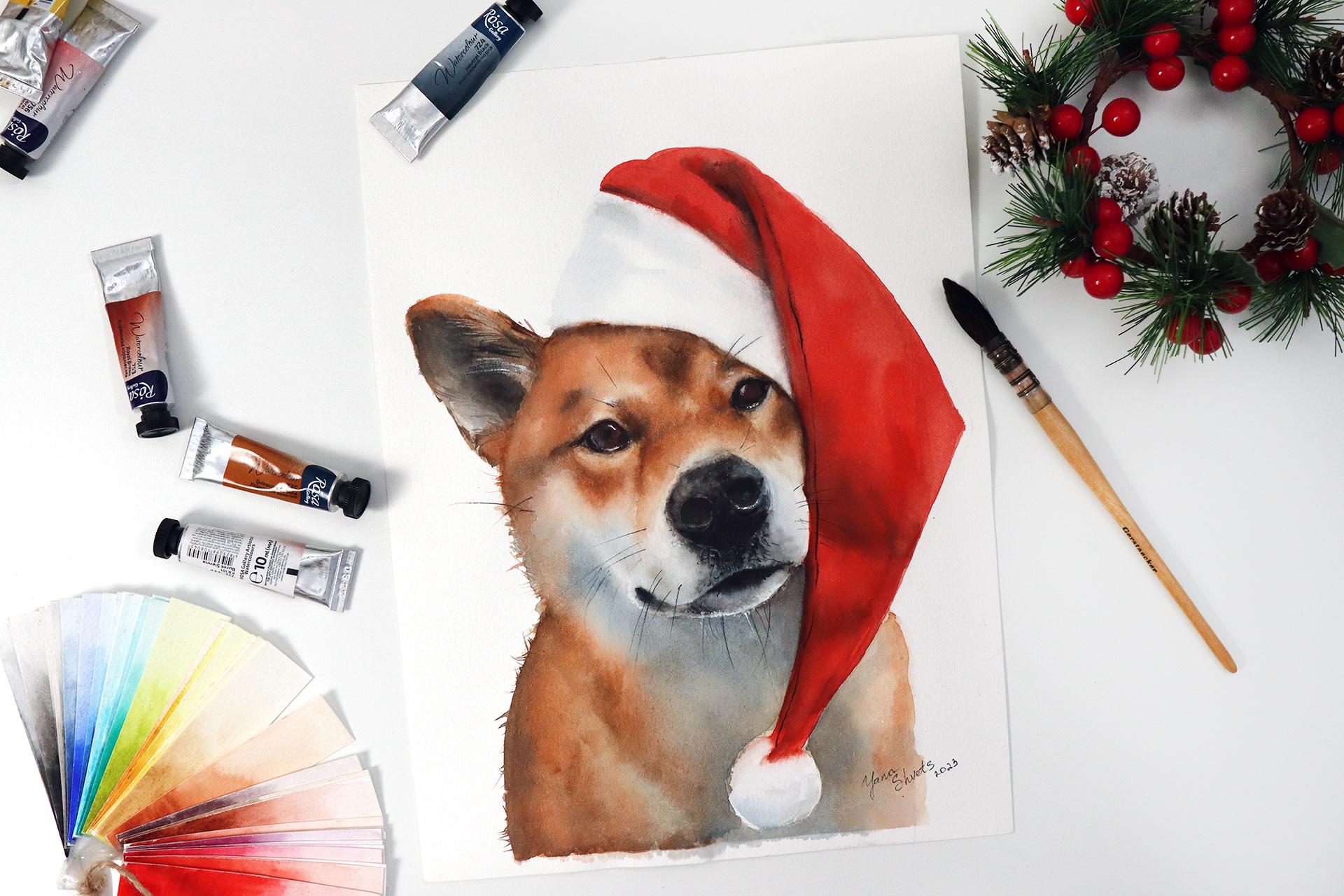
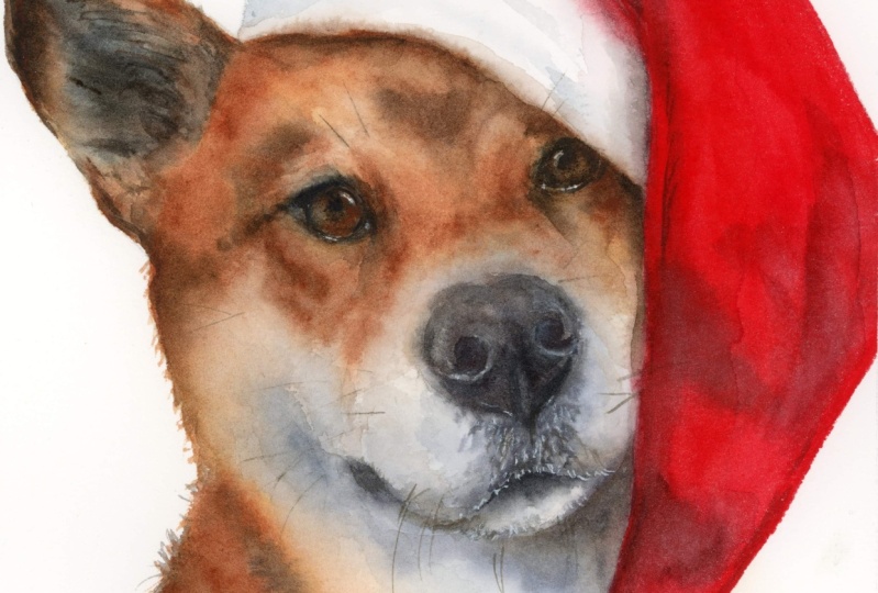
11. Glazing technique: Third layer: A unique feature of Shibaino. Special pattern of
white or cream colors that you can see here. Above the eyes, on the cheeks, on the muzzle, on the
belly, on the chest. Those markings, they are very unique for Shibaino and make them recognizable
as a breed. And they're called zero. We need to show them. Now is the time when
we start working on the darkest parts of ju, fur. With my darker brown color. I am just adding those stones
here and there where I see shades and darkest
parts on Kaiju photograph. I also feel like with the
paper I'm working on, it really needs to be
constantly humidified. Otherwise the paint is just going to dry out
with the sharp edges. I'm bound to use wet
and wet technique at all times to be able to achieve
softer color transitions, because I don't want
any sharp edges with one de, darker brown color. You can mix your
own brown color by adding blue into your
burn. Siena, for example. It's not going to be identical, but it's going to
be darker brown. It's going to do the job. I'm locating those
shades right here. Now, after placing
the rough lines, some of them are pretty sharp, I need to dilute the
edges and the approach is the same semi wet
brush along the way, I'm correcting myself
and adding darker tones immediately soften the edges. With the semi wet brush, make sure your brush doesn't
carry too much water. Otherwise, you're
going to create cauliflower effects that are going to just spread on
the face of your dog. As you can see, we're following this formula where we start
with the lightest color. In our case, it was light brown. We build up tone by tone the
color of the fur of our dog. Using wet and wet technique
and layering technique, you can do the same and apply this formula
to paint any dog, or a cat operator, or any pat you want by yourself. Now as I'm doing this, I feel like the darker color is way too detached from my base colors, my browns to level them. I'm adding a bit
more of Burn Siena. Also, as you notice I'm
going carefully around those a white spots,
keeping them lighter. They're not like super
bright white on Kaiju. But in other Shibaino, you can see those white
parts standing out more, especially if the color
of the dog is black, then O stands out a lot. Kaiju red, same color. Ai are more creamy. But you can still see them, especially depending on
the light in the room. Now, when I feel
that my shadows are placed in all the correct
areas on the face, I will leave it to drive
and I will move down to do the same with the chest here with the muzzle,
but first to the chest. As I said earlier, my paper doesn't like wet
on dry technique because the paint stays on the surface and creates
sharp, sharp outlines edges. But this is not an issue. If your paper does
the same thing, you just need to use
more of a wet technique. And it will allow
you to blend colors smoothly right after
intensifying brown color, the burn sienna in my case. Also, I want to
point out that while the pigment is still wet, it's really cool moment
to work on some of the fur hairs that stick out of his face because
he's very, very fluffy. Since the layers are wet, you can really pull the color and it will look more natural than if you just add it later. Just make sure
that those strokes that you pull are very thin. Otherwise, the thick
line is going to look odd on the painting. While I was doing that,
my paper got dry. You can see it really
dries out fast. I am adding another
layer of water, water, but like wet pigment
immediately add darker tone. I'm using Van **** and
also at the same time, add some of the mix
of blue and brown that I did earlier to
achieve natural dark tones. While this layer is wet, I can pull the colors
with the brush. I don't even have
paint on the brush. It's literally just the brush. Because the layer is wet, it's very easy to pull
those colors out. Also, make your
strokes more chaotic. Don't do them all
in one direction. Some hairs they're sticking up, some of them sticking down. That's going to give you
more of a natural feel. Here on the chest,
we're missing a bit of blue tone the shades. I'm injecting them right now and here I'm diluting the
edges so they're not sharp, to make this part of
the head look fluffy. While this part is getting dry, I can work on the
muzzle very carefully. Fine, clean water. However, I suggest you only do it when you're sure
that this part is dry. Otherwise, this color that you created here is going to leak
into your current layer. Making blue slightly
darker by adding brown and working on shadows
under the nose. Even though here
the color is black, we're going to add it later on. Right now, I'm just working on underpainting for this part with pure black. I'm adding it with dot, like moves here under the nose because the
layer is still wet. It's blending on its own. Again, this is just
the preparations. We're going to go
over this again, but when it's dry and we're going to use and dry technique, I can see that after
slowly drying out this, it's still pretty wet,
but it's getting drier. This started to create a colifower effect over
here and I don't like it. First, I'm going to remove it carefully
with the smit brush. I would need to add another
layer of darker tone. But I'm not going to do it now because the base is still wet. Everything is just going
to become a big colifower. I need to wait for it
to dry and then I'll be able to add darker tones.
12. Painting a Santa hat: While the dog is getting dry, I'd like to work on the heat. We're not losing time again, I'm applying wet
and wet technique. Blind water to use
wet technique. First I would like
to lay the base for the white part of the hat. It's fluffy even
though it's white, it's never just purely white, otherwise it would be flat. We need to show the
three dimensionality of this fluffy part
by adding shadows. That's why I'm using light almost invisible blue color that will show the shades and
folds on this fluffy part. Make sure it's not too dark because objects
influence each other, we have this red color shining on the whiteness of
the fluffy part of the head. Because this part is red, this red color is being
transferred here. But here we already
at it before. Now I'm taking cadmium
red painting the hat, because here the
area is still wet. When red touches
this humid part, it naturally start
to bleed inside, which I don't mind, because it creates this feeling of a fluffy
13. Painting eyes: As you can see, when the
paper got dry, red color, even though it was
so bright now, it became much, much
lighter as expected. I will re paint the
hat again with red, but for now, I would
like to work on the nose and the eyes. The face can have a more finished look and get together has brown eyes. I'm taking brown and add a tiny bit of blue so
it's not so vibrant. First, I will paint
the brown eyes. Also, I remember that under here there will be a highlight. I will paint around it using
negative space technique, also with tiny bits of blue. I want to add little stroke on the left to show
that it's shining. So essentially the
eye is a sphere. That's why here on the side, we have a tiny reflection. Now I want to take brown color, Van ****, in my case, the one I used
before for shadows, add tiny bit of black and start outlining the
actual shape of the eye. Now I'm introducing
bits of brown. Again, I'm spreading this color a bit outside to show this
darker tone around the eye. Basically, I dropped
the brown color and now I'll wash the brush it, there's no water in it. It's just slightly humid. I'll try to sort of
blend the edges. I'll do the same under
the eye attention. The air alert is over. May the force be
with you attention. The air alert is over. May the force be with you. The air alert is over. Now all my students know the idea is to have
the outline of the eye with a dark black color. From the edges of
the black stroke, the color gets a bit lighter, moving into brown and then
moving into completely light. The fur color that we had. The transition is smoother. If we would just outline
the eye with black, it would look like a cut out. It would not look natural. That's why I've been doing all this games
with adding brown. Also, I add the iris over here. I might as well add another
layer of brown on the eye. Just to make it a bit darker, because it feels
to me pretty pale. I spend a lot of
time painting eyes. To me, it's one of the most important parts of the portrait. I also really enjoy
painting them. Take the time to achieve almost photo realistic look when you paint a portrait. Usually it's the eyes that
give away the look in the eyes that give away the
personality and the animal, or the person recognizable. So you can say, oh yeah, I really see that. It's so. And so. All right, and I'm going to do the
same with the right eye. Take some brown. This right eye has more
shadow on it from the hat. We see less of the highlight and it's
generally feels darker. You almost don't see
this brown color, but I know that his
eyes are brown. That's also why I usually
ask the clients to send me a bunch of photographs so
I can see a dog, or a cat, or any pat in lightning
in different positions, so I can have better
understanding of the colors, colors of the fur,
colors of the eyes. Again, I'm taking brown, brown that I used before on the face and I want
to add it here. Inevitably, my black color is leaking because I touch
it with the wet brush, I think it's okay because
it gives me the opportunity to blend the color and have this natural transition from
the darkest black tone to lightest browns here as well. We are going to have
a bit of highlight. I'm going to correct the
shape of the eye a bit later. Right now, there's
no sense to go there because it's still wet and the paint is just
going to bleed everywhere. Yeah, I need to wait
for it to get dry. The eye on the right, go dry. It's not as dense anymore. The color is not dark anymore. Yeah, I'm refreshing the color. Adding a bit more of
the same dark tone. Dark brown also adds a bit
of blue to keep it darker. This really happens
when you work mostly with cotton paper because the pain goes deep in its layers and the color often
loses its intensity. This is great when you need to achieve smooth
color transitions, but also very different
from cellulose paper. If you work on cellulose the layers mostly staying
on top of the paper, They are more likely to be as vibrant as they look
like when you lay them down. Also more likely to have cauliflowers and dry edges
for the same reason, because the paint
stays on the surface, it doesn't go deep into
the layers of paper, is not absorbed as
much as cotton. But again, it really depends
on each brand of paper. I'm diluting here under his eye, there is a bit too much
of gray color right now, I'm removing it with the tissue. All right. So I want to have a clear shape of both eyes with
nice dark color. And that's it. Now we can move towards
painting the nose.
14. Painting the nose: Because of the reflection, I would prefer to first
apply very transparent, watery blue on the nose and
use it as underpainting, the main basic base
color for the nose. I need to make sure that the
edges of my layer are soft. Here on aside, I can
even add more of a bit intense blue color, switching to a smaller
brush and take brown now. The brown can be the same we used for the
ice or for the shadows. It's not really important
because we're going to put black over it for me, I just don't want to have pale, flat, black color in our nose. I like to have more
complicated color transitions and base colors that are
shining through here and there. Here is going to be a high
light under the nostril. I keep it lighter here. I see my blue color
just run away. I'm removing the edge. It looks not as sharp as it was. If I see any sharp edges, I just remove them with
the semi wet brush. Now I take neutral black, mix it with brown, but I need
to have more black in it, receive color because
my layer is still wet, the nose is still wet, the color is flowing smoothly
and blends on its own here. If you see at
the base of the nose, the nose is not
perfectly rounded. There's small hairs
that are going outside and other
colors that we see. I do want to lift here the
highlight under the nostril. I want to make sure it's there may be another one
too, but just a tiny bit. Don't worry if you lift
too much because we can always cover it with
a darker paint. We're going to add another layer after this one gets
completely dry. I just want to make sure that this area is clean and white and we will work on it
after it's dry. Now, I'm clearly overdoing it. And there was too much
water in my brush. It created this
coli flower effect and basically ruins everything
I was doing before. I just need to stop and let
it dry and fix it later. Right now, there's nothing more I can do except
make it worse. Lesson learned. Do not overdo your work. As you can see, after drying, the colors became pale again. We have a horrible
cauliflower on the nose. Normally, I would be
stressed about this, but because I know that
this particular place is going to be completely covered with black because it's nose, I am not worried about
this cauliflower because I know it's going to be hidden. Let's do it first. I'm refreshing some
brown on the nose. I'm getting black and painting the rest of the
nose in what the color. It's important to understand
the difference between dark tone and the
density of the tone. The density of the color. There's a difference
because a color on its own can be dark like, for example, the nose here before I started
working on it just now, was painted in a
dark brown tone. It was dark, but
it was also pale. It wasn't dense enough. It was linient towards grayish
and didn't look intense. What I'm trying to say here
is that it's important to understand the difference
between tones and density. Because in many situations, you're going to need to
achieve a certain density of your layer to create
this feeling of depth, volume, and achieve some
realism in your painting. I make sure that the
pigment is thick, which means it doesn't
have a lot of water in it. Not in the pigment itself
and not on my brush. That gives me this
very thick layer, which confirms what I was just saying about the
density of the color. We get a very layer, which immediately
makes the nose stand out and makes it feel
actually three dimensional. Now our nose looks like really
dark and it stands out, but at the same time, it's
not connected to the muzzle, to the rest of the face. To do that, to connect
them naturally, we need to intensify colors
over here once more, I will use technique. Work on tones in here with like
moves, like spots. I'm creating those darker
parts on the muzzle, the darker hairs right
under the nose to connect nose and
mouth more naturally. Because I put water on this
area just before that. Even though I put
pretty dry strokes, they still come out softer
because the paper was wet here with a brown,
dark brown tone. I want to create
a bit of a shadow on a side to show the
three dimensionality. The paper was dry. My stroke also looked and
turned out to be dry. I'm diluting them
carefully here. We're going to have
another piece of shadow which I will add
later, not right now. For now, I want to go again with dry black pigment
and add those hairs. The color immediately loses its intensity because
I work wet on wet, but it also gives me
more natural feel. At the same time I want to paint this black
area, the mouth, at the same time, it gives me this opportunity
to create soft F feel and make it look like everything is
nice, soft and fluffy. At the same time,
this line over here, I want to make it
slightly softer. So I'm diluting this line
with the semi brush. Just basically
going over it here. I have this blue pigment that
I don't like the edge of. It's got a bit too sharp now. I just need to wait for
this part to get dry, and meanwhile I will
work on the heat.
15. Fixing our own mistakes: the nose: I stand up, I realize
that my nose is turned a little bit too
much up like this. Instead of having it
tilted so much like this, I need to move a
little bit down. That's not going to be easy, but I will try first. I need to dilute this edge
to free up the space. All right? I will do the same
for the nostril, Because I need to put the
nostril on the right, a bit lower as I'm diluting
the edge black line. I'm also stretching
the brown color that was under on the sides. Everything looks more natural. Now I'm taking black bits
of brown. It's more dense. Now this nostril needs to be a slightly lower Hmm. Another air alert,
attention air regler. Proceed to the nearest shelter. Okay, be careless. Your overconfidence
is your weakness. Believe it or not, Irreguler. Proceed to the nearest shelter. Don't be careless. Your
overconfidence is your weakness. Believe it or not. It was
fourth air alert for today. But yeah, this is the reality. All right, keep going. I put this line a
little bit lower now. It's tilted too much. Like if you use the rules of parallels like
we were talking before. The eyes are on the line
which is slightly tilted. If we go down, we'll see that everything else should
be on the same line. Now I see that here the mouth
goes a little bit too low. What I would like to do
is to bring it slightly up like this with black. And now take brown and
continue here for the chick. As I said before, I bring this line
slightly higher. Okay, now it looks better. Also, I feel like this
is a bit too sharp here, the curve is too sharp. So what I want to do
is to dilute the edge. But before I reapply
another color, I need to wait for
it to get dry. Otherwise, everything is
just going to flow back in. And I don't need it right now. But I think I managed
to rescue the nose and put it back on track here. I think it's I can go on
and create this shadow also maybe keep it a bit higher up so it
doesn't go that low. The brown cower I just put down, I'm stretching and diluting
it so there's no sharp edges. And I'm doing it with
the semi wet brush, the same way as before. Basically, when you have
any type of a mistake, you can try and fix it by removing the
color, moving the paint. And if the paint is not stainy, you will be able to remove it, at least to some point and reapply fresh layer of paint
to correct your mistake. But you need to do it later when the paper is dry so
that the fresh paint doesn't blend in with other layers that you just
reactivated with water. Now we can move to
paint the heat again.
16. Working on the shadows: So while the face is
getting dry, I as I said, I would like to
refresh red color of the hat because
even though I took a really thick layer
before it got dry and lost its intensity
anyway, so no problem. We'll just reapply as
many layers as needed. As I said earlier, if you have
less water in your brush, your paint is going to be more
as it's going to get dry, it won't lose the
intensity of the color as much right away I add tiny
bits of black into my red. You can also use green
because green is complementary color and it's going to naturally
make it darker. I apply to work on
some shadows that are naturally created by
the folds of our hat. Remember this fluffy part, we let the edges bleed just
a little bit by adding, by diluting the edge
with the wet brush. That's what I'm doing now. I'm letting it slightly bleed
into the white of the hat. The hat looks fluffy. I add a stroke of a darker
tone and diluted right away, so the edges are soft. If needed, I can add bits of red and any sharp line is
diluted with the brush. Here, I need to
create a shade that is the shadow
that's been dropped by the hat on this
white fluffy side, I would like it
to be noticeable, but not too long. Not going too far
into this heat. That's why I'm reapplying
it multiple times. Once more, I'll go with red just to this layer and also have an opportunity to add shadow where
there is a fold. For example, over
here on a side. It's easier to do over the wet layer instead of trying
to do it on the dry one. And I'm adding
shadow from folds, from the folds on
the heat like so, especially here under the cheek where the material is
hiding behind the cheek. I want to make it
slightly darker to show again that this part is casting shadow on the tissue. It would be nice to rotate this painting so I can
place shadows on the face, but I can't because
it's attached. But if you can, if
it's on the cardboard, it's easier to just rotate and do all the blendings
that you need. All right, now we are on the final stages and we need to work on shadows on the face, the final ones, and some details like whiskers
and white highlights.
17. Glazing: final layer: I feel that once more we need to intensify the
shadows in the face of Kai Ju just to match the
intensity of the colors. That's why I'm applying water. Again, to use button
with techniques so that the colors
are nice and smooth. Transitions are soft. You can see that when
you apply water, colors become more vivid. But don't let that fool you, because after drying out, they're going to get lighter. Now I'm mixing darker
tone of brown once more. First, I'll put
those brown strokes in the areas where I
see the most shadows. Then with the semi wet brush, I'll smooth it out
so we don't have weird strokes in random places. I also feel like some of the nice bright
burn sienna can be added here and there just to intensify the
color of the fur. And at the same time
those white patterns I was talking about
on the fur of Kaiju stand out even more. I'm purposefully avoiding, for example here on the cheeks, keeping it whitish with
the fresh brown colors, this white parts
standing out even more. Again, I need to remind
you that if you're working on cellulous paper, you probably do not need
to apply that many layers. Because cellulose paper does not absorb paint as much as cotton. The colors remain as intense as, or approximately as intense as they were when
you applied them. You don't need to revive them and intensify
them once more. I really leave it to
your own judgment, decide if you need to
intensify those colors or not. Because I felt that the
face of Ju was pretty pale. He's a very bright dog. He has nice bright fur. That's what I wanted to show. That's why I decided to
reapply fresh paint also. This is the opportunity
for me to paint the shadows that are
being dropped by the heat right under the head and immediately
stretching it down. But because the paper
was already wet, it's blurred
naturally on its own. But if it didn't, I suggest you do this manually with the brush and stretch out the color
at the same time. I'll soften the edge over here, allowing the paint
to bleed inside of the hat of the white part of
the heat just a little bit, which will show that
the hat is fluffy. Now here, the paper cut dry, I need to refresh it
with clean water. I try not to go over
too many times, so I don't actually lift the pigment that
is already there. I just go one time carefully. Now I'll add just a
little bit of a shadow here just like and with the other brush just help it being stretched
into the side, refreshing the shadow right
under the mouth of Kaiju. Even though the belly is
supposed to be white, we paint and gray because of the natural shadow that's
being caused by the face. It appears to us
as if it's gray, even though we know
it's white or creamy Here, I feel like I made a very big distance between the mouth and the
fur underneath. So I will carefully
correct the shape. Of course, we need to do
the same with the ear. You remember we started
with literally orange, orange in the beginning, and now even mention
of that color anymore. It's somewhere deep
under all those layers that we've painted.
But it's there. It plays an important role creating depth and
volume in our painting. Because those layers, they
all build up on top of each other and gives us this feeling
of three dimensionality. So needs black with some burn sienna to
work inside the ear. Yeah. Better to do
it wet and wet. Your strokes are soft because it's a shadow
inside the ear, so you don't want to
have sharp sharp lines. Maybe it's not too late
and I can just add water. Just final touch, I'm
evaluating my painting, checking in with the reference if there's anything missing. If you feel like you need to
add something, go for it. But it's really important to
not overwork your painting because you can't go back and remove your layers
in water color. It's very important
to know when to stop. I want to slightly intensify the shadow
right here because it's the darkest area
right under the head. And at the same time, it's both the head and the
head that are cast in shadow. That's why I just
wanted to carefully add a little bit of darker tone. And at this sideline, those are really just small
details that you can add if you feel that is going
to improve your work.
18. Details that bring life to the painting: It's time for the final details and I promise they
are really final. Yeah. So remember I
said that this eye on the right should be
more covered in shadow, So it's not very logical to see this very bright highlight on the right eye because the
hat is cast in shadow on it. I dimmed it with a very
light, transparent blue. Doesn't stand out too much. This is something that
you want to look out for. Those things that indicate
they look like in real life, those are mostly about contrast
and lights, and shadow. You always want to make
sure that your eyes have a reflection like this
very bright light spot. Even if you don't see
it on the photograph, you still might want to add, which will significantly
affect your painting. Making it look so much
more real like if the dog is jumping on you
from the paper. Also, adding shadows like
a shadow that has been cast by the eye lids
here on the eye. And also shadows
from objects from the head or from the
head on the body. Those parts, they really add this realistic feel to the
painting, also here and there. You can add tiny strokes of fur with the super thin brush just here and there,
not everywhere. Do not overdo it,
you just give a hint and the brain is going to
finish this on its own. You just need to give an idea
of what is going on there. You don't need to paint every single tiny hair
that you see on the dog. Now, with the thin stroke, with a thin brush, I will paint the whiskers. There are whiskers
here. Before you do it, you might want to test if
your paint is not too dry, but also not too watery. You can test it on a
separate piece of paper, like we did in the exercise. Then it's important that your
strokes are really thin. Also, you don't want to go back and paint on top of the
stroke you already did. If it didn't come out the way
you wanted, just leave it. Otherwise, you're going to ruin the painting. I've
been through it. If the line is broken or not, what you want it to be,
just leave it there. Nobody's going to know
it's wrong except you. But if you will, try and go over the tiny thing whisker
that you already painted, trust me, is going to be very visible and not going to work well with the rest
of the painting. Finally, I'll take
white gouache. I'll locate the highlights
that are missing. To add some life
here under the eye, I would like to add a tiny, tiny spot here in the under
the not tiny tiny highlight. I'm barely touching the paper. I'm not making a
very thick stroke. I'm very much aware
about the thickness of the pigment and I
don't want to have a very thick stroke in here. Some of the hairs are white. I'm adding them, maybe a
couple of hairs in here. Especially if you didn't manage
to achieve this contrast between lighter hairs and this
dark tone inside the ear, this is when you can
actually fix it. And of course, the final step will be to sign your painting. And here we go, Sino
kai jo is ready.
19. Conclusions: I can't wait to see your
pet portraits. My friends. If at any point you had any troubles with
painting or drawing, feel free to send me a message. I'm also very active
on social media so you can reach out
to me there as well. To conclude, these are the main steps to creating
lifelike portrait of your pet. Ensure a perfect pencil sketch as it is the foundation
of your painting. At every stage of the
portrait drawing, double check yourself measuring
distances between eyes, nose, cheeks, chin, and so on. Using the eye of the dog, of the pat as a measuring tool. Also use the rule of
parallels to see that all elements of the face are in the right places
relative to the lines. Don't forget to take photos
of the sketch regularly to spot mistakes and
take breaks to see you. Work with fresh eyes. Start your portrait with the lightest color and
with your underpainting, create color foundation
of the face of your using wet, wet technique. And then add new
water color layers to achieve depth using
wet on dry technique. Finally, add details that create lifelike effects on
the face of the dog. Highlights in the eyes, shadows that are dropping from eye lids or from the head and the Santa head soften sharp edges to recreate the fluffy effects
of the animal fur. And of course,
submit your portrait here and show everyone
how awesome your pet is. I will happily review a painting and offer advice if needed, and see you in the next course.
 Yana Shvets, Professional watercolor artist