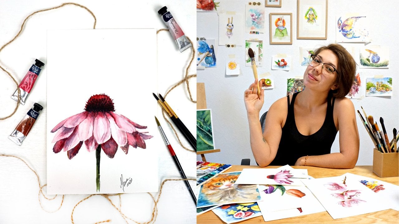
Transcripts
1. Welcome to my course!: Hi there. I do like to paint flowers while you're in the right place because this is a watercolor class where you will learn how to paint beautiful flower step-by-step. Welcome to my botanical series. This is a course for complete beginners where you will learn how to paint amazing flower, lily flower in watercolor, or you need to do is just follow my guidance. You've all learned how to apply basic layers and watercolor, how to mix colors using special rules and secrets. And I will share with you tips and tricks with painted realistically in watercolor. After completing this course, I will be very happy to share my feedback with you about your painting and also you will be on my list for my next course where you will apply the knowledge from this course in advanced level course.
2. Review of art materials for this course: Hi there. Today we are going to be painting beautiful Nellie, it's very colorful and interesting follower. And before we start, I would like to talk about materials that you will need in order to paint this flower. So let's start from paper. Today I'm using cellulose paper. It's student quality paper is so the class is for beginners and people who are not very, don't have that much experience with what the color. So the paper I'm offering East satellites, however, you are free to use a 100% cotton paper, which I always recommend. This paper is magical. It's gonna literally paint and the flour for you. But if you don't have cotton paper, it's totally fine to use cellulose. This means that the type of material, the layers that are in this paper will not absorb water as much as cotton paper. So everything you're gonna paint is going to kind of stay on the top of the paper sheet. On the surface. The paper is 300 GSM. It's pretty sturdy and the texture is called press. This means that the grains are slightly visible. So usually when we paint botanical art, art district command to use hot press paper, which has 0 deck sharing like no grains wherever whatsoever. But I do look a little bit of texture and this is how it look like. Kansan Moncler. This I think is one of the best watercolour papers to use for beginners because it's very loyal and it also behaves almost the same as professional quality, artistic quality. Cotton paper. Speak enough paper. You can attach it with the tape to the table directly or use a cardboard to avoid paper from going in waves. And the form. However, we're not going to use heavyweight techniques. Almost know what technique in this artwork. So personally I'm not going to strap it or touch it to anything and it's just going to buckle up or it's fine. So I'm going to be bad. Pencils. I give you two options for this class. You can use an ultimate pencil. It's very fame and pretty dark. So you will see the line that you do. And if you don't have ultimate, and so you can use regular pencil. And I suggest you use for h or any, any age heart pencil so that when you draw, the line is really thin and you don't match it with your hand accidentally. When we create a sketch for botanical painting, it should be really thin and very dedicated and beyond, we should avoid any unnecessary lines whatsoever. Speaking of which, you might need eraser. And I always suggest to use mutable razor. This is very good material that technically big sub D pencil line from the paper instead of scratching the paper. Because to regular eraser is going to damage the surface of the watercolor paper, which will affect the watercolor layers into future. And you're painting in the future. So you want to make sure that your paper is perfectly safe using this one. Then, how about brushes for this particular flower? We are not going to end up many. I suggest three here, but you don't really need to have all of them. And I really love language, will squirrel brush. It's very high-quality branch that will serve me forever. You will never need to change it. That also absorbs a lot of water and release a lot of water. So if you work with what techniques you're gonna need that today we don't, but I always keep it handy. If I work on an a background or have a big wash that I need to cover fast. This is the brush studio. And my work inverse for today will be synthetic brush. Size eight. However, different brands have different sizing. So let's say it's middle-size price. And if you compare it to your watercolor sheet, you will see that it's not that big of a browser. So you can work on each petal, no problem. And you can go and work on details and have no difficulties with that. I have an analog, pretty much same size nature numbers, which also does the same job as the previous one for releasing a lot of water. I like it when I work on nice and color transitions. But again, these two are optional. And synthetic branch will be the one that we will be using today most of the time. Also, if you want, you can use a tiny, tiny, tiny brush, for example, like this one. For the finest and tiniest. Then I have my coffee over here. And of course, watercolor set makes sure to clean up your palate so there's no leftovers of any big monk left. I also have a little spray like this to spray my paint and kind of wake it up because it gets them try since the last time I use it. Of course, you will need tissues, lots of tissues to correct yourself and fix whatever mistakes you might do. And a glass of clean water. This is pretty much it. I do suggest if you want to use this special material, it's masking film or masking liquid. Basically, when we are going to work on the tiny details inside the flower that are very light, almost whiter, yellow, very light yellow color. Easier way to be to mask those details with the must conclude so that you can paint with watercolor and do not worry that you're gonna go into this white area that's supposed to stay white. If you don't have this masking liquid, it's not a problem. We're going to use a different technique called negative space painting to go around those areas. And we then don't need to use masking liquid. That's it. And let's discuss the actual paints that we will use, the colors of paint that you would need in the next lesson. So I'll see you there.
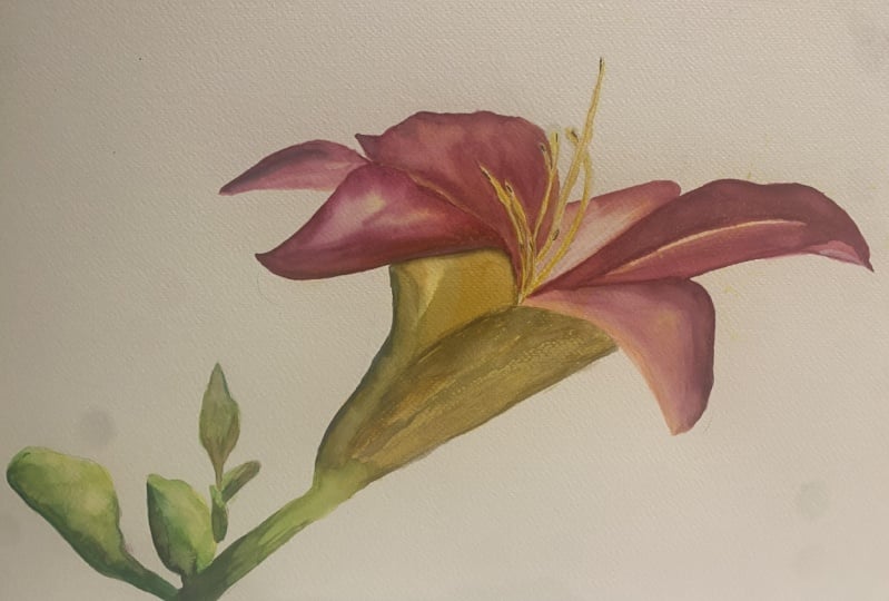
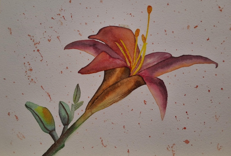
3. What color palette we will use today: Alright, so for this, we will need just a few colors, essentially just three. However, some of those are a little bit complicated, or better say, complex, which technically consists of two colors of three colors. Let's dig into it. So first things first, the actual petals of our allele will be mother, red color. So kind of like cold, think color. I will painted here. This is going to be our main color of the petal. Also, the Lilly has kind of bottom of each petal that have some sort of orange color. Now you can take cadmium orange from a set that's already premade like I have over here, which is super bright. However, I do prefer to mix my own orange color and I will take cadmium red and cadmium yellow and mix it in a proportion that will, to my, I look like the orange that I wanted to. So this orange seems to me more sunny and then this one. And also this is going to be the orange color I will use. So here are the two tubes. And sometimes I will mix this orange with mother, read the pink color to show the edge of the flower. So sometimes we will mix those two. Then also, if you look at the reference, you will see that the right onto the pedal when it's bended like this, there is a shadow and the shadow on this orange pencil. And this shadow we will achieve by adding brown color. It's going to be burnt sienna or like certainly up to you. Just dusted by yourself and choose the one you want. So I'm adding Bernstein and L And to me, burnt sienna is way too bright. So how about we try Monday? Books, please at first and don't have it in my Paulette. One deck is much darker tone. However, it is really obviously round. So in order to calm it down and make it rather leaning towards gray tone, I will add a tiny bit of blue. And this way we will achieve darker tone. But it's not going to be vibrant, it's going to be. So this is going to be the color will be using right under the battle where we can see the shadow. Then we have the green parts, the stamps and well not leaves but like the green parts of the flower. And for that we will be using emerald green. I'll show it. And this is very bright and vibrant colored. And in some areas, it's kinda leaning towards yellow, but not cadmium yellow, not warm. It means stalwart cold yellow color in the cold yellow, lemon yellow. So I mix lemon yellow into the green. And this is going to be the transitions that we will be applying in our green part of the painting. Here is the lemon. Also at the same time, somewhere on the petals, our original pink coloured, we see darker tones of pink. So how do we achieve that? Of course, you can add the block, but usually watercolour artists don't use black paint to create tone. They use color Mixin rules to make darker tones. And when we speak of pink, pink as a sort of cold read and complementary color to red as green. So technically, if we take mother read or called Pink, called red, pink, colored green, which we already used, emerald green. And mix them together, we will achieve a nice dark kind of gray tones, so I add more of the pink. And now we have this really dark, nice pink tone that we will use on the battles. So technically we'd have pretty limited color palette, especially if you are not going to mix your own orange, but use already premade orange from YouTube or and this is going to be the colors that we will be using in this painting. Ok, let's sketch now.
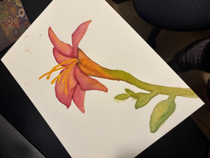
4. Let's sketch a lily: Alright, so I will be using automatic until AN amyloid tried to press my pencil as much as possible. So you can see what I'm drawing on the paper. But it's very important that you make your sketch very, very light. So it doesn't believe that dark trays on your paper. Otherwise, when you will erase the line, you will damage your paper sheet. And this is no good for watercolor layers in the future. Okay? So I will think of the competition first and actual follower, the main big part will be here in this kind of right hand corner of the paper sheet. And it's gonna go down into the left corner. So first, I will suggest you to create sort of circle, at least virtually or visually if you don't want to draw it. Because again, the more you draw, the more you will have to erase. And this is not very good for paper. And now I'm starting to outline my follower first. So I do nothing specific. All right, now I have an understanding of how my flower will look like and I will clarify the lines for you so you can see them more sharply. I will make it darker. But please do not draw your sketch as dark as I'm two in mind because I am making my sketch darker just for the reason that you can see what I am drawing. Only for that. Usually students complained that they don't see my sketch because it's too light. And this is how it's supposed to be. On watercolor paper, your sketch should be very, very light in very noticeable. But since it's important that you see what I'm drawing, I'm making it darker on purpose. Here's an interesting detail. This part that disappears kind of under the petal. Actually, it expands over here, the other paddled long one and goes all the way up. And it's almost like a one line. So when you draw, make sure that this line is kind of extended into the petal and this battle is not here or there. It's one line. That's an interesting moment to footnote. I hope you saw my sketch. If you didn't, if you're not sure or if you don't want to draw the sketch by yourself, please feel free to use my downloadable outline that you can download and print and trace on your work, our paper and color and now I will make lines lighter with my razor and we can start painting.
5. Painting first layers: pink petals: Alright, so I remember I said that we have this very special masking liquid. If you want to make sure that the inside is preserved and white and you don't accidentally paint paint or something else inside. You can use the mosque in liquid and applied only work a few strokes to protect the area from paint and let it dry. And then start painting what we are going to paint now. You don't have masking liquid. It's totally okay. I am not using it today. So you just follow what I do. So I would like to start from the petals that are big. And as I've already detected, my pink is Amanda. And I will start from this particular battle. Remember I said that we have, we're going to mix in a little bit of orange in Tower pink. So I'm comparing this orange color now. I mixed cadmium red with cadmium yellow to achieve my orange. I got it's reading. If you have your orange in the palate is perfect. And I apply a tiny bit of water first on my battle, but only on the big part of the petals. So only this little triangle. Then I take orange and very light translucent layer goes down on the pedal. Just like this. Just a tiny bit very light. Make sure you have lots of water. Now I take my pink color and I go with the pink inside. I try not to really touch the orange that I just entered. If I do touch it, it's fine. No big deal. But I would like to make this orange kind of visible. And when you do this, your pink colors should be light, transparent, but not to water. I don't want your brush to drop. Pigment. Dark waters are should be relatively wet but not dripping wet. Okay. So I can cut the edges with orange and I will leave it be. Meanwhile, I'm mixing pink with green to achieve darker tone of fig. Remember as I said. Complimentary color and you add more pink into it, so it's actually dark pink, green. And then I want you to reigns the water tissue and apply a tiny bit of this darker tone on the battle, right where we see it on our reference photo. Now let's move to a different petal, for example, this one. Same logic. Take my very transparent orange. Very transparent, very light. And applying my federal, I forgot to put water first. So now I am diluting the edge with a wet brush like this. Pink. My brushes pretty drive that because the paper was wet. Otherwise, we'll make some bleed into each other. Every time you want to. Make sure there's no water in your brush. Always choose pedal that doesn't touch metal. So that's why I'm choosing to work with this one because I know and see and then this one is already drying. So let's try and apply clean water refers to sunlight, orange. Maybe even codename red. Variety. Again, is pretty much because the paper is wet. Pigment is bleeding, edge. Now this battle is very important because remember that inside we have a part that we need to keep white. So we need to go around it. This is called negative space technique. So first i pi water, but I only applied on the pink area. And I go carefully around those yellow and white excessive amounts. In very carefully. I will apply that pink color around the white and yellow areas. We need to keep them clean. If you use a masculine liquid, you can just paint on top mosque in liquid. It will preserve the area from paint. Just make sure we can move to the bottom.
6. Painting orange part of a flower: I will follower is completely drive. The paper is dry. And now I would like to work on this part of the power. We will use the same approach. By the way, I changed my water. So I wanted to make sure that I'm not bringing some dirty water on my paper. And I'm applying clean water on this part of the flower first. Then I'm taken my orange. And this time I would like to have more yellow in my orange. And since I'm mixing my orange color by myself, it's easier. We can control what type of color I have in my mix. I'm reminding you that I have a mix of cadmium red, yellow. And carefully going around, trying not to touch the painted. Here and there, I dropped a little bit more reddish somewhere it's a bit more orange somewhere it's a bit less orange. Like here, for example, which is more orange. And remember that we discussed that here will be a shadow area. So now I would like to mix darker tone and I'll add a tiny bit of bandit, which is brown and blue. I use indent trend Lu, You can use cobalt if you don't have inventorying. It shouldn't be blue, LED doesn't granulate and doesn't creating or emulation effect. And we have a bit more red in my mix. And read up, I'm adding the shadow. I'm not waiting first for to be dry, which I usually do in my paintings, because I want the transitions here to be soft. Later on we can add darker tone using layering technique. So we will add darker tone on already dried layers. But for now, I would like to make sure that my strokes are solved. And for this, I need to paint on paper. I am right now while this area is kind of at a tiny bit of water drop. And I will extend down here. I would like to work on the green part. And remember that the green was mixed with cold yellow, lemon yellow in my case. So right up, I will add a little bit of lemon yellow here so that the colors blend nature. So here in this place, the colors blend and mix without sharp edges and this is what I want. I want to avoid any sharp line. No tried whatsoever. Nice and tender vowel. Emerald green. Hopes match. And going down here, this area, I will place water first as well. And actually I will apply a very, very, very transparent drop, my image. Or the same blue that you were using before. Then I will add lemon. Yellow plus blue will make us green. Here, I continue with the green. So this way we have more interesting color mix than just pure paint from the tube. And in the same time we need dark tone style. I am mixing up darker green by end in red or pink into it. And applying darker tone right away. Again to avoid any sharp lines, I'm mixing it right out of the previous layers still let do not worry, we will be back to this place and work in details after it gets dried. But I would like to place first, so to speak, layers and washes with soft transitions, which just like so. And a couple of details. Here. I will do it with the same style in the same manner interests applying water first time, interrupt of blue here, the top. Actually overcome this one right away. And green mixed with yellow, darker tone on this one right away, that it saying lead. But this is not the important part of the follower in terms of the painting. So we don't need to be very precise. And into the details, at least now, we can come back to it later on. For now I am placing just the first layers, first washers. This one is missing some density. So I wanted to add more yellow to make it. Be careful with this part. Destroy the previous layer. To achieve a nice Washington. Every time when you want to fix a sharp line, reads your brush on tissue and it is still going to be a little bit humid. So with this humidity, you can move the layer. Alright, so let it dry and then we can finish up.
7. Applying first shadows: How about we move to painting pistols and stamens? And since everything here is 100% dry, you don't have to worry about damaging previous layers. And we already preserved some space here, so it's white. And we're going to just fill in the blank areas with yellow. If you use the mosquito liquid, you can take a coin or a card or just a razor and gently scratch the masking liquid from the surface. And well, you will reveal empty, clean paper underneath. So I would like to start with the yellow yellow color and mix it into orange a little bit because pure yellow is standing out way to manage. And I'm coloring it, but not everywhere. So I'm leaving some blank white space somewhere for better realistic effect. So the goal is to make sure that the color is somewhere. Somewhere it is more yellow. Correct me if I'm wrong. Now we can continue working on layering. Layering technique and applying it to make it stand out.
8. Creating deeper tones: Okay, while this area is still wet, I would like to apply our new layers over here. As you can see, my brush is almost dry. We don't apply water first like we did before, because if we do, we will wash out our previous layer. And I'll a rinse my brush and it's pretty much dry. I am carefully washing out the layer. So now you can see that I kind of picked the previous layer and the thing that I was worried about. But if this happened to you, take your orange ring, you can layer. If you have too much water on your brush, you will be lifting previous layers from the Fowler. And while I was busy with this part, this one got dry and it doesn't look nice anymore. But I'm not worried about that. I take her on my pink and literally covered over and go down. And because I put pink over, it gave me the chance to intensify the color, to intensify this shadow. They only send I don't like is this sharp edge. So first I'm making it smooth with the dry brush. And the other side, I will do the same but with my orange color. Every time I watch my brush, Irene's it on a tissue to make sure that it doesn't carry a bordered. Alright. Now this side, I have a spurt of petals that are overlapping here. And because they are overlapping, they are darker. And I'd take my Monday, my dark brown. With this brown color and dry brush. I want to clarify this dark part where my two petals are overlapping. Here. It's the line, God's glory and kind of steak. So I'm saving that orange color here. Use this as an opportunity to, to create a shadow here. Our bottom part. Clarifying the green part. Our green bar.
9. Painting shadows on green: So with the green part, the darker town that we already mixed before, which is green, mixed with red. And i will just create texture. I'm now going to add like a whole new layer. I'll just show the beans and leafy textured of our green part. Here I'm blending it. Clarify. The sharp edge, dry tissue, just like I see you. So our final part is to work on, I think, adults. And we're done.
10. Final details of our lily: Well, I kinda mess up this petal o here because Trump border and I didn't see it. So the water due to tape my layer and now I need to well fixed up. So it that happened to you. The way to fix it is to take a dance band. So less water, more pigment. And I'm taken my bank mother read the one I already used before, make some tiny bit of green into it so it's a bit darker. And applying on top to cover my mistake. So Britain dry layer, I'm rinsing the brush and carefully diluting the edge. It still picks my previous layer some more pink. And also would like to add some red in the middle on the reference. Kinda feels warm, so I'm adding codename red here, back to darker here. All of the petals actually need additional. This one, for example, I only want to do the top part is a bit more. At the same time. I'll just intensify pink. Sometimes watercolor is, while most of the time her watercolor lose its intensity. So it's not as vivid and dried as when we first applied. So sometimes you need to add the tone and just make your collar more intense. Especially if you're working on such a carload full painting like this filer. And I'll just add a tiny bit of it here. This one, I think it's fine. I don't need to do in this one, I will just correct it. And here we go, we have our super bright, namely Follow me and well, if, if you're looking to add anything more, you can add tiny details with the tiny brush. It's my opinion that this flower doesn't need anything else. So I'm going to leave it as it is because it's important to know when to stop.
11. Project for today: Alright guys, I hope you enjoy this class. It was a beginner level class where we learned how to paint a very bright colorful Lily and watercolors step-by-step using very basic multi-carrier techniques. We also discovered a few mistakes and how to fix those mistakes. It is possible in watercolor to correct your mistakes and be painted. This artwork AND project would be to paint her. Only follow with my steps. And please do submit it in the project section. Everybody who submit your painting will receive a personal feedback from me. And also if you have any question, please do ask your questions. I will be very happy to help you in your process. And they feel like this class stay tuned because I will be recording in next class where we will dependent in a limit as well, molecule bouquet of lists where you can already use the knowledge that you just learned today and apply it in the next course and improve it and take up into the little challenge and to become better and grow with every painting. So stay tuned for my next lilies for advanced level watercolors.
 Yana Shvets, Professional watercolor artist