Transcripts
1. Welcome to Class!: Imagine being able to
create breath thinking, What color paintings
that capture the essence of nature's beauty. In autumn, picture
yourself effortlessly blending colors and infusing
life into your artwork. If you've ever
dreamed of mastering water colors, you're
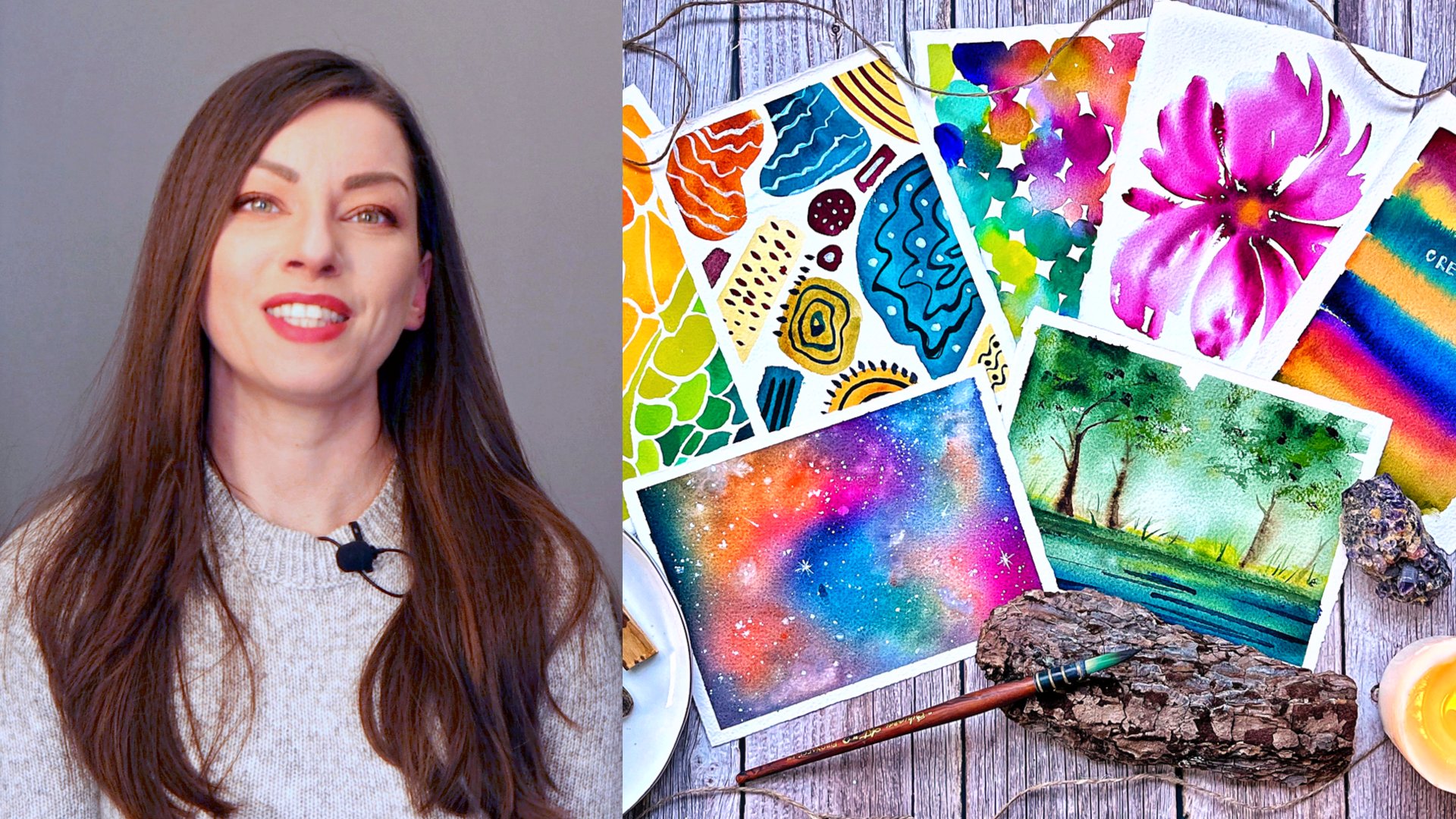
in the right place. Hello creative friend Melina, a passionate Cal artist from Bulgaria with five years
of experience in the world of what color autumn is
my favorite season and it inspired me to embark on countless artistic
explorations. These journeys led me to experiment with different
color palettes and techniques on in pursuit of capturing the essence of this
enchanting season on paper. In this class, you
will learn how to use different color painting
techniques to create a stunning masterpiece featuring a ripe just peer surrounded by the warm
hues of autumn foliage. You'll dive deep and solidify what you know about
color mixing, layering, glazing and lifting. You will learn how to paint a background that makes your
main objects stand out. And how to recreate the soft and warm light
of an autumn afternoon. Learning these skills is
crucial for expressing your creativity and connecting with the beauty of
the natural world. By the end of this class, you'll be able to
paint confidence, master essential what
color techniques, and understand how
to create vibrant, realistic, and
captivating artwork. This class is created with
intermediate to in mind. But both beginners and
seasoned artists may find valuable insights and techniques
to elevate their art. The highlight of this class
is your class project. You'll create a stunning what
color painting featuring a luscious sphere and the
vibrant colors of autumn. I'll guide you
through every step, ensuring your final artwork reflects your new found
skills and creativity. Let me also share with you
what inspired this class. Earlier this fall, I used a generated images to create a series of
autumn fruit paintings. I share them all on
Instagram and received lots and lots of compliments and requests from my students. And this is how the idea
for this class was born. I'll share with you all
the photo references that I used so that you can
try and paint them too, and create your own
autumn fruit collection. Are you ready to embark on
this artistic adventure? Let's dive into the
world of photo colors. Together, explore the beauty of nature and create
mesmerizing art. In the next video, I will
give you a more detailed look on the class structure and
the final project. See there.
2. Class + Project Overview: In this video, we'll
take a quick look at how this class is structured and what you can
expect to learn. Let's Devin, first and foremost, this class is
designed to help you master wall painting techniques. And it does so by guiding
you through the creation of a beautiful peer painting
along with its surroundings. The class is divided
into several videos, each focusing on
a specific aspect of the painting process. We'll cover everything from
sketching to adding details. You'll find separate videos dedicated to
materials and colors, helping you understand what you'll need for this
creative journey. By the end of this class,
you'll have finished artwork to showcase your newfound
skills and creativity. Don't forget to share your masterpiece in the
project section of the class. It's a fantastic place to
connect with fellow students, Share your progress, and get feedback from me
and the community. In the resources section, you'll find the photo reference and sketch for this project. Additionally, I've included photo references for
automaton fruits. This means that after completing the project,
you can explore, painting other fruits, and create your own auto
fruit collection. It's a wonderful way to applaud your newfound skills and keep your creative
juices flowing. And that's a wrap for
this overview video. In the next video,
we'll go through all the materials you'll need
for this class. See there.
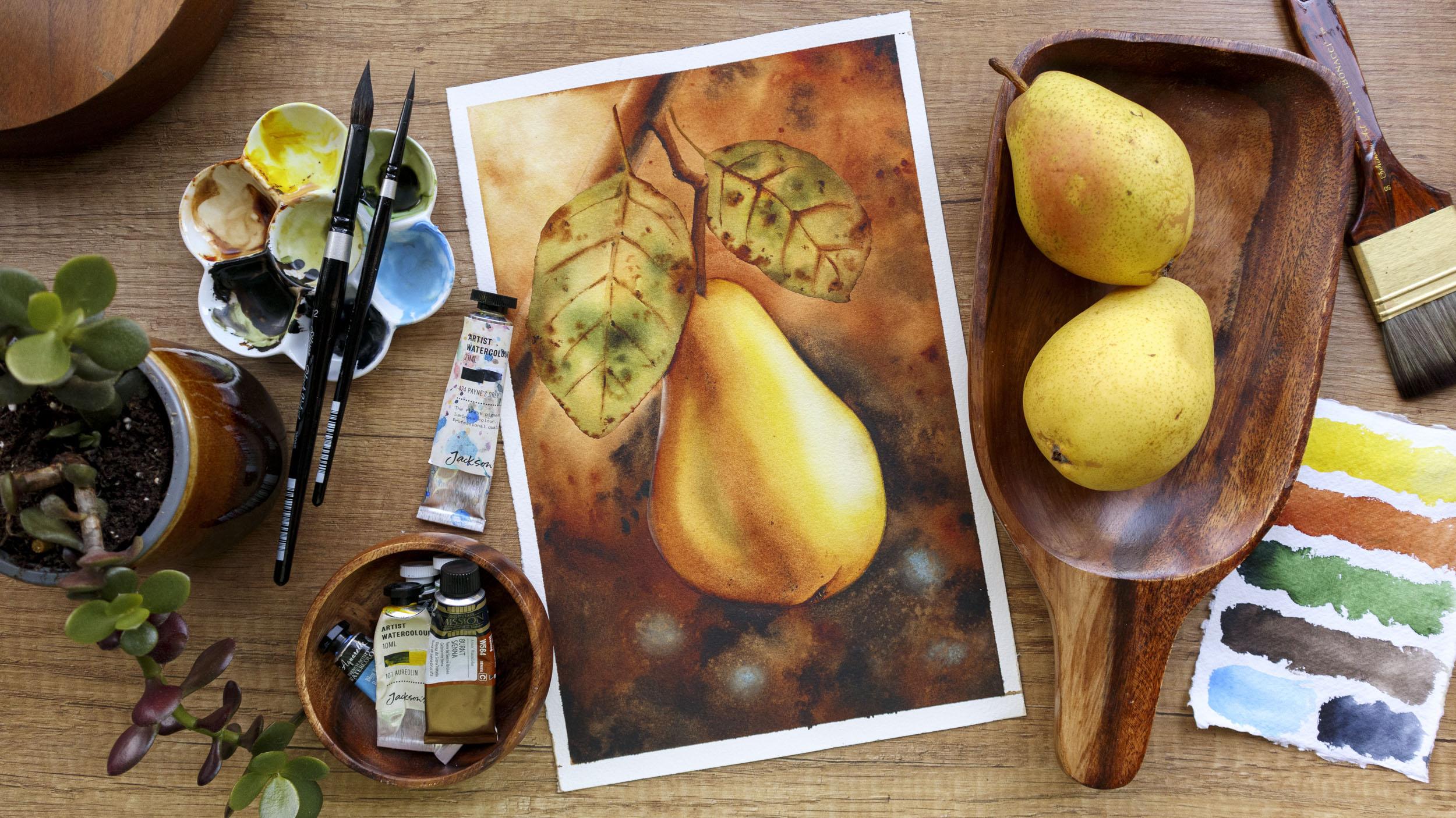
3. Materials: In this video, we'll explore the materials you'll
need for this class. I'll mention the
supplies I'll be using and offer
some alternatives. Let's start with the paints. In this class, I'll use watercolor tubes
from various brands. You don't need to have
the exact same colors. In the next video, we'll
take a closer look at them and all suggest
substitute for each color. I'll also be using white
gas for adding highlights, but it's optional so don't
worry if you don't have it. The paper I'll use
is underwater for it's 300 GSM and 100% cotton, which is crucial for many
techniques I'll demonstrate. If you don't have cotton paper, you may have difficulty
following along completely. The paper size is
approximately a four. I'll take my paper to this cutting using paper
tape as a makeshift port. As for brushes, you'll need at least one large brush
for waking your paper. A larger soft brush for
backgrounds and larger areas, and a smaller one for details. Additionally, I'll
use two flat brushes, one large and one
small for lifting. If you're unfamiliar with
the lifting technique, I recommend watching
this short video from my class from
good to great, intermediate at color
techniques to quickly catch up. Now let's discuss pilots. I'll be using a ceramic
pilot to mix my paints, but you can use any pilot
or even a dinner plate. You also need paper
or cotton towels to absorb excess moisture
from your brushes. An eraser and pencil for sketching two jars of water. One for leasing brushes and
another for clean water. And a spray bottle,
which is optional. We'll use it for waiting areas if they start
drinking too quickly. These are all the materials
you'll need for this class. In the next video, we'll take a closer look at the colors
I'll be using. See you there.
4. Colors: In this video, I'll introduce
the specific colors I'll be using for this project and provide insights into each one. The colors I'll use today
include Arelin, burnt Tianna, green, sepia, and
two optional colors, Roy blue and paints gray. Let's discuss them one by one. First, Aureolen from Jackson's will be used for
creating the warm glow, the leaves and the peer. It's a transparent
color that helps recreate soft light and glow. Any transparent yellow
will work and you can warm it up by adding
burnt sienna if needed, which is what I have done here
for this part of the pier. This is our next color. I used it to paint almost every
element in this painting. The background leaves, the
shadowy part of the pier. I'm using the burnt
sienna by yellow, which is a little
bit different than the burnt sienna from the
other brands of the market. Let me show you here in my Swatch book here, you can see that it has a slightly warmer tone than the others and it is
also transparent, which as I already mentioned, help us to create the light and translucent look of
the entire painting. It kind of reminds me of
this red occur actually. So if you have it you may
try using it instead. But if you don't
just use whatever burnt sienna or warm
brown that you have, I'll use green pie white
nights for the leaves, often mixing it with
yellow and burnt sienna. Choose a warmer
green if possible, rather than an emerald shade
like this tree on top. This again is the green
that I'll be using today. More dark and muted Pa will be used for the
background and some details. If you lack Pa, try
mixing paints gray with Persia or burnt on
bird to darken it. If you have Pa, then paintsray itself is optional
and used sparingly. Lastly, royal blue is optional, but provides a nice contrast to the warm tones
in the painting. Don't fret if you can
find these exact colors, find similar ones, and don't
hesitate to experiment. In the next video,
we'll move on to sketching our final
projects there.
5. Sketch: In this video will create
the sketch for our painting. Typically, I would use tracing for a quicker
and easier process. This time, I lightly marked each element to ensure the
proportions are accurate. You can find the reference image in the resources
section of the class, so feel free to download it if you'd like
to follow along. Museum mechanical pencil with
two millimeter to be lead. This allows me to avoid
pressing too hard, making easier later on. Here we have a
leaf. I decided to simplify the reference photo
by removing some leaves. You can choose two, leave
just one if you prefer. The painting process for
both leaves is the same. Now on to the second leaf. The great thing about
this sketch is that it doesn't need to be
perfectly precise. Per sand, leaves come in
various shapes and sizes. Even if it looks a bit crooked,
that's perfectly fine. In fact, such
imperfections can enhance the natural and organic
lock of your painting. Next, we have the branch
continue like this. Finally, we arrive at the pier. This is my sketch. You can post a video here to copy
or recreate it, or you can download it from the resources section
of the class. Now I'll remove the excess
graphite with my soft as. Let's take the sheet
to the border to keep it in place and
prevent any buckling. We're now ready to start
painting in the next video. We'll begin with the background.
6. First Wash: Let's start painting.
In this video we'll paint the background. Let me just quiz each of the
colors here on my palette. And I'll place the
paper tape here like that so that my
board is at an angle and water colors will flow down instead of pulling
on the paper surface. And I'll start by
wetting the paper. I'll wet everything except
for the per itself. You can also use masking
fluid to make sure that no color will
go over your fruit. It's actually how I painted
all my autumn fruits. But I wanted to make this class simpler and accessible
for everyone. So we'll paint it without
the help of masking fluid. And because the shape of
the fruit is pretty simple, it won't be that hard
to paint around it. Make sure that your
paper is well moistened. As you can see, I'm
going over it multiple times until it absorbs
the water very well. This will ensure that the paper will stay white for longer, allowing us to work for as long as we need on
our background. Now I'm switching to my size 12 and I'll start by
taking some yellow. It seems that my brush
wasn't very clean, so I got this dirty color. If this happens to you better, white it and start a new. It's important that we
keep the yellow pure. It will give our painting
warmth and transparency. Once again, I'm
adding some water to the yellow and I
make water mixture. I'll add it here, painting spots of yellow instead of
covering the entire paper. This will make our background
more complex and rich. I reached about the middle of the paper and now I'll
switch to burn Sienna. I'm adding enough water to
it so it's not very thick, but it's also not as
watery as the yellow. I'm adding it in the
upper right corner. And from there I move
downward, avoiding the leaves. Of course, because
the paper is wet, some colors will flow over. But try not to add
dark colors there. So I'll try to go around the leaves in the
pier, of course. And now I'll mix some sepia into it to make it colder and darker. I'm adding a few spots
with that color too, mostly in the bottom
half of the painting. This way will recreate
the light that we see shining from the upper left corner in the
photo reference. Let's now add some of these blue accents
just here and there. If you're using paints gray, now's the time to add that too. I'm washing my brush
and now I'll make sure there are no white
spots like this one here. I let more burn here
because it looks too light. Some darker spots here. Now I'm washing my brush very well and I take just a
little bit of water, burnt sienna on the tip and I'll use it to cover the
white spot here. We want this part to be white, but not completely white
With the clean brush, now I'm blending the colors, the next time wiping the sides where water and
paint Half cutters. Here's one of my
favorite techniques for achieving a
smooth background. Tilting the board while
the paper is still white, this way the colors
will flow into each other and create very
natural and soft blends. Just keep an eye on the sides. Whenever you see
liquid guttering there, you need to wipe it. At this point, my
paper is still weight, so I can take advantage and fix some areas like this one
here that lacks some color and this one here
that is very light. I'll also blame those
blue spots with the rest of the colors because
they stand out too much. At this point, I bet your background looks
different than mine. Try to assess whatever it needs. Does it need more dark
tones at the bottom or maybe some more saturated
colors around the pier? I think mine needs
more darkness, so I'll add more spots with PM. Once you're ready
with the colors and if your paper is still wet, you can take a flat brush,
washing clean water, and start wiping the colors from the leaves and the branch. This will help us to
keep them lighter. I wipe my brush,
on my paper towel, Each time I pick up some color. This may also look
different for you because the different colors settle
differently into the paper, so are easier to lift. And some are cold staining, which means it's almost
impossible to lift them. Don't get confused if it
looks different on your side. Also, make sure you're not introducing water to the paper. You just need the brush
damp, not dripping wet. Wash it whenever you feel you have picked
up too much color. Now is the time for
splatter with clean water. It's one of my favorite effects, especially for soft backgrounds. The drops of water
push away the pigment, and this way the background becomes much more interesting. If your paper is too wet, the drops will just mix with
the rest of the liquid, so you won't see
much difference. If it has started to dry, it will create spots
with a hard edge. So make sure your
paper is glistening and you don't have too much
liquid sitting on top of it. You can also splatter
some yellow. Here's that hard edge
that I just mentioned. So I take my size 12, I wrap it on my
towel and now move the pigment with the tip of the push to smooth on this area. Some more splatters,
you see that? I try to concentrate those on the upper part because they
create a feeling of light. You can also drop
some clean water directly with your brush,
creating larger spots here. Again, I have
a nasty water mark and it has started to dry. I'll spray some water on it
to reactivate the pigment. I didn't do a very good
job of covering the pier. Now I need to blow the paint
that has gotten on it. I think now's a
good time to stop. Don't worry if you're not
happy with your background. In the next video, I'll show you how you can correct it there.
7. Second Wash: Okay, my background is
now completely dry. In this video, I will
show you how I painted all these moot and
warm backgrounds for Mouton fruit series. As you can see right now, it doesn't look
very homogeneous. If you're happy with how your background is looking,
you can skip this step. I'm preparing here a diluted
mixture of burned Tianna. Now I'll take advantage
of that warm tone it carries by leasing it
all over my background, I have this very
transparent mixture. I add even more water starting from the
upper right corner. I'll cover my entire background. You can already see how this adds warmed in such
a lovely glow, but it also reactivates
some of the paint below and it makes everything
so much smoother here, close to the upper left corner. I'm adding more water in order
to keep that area light. And then I continue
downward again, I'm covering the leaves, but once again I'm
going around the pier and notice how I
leave lots of liquid on the edge when I move
towards another area. This way the paint won't
dry while I'm working, so I won't get a
hard edge on myself. Background, my board
is still tilted, so this also helps. Here I can start adding more paint to the
mixture in order to make a stronger contrast between the upper
and lower parts. You see how this
glaze made everything look so much smoother
and unified. Now you can stop here. I would usually do the same when painting my autumn fries. If you live like that, you should get a super
smooth background. But let me also show you
another way in which you can make an interesting background
a bit more dramatic. I'm just going to add more spots with burn Tiana here and there. Here my paper started to dry, so I'll spray some water on it. I'll add more yellow too, so splatters again. You can also splatter
yellow or burn Tiana. I'll blame those drops because
they stand out too much. Let's add more spots with burnt sienna to
create the impression that there are some leaves through which the
sunlight is filtering. I'll add those accents with the blue again
because I lost them. Some splatters with Bernina and now I'll make it more dramatic by adding
some spots with P. By going with that color around the pier, it will make it stand
out more but don't outline it entirely,
just here and there. I'll tilt my board. My per, lost its shape. So now it's a good
time to fix it. And I'll use my size four
and just a little bit of water to blend some of the
spots with the background. I think more of
that are out blue. If you want to smooth
a specific area, you can use a large Enb brush. Just make sure it's clean and wipe it to take off
the excess moisture. You can use the
tip of it to move the pig mint and
blend the colors. Let's add more spotters now. We'll finally
leave the background in peace in the next video
where we'll do some lifting.
8. Lifting: In this video will lift some of the colors and will smooth
on the edge of the peer. If you haven't tried
lifting before, I hope this video will convince
you that it's worth it. It's actually one of
my favorite techniques and I enjoy doing it because I can got my own pace and the chance of spoiling
something is very small. Here's a quick before and
after so that you can get an idea of why
we're doing this. Sometimes it's harder to see the progress because the
results are very subtle, but I think they make
a big difference. I'm preparing a clean napkin. I have my clean water
and my flat brush. And I'll start with the branch. I can actually barely
see my pencil marks. So this will also help me to
bring packet shape and it will make the process of painting the branch
later more easy. It will also allow me to use lighter colors because
I'll have a lighter base. We're basically scrubbing and then we're blotting
with the paper towel. I'll move to the
Live. Now remember that the different colors live differently and it also depends on the
paper you're using. So you might have something that looks quite different
and that's okay here for the stain on the leaf, I'll use the smaller brush. I want this part
to be very light so that it stands
against the branch. Same for this one here. And switching back to
the largest brush, lets bring back the
shape of the other leaf. Sometimes it's easier
if you turn your paper. I try not to do it a
lot while filming, but you can position your paper however you feel comfortable. Let's move on to the pier now. Usually when we paint
around an object, we get this very harsh
line. It is often crooked. And if we go ahead and
just paint the object like it will often look like we have cut it out
and glued there. By scrubbing around the
edge, we soften it, allowing the object to blend more naturally
with the background, making our artwork more
realistic and polished. This process also helps us to
fix the shape of the peer. Remember to use clean water and to blot with a
clean paper towel, and that's it. Here's once
again, before and after. I hope you give this
technique a try, and I'll see you
in the next video where we'll paint the branch.
9. Painting the Branch: In this video will paint the branch and the
stem of the pier. Let me just try to lift a little bit more color here so that I have
a nice high light. There it is. I'll start by waiting the small area here above the stem of the leaf. I'll use my flat pre for that. Now I'll switch to my size four. I take some concentrated
sepia and I'll paint a line over here a little bit below the
middle of the branch. This is where the
core shadow is. Then now switch to
burn sienna and not here washing my brush. And now I'll just blend
it with some clean water. Let's fix the edge here. I'll add just a
little bit of burn. Tianna, I got a hard age so I'll try to fix it. Let's move on to the other part. We'll repeat the same process. First weight, Aria, then some sepia for the shadow, some burnt Ena. The hard part is to make it match the part
that we already painted. This looks okay. And finally, this part here, first waiting. Non sepia. Son burn Tiana. Ah, let's, I'm here again, lending everything together here. We can even add some of that real blue for
their reflected light. A nice little touch. Let's now paint the
stem of the pier. I take some very
concentrated CPR. I paint the lower
portion of the stem with it because the
paint is very thick, I get this drift and now it's on burn. Anna, I'll repeat the same
process I used to paint the branch here. It goes like that. Some small lines here
to define the ship. More sepia here for the shadow. And that's it, we are ready to paint the leaves. See
you in the next view.
10. Painting the Leaves: Let's now open the leaves. I'll just correct once again the shape of the
stem a little bit, that's better. I take my brush size for now, prepare a mix of ao
line and burnt sienna. I get this warm yellow
or ocher color. I place it on one
side of the stem. I try to keep that high
light on the left. Now let's paint the shadow
part with some burn senna. And finally, I'll take some spa and paint the
very edge of the stem. This way we get a nice,
realistic looking stem. I'll use the small flat brush to make sure the
highlight part is clean. And now for the leaf itself, I add some yellow to my green, some burned Anna, I got
this nice olive green, and now I add some more
water to the yellow. I wash my brush and he'll cover the area of the leaf
with some clean water. First, started with the yellow. This will make our
leaves warm and glowing. I'll drop some green. Make sure to add some both in the middle
and around the edges, but don't outline it entirely. Finally, I'll mix some of that green with sepia to
get a darker tone. And I'll add some spots
with that color too. And now with just some
water on my breach, I'll blend those colors some more dark spot. Now I'll take some
concentrated burnt sienna. I need to squeeze more. And with that I'll add some
spots around the edges. I left them press
my breath slightly, I'm not outlining it. Some spots on the inside too. You can add as many or
as little as you want. And finally, some
lines for the vans. If you don't feel sure about this, you can
skip this step. We'll add more details on
dry in the next video. You can even splatter some clean water for
additional effects. And now I'll repeat exactly the same process
for the other leaf. Okay, this one is ready to, you can leave them to dry now. And let's meet in
the next video where we'll add some details to
make them more realistic.
11. Painting the Leaves pt2: My leaves are now dry. I will now at some details and try to make
them look Morial. If you want, you can
leave yours like that, but you'll see now how with just a few strokes we can
make them look morial. I'm taking my brush size
four and I take some burn. I will let the shadow here, some veins. I'm using just the
tip of my brush and I lift it every now and then
for a more natural look. I don't have a lot of
water on my brush, so I get these textured lines. I think the veins
on the other side now, as much the veins I
just made with the downs. I'm just blending those lines so that they do not
stand out too much. By the way, I have a class
where I teach you how to paint six different leaves in combination with six
different mushrooms. It's one of my most
popular classes. If this is something
that you want to learn, go ahead and have a look. It's in the form of a challenge, but you can take it
at your own pace. And now let, set
some dots and spots. I'll go over the central vein
once more with the tempers. Now let's add some
details with sepia. I'm just adding some
spots here and there. And that's it. We are ready
with the first leave now, let's repeat the same
process for the other one. Okay, we are now ready
with the leaves. Now, it's finally time
to paint the pier. See you in the next video.
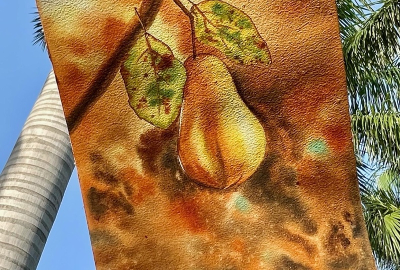
12. Pear - First Wash: Welcome back. Let's
paint that just per, I'll start by a waiting
the entire shape. I take my time with it. This will allow me to
work on it for longer. Now I take some of the
yellow and I'll add it where I see the brightest
color on my reference. I'll leave this high
light on the right. It will make our appear
look real and three dimensional and it will help us convene the light
in our painting. I'm adding some yellow
on the left as well. I wash my brush and I wiped
the area of the highlight, making sure no paint call there. At least for now I can now start adding more
intense color to the pier, slowly building its volume so I intensify the yellow in
this part of the pier. I keep an eye on
the highlight and whenever I see some
color creeping there, I wipe it with a clean brush. Now let's mix an orange color. I'm adding some of the
burn, Tiana to my yellow. I get this muddy orange color. I'm adding it here, making sure I'm not covering the
yellow entirely. Some here on the left as well. Our peer is starting
to take shape. Let's add some here
on the edge as well. Using the tip of the brush, I make sure the colors
are blended very well together by going over
some areas a few times. Because I'm
simultaneously working on all areas of the pier, the paper stays wet and allows
me to add more colors as I go wiping some of the paint around. The highlight again, here on
the highlight on the left, we can see in the photo
reference a green new once I add some deleted green light now adds on pure burned
Tiana to the pier, I add it wherever I see shadows
on the photo reference. I'm washing my brush, I wipe it and now I'll
blend it with the rest. I lost the grain here, so I'm adding it again. You can see that I'm
constantly watching my brush before switching to a different part of the pier. I do this because
I don't want to transfer some of the darker
colors to the lightest areas. I keep blending the colors
and dragging them across the paper until the blends
look smooth and natural. Wiping the highlight again to make sure it stays super light. Here we also have a highlight. I'll try to wipe some
of that color too. I am now satisfied with
how everything looks. We need to add more
shadows to the peer. But I will let it now in order to have more
control when I do that. See you in the next video.
13. Pear - Second Wash: My pair is now completely dry. I will do a second wash which will make it
more realistic. I will weigh the
entire area Again, I start from the
highlight because otherwise I is dragging
darker paint on top of it. And same as with the background. Whenever we go over the
initial layer with the brush, it reactivates some of
the paint underneath, and this all leads to a more
smooth and uniform work. I will start again by adding some yellows and that we
have deeper and richer hue, some more burnt sienna
in the shadowy part. Now it's time to make those
shadows colder and darker. So I will take sepia, I led it to the
places where they see the deepest shadows on
our photo reference. This is very, but I will distribute it with a
dump brush and blend it seamlessly with the rest washing my brush and I take out
the excess moisture from it and I use it to distribute
the color more evenly. Some more burns end here. So bring that darker color to cover the entire shadowy area and I still feel the
shadow needs more depth. So I will prepare a mix
between burns and Pia. I added again to the areas where the
darker shadows are. I'm washing my breath again and I will use
it to blend the colors and I'm happy with how it looks. I will leave it like that.
We can now add some spots. Walled paper is still wet. I'm taking some burned Tiana
with my burst size four. And I will just drop
it here and there. You can even make
sound splatters. So with clean water too. Let's leave it to dry now and in the next video we'll
add some details.
14. Pear - Details: Now what is left
for us is to add some details and our
project will be complete. I'll start by fixing the small white corner
I have over here. I'll just cover it with
some diluted burnt sienna. Some here for the
shadow of the pier. Now let's paint this part of the peer main line
with burnt sienna. And then I'll soften
the bottom edge. I'm drop some sepia and has the shadow with very delighted AP. I'll try to fix the shape of the per some yellow here. Now lets add those hair
like structures here. Below I concentrated Pia and I just paint some wavy lines with the tip of my press. And since I already
have it on my brush, I can add a few dots with it. I'm just whirling my brush here with what is left
of the burn sienna. I get a transparent
brown mixture. I'll add some dots with that too when they come
out to pronounce. I smush them with my finger. I'm adding some hairs with this lighter color as well. Now let's try to bring
some highlights here. On the left side of the pier, I'm taking my small flood brush and a clean napkin
and I start to, I managed to lift
some of the color, but I want to have a more
pronounced highlight, so I'll use my white cash. I take some of it straight from the tube and I add it here. Now with some clean
water, I'll soften age. I find it hard to
make a highlight with a white quash look
natural somehow. You can always tell that this
part is somewhat different. Now for the other highlight, I'd be in the same process. Now I will often the outside
tage. Very lightly too. I still don't quite like how it looks, so I tried to fix it by activating some of the question
and trying to blend it. And finally, because
it's too wide and crisp, I will add a very thin layer
of yellow on top of it. Let's fix the shadow
underneath the leaf, and there you have
it. Our golden, juicy peer with a glowing
background is ready. Let's wrap up the class
in the next video.
15. Wrapping Up the Class: Congratulations on
completing the class. I hope you've enjoyed this
exploration as much as I have. From the essential
techniques to bringing a vibrant note on peer and
foliage to life on paper, you've made incredible progress. If there's one thing I hope you take from this class
is the confidence to keep exploring and expressing your creativity
through what colors. Please share your beautiful class projects in
the project gallery. I can't wait to see your unique interpretations of
the Autumn Peer. Plus, it's a fantastic way for our creative community to connect and inspire one another. If you post your
project on Instagram, don't forget to tag me so
that I won't miss your work. Don't forget to
follow me here on skill share for updates
and future classes. And if you enjoy this class, consider leaving a review. Your feedback is so precious and it helps other
students find the class. You can also follow
me on Youtube when I share real time tutorials
and process videos. Thank you once again
for choosing to paint with me until the next
time. Happy painting.
 Elina Zhelyazkova, Watercolor Artist