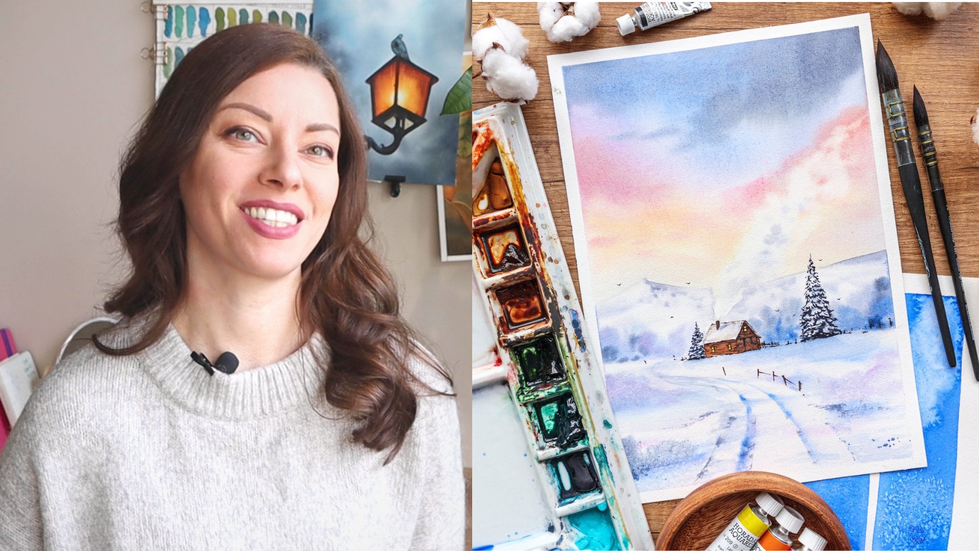
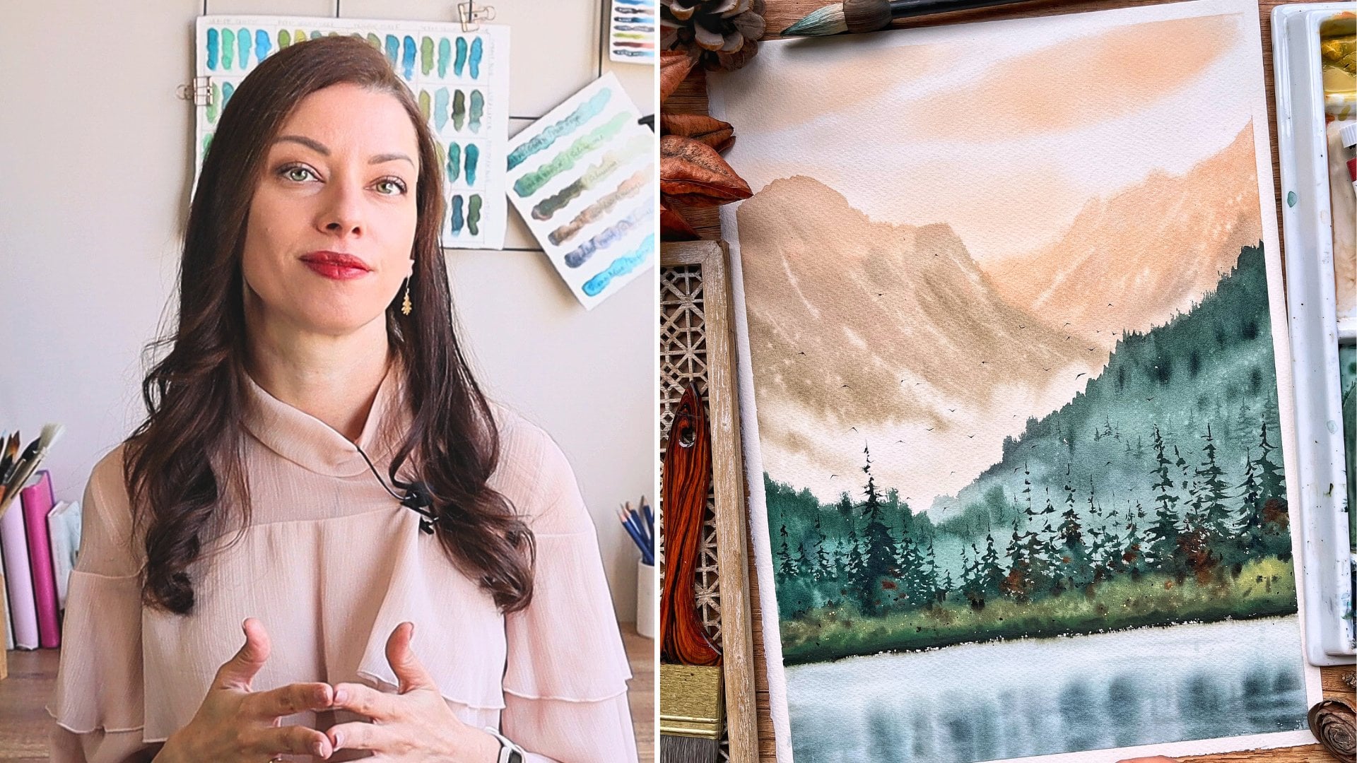
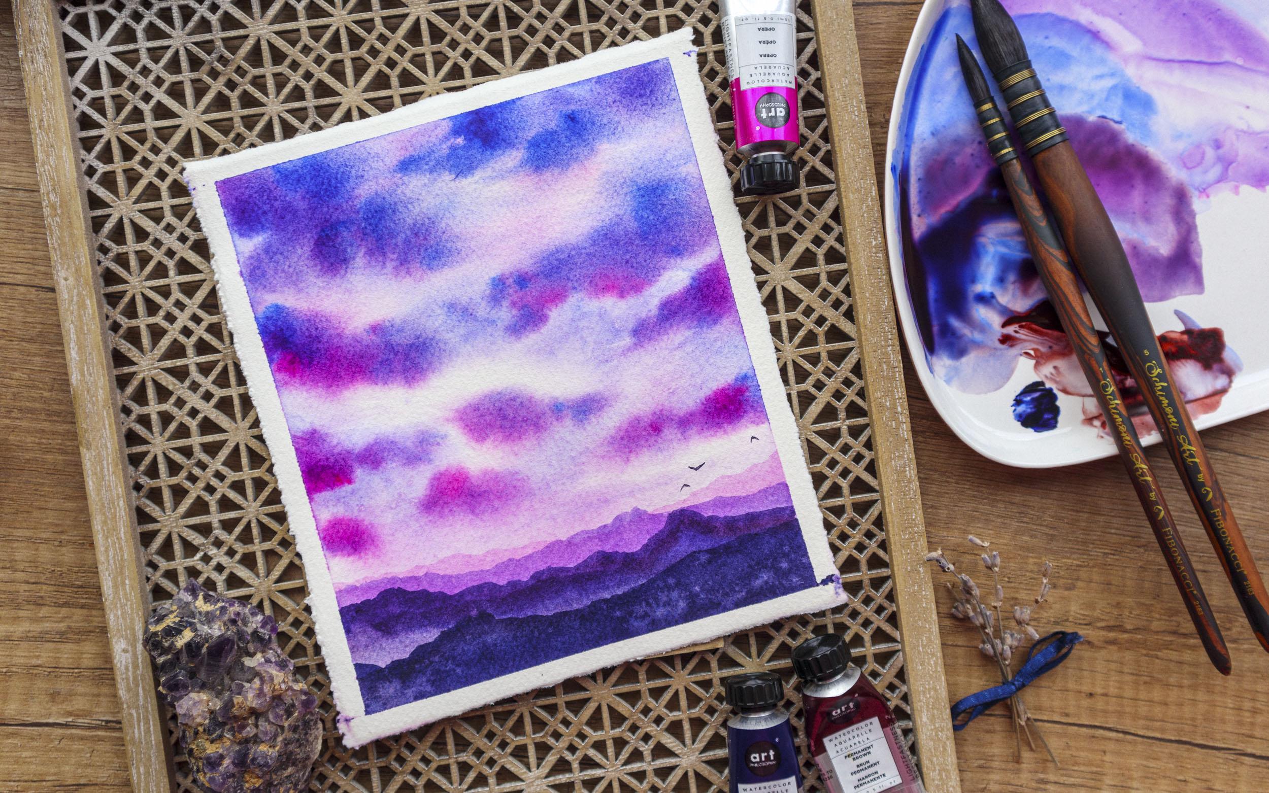
Effortless Watercolor Blends: Painting a Mesmerizing Purple Sunset
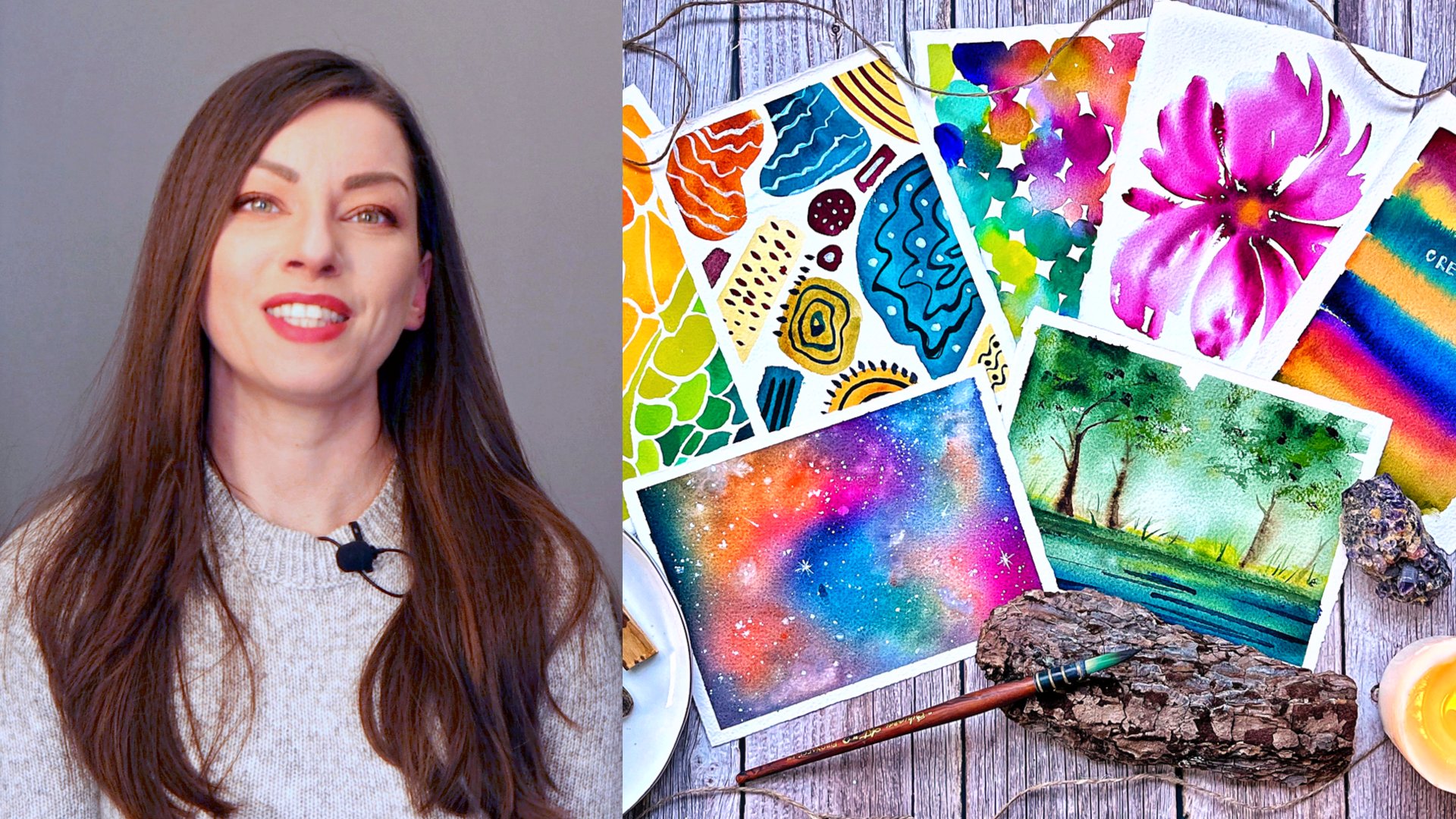
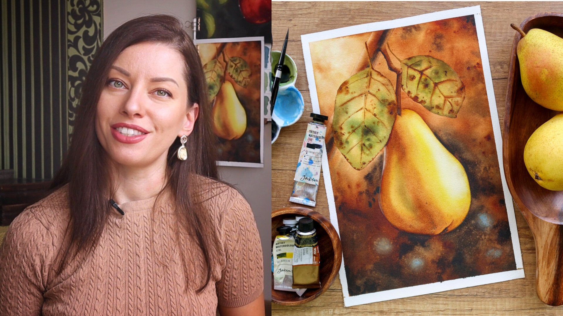
 Elina Zhelyazkova, Watercolor Artist
Watch this class and thousands more
Watch this class and thousands more
Lessons in This Class
-
-
1.
Welcome to Class!
1:32
-
2.
Class + Project Overview
1:28
-
3.
Materials
1:54
-
4.
Colors
3:39
-
5.
First Wash
5:56
-
6.
Painting the Mountains
7:32
-
7.
Wrapping Up the Class
1:08
-
-
- --
- Beginner level
- Intermediate level
- Advanced level
- All levels
Community Generated
The level is determined by a majority opinion of students who have reviewed this class. The teacher's recommendation is shown until at least 5 student responses are collected.
190
Students
19
Projects
About This Class
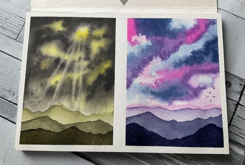
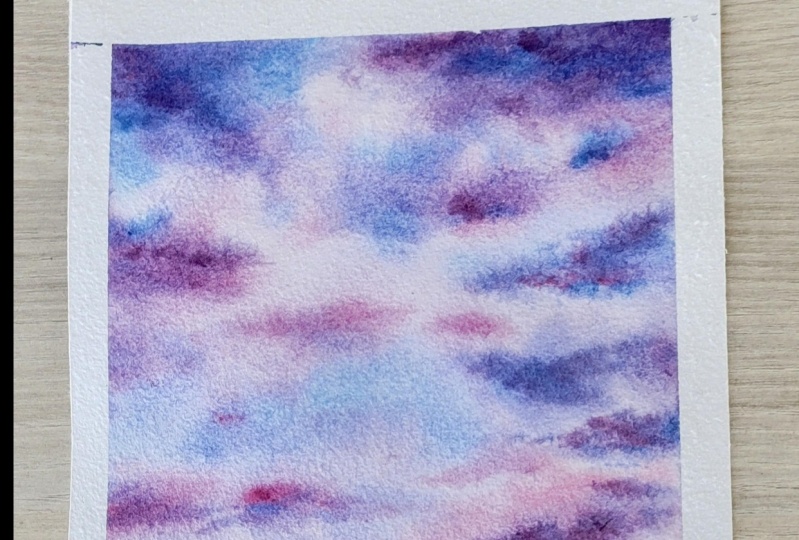
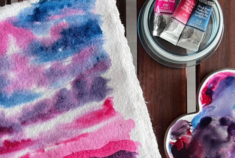
Welcome to "Effortless Watercolor Blends: Painting a Mesmerizing Purple Sunset"! In this engaging watercolor painting class, you'll embark on a creative journey to master the art of effortless blends and captivating color transitions. Led by Elina, a talented watercolor artist with five years of experience, this class will take you from a blank canvas to a breathtaking purple sunset with beautiful clouds, achieved effortlessly using just three colors. Get ready to unleash your creativity and create a stunning masterpiece that will leave you in awe of your own artistic abilities.
What You Will Learn:
- Discover the basics of watercolor painting and gain confidence in handling this versatile medium.
- Learn how to create stunning color blends and seamless transitions using a simple palette of three colors.
- Master essential watercolor techniques, including washes, wet-on-wet, and wet-on-dry, to bring your painting to life.
- Gain valuable insights into color mixing, ensuring harmonious and vibrant results in your artwork.
- Develop your artistic skills through step-by-step guidance to paint a mesmerizing purple sunset with beautiful clouds.
Why You Should Take This Class: Watercolor painting is a beautiful and expressive art form, and mastering the technique of effortless blends is essential for creating captivating artworks. Whether you're a complete beginner or a seasoned artist looking to expand your skills, this class offers a valuable opportunity to enhance your understanding of color blending and transitions in watercolor.
The skills you'll learn in this class are incredibly useful and applicable beyond this project. With the ability to effortlessly blend colors, you'll have the power to create a wide range of stunning watercolor paintings, from landscapes and floral studies to abstract art and beyond.
As a bonus, watercolor painting can be a therapeutic and relaxing activity, allowing you to immerse yourself in the joy of creating art and disconnecting from the stresses of daily life. The painting you'll create in this class will serve as a testament to your progress and a source of pride in your artistic journey.
Why Learn from Elina?: Elina, a passionate watercolor artist based in Bulgaria, has dedicated five years to perfecting her craft. Her love for painting beautiful and easy projects with gorgeous blends shines through in her teaching. With a warm and encouraging approach, Elina makes the learning process enjoyable and accessible to students of all levels. By sharing her secrets and techniques, she empowers her students to achieve impressive results and build their confidence as watercolor artists.
Who This Class is For: Whether you're a curious beginner or an experienced artist seeking to enhance your watercolor skills, this class is designed for you.
Materials: To participate in this class and create your masterpiece, you'll need the following materials:
- Watercolor paints
- Watercolor brushes in various sizes
- Watercolor paper or sketchbook
- Water container and paper towels for cleaning brushes
Elina will provide step-by-step guidance, ensuring you have everything you need to succeed in this artistic endeavor. So, don't wait any longer! Grab your watercolor supplies and join Elina on this inspiring journey to create an effortlessly beautiful purple sunset painting!
Meet Your Teacher

I'm Elina, a watercolor artist from Bulgaria. Growing up, I loved painting and drawing, but as a teenager, I set it aside for more than 15 years. When I finally picked it up again, I tried different mediums, but it wasn't until I discovered watercolors that something just clicked. I fell in love, and years later, that love has only grown stronger.
Watercolor is one of the hardest mediums to master, but it's also the most magical. There's a dreamy, ethereal quality to it that makes all the challenges worth it. I know how frustrating it can feel at first, so I focus on teaching beginner-friendly and intermediate classes to help others move past those early struggles and start enjoying the process.
You can find me on Instagram @inkpapersquirrel and YouTube, w... See full profile
Hands-on Class Project
Welcome to the exciting and creative class project - "Effortless Watercolor Blends: Painting a Mesmerizing Purple Sunset"! This project is designed to be easy to start, relevant to the class topic, and a fantastic way to promote independence and creative thinking in your watercolor journey. Get ready to have fun, experiment, and create a stunning sunset painting that truly reflects your artistic style.
In this project, you'll be applying the skills and techniques you've learned in the class to paint your own mesmerizing sunset. Don't worry; it's not just about copying a specific image. Instead, I encourage you to let your imagination soar and make this project uniquely yours. You'll be amazed at the creative possibilities that unfold!
Your final project for this project is a stunning watercolor painting of your dreamy sunset masterpiece. Remember, this painting should reflect your creativity and the skills you've acquired during the class. Feel free to include a brief description of your artistic choices and the techniques you employed to achieve the final result. Once you complete your project, take a photo of it and upload it to the projects section of this class. This way, you can share your beautiful artwork with the entire community and inspire others!
So, let's dive into this wonderful project together! I can't wait to see the beautiful sunsets you'll create and witness the growth in your watercolor skills. Remember, the process is just as important as the final outcome, and each stroke is an opportunity to explore and expand your artistic horizons. Have a blast, and let your creativity shine bright!


Class Ratings
Why Join Skillshare?
Take award-winning Skillshare Original Classes
Each class has short lessons, hands-on projects
Your membership supports Skillshare teachers
Learn From Anywhere
Take classes on the go with the Skillshare app. Stream or download to watch on the plane, the subway, or wherever you learn best.