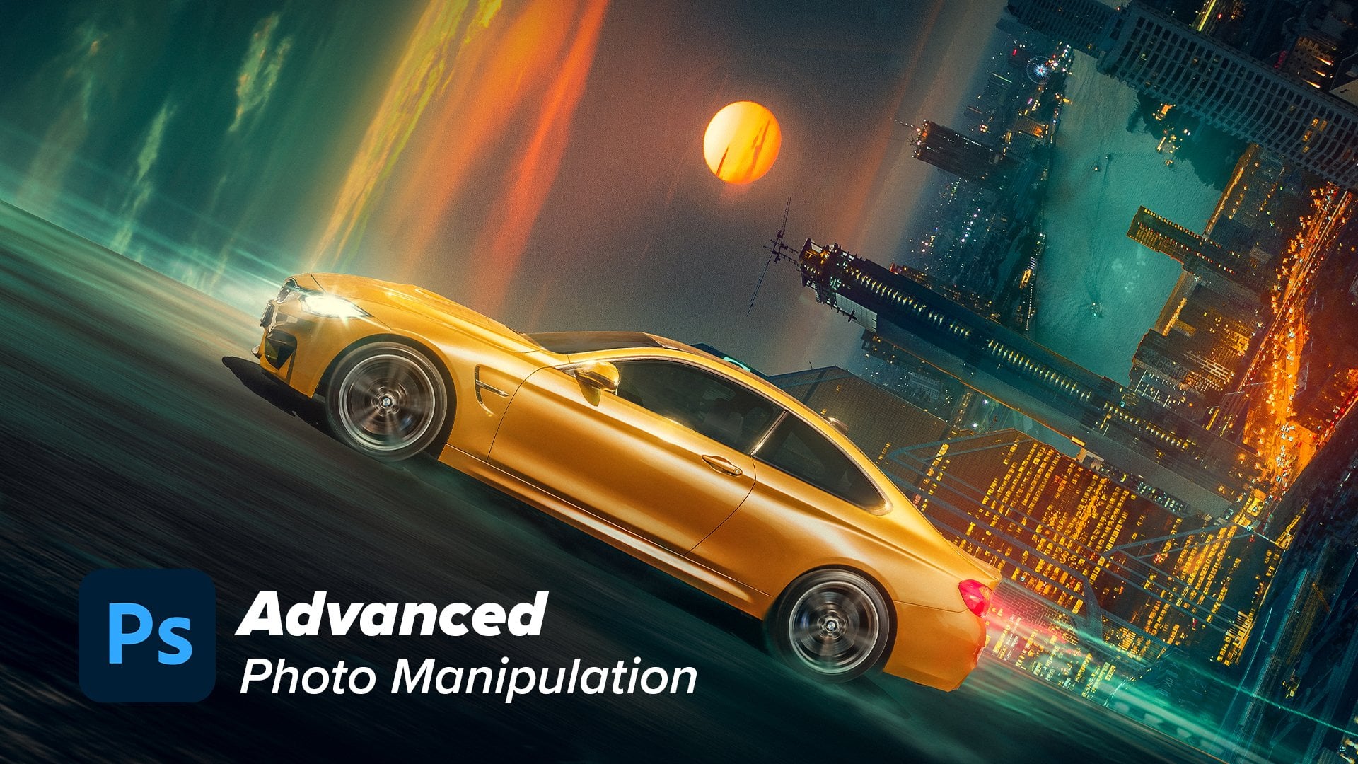
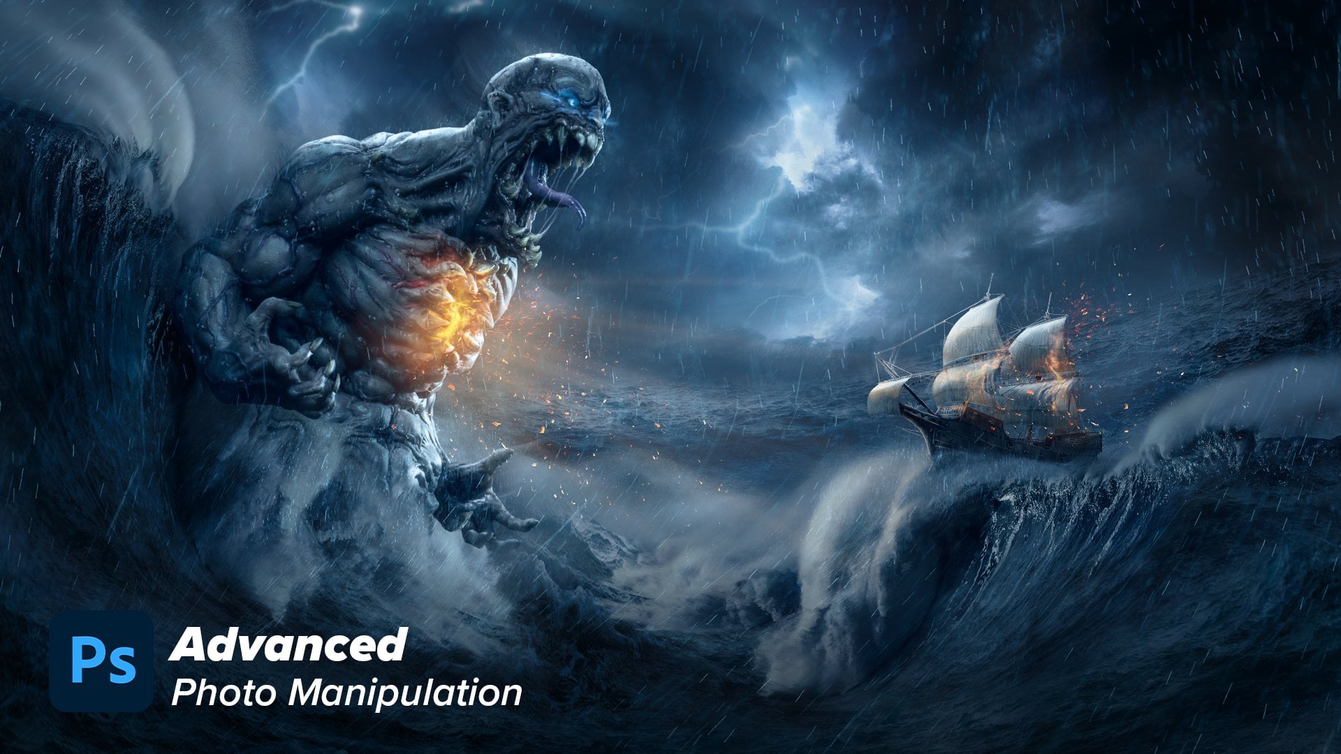
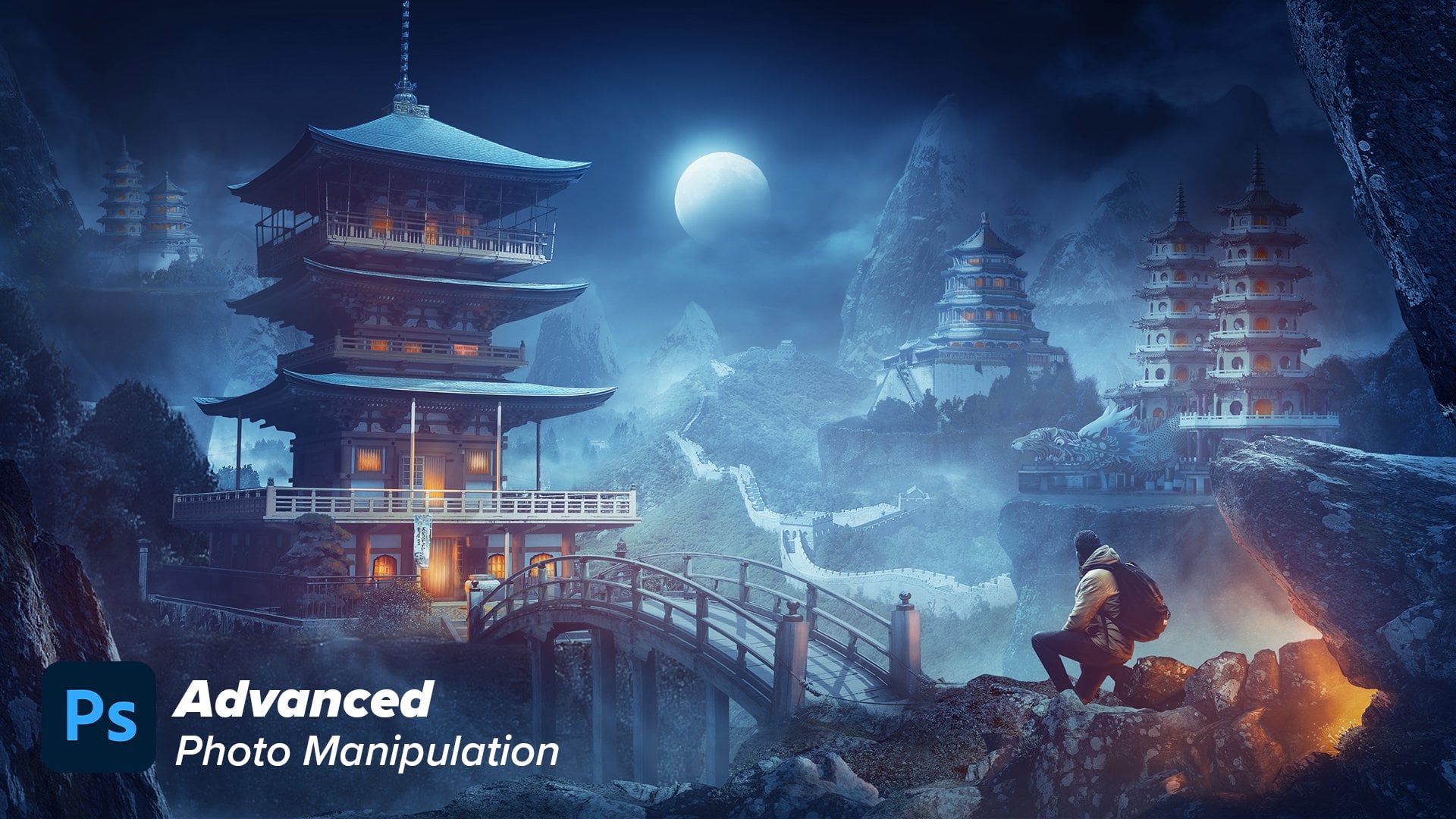
Transcripts
1. 0 intro: This exciting tutorial,
we will delve deep into the realm of
photo manipulation. Throughout this put tutorial, I will guide you step by step, revealing the secrets of creating captivating
compositions. From masking and blending
images together to color, correcting the elements,
color grading them, painting light and shadow, putting the final effects, the atmosphere effects, and enhancing everything
in the final touches. Whether you are a beginner,
eager to learn the basics, or an experienced artist looking to refine
your techniques, you will master all the tools and techniques that will take your photo manipulation to the next level without
any further ado, let's dig into sons.
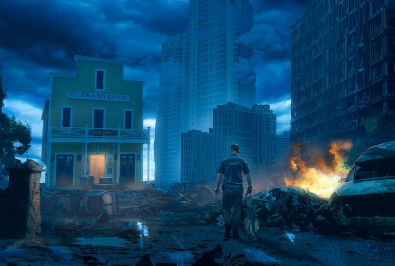
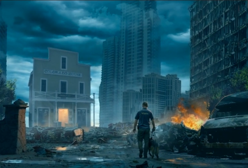
2. 1 Idea and reference: Hello guys, welcome
to my channel. My name is Nora and
this is Nor Ar Chan. Okay, so let's not twist anytime because I guess this
tutorial will be long. So let's go to Puha. And let's start by the references I gathered
to create this visual. Okay, so my main
plan here was to create something
that tell a story and it is something related
to crime or war or something. And I just wanted
to design a visual in the low light situations. For example, here,
if you zoom in, all this area doesn't have
this high brightness. And if you are into
four manipulation, you will know that this is
one of the hardest things to create low light
situations, okay? So this was another reference
and this was another one.
3. 2 Blending the sky (Butting the mood Color & light): Let's go to 40 shop and let's
just start into the visual. Okay, I will start by
creating a new file and I will make it for each
de size 1920 by 1080 B, maintaining the
color depth into 16. This will give me
flexibility in coloring. And then press Create. Then I will just expand
the canvas to four, Press control and then
change this into four. This will give me flexibility in zooming in and zooming out. You can find all the images
that I'm using in the link, in the description so that
you can follow along with me. Always start with a sky. This will put the initial
mode of the visual. Of course, for this I chose
the dramatic cloudy sky. Let's make it bigger. One problem with this
image is that this area of the cloud is simple or it
doesn't have a lot of details. That's why I got this
image of clouds also. I put it right here
and then blended it. Okay, let's create a mask
with soft and brush. I will just mask it like this. That's how I created like depth into the clouds. Very good. Let's select both layers and create a group
pressing control G, and let's name this Sky. Okay, I will start
element by element, which means I will
correct each element I put until I get
the final vgual. Let's start by putting the first color grading
that we want in this Vdual. For this, I decided
to create some anish, bluish, bright
color into the sky. I always go to color balance and you
can use selective color. You can use curves,
whatever the way then pressing Alt and pressing
between the two layers. Let's create a clipping mask. Let's put some sans, some greens, and some blues. Let's go to the shadows, doing the same
thing until you get the result that
you want to go to. The highlights the same thing. Now let's bring the
second layer of the sky. But first, obviously these
clouds are very dark. Let's match the brightness of these two clouds and
then correct the colors. Let's start by creating a
curves adjustment layer. Let's make it
brighter like this. Don't forget to clap
it to the layer. And maybe we can open up the shadows a little
bit like this. Then let's go to adjustments
and creating color balance. Create a clipping mask. And let's adjust the colors to match the other sky or clouds. Okay, let's add some, say ans, maybe some
greens and some blues. Go to highlights and
do the same thing. Very nice. Here is before correcting the
lightness and after. And before correcting
the color and after.
4. 3 Blending The main Ground: Very nice. Now let's go
to the main elements. This scene will
be something like post apocalyptic scene in which everything is
damaged and crashed. Let's start by this image. Let's put it right here. Let's put it above everything. Make a beggar. I will
start by selecting this. Let's go to Select Sky. This will make, I
select the sky for us. And then let's press out
and press into the mask to select only the
buildings, not the sky. Very nice for this. I will take this image as the
main image of the ground. Let's make it a
little bit bigger. Very nice. Maybe we will have to remove
some parts of this image. Let's mask this building. We will not need it. And this one as well. Very nice. Now I think we need to
expand this building. How can we do this is simply by selecting the
image like this, and then duplicating
it by pressing control J. I have created like
another duplicate from it. And then let's just
make it stretch it like this
pressing control and just stretch it like this. Very simple, and it will
not be very noticeable. Okay, because we will
only need this part. Let's mask it. Create
a mask and pressing control to invert the mask. And using the brush, I will
just paint over this area. Subtle and nice. Okay, very nice.
Now let's correct the lightness and the
color of this image. The main thing I want
you to think about in this part specifically, is the further you
go in distance, the less contrast
the elements should, this is due to the
atmospheric effect. Firstly, put these two
layers into a group, and let's name it ground. Let's start by putting these two layers
into a smart object, because we want to put some effects on
them, both of them. Let's go to adjustments. And let's start by
creating curves, adjustment layer,
creating clapping mask. And let's start to darken the image like this and open
the shadows a little bit. Now let's go to adjustments. And let's go to color balance. To correct the colors, let's add a bunch of ions, some greens and some blues. The same thing we did
before into the sky. And it is the same thing we
will do for the whole design. Go to highlights and
some other touches. Okay, that's very nice. Now let's add the atmosphere
effect in front of this areas, the four elements. How can we do this is simply by creating another
curves adjustment layer. And then open up the
shadows like this and maybe make it a little
bit more or darker. And then let's create a
clipping mask and let's change the blending
mood into ilimonosity. This will make the curves layer only affect the
lightness of the image. Then let's create a
press control eye to invert this mask. Then using the softened brush, I can fade these four elements. Like this, I'm basically putting like atmosphere effect
or hazing fog effect. Very nice. We can create also a new curves, adjustment layer, increasing
the contrast like this. And then increase changing the blending mood into
deminosity as well. And press control to
invert this mask. And we can paint over
the closer areas. This will emphasize the
effect that there are, some elements are far away
and others are close. Very nice. Let's do the
same thing into the sky, because we want these parts of the sky to be darker
a little bit. Let's create a curves adjustment
layer. Make it darker. Changing blending mood into ilminosity pressing control
to invert the mask. And then let's paint over these close areas using
another curves layer, We can make it brighter and change the blending
mood into luminosity. Press control to
invert the mask, and let's paint over this
area to make it bright.
5. 4 Blending The skyscrapers: Okay, let's go to
the next element which will be this building. Let's bring the object
selection tool firstly. I will get this image of this
building by selecting it, simply like this, using the quick selection or the
object selection tool. And then I will simply
press control C, control V. Let's take
it to our project. Put it right here. Let's convert it
into a smart object. Let's put it behind the
main ground L image. Let's make it small. Something like this. I'm putting several layers of buildings. This will make depth
into the visual. Okay, okay, now let's put it
into a group and let's name it Tower, right? Very nice. And let's correct everything. This should be
something very far away in distance and it
shouldn't be that clear. Let's start by
reducing its contrast, by creating curves
adjustment layer. And let's make it
dark like this. At the same time, let's
open up the shadows. We will get into the
lightness again later, but let's go to
adjustments now to enhance or to correct the colors and then get
back to the lightness, because I want to judge
it into a better way. Let's add colors. Let's go to shadows. Add some sans greens
and blues. Let's see. Of course, we need
to make it brighter. And at the same time, let's contrast
something like this. Very nice. Then let's correct the colors. Again, a very good trick
I always do to blend these images into the
atmospheric effects, I use a solid color
adjustment layer and create a clipping mask. Let's choose color
from the background. Let's say a anish color
like this. And press Okay. Then I can go and blend this
color into the shadows. I'll double click
into the layer and remove the color from the
highlights like this. By pressing the split at, I will split the coursors this. Let's blend it somehow. Like this. Very nice. Then press Okay, let's see, we can decrease the opacity. One final thing, we can
create a new layer. Using the soft push, I will pick some bright
color from the background. Not so much something like this, then creating a clipping mask. Let's just paint some
hazing effect like this. One final thing is I
create a new layer. And let's choose some fog brush. And let's pick some
colors from here. Let's blend it like this. I'm now trying to blend the clouds into the
building itself. Something like this. Very nice. But the building
itself is very bright. Let's make it darker. Let's make this opacity
lower, something like this. And let's decrease the
capacity of this one as well. It will finally work after
some tweaks will finally work. The reason why it's
taking all the time is that the image itself was
super sharp and clear. We want it to look
like it's faded. That's why it's not that
easy, but it's okay. We can do it very nice. Now, let's bring another
copy of this tower. I will simply press out
and duplicate this tower. And maybe I will change orientation because I don't want it to look
like it's complete. Duplicate from the right one. Something maybe like this. And then press Enter. Nice. Maybe we can make it closer by increasing the
contrast a little bit like this and decreasing
the opacity of this layer. Maybe we can move this
cloud layer to the top. Something like this.
Very nice and easy.
6. 5 Blending The Main Building: Let's go to the next element which will be our focal point, which will be this house. Let's open it into
a new project. We will simply select this house by the object selection tool. I will just select it like this, and then let's create a mask. Using the brush, we can refine
this selection and just paint over this part
because we will need it into our visual. Very nice. Now let's right click Convert it
into a smart object. Let's bring it into our main
project. Put it right here. Let's put it into a group. And let's name it main building. Let's put it behind
the main ground part. Put it right here.
Let's make it small. I guess I need to change its orientation to make it
like taller or something. This, I think this is better. Very nice. Let's enter and
let's put it right here. I just want to mention
Rule of composition, which is called
the Rule of Third. It's basically to divide your visual into three sections, horizontally and vertically. You can put your
main focal points into these four points, which can make your composition
and message better. If you put your
main focal points or main elements
into these points, this will deliver the
message in a better. That's why I put this
main building here. Another thing I want to do
before blending the colors, I want to change this black part into
something that has textures. Let's press double click into the smart object to
open the image itself. Then I want to fill this
black area with some texture. I will just take this door. I will select it and put
it into this black spot. Control C control V. Then
let's just put it right here. That's it. Let's press control. This will save it and
it will look like this. Very nice. Now let's care about blending this
main focal point. Firstly, I will just erase some parts from
the main ground. From here, I will
just mask some parts. Let's mask this area. Now let's enhance or
match the colors. Firstly, I will
start by decreasing this very yellowish color. By creating a saturation hue. Saturation adjustment layer. Create a clipping mask, analys the colors like this. The next element will be creating curves to
match the brightness. I will darken it,
create a living mask, and then darken it and
open up the shadows, because this should
be somehow hazy, this will give us
the illusion that this element is a
little bit far away. Invests next, let's go to adjustment color balance and do the same color
correction things, try to match it with
the background.
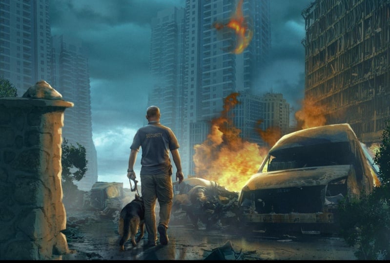
7. 6 Blending The Broken car (Foreground): Very nice. Now let's bring
some foreground elements. As I'm always saying, if you want to create depth into your photo manipulations, you need to create some elements that are
closer to the camera, the foreground elements,
the mid ground elements, and the background elements. This will create some depth into your visuals
and composites. For the foreground elements, I will bring this
image of the car, make it bigger,
something like this. Let's just put it into
a separate group. And I want to select this part. I will do this simply by
the object selection tool. Let's just select it like this, then let's create a mask. Let's put this car into the foreground
somewhere right here. Make it bigger like this, it's going to be dark. Let's put it right here. Let's erase these parts, or fade it away using maybe the soft turned brush
or any texture brush. Let's just go to the
soft turned brush. I would just fit
it away like this. Maybe we can decrease the flow. Let's like this. Very soft and gentle. Now let's enhance
and match its color and saturation and
all the other stuff. Let's start by adjustment,
creating curves. Let's make it dark like this. Maybe open up the shadows. Let's create adjustment
color balance layer. Let's add some greens and blues. Do the same thing
into the shadows. Bunch of San, maybe
some blues. Let's see. Yeah, it needs a
lot of in color. Okay, Maybe the
blues are very high. Let's decrease it. Let's
go to the highlights, the cans and blues. Maybe some greens. I think we can fix this
using a solid color. Let's create a solid color
and create a clipping mask. And let's pick some ish color from the background element. Then using blend, I will
just color into the shadows. I will reduce it or remove
it from the high lights. Like this. Then to split the cursor, maybe you can make it like this. Let's see, it's not bad, can decrease the opacity. Very nice. Now let's paint some hazing or atmosphere
light effect into this car. I will create a new layer, an empty one, using the soft brush and picking
any color from the sky. I will just paint clapping mask. I will just paint
over these areas. It's changed the blending
mode into screen. Maybe with low
flow of the brush, we can simply paint over here. Very soft lights. Then we can go to double
click into the layer and remove this effect
from the shadows. Press all to split the cursor
and remove it like this. And press, okay, let's
see, Before and after. Nice, very nice.
8. 7 Blending the left fence (Foreground): Now let's bring another
element for the foreground, which will be this fence. Let's put it right here.
Let's press control. Flip horizontal, and
let's make it very huge. Then let's just select it using maybe quick selection
tool. Very nice. Now let's create a mask. Let's put it right here. Very nice. Now let's
correct these colors. And I guess guys, you understand the main idea. It's basically the same thing, curves to adjust the lightness. And then let's go
to color balance. Create a clipping mask. And then add the
color that we want. The tones and the same thing into the highlights
and the shadows. Very nice. We can also
bring this layer, solid color layer we used here. We can put it into this layer as well to give it the color
that we want. Okay? It's basically giving the
shadow specific color. Okay? So what you can see
here and after, and after this is the effect. And we can always go
and reduce the opacity.
9. 8 Blending the man (shadow light color): Very nice. Now let's bring the main focal point
which is this man. And I'll just simply select
it using select object. We see for this we can use any four or grass brush using the arrow keys and it's
just paint over the edges. We couldn't be detailed
or very accurate in this tutorial
because I don't want this tutorial to be like
five or 4 hours long. But we are doing
our best to give you the most value of the video. Now selecting the two
layers, our right click, convert it into a smart object, Let's put it into
our main image. Press control T flip it horizontally because
we want it to be, we want the man to
look like he is going into the
direction of the house. Let's put him right here. Now next let's enhance
or match their color. I guess we can quickly
make it or I will speed up this process because
it's the same process. I will just make it quickly. Very nice. The man
is now matched. Let's start by creating
a shadow for this man. I will start creating a new
layer and clip it to the man. Let's use a soft to make
this area a little bit. I will choose dark color. This may be more
greenish, very nice. Now let's to create the opacity, let's select this man, pressing click and pressing into the layer and then
create a new layer. In this layer, I
will just press out back space to fill it with
the color of the shadow. And then press control D to select Control to
change its shape. Right click, flip it vertically, and let's put it right here. Pressing Control to change its shape and orientation to match the direction of
the main source of light, which will be the sky. Let's just make it
like this. Very nice. And then, okay, of course, in this type of atmosphere, the shadows should
not be that sharp. Let's go to filter
and blur gallery. And let's use maybe field blur. I use field blur to control
the sharpness of the shadow. Let's put one point here, another one here without
increasing the blur. And let's put another
one here with a very blurred thing like this. Maybe we can put another
one right here. Very nice. And press okay, let's
see, it's not bad. Maybe we can increase
the opacity. This is called the
ambient shadow. And then we can create
the contact shadow, which is resulting from the contact of
these two surfaces. The leg of the man
and the ground. I will do this, let's just put this shadow
behind the man. Let's create a new layer. Using the softer on the brush, I will just change its
shape to make it like this. Smaller, Let's paint
into the small areas, that is the contact areas. Let's decrease the flow. Just paint over
here, here and here. The areas that has contact
between two elements. Very nice. Let's see after
you can make the pacy low. Very nice. Next we can paint the ambient light coming
from the sky into the man. I will do this this time
using solid color layer. I will choose some bright,
desaturated anish color. Like this change,
it's a blending mode. Into screen and create
a clipping mask, double click, Remove the
color from the shadow parts. Courser. Something like this. Press. Okay, and let's shift
to the graphic tablets mode. Then. Press control
to invert the mask. Here I will use a texture prush which is called oil pastel. Push this one because it gives me some texture in
painting the highlights. Maybe I can speed
up the process of painting the highlights.
Time consuming. But if you want to know how to paint lights or
highlights precisely, I have a full video
explaining this. You will find it into
the link, of course, I talked about this A
into my premium course. You will find the link into
the description as well. Let's paint over his ears. Thing like this.
Maybe we can decrease the flow more here. That's very nice. Let's see, here is before and
here is after. Before and after.
10. 9 Blending Trees (Color & light): Very nicely. The next
element will be adding some greenish color and color
variation into the scene. I will use this image to
just select these trees. To add dynamic coloring
into the visual. Let's go to Channels and
choose maybe the blue channel. Right click. Duplicate
the channels. Okay, in this duplicate, I will just press control
L to bring the levels. I will try to make
this tree part as black as possible and everything else as
white as possible. To just separate it, very nice, maybe we can use the software
and brush or something. Change the blending mode
of the brush into overlay. And using the white color. I will paint over these areas. That should be enough. Change this into normal. Again, using the hard
brush I would just select. The main concept is the
black parts will be visible, the white parts
will be selected. Or the opposite, the black
parts should be hidden. Let's press control
to invert the mask. And then press control
to select the pixels. Going to the layer,
create a mask. Very nice. Right click, converted into a smart object. And let's bring it
into our project. S. Let's just, or maybe rotate it and flip it horizontally like
this to put it right here. To add some color dynamics, color variation into the visual, let's put it, let's
name this fence left. Very nice. Let's put it
behind it, control G. Let's name it left as well. Put it into a separate group. Very nice. Now let's match
its color and let's put some effects to blend it
the same way we did before. Very nice. We can create
some atmosphere effect to fade it away or to
separate it from this fence, creating a new layer. And using the fog or cloud brush to fog, we get bigger. Choosing bright color,
something like this, create some fog effect too. M paint over this area and see maybe we can
reduce the opacity. That's very nice. I can
now bring this tree to the right as well to
add this color variation. But before that, let's
paint some lights over the top of the trees using
the soft rounded press. I'll pick some color like
this and paint it like this. Let's decrease the opacity. Let's see, this is too much. Maybe we can use curves
adjustment layer like this. Create a clipping mask control
in a mask and using crush, weak and paint these areas. Let's change the
blending mood into luminosity because we don't
want to affect the coloring. Very nice. That's
good enough, I think. Let's bring this one to the other direction
and let's name it. Right. I'm trying to put some
colors because I don't want the final image to be like
monotony anish color only. Let's put this tree behind
the car and press control. Flip it horizontally. Let's see, Maybe we
can put it right here. Let's make it dark
in the curves. I can make it darker like this. Very nice. There's not as atmosphere effect
as the lift one. Maybe we can control, make this atmosphere effect this bigger. That's very nice. I'm satisfied for now.
11. 10 Adding fire and orange lights: For now, everything
I guess, is blended. But we need a spice, we need another color
into the visual. It's just a very
monotony canis color. There is no, a lot of interest. What is the complementary
color of the cyan? As you know, the orange is
the opposite of the cyan. When you add contrast
or complementary colors into the same visual, create color, dynamic
color contrast. And it's just good to your eye. Let's start by putting
some orange color. For this, I will pick this
image of the car explosion. Let's just select it using
the Quick selection quickly. This, very nice. Now let's create a mask. And then let's go to Select and Mask to remove
these black parts. Using the Refine Edge tool, I will just refine the edges. Paint over here, I only
want the orange color. Let's paint over the
dark areas. Very nice. And then press, Okay, let's bring this image
into our main project. And we can put it
behind this car. Let's put it behind this car
and behind the tree layer, let's make it smaller. Something like this, just some explosion
coming from the right. Bring the fog or
any clouds brush. We can erase or
refine the edges. Painting with the clouds brush. Now I think this
is very saturated. So let's just correct its
colors using color balance. Adding some sands and some blues and some
greens. A bunch of sands. The same thing to the
shadows, to the smoke. Very nice. That's better. Maybe you can go
to the highlights. Add some sands as well, and some blues which will
decrease its saturation. Let's see before after it's
now blended in a better way. Another thing I want to add here is the visual is now
looking unbalanced, because the right part
has a lot of orange, the left part doesn't
have any orange. We can add mysteriousness
and at the same time, add balance to the visual
by lightening this area. I'll do this by simply
going to the main building. Let's create a solid
color adjustment layer. Let's make it some orange color. Let's change the
blending mode into maybe linear dodge
a clipping mask and press control
to invert the mask. Now I can select the area
using polygonal lasso tool, maybe something like this. This should be like the main part that the
light is coming from. Then we can cast this light
into different elements. Let's firstly fill this
area with this color. Maybe we can figure it
a little bit because it's very sharp figs, crease the fill,
something like this. Maybe paint with a
very low flow brush just to give it some
color dynamics. Something like this.
Create a new layer, clip it and we can pick a brighter color and
paint over the top parts. I want to have some color dynamics change
its blending wood to screen. Maybe, yeah, maybe we
can decrease surpacity. Okay, let's see. Now it's way better. It is now balance it. Of course, we have a lot of work painting
lights and casting. These are two
sources of light to additional sources of
light that we want to paint the casted light over every element we can
into the visual. Let's start by the easy part. I would just maybe some
texture like this one. And let's just paint with
a new solid color screate, a solid color press. Okay, changes blending
option to screen. And then press control
to invert the mask. And let's cast light
into some elements. Let's start by this
part should have some lights reflected on it. The surfaces start
with the obvious one and it shouldn't be like super hyperrealistic
lights, you know? It's just you need to paint some lights to seal the
idea and that's it. Okay? Any edge, something
like this here as well. Maybe this area. And the further you go in distance from the
source of flight, the lower intensity
the light should be. Okay. It's paint over here, some lights over there, pole, maybe we can from here. This process takes some time. It's time consuming process, but believe me guys,
it's enjoyable. You will enjoy painting lights because it's like
icing on the cake. It's giving the visual the
final look that you like. Everything from
matching the color, matching the lightness and all this stuff doesn't give satisfaction that you
find in painting color. Let's bring some, maybe
folk brush to paint some hazing effect like this. Very subtle, very nice. Maybe we can increase the size and give it some
final hazing effect like this. Let's see, that's very nice. Now we can paint or cast the lights that is
coming out of this fire. Let's go to the fire. Let's name it fire. Let's firstly create
a solid color to create a glow effect
coming out of this fire. I will press control and using maybe the soft
rounded spring it. Let's paint some glow effect,
the flow of the brush. Let's just paint glow
effect like this. Maybe this color
is very saturated. Let's create the saturation
using the fog brush. We can paint these areas
because it's a hazy atmosphere. The particles of the bust in the air should
reflect any light, including the light that is
coming out of this fire. Let's try to paint some lights casting over
the mess of metals. This will be very hard to
follow every tiny element, but let's find some elements and paint some light over it. And this will finally
sell the idea. We don't want to paint
light in every tiny detail. Let's just pick this texture, push the oil pastel prush. I always use. Yeah, this one. And let's increase flow. We can paint some
lights like this, some parts sem, give it
some metal reflections. Maybe you can out and see
where in the right direction. Maybe I will speed
up the process of this and then get back to you.
12. 11 Adding Final touches (water refelections & grading): That is very nice. Now, I guess we need some final atmospheric
effects into this part, and we are good to go. I will do this. Maybe we
can bring a fog overlay. Let's bring the fog overlays. Let's put them here. Here. Let's bring this overlay. Put it right here. Press control, and
let's make it very big. Like this. Press control, you, let's give it the color. Let's decrease that brightness
and saturation as well. Let's put it here. Let's mask and fade the edges. Something like this. Very nice. Before and here is after. We can now separate this man using atmosphere effects
behind him or in front of him. Let's create a new layer
using any fog brush. I'm just trying to paint with maybe or some atmosphere effect here to separate from
the other elements. Something like this. And
then we can mask it or decrease the opacity like this. Very nice. One final
thing I'd love to add is to add some water effect. I'll do this by
creating a new layer. Pressing Alt, Control
Shift to bring everything into the
canvas into one layer. Press control, right click,
flip vertical first. Okay, then let's go to
filter blur and motion blur. This will create this
water reflection effect. And then press control,
let's squeeze. Press shift to
squeeze it like this, maybe we can distort it. Right click, Distort
And pressing shift, we can distort it thing, this. Then press okay. And
there's create a mask. Press control to
invert the mask. And using a texture,
any texture brush. I'm using this oil pastel brush. This one I can paint. Let's change its
shape Like this. Let's paint some water
bottles here and there. Let's just increase. But you need to choose which parts you want to
be reflected at first. For example, here I bright
sky spots here as well. But I don't like this area. Maybe we can paint over here. Let's just erase or
mask these parts. Finally, we can
create a new layer. Press out control shift to put everything into a new layer, convert it into a smart object. And let's go to filters, Camera row filter to enhance the image and to give it the final tone and
the final color. Let's start with the exposure. The exposure a little bit, maybe increase the contrast. Let's go to highlights.
Increase them. Open up the shadows a little
bit about the whites, open up whites and the
blacks open them as well. Decrease the texture and maybe increase clarity. The hazing. Yeah. Let's go to vibrant. Maybe we can increase
vibrance or decrease it. Increase it touch. Let's maybe add some
agenda shift and yellows to give it
more realistic one. Okay, let's go to maybe detail, add some sharpening and effects
to add some green effect. Zoom out, what else? Maybe. Let's go to the basics and open up the shadows
because they are very dark. Yeah, let's see. Before and after that, you can't tweak it as you wish. I guess for now
this is good press. Okay, the final thing I would like to do is to
create a glow effect. I'll do this by selecting
the highlights. Let's go to Highlights. And let's increase the fuzziness
and increase the range. You just want the absolute
highlights. The press okay. Then press control J to only
duplicate the highlights, change its blending
mode into screen, and maybe you can convert
it into a smart object. Let's go to filter blur
and Gaussian blur to blur it to give it this glow effect. I'm basically selecting the
highlights and then changing its blending mode
into screen and then Gaussian blur it to
create a glow effect. See before and after. Very nice. Yeah, here
is the final result. Here is before,
and here is after. Okay guys, if you
stay to this minute, I guess I should encourage you because
you've done a great job. This was a full tutorial, I guess it exceeded
1 hour, I think. Great job. Congratulations, you have a great desire to learn. The next step I want you to do is to take this tutorial that you have learned and try to make something unique with
your own images. Maybe you can use
the same techniques, but with different, this will
give you different results. Okay, whenever you're trying
to follow a tutorial, try to do it with
your own images. This will make you a
better artist, of course. See you in next tutorials piece.
 Nour Art, Digital artist, Youtuber