Transcripts
1. 0 Intro: Alright, this is a
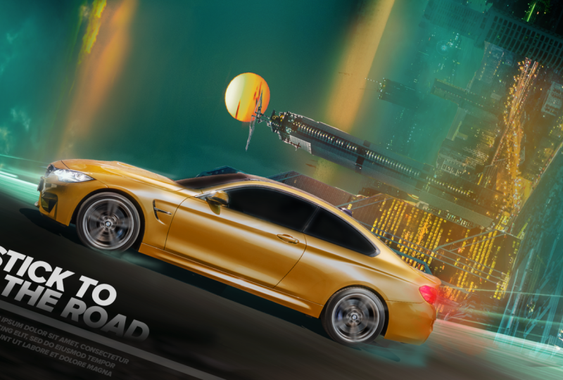
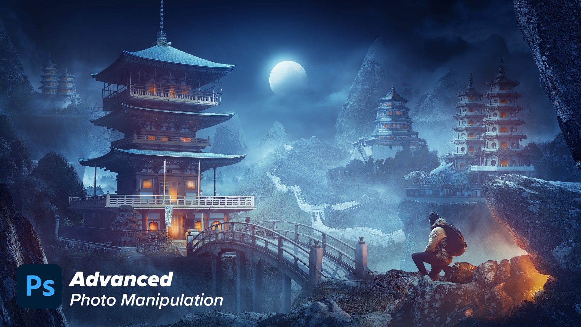
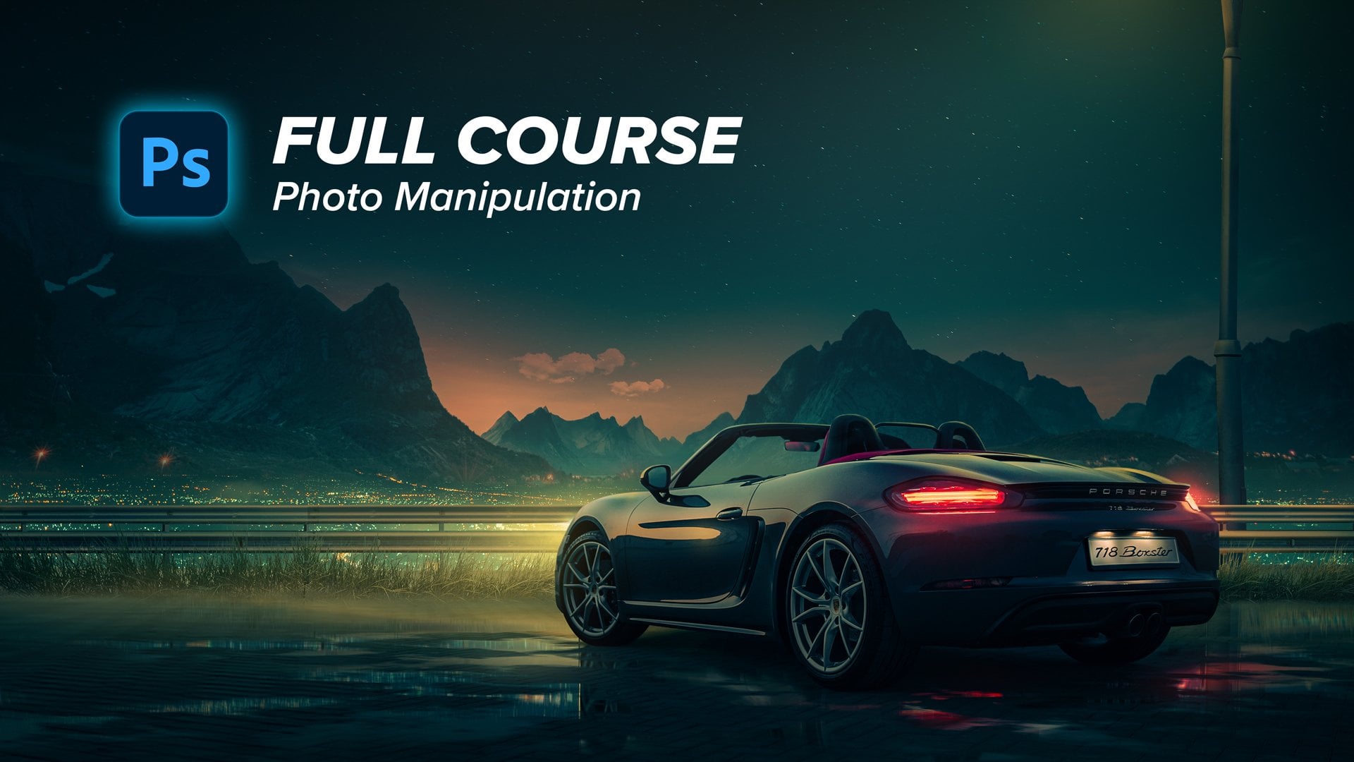
full Lynn's class of advanced photo manipulation. After finishing this class, you will learn how to create this advertising visual
by yourself step-by-step, starting from the idea itself, discussing the references
I used to create this visual and then creating
the main composition. Next, we will learn how
to match the color of each element and how to draw a light and shadow precisely. The next step we will
learn how to spice everything up by the glow
effects and reflection. And finally, we will go to
the topography part and then we will finalize everything by the
final color grading. I'm so excited to
start with you guys. So let the fun begin.
2. 1 Idea & Reference: All right guys, let's jump
straight into Photoshop. But first you will find all the stock images
used in the description. And I encourage you
to follow up with me step-by-step so that you get the best use of this tutorial. Let's go. So let's start creating
these amazing visual. Firstly, I wanted to start
with illustrating or explaining the idea
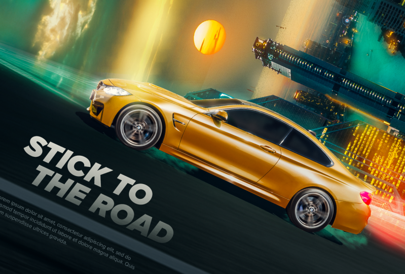
behind this visual. I wanted to create a
visual to represent that these beautiful M4 car is powerful and can stick to
the root in high-speed. So my initial idea was
that I wanted to create an exaggeration of the idea by creating a visual like this. So I wanted to the root
to be like vertical. And despite of this very
hard circumstances, the core will handle
it efficiently. So this was the main idea, but I didn't like how
it look visually. So I started to think how can
we demonstrate this idea, but with lists severity. So I thought that we can make it a little bit
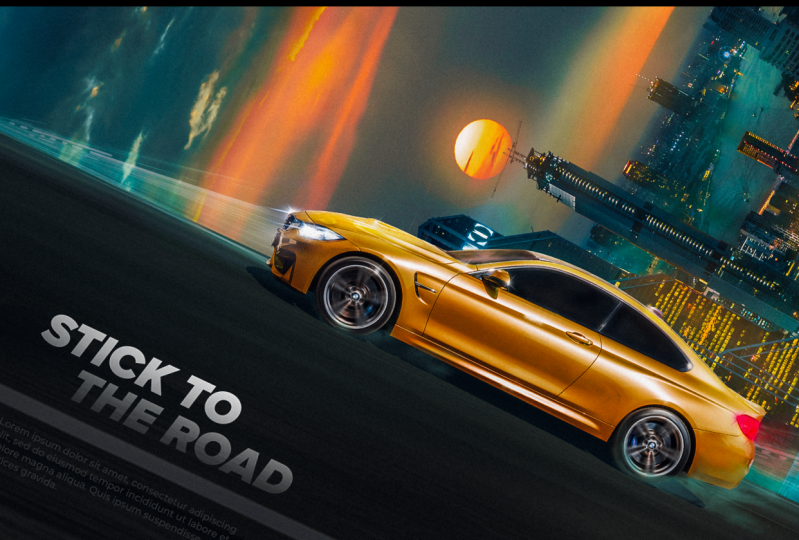
tilted like this. And here is the final idea. So that was the initial idea
and the mood of the design. I wanted to use these reference
in the color and moods. I love this beautiful contrast. T teal and orange look
the teal color in the shadows and the
highlights, the orange color. Here's another example,
and here's another one. So this was my inspiration for creating the colors of the visuals without
wasting any more time, let's dig into business.
3. 2 Getting everythingin place: Firstly, I'll create a new
file by pressing File New. And let's create 1920 by 1080
be kansas and press Create. Alright, here are the old images as I will use in this visual. You can download them from the description and I will
start with the root image. It's drag it and put it into the Photoshop here and
to our project file. And now let's use
the selection tool to just cut the root port. Let's select it and
then press Control J. Now let's erase
the original one. Okay, Now let's distort the road a little bit
because I want it to look. It's deeper than
what it looks now. So I will right-click
and press distort, and press Alt and Shift
and just drag this point. This will flatten the
route more like so. Very cool. Now let's
make it a lot bigger. Let's stretch it to rotate
it to make an angle. Like so, make it bigger. Very good. Next we will put the buildings into
the background. So let's drag this image and
open it into a new project. Because I wanted to
select the buildings and still keep these parts selected. So I will use the channels, which I think is the best way to cut it
from the background. We will go to the
channels and then we will toggle between the channels to see which channel has a better contrast
with the background. So here I guess the red
channel has the best contrast. The buildings are more dark and the background can be
easily turn it into white. But the blue one,
as you can see, it, has not such contrast
to the green one also, maybe, but the red one
has the best contrast. So I'm going to duplicate
this channel by pressing, right-click into the channel and then duplicate channel
and then press Okay, and let's hide this one. It's hide the original
one and let's work into the copy one. Alright, so I will try to make the best contrast
in this channel. I will do this by the levels. So I will just press
Control L and then try to make the best contrast between the background
and the buildings. So here what we're,
what we're trying to do is to make the background, why totally white and the
buildings totally black. So I'm just playing with
the level of the sliders until I guess I get the best separation or contrast of the building
to the background. And you don't want also to
lose details in this part. So I think we will move this
slider and then press Okay, now let's start trying
to separate this part. We will do this by any brush. I prefer this square brush, and let's start to paint
with white in this sections. We will also use the overlay blending mode
of the brush from here. And let's choose overlay. And let's try to paint too. I used overlay mode
because it will just push the grays into blacks or whites
depending on how far it is to the near color. So if it is gray
color near to Wyatt, then it will turn it into
white by painting with white. Of course, if it is
gray near to black, then it will just
leave it as is. So I will just try to
separate this section. Now we can paint into
these clouds and we will also do the same but with a
black color like that here, these sections also,
and here, very cool. These sections walls. This is the most important part. The intersection between
the sky and the buildings. Very cool. Now let's change
the blending mode of the brush into normal. And let's paint in this
section with white. And we will do the same thing, but with black into
the building section. I know this is kinda tricky, but is there results
with pay it off? This is the best
way you can use to select such things without
losing any details. I will just paint here. That's why I prefer this
square brush because I can paint into buildings
easily, as you can see here. And if you wander from, where did I got
this square brush? You can find the brushes
like this in brush easy.com. Alright, I will speed up this
process of this section. I will just paint. Was black legs is
so I will speed up this part and
get back to you. Alright, Very cool. Now we have the
Belding's selected. So let's press Control and
press into the channel. And now we have the
buildings selected. So let's just get
rid of this channel. We don't need it anymore. And let's go to the Layers
panel and press into the mask icon to extract it and press Control I
to invert the mask. Very cool, as you
can see here is the selection is very detailed. Maybe we can get some parts here back by just drawing
into this section. So let's convert this
layer into a smart object because we don't want to
lose details and quality. And let's drag it and put
it into our main project. Alright, so let's now we'll
rotate the buildings a little bit to be at the same rotation
of the root, like so. The reason why I chose this
image of buildings because I want to make some
depth into our visual. So I choose near buildings and I will then
choose another image, this image for the, for building this image. So I will just drag this
image and put it into our project and put it
into the background. Let's rotate it a little bit
to be at the same rotation. And then let's put it down. And let's try to
choose a good place. I think we can blend
the two images into this building at the right. So it's just move
this a little bit. And I think that's good. This is a very good intersection between the two buildings. Maybe we can make it a
little bit bigger, like so. And now we're good to go after
correcting the light and the colors they will match together without
any more effort. Alright, let's move
it down a little bit. Control and let's move
it down a little bit. Let's put a t. Very cool. Now let's drag our
main son here. I loved this sunset sun. So let's drag it and
put it right here. Rotate it, make the sun bigger because it's a main
focal point of our design. Like so. I loved this scene
of the sunset. So that's why I've chosen it. Like, so I want to
the horizon line over the sun section to be like it's perpendicular to
the root variable. Then let's create a mask and lead with the
soft rounded brush, I will just erase the
bottom parts. Like so. Very cool. I wanted the
intersection between the buildings and the
Son to be like this. This is very cool. Okay? And let's now change these clouds part
because I don't like it. The highlights are extreme and it doesn't
look right for me. So I decided to change
it with this sky. I loved how the
horizon line looks, and it's also a sunset scene. So let's put it right here. Now let's make it a
little bit smaller, and we're good to go. Let's put it right here, and let's put it behind
everything with the mask. We will erase this
part very good. Softly and gently.
4. 3 Car retouching, selection and Shadow: Now it's time to work
on the core image. Let's open it into
a new project. Now, before putting the
core into the main visual, it needs some work. We need to get rid of all these harsh reflections
in the main image, as you can see here is the
sun is behind our core. So it doesn't make
sense that the car has all these harsh reflections. So we will get rid of these reflections by
the clone stamp tool. I will just choose
software in the trash and let's pick a source
from this sharp line. And I will just paint over
these harsh elections like so. But be careful because we
don't want to distract it. And let's pick source from here. And let's draw like this. Also this harsh reflections. The same way because source and paint into
this intersection. Very cool. Maybe this part also
pay attention to details because it will
pay off at the end. Maybe this part also. Very cool. Now it's time to get rid of
the reflections of the glass. I will do this by
a different way. I will just select
it by the Pen tool. Like so. After selecting
it with the pen tool, right-click, make
selection, press. Okay, and then let's duplicate this sport by
pressing Control J. And now we have this
section into a new layer. And now let's press Control
and press into our layer. And let's go to the filter
and blur and Gaussian blur. By this way, we will bluer these parts and the sharp
reflections will not be shown. And of course it will
not be like this. We will darken this
section by pressing Control M to create curves because we want the
car to have dark glass. And that's looking very cool. Now let's make this
a little bit bigger. I think because there
is a sharp edge here. Very good. Always do the
same thing into the other. Glass was the same
way by the Pen tool. Let's speed up this
process of this section. Alright, now the
car is ready to be selected and to be put
into their main visual. So I will select the
core by the Pen tool. I will speed up this process assuming that you know
everything about the Pen tool. Of course, because this
is an advanced class. So here I'm just selecting the
color from the background. Nothing else. Very cool. Now with the chorus selected. So let's press right-click and make selection and press Okay, and then let's create a mask. And now we have the
color selected. Now after selecting the core, we want to extract the shadow of the main image before getting
back into the main project. So I will just
duplicate this image. Let's create a solid color
first to see everything. Let's put it into the
bottom and then let's duplicate this layer
pressing Control J. And now let's get
rid of this mask. Okay, what do we need
now is to extract this shadow to use it
into our main visual, because this is the most
precise shadow you can get. So I'll do this by desaturating the main image
by pressing Control U. And let's change the blending
mode of the layer into multiply to only preserve
the, the dark pixels. And then we will do
the same technique we did into selecting
with the channels, press Control L to
use the levels. Like so, because I want to
extract the only the shadow. So I will just play with
the sliders until getting only the shadow
and there's still some traces here and there. So I will get rid
of these black dots by a brush with overlay mode. Let's change the blending mode of the brush and to overlay. And let's paint here and there. Very cool. With overlay mode,
you will just get these dark small dots, like so. Very good. And here also, now it's time to use a black to
preserve the blacks. This part here also. And here. Very good, Very good. Now let's create a
mask and let's just select this part of the shadow. That's all what we
need from this way. Okay, Let's press Control, Shift I to invert the mask. And now let's press
Control Backspace. Now we have the shadow
in a separate layer and the core into a
separate layer and it's ready to be used in
to our main visual. So firstly, we'll put everything related to the
core into a smart object, select them and right-click
Convert to Smart Object. And the shadow. Let's convert it
into a smart object. Right-click Convert
to Smart Object and it still has
a multiply mode. Very good. Now let's put them into a group, press Control G, and
let's name it color. We want to be organized here. Now let's drag all these group and put it into
our main project. Very cool. Pour it into the top and press
Control T. And let's just rotate the core to match the
same direction of the root. Very cool. Now we have everything
in possession. So what we're going to
do next is to correct the colors and then add the glows and
everything you like. But firstly, I think we need to create some motion
blur into the core and into the root because
it bothers me how it is, how the road is pixelated. So let's start by creating a
motion blur into the root. So I will just right-click
into the road and convert it into smart
object and then get to the filters
bluer and motion blur. Now, we want to choose
a specific angle that will be the same
angle of the root. So here, let's try to match the same angle of the root with the same angle of this
motion blur like so. I think number between 23, I think maybe 23. Yeah, That's very cool. Now let's press Okay. And now let's go to the wheel
or the tire of the car. It needs to have something
called Spin Blur. We will do this by pressing into the car layer and go to
Filter Blur Gallery. And let's go to the Spin Blur. This Spin Blur,
we'll just give it an motion effect will give
the wheels in motion effect. So I will make it smaller
to only affect the tire. And let's make sure that the
pinpoint into the center of the tire and Very cool. Now as you can see here, it's, the tires looks like
the car is moving fast. So it gives us this
motion effect. Now let's put it another one
here to the front-wheel, and I will just keep
the velocity as it is. Now. Let's make it smaller like this. Drag and drop until you
reach the full tire. Very cool. Now let's press Okay. And as you can see here, it gives the core motion.
5. 4 Color Matching: Now it's time to
correct the colors. We will start by the reference. Having a look at the reference, as you can see here, I want to put the teal
color or the cyan ish, greenish color into
the darks like so, and the orange tones
into the highlights. So I will start with the
foreground buildings, this one, and let's create a new group. Goals. We want to be organized here before everything
has gone messy. So I will just create a
group and name it building, and I will correct the
colors by selective color. This is a very good
adjustment layer to correct colors precisely. So let's analyze what
we can see here. The buildings colors
have a lot of Fred, a lot of magenta, and some blues tunes. So we want to change these colors into a
more cyan colors. So firstly, I will
create a clipping mask by pressing Alt and press
between the two layers. And Let's just choose this section to be our main reference for
correcting the colors. So here we want this section to be the same colors
as these buildings. So let's start with
going to the magentas and let's try to
match the colors. I will just add science like so, and decrease the magenta, which will increase the greens, and maybe we will
decrease sales. What I like into this
selective color that it has this darkening slider, so I can make a specific
color darker or lighter. Now let's go to the neutrals. Changing the neutrals here will change the mid tones,
as you can see here. So I will just add some cyan, like so I'm trying here to
match these two layers. I think maybe we
can also decrease the lightness like so now we
are closer to the building. Maybe we can decrease this
and maybe add a little bit of magenta plus to be careful
in using selective color, but because it can be tricky and it needs a lot
of eyeballing. So be careful in
matching colors. Very cool. Now let's see. I think we have a good job here, but the main image has
a lot of blue tones. As you can see here,
we did a good job, but we still have a
lot of blue tones. I think. So let's go back into the Zoom mood and
let's go to the blacks. Maybe add a little bit of cyan. So until the blacks, as you can see here, we are targeting only the
blacks, the dark sections, we'll add cyan, maybe a
little bit of magenta, maybe a blas one, and little bit of yellow. Very cool. Now let's go get back. We are closer, but we still
have this blue tones. So we will get rid
of these tunes or we will neutralize it by
also the selective color. So I will just press into the
blues and let's neutralize it by decreasing the blues
and increasing the yellows. Here. As you can see here, when I increase the yellows, I will add the same time
decrease the blues. Like so. Let's zoom in a little bit. Let's decrease The Blues. Very cool. Now we can also add
some cyan ish tone, and we can also add some green. Here, as you can see here, when we decrease the magenta, we will increase the green. Very nice. I think. Now it's good. I think we're in a
good point right here. Alright, now it's time to
correct the sky colors, the sun and the clouds part. So let's create a new group. And let's name it sky. And let's put everything
inside this group. Very cool. Now, let's choose a
selective color from here. And let's go to the
neutrals and let's increase the science into
this clouds part here. And maybe we can
decrease the magentas. And maybe we can add a little
bit of yellow, like so. Very cool. Maybe we can make it a
little bit darker from here. That's what I like in the
selective color because it has this darkening or
frightening slider. Okay, We need to create a clipping mask because it affected everything else. So I will press Alt and press
between the two layers. And now it's time to create
the same thing, correct? The colors of this sun part, I'll create a selective color and let's choose the neutrals and add some science
and some greens. Maybe. Needs a lot of
eyeballing actually, because you need to match colors carefully
here. Very cool. Maybe decrease it. No, I think we
will increase ALS. Yeah, maybe plus one. Very good. But I think here
we need to erase. I don't like how
this part looks, so let's erase it. Some parts from here. Very good. Now it's time to correct the
colors of the four building. Let's create a new group
and put it inside. Let's name it
building number one. And let's, this time we
will use color balance. Create a clipping mask
and the mid tones. I will try to add some
cyan, add some yellows. Let's zoom in a little bit. Here is the before and after. Okay. Maybe in the shadows
also will add some cyan. I was a little bit of yellow
and we are good to go. I think Here's before
and here's after everything is match
it in a better way. Now it's time to work on
the car and the road part. So I will just select this
road part and let's put it into a group and let's darken it a little
bit by curves layer. So because it looks very bright, so I will darken the
highlights like this, create a clipping mask. Very cool. Very cool. Now let's correct the colors
by the color balance. Add some science, adds a
little bit of magenta, maybe some blue and the shadows, we will add also some seance. Be careful using color balance
because you can easily over saturate what
you are correcting. So I think we are in
a good point here. Maybe we need to darken
some parts into the road. So I will do this by curves and other curves layer from Adjustment, Curves
darken everything. I will darken this right part
of the root because it's, it looks very bright
like so maybe here also. Very cool. Now it's time to work
into the core itself. So when you look at the
car and the first time, you will notice that it needs to be darkened because
it is very light and the colors needs
to be a little bit shifted into orange to
match our color palette, which is orange and teal. So we will start firstly by creating a hue saturation layer. And let's make a clipping mask. We will do this by pressing into this finger button and
choose these yellows. And let's shift the colors into more saturated
orange color. And let's make it darker. Like so. Very cool. Now it's time to dark in
this section because it will not have so much light
the sun is behind it. So this section needs
to be darkened. This needs to be dark. We will do this by creating
a Curves Adjustment Layer. And let's darken
it a little bit, make it a little bit
contrasty, like so. And I think there's good. And let's create
a clipping mask. Press Control I to invert the mask and with
the soft rounded brush, I will just paint like this. Simple as that. Very cool. Maybe you can erase the
sports because it should be a little bit bright because of the sun color
or the sunlight. And we're good to go. Now it's time to work on the
shadows because they shadow here looks very dark and black. So it needs to have
slight teal color by pressing Control U and
just person to colorize. And let's increase
the saturation and let's make it a little
bit bright, like so. And let's choose
this teal color. Maybe it can be more saturated. And now we're good to go. Let's see before and after. Here is before and after. As you can see here, it has some teal color into it. Very good.
6. 5 Adding Atmospheric perspective: Now it's time to add
atmosphere effect. This will give our
visual more depth because the farther you go, the more atmosphere
effect it will be. This is called
atmospheric perspective. I will do this by dragging this foggy layer overlay
and let's make it bigger. And let's change the
blending mode to screen. And let's put it here
to see the colors. Now let's press Control
U to change its color. Press colorize, and let's
choose this teal color. Maybe a little bit saturated. And press Okay, change
the saturation, change color, and then
press Okay, Very good. Now let's put it behind the front buildings and let's
make it bigger like so. Then press, Okay, very cool. Needs to be rotated. Press Control T, and then
let's rotate it like this. Very cool. I think like so. And maybe we can
decrease the opacity. And let's choose a good place for it to be pot, Very good. Now let's duplicate this layer
and put it into this part. Here. Press Alt and drag this layer and put it
above everything here. And let's make it a little
bit bigger like this. And maybe we can
increase the opacity. Like so. Very cool. Maybe we can erase
some parts were using the mask and the brush. So very good. I want to if the effect
to be like subtle. Now we can do this the
same atmospheric effect by solid color and choose
this teal color. Press Okay, and change the
blending mode to screen. And it's decrease
the opacity like so. And press Control I
to invert the mask. And now let's add some atmospheric effect
here by any fog brush, you can find a lot of fog brushes into brush,
easy, I guess. So let's just draw some hazing effect behind the car to separate the
core from the background. Make it, let's make it bigger. And very good. I think we need to decrease
the saturation of this color. And then press Okay, here
is before and after. Now it's time to create
the glow effect. We will do this by creating a solid color
adjustment layer. And let's choose an
orange saturated color and then press Okay, and change the blending mode
to screen press Control I to invert the mask
and was a fog brush. We can draw like this. Maybe we can increase
the hue or change the hue to be more saturated,
reddish, orange color. And let's paint with this brush
into these orange lights. This creates this
glow effect around the light source
you can see and it looks artistic and very cold. We can draw it here and there. Try to keep it subtle. I'm now here exact grading into the effect because I want it
to appear into your screens. But try when you are
trying to get your own, try to be subtle. Here and there. Very cool.
7. 6 Adding Lights and Glows: Now I think the car needs some highlights that is coming
from the sun, of course. So let's go to the color layer analysts from the adjustment to its create
a curves adjustment layer. And let's make it brighter. So very cool. And we can also add some color. Let's create a
clipping mask first. We can also add some color
with shifting the channels, I will just increase the red
and decrease the magenta, which will increase the green. And maybe we can add
some blues like so. Here we are creating
highlights with some tone, yellowish, orangey tune into it. And then let's press Control
I to invert the mask. And then let's draw with
a soft rounded Prakash. I will draw the light effect. Maybe you can change the
size of the brush like this. And let's draw some lights. I think it's very bright, so we'll decrease
the opacity later. But now let's care
about just drawing some highlights here. Like so. Very good. Now let's get back to our channel
That's decrease. The intensity of the
light was very bright. And I guess it's kinda cool. Maybe we can decrease
the ILO's a little bit. And now it's better. Here's before and here's after. Maybe we can erase
some of these slides, the software and blood pressure. So now we're good to go. Okay, now let's add
some artistic effects. By using this long
shutter image. I will put it into the Photoshop and let's rotate it and let's distorted to make
the lines a little bit straight, like this. And let's change the
blending mode into screen and put it
behind the car. And put it right here. Very cool. But firstly, let's erase this
moon part, a regular mask. Let's put it here. Very cool. Rotate
it a little bit to match in the same
direction of the root. Very cool. Now let's erase this
bottom parts here, and let's change its
color into teal color. Press Control U and
press colorize, choose this teal color and
maybe increase the saturation. Maybe this color and
then press Okay. Then let's lower the intensity by pressing Control
L to bring levels. And let's play a little bit to the sliders to lower the
intensity of this layer. So then press Okay, maybe we can decrease the
opacity to let's say 84. And that's good. Let's duplicate it and put
it into the front part. But here we want the
effect to be very subtle. So I will decrease its size and decrease the
opacity like this. I want the effect
to be very subtle. Maybe we can erase some
parts like so. Very cool. Now it's time to add some glow effect to
the car lights here, some red glow effect. So we will firstly lighting up the light itself by the
exposure omega adjustment. Let's use exposure and let's increase the exposure like
so, decrease the offset. Gamma correction, decrease it. And press Control I. Firstly create Clipping Mask and press Control I
to invert the mask. And now let's paint with
a softer on that brush, like so simple as this you can see here is before,
here's after. Very cool. Now let's create a glow by creating a solid color
adjustment layer. Let's make it red. And at this time we will
not create a clipping mask. Let's change the
blending mode to screen. And with the soft rounded brush, I will first three invert the mask and do the
source term that brush, I will just draw some
glow effect, like so. And maybe we can draw
some fog effect. Was with this fog brush. It's like the light is reflected into
the dust in the air. And it's giving you this
effect was this fog brush. I will also draw some
dust particles like so. Next we will create some
smoke effect around the car. This will emphasize
the idea that the core is powerful and it's
climbing the road Fastly. And this will add an overall
motion into our Visual. So I will do this by this image. I'll open it into a new
project and I will try to separate the background
from this dust effect. So let's firstly create a solid color layer,
put it behind, and I will just select this section by the
Polygonal Lasso Tool, this dust section, and then press Control
J to duplicate it. And let's go to the channels the same way we did
into the building. So I think this red channel
has the most contrast, so I will duplicate it. And let's press
Control L to try to separate the smoke from
the background, like so. And I think we can increase
the highlights a little bit like so and press Okay, and with the same way, I will just erase these parts. Let's change the blending mode
of the brush into overlay. And let's erase these
bottom parts like so. Here. And here also. This is, I believe this
is the best way to select any transparent
thing object. If you want to
select smoke, dust, clouds, the channels
is very good. So I will just press
control and then go to our main layer and create
a mask, simple as this. Maybe the mask needs some
adjustment or refinements. So I will erase these parts
using the software on the brush and then I
will just right-click Convert to Smart Object. And let's drag it into our core. Here. S. Now I will put it into around the wheel to create the
effect that you have C. So I will make it small, very small portal triad
here and press Control T, using the wrap tool, I will just wrap it around
the wheel or the tire. So I'll press Control
to create this line, which by which we will
control the orientation of the dust like so or lower
bit around the tire. Take your time to make
it accurate as possible. Very good. Now let's create a mask
and let's erase some parts with the same brush
we have used before. Like so to lower the
effect because it's, I believe it's very high. Very good. Maybe this section also
decrease the flow of the brush. And let's just erase
these parts. Very cool. Now it's time to
change its color because it looks white
and it looks off. So I will press Control
U and press colorize. And let's choose
this teal color. Lower the lightness and
decrease the saturation. Like this. I want it to be subtle. So this is good. We can also decrease the
opacity if we don't like it. But I think it's okay. Now it looks good. So let's just duplicate it. Press Alt, drag the
layers to duplicate it. And maybe we can change
some, erase some parts. Because I don't want
it to look like if it's a duplicate
from the first one, now it's time to add the
lights into the car. So I will just bring
this car light overlay. Let's flip it vertically,
vertically first, and let's rotate it
to put it right here. Very cool. I'll try. I'm trying now to match the same orientation of
the lights of the car. So we can now put it right here. And then we can erase
everything using the mask. So I will create a mask and
with the soft rounded brush, I will erase this part. And also the sports like this. Make this brush bigger. And I think now
we're good to go. Very cool. Now let's drag this
lens flare also. This will give the
light's better effect. And let's put it here. Now let's change the blending
mode into the screen. And we can get rid of these
white edges by pressing Control L. So I press Control L and dark in
the sports like so. Then press Okay. Very cool. Now let's put it into the car, and now it looks way better. So let's drag this lens flare and let's create a
duplicate press Alt. And let's put it behind the car. And let's put it here. Maybe we have some
blue color here. We need to get rid of. These are shifted to teal, so I press Control U to bring up the hue saturation and
let's shift it like so. Maybe you can erase this
by the mask. Very cool. Now it's time to add some
glow effects over everything. I will start with
creating a new layer and change the blending mode
of this layer into screen. Then I will choose
this soft edges layer, and then I will pick some
colors from the sun, e.g. and just draw around
the sun like so. And maybe we can, yeah, we can decrease
the flow like this. And Joe here and there
was the same color, but here are the colors
have some low saturation. So we need to increase
the saturation. So I'll go to Window and
bring back the color panel. And whenever I pick any color, like so, let's pick
some orange color. I will just increase the
saturation and maybe make it a little bit
reddish, like so. And then I will draw
like here and there. And when I pick like this color, I will bring the
saturation to the top and draw some
glow like this. Here and here also
decrease the flow. To make a very subtle
effect. Very cool. Maybe here, the sky part, we can choose an orangey
reddish color here. And maybe here. Very cool. Now, as
I've already told you, I'm now exact grading into
making the glows because I want it to be clear
in your screen. I think we need to erase it. It's very high. And heroes, very cool. Maybe you can erase it from me. Here's before. Here is after. As you can see here, it adds a lot of glow effect. Maybe we can create a
red glow here, also. The same, within the same layer. And the heroes, very cool. Now I think we can create some shiny reflections
into the car. I will do this by using
this effect spark brush. You can also download
it from maybe a brush, easy I guess, but it
is a spark brush. I'll use it to
create this effect, but I will change
the blending mode of the layer into screen. And now let's decrease the
flow of the brush, like so. And let's create some Chinese. Here and there. I'm picking the color
from the core itself. And I'm just putting some
shiny parts because this is a metal one end the
core here is the hero. So we need to emphasize or exaggerate into these
Chinese over the course. Of course, here, maybe
here, these edges, but not so much like
so. Maybe here. We need to create
a clipping mask. From here, press Alt. Let's put the layer
here and press Alt and between the two layers to create a clipping mask
for only the car. Also, we can pick this color
and create maybe this color. No, I think we can, we need to make it smaller. And let's just put some tiny
Chinese on these edges. No, I think we can pick
this gray color and put some shininess into the tire
or the wheel. Here, also. Very cool. Now let's see here
as before and here's after. A little touch, but it brings the viewer eyes into the court.
8. 7 Typography: Now it's time to add
the topography part. I will just write the main message which
is stick to the root. Like so with this
beautiful font, it is Proxima Nova black, italic, and stick to the root. And then I will try to
create some effect. Let's change the color to white. And let's put it into a way that emphasizes movement,
as you can see here. I've tried here to create some dynamic into
the font or the text. Let's select both and Control T. Let's rotate it a little
bit and put it here. I've left this space
for the topography or the text since we
started the visual. So you need to put in
consideration the, if, if your visuals
will have a text, you need to leave some
space for the text. That's why I left this
area without any details. Maybe we can shift this line a little bit down with the clone stamp tool in
a new layer, like so. Just shifted a little bit down and I will clone stamp
it from the above. Like so. Very cool. This way, I will give
space for the text. Very cool. And now let's put
some dummy text. Let's put the text
into the group first and let's make it bigger. Here we go. And then let's put some
dummy text into a text box. So put some dummy text, make the font regular, adjusted. Make it small caps and
adjust it to the left. Very cool. Now let's rotate
it a little bit, so make it smaller because
it's not a big part, suggests that dummy text. And then I think we need to decrease the
text a little bit. Yeah, that takes this too much, but let's first change
the color because it's very contrasty and
it is taking your eyes. So we need to lower
the contrast a little bit by making
darkening its color. Like this. Maybe like this. Very cool press. Okay, and now let's
decrease this text. Very cool. Maybe you can create
a gradient in this topography or
in this text part. So I will just create a mask. And with the gradient tool, this one, I will just draw, make a gradient like this. This is a small effect, but it will decrease the
contrast between the text and the background
because I don't want the text to be the
main focal point.
9. 8 Color Grading: Now it's time to create
the final color grading. I'll do this starting
from creating a new layer from
here and then press Alt Control Shift E to merge all the visible layers and then right-click Convert
to Smart Object. Now I will go to the filter
and camera raw filter. And this filter, I will
do all the color grading, the final color grading I need. So let's start with the basics. I will just leave the temperature as is
and then go to contrast, add a little bit of contrast. And then maybe you can decrease the
highlights a little bit, increase shadows a little bit. Maybe make it a little bit brighter and lower
down the whiteness. And let's increase the vibrance, leave the texture
and clarity as is. And let's go to the curves. I love to add some
tune into their mid, the shadows and the highlights. So let's start with
the blue yellow curve. So I will add some yellow
into the highlights, like so, and add a little bit of
blue into the shadows. Just a tiny touch, like so. And maybe we can create an S-curve here to
increase the contrast. Like this. Very cool. Now let's go to the Color
Mixer or the details. The details first I will sharpen the image a
little bit and that's it. Let's go to Color Mixer. I will start with laminins. I will just decrease the greens and the
ACK was luminance. Like so maybe you can decrease the lightness
of the orange. Yeah, I guess so. And that's it for
the color mixing. Let's go to the Effects. Add a little bit of grains. And maybe vignetting effect, but not so much. Increase the feather,
decrease the roundness. And we're good to go, I guess. Maybe go to the calibration. Let's try to change
the hue here. Maybe add a little
bit of saturation, and we're good to go. Press OK. As you can see here, Here's before and here's the
after, before and after. And that's it. Maybe you can reframe
the visual of the bed. I think we need to make
it bigger, like so. And then press Enter
and there you go. Alright guys, That was intense. I hope that you've
benefited from the glass and most
importantly in the hide it. So that was it for today. See you in the next
tutorials piece.
 Nour Art, Digital artist, Youtuber