Transcripts
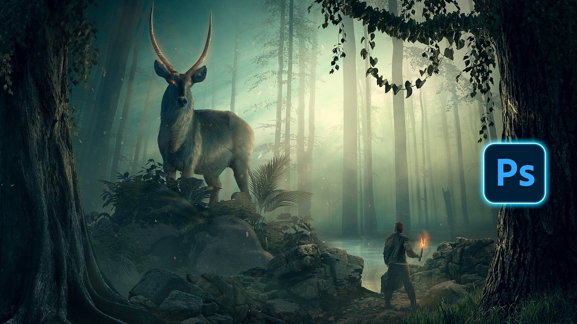
1. 1 intro: Hello guys, welcome
to the masterclass in advanced photo
manipulation techniques. In this class, we will go
beyond the basics of Photoshop. After finishing this class, you will learn the whole process behind creating this scene. We will learn how to
put images together to create a decent composition. This will be the
main structure and the organization of each
element into the seat. Then we will learn
how to correct the lightness values to
create depth into our Visual. Then we will learn
how to correct the saturation and the color, each element into our visual
to create a cohesive design. And next, we will learn how
to draw light and shadow. And finally, we will
put the final effects and the color grading using
the Camera Raw Filter. I'm so excited to
start with you guys. So lead the firm big gains.
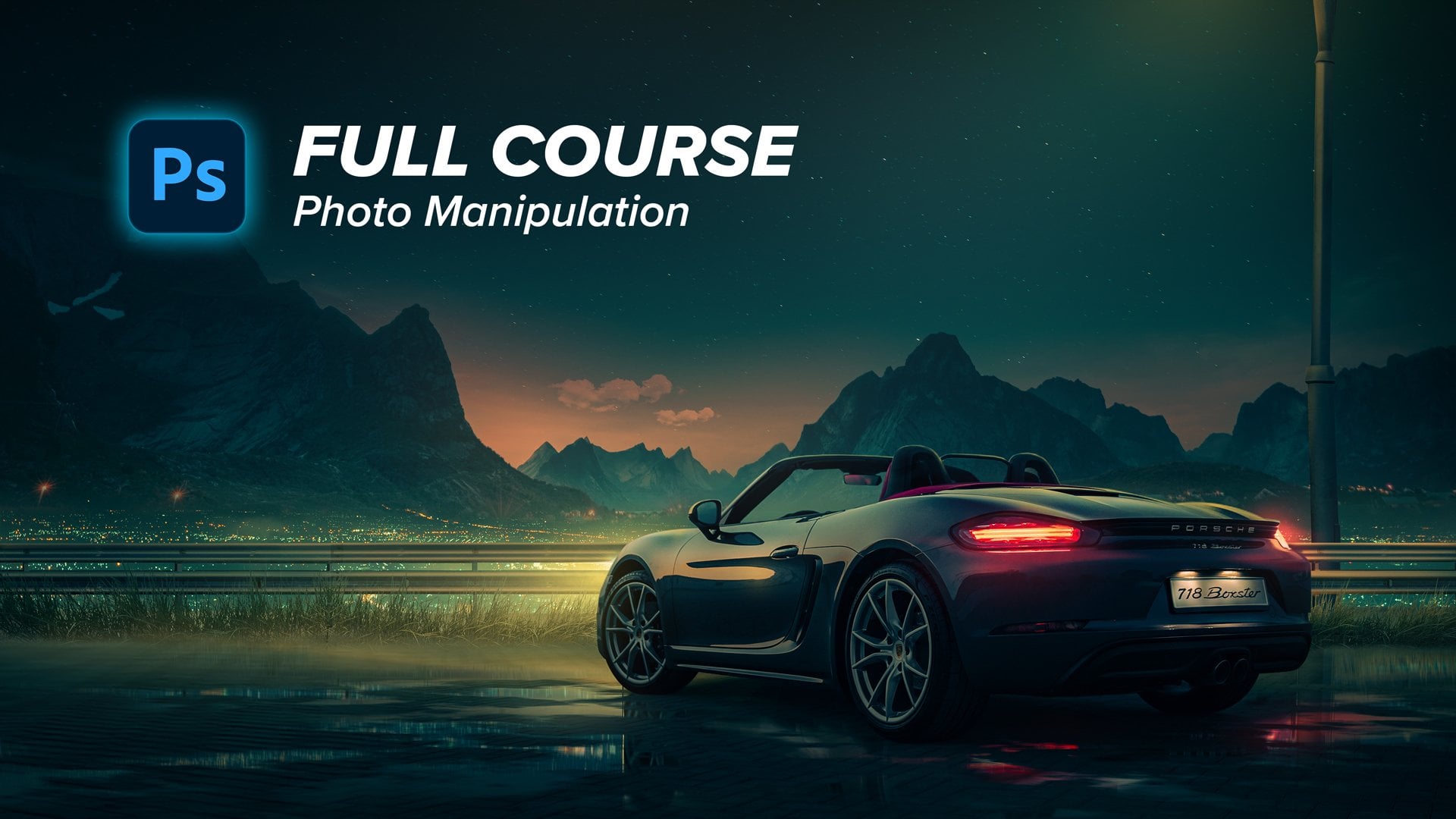
2. 1 Putting images together and adjusting the Composition: Alright guys, I encourage
you to follow up with me step-by-step to make the
best use of this class, you will find all
the stock images and the PSD file in
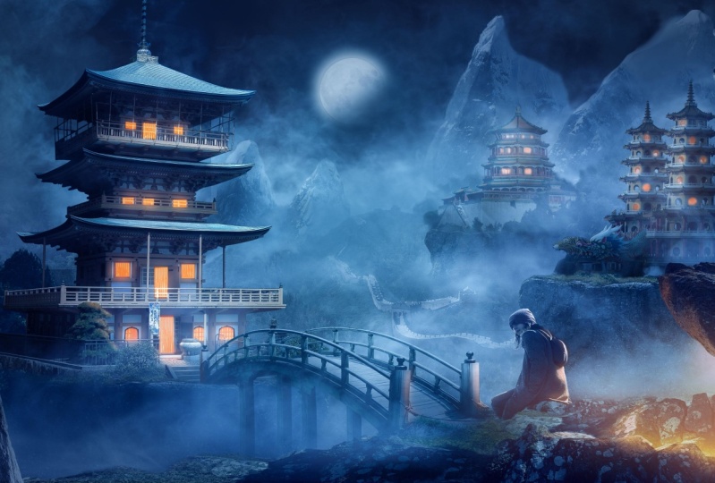
the description. Let's go. This visual is inspired by
the Chinese colored chart. So when I finished this visual, I wanted to create
several versions of it. And each version was with
different color grading, which tells a different story. So here is a neutral
grading, as you can see, and this one is more warm grading and it's
talking about something, let's say in the past or some
memories, something more. But this version is
more futuristic, more dreamy, and it
looks like fancy. And let's talk about the
inspiration from where I got the inspiration
for this visual. I have browsed art station. I like it a lot and I found
several art pieces like this. As you can see here, I
love this foggy effect. So I decided to
create this concept, as you can see here
is these grounds. It's the first inspiration. And secondly, I love
this color grading the gray tunes with a little
bit of blue, I love it. And the contrast between
it and the fires color, the orange color is really good. So I wanted to create it, as you can see here. So this is not the first result. I'm now showing you. First art piece, which
is not art piece at all. It's not good at all. I like to start through
images everywhere because I believe that artists
think with their eyes. So if you have an
idea in your mind, you can just execute it
quickly as you can see here, I put everything here and
there quickly to adjust the composition and to validate the idea itself if it's
going to work or not. We have already talked a lot. So let's jump straight
into Photoshop. I always start with
1920 by 1080 be canvas. And this is the full HD size. And let's press Create. Now, let's start
with this image. This will be the image
of the rocky land or the rocky surface in which
I will put the buildings. So let's make it bigger, like so I only wanted this part. So let's make it a whole
lot bigger like this. And now let's cut it and let's select this rocky part
with the pen tool. I will speed some parts
in this tutorial, assuming that you know
the basics of Photoshop, of course, you know how to
cut images using pen tool. So assuming that I will
escape some parts. And of course, if
there are some tricks, I will of course, explain it for you. But the easy and
the basic stuff, I will skip it. So let's just put some points
here using the pen tool. And let's, I know you're
already know how to cut images. Let's just keep this part. Alright guys, here is our
rocky surface after selecting. And it's all just
basic selection. But this part, I selected it and refine it by using a
grass brush like this. And let's make it a
little bit bigger, like so I'm just showing
you how did I adjusted and refine the edges of
the grass because it should have some texture. So I'll just make
it small and with the grass brush you can
find it in Prussia easy. I will just to
refine these edges. Simple as that. That's it. That's what, that's how I
have created this selection. So, and then creating
this transition, because selection is
all about details. If you want your
selection to be, to look professional, you need to pay attention to details. Very cool. Now let's make it, let's put it into a group
pressing Control G, and let's press Control
D to make it bigger. So I'll put it here and start to make it
bigger. Very good. Now let's get this
image of the building. I will put it above
the rocky surface, so all the images will
be in the description. And I encourage you to follow
up with me step-by-step. So now I'll use the pen
tool to cut this building. And it's very basic
and straightforward. It's just time-consuming. And I know that you
know the basics, so I'll just speed
up this process of cutting this building and
get back to you in a moment. Alright guys, here is our
building after selection, and I've selected it using
the pen tool and of course, I have refined these edges using the grass brush the
same way we did before. Like this will make it smaller. And just rotate it and
increase the flow. And they just
refine these parts. As you can see here. Because of grass pushes
should not be very sharp. Okay, now let's make
it a bit smaller. Put it above, right
above the rocky surface. We will worry about
the composition later, but now we will just put the basic elements
into our vaginal. So let's put a t, Let's refine the transition between the rocky surface
and the building. So I will just erase this
using the hard edges. Erase this part. And now let's start
to enhance the sport. Let's get back some parts here. And this transition,
I don't like it. So let's use the
grass brush too. Make it a little bit
more realistic. Like so. It's like some pushes are
growing around these surfaces. So I'll leave this Tears
part and this is good. Okay, now let's get
to the next element, which is the rocky part
in the foreground. As you know, of course, if you want to create some
depth into your visuals, you need to put some elements into the foreground
like this rock, like this shrug and like
this rock with the man, these are the foreground
elements and also this building, the mid ground elements, or these parts here
in the middle. The background elements
are like the sky and the mountains
and every layer. These should have specific
level of brightness. So the very four parts should be bought contrasty at
all and should be live, or the lightness
value should be high. The middle ones should be in-between and the
front or the foreground ports should be highest
contrasty and with the highest value of darkness or the lowest
value of brightness. So let's get back to our visual. Now let's select
this rocky part. Let's first be organized. I will put each
element into a group. Let's name it, because we will have a lot of
groups and layers. We don't want to miss this. So let's name this building one and let's put this
building inside it. And let's name this
the foreground. Very good. Now let's select the rocky part. And as you have gas, we will use the pen tool course. I will select it fastly
and get back to you. Alright guys, here's
our rocky part. I will just make it
a little bit bigger. So very good. Now it's time to try to
adjust the composition. So let's make this
building part a little bit bigger because it's a focal
point into our design. And let's, and let's create
another copy from this layer. Let's rotate it a
little bit and let's see how or where can we put it, I guess behind this one. And let's erase some
parts from this rock. So I'll just restore the Pexels that was
deleted from the mask. And let's erase these
parts because I wanted the rocky part to be a little bit
extended to the left. So let's erase,
get back this one, and let's erase it. Erase it properly. Giving attention to
details is what makes your visual professional
and looks cool. Alright, racist part. Very good. Now let's get our man image. Let's put it here and let's
flip it horizontally. And I will put this man
or this person below. But let's firstly select
it with the Pen Tool, select it and get back to you. Okay, here is our
guy after selection. Let's choose a specific
place for him to be n gas. This is not so-called. So let's put it here. Let's put this a little
bit up, scale it down. I'm trying now to find a proper place for
this person's image. I guess this is good. I guess we need to create
another layer of rocks. So let's just, but before that, I guess we need to erase
these rocky part because we cannot see the man or the person properly is
hidden behind this rock. So let's get rid of this
one bracing and let's move this guy a little
bit to the left or layer. Now, this is a proper
possession, I guess. Very cool. Now it's time to create a
rule of thirds composition. I will do this by
pressing View and then press into
new guide layout. And by creating three
columns by three rows, this will create this grid. This grid will represent
the rule of thirds. So we need to put our focal
points into these points, this one and this one,
this one and this one. These are the four focal
points in which we should put our main
parts of our visual. This will guide our eyes
or the viewer's eye to the main important
things into the visual. So according to that, I will just move this guy
alphabet to the left, move the building to the right, and now we're good to go. Now I'm trying to
build the composition, which is a very important thing because it's like
the foundation. It's the solid thing upon which we will depend into
delivering the mass. Let's move it and put a t.
Let's make it a bit bigger. No, I guess we will
lose the scaling. I don't like it, so
it's okay to put it not exactly into the focal
point right here. Maybe we can create
another layer for rocks. I guess. I'm trying now to find the proper place near the focal
point of the rural third, and also a proper place to be around the
surrounding rocks. So I guess we need to create
an another layer of rocks. I'll just duplicate this layer, put it behind everything. Now let's put it here. Very cool. I guess. Let's erase the other ports. I only want the sport. I want to just Iraq for the
guy to set simple as that. And I guess that's cool. And maybe we can erase
some parts from this rock. And now we're good to go. Maybe we can just put these portals little
bit to the right. And let's make the
rocky surface bigger. Now we are good to go. We are now applying the rule of third of
in our composition, which that ensures a good
composition, as you can see. Alright, now let's build the other parts of
the composition. I could have just
duplicated this part, right-click, Flip
Horizontal, and that's it. But I don't like it. This will be so
repetitive and it will not be good for
your eye, of course. And you can see a lot
of buildings with the same exact identical. This is not good at all. So I tried to find some new buildings which have the same vibes
but new ones. So it's this image. I found this image, which is pretty cool,
puts some variations. So I will just flip it horizontally and
put it right here. Of course, I will firstly select these balding
and get back to you. By the way, I will select this by hand tool as you
have already guessed. So I will select it quickly
and get back to you. Alright guys, here
is the building. After selection. I will put it right here. It took a lot of time to select this stuff, but it's okay. So I will just
erase these parts. Let's use the software
on the brush to erase these bottom parts. Like so. Select this brush. I will just faded from here. This will enhance
the intersection between the rocky
parts and the Bolding. Very cool. Now, let's duplicate
this building. The whole group we call analysts because we will
create another one, but let's put it
behind everything. Let's name it building
three and put it here. Of course, I will make it a
little bit smaller because everything gets smaller
when it's far away. And destiny, Very good. Now let's these parts. I don't like it. Of course, this part will be shown, so we need to redefine
selection of this part. We will do this, but after
selecting our building, we will get this new
building to put it here. Because as I've
already told you, I don't like to create
identical Belding's. This will be like so repetitive. I will select this one using the pen tool and
get back to you. Sue. There we go. Here is our building. Now let's try to fade the intersection between the
rocky part and the building. Let's put it here and with
the software and I will just erase these
parts from here. Very good. These parts also here and here. This part. Cool. And let's make the brush
bigger and let's fade these parts. Very cool. Now it's time to
refine these sports. I will get back some of these
Plants or bushes or trees. And I will just erase it sharply and creates a specific
shape for the plants. And then I will restore them back by using
the grass brush, which will give me some
texture in the edges. You can see, right? Well exists. As I've already told you. That's how I select
that plants part. Let's, It's also follow
the shape of the plants. Because even though if you
create a perfect selection, but the shape
doesn't look normal, is will not look cool at all. So it's time to put some
elements into the mid ground. Oh, let's get this image of the Great Wall of
China to put it here. And let's create a new
group pressing Control G, and let's name it
the mid ground. This part will be the place between the foreground and
the background elements. So I will just make it
a little bit smaller. And as you can see, this image is very
good because it's already having this depth and this hazing effect
embedded into the image itself or we don't
need to create it. And that's very good. So now let's select this
part by using the Pen tool. I will use it quickly and I'll, I'll not speed this part
because it's very easy. Selection, just selected
quickly as this, you can select it using
select sky option, but it's okay to be faded
and we will not see it. So I will create a selection, right-click make
selection and press Okay, and then create new mask, press Control I to
invert the mask. And let's put this midground
group behind everything. Very good. Now let's hear, I guess, maybe right here. Maybe we need to change the
building three possession, put a T here. And let's erase these parts
from the bottom here. I'll just erase them with a soft turn that pressure and
this intersection will be blended better after adding colors and herbs
and other stuff, so it will not be
visible like this. Now, we just want to
lend the image is smart, the colors or the lightness. Now we are trying to blend the shape and the form of
the images with each other. And then we will care about matching the colors
and the values. The other stuff, they'll
just blend this part. Very cool. Alright, now it's
time to add this image. It's also a midground
part, positive here. It has a hazing effect also. So let's put it right here, and let's put it behind the
Great Wall of China here. Let's put it here. And let's fade this intersection between two layers using
the software on that brush, I will erase this
part from here. You're also course. Very good, very, very good. Okay, now it's time to fade or to erase this
part from the sky. Let's increase the flow. And let's erase this part
because we don't need it. We only just want these
health Very good. Now it's time to
add the mountains. Picture, drag it
and drop it here. Let's put it right here. I guess we need to open
it into a new project. So let's firstly create a new
group and name it mountain. And let's open it into a new project because we want
to see our selection here. I will just select this by the
Pen tool quickly, like so. I'm just selecting it
quickly with the pen tool and then right-click,
Make selection, press. Okay, then create a new mask. And let's create a
solid color with a black color because I
want to see the background. And now what are you wanted
to refine the edges? I want to select also these clouds that are
around the mountains. So I will do this
by pressing into the mask and from the
Properties panel, I will press Select and Mask. And with the Refine Edge tool. I will refine these ports. Let's start with these cloud. The part from here. I will just Restore some transparent clouds that are around our mountain. Like so. And here
also these particles. Very good. Let's get back to
this part again. And if I don't like some parts, I will just press Alt
and restore it back. Story this part,
maybe I'll just press Alt and get it back to
its first selection. And this part also. Okay, feel free to
take your time. I'll just do this quick. Okay. That's it. I'll just press.
Okay, and let's get our image to our
project part here. Press Okay, and it's
change possession. Let's make it smaller first
and let's put it right here. Very good. I guess we need to
erase some parts from here. Maybe very good. Now let's press Alt and drag
it and create a new one. Put it here. I guess, let's choose this. I guess, very good. Now let's erase this part using the hard edge brush and
let's erase this part. Feel free to take
all the time in the world to create
perfect selection. Very cool. I guess we need to
erase this part from the mountains and
also from the hills. The mid grounds part also. Now let's erase this part
from the midground ports. Okay, Next I will bring
this image to use the sky. It's a dramatic
one, which I like. So I will put it
behind everything. I'll create a new group and
let's name it's caught. Now let's erase this part from the midground because
it's, doesn't look nice. So let's fade it and
erase it. Very good. And let's get back some
parts from the mountain. The sports, Let's erase it. Now I think we need to adjust the composition
a little bit. So let's make this part bigger. Let's put it right here. Now we're good to go. We're adjusting
everything in the goal. So don't expect that this is the final version
of the composition. Of course, we will
change things later, but this is the first step. So we may need to adjust
some parts here and there, even after finishing
the whole visual. So it's okay. Feel free to always
look at the picture was a fresh eye and
edit whatever you like. So next we will add some
other foreground elements. I will use this rocky image to create some foreground elements like this rock and
the foreground. These are just framing or visual and giving you some context
about the composition. So there are some elements in the near part and
the foreground, some other elements
in the background. So I will duplicate it also
on put this right here. Maybe this will create a
frame or a visual like so. Then let's erase this rocky
part with the brush or edges. And let's erase it. Like so. Very good. Very good. Now it's time to add
the bridge image. So let's grab this image and
put it here and right-click, Flip Horizontal, smaller and right-click and then
flip horizontal. And then let's make it a
little bit smaller, like so. Here is where it will be. Now it's time to select it. And it will take a ****
lot of time to select it, because as you can see, there are a lot of details. So I will just select, as you can see, this part, what I'm showing you now, this is the only part I will
select using the pen tool. That's it. But a tool take a lot of tie. Of course, because
these parts inside. And let's go. Alright guys, here is the
bridge after selection. As you can see, I've separated everything from the background
using the pen tool. And of course,
these grassy part, I've already used the
grass brush to select it. Let's make the brush smaller. Like so. This is the same way
we select grass every where in our visual. Ok, and now it's time
to refine this part. And to add some legs
for our bridge. So let's select this part using
the Polygonal Lasso tool. And then let's
press Alt Control, Shift and press into the mask. This will select
the intersection between the mask and the
selection we're doing now. So we're now just
selecting this part. And then let's press
Control J to create new layer with the
leg or a sport. Just put it here. So now let's erase this
part using the eraser. I'll just erase this part. Maybe the software and
the brush to fade it out. That's good. Very good. Now let's extend the legs. So I will just like
this and press Control C and then
Control Shift V. This will create a duplicate
in the same place. And then let's press Control
T to extend this part. Like so. Very good. And maybe we need to erase
some parts from here. Let's press Control E to
merge these two layers. And let's erase some parts. And then let's press Alt and drag it and put it right here. I just wanted to
expand this leg. And now we need to
duplicate these two layers. Put them behind the bridge. And this will be the four legs, as you can see here. Simple as that. We'll just bring everything
into a new group and then let's drag it and put
it into our main visual. Now let's make it smaller, and I will just
put it right here. Very good. Let's put it behind
the foreground, and let's name the group bridge. Very cool, Very cool. Now let's change the possession. I guess this is a
good possession. Maybe we need to
refine the edges to blend it better
with the rocks. So I will just create
another layer of these frogs or change its possession and
put it right here. This is another layer
of the rocks to blend the bridge better. Very good. Let's put it here and
let's erase some parts. Erase this part. And this part needs
to be erased here. And here. Very good. This part also. Now it's time to bring the moon image and
put it right here. I'll just put it right here, exactly in the middle. And let's select it using
the select object tool. But let's firstly the
product into the sky group. And using the
select object tool, I will just select it. Boom, Easy, BZ. Then let's create a
mask and that's it. This part, I guess needs to
be edited and building three. So I will just restore
some parts like this. Very good.
3. 2 Adjusting the lightness values: Now it's time to fix everything, because as you can see now, there are a bunch of images, but they are not blended at all. So we need to correct everything and match
everything together. So how can we do this? We will do this in steps. The first step we will
correct the lightness values. That image should have some
parts that have higher lightened his values
and some parts that are lower in the
lightnings value, we will define these parts and we will correct it together. The second step, we will correct the saturation because
as you can see here, there are some parts has a
lot of color like this part, and there are other
ports that has a very low saturated color like this port and also the
part of the mountain. So we need to unify
the saturation. And the last part, we will unify or correct the colors because
as you can see here, this image was
talking at the noon. So the colors are a little
bit towards the yellows. So we need to correct this
according to the mode. We want, the force step, we will draw the
light and shadows and distribute it to each
element into our Visual. And then finally, we
will put some effects like some lightness and
some final color grading. So I can't wait to do
this with you guys. So let's start. Firstly, we'll correct
the lightest values. I will create a new black
and white adjustment layer. This will show me only the
values of the lightness. So now I'm not
thinking about color, I'm not thinking about
saturation of all. My only concern is how
light elements are. So let's start
element by element. I will start with the sky, and I will use curves mainly
to correct the values. Let's create a clipping mask, and let's make this
a little bit darker. And let's open up the shadows. Like so, because shouldn't
be the contrast to be faded. We may create an S curve. This will add a little
bit of contrast, but not so much Very good. This is the first element. I guess we need to make it a little bit brighter
in the shadows. Very good. Now let's go to the mountain. I will select. Start with this one. Let's create a curves
adjustment layer, and let's create
a clipping mask. And let's open up
these dark parts. And it's darken up
the highlights. Like so. It will darken the highlights
and open up the shadows. This will decrease the contrast, and that's what I wanted. All these parts are very
far away, very good. And let's duplicate this layer and put it into the
other mountain. Very cool. As you can see here, it's kind of blending
with this cost. So let's get back to the moon because I want to
correct everything step-by-step going
from the far objects into the near objects. So let's correct the
lightness of the moon. I'll do this by double-click
into the layer. And let's create an outer glow. Let's choose the
right color, like so, and then press Okay, this will be outer glow and the inner glow will be of
course, another color. We will adjust this
later on just now, trying to get the values right. And also let's add
some color overlay. Let's choose some
desaturated blue, then press Okay, and let's
decrease the opacity. And then the moon is
blended in a good way. We'll get back to this next. Let's go to the building. This building. We will correct the lightness of the building and
the rocky serve. So I will just open the shadows a lot and let's
create clipping mask. And I'm trying now to match
it with the midground, the other midground part. Let's make it a bit darker. Like so. Maybe we can open up the
shadows a little bit more. And let's duplicate
this curves layer. And let's adjust it. According to the
surrounding parts. Decrease the lightness and. Let's increase the darkness
of the shadows a little bit. Now it's kind of blended better. You can think about
this like you are increasing the
contrast gradually. So the lowest contrast
will be in the sky. The mountains will
be more contrasty. And this building will be
like third grade contrasty. And then this is
the fourth grade. This part will be
the fifth grade, and this part will be
the very contrasty part. Can think about, about
it, like grades. Very good. Now let's create
the midground part. I will create the curves, and let's decrease
the lightness. Let's open up the
shadows and let's see if they are blended
together properly. I guess we need to decrease
the shadows and highlights. I guess now they are
blended in a good way. Very good. Now let's get to the
other foreground element. I will just duplicate this curves layer and
we'll enhance it. So let's focus in the part, in this part and the
right and the left. And that's all what I wanted. Very good. This part, maybe we need to open up the
shadows a little bit. We will get back to
this part later. For now. It's pretty good. It's pretty good to go. Make the highlights a little
bit darker and very cool. Alright, Next, let's correct the values of these building, building number to this one. So let's go to the group
building number to handle. Let's create a curves
adjustment layer. I will just open up the
shadows a little bit. Let's not forget to create
a clipping mask now, it's not too much. I will open the shadows,
but not too much. And I will also
decrease the price. Very good. Now let's do the
same thing into the building, opened the shadows a little bit, not so much, and let's darken everything very
good continuously. Try to zoom in and
zoom out to see the full picture up in the yellow highlights
a little bit, I guess, because I
want this part too be more contrasty than the
background elements. Very good. Now it's time to
work on building number one. So there are a lot of
blacks into the shadows. So the first thing I will start to decrease the lightness, end up in the shadows, a little dust, a tiny bit. And let's fix this point. And let's open these shadows a little bit and
let's apply it in. I'm now trying to decrease the lightness of
this middle part and try to maintain the details into the shadows
because what I don't want to low lose all the details
now it's time to do that same thing into
their rocky surface here. So just create a curves
adjustment layer, open it a little bit, create a clipping mask. Now let's talk a little bit in the mid tones and let's
darken the shadows. This is curve will
add some contrast. Very cool. Now it's time to do the
same thing into the bridge. But here, let's firstly, bright in the
highlights a little bit more because it looks dark. Now let's go to the bridge. I will use the curves. Of course, let's merge
everything by selecting them. Right-click Convert
to Smart Object. And now let's create a curves adjustment layer
and create a clipping mask. And now let's darken this, bridge this up in the
shadows a little bit. Not so much like this. Maybe we can put it here. Very good. And let's open up the
highlights and the mid tones, and let's darken it a
little bit to this. We'll add a little
bit of contrast. Of course, maybe we
need to decrease the shadows a little
bit. Very good. Now it's time to the
foreground elements. Let's start by the rocks. So let's start with this
rock and I write the top. Let's create a curves
clipping mask. And let's just increase the contrast like
this. That's it. Lab do a lot of fork here and also do the
same thing until this layer to the left will just increase the
contrast a little bit. And we'll do the same thing into this layer and the mid tones
and dark in some mid-tones. This will create
some contrast also. Maybe we can hear, decrease the lightness
a little bit. Very good. Okay, Now this guy image
needs a lot of work because the black of the
man is not totally black. So we need to darken it to make it black, not faded black. And let's increase
the contrast also. I guess this is good. Very cool. Now let's do the same thing
into the other rocks. Do the same stuff
for each element. Curves, dark and
the other curve. Let's create curves and darken. Very good. Now we're good to go. We have already corrected. But when we remove the
black and white layer, you will see that we
are missing a lot of things that needs
to be corrected. But for now, the lightens
values are good to go.
4. 3 Matching the Saturation: So we need to correct the
saturation of each element. Because as you can see here, some parts are having a lot of color are like this building
have a lot of yellow. The other building
has a lot of fuel. They jacket over the man
has a lot of yellow, some greens in the mid ground. So I'll correct desaturation
of each element. Try to blend
everything together. This will be made by the Hue
Saturation Adjustment layer. So let's start with the sky. This is the first layer. I will create a hue
saturation adjustment layer and create a clipping mask. And then let's press into
this finger pattern. And let's choose specific
color and drag to the left. As you can see here. When I choose science, you can see here,
here is science. And now I'm decreasing the
saturation because I wanted to create a dramatic sky
with low saturation, low blue, saturated color. So next I will correct
the colors of the moon. So let's decrease
the saturation of this blue color that we
have pot to the moon. And we will do the same into the inner and the outer
glow variable. Then press Okay, now this
moon part needs to be edited. So I will just
create a group for the moon and create a mask. And in this group, I will just erase some parts. I don't like how complete it is. So I will use the software
and brush and using the mask. And let's erase
some parts like so. So we'll make the moon like it's fading through the clouds. I guess this is cool. This is also in a
shell thoughts, maybe I will change it later, but for now, it's cool. Next we will correct the
saturation of the mountains. I guess the mountains
are good to go. We don't have a lot
of colors there, so the saturation
is pretty good. So let's go straight to
the mid ground section. This section, we will decrease
the greens of the plant. So I will create a hue
saturation person to this pattern and let just
press and drag to the left. Simple as that. As you can see here, when we choose specific color like this one and
decreasing the saturation, it blends in a better way
with the surrounding ports. Very cool. It's decrees these ions
and now we're good to go. Okay, now let's create a new application from
this hue saturation. And let's plot it. Press Alt and drag, and let's put it into
the other horizon layer. And it's good. It's not that much
effect, so it's okay. So next, let's go to
building number three. We lose a theme. Seeing into the building. I'll create a hue saturation
adjustment layer, create a clipping mask, and let's press and
drag to the left. Now, decreasing the greens, maybe I will choose another
spot to decrease the yellows. Yeah. I've chosen another spot now, decreasing the yellows
because as you know, the plants has three colors, has yellow, has green
and has some cyan color. So now, when I have chosen this yellowish, greenish color, just selecting the greens, but we need also to
select the yellows and to decrease its saturation. Maybe they're cyan salts. Very cool. I guess we need to adjust
this part little bit more. Let's get back to the curves to adjust the lightness
of the bone. That's what I was talking about. You will always go
back and forth, adjust the curves,
adjust the saturation. It will not be final. And that's totally okay. Now it's time to add
the hue saturation for these rocky surface. So just create a hue saturation. And we'll do the same thing. Select these yellows and
drag saturation down. Very good. I guess this part
needs to be edited. Great Wall of China. So let's get back to
the mid ground section. Let's go to hue saturation or forgotten to create
a clipping mask. So let's create it
and let's decrease the saturation of
these reds or yellows. The reds. That's better. Now let's go to the
building number two, we have a lot of
yellow color here. There is a vivid
colors in this image. So I will start
with these yellows. I'll decrease the saturation and maybe the reds also, I guess. Yeah, let's just decrease
the saturation of the reds and these greens and some Sans, I will get back some colors
because I don't want it to be like totally
missing the colors. Just to get back to this part and decrease the
saturation over these blues. And we're good to go. And let's do the
same thing until the rocky surface,
Hue, Saturation, drag and drag to the left, I guess it's already
desaturated, so it's okay. Let's go straight to belting
number one, our hero. Create a hue saturation. We need a lot of
adjustments here. So let's decrease the
reds and the yellows, and also the cyan or the greens. And also the science. So we have decreased the saturation of
almost a whole colors. We'll do the same
thing into the Rockies serves the Hue Saturation. Create a clipping mask and put it above the layer and
create a clipping mask. And let's choose the
greens and science. Yes. Maybe as a ellos,
yeah, this part. Now it's time to
go to the bridge. Let's go to the bridge
using the hue saturation. And let's decrease the
saturation of this part. This is some yellows, there are some greens,
you know what? I'll just go to the master. And it will decrease
the saturation of the whole image because it
doesn't have a lot of colors. Very cool. Now it's time to work on the foreground elements. I'll start with the guy. I will create a new group. And let's name it, man, because I don't want to miss
it again between layers. And now let's create a hue
saturation clipping mask. And let's decrease the
saturation of this image. This is the first one
at the top, right. Let's decrease the saturation. I will just duplicate this one. Duplicate it. Put it here. And let's see, this is the left bottom one. And let's go to this one. Will decrease the
saturation, not so much. We need to maintain some colors. And let's go to this one. Also decrease the saturation
and the final one. Now it's time to work on
the saturation of demand. So let's go to the
group, the man. Now let's create a hue
saturation adjustment layer. And let's go to the yellows. Mainly, the yellows needs adjustments because
it's very saturated. Now the image looks way
more blended and unify, but it's a lot vague. It's not contrast, it
doesn't have any colors. So that's what we will do next.
5. 4 Matching the Colors : So I'll do this by creating a color balance
adjustment layers. This is the easiest way to add color or its create
a clipping mask. And let's start with the
shadow will add some sand and some not so much because I wanted to be less
contrasty, low contrast. And that's it for this guy. Yeah, I guess this is the main color that we
want in our visual. Now let's work on the moon because I don't
like it actually. So let's start with adding some highlights or
the moon like so. Maybe you can get
rid of this Group. I will ungroup this layer, and I will just copy the
effects that I've already made. Right-click in the effects
and Copy Layer Style and then I will delete
it or clear the effects. Next I will create smart
object from this layer, and then I will paste
the Layer Style. By this, I can apply a mask
and maintain the effect also, because I want to go back
and force erase some parts and get them back again
until I'm satisfied. And this will not
be possible if I'm working on the original mass. So I'm now trying to
erase some parts, and at the same time I have some effects like the outer
glow, the Inner Glow. This now duplicated the layer. And let's go to filter
blur and Gaussian blur. By doing this, I'm just creating a glow and then I
will go to the, gets rid of these styles. I'll clear layer style
of the blurred layer. And then let's go to the blending options and
let's choose screen. This is only for creating
this glow effect, as you can see here is
before and here's after. Very good. Now, let's erase sports. Tell them. Totally satisfied. Very cool. Now it's time to go to the mountains to
correct the color. I'll add a color balance
adjustment layer and let's add some blues
in the mid-tones. Never, never forget to
create a clipping mask tool. I'm working on the wrong layer, so let's just
correct the colors. Add sands and blue,
and that's it. Here's before and here's after. Duplicate this color
balance and put it here. Now the colors are corrected
and as you can see, before, after, before, after. Very good. Now let's work
on the mid ground section. So I will start with this layer, great color balance
adjustment layer. And let's just start with
the shadows will add, I'll add some blues
into the shadows. Some science here is the effect, as you can see. But I don't want to
add a lot of color because I want it to
be a desaturated one. Let's go to these
great China wall and we will use the color
balance adjustment layer. The mid tones, add some blues. Never forget to create a
clipping mask at some sands. Maybe this is the tricky
tried to unify everything, work on the shadows at sands. Blues. Maybe some
measurement or no, I guess I guess this
is good to saturate. It needs some work. Maybe the highlights, I
don't like it actually. So let's try to do it again. So let's add some tiny amount
of cyan and the mid tones. I will not cut this part
because I wanted to show you that it's normal to not get
it from the first time. You can try correcting
the colors. And it's sometimes,
it can be tricky. So it's okay, take
your time and notice the differences and the
colors and add some colors. But little by little, you will correct and
the blend damage. Let's work on the
shadows at some, some blues like so. And maybe some greens. I guess, I guess this is better. Now let's do the highlights. Maybe add some sense, no. And some loose tiny bit of blue. Very good. This is working better. I guess we need to feed
this part properly. This is not faded properly. This is good. This part also we need to erase this part and fade it properly. Okay. Maybe we can correct the Curves. Open the shadows a little bit. Yeah. I guess so. That is way better. Now this part needs
to be edited. I don't like this part, so let's erase it. X0 to fade it better. Okay, let's start working
onto the building. I will start with the ground
or the rocky surface. And using the color balance, adding some blues in the mid tones and some sand
and maybe some greens also. The shadows, tiny bit of blue, tiny bit of sands. Not so much, and some
magenta, I guess. And in the highlights
will add some yellows, I guess, and some say ions. Feel free to try everything you can until you blend all the
images together. And remember that the
source image you are correcting its color is not
the same in the whole scene. So for example, this
picture was not the same as this picture. I mean, the source image
were not the same colors. So now we are trying to get
them to the zero-point. Never forget about that. So now I'm trying to correct
colors of the building. Add some sand, maybe some magenta and the
mid tones, and the shadows. At some blues and some SAS, maybe some greens, I guess, maybe very good and
the highlights, some loose, I guess, little bit, not so much. So let's keep the stool minus
five and we're good to go. I guess this is not bad. I'm not totally satisfied
with this part. I guess it needs to be
edited, needs some shadows. So let's create a curves
adjustment layer here. And let's darken
this part like this. And now let's draw some
shadows in this part. Faded a little bit like this. Very good. And now let's
present to the Mask and press Control I to invert the mask
and using the hard edges. Whereas the software
and that pressure will draw some shadows right here. And we'll select the hard edges, brush and create a hard shadow because our source of
light is the moon. And it will cast a hard
shadow because it's a small surface and it's very
far away from the Earth. So this is how it
should look like. Very good. And you can notice the shadows
of the moon in the movies. It's very sharp. Very good. That's better. I guess. Maybe we can fade the
sports little bit. And now we're good to go. Let's go to building number two. And let's add color, balance. Some sands in the mid tones. Let's go to the shadows, add some blues and some sands. Maybe some greens. Yes, and in the highlights, maybe add sands and some
magenta and some very good. We'll do the same
thing into the Rockies serves using the color balance. Create a clipping mask, maybe some magenta
and add some loose. This is very good. So go to the shadows at some blues and some sands
and we're good to go. Now let's go to belting
number one, our hero. Let's go to building number
one and let's create Karla are balanced,
adding some blues. Never forget to create
a clipping mask and adding some science
in the shadows. Do the same thing, blue and cyan, until I'm
satisfied with the result. Maybe some greens and I
guess plus two is good. And then the highlights, maybe adding some yellows
and adding some science. Maybe you can add some
blues. There it goes. Go to the rocky surface. Of course, you have
already guessed. Using color balance, I guess. I guess we can use the same one as we have already used
into the building. Let's go to the bridge. It's copy this color balance and put it right
straight into it. I will not edit this
color balance part. Maybe we can increase or decrease the blue's a little bit and let's
go to the shadows. Just increase the
blues and the shadows. And I guess we're good to go. Now it's time to work on
to the foreground parts. You can see how when we are organized, everything is easier. But you can imagine if we're not organizing
everything into groups, it will be a total mess. You would never find the
layers that you want it. So let's start with
this rocky surface, adding sand and lows
into the mid tones, the same thing into the shadows. I will make this Edits quickly. Lay with the greens. Let's go to the highlights at
some blues and some sense. Very good. I guess we can duplicate
this sport because it's the same source layer. As you can see here. That's very good. It's
just tweak some things. Decrease the blue's
a little bit. And that's good. Let's duplicate it and put
it here to this surface. And we can also put it
into the man's group. And let's put it into the rocky surface here
and the other rocks here. I guess we need to get back to the man image and
edit it a little bit. But now let's edit this part
of the rocks at some blues. And maybe the sport also
needs to be adjusted. I guess we need to
make it a little bit brighter because it's, the shadows are very dark. The rocks, the foreground parts. Let's get back to this port, opened up the shadows
a little bit and that's what I was talking about. You will always get
back to some elements and re-edit the values. Saturation. It's threats are, so
it's totally normal. I'll just edit the
lightness of this part, the rocky surface here, and it's time to correct
the colors of the man. So let's create a color
balance adjustment layer, and let's add cyan. Never forget to create a clipping mask and
add some blues. This will be in the mid tones, maybe some greens in the
shadows, add blues, sands. Some greens and
in the highlights also will add the same thing. Now as you can see, now, everything is kinda corrected. You can look at the
image and notice that everything is not
looking horrible. It's not bad. The colors are matching, the saturations are good, the values are not bad. You can feel the depths
into the design. But we need to color everything again because we lost
a lot of colors here.
6. 5 Drawing the moon lights & shadows: Let's start with
drawing the lights. Because we have now the first source of
light, which is the moon. And we need to distribute
and draw the light resulting from it into each
element in our visual. And then draw the shadows
resulting from the slides. I'll do this by starting with
the building number one. And I will create exposure
adjustment layer, create a clipping mask. And let's increase
the exposure like so. But as you can see here, when I'm increasing
the exposure, the color is now more saturated, which I don't like. So I will just change
the blending mode. It took them a nasty, this will change only
their luminosity and it will not affect the
colors or the saturation. Then let's press Control I to invert the mask and
using the brush, I will draw the lights. But as you can see here, maybe we need to adjust
the values of the light. Because as you can see here, this part has more light
than the moon itself. So this doesn't
make sense at all. So I will just
decrease the exposure until I get decent results. Now let's draw some lights
using the hard edges. I'm now using the hard
edges brush because the moon will generate sharp lights and this will
create sharp shadows. So I'm now using the sharp edges brush and I guess we need
to use a sharp edges. Here. Let's decrease the flow, the brush until 4%, and then let's draw
lights like this. And next, I'll make the brush smaller and erase the sports, which will be like shadows, but let's increase the flow. And let's erase this board. We want sharp shadows here. We don't want small
swans because this is, would be much more realistic. Let's erase these parts, I guess, I guess is now good. The shape of their light
should be like this. Yeah, it's better. Maybe we can feed
it a little bit. Not so much. Very good. Now let's decrease the
lightness a little bit. Let's draw some lights here. The software on the brush. Here. In this part, this part. Make it a brush better. Draw some lights here. It's very soft light effect. And let's erase it. Zoom in and zoom
out until you are or you are seeing
the full picture. And this draw some lights here, this part and erase some
parts to create some shadows. It's drew some lines here
and then erase most of it. Very good. Here's before
and the year is after. Okay. Maybe we can erase and
drove some lights here. Cool. Now it's time to draw some shadows which are resulting from the
source of light. I'll do this by creating curves, decrease the values, change the blending mode into living nasty to preserve the colors. And then press Control I and with the software
and blood pressure, I will just draw some shadows. Let's change the flow, decreases the Florida
alphabet and let's draw some shadows
into these parts, which should not have light. But be careful because
we don't want to lose all these details
into the shadows. To make it a little bit subtle, maybe we can change
the brush orientation. And let's draw some contact
shadow here and there. This is a different layer. I have already created a
duplication of this layer. And now I'm starting
to draw some shadows and decrease saturation and maybe increase it
so to that degree. And let's remove the clipping
mask from this layer. I guess from now, we can create some contexts
yet I guess we can get rid of all this part and
let's draw it again. So let's be careful here. Draw some contact shadow here. And this part will
not have any light. And this part also will
not have any light. Very good. Take all the time in the world. W are satisfied. Maybe you can put this behind, but I guess it's okay. This part draw some
shadows here and there. And let's make the brush bigger. And was the software on
that brush very small flow. And just draw some
shadows in these areas. To blend the shadows better. Very cool. As you can see here. Let's see, Here's before. The, here is after
the light and shadow. Here's before and after the
sharp decrease the opacity. And that's good. Now it's time to start
working until the bridge. The bridge will need
some work until the light and shadow. So let's firstly find a proper possession because I don't like its
possession right now. Yes. I guess this is good. And also, let's
create a mask and let's refine these
intersection between the row, the rocky surface and
the bridge itself. So I will just erase this part, make the brush smaller, and erase all these dark part. Very well. I guess
this is better. It's now intersecting. Now what I'm going to do is create a solid color
adjustment layer because I wanted here to
create a shadow that will affect all this part. So I will create, Let's choose this dark blue color and
press Okay, press Control. I and I will not
create a clipping mask because I want the
effect to affect on the, both the rocky surface
and the bridge. So let's decrease the flow of the brush and with
the white color, I will just draw here. So as you can see now, I'm now blending the two
parts with each other. I've changed the
color because it's very dark. Now it's girth. Let's blend these
Bartlett's make it darker. And now, as you can see, this is looking way better. It's blended in a better way. Maybe you can add
color to this part. I guess this part
needs to be edited. But let's let's move some
rocks from the upside. This part, It's I think
it needs to be uplifted. Bit higher. I guess this is good. Maybe like this. This is good. Maybe now we can delete these parts using
the brush and the mask. Here. Let's erase these parts and let's blend them
together properly. Year. Very cool. Now let's get back to the
bridge layer, a shadow layer. Now trying to blend the shadows into this
part. Not so much. And here we go. Here's before, and
here is after. It's now blended better
and it makes more sense. Very good. Maybe
we can decrease or erase this part. Beautiful. Now it's time to
add some shadows. I'll do this by creating
curves adjustment layer, though Curves Adjustment Layer. And let's make
everything darker. And let's change the blending
mode into luminosity. And let's create
a clipping mask. And oops, we're working
on to the wrong group. So I will just put this curve into the bridge group
and let's press Control I to invert the mask and using the hard edges brush, I will just draw some
shadows resulting from this bridge part. So because the lights are
coming from the top left, the shadows will be in the
bottom right, like so. This is, I'm now looking
at that source of light and concluding the
shape of the shadows. And let's change the size of the brush That's decrease it. And let's draw
some shadows here. And maybe even this
horizontal bar should cast some shadows to the root and
the other four here also. And this stick, this
one. Very good. This is better, I guess, as you can see before,
after. Very cool. Now let's work on the rocks. Surfaces, I'll do the
same thing, luminosity. This will create dark
shadows for the rocky part. And then let's duplicate
this one and put it into the other rock part. Maybe we can erase some parts using the
soft rounded brush. I will erase some parts. This will represent
the light and shadow. Drag the same layer and put
it into the other rock here. And let's draw some lights here. The soft round brush here and there on terror we
are fully satisfied. Guess this is good. It's copied and put it here. Also. Create a clipping mask
and erase everything. And then let's draw some
lights right here. Very good. The same thing will do for the last rocky part
at the top right? And I'll just draw some
lights right here. Very cool. Now it's time to draw some
lights into the Belding's. So let's start with building lumber to Curves
Adjustment Layer, and decrease the brightness. Create a clipping mask and change the blending
mode into luminosity. And now we will start
to draw the shadows. So press into the hard edges, brush and erase some
parts from here. Let's make this darker, like so. And then let's draw some lights or erase some parts
from the shadows. Like this. Very good. This should be sharp shadows was as I've already told you, the moon lights are
sharp lights and it will create sharp shadows. Very cool. Then let's create exposure layer to create the highlights. Press Control I. And
start to draw here. This part. This part. And this part here. Well, I guess we need to lower the intensity
a little bit. But it's okay here. And here. Very good. Go back and forth until
you're satisfied. I guess. You can see here is
before and here is after. Very cool. Let's erase some shadow
boards from here. It's very dark. Very good for and Daft. Alright, now it's time
to add the light and shadows for the
Great Wall of China. So let's go to the
midground group. And in this layer, I will create a curves
adjustment layer, the same way we did before. And let's change
the blending mode into luminosity to preserve everything other than
the lightness values with the hard brush. I'll just draw the shadows here, as you can see right here. And as I've already told you, I will use sharp shadows because the moon will create
sharp lights. And then we can feed
it a little bit. Basically, I don't want
the shadows to look soft. Very cool here. And this part will
not have some lights. And then we can soften the edges using the
soft round brush tool. Here, this part. And there you go. Take all the time
in the world to get the attention for details. For me. That's enough, I guess, because we will
add hazing layers. Later. Very cool. Now it's time to add the lightened shadow
for the building. Number three. You already know what
I'm doing right now. Curves luminosity and then create a clipping mask
because the same process. And then invert the mask using
the hard edges brush tool. And it's important
here to define the form of the building. So as you can see here, there are some planes
facing the lights, and others are not
facing the lights. And the transitions between
these planes should be sharp, as I've already told you, because this is the
moonlight, it's sharp, light. Very cool. Now let's
create exposure layer. Open up the lights like this, create a Clipping Mask
and press Control I to invert the mask. And then let's draw
some lights here. This part will be far away. So it's okay for me not giving a lot of
details right here. Let's make the curves, the shadows needs to be
adjusted a little bit. I think doesn't look nice. So let's soften the
edges a little bit. This will also break the
rule, but it's okay. Alright, next, we will
go for the mountains. There was a theme seeing what here we will not
have a lot of work. We'll just create a
curves adjustment layer up and the lights a little bit. Press Control I to
invert the mask and just hit some soft lights around
the edges of the mountain. This should not be very highlights here in this
part. And this part. Perfect. Maybe the sports, the clouds. And I guess that's it. Very cool. Let's duplicate this part. And let's work on
the other mountain. This part using the
brush, draw some lights. Now it's time to add
some lights to the moon. Let's get back to the sky group. Let's add some hazy lights. We will do this by creating
curves adjustment layer, and let's bump up the
lights like this. And now let's press Control
I to invert the mask. And let's draw some
lights around the moon. So this will give it
extra layer of low, of course, will change the
blending mode into luminosity. And that's cool. Very good. Next, I will create reflected
light in the Cloud. So I will duplicate this
curves adjustment layer, press Control a to
remove everything and then press Control I
to invert the mask. Then I will use blend F
by double-clicking into the curves layer and
up in this window. And then, and from the
blend if slider, from here, I will remove some
parts from the shadows, like so press Alt to
split the cursor. And I will just limit these
effect to the highlights. And then press Control I and
with the soft rounded brush, let's make the flow higher. With the soft turn the brush. I will try to draw
some lights that will be reflected from
the moon lights. You will notice this everywhere. Around the moon. If there is a cloudy day, you will have the moon. You will notice that
the clouds will be lit by the moon's light. So that's what I'm trying to do. Of course, it should
not be very high. Like this. Should be subtle. So let's draw some
lines here and there. Very cool. Yeah, Perfect. Okay. Next we will go to the man. We will. Joel's a light, the moonlight. So let's go to the foreground, and let's go to the Man Group. Now let's create a
curves or exposure, and it gets exposure. And then create a clipping mask, press Control I to
invert the mask. You already know the process. Now we are drawing the lights according
to our imagination. So as you can see, the light is coming
from the top, the top. So the top parts of the man, of course, we need to change the blending mode
to the monastic. The top parts of the man
should be led by the slides. So draw some lines here. That's very cool.
7. 6 Adding the foggy hazing effect: Now it's time to add the
hazing effect there, foggy effect that we needed. So how can we do this? We will bring this layer, this image of fog. This is an ordinary stock photo. So I will take this
layer for it here to our design and press Enter and change the
blending mode to screen. And then we will change its
color, pressing Control U. And then press
colorize and choose like this blue and
desaturate it. And maybe we can
make it a little bit less brighter like this. And then press Okay, this
layer we will use to create all the clouds or
the foggy ports for our c. So I will pick this
layer, put it here. I wanted here to
explain the places in which the foggy
part should appear. The foggy part or the
fog should appear at the bottom of each element. For example, in this area, here should have some Fogg's, this area should have some fog. And of course in this area behind the man should
have some fog. And this area should
have some fog. Because the fog and
the clouds should be surrounding the lower
part of each element, we will duplicate or pot this foggy layer here,
create a duplication. And let's put it in front
of the mountain group here. And this part, maybe
you can make it bigger. Like this. Very good school. And let's create
a mask and erase some edges from this layer. These hard edges
should be erased. And the lower parts, and let's duplicate it
and put it right here. Very cool. Now it's time to take this
layer and put it into the top of the mountains
because there are some clouds around the mountain, the source image itself. So we need to emphasize this. Now we need to
duplicate this layer. I guess we need to change
its possession and duplicate it and put it
at the bottom right here. And there is good. Now we need to duplicate this foggy part and put
it in the mid ground. This part will
have a lot of fog. So let's make it
bigger like this, and let's duplicate
it and put it here. Maybe we can make it smaller. And put it here. Very good. Let's decrease the opacity because the effect is too high. And let's duplicate
it and put it here on a lot of folk in
this mid ground. And my design, I
didn't like this part, the left jaw, I just choose to neglect doing it in
front of the camera. So I'm not doing it in our
design and that's okay. So next we will plot the fog effect in the
building three group. Let's put it here. Very good. Maybe you can make it smaller. Let's control TIM
potted, try tier. Very good. Maybe you can
put it above criteria, increase the opacity, and change the possession
until you are satisfied. Maybe we can mask it
a little bit better. Like this. Very good. I'm now going back
and forth until I'm satisfied and everything's
blended in a good way. Very cool. Now let's duplicate
this foggy layer to the building number two, let's put it here, increase the opacity, and
let's put it right here. And I guess that's it. It doesn't need a lot of work. Maybe you can make it
bigger and put it here. Very cool. Maybe we can increase
the saturation. I guess. That's a good, very good press. Okay. Now it's time to add
some fog for this part. I believe that this
midground section is not looking cool. So let's get back to the
mid ground section and let's create a solid
color adjustment layer. This is a new way to
create hazing effect. And I will choose this
color and then press Okay, and press Control I to invert the mask and do the
soft round brush. I will just draw some
hazing effect here. And this is in effect, will emphasize the fog effect and it will blend
it in a better way. Let's try it. Let's change the color. And let's try. I guess let's make it brighter. And as you can see here, when we change it and when we draw these hazing effects
now kind of blend it better. Let's duplicate
this layer and put it behind building number three. Press Control, Alt Backspace, and then draw in
this part again. This, this is the fog effect. I guess this is cool. Maybe you can make it brighter. And I guess this is better because you cannot see the
whole elements clearly. And that is what
fog effect does. This part and here and there, we're now trying to
fade it a little bit because this should
be very far away. Maybe you can change the color until we get a decent color. And let's saturate
the color alphabet. And now there's this. Good, Very cool. Maybe you can edit it later. But for now, I
guess this is good. Change opacity,
lower the opacity. And now it's good to go. It's duplicate this fog effect, the solid color layer,
and press Control. A. Don't forget to be on the mask
and then erase everything. And now let's draw
some fog effect. The building number two
and this bottom parts, the parts that are
a little bit far, but we will not make the effect. Hi, very good. I guess we need to
desaturate this part. Very good. Now it's time to draw some
fog effect into the bridge. Let's duplicate this layer, press Alt and drag and drop it, and then press Control
a Alt Backspace. And now let's draw some fog
effect in this bottom part. Here, the soft rounded pressure
and decrease the flow. And as you can see here, this is the shape
of the fog effect. And let's duplicate
this foggy layer that we have already used
in the other ports. And now as you can see, this is looking fantastic. Let's erase these
parts, the edges. And then we can duplicate the foggy layer and
make it smaller. Because I want the full gear to intersect with the
bridge itself. You know, there
should be some fog intersecting the bridge
itself that way. So let's erase
these sharp edges. And now here's the
before and here's after. I guess this is better. Very cool. Now it's time to add
some vignetting effect. I will create a curves
adjustment layer here, but it will be
behind the belting. Number one, let's decrease
the brightness and press Control I to invert
the mask and we will darken the edges. Because I think needs
to be darkened. This will frame our visual. So you know, these parts, Let's change the blending
mode until luminosity. Maybe some parts from
here, not so much. But as you can see
your before and after this vignetting effect, maybe make it a bit higher. And then let's erase
some parts from here. That's good. Very cool. This is better.
8. 7 Drawing the orange lights: Now it's time to draw
the main lights, the lie the orange lights that will be in the
building number one. But as you can see here, there are some black
parts in the building. This part is totally
black and it will not look good when
we draw the lights, the orange lights on it. So what we're going
to do now is that I will select this
part from the window and go to the building itself
and the building group here and press Control J to duplicate it and
create a clipping mask. And then I will put
this part here and this black section because I want some texture
into the lights. After drawing the lights, there should be some texture. But if we are drawing lights
in front of black color, there will not be any texture
and it will not look cool. So now I'm trying to
erase some parts. This part with the eraser. Let's make the eraser smaller. Erase this one. And this one. Very good. Let's duplicate this
one and put it here. And this black part, I guess we need to recopy it. So select it and then press Control J to
create a clipping mask. And let's move it and put it
right here. Press Control T. And let's extend it. Very good. Now it's time to
draw some lights. The easiest and the better way to draw lights for me is by
using the hue saturation. So I will create a hue
saturation clipping mask, colorize, and choose
specific orangey color. And let's open up the lightness and
increase the saturation. And this is good. Let's change the blending mode into maybe Color
Dodge or screen. Linear Dodge. I guess Linear Dodge is good
and screen is good. Awesome. So let's get back to screen. Screen is press Control. I. Maybe we can increase the
saturation lightness because we want to have vivid
orangey color. Press Control. I invert the mask. And let's draw the lights with that rounded hard
edges pressure. We can draw the lights
here like this. Press Shift to draw lines, and then draw like this. Here and here, there, we can use also the selection. This will be easier because
the rectangle selection, yeah, let's select this bar, press Shift and
select this part. And also they swim though. The bottom bar. Of course. This is much more easier. And these part also this one. And this one. Go up this window. And this one, this one. And this one. Maybe above here, this window. And this one. Maybe this one. And then press Alt, Backspace, boom, everything is late. But this, I don't
like this section, so I will erase it, I'll select it and erase it. Spark needs to be edited also. So I will just select it and press Alt Backspace
to fill it again. And it looks cool. I guess maybe we can fade
the selection a little bit by pressing onto the mask and then increase the
feather and boom. There you go. Now it's time to refine the
lights a little bit. This part. And this part. Very cool. Now let's duplicate this
hue saturation layer. And let's create a
clipping mask, of course, erase everything from the layer, press Control a and
then backspace. And now let's draw some. Of course I will
increase the saturation. And then with the
soft round brush. Let's change the blending
mode into color. Or Linear Dodge,
I guess is good. And then press Control. I endorse the software
under pressure. I will draw the glow effect. So you can see just
tiny subtle effect. Glow, not so much. Don't overdo this. It will not look good. Let's make the brush smaller
and just tiny touches. Really cool. As you can see here. Here is a glow effect. Very good. Now it's time to
reflect the slides into some parts of the building. So for example, here
in these plants, I will just draw
some plots here. Not so much, not so detailed. Just draw some through
some lights here and there to give context to
the direction of light. So there are some lights
coming from the right, then these bushes should have, should be let and this
part also should be late. And maybe in the
ground this section. And let's erase some
of these sports that will not have lights
in this part, of course, this stairs. That's it. Very good. Maybe some lights here. This bar. That's very good. Very nice. Now it's time to reflect some
lights into the bridge. Some rim lights into the
bridge will add realism. So I will duplicate this saturation layer and
erase everything from it. And press Control I
to invert the mask. And let's draw some
small rim lights here. Tiny bites. This will be subtle
effect, of course. Heroes. Very good. Now it's time to create
the other source of light, which will be in the
caves and the right. So I will create a hue saturation layer
into this rocky part. Shows this rocky part, I guess. This one? No. This one. Yeah. So here we will create a hue saturation
adjustment layer and draw the source of light, mainly the source of light, and then distribute the light. So our key it Hue Saturation, do the same thing,
increase the lightness, increases the saturation and change the blending
mode to screen. Press Control I to
invert the mask. Let's draw the source of
light with the lasso tool. Let's bring the Lasso tool
and let's draw the source of light should be
coming out of this cave. That's how I have imagined. So this is the source flat
will be coming like this. And let's choose
some foggy brush. All the brushes used
are from brushes. Now, okay. This will give
texture to the light. I didn't use the software
and pressure because it will be sorted that flat. But this will give some texture to the light. As you can see. It needs some work. Maybe we can decrease or increase the lightness
and saturation. Maybe. Yeah. Very cool. Now it's time to duplicate, or let's erase first parts to give it some
texture like this. This is good, and let's
duplicate this effect. Press Control I to
invert the mask. And then let's erase
some parts because there is the core of light should
have the most lightness. And then let's increase
the saturation. Maybe decrease the lightness. Because decreasing
the lightness, we'll make the color more vivid. Very good, Very good. Alright, now it's time to draw the lights into the
rocks themselves. So we need to duplicate this hue saturation layer
and create a clipping mask. And let's erase. Let's erase the mask. And let's double-click into the layer to use the
blend if sliders to limit the effect into
the mid tones, I don't. B equals this will
give me some texture. And then press Control I. And now let's draw the lights according
to our understanding and our analysis of the
shape of the rocks. So as you can see here, the light will hit this
part and this part also. Maybe let's erase these parts. Again. This needs some practice. So take your time and practice in simple shapes
at the beginning. Until you, are you
master this skill. This is drawing, this
basically drawing. So ana analyze what
you see and then drove some brush and
blend the edges. This part, and this part will
be lit by the light source. Of course, the further we go, the lower the intensity
of light should be. This slide should
have subtle lights. You can see. Now there are a balance between the lift orange and the
right orange color. And then let's distribute
the light into the bridge, create a hue saturation
adjustment layer. Maybe let's decrease the
brightness a little bit of this bridge because I guess it needs to be a
little bit more darker. The shadows also. Yeah. Now we can draw
the lights on it. Some subtle lights. So let's create a hue
saturation adjustment layer. Do the same thing we did before. Clipping mask and
then change the hue, saturation, lightness, press Control I to
invert the mask. And let's draw some
subtle lights here. Change the blending
mode to screen, and just draw some
lights. This part. And this part, this is bare result before, after. Very cool. Alright. Now let's get, let's get to the man's layer and let's create a hue
saturation adjustment layer. We need to duplicate this one
and then press Control. I. Of course we create
a clipping mask. And now Let's follow
the form of the guy. And let's draw the lights. This part here, here is leg. You need to follow the form, how the shape change
its orientations. This, this is what gives
your lighting realism. And draw, then erase. Very cool. It's changed a brush and to the
hard edges brush. And let's change the
flow into two per cent. This is I, I like this brush. Let's increase the flow. Yeah, we need to change the
brush to the real hard, just Prussia that said, let's decrease the
floor up to 2%. And now let's draw a lights. I like this brush because
it gives me some texture. It's not faded. And soft on the edges, sharper and gives me some
texture while drawing. Good. This part. So this part here and here. This should not be
like hyper realistic. This is just for giving
context for the viewer. Because when you see
lights drawn like this, you understand that
there's a source of light that is coming
from the right. That's what do we
need to unlock? Of course, be hyper-realistic
and the lights will not be 100% rightly rendered. Just for giving
some context about the light direction. Very cool. And of course, if you mastered
drawing these slides, so that would be great. But it will take you a lot
of time, Hill, lot of time. And I guess that's enough. Very cool. Here. And now we are talking. Let's draw some lights
into these rocks. Course. Erase them. And now it's good sign to draw some satellites into
the rocks in the foreground. So let's do this. Let's which one? I guess. This one. Yeah. This one is good. Yeah, this one. Let's create a hue saturation. Let's just duplicate this one. This hue saturation layer, duplicate it and create a clipping mask and
press Control a, remove everything per
sculptural I same process and draw
some reflected light should be very subtle. And let's duplicate this layer
and put it into this part. And let's draw
some other lights. Do the same thing. Here. This part of the rocks should be
hidden By the lights. That's why I'm drawing
lights right here. And it should be very subtle. Yeah, there we go. Very good. We're close now. Maybe we can decrease decrease
the lightness of the guy. Make him a little bit darker. Like so. Yeah. Because I don't like
when he was very bright. Now, it looks good. Now adjust the lightness,
solve them better. And now we're good to go. Very good. This part, I will just duplicate this hue saturation
adjustment layer and put it into the building
number two group. And it will not
take a lot of time. I will not, because this
is will not be clear. So let's just draw
some bytes here. Don't give it so much details. We need to remove the
clipping mask, I guess. Yeah, because these parts
are ready selected, so we need to remove
this clipping mask. And now let's draw
some lights here. And I guess this isn't
a math looking good. Now we need to make it random. Windows should not have
lights into a whole Windows. So let's distribute it
randomly like this. In this one and this one also. Maybe this one, yeah. And it's double-click increase
the feather a little bit. I guess this is, this
part needs to be erased. The edges like so. Let's erase it at all. Next, this, duplicate it. And let's increase
the feather from the properties of the mask and increase the saturation,
decrease the lightness. I'm now trying to see if it's
going to look good or not. Decreased capacity? No, I guess is this
is this is decent. It's not the best of us. This is decent, but
you've got the idea. Okay, next we'll do the
same thing into this body. The same process,
Hue Saturation, colorize, increase
the saturation, increase the brightness. And choose orange color, change the blending
mode into screen. Or maybe a Linear Dodge. Yeah, this is better. Then press Control. I on Joel some windows. I believe the S1 would
take a lot of time because take your time until
you get the best results. This one needs to
be adjusted here. And lights here else. I guess it's we need
to erase this part. The tricky part
here is the bolting itself has bright windows. That's why the light is
not good, looking good. So let's duplicate
this layer or maybe we can duplicate it and increase the feather of
the duplicated layer. See if it's good or not. Maybe you can decrease the
opacity to 40 per cent. Maybe that's not bad. You can take all the time the world until
you are satisfied. What I've already told
you that technique.
9. 8 Final color gradding: Now I guess we already finished. So what we're going to do
now is to color graded. And we will do this by
creating a new layer and press Alt Control Shift E to merge all the layers
into a new layer. And then right-click
Convert to Smart Object and now go to Filter,
camera raw filter. And this filter, we will enhance colors and change the grading. The first thing, we're
going to increase the temperature or decrease the temperature and
increase the magentas. Let's go to the calibration. Let's change these little Brian Murray
hue and saturation. Horizontal. You're satisfied. Maybe the oranges, let's, let's keep it as it is. Let's go to the Color
Mixer and the saturation. We will decrease the greens
because we have a lot of greens which is not good. Yeah, decrease their saturation. And maybe decrease them
a little bit more. Maybe the yellows increase the
yellows and reds, oranges. Here the before-after. This is a very subtle effect. And then let's go to the basics. So firstly, it's change
up and up the shadows, shadow parts, and then let's increase the contrast
a little bit. Exposure, I guess It's
leave it as it is. Highlights, increases
them a little bit. And let's go to the texture and carries
the textures a little bit. And the haze, maybe
again, the haze, it maybe increase the contrast
and decrease exposure. And let's go to the Effects, adding the vignetting effect. But it's not good because it's also affecting the rocky
part which is already dark. So I don't like it. We can create it manually later. So let's get this back to 0. So let's go to the
color grading. Let's increase the saturation
there. Why parents first? And let's go to the details,
increase the details. Next, we will go to
a color grading. This part I will
give some color to the shadows and give specific
color to the highlights. And this will unify and blend or image better
as you can see. Now. Now the shadows as
some bluish color. Let's make it a little
bit darker, like so. And let's make the highlights
a little bit orangey. And let's open
them up like this, or darken that down. Very good. Maybe you can increase the saturation
and the oranges. Now we're good to go, I guess. I guess that's enough. Maybe you can add some greens
then press Okay, very good. Here's before and here is after. Next, let's create a
curves adjustment layer. This using luminosity, I would create the
vignetting effect, but it will only affect
the parts that I want. Press Control I into the mask
and make the brush bigger. And let's draw. Darken the edges like so. This will frame our
composition and will make us focus mainly
into our focal points. Next to it can create a
gradient from the adjustments. Here, gradient. Let's choose specific,
some bluish color, this one, or maybe
they saturated one. Press into the radial, radial gradient and inverse it. And let's put the center into the moon part and then change
the blending mode into, let's say soft light, I guess, maybe
decrease, that fell. So seven per cent. Maybe we can change this
color into the saturated one. Yeah, this one will be better. Very cool. Before, after. It's a very subtle effect. Now and next, let's
add some glow effect. We can do this by creating a solid color adjustment layer
and using the color dodge. This will create glow effects. So let's choose an
orangey saturated color and this one change the
Blending Mode to Color Dodge. And its press Control
I to invert the mask. Let's decrease the
flow of the brush. And let's draw some glow around
these orange parts here. Some very subtle
glow, very subtle. Like this. This is very subtle, but it gives a visual some
tone, some color tune. Before, here is
after, this is cool, maybe you can create
a new solid car. Duplicating this
layer and change the color and to bluish
color like this one. This one dark one. Press Okay. And then press Control I. And let's draw some
bluish color into the dark parts and also into
some of the light parts. Here. Here. Here. This
color grading step is something you can do
according to your test. So this is subjective. Something that you, this
is this is how you think, how you think and how you want That designed to look like. Your opinion. And
each color grading will deliver a specific message. So here I'm now using the tones of the blue
and the orangey, the hazy, dreamy want. So here is design. Here's before called
grading and who you are is after Color Grading. Very cool. And that's it. Here is the final product. After tweaking a lot of things, as you can see here, I took my time to
create two versions. This Virgin was warm and the highlights was having some green tint and
some yellow tint. And as you can see, I took my time and this one
was like dreamy and fancy. And of course this
one that details in the visual is better than
we have already made. Because I took my time to
edit every tiny detail. This took me about
eight hours of working. So we cannot we cannot make
or tutorial like eight hours. This will be very long. I've tried to teach you the basic stuff and how
did they do things. And you can adjust every
tiny detail according to how can you see it
and the time you have. So that was it, guys. Thank you and see you guys. Thanks for watching. I hope you benefited and
most importantly, have fun. See you soon in the next
two classes. Piece.
 Nour Art, Digital artist, Youtuber