Transcripts
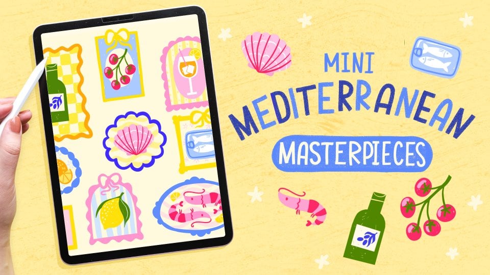
1. Intro : Great design can show up in the most unexpected places
like a simple sardine tin. In this class,
we're going to make our own s sardine tin
illustrations in Procreate. My name is Claire, I'm an illustrator and lettering artist in
Madrid, in Spain. Sardines are a
part of life here, and their beautiful packaging can be a great source
of inspiration. This class is a great way to practice your
linework, textures, and creative thinking all within a contained,
playful format. Sardine tins may seem
unusual as a topic, but they are packed, pun intended, with opportunities to
explore illustration, lettering, vintage packaging,
storytelling, and more. Along the way, I'll share some fun inspiration
from real sardine tins, tips for working more
efficiently and procreate, steps for creating your
own printed greeting cards and ideas to help you make
your design truly your own. I also want to pay some
extra attention to lines and line brushes and how
you can use them to add charm and character
to your illustrations. By the end, you'll not only have your own mini collection
of sardine tins, you'll also have
new techniques and knowledge that you can
apply to future projects. This class is suitable for both experienced and
beginner illustrators, because we're going to focus on your ideas and your
process first. I'm going to use Procreate
for this project and some of the resources will
apply only to procreate, but you can follow
along whichever way you prefer. Let's get started!
2. Why Sardine Tins?: Firstly, I want to
share a little bit of the history behind sardine tins because this is
super interesting. Fish in tins originated in the 19th century as a way to
preserve fish like sardines, entovies, mussels, and more. France, Spain,
Portugal, specifically, all have a longstanding
tradition of sardines in tins. And fish in tins is something that's
part of everyday life. They are everywhere and they are usually easy to recognize by their bright colors and sometimes even pretty
luxurious packaging. Sardines are celebrated
in numerous ways. They are an icon in Portugal. Lisbon is famous for their
decorative sardine tins that are also sold at souvenirs. In Madrid in Spain,
which is where I live, there is even a
sardine festival, which is centuries old. And Portugal also holds its own annual sardine
design festival. Sardine tints often feature retro topography ornate frames, vibrant colors, and include hand drawn fish or
fishing motifs. Each brand has its own
unique packaging design. However, you can spot some similarities
between most tints. You've got lots of bright
reds and greens and oranges, which remind viewers of the sunny seaside and the colors of the
Mediterranean summer. The illustrations on tins are often quirky vintage
or historic scenes, and the topography can be
elaborate, handwritten, or have a bit of an art nouveau feel depending on the tin, but it's usually elegant and rooted in traditional
lettering techniques. There's so much history
behind these tins, and they have become a symbol
and a popular souvenir. It's so fascinating to see
how art and design can turn such a simple product as tinned fish into
a centerpiece. You now see sardine tins
commonly on ceramics, tea towels, on postcards,
and much more. And it's not surprising
that they are now seen in surface design
all over the world. Sardine tins are a
really great source of visual storytelling
and inspiration. There are these
little small frames that can contain lots of detail. It's a really nice way to be
able to combine typography, character illustration,
packaging design, and much more into
this little shape. Drawing these tins is also perfect for exploring
your style, exploring lettering,
and they can be used for a variety of products
in surface design. I came up with the idea for this class because I made
a collection of tins for a client and I realized
when I researched this topic, how much there is to know about sardines and sardine tin
design specifically. I attached some
articles and info in this PDF guide in the
resources as well. In the next lesson, let's talk about what's coming
up in this course.
3. Overview & Resources: Before we get started, I want to give you a little
overview of what we're going to do in this course
and what you'll need. For your project, you're going to illustrate your
own sardine tin. In this, we'll focus on our shapes and
specifically our lines. This is design that we're going to be making in the next lesson, and I'll explain step by step what I'm going
to do in Procreate. I'm going to go over
the steps slowly, but some experience in
Procreate would be helpful, as I'm not going to
explain all the basics of how layers and brushes work. You can either follow along with me or make your own version. After that, I'll talk about lines and finding your
style with line brushes, and I'll give you some tips for creating with lines
in different ways. Then we'll create
another sardine tin. We'll follow the same process, this way, it will become a
little bit easier to do. At that point, if
you feel confident, you can change it up
a bit and I'll also give you some ideas for adding
your own style on this. I'm a big fan of printing and I want to show
you whenever I can, how you can take
your ideas out of the Procreate gallery and turn them into finished
printed pieces. I'll show you some
ways that you can turn this design into a
postcard after that. Lastly, I'll share the third
design Tin number three. This is going to be a
little bit quicker. I won't talk as much and I'll just leave you to follow along. As you can see, this is
a pretty long course. We're making these
three designs. You can pick and
choose which one you want to follow along with. But the reason that we're
doing three in total is because making this
a little series, a little collection is
incredibly valuable. It means that you've created a collection that
you can easily turn into a pattern or a collection of postcards
or stickers, for example. So this is really helpful
for your portfolio and cementing your drawing
process a bit as well. About materials, what we're going to use in this
class is, of course, your iPad and Procreate, in the resources you can
find a color palette. This is the one that
we'll be using, so make sure to download that. Then I'm going to use
some brushes from my liner toolkit for details because I want to show you how these line
brushes actually work. But they are not a necessity. In the resources, there
is a little PDF guide, and I have some info on default brushes in
procreate as well. So recommendations that
you can use instead. I'm also going to be using this basic monoline brush for basically the shapes and
the coloring in process. Lastly, for inspiration,
you can have a look at the Pintssbard which is full
of inspiration for colors, different themes and puns and just lots of ideas to
spark your inspiration. And all of the links for
absolutely everything is going to be in this PDF guide
in the resources as well. And lastly, don't forget
to share your work in the project gallery once you finish either do three
tins or just one. It doesn't have to be finished, even if you just started with
a mood board or a sketch, that is more than enough, just keep in mind
that you can share whatever you want in
the project cademy. In the next lesson, we're
going to get started. Make sure to grab your iPad
and your Apple pencil.
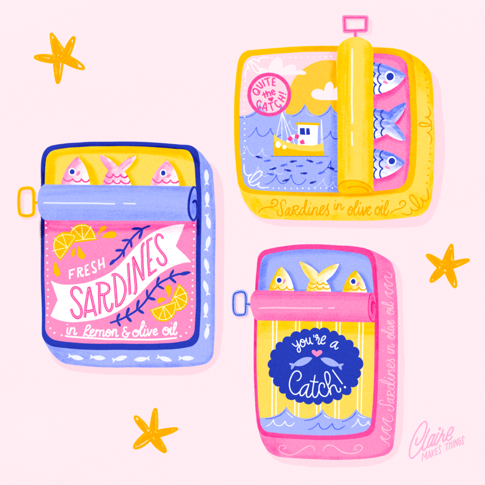
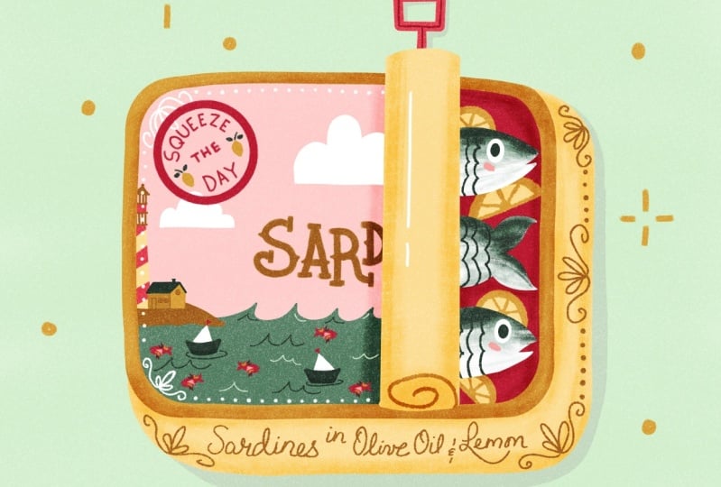
4. Tin I: Sketch: We're going to start with
our first sardine tin. This tin in yellow. We'll start with a sketch, and then after that,
we're going to build up our
illustration in layer. We'll start with the tin
and then add our scene on the packaging and our sardines and add our details
on top later. Let's start with a new canvas, 2,500 by 2,500 pixels. That should be big
enough to use this as a small print as well
if you want to print this. Something to keep in mind here, the color profile should be automatically on
display P three. If it's not changed
up because otherwise on RGB or CMIK the colors
will look a bit muted, so you won't have the
same result as me. Let's start with a sketch. I'm using a sketch liner
from my liner tool kits, but use whatever sketch brush
you're comfortable with. I'm going to turn on a
simple guide for reference. We first want to
create the outlines. This is the shape of our tin and we're making this horizontal And we want to make it look like this tin is opened slightly, and it's kind of this
antique opening, so it is a little twisty thing. That way we can see the sardines inside as well as
a little detail. And then we can add
some lettering, maybe some script on the side. That leaves us
with lots of space on the packaging to
add a little scene. Maybe something with a
boat and some waves. This is a little scene that you typically see on sardine tins because it's quite historic and it's like a small
town fishing boat. Then we can add some more
details, some flourishes. We have some space to
maybe add a little stamp. This is something
where you can add just a bit more
lettering so something that's on top of the packaging. That's pretty much it.
That's our sketch. In the next lesson,
we're going to start building our shapes.
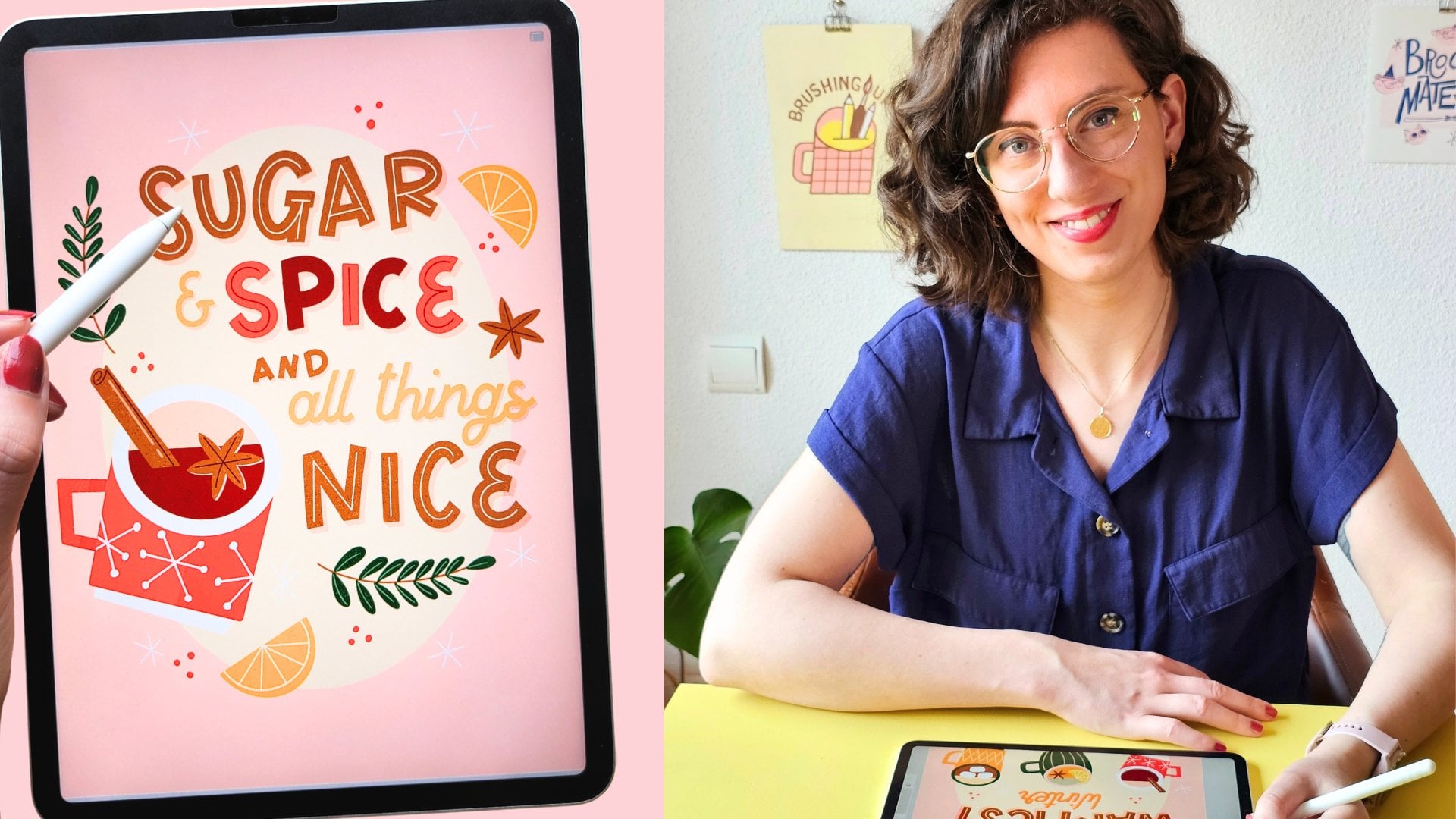
5. ✨ Update: Student Spotlight ✨: This is a bonus update
I've added to celebrate all the amazing
student projects that have come out since this
class first launched. I'm always inspired
by what you create, and hopefully this
will inspire you, too. A huge thank you to
everyone who has taking this class and shared
the project so far. If you haven't yet, make sure
to check out the projects and resources to explore
even more student art. If you're browsing, consider leaving a kind comment
or a compliment. It can really make
someone's day. If you haven't shared
your own project yet, I would love to see it
by the end of the class, whether it's finished or
still a work in progress. You can also ask questions there or on the discussions tab, which is where I share updates and anything of
interest in this class, too, and feel free to share your process with
me on Instagram as well. Since this class launched, I've also added a
new course that you might enjoy and a toolkit that comes with brushes and a tutorial to spark your
creativity even further. You can click the
Follow button or join my newsletter to stay up
to date on new releases. I also regularly share
student projects there. Thank you so much for being part of this creative community. Seeing your work is honestly the best part of teaching here. Now, let's continue with
the next lesson. O.
6. Tin I: Color & Shapes: Let's bring down the
opacity of our sketch. As I said, we're
going to start with the basic shapes with the tin. We're going to think
about everything that's going to be on separate layers. Everything that overlaps is pretty much on a separate layer. This way, we can add lines and textures in between in a
much easier way later. For building all
of these shapes, I'm using the simple
monoline brush. Use any smooth brush that
you're comfortable with. Then I'm using this
yellow for the tin. Make sure to add a new layer
underneath the sketch, and I'm going to show
you a little trick for making your tin. Making this rectangle
shape with round edges. Start with in one corner, drawing an ellipse or circle. Then duplicate that layer
and make sure to turn on snapping and then you can move that circle to
your other corner. Merge those two layers
and then duplicate that layer and then move that layer to your
other two corners. Now you can merge all of those circles and then
connect them by hand. I like to draw these
lines just free hand because it feels a little bit more handmade and
a bit like wonky. But you can make straight
lines here as well. A quick way to fill in
multiple shapes is by dropping your color
into your first shape and then the color drop tool at the top will show up and
then you can tap on continue filling and then tap on the rest to quickly fill in your shapes with
the same color. As we're going to be using this monoline brush quite a lot, I like to pin it
to my recent tab. That way it's always close and
I can easily find it back. If you're not satisfied
with your shape here, you can make adjustments in the selection
tool and then to warp and then you can change the outline of
your shape slightly. Next up, we want to make sure
to add depth to our tin. Let's duplicate
this yellow layer, and then let's select our
slightly lighter yellow. Turn our bottom layer to Alpha
lock and then fill layer. Now we can simply change
the size of that layer underneath to add the
sides of our tin. I'm making that bottom
part a bit bigger because our lettering is there and we want to give it
a bit more space. Then I'm cutting off these
curves a little bit. We want to make sure
to do that with our smooth monoline brush again. Tap on eraser and hold to make sure to erase
with the same brush. And that's the basis
of our ten done. I don't think we
need a drawing guide anymore, so we can
turn that off. By the way, in the actions
menu and then in preferences, you can see that I have my
brush cursor turned on. This means that
you can basically see the shape of your
brush on your canvas. I like to have this
turned on sometimes, especially when
we're working with different lines,
which we'll do later. That makes it a bit
easier to see where exactly your pencil on your
canvas is going to be. Next up, we're going to change the inside color of our tin. We're going to
duplicate that darker yellow layer again and then
turn that top layer to Alpha Lock and we'll
change the color to that light pink and then
with the selection tool, we'll make it slightly smaller. Then you can see
we've actually just created a line around our tin. This pink is going
to be the color of the inside of our packaging. And we'll use a similar pink for the background of our
little scene on our tin. But I want to make sure
it's a little bit lighter. Let's select something that's slightly lighter than
our already light pink. Then we'll just fill up
that half of our layer. I'm actually thinking
for some contrast, let's make our inside of
the tin a bit darker. We'll use that middle pink. Next up on a new layer, let's also draw
the rolled up part of our tin. I don't
know what it's called. That will be light yellow as well because that's on
the outside of our tin. For straight lines, you can simply draw the
line and then hold down your apa pencil to create straight lines with
the quick shape tool. And next up, let's
draw our fish. I'll make these a slightly
different colour, but the base will be white, so let's add that
on a new layer. As you can see, when
I open my layer menu, everything is really
organized on separate layers, so make sure that everything is kind of in the same place. And I think it's time we
can start on the shapes of our little boat and
our scene on top. On top of your pink layer, add a new layer and then
turn it to clipping mask. Now we can create on top of our pink in the
boundaries of that layer. Let's start with the
bigger shapes first. Let's start with that
sun in the background. By the way, as you can see, we're still using
the monoline brush. We're creating everything in smooth brushes so that
everything matches. And then again on a new layer, make sure to turn that
to clipping mask again. Every clipping mask
that you'll add on top will all be clipped to that pink layer and we'll
use that light blue for RC. I'm sure that you've
noticed by now, this color palette even
though it has nine colors, it is actually
just three colors, and then I added a darker
and a lighter tone of each. We're using a very
limited color palette, but we've got different
tones of each to play with. Then let's add our
clouds in white. I make sure to add this
on a new layer again. I actually don't think
we're going to make any changes to the
sun and the clouds. So I'm actually just
going to merge those two. Now let's start drawing the
basic shapes of our boat. I'm actually just going to
use the selection tool and then the free hand
option to draw a shape. That will also give you
really sharp edges, and it's a really quick way to draw without having
to use any brushes. Then just drop your color
into your selection. We'll do the same thing
with the white as well. And then I actually want to
use this slightly darker yellow on the top of the boat, but it cannot overlap
with the sun, so I'm just going to fix this by just making the sea
a little bit bigger. Then I'm just moving
everything up a little bit. And let's add a couple of basic details like these
guidelines or polls. By adding some simple shading with our second tone of yellow. I'm just selecting
the bottom half of that boat and then
adding that color. Then some basic little
windows in blue. And then for a pop of color, we can add this little
life preserver, I think, is what it's called
in white and red, but we'll just use
some dark pink for this as a little detail. Maybe lastly with white these small little
windows as well. I think that's our
boat pretty much done. And on another layer, let's add the handle
of this tin as well. Let's use pink for that. To make these straight lines, just creating a rectangle, holding down the upper pencil, and then the quick shape
toolbll creates straight lines. Now that we've got all of
our main basic shapes, let's change our background
color to the lighter pink and let's make it
actually even a bit brighter, something very subtle. That will also allow us to
add some simple shading. I'm just going to use
the pink for that. And then basically follow the shape of our tin underneath. And lastly, that handle, we could maybe also use a
bit of shading underneath. And this is our
sardine tin so far.
7. Tin I: Stamp Brush: Before we continue,
let's group our layers, just swiping right on all of these layers and creating our group to keep
things organized. What I want to add
to the little boat here is some little
sardines in the water. But there's going to be
quite a few of them. What we can actually do is
make a stamp brush so that we can reuse this little
illustration multiple times. Let's create our
sardine stamp brush. We can do that in
our same canvas, turn off your group and your background and then add a new layer and select black. If you have this liner toolkit, you can check this
croissant stamp brush and you can see that
every time you tap, you get this little
repeated element. That's what we want
to create as well. Use your simple monoline
brush and then make sure to use the whole canvas to
draw a simple fish, sardine. In fill in your shape with black because we want to
have one filled up shape. And We also need a
background for this, just fill another
layer with white. Go to the actions menu to
add and then copy Canvas. If you have the liner brushes, go to this croissant stamp, swipe to the left and then duplicate because we can simply use that stamp brush. If you don't have this, go to the plus icon to
make a new brush. And then go to shape,
import and paste. Now we created a stamp
with our new shape. We're going to make just a
couple of changes to this. Firstly, go to stroke path
and then turn up the spacing. Especially if you started
with a new brush, make sure to turn up the spacing and that will turn
your line into a stamp brush because
you're giving that shape lots of
space in between. Then let's go back to shape. Here in shape properties, you can see that you can
play with the scatter and that will change the
rotation of your shape. In this case, I want to turn the scatter on
just a little bit. Then most importantly
let's turn on the flip. Let's make sure
that it looks like the sardine is swimming in
two different directions. Next up in properties, make sure to turn on the
stamp previews that you'll be able to see your stamp
shape in the brush library, and then you can change the maximum size of your brush here as well if you want to. Lastly, about this brush, let's change the name of
our brush, of course, to make sure to
save your changes, create a new set
point and this way, your sardine stamp is saved. I'm just making this preview
size a little bit bigger. And now let's test it out. This is our new sardine stamp. We're going to use
this right away in our illustration so we can delete these layers and
then turn on our group again. Then let's go to our boat layer. Let's add our stamp brush to
this layer with our blue. I'm just tapping a couple of times so that we add
a couple of these. Then I'm also going to
use that darker blue just to add a few
different ones. That's a really easy way to add your little sardine as a stamp and that makes
it much easier to use. Of course, you can
easily do this by hand, but this is a fun
way to add it as a little stamp and have it saved as a pattern or
a line of sardines. We're going to be
using this sardine stamp in all of our three
tins in different ways. In the next lesson, let's
continue with our illustration. We're going to add some
details with our line brushes.
8. Tin I: Details & Lines: Now that we have most of our basic shapes and our
stamp brush as well. Let's add some details to our
tin with our line brushes. Let's continue with our C. We're going to add
some waves to this. Then I'm going to use
this retro liner. This has a bit of
a jittery texture, and we can use that
for our detail. We can use the middle
tone of blue for that. I'm just starting with
a few lines at the top. Then a couple of waves randomly
in the middle as well. I maybe for some quick
shading just like a line underneath the boat so it doesn't feel like it's
floating so much. Then perhaps with white, maybe we can bring down
the opacity a little bit, just a few more waves
and highlights. It really doesn't
have to be perfect. It's just to add a
little bit of interest. So we're just breaking up
that big block of blue. Next up, we'll just continue with our same retroliner brush, and we'll do the lettering
on the side of our tin. Let's add a new layer on top
of the first yellow layer. Then we need a darker
tone of yellow on top, maybe the darkest
yellow that we have. Then I'm roughly following
the sketch that we have. And this lettering really
does not have to be perfect. If you don't have any
experience with lettering, this is a great way to
start trying it because this lettering isn't the main
part of our illustration. It's just a little
element to our packaging. So it actually looks nice
if it's not that perfect. It kind of adds to the
whimsical feel of the tin. So I would say just try it out. And to the side of the tin, that's also add just a
couple of flourishes. They can just be
these little curls. They don't have to be perfect. They will feel more intentional if you just repeat them
a couple of times. And we'll add those
same flourishes to our seen on our tin, as well. So let's create a new
layer on top of our seen. And then with white, we'll also add these same
little curls in the corners. Aw that we have
these flourishes, we also want to add
a little frame to our scene on top of
our boat and our sea. You could either add a
line or a double line, more flourishes or for
example, this dotted liner. We'll just add that in white and add basically just
connect our flourishes. Let's also add a dotted line
on the side of our tin. I'm actually just going
to draw that by hand with the retro liner because
as you can see here, this dotted liner,
I specifically created this to add lots
of different colors. Every dot is a different color. But in this case,
I don't want that. I want them all to have the
same orange yellow tone. Let's continue with
our retro liner. We'll add some detail
to our little handle. I'm just using the
darkest pink we have and creating a line on
top of that handle. Next up, let's add
details to our sardines. For that, we'll do that
directly on our sardine layer. Let's turn into Alpha lock. You can do that by
tapping on the layer and switching to Alpha lock or swipe to the right
with two fingers. Then we're going to select
our dusty liner brush. This is a line brush
that has a bit of a well, dusty look. But if you turn up
the size to maximum, you can see this is
a bigger size and so we can actually use this
for coloring in as well. That's what we're going
to do for these sardines. Let's use our middle blue. I'm simply starting at
the top and creating this little gradient by adding a really soft layer on top and then using the opacity to tone it down a
little bit as well. We want to create this
textured gradient with blue and white. And then what's missing is
just a couple of details. So with our monoline brush, we'll add some ice. And then as a little cute touch, I like to sometimes add a little blush to my
character just with pink, just a little dots
on the cheeks. Because we've been using
this retro liner brush in our lines, we'll use that again to add
the lines on our sardines. Is it the gills? I'm
not sure what it is. If you have a lot more of these double line details
that you want to do, you could also use
something like this duo brush that allows you to do stuff
like that a lot quicker. You can also use that for
making frames, for example. What's missing from this piece is just a few more details, some shading and
some highlights. That's what we'll do
in the next lesson.
9. Tin I: Shading & Finishing Touches: There are still a couple
of things missing. So let's start with making this little stamp on
top of our packaging. I think we can use
our pink for this, something that
really stands out. Then we're going to use
this flat crayon liner that has a little bit of texture
and it has these flat ends, so that will be really nice
for our letters inside. What we can add here is
something of a detail, something that you would
normally see on a sardine tin, something like with olive oil and salt or something like that. But we could also
add a little pun, for example, a message that would look
nice on a postcard. As you can see here
on this packaging, it has this little stamp and it has something like
original recipe. So you can add what
you want here. I think I'll go
with a little pun, so something like quite
the catch, for example. I'll quickly do a little sketch
on a separate layer with the flat crayon brush
just to try it out. And this is a pretty small size, so I'm just roughly guessing
where everything goes. It doesn't have to be perfect. And I think this works. I'm going to do the final
version with the letters. And as you can see, this
brush has these flat ends. I really like that for
letters specifically, and it makes it a
little bit easier to read on a small scale. I think that looks good. I'll
just merge these two layers and then I'm just changing
the placing a little bit, so it overlaps with
our sea just a little. Next up, let's add some final details to
this rolled up part, the opening part of our tin. And this doesn't have
to be realistic, but we're just adding this
little curl or roll detail with a monoline brush, just so you see what the
packaging looks like. Before we continue
with our shading, I just want to merge
a few layers and that will make the shading
process a bit easier. Firstly, I think
this sun and clouds, I might just make
them a bit lighter. I'm just bringing down
the opacity a little bit. I'll just merge it
with this layer. Then let's select our
dusty liner brush. This is the one that we
use for our sardines, and we're going to use
this for our shading. We'll start with the
tin itself first. Those are the yellow layers. I'm going to merge the two
bottom layers of yellow. Let's add a layer on top
and then set it to clipping mask and then change the
blending mode to overlay. This is how we're going
to add our shading. With our dusty liner,
let's select black. I'm just adding a bit of shading around the edges so
it doesn't feel as flat and a little
bit on that edge as well and lower the opacity
of your brush a little bit, so it's more subtle. So as you can see, because of
the overlay blending mode, any shading that you add
here actually turns into a more saturated version
of your color underneath. Next up, we also want
to add shading in the same way on our
packaging on top. For that, you can either
merge more layers, but we can also turn
all of these to clipping mask and then on top, add our layer for shading. Turn that to clipping
mask as well and then set the blending
mode to overlay again. Then we'll do exactly
the same thing. We'll add some
shading underneath our sardines, so
they look less flat. And a little bit more
inside of the tin. Next, there would also
be a little bit of shading underneath that
rolled up parts on the top. I'm adding a little
bit there as well. By the way, for all
of this shading, you could easily use a smoother brush or
whatever brush you prefer. But I like that it
has a little bit of that dusty rougher texture. I like to keep my
illustrations quite flat and graphic a textured brush like this is a really
nice way to do it. Lastly, on top of I keep calling it that
rolled up part of our tin. Let's add a layer on top, a clipping mask and then set it to overlay and I'm just adding a little bit of
shading to the sides. The reason that
we're using overlay for all of this is just because we want to stick to that
limited color palette. This way, you're not
adding any new colors, you're simply saturating
your color slightly. That way you can also play with the intensity of your shading. You can change the
opacity a little bit. I'm just merging the two. Lastly, here with
the manline brush, I just want to add
a little highlight and you can do that
by just adding a line on top with the opacity
down just a little bit. I think by now our sardintin
is pretty much done. To make this a complete
finished piece. Let's add some little
stars in the background. This is optional. I just
like adding something extra. I'm using the flat
crayon liner to add these little sparkles or
stars with yellow again. I'm just roughly
coloring them in to give them much more
of a handmade feel. Lastly, what I always do to
add just a bit more texture. Again, this is optional is adding an overlay
texture on top. Add a new layer on the top, select black, and then I want to look for
a noisy texture. I like the one that you
can find in materials, and it's called noise brush, and you can use this
to simply fill up your entire canvas to give it that slightly noisy,
gritty texture. And then change the
blending mode to overlay. As you zoom in, you
can see that it adds that gritty quality and it saturates your
colors a little bit, just like we did
with the shading. Then I bring the opacity
down to about 40%.
10. Share your Work!: So we've added our
texture on top, and now's the time to make any last changes to
your illustration, any adjustments that
you want to make. And then at the very end, make sure to add your
signature as well. I'm going to use pink for that, and I'm just adding
it in the corner. And this is our
final illustration. Don't forget to export your work and share it in the
project gallery. Even if it's not finished, even if you just have
a sketch or whatever, I would love to see
where you create it. Now let's take a little
break from your iPad. And in the next lesson, I'm going to tell you
a little bit more about lines and line
brushes in Procreate.
11. Break: About Lines: Now that we've finished our tin, I want to give you
some tips about lines and how you can use
them in your illustrations. We've used a lot of lines
in our illustration, of course, and we use them
all the time in our art. But I want to show
you how you can use your lines
more intentionally and how that can actually change the feel and the look
of your illustrations. As you probably already know, with lines, you can
create shading, highlights, depth,
rhythm, repetition, movement direction,
and much more. But the way that we use them changes the feeling of your art. For example, static straight
lines convey order, stability, and it can create
a more graphic look as well. Round curved lines
can show calmness, kindness, comfort, and
they can feel organic. Sharp corners and lines can give the feeling of energy or
movement, but also danger. The same applies to shapes and patterns as well because those are made up of lines as well. Because of all of these
associations with lines, we can convey the
desired atmosphere and our art or show the
personality of something. The next time you
look at cartoons, it will become really
clear how that is done. So for example, villains, dangerous situations,
moments with lots of energy. They can be very angular, have sharp lines and shapes. Heroes, nice people or
calming backgrounds, they would have lots
of round shapes. Lines are always supposed to be intentional, even
if subconscious. The way that I use my lines
in my own personal work is by making them usually wonky, not perfectly horizontal
or vertical, imperfect. This gives this
feel of something being quirky, retro
and innocent, that has slowly over
time become part of my style and how I want the audience to see
my work as well. So the way that you use
your lines and details can become part of your style
and the more you practice, and the more that you think
about how you use your lines, the more that you can
use it intentionally. And that's what we did in
our sardine tin as well. Because of the lines
and the details, you make it special and you
give it its own unique look. We'll start with the
same shape and colors, but by changing the lines
and giving a detail, you get really
interesting results. As you can see here, we
use lots of soft curves, wonky lines, and that makes
it feel sweet and innocent. We really only use sharper lines in our waves and that's really just a creative
bit of contrast. But you can even see
in the lettering that we did those curves, the script, everything feels very sweet and imperfect and that really shows the personality
of our illustration. In conclusion, once you
understand how lines work and how you can manipulate them to change the look
and feel of your art, you can use it to your advantage and use it intentionally. You can have a look
at the Pinterest board to see how this is done. Most of these sardine
tin illustrations, they have lines that are used really intentionally
by giving it a really quirky and fun,
soft, innocent look. If something catches
your eye here, feel free to make a screenshot and add it to the project
gallery, as well. This would be really
inspiring to see. In the next lesson,
we're going to create our second illustration.
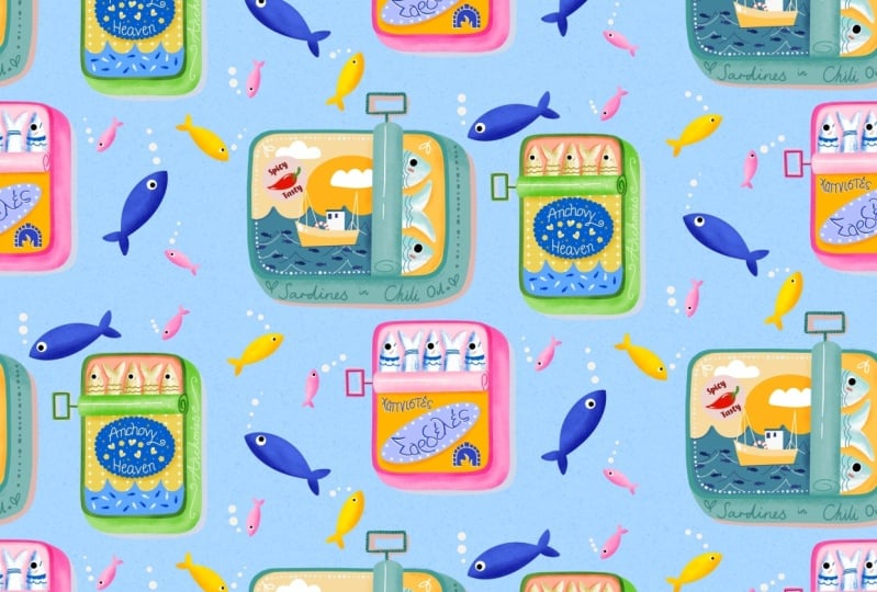
12. Tin II: Color & Shapes: But in this lesson, we're going to make
our second design to build our little
sardine tin collection. We're going to be following the same process and the same
brushes and color palette. You can follow along
or start thinking about making small
changes or lines. Either way, the second time should be a little bit easier, but I'll still guide you
through the process. If you haven't done so already, make sure to group
all the layers in your first tin because we'll
work in this same file on this canvas and we'll start with our drawing
guide and a sketch again. For safety, you
can swipe left on your first tin group and just lock it so you don't make
any accidental changes. This tin is a little different
because we're making a vertical format and
on the packaging, we'll add a little pun because this would be really
cute as a postcard, as a greeting card, for example. So we're adding our
three sardines again. Then for our lettering, let's add this big
oval and we'll use that as the frame
of our letters. There are so many cute
little ponds that you could add to this
fish sardine theme. I'm thinking of a
catch or something. Either way, pick
something that is short. If you want to pick
something else, just make sure that it's not
too long and that you can divide it into these two lines. Again, we'll add this
little C element, and there may be a little
pattern in the back. And we've got some
space on the side.
13. Tin II: Details & Lines: But let's turn our packaging, the pink roll part to Alpha Lock and then we can
add our little line detail. I'm turning the sketch
back to black that will make it easy to see the
details that we need to add. Let's move on to
finishing our sardines. For that, we're using
our dusty liner again. This time, let's
change up the color. Maybe we can make our
sardines yellow this time. Remember to color
them in by doing this little dusty gradient, start on one side, on the left, and then use the opacity setting to slowly fade out that yellow. Then with the monoline brush, we'll add our eyes with white
and then dark blue on top. I'm adding the little
cheeks with pink. And then with the retroliner
adding the final lines. I since we've got the retro liner selected, let's add the rest
of our lines here. We're adding a detail
to the handle as well. I'm just doing that on the
same layer with the dark blue. Let's finish up this side of our tin by adding our lettering, maybe with the lightest pink. My sketch is not quite
in the right place here, but since we've done it before, it feels a little bit easier
to just do this again. And just add a few more flourishes when you
have the space. And next up with the
retroline we're also going to add some lines to this C bits, just like we did
on our last ten, with some darker blue. And with some white as well. Okay, we're making
really good progress. Next up, let's add some
shading underneath. This will be our layer
underneath our tin. Let's use the lightest pink and then just with
the monoline brush, add a and then just add
some shading underneath. We're making it a
little bit more subtle by lowering the
opacity a little bit. Now there are just a few details missing like some shading. To make it easier to add
that shading on top, we're going to merge our pink tin layer with
the letters on the side. And we'll add our dark pink
layer to that as well. Then just like before,
add a layer on top, set it to clipping mask, and then set the
blending mode to overlay and we'll use that
dusty liner for this. With the opacity
just slightly down, we can add our shading to
the outside of the tin. We're going to do
the same thing to the inside of our tin as well. You can add a layer
basically in between our se layer and our
dark blue layer, basically of that oval because that's where we
want the shading to be. Turn it to a clipping
mask and then to overlay, and then you can add your
shading inside the tin. Well You can also add just a little bit to
the packaging on top. Lastly, we'll do. We'll add the same shading to the
very top of our packaging. Add a clipping mask
to this as well. For a little highlight, we'll use that monoline brush. I'm just adding this
little line on top. For some texture,
let's add a layer on top and then we're going
to add our noise brush, which you can find in materials
and then noise brush. Let's select black and
fill up the entire canvas. And then set the
blending mode to overlay and turn down the
opacity a little bit. Now we've got our
gritty texture on top. And that's our second
design finished. Just like in the
first tin, you can add something like
little stars or sparkles around your sardine tin as well. That is optional. Don't forget to add your
signature, of course. Towards the very end,
I'll also show you how to actually put all your sardine tins together into
one composition. But if you just followed
along with this one, this is going to be
your finished piece. I hope that you had fun
in this lesson and I hope that it felt a little bit easier the second time around. Don't forget to add this result to your student project as well.
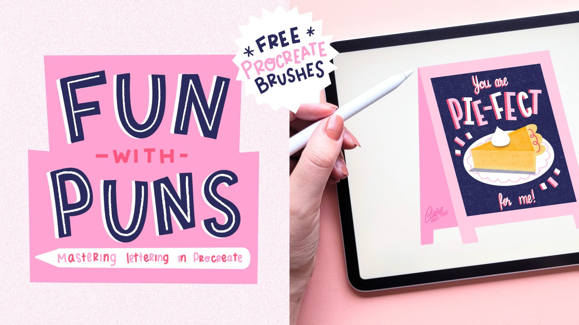
14. Tips for Printing: I quickly want to show you what your illustrations could
look like as a postcard. This is completely optional, but I just want to
give you some tips. I love taking what I make out of the Procreate gallery and turning it into
something tangible. Printing is so fun and it is really satisfying to see
your finished art on paper. You could turn your sardine tins into printable
postcards like this or stickers or any other product in the world of surface design. You can make them for yourself
or give them as a gift, and they're really great way to practice your printing skills. I simply took this
to a local printer. You don't really need
any experience for this. All you need is either
a local printer close by or a printer at home. What I want to show
you is how you can turn your tin into
a printed version. I'll show you how to do this with the first tin that we made. Let's open that group and
then I'm going to turn off the stars in the background and the background color
as well. The shading. And then that little
handle because that would be really
difficult to cut out. Then we've got this
texture on top. We do want to include
this in a print, but we need to make sure that
we have a cut out of that. For now, let's turn
the texture layer off and then go to the actions menu and then
to add copy Canvas. And then paste. Now you've got your tin on a separate layer where all the layers are merged. Let's add that to our group and then underneath our overlay, tap on your tin layer and then select and then we'll cut
out our texture overlay, duplicate that layer
and then cut and paste. Then we'll turn that
selection back to the right blending mode to to overlay and then with
the opacity down. Now we've got our
texture overlay on top that is only visible
in our sardine tin. This is what we're going
to use for our postcard. With only these two
layers visible, let's copy our canvas and then we'll make a new canvas
specifically for our printing. I'm just using the screen size. That's the first one at the top. That one is big enough
for a postcard. And then to the actions
menu to add and then paste. Let's move our tin to
the top right corner, and then we need to
make a back as well. Duplicate that layer,
turn it to Alpha lock, and then we'll fill that
layer with our yellow. That's the color of our tin. Then let's go to the selection
menu and flip your canvas, turn on snapping and then we can move that layer to the left. What you've done is
basically create a symmetrical shape so that
when you fold this card, you'd have the back of
your postcard as well. Then all we need to do is just connect those two
layers a little bit. Otherwise, there's
very little space there to fold your card. I'm just adding a
little rectangle there. Lastly, on the back,
we've got some space to maybe add our signature. You could also add, for example, your social media handle. I would always suggest if you're selling your cards
or giving them away, just add a little signature or something because people want
to see where it comes from. That's basically it for
your printed version. You could export this as a PDF. That is what you
would usually use at a local printer and fast
forward to the printed version. As I said, I just took
this to a local printer and I use some thicker
paper for postcards. And all this I'll
have to do now is to fold and cut our card. I'm just using a ruler and
just making a little indent in the middle and that
will make the folding a lot easier to do and
a lot neater as well. Then I'm just using scissors
quickly to cut at this card. If you want some more tips on how to print your
greeting cards, in my really short class
procreate to print, I give you more tips on
different routes you can take and how you can print
your procreate files. This is the final results. If you do any kind of printing or perhaps even just a mock up of your sardine tin in some kind of product, I
would love to see it. So don't forget to add it
to the project gallery.
15. Tin III: Color & Shapes: In this lesson, we're going
to make this sardine tin. By now, you probably
know the process, feel free to give
it your oat spin and make any changes
if you want to. By the end, I'll show
you how to add all of these to your final
finished illustration. Make sure to group the other tin here
if you follow along. You can keep that
overlay texture separate because we'll need that for this specific sardine tin as well. Then we can lock all of those groups so we don't
make any accidental changes. We're going to start
with our sketch on a new layer and I'm going to turn on the
drawing guide for that. The shape of this tin is
a little bit more square, so just a little bit wider than the narrow tin that we made. I'm going to add our
three sardines inside. This one I just want to
keep a little bit more classic with lots of natural elements and then and then we'll add some
lettering as well. Maybe something
like fresh sardines in lemon and olive oil, and then we can add some
leaves and some lemon slices. So lots of color. Feel free to change it up here
if you want to. You can simply follow the same composition
that I'm using but add something like a pun or something personal that
you would like to add. And because this
is just a sketch, we can cut and move stuff
around in the composition. A to the side we've got some space for either
flourishes or maybe that sardine stem brush that we made, we
could use that there. Now we can turn off our drawing guide and bringing down the opacity
of the sketch a little bit. Then on the new layer,
let's start with our tin. We'll use the monoline
brush and our darkest blue, and we'll start
with our tin shape. Let's start with our circle
in the left hand corner. Duplicate that layer, and
then with snapping on, move it to the right, merge that layer, duplicate it, and move the second layer
to the other two corners. Now you can merge those layers and now you can
connect your circles. No. It doesn't have to be perfect. We can fix it a little bit with the warp tool in the transform menu to change
the shape a little bit. And then let's fill
in our shape and then continue coloring to fill
in the circles as well. H et's make the rest of our tint. Let's duplicate that layer and then turn the bottom
layer to Alpha lock. Let's use that
other tone of blue. Fill that layer, and let's
see what that looks like. I think there's not
quite enough contrast, but let's just finish
this up for now. Let's connect those
two layers and then we might change the
tone of this blue. Let's see what that
looks like with our lighter blue. I
think that's better. Let's continue. Let's
duplicate our dark blue layer, and let's fill that
with our pink. That will be the background
of our packaging of our tin. Then the inside, let's
use another color. Let's fill that with
our light yellow. Then on another layer
on top, of course, we need that open part of our
tin, so the rolling part. Let's use light blue for that
in the color of our tin. So now that we've got the
basic shapes of our tin done, let's add the handle as well. And now we can add our
sardines in white. Let's add a layer on
top of our pink so that we can start on our packaging. Let's first make this banner. Let's do that in white to
create a bit of contrast. We'll fill that in with white. Now let's add our
lettering on top on a new layer with
our darkest pink. I think that would
look nice. I'm just using the monoline brush for this something with sharp lines to make it just easy to read. It doesn't have to be
perfect because we can still make some changes to this with the transform tool. E. I'm actually just using
the warp tool just to make sure that it's placed just a little bit better
inside that banner. Then a little detail
that we also added in our other sardintin is by just cutting off the
edges of our letters. Now that the base of
our lettering is done, to add just a little fun detail, we can add an in line to this. We'll use the troliner
for that and then white. This will be on a
very small scale. It's just a really thin hairline stroke in the middle
of the letters. But from far away, it looks
like a nice little detail. That's our main lettering done. Let's continue with the
rest of our letters. Let's add those in white, and we'll go back to the
monoline brush for these. I'm very roughly
following the movement, the curve of the
banner for fresh, and then cutting off the
edges of the letters. At the bottom here, we could use a script just to
change it up a bit. I think it might be
a little too big. I'm just changing the
scaling you know, and then adding a
line underneath. Then just cutting off
those edges again. Even with really simple
script like this, I'm certainly not an expert. Just cutting off those edges
just make it feel a lot cleaner and easier to read
from a distance, I think. You can still move
those layers slightly if you feel like you just
need a little bit more space. Let's also add a frame
around our lettering so is following the lines of our
tin with the dotted liner. You could also add
flourishes here. You can also just
add a simple line, for example, following the
line of your packaging here.
16. Tin III: Details & Lines: H. Let's add the final details. So we're going to add some
lemon slices with yellow. We can just duplicate these
and rotate them slightly. I'm also adding these
little droplets. These are just little
things to add to fill up the space and
add to the composition. Then these simple leaves
with this dark blue follow the shape of
the banner as well. At the moment, the lemon slices look a little bit too basic. So we're going to use
the retro liner and add some lines on top and white. Let's make it a bit bigger. M We've got some space
on the side here. So I would really like to reuse that sardine stamp brush
that we made earlier. We can add that in a line. So just make sure to add
that on a separate layer. And then we can bring down the opacity a little bit
of those little details. Et's finish up our
sardines next. Let's turn that layer to alpha. Remember two fingers swipe to the right and then
with our dusty liner, let's color these
sardines first. Let's use pink for this one. I remember to add
them a gradient, more pink on the left
and then slowly fade it out using the opacity of
your brush to a white. And then with the monoline
brush, we're adding our Is. And little cheeks and then with the retro liner,
our final lines. Maybe in the darkest
pink that we have so that we reuse that
from our main lettering. Let's also add a
line to our handle. And to the top layer
of our packaging, let's add that little
rolled up detail that line, so it looks like our
tin is being opened. Now onto the shading, let's add our layer
underneath the tin so that we can add our pink shading
with the monoline brush. Then for the shading of our tin, let's add a layer on top of
the blue part of our tin. Then to overlay, set
it to clipping mask, and then with the dusty liner, we can start adding a little
bit of shading to the edges. Remember that the opacity
is down a little bit, so it's just a bit more subtle. And we'll do the same with our pink layer as well
and inside of the tin. Let's add a layer
on top of the fish. Set it to overlay
and now you can add your shading in the tin as well. We'll also add a
little bit of that on the pink packaging. As a little detail, we also want the shading to be
visible on our banner. But with whites, the
blending mode doesn't work. Let's add a layer mask to our white layer and then simply use the same
dusty liner there, so you have a little bit of shading on your banner as well. For the last bit of shading, add a clipping mask on top of the upper part of your packaging and add some
shading to that as well. I don't forget to add a little highlight
with the monoline brush. For the texture on top, you should already
have that noise layer. If not, you can
add it here again. And then I'm just bringing
down the opacity a little bit. That's it. This is our third sardintin
illustration finished. And you Make sure
to group all of your layers if you want to
finish your illustration here, make sure to add your signature and add any last details
that you want to. But after this, I'm going to
show you how you can take your three tins and turn them
into one final composition. Let's go back to Tin number one. What we want to do is make
a merged copy of this. Make sure to turn everything
else off and turn the background off as well and then go to
the actions menu, add copy Canvas, and then
on a new layer, paste. We're going to do the
same with our second tin. Deselect all your other layers, including the noise on top. Actions menu, add copy
canvas, and then paste. Then third, do the
same thing here. Copy Canvas and paste again. Now you can turn the background
back on and we've got our three tins on merged layers. Because we're going to
be moving these around, we want to make sure we don't do that with our original groups. Now we can scale these three tins up and down and move them in
our composition. Because I make three
distinct shapes, these look quite nice in
a composition like this. I just play around and see what composition
you like the most. Remember in the first tin, we added these little stars. We can add those in our composition to fill
up the anti space at. Make sure that your signature is visible or added here again. Lastly, we can turn on the
noise texture again on top. Make sure to export it and don't forget to share it
to the project gallery. That's it. This is our
final mini collection of sardine tins done.
17. Final Bits: You made it to the end.
Congrats! Thank you so much for checking
out this class. This topic was so fun for me to work on because I'm really
passionate about this, and I really hope that
you enjoyed it, as well. Feel free to send this course to fellow artists or creatives if you think that they'll
enjoy it, as well. I also added a short
tutorial to YouTube so that those who are
not on Skillshare can create something as well. I would love to see
what you've made, so don't forget to share
your process and results in your student project in the
Projects and Resources tab. And don't forget to
tag me on Instagram. I love to share projects
in my stories there. If you enjoyed this class, please leave a short review. This really helps me to make
more classes in the future. And any suggestions or
questions that you might have, anything that you want to share with me or other students, you can add that to
the discussions tab. I also regularly share
links and resources there. The liner toolkit
brushes that we use are available right
here on Skillshare, just like my other brush sets. You can find all of
my other brushes for Procreate freebies, guides, and more in my profile, or check the links in the notes that you can
find in the menu bar. Extra brushes like this are never a necessity,
like I mentioned. Procreate has plenty
to offer by itself. They're simply an addition, something for you
to experiment with. As you've seen, I rarely use all of my brushes in
everything that I make. I simply make a selection and stick to those
for one project. I love creating illustrations
like this in collections. So if you want to know
more about this topic, creating a collection,
greeting cards for Illustrators might
be helpful for you. This class comes with a set of brushes and an in depth Q&A about licensing and selling your own greeting cards.
So do check that out. If you want more
tips on Procreate and how to speed
up your process, check out Procreate Power Tips. I also like to share
student projects in my newsletter,
so join me there. You'll also be updated first
on exclusive giveaways, tutorials, free
brushes, and more. Thanks again for checking out my class, and I'll see you soon.
 Claire Makes Things, Illustrator | Lettering Artist