Transcripts
1. Intro: Imagine capturing the feeling of a Mediterranean summer in just
a few illustrated frames. I'm Claire. I'm an illustrator
based in Madrid, Spain. I'm surrounded by the bright
colors, traditional tiles, and charming everyday details that make this
place so inspiring. This class is my
way of sharing that colorful Mediterranean
charm with you. We'll create a collection of small illustrated frames placed side by side like mini artworks. Each mini illustration
stands on its own, but together, they
form a cohesive, bright, and joyful composition. To help you get started, this course includes
a Procreate template, a pattern tester,
and a color palette. This is a relaxing
project, so no pressure, no perfection, color
and storytelling, one small piece at a time. This project is for you
if you want to loosen up, explore your style,
and create something that's both playful
and portfolio ready. You can make this project
as personal as you like by adding objects from
your personal travels or things that inspire you. You can pick and choose from the lessons what you want to create. We'll sketch and build
each frame step by step, and then I'll show you how to turn your collection
into a pattern. Your final piece could
become a greeting card, wallpaper, or anything
else you can imagine. I'll be using Procreate
for this project, but any tool or
even a sketchbook works for drawing your frames. These lessons are
beginner-friendly, as I'll explain everything
slowly step by step. Creating the pattern
at the end requires some experience in Procreate and is a bit more technical, but this is completely optional. This is a fun bonus if
you love surface design and pattern making or want
a new portfolio piece. Let's start with some
inspiration and our tools.
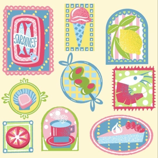
2. Inspiration & Project: In this class, we'll be creating a Mediterranean inspired
tile composition, a playful grid of illustrated
frames of daily objects. Living in Spain, I'm surrounded by Mediterranean
design every day, the vintage olive oil tins, the seafood at the markets, the sunny yellow tiles on
old buildings, and more. This glass is my way
of helping you capture that same atmosphere in
your own illustrations. The summary bright and
charming designs inspired by the Mediterranean are a popular
theme and surface design, as the colors and motifs
instantly brighten a space. The motifs make for
beautiful dish towels, greeting cards,
wallpaper, and much more. We're going to make
a tile composition inspired by traditional
ceramic tiles. But instead of traditional
abstract motifs, we're going to add
everyday objects, mostly food and drinks. This is a great exercise for developing your
illustration style, improving color
harmony, and creating something portfolio
worthy without the pressure of a big
complex illustration. It's like designing
mini artworks that come together
in a cohesive piece. This also gives you lots
of options like creating patterns or using them separately and customizing
them yourself. H. I'm going to treat this
like a real portfolio project. I'll show you my process, including my mistakes
and revisions so you can understand a bit more of the behind the scenes of
a project like this. I'll take you
through the planning and the sketching phase. Then we'll color everything together and add
finishing touches. Lastly, I'll show you how
you can turn this into a repeated pattern ready
for your portfolio. These are independent
frames so you can pick and choose from the
lessons what you want to do. You can either follow along with me or make this really personal, so you can pick a topic
using the different motifs. Have a look at the projects and resources tab of this class. There I've added a
couple of things. Firstly, I added a
procreate file with the composition
that we're going to use that will make
starting a lot easier. Secondly, you've
got a color palette there as well, and for brushes, we're actually going
to keep it really simple and just use one
default brush and procreate. But if you want a little
bit more control, some inspiration,
and more templates, you can use my
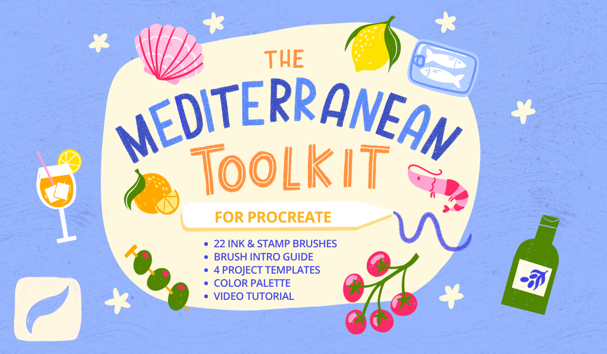
Mediterranean toolkit that comes with a couple
of brushes that are really suited for
projects like this. But for following along
with this course, none of these resources
are a necessity. You can easily follow along in your sketchbook or another
tool if you prefer. We'll go at a fairly easy pace, and it should be easy to follow. But make sure that if you
follow along in Procreate, you do know some of the basics. I'm going to be using
stuff like clipping masks, Alpha lock, the selection
tool, and more. Remember that you
don't need to follow the exact steps to
get the same result. Some of these functions in Procreate just make
things a bit easier, but you can easily find another
way to make it work too. In the next lesson, we're going to start with our composition. If you want to go straight
into making our tiles, skip the next two lessons so you can get started with
coloring right away.
3. Frames & Guides: Firstly, we're going to make our frames that will then
turn into a pattern. This is going to be
a tile composition, meaning that if we
repeat our canvas, this is going to turn into a
neatly spaced out pattern. The easiest thing to do
would be to download the Procreate file
that already has the frames inside of it
in the resources tab. But if you maybe want
to change the frames, make a new composition yourself, or you're working
with another tool, then you can follow along here. If you downloaded
my Procreate file, you can just skip this lesson and go straight into sketching. Let's make a new file here, 3,000 by 3,000 pixels, and make sure to set the
color profile to display P3 for the
brightest colors. If you downloaded
the color palette, you'll find that at the top or at the bottom
of your palettes. Let's start with
a drawing guide. We're going to use
this to create our rectangles and squares. Set your layer to
drawing assist and this will make sure that we only follow the lines of
our drawing guide. Let's start at the top left with our biggest frame and then we're just going to neatly space out different sizes of frames, rectangles and squares
to fill up our canvas. Right now it looks
like those shapes are placed really
close to the edges, but this will help us when
we repeat this canvas to make sure that there is a spacing between
all of our frames. But of course, if you don't
want to make a pattern, you just want to make a
composition of different frames, then feel free to
change it up here. Just make sure that
everything is evenly spaced. And now we can turn
off drawing assist. And as this is just
our basic guide, feel free to use the select tool to move
stuff around here. And then we can turn off
our drawing guide as well. To make this composition
more interesting, let's change some of these rectangle frames and
give them some curves as well. So I'm going to turn these
into curves at the top. And then let's turn these into some circles and maybe
an oval, as well. This will make it
more interesting for us to draw our
objects inside of. This is our final composition. At the moment, this
obviously looks a bit messy, but
it doesn't matter. We're going to sketch on top
of this in the next lesson. So just make sure
that everything is ready for sketching. Well
4. Sketch: Before we start sketching, let's brainstorm some ideas, things that we can
add to our frames. I'm going to stick
mostly to food and drinks to narrow it
down a little bit, and we're going to stick
to simple objects that we can add because everything is going to be on a small size. So if you want to infuse your own ideas here or
maybe pick your own theme, maybe write a couple
of things down, things that you can think of
that would look nice here. If you want to follow along, you can skip the first bit. We're going to start
sketching about 2 minutes in. If you prefer to skip the
sketching phase and just go straight into coloring your design, that's
totally fine. Just skip to the next lesson. Here I'm just thinking of
simple objects that fit with the theme and that have a lot of
color infused in them. Maybe some lemon, orange. I live in Spain, so
I definitely want to add some olives there,
some tapas maybe. If you want to pick
your own theme here, try to stick to
singular easy objects, stuff that is easy to draw because it's all
on a small scale, and other than that, also
think a bit of color maybe. For example, lemons, oranges, stuff that is really
bright that we can use with our color
palette as well. In general, this
is a really great exercise for those of us who get quite stuck on details
and tend to overcomplicate. This is really just tripping
it down to the essentials. I'm just going to
lower the opacity of this layer and on a new layer,
we can start sketching. I'm not using any
reference photos here. Of course, you can,
but let's try to think of the basic shapes and
keep it really simple. And make sure to
place your object centered in your frame, and we're just slowly
going to sketch out all of our ideas in the
next few minutes so you can just follow along. Now that we have
all of our objects, we can turn off our notes layer, and now we can add some
fun frames as well. So thinking of these
guides that we have, we can use those as a
base then we can add some frames with different
curves and shapes as well. This is also a nice way to add some color and make everything
feel a bit more playful. Just make sure that
with your frames, just to have some consistency to make all the frames
of the same width. And then perhaps we can
add a bow on top as well. Now that we have kind of
three different styles, I'm just going to sort of repeat the same kind of style in
the other frames as well. And this is our final sketch. Now comes the fun part,
and the next few lessons, I'm going to add color to this, and you can obviously
either color everything or pick the
lessons that you want to do.
5. ✨ Update: Student Spotlight ✨: This is a quick
update to celebrate the amazing student
projects that have been shared by all of you since
this class launched. It's always such a joy to see
your creativity in action, and hopefully these
projects will inspire you and motivate you
to create your own. A huge thank you to
everyone who has taken this class so far and
uploaded their project. If you haven't already,
make sure to visit the Projects and Resources tab to
discover more student work. And while you're there,
consider leaving comment or an encouraging note. It really helps to build a
supportive creative community, and it will really
make someone's day. If you haven't shared
your own project yet, I would love to see it
before you finish the class. Whether it's complete
or still in progress, feel free to upload it. You can also ask
questions there or tag me on Instagram if you'd like to share your
work there too. You can also ask your questions
in a discussions tab, and I'll also share
updates there regularly. If you're enjoying this topic, you might like my other
class on sardinetins too. And remember that the
Mediterranean Toolkit comes with brushes and lots of tutorials
to help you spark new ideas around
this topic as well. You can follow my
profile or join my newsletter to stay up
to date on new classes, tools, and feature
student projects. Thank you so much for being part of this creative
community here. Seeing what you make is truly one of the best
parts of teaching. Now let's head back
into the next lesson.
6. Color: Olive Oil, Tomatoes, Cocktail: We're going to start
coloring our design, and what we'll do first of all, is start with the object and next we'll do the frame
and then at the very end, we'll also add a little
background in our frames. But for now, we're just going to do the objects and frames and that will be the first
three in this lesson. Firstly, let's create
a little background. Using the lightest yellow
from the color palette and then making it even
lighter almost white, but just giving it a bit of
an off white warmer feel. Then we'll start at
the top left with our olive oil on a new layer. For this entire project, we're just going
to use one brush. In the classic library, in the calligraphy tab, there is a monoline brush. That's the one I'm going
to use for everything. It is just a really
simple brush. I'll show you how to just
use one simple brush like this and still create a bit of texture in your design. It is also just to keep
things simple for now. Let's start with our green. Instead of using a brush, I'm actually going to use
the selection tool and just roughly select the
shape of the bottle. And then use the fill tool
to fill it in with color. This is just a little bit
easier than using a brush, and it creates these very
sharp cut out lines, which I quite like sometimes. It's a little bit more
imperfect in a way, but I think it works
for this design. Then we'll use the
selection tool again to fill in our label with
our background color. And then on a separate layer, let's add a detail to the label
here with our dark green. And by the way, colors don't necessarily have
to match reality. This bottle could also be
another color if you want. And then we've got
the cap, lastly. Even though the bottle is
actually done already, a nice way to add
texture here is by making it look like
it's colored in by hand. An easy way to do that now is by just erasing a little bit of that green then filling it back in but roughly. You have a little bit of that white or off white
coming through. I really like the way that
looks as if it's maybe colored in by hand or it's
not printed perfectly, and this is something that we can use in all of our objects. And next up, let's add a
frame, perhaps in orange, something bright in contrast to the green that we have
in the olive oil. Later on, at the very end, we'll add a background to this. But for now, this olive
oil frame is done. Let's select all of our layers, swipe to the right,
and group this frame. And let's move on
to our tomatoes. We'll use green for this. And for the tomatoes
themselves, maybe there's red. And as you can see right away, now it kind of feels like
this green is a bit darker, so we can use the
lighter green instead. And I think yellow as the frame would look
quite nice with this. And for those frames,
once you find a brush width that you like, make sure to stick
to that so that all of the frames
will have the width, the same consistency so that our frames
will match better. For this bow on the frame, let's do that on another layer in case we need to make changes. Goods. With those tomatoes, we want to do the same thing as with our olive oil bottle. These are slightly
bigger, bulkier shapes. We can add a bit of texture
to this by erasing the middle and filling them back up a bit of the
background comes through. Let's see how that looks
without our sketch. I think this bow would
look better if maybe the frame behind it
is erased slightly, and let's make it a
bit bigger as well. And that's it. And for a bit of a highlight
on these tomatoes, maybe some pink would look good. As I kept changing my
mind here a little bit with color quite often,
just follow along. If you see something
in the canvas that doesn't look exactly
the same, don't worry. I'm still in the
process of changing it. Any changes that we make, I'll make sure to explain
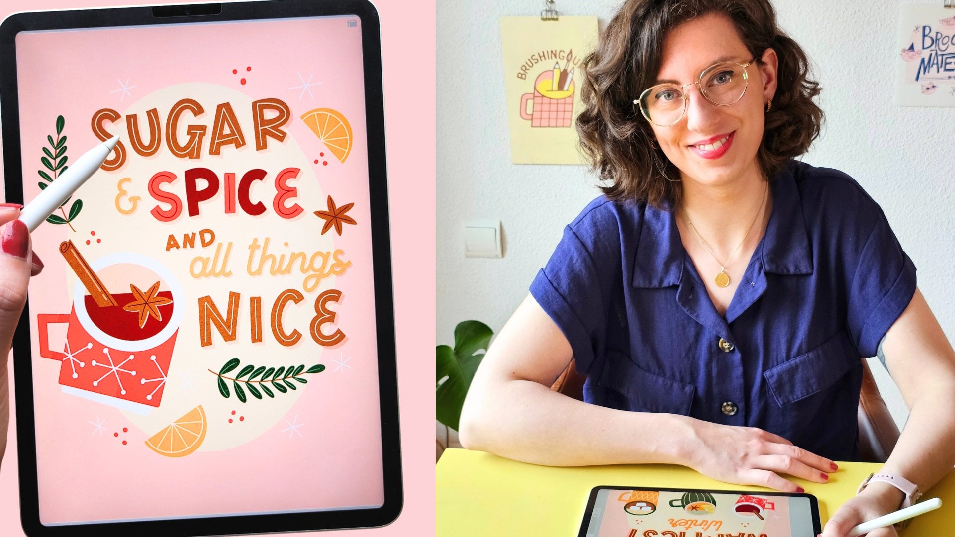
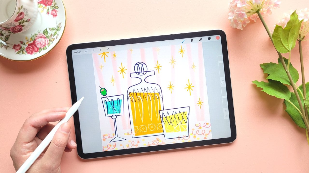
it at the very end. Our drink, lastly, over
here, this is up to you. I want to turn it into
something orange, maybe like an apparel
spritz for example, but you can turn this into a wineglass or
whatever you prefer. Then let's make this
glass maybe blue for now. Perhaps we can change
that to why later, but let's see how it looks
later on with a background. Let's say you're not
following along or you're infusing your own ideas and you're not sure
what colors to pick. Just pick a color
for now and move on because at the end when
everything is colored in, you can still
change those colors and see what makes
sense together. Just make sure to work
on separate layers and just move on to the next
thing and keep coloring. And then we'll still need to add a straw and some ice cubes. And lastly, maybe some
lemon on the glass as well. And let's group
our glass as well. And perhaps we can
make a frame in pink. To make this curve a
little bit easier to draw, let's turn up the
stabilization a little bit. And that's our
curve done as well.
7. Share your work: Have done quite a lot already, so make sure to
share whatever you have so far in your
student project. It doesn't have to
be finished at all. Feel free to share
your inspiration or a sketch or whatever
you've done so far, your selection of
frames that you picked. It doesn't have to be perfect. Skillshare is for process,
not for perfection, feel free to share your work
with me on Instagram as well or share that you're
taking this class with me. I would love to see
what you're working on. Let's use the projects tab as a way to encourage
each other. Perhaps leave a comment on someone else's student project and motivate each
other to keep going. If you have any
questions so far, you can leave those in
the discussions tab. We've done quite a bit already. What's coming up next is all of our frames are going
to keep coloring those. Then we will add
the background to our frames and some finishing
touches and lastly, we'll put all of this
together into a pattern. But for free to end this
class wherever you want to, if you just want
to do the frames, make sure to share those in your student project,
and that's it. I'll see you in the next lesson.
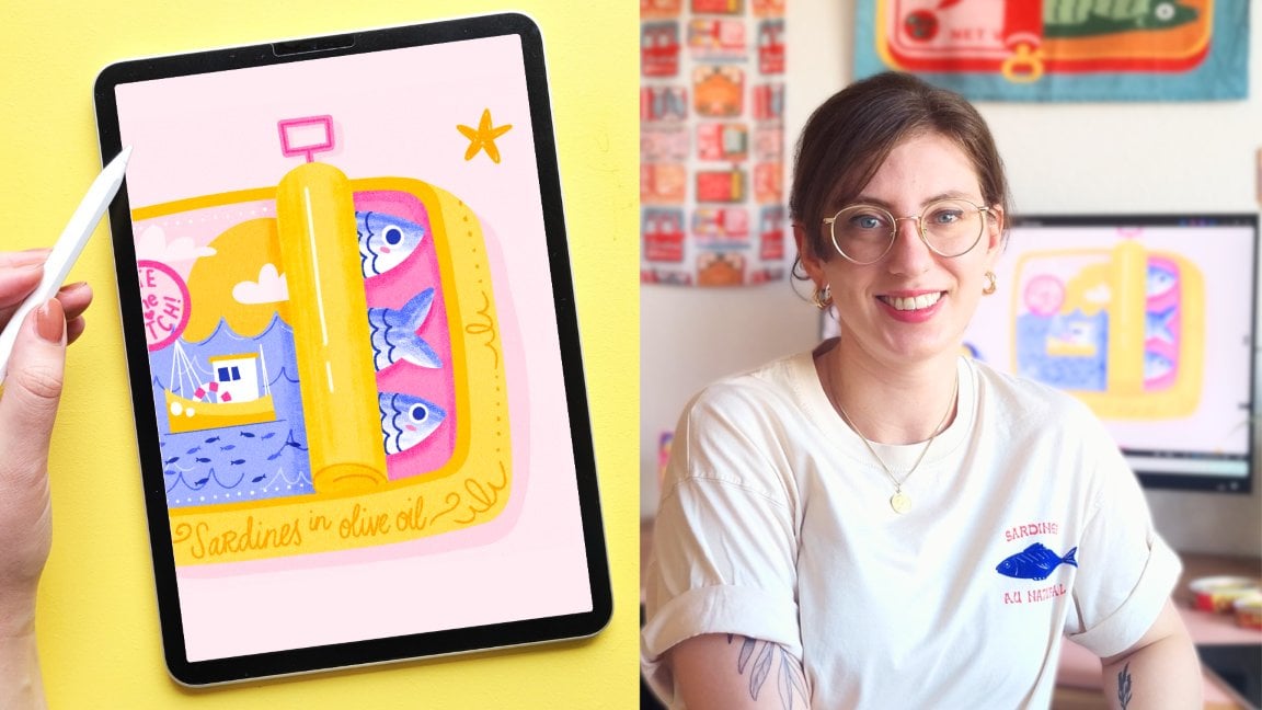
8. Color: Fish, Lemon, Olives: Let's continue with
coloring our frames. Now that we've done
the first three, let's continue with these
three slightly smaller ones. We've got our tin, our
lemon, and our olives. So this sardine tin, I actually wanted to change it because
I just wasn't happy with it, and I think we can simplify
this a little bit more. So just follow along. Let's use our lightest blue and just make our
rectangle shape and then we'll roughly color that in to create our slightly
rougher texture. And on a new layer, we'll add a line around it in
our darker blue. So we still have
the sardine tin, but we'll make sure
the tin is closed. And then I'll just
draw two fish on top. Perhaps yellow on top of
this would look nice, but we might delete that later. Let's leave some blue for details maybe a line
around our fish. And then last detail to
make it look like a tin, we'll just add the
little tap on top. Let's turn this into a group. And then I think
the frame for this maybe let's bring back
more of that yellow. We can use that for our frame. And again, we'll make the
bow on a separate layer. As I mentioned, we're
discovering what works. Every now and then
you're going to see the old versions
of my frames that I'm not happy with
that I decided to change like the
sardine tin before. I think it was just way too
complicated and as I said, we're trying to keep it simple. Sometimes I just forget. I really should
know because I have a whole class on making sardintins sometimes
when you're not careful, you can just get stuck on making something too complicated. But the whole point is to keep our object simple and move on. Let's continue with our lemon. For now, I'm making this
leave this middle green. Let's see how this looks later on with all the other
frames next to it. And I'm adding a bit of texture here as well. By erasing our shape, and I'm roughly
filling it back in. Let's use pink for our frame. And that's our lemon done as well. Let's group that layer and then we'll draw our olives as well. I'm adding these
olives on a stick. So let's draw that stick
first in that light yellow. And then our olives on top. Let's add a bit of texture. Then lastly, our frame. First, I thought maybe
that red would look nice as the frame to bring back the color
that's in the olives, but it's a really strong red. I think something lighter like yellow would look
better, actually. So I think just a
yellow frame on its own, no details on top. It looks good on its own. Let's group our olives, and that's another
three frames, done.
9. Color: Shrimp, Shell, Orange: Now we've got six
frames done already, and now we're going to make
the last three blue frames. Let's start with our shrimp. And we're going to use our
three shades of pink for this. Let's start with our
lightest pink and fill in the shape of our shrimp. And then with a slightly
darker tone, let's add details. For some contrast, let's use
the red for details on top. I actually think that red would look best in all the details. Maybe if you zoom out, you don't really see the
other details that wells. Let's make all those
details red in this case. We've got some yellow
lemon slices to the side. Then for something
slightly lighter, let's use our light
blue for our frame. I'm actually going to change the shrimp to a slightly darker pink. That's the shrimp done. Let's group that layer, and let's go to our shell. I'm using the same colors
here with the lightest pink, let's create the basic shape. And then with the
slightly darker pink, add a bit of shading. And then let's add a clipping
mask on top of this shell, and then we'll use the
red for the lines on top. And then perhaps some
more details in white. You can add that
directly onto the shell itself onto the pink layer. And we still have that medium
pink tone to play with. Let's add some dots as well
for some more texture. We haven't used our darkest
blue yet for a frame. Let's try that here,
see how that looks. I think that creates a nice
contrast with the pink. So when you're happy,
let's group that layer and move on
to our orange last. Firstly, the basic the
main orange shape. And then let's add our leave. Perhaps in darkest green,
let's see how that looks. We haven't used that much yet. Let's use yellow on top
for a bit of texture. And also a slice on the side. And I'm zooming out
to actually realize, let's make that leaf
the same color as our lemon leaf. That
makes way more sense. And I'll group these
layers right away. Then for our frame maybe
let's use a blue as well, not the darkest one,
but the medium tone that will look quite
nice with the orange. Now that we have
all of our frames, it's much easier to see what's working,
what's not working. In the next two lessons, we're going to make
some small adjustments to color and we're also going to add the backgrounds
to our frames as well. Mm.
10. Details: Now, let's continue
with some details. First of all, now that all
of our frames are in place, I can see that we haven't really used our dark blue that much. So maybe the label
of our olive oil, we can change that to dark blue. And let's add a
background to our frame. And by the way, this is
completely optional. I'm just going to add
a bit of detail here, but you can also just
fill in your frame with a color to set it apart
from the background. Let's add a new layer behind
the olive oil bottle. Let's use a light pink, and then let's make a
checkered pattern for this. Turn on the drawing
guide and make sure that the size looks
similar to mine here, and then we can use
that as a guide and just fill in these little
blocks inside our frame. You can fill this
in quite roughly. It doesn't need to
be perfect at all. And we can turn off the drawing
guide again. I think this adds a nice detail. I think this looks quite
nice with the bottle. But I'm not sure about the pink, maybe yellow, but look
just a bit brighter. I'm actually going
to change this checkered pattern to yellow. Let's move on to the tomatoes. This is a slightly
smaller frame, so let's keep it simple. Let's add a new layer
behind the tomatoes and then let's use
maybe a light blue. Et's draw an oval behind the tomatoes and
fill in the rest. So it's kind of like a
frame within a frame. And I think the light blue with yellow is quite a
nice combination. I next up our drink. Another really easy
pattern could be drawing some vertical
lines, like a wallpaper. Let's try yellow for now. Let's see how that
looks in a light pink, perhaps make it even lighter by lowering the opacity a bit. Then perhaps some dots in
between the lines as well. And next up in our sardine tins, there's not a lot of
space here to work with. So perhaps just
some small, like, stars behind it could
work in a light pink. And behind the lemon, I think a light blue
would look nice. And we can repeat some of the patterns we've
already created. So maybe some vertical
lines and keep it simple. And let's make it a bit more subtle by lowering
the opacity a bit. And for the shrimp,
I'm thinking maybe some wavy lines in
the background. So perhaps with
our lightest pink. I do think this looks nice, but now I'm thinking this frame is just a little bit too light. Maybe let's change that to
a slightly darker blue. I think that looks
better already. I really like this
wavy pattern we did. Let's do the same
thing with the shells, but this time in yellow. And this olive frame
is really small, so we're going to
keep it simple again. Maybe do the same
thing we did with the tomatoes but in pink. And lastly, that orange frame, there's also not a
lot of space here, so maybe so some sparkles in the background would fill up that frame nicely. These are just some options that you have to fill
up those frames. Again, just using
one technique or filling up the
frame with a color is totally fine as well. But this was a really
easy way to add some more color into the design
and now everything feels, I think, quite cohesive as well.
11. Tweaks & Touch-ups: Our frames are done and we can move on to
creating our pattern. But first of all, I
just wanted to give you a little checklist to help you figure out if
everything is finished, and I wanted to show
you the couple of slight changes that I've made
and why I've made those. So feel free to
follow along here and have a look at what
you would want to change. Here's a little checklist
of things that I would go through before finalizing
a design like this. Firstly, are the tiles or the frames all working
together as a group? Is it cohesive? Does it
make sense together? Are you reusing colors across the frame so that it feels
cohesive and balanced? If you're using color, try to use it once or twice more so that
it feels balanced, and if not, then maybe think
about leaving the color out, for example, if
you don't need it. Thirdly, is anything too bright or too dull compared to
the rest of the frames? When working with color, sometimes there's not enough
contrast or too much. Zoom out and have a
look at your design. Does anything feel off, or do we need to make any
changes in terms of color? Lastly, do you feel
proud of your design? Is it fun to look at and
did you enjoy making it? I think that is most important and then you'll know if
it feels finished or not. Here are a couple of
small tweaks that I made after just taking a break
and stepping back for a bit. Firstly, in the
olive oil bottle, I realized we're just not using a lot of
that darker green, so I'm just changing it
back to the medium green. That checker
background, initially, I was thinking of pink, but I think just using more yellow brightens
the whole piece and I think it just
looks a bit nicer. We're changing that to yellow. I wanted to use a
little bit more of that dark blue in the design because
we're not using that a whole lot to be honest. I think just changing
that label to dark blue, I think it just looks
a bit more fun. And I really couldn't make mind up about the color of the
stem of the tomatoes. In the end, I'm just using that medium green
because I think it just looks a little
bit better than the lightest color here. As I said before for this drink, it was initially blue, but I think turning it to
white looks a bit nicer. But then obviously with a
little background behind it, maybe a pink oval so that we can actually see
the white of that class. Then because now basically
everything is pink, maybe just turning those
lines in the background a little wallpaper to yellow
then to make it more subtle, you can lower the opacity a bit. I think the sardintin compared
to all the other objects, there are too many lines. I just think in terms of style, it doesn't really make sense. I'm taking away that
yellow and just keeping those fish a bit
more simple, just white. To brighten it up a little bit, I'm using that
middle tone of blue. Initially, the frame of our
shrimp was a light blue, but it just didn't
stand out enough, it just really felt flat. I think the medium blue
looks a bit better here. As we're really not using that dark green as
much in the end, I think also in the line of that leaf instead of
making a dark green, just white is maybe
a better option, and I'm also changing
that for the orange leaf. Lastly, the frame on the olives. Initially, I made that red, but it was way too much and I think yellow just
looks a bit better. Then lastly, the stick on the olives I changed
that to orange. All of these tweaks
are optional. These are the changes
that I wanted to make, but have a step back and
see if you're happy with everything and then we can
move on to making our pattern.
12. Pattern: Now we're ready to
make our pattern. Because we have a composition that consists of
different frames, you can simply repeat this
design and that's it. You have your pattern. The
problem is sometimes the edges might not line up perfectly and your pattern can feel a
little bit choppy this way. You have these empty spaces and it doesn't
line up that well. With the composition
that we started with, I try to minimize
this as much as possible with the
placing of our frames, but you're still going to
have that a little bit that it feels a bit
cut off or matched. This is where the seamless
pattern technique in Procreate comes in. With this seamless method, we're going to shift and
wrap our design so that the edges of your canvas
will connect perfectly. This will make your repeating
pattern flow continuously without any breaks or visible
borders and awkward seams. This process will work
with any composition. If you start with
different frames, you can follow along and follow exactly the same method
to create your pattern. So just follow along
with these steps. It might look a bit complicated, but it will make
sense in the end. First of all, let's turn off our background layer so that we have our
frames separately. Then let's go to the
wrench tool to copy Canvas and then paste Canvas. We want to make this pattern not using our original frames, so we're going to
deselect all of those and not touch
the originals. Then we need a background layer behind our frames so we can
see the edges of our canvas. Make a new layer underneath. Any color is fine,
fill that layer. I'm just lowering
the opacity a bit so it's easier to see then let's duplicate our frames then duplicate
your frames twice. I'm just leaving one underneath
our layer as a backup. If something goes
wrong, we have an original and then let's
duplicate our background. This is what your layer
should look like now. You've got the frames, a pink layer, the frames again, and a pink layer again. We're going to select
those two top layers, swipe right on your first
frames and your pink layer. Then go to the
Select tool and then in our settings,
let's go to snapping. Here we're going to turn on
magnetics and snapping both. This will help us
when we will shift our layers because this
will keep it in place. Those two layers are
selected and we're going to move those to the left and then drop them with the edge with
the right edge centered on your canvas the
snapping tool will make sure that you can find the
exact center of your canvas. Now let's select the
other two layers. We've got the frames and
the other pink background, this time, let's move
those to the right. Again, the left
edge on the center. Let me explain what we've done. Here we've got our right side of our pattern and our left and
we basically switch them. This way, the left edge
of our pattern connects to the right and we can
repeat it seamlessly. Now you can see in
the middle we've got some empty space and
we want to fix this to make sure that you
don't have as much empty in the middle
of the canvas. We've got our two
halves of our frames. Let's put those together
and we can merge them. This would be a
good time to move any frames around if you
want to in the middle. For example, here, I think this cocktail frame is a little bit too close
to the yellow frame. I'm just selecting
that and moving it. Then what really helps to create a really nice flowing pattern is to fill up some of
the space in between. What I'm going to do is add
these little pink stars. But this is completely optional. You don't need to
do this. I think it would just be a nice touch. When you're happy
with your pattern, we're going to do the same
thing that we just did, but with the top and the
bottom of our pattern. Make sure your frames,
your filler elements, everything is on one layer, and we don't need those
pink layers anymore. You can delete those,
make a new layer, and fill it again with pink
underneath our frames. Duplicate your frames and duplicate your
background, pink layer. Here's what the
layers look like now. You've got again, your frames, pink layer, frames
and pink layer. Select the top two, we got our frames
and our pink and move those two layers up
and then make sure that the bottom edge is placed in the center and then select your other
frames and pink layer, move those center to the middle. Here's what our
pattern looked like. Just a couple of steps before, we have our bottom half and the top and we essentially
switched those around. The bottom half is
now at the top and the top half is
now at the bottom. Now our top edge connects
to the bottom edge. Here you can see
again, we've got some white space in the middle and we're
going to fix that again. We can delete those
pink layers and now we can merge our frames. I think just moving
this olive frame down a bit would make
it look a bit better. Rest, we can just fill up with
some more filler elements. Make sure here to not add anything on the edges
only in the middle. That was the most
difficult part done. Now we pretty much
have our pattern. Let's add our
background over here. We had that light yellow. Okay. And you can merge those layers, and that is our
pattern finished. I know this is a bit of
a complicated process. If you do have questions about this or you're stuck
at some point, share a screenshot in
your student project or in the discussions tab
so that I can help you out. Let me show you again
the difference here. If you simply took your
design and repeated it, that is totally fine. It
would look like this. That is a fully functioning
pattern as well. And on the right, you can
see what we've just created. Here you can see that you've got a bit more of
a smooth pattern. You've got these nice little
filler elements there too, and this is a pattern that you can repeat over
and over seamlessly.
13. Pattern Testing: This is what our final
pattern looks like. The easiest way to
test your patterns on a bigger scale like this is
to use a pattern tester. You can use this one that
I have on my website. This will show you what your
pattern will look like in different directions and at different scales, which
is really useful. What you can do here is take your iPad and scan this QR code, and that will take you
to my pattern tester. What we want to do is drag our layer into that
tester right away. Make sure to open Procreate
next to your browser. Open your layers and
then simply drop your final pattern
into the tester. Here you can play
with different scales and even flip it, for example, which would be
interesting if you have a design that has a lot more abstract
shapes, for example. You can test out
sketches as well if you don't want to commit to making a full
pattern all at once. This would be a great
way to test it out. Especially with the seamless
method we just did, which can be a little
bit confusing. If you're not sure if you
followed it the right way, use this tester and if your
pattern comes out perfectly, then you know you
followed the right steps. Once you're happy, you
can download a preview. Now you've got a
downloaded preview of your pattern
that you can share. If you do need a high resolution
version of your pattern, for example, for a
portfolio project, the only thing you need
to do is duplicate your final pattern and then scale it down using
the snapping tool. Then make sure that you scale it so the edges touch the center, and you can scale this down
as many times as you want to. Just make sure that
you always keep the original because
you don't want to downsize any of your
original frames. And that's it. I would love to see
what you've created. So make sure to share
your student project in the Projects
and Resources tab. And if you've used my pattern
tester for anything else, I would love to see as well.
14. What's Next?: Thank you so much for
taking this course. I really hope that it
was helpful for you, but also that you just enjoyed the process of
creating together. Make sure to share your process, anything that you've created
in your student project. And if you have any
questions about what we just did or if
you want feedback, make sure to share
it there as well. I would love to see
what you're working on, so feel free to share
your process with me on Instagram or on the creative
feed on Skillshare. And don't forget to leave
me a review for this class. This helps me to make new
classes in the future. If you enjoyed this course, you'll probably
enjoy my other class Illustrate vintage sardine tins as well and have a look at all the student projects
in the course too. There is a lot of Mediterranean
inspiration there, and if you did already
take this course, maybe you can turn your
sardine tins into a pattern. Feel free to share all
the results here as well. I made this pattern
tester for anyone who just wants to practice and
make patterns from scratch. If you find this helpful for free to share it
with other people, it is free after all, and I would love to see
what you create. More inspiration, check out
my Mediterranean toolkit. This comes with a lot more
inspiration and project templates that you can use for creating different
projects like this. I will share updates
on freebies and new classes and resources
in my newsletter as always. Thanks again and
I'll see you soon.
 Claire Makes Things, Illustrator | Lettering Artist