Transcripts
1. Introduction: The best way to show off
your unique point of view as an illustrator
is through a collection. If you want to develop
your drawing skills, take your ideas
to the next level and attract potential customers, a collection of greeting card
designs is the way to go. My name is Claire. I'm an illustrator
and lettering artist. I've been working
with businesses on custom illustrations
for the last six years. I work on greeting
card collections, brand illustrations,
chalkboard menus, and more. The times in the past
where I felt like I've made my best work
and I've also had the most fun is when I've done multiple pieces in a collection rather than a standalone
illustration. Creating mini collections of greeting card designs and patterns and more
has really helped me to save time and has
helped me to improve my skills and visual language over the years tremendously. In this class, we're going
to build a collection of festive greeting
card designs that can also function as
standalone pieces. Creating a greeting
card collection will teach you so
much about planning, developing your
unique point of view, and about scaling your work. It's also a really
great way to practice your lettering skills and get to know the world of
surface pattern design. We're going to break down this building process
and kind of get rid of that stress and that
overwhelm that can come with creating
multiple pieces. In between our lessons, I'm also going to
give you some bite sized info and tips on building collections on
printing, lettering and more. I'm going to be using
procreate for this. And if you want to follow along, you can use the brush pack
that is in the resources. This process is going to be
more about the planning and the idea creation than about the final
execution of the piece. By the end of this hour, you should have your
own mini collection of greeting card designs, plus a strategy that you can use in the future for building
more collections. Building a mini collection might seem daunting and a
bit overwhelming, but what I want to show
you in this process is that it does not
have to be complicated, and you certainly
don't have to be a professional illustrator
to make this happen. It is simply a way to scale up your ideas and to show off your skills in the
best possible way. I'm so excited to show you my process and for you to
make your best creations yet. Let's get started :)
2. Planning: Making a greeting
card collection is a great opportunity for
you to share your work, but also for other
people to buy your work. Because you're working
on a small size, it is a perfect way
to experiment a bit. If you, for example, never
tried lettering before, this is a really nice
opportunity to do that because you don't have to worry too much about the smaller details. It's also a great
way to infuse humor. I like using puns and wordplay, especially for greeting cards. So we're going to
start with picking a topic for our collection. I would suggest picking
something you're interested in that you don't mind
making more designs of. I'm going to go with
a festive theme because greeting cards are
a perfect time to pick specific events or times of the year when people might be
interested in buying cards. Holidays, Christmas
perhaps specific seasons or birthday cards, for example. If you're looking for
some inspiration or you're not sure which
direction to take this in, have a look at the guide
in the Resources tab. You might think that because
it's not the time of year that a festive collection
seems a bit out of place. But actually a lot of
surface pattern designers, people who specialize in making greeting cards,
they start really, really early in
the year to build their collections
for the holidays. Because that means
they have enough time to plan and work on an entire collection
and put it online in time for people to
buy or for licensing, and for other art buyers
to buy their collections. Even though I like to plan
my collections quite a bit, I usually find that I
run out of time anyway. So maybe this is
the perfect time to start your
festive collection. And that way you have enough
time to build upon that and maybe add more pieces later
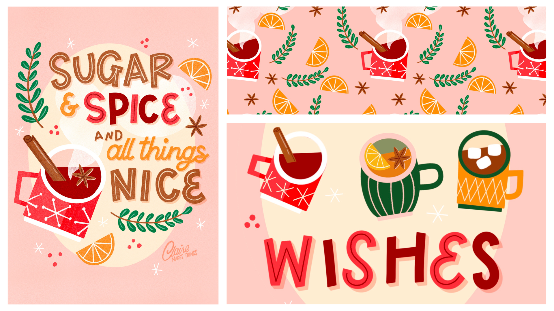
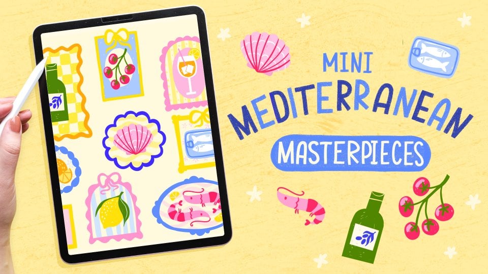
and take your time as well. Our mini collection is going
to consist of three pieces. The first one is going to be illustration and
lettering together. The second one is
going to be a pattern, and the third one is going
to be an illustration. Again, we're going to start with the first piece, because
that one is most important. And then we're
going to repurpose visual elements from that into piece number two
and number three. A great place to start
is to write down a specific topic that
you would like to focus on, something visual. I love everything to do
with food and drink. I'm thinking of maybe mulled wine, which is one of my
favorite things. Other things you can add
to that are some spices, maybe orange slices and then spices like
cinnamon, star and nice. I think it is what it is
called, maybe some holly. Just something else,
festive, like. Other visual elements we
can add to this then, because we're doing
multiple designs, maybe there's an opportunity
to expand on this theme. A little bit of hot drinks, festive hot drinks maybe
like hot chocolate, tea, coffee, maybe a hot toddy, like a warm whiskey drink. I think that's plenty of visual bits that we can
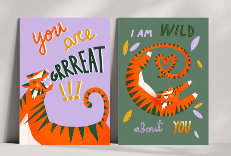
use for our designs. We're going to start with
our thumbnail sketch, and we're working in
this vertical format, like a greeting card format. As I said, our first
piece is going to be illustration
and lettering. The lettering could be
like a short quote. It could also be something
like happy holidays or festive greetings,
I don't know. But it could also
be something that goes well with our theme, like sugar and spice and all things nice.
Something like that. Just make sure to keep it short because you
don't want something really complicated for
a greeting card design. Remember that greeting cards
are usually a small size, so you don't want
something really long and difficult to read. We're adding
illustrations to this, so we don't want to fill
up our page too much here. I'm just making a really quick
sketch to see how our mug, like a mulled wine, will look together with our lettering. I'm just using
like big blocks to indicate where our
letters are going to go. Then this quote, specifically
the emphasis is on sugar, spice and nice, the
words that rhyme. You want to make
sure that those are biggest and then everything
else can go in between. And then we're using this
oval shape in the background. There's a bit more like unity. Like you're making
sure that you're uniting the illustration
with the lettering here. We can even do the
same thing with maybe some steam coming out
of the mug somehow. At this point, you
can add your letter, see how everything fits, and if you're happy
with everything, I'm just double
checking that we've added all the elements
we want to add here, maybe those orange
slices as well. It's just a really basic sketch, but it just helps us to see
how everything fits together. This first piece is going to be the start of our
mini collection.
3. Mini Break: Collections: During this class, there are a couple of mini
breaks. In these, I want to give you just
a bit more information on how to build your
mini collection. And obviously, feel
free to keep sketching. So a collection is a
cohesive body of work. The designs in this
collection can be connected through
concept or topic, maybe size, similar
techniques or tools, a color palette or all
of those combined. When viewing your collection, it should be obvious that they're related to
each other somehow. And illustrators,
surface designers, lots of other creatives work
in collections because they want to work around
a certain theme or a specific tool or technique, or maybe even tell a story. Creating a collection
like this is such a good opportunity as an
illustrator because you're able to infuse your
visual language much more in multiple pieces
than in a standalone piece. And when a potential client comes to you that is
interested in your work, you can show that you're really flexible and that you can turn one idea into multiple
solutions or multiple designs. In the past, I have used creating many collections
or illustrations to build my portfolio and to kind of attract the clients that I really wanted
to work with. So a few years ago, I did
this mini collection of little chalkboard
illustrations with puns on them specifically
related to tacos. And then I made sure to
keep that momentum and make a new design every
week and then post it on Instagram,
on Taco Tuesday. That really helped
me to keep iterating the same idea and try
it multiple times. And that really helped
me to develop kind of my style and keep up that
momentum of creating. What happened after a few
months is that this got picked up by a couple of
businesses and restaurants. They wanted me to basically hand letter all their windows in the restaurants
and the mirrors, so they needed someone to actually not do
anything digital. It had nothing to do
with puns either. It was just different
lettering styles on all of their
interior design. Making a new design
on a weekly basis really helped me to keep up
the momentum of creating, not having to start
over every single time. And it was really easy for
an audience to understand. And when a potential
client came to me for the first time
asking about these designs, they had lots of options to choose from that
would work for them. I personally like to work
in a minimum of three. Three is enough
for a collection, but if you have more
ideas in this process, make sure to keep some sketches with you, make some notes, and then later on perhaps you could add to this
collection if you want to.
4. Sketching: So we're going to
make our canvas, and this is our final size that we're using for
our greeting cards. This is a big size, but I just want to make sure
that it's really big enough, and then we can also still
use it for printing, perhaps even a small poster. You can always scale
your work down, but you cannot scale it up. Your work is just going
to look pixelated. So keep in mind if you want
to print these cards or maybe you want to put it in a print on demand store that you know what size you
need to work with. I like to keep my sketches
on a separate layer so that I don't lose them and I might be able to reuse them later on. I'm just going to copy that
layer to our final canvas. We're going to make
our final sketch now. For that, I'm going to be using the brushes from the resources. So make sure to download those if you want
to follow along. I'm a very messy sketcher, so I really need an extra final sketch
to help me out here, but feel free to skip this step and just move on to
the final piece. I'm just blowing up
this thumbnail sketch. I'm going to add a guide because this is the moment
where we can kind of move stuff
around a little bit and make sure that
everything is centered. So on a new layer, I'm going
to start with this mug. I like using these, like,
graphic flat shapes. Because it's a little
bit retro and I think it just goes perfectly with a
festive theme for the mug, it's perfect because we have this it's like we're
looking inside the muk and it's perfect for
being able to add some more ingredients and
add some information there. Next up, we're going
to do the letters, and I'm using the
lettering guideline for that just to see the space that we're working with to make sure that
everything is on the same line. I'm going to show you a really simple way that I do lettering. I'm going to use the
monoline brush for this. That size is the one
that we're using, and I'm just adding
these letters on top. Not really in a straight line, kind of wonky as well. Then with the eraser,
I'm going to cut off those round edges
and make them flat. Now your letters look a lot
more intentional and it's just a really easy way to add these big bold letters while still making them
look really intentional. I just think lettering adds such a whole new dimension
to your illustrations. It's not just about
conveying a message, but just creating
this visual harmony, and the right lettering, the right kind of lettering
style really helps to enhance the overall
mood of your artwork. I think this works really well if you're a
beginner in lettering. You're not feeling very
confident in your skills. I'm certainly not an
expert in lettering. I have just found
a few easy ways that I can add lettering
to my work without making it too complicated. H. And then for those
smaller words, I'm just using the smaller size. So I'm just cutting off
all these edges and now you can see that the letters
are all very consistent. I've just applied
the same rules to all those letters instead of
focusing on a certain style. And then for the two last
words that we have left, all things, I was thinking
we can try some script. This is a little
bit more difficult, but luckily, the
words are smaller. Like there's not going
to be too much focus on this, so we can try this out. To help you out
with those curves, you can turn up the smoothing a little
bit in the preferences, and that will make
things a lot easier. So with this as well, I'm using the smaller size in
the monoline brush, and then again just cutting off those edges the same way
as your bigger words. This is just to show you an
example because remember, we're going to do the final
version of this still, so you can just follow along to practice, but you don't have to. I do like adding this stage just because of the
big blocks of text, it's easier to see if
everything is placed well and if you need to
move stuff around still. And then we're adding this oval shape in the background as well, and all of our final
visual elements to finish up this final sketch. A And then I'm turning off the guide, and I think that's
pretty much it. Next, we're going to
talk about colors. One thing to keep
in mind here is that we're working
in a festive theme, and we need to use certain colors to
add some information, for example, a dark red
for this mold wine. You can download the
color palette in the resources. That's
the one we're using. Which has some dark red, some lighter red, some green, and now it's looking
really festival already. So brown for our
spices, some orange. And then kind of to
brighten this up, I'm adding some beige for
the background and then some very light pink
because I love pink. You can add whatever you want. Just keep in mind that you need a few colors to add some
information here, too. And if you want to make
your own color palette for collections in the future, have a look at the
color wheel and take advantage of
that complimentary, split complimentary, all those options
that you have there. I love using that for making
a limited color palette for collections because
you can just start with one color and
then see what matches. So before we move on
to the next lesson, where we're going to make
our final illustration, if you're working in a
collection and you are revisiting designs or
adding to this later on, it is vital to keep your
stuff a bit organized. Otherwise, it's incredibly
frustrating to revisit a project and you
don't know where your brushes are or your colors. So keep your color saved in a color palette or on a
layer, that's fine, too. Keep your brushes in a separate tab or pin
them to your resins. You can save them there as well. And also with brushes, what I like is using a
brush memory tool to save those specific sizes.
That is really helpful.
5. Mini Break: Lettering: While you're
organizing your files and getting everything ready
for your final illustration, I want to talk a bit
about lettering and about imperfections and quirks. I love using hand
lettering and work, especially greeting
cards because it's a really nice way to
show off your style. And as I said in a
previous lesson, it's a great way to add to the
overall mood of your work. Even though hand lettering has obviously been around
for a while lately, in design, illustration
in typography, we're sort of heading
towards a time where people like a lack of precision and they prefer
more unique pieces, unique type of lettering. I think it has something
to do with how screens are becoming more advanced and everything is
really easy to read. So that just really allows for more bold types of lettering and lots of
like, powerful shapes. So I would say this is
the perfect time to experiment and just kind of
go crazy with lettering. If you were a
beginner, I would say try to make it easy
for yourself to start. Don't start with things like script lettering
and calligraphy. Remember that lettering
itself isn't writing. So you're constructing
your letter separately. And you can try to
keep three rules in mind when you're using lettering
in your greeting cards. First of all, make sure that
your letters are legible. Keep it simple. Make sure
that it's still easy to read. And especially because we're
working with a small size, it's okay to keep things
simple and to the point. Secondly, stay consistent in the
things that you do. Just simply set limitations to your letters and do
that in a consistent way. For example, cutting off all of the round
edges or your letters or using a certain shape in all of your
letters or one color. Just be very intentional about certain rules that you set to your shapes and
to your letters. And that will turn it
into a style by itself. And thirdly, you can obviously experiment with certain styles and try all these
different things, But it's okay to have go-to lettering styles
and to stick to those. And they do not have
to be complicated. I am certainly not an
expert in lettering. I just have a few go-to
lettering styles that I'm comfortable with that I
really like that fit my work. And they can develop over
time, they can change. But it's okay to stick to those because that also creates
consistency in your work. When you're using procreate, there are a couple of
things to keep in mind. There are plenty of great brushes that can
help you out with letters. You've got templates,
you've got guidelines. And these like monoline / duoline brushes to make sure that you stick
to the same line width. I've used that in
my other class, short and sweet lettering. And you can see
how with one brush you're able to create a
consistency in your letters. Also play around with
the preferences you can turn up and turn down the smoothing and
the stabilization. And that really helps
with your curves, just like we did in
the last lesson too. You also have these options in the brushes themselves if
you want to try that out. Lastly, when you're
making your letters, most likely you're
zooming in and out of your canvas quite often. I do that all the time. What happens is that if
you zoom in and out, your size of your brush is going to change, especially
with lettering. You don't want that, you want to stick to that same line width. So make sure that
in preferences, you turn on the
dynamic brush scaling, so that size does not change
when you zoom in and out.
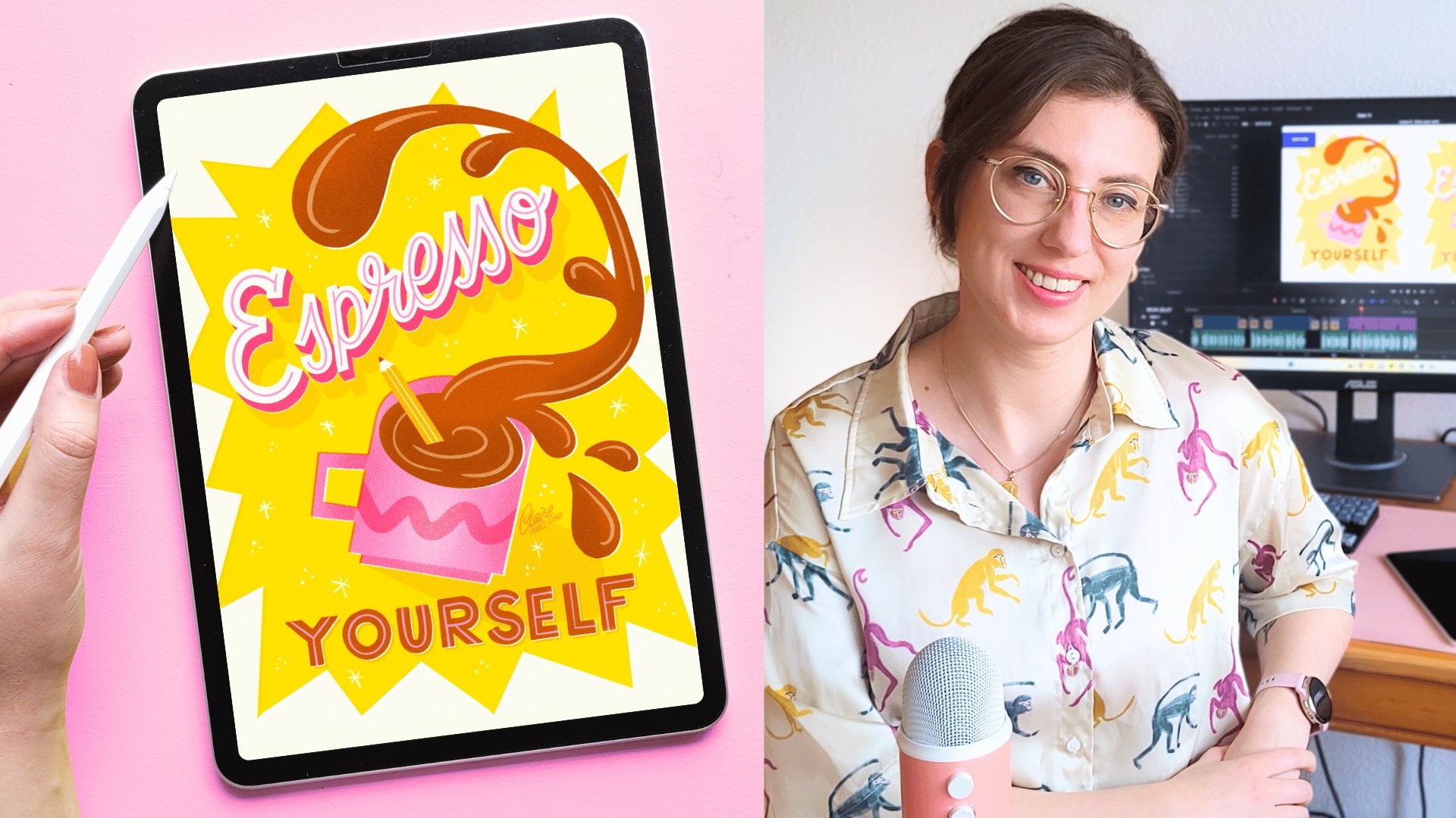
6. Illustrating Design I : I'm gonna make sure to put
my sketch layer on top. And we're going to start
with our background, so I'm going to fill
that with pink. And then our oval shape
is going to be beige, just to kind of
brighten it up a bit. Then we're going to
start with the mug, and I'm using the mon
line brush for that. For this mug, I really
like to just stick to smooth lines
and clean shapes. This way, you can always change the final look of your
illustration if you need to. Especially if you're working
on a collection and you might want to revisit the
project or make changes later. It's easier to stick
to textures on top, which we're going to do later,
instead of having lots of different textures and maybe clipping masks in
between your layers. And then for some details, I'm going to use this
felt tip brush just for, like, a little bit of texture. I once you know the kind of linewidth that you want to use. Make sure to save that in your sizes so that you can reuse that same linewidth
in your letters as well. And then we're adding our
other visual elements too. And I'm just going to duplicate these to make things easier. I'm also going to
add a little pattern to this mark to make it
a bit more interesting. And I think we're done
with the illustration. I'm just grouping all
these layers for now. Then we can start
on our lettering. So we just do exactly the
same thing as we did before. If your sketch is really clean, then you can maybe reuse
those letters as well. But I'm just going
to start over. I'm going to use brown for these letters and then maybe
add some red later on. Because we have a
lot of letters, we can reuse a lot of
the colors we already used in our illustration too and bring some of
that color back. I spice, I'm using the red, but I'm thinking we
can change some of the letters here to the dark red to create a bit of balance
in our illustration. And I'm going to use
orange for the rest. I remember that you can turn up the stabilization
and the preferences to make this a bit easier,
the script lettering. Mm. And now it looks like our
lettering is finished. Now we're going to add
some details to this. So I'm going to use
that felt tip brush to create an inline on
top of our letters. So with Bige I'm just going
to trace those letters, and I'm turning up the
stabilization for this, too. And this immediately to me, makes the lettering look
a bit more retro too. And here comes the fun part. We're going to add some
shading to our letters. We do that by simply duplicating
our lettering layer. Alpha lock, fill our
layer with our pink, and then moving it slightly. I love how easy this process is, and it immediately makes the lettering look
so much more fun. I'm going to set
this to multiply so we can actually see the pink, and it doesn't just disappear on our background on the edges. And then I'm going to use the
monoline brush to just kind of connect the corners a
little bit to finish it off. So our letters
actually look three D. Adding touches like
this to your letters also really helps to refine
your letters a bit more, and it makes it look
even more intentional. I'm going to do the same to
the script lettering as well. Just keep in mind, the
smaller the letters, usually, the smaller your
shading is going to be. I'm not moving that pink
layer quite as much on the small letters to
make sure that you can still read everything
properly on a small scale. And I forgot to add a bit of red to the
inside of this mug. And let's see what
we're missing. We're missing our steam. We're gonna do that in white
to create some contrast. And I'm just adding that
behind not all of our letters, just like the spice
part, and that's it. And then I'm using
the noise brush as the eraser and just kind of taking some of that white away and that kind of
change of the opacity. And it looks like our
lettering is done, and next up is adding
some filler elements. This is optional,
but I like to add just little details that kind of fill up some of the blank space and kind
of set the mood, as well. So you've got some stamp
brushes in our brush tab, but you can also just
do this yourself. So adding these,
like, little red dots and maybe some
little stars, too. And it just makes everything
look even more festive. It's actually
really easy to make a design kind of festive
without using too many, like, traditional themes or
visual elements or colors. And I think we're almost there. A good final check
here is to flip your canvas horizontal and vertical and see if everything
is in the right place. That will help you point out potential mistakes
that you've made or things that stand out to
you that are not in balance. If you're looking at
it the right way, you're just going to
focus on the text instead of seeing everything
as graphics and colors. I think we're pretty much finished or at least
we're almost there. What I like to do is
do a color check. So we're going to be
checking our color values. We do that by
making a new layer, and I'm filling that
layer with black, and then changing the
blending mode to hue. So value is basically
how light or dark your colors are on a
scale of black to white. Might not be as easy
to see on your screen, but if a piece is going to be printed and certain colors are
really going to stand out, it can be distracting. At the same time, the
other way around, if there's not enough contrast, then everything just
looks the same. Here you can see
that the dark red, especially in some of
our letters and then in our mug is quite strong.
I don't mind it too much. It's not completely black, so it's not too distracting. But let's say you wanted
to bring that down, you can maybe make that
color a bit lighter. So this is a really nice way
to check where your colors are and see if you wanted to make any changes in contrast. If at this point you did
want to make changes, you can copy your canvas and then paste so that everything
is on a new layer, and you can experiment with
changing your colors by going to adjustments and then
color balance and curves. Both of those allow you to
change the color slightly or maybe use an entirely different color palette
and see how that looks. I might be a nice
way to play with different colors
without changing your entire piece all at once. Lastly, before we
finish off this piece, we're going to add
that texture out. We do that by making
a new layer on top, selecting black, and going to either that noise brush
or the ink speckles. This is very much a trust
the process moment. So you're just going
to fill that layer with those ink speckles or
that noise brush completely, and we're going to do the
same thing on another layer. If you've taken some
of my other classes, you already know how this goes. We're going to use
the blending mode. So this is just a
really easy way to add some more textures on top of your illustration without having to apply that to all
the different layers. Especially when you're
making greeting cards, knowing that they're
going to be printed, perhaps at some point, it's really nice to
add a texture like this because it makes it
feel like it's printed, and it just adds a bit of that noise quality that makes
it look more interesting. By now changing
these blending modes to overlay and divide, you see that those
layers change from black to colored speckles
and white speckles. And then you can play with
the opacity a little bit. So by changing the opacity
of those layers here, you can change the intensity
of that texture on top. And I think that's looking
pretty much finished.
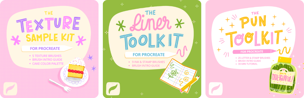
7. Design II: So now we're going to reuse
some of our visual elements from our first design into our second one to
make a pattern. Patterns are
incredibly versatile. They work really well on
greeting card designs, but also on other surfaces. So they're a really
nice way to also complement your original
piece like we're doing, but they can also
go on stationery, wallpapers, textiles,
gift wraps, home goods, and more. If you're not familiar with the world of surface
pattern design, maybe have a look around on Pintras and find some different patterns,
some inspiration. Before we're going to
start on our pattern, I want to quickly talk about scaling and moving
objects in Procreate. We're going to be maybe
scaling a few objects, a few layers, and maybe
resizing things as well. Because Procreate is a
raster based program, all of our art is
made out of pixels, and you can see that
pixelation when you zoom in or resize things or work on a really small
canvas, for example. When we're resizing layers
and moving them around, interpolation is the
method that is used to adjust these pixels
as a layer is resized. So basically, the
program tries to connect the pixels as best as possible or tries to sort of
re scramble them together. You've got different
interpolation settings in the transform tool, and those change pixels
in different ways. So in this first shape, if you zoom in, you can
clearly see the difference. In this one, we used nearest neighbor to
resize this circle. And in that you can see
the pixels very clearly. The next one over here,
you can see bilinear. And in this, you see
slightly smoother edges, but the last one bicubic is where you really
see a smooth edge. It's not very sharp, obviously, because you resize this object, but at least you don't see
the pixels quite as clearly. So when we're going to be using our layers and moving
them around a bit, maybe resizing as well, you want to make sure that
in the transform tool, you've got bicubic
selected just to make sure that when that
interpolation does happen, you get smooth edges
instead of pixelated lines. This is not going to prevent
quality loss altogether, but it does limit it slightly. Okay, so that's all for now. We're going to duplicate
our greeting card so that we don't make any
changes to our first design. And then in this, we
don't really need our lettering and don't
need our sketch either, so we can get rid
of all of that. We're just keeping our mug and our background and our steam and our other visual elements. So our interpolation
should be on bicubic because we're going to start moving some layers around. So I'm going to show
you how to make this pattern with our
illustration alone. And for that, we need to
first make sure that all of our elements are
a bit more compact. So you can start moving stuff
around and resize them, rotate them where
necessary to make sure that we have a more
compact illustration. You also want to make
sure to keep a duplicate of all your visual elements
so you can reuse them later. So now we can merge
all of these layers. And scale it down a bit, duplicate that layer and make sure that these two
kind of fit together nicely. Make sure that these
elements don't overlap and that they don't
touch any of the edges. You don't want to cut anything
of your illustration off. It doesn't matter if some of your canvas is looking empty. And when you're ready, let's move our background up and merge it with our mugs and
duplicate that layer again. And now we go to
transform and we turn on in the settings
megantic and snapping. Now we're going to start
moving our layers around quite a bit so that everything
connects the right way. And then swipe one layer to the right and snap
it to the middle. The other one, move it to the left and snap
to the middle again. So now we've got the
edges of a pattern. It might not make a whole
lot of sense this process, but trust me, we're
going to get there. And now we're going to use
our other visual elements, move them to the top, and use that to fill up the
space in the middle. You might want to toggle off snapping at magnetics
for this again. Make sure nothing overlaps. Just fill up the empty space. And when you're ready, merge all of these layers together, just keep some of these visual elements in one layer separate, and merge everything
else, duplicate. And now again to transform, we're going to turn
on the magnetics and snapping again
and move our layer to the bottom edge until the exact middle and
the other layer, same thing, but to the top. And now again, we've got the top and the bottom
edges of a pattern. Now, we've got a little bit of empty space left
in the middle. So again, we're going to
fill that up a little bit with some orange
slices and some green. Make sure the spaces are
kind of filled evenly. See And when you're ready, merge everything again. And this should be the
beginning of our pattern. Now, we're not sure what it
looks like when we repeat it, but there's a really
handy tool for this. So you can go to the
repeating pattern tester by Lisa Bordeaux on the
Bardo Brush website, which is really useful for this. So you just swipe your layer to this website and you can check if your pattern
actually connects. So you can adjust the
skill and have a look, see if you're happy, and see if it actually
connects properly. Now, I'm just going to duplicate
this and scale it down so we can actually have
a sample of our pattern. And here you can see, we've got a beautiful pattern
based on our first piece that's perfect as
another greeting card or perhaps on
another surface. And
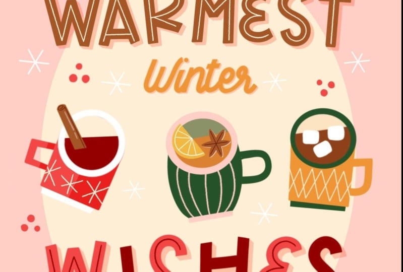
8. Design III: And now we're ready for our final greeting
card number three. And here, you can do
whatever you want, whatever you can think of. I'd really like to
make something that can complement the main piece, but that is also kind
of flexible that I could change in the
future if I needed to. So I'm going to duplicate our first file and then delete
the layers we don't need, like the lettering
and our sketch. I'm going to keep that same
oval background shape. I'm going to make
a quick thumbnail sketch of the third piece, and we're going to put
a code on top here, something simple, festive, maybe season's greetings
or happy holidays. Maybe warmest winter wishes. And then we can use that topic that we talked about
with the hot drinks. So I'm going to see if
that works where we have, like, maybe three
drinks in a row. It's a little bit smaller, but it's based on the
malt wine illustration. And if you want to go crazy
with the lettering here, maybe do it in different
shapes or diagonal, you can totally do that. I'm going to follow exactly the same process as the first piece. So you can follow along with this one again if you want to. I'm gonna blow up this sketch. And then turn on a guide to see if everything is centered. And again, very messy sketch. I'm going to do a clearer sketch on top of that before
I get started. And this process
at this point is a lot easier because we've
done it once already. So this should be pretty smooth. Mm. The only thing that's new
here is the other drink, so I'm thinking to just change the mug designs a little bit. The one in the middle
is going to be a hot toddy,
something in orange, and then the one on the
right, maybe a hot chocolate with some marshmallows inside. And I think we've got all
the red colors for that. I'm going to use
exactly the same colors for our text again, the brown orange,
red at the bottom, and just refine
those lines again. I think I think For our mugs, you can open a little reference window
with our first design. I'm definitely redrawing this just because I want to
make sure that I'm using the same kind of lines
as the other two and make sure that it's not too detailed because this
mug is a lot smaller. And I'm using that felt tip
brush to add some details. And I'm bringing back as many colors from my collar
palette as possible in these drinks with the
orange and the green and the pink and finding
a balance there. And we've got our stamp brushes, our filler elements to
fill up some of that space around in that red
and white as well. And we still have
those texture layers, and we can drag
those to the top, and our texture is
added there as well. I think this piece complements our
collection really well, and I really like the
addition of the other drinks. You could even do more
with those other drinks, turn it into another
pattern if you wanted to. In the beginning, I said
that I really wanted this to stay kind of simple,
kind of flexible. Here's an example
of what that design looks like if you
change the text. I've done a couple of
mini collections of festive greeting
card designs where I wanted the message
to be bilingual, so I could easily add another version to
that collection by simply changing the text. Because we kept it simple, that was really easy to do.
9. Mini Break: Stamp Brushes: I got a review a while back on another class of
mine on skillshare, asking if I could pay some more attention
to making brushes, specifically stamp brushes, and how you can use
them in your own work. So I would really like to pay some attention to
that in this lesson. If there's anything
else that you would like to learn more about, anything about lettering, procreate, working with clients, maybe printing or anything else that you would like me
to pay more attention to, please let me know in a review
or in the discussions tab. I would love to know what
I can help you with. We have created
consistency throughout our collection using
our color palette, our composition, our
lettering style. But we've also used these little repeated filler elements. I really like adding these
little filler elements to also show the mood of our
collection of a design. There are a really
nice way to add a unique spin to your work too. As you've seen in our brushes, you can simply use
those as a stamp brush. I want to show you
how to make this so that when you start
a new collection, you can make these little
stamps and use those to create consistency and show your unique style
in a collection. To make our stamp brush, we're going to
make a new canvas, 2,500 by 2,500 pixels. And we're going to use black. And then a simple brush, maybe the monoline brush
is good on a big size. Let's say we want to make that orange slice
as a stamp brush. We want to reuse that
in multiple pieces. For this, we need to use the entire canvas when it's finished, go to Actions, copy canvas. And then in the brush library, we make a new brush. And then we go to
shape, import, paste. Now our shape is inside this
brush with two fingers, we tap to turn this negative. Now we still don't
really see the shape. We need to go to
stroke properties for that and turn that spacing
all the way up to maximum. Normally, a brush is made up of a simple shape and then it is connected so that it
turns into a line. But what we want
with a stamp brush is that those shapes are
separate from each other, so that every time we tap,
we get that shape. We don't really need a lot
of these stability settings, but if you go to the shape
tap, you can rotate, you can randomize, you can play around with these
settings here a bit. Next up, you can go to
dynamics and use jitter, especially the size here. You can change the size
every time you tap. You can also have a
look at color dynamics, which is really cool if you're
using a color and want to just change up that color every single time you tap as well. You can also change
your settings according to your apple pencil, the pressure of your pencil, if you find that useful. Then in brush properties, turn on stamp preview
so that we're able to actually see our stamp
in the brush library menu. Lastly, we'll go to
about this brush. We give it a name here, you can also add a photo, add your name, your signature, and most importantly,
create new reset point. We want to tap this now. Every time that you
make changes to your brush and you want to go back to those original settings, you can come to this tab and
go to the last reset point. Now let's have a look at
the last design we did. Let's see how our stamp
brush turned out. Here you go. You've got your
little orange stamp brush. Don't forget, you've got the
brush memory tool as well. You can save your size, you can really easily reuse it in other pieces. Stamp brushes are such
a nice way to add like a personal spin to your work to just save
some time as well. I even use stamp
brushes for guides, or to even add my signature
to my work, for example.
10. Finishing Touches: Okay, now we've got
our three designs, and let's have a look at all three of them
next to each other. So here we're kind of double
checking to see if all of our designs make sense next to each other and just
do a little check. So your collection should
kind of look like a family. They are related by color. The theme is very clear, consistent in all three pieces. So lastly, depending on
what your end goal is, you can finish this
collection up. If you're printing your
greeting card collection, it would be really
nice to perhaps do a little test print
and see how they look. Maybe on the back, you
could, for example, add your signature or
your Instagram handle, maybe like a little QR code
that goes to your social media so that
when you sell your cards, that they can look up
more of your work. If you're putting your cards, let's say, in a print
on demand store, a collection is a really
nice way to present your work because you've got not just one card, but three. So you're showing a lot
more of your style. You have a lot more to offer. So if people enjoy one card, they might want to buy
other ones of yours too. You might want to add your
collection to your portfolio. In that case, you maybe want to give a little bit of context, so it's immediately easy to understand that this is a
greeting card collection. So you can present your
designs in mock-ups. You can use, for example, Canva for this, show the result in a festive greeting
card context. Maybe even show your pattern
in a different way as well. That then shows also how
versatile your collection is. It's a really nice way
to present your work.
11. Bonus: Answering Your Questions: Hi, everyone. In case you
have any more questions about greeting cards or
feeling inspired to create more or maybe
even build your portfolio. In this bonus lesson, I'm talking to Cody, who is a talented
surface designer, and she's going to
answer a bunch of questions about greeting cards. Hi, Cody. Hello. Can you tell me a little bit about your
experience as a surface designer? Well, most of my experience started out as like
a graphic designer. I worked for over nine
years in kind of corporate, just doing design work,
some illustration work. Most of my greeting
card experience is specifically within the
niche of photo cards. So I worked at a
national photo lab, and I started out as a
graphic designer, illustrator. And then I transitioned
to be an art buyer, and I worked with a lot of different artists
acquiring art for them for their photo
cards and gift products. Yeah, remember you
telling me a bit about your experience, and to me, a lot of this was all new
that there's so much going on in the world of greeting
cards and surface design. Super interesting. So
for people who want to get more into this
industry, how does it work? What would you advise people? I just think it takes
a lot of patience. A lot of persistence. And I think a big thing is
also diversifying your income. Different streams, and that may mean it's like in one market, like greeting cards
or stationary. You can enlarge that to stationary not
just greeting cards. Yeah. Or you can branch out into other markets
like home decor, or you can work with interior
designers or fabric. So there's a lot of different markets you can work in in surface pattern design. Yeah, I actually completely
forgot to ask. Because you would work on collections first, like
patterns, illustrations, and then kind of find a way to apply those to different
products in the field, which then includes
greeting cards, right? Yeah, I'm actually working through this
a little bit myself. I found that in approaching
greeting card companies, that it's a lot about
getting on their list. So once you're on their list, like, you initially have
to start pitching to them. And, you know, a lot of times
if they like your work, they'll reply back
and they might not necessarily want
to take anything that you've submitted to them, or if they'll look
at the portfolio, they might not take
anything either. But they'll put you on their, like, open call list, which is similar to how it
was when I did photo cards, I would put an open
call out to the artist. And I would say,
we're looking for this and then artists
would send in their work. And we would say whether
or not we want it or not. And it's actually turns
out the same way with greeting card companies since I left, I'm working for myself. Trying to pitch your
greeting card companies is getting on their
list of open calls, and then sending
in work that way. And for people who might not
know how this kind of works, how do you start with
licensing and surface design? Well, it's kind of like renting
out your artwork. So a lot of times
companies will say, this is how we typically work. We'll give you a percentage
for all this, like, every sale that you
make, and we'll specify the amount of time
that they can use your work. If you're not licensing,
you can sell it outright. You always want to make sure you get more money
for that because that typically means you're giving away all your
rights to the work. Okay. So yeah, there's two ways you can sell it outright
or you can license it, and licensing is
more of like you're renting it for a
certain amount of time. And it could even, you could specify if you
want it for certain markets. So a lot of my work that's
licensed for cards, but then it's also in wall art. Okay. So then you license, think about that certain
industry, right? So you also
have sort of like a contract where it
goes onto wall art, but it's also on greeting
cards or photo cards. Yes. And you want to
make sure that you get that in a contract.
Whether that's, like a contract that you
supply them and you negotiate, or you look at
their contract they supply you and
always make sure you read it and negotiate
and make sure that you got like something that you're
comfortable with. Okay. So in general, with greeting cards, if you want to make them
professionally, there's kind of three routes, maybe like you're
talking about licensing a buyout where they get all the rights or
commission, right? Like freelance, if a company
might want a certain design, and they want you to
design it for them. So those kind of Those
kind of three options. Yeah. You can, a company might
commission you basically freelance to create
something specific for them. And I actually did that a couple of times also as an art buyer. So that is something
that is done as well. Okay. And what sort of work have you find
that gets licensed? What kind of themes do you work with or have you
found that are very popular? Well, I know overall
surface pattern design industry,
Christmas is huge. You'll often see, at
least in my experience, it seems like you're working
on it all year long. I know I started in January
working on Christmas, and I just had turned in some Christmas designs for
photo cards just recently, like this past month. So they start pretty early, but greeting cards, it really
depends on the company. Some of them are
asking for that, like a year ahead of time. So it really depends.
For greeting cards, the next biggest
theme is birthday. So those are I think in terms
of greeting cards, the big themes, but
overall, Christmas. I find it fascinating that you start with
Christmas in January. I mean, it kind of makes
sense because a long year ahead of things that
can get licensed, and you don't want to start
with that in November. But it's funny to
think about starting Christmas ideas in
January, but that's cool. Yeah, I like it a little bit, because especially if
you start in January, you don't have to
start in January, like some start in spring. But it's kind of
fresh off Christmas, so it's a little bit, like, more kind of in your
mind a little bit. You're kind of in
a mood already. You might have some fresh ideas, and you can put all of that into your work for the next
season for the next year. I like that. I've also had a question from someone
who wants to know, how do you show off your portfolio online
of greeting cards, and also how do you
find potential clients? So I have a monthly
newsletter that I send out to art buyers
and art directors. So it's just
usually, a sampling of my work
from my portfolio. And I will just basically, I'm always on the lookout for companies that I
want to work with from things I see in stores
or things that I see online. A big one is also,
I'll see other artists. Like, they'll say, Oh, I had
work done with this company, and I'll have a little
folder on my Instagram that's just potential clients, and I'll save it for
later to look into that company and see if my
work would fit in there. And then it's like kind of being a little
bit of a detective. And finding the
contact details for them. I actually did two online
shows during the pandemic, so and both of
those online shows gave the contact details
of everyone who attended. So that was really great
in getting kind of, like, a solid list of people I knew were
the direct contact. You should always make sure that you get permission from them, though, before adding
them to your list. But if you do it that way, you can view it
as an opportunity to reach out to them
and introduce yourself. And then ask if you can add
them to the list or give them a direct link in your
e-mail so they can sign up. And then I segment
my list, so I have, like I've specified that it's for art directors
or art buyers. So that when I send out
that monthly e-mail, It directly goes to them. And sometimes at the
bottom of the newsletter, I'll put a little kind of, like highlight of stuff that I've licensed other companies. It kind of, like, gives
me a little bit of authority like I show I
am a licensed artist. This is how my work
has been used and like a link so they can kind
of check it out as well. And I have noticed some of them will click through on
those links to see. So yeah, I also show
my work on Instagram. I try to update, like on my website, my work, not very good about updating it, but I try to do
it, like quarterly to just to kind
of keep it fresh. So yeah, it's just, it's work. You definitely have to
be kind of a detective. I tried to set like a
little date each month to either research
companies or pitch like sending direct e-mails
to people as well. Sometimes it'll be
just like I'm trying to figure out if this is the e-mail address
of the person. So there's a couple of tools that I use to kind of
figure out e-mail addresses. Linked is a big one. There's some like
Rocket reach where you can type in the names of
companies and stuff, and it'll list out people
and their e-mail address as potential e-mail addresses
that go with the company, and I'll look at them
on Linkedin. Is this legal? Can we confirm
this? That's amazing. Yeah. Wow. Okay, so lots of lots of
different options. What about the monthly
newsletter that you sent out? Is that sort of like
an update of things that you have to offer that
are ready for licensing, like new artwork? Or
what does that look? Yeah. If I have new
artwork, I'll highlight it. There, So I'll wait until, I think it might be like, when they would be
looking for it. But I haven't really really been able to have time to make a lot
of new work lately, so a lot of it's like
recycling through, but people are so
busy that a lot of times I don't think that they
see even my initial e-mail. So I don't worry
about it too much. If I've showcased
it more than once. I just make sure it's
spaced enough time, like, at least three months
before they've seen it before I'll show it again. I always make sure all the
images and they're linked to my website so they can contact
me. Yeah, this is just Okay, that's a lot
of info. I like it. So next question, when is the best time to publish
a greeting card collection? What sort of like does
the planning for you look like as a surface
designer in the year? For greeting cards, I'm
still working that out. My newest thing I'm
going to try to do is to work kind
of in a batch of, like, definitely starting with the most popular greeting card subjects that
I think might work. And then as I've gotten on lists from
greeting card companies, having that basically
ready to go for when they send out their
needs in that e-mail. Okay. That's kind of
my strategy right now. Before it was they would send out the e-mail saying
that they needed it. I think it's that's why I'm
I'm trying to figure out a way to kind of get ahead of that so that I have new work. That's ready to go as
soon as they need it. So I've also started keeping a calendar of what companies are looking for when
based on what they previously asked for
the year before. And so I can kind of anticipate
and maybe going forward, pitch a little bit
earlier than what they're asking for so that I can
kind of get it in there. Yeah. Less stress. Yeah. Next question. What is some feedback
an art buyer might give to greeting
card designs? What are some things that
they might look out for? It really depends
on the art buyer. Like, a specific example I
actually have is someone, they asked me to change out
the lettering I had for a greeting card for a font
and then it went through. It was fine. That's really
the only thing they wanted. And so I did that,
and it was fine. But yeah, a lot of
times most of times you're lucky to get
any feedback at all that I found specific in trying to pitch and
work with clients. I do think though that some
of that depends on like, how long you've worked
with the client? Cause you really have
to build trust and, like, that relationship
with them. I actually have a class that talks about all about feedback and drawing
feedback from clients. And then we actually
on our podcast, Brushing Up, have
an episode on it. Yeah. That was really enlightening because
you talked about specific greeting card
designs and what kind of stuff that they want to
switch or like colors, like lettering,
that sort of stuff, to be able to let it
go through, right, to be able to actually
license the work. So basically, an art buyer is someone who works in
the company, right? And they're the ones that might look at what kind
of work they can license and how they could work with greeting card
collections. Well, like, when I
worked as an art buyer, I worked with an art director. So and the art
director actually had the final say with all things, but I was the one that worked directly with all the artists. And so it was more of like
an acquisition process. I was the one that gave all the feedback and
stuff to artists. So a lot of times when I
say art buyers because I've done that role so
Yeah, you know how it goes. Yeah. Yeah. This kind of I mean, feedback is a whole
different topic on its own. The kind of stuff that what
you told me about before, like what they are looking for is not the kind of stuff
that we would think about, but just like, well, this color because
it sells well, or this shape, because
it works well, or lettering has to be what
you said replaced to a font because that's what the company works with, that kind of stuff. Next question, what are some other things that you would keep in mind for
designing greeting cards, specific things that
people could think about. Hierarchy. I think
that's a big one. I think that's sometimes the
easiest one to forget about, especially because a lot of times with illustrators,
specifically, it seems like there's a lot of elements that they want
to put in a piece, and that could be
easy to lose track of when in terms of hierarchy. I also think color is
really important as well. I remember, actually, when trying to acquire work for the holidays, that we kept seeing
a lot of, orange instead of red
for Christmas cards. I understand it now, though, now that I'm on the
other side of it. Find myself using more
of an orangey red, because I think
it's also in a way, two parts; you want to
make it a little bit different than
traditional, like red. And at the same time,
for some reason, I think it looks a little bit better when it's a
little bit orangy, but you know, we would find ourselves,
I know, asking a lot. can you make this a
little bit more red, red on the orangy sides? Interesting. Yeah. Specifically, actually for
festive greeting cards. Do you think it's better to just stick to
traditional colors, or can you change it up a bit? Is orange okay or pink? Can I ask about pink? I think it depends on, actually, well, one, the
company and also the region. It seems like in the US, and also the company I worked for, traditional sold better. But I've heard
from other people, particularly people who are
in the industry that work more in like UK, other
parts of the world. Non-traditional
holiday colors, they like it better if
it's not so traditional. So I think it just
really depends. Maybe it's a good idea to do research at this point, right? Because now I'm
thinking, what have I seen
in the UK, if you go to a
greeting card store, I think for festive
greeting cards, there is a lot more color. There it is not just
traditional colors. So maybe kind of depends
on where you are and, you know, what you
want to be working on. It's a good idea to
have a look at colors. And hierarchy,
we talked about that specifically that point in when we talked about lettering, how important
hierarchy is because that's especially
with greeting cards, it's so important,
what do you read first? What do people look
at first, right? So that makes a lot of sense. I also think in terms of color, it's good to print them
out because lot of times, at least when I did it, like, we printed out everything. And so it made a big difference
in how it looked printed. And so it's kind of
good to know if like, something like ends up
being muddy looking or tone is a big one that you'll catch if
you print it out. So a trick is to put a layer of black over my
work and then multiply it, and you can kind of see, like,
more of like the contrast. It needs to be up
to not. But yeah, printing out in
general is good to do. Just to kind of get
a sense of the color. I think also just seeing
mistakes that you've made, anything that doesn't
stand out on the screen, once you print I've
had this early times, and it's just like, Oh, no. I had no idea this was going on. A whole different world. You talked a
bit about printing. So do you ever print your work, or do you just show
it off online? Most of it's online. I did I showed in person
at Surtex last year, and I had to make and print these huge banners to cover
my entire booth. So that was the first time I'd really printed
something in a while, and then I had to do business
cards and print books, portfolio books,
and all this stuff. That was the most I printed
at one time in a while. So I do print my work, and I tried to print, you
know, just to kind of, you know what we talked about
earlier with you know, fix, like, spotting mistakes and checking for color and
that type of thing. Online is the biggest one that I
probably do right now. But it's really fun when
you license your work with companies and you get samples because they will send you
samples of everything printed. That's always
really fun to see the cards and
all that stuff. That's fun. I did not know that. And if they don't do it, you should negotiate it
in your contract. Good point. Okay.
Negotiate that. I've done this with some
print on demand stores, a good idea is either to send
yourself like a test pack, or they will do
that automatically, for example, with Printful, I think, they do that. If you start to sell posters, then you can get I think a free sample
sent to you so that you can see actually what
other people are getting and then make changes
as well if you need to. Definitely always
have a look at that. I love that to get those samples to improve your work as well. I've also found I'm not
sure how Zazzle works, but with Printful, I think, Society 6,
I think, as well, they have these color samples. So it'll send you
I have one here, and maybe I can show
it like a big poster, and they basically have all
the colors that they print. So you can see what those colors looks like. So if you use that
exact shade of blue, this is what we print. So that's really helpful. That's an awesome tool. And very quickly, Surtex. What is Surtex for? It's like this huge trade show where artists, surface
pattern designers, illustrators can show their work and a bunch of art directors and buyers will come and they can license your work, get
contacts, network. It's just a general way
to get connections in the licensing and
art buying world. A really nice opportunity
to show your work. And also what you
talked about with the list of art buyers, like people that can get
on your list so you can send out your newsletter
to these specific people. That's the way to get
context as well, right? Yeah, everyone who
stopped by my booth. I had, like them fill out
a little questionnaire, basically, like a contact form. And so I was able to ask them, like, exactly, what are
you looking for, basically all the information
I needed to know about how they make purchasing
decisions and their contact. So that was great, and I could follow up with them
after the show, get them on my list, and try to keep in contact with them and build a
relationship with them. Good point.
How do you find inspirations, inspiration
for your collections? I don't know why I said inspirations. Inspirations, please. A lot of it's like
I walk every day, so that's a big one because
I listen to podcasts, Pinterest, my son, he's a huge
inspiration, reading. I'm like a huge reader. So that's a big one, too. And yeah, just living life. I like that about
going on walks. I found that a lot of creative
people have this if you just like shut off or
just have a shower, go for a walk, do some exercise, just the most random
best ideas can pop up, and that's how you can find
inspiration for things. Yeah, really it helps if I'm working
out a problem too. A lot of times. It's like, you know, I think most
creators are like this. I'm always thinking
about a solution to something or an idea or like, something I'm having an issue
with or I'm working through. And a lot of times it resolves
itself after my walk. Yeah. No, it's actually
scientifically proven as well, especially for if you
want to come up with new ideas if you
new perspectives, then just step away
from everything for a bit and they
can just come to you. That actually reminds me
as well of the book Big Magic by Elizabeth Gilbert that talks about this specifically. I'm not wording it very well, but just the idea
of how you can come up with creative ideas. That's kind of a bible
for creativity, that book. I love that book. Yeah. It's like, creative pump me up. Yeah, exactly. Okay, there's a couple more questions
that I've received. I really struggle with coming up with fun or cute sayings, and I worry about any
copyright issues on these too. Do you have tips
for inspiration? And are there rules to using certain phrases or visuals
on your greeting cards? Yeah, you definitely
have to be careful about copyright issues
with sayings. In the US, you can check the
patent and trademark office, and you can actually
search so that there's a saying that
you're not sure about. You can actually do a
search on that website. And it will, like, list
if it's trademarked. And then a general rule
of thumb is any work published before 1924 is
in the public domain. But you'll still want
to make sure you do research on licensing because it doesn't
necessarily apply worldwide. And then it also could only apply to certain elements
of a collection, like for example,
with like Disney. Some stuff has come into the public domain in
terms of Mickey Mouse, but it's only specific
Mickey Mouse stuff, like the steamboat stuff. I heard the same with
like Winnie the Pooh. The certain parts of Winnie the Pooh is
in the public domain, but the thing with Tiger and his tail like
bouncing, that's not. So you can't do anything. So you
have to be careful, you do your research even on the stuff that's public domain. And there's a
lot of different, like, public domain sites
that you can search. And you just have to
make sure that you check the licensing information
for everything. And some of it will
actually say, you can use this, but you
have to give me credits. Just make sure you
do due diligence. Find that as well with
using puns and things. It's always
good to kind of double-check to
see if it's okay. I think as well, people
struggle with, for example, lyrics and songs that they have to double
check that as well. That's a dangerous one. But, yeah, always do your
research, basically. And let's say you
want to start on, like a birthday card. Where would you
find inspiration for cute sayings or phrases? I'll like, just do
an online search a lot of times for
that type of thing. And sometimes it, it
comes up through, it feels like brain osmosis, is how I can describe it. I also actually have like a little
notebook where I wrote down, names of,
potential t-shirt designs. But if I'm kind of,
trying to plan something out, a lot of it's just
pinterest research or just online research, I'll do a check for it. Yeah. Memes as well. Check if you want to use
any references from memes, just double-check if
it's okay to use. For inspiration, I
like that as well. When random stuff
just comes up, to have a list of ideas
in a later on, I'll see if anything
that I'm working on can apply to what I
already have on the list. I just have a random Google
Doc full of random ideas. I have pages and
pages full of puns. I might never use
them, but who knows? They might be relevant one day. And you use the puns in
your newsletter, so. That's true. I sometimes
wonder in my newsletter, at the very bottom I put
a little pun hidden away, and I wonder if
anybody reads it. No, I see it every time.
I think it's fun. Next question. I wanted to
ask you about how we should approach clients that are looking for greeting
cards to license. Do we need a website? And how many greeting card collections should go on there? I would definitely say
you need a website. That's pretty
important, I think now. And if you have an
Adobe subscription, you can make a quick one
with the Adobe portfolio. So, there are lots of different ways you
can go about doing that. And then I would
say, once you have the contact information of
the art director or buyer, send him an e-mail with an attachment of like
three to four pieces, but I've also heard that
you can go about doing it by sending a link to an online portfolio
that you set up, either a web page or a Zoom book-type flip through document that's
online. You can do that. Make sure that if you find in your research in the company, if they have
specific guidelines, they want you to
follow for contacting them for submitting
work that you follow them because I know from being on
the other side of it, it is really frustrating
and annoying when people don't follow
those directions. Yeah, you don't want to start off on
the wrong foot there. So a lot of it just seems like the undercurrent theme
here is like research. And then
keep following up once you got them
on your newsletter, following up with a
monthly newsletter, or if you have something that you created in mind for them, you can send or if
you have new work. You can just pitch them
whatever you have that ready. And then I would say for
greeting card collections, you can do it a couple of ways. You can do it like as they send a call for certain things
that they're looking for. And really unless they have
a limit on what they want, you can send as many as you have or as many as you
want to send in. Sometimes I will do that. Like, I did that in the past. They're like, we're
looking for birthday, so I sent all my birthday that I had wasn't a whole
lot at the time. It doesn't have to be
a whole lot, though. So as I
understand it, right, like, art buyers, art directors, they don't have a lot
of time on their hands. And then they get a
whole bunch of e-mails or applications coming in. So whatever you send needs to be an easy overview,
no matter what it is, whether it's a link to
your portfolio website or portfolio overview, something that
they could quickly see and then make up their mind, and also to show that
you're reliable, right? That you've got
everything sorted out, not like a massive portfolio. Which is usually the case. I mean, really,
it's better to have a fewer really high
quality designs that has your own spin fresh
take on things than it is to have a lot of
work that's just kind of, you know, not as good. To kind of show that you
have a unique style, right, but that you'll
kind of know how to select not to curate
yourself. I imagined. That is actually a good point. Curating is a big
thing, knowing what to send. And you know, that's kind of a balance you
have to figure out. The good thing is is
a lot of times that because they are inundated so much with work all the time, that that's where
the consistency and persistence comes in. You don't want to bother them, but once a month is not unreasonable and keeps
you in their mind. They may see work that they didn't notice before
building that relationship, because that's really
what it's about is. It's just like when you're
buying anything from someone, you kind of have to see
it a couple of times to kind of think about it to make up your mind.
Yeah, same thing. So, I mean, if they don't
respond right away, not right now it doesn't
mean it's a no necessarily, not at this moment in time, but later on, perhaps. So if you
have a website, how many pieces would you show? Like, what would you
show in your portfolio? I think I have them by pages, by like category, but I don't
think I have more than five. Less is more in this case, like a quick overview. I like what you said
about categories, too. Next question. I understand
that I shouldn't post them publicly the collections before sending them to art
buyers. Is that correct? No, I mean, not necessarily.
It just really depends. Some people don't
like that, you know, putting their work
out because they're afraid that their
work is going to be stolen or stuff like that
or like an art director. I've heard of people they
find their work on Pinterest, they see their
work on Instagram, and they'll even see their work, like on a print-on-demand place. And I've never really heard of anything
where that hurts you, if anything, that's just
how they found you. And if they don't want you like having it
on a print on demand, it seems for
the most part, from what I've heard,
the worst that happens, they'll ask you to take it down. So really, that's from what I've noticed, the
wort that can happen. They'll just ask you to either remove it from, you know, one thing. I think
it's better to show your work than it is
to keep it to yourself. Because I think also when you tend to keep it to yourself, you tend to, also hold
yourself back from, like, pitching your
work in general. And so if you license your work, does that, is that the moment that you
would take your work down or you just keep
it in your portfolio? Depends, if you license in only in a certain category, then that doesn't mean that you can't go license
it in another category. If the contract allows for it. You just have to make sure
you keep track of, you know, what exactly you can like within your
contract that you have with a company or
manufacturer, what is allowed? And sometimes that
means they'll want worldwide exclusive rights
for all the categories. But sometimes that
means it's only within one small niche category. And that's something
that you just negotiate, or you just decide
if you're okay with depending on
what they want. Okay. I see. A last question, making the work is one thing, but how do you get
it across to them? Is there like a specific size or dimensions they usually
prefer to receive? I typically set up my
sell sheets at like 11 by 17 size document. Like I have an Indesign document, and I just set them up in there. And then I make sure
that has my name and my contact information
on it on everything. I would have it no
larger than 150 DPI, but no smaller than 72 DPI. Okay. But also, you need to make sure that you check the submission guidelines
for the company. So I save all of my sell
sheets primarily in JPEG, but I've had some that I've
pitched you they're like, we want it
specifically this way. We want it as like a PDF, and so I've had to adjust depending on that type
of thing. And this is specifically how do you call
that, a sell sheet? And that's what you would
send to pitch, right? That's kind of your portfolio. I'll send like
three to four attachments of those JPG sell sheets. But I've also heard of other
surface pattern designers who have a portfolio book, and they'll just send
a link that way. I tend to do that, like at a second stage, if
they're interested. I've had people who, they'll see my most recent
art buyer newsletter, and they'll e-mail
me and they'll ask me for a link to my
entire portfolio, so I'll send a link that way. It just kind of, it's always kind of like
depends on the situation. Lots of different
options at least. I think that's it.
Thank you so much, Cody, for all these insider tips. Yeah, you're welcome. It
was really fun to talk.
12. Final Thoughts: Thank you so much
for following along. I really hope that this
process has given you the excitement and
the motivation to keep creating collections. By now, you should have
your own collection of greeting cards or at
least some inspiration to get started on
your own ideas. If you have more ideas after, for example, three pieces, I hope you can continue. But either way, try to make
some notes and leave those in that same sketch
layer so that you can revisit this collection later and you don't have to
start from scratch. I know that this process
can take some time, but remember that
two or three pieces is enough to make
a mini collection. So even if you don't have a finished result at this point, upload it to the project gallery
regardless because it is a start and your ideas are just as valuable as the final result. It will also help other
students to see that it's okay to upload your process instead
of only finished pieces, and it can give other
people inspiration, too. What I would do after this class is have a look at some
of your older work and your older ideas and see
what you can potentially turn from one piece
into multiple pieces. Feel free to upload that to
the project gallery as well. I would love to see what kind of collections you come up with. If you want to learn a
little bit more about the blending modes and the
textures that we talked about, I've got another class where I talk a little
bit more in depth about how to use textures in Procreate to develop
your style further. I know that we went
over composition and lettering quite quickly as well in my other class
short and sweet letter, I talk a little bit
more about how to combine lettering
and illustration in other greeting card designs. I've also added a few
more resources to the discussion step that you
can look at and listen to. If you want to stay up to
date with new tutorials, procreate brushes,
articles, and more, subscribe to my newsletter. See you in the next class.
 Claire Makes Things, Illustrator | Lettering Artist