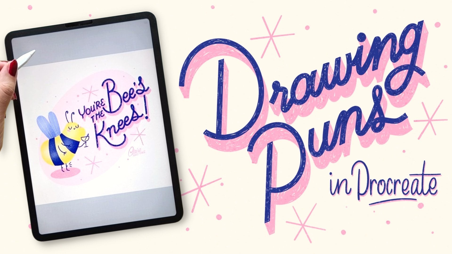
Transcripts
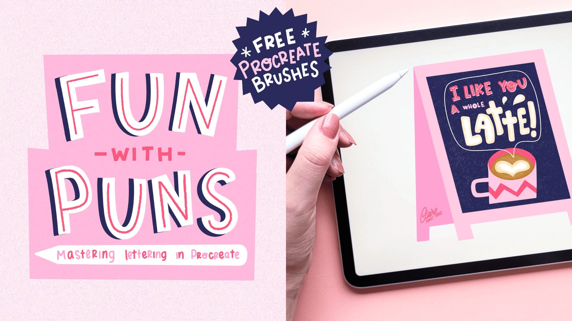
1. Thyme to Get Started! : The best way to elevate your lettering and
illustration skills is by turning text into
impactful designs. I made this collection of
shorter classes to show you that you don't need to be an expert to make your
own lettering designs. By experimenting with different lettering
forms and styles, you can elevate your lettering
and illustration skills. In this class, I'll
show you how to perfect the basics like brush
control, letter forms, and composition, but we'll
also dive deeper into things that make your designs really stand out like
textures and shading. By the end of this class, you'll not just improve
your technical skills, but you'll also
gain the confidence to create your own
unique lettering pieces. Before we get started, go to the projects
and resources tab. I added a brush pack for
Procreate there to help you out. Let's start drawing! :)
2. Sketching: We're going to start with
a new Canvas in Procreate. In the next few lessons, we're going to go over
steps pretty quickly, so a bit of experience in Procreate would
be really helpful. And you can also slow down the speed of the
video if you need to. So let's start with
our inspiration. You can follow along with
the pun that I'm going to be making or
pick another one, especially in this topic of pies and pastries and
everything to do with, like, baked goods, I guess
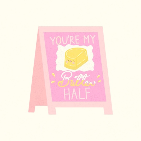
is the overarching topic. There's a lot of inspiration
here to pick from. They make for really fun Valentine's Day
cards, for example, and especially when it comes
to sweet desserts and pies, they're perfect for
the holidays, too. So they make for really fun
festive greeting cards. So what we're going to
do is make a design that incorporates our lettering
and an illustration of a pie. I always like to start
with writing down the pun, the sentence that we're
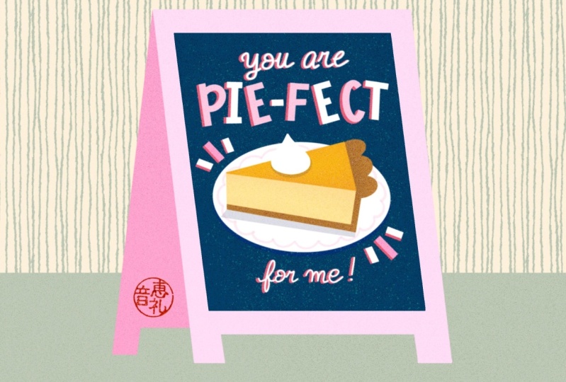
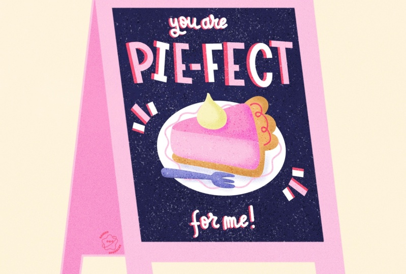
going to be using, and making a thumbnail sketch. In this case, you are 'pie-fect'
or perfect to me, 'pie-fect' is basically
the only word that's important here that we want to put the emphasis on. So what we're going to do is
in the middle of our design, make a little
illustration of a pie and then put our lettering at
the top and at the bottom. Especially if you're
picking a different pun or maybe you're new to
lettering and compositions, this is a really important
step because it helps you create a composition for your design on a
really small scale, and it's a really great
way to generate ideas, and it is a great
way to warm up. Normally, what we would do at this stage is take
the thumbnail sketch and scale it up to the size of our canvas and then
refine that sketch. But to make things just
a little bit easier, there is a pie stamp in our
brushes and you can use that to skip that step and use this as the
base of our design. And these blocks will help us with the placement
of our letters. This just makes things
a little bit easier. Then on the new
layer, we're going to place our letters
into these blocks. I'm not thinking too much yet about what kind of lettering
style I'm going to add here. And a tip here for placing your letters and making sure they all have an equal amount of space is to start with the outer letters
and then work inward. This way, you're certain
that all the letters occupy more or less the
same amount of space. At this point, you can start
thinking about what kind of lettering style could
elevate this design. In this case, especially
with this pun, it feels very sweet and naive and I feel like something retro would work
really well with this. I love using
lettering styles that are inspired by the
1950s and 1960s, especially bigger
bulkier block letters because they have this
sweet naive look to them, especially in this design, I think that will
work really well. Then for the rest
of our letters, we could use something that
contrasts with the rest, maybe a script, but something
simpler is okay too. This is the moment where
you can cut and paste and move stuff
around to make sure that everything fits
well inside our canvas. I'm also adding some
weight to our letters, just really messy, but
it just helps to see if these letters are going
to have enough space. Because later on we're going to be adding some
shading to this, so these letters are going to
need quite a bit of space. Another advantage of using these bigger blockier letters is that they're very easy to
read also from a distance. When making your final sketch, keep in mind with the letters
that everything needs to be legible and it doesn't need to be perfect or
super complicated, especially when it
comes to letters, usually less is more. When your sketch is
finished, on a new layer, we're going to be adding
a darker background. I'm using the dark blue, and that's basically going to be the background of
our chalkboard. You could also use
black for this, but I think something
like a dark blue or a dark green is just a
little bit more interesting. On this dark background, we're going to be adding
our light letters on top to create that contrast.
3. Illustrating: We're going to start with
coloring in our design, and we'll do the
lettering first. For that, I'm using
the monoline brush and then tracing our
biggest letters first. And here I am constantly holding down the Apple pencil to
create straight lines. Next up, we're using
the studio pen for our smaller
letters, our script. I don't use this very often because I don't think
I'm very good at it, but it's not as scary when
it's on such a small scale, especially in a piece like this, the emphasis isn't on
this script lettering, so might as well give it a go and see how it
ends up looking. The more you practice,
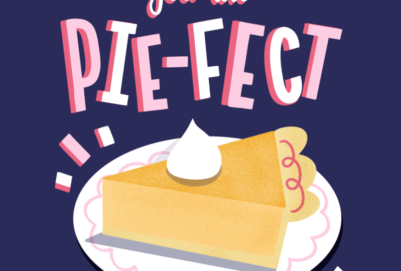
the easier it gets, too. And to turn our 'pie-fect' letters into block letters
with the eraser, I'm just cutting
off those edges. I think that makes the letters look a bit more intentional. This is just a
really easy way to make those letters with
a bit more control. Then I'm also just filling
up those corners a bit more, making those corners
a bit sharper. This is why I love creating small lettering
designs like this because it doesn't
need to be perfect and it's a really good
opportunity to experiment. And at this point, we can
experiment with color a bit, with the 'pie-fect' letters to
make them a bit more fun. We can alternate the pink
with the white, for example. This makes it look more
playful instantly. Next up, we're going to
add some shading to this. A really easy way to do
that is by duplicating that layer and then filling
that with a darker color, in this case, our red. What you could normally do
is then move that layer down a bit and then you've
instantly created a shadow. But we're going to do it a
little bit differently by selecting each letter
separately and then moving it. Because all our letters are at a different angle,
moving them separately, makes sure that we can add our shading to each
individual letter. For me, this effect instantly
makes it feel very naive, retro and it somehow reminds me of I think children's
cartoons, maybe. I'm not sure what it is, but it reminds me of
something specific. I think our lettering
is almost done. But for now, let's
move on to our pie and we can come back
to that lettering later if we want to
make any changes. Let's start with the monoline
brush and make our plate, and then we're going
to fill in all of the bits of our pie
separately in color. I'm lowering the opacity
of this plate and then actually just moving our sketch layer to
the top will help us while filling in this pie shape. Here we're using various
shades of orange because I'm thinking of a pumpkin pie and it's just a really
nice color, to be honest. But feel free to change it up. You can add some
filling to this pie or change the details to turn
it into something different. Especially when it
comes to coloring in, it's a bit of trial and error, especially if we haven't
done a colored in sketch. I tend to just pick
a color and move on. When the piece is almost
finished and colored in, it will be much easier to
see if something feels out of place or if you might want to change
the color of something. This will be really
easy to change because everything is
on separate layers. As you can see, to make
all of these pieces, we can just trace the lines
and then fill those shapes. But another way that
we can do this is by using our sketch layer
as our reference layer. This is especially helpful when you've got line
drawings, for example. It isn't perfect. We still
have to make some adjustments, but it helps with the
coloring in a little bit. And here we're adding our
cream on top in white. And then with a lighter
version of the blue, I'm filling in that fork, too. Here you can see we've
got our basic shapes, but we're going to be
adding some details to this and we're also going to be
making some changes later on. Firstly, let's add
some decoration to this plate on a clipping
mask and then we're going to use that pink to
add a design to this. This is also a really fun
way to bring back that color from our letters because we want to make sure that the
letters are connected to our pie as well and we can
do that by reusing color. I'm actually
duplicating that layer just to make that
line a bit thicker. And to all the parts of our pie, we're going to add
some texture as well. So the speckles are a really subtle way
to just add a bit of interest and to add
a bit of texture. I actually think that at this point that fork feels just a little
bit out of place, and I think I'm just going
to take it away and replace that by some shading underneath
our pie and that's it. I think that just feels a
little bit more balanced, but it is completely subjective, feel free to keep that fork
there or whatever you prefer. We're adding some shading
underneath our cream as well. And then just these
little filler elements that are based on our block letters that just fill up the design a little bit more and adds to
the playfulness. These stripes also push your attention to the center of the illustration,
towards the pie. We can change the color
here and I'm thinking our brightest colors
are orange and pink, and I'm just seeing
which one works better. I think I'm
going to change it back to pink here, to be honest. I think that looks nicer, especially with the darker
red / pink underneath. At this point, I feel like we're almost finished with
our lettering design, but I'm not 100% certain. In the middle of a
piece like this, it's usually a good
idea to take a break, just come back with
a fresh perspective, and then it might be
easier to see what is actually missing or
what needs to be fixed. Take a little break and
then when you come back, we'll finish up this piece
and make final changes.
4. Texture & Shading: I've turned off the sketch layer and turned up the opacity of our blue so we can see what our design
looks like up until now. I think it is almost done, just a few final bits that
could make it better. Like, for example,
I think this pie is lacking just a little
bit of a pop of color, and I think we can use
our red to change that. So with our felt tip liner, I'm just making a line
on this crust here. And we can also add some
shading to our smaller letters. So we're going to duplicate
that layer, fill with perhaps red. Let's see what that looks like. Perhaps with orange,
maybe that's better. And to finish up the shading, you can fill it up manually, or a really easy thing to do is just duplicate that layer a few times and then move it towards
your original lettering. Then just merge all
the layers together. I think at this point, I'm still not liking the
way that orange looks, so I'm changing that
shading back to red. Let's also add some
shading under our plate. Duplicate that layer, turn it to Alpha lock and
fill it with blue. Then, because our blue is already our darkest color on
our color palette, change the blending
mode to multiply. Then when you move
it, you can see, we've got a slightly darker
tone underneath our plate. When you're happy,
we're ready to put our design on
our chalkboard. But we're going to make
a copy of our design, so we don't lose any of
these separate layers. Let's select all of our
layers, put them in a group. Deselect our blue, so you only have your lettering
design with no background, and then go to Copy
Canvas and then paste. This is going to be
our layer that's going to go on top of
our chalkboard design. So to finish up our piece, let's make our chalkboard. This is a really fun way to put our pun or our lettering
design onto something, and it's a great way to
finish off the piece. You can make your own
chalkboard or use the stamp, and my chalkboard is going to be pink and this stamp is
pretty much ready to use. You can color it directly. The back of that
chalkboard could be a darker shade
of whatever color you're using to give that effect of the shading of that board. Make sure to fill the chalk part of your
chalkboard on a separate layer. Turn your chalkboard
to reference and then on a new layer, use your darker color
and fill it up. Let's move our
design to the top. Make sure that it fits on your
chalkboard and you can use distort just a bit to make
sure it fits at an angle.
5. Finishing Touches: We're almost finished. We're just going to add
a few more details. Let's start with our background. On a new layer, I'm
just going to fill with orange and then
bring down the opacity. Next, we're going to
add some texture. For this, let's select our blue chalk layer because that's where we want to
add our first texture. Then on a new layer, use black, and then we're going to
use our ink speckle brush. With this, we're going to
recreate a chalk texture. I really like using this
texture in particular because it feels very handmade, which especially when
you're working digitally, it's just nice to
be able to bring back a bit of that
handmade feel. So we've just got
two layers here and then we're going to play
with the blending mode. Turn one layer to 'overlay' and then the other
one to 'divide'. Then you can play with
the opacity or bring it down a bit to soften
that texture. And feel free to play around here with different
blending modes. This is just a really easy way to add a texture on
top of your work without damaging or making changes to the actual
design itself. Next up, we're also going to add a texture on top of
our entire piece. If you're adding a
grainy texture here, this will look really
nice if it's printed and again gives you
a little bit more of a handmade feel.
And just change that layer to 'overlay'. You're also going to
get slightly more pronounced or saturated colors. And last but not
least, of course, we're going to add our
signature, very important. And now it looks like
our piece is finished. I'm really looking forward to
seeing what you've created. So before you leave, please upload your sketches, your final pieces,
whatever you've made to the student
project section. Even if your work
isn't finished, share it with the world, anyway. I have found that,
especially when it comes to humor and using puns
in lettering designs, it really connects with people, and your work certainly
doesn't have to be perfect. If you're not done creating, feel free to upload more puns to your project or check out my other short classes
in this series, where we'll be creating
other lettering designs. I hope that you
enjoyed this class, and it boosted your
confidence and creativity. Don't forget to
leave me a review, and I would also love to hear your suggestions on topics
that we should cover, puns you want me to work on or any questions that you have. You can leave those
in the reviews section and in the discussions tab. If you enjoyed using the
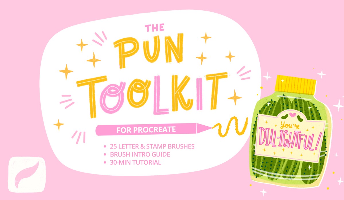
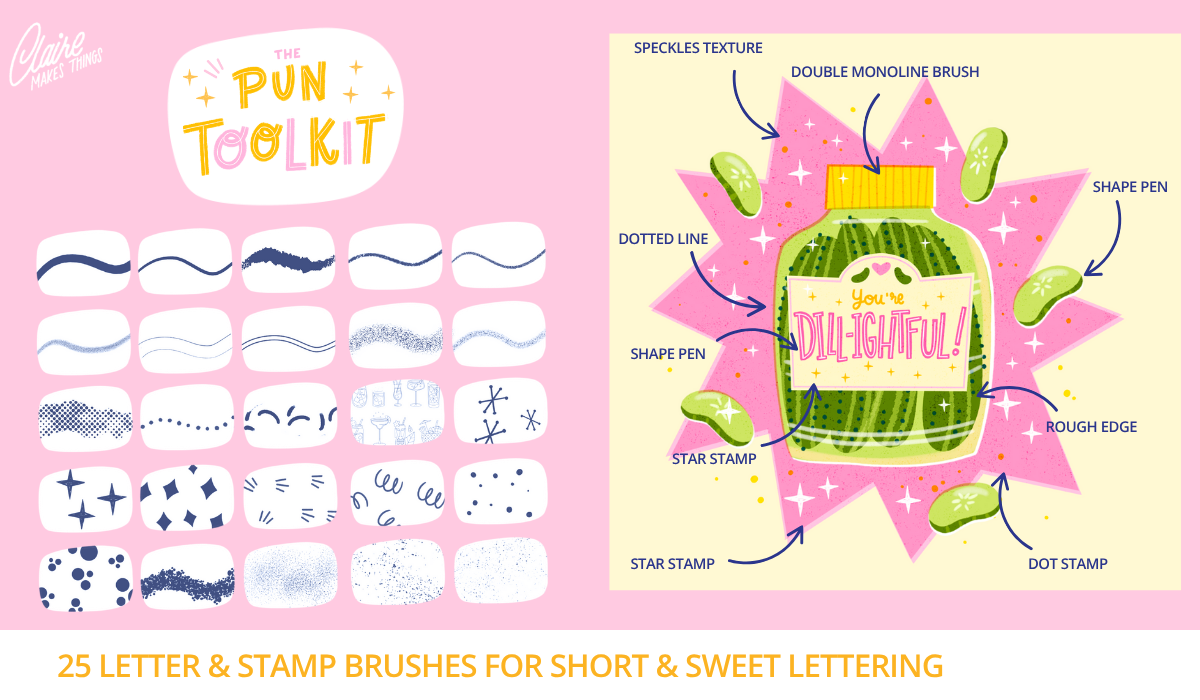
brushes in this class, you might also like my pun
toolkit for Procreate, which is available on
Skillshare as well. If you want to stay up
to date on new classes, Procreate brushes,
drawing tips and more, subscribe to my
newsletter below. See you in the next class! :)
 Claire Makes Things, Illustrator | Lettering Artist