Transcripts
1. Intro: Lettering doesn't have
to feel intimidating. Sometimes all it takes is a few simple projects to spark inspiration and
uncover your style. In this class, we'll explore
three lettering projects in Procreate that make it
easy to experiment, build confidence, and start shaping a style that
feels uniquely yours. The best part is you don't
need to start from scratch. If you're joining me for
the first time, I'm Claire, an Illustrator and top
teacher here on Skillshare. I've worked on lettering and
illustration projects for clients for years and taught
thousands of students. But I'll be honest,
it took me years to feel confident in my own
lettering abilities. Finding your style isn't
a one-time aha-moment. It's a process, and your style keeps evolving
as you practice, explore and discover
what excites you. This class won't give you
a perfect way to letter. Instead, it's about experimenting
with techniques and starting to see what
feels most like you. Here's how it works. We'll dive into three lettering
design demonstrations. In each, you'll
learn two or three simple techniques
and fun effects. I wanted to create a
class that allowed you to jump right in without needing to start with sketches and the most daunting
part of lettering. This is not a class
about the basics. These are simply three
ways to approach lettering to inspire
and motivate you. Finally, I'll share some of
my favorite lettering tips, plus lessons I've learned and mistakes I've
made over the years. By the end of this class, you'll have a mini library of lettering ideas and
styles to pull from in your own work and maybe
a clearer sense of what makes your lettering uniquely
yours. Let's get started.
2. Finding your Style : Before we get started,
just a quick note about the topic of this class,
about finding your style. It might sound like this
big mysterious goal, like one day you'll stumble upon it, like a treasure map, but it's not really an
end destination. Your style is something
that is always evolving. It's shaped by the
choices you make, so how your lettering
looks, what you decide to draw, and what
excites you the most. You discover these
things step by step. So how do you actually
find your style? Try out different
lettering approaches from elegant scripts to bold serifs, to playful illustrative letters, especially when you're
just starting out. The more you
experiment, the more you'll notice what
feels right for you. Things like challenges
and daily practice can really help because you can learn stuff so
quickly from that. You can also start
by emulating others, copy styles and test techniques, and then adapt those
to your own ideas. You'll realize very quickly in that process what you like
and what you don't like. If something doesn't click,
that's totally fine. That just means it's a dead end on your map on your journey. Just keep moving
forward and you'll naturally build a path
that feels like your own. That's why I created this class. I wanted to create
something that could help you move
forward in that path. It's a chance to peek behind the scenes of my
lettering process, learn new techniques,
and reflect on your own preferences
along the way. As I mentioned in the intro, this isn't a complete
lettering 101. I'm not going to cover all
the rules or the basics. It's just about
trying things out. I've done plenty of
lettering projects for clients and I have some
classes on lettering, but I once struggled with lettering as well, and
I'm still learning. What really helped
me over the years is emulating and slowly figuring out what I liked and
what I didn't like. That's how style develops. So if you're feeling unsure or hesitant and you've maybe
never tried lettering before, remember, you can do lettering. There's not one way to
be a lettering artist, and your results don't need to look like mine just to
be sufficient or good. In fact, the quirks
or imperfections that you might start to notice in your work when
we get started, those are what make
it uniquely yours, and that is part of
your style as well. So just keep that in mind
when you're maybe feeling like you don't
want to share your student project in
the next few lessons. Your results are worth sharing, and they will also motivate
others to share their work. In the next lesson, I
just want to give you a quick overview of the resources and then
we can get started.
3. Project: Let me show you real quick
what you need for this class. In the Projects
and Resources tab, you'll find a Procreate file, and this is what we'll use for our demo lessons that are coming up so that you can jump
right into the process. Just download this file and then when you tap on this file, it will automatically
open in Procreate. There's also a color palette. We're going to reuse colors from the existing designs
in this file, but the color palette
will make it a little bit easier to see all of the
colors in one place. Procreate brushes are not
really important here. I'm going to use mostly default brushes and I also give some
suggestions on the way. Lastly, there's an
inspiration guide, and I added some more
recommendations for brushes there if you want
to try anything new, and some more inspiration to make your own
designs from scratch. Just a quick disclaimer: The designs in this
file are my own. This is actually greeting card collection that I
made a while back. Feel free to share this
also on social media. Just make sure to
mention my name and obviously don't sell any of
the designs in your own name. Before we start
drawing, make sure to download all the
resources that you need. And just a really quick thank you to all
Skillshare students. I asked for feedback
on this class a while back and you all made that
happen. Thank you so much. Even though you chose
overwhelmingly to do a class that is focused on demos like this with
a Procreate file, I did also want to add
some more tips at the end. Even though this is mostly a practical class
towards the end, you can find some tips as
well. Let's get started.
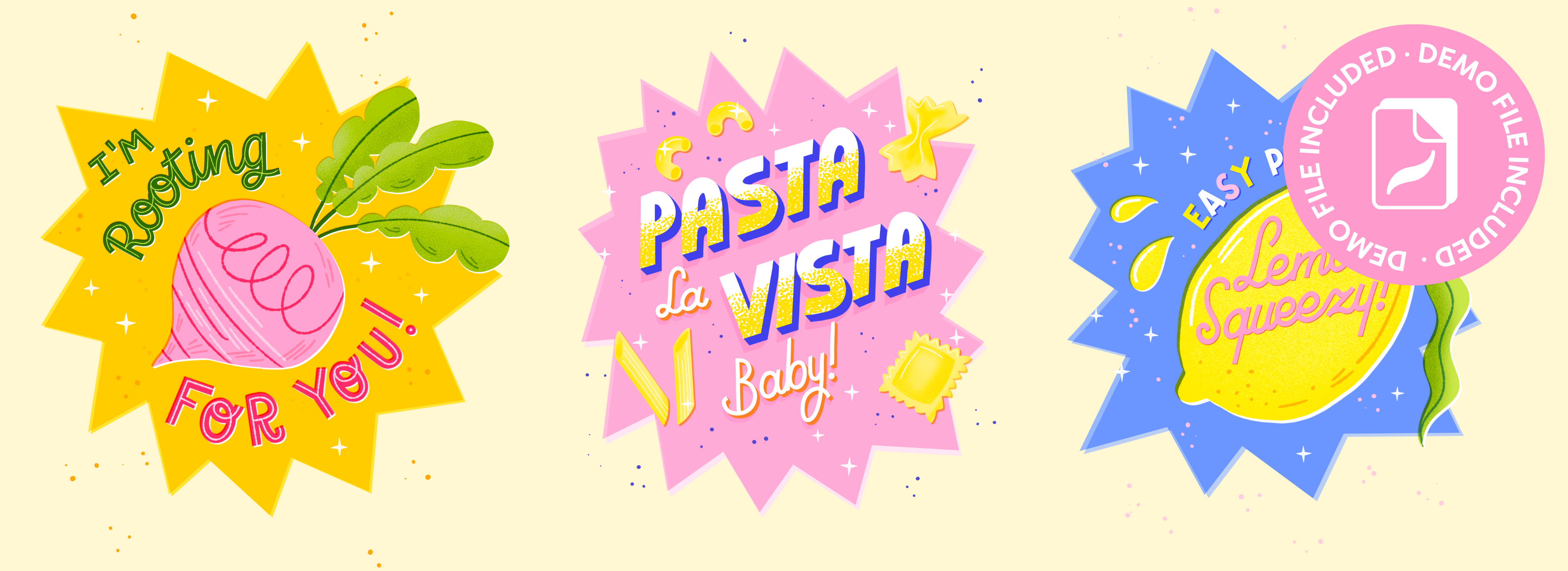
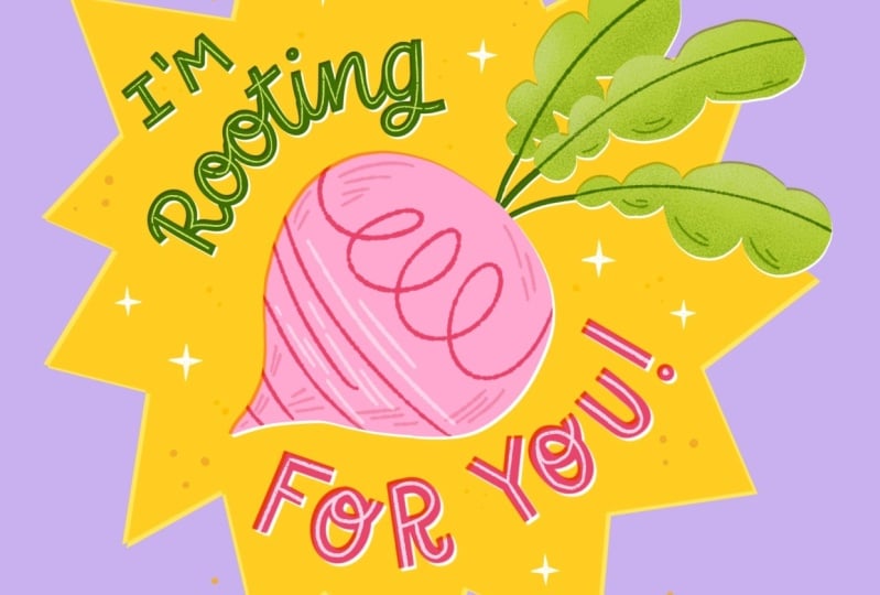
4. Demo I: Inlines & Offset Effect: Let's start with the first demo. Let's open up our
file and then go to the layers and then you can see you've got three
different groups here. Those are three demos
that we'll be working on. Then if you downloaded the
color palette as well, you'll find that in your
palettes at the top. I'm going to set this to default because we'll be
using this as well, but you'll find all
of those colors in the layers as well. Let's open up this first design. As you can see,
this is pretty much a finished lettering
design that's actually intended as a greeting card and you can see that everything here is separated into layers. What we want to do is just add some finishing touches
to make this design, especially the lettering
really stand out. The first thing that we'll do is add inlines to our letters. Inlines are the easiest
way to add something unique to your letters without changing the shape of
the letter itself. We're going to add lines
inside of our shapes. These could also be broken up lines or dots or flourishes, anything that just breaks up
the color of the letters. At the moment that green
especially just feels a little bit like it
needs something bright. Let's add a layer on top of our letters and let's
use this bright green. Then for a brush, as
I mentioned before, you don't really need
anything in particular. I'm going to use the
retro liner from my liner toolkit
brushes because I used that before in
this beetroot as well. It has that consistency, that same blotchy texture. But you can use whatever
brush you like here. Then before we get started, something that really
helps is to turn up the stabilization
of your pencil. This will make it
a lot easier to do the curves of the letters
because this is a script, that will make it a lot
easier to follow the lines. Then we simply trace over the existing letters
in the middle with a thin line and that
breaks up that darker green. And just simply
follow this shape, the direction of your letters and make sure that
the line is in the middle of your
letters because that will make it easier to read
from a distance as well. As I mentioned, an inline
could be swashes or dots. You can change it up here a bit and even try different brushes, for example, this dotted brush. But I'm going to keep
it really simple and just stick to a simple line. We don't want to add too
many details to this because the letters itself are
quite small on the canvas. So when you zoom out, you want to make sure that
you can still read it. We're really not
taking away from the legibility here by just
adding a line in the middle. You can make adjustments
here if you need to. That looks good. I think that already makes
such a difference and it just makes the letters more
pleasant to look at, I think. I really enjoy using this in
line effect with letters. This is a really nice way to, as I said, break up
those bigger colors, but also just bring back
some of the color that you use in your
illustration, for example. Now we're going to
do the same thing with our red letters, and obviously we'll do this again on a new layer
so that we can make changes if we need to to reuse some of the color
from that beetroot, let's use that light pink. And this time we're
going to turn that layer to a clipping mask, tap on that layer, turn
it to clipping mask. The reason that we turn this to clipping mask is
because this way we can continue that inline to
the edge of our letters. It's just a slight variety on the inlines that we just did. But it looks fun, I think. And that has really brightened
up this piece already. I think the red was
just a little bit too much and this way from
when we're zooming out, it just looks a little bit
more pleasant, a bit brighter. Next up, we're going to
add one more detail. As you can see in
this illustration I did of this beetroot, there are two layers, you've got the actual beetroot, and then the white
layer underneath. As you can see,
the beetroot layer is set to a blending mode, multiply, and then the
white layer underneath. I moved it slightly you see this especially
when you zoom in and you have this slight
white edge on one side and a darker
multiplied edge on the other. This basically is a way to mimic printing
technique where it looks like the
colored layers are misaligned and this helps to set apart your
layers a little bit. We're going to do
the same thing to our letters to just set them apart from
that yellow background. Let's start with green. Let's duplicate that layer
and then make sure to turn that bottom layer to alpha
lock if it wasn't already. Let's select white
and then fill layer. Now we're going to
use a selection tool and we'll just move
it a tiny bit. If you just want to
move it a little bit, you can simply tap a couple of times with your pencil to
just move it slightly. The last step is to go to
our green lettering and then turn the blending
mode to multiply. When we zoom in, you
can see the difference. Because of this
multiply blending mode, you can see a slight darker
edge because that is the green and yellow mixing and on the other side,
slight white edges. That just helps to set your lettering apart from
the yellow background. We'll do the same with
our red lettering, duplicate, fill with white, and then just tap to
move that white layer slightly and set your lettering blending
mode to multiply. And you can see the difference. These are just really small
changes that we made that you can apply to any
lettering design that you feel is just not quite
finished yet and it's a really nice way to just add some finishing touches
to your designs. In the next lesson, we're
going to take it up a level and work on our
second lettering design.
5. Demo II: 3D Effect & Drop Shadow: Let's continue with
our second design. As you can see, we've got some letters here that
are almost finished, but there's some
opportunity here to add a 3D
effect and shading. I want to show you how to
add shading to your letters, both in these big block letters and in a script
lettering as well. We're going to start with
our main lettering and let's reuse a color that's already in this design in the small
dots, this dark blue. Let's duplicate our
main lettering. And then we'll turn that
bottom layer to Alpha lock. To do that quickly,
just swipe to the right with two fingers and
now you turn your layer to Alpha lock
quickly then select dark blue and then fill
that bottom layer. Now that's hidden behind
our white letters. With the selection tool, let's move it to
the bottom right. Again, you can just use
the Apple pencil and tap in the corner so you
don't move it too much. Then to turn into actual
3D letters to make sure that the white and
blue layer are connected, we have to connect those lines. Let's turn Alpha lock off, swipe again to the
right with two fingers, and then we need a simple brush that doesn't have any texture. I like to use something
in the calligraphy tab. You have a monoline brush
and a script brush, and those are perfect for this. All you need to do is connect those edges to each other
all in that same direction. Adding this 3D
effect to your letters, it really changes the feel of your entire lettering piece. It's a really good skill to
have because you can apply it to really simple letters that you might not feel
very confident about. Just adding this technique
really takes it up a level. Now you really made it look like those letters have
a lot of depth. This is again a really nice
way to bring back some color. We're going to do
the same thing to our smaller script letters and maybe we can add
a different color. As you can see with
the pasta shapes, I actually added
orange underneath. With the script, let's
do that as well. Let's duplicate
that script layer, turn it to Alpha Lock, and then select our orange. Let's fill that layer and
then with the selection tool, we'll just move it slightly. The more you move
the shading layer, the more intense your
3D effect will be. In this case, these script
letters are smaller, so we don't want it
to be too intense. As a small detail,
what I've done with the pasta shapes as well
is turn that orange to the multiply blending
mode to make it a bit darker on top of
that pink background. And lastly, let's connect
those edges to make sure that the white and
orange layer are connected. Here you can see what
our lettering design looks like with the
3D effect. Once you have that
3D layer, you can even duplicate
this and make this as big as you want to. You can even change this
to add different colors. This actually adds
a bit of I guess, a 1970s effect, which is really fun. You can play around with this. There are not really any rules. Just make sure that your
letters are still legible. At the moment, our white letters are still just white
and nothing else. I want to make sure to add
some color to this and maybe bring back some of that
yellow from the pasta shapes. A fun way to do this is
by adding a gradient. In this case, yellow to white. To do this, we're going to
add another layer on top of our main lettering and then set that layer
to clipping mask. That way we can draw inside
the shapes of our letters. Let's select yellow. That's the same yellow
as our pasta shapes. Then you can either
to add a gradient, add a really smooth brush
and then just start at the bottom of your
letters to create this smooth transition
from yellow to white. But what I like to do is add something with a
bit more texture, like a speckled
brush, for example. I usually use this grainy brush from my texture sample kit, which I really like for
doing gradients that just feel a little bit more
gritty and imperfect. Another fun option is to use the myrtle brush in
the vintage tab, and that has these sprinkles and they're just a
little bit bigger. I think for such blocky letters, that would look really nice. Feel free to change it up here
and use different colors. Reuse something that
you either have on the color palette or
already in this design, for example, that
orange or blue, you've got lots of options here. Our last step, I also want to show you how to
create a drop shadow. At the moment, our letters are just laying flat
on our background, but to add some depth here, we can add a shadow as a way to connect our
letters to our background. Let's start with our
main letters for this. Go to the white layer, duplicate it and add
it to the bottom. Underneath our blue layer, set it to alpha lock, swipe right for two fingers, and then we're going
to use our pink, the pink from our background because we want to
make it look like these letters cast a shadow
onto the background. Fill that layer with pink. Actually, let's move
this layer on top of the background because we might need some more space
for this and it has to be connected to
the background itself, not on top of any other
shapes or letters. Let's change the
blending mode to multiply and set the
opacity to around 50%. With the selection tool, let's reveal that
layer underneath our letters and here you
can see what it looks like. When we move this layer
to the bottom left, it makes it seem like
there was a light or a, a light source coming from
the top right corner. You can bring down that opacity slightly to make this
a bit more subtle. So it's not so noticeable. The last thing we need
to do is then connect our drop shadow to
our main letters. And I hope that it's
starting to make sense here that it's basically
those main block letters. You have to see them as,
like, buildings, almost. They're casting the
shadow on our pink. Again, you can make
this as intense, as big as you want to. If you want it to
be more intense, just move that layer further
away from your letters. This is a really subtle
effect in this case, but I didn't want it
to be too noticeable. It's just something
that's adding this finishing touch
to the letters. Let's do the same thing to
our script letters, lastly, duplicate your
white script layer, move it to the background, set it to Alpha lock
and fill with pink. Set the blending mode to multiply and then just bring down the opacity
a bit as well. Then when we move it in the same direction
to the bottom left, you can see that makes
a difference already. Then turn off that Alpha
lock so that you can make adjustments to these edges and connect it to your letters. Lastly, this is a
really small detail, that orange layer is actually set to multiply and that now interferes
a bit with the shadow. If you want to change this,
just grab that orange from your letters and then fill your drop shadow
with that exact orange. I want you to apply this 3D effect and drop shadow, you could even add a darker
shade to, for example, the bottom of these letters and give it even more
depth, for example. There are a lot of possibilities
you have with this. I'm going to just
leave it as it is. I prefer a bit more of
a flat graphic look, but feel free to try out
your own options here. This is the before and after. Now that you've tried out
different lettering techniques, it's time to try our own
lettering from scratch.
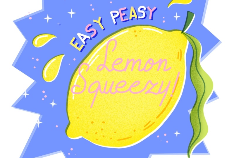
6. Demo III: Sans Serif & Script Letters: Now that we've tried a couple of techniques for finishing
up your lettering, let's do some letters
from scratch. Here in this last demo, you can see we've got
some guidelines and we're going to use this to make some block letters and
some script as well. Let's start with the
smallest letter, start easy. I'm going to add these letters, 'easy peasy' with white
at the moment. In this guide, you
can see every letter will fit inside this box. We just want to make
sure that our letters fit in that height. That's the most
important thing to make sure that your letters
are consistent. If you want to
follow along here, I'm going to use
a specific brush that you can find in
the painting tab. It's this flat brush which
I like for block letters. I like letters that
have these flat ends, so that's my preference. You can use whatever
brush you like here. What will help as
well as always is to turn up the stabilization
a bit if you need it. Let's make this
brush a bit smaller. What helps with block letters
is to make straight lines. Simply hold your
Apple pencil down, and then you can create
automatic straight lines. Because these letters
are at a curve, just make sure that you move the canvas a little bit to make sure that every letter is
done at a slight curve. Again, the letters
don't have to fit perfectly in this box as long as they follow the guidelines a bit and we can clean them up
a bit after if needed. Feel free to change it up here and change the style of
lettering if you want to. And then with the eraser, we're just going to make some adjustments and smooth the edges of our
letters a little bit. You can make small adjustments
here if you need to, like, moving the
letters around a bit. I think it'd be fun to add
some more color to this. Once your letters are finished, let's set that layer
to alpha lock and then we're going to reuse
the yellow from this lemon and also use pink. We're just going
to alternate them. You've got yellow, white
pink, yellow, white pink. Lastly, to make these letters stand out just a little bit, we can add a simple
darker layer underneath. Let's duplicate that layer
and then fill it with blue. And then with the
selection tool, we can just move it slightly
and then set it to multiply. This will make our
letters stand out just a little bit more
from the background. When you're happy
with these letters, let's move on to
our main lettering and this is going
to be a script. For this, as you can
see, the guidelines are a little bit at an angle and this will help us with the direction
of our script, which is going to be a
little bit angled as well. We're going to use the
same flat brush and maybe pink, so these letters, it's going to be
'lemon' and 'squeezy'. The L and S are
going to be bigger. So make sure to use
your space for that. Again, this doesn't
have to be perfect. Feel free to just try out
whatever feels comfortable, but just keep the X-height of
your guidelines in mind. It might take a couple of tries
to get it right until you set on a letter that you like,
but that's totally fine. Just take your time and make sure to do all the
letters separately. Simply take a break after every letter and see
if you're happy. Don't do it all at once like
you do with handwriting. The S is a fun letter
to do because there are so many ways that
you can do an S. You could give the top half of your letter a lot more space or for example, the bottom half. This really changes the
personality of your S. I find the E such a difficult
letter to do because especially a lowercase E can be done in different ways and it really changes how it looks. Maybe try this a
couple of times until you like the look of
your letters here. Lastly will add an
exclamation mark as well. It's fine if your
letters don't fit perfectly inside the lemon,
we'll change this later. At this stage, you can make any adjustments if you need to with the eraser, because
the flat brush isn't perfect in any way, so you can adjust your
lines here slightly. Now that our script
lettering is done, this step is optional, but I like to sometimes
just distort my script. We can make it feel
a lot more dynamic. In this case, because
of this lemon, because of the
direction of the shape, we actually have a lot more
diagonal space to work with. It makes sense for us to
distort it a little bit. Make sure to
duplicate a layer in case you want to
make changes and then we'll go to the selection tool and
then go to distort. This way, you can make it fit a little bit better
inside that shape. You could easily
start your script lettering in a diagonal
direction already. But I find that
it's a little bit distracting to use the correct
X height of the letters. Sometimes I just prefer to do it this way so that the script is a little bit easier to do and it just makes the
letters more legible. Lastly, we'll also add
a small detail here, a darker layer underneath. Let's duplicate that
layer and I'll use that pink underneath to set it apart
from the yellow a little. And to make it a bit darker, I'm just duplicating that layer. And that's it. This is the before and after. I hope that this
wasn't too difficult. If you've tried
lettering before, maybe try some different styles here and see what you like most.
7. Share your Work!: I would love to see what
you've created in the demos. Whether you followed
along with me or tried your own
lettering ideas. Don't forget to share your
project in the projects tab. In the resources tab, I also added in
inspiration guide with some other
lettering options. So you can use these as a
starting point for making your own lettering designs from scratch using the techniques
that we've learned. Keep in mind that it doesn't
have to be complicated. If you do want to add some illustrations
to your lettering, stick to just really
simple shapes and don't overthink it too much. It's also totally fine to add sketches to your project
rather than finished results. That way, you're experimenting
and you're learning, and that's also the whole
point of this class. Don't forget to
share your project, and in the next lesson, I'm going to cover some
tips that are helpful for your future
lettering projects.
8. Lettering Tips : I want to talk
about ten tips that have really helped me in
my lettering journey, and I think will help
you to become more confident in your
lettering skills. The first one, most importantly, there's absolutely no right
way to be a lettering artist. Just because you might
not feel confident in your drawing or your
lettering abilities, that does not mean that you
are not able to do lettering. You certainly don't have
to master every style and flourish or fancy
brush technique that's out there to call
yourself a lettering artist. If a certain method
or trend just doesn't feel like you,
that's totally fine. I came to lettering through
the world of Illustration. I already knew I liked
things a bit retro and wonky and imperfect and that's
totally become my voice. I decided to focus on
that and do nothing else. Secondly, experiment with
tools until something clicks. I really like using
Procreate for digital lettering
like most of us, but maybe digital apps
aren't your thing, or maybe you just haven't found a process that
works for you yet. Try different brushes, tweak
the stabilization settings, for example, experiment
with analog tools too, or even trace fonts
as a practice. This is something
that I encouraged in a class where we worked with lots of lettering and it can feel
really overwhelming. Doing something like
that really helps. Every time you try something new, you'll learn from it too. I tried lettering for the first time using
brush pens on paper, and as someone who's
left-handed, you're constantly wiping away all
the ink from the paper, it's such a frustrating
and messy process. I honestly gave up
after that thinking, Well, lettering just
isn't for me, I guess. Years later, I
discovered that there are tools that actually
work for me, so iPad, procreate, and chalk
pens that are less messy and easier to use as a
left handed person, I think. I realized I could
do it after all. Don't feel discouraged if a certain technique
doesn't feel right. It just takes some time to
find the right tool for you. There are many different
ways to approach lettering. Having a go-to style or process
is also really helpful. This is actually
a tip I got from the incredibly talented
illustrator Tom Froese, who has mentioned in a
couple of classes that he mostly does illustration and lettering is part
of that process, but it isn't his main thing. He actually recommends just
having a go-to style that you can fall back on to make things a bit
easier for yourself. This is really helpful because
when you're starting out, having that go-to style just gives you a bit of
confidence and it's something to lean on
so you don't have to start from zero
every single time. If you're more experienced or you're an artist
for a living, it also helps to make your
work more recognizable. My go-to style when I don't
want to experiment or I just want to keep
things simple is wonky and bulky block letters, and that's something
that I can always return to when I want to keep it simple or when I don't want to explore
anything new in that moment. I mentioned this a
couple of times already, but make sure to plan for
legibility in your lettering. Make sure that your
message is clear and don't overcomplicate your letters to the point where you
can't read it anymore. Before you jump into
designing full pieces, start with quick
thumbnail sketches to test out your ideas. This helps you to
explore compositions and choose which words in your
phrases to emphasize. This way, you can spot issues early and work on the spacing of your letters to make
sure that nothing is too cramped or difficult to
read from a distance. Especially when you're making something like
greeting card designs, it's really important
that everything is legible because
these are usually a smaller size and readability matters way
more than fancy flourishes. So when you're starting
out lettering, focus on your spacing and always work with
thumbnail sketches. Use all the tools and guides
that are available to you. Procreate has lots of powerful tools to help you
stay organized and precise. So things like grid lines
and drawing assist, snapping and the selection tool, you can also use premade
layout stamps, for example. These are really helpful for starting with ready
made compositions. All of these tools, they
don't limit your creativity, they support it. So use them. Simplicity is your best friend. Avoid filling the canvas with too many words or
decorative elements. Obviously, this is
important, like I said, for legibility, but you also just want to make
your letter shine. Less is more and over time when you learn to be more confident in your lettering abilities, you'll be able to rely more
on the letters without hiding them behind lots of unnecessary
flourishes or extras. If you do ornate detailed big lettering
pieces, that's totally fine. But use your filler elements and your flourishes
intentionally. Even in those elaborate pieces, the most important thing is the composition and the
placing of your letters. Flourishes and details,
they come after. It's really easy to
be intimidated by the amazing work of lettering artists that
make elaborate pieces. But they were beginners
at one point too. If you see their
sketching process, you'll see that they
always start out with the basic composition and
then build it up bit by bit. Something that has
really helped me out in the past as well is to keep in mind that lettering doesn't need to be the star. You can try integrating
lettering into illustration, and that way it could feel less scary and the focus isn't as much on the
lettering itself. You can add your
lettering inside objects, for example, or in
signs or packaging. This is a great way to practice
and explore your ideas without the pressure
of having to make a full lettering
composition. We did this in my
sardine tin class where even for people who have never tried
lettering before, we're able to add these
little bits of lettering here and there and it felt way
less scary to start that way. Work on your consistency. Set simple rules for your letter forms and
try to stick to them. For example, if you use a certain kind of
serif on one letter, apply that idea to others
with small adjustments. This consistency makes the piece feel cohesive and polished. Adding those little
repeated elements to your lettering are far more important than perfecting your lettering and it's also the easiest way to
find your style. If you set those basic
rules to your letters, you maintain some uniformity and it feels much
more intentional. For example, these letters might seem imperfect and wonky, but if you put those together, this actually becomes
an intentional choice and it actually looks playful. The letters say we speak the same language and this
makes it really unique. And similar to this is to embrace your imperfections
or your quirks. Your quirks or things that you repeat that you
notice about your work, they are your strength. They can actually add charm and uniqueness to
your lettering. You can have a look
back at some of your older work and notice what sort of mistakes or
quirks keep coming back. Those could be things
that you could lean into and use as a strength. For me, it's a lot of wobbly lines and
asymmetrical shapes. I really just started because I didn't want to
draw straight lines. Instead of in the beginning, when I started with lettering, I was trying to hide
those asymmetrical shapes and now actually let them shine
and use it intentionally. And also just embrace the playful imperfect
nature of lettering. Those quirks will add personality and they will
help your work stand out. Lastly, make your design pop. What I mean by this is
actually what we've done, especially in the first
and the second demo, which is using these
different techniques like this offset technique and a drop shadow and highlights to really make
your lettering stand out. Like we saw with just
simple lettering, you can really elevate the piece by just adding
these techniques. In my make a pop class, we actually go over this and I show you in
eight steps how you can really elevate your piece without actually changing the lettering itself. Make use of those little techniques that
you've learned in this course and use those in
your own lettering process. A lot that you can do
with your letters without having to improve your
lettering skills right away. I hope that these tips were helpful and as I said, for me, they've been a
guidance throughout the years to improve
my lettering process. I would love to know
what you found most helpful and what you're
going to use in the future. Let me know in a review or
in the discussions tab.
9. Final Bits: Thank you so much for
checking out my course. I really hope that it
was useful for you and that it inspired you
to keep trying lettering. By committing to this learning
and discovering process, you're not only creating art. Each attempt teaches
you something new, whether it's about your style or new techniques or discovering
your creative process. I would love to
hear from you which lettering design was most fun to work on and also which tip resonated
with you the most. You can let me know
in the discussions tab or by leaving a review. And if there's anything you in particular want me to focus on more or any of these
lettering designs that you want me to make from
scratch, do let me know. I would love to
hear your feedback, and that also helps me to make better classes
in the future. If you're looking for more
lettering inspiration, I've got a class on short
and sweet lettering designs, and my 'Make it pop' class is all about elevating your
designs in Procreate, and that also comes
with a demo file, so you don't need to
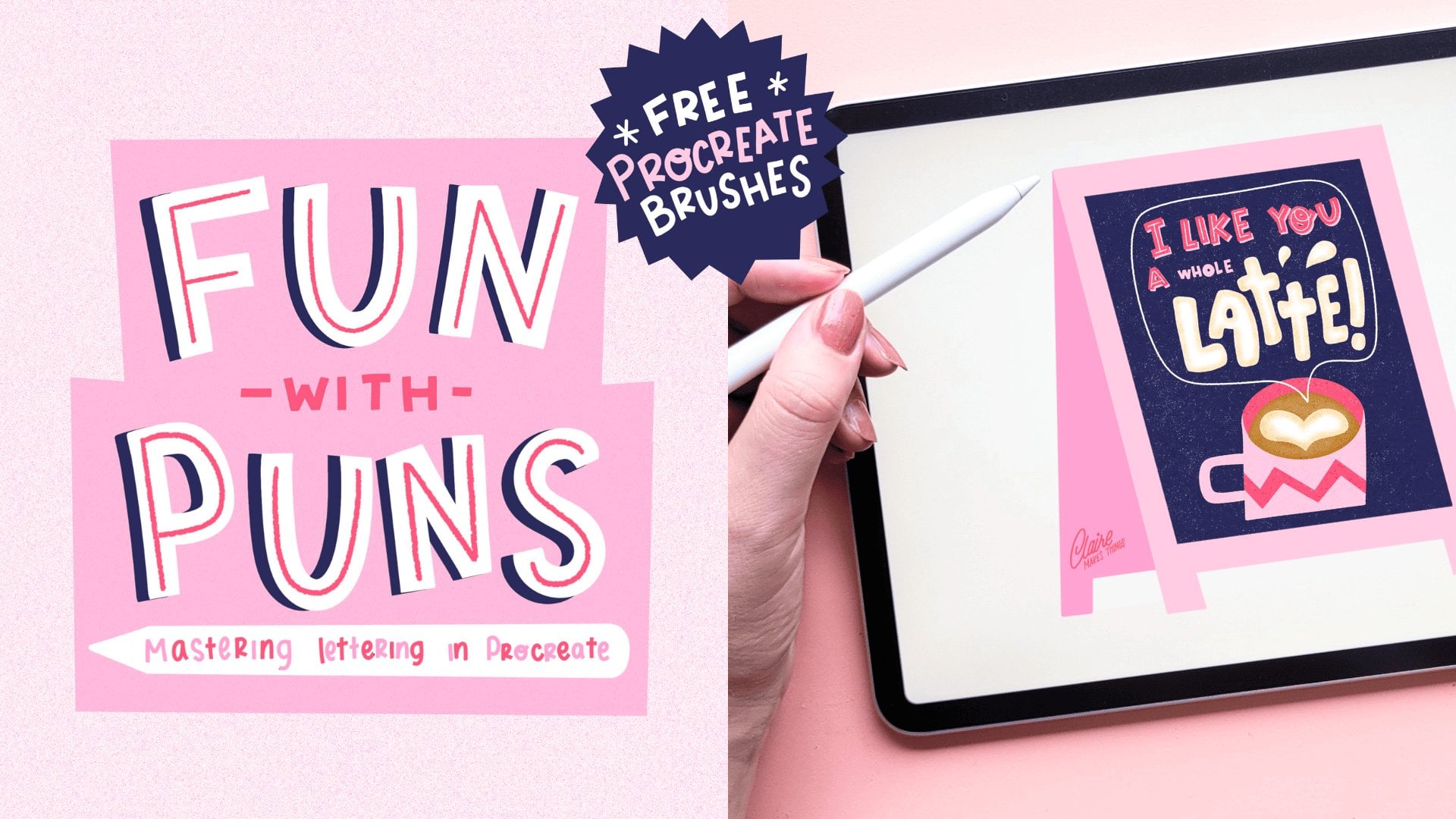
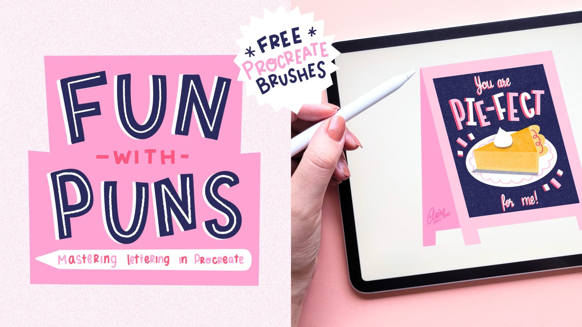
start from scratch. For shorter classes, I've got
a 'Fun with Puns' collection, and in those shorter classes, we're actually using templates to help you with your
compositions for lettering. I have also loved
seeing the projects in my 'Master line Brushes in
Procreate' class, and in this, we're illustrating a
collection of sardine tins, especially for
beginners in lettering, this is really fun because we're incorporating the lettering
into the illustrations. Don't forget to upload
your project and, of course, leave a review. Thank you so much for joining, and I'll see you
in the next class! :) 20% Discount code for brushes: BRIEMINE
 Claire Makes Things, Illustrator | Lettering Artist