Transcripts
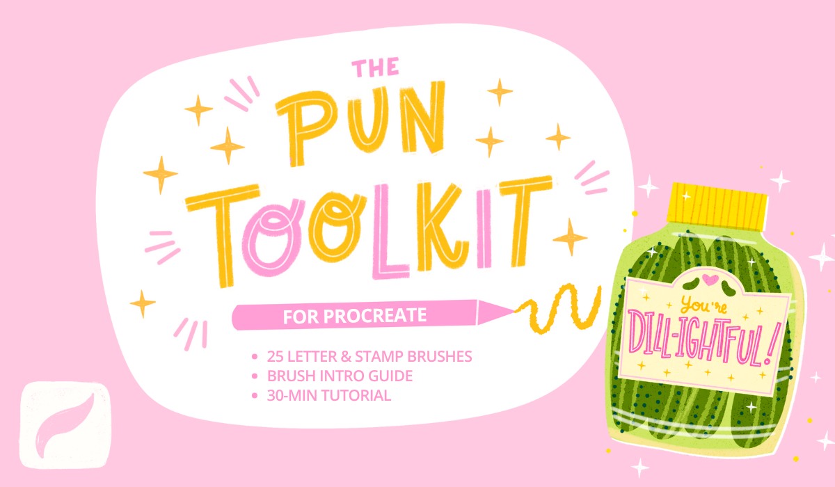
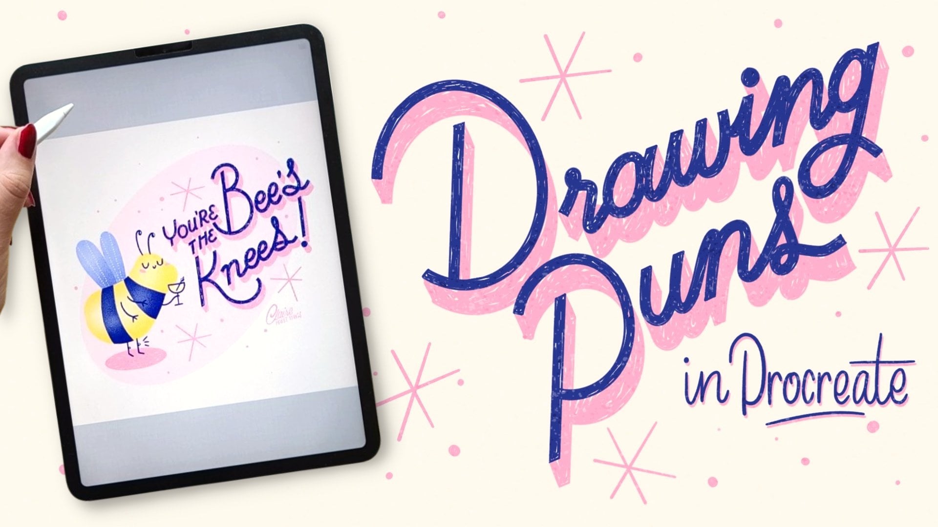
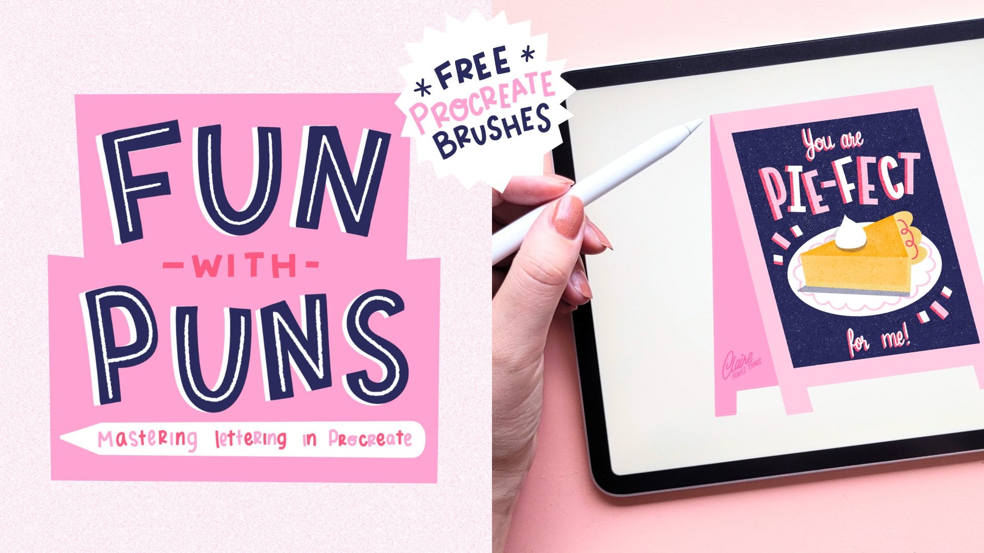
1. Let's Go Bananas!: Are you a fan of puns and
lettering just like me? This class is about turning
your favorite messages and puns into unique illustrations.
My name is Claire. I'm an illustrator
and pun enthusiast. I'll share my tips for combining fun wordplay with eye catching lettering
techniques in Procreate. Puns on wordplay are a fun and memorable way
to add a message to your design that make for unique lettering pieces
on greeting cards, stickers, merchandise, and more. That's why I'm sharing
my favorite techniques in this series of shorter
classes that will help you elevate your lettering
skills and hopefully give you the confidence to
create your own unique pieces. In the next few lessons, we're gonna go over
steps pretty quickly, so a bit of experience in procreate would
be really helpful. You'll also get
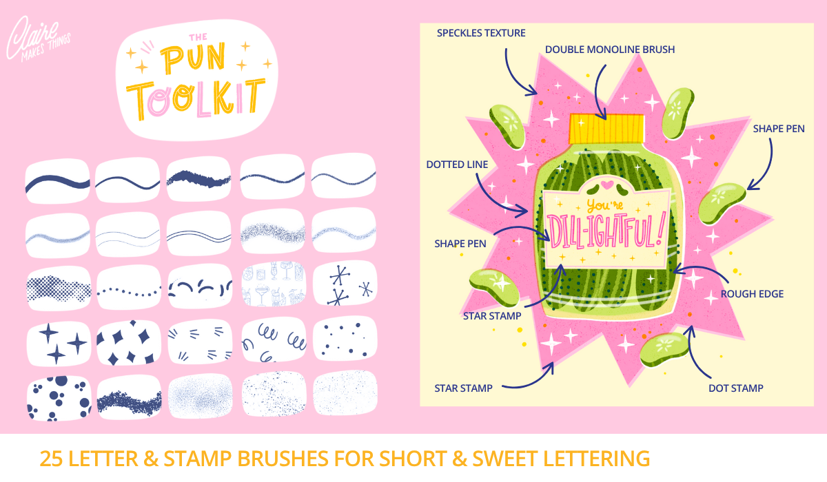
my brush pack for Procreate to help
you get started. By the end of this glass, you'll have your own
fantastic masterpiece. Let's start drawing.
2. Sketching: We're going to start
with a new canvas, and we're going to make
this 2,500 by 2,500 pixels. In the next few lessons, we're going to go over
steps pretty quickly, and you can also slow down the speed of the
video if you need to. We're going to start with our inspiration and
our thumbnail sketch. You can follow along with the pun that I'll be working on, but you can also
pick something else. I like to start with just
writing out the pun that we're using and seeing what
words are most important. We want to make
those a little bit bigger because that's
where the emphasis is. We want to figure out where the text should go in
our thumbnail sketch. Especially if you're
new to lettering, don't skip the
thumbnail sketching because that's really
going to help you with making your compositions and placing the lettering
in the right places. Make things a little
bit easier though, we're going to use a
guide to help us out. If you go to the brushes
and go to the latte stamp, this is where you'll find the layout that we're
going to be using. You can put that on a
new layer and then I'm using the snapping to just put it in place and
make it a bit bigger. This will serve as our guide to put our
letters inside of. I'm going to place
the text inside of these boxes and you can
keep this really simple. But if you want to try out
different types of lettering, you can do that
here in our sketch. Eventually, our lettering is going to end up on a small size, so we want to keep it simple. That's also why
I'm using lots of block letters instead of script because this
is a little bit easier to read from a distance
when it's a bit smaller. This is also something
to keep in mind when you're creating lettering
for greeting cards, for example, you want to make sure that your
letters are legible. And at this point, you can
add more filler elements here and kind of come up with your own ideas and add a
pattern to your mug, as well. When you finish your sketch, we're going to add our
chalkboard background. This is going to
be black or maybe a dark blue or green like I have here on
the color palette. So we're going to put
our illustration on top of that and everything is going to be light to
create a contrast. Then just turn the opacity down a little bit so that we
can still see our sketch.
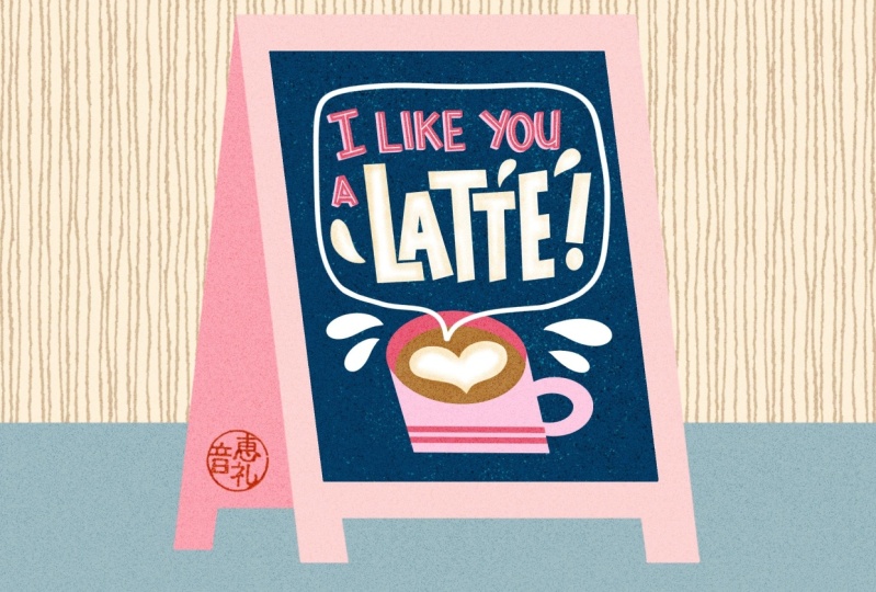
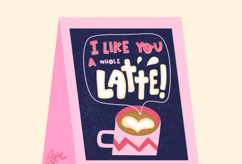
3. Illustrating: So we're going to start
with our lettering. I'm going to use the pink
color, the medium dark, and with the monoline brush, I'm just going to
trace the first line. And for this specifically, make sure that your dynamic
brush scaling is toggled on. This makes sure that when
you zoom in and out, your brush size, the width of your brush
is not going to change. And what we want to do
with these letters is make sure that they are
all the same width. I'm going to show you a
little trick basically on how to make these
playful block letters. Once you have your letters, use the eraser,
also as the monoline brush and just cut off your edges. This basically
turns your letters into block letters
with sharp edges. Then I'm also using
that monoline brush in a smaller size to make those
edges a little bit sharper. Especially if you're a beginner, this is a really easy
trick that I love to use. It reminds me of really
playful retro letters. And it also matches
the topic of puns. It's very playful and quirky and imperfect and
it's also super easy to do. I think a lot of
lettering works that way. It's not really about
making perfect letters, more about consistency
in how you draw your shapes and just setting rules to the
letters that you make. Now that those block
letters are done, we're going to add
shading to this by duplicating that layer and
then the layer underneath, we're going to turn it to
that lighter pink, and then moving it slightly. Now we've got our
shading underneath. I think we can actually make our main letters a
little bit darker. I'm using that very dark pink, almost red for a
bit of contrast. Then on top of that,
just to finish this off, I'm using that rougher line to add an inline to our letters. Now onto our most important
lettering here, the latte. I'm going to use white
for that and just trace our lines and fill up
those spaces right away. This is really going to help
brighten everything up. If you feel like your lines here aren't as smooth as you
would like them to be, turn up the stabilization in the pressure and smoothing
tab in the preferences. This kind of lettering, this latte that
we're doing here is why I love creating small
lettering designs like this. It doesn't need to be perfect. It's just such a nice
and quick opportunity to experiment with
different lettering styles. Illustrating chalkboard
designs is exactly the same. When I make the sketches
for that in procreate, I always keep in mind that basically the details
don't matter as much. What matters is what you see from far away because
that's where people will see them from that
helps you to focus less on the details and
more on the overall design. And now we're going to
use the speckle brush to give our letters a
little bit of color. And I'm just using
the orange for this kind of to add a bit
of color around the edges. This gives it a bit of texture, and the color reminds me a little bit of
the foam on a latte. And next up, we're
going to draw our mug. We want to make sure to keep
as much as possible here on separate layers in case
you want to change the colors later or just
make any changes in general. For example, for the inside of the mug where we're
going to add the coffee, what we can do is
make a new layer and then set that mug
layer to 'reference'. That way we can add the
inside of our coffee, fill that space, and it will still be on
a separate layer, so we can make some
changes there later. And I made this pretty dark, but I added some other color options in
the color palette. So you can make this
a little bit lighter. That might be more
accurate, actually. And we're going to add
our foam on top in white and add the
shading there as well. To create that little pattern
that zigzag on our mug, you could, for example, use
a clipping mask on top. But another thing you could
do is select your mug, go to a new layer, and then draw your pattern and
then deselect again. This way, your pattern will still be constricted
to those lines, but also on a separate layer so you can make changes
if you need to. I realized, actually, a latte
isn't really that dark. I'm gonna change that color. And now we can really
easily do that. And lastly, my idea was to
kind of create a sort of steam shape so that
it kind of looks like our lettering is coming
out of our mug in a way. You can use the shading brushes for that to make that happen. But I'm going to keep it
really simple and just use the shape pen because I think on our dark background
that just might look best, but feel free to experiment
here and give it a try. Maybe you can come up
with a better solution. Let's see how that looks on our chalkboard, and there it is.
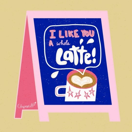
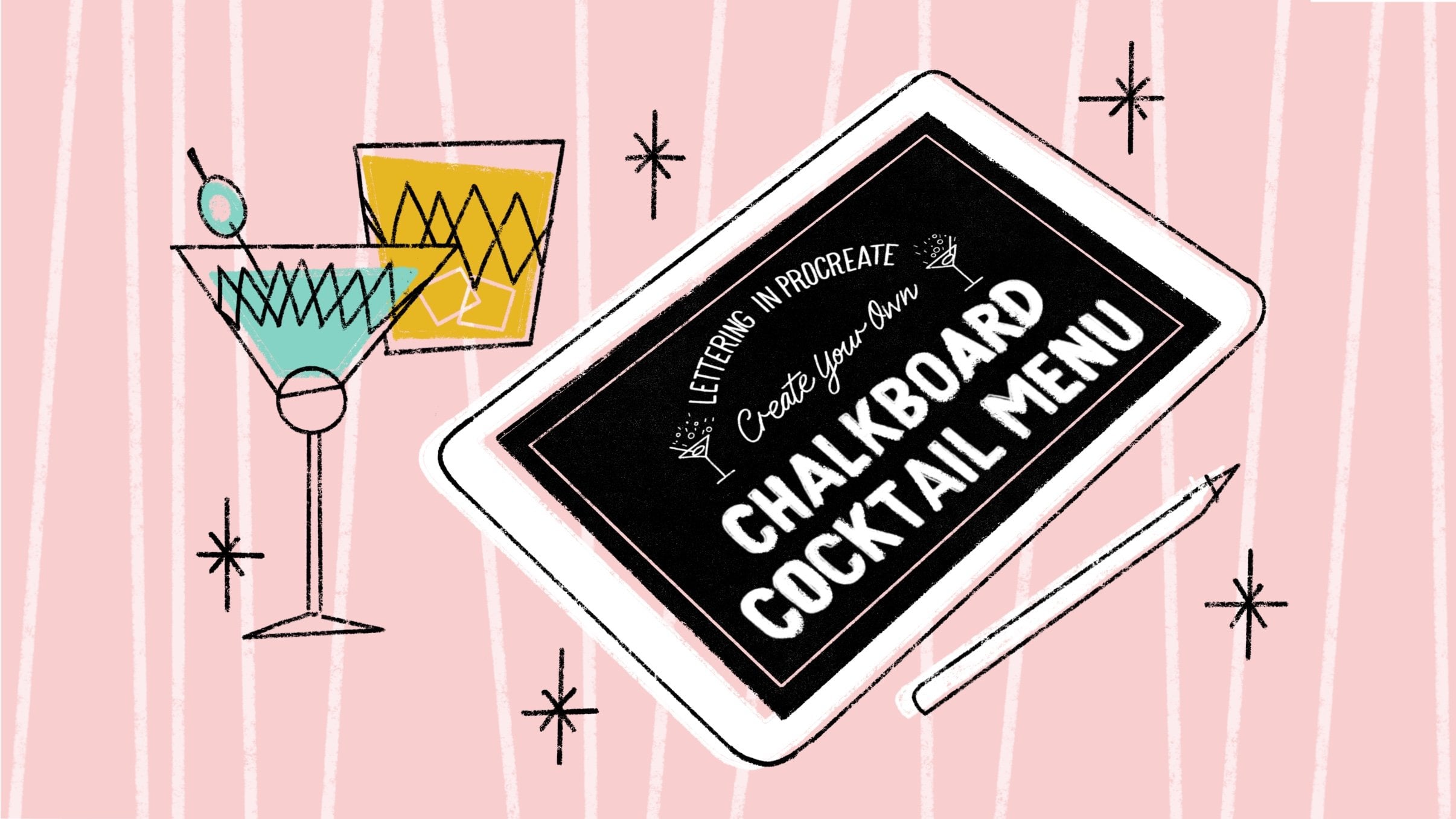
4. Finishing Touches: So the last step is to put
our design on a chalkboard. I started creating this
little collection of chalkboards and it really
connected with people. And when you put it on a
little chalkboard like that, it's almost like it's being
shared on the street, and it just makes
it a bit more fun. And it's also a really nice
way to just finish the piece. So what we're going to
do is, first of all, select all of our layers
and create a group. We're going to keep
all of those separate. Then we're going to select our chalkboard stamp and
we're going to use that with light pink to
create our chalkboard design. Then I'm just turning on
the snapping so I can center this stamp and make
it a bit bigger too. You can use whatever
color you want here. I like to use a lot of pink. And then the actual chalk
of our chalkboard is going to be blue, so I'm
going to fill that. Then we need a copy of
our lettering design. I'm going to open up the group, take out the background layer, and then 'copy canvas'. Then on a new layer 'paste', now we've got our
design separate from our group and we can use that to place on top of
our chalkboard. I'm just transforming
this and we can use distort because the
chalkboard is at an angle, but it doesn't have to be
realistic, move it slightly. That's it. Now we're going to do just a couple
of things to finish it off. I'm going to add a background. Then, of course, our signature. I have that saved
as a stamp brush. I would highly recommend using it that way because
it's super easy. Then we're going
to add some more texture because it
is a chalkboard, you want to add a little
bit of texture here. I'm just selecting
the dark blue area. On a new layer with black, we're going to add
some ink speckles. On another layer we're
doing the same thing. We've got two separate layers
with ink speckles in black. Then we're using
the blending modes to create those textures. I'm going to turn the first
layer into 'overlay' and that turns those ink speckles
into saturated spots. It looks like maybe paint or some texture
on the chalkboard. The second blending mode
is going to be 'divide'. This turns those black
speckles into white. Lastly, we're also going
to add a texture on top of our entire image, fill up that whole canvas, and then turn that blending
mode to overlay again. Here you can see if you zoom in, you get a little bit of a
smooth, grainy texture, and this texture makes
it a little bit more imperfect and as just a
little bit of graininess, which would look really nice
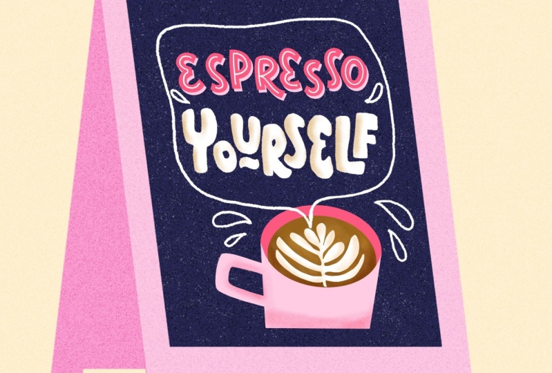
if you print this as well. Here's an example of
a piece I did with those ink speckles and then this one with
the grainy texture. And this is our final piece. If you're interested
in this topic, especially textures,
in my other class, I take a deep dive into
textures in Procreate and kind of the why behind those and how you can use
those for your own work. Thank you so much for following along and taking this class. If you enjoy these
shorter lessons, check out the links below to go to my other short classes
to keep creating. Feel free to upload your other pun ideas to
your project in this class. I want this to be
kind of a space where you can just
try out your ideas and upload your sketches without having to finish
anything necessarily. This process is more about
getting quick ideas on paper and improving your lettering and illustration skills
in a quick way. Don't forget to share
your work with the world, even if it's not finished. I found that especially
with puns and humor, it just really
connects with people and done is better than perfect. I would love to hear what
else you want us to work on and what kind of puns you think I should make
another class about. So please leave me
a review or start a discussion post to share
your ideas and suggestions. If you like using the
brushes in this class, you might also like my Pun
toolkit for Procreate, which is available on
Skill Share as well. And lastly, if you want to stay up to date on new classes, procreate brushes,
drawing tips and more, subscribe to my
newsletter below. You'll be the first to hear
about my new classes there. See you in the next class! <3
 Claire Makes Things, Illustrator | Lettering Artist