Transcripts
1. Introduction - Anthurium: Hi guys, Welcome to another
lesson with me, Clarice. I am a Youtube watercolor artist that specializes
in loose florals, If you love florals, this lesson is for you. This is part three to my
tropical floral series. And in this video
or in this lesson, we are going to learn how to get loose with watercolor
and paint in Athea. A little bit more about me.
I am a watercolor artist and I do have a Youtube
channel where I've got tons of watercolor tutorials
for those who are interested in just dabbling
around and having fun. Another way of
spreading the joy of watercolor is through
my watercolor events. I host a lot of paint
and sip events around several wineries and cafes in Niagara and the GTA
in Ontario, Canada. The tropical
watercolor series was inspired by my recent
trip to Maui, Hawaii. And I came back thinking I must create a series documenting these gorgeous flowers that you don't find typically
everywhere in the world, but specifically in
the tropical regions. In this class, like I mentioned, we are going to be learning
how to paint the Etherium. In this lesson, you can be sure to start off with learning
how to pick your colors, swatching them, mixing them, getting yourself prepared and warmed up for the
technique behind it. Once we finish swatching, we go into the basic technique. I'm going to walk you
through how to do a basic sketch of
these beautiful blooms and then going into several
options of how we can tackle painting them
along with a leaf. Please post it on the
project. Leave me a review. I would love to see
everything that you've done and even your thought process behind it If
you want to share. I'm also on Instagram
and Facebook. So again, if you want to
post it on there and tag me, I'd love that. Thanks guys. So without further ado, let's get right into our lesson where we're going
to learn how to create some beautiful loose
watercolor effects to create our gorgeous
tropical flower.
2. Project intro: Let's talk about what the
project is and what's involved. As you can see, this
is our project, which is the Anthurium. The point behind this project is learning how to do the
basics in watercolor. One of the main things
about watercolor is learning how
to do wet on wet. And getting the smooth blends, light areas, dark areas,
layering as well. You'll notice that
over the last video, the last two videos
including this one, we keep honing in on the whole blending
the wet on wet and the layering reason I'm
picking tropical flowers y'all know already based on my intro video is because
of my trip to Maui, Hawaii, I'm picking
these specific flowers. Because it allows us to be loose with very minimal
sketching involved. For those who are not affiliated or very confident
about sketching, you have to do bare minimum
just to get these results. It's always nice to learn the effects of watercolor while you're creating a subject, because this allows you to
think how you're going to be using this for future items that you
may want to paint. Here's how we're going
to be tackling this. We're going to start
off with doing our swatching on a blank
sheet of paper. Then I will walk you through
how to do the sketch for the flower and you can do as many drawings or sketches
of the flower as you wish. And then we'll get into exploring two techniques
of how to paint this. One using the full coverage where it's pretty much all pink. Then the second one
is where you're leaving a little
bit of white space. Both are fabulous ways of
achieving the Thurium. Feel free to pick one and just run with that for our final. This is where the
project actually begins. Once you've finished
watching you finish doing the techniques
and your practice, it's time to do
your final project. I'm giving you more
freedom in terms of taking what we've learned and applying it into your own
little composition. You can follow along with me. However, if you feel like you want your leaf to be turning a different direction
and you want to add a second flower or
a third flower, go with the flow,
because this is where you get to explore
your creative side. And take what you've learned
from our lessons and our practice time and
apply it into your final. Once you're done, uploaded onto the project section and I will
be reviewing it for sure, giving you commentary
and all that good stuff. So feel free to add
in questions too. Here's some of the
things I will be looking for in your project
once you uploaded. I am looking for mainly
how the blending happens, How well are you using
the wet on wet technique, how are you using the layering technique
and also the wet on dry? There's a little bit of
wet on dry happening. Can either choose to
do it like I did in my final or you may choose to leave it a little
bit more loose. I will leave that up to you. Explore your own
style, what you like, what you don't like,
and make it your own. Last but not least, I'm also
looking for a splatter. A splatter is a plus, Not exactly necessary if you
don't really like the look, but it's a great way to add added looseness
to your painting. That's just my $0.02 Now that you know exactly
what's involved, let's get right into the
supplies that are needed. To get started, let's
start painting.
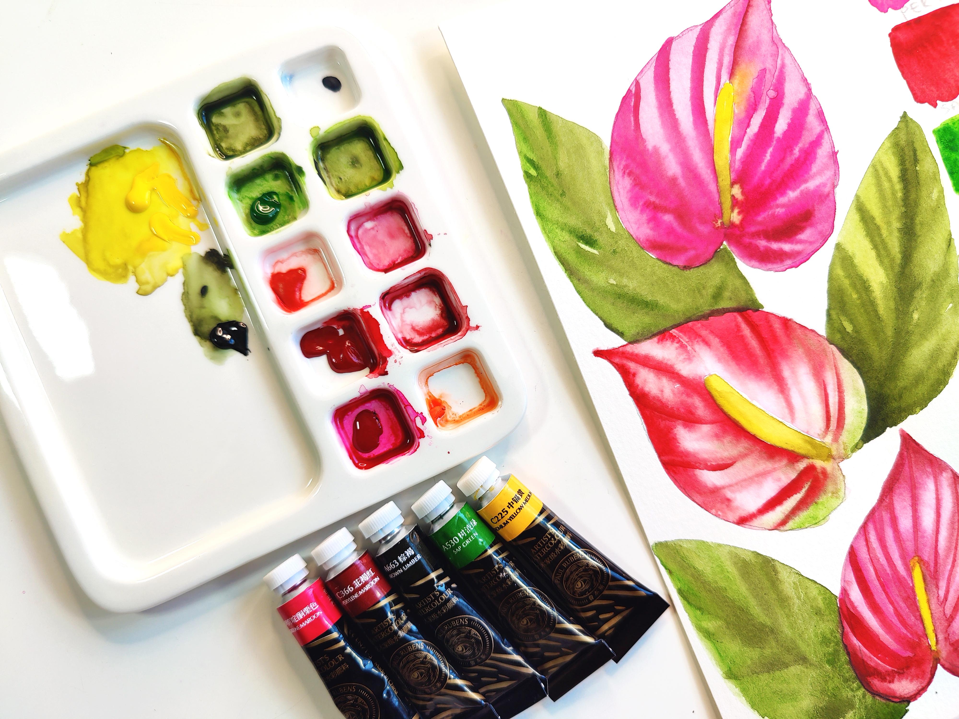
3. Warm Up & Swatching: These are the supplies
I'll be using for the third video to my tropical
watercolor flower series. To start off, we've got
the watercolor paints. This is the fourth
generation watercolor paints by Paul Rubens. Then for brushes, I have a bunch of different
options over here. Feel free to use what
you have on hand, like with any of these
supplies, really. But we've got the round
Princeton Lauren, number two. Then we've got the Princeton
velvet touch number four. Princeton Neptune, number six. I also have the
number eight handy. They work literally
the same way. It's just a size difference. Just like a tad bit
of a difference. Then we've got the oval brush,
Princeton, Neptune again, brushes like this
pretty much give us exceptional organic shapes, which is great for a
loose style of painting. Technically, these three will do the same job then these two. It's just to get those fine
little lines in our flower. That's why we've
got a smaller brush and then a bigger brush. I have all of them here in case I decide to switch
in and out of them, But I'll let you guys know
as we are going along. And then last but not least, we've got paper and
I'm using my Saunders Waterford St. Cuthbert's Mill. This is the same paper I
used for the King Podia, and we're going to
be using it again. We're also going to have a sheet of Canson watercolor
Excel paper handy. And this is just going to be for our beginning process
of swatching colors and then also doing a little
bit of practice so I can break down this gorgeous
flower for you guys. I have water handy
on the side and then paper towel is your
friend so that you can dab off excess water
from your brush or even maybe if there's any
puddling on your paper. Okay. So to begin, I'm going to mention the
colors we are using. The colors we're going
to be using from our Paul Rubin's fourth
generation set of water colors are going to be the Quinacridone maroon for our base, gorgeous pink color. Then we've got the parlane
maroon for our darker tones. I'm on the cusp
about using this or mixing some of the
maroon with brown umber, and that's why I have
brown umber on here. If you mix a little bit of
umber with any of the colors, you get a darker tone. I might end up using the combination of
these two together. Then we've got the sap green
for our green leaves again, for a second green, I'll mix a little bit of
brown umber with this to get those nice
darker tones in our leaves starting to
get a little bit of color onto my palette over
here, which is to the side. The first thing we're
going to do after we have added some color and
mixed some color on it, is we're going to use little area to the right while I'm going to be using
this area to the right. Feel free to use
the top, bottom, or even the left hand side of your paper to do a
little bit of swatching. I'm going to put my
Umber over here, so I know it's off to the side. And I don't get my colors mixed. Sometimes these colors can
look dark on the palette. Mind, you have got
reds happening here, so we don't have an issue there. Let's get some green
happening right there. What I like to do is take a little bit
of color from here, take a little bit of
that umber and mix it in an entirely
different area, or you can just add additional
color in there and umber and mix it really
whatever suits you. For those who are really neat, if you want to draw a line and then do your swatching,
that's fine. I'm not so bothered
about things like that, so I'm just going to go
right into swatching. Okay. I'll use the number six. Dipping it in my water, first thing I'm going to do
is get some of the maroon, which is a gorgeous,
gorgeous, deep pink. Again, like I mentioned, I'm using my right hand side, right here, and I'm just going to do a
little bit of a swatch. This is all there is to it. We're just getting
used to a mixing, our brushes and then
also the paper. This also could even act as a warm up
session for you guys. You're exploring to see what it is you're going
to be dealing with. This really does help your brain conceptualize how the flower can look because now you have
a visual right beside what, with the colors and such. I'm just trying to unroll
this folding in my brush. There we go. Now let's
go on to the maroon. And here we go, watching this. Got too much color on here, so I'm trying to get
some off and adding more water to my blend. If you can get versions of
dark and light so you can see exactly how this
color transitions and plays on the paper.
That would be great. I do know I am using
my cancel Excel paper, which is going to
be different from our final paper for
our final painting, but I'm okay with that. If you feel like
it's just easier for you to practice
on the same paper, then please go ahead
and take a piece of, of the same paper for
this whole exercise. Moving on to my green here. This is a gorgeous
green next to this red, it almost looks like Christmas. And then finally, Umber. Let's get some of that umber and mix it in with some of
these colors as well, and see what we end up with
further down on our sheet. Here's umber dipping in water, just so I can get a nice
fluid feel for the umber, getting a little
bit more color and dropping that in here
while it's damp. Because that's what really gives us a beautiful translucent, dark to light gradient.
Really drop that in. Okay. Oh, I didn't even have to wash that off
because what I'm going to do is get some of the
Umber mix that on the side. This is exactly what I
mentioned previously. I'm going to get
some of the pink, mix it in with the Umber, Need more pink and mix that in. It depends on how much ratios you have happening between
the pink and the umber. You'll get different, varying
levels of dark tones. This is a dark pink, almost like a jewel tone. I think it would
complement this really well for shadow areas. Let's try maroon. Taking some maroon right here, I'm going to mix this
color over here and get some of that
Umber mix it in. I think we're going
to get a really beautiful, rich maroon color. Let's get a little
bit more umber and this is what
that looks like. If you want to try
this flower with the two different
colors that we have just for variation
in your composition, that also works well. Or if you want to just keep
it consistent with these two, that's fine as well. Now, I know I have some
maroon in the Uber. I do know that if you mix a little bit of
red with the green, you can get a darker green. I'm not going to
fuss too much about the fact that it's
not a pure umber that I'm mixing with my green. And I'm just going to go
for it. So here we go. This is a dark green.
It's gorgeous. I love adding brown to my
green and just getting that nice wooded feel within
the dark green that we have, as opposed to like a pure
emerald, bright emerald look. These are great for our
shadows, all three of them. These are great for our
highlights and bright areas. And then this is
the mid tone that we're using to get these right. Make a note of this
for your notes along, then we're going to move on to the next bit of
tackling the flower.
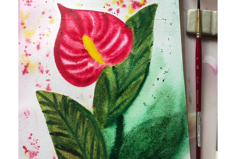
4. Sketching Anthurium: I've gone ahead and done a
basic drawing of the flower. I'm going to break this down for you again because
we're going to draw this two more times.
Here's your visual. We're going to start off
with doing the pistol, which is the center, the
long protruding thing. I'm going to draw
this exact same thing but facing in this direction. Let's go ahead and do the
center looks like that. Again, notice how organic
this is. It's not perfect. We're not having
perfection here. Loose style of paintings, very liberating in that fashion. Then we're going
to draw our heart, because if you really
look at this shape, it is a heart, right? It's like a very loose heart. So that's what we are doing. And I'm going to
start from the top. Feel free to start from
the bottom if you wish. I'm going to start from here. And again, use the image that I've attached as a
reference if you want to try your hand at getting fancier angles or shapes
within your piece, Lily, here's another one. And then do it for a
third time and then we can get into actually painting and that aspect of it before we get into the final.
5. Painting Technique #1: Got my three flowers, we're ready to start painting. And while I was getting ready to figure out how to break
this down for you guys, I realized we don't
have a color for the pistol. So here we go. I am introducing the
cadmum yellow medium. I know we've already
swatched colors, but this is my little faux pas. I'm just going to add that
yellow real quick in there. And the same thing like we've done with the
other colors here, we're going to do a quick
swatch for the yellow. If you want to drop in a
little bit of the umber, then that works great for getting a little
bit of shading at the bottom of your pistol, like where it attaches
to the flower itself. Okay, I have that in there. Let's go to adding color to our beautiful heart
shaped in there. I'm going to use my oval wash for this one and we're going to get started dampening my brush. I'm going to get a
very diluted version of this maroon Quinacridone, maroon tipping the tip
of my brush and water. I know it's damp. We're going to go ahead
and really damp in this area with the light pink. Now if you're not very
confident about keeping the center white so we can
go in with the yellow, I would suggest using
some masking fluid. This way you're able to go in and then get in your yellow. After then you don't have to
bother so much about sure to skirt around while painting
the petal part of the flower, Dampening this whole area, making sure it's
nice, covered up. I'm not trying to be super perfect because we
still want to be loose, but we still want to
have enough control that we're making sure it's not going terribly out of
the heart shape here. Now that we have a base color, this is where it's had some
time to dry a little bit. I'm taking a little bit
of the darker tone. I'm going to drop that in
right here in this area, because we want this area to
stand out a bit more than the rest as this is the area where the
pistol is attached. And also the area that
gives us the most shadowy, like the shadow starts
from around this area. If you noticed, I'm getting big blooms
happening right now. And that's because this area is D. If you wait a little bit longer before it
completely dries and then go in with this color, you'll find a different blend. I'll show you that.
You'll notice that if you actually
try what I'm saying, perhaps we'll try that
for this one here. You just move the
color around so it's not random looking. Now, once I have that, I'm going to go in and
get more of that pink. I want to add these pinks in certain areas again
where you can see there's folds or different veins or things like that
within the flowers. If you look at the image,
you'll notice these things. I'm going to lightly add
drop a little bit in here too where we added
our dark tone. Then we're starting at the top a little bit because it's almost like a leaf pattern with the veins
spreading outward. We're going to then use, after dropping in a
little bit of paint, we can then take
our smaller brush. I'm just moving
some paint around a little bit to give
it some nice coloring. You can take your smaller brush, so feel free to use the six, or in my case, I'll
use the number four. The amount of color we want for this section is we want to make sure that
there's more color, less water when you
drop this color in, it's darker because the
area is still damp. I'll start off with just doing a little bit of a line here. You don't have to
because you could even just scrape off the paint instead of adding paint
to indicate the line. And then I'm starting from the bottom and we're
going to go outward. Just like that, you continue this
pattern all the way. Upward. If you want to add the
mix of the quin adon, not the quin, the paroline
maroon with the umber. You can add more of
that at the base. Look at these beautiful
stripes that you get now, It doesn't need
to be this thick. Notice how it's getting thicker as the color is settling
and just blending in. You can wait for it to
dry just a little bit more and your results
will be less blending. Here's the other side. I'm
starting from the base of the pistol and I'm curving
and I'm going upward. We're not looking for
super crazy perfection happening with our flower. We're looking for
basic colors that will tell the story that
this is a Peace Lily, and you can clearly
tell that it is, or some exotic tropical flower gaining inspiration
from the Peace Lily. The other technique,
I'll show you another technique down here where we're going to
be taking color off. We added color to show the dark and the
lights and such over here. But there's also another way. Before we move on
to the next thing, what I'm going to do is
using the same brush. Actually, I'll switch this
brush for my number two. And I'm going to take some
of the darker tones here. I'm just going to
lightly add a couple of veins with my flowers. All I'm doing is just
extending lines in between. You want to do this while
it is damp so that you get that nice blending and
bleeding in within this area. This is the area that
has the most shadows and keep it that way by adding
more strokes if you can. It enhances this bit, giving it a little bit more
depth at then in this area. Now this part has
dried up and that's okay because if you've watched the previous video,
the King Protea, what we've done is
there's a technique where you can add color and then go in after washing a brush
and with just water you're blending this
within your painting. A little trick I would say, to really give certain
enhancements in your subject. Okay. Last but not
least for this flower, we're going to go ahead
and do our pistol. Let's do a little
bit of the yellow and I'm going to take some of the umber to mix
in with the yellow. We'll start off with that darker yellow at the bottom
and then blend it into the pure yellow
cadmum lemon rather. Since I have some lemon already, I'm just going to start
off with the top. Make sure you're not touching. If any areas around
your pistol are damp, make sure you're
not touching it. Or make sure you wait for it
to dry off before going in. Because look what's
going to happen. It's going to flare
out into your flower, giving you that mixture. Now, I like what
this looks like, but you might not. In which case, take
your paper towel and dab and take it off. This is where your paper
towel comes in handy as well. You can also take your brush
and lightly brush it off. But again, when it's a
loose style of painting, you want your colors to have a, a subtle mix like that, which is nice mix some of
that color real quick, I can blend that in with it. Here we go. So
I've just got like a beautiful little dark mix. I'm adding that to
the bottom here. Then slowly it's
spreading into the lemon, cadmum lemon at the top. So you have a nice dark, it's a light giving a nice depth and
direction to your flower. So I'm just going to hold it
up higher so you can see. Also notice the smudging happening because it touched
some of the damp areas. If you're noticing
that, like I said, it's your first flower you're
practicing, that's fine. But if you want to
take your paper towel, you can always slightly
dab it off or for future. Just make sure you attempt
this when everything is dried so you don't
get a blend that way.
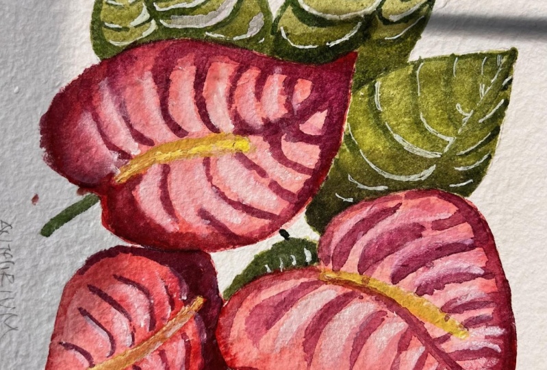
6. Painting Technique #2: I've zoomed in for
the second one, just so you can see what this process looks like
up close or closer. This time instead of
using my oval brush, I'm going to use my
Neptune number eight. And then we'll use the Loren
number two for our lines. If we want to switch the colors, I'm going to use a little bit of the pearline maroon
instead this time around. What I'm also going to do is I'm going to use the
oval brush to dampen the area and then drop
this color in this way. I'm showing you a
different technique, but also allows you to get a little bit more
control as to which areas in your flower
you want to be darker. There's going to be a
twist to this flower. We are going to have the
base of this in a green. We'll have a little bit of green happening just
around the bottom. And I'll show you what
that's going to look like as soon as I get this done. We're just dampening this area. I know I have a little bit of this light pink and that's okay dampening the whole
area now because I'm using the Canson Excel, this is not 100% cotton and
it dries up fairly quickly. I'm going to make sure
the whole area is still damp before I drop in
some of the other colors. Starting off with this,
we're going to start at the tip and allow that to bloom and just pull it along. I'm also going to
lightly bring it downward this way,
leaving it that way. This is a great loose style
of tackling your flowers, just allowing the color
to just do its thing. Now I'm going to get
a little bit of, I've washed off the pink and I'm getting
some of that green. And I'm going to drop
that in right here at the bottom, very loosely. Dropping it in. Feel
free to the color go downward or blend in with the pink that
we have happening. Look at that gorgeous
blend that we have. You don't like things
like this where it's looking like a drip. Just take your brush, making sure that
there's no color on it, and just lightly guide
or brush off the color. Now, same thing with the rest of the color that we
have happening here. This is where you can take your brush and the lines along. I'm using my number two
with just water on it. I'm doing my strokes. You can start your strokes
from here, go upward, or you can start outward, coming inward
towards the pistol. You'll notice a completely
different effect. Notice how you're almost creating a pattern within the paint that you've laid down. It's very subtle right now, but it's almost like
taking color off. Here's where we added
color to create the lines. This is where we've taken color off two different techniques, giving you similar results. Keeping it very loose, not going in for crazy details. Now you can also do this
with the same colors we've done here and the
same technique we've done here over here. What's helpful is the
fact that we've got color piling up in the
site while it's damp. You take your brush with
water and that's what helps you get these faint
red lines in. You can also go back
in using this brush, get some of your red if you really want to
highlight certain areas. For instance, say you want to do the center, get that in there. You want to perfect the
shape of your pistol. Go ahead and really
outline that properly. Get more red happening at
the bottom if you want to. Now is the time
before things dry up. You don't have to
have the pattern being consistent throughout. You can just have sporadic
ones happening here and there. Then you've got a great contrast
of light and dark lines. Last but not least to
this part is going to be adding the yellow
to our center. I can just use the number two and we'll get
some of the yellow. I'm mixing some of the umber
with the yellow first, exactly like how we
did that first one. I'm going to leave a
little bit of white space because right now I know
these areas are still damp. I don't want there to
be a lot of bleeding happening Then going
in with my lemon, I'm going to turn
this sideways so I have easier access
to painting this. Then I'm just
dragging up the umber and lemon mix to get a nice
gradual, dark to light. Feel free, like I said, to leave a white
space around it. Excuse me. That also helps give you that nice loose look and you can leave it just as is.
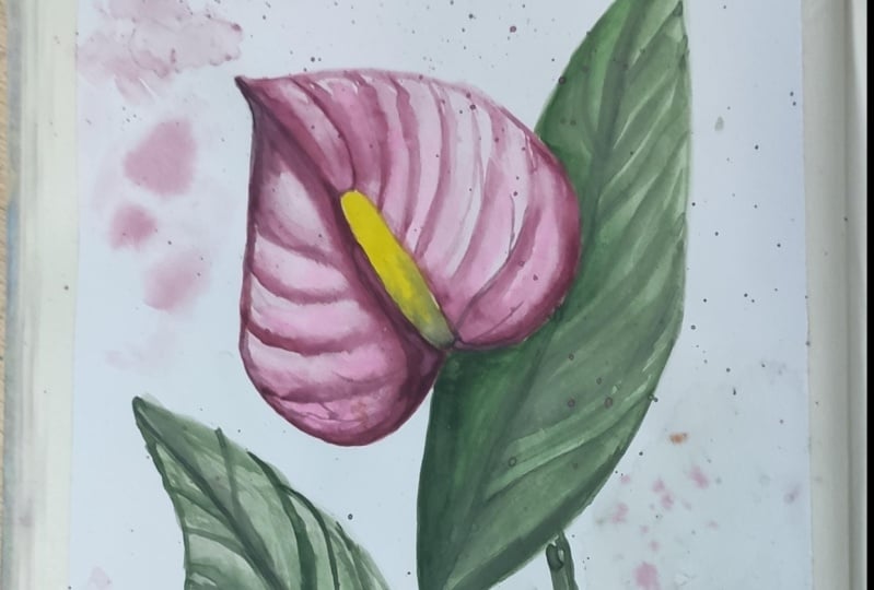
7. Painting Technique - Leaf: Okay, so there's one more left. I've shown you my two
ways of doing it. So I'm going to make this a time lapse so I can get
this done quickly and then we can move on to
let's tackle the leaf, and then we get onto our final, so for our leaves I'm going
to use the number eight and we're going to use the nice bright green that we
have happening here, which is the sap green. I'm going to mix it in with
a little bit of the umber. Actually, maybe
all of the umber. And then I'll even throw in a little bit of that
lemon because I think that lemon would give
it a nice bright tone. We've got tons of that
lemon happening here. Just mixing it a
little bit in here. Feel free to use
the green that you like. That's your favorite. Now we've got this
nice little green. What I'm going to do is for leaves or anything
that's nice and thick, I like to hold my brush midway and really use the full span of my brush to get nice coverage or proper coverage
with less strokes. Let's just say a leaf is
coming out from this flower here and I'm pressing down
and I'm trailing off. Now you'll notice that I
don't have too much water, so what I'm doing is
dipping in my brush, then going back and
completing the leaf. Now these leaves
are very similar to what the actual
flower itself like, the shape of the flower
we're creating or we're painting a similar
shape to the flower. Pretty much just free
handing it as opposed to drawing it in first. But the drawing in bit was
more for your comfort, your initial
understanding of what we're doing before we
actually get into things. That's all I'm doing
for this leaf. Then I'm going in
with my darker tone, I'm going to go ahead and
do that first center vein, then from here we're protruding actually you can go
from out in this way, all the color will
collect at the bottom, giving you a nice dark
green happening there. Then again, just like we did, the flowers feel free to either add or not
add too many lines. You want the colors to blend and really just
speak for themselves. I've added a ton of green at
the bottom so that we've got a nice dark to light
situation happening this way. Because you always
want the shadowy, darkest areas
happening where it's touching or looks like it's
emerging from somewhere else. Keep dabbing your
darker color in there, push the color around till
you're happy with things. Then we are done. Our leaf, keeping it loose, keeping it simple, you get
the idea, it's a leaf. You're using lovely
shades of green. You're getting this by
either more water for a lighter tone or mixing in
more color for a darker tone. Or simply just adding second layer of color on top of what you've
already added, which is what I'm
doing right now. It doesn't necessarily
have to be on the same place that you
have placed the strokes. You're just adding texture
and building up on the depth. Look at this area right here
where I have intensified the green to give it
that gorgeous depth, making it seem like it's coming
from behind this flower. This is how we do our leaves. Practice it amongst the two that you have on
your practice sheet, before we get on to
doing our final.
8. Final Project - Part 1: We're finally ready
to do our final. I just wanted to give you
a quick close up of what our practice looked like when we walk through
things together. This is what mine looks like. Now we're going to
transition from here onto the 100% cotton. But to give you a quick overview
of what I'm going to do, I'm going to keep this simple because we've done quite
a bit of practice. We're going to do one or I'll do one and then perhaps two
leaves shooting out of it. And maybe even throw in a
little bit of metallic. I'm not quite sure we will see, so let's get started. So here I have my sin cut
birds watercolor paper. And just for a visual
reference for you guys, you can feel free to
follow along with me or do a different
angle altogether. But this is how I'm going to
be positioning my flower. I'll be having the one flower that I said I was going
to be doing right here. So I'm going to be drawing in my nice big heart shape first. It's kind of off to an angle. And then here's the
other part of it. I love how beautiful
the heart shape in this flower is.
And I love hearts. So this is such a
looking for the eraser, such a fabulous little fun,
loose floral painting. There we go. And then
let's do the pistol. For the pistol, I'm going to probably have it
go up until over there. Starting from here. I don't want to make it too too thick. Something like this
is good enough. And I'm just going to
leave it there open ended. Perfect. Then I don't
know if you want to give it a stem. Sure, why not? I'll just do curve
line like this. Give it a little flow. Then I'm going to make
sure that my leaf, one leaf is positioned
almost in the back here. There's just a very rough
drawings for placement. And then another
one possibly just coming up from over here. Maybe just half of it is
seen or something like that, it covers off the stem a bit. You've got this nice
little whimsical feel to your full painting. These aren't going to
be the exact places for placing things, but this is the overall
estimated range. Now we can start our painting. What I'm going to do is bring in the oval brush because I
really like how that works. Because this is
cotton, 100% cotton. The fabulous thing
about this is that it's going to remain damp longer. I'm going to start off with
getting a very light version of my Quinacrodone maroon. That's what I've chosen
I'm going to do this with, we're going to start off by
just dampening this area. Remember I said this is
just a rough sketch. I'm not going to be holding to these constraints done in pencil tightly because we want to
make this nice and loose, and fun and organic looking. The only thing that will be
very detailed in this is the is the area
around the pistol because we want to make
sure that it's nice and clean for our yellow. When we are ready
for the yellow, putting in as much paint as possible so I can
keep this area damp. Another reason why I
like the oval brush because it really helps you cover more space when
time is of the essence. In a situation like
this, you want to make sure things are damp so it can give you that nice pop
when you're adding color. This is one of those
brushes that just works really well for that. Okay, now that I have that, I'm going to get this brush
and get some of my pink. This time we're
getting the pink to be a little bit more colorful, less water, more color. I'm going to start off with a, I was dabbing and then I
decided to do a line of stroke. And then I'm just going
to go around here. The main area is to show that. Then to show the bottom a bit. Then to make sure that this area around the
pistol is nice and dark so that it pops out more. I'm going to get a little bit
of color happening here at the bottom and just
push things over. If you want to do the version of this flower where there's
green at the bottom, go ahead and absolutely
give that a stab. I'm just going to keep things simple on my end and do this. Now that I have that,
I'm going to get a slightly more diluted
version of this and we're just going to add in our strokes, you can either choose
to go from out in, just like we did
in our practice. This is super dark, I can tell because
I had some color that's transitioned here without really mixing properly.
And that's okay. We want to keep things loose. We want to allow the color to do its thing without
feeling like, oh my gosh, it's not quite
looking like a real one. You don't have to worry
about those things. When it comes to a
loose style like this, we're working more
towards making sure that the beautiful color speaks for a nice tropical bright lily. Again, transitioning
for the bottom and adding more of
that darker tone. Now I'm going to
get a little bit of that umber and drop it in to my pink or the
Quinacrodone rather. Now that we have
this darker tone, this is where we go in
and add a little bit of additional umph happening
in certain areas. You're building up
in these areas here just to add that nice
visual interest and pop, especially at the bottom here
where the pistol emerges. We want to make sure it is as layered as possible to really give it that
nice dark to light. Just giving a depth. Remember what I also
mentioned about timing, when to go in with
these strokes? Because if you're
getting much of a blend, then maybe wait for it to get a little bit drier before
going in and adding more. But you can see how
it's just evolved. It's rich, gorgeous, different tones of pink
happening in here. This is the beauty of loose. I'm just adding a couple of more strokes over because like I mentioned previously in my previous videos
or lessons as well, that watercolor dries lighter. You want to make sure the areas that are meant to be super prominent are layered
a few times perfect. We're going to allow this a
little bit of time to dry up, but in the meantime what
we can do is go in with this brush and add a little
bit of loose detail if you want to give some texture
to your overall painting. I'm mixing a little bit more of the Quinacrodone
maroon with my Umber. And now I'm going to go in and add in thin strokes
with the number two. Just trying to give it a
little bit of texture. Might not quite happen just
yet because it's not dried up completely as much as
we would like it to. Because I can see even as
I'm adding the strokes in, it's just blending in. Maybe wait for it to dry up just a bit
more before going in. I'm actually going to
take this opportunity to get a slightly darker tone. Just dab this color in here, especially at the bottom
where the pistol starts. Then just off to the side here, gorgeous. You see how it's just popping. That's great. Okay, so we can allow this to dry
for just a bit. Let's go in with the green. For the green, I'll start
off with this one first. I don't want to touch
this area just yet. Starting off with the lighter
green sap green by itself. I'm going to take a bit of that. I'm going to take a,
what was it called, the pearline maroon, and
mix that in with my green because I really liked what
happened when I did that. It was a. Gorgeous little wooded
green, almost wood green. I know I have weird words or descriptions for things
that's good enough. I'm going to start
off with the tip, press down and just get
more water on my brush. Press down, pull all
the way downward, and get a nice shape to my leaf. I really like how the
edges are white as well. Really just adding something
pretty to our loose style. I'm getting some of
that darker tone now. I'm going to complete
the bottom with the dark color
because like I said, it's nice to have the
dark colors start at the very bottom,
adding depth. If you don't like
the white edges, simply just go over it
and paint over them. I'm going to leave my white
edges because I like it. I'm going to add a
little bit of color to the tip, drag that downward. And then before this
we're going in and some loose little
leafy detail here that's good enough for now if you feel like you've got too much color and you want to swipe off some color to give
a little bit more detail. For instance, over here, you can just wash
off your brush dab on your paper towel so you
don't have too much water. And you can just
start from there and then slowly downward. This will help you
lift off color, giving you a little bit
more detail within. You can even add light
strokes in between here, which will really help open up. Just give a little
bit more in depth, loose detail to your leaf. Okay, so something like that. Again, these stripes add it almost like a
texture pattern, a principle of design. Okay, now this has
dried up quite a bit. We're going to go
ahead and take some of that quin acrodone maroon mixed in with the umber
like I mentioned. We're just going to
go in and try and add some loose detail within here. Just starting from the center, I'm just pulling out word, just very loose strokes then this is a fairly watered
down version of this. And that's okay because
we're layering. Then you can either add
little veins coming out of these guys from
the very bottom. Just tiny little details. But you're not honing in on
being extra specific with the pattern and you're also
not trying to be super consistent throughout
these little rivers.
9. Final Project - Part 2: Now I'm going to
do my second leaf. I'm doing the same
thing, same technique, Really just going to
start from the top and bring it all the way down. The number eight, which is
what I'm using right now, also works great for
areas like this. See how I just curved
all the way around, bringing it downward
in one swoop. Pretty much painting
this whole thing in and then getting more
of the darker color. In fact, you know
what I'm going to do, I'm just going to
add another line just around here by line. I mean, we're just going over and adding a little
bit more color here. It's getting it to bed. We get that nice
depth happening. I'm just going to cover that whole stem that we said was going to
be there as well. I need to get a little bit more green to fill up this area. This leaf can be just
starting from below, but it's covering the stem. Let's just pretend that's
what's happening here. Or if you really want
to add the stem in, you can add the stem
in, That's fine. It's just such a rich color that it's against the
quin acrodone'sj. Stunning. Now imagine if we added
gold for a background, then we really have a party
happening here. Okay. Going to add a dark
stroke right here, so that we are able to get some gradient style
effects and a light visual of where the
veins are going in the leaf. And then last but not least, let's just do the
stem protruding. I need to get a little
bit of green happening. You can feel free
to extend the stem, the leaf, and make it thicker
because these leaves are technically a
little bit rounder. But I'm not obsessing
too much about the shape because this can be interpreted as the leaf being turned a
little bit or what have you. All I'll do is just
extend it a tad, then just add this color here
to really intensify that. That's okay. Then I'll
do one more thing. This is something that I
have shown you guys in the last video that we
did the King Pia in. You can just give an idea that the leaf is maybe curling
a little bit here. All I'm doing is getting
very potent green. I'm adding this
to the side here, deliberately, in this
area where it is light, so that it looks like
there's a little bit of a fold happening right there, just like that. Then last but not least, we're going to continue
with our stem. Starting the stem. Say
the stem starts there. We want it to go this way. The stems are fairly thick. I'm making sure that it's
nice and thick here, covering that up. That's great. This is all that there
is to it for this bit. Yeah, this leaf, we need to have a connection here so it can look like it's
coming from somewhere else. Like another stem downward
or something like that. Like it's attached to the stem. Now that we've done
that, let's go ahead and this has dried
up just a bit, but it's still damp enough so we can add those details in. Let's go in, add this. You want to keep something
to the viewer's imagination. This is where the loose style, it gets fun, it's relaxing. It's also taking off
that added pressure off. It needs to look exactly like in the image.
No, it doesn't. You can have something beautiful mainly because the
colors speak for it. And the fact that it's a loose
rendition of it makes for a very interesting visual
topic of discussion as well. Here I am just adding a
couple of Lucy details within the leaf as well now that this one has dried up
and we're just going to extend the dark
strokes at the bottom.
10. Adding Splatter: So we're going to add a
third leaf and really make this a lot looser in comparison
to what we have here. Because there was a lot of
layering and things like that. It's starting to look very controlled because we had the base drawing
and I stuck to it. Again, it looks more detailed, but here's my twist to
everything we've done so far. When we add, the consistency that I'm mixing here is
more water, less color. I think I need a
little bit of green. So I'm going to add a
little bit of green here. Perfect. We're going to, we're going to, we're going to add this leaf
over here at the bottom, so protruding and
coming out this way. But what I'm going to
do in addition to this, I want that nice dark
green happening here. Notice how loose
the strokes are, and I'm just throwing
in the color this way. I'm going to dampen
this area here. We almost want the color
to go up and flare out. Make sure you don't
have puddles of water, because what happens is
when you have puddles of water instead of flowing, the color just sits. This is why I'm having
it go along this way. If you want to make sure
that there's no green tinge, just get fresh water and
wash off your brush. But essentially what we're
trying to do is get a flare of green dancing up into,
towards the leaf. I got a little bit of dampness happening within the leaf here. This is where I'm going
back in with my color now. And watch we're adding our leaf, it's phasing out. You want to add all that
darker tones to the bottom, mixing more umber with the green and just throwing
in more streaks. See how it's a very loose field there if you want to do that. Same idea happening at the top, but I like to leave
it at three leaves. That's where we're leaving
it. That's totally fine. I'm leaving this nice loosey
strokes happening over here. And then I'm going to do the
same idea for the strokes. I'm just making sure
that there's as much dark green at the
bottom as possible, allowing that to seep
into this almost. And then going in and
doing a little bit of a splatter right about here. Now notice how the splatter
is hard edged over here. And that's because we
don't have this area damp. It's only damp here, so it's
phasing off in this area. You take more, do a little
bit more of a splatter bit. You can even just add dabs in here if you want to just
go in and dab this, paint the paint marks over here. Again, adding visual interest to loosen up the whole
painting that you have. So look at this right then I want to end off with doing a little bit of a pink
splatter at the top here. I'm going to get
some of that pink, maybe even mix it bit, some of the Uber version of it. You can get different variations
of splatter. Here's one. Now I'm going to dip my
brush in water to get a more translucent or
transparent splatter. Then if you just get a very
slight variation in the pink, I'm taking some of the pearline, maroon and really
watering it down. You can either use a
different brush size or keep, feel free to use the same. It's up to you really adding some of that pink in here too. We want it to tie in
together nicely and this helps when you have blobs of this color
that you've used. Showcasing all over the place. Even if you wanted to dampen this area here, for instance, and just add some of that pink, it looks like there's
pink emerging from here. Go for it, or even
at the bottom here, or even in between here. It's helpful. And just
again, visually interesting, again like I did
with the greens, I'm picking a couple of
spots of the pink and I'm just moving it around. Not necessarily all of
them, just a couple. And I'm being random, being very specific.
There we go. There we go. This is
our finished product. I'm going to allow this to dry, but I want to have
a quick little show and tell with both of
these side by side. In conclusion, the technique I've shown you over
here is loose and you can absolutely go ahead and do it this way and
do a whole bunch on a sheet and get beautiful results with
very loose strokes. This turned out to be a
little bit more detailed, but again, I'm also walking
you through this lesson. Certain things that
I'm highlighting, I'm going at a different pace. All those details that
you typically would not be doing if you were just
sitting down to paint for fun. I want you guys to try it. These are the details
involved in creating this gorgeous Peace Lily. Tropical Peace Lily. Try it in different
colors as well. Try turquoise if you want
to, because why not? Let's see how it goes. When you add these
tiny little details, splatter different variations in green and all that good stuff, This will really help you on your loosening up journey
while you're also picking up key how to factors or pointers to achieve
certain results.
11. In Conclusion: In conclusion to
this lesson guys, which I hope you
guys have enjoyed, you should walk away
with your practice sheet along with your swatching. And then your final little composition that
you've done all by yourself. Please, please please
post it on the project. Leave me a review. I would love to see
everything that you've done and even your thought process behind it If
you want to share. I'm also on Instagram
and Facebook again, if you want to post it on there and tag me, I'd love that. Thanks guys, and I hope
you guys had fun again. We'll chat soon. Bye.
 Clarice Gomes, Go with the Flow in Watercolour