Transcripts
1. Hello! I'm Clarice: Okay. Hi, guys. My
name is Clarice, and I am a designer and artist. I teach watercolor florals, the loose kind over here on Skillshare and also on YouTube. Watercolor is a
fabulous fabulous way to unwind, relax, and express. This is why I like to teach it just to share that
joy with everybody else. The techniques in watercolor is just as important as
using the right supplies, and I'm very proud
to say that I am an ambassador for the
esteemed Princeton brushes. You'll find me using a ton
of Princeton brushes and all my videos here on
Skillshare and also on YouTube. In this class, I'm going to
show you guys how to relax, unwind and get into
loose florals. This class is definitely
for you if you're looking to paint for fun and
B paint flowers. So a little bit about
what inspired this class. This class was inspired by my self care
watercolor challenge that happened over on Instagram, where we learned to paint four flowers and
then got together on the fifth day to put those four flowers
together in a composition. That is essentially what we're going to be doing
in this class here. And the idea behind the self care watercolor
challenge is pretty much getting people into a habit
into a routine of taking at least 15 minutes for themselves to
sit down and paint. How many times have you heard yourself say or a friend say? Well, I wanted to paint today, but I just didn't get a chance
to because I was so busy. That's the point
of this. It is to make you realize that 15
minutes is not too much. You can do so much
in 15 minutes. Minimum of 15 minutes
and make this a habit for you so you can fill your bucket so you can
be there for others. Class is for you if
you love flowers are looking to take time
for yourselves to just do something that
you enjoy AKA paint, and express, or if you're looking to learn and
grow in watercolor. For all the videos and paintings that I've
done on YouTube, Instagram, even on Skillshare, I constantly get
one comment that is quite popular and
it's these words. You make it look so easy. I'm here to tell you
you can also make it look easy and achieve the same results
that I am achieving. All you need to do is pick up
the brush. More than once. If you're an
absolute beginner in watercolor and you have
no experience whatsoever, this class is also for you. Because in this class, we're going to be
touching on the basics of watercolor just to give you an understanding of what
the medium is all about. We're going to be starting
with things like how to mix the color, wet on wet, which is one of my favorite
techniques in watercolor, wet on dry a little bit of lifting color and
glazing as well.
2. About this Class & Class Project: If you're an
absolute beginner in watercolor and you have
no experience whatsoever, this class is also for you. Because in this class, we're going to be
touching on the basics of watercolor just to give you an understanding of what
the medium is all about. We're going to be starting
with things like how to mix the color, wet on wet, which is one of my favorite
techniques in watercolor, wet on dry, a little bit of lifting color
and glazing as well. Once we brush through
all the basics, we're going to get right
into our fun flowers. I've got four exciting
flowers for you. We've got the cherry blossom, we've got the lilac. We've got the anemone, and last but not least
everybody's favorite, the peony. The bonus I've thrown in a little section or a little mini class in here
on how to paint leaves. We've got leaves
covered as well. Once we're done all of this, we gather together what we have learned
and we're going to paint a wonderful composition all from our own
creative intuition. My hope for you by doing
this class is that you will not only get
comfortable learning how watercolor works
on a basic level, but also seeing how you can take those basic skills and
basic knowledge and apply them to create
something beautiful and pretty and make it your own. Once you have successfully
completed all four flowers, including the leaves and painting your own
little composition, please post it under
the gallery section. This way, I can see your
gorgeous flowers and provide you with words of encouragement and
maybe even feedback. By the end of this class, you will have a pretty
good understanding of how watercolor works and how you can achieve all
those fantastic effects to create your own florals. On that note, let's get started.
3. Art Supplies: In this lesson, we
are going to go over each flower that's
represented in here. There's a total of four flowers. I'm going to show you
my loose techniques of how to get these flowers, and then at the end
of all of the four, we're going to get together
and paint them all together in a composition that is
reflective of our own style. I will also be doing
this as a video so you can check out mine
and paint along with me, or you can feel
free to just learn how to paint each flower
and then do your own thing. So for my supplies, I'm going to be using
my Princeton brushes in the Neptune number six and the Princeton velvet
touch number four. And for watercolors,
I'll be using this set of mailing watercolors,
that's right here. It's a quaint little set. I've got a palette
handy on the side. And then last but not least, we will be using Bow hong
Academy watercolor paper to learn our flowers. I think I went through
everything. Now we can
4. Watercolor Basics Before You Start: Paint think something
like this is simple if you understand the basic techniques
behind watercolor, what can be achieved, what you need to achieve
certain results. This video, I am going to show
you exactly those things. We're going to be touching
on brush strokes, mixing paint, wet on
wet and wet on dry. Get your supplies
ready and let's go. I'm going to very quickly
walk you through a couple of key concepts and techniques that are involved in watercolor. Especially if you're a beginner, I think this is going to be
extremely helpful for you. First thing we're going to start off with is brush strokes. A lot of us have grown up with pencil crayons and pencil
markers or pen markers, and we tend to hold it like so, using the tip of the brush
to draw and paint in. For instance, if I were to
do this with this brush, I'm holding it like this, and I say I've got a circle, and I want to paint in. We are painting like
this if we were to use a pencil marker or a crayon. However, with water color, the less strokes you
have, the better. This looks fine, mind you, but covering large
surfaces and we're looking for seamless blends happening within our paintings. What do you do? Instead of
holding the brush like this, we're going to hold the brush
slightly to the midpoint, the belly area and use the full width length of our
brush to drop in strokes. This comes in handy when
we're doing petals, leaves, all those things. Really quickly, let me show
you what that looks like. I'm going to take the
slightly darker color just so we have a very clear
indication of which is which. Now I've got color on here. I'm going to hold it sideways, and this is what
this looks like. We've actually
completed this circle with about two strokes. Don't worry about where the
color is sitting right now, but this took me
several strokes. This took me literally maybe
one and then I lifted off my brush to and that's it. Let's apply this concept into flowers and petals because this is what
we're doing here. If I were to do this
technique here using a pen, let's just entertain that idea. You can do it. There is like
I've mentioned many times, there's really no
right or wrong way, but if you're looking
for clean results, this is what I would
be suggesting. If I were to just paint a five petal flower using
holding my brush like this, this is what I'm doing,
two, three, four, five. Nothing wrong with this.
You can absolutely do this. Now I'm going to get my darker color and I'm going to hold my brush higher up and
paint these flowers. One, two. We're going to get some water. Three. We get some color. Four, and five. You're getting a
more robust flower over here with less strokes. Over here, you're literally
just getting what this brush can give you when
you lightly press down. Keep this in mind when
you are practicing, holding your brush this way to get those first
initial strokes. Then if you're
trying to hone in on tiny little details, absolutely, you can tighten up your hold on the brush and go in and
add your little details. Now, let's talk
about mixing paint. Here's some paint that
I got directly from a paint tube and my brush is already
damp or wet with water. I'm just getting some of
this paint from here. This would be considered more of a in the 90s
percentage of color. This is what color looks like when you don't
have too much water, but you're using more paint. Now, I'm going to dip
my brush in water and then do the exact same thing and let's see the difference. My brush has been
dipped in water. And so you can see
the potency of how the color transitions onto
paper is vastly different. We're getting more yellows here. We're getting a lot of
dark greens happening in there with a little
background of yellow. It really depends on
what you're trying to achieve within your painting. If you're looking for
something more washed out, with a lot more water, you're going for
something like this. However, that being said, you can wash this out a lot more because I had a lot of
paint on this brush. I just dipped my brush
and water some more, still have a lot of paint. I'm going to wash off
most of the color from this brush. Let's
just go with that. Now with just water on my brush and a little
bit of paint on here, I'm just going to add more
water and bring that down. In water color, a
little goes a long way. I mixed a ton of
paint on here and we got that nice
thick consistency. Then I dipped my brush in water without really
washing anything away and then we got
this medium consistency. Then last but not
least I ended up washing off most and then
adding more water to it. You can see it's still almost very similar to
what we got in the middle. Keep this in mind when you're mixing colors and consistencies. My G two is about a 30 70, and I think that's more like this consistency right here that we got with these flowers, and this way, it's
30% color, 70% water, and this way, when you're
adding details to your flowers, you're not adding it to
something that's dark. You start off with a nice
light base like this, and then you can always
drop in darker color. Here's me dropping darker color. When you drop that darker color, I need to mix this a bit better. Okay. You're getting more of a nice bloom within Typically, this is how you add layers to your flowers and your
leaves and such. So wet on wet involves dampening your sheet or placing color within an area on your
sheet that is damp. It can be with color and it
can be without color as well. And what do I mean
by without color? Here's the absolute
basic understanding of how water color works. So dampening our sheet of paper very roughly just to
demonstrate how this works. And then with a second brush, just for the sake
of this exercise, I'm getting a little bit
of color on my brush, and then I'm dropping
it right in there. That bloom that you see, that is what wet on
wet is all about. Now, clearly, the more you
dab the darker it gets, and my consistency
or color mix on here is about more of a 50 50. Because I have a 50 50 mix on here and I've got a
damp area already, obviously it dilutes
the color even more, making it a lot lighter. If I were to go and just do this here, that's
how much color I have. This is the basic
understanding of wet on wet and also
water color in general, I guess, because
it's the water that really allows it to flow and go. Now, let's do another
technique with wet on wet. Let's get a little bit
of a base color on here. I'm going to use this
lemon that I have, and I am going to dampen
my sheet over here. I'm getting some water and extending this all the way down. You can only get this effect
if your area is wet or damp. If it is dried up,
you're not getting that, and that's going to be
our next demonstration. Here we go. I'm going
to drop some of this beautiful orange in here and you can see
what that looks like. I didn't have a lot of water, so that's why the bloom
is not as wide spread. Here we go. And this is what I did up there while I was
demonstrating mixing paint. You can actually drop in color that has a
background color already, and then you can get
depending on what the colors mix giving you. I got this beautiful
peach happening here. So I've used a very
reddish orange or an orangish whatever
you want to call that, and the base is a yellow, and so that's what gives
me that beautiful result. Now let's do some wet on dry. Now, for wet on dry,
you guessed it, we're adding paint after
our base is dried up. So just to keep things similar, so you can see the difference, we're going to start
off with a base that is so we don't need to do a water base because I can just take this and dab it right now and that's
what it would look like. Here we go. Dropping
that yellow in We're going to
allow this to dry. I'm just going to chat
a little bit about wet on wet on dry and where
you would end up using. Wet on dry is typically
where you're you're looking for details to
overlap on your flower, for instance, since
we're doing flowers, that's why I'm giving
you the flower example. For instance, over here, I
know these guys are dried up. I've got paint on here already. If I wanted to intensify
the center for this, I'm going to not use the red. I'm going to use
a different color just so it stands
out a lot more. I'm going to get some
of this Prussian blue that I have here, and I'm just going
to lightly graze and drop in these little
lines to give me a center. That my friends, is what
wet on dry is all about. You're literally just adding in strokes when the whole
area is dried up, that's all there is to it. Okay. Now, I've added details
to a center for this. You can also be coloring
surfaces as well. Let's check to see
if this is dried up. No, needs a little
bit more time. You can also be
covering surfaces. It really depends on what it is, what effect you're trying to achieve and what
you are painting. I'm going to add one more
yellow box over here. While I'm discussing
this with you, we're going to
allow this to semi dry and then I'm going to add some color to it and I
will show you the results. Again, none of this is
really wrong or right. What I'm trying to say
is you can achieve all these various effects for anything you're
wishing to paint, achieve the various results and it's just good to know
what happens when you do this, what happens when
you don't do this. This way, if you ever come
across something and you know in your mind the
effect you're looking for, and you know it's possible based on any of these techniques,
then you go for it. Okay. So on that note, let's go right into
this area here. It still feels a
little bit damp, but I'm just going to go for it. I'm taking color from here, and what I'm going to
do is I'm just going to cover half of it. Okay. I already showed you
what it looks like over here if you wanted
to add fine details. Now I'm going to show you what it looks like if you just want to add color coverage, and I'm going to do this
corner here and I'm going to make it like an arc. Let's just say we're adding polka dots to this, for example. And you can see that
we're overlaying color. This would also be considered
layers wet on dry. When I add some to the bottom, but you get the idea, you're able to get more
edges and the pattern is its shape or the shape
is retaining it's edges. How are you want to put it.
You all know what I mean. Here we go. This is one way
to add more detail as well, whether it's in
flowers or if you're adding a background pattern. Now this is semi dry or maybe almost dried up
as well, actually. But you're going
to get a bloom is what I was hoping to show you and I don't know if
it's pretty much dried up. Let's talk about how you can
just add a little bit of a glaze to this. Here you go. You can do exactly
what we did when we swatch our colors
by adding that first lay of color thick color
and then taking water and blending it into your
yellow or your background. And this is more of a Yeah, this is definitely wet on dry. However, just
showing you a way of how you can do a
little bit of glazing. This technique would be
called glazing because you're adding more of a lighter shade over another shade of color just to mildly tweak what
that looks like. You can see these
colors side by side. One is very lemon, this is
more of a peachy color. Again, these are
things that will be helpful and useful
along the way.
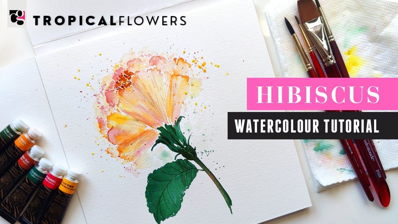
5. #1 Cherry Blossoms in Watercolor: For this first video, we are doing cherry blossoms
and I will be dominantly using the Princeton
velvet touch number four. Now the reason we're using the Princeton velvet
touch number four, A because cherry
blossoms are smaller, B because you need to get those nice little fine
lines for the center, and the velvet touch number four is an amazing brush
for doing both. And the Princeton number
six is also a great brush. However, the reason it's not my first brush of choice
for this is mainly because the fine pointed tip isn't as fine as
the number four, especially if you are a
beginner and you don't really have your brush
control under control. Yeah. Use that
control word twice, then you'll find it hard to get those nice fine lines in the center off our
cherry blossoms. Now that that's out of the way, let's just get into
mixing some color. For the cherry blossoms, I would like to use a quin rose and I
have that right here. I'm going to mix some
of that color on here. It's this beautiful
gorgeous pink. Just look at that color. We want to water it down
to make it really watery. Notice how much color
I got and notice how much I am mixing to get it
really diluted and light. Okay. Once we have this, we're going to use
we've mixed it up with a number four,
so we're ready to go. We're going to create
our five petals and it's a very basic simple repetitive
action or brush stroke. Making sure that our brush
is nice and full of color. We're going to go
ahead and create five do This simply helps you
to keep that center open. Then taking water,
we're going to go the mixed color that is. We're going to go ahead, start
with one dog, press down, trail out, close
it up like that. You want to push all the
color to the center. You can also dip your brush in water right now
because I like different variations of color within my flower and the petals. I'm just going to go ahead
and create another one. We're going to go ahead
and do another one here. Okay. And then another one here. Notice how uneven
my my sizing is, also the the spacing
and whatnot, but we want to keep
this loose and fun. There we go. We've
got our simple flower for cherry blossoms pushing all the color down
to the center. Now I'm going to get a bit
more water on my brush, water this down some more. Maybe even get a little
bit of a different color, like a different pinkish color
just to get a variation. I love variations. I
know I said one color, but here you go.
Here's another one. Making sure we've got
enough water. Same idea. Let's create another
cherry blossom. This time, I'm doing it without my five dots in the center. But if you are more
comfortable making sure you've got your five dots
to keep that center open, do the five dots. It's definitely a helpful trick. I've got two here. What I'm going to do now
at this point is get some of the color directly from the color cake on
the tip of my brush, and making sure that our flower is not dried up completely, I'm going to dab right
in the center this way, and this is what gives us this beautiful soft
bloom in our flower. You'll notice the bloom is
probably a little easier on my second flower
and that's simply because it's the last
one that I painted. This one dried up
just a tad bit. It's really really
Timing matters. Timing matters in terms of
when you add the color. At this point, if you feel like you need to
mix a little bit of color and get some
more flow happening, you can just take
your brush, push down color towards the center. That's something I wanted
to do for this flower. You might even want to
extend color outward. In which case, you
can just start from the center
and pull outwards. It's really a preference thing. Remember, guys, this is a
loose style of painting. Just go with the flow, learn these techniques
that I'm showing you to paint these
specific flowers, but you can also use these same techniques and enhance and create
other flowers. Let's just do one more flower. Before we move on. I'm going to do one, a
third one over here. This one is going to
have one of the petals slightly curved upward and you'll see exactly what I mean. We do our two basic ones.
Again, you know what? I'm just going to
make my little dots here just so it's
easier on you guys. Then one more. Then I should have
probably made the curved petal over
here, but that's okay. Then we're just going to
do something like this. All I did was do a
little stroke like that. Simple enough. I'm going to show this stroke to you on another sheet of paper
just so it's more clear. The stroke we're looking for for our side stroke is
something like this. I made it dark just so you can see exactly what
I'm aiming for. I have some color
on here already, so I'm just going to use
that to do our center. Now, because this
one is like a flip, I'm just doing a little bit of a dotted line right
in the front of it, so it doesn't get
directly onto it. Now, again, with the bleeding, if you feel like you need
to swipe off some color, swipe it off, make sure you have some paper towel handy on the side and just dab it
onto your paper towel. That's all you're doing.
Same thing over here, if you need to swipe off how
this color is moving around, now's the perfect time
while it is damp. You want to enhance the
darkness of your center, go back in and add
more of the pink. We're keeping this simple, we're keeping this
fun and loose. You can also dab
after it's dried, but that's essentially wet on dry as opposed to wet on wet. If you like that look better, absolutely wait for it
to dry and then go in. I love the wet on wet. I think it's so
seamless and pretty, and that's why I do what I do. Or that's why I do this
move when I do it. Okay. Let's do the last thing which is doing a couple of buds. The buds are super fun and easy. All we're doing is, let's do a couple of
buds over on this side. We're just doing that.
That's all we're doing. That's an easy enough bud. Let's do another one over here. You can do a couple
of them together. I'll leave that up to you guys. I'm just placing
mine where I feel. They should go. And probably shouldn't have done it
right below the flower, but we're going with the flow. Let's just see where this takes. Last but not least, if you would like to,
you can do a splatter. All I'm doing is getting a
lot of water on my brush, and then I am doing this. This gives it that
beautiful whimsical look. Another great move
to your florals. Last but not least we are going to be
painting the branches, and for that, I'm going to
use some of my weight for it. Burnt brown, which is
right here, I think. Sometimes it's hard to tell. It looks more like a green. But then again, I mix a lot of my bright greens with the
brown to get some nice color. It's probably just a
matter of washing it away. There we go. That's the
brown we're looking for. I'm going to get
some of that and using the fine tip of my brush, we're going to start
doing these branches. And the branches
are very not flowy, but they're very kind
of thick and awkwaris, feel free to kind of
extend and create Okay. Without giving it any
flow flow the right word. Without giving it any sort of, I guess, whimsical
look. Here we go. Let's do this flower
extending onto another branch. I'm
going to do that. Okay. Something like that.
We're just kind of connecting the
dots at this point. This one kind of is a
lone wolf here as well. So let's just do
another one here. So clearly, I really
went with the flow and I didn't really plan to see
where things were going to be. But sometimes this
is how you paint. This is how you learn.
This is how you train your brain to kind
of really go with the flow and figure out how to position
things in your paintings. And there's absolutely
nothing wrong with that. In fact, you might find
it very, very helpful. Okay. Now we've got
some at the top. So we're just going
to finish this. And you want to give the buds a little bit of that triangle look at the bottom to kind of indicate that
it's being held. Then let's just do
a couple more bud like elements here. Okay. All right. So now let's do
the center of our flowers. Once again, this requires
a lot of brush control, and the number four
is perfect for this. However, if you are brand
new and a beginner, I would suggest going for
something a lot thinner. I'm trying to look for my number one brush or even a zero. Princeton Heritage
zero works great. What I'm doing is dampening
my brush and I'm just going to use or add this brush to this video for
people who have never not never done watercolor, but haven't quite
mastered the skill of brush control just yet. So we've got some pink, feel free to mix it in
with a tinge of brown. That's all I took to get
that darker reddish tone. And then using this brush, we're going to go ahead
and lightly paint in little lines into the center. And then we're doing dots. Okay. Okay. And you don't need to be
specific about how many lines, how tall, all that stuff. We just need a very
loose rendition of that. I'm even going to get
a little bit extra brown and add that to
the dots just so that they stand out a bit
more really gives it such a beautiful pop and your eye immediately or the viewer's eye
immediately alerts them, those are cherry blossoms. Pretty, right? All right. So we're going to
continue creating more of that over here. Okay. And if you don't want to use the dark tone for your
little dots, that's okay. I'm going to have
just a little bit. Use your creative judgment. I'm giving you options
and ideas on how to build up and so
you run with that. Have you even enhanced some of these dark lines in
there because it looked like they were drying up to look almost pretty similar
to the center. And then last but not
least one more over here. I'm going to get some of
that brown and drop that in. And vola, we are done
our cherry blossoms. Simple, cute, easy
enough with filled with lots of techniques that you
can use with other elements.
6. #2 Lilac in Watercolor: We're back. In this video, we are going to be
painting the lilac. For the lilac, what we're
going to be using is the Princeton number six
neptune I'll be using three variations of colors
or variations of purple rather with actually
the third one will be pink or the
second one will be pink. This way, we get those nice
soft blooms in our lilac. And this technique is also something that is very indicative of the loose
watercolor style, and it all boils
down to white space. Please pay attention to the white space that we're going to be using in this one here. For the first color that I'm
going to start off with, it's going to be a lilac. Yes. That sounded
like a question, but it was more of
a thought for me. I've got some lilac in here on the Paul Rubins set of colors. I'm mixing that in here. And I want it to be a very
watered down version, not as much as as
the cherry blossoms, but a tad bit less. Okay. Something like that, and then we're going to make sure that our brush is nice
and full of color. Then we're going to start
off in doing little dabs. We're going to form
a cone shaped shape. Yeah. We'll start
off with the darkest at the top and as we
progress downward, we're going to dip our
brush in water to get a more muted mix of the color. Something like that, and
then we're just going down. Notice the white space. I'm roughly trying to
create that shape, the cone shape, that is. As I'm going lower, I'm
getting more water. And if you see little
puddles of water in your lilac,
that's totally okay. Keep going. Just
make sure you're not filling up all the
white space in between. It's a very simple technique. It might require a little
bit of trial and error, especially if you've
never really encountered watercolor in these
techniques before. It will definitely give you more of a sense of how
watercolor works. This is the first step. We're getting
something like this. Then we're going
to get our pink, and the pink I'm using
is called a rose red. And it looks like this, and I think it'll be a
very pretty mix in. All I'm doing is taking
this rose red and I'm dropping it into these areas here because if
you've not gathered already from your
encounter with watercolor, watercolor when you add another color while the
base color is still damp, you're getting a bloom, and that's what we want
in this flower. So you'll notice maybe
because you have pooling of water with the
purple, it's just sitting. Remember what I said, move your brush to move
the color around. Don't overdo it because there is such a thing
as overdoing it, and then you end up covering
all your white spaces. B I'm trying to find
the right word B. Use this technique sparingly or use the amount of
strokes you make, make it less than more. Something like this. Now we have that nice little pink peeping
out which is beautiful. We can then move on
to our dark purple. I'm going to be
using a deep purple, and this is what
that looks like. We're dropping that in mostly
at the base of our shapes. Just to give it that more it's shadows happening beneath and sometimes there's little blooms of purple happening in there. Again, just like I said, with the first two steps, if you feel like you need to
blend in the color a bit, go ahead and do so. I'm even going to
add a couple of dabs of that at the bottom. I'll even at this point, if you want to take
a little bit more of the first purple you used and drop that into certain areas, that'll really help
things mix as well. You want to get that nice soft almost impressionistic
look to your lilac. Look at that. Okay, so what I'm doing next is I'm going to help this
flow a little bit better, so I'm just going to dab
my brush in a paper towel. And then we're
going to help this along because sometimes
if you let it just sit, it's going to stay
with those shapes. But if you kind
of help the color move along within that area, it'll give you a nicer effect. Again, If this is
something you want to do. If you want to just let it be and see where that takes you, I encourage that because this is how you learn from watercolor. This is how you grow as well in your understanding
of how the medium works. I absolutely encourage
that as well. So I'm just lightly
phasing off the edges. Okay. Now, one more thing
that I want to do and this one I will do with the number four is just take the darkest purple we
use, which is right here. I want to give the top a bit more and I'll mix it
with the pink actually. I want to give the top a little bit more of a structured look. I'm going to do little
strokes like this. Making it seem like those are the tiny little buds at the top. Drop in some of that
dark purple as well. Okay. And that's it. So now we can move on
to doing our stems, and for the stems, I love
using the olive oil olive oil. No. The olive green, guys. Here we go. I think the
olive green is fabulous. I'll mix it in with a
little bit of yellow green. Just to get a slightly
brighter green. Otherwise, the olive green has more of that
brownish look to it, which I personally love. But when you have
that yellow green against the purple,
it's stunning. All I'm doing is going in
between and drawing in tiny little lines to indicate the stems that are
holding our buds together. You see this little bloom
happening, that's beautiful. Leave it as is. And then I'm going
to do my main stem, give it a nice little curve
because I felt like it. You can always extend
to make it slightly thicker and then extend to indicate branches
protruding from your main stem to the flowers. Simple, fun and loose. Then if you wanted to take
it a step further and do some leaves, have
something like this. Then using the tip
of your brush, press down and trail on
the tip towards the stem. I'd like to give it a
second thicker look, so I just do
something like that. Here we go. We are done. One last thing, if you
wanted to do this, and I think I'm definitely doing this. No, I think I know. I'm going to do a splatter, and I'm using the darkest
purple that we used, and I'm going to
go for a splatter. Dipping my brush in water to get a slightly lighter version, sorry, not lighter, but
muted version of the purple. I'm going to do a
splatter around here. And I love when it's so kind of throwing
caution to the wind, not really caring so much about placement that you lose control over you don't have any control of where
these spots fall, so you go with the flow, and this is exactly what loose
watercolor is all about. It is refreshing and takes a lot of unlearning everything you have
learned in school, which was always
about painting within the lines and keeping
things tight. Here we are going loose. This is our lilac.
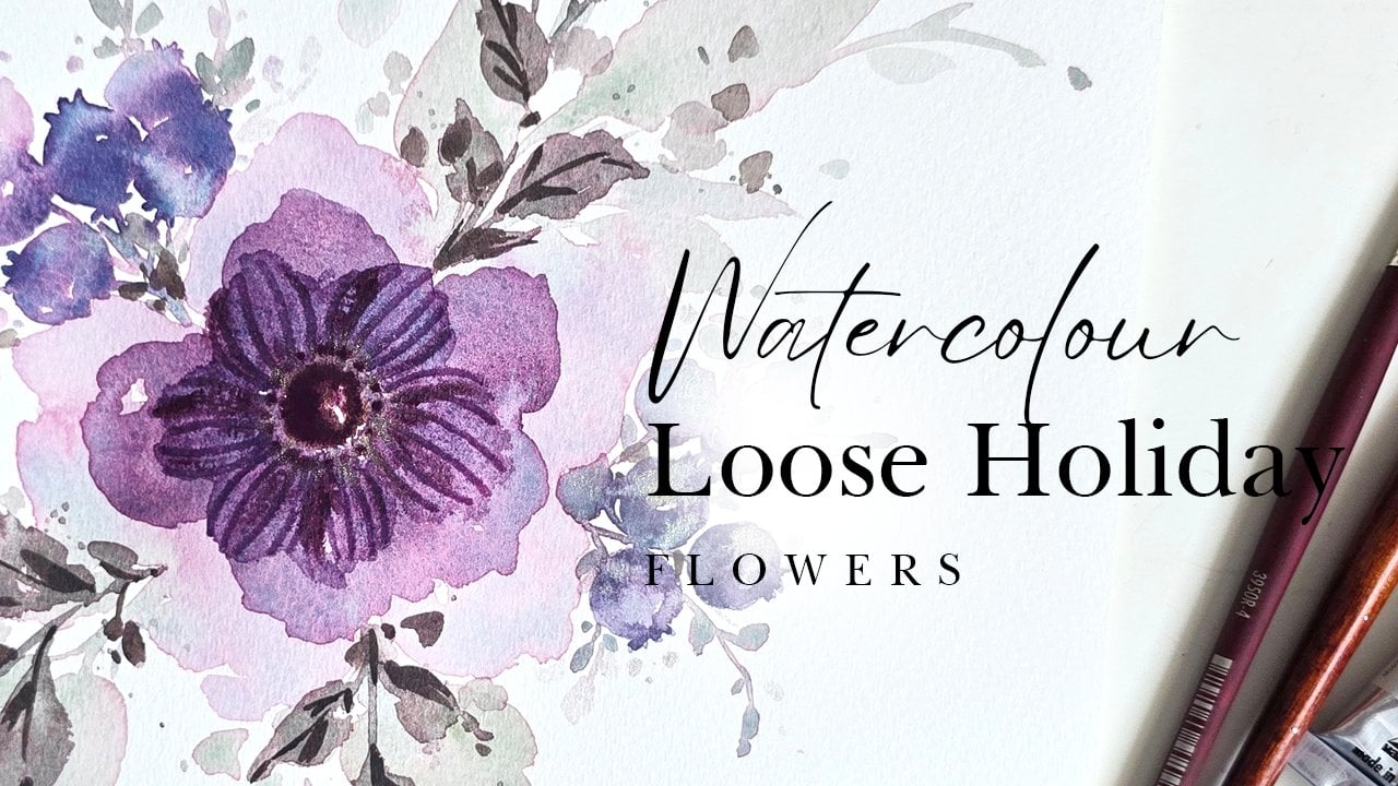
7. #3 Anemone in Watercolor: So in this video, we are doing
anemones you're already. We are going to be using the Princeton number six
dominantly for this one. Then we'll use the number
four for the center. However, again, just
like in the first video, which was the cherry blossoms, if you prefer to use the zero, you can totally use the zero. For this video, we're
starting off with doing the center and I'm getting some of my
paints gray right here. I'm mixing it onto my palette. Looks like indigo
for some reason. You can also use Indigo guys
if you want to use indigo, totally a thing for
the anemone centers. Getting some of that
nice dark color, we're going to do our
very rough circle. Feel free to leave some
white space in between. Let's do one here. Notice how I'm dabbing and going around to get that uneven
surface happening. You can create your
outer circle and then lightly fill it up to get those nice little organic
looking white spots in between. For the mixing of how
dark it should be, we want this to be
as dark as possible because our centers for the
anemones are pretty dark. There we go. We've got that. The next thing we're
going to do is watering down our
mixture just a tad. I'm dipping the tip
of my brush in water, and then I am not lightly. I'm just going to go
around the anemone and do these little droplets of
watered down panes gray. Now, once this is done, this is where time
is of the essence, and so we need to make sure we get our number six
involved fairly quickly. I'm going to use I'm going
to get a little bit of my quin rose and mix it in with some of this
leftover purple that I have. But anemones come in so
many different colors, feel free to go with a color that you
gravitate to the most. Very watered down version
again of the color pink, and before this dries up, I'm going to use this as a
guide to paint our petals. The first petal is going
to be around here. Something like that. Look at that beautiful
bloom that you get. That's another one. If you see color collecting like this, you'll know what to do already. We've done it in the
last two videos. Just take your brush and
move the color downward. If you wish. And feel free
to rotate your sheet. Like so I'm going to get
more water in my mixture. We're not overthinking
this process. We're not counting petals. We're not looking at the shape. The anemone is a very
tell tale flower mainly because of the center and the center is going to do
all that work for us here. If you're painting
this and someone goes, that's not an anemone
because it's got six petals and it actually
has eight or whatever. Don't worry about it because
we're painting loose guys. Okay. So go around all over until
you get something like this. Now you can see I've got puddles of water happening. That's okay. Just going to lightly
dab on my paper towel, and we're going to kind of really just give it a
little bit more shape, pushing the color down. Okay. We wanted to dry
with the color down. Once that is semi dry, we're
going to take our four. We're going to get
a little bit off the pink color that I used, and we're dabbing
it in the center here pretty much exactly like what we did with
our cherry blossom. Getting color directly
from the color cake, d to the center, so we get
a nice beautiful bleed. Or blend. Depending on what kind of paper you're using because
supplies do matter. You might either get
a beautiful blend, you might get something
that doesn't blend as well. Also depends on how long
you've waited to do this move. Now that we've done this, this is the part where we get a little bit of
texture in our petals. The way we're doing the texture is by washing off our brush, lightly dabbing
onto paper towel, then we're extending
into little lines. From the anemone all
the way out into the petals from the
center, obviously. It's the anemone because
the whole flower is one. Now if you find when
you're extending, there's color sitting like that, help it along, or
your next option is to start from out and go in. Although that to me
doesn't quite work because I want the pink
to extend outward. You're just lightly creating these lines and
bringing them outward. Okay. Again, this requires
your paper to be damp. And then this way, you get
those nice beautiful lines creating that nice linear
texture in your petals. It's a very relaxing
repetitive move as well. Okay. Now, this also site
full disclosure. This by no means
is an easy flower. Take your time, try
it a few times if you must and don't sweat
the small stuff because a lot of it depends
on how long have you waited, is it dried, all those things. And while this is loose, I do know that I'm adding a couple more steps that really don't need
to be in there, but that's just how I
like my anemones to be. I've waited for this
to dry a little bit, so it's kind of damp right now. It's not completely dry. And we're going to do
our final step to this, which is doing our center. Now, the telltale part
for the anemone is those nice little dots on the outer edges and the
lines holding it together. This is my best way of describing it because this
is what we're going to be painting right
now. Here we go. I'm using the number four again, and this is where
we're getting more of our paints gray,
mixing that in here. And then we're
going to start off with doing the center
actually not the center. We're going to do little dabs, little dots right
on the edge here. You might get a bloom happening depending on how
damp your sheet is. I personally don't
mind the bloom just because we're
painting loose, and this is a loose
rendition of the anemone. And I think in the
large scheme of things, it really does help enhance that whole whimsical loose
look for our flower. Then once we've done our little dotted or dots all around, we're going to use the
tip of our brush and lightly create little lines extending from that
into the center. Again, feel free to use the zero if you feel like the zero is giving you more control in terms of how thin
your lines are. Then lastly, what
I'm going to do is paint the center
in one more time. To really give it
that nice dark look. I'm not going into every nook and cranny
to paint the center. I'm leaving some with
that light gray. Again, very rough rough, loose. Loose is the word not rough. Now, one more thing, if you're getting
blooms like this and you're not
entirely liking it. Again, Can you guess what
I'm going to suggest you do? Take your brush, make
sure it's washed, make sure you dab it
on your paper towel, and you swipe the
color to the center. Or stop the color from
spreading outward, right? Okay. But really and truly, you don't have to do too much because this is what the
anemone is all about, and this is what the loose style of painting
is all about too. It's getting those
beautiful blooms, knowing when to use your
watercolor blooms to kind of show you certain aspects or elements to I was
going to say a flower, but really and truly, it could be anything that
you're painting. You can even use this
center to kind of draw in more lines coming
out from the center, and it gives you that darker shadowy kind of feel,
which is fantastic. Again, it's a very
this is optional. You don't have to do it. I figured, let me
show it to you guys and you guys can decide if this is
something you want to do. It just prolongs the steps, but look at how much
texture and how much more enhanced our anemones. Really and truly, it's a subjective thing if you want to do this
extra step or not. Do this here as well. And notice how I'm
being very loose in it. I'm not really checking for extensions all
the way to the end. Look how cute or how
realistic this looks here, which this is more
what I like in comparison to having them extended all the way
to the end over there. All right. And this is our
anemone in a nutshell. You can also extend
further if you wanted to and get more definition
between your petals. The simple way to
do that is just to get some of your color
that you've mixed up. And you're just enhancing
it. What did I use? I used a little
bit of that pink? Yes. Here we go. Now,
this is a bit too bright. Let's get some of
that purple in there. All I'm going to do is
using the tip of my brush, making sure things
are not still damp. We're going to lightly
start at the top, press down, go down
to the center. Or you can start from the
center and go up to the top, but you're trailing
off to your dot or to the point of your brush. You can push the color down. Something like that,
which really helps give more definition
to your petals. Again, optional enhancements. All right. And we are
done our anemone.
8. #4 Peony in Watercolor: Last and final flower, and that is the peony, and this peony is going to be a combination of two
different colors. We're going to be
using a base color called permanent yellow deep, which is like an orange
hue, which is right here. This is what it looks
like on my palette, and we'll mix it in with a
little bit of that pink. Again, a watered down
version of this, and we're using the number six. Once we have that
watered down version, we're going to start
doing our strokes. The main reason for the
watered down version is so that you can you can build up on
the color because if you start off dark and
you feel like it's too dark, it's harder to take away color. This is why we start of lighter and then proceed from
there. Here we go. We're starting off, I'm
holding my brush sideways, and I'm going to do
stroke like this. I'm dipping the tip of
my brush and water, and I'm going to enhance on this stroke and then do
another one to the side. But these strokes right here in the middle are going
to be our main strokes for the outer cover
portion of our peony. Once this is done, dipping the
tip of my brush and water, taking some pink,
I'm going to extend and create another petal
flopping over this way. Getting more water,
we're going to continue creating another petal
that's flopping this way. We've got one here, one here. I'm going to get more
pink for this one here. This is what helps differentiate the shapes that we
have happening. Now we're building
up on the top. We're just taking a very
watered down version of the orange and
we're just doing this. Okay. I'm going to take
some of that pink, drop that in there as well. It's nice to have that
nice little glow. And then washing off most of
the color from the brush, dabbing on paper towel, we're just going
to sort of extend and do a couple of strokes at the top just to make
it extra lighter, and then using whatever
color we have on our brush, we're creating additional
side strokes here. Now, we allow this to dry before we add anything
to the center. This is our base basic pony. Before because this area
is fairly dried up, if you want to if you want
to add an enhancement to it, now is the time to
get a little bit of pink and kind of drop
that in at this time, or even within your
whole petal itself. Okay. Then just dabbing it off. If there's any coming
on the floppy petals, just brush it off. Guide the color along. This is one of the
things I didn't do when I started watercolor, which was lifting or just
guiding the paint along. That is such a powerful
move when you're doing watercolor and say something is not spreading the
way you wanted it to. One more thing I want to do before we leave
this alone is add a little bit of that
pink on the top here. Okay. Give it that nice
little additional feel that the other petals also have a little
bit of that pink. Okay. And then we allow this
to dry for a bit. Let's do another rendition
of a peony and this time, we're going to use
two different colors. We're going to use I want
to call it yellow ocher, but for this particular set, it's called natural yellow, and it's like a yellow
ocher for sure. Mix it in over
here. I don't mind it mixing in with a
little bit of the pink. And we again want a water
down version of this. And we're going to start off with the pony is going
to be facing upward, all we're doing is creating
a little strokes like this to kind of create
that center for it. And then we're taking the same color and we're
going to build up on it, but feel free to get a
little bit more color because I ran out and then we're just doing little
strokes all around. And it's little C strokes
that you're going around. So we're using the
same color still, and you'll see why because
once we reach a certain stage, I want to drop in a little bit of that second color
I spoke about. So here we go. We've built
up the roundness of this. Okay. As I'm going outward, I'm adding more water to my brush so that it fades off into a
lighter tone or color. Now we're getting some of the orange and I believe this is called orange. Very fancy. I'm taking some of the
orange and I'm going to lightly add strokes
in between like this. The reason I'm adding
the strokes at the bottom is to really help it stand out and show us
the folds in our petals. I'm doing this while
it is still damp. The reason if it's not clear already after the
previous three flowers, the reason being
is so that we get a little bit more definition
of what layers are aware. Then I'm taking that same
orange and we're dropping that in to the center of the flower just to give
us a nice little bloom. Now, for flesh tone colors like this or florals like this. I like to throw in
a bit of brown. I know it's orange, it's
not exactly flesh tone, but it is a lot lighter in comparison to some of the
other flowers we've done. I would like to get
I'm just looking at my colors a little
bit of burnt brown. Let's mix that in with
some of the orange. It's like a nice orangey brown when you mix it with
your leftovers. Again, drop it in. It really gives
you some beautiful shadowy effects and really helps the eye with deciphering where one
petal ends and such. I'm going to drop that
into the center as well, and I'm doing all of this while while all these
areas are still damp. That is key to get these nice loose effects
happening within your florals. Just make sure that your areas are still damp while
you're doing this. This is what gives
us that nice bloom. And don't overdo it. Sometimes it's easier said than done, look at
me overdoing it. Or maybe do overdo it, and then you learn from it. There we go. We are done that. Now let's bounce back up to the first flower and
add some center to it. Now, for our first flower, if you wanted to go in and highlight the way
we've highlighted over here with that third layer of a slightly darker
color, you can. But I wanted to keep
the series very basic and very fun
just to get you acquainted with the strokes involved in getting basic
shapes for your peonies. I'm not going to
enhance it and make it extra taxing on you guys. But we're going to
do the center now. Taking my number four
Princeton Velvet Touch, I've taken some of
the brown that we used here and we're going to do little lines Just grazing, and then little dots on top. Again, very loose and
rough and not rough, loose. Loose is the word. I'm trying not to use negative
sounding words because, totally a different vibe from how relaxing and
fun watercolor is. And also, we're painting
pretty flowers. So we don't need to
use words like that. Enhancing it. You
can feel free to use a slightly darker version or a darker brown is
what I was meaning. Because again, two tones
within certain areas, especially tiny areas like this that don't have
a lot of detail. Really enhance it and give the viewer an impression of light and dark and
shadow and stuff like that. Light and dark is obvious, but I mean, shadowy areas. Something like that, very basic. Then you can add the
same thing over here. I'm just going to add a couple of dots. That's it. These are the pies. You can choose to do either or both in our
composition painting.
9. BONUS - Leaves in Watercolor: I am adding one more bonus
video to this series, and this is going
to be four leaves. We're going to stick with the same brushes for the leaves. I'm going to let you
know in a moment exactly what kind of colors
we're going to be using. Olive green is
definitely on the list. Let's start off with
using the number four because it gives you a
little bit more control with your sizing for leaves, and let's go ahead and get some. Let's extend this over here. You can see me
mixing some color. And I'm going to mix
it in with some of the blue here just to get
a different variation, a slightly darker color. And we want the
consistency to be a little bit not super creamy, a little more watered
down than that. So this is perfect. Okay. So what we're going
to start off with doing is the first kind of leaf and the leaves are pretty much using
the tip of your brush, then the belly of your
brush and then kind of trailing off back onto
the tip of your bruh. So this is how I would
typically paint a leaf. I would do the stem lightly
grazing to create a stem. Then I want to make sure that my brush has a ton
of water on it, so I don't run it
doesn't run dry. I dip my brush in water, mix it back in with
the color some more. Using my tip, pressing down, trailing off onto the tip. You can get thin
leaves like that. Let's just do that first. Let's create another
one another stem. Using the tip,
press trailing off. And what you can also do is you can start from the out and then go towards the
stem for your leaf, if that is something you can
do or you're fine trying. Some people don't
want to do that. So same technique,
you're just kind of using the guide
the little branch, stem, whatever you
want to call it as a guide as to where
you want to stop. So these are thin
leaves that you can do. Let's get a little
bit more color mixed up and do thicker leaves. I'm getting a slightly
darker tone here. Let's just get more of that
color so we don't run out. Using the number four still, we're going to do a branch first or a stem first like that. Then I like creating my thick
leaves from the outside in. Starting with the tip, press trailing to there. Getting more color now
for my second side. I'm going to start a little
bit below pressing down. Coming down there,
and this is how we have a thicker leaf. Let's do this one more
time so you can see it a bit better. Let's make this leaf
over on this end. This time, again,
starting from outside, using the tip, pressing
down, trailing there. Notice how there's a little bit of white space happening there. That's because my brush
didn't have enough water. I'm getting more water,
mixing it with the color, and we're going to do the
second half of our leaf. Okay. There we go. This might take a little bit of practice if you've
never done this, especially if you've
not quite mastered the whole using the brush because it's so soft and
whatnot, but give it a shot. Now, let me use the number six to create a bigger
leaf in the center. Hopefully it doesn't
touch that one, but we're just going
to go with the flow and see where this takes us. Taking some of my green, take any green really
that you have. We're just practicing here. I'm going to get the
green, get some brown in it because I don't like
the bright greens. That's just my preference to mix them with brown to get something a little
bit more wood z. Here we go. Now we're going to
use the number six, and this will obviously give
you much thicker results because it's such a thick
brush, use it sparingly. Okay. Using the tip, pressing
down, or trailing. Then we're going to
do the second half. Trailing. Let's just
join it. There you go. Now, another way to do leaves, and this is entirely
up to you if you just want to go buck wild and just
be very loose with stuff. I'm going to get a
slightly different shade of green here for this. We'll use the number six, you can just do something
like using the brush, press, trailing off.
That's a leaf guys. Let's give it a stem.
Let's do another one. Okay. That's also a leaf. Then if
you don't like how it ends, just help it along and
you should be fine. Here we go. Again, pressing
down, trailing off. Okay. Can do that twice if you want it to
be slightly thicker, little tiny leaf
coming out from there. Again, leaves, loose leaves. Then what I also like
to do at the end of my leaf painting session is to give it you've got
your dark leaves, then you've got
your light leaves. For that, you just water
things down a whole lot. Then using the watered down version that you
have on your brush, you're just going to create
additional leaves around it. For instance, I don't know, this is not something
I would typically do, but let's just say something
is protruding from here. Okay. Okay, so it needs to
be watered down a bit more. So I'm going to
get more water on my brush and just do
something like that. You can even extend from leaves like this where it's
really, really watered down. And then they're
bunched together. Again, this particular segment here is not something
I would typically do. Let me show you something
that I would do just so it makes a
little bit more sense. Once this dries up, you'll
see exactly what I mean about it looking lighter in
comparison to these guys. But, I like to do a little tendril elements
and they essentially. I would use the number
four, by the way for this. They would typically be
protruding flopping outward, and then getting
water on the brush. I just do something like this, one swoop, second swoop, if I want a really thick leaf, and then another
one to the side. I'm not really attaching them, and then another one
here maybe because I like to do my leaves
in threes and then little dots or
dabs of color that are trailing off to
indicate more is happening. One more style of leaves, and then we can go on
or move on to using these and watching them take full effect in a
composition. Here we go. Using my number four,
I'm going to create a stem and then getting more color
because I always like to make sure that it's
nice and hydrated. I'm going to use this as a
guide for where my leaf is. Create your second stroke. We're doing exactly
what we did in the second leaf session, and we're just building
up on how this looks. And there we go. So you can have protruding
leaves like this. You can have random, big element leaves like what
I showed you above here. You can have thin leaves. So here's a couple of different options
that you can explore. You can also take these
to be a lot smaller, and then you're just painting, I'm going to deliberately touch this and extend and make leaves. Okay. If you wanted to
do something like this, kind of like almost
like a fern style. No, not really a fern style. Just like a herringbone pattern leaf,
I guess, you would call it. I don't know. Okay. Just
ideas for you guys. The leaves are there to
enhance your flowers. They are not the showstopper. Never feel like you have to do a ton of leaves
in your composition. Just a couple here and there to balance all the bright colors. Works wonders. Another tip I want to
mention for leaves is adding that dab of additional color to
layer while it is still damp just so you get those nice light and dark areas. We've done that for our flowers. The same thing works
for our leaves. Let me just do another leaf. Or stem or branch or whatever
you want to call it. And let's just make
this really light. No, I want to mix
it with some of the colors I know, I rarely use. So it stands out.
Okay, so here we go. I've got some emerald
greenish color. And let's paint a leaf
here, a stem rather. Again, I like to have lots of color in my brush, so
I dipped it in water. And then I'm doing this. You can leave a little bit of a gap in between your
leaves if you want to just to give that loose
indication, that's the center. Then I'm going to
get a little bit of the brown mix that in with
our green on the side. Then we're dropping that
in before it dries off. You always want to do
this particular move right where the leaf starts with the stem or
even at the tip. Then what I typically do is
extend it all the way down. Then one side looks
darker than the other. Just a little quick
tip for getting some nice beautiful
gradient effects within your leaves that
you can try out. You see dark to light.
It's a pretty effect. Here, I don't have enough water, and so the leaf came out half. You might like that
effect in which case, go for it because
that also enhances that whole loose fun
watercolor look. Just keep that in mind. Okay. Let me finish this off, and then we are done
with our leaves. In a nutshell, these are all the leaves you'll
need to know in your loose floral journey or loose floral
painting journey. I hope this made sense. Go ahead and try it out
and then let's hop on and put this to the
test and see how we do
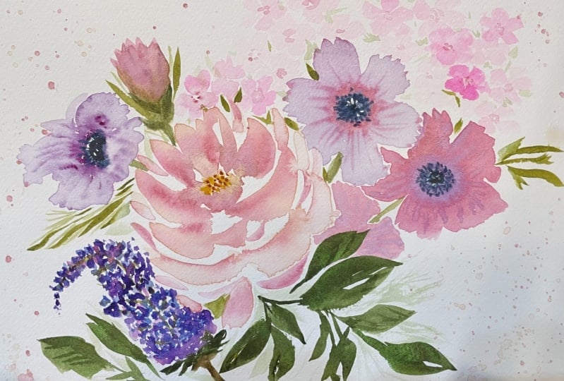
10. Painting our Floral Composition - Part 1: Okay. Okay. We're
now ready to go ahead and create our
own little composition based off everything that
we've learned over here. Here's my approach really quickly. Let me put these aside. My approach to doing your own little
composition would be starting off with our
main flower placement, then onto our secondary flowers, which would be the anemone
and the lilacs and then finally finishing off
with some cherry blossoms, which would just be peppered
around and then leaves. Throughout this
painting session, feel free to watch
how I paint along. Or have me playing in the background and do your own little composition because we've already gone through
how to paint each of these individually,
including the leaves. So go with the flow, see what your
creative intuition is telling you, and go
along with that. I'll be explaining everything
I do as I am progressing. This way, if you want to
mimic what I'm doing, you can absolutely
go along with it. Now, for supplies, for
this specific one, I'm using the Etch
watercolor pad, hot press, and then
for my brushes, I'm using the number six, number four and zero. I've got my colors ready. I may or may not use
the exact same colors. I'm just going to go
with this flow for this whole process and
see what we come up with. Using some of the permanent
yellow orange hue that we use with the ponies, we're going to start off
using the number six and doing that little cup
portion of the pony first. Holding my brush sideways
because that full length of the brush is helpful when
getting these thick strokes, you're just doing these
little C strokes, dipping your brush
in water to get a more muted version
of your color as you go along and create
the next portion of this cup. Once we've done that, we're taking whatever leftover
color we have on here, and we're just doing little
arcs. I didn't have too much. Little bit of an archy
movement or stroke at the top. Those are our background petals. Getting more water on the brush, I'm lightly creating lighter
strokes just at the top. We've got that gradual dark to light in our circular area here. I'm going to get a little
bit more of this orange, add some strokes this way, and now we're doing our
floppy flopping over petals. Same idea. Try and leave as much white space as you can so that it doesn't blend
in to one another. Then once I have a
good enough amount of coverage on here, I'm going to get some
of that pink and add it onto the flopping petals. This is me just adding
more shape to our peony. Now we're getting some of
that pink mixing it in, and we're going to
drop that in here. And I'm alternating
where I'm putting it, and this is just so it can
bleed out nicely and blend, going to get some happening
within here as well. And then a little bit at the
bottom of these areas here. So it looks like it's
coming from the inside out. Now, what you're going to notice is it's blooming all over. In which case, just take
your brush, roughly wash it. Make sure you dab it onto your paper towel and you can
help the color move along. Like for instance, over here, I want to move it
along to this area here. Same thing here. Okay. Same thing around here. Don't overwork these
areas because it can end up looking very overworked and then you might end
up ruining it. However, having said that, the best way to learn how much is too much
is by just going for it and then taking a step back to view what's happened. We're going to get a
little bit more of this pink and I want to
drop some right here because I want this area to be the prominent in terms
of shadow and dark. And the rest can be more
of that lighter feel. We'll allow this to dry just a bit before
we come back to it. I'm going to use
similar colors to get our second peony and
let's go with that. Let's start with that, I mean, I'm starting off with the yellow cherish color that we had, and I'm going to
start off with doing our little petals in a
basic flower format. The darkest color for
this one is right here. Now, dipping the tip
of my brush and water, I'm going to continue
creating strokes like this at the bottom
of this flower. These represent the folds of petals that are
at the bottom. We're going to do a
couple at the top. Again, a white space is
a big deal over here. Okay. And our flower
is almost done. If I didn't have
any white space, it would all just look
like one big blob. So this is where white
space is important. I encourage you to
keep practicing. It's not something that
will happen overnight. It's just something that
the more you practice, the more it'll become a part
of your painting ritual. This is all I'm
doing for this one. I'm going to get a
little bit more of the pink to revert back to this. By now, it's dried
up a little bit. So what I want to do is add
a little bit more pink. Okay. So I'm going to some
of that in right here. Again, I'm just adding this in so that I can get a
little bit more of that nice dark to light
within my petals before it completely is dried up. Okay. And then I'm adding
a little bit more of that at the top here. That's great. I don't
want to do anything else to this little
pony up here. We're going to add our browns
to this one over here. Using the number
four, we're going to go ahead and get
some of the browns. I believe I had used
raw umber and I'm mixing that with
some of the yellow. So what we're doing is
doing swoops or C strokes. Okay. Now, I know I'm
using the number four, but the number six would
give me larger coverage. Some of the color on number six, and we're going to only do
this at the bottom half here. And then in the center. Can even add a couple of strokes within your main petals or your inside petals just to give it a little bit
more loose definition. Then I'm getting a little bit of a darker brown
dropping that in here. And the reason I'm
doing it right now is because it's damp and I
want that soft bloom. Look at that immediately. Everything just opens up. So you're allowing the color
to speak the story almost. And that's pretty
much it for this one. We can allow these
to dry a little bit before we get back
to doing anymore. So now let's do some of
the secondary flowers. Let's start with the pony. Sorry, we've started
with the peonies. Let's start with the anemone. Using my number four,
I'm going to place some the one anemone
right here at the top. We're going to start off
with doing the center first. So really rough. And I'm controlling how big this flower is because
our peonies are massive. So rough little center filled in with a little
bit of white space. And then I'm doing a dotted line or circular circle all around. And then we're taking
our number six in whichever color pleases you or if you want to use the
same colors we've used. I'm going to get
a little bit of I believe this is rose pink, and I want to water it down a bit so that I get
some good bleeds. Let me just put this on the screen here.
You can see this. Okay. So again, using
holding the brush sideways, we're going to create these
petals going all around. Dipping the tip of
my brush in water, Now, notice how this pains gray is bleeding into the
petals. Remember what I said. When this happens,
just take a brush, make sure it doesn't have
too much water on it, and you just take swipe off the color or
lift off the color. I do like how the color just seeps into the pink and it gives it that really
pretty soft look. I won't do too much of swiping,
but just a little bit. And then before we allow
this to dry too much, we're going to get
some darker pink. In this case, I'll take
some leftover pink that we have from the pony it's
a watered down version. I'm just going to
drop in some color like this. Excuse me. So it's a slightly different
look from what we had done in the video itself. Now we're taking the
back of this brush, and we're going to draw in
these lines within our petals. And I'm kind of giving it
the shape of the petal. This way, it doesn't look flat. We're kind of getting a
little bit more movement within your petals
and curves almost. And you'll only get these lines if you do this while it is damp. If you wait for it to
completely dry up, that's okay. What I would suggest doing
is taking the zero and then getting a little bit of your center and extending
to paint in lines. Now I'm going to get a.
We're going to allow this to dry before we
enhance the center, but that's much how we do our anemonies for
this composition. I'm going to do one more All right. This is what the
second one looks like. I went for some purples and pretty much the
exact same thing that I did over there with the
exception of one step, which we're going
to do right now, which is adding a couple of dots to enhance this you do only after everything is completely dried because we do not want things blending into
the rest of the petals. We're just adding those
little additional dots and we're enhancing our center a little bit
more with the panes gray. Okay. Okay, so something
just like this. So we've got our two flowers. Let's just get into our lilac.
11. Painting our Floral Composition - Part 2: So we're starting our lilacs off with a little bit of
a cornflower blue. So I'm switching the colors
around just a bit because we've got all these pinks
and purples happening. So here we go. Let's
do a lilac over here. I'm going to start
off with the tip, and then we're kind of
creating this cone shape by just going downward
in a in tiny dabs, trying to figure out how
to describe this best. Then the closer we
get to this flower, the lighter it's going to be. I'm just all I did was get water on my brush
and go downward. Now, this top portion, I like to have a little bit of a twirl instead making
it look like a cone. What I'm going to do
is in my next step, which is going to be
adding a second color, we're going to get a
slightly darker purple. I know that's a blue,
actually, you know what? We're just going to go with
the lavender carmine rose, I believe this is called, and we're going to
drop this in here. Again, while this is
damp so that it gives us some nice blooming
blends and effects. These are my two colors
and we're going to do a third shortly. Getting some water on
the tip of my brush. We're going to fluff some
of these areas here. I'm reshaping this We go. And now we're going in for
our third and final color, which is going to be for me, I'm going to be using
the bright purple. So if you've got blobs happening
on your lilac currently, make sure it's not It's a little bit dried up so that you get a wet on damp effect because if I drop
in color right now, I'm going to show you exactly
what that looks like. You're going to have the
color just sit on there. Reminders to wait
for it to dry a bit, and if it's just sitting there, you know, you've
got too much water. In which case, just help your color move along
and you should be fine. I'm going to start off
with the bottom here add our two little tiny dots to
indicate the darkest tip, and then I'm going
downward dropping it in C. This is what I mean
by just sits there. That is what I meant. So it's just sitting there. It's not really
blending in that well. But we're going to help
it blend, don't worry. I'm adding some color, leaving tons of white
space in between guys. If I've not mentioned
that already, white space is a must with all these flowers because we are doing a loose style of painting, and so we want to make sure the only way you can tell what things are is because
of the white space. Otherwise, it's going to
look like one weird blob. At this point, I know I
went rogue with the colors, slightly different
from what we used in our videos for each
of these flowers. I'm going to get a little bit of that pink that we
used for this one, and I'm dropping that in here to get a little
bit of a pinky hue. Okay. Okay. Now, allowing this to dry just a tad bit, and then we're going to go
in with some olive green, and we're going to add
in our connecting stems. I think I'm okay to
start at the top here. So I have some olive
green on the tip of my brush and I'm
going to lightly extend and then do a
little bit of that here. And that's it. So we can use the exact same technique
we've done here and create another little lilac, maybe around over here. So this time, I'm going to
start off with a little bit of a lavender purple and we'll start we'll do a little
bit of that over here because I want
this to be almost like a background lilac. So a more muted lilac
happening here. So it'll only be
about this high. Okay. So that's what that looks like. I'm going to get a little bit of the pinkish hue that
we used for our puny, and I'm dropping that in
here. Just a little bit. And then we're
sparingly going to get some of the darker
purple and use it, but we're going to mute down the ratios of the color by
adding more water in it. So getting some of that purple, I have that on the side here. Could even use the
purple that you used for this one, this anemone. So we're going to start off with the top And then just dabbing a little bit
while the areas are still damp to get that nice
smooth blend and bleed. And we want the darker areas
to be more at the bottom. Again, sparingly using this, this one pops out more
than this background one. And we're achieving that effect by using more muted
tones for the back. Now, once that is done, I'm fine with how loose
and stuff that looks. We might need to
edge a little bit. Let's just wait and
see how it dries up. Watercolor always
dries up lighter. So this might end
up drying up a lot lighter than this,
which will be great. But if it doesn't, we're
just going to go in with a little bit more purple to
sort of pepper this edge. So there's a clear distinction. So getting some of
my olive green, I'm going in and dropping
in my little stems. Using the tip of
this brush here. I'm just going to extend that
and add cute little leaves. Not really leaves, but I
guess buds for this flower, give it that look.
It's popping out. There we go. For the
cherry blossoms, we're going to start
off with doing some over here between
these two flowers. I'll start off by getting some of the pink
on my number four and it can be a similar pink to
the ones you've used in your puny or
even your anemone. I'm doing a diagonal position, so it's not all
in the same area. Here we go. Starting off
with doing dotted circle. And then I'm dipping
my brush in water so that it's not potent
and dark in color, and we're going to start
off with doing our petals. You can start from the
outside in like I just did, or you can start
from the inside out. It is a preference, see what works best for you. I'm sure you've tried
the video already and you have an idea
of what works better. Again, we want very loose
renditions of these petals. We're not looking to perfect. We're just looking
to get some nice loose cherry blossoms in here. Getting some of the color directly on the tip of my brush, we are now taking
advantage of the fact that this is damp to drop in some dark pink in the center so
that it gives us a nice bleed or a blend. Okay. You can even
drop in some of this color at the top
of some of the petals, if you want to intensify certain folds or
the look or really, it's again, a preference
thing if you want to. Something like that. Moving on, let's do a couple more. Same idea. I'm going to do one more half of it
peeping out from here. Then dipping my brush in water, we're extending from
here to create petals. Then in the middle here, I'll just do one
really weird tiny one. Then going back to the center, we're enhancing to show
that that's the center. Okay. Something like that. And if you feel like
all the petals are too consistent in color, just take your
brush and swipe off color and then wipe it
onto your paper towel. And that works great. Okay, so we've got some nice
flowers happening. Let's do a couple more and feel free to add peppers
at the top over here, pepper on the side here, and then we can come back and do some leaves to finish off. But we're finally ready
to place some leaves. We've peppered our cherry
blossoms all around, and now we're going
to do a couple of leaves before we go back in to finish little tiny center
details for the flowers. Because we've got
beautiful oranges and pinks and purples happening, it would be great to use olive green as one
of the greens. Then I wouldn't mind using hookers green dark or maybe even mixing some turquoise or deep turquoise in there just
to get that nice offset. I think those colors
would look so beautiful. Let's just start. I'm going to start
off with using the number four
sorry, number six. We're going to mix olive green. No, actually, let's mix some of the yellow green first and then drop in some of the
deep turquoise in there. I know yellow green
is very, very bright, but let's mute it down to get a more soft see through
version of that, and mix tons of water in there, so we can get that as our
base damp or wet surface. Getting more water in here, really watering this down because then we can go
in with that turquoise, drop that in, maybe even
the hookers dark green, and it'll look
really spectacular. Okay. So here we
go. I've got that. Let's add some nice big petals. I was going to say petals leaves happening over here first. I like to do a little
bit of a stem to help guide me,
something like that. Then really pressing
down, trailing off, getting more water, going to press down trail
off on this side. Get that nice little bit
of white space effect. I'm going to get a little bit
more extend this this way, press down and pulling towards the center of the
flower, something like that. Then we're going to get
some of our turquoise. I've got the deep turquoise. It's right next to
our cobalt teal. This is what that
looks like over here. Let's just mix it onto the palette really quickly
before we do anything. I'm just going to
mix that over here. And then maybe even mix it in. Actually, a little bit worried about using the
turquoise not going to lie, but let's just go
for it and see what happens because this
is how you learn guys. If you have an idea, you
want to run with it. This is me running
with an idea I have, so let's see how this goes. Dropping it in while it's stamp, pressing down and kind of extending to get color in there. Same thing here. And let's
see how this dries up. It's going to dry
up green obviously, but we've got some nice
bright colors happening. It's seeping in there. Let's
get more of this color and extend and add extensions to it. So maybe one just kind of
flopping underneath here, but without the green,
the light green in it. Another one just
extending from here, like a really small
petal not petal leaf. And we want to
push all the color down to the bottom of the leaf. That's the darkest. All right. We've got this happening here. Let's create another
version of this diagonally. Washing off my brush,
getting some of that green. We drop in a stem first and then extend
paint in our leaf. I'm doing a second one and
just like a line there, and then getting our
turquoise, dropping that in. Kind of like
allowing it to blend into our lime green base. I'm going to drop some
more in here because I got that nice dark
hue happening there. Dropping some more in
here to match that nice. Okay. Perfect. We've got
some of that happening. Let's get a couple more of these colors hovering or peeking out in between the flowers, this really helps pick up and tighten the
areas a bit more. Let's get some in here. Just pick two or three spots
in between your flowers to drop these hues in
or blobs of paint in. Closing this area up here because there's a little bit
of a fold in that petal. Another one there. Let's do
one happening behind here. And then for the
rest of the leaves, we're going to do more of the hookers green
and the olive green. So let's start off with
the olive green first. And getting some olive
green directly on my my color cake, my color cake. My brush. We're going to
start creating a couple of loose long looking
leaves starting off over. Let's start one here. Actually, let's start one here because we've got
so much happening there, there's all this
white space here. Let's do a little bit here. Here's an extension, Tipping the tip of
my brush and water. I'm going to start
from the bottom, press down and trail
towards my stem. Now, this is really dark. I'm going to water it down. Create another stem. Press down. Now this
is really light. I'm going to create
another one just at the side of
this in hopes that it'll touch the darker one and give me a nice little bleed. Maybe we'll see how that
works. Something like that.
12. Painting our Floral Composition - Part 3: Let's place some of these guys around here as well just to touch some of these
areas here and then give everything a nice tied
up cohesive look. Drop a little bit
of that in here. Let's place one here. But I'm not going to make it as long as the ones that
are happening there. You can control
the size of these And I'm even going lighter
so that it looks like it's fading off into the
background sort of deal. So get some color and drop
that in before it dries up. Okay. We're adding more
watered down version of leaves happening here to sort of give it
a more fuller look. I mean, even
sweeping off some of the color because if you feel like there's too much color, just sweep it all the way down. This way, you get the
nice dark starting from where it's touching the
flower to light outward. Okay. So the last
thing to do is just go in and add some
tinier looking leaves like using your hookers green and then also adding in some details in between
the flowers like this. Leave majority of
the white space, but also add little hints of green in between
your flowers just to tighten things up and make the flowers
pop a little bit more. It's an optional step.
You don't have to do it. I like to do it
every now and then, and so that's why you'll see
some of that happening here. But essentially, this
is how you would go about adding your leaves on the outskirts and also
filling them on the insides. I'm going to add
a couple more of these tiny hookers green leaves. Happening a little bit over here like that. You can
see how it just makes the flower pop
because the green is so dark and the
flower is so light. It's a stunning
juxtaposition next to it. I'm going to add
one over here too. Okay. We're just going to add a little bit of a stem here to show tinier
versions of this leaf. The peeking out from the back. Maybe one just
overlapping here as well and then get lighter
version of the color by dipping the tip of a
brush in water and just in blobs of this green. And you're just kind
of fluffing now. You're kind of creating dark in the center to phasing
out with a light color. At this point, you
can even drop in some like a splatter and just around the leaves
or around the edges, which will be a nice
little loose sort of phasing out Just
adding a couple, and then we'll do a little
bit of the splatter, and then we finish
off with the centers. So here's a splatter. Just
going to drop some in here, drop some in here, feel free to cover up the area where you don't
want the splatter to be. So for instance, I'm going
to cover up this area here. If I just cover that up, get some of my green
and drop that in here. And then slowly lift it
off. And there we go. Oh, I realized that
was blurry because when it's a white sheet of
paper, my camera blurs. So I literally just
did the bladder there. Let's do another one here. I'm going to do a little
bit happening here. When you get water on your
brush and do another splatter, you're getting another
variation of that. You're getting a lighter
looking splatter. I encourage you to try the
splatter on a sheet of paper, see what that looks like,
and then come back into your composition and see if this is something you want to
incorporate in or not. Quick additional
thing I want to do is add some of the olive
green leaves at the top, because I always say when
you're doing a composition, it is nice to do things in threes as opposed to
just doing even numbers. It has to be done
in odd numbers. It's it's a designer thing
more than anything else. So just adding two of that or three of that
at the top there. And washing off my brush, we're going to finish
off doing our centers. Let's start doing the
peony centers first and then we'll finish off
with the cherry blossoms. Mind you, if this
is where you want to call it quits and just stop, this is perfectly fine
as well because we've got a great set of loose
florals happening on here. But if you want to tighten
things up just a little bit, let's carry along and carry on. Starting off with the peonies, I'm going to do my
brown for the center. Okay. I'm using a medium brown. I believe this is called the
burnt brown in my palette. We're going to start
off with doing tiny lines using my zero. Again, we're not
fixating on length or spacing or
anything like that. We're just creating lines and then little dabs of
brown dots on there. Okay. There we go. We have our first pony center. We're going to do
the second one. I typically like
to do it in pink, but because these flowers
are so much brighter, we're just doing it in the
brown, and that's fine. Lots of white space, loose, different variations
of the brown, different sizing for
your lines and also your dots should help you get some cute little
results. Okay. Okay. That's that
for our centers. I just want to that. Okay. And then we're doing the centers for our
cherry blossoms. We're just going to take
a keeping with the zero. We're going to take a nice
version off our pink, mix it with a little
bit of the brown. You can feel free to use
the same brown we just use, and this will give us a
darker version off the color. And then we just go in and add our little lines almost exactly the same way like
we did with our peonies. We're just doing it for our
cherry blossoms. Here we go. Feel free to use pains gray. I think that should work, although it would
be extremely dark. So if you want more of
that monochromatic look, then stick with making
a darker version of your pink and just
dropping that in. Like so. Okay. Now notice I have not done
branches or any of the leaves and such
for cherry blossoms, I'm going to add a little
bit of that shortly. But initially, I had planned
not to add any of that just because I wanted to
keep things loose and fun and not
as much detailed. But again, this is
a preference thing. If you feel like you want to add a lot more detail you can, I'm going to turn this around so that my hand is not sitting over damp elements
ruining end results. And I'm going to turn
this all the way upside down now for this one. And this one just gets a
couple of dots. That's it. A.
13. Conclusion: Congrats on finishing
this class. You made it, you've done it. You've taken time for
yourself and you've created something beautiful by
practicing the pause. I hope you enjoyed this. I hope you gained a
lot of understanding and learning and growth from your aha moments, your mistakes. We like to call them
happy accidents. This is essentially
how you grow. You grow by picking
up the brush. Or several brushes, and you grow by learning from your happy
accidents or mistakes. You had a lot of fun
learning the basics of watercolor throughout these several videos
that we've done, all the way from how to
hold your brush to how to mix color, consistencies, how to mix to get that
beautiful wet on wet look, how to layer, so
on and so forth. Most of all, I am so curious to know which of the four
flowers was your favorite. Okay. When you do post your composition in the
gallery of Skillshare here. That's part of your
project, by the way. Please make a note
and let me know. I would love to hear from you which flower
was your favorite. Specially excited to see
all your compositions. Please please make sure to post it in the gallery section
here on Skillshare. That note, let's wrap this up. Thank you so much for being
a part of this class. I hope you found this helpful. I look forward to seeing you in my next class or on YouTube. Thanks guys. Bye.
 Clarice Gomes, Go with the Flow in Watercolour