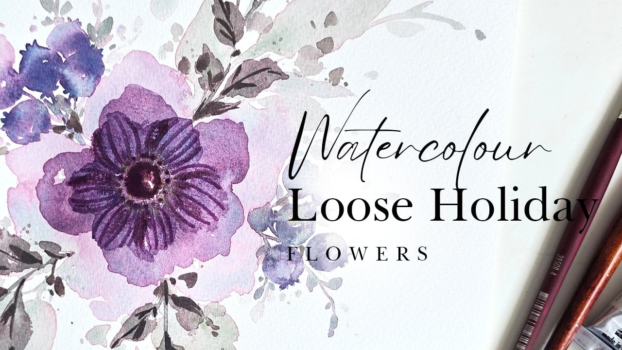
Transcripts
1. Intro: Hi guys, My name is
Clarisse and I am a watercolor artist specializing
in watercolor flowers. My teaching of
watercolor flowers began over a series of YouTube
video tutorials that really seem to do
very well and gave me enough encouragement to continue on in this watercolor journey. My style, I would say, is plural for sure. And it is very loose. I love the loose and romantic
watercolor feel that, that the medium has
to offer pretty much. And I love teaching that
because it is relaxing to do and it takes away the stress of having
to copy something. Picture perfect. So one thing I always
tell my students is remember to always have fun. Do not compare yourself and
don't sweat the small stuff. It's just a piece of paper. If you don't like it, you
can always do it again. And before you do it again, take a break, walk away, come back, you'll see
it with different eyes. Online teaching slowly expanded into in-person
watercolor experiences. And I've coined them
watercolor and wine. Watercolor and wine is typically
an experience where you enjoy watercolor with a
glass of wine in a vineyard. And I organize these with a
bunch of different wineries around the Niagara wine country
region here in Ontario. Over my budding
watercolor journey, I've had the privilege
of working with some pretty amazing watercolor
brands at your lab. White Nights, Zen art supplies, Paul Rubens, and
Princeton brushes. I'm also honored to
say that I am one of the ambassadors for
Princeton brushes, and it's really,
really an honor. This class is
geared for everyone across the board,
including beginner's. The way I structure my
classes is very deliberate so that even if you are a
beginner or your intermediate, these are great reminders
for you to sort of go along or to just look out for
and watch out for it. Typically, we start
off with swatching, exploring our colors,
getting warmed up, making sure we are
getting used to the whole brushstrokes and feeling the paper and
all that good stuff. Going into technique. Technique is where I explained minute details on what
to look out for so you can better your
results in the end. And last but not least, is where we team the first two. So we've warmed
up by now, we've, we've practiced or a technique
and we go right into creating our final project. So yes, we are painting
pretty hibiscus. But the whole point and end result or what I want
you to walk away with at the end of
this is you're getting more practice with your
mixing techniques. I want you to feel free to explore different color options. As we paint this flower, you do not have to use the
same colors I'm using. And feel free to try
something that you might be inspired by as you're painting along or you
watch me do something in, an idea, comes along, go for it, try it. It's a piece of paper. If you don't like it, you can always come
back to the video, try it my way and
progress on your journey. Every experiment you do
is a learning curve. I hope you're excited to start this journey with me as we delve right into painting a
hibiscus, let's begin
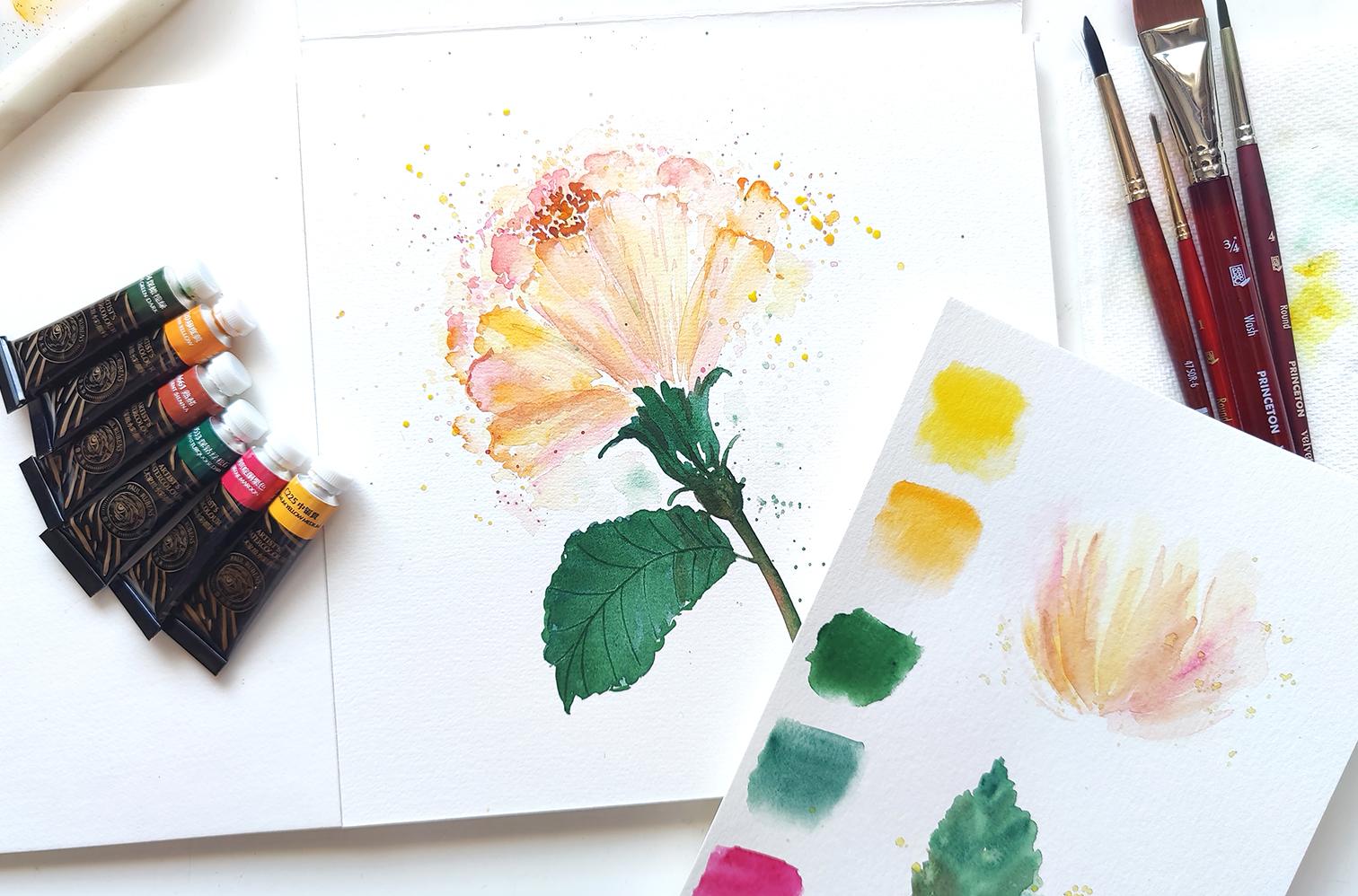
2. Mixing & Swatching: Here's all the supplies
we're gonna be using throughout this
tropical floral series. For colors. I'm using my Paul Rubens
fourth generation set of watercolors. It's 36 colors in total, and it comes in tubes like this. For paper, I'm going to
be using my art supplies, 100% cotton watercolor paper, eight, 8 " by 8 ". And then for brushes, I'm using all Princeton brushes. We've got the set of
velvet touch brushes. And that comes in a
wrong number four, round, number eight in Angular. And then a wash. I also have a number one, Princeton Lauren or sorry, Princeton heritage, which will help for any detailing
I might need. And then last but not least, I've got a Princeton
round number six, and that's from the
Neptune series. I've got paper towel handy, I've got my little
cup of water handy. And then one more thing. And feel free to do this
if you wish to save your good paper
for swatching and testing out colors and just doing a little
bit of practice. I am using my Canson
Excel sheet of paper. It's just a sheet that I've
cut out and I have kept here. That's all we need and
we are ready to begin. So in this first video, we're going to
learn how to paint this loose and whimsical
looking hibiscus pointing upwards. This is not your
typical round hibiscus. This is one of the
more frilly ones that I saw on my trip in Maui and I absolutely fell in
love with how it looked. It reminds me of a
fluffy tools skirt, which I also love. So here we go. I'm going
to tell you what colors we're going to be using
specifically to create this. You just put this aside. I have picked the Indian
yellow, cadmium, yellow medium. Quinacridone, maroon,
quinacridone, turquoise, turquoise dark, super
tiny over here. And then we've got
olive green dark. So I like to use two
colors for my leaves. And then I've got burnt sienna here handy just in
case I wouldn't add some shadowy effects within
the folds of our petals. Alright, and so we're going to use a palette and just quickly get some color on here so we can get started and on our way. Alright, so I have some of my color on my
palette over here. I started off with
the lightest yellow than to the orangey
hue. I've got Mike. My pinky hue on here. Burnt sienna is right here, and then the two greens. So what we're gonna do is
we're going to start off with doing a little
bit of swatching. This always helps us
loosen up and just getting ready to paint. It's almost like a warm-up
before exercising. So I'll be using the wash to dampen the sheet
and then we're just gonna do some quick swatches for the color so you can see
what that looks like. And then we can begin. So here's what the
lemon looks like. Super bright. So we know a little goes
a long way with this. We're not going to be super, um, what's the word
I'm looking for? We're not gonna be super happy in terms of
picking out the color, I guess, and generous. We're not going to be generous. That's the word. Here's the Indian yellow, which I think is very pretty
like an orangey mango color. Get into some of
the olive green. Actually this might
be the turquoise, this is the turquoise
green guys. I think it compliments these
two colors really well. We've got some olive green here. And then last but not
least, second-last. Some of the quinacridone Beautiful. Now I can see your last but
not least, the burnt sienna. Perfect. So based off what we
have swatch over here, this gives us an idea of where to start and
how we're going to proceed and execute this flower. Now, here's my visual reference just so you have an
understanding of how this works. A lot of this, if you notice, has a whitespace. Whitespace is integral
when it comes to loose style of
watercolor flowers. So throughout this
series of my flowers, we're going to be
focusing in on whitespace unless we're being a
little extra detailed. We also have a
splatter happening. I've also got three tones
within this flower, or four tones, three
to four, I believe. And then we've got
two within the leaf. I will be adding
the burnt sienna along the stem as well over here just to give it some
nice blooming, dark to light. And we'll be doing some of that burnt sienna within
the flower itself as well. So let's just practice, or let me show you
the technique of what we're doing in
terms of getting these smooth or really loose
looking petals going for us. Okay? So for the sake of this practice and just
showing you how to do this, we're going to use the wash and this will just help us
get a nice surface damp. And then we're going to focus in on the mixing of the
color at the ratios. So I'll just do a
rough little area. I'm just going to dampen this
this area really roughly. We're going to allow
this to sit for a while. We focus in on the colors. So now, when it comes
to mixing colors, a little goes a long way, like I mentioned before. So we're going to start off with using just a little bit off the, actually, I'm not going
to use my number four. I'm going to use my
number six because it's a nice thicker brush and
it'll give me a nice spread. Rubbing all the water
away from my brush. We're going to go in and get
a just a tad bit of yellow. You can see how much
I have over here. It's easier to start off less, and then you can always add
more color if you need to, but it's hard to take off
color if you go in dark. So look at this. I took a very little
amount and I'm just like lightly mixing it on my palette to get a little
bit more water as well. Continue mixing. Now my brush is nice
and full with water. We're going to go ahead
and add just a couple of strokes and I'm holding
my brush at an angle. And I'm leaving a little
bit of whitespace as I'm dispersing the color. And I want you to appreciate how the color just blends
in with the water. Another thing to keep in mind, watercolor always dries lighter than it actually shows when
you initially laid down. Okay, so we're going
to put this aside. I'm gonna get some of my Indian yellow using
the number four. And we're doing the same thing, just taking a little bit, mixing it on here. The side. Just dipping just
the tip of my brush in water to get a
little bit more color. And I don't want this
to be super watery. My brush that is and the
reason being is because this area is nice and damp
and watery right now. So when I'm adding this, this hue of orange, if I want it to bleed
and bloom nicely, I need it to be a little
bit less water down. So we're just lightly grazing and adding some strokes
within the yellow. And again, just like I
mentioned previously, were these are the
techniques or this is the method we're gonna be
using to create our petals. So watch how the colors
mix with one another. Watch how the colors dance in the water and
bloom in the water. That is the beauty
of watercolor. We've got a nice, beautiful blend and
bleed happening. And I'm going to use
the number four again and get a little
bit of that pink. And let's drop in some of the pink and see what
that looks like. For the pink, we're just
going to add it within here. Now if something
like that happens, just take your brush Another brush. And just sort of with water, we just help it blend. Again. Watch how watercolor blends in with the color
you've already added, plus the the actual water
that's on the sheet itself. And watch for the results you're getting because
this is typically all that's involved when
it comes to doing the loose hibiscus
we are doing today. Notice how if you wait for a few seconds more for things to dry and then go in with color. You get a different
sort of bloom. This is a little more hard edge. This is really soft and pretty almost going
from dark to light. So pay attention to these
details as we progress. And again, like I mentioned, you might want
something to look like that or you might want
something to look like this, in which case you just take your brush and
lightly blended out. There is a window or closing
window to the blending out. If this dries up and it's
not damp when you do this, going in with the
brush and adding water to smoothen it out, you will not get a
pretty result like that. I maybe even
experiment with that because once you realize
what that looks like, it'll give you a
better understanding of your timing that
you're working with and how to proceed
when you come come along. Instances like that. I'm taking some of the burnt sienna and
we're just going to add that in within this area. And I'm just very loosely sort of just adding
it in-between. The reason I'm doing
it like this is again, we have just taken a
very loose shape of the hibiscus and we're
we're building up on it. Now you can see, remember I was talking about allowing it to dry
and then going in. Here's, here's what
you would get. And so it's integral that you either get to this while
it is still darkening, or if you are able to blend in, just go in with another brush
and just lightly blend in. I, however, would like to get
to it before it dries up. I don't like muddling
my my flower. And so we will not be doing this once we actually
start the flower. But acquaint yourself
with, with this. Just so you are
trying things out and experimenting because
that is how we learn. So this is the, this is
the results you will get. This is not the kind of
results we're looking at. As you can see, we've gone
over it several times. Again. Once it dries up, this will pop out a bit more. This doesn't quite
look as smooth as the hydrangea we have
happening over here. Right? So we just got to
keep these things in mind and proceed with caution. Or maybe not caution, but more with, I guess, wisdom, knowing, wisdom
and experience of knowing
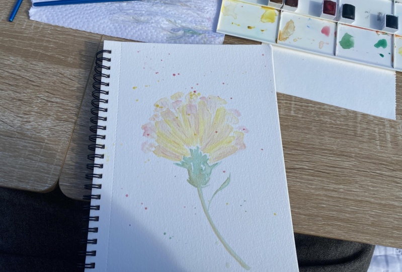
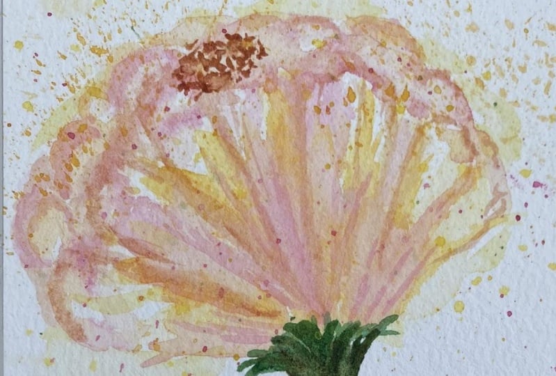
3. Painting Part 1: Here we go. We're starting
our actual flower right now. And I'm going to start
off on really quickly. We're painting on the
Zen art supplies, 100% cotton paper. I'm going to start off with my number six brush
and we're going to lay down some nice color. I know during the exercise, I dampened it first and then
went in with the color. What we're doing here is we're diluting the color
going in with a very light sort of
lemon or yellow. Here we go using some
of that diluted color. And I'm gonna have this
flower in this direction. So it's kind of like a V-shape
that we're doing here. So very loosely, adding two
strokes just like that. Dipping the tip of
my brush and water. I'm going to add a
couple more strokes. Getting more water. We're going to try and leave a little bit of
whitespace in-between. And we are doing like this
haphazard sort of uneven, bunch of strokes dipping
to get more water. I'm gonna get a little bit more on this side to
give me that nice shape. Then I always like
a little bit of a floppy pedal onto the side. So what I'm gonna do is
just get some water, get a little bit of that color, throw that color in here. So we get those nice rivers
in lines of yellow or lemon and then just do little
floppy kind of petal here. Now this is where
the fun part begins. We're going to take
the number four, get some of that Indian yellow. And what we're doing is we're going to go in and highlight certain areas so we can
get some folds to see. So getting some Indian
yellow in here. Some just, you can have some starting from the
top and going downwards, some coming from the
down, from the, down, from from the bottom,
going upward. You're getting those
nice, beautiful blends. Get a little bit of
that happening here, just some at the top because you want to
get a nice semblance. Lucy colors happening
all over the place. You want to blend
some of the colors. Just go in with just water
on your brush and just lightly pull around and
have them just blend in. And then we're gonna get some
of that quinacridone pink, very, very light version of it. And just throw in some wherever you feel like it needs some. You don't have to
follow me exactly. But I just close up all
my whitespace there. Try not to do that and add
some just here at the side. And I add a little
bit at the top. They're blended in with
all that happening. To add a little bit
happening over here too. And immediately you get
that beautiful bloom of color and blending going on. I'm just dabbing tad bit more of those
pinks here and there. I wanted to sort of mix in and give us a nice,
beautiful, cohesive look. So now we're gonna
do the background, petals that are in the
background, the fluffing. So what we're gonna do
is use the number six. And again, we want a very watered-down version
of our colors. And so getting
some of the lemon, we're going to start
off with a lemon. We're just gonna do a little
peaks and white peaks. I mean, little arcs at
the top just like this. Okay. And it has to be light in color. So you could even get
a little more of the, you can get some of
the quinacridone mixed in with the
lemon if you want. That's decent enough. Look, and I'm just doing
these little peaks. Get in some of the
lemon in some areas Leaving whitespace in-between. We're not directly going
on top of the petals. And this needs to be lighter because it's
background petals. This way we have a hierarchy, the dark petals stand out and then the background
ones are in the very back. So give it a nice shape. Getting a little bit of that lemony Indian yellow as well. I'm just throwing some. Not throwing, but just dabbing a little bit of color
in here and there. And then what I like to call fluffing can just
do a couple of dabs, which is also like
splatter, really beautiful. So you can get that idea of
the fullness of the flower. Now, we're gonna get
a little bit more of the pinky hue that we have, again, very watered-down
version of it. And I want to add folds
of pink within here. We're doing the same action. And we're kind of going over the areas
where we've painted just to kind of really
lighten it up some more. And then we're going and getting a mixture of the orangey hue. And we'll add that
in here as well. Once we've added these
folds of different colors in here to kind of give
it that nice fluffy look. We're gonna go in
with the number four. And we're gonna do a
little bit of outlining almost with some
of the I would say let's do it with some
of the burnt sienna mixed in with a little
bit of the Indian yellow. And you'll see the
effect that we get. The consistency is
I'd say about 30, 70. I've just taken a
dab of each color, mixed it in with some water. And we're using the number four because it's
got a beautiful, nice, fine point hip. And we're gonna go ahead and add tiny little strokes
around these areas here. We're just sort of outlining
where the petals are. At some point, we
will also switch to adding a little bit
of that pink in there. So we get pink. Then we're lightly adding very grazing grazing
were grazing with our brush to add in little
lines mainly from the bottom. They can sort of go in the direction that
you have your petals. And that's always pretty just adding a little
bit more here. And what you can do is just
lightly bring it down. And then taking this brush and I've shown you this
technique already, We're going to lightly
blend it in into the petal. This is the key, key point to getting a really nicely layered
and textured pedal for these flowers. Get a little bit of that
pinky hue in here and just add some here and
then blend it out. I didn't learn this
one and that's okay. Some can be a little bit hard edged so that it
really stands out and some can be blended. You don't have to
do the whole area. And then it just really
pops out the ones, especially the ones that
have like a little bit more of a darker edge
4. Painting Part 2: I'm just highlighting
certain areas to kinda get that effect. And then we'll do
a little bit of a fold happening over here. And then we do a little bit of the same folding or
outlining rather, I called it happening within the petals in the back
on a smaller scale. So like some of
them can be right here with a little
bit of line detail. You go in with your number
six and smoothing it out just a tad. And you see how they look
like little clouds right now. So if you kind of add a
little bit of a wave, then go in and smoothing
it out just a bit below. You'll get more detail
happening within your little cloudy puff of pretty flowers are
pretty petals rather. And that's really the idea
behind this technique of mine. I'm gonna do a big one here, a brighter sort of hue, and then blend it down. You can see what
that looks like. This, this technique can
be really mesmerizing and, um, you can get
lost in doing it, which is always a nice thing to happen when you're painting. Art, is therapy. What I always say. Veteran, oops than a what
if smoothing some out. So now I've got enough orange, I'll do a little bit
of that pinky hue. Then I think we
should be good to go. So just get a little
bit of that pink. Notice how I'm like,
really like jittering the action to really get that nice full
effect happening. And we're good. I think this is perfect. You can try and add
a little bit of more of the pinky hues here. On a watered-down scale. We're just doing little lines. And notice the lines
are like broken. They're not they're not in
one straight sort of motion. And you've got that
beautiful tone happening. Can do a couple of
lines in here too, because these are folds, but they are pedals, right? So now we can tackle the, the leaf in the base. So we're gonna get some
of the turquoise dark. Actually, let's start off
with the lighter color. Keeping in theme with what I've been suggesting all along. Starting off with
a lighter color and we're going to do our base. So I'm going to
lightly sort of get a nice pointed tip to
get this happening. You just want it to fill
up this area here loosely. We're not covering up all the whitespace
that we've created. Remember, I said
whitespace is your friend. If you want to try and leave some whitespace
in-between here as you're painting this little bulb
sort of section, that's fine. And then we're going to
extend and get it lower. It's got a little bit
of a disconnect there. And this is where we get in with some of the burnt sienna. So just kinda adding that
in human adding it from, from the top here. And then going back with this in Pulling it downward. Now, this is damp just
enough that we're able to get a darker hue flowing. This is almost like a
river at this point. So I'm gonna get some
of that darker color. And I'm just adding it mixed. Get some of that happening from the top, pulling it downward. I'm spreading it here
and there within this beautiful base that
we've created for our flower. And then just kind of thickening
up the stem just a bit. I like I like my edges
to be curled up. And you can see how the light and the dark really gives you such a beautiful effect
as a whole really. So now let's just create the, the leaf that we need to do. These are a little bit
extra big, but that's okay. We'll cover it up with the leaf. So I like to use my number six. Are going to continue
using the number six and we'll use the dark. No, let's use the light and then we'll fill it
up with the dark, just like I had mentioned. So the first leaf I will do, you can do one or you
can do more than one. I'll leave that up to
you. I'm going to do one happening over over here. And just like I mentioned, we're starting off
with the tip and then lightly trying
to get that shape. I'm going all the
way there because I wanted to cover that up. Painting leaves are fun because especially leaves like
this which have a lot of texture because you're able to get some beautiful
organic shapes. So this is like a
curved leaf for me. Whoops, don't throw your brush. That can happen. When I get my number four
and get that darker hue. And now we're going
to guide the leaf. So here we go. I'm adding one big stroke. Beautiful. This is called wet on wet. I'm going to add
more strokes within. First, very close,
starting from the stem. And then as I'm going upward, I'm going to extend the
amount of space in between. So I'm increasing how
much space there is. And what this does is this
pretty much just gives, gives us more texture. So you can see how
you immediately have that idea of lines happening. You can take the
darker tone and just highlight the areas
around the leaf, kinda like what we did with
the edge of the petals. And that's beautiful. You some over here. The more you layer an area with color is the darker
that area becomes. It's almost like yeah,
layering up really. Then last but not least, you want to give this leaf
a little bit of texture. So what we're gonna do is, oh, sorry, It's got
texture already. But if you want to add
a little bit extra, using the back of your
brush, do the center. And then you can do the veins. You could choose to
do it on one side, not do all the veins, just sort of do a
couple here and there. Really makes for an
interesting result. There we go. We've got that. Last thing we need to do is this bladder
and just do a little bit of dots for the Center,
for the stamen. And we are finished
5. Finishing Touches: All right, so I'm going
to be getting some of my lemon like we had
initially discussed. And watering it down, making sure my brush
has a lot of water. We're just going to tap. Now. I don't mind the lemon
being the way this is, but I want it to be lighter. So I'm just dipping
my brush in water. And now when this dries up, it'll be more water, less sort of pigment you smoothing that out
or washing that out, just getting some of the orange. Throwing that in. And I want like stuff
happening at the top as well in-between here to really
make it seem full and fun. Then getting some
of the pinky Hugh, last but not least, actually the pink hue. I'm going to do it in. I'm going to switch my brushes. I'm going to use the
number four for that. Just to get a thinner, finer variation of splatter happening and then
dipping it in water. I want a lighter
version of the pink. Just getting that there. Then why not? Let's add
a little bit of green. Just at the bottom. This is where your paper
towel comes in handy. Any areas you feel like
you did one green, for instance here, just dab
and you should be fine. All right, so now
last but not least, the little center area
that I was talking about, we're gonna get some
of that burnt sienna. And I'm using my number four or you can
also use the number one for details like such. And I'm just going to
add a couple of dots, like just sporadically here. And I'm not overlapping
on this petal here. I'm just kinda centering
it in that area. Not too much, just a little bit. And then we're going in with the yellow mixed in with a
little bit of the lemon. Sorry, the lemon mixed
in with a little bit of the Indian yellow in
before this dries up. I'm just sort of underlining these burnt sienna
dots with this color. It just makes for a nice fluffy. Look. There. There we go. This is what it looks like. You're so close up of it. And feel free to go in and
just add a couple of swipes. If you want to really
blend in some of the green dots within
the, then the petals. And I'm just like getting a muted version of the color and I'm just adding
a couple of lines again, this kind of makes the
folds stand out a bit. I don't mind this edge, but I also would like to
have it nice and fluffy. So I'm just gonna do like
something like that and just leave it mixed some
of the colors in here too. You can always do that. When you mix some of the greens. It kind of gives you a hint of greenery happening
in the background. So that's always nice too. And obviously you can have
green here but not here. So just feel free to
add a couple of drops or to your liking if you
are okay without it. And that's it. That is literally the way
I do my loose hibiscus. So I hope you guys enjoyed this and I look forward to seeing
what you guys come up with. Thanks guys for watching
 Clarice Gomes, Go with the Flow in Watercolour